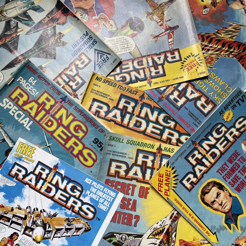
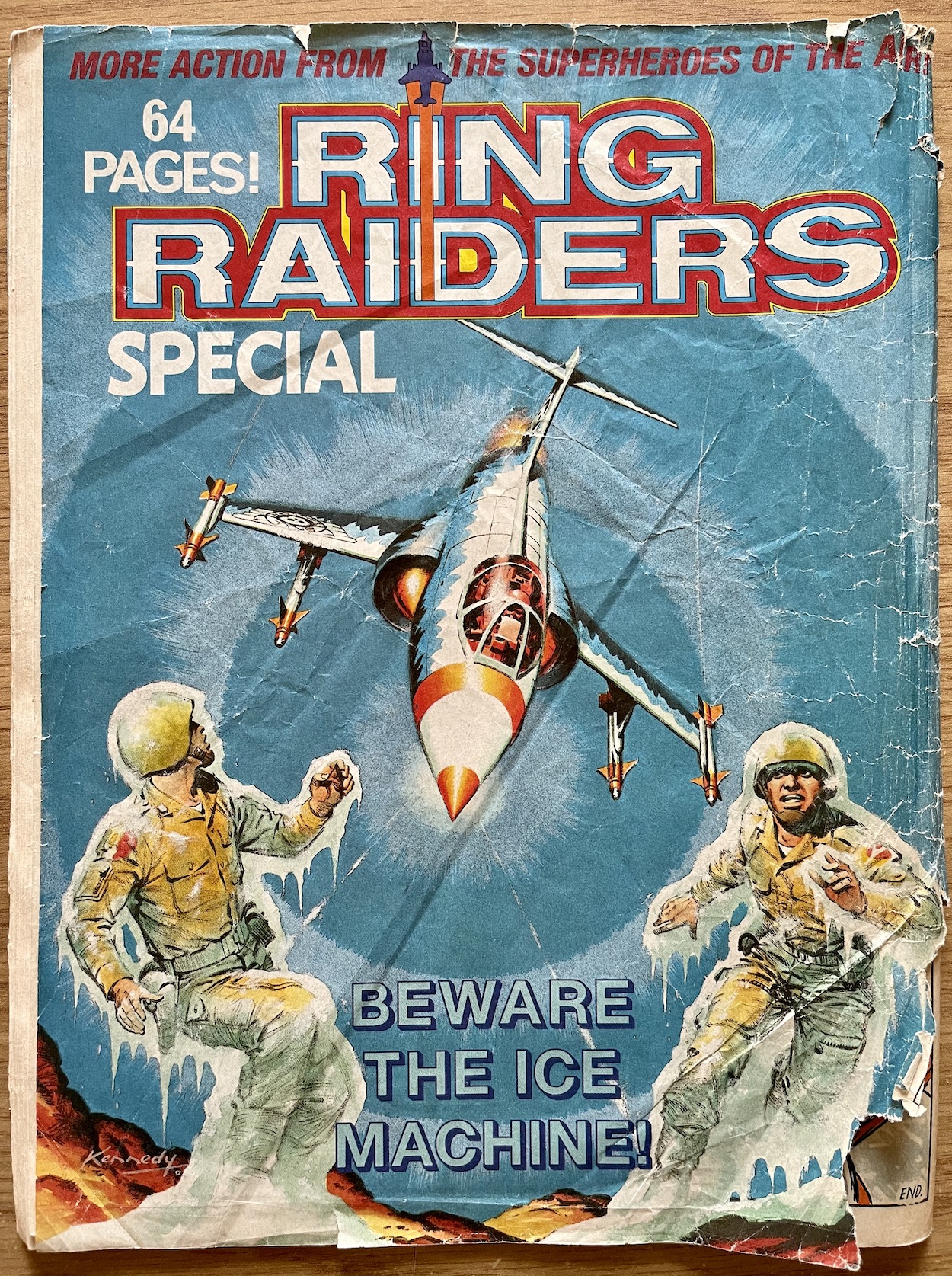
RiNG RAiDERS SPECiAL: SPECiAL iNDEED!

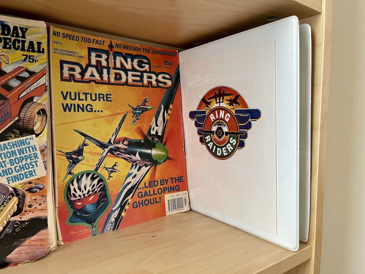
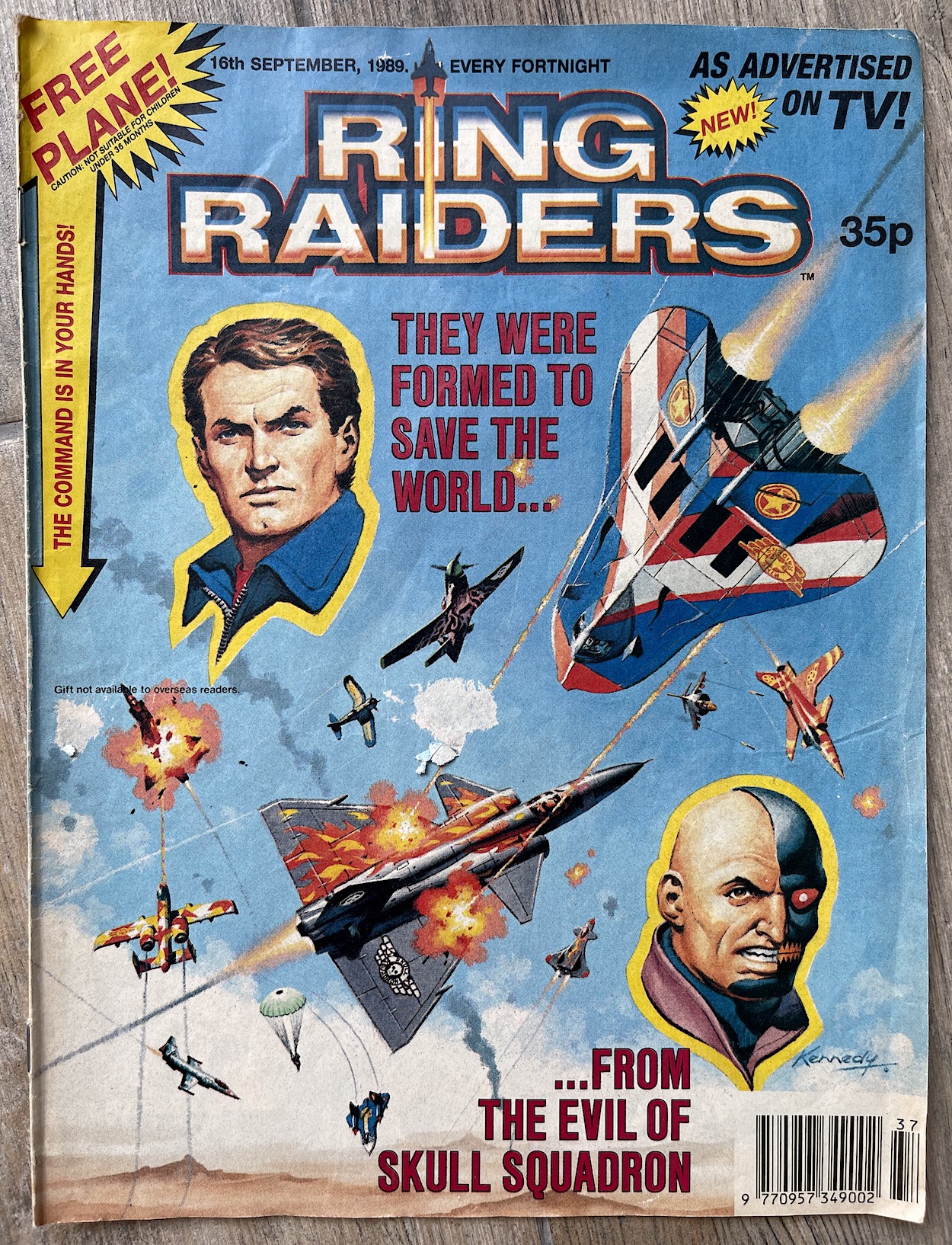
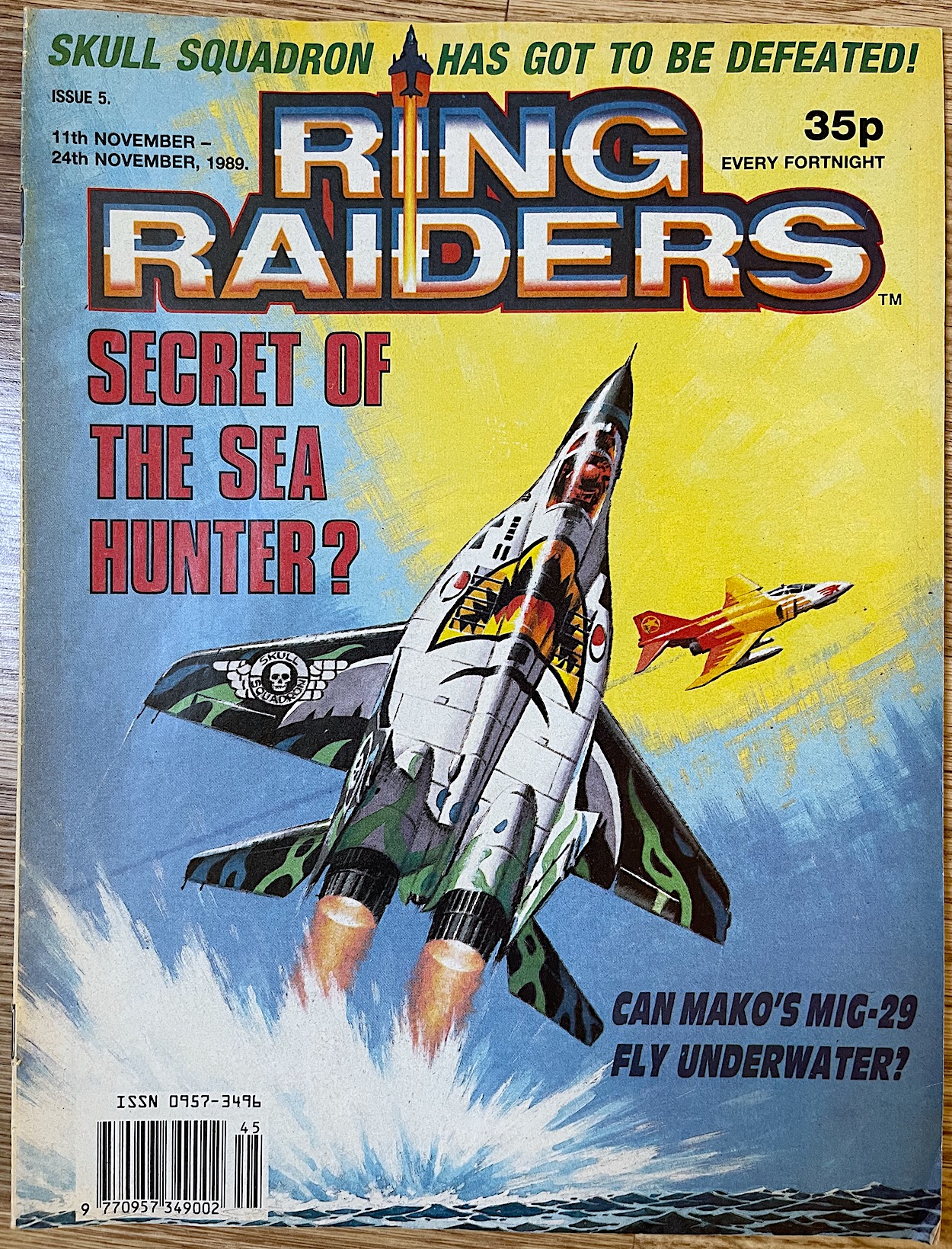
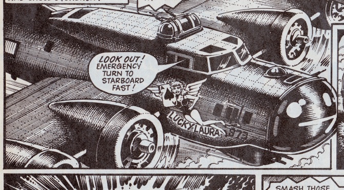
When editor Barrie Tomlinson gave us the bad news that #6 of Fleetway‘s Ring Raiders was to be the last, he told us they hoped to produce a special the following year to finish off all the stories frustratingly left on cliffhangers. Given how comic specials usually appeared in April or May, and the fact I didn’t know if it’d even be published, you can imagine my surprise when my parents came back from the shops with this some time in February of 1990. With its gorgeous Ian Kennedy cover and a hefty weight to it, I immediately ran to my room where all my planes and bases could be found.

Also in my room were my comics and after giving the special a quick flick through and seeing glimpses of exciting aerial action I decided to spend the whole day with these characters and read through all of the previous issues, every single story (including the ones that had already finished) before settling down for this mammoth 64-page feast of an issue. The regular comic was 24 pages so this felt like a real treat! Especially when we got not one, but two covers from Ian.
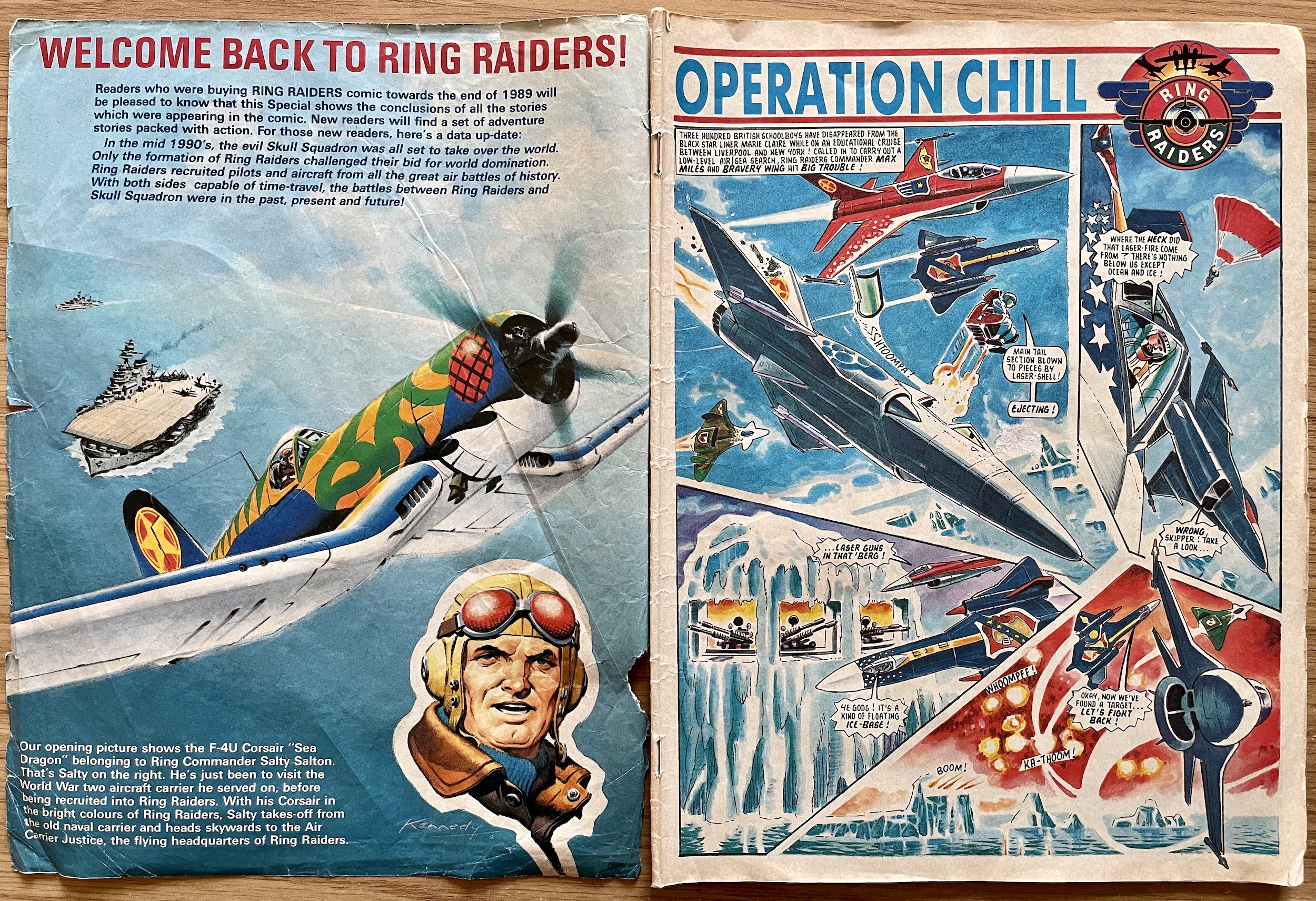
Was #7 meant to be the start of the comic recolouring the logo each issue? Or was it just for this special? Who knows? But clearly Ian had finished the next two covers and I think this inner page (likely #8’s cover) is just beautiful, evocative of the Commando covers he was so well known for but with a modern (for the time) splash of colour on the Corsair. Wonderful. You’ll have to excuse the state of the pages though. This is my original comic and it was read so many times back then, devoured over and over. The creases and tears tell a story though, of a much loved comic I couldn’t get enough of as a kid.

I really enjoyed reading through the fortnightly and was meant to cover this several months ago but had forgotten I’d let a friend borrow it (and the Super Naturals Adventure Book) and she’s not someone I see too often. But here we are at last. I’ve been looking forward to this. As you can see we kick things off with Operation Chill as colourfully brought to life by Carlos Pino, which only began in the final issue. When a cruise ship carrying a talented bunch of school kids crashed at its destination port with no one on board Wing Commander Max Miles and his Freedom Wing were dispatched to track them down.

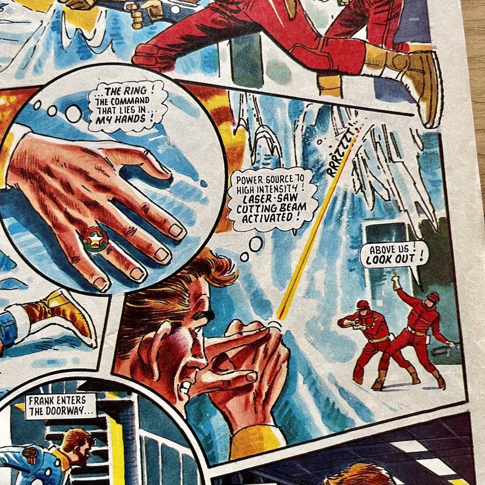
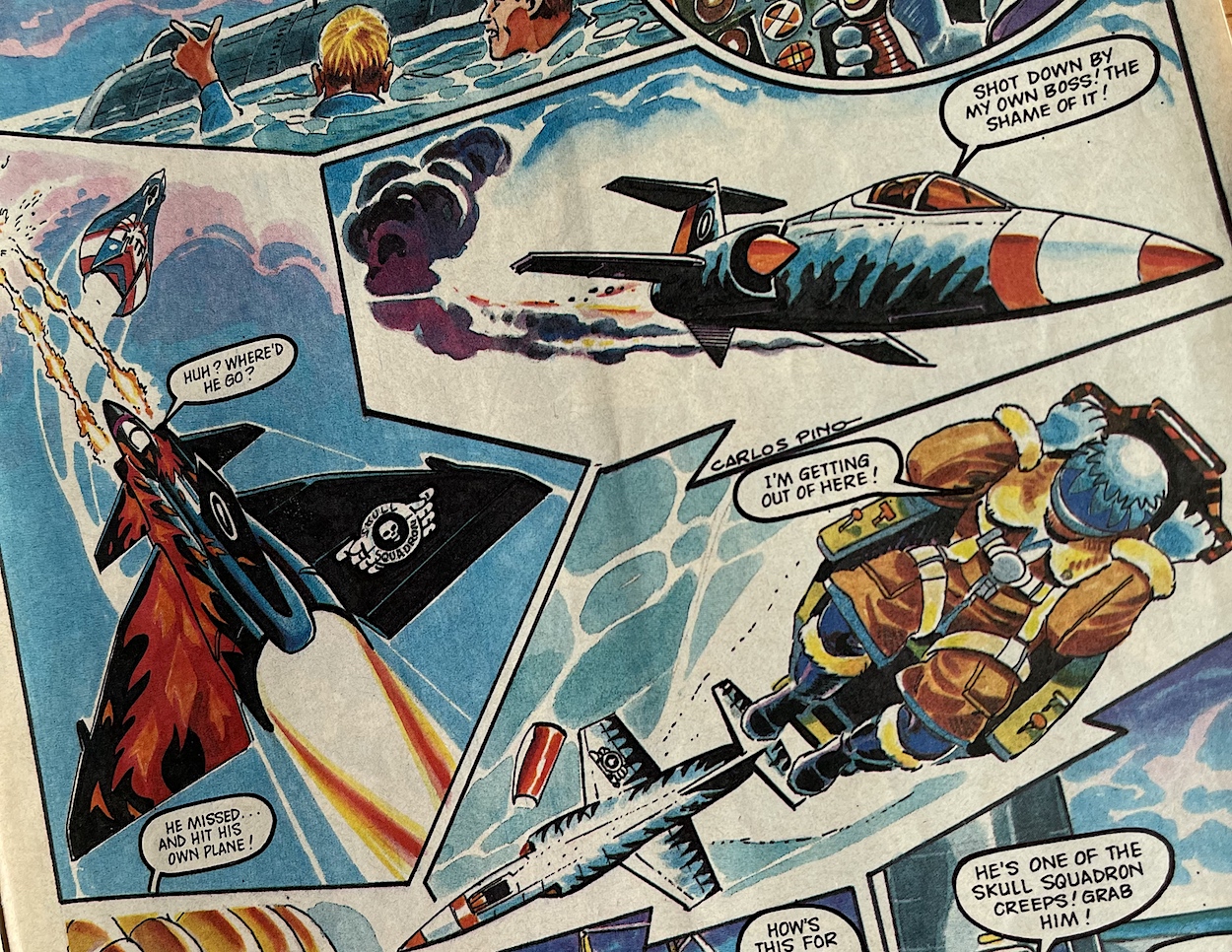
His wing ended up over chilly Arctic waters and fired upon from an unknown source, with only giant icebergs beneath them. On the first page of this issue’s strip you can see gun ports in one of them and it’s on this that our ejected pilot Frank Turner finds himself. Another character named by the comic, Frank is soon set upon by Skull Squadron goons but he’s not as unarmed as it would seem, using another of the miniature gadgets the comic invented for the rings.

The iceberg was also on the move! At this point as a kid I had an idea of what was really underneath the ice and the next part of the story confirmed my suspicions. This particular segment would’ve been in #8 with a release date of 23rd December, the Christmas issue. If all had gone according to plan eager kids awaiting Santa would’ve read this just a few days in advance, and no toy in the series was more sought after than the Skull Action Assault Base!
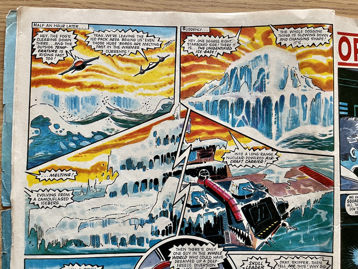
While readers had seen the base in the Trackdown strip we have to remember these are time travel stories and so, much like with Doctor Who for example, timelines can be presented out of order. Even though this takes place a few years after Trackdown in order of actual date, for the time travelling characters it occurred before it. This is when the Ring Raiders themselves first encountered Skull Squadron‘s new mobile HQ. Over time it would’ve been fun to piece together these events into a timeline.

The villain is of course Chiller, the most used in the comic and simply the most sinister, not to mention the most fun for the reader. The plan is to re-educate the kids as mind slaves but, even after Chiller takes to the skies with his new ice weapon and takes out two of the Raider planes, Commander Miles doesn’t give in, making the most audacious of moves by landing on the base. Staying inside the cockpit and using the plane’s weaponry to disable the base he soon overpowers the enemy and commandeers it.
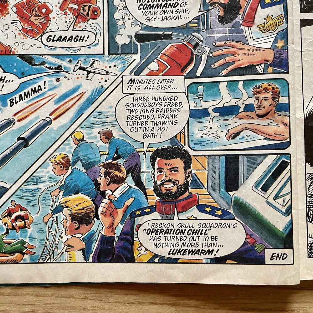
This final panel has Miles posing as he does on the toy packaging. Hmm, he’s called Max Miles and his plane is the Knight Fighter… and in Knight Rider we had Devon Miles… oh I’m just overthinking that, right? Anyway, with the funny image of Frank using the Skull base’s facilities Barrie’s story comes to an end with four parts here, making five altogether so originally it was due to conclude in #10. Who knows if the next story would’ve seen Skull Squadron coming for their base, but it would’ve made for an excellent battle if they had.

This would’ve sealed the deal for Ring Raiders as one of the very best action adventure comics in the UK

On to what was the main strip in the comic for me, the epic Trackdown written by Angus Allan and drawn by famous British artist John Cooper. It always felt epic in its scope, story, use of character and pace, and as it turned out it truly was as epic. With five four-page episodes in the special, altogether it was 11 parts and 48 pages in length. Beginning in #1 on 16th September 1989 it wouldn’t have come to its explosive finale until #11 on 3rd February 1990. Getting the final 20 pages here feels like a bit of a cheat, but these are the best pages in this special, and indeed the series.

In fact, the very first part here (which we’d have enjoyed in #7) would’ve sealed the deal for Ring Raiders as one of the very best action adventure comics in the UK. The Doomsday Device is on its way back to Skull Squadron in Blackjack’s auto-piloted Harrier while he’s taken a young boy hostage in a biplane, threatening to throw him out. Wing Commander Joe Thundercloud of Rescue Wing can only chase one, but which one? Much to Blackjack’s surprise he takes off after the Harrier, or so it seems.

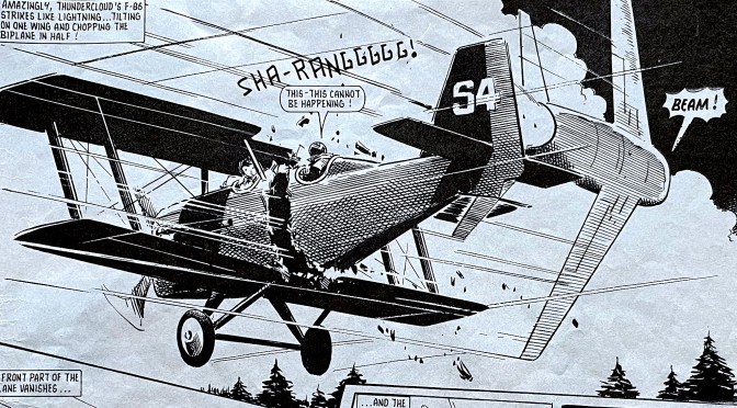
This sequence is thrilling today, so imagine reading this at 12-years-of-age surrounded by all the toy planes, including the one featured here! Scorch orders Blackjack to toss the boy out of the plane to his death, but Blackjack hesitates, just long enough for Joe to swing his plane round and come at the biplane at a 90 degree angle and slice it in half, giving the Air Carrier Justice the order with split second timing to beam up based on his location. The boy (and half the plane) materialise on the Ring Raiders’ flying base while the rest plummets to the ground.

Where could this story go from here? Clearly anything is possible and next Angus has the Wing Commander catch up with the Harrier. With Blackjack out of the picture, Joe disables its engines and then picks it up with his own F-16, using the power of the ring to convert his own body’s energy into extra power to try to get the pilotless plane to the Justice.
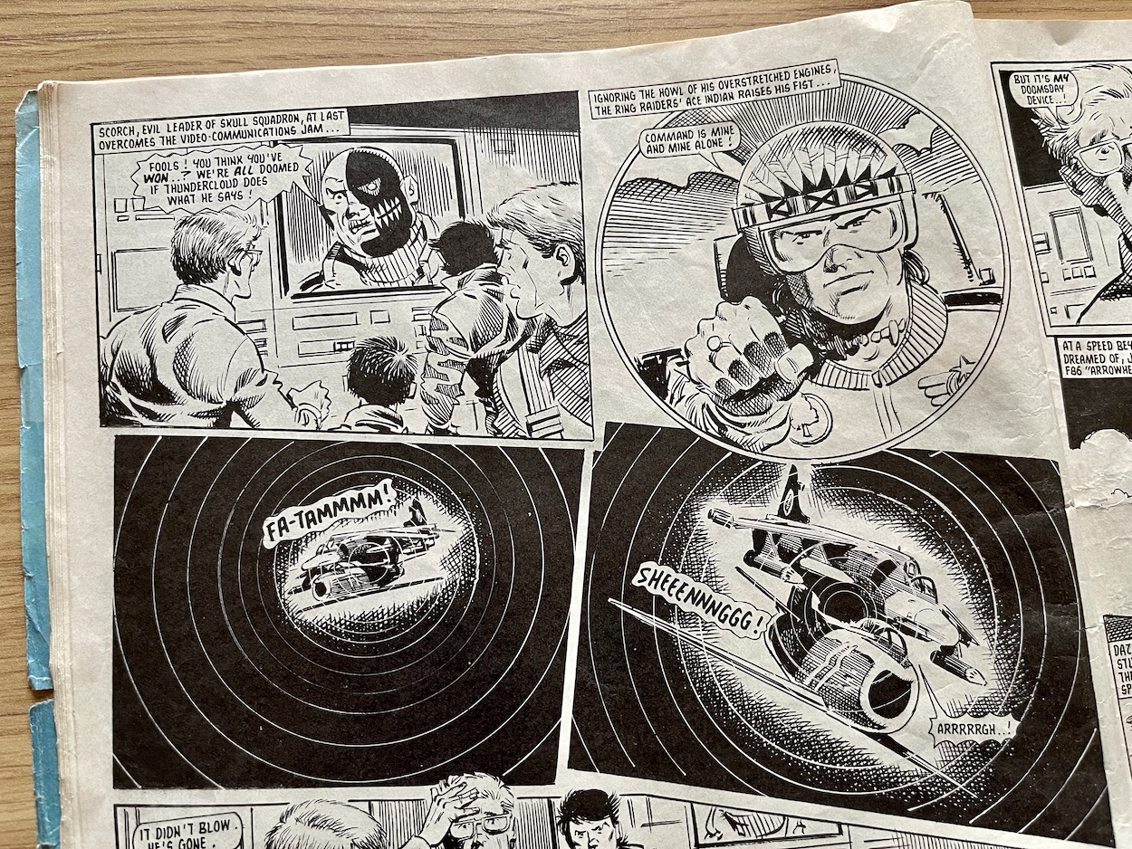
But as a caption reminds us, “Use of the rings means terrible physical exhaustion” and, tapped into his mind as well as his body, Joe’s wish to protect those he holds dear and the panic over the screaming engines accidentally sees him activate the time jump engines with his thoughts, ending up back in prehistoric times, now flying above dinosaurs! As you can see the Harrier is no longer balanced atop his plane. The strain was too much for his body to bare and he lost control, the Harrier tumbling into the lake below.
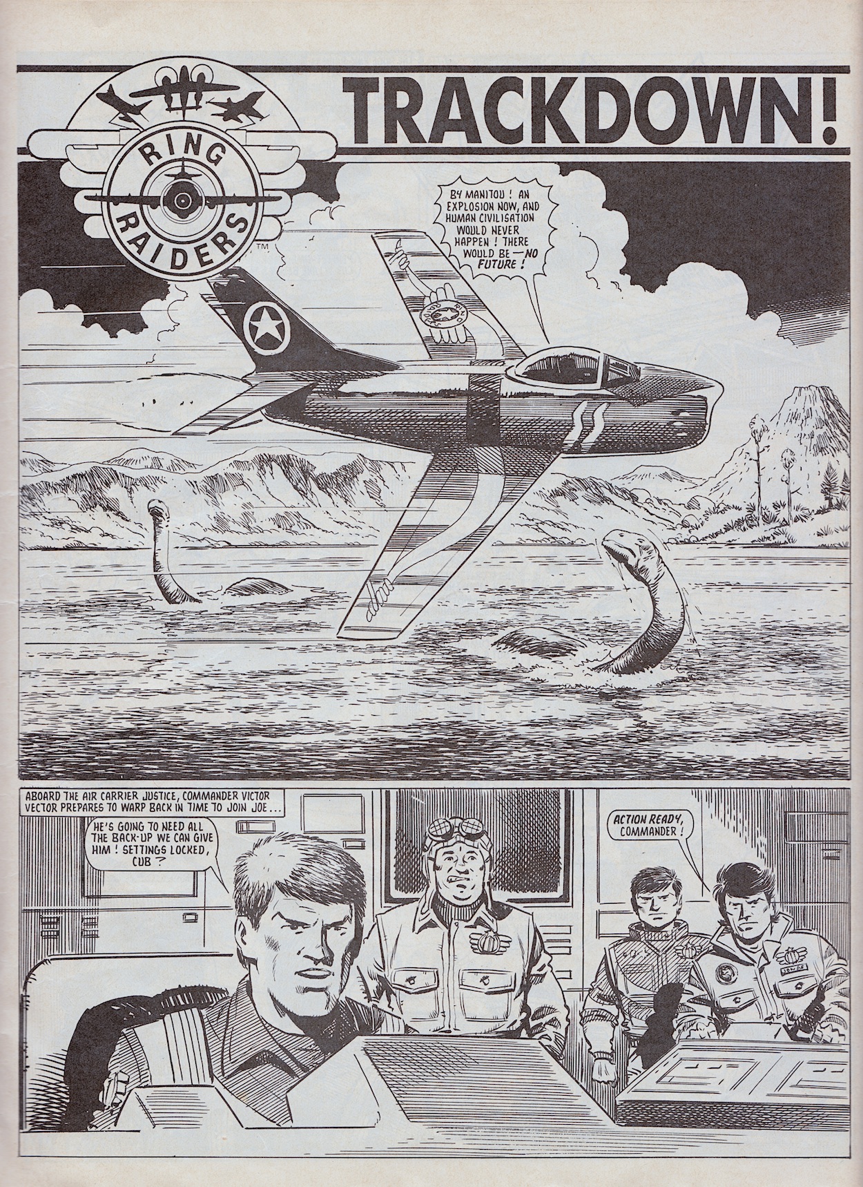
How amazing was this scenario for young comics fans? Ring Raiders deserved a much larger audience than it got in the end because this was top comic action with or without the licence. But as a fan of the toys this was the most amazing thing I’d ever read in my young life as far as I was concerned. (We love hyperbole as kids.) It was a story I’d replay with my Matchbox planes over and over. I think I even created a tiny biplane out of Lego so it could be cut in half, that’s how much I loved this.

Contacting the Justice over millions of years via more use of the ring (and nearly passing out as a result) the rest of the force arrives, giving Joe time to get his energy back and load up the F-16 with Super Sidewinder missiles which he uses to destroy the side of the lake (it overlooks a cliff), draining its water and exposing the Harrier with the Doomsday Device in its cockpit. But the sky suddenly fills with more explosions. Blackjack in his replacement aircraft and his Havoc Wing were tracking his original plane all along.
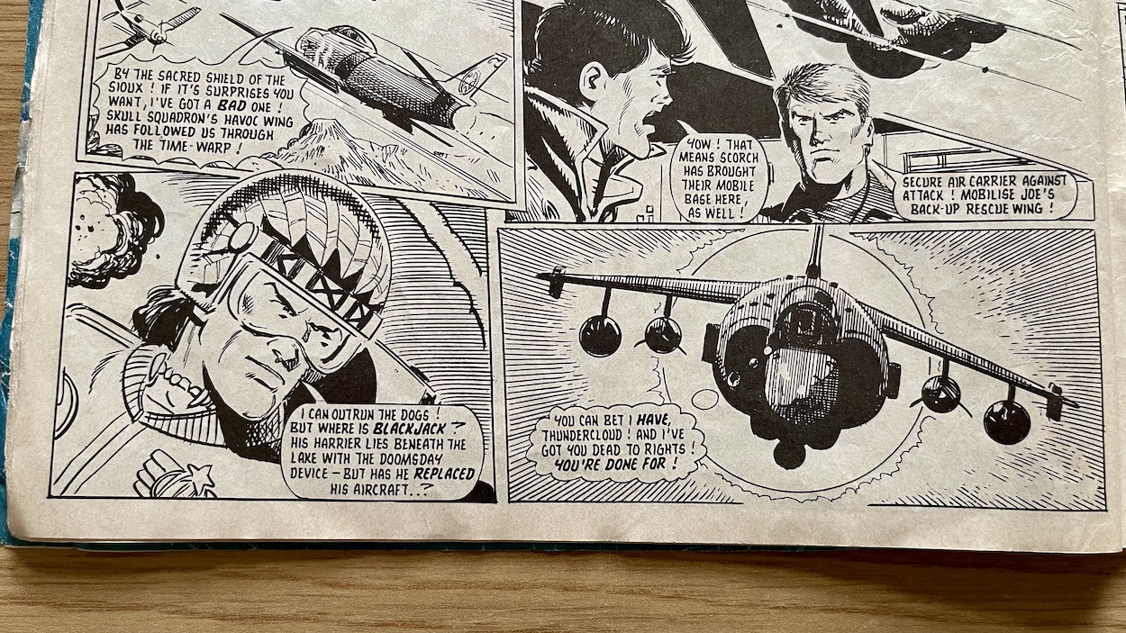
It may be black and white but that last panel of part nine (third episode here) exudes atmosphere. The sun feels hot, the Harrier ominously coming out of silhouette as Joe looks desperately for his arch enemy. My memory had this as a cliffhanger in the fortnightly, such was the impact it had on me but nope, it’s right here with the next part on the very next page. Simply gorgeous imagery by John Cooper there.

Using the ring has consequences and must be used sparingly, unlike in the cartoon version

The characters having replacement back up planes may initially seem to ruin the drama and tension somewhat but it’s not uncommon. Later in Castle of Doom Yasuo needs his reserve machine in a hurry but the landing crew try to dissuade him as you’ll see. Clearly each character has their main craft and a reserve, which makes sense militarily and they’re never presented as a cheap way of continuing the action. It adds another layer of authenticity to something so fantastical.

The story comes to its conclusion as Blackjack steals the device back while Skull Squadron keep anyone from launching from the Justice with an all-out assault. But, with the device dangling from a claw under Blackjack’s cockpit Joe blasts it, opens his own cockpit and uses the power of his ring like a form of tractor beam to pull it aboard. Thing is, the ring was never meant to be used that way and with too much toll on his body already he loses control. Scenes like this establish that the ring isn’t a get-out-of-jail-free-card, it has consequences and must be used sparingly, unlike in the cartoon version.
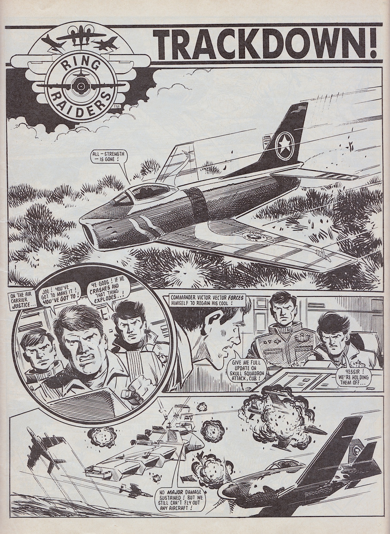
The story constantly flips back and forth between which side is winning, every time success is within grasp of someone it flips again. It makes for genuinely tense, exciting reading, even as an adult. It’s also nice to see other characters milling about in the background or helping out here and there, giving more of an ensemble feeling to the cast than normal. Joe just about touches down without crashing and taking the future of the planet with him. Then our inside cover star Salty Salton launches against orders, his slow but manoeuvrable F-4U Corsair making it to the ground just in time to punch a hole in Blackjack’s cockpit, making him scarper.

Salty uses the ring to reenergise Joe’s and in turn Joe himself, the story wrapping up with doomsday averted and the device launched into deep space. What a ride. Ever since those early episodes with Rescue Wing’s Freddie Riley and the professor it’s been non-stop, the tension always building, with high-flying, high-octane stuff fans of the toys longed to see with one-on-one dogfights, crash landings, huge battles and at the centre of it all two characters driving the story forward. The story was never forgotten for a single page, never sacrificed to show off the action. These final Touchdown chapters were a worthy climax to the comic as a whole, even though that was never the intention.

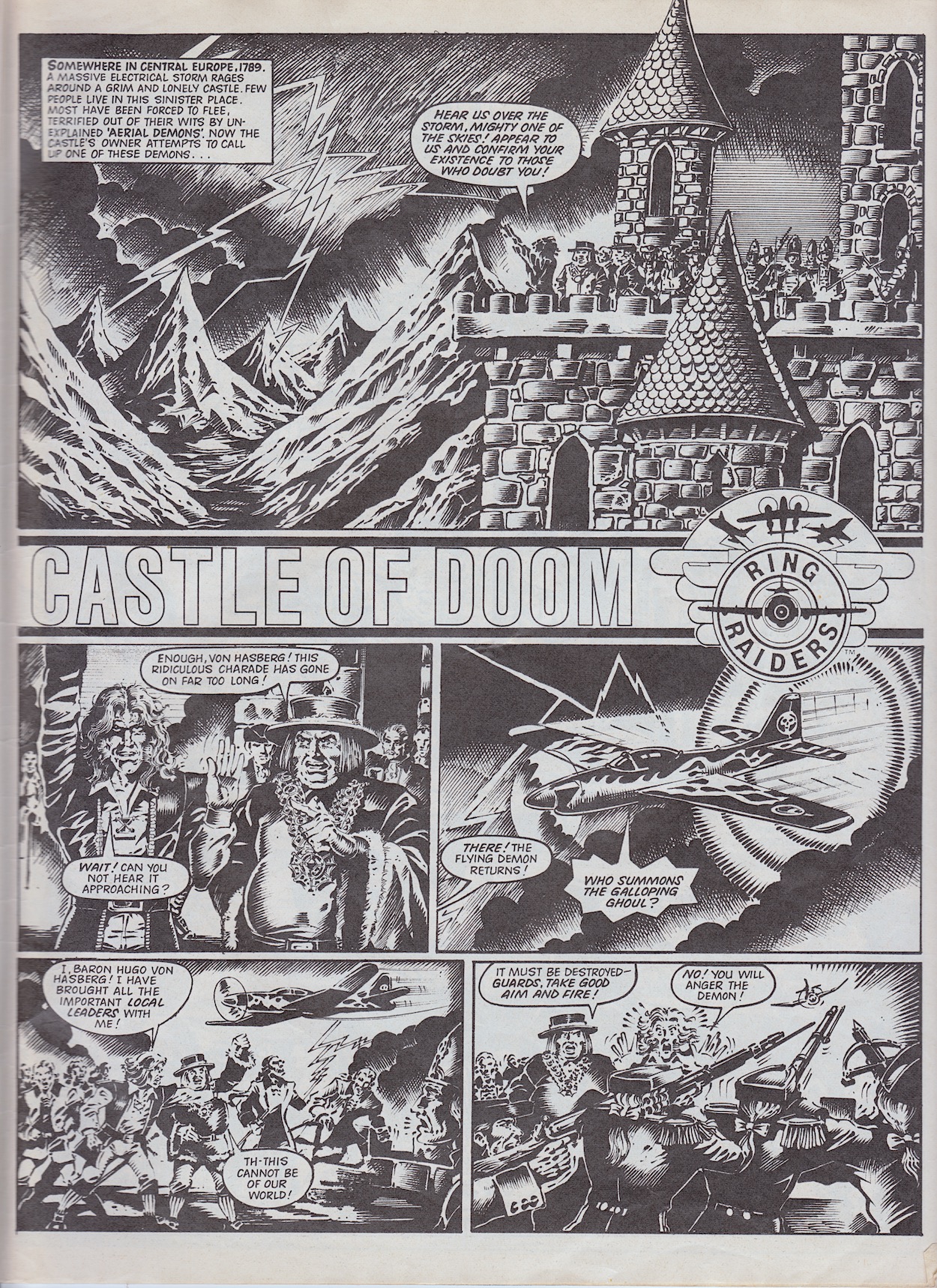
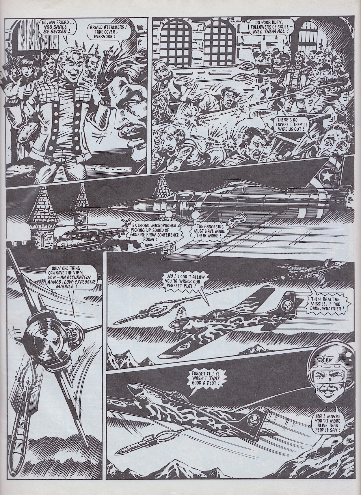
Castle of Doom began in #6 and was instantly a favourite because it starred my two favourite characters, Wing Commander Yasuo Yakamura and Skull Leader Wraither, their planes being the first I ever purchased, so naturally I had a soft spot for them. Following on from the cliffhanger last time, how does a jet pilot rescue a man hanging by a branch on a cliff face? With this rather ingenious Rescue Pod above, that’s how. I love that.

This story has six parts here which would’ve taken it up to #11 with seven parts in total, so as you can see there was no standard length to a Ring Raiders story. This would’ve made for a wonderfully unpredictable reading experience if the comic had continued. Castle of Doom’s plot was all about using time travel to the past in order to affect future events, something which had always intrigued writer James Tomlinson (who went by James Nicholas at the time), and it’s clear he had great fun crafting this tale as it jumps about time zones within the isolated castle setting, layering the plot slowly over the first few episodes.
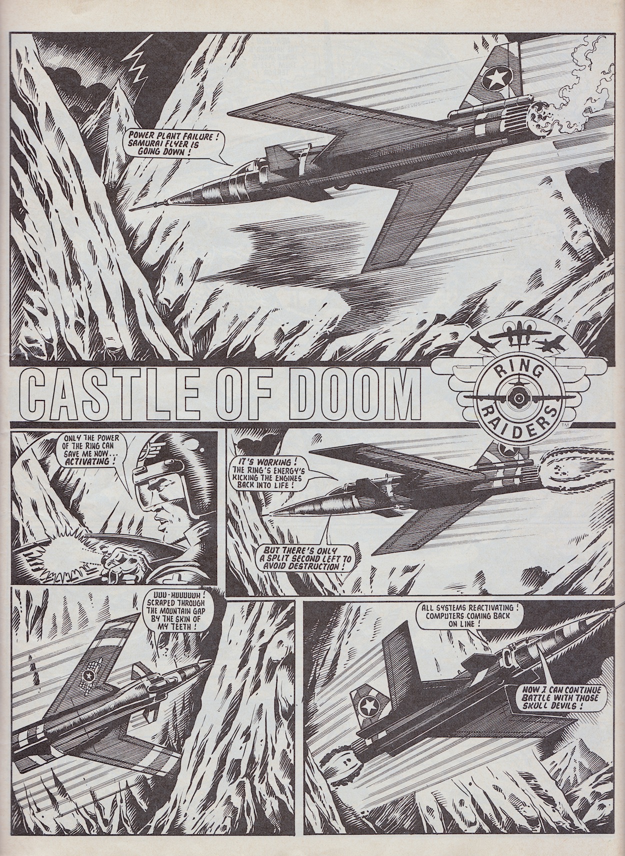
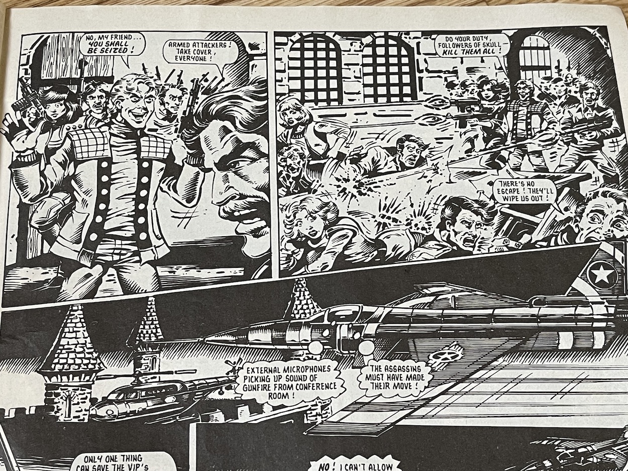
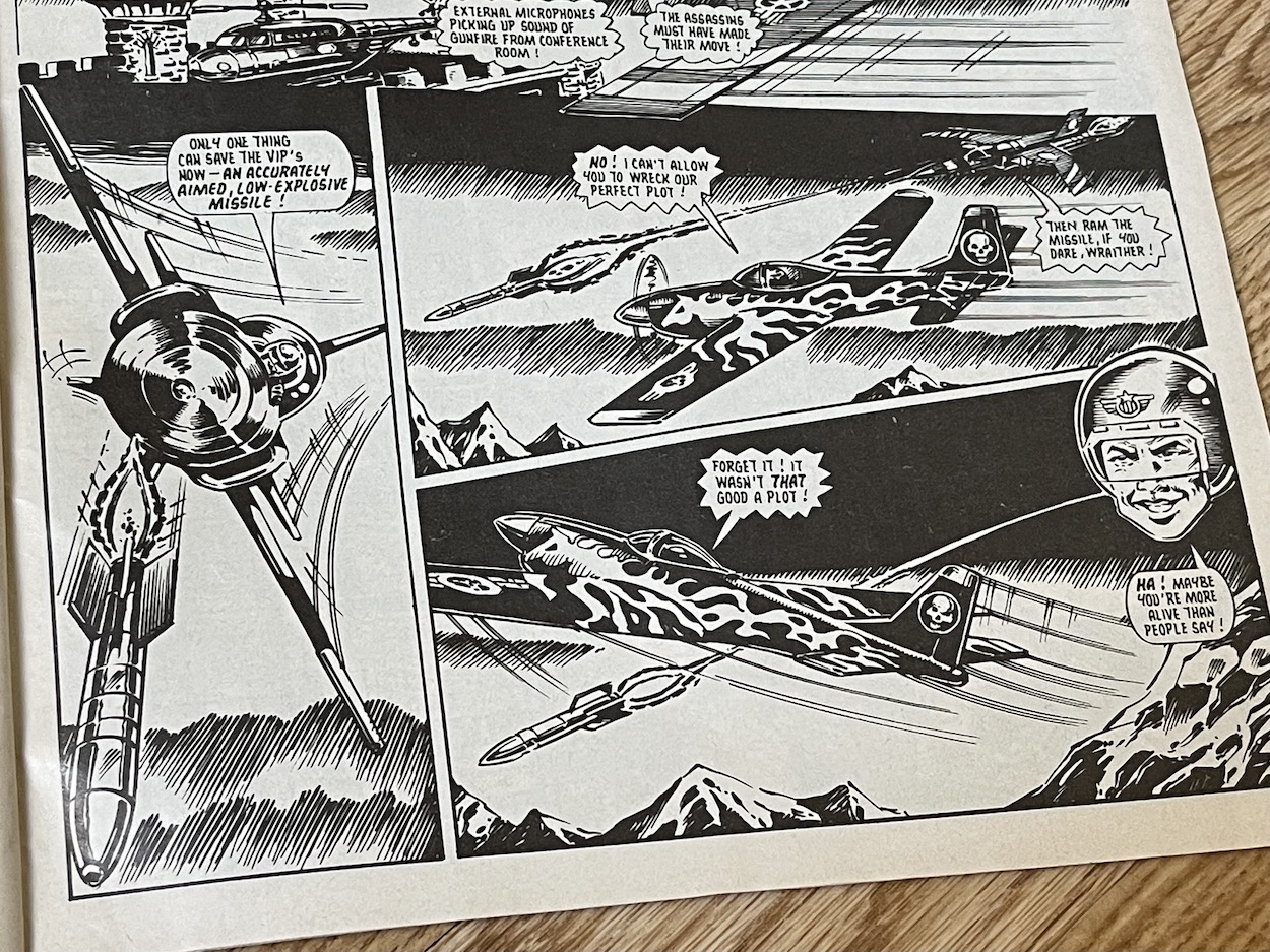
Basically, in 1989 (two hundred years hence) this castle would be seen as the ideal secure location for various governments of the world to gather and discuss the  growing threat of Skull Squadron, a meeting which would be key to the formation of the Ring Raiders. So Wraither and Vulture Wing have ventured back centuries to hypnotise (using a nose mounted ray of some sort) the family living there, planting a seed that wouldn’t be activated until hundreds of years later in the minds of their descendants.

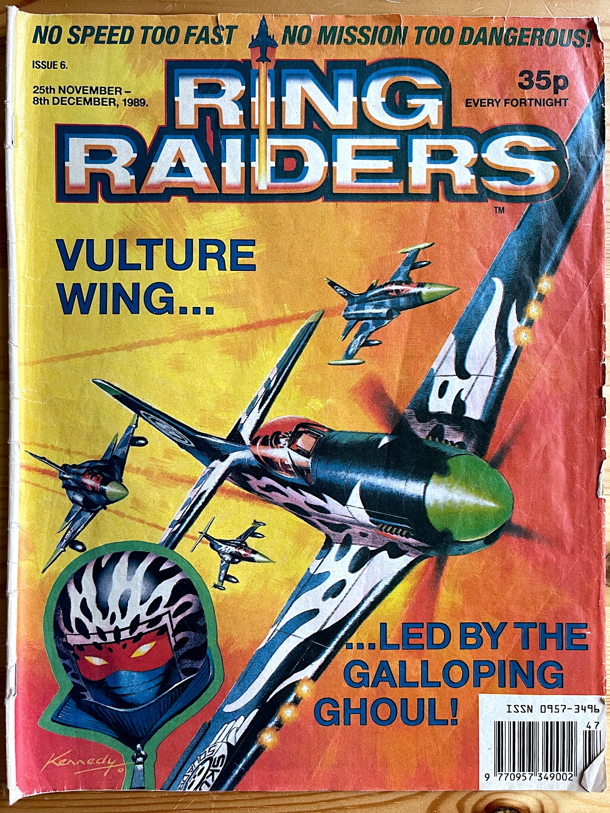
This manifests itself as a mass shooting in 1989, the owners of the castle suddenly falling into a trance and opening fire with automatic assault weapons on all of the representatives present! Yakamura wins the day by using a low-yield missile to knock out a wall of the castle and take out half of the assassins, but the head of the family escapes and throws a grenade into an ammunition store. In the end the survivors evacuate just in time. The rest of the assassins are captured (I’d assume to come round later and be exonerated) and Wraither’s P-51 Mustang Galloping Ghoul is shot out of the sky, the mysterious pilot left abandoned in that time zone until Skull Squadron come to rescue him.
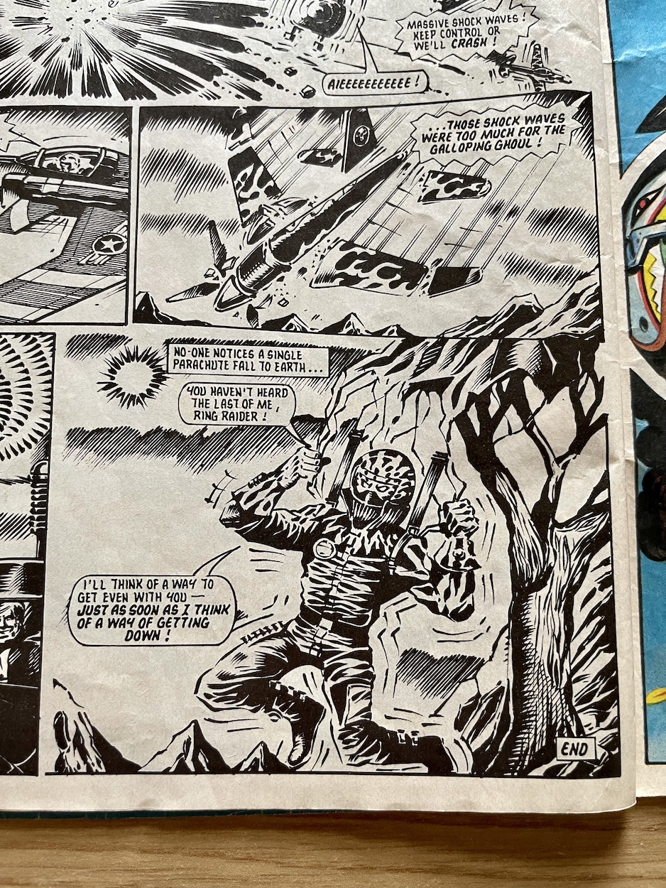
That’s it pretty much summed up but there are two main reasons I love this strip so much: the fact it’s full of great action between my two favourite pilots and planes and how it was delving into some of the backstory, taking tentative steps at setting up some mythology. It reads as an important early chapter in what I’d hoped would be a long-running comic. Wraither and Yakamura were likely chosen because they formed a special two-plane Matchbox Starter Pack (my Starter Pack in fact) and because of this it seemed they were destined to duke it out forever.

To the uninitiated it might seem daft to have two such vastly different planes engage in battle but it’s actually believable. Yasuo’s jet has speed on his side but is unable to make the kinds of quick manoeuvres over short distances Wraither can, and the latter’s ability to fly so close to the ground and mountains and use cloud cover to disappear and reappear at will evens the odds somewhat. In fact, the Grumman X-29 is almost trashed at one stage and Yasuo has to time jump back to the Justice for his reserve machine.
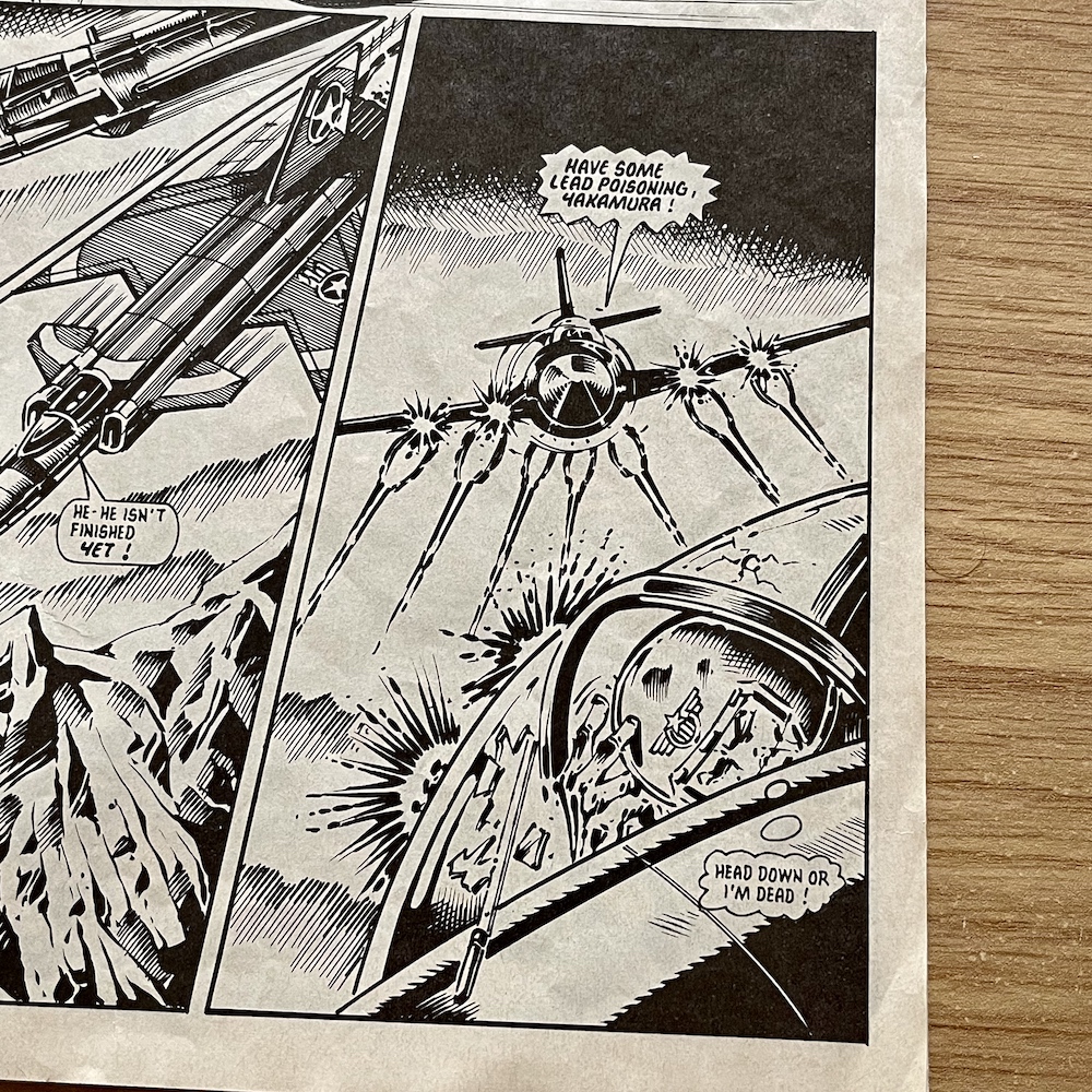
Untested and with unfinished computer systems which were such an integral part of his plane (Yasuo usually relied heavily upon the computer), it made for a tense showdown with Yasuo outnumbered four-to-one against Vulture Wing, the castle under attack by assassins, his inability to land to help and the castle poised to explode, wiping out the Ring Raiders before they’re even formed. The last three chapters were clearly not finished by the time the comic was cancelled as they are combined into one, 12-page finale.

Artist Don Wazejewski again brought James’ script to life and there are some lovely atmospheric visuals here (my favourite being the panel of Yasuo “almost hearing” Wraither’s laughter) and aerial battles that feel genuinely fast and exciting. I also like his chunky depictions of humans, especially on board the gigantic, high-tech Air Carrier Justice; there’s a certain Thunderbirds-esque feel to these particular scenes. Over 24 pages it’s a real thrill ride and it’s such a shame this would be the last meaty read of the special and the last time I’d see these characters.

It hasn’t lost any of its ability to excite for this 44-year-old. But then again, all those happy childhood memories of favourite characters and those little toy planes all bubble to the surface when I read any issue of this comic.

In such a serious storyline, with the tension ratcheting up page after page, there’s a genuine laugh-out-loud moment during the fast-paced climax as Yasuo delivers his missile. The story had made a lot out of the supposed mystery of who, or even what, was behind the mask of Wraither and his sinister character is perfectly portrayed, making this moment towards the end of the story even funnier for the fan in me.
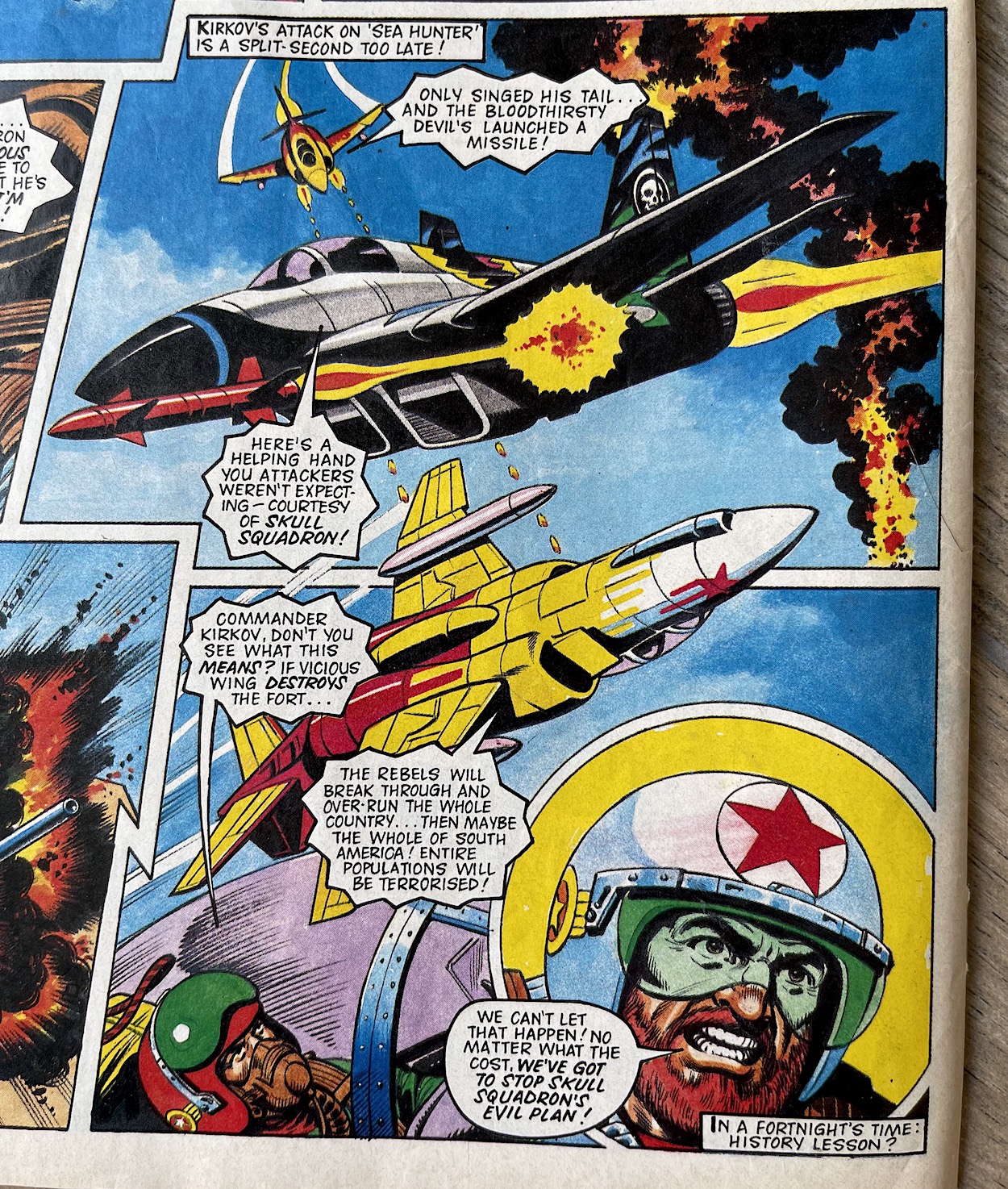
After that momentous blockbuster we’ve only got two individual chapters to go. Next up is the seventh and final part of Freedom Flight. Tom Tully’s story involved Skull Squadron using a band of rebels for their own ends, assisting them in their attempts to overthrow a democratically elected government in South America. The story ended on a cliffhanger in #6 which had Skull Leader Mako’s ‘Sea Hunter’ MiG-29 about to be blown out of the sky by Raider Yuri Kirkov’s missile, fired from his ‘Comet’ F-4 Phantom.

As the young readers could be fans of either side of the never-ending war we would sometimes see the cliffhangers sway towards Skull Squadron, although this was used sparingly in the issues published. Still, it made for a refreshing change. Speaking of which, after 40 pages of beautiful black and white art, turning the page to see Sandy James’ full colour pages is a shock to the system.In the best possible way of course.
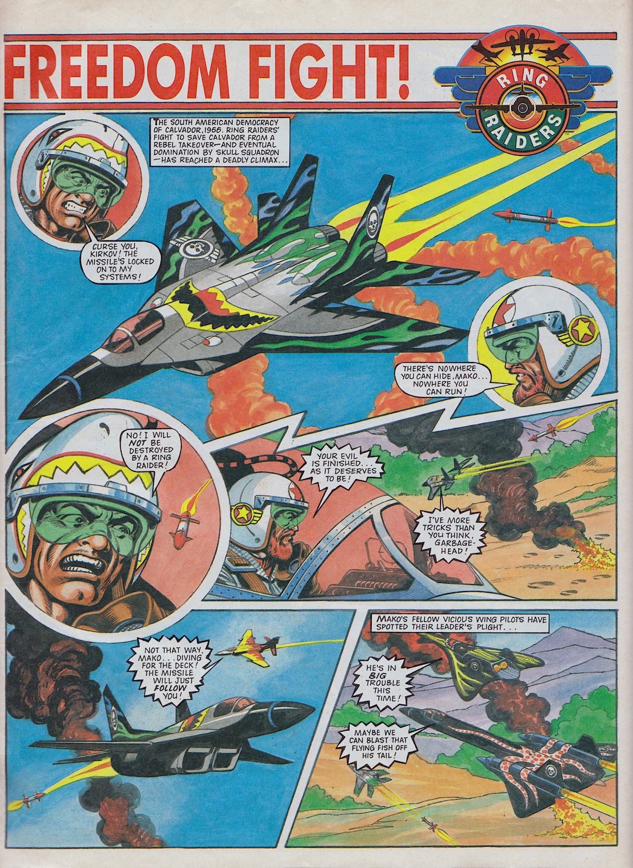
This being just the one chapter it’s basically the end of the battle that was raging months ago in the comic, so alongside the juicier stories in the special it unfortunately feels rather slight. However, in actual fact, if read with the previous half dozen instalments it’s the perfect, exciting ending with Kirkov finally fighting his way to victory after the hardships of other issues. His missile closes in on Mako and he even sees off the wingmen who attempt to come to the rescue.
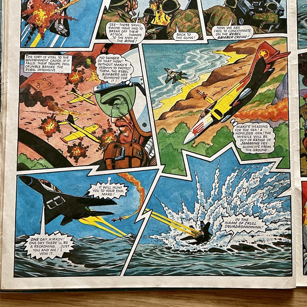
Usually this would mean the end of the plane and most certainly the character, what with him not bailing out before impact, but as we readers know and as Kirkov suspects, Mako’s craft can operate underwater so the Ring Raiders must content themselves with the fact he’s escaped. Without the futuristic back up the rebels are soon defeated and our heroes travel back to the Justice to await their next mission, their work in the air complete.

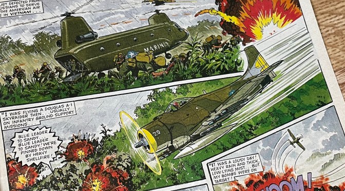
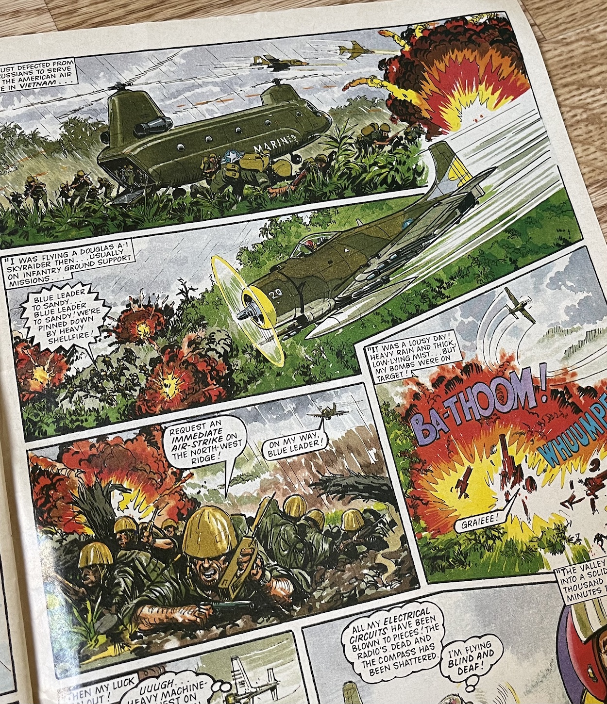
Just one page later Kirkov returns in the one-off character story we would’ve read in #7 and it’s quite possibly the best one of the series, or at the very least right up there with Chiller’s in #3. As usual it kicks off with an air battle against the Skulls. Wraither again actually. As he expertly uses clouds to vanish into thin air during battle, Kirkov is reminded of the mist covered skies of Vietnam through which he flew in his Douglas A-1 Skyraider after defecting from Russia to fight for the United States.

Those of us who grew up in the 1980s will remember most of our heroes in primetime television had fought in the war, each one suffering some degree of personal trauma (Thomas Magnum, Magnum PI), physical damage (Michael Knight, Knight Rider) or psychological issues (Stringfellow Hawke, Airwolf). So as a young teenager this lent a credibility to Ring Raiders, seeing a character caught up in a real world war, one that we were all too aware of at the time and of the devastation it caused.

I think it could’ve reached beyond those obsessed with the toys if given the chance

The story was a real treat and as the last strip the comic would ever publish it made an impact; its gritty, rain-and-mist-shrouded panels evoking the same atmosphere we were used to in flashbacks in those aforementioned television shows (and later in the 90s when Bravo showed Tour of Duty which I became completely hooked by). Reading it now, Scott Goodall’s well-paced script and John Gillat’s superb artwork take me right back to those times. In fact, it feels all the more mature reading it now through adult eyes when compared to the other strips in this issue.
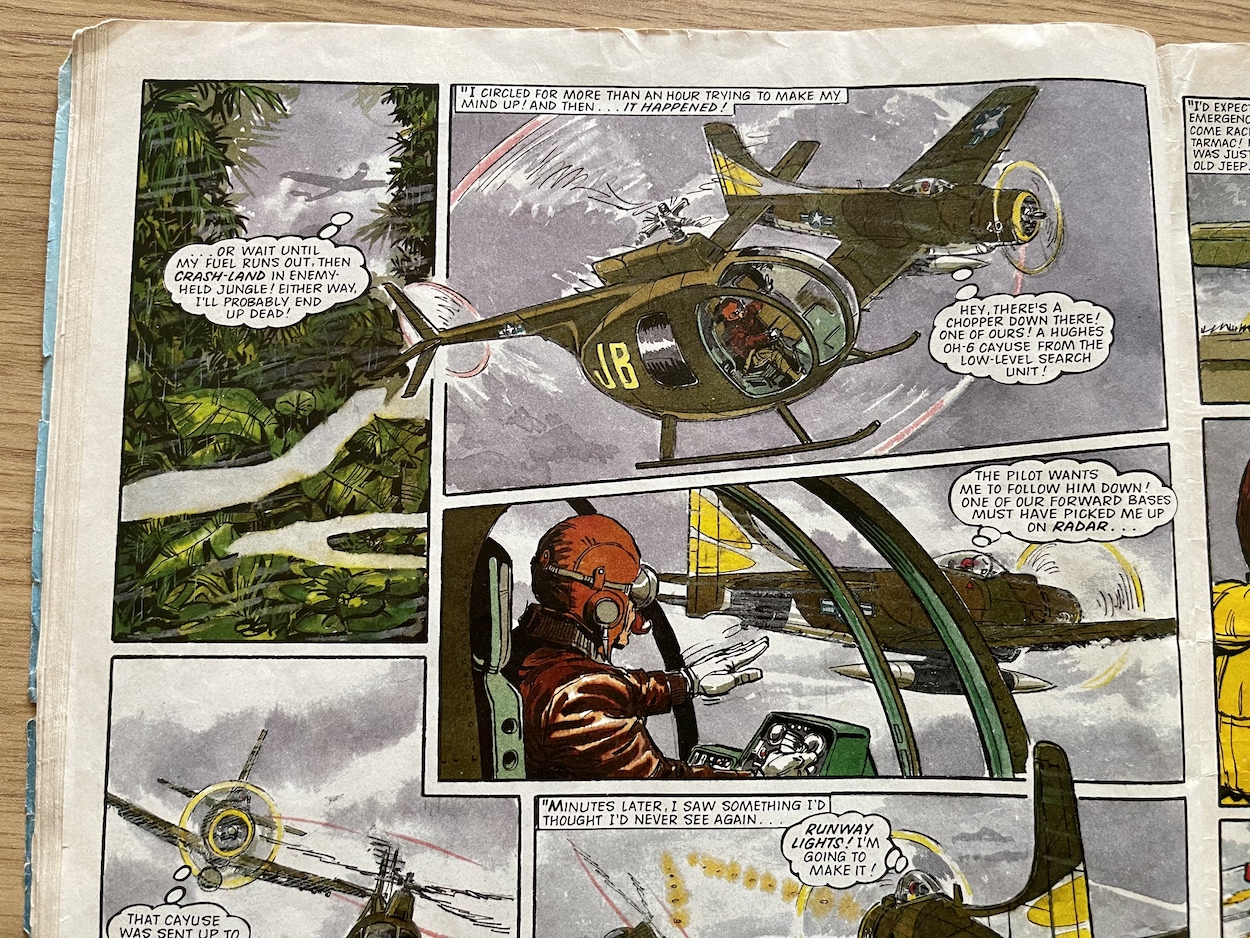
The story is a bit well worn by now, with a mysterious character helping our hero in their desperate time of need, only for us to find out that person had actually died and it must have been an illusion of some sort (although implied to have been their spirit continuing to help people as they had done in life). It’s the fact this story is in Ring Raiders and is illustrated in the way that it is that makes it so very special.

The perfect way to wrap up Ring Raiders, not just this special but the comic as a whole. Not only is it a superb strip, it shows the real potential this comic had in the range of its storytelling and how I think it could’ve reached beyond those obsessed with the toys if given the chance. It’s heartbreaking to finish the final story but I think it just proves the point I’ve been making since the beginning. Rounding off the issue is the second Photo File by James, this time one of his favourites and cover star the F-104 Starfighter,.

Well, that’s it.

James and Barrie were able to tell me the names of some further adventures that we never got to see. Hill Kill was written by Scott Goodall so possibly another character piece, Viking Job was by Tom Tully and Sandy James (their follow up to Freedom Flight and most likely set in the distant past), Surprise Attack, Skull Surprise was by Barrie Tomlinson himself so most likely was to be drawn by Carlos Pino and there was an unnamed Christmas story by James Tomlinson and Don Wazejewski, plus another story by the same team called Blow Bubbles, whatever that was about. A Christmas issue of this comic would’ve been nothing short of awesome for me! Oh well.

Proof that licenced toy comics could be taken seriously and produce excellent results

Ring Raiders could effortlessly flip between the futuristic and the historical, the fantastical and the realistic, keeping its feet grounded with believable, likeable characters, exciting action, superb art and interesting stories. If it had continued goodness knows how much better it would’ve got as it developed. It’s anthology style worked a treat and for those few short months I didn’t just run, I sprinted to the newsagents every other week to get my next fix.

OiNK aside, the fact this comic remains my number one from childhood with only seven issues to show for itself should tell you something.

Ring Raiders was a superb comic and is well worth picking up, although be aware issues can go for a pretty penny on eBay and you’ll be very lucky indeed to find this special. (There were also two annuals but they were by Grandreams, had nothing to do with the comic and are really poor, with no strips, just bad text stories and basic art.) Ring Raiders was proof that licenced toy comics could be taken seriously and produce excellent results. Kudos to Barrie and the whole team, thank you for a superb comic and for some really enjoyable memories.
BACK TO iSSUE SiX

RiNG RAiDERS MENU

WRiTiNG RiNG RAiDERS: JAMES TOMLiNSON iNTERViEW

With its huge ensemble cast, near limitless storytelling possibilities and its ability to turn small plastic airplanes on rings into thrilling war machines piloted by dynamic, three-dimensional characters Ring Raiders was (and still is) my favourite non-OiNK childhood comic. Editor Barrie Tomlinson had assembled the very best talent to bring my latest obsession to life in 1989 and this included his son James, who went by the pen name James Nicholas at the time.

James was an acclaimed writer for Eagle, Battle and Scream! and would be the person responsible for one of my favourite stories in Ring Raiders. According to Barrie, James has always been an “aviation nut”, so surely this would seem like the perfect comic for James to write for.

“With the aviation connection, Ring Raiders really did stand out for me amongst so many ‘here today, gone tomorrow’ titles,” James told me. “This does bring back some great memories of marvellous times long ago. So good to hear that Ring Raiders was, and still is, appreciated so much by those that read, and continue to read, the title. It makes us writers (and artists I am sure) so nostalgic and proud. It was indeed so sad (I’d use the word tragedy, but that may be a bit too far!) Ring Raiders lasted only a handful of issues, it deserved a longer print run for sure. Many others clearly think the same!”

James very graciously (not to mention rather excitedly) agreed to answer some questions about this brilliant comic which unfortunately launched at a time when comic sales across the board were in decline, when it seemed no matter which one I started to collect it didn’t last long. The fact Ring Raiders remains a favourite all these years later is testament to its quality. So with an ace publication based on a childhood obsession and a fan of all things aviation at the helm of some of its top stories, I was really looking forward to this interview. James was not to disappoint.

OiNK Blog: It was great to hear you’re still an aviation nut and have fond memories of your time working on Ring Raiders. Were there any particular aspects of the idea that stood out for you?

James Tomlinson: Yes indeed, I’m still very much an aviation nut after all these years! Rather than just one story, I think it was the whole concept that really stood out for me. Pilots and aircraft from different eras locked in mortal combat in contrasting time zones all over the globe. It really had the makings of a long-running and thrilling sky-based adventure which seemed to be just what the kids back then would have loved. Well, that’s what I think anyway!

OB: What was the process like when a new licence came through, to get up to speed on everything you’d need to know about something like Ring Raiders? I imagine it wouldn’t have been a very long timeframe before you’d start producing stories?

JT: With these sorts of stories, based on toy products, there’s really no definite answer to this one. It varied so much. Sometimes we were given a lot of information about the characters and storylines, other times there was much less for us to go on. Of course, in the latter scenario, this could be a good thing as it allowed writers to use their own imagination more and pad out things with their own ideas. Again, the amount of time we got to read up and prepare for something new like Ring Raiders varied hugely. Often there had to be a very quick turnaround with the stories, on other occasions we had months to get things just right.

OB: You very kindly sent me a folder from the licence holders you used (look out for this at a later date) and it was very scant on details for each character, basically consisting of the information on the toy packaging and focusing more on the decals of the planes. Did you get anything more to go on, or was it up to you as a writer to embellish them as you saw fit?

JT: From what I recall there was indeed not a great deal to go on with the characters from Ring Raiders, so it was a case of each individual writer embellishing the characters. Obviously, if the licence holders didn’t like what the writer had done with the characters they could object and ask for changes, which did happen on a fairly regular basis (although not so much, thankfully, with Ring Raiders).

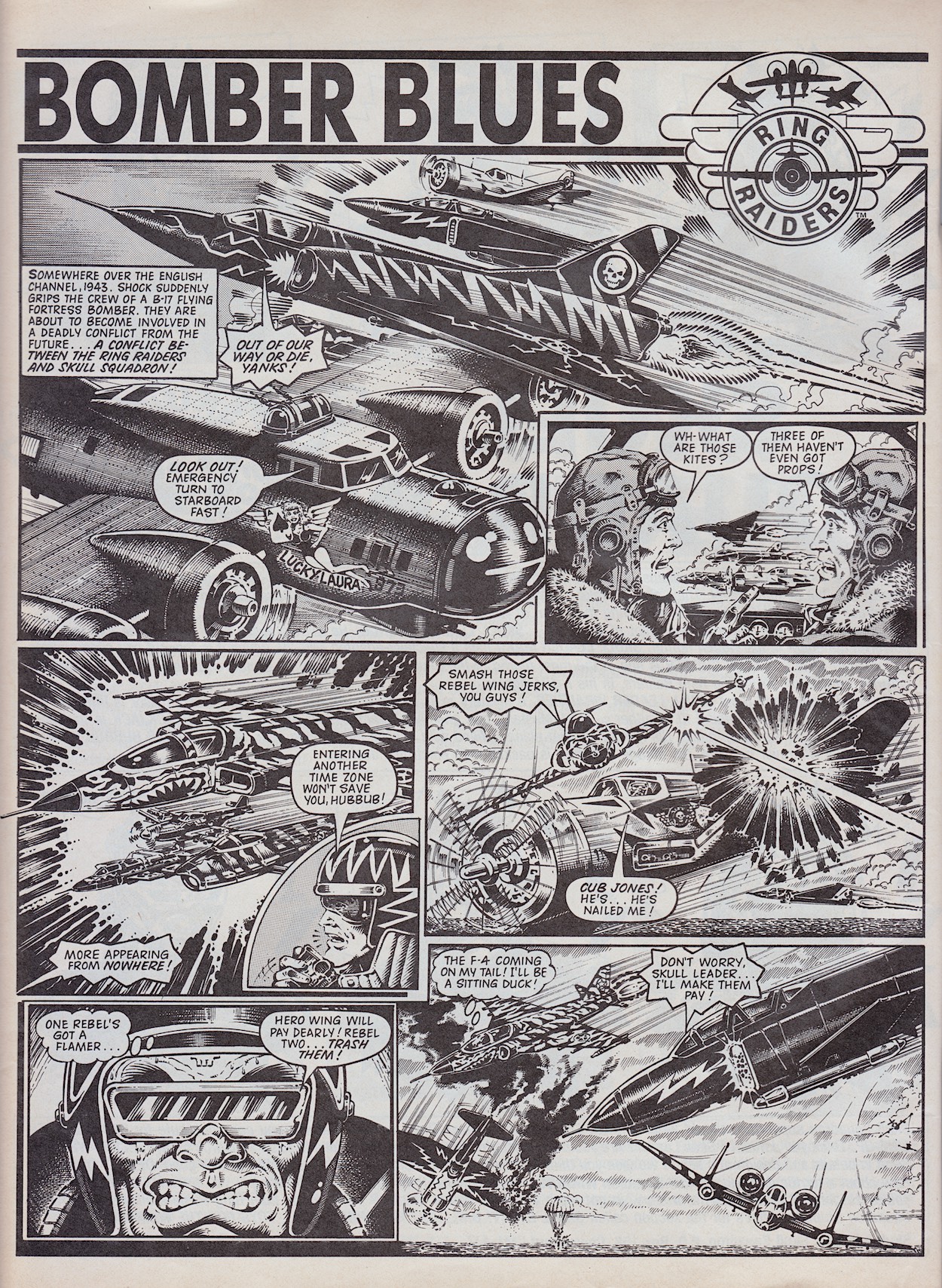
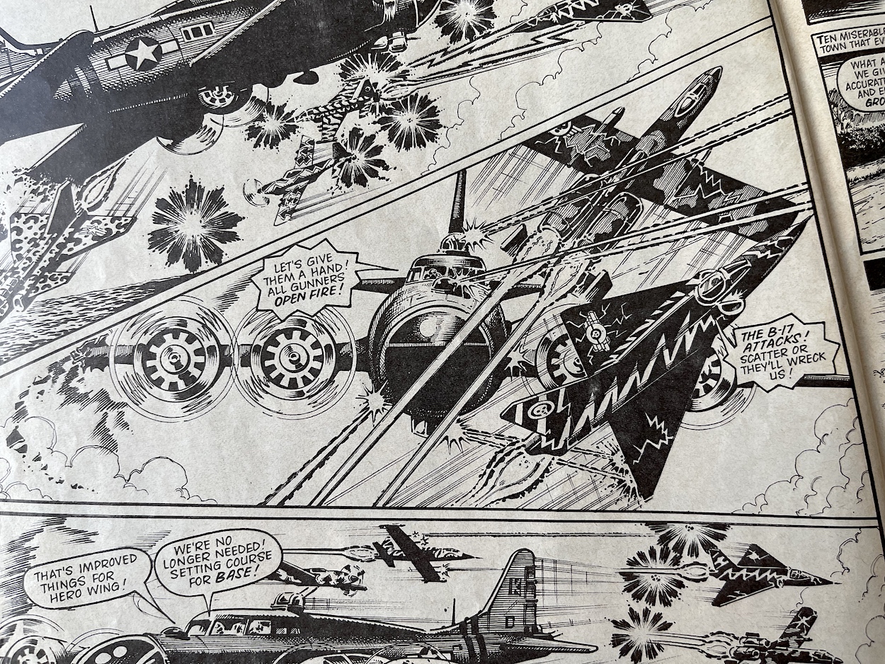
OB: It was like an anthology comic in many ways. Who came up with the story ideas and chose the characters you’d focus on? Your first story was set during World War II at a time linked to the origin story of the ‘Raider featured, Cub Jones. It’s also chock full of B-17 Fortress Bombers fighting modern day jets and classic prop planes. How very you.

JT: I think most of the basic story ideas came from the writers themselves, apart from those that, say, focussed on the early life stories of the individual heroes and villains. Those were probably more down to editorial decisions. Bomber Blues was very much my sort of story, with all my kind of ingredients. I’d always been a fan of stories about the Flying Fortress of WW2. This big plane with a big crew and a ton of guns really caught my imagination. Searching my dusty old memory banks, I seem to recall there was a serial story in Battle about an American Flying Fortress squadron flying out of wartime England which I always enjoyed. To have a Flying Fortress going up against jet fighters from the future was just perfect in my eyes. I’m sure I had a lot of input into this story choice! 

OB: Both of your published stories were beautifully illustrated by Don Wazejewski, how did that come about? Did you write your stories and they were assigned to Don or did you work together more closely to produce the final product?

JT: It was just luck that a great artist like Don Wazejewski was chosen to illustrate Bomber Blues. Certainly, in my time writing I never worked closely with the artist who would eventually illustrate my work. We always worked very much apart. Many lucky artists lived abroad in the sun anyway and it wasn’t so easy to keep in touch as it is today; no internet, emails or social media back then! I always thought the many different artists who converted my (sometimes difficult!) ideas to a finished visual work did a superb job. I wish I could have produced work half as good as they did. Unfortunately I’ve never had any drawing talent at all (always a bit of a drawback if you want to become an artist). Artists like Joe Colquhoun, John Cooper and Sandy James were at the top of their game. (The latter two also produced some stunning work for Ring Raiders – Phil) I take my hat off to their much missed talents!

OB: Your second story ‘Castle of Doom’ involved more time travel into the past and a plot by Skull Squadron to undermine the formation of their arch enemies. It seemed to be setting up a larger scale story in the background. Was this the idea, something you could return to at a later date? Or am I reading too much into it?

JT: Once again, Castle of Doom was just my cup of tea when it comes to a story. Travelling back in time to change what will happen in the future has always intrigued and interested me. Maybe because I watched a lot of Doctor Who and The Time Tunnel when I was a youngster! I really don’t recall if there was any plan to make this story part of a long-running adventure (like my story Operation Deep Cover which I wrote for Battle Action Force) but it’s an interesting idea. Perhaps you should have been on the editorial team and suggested it, Phil!

OB: Oh if only! Once the ‘Raiders perfect time travel I’ll see you back then!

OB: In that story the main characters are the Ring Raiders’ Yakamura (X-29 fighter) and Skull Squadron’s Wraither (P-51 Mustang). These two characters’ craft were in a two-plane ‘Starter Pack’ which was how I started collecting the toys. Was this deliberate?

JT: I’m almost certain that the Yakamura X-29/Wraither P-51 Mustang were deliberately chosen to go up against each other in this story given they could be bought together in a Starter Pack. The idea was probably to encourage youngsters (such as yourself!) to go and buy the X-29/P-51 combo (then available in all good toy shops) and re-enact the dogfights from Castle of Doom. Whether this decision was down to Those Characters From Cleveland/Matchbox/someone in editorial or even the humble writer is lost long ago somewhere in the clouds!

OB: My inner fan just grinned from ear-to-ear! For UK fans your comic was responsible for developing the characters beyond the toys. Did the licence holders ever request alterations that affected your work? Barrie has told me they were more understanding than most.

JT: I’m glad the then young UK fans appreciated our efforts to flesh out the characters from what was perhaps a not-so-detailed starting point. Licence holders could often be very fussy about things and ask/demand/insist that changes were made. Usually this was at the script stage, although when deadlines were tight sometimes the artwork had already been completed. I’m thinking of Teenage Mutant Hero Turtles Adventures here rather than Ring Raiders. Last minute changes to the actual artwork were usually impossible, given that many artists lived on distant shores and there was just no scope to alter things late in the day. We’d usually say we’d take on board their comments and make sure we did things properly next time!

OB: You were responsible for the Photo File series, which we only got two parts of in #6 and the Special, unfortunately. The comic seemed to get a new found confidence with that sixth issue so I was gutted it was the last one. Can you remember any plans you or the team had for stories or the comic as a whole beyond these early issues?

JT: Yes, I was behind the Photo File series, I’d produced similar types of aircraft fact files for other titles in the past. Again, this was right up my street as I obviously had more than a little(!) interest in the subject matter. I was disappointed only a couple of these were completed, the P-51 Mustang and the F-104 Starfighter, the latter for the Special. The Starfighter was another of my all-time faves, a really special plane which had the nickname ‘The Rocket With A Man In It’! I do agree that Ring Raiders was getting better all the time and the sudden end of the title was a real shock to us all. What the long-term future held for the title is difficult to say with any certainty. I would have hoped it would have gone from strength to strength as we got more used to the characters and expected storylines. There was just so much scope with all that dogfighting action through the centuries!

OB: Finally, Barrie gave me some details of unpublished stories which were being worked on when the comic was cancelled. There was apparently a Christmas story and another called ‘Blow Bubbles’, both written by yourself. Can you remember anything about them?

JT: There were at least three of my stories for planned future issues which were sadly unpublished. Apart from Blow Bubbles and the untitled Christmas story, there was also a story called Hijacked. Unfortunately, I don’t recall anything about any of them! I’m not even sure what stage the stories had reached, whether I’d finished or even started writing one, two or all three. I’m afraid the three tales have disappeared into ‘The Bermuda Triangle’ of unpublished writing!

Thanks so much to James for this brilliant interview and his detailed, enthusiastic answers. It’s been great to bring this comic back to life through the blog and to give it the appreciation it so clearly deserves. If it had continued I’ve every faith it would’ve evolved into an epic title to rival any licenced fare in the UK, including even Marvel‘s Transformers. Sadly, it was not to be.

But we’re here to celebrate this comic, not mourn it and I’ll leave the last word for James:

“It’s been a pleasure spending time revisiting the history of Ring Raiders. Those were great days!”

Just last week I published an interview with Ring Raiders‘ editor Barrie Tomlinson and before the month is out the long-awaited review of the Ring Raiders Special, so stay tuned!

RiNG RAiDERS MENU

OiNK! #37: NEW ADDiTiONS

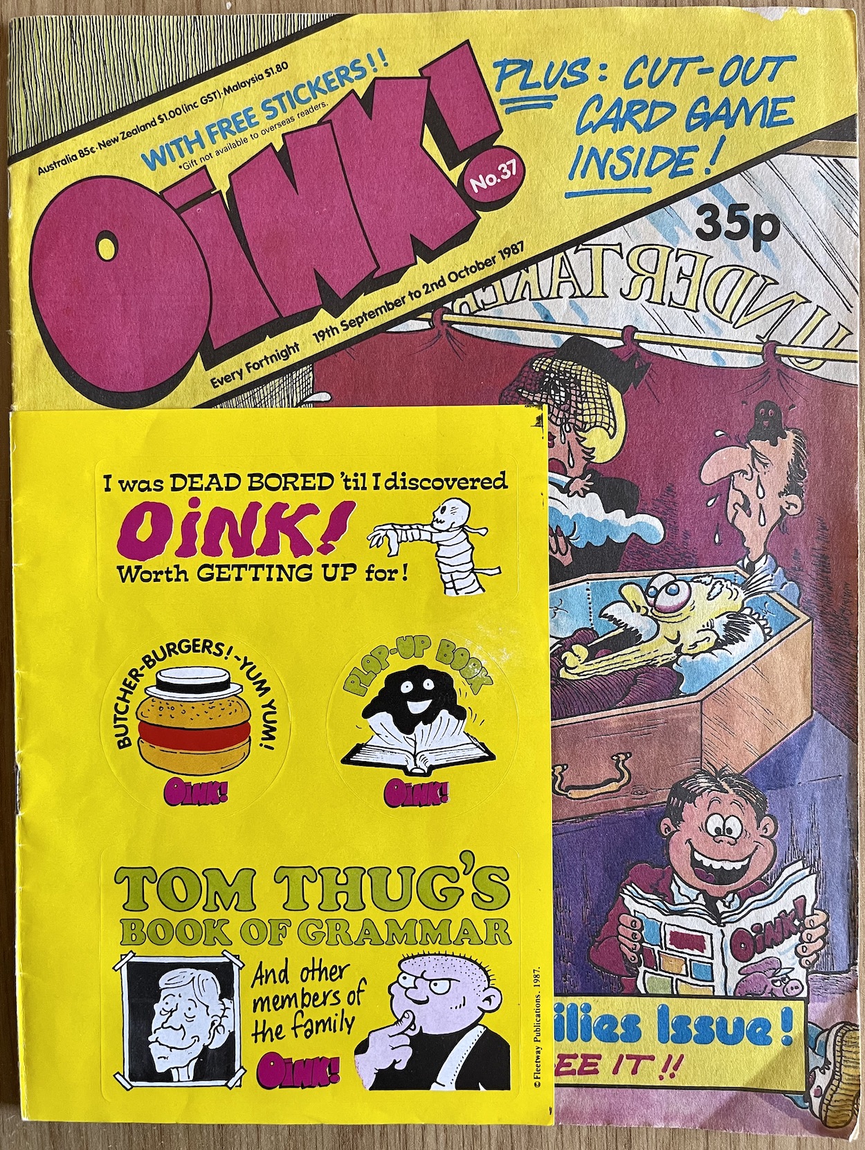
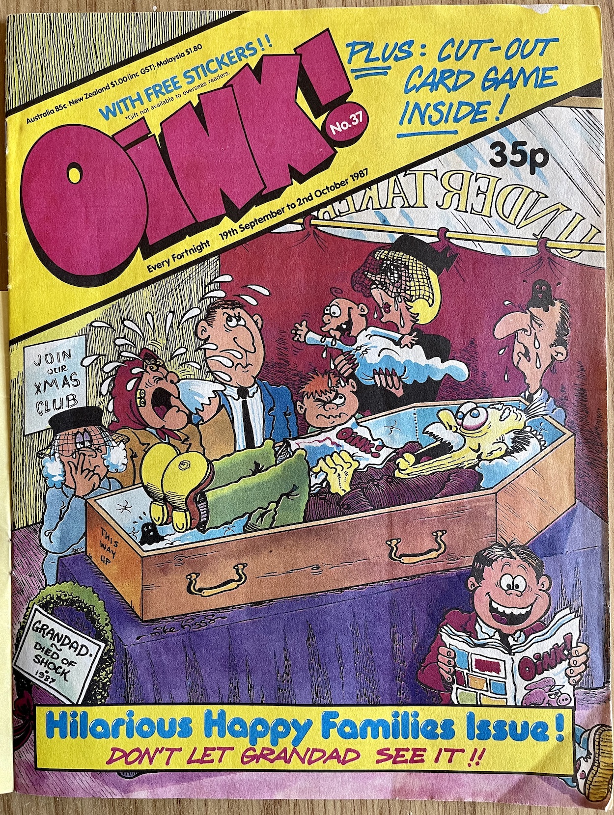
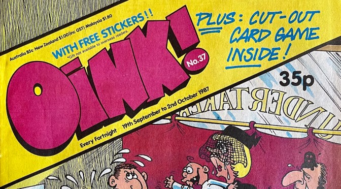
Our second new look OiNK sees the logo enlarged a little, sitting proud in its new position and, as promised by co-creator/co-editor Patrick Gallagher it lets us see more of the superb cover image by Mike Higgs. There’s a confidence about this issue and it’s new format that takes me right back to those days of running to the newsagent for my latest issue every fortnight, knowing I was going to get another 32 pages of perfect pork.

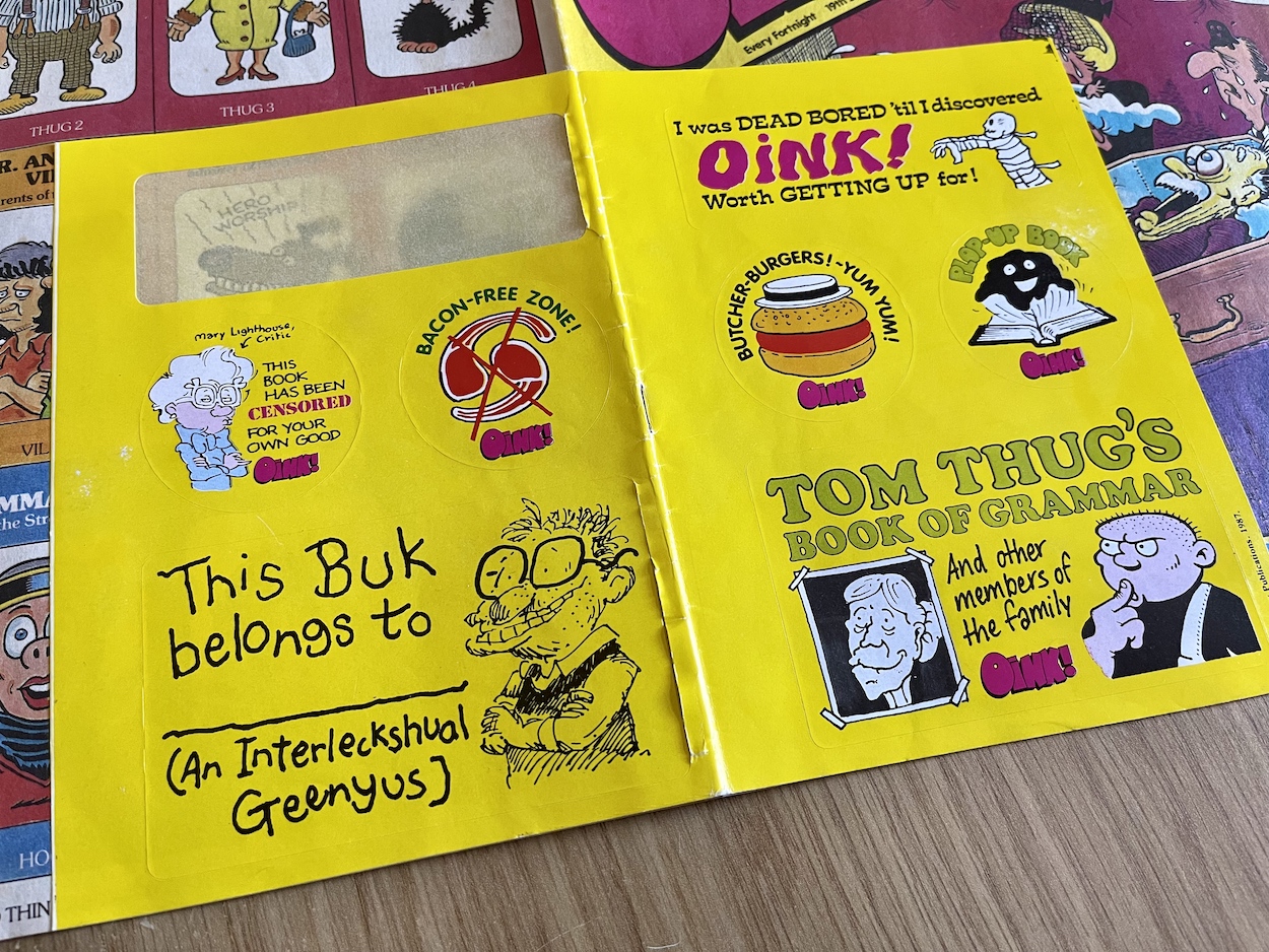
Another set of free stickers are wrapped around the cover, that Tom Thug ‘Book of Grammar’ one being my particular favourite. I think I used the Hadrian Vile sticker on a school book of some description back in 1987 (I would’ve been in primary six at the time of this issue) and the missing one on the back was the same as the one in that position last issue, which ended up on my fridge. This issue’s has been added to the comics shelves in my new home office.

The ‘Hilarious Happy Families Issue’ lives up to its name from the very first page with that brilliant cover complete with a couple of strategically placed OiNKs, portraying an elderly relative dying from the shock of reading an issue. The Christmas Club, the note on the bottom of the casket and a couple of plops for good measure, I can remember visiting my mum’s friend’s house with this issue and sitting absorbed by it while they gossiped.

In fact, I remember they were talking about Santa Claus and wondering if I knew the truth (that he most definitely existed, obviously) and I caught part of the conversation between strips. I can recall May asking the question and my mum saying at my age my friends would’ve been talking about it, so she assumed I knew. I kept quiet, I still wanted all my toys (and my OiNK Book!). That’s something which always comes back to me whenever I see this cover. May (or Aunty May as we called her, even though she wasn’t related) is no longer with us so it’s a happy memory that I’ll never forget thanks to OiNK.

This is quite simply the perfect comic script

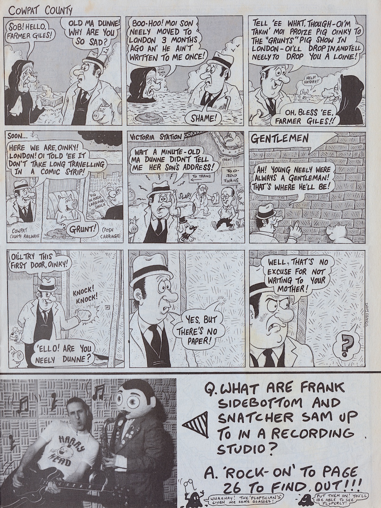
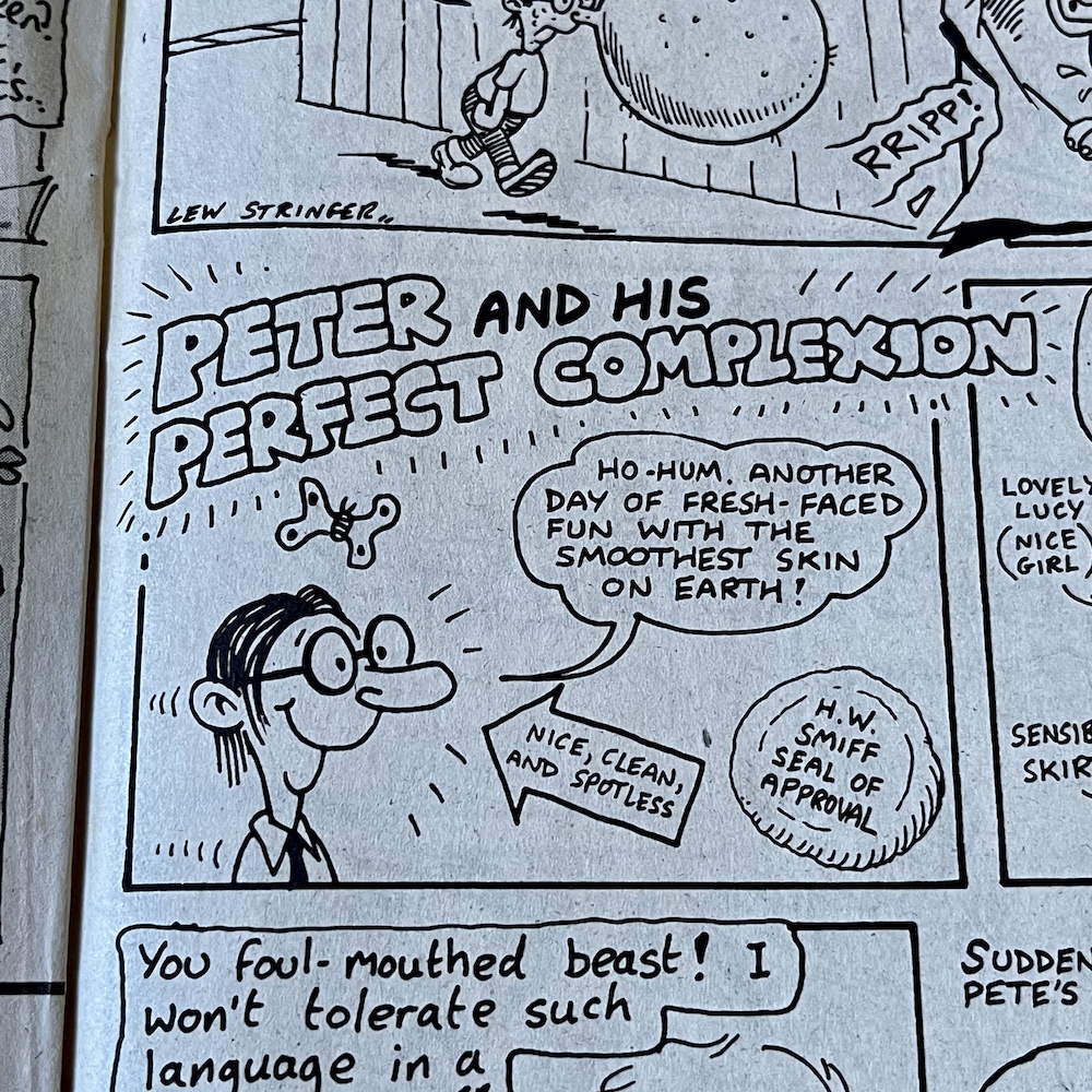
Inside, one of the first strips is an old favourite, Davy FrancisCowpat County. Davy has two trademarks when it comes to his funniest strips, background gags and brilliant puns. This next page is easily my favourite featuring Farmer Giles. It is quite simply the perfect comic script. It all leads up to the final joke, expertly laying in the little bits of information along the way that’ll make it work, the reader unaware this is happening until the end.

Davy is a real comedic genius and it ran in the family. His father Stanley Francis was a comedian, performing in the old club circuits in Northern Ireland with Frank “it’s a cracker” Carson. Stanley also played piano and once accompanied Little Richard at Belfast’s Boom Boom Rooms! He’d often tell jokes at home to try them out (which Davy now uses on his bus tours) and the joke at the centre of this Cowpat County was one of Stanley’s. Also, check out that middle panel and you’ll see Davy’s caricatures of fellow OiNK cartoonists Ed McHenry and Lew Stringer! (Thanks for pointing them out, Davy!)


“She’s luvly!!”

Hadrian Vile

Just one final note about this strip. I have the original artwork, one of a few pieces of Davy’s I own. I’m going to hold that back for a future post and show them all off at once. It also couldn’t have escaped your notice that something is going on with Snatcher Sam and Frank Sidebottom. Anyone who grew up on OiNK should instantly know what this refers to. Yes, it was finally available. Exciting! I’ll get back to that later in the review.

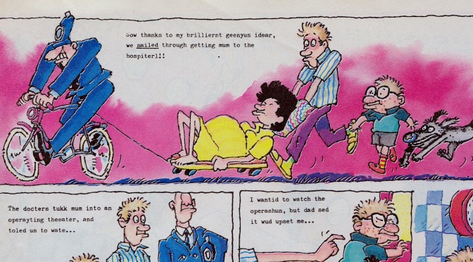
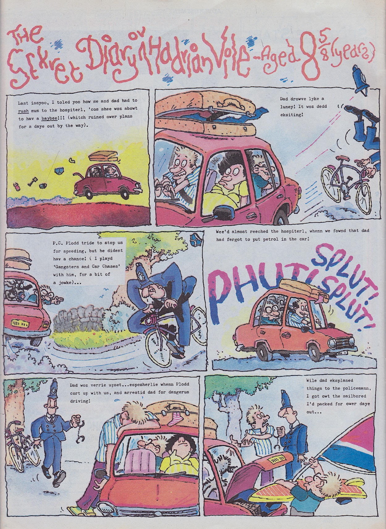
Next up is what I’d easily describe as the main event of this family themed issue. In fact it’s probably the main event in the whole life of Hadrian Vile thus far, something I’ve alluded to ever since the character first appeared on the blog back in #4’s review. To mark the occasion he gets three pages written by Mark Rodgers in glorious Ian Jackson full colour. This story more than any other plays to Ian’s strength of perfectly capturing a character’s thoughts in their face and body language. For example, his exasperated dad when they’re pulled over and in the next panel when he’s trying to explain things to the police officer.

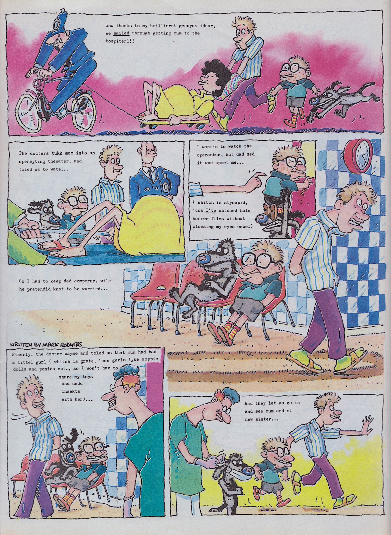
We saw Hadrian’s age increase in the birthday issue and his reaction when his parents explained he was going to be a big brother. Now, after months of him torturing his poor pregnant mum the big moment has arrived and while the laughs are still plentiful, what we have here is a surprisingly sweet strip. After all those previous issues full of Hadrian getting into trouble thanks to his ridiculous schemes, he actually comes up with a helpful idea when the situation calls for it. It’s still daft and funny of course, especially his dad trying to run along holding that pillow. 

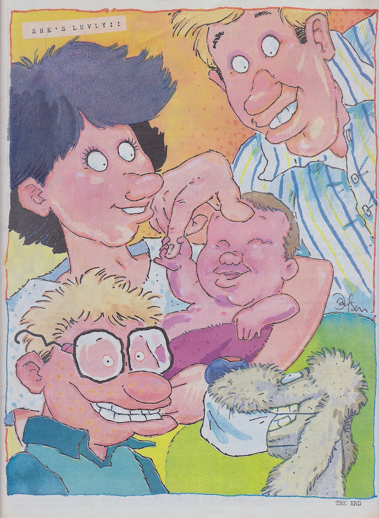
After wearing down the carpet in the waiting room the family are called in to see their newest addition and even Bowser gets a mask so he can join them. We turn over to see the following full-page image with a simple, sweet (yet still incorrectly spelt) diary entry. This was certainly a memorable moment in humour comics. When did a character live their life in an almost real time manner like this? When was something like this properly built up to instead of just being a sudden change? OiNK was always unique and this is all the proof you need.

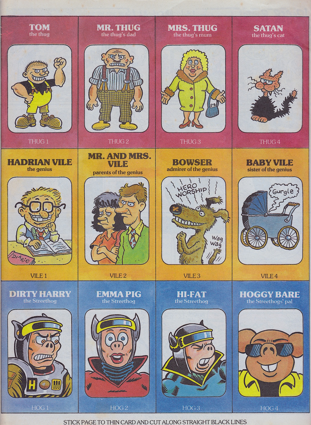
Don’t be thinking Hadrian is going to go all slushy on us though. Instead, he sees his new baby sister as a potential protégé, someone to teach the ways of the world to, someone to train to be just like him and we’d get to see these in various ways over the following months. She also makes an appearance in the card game in this very issue.

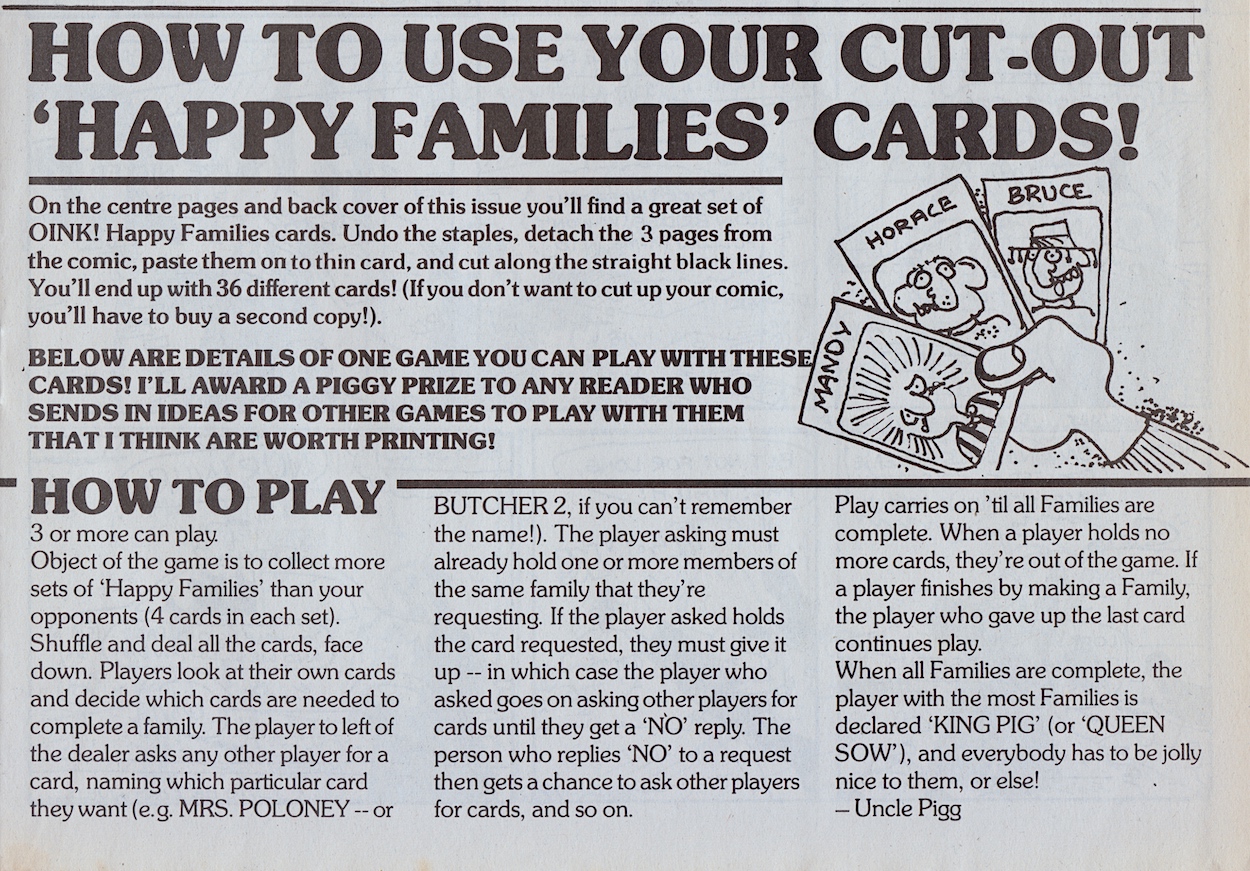
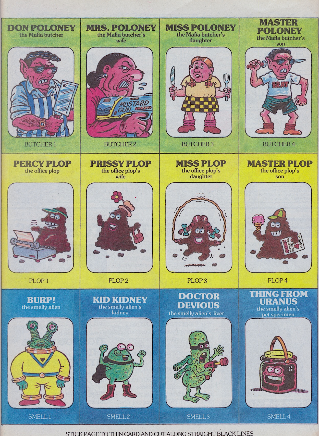
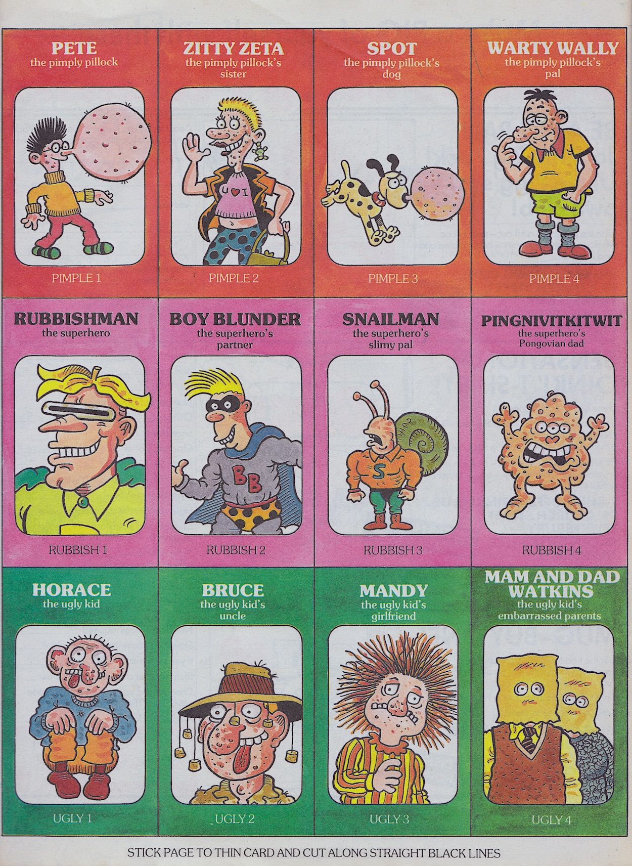
This takes up the middle pages and the back cover, with another half page for the instructions, which are the same for the regular Happy Families game.

So as per the typical rules each family is made up of four individuals, with Hadrian’s not including Bowser as would’ve been expected up to this point, instead his baby sister gets a little cameo of sorts. Altogether there are 36 cards for the reader to stick on to cardboard and cut out, split into nine families. Parents and siblings could also easily take part because each group has a simple numbering system so non-OiNK fans (yes, they exist!) wouldn’t get lost amongst the silly names.

I always liked seeing favourite characters drawn by different artists. Ed McHenry is the person responsible here and his depictions of Ian Jackson’s Hadrian and his family, David Haldane’s Rubbish Man, J.T. Dogg’s Street-Hogs heroes and villains, and Jeremy Banx’s alien innards are my particular favourites. Did any blog readers cut out and play this game when they were but a piglet? I never cut up any of my OiNKs back at the time. (I did begin to colour in something in the first annual but that was about it.) However, these days the angel on top of my Christmas tree is from a page of the comic and for the blog I’ve already constructed an old-fashioned Frank Sidebottom toy.

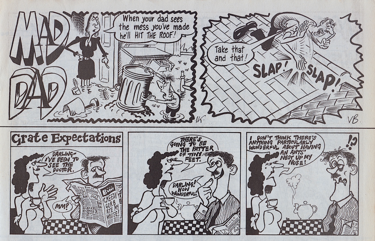
There’s a certain phrase I remember my dad using whenever my siblings or I did anything that our mum would’ve found particularly bad and one of the little quarter-page strips in this issue takes that exact phrase and ridicules it, albeit swapping the parents’ roles over in the process. From that moment on I could never take it seriously when it was used. I still can’t. Mad Dad is written by Vaughan Brunt and drawn by Ian Knox. This is followed up by Grate Expectations, a memorable little one-off from the insane mind of Simon Thorp who, I’m very happy to say, was turning up more regularly by this point.

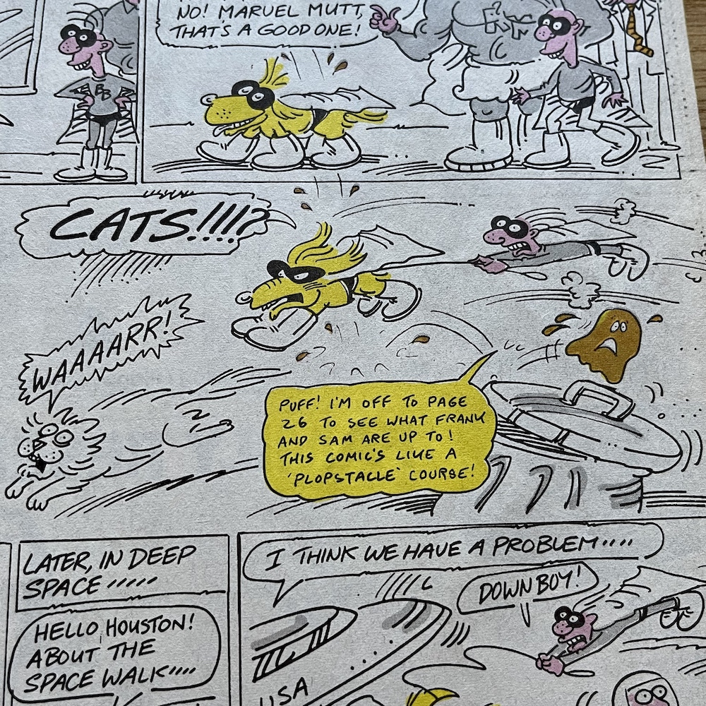
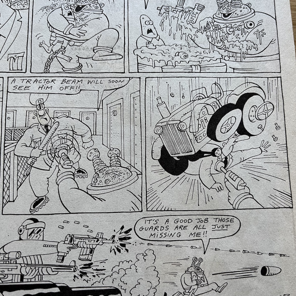
There were so many highlights in this issue I really struggled deciding which ones to include. This could be a regular problem over these next few months, but it’s a nice problem to have, isn’t it? The Grunts page features press clippings about OiNK itself, although I’ll save them for their own post at a future date. Just mentioned recently on the blog’s socials by a fellow pig pal was Burp’s tractor beam and it pops up here, so I just had to include that in this little selection of panels.

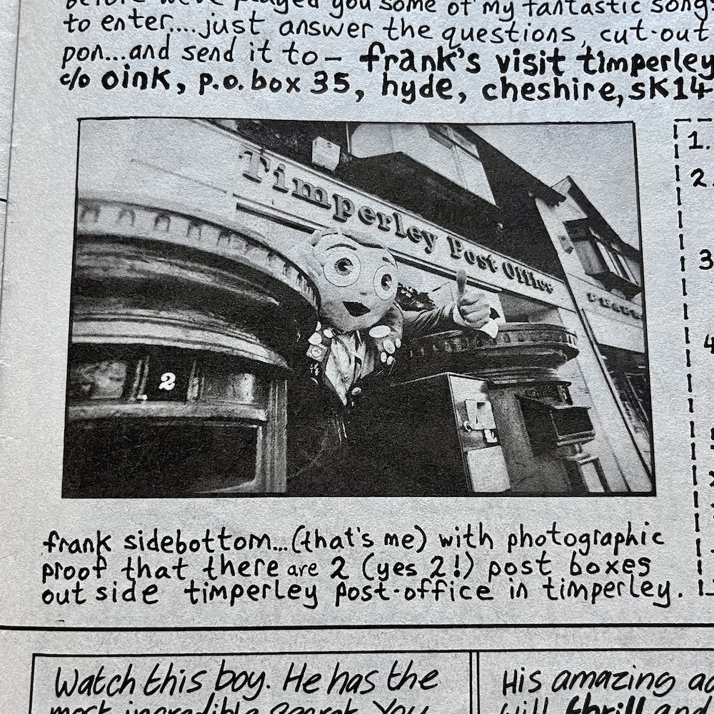
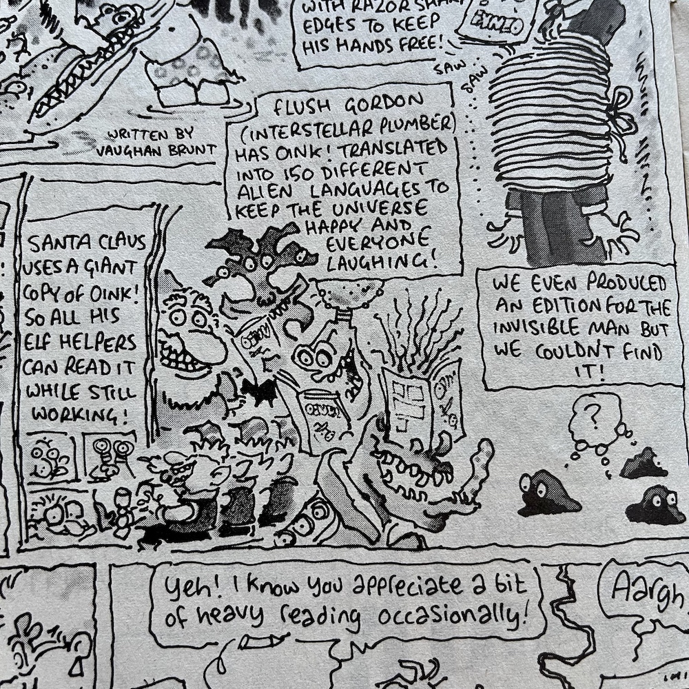
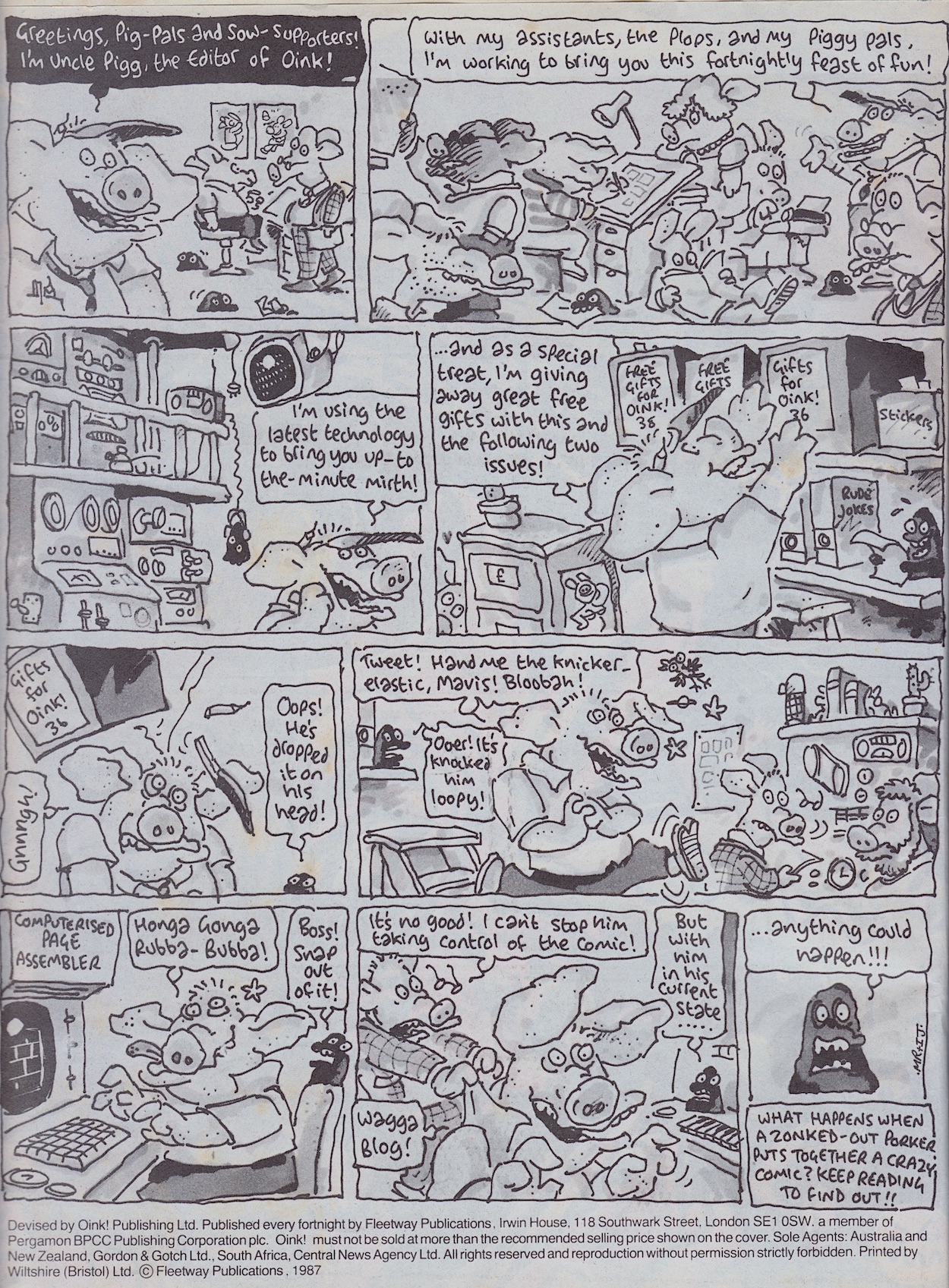
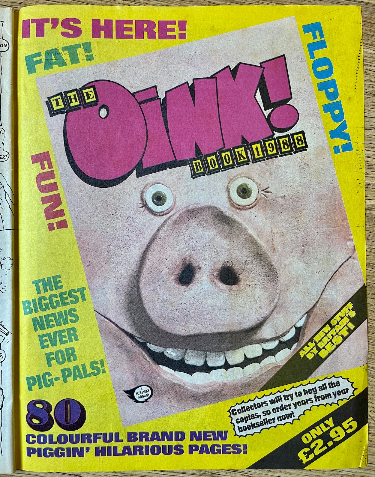
There was also a unique competition in which readers could win a trip to Timperley, the home of megastar Frank Sidebottom and meet their hero, and to get readers excited to enter he tells us all about his post office having two letterboxes! Woo. I’ll keep an eye out for the results. There’s a full-page Uncle Pigg strip describing the special versions of OiNK he publishes around the world and it’s nice to see he and Santa have made up since #17

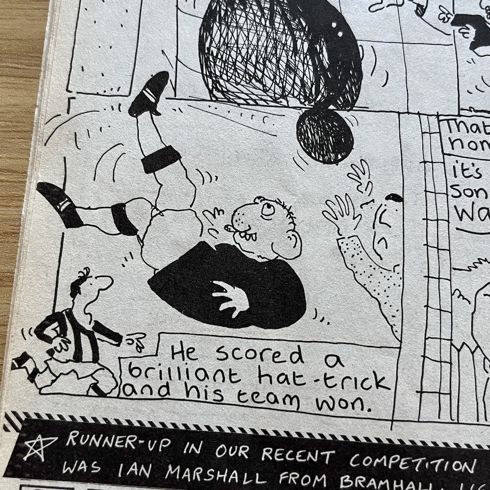
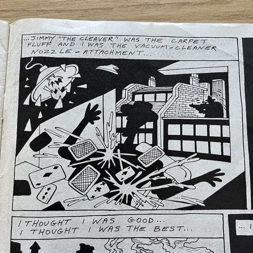
For the first time we see Horace (Ugly Face) Watkins playing football, something which would lead to a huge multi-issue story for the character in future issues, a little plop drawn by Patrick Gallagher invaded a handful of pages throughout the issue such as Rubbish Man’s, and in the latest Butcher Watch a pig by the name of Stig the Pig thinks he’s finally won the battle with Jimmy ‘The Cleaver’ Smith, with wonderfully Banx’y captions.

Of course, Jimmy has to live to see another day and terrorise the world in which the characters of OiNK reside. As it turns out that shadowy figure wasn’t Jimmy at all but rather a selection of pork sausages tied up and dressed to resemble him. We see this reveal just before Jimmy strangles Stig to death with another string of sausages. This might sound a bit brutal for a kid’s humour comic but it was so ludicrous and over-the-top we’d just laugh at the absurdity of the pretend horror.

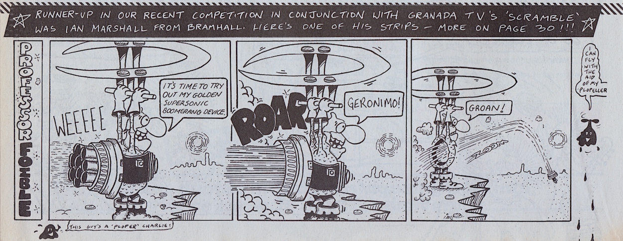
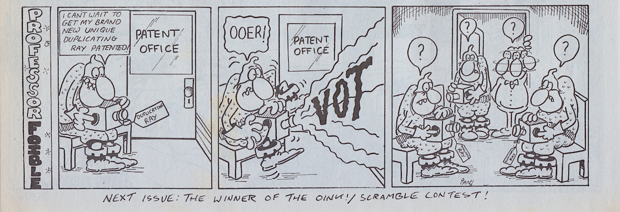
So, Frank has just set a new competition and this issue announces the runner-up of one we hadn’t seen in the comic. In much the same way that OiNK ran a competition in conjunction with Radio Manchester (the results were in #26), they teamed up with Granada TV’s Scramble programme. Ian Marshall from Bramhall has not one, but two small strips in this issue starring his own creation, Professor Foible.

If this is the level of quality the runner-up produced I can honestly say I’m eagerly looking forward to seeing what the young winner came up with! We’ll have to wait to find out though because that’s being held back until #38.

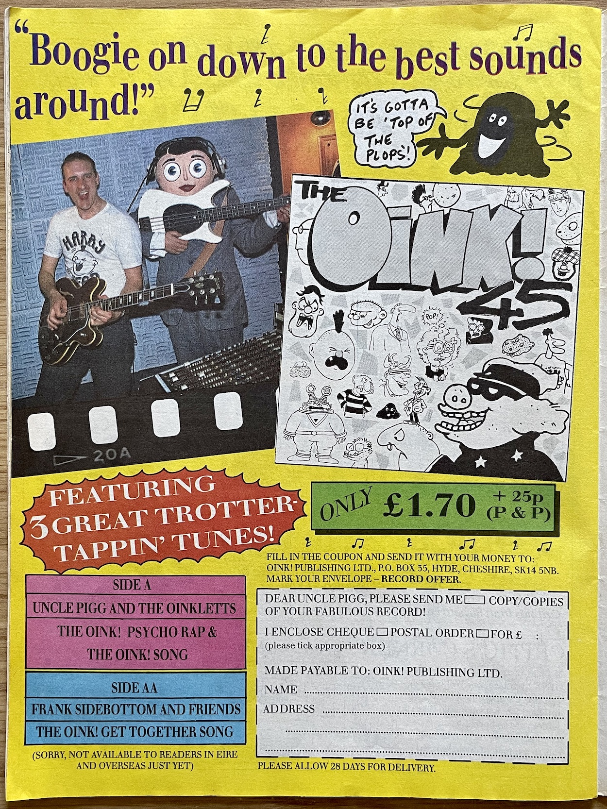
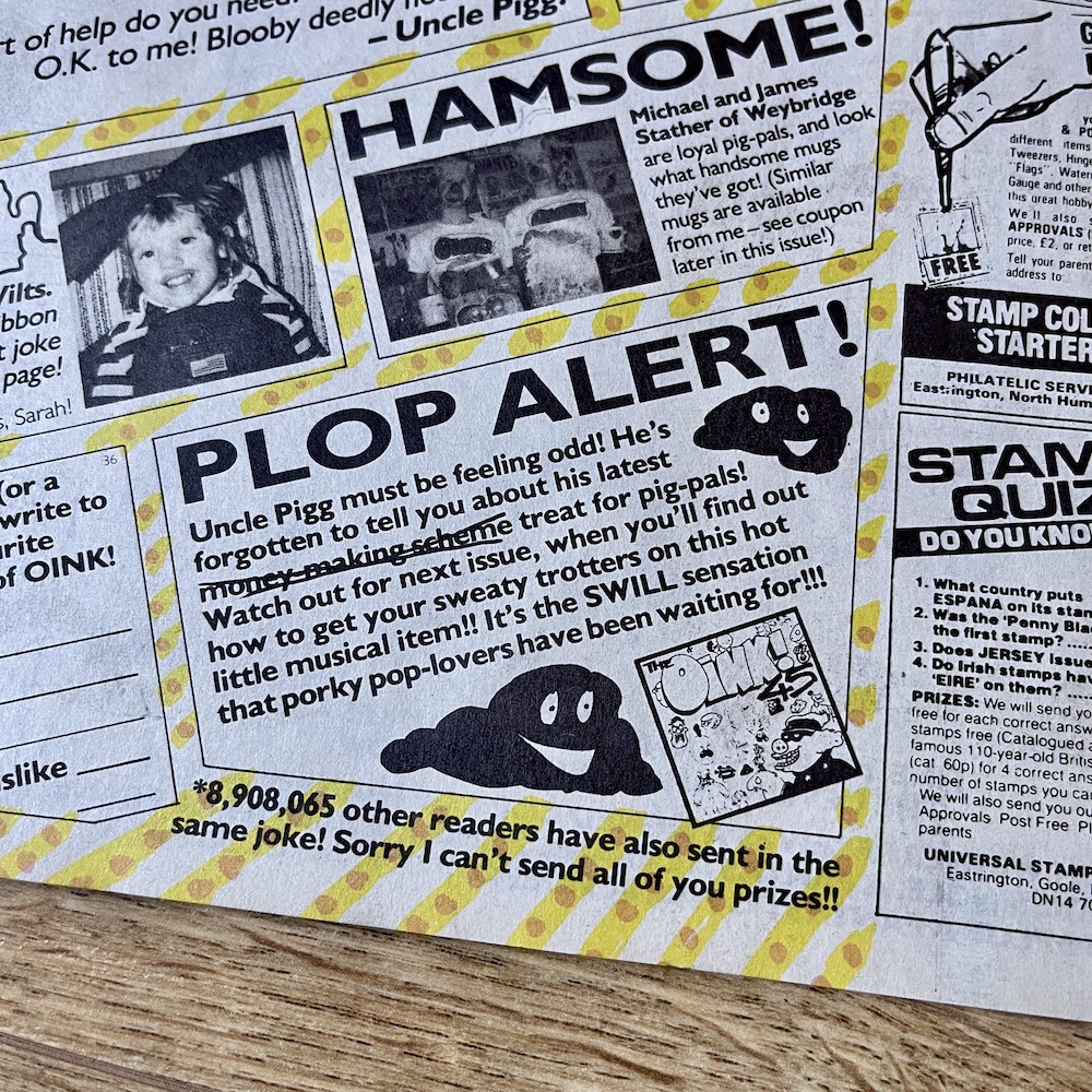
So for the uninitiated, what were Frank Sidebottom aka Chris Sievey and Snatcher Sam aka Marc Riley up to earlier in the issue? Why, they were recording a new song for the OiNK 45 of course! Way back in the mists of time the premiere issue of our favourite comic gave away a fun flexidisc record with two songs created specifically to annoy adults as much as for the kids to enjoy. The OiNK Song and The OiNK Rap are often quoted by fans to this day and on this new proper record they were getting another outing alongside a new song.

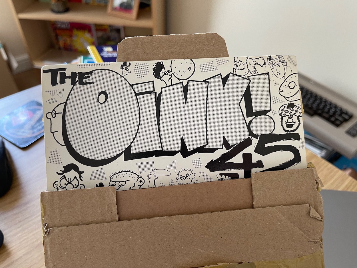
When the original songs were produced by Marc, Chris had yet to join the comic (#16) so the new track, called The OiNK Get Together Song was a chance for the pop music sensation to get in on the action and team up with the former member of The Fall. Along with the other two songs (the rap now renamed The OiNK Psycho Rap) this was a proper, solid record the size of a single, in its own sleeve for just £1.70 and I for one jumped at the chance to own it, especially since all three songs were new to me (having missed the flexidisc first time around). In fact, this and the mug were the only pieces of OiNK merchandise I originally owned.

I recall the song contained impressions of various characters and it irritated my family just as much as the other two. My record met with an early demise when it warped under the hot sun from a skylight window only a couple of weeks after it had arrived in the post. I hadn’t even had a chance to tape it yet for my Walkman. Now if only I could listen to it again after all these decades to see how my adult brain would react to those songs.

Well would you look at that. Yep, in a moment of perfect timing this appeared on eBay and the record is in mint condition. I could not be happier. But then again, I haven’t listened to it yet! Nope, I haven’t stuck it on the ol’ record player yet, I’ll do that when it comes to writing the accompanying blog post. So look out for that just after 17th October. Why am I making you wait so long? Well, we had to wait 28 days for delivery after all and this is all in real time.

That brings us to the end of another fantastic issue. As a child I’d loved the changes and was so happy they weren’t a one-off (the previous issue‘s theme seemingly explaining them away for that one edition), the book was in the shops and I was eagerly anticipating it for Christmas, plus I’d just ordered an exciting new piece of merchandise, my first piece of OiNK merchandise in fact. I’d been a fan of OiNK since I’d first discovered it, but by now I was completely obsessed. The next issue is the Food and Drink Special with yet another memorable cover, a full-page photograph of (who else) Frank and Sam. The next review will be here on Monday 3rd October 2022.

Is it really October already?! OiNK really had helped this year fly by,

iSSUE 36 < > iSSUE 38

OiNK READ THROUGH MENU

OiNK FREE GiFTS MENU

MAiN OiNK MENU

COMiNG UP: OiNK! #37

As OiNK continues through my favourite issues each one brings with it more happy memories of reading these all those years ago (35 years ago to be precise). The next issue brings back specific memories for me, not least of which was how much I enjoyed it. Will it live up to those memories all this time later? Given how much I’ve been enjoying the blog’s main real time read through I think the odds are pretty much stacked in its favour.

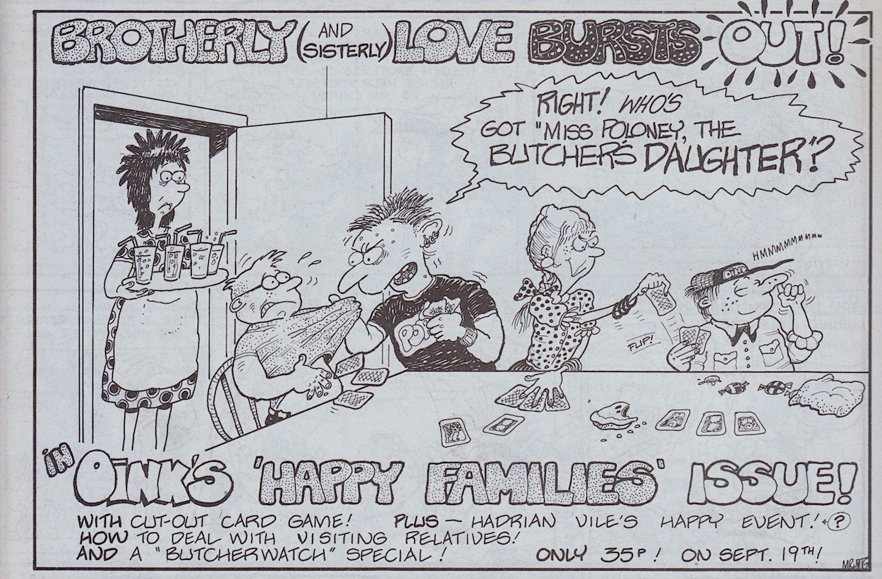
In the Happy Families Issue you’ll see a surprisingly touching moment for the young trouble maker Hadrian Vile when his diary chronicles a major life moment, Cowpat County delivers one of the greatest gags in all of OiNK history, there’s a cut out (or rather, save image and print and cut out for you lot) card game and a major announcement of some new OiNK merchandise! The next review will be here on Monday 19th September 2022.

GO TO iSSUE 37

OiNK iSSUE PROMOS MENU

‘MORE OiNK’ MENU

MAiN OiNK MENU

EDiTiNG RiNG RAiDERS: BARRiE TOMLiNSON iNTERViEW

My very favourite non-OiNK comic from my youth may have only lasted six fantastic issues and one brilliant special in 1989/90, but that didn’t stop me from being hyped to read Ring Raiders again as an adult for the blog. They may have been based on obscure toys that weren’t the success they were expected to be, but the comics hold up incredibly well today, full of character, fun stories and high octane action.

In the then-near-future of the late 90s Skull Squadron were a terrorist organisation on the brink of world domination. Capable of time travel and made up of the most sinister of pilots plucked out of various eras they planned to use this ability to destabilise the world order, with them in control. In response, the governments of the world formed the Ring Raiders, an elite airforce formed in a similar way, each equipped with a special communication and energy ring.

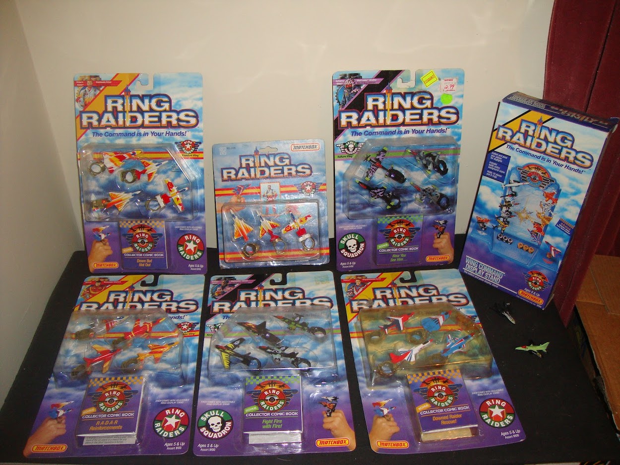
The gotta-collect-’em-all toys came with small comic books featuring basic dogfights, but it was no small feat to transform those little plastic Matchbox planes into compelling strips with fully formed characters. While the toys may seem to limit what a comic could do, the opposite was true of that background storyline which was almost endless in scope. Fleetway Publications were going to need a top editor to craft their new fortnightly comic, so they naturally turned to Barrie Tomlinson (Eagle, Tiger, Wildcat).

Barrie formed a team of the very best in British talent; Ian Kennedy, Carlos Pino, Angus Allan, John Cooper, Scott Goodall, John Gillatt, James Nicholas (Tomlinson), Don Wazejewski, Tom Tully, Sandy James and Geoff Campion. I must’ve read each issue dozens of times and was gutted when it (and the toys) ended so prematurely.

The Ring Raiders comic genuinely surprised me with just how brilliantly it read for the blog reviews. It was exciting and had masses of potential to explore an epic storyline. Within its short lifespan it covered World War II, Vietnam, the threat of nuclear annihilation, futuristic sci-fi battles, murderous back stories, civil wars and even an homage to a certain 80s 3D movie I’m a big fan of. I loved the range and I think as an adult I appreciated the character development at the centre of such fanciful tales even more.

I was so excited when Barrie agreed to answer some questions for me and I came away from our chat delighted at how proud he was of this licenced comic fave.

OiNK Blog: Hi Barrie, can you remember what made Fleetway choose the Ring Raiders licence? Looking back they were just tiny Matchbox planes with only minimal character drawings on the packaging.

Barrie Tomlinson: Fleetway Publications was a massive organisation. The first I would hear of a new licence would be from the Editorial Director. It would have been negotiated by a non-editorial department and presented to us. I just had to grab all the info I could find about the storyline and characters and make myself an instant expert on the subject.

OB: There’s a similarity between Ring Raiders and Wildcat. Both have an anthology feel while wrapped up in an overall theme. Was this a conscious decision or was it just befitting the licence?

BT: It wasn’t a conscious decision. I would have just wanted to use the characters I had been presented with and turn the comic into something which was liked by British readers.

OB: Were you personally responsible for selecting the writers responsible for fleshing out these characters?

BT: Yes, I would have been responsible for selecting the writers. It’s really unfortunate that the detail books for Ring Raiders were not kept. They would provide a wealth of information. My son James, who wrote under the name ‘James Nicholas‘ was one of the writers. He was a natural, as he is an aviation fanatic! I’ll have to guess at the others. Probably Tom Tully was one. I can’t remember writing any of those scripts myself… but I probably did! (He did indeed as we later found out during the read through, as well as the names of the others – Phil)

OB: There were some mature themes in there, such as Vietnam. This strip in particular wouldn’t have looked out of place in a classic IPC war comic. The setup allowed stories set in the past, present or future, time travelling, fantasy of historic tales. It sounds like a writer’s dream title! Did you feel you had that freedom in a licenced comic?

BT: Everything we did had to be approved by agents of the copyright holder. Each script and piece of artwork had to be submitted and approved so we always had to stick closely to the original material we had been sent.

OB: There’s a feeling of a larger scale story developing in the background too. Was anything worked out in advance or were you winging it (pun not intended) and seeing how they developed over time? Can you remember any plans you had if the comic had continued?

BT: There were not any massive plans. It was always a rush producing titles like this as everything had to be approved. Once we had taken on board all the story/character details it was just a question of talking to writers, recruiting artists and getting on with it. I was pleased with the high quality artwork we achieved on this title, using artists who were greatly experienced in working for my department.

OB: A cartoon series was also in development which was very different to the comic in basically every way, going down a more sci-fi route with clichéd characters. I preferred the flawed characters in your comic by far.

BT: We didn’t have any contact with the cartoon series. We could develop the characters to a certain extent but everything would have to be approved.
(Below, Castle of Doom was written by Barrie’s son James and featured plenty of time travel and the beginnings of a larger overall story arc.)

OB: Speaking of those approvals, were there any requested changes or outright rejections? There was very little established in the toy line so for me the comic was really creating these characters.

BT: Occasionally, they would ask for alterations. Nothing too much. Some of the other toy comics were much more hands-on. I had to train people doing the approving that it was a comic. At first, they were looking at each individual frame as if it was a one-off poster. Eventually they got to realise these were small frames and the slick comic artwork was very different to that used in a giant poster or on a toy product. As I recall, we didn’t have that problem with Ring Raiders.

OB: It seemed at one stage almost every comic I began collecting got cancelled very quickly. Having read back over some of those titles it certainly wasn’t because of a lack of quality! Why do you think so many excellent comics were cancelled so early in the late 80s and 90s?

BT: I think it was just that the comic era was coming to an end. Television and computers were taking up children’s time. Once upon a time, the delivery of the weekly comic was a big event in a child’s life. It was delivered with the morning paper. Dad read it as well. Then children became more sophisticated and they wanted something more than a comic. They were growing up faster.

OB: Finally, the late Ian Kennedy always said his favourite subject to draw was airplanes, especially fighter planes. Ring Raiders seemed like a perfect fit for him. Was he contracted to work on covers for Fleetway or was he selected by you personally? Can you remember any comments from him on his time working on Ring Raiders?
BT: Yes, I would have selected Ian to work on the title, he wasn’t contracted for covers. I think I remember him being disappointed when Ring Raiders came to an early conclusion.
I was delighted that Ian worked on Ring Raiders and other titles in my group. His recent passing was a sad occasion for the world of comics. Greatly missed but his art will live on!

OB: Thanks so much for your time and insight Barrie, it’s been a pleasure to read this comic again, thank you for producing such a quality read for fans at that age.

BT: It’s great to know that the title is so well remembered. It’s a great tribute to the writers, artists and editorial staff who worked on Ring Raiders. It may not have lasted long but I think it looked good as a comic in its own right.

If you’d like to find out more about Ring Raiders and read the real time reviews just click here.

At the time of writing the final edition, the whopping 64-page special will be reviewed later this month and next week watch out for a wonderful, lengthy interview with Barrie’s son and Ring Raiders writer, James Tomlinson (or James Nicholas as he was known at the time).

RiNG RAiDERS MENU

DESiGNING HAVOC: A CHAT WITH PAUL CHAMBERLAiN

Havoc may not have lasted very long but it left a lasting impression, introducing me to characters I’d never previously heard of as well as giving me the chance to see the comic strip adventures of a favourite TV star. At the time of writing I’ve just finished a real time read through of the comic’s nine issues, during which I was able to have a chat with the person responsible for that terrific logo, Paul Chamberlain.

Paul is currently Creative Director at Pre-Flight Visual Communication Ltd, a company that seems to have designed pretty much every logo and front cover of every magazine I’ve purchased over the last decade! While chatting to Paul I discovered his inspiration behind Havoc’s logo, the other duties he took on and the string of Marvel UK and Fleetway Publications titles he contributed to.

OiNK Blog: So Paul, you created the logo for Havoc. Is there anything about the process you could share with OiNK Blog readers? For example, how did you get the gig?

Paul: It was spring 1991 and I had just returned from backpacking in India and Thailand. Before I went on my trip I had been working with Bernie Jay, the then partner of Paul Neary, at Headway Home & Law developing an idea for a monthly consciousness raising magazine. Headway Home & Law at the time was also the home of Fleetway who were publishing 2000AD and Bernie managed to secure me a couple of freelance jobs with them.

Upon returning from my travels, Bernie got in touch to ask if I would be interested in a bit of freelance work with Paul for Marvel UK. The first of these jobs was to design a logo for Havoc. I was working from home at the time and this was before the days of DTP (computerised Desktop Publishing – Phil) in comics so everything was produced by hand on a table in the corner of my bedroom. 

OB: The Havoc logo is made up of a five-pointed star and there are five strips in the comic. Was this part of the design process or just a happy coincidence?

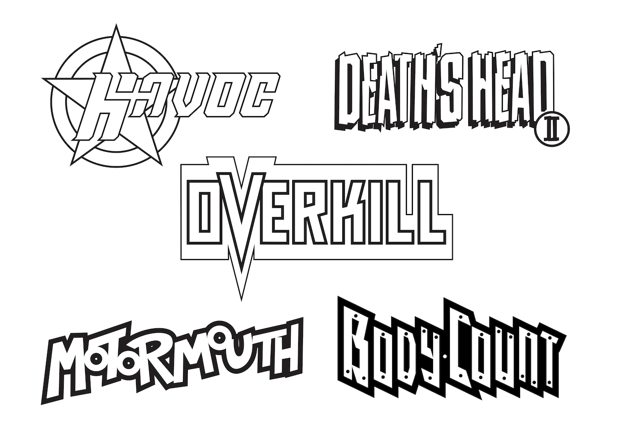
PC: Sorry to say it wasn’t quite as deep as that and just a happy coincidence. It’s difficult to remember my thought process at the time but I do remember having a thing for circles and stars. When I submitted the design to Paul Neary I do remember him saying that he liked it because it reminded him of a gun. I have to say that had not occurred to me during the design process.

I wanted the logo to have a slightly dynamic feel, hence the slightly italicised type. The original type design was very squared-off and blocky which didn’t sit very well with me so I decided to round off the corners slightly and add subtle serifs. A lot about the design was lead by the resources available to me at the time – Rotring pens, a ruler, set of compasses and a drawing board. As we used to do all our colour separations by hand everything had to have a strong black keyline so that this process would work properly. 

The next job I did for him was to design the logo for Death’s Head II which was created in-house and I had the pleasure of sharing a studio with Liam Sharp as he developed the character visuals.

After that I was offered a full time designer post at Marvel UK where I stayed for an amazing three years before heading off back to India for more travels.

OB: After Death’s Head II what other titles did you work on for Marvel UK and what work besides logos did you do for them? Were there any Fleetway comics you worked on too? I was a big fan of both publishers at the time.

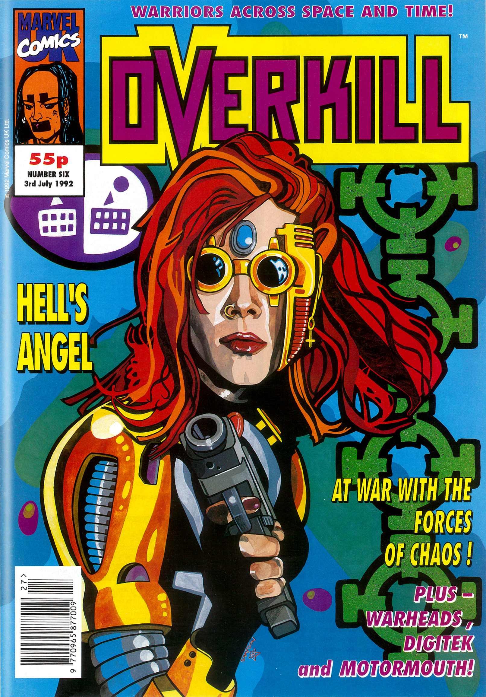
PC: So after Death’s Head I developed the first logo for Overkill and was Art Editor on that for some time. Along with another designer, Ed Lawrence, we became the design team for all the new superhero titles that came out of Marvel UK between 1991 and 1994 – Motormouth, Warheads, Hells Angel (which became Dark Angel), Super Soldiers etc. For Fleetway I produced the designs for The Judge Dredd Mega Collection with another designer, Colin Fox. Upon returning from my second stint in India I secured the post of Deputy Art Director at Titan Books where, amongst other responsibilities, I was the Art Editor for the official Lucasfilm Star Wars Magazine.

(Below, Paul’s favourite Overkill cover with art by Steve Sampson.)

OB: Wow, tthat’s a wonderful selection of titles, it must’ve been such an amazing time! I’ve always been curious, for an ongoing reprint comic what does the role of an Art Editor entail, after all the initial titles and pages have been designed?

PC: You are right. It was odd coming from a consumer magazine background. It was mainly covers and house ads. With the reprint stuff there was some resizing of artwork and new title pages if it was a longer story being broken down. For the graphic novels and collections there were also end pages, chapter dividers and the likes.

OB: Ah right, of course, all those American strips being chopped up into parts in the UK comics. I also noticed new opening panels for some of the Havoc strips so would those have been you, creating them and resizing the original art around them, yes?

PC: As designers we wouldn’t be creating new art but definitely resizing and re-laying out. That would be the kind of thing, but I think Gary Gilbert was responsible for the ongoing design duties for Havoc (like the contents, letters and Eye Level news pages).

OB: Thanks so much for the chat Paul and the insight into one of my most fondly remembered comics.

PC: No problem Philip, anytime.

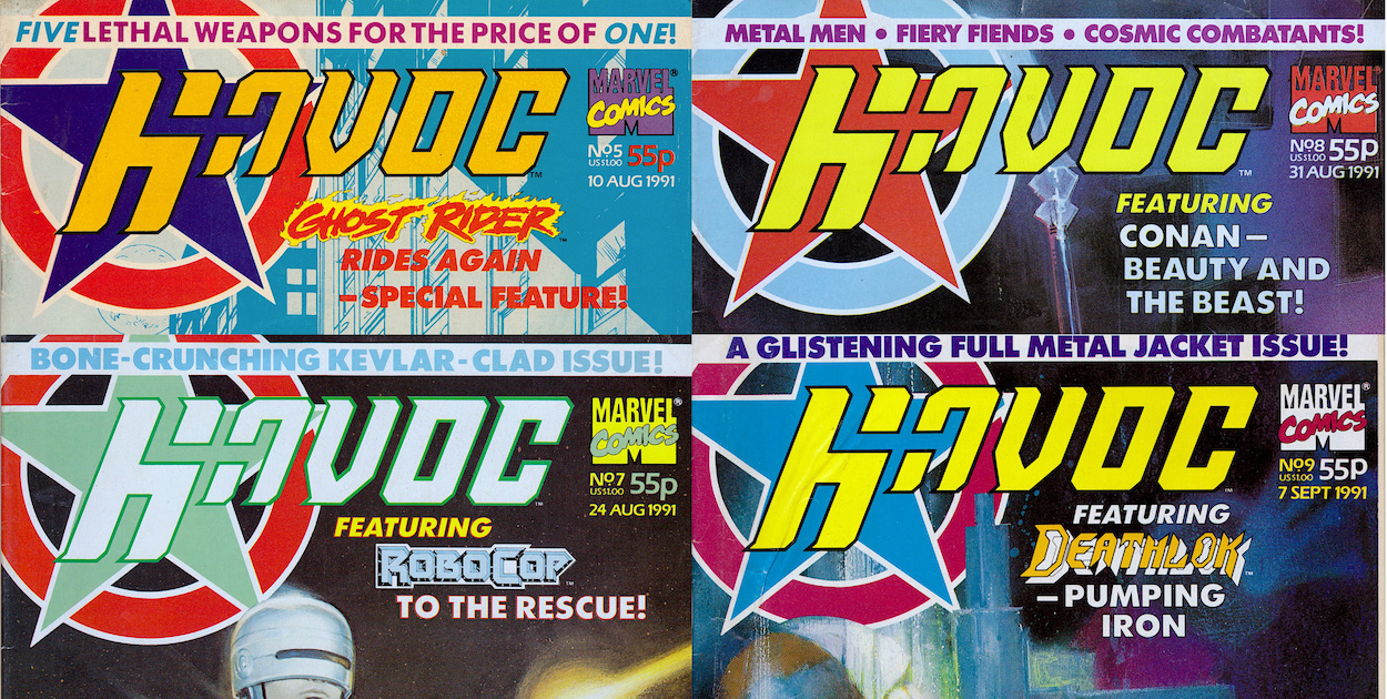
Above is the complete Havoc collection with its many variously coloured logos. To read all about this wonderful comic and begin the real time read through just click here.

HAVOC MENU

JURASSiC PARK #14: CARTOON CARNiVORES

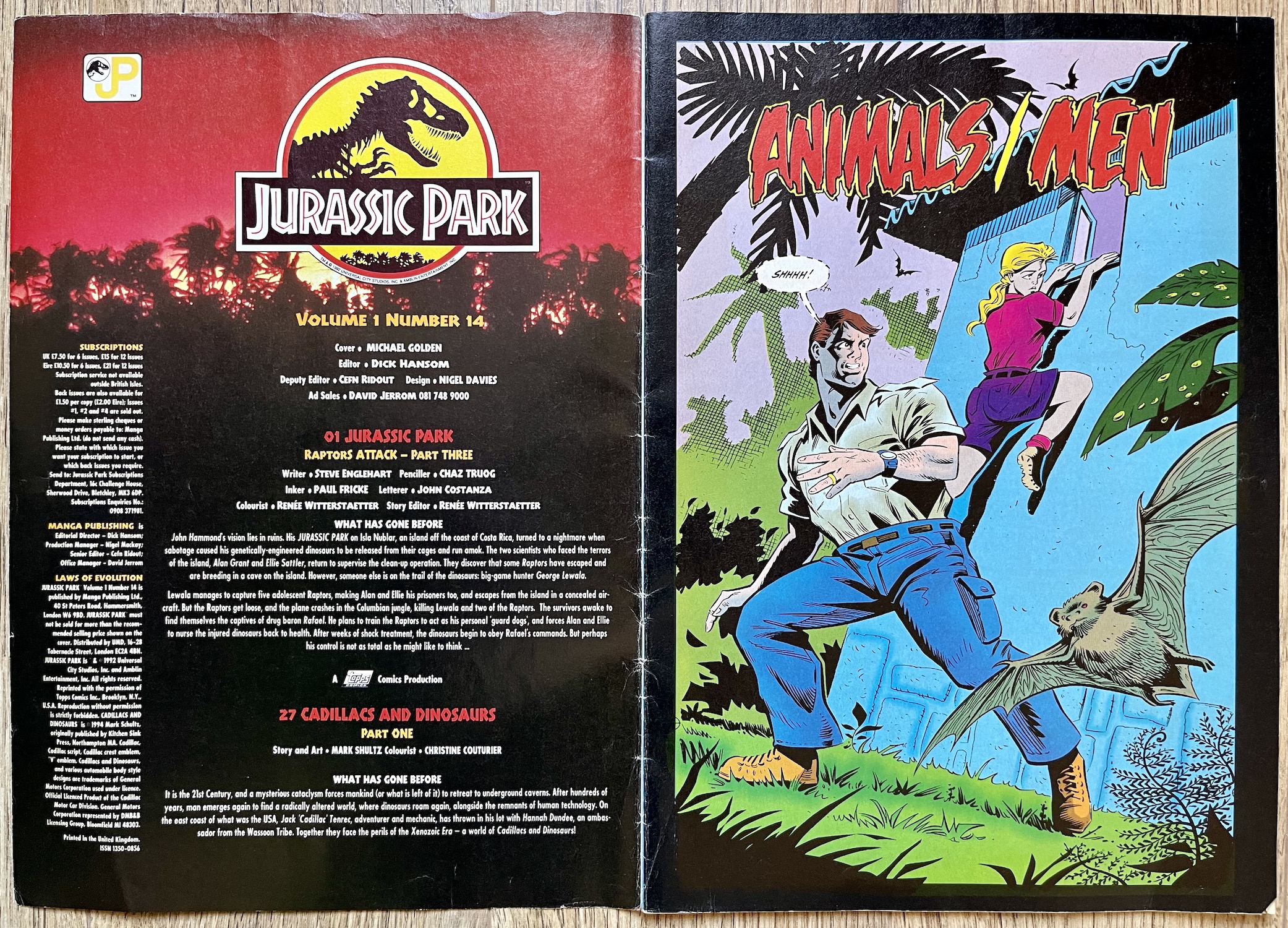
It’s all change this issue as Dark Horse International has now become Manga Publishing. The UK arm of Dark Horse had gone out of business but the success of its Manga Mania comic and the rapidly growing interest in the UK for the art form saw a purchase of the titles and a rebranding across them all. (The company changing hands could account for the delay between #10 and #11.) I’d assumed all their comics were cancelled by the end of 1994 but Manga Mania (at #15) would carry on all the way through to #39. Jurassic Park wouldn’t be so lucky.

But at least this temporary reprieve enabled our comic to reach a decent ending point in #16 instead of just stopping on a cliffhanger (I’m looking at you, Havoc!). Michael Golden’s cover would’ve been better suited to last month’s issue but it’s still a striking image, even if it’s somewhat disappointing to lose that distinctive border on the left. You’ll notice ‘Cadillacs and Dinosaurs’ is mentioned, is this a new back up strip? Not quite, as you’ll see below. Finally, the mysterious free gift mentioned last issue ended up being temporary tattoos, long lost to the mists of time.

The contents page retains its atmospheric design and still offers up subscriptions so the plan must’ve been (initially at least) to carry the comic on for some time to come. In reality, the boast of “Now With Extra Pages” on the cover meant we were up to 40 pages which, while a good increase over the previous three, is only four more than we had in the first ten issues. It does mean we now get a full chapter of the American story per issue though, with the aforementioned back up bringing up the rear.

There’s now a whopping 26 pages of Jurassic Park to enjoy but it’s still listed using the name of the US mini-series comic it was taken from, rather than the name of the story itself. This was confusing because we were unaware of the mini-series’ name, so to the uniformed (like me) it looked like laziness on the part of UK editor Dick Hansom, like he didn’t check what the strip he was printing was called. As you’ll see over the course of this and the next two issues, Animals/Men was the beginning of a trilogy of stories, the title of each a variation on this theme.

It feels very much like the Jurassic Park movie had been given a cartoon makeover in the same way Ghostbusters had with The Real Ghostbusters

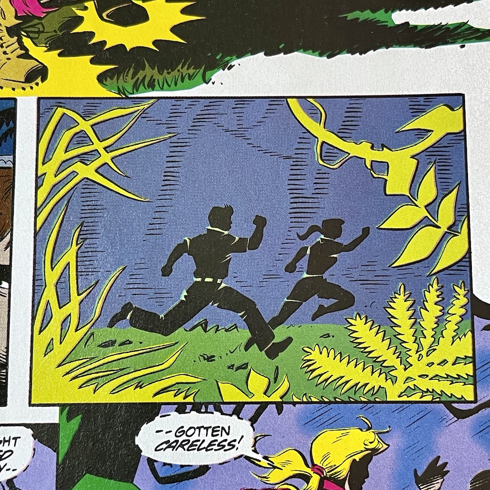
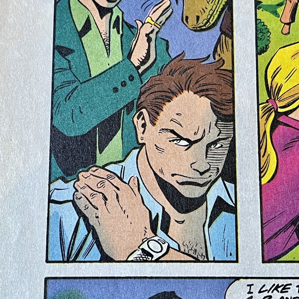
As you can see the art team has changed. Steve Englehart is still the writer of this official sequel, John Costanza is still letterer and Renée Witterstaetter remains as colourist and story editor. However, joining them are penciller Chaz ‘Atlas’ Truog (Green Lantern Corps, Animal Man, Coyote) and inker Paul Fricke (The Fly, El Diablo, Secret Origins). At the time I was a little disappointed in the change from the more scratchy, hard-edged artwork but nowadays I absolutely love this.

Even Renée’s colouring appears to have changed to suit the new style, boldly coloured backgrounds highlighting each frame. The cartoonier style put me off initially as a teenager but it did grow on me. Today, it feels very much like the Jurassic Park movie had been given a cartoon makeover in the same way Ghostbusters had with The Real Ghostbusters. It’s great. It’s a lot more animated and dynamic, and as you can see having better defined facial features means our characters now actually look like cartoon versions of the actors.

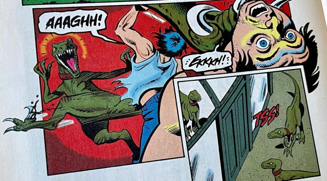
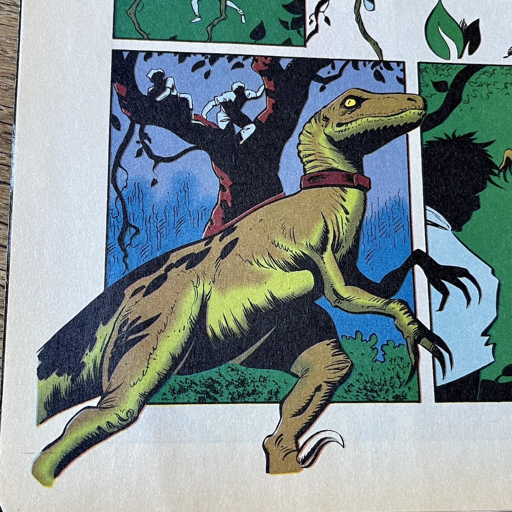
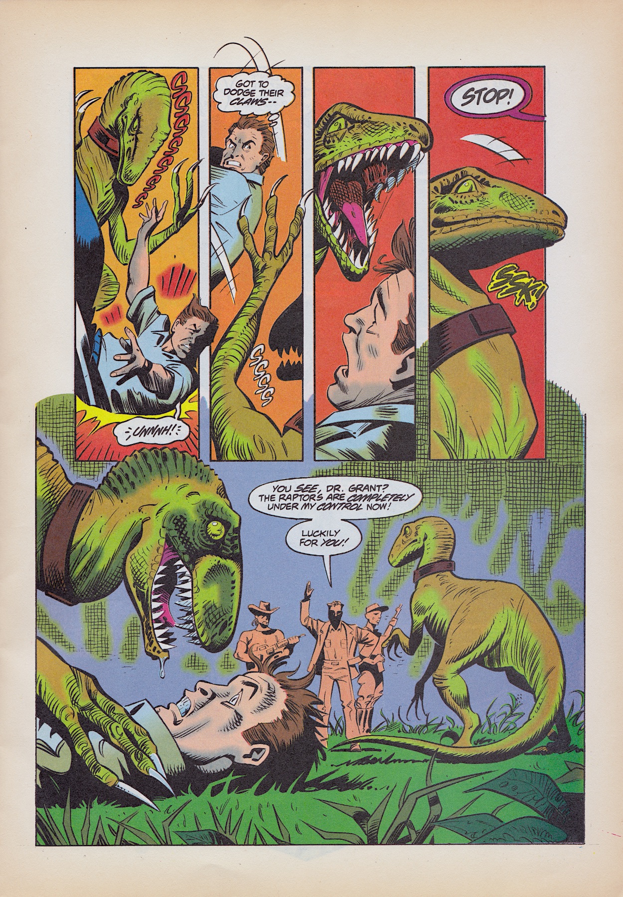
Drs Ellie and Alan Grant attempt to escape from Rafael’s compound deep in the Columbian jungle but accidentally set off a hidden alarm, in response to which Rafael immediately unleashes his supposedly trained Velociraptors. Trying to escape their reach up a tree, a vine Alan clings to is grabbed by one of the ‘raptors and suddenly he finds himself flat on his back, exposed and an easy target. That is, until Rafael catches up.

During the attack we find out Alan and Ellie have named the dinosaurs. The alpha is called Alf, the beta is Betty and the injured ‘raptor who is still within her cage is Celia. If this rings a bell you’re not alone. Much later in Jurassic World, released 21 years after this comic, Owen Grady named his four Velociraptors after the second to fifth letters of the alphabet too (Blue, Charlie, Delta, Echo, with Owen as the ‘alpha’). Was the movie inspired by this comic, or was it just a coincidence? Either option is likely.

Having game warden Robert Muldoon alive and well is just stupid

Ellie and Alan are ordered to return and look after the injured Celia, who continues to let Ellie do so, knowing she saved her life. But our doctors think if she wasn’t restrained they’d be on the menu. They’re very aware of how they’ve romanticised the dinosaurs’ place in nature, but they’re still killers. This leads on to a dark scene in which one of Rafael’s men suggests they take it in turns raping Ellie to relieve their boredom and he’s immediately shot and killed by his boss, telling his men to feed him to one of the ‘raptors, so he clearly wants his creatures to maintain their taste for human flesh. But why?

Then, after all the action, tension and interesting story developments the strip unfortunately takes a turn for the absurd.

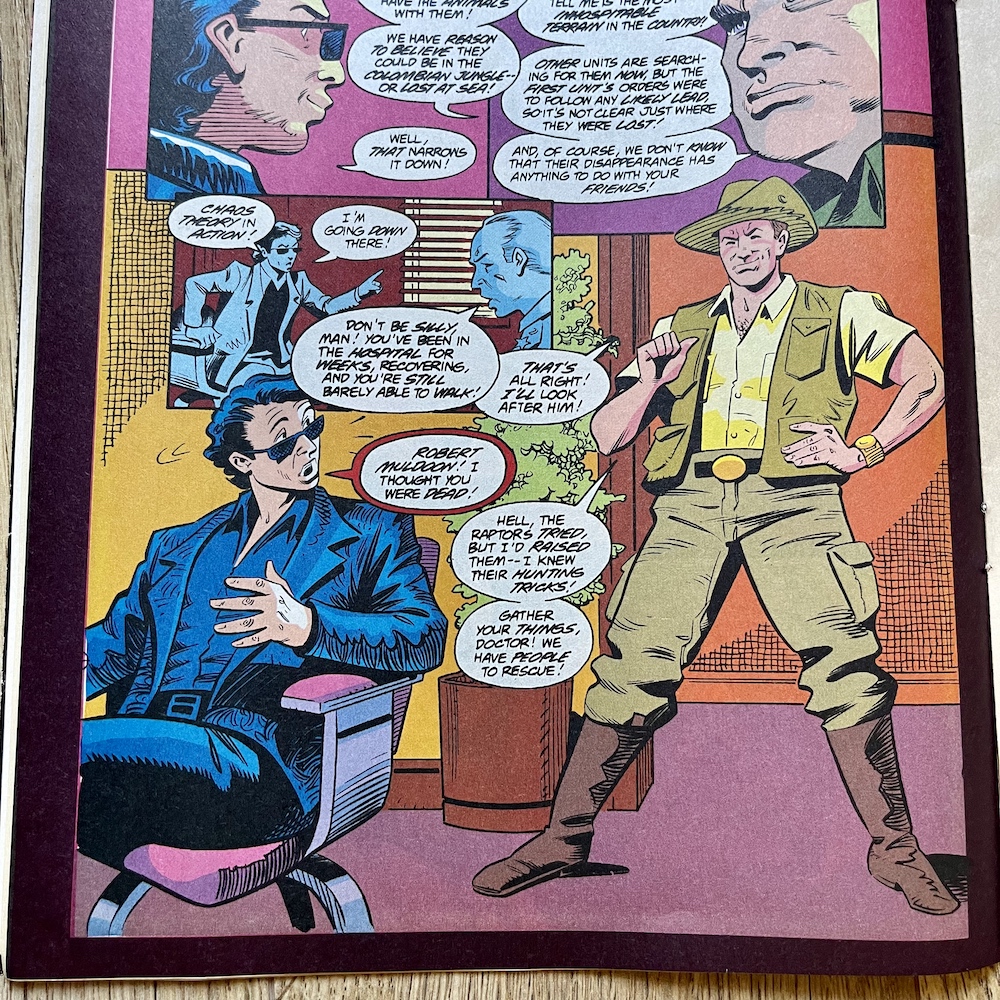
Even as a teenage reader I didn’t find this to be the thrill it was hyped as on the cover and my opinion hasn’t changed since. Having game warden Robert Muldoon alive and well is just stupid. Remember that “clever girl” scene in the movie? He looks awfully healthy after that, doesn’t he? What elaborate explanation is given for him surviving a Velociraptor jumping on top of him and apparently eating his head? He raised them. I hate this. Not only is it ridiculous to think he survived but if he did it completely ruins that whole scene in the movie.

According to #10 Ian Malcolm had to spend months in a hospital after his injuries but Muldoon gets the kind of return we’d expect from a superhero comic that finds some trick to retcon a character’s demise. I remember feeling let down by this but thankfully it isn’t dwelled upon beyond this one page (for this issue anyway) so we can get back to the meat of the story which is much, much better.


“It seems ‘raptors can remember a kindness”


Celia’s training commences but she isn’t cooperating. She responds to commands but doesn’t go for the head of the human-like hay dummies like the others, instead biting an arm or leg, never going for the kill. The ever-paranoid Rafael thinks it’s a trick but we’ll find out the real reason soon enough. Meanwhile the government’s leader is planning to announce new indictments against him in the murder of dozens of law enforcement officials, and the next day as the judges leave the courthouse a van pulls up and out of the doors rush Alf and Betty!

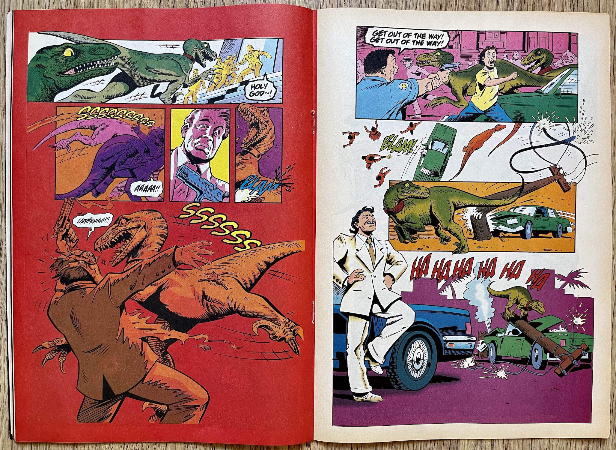
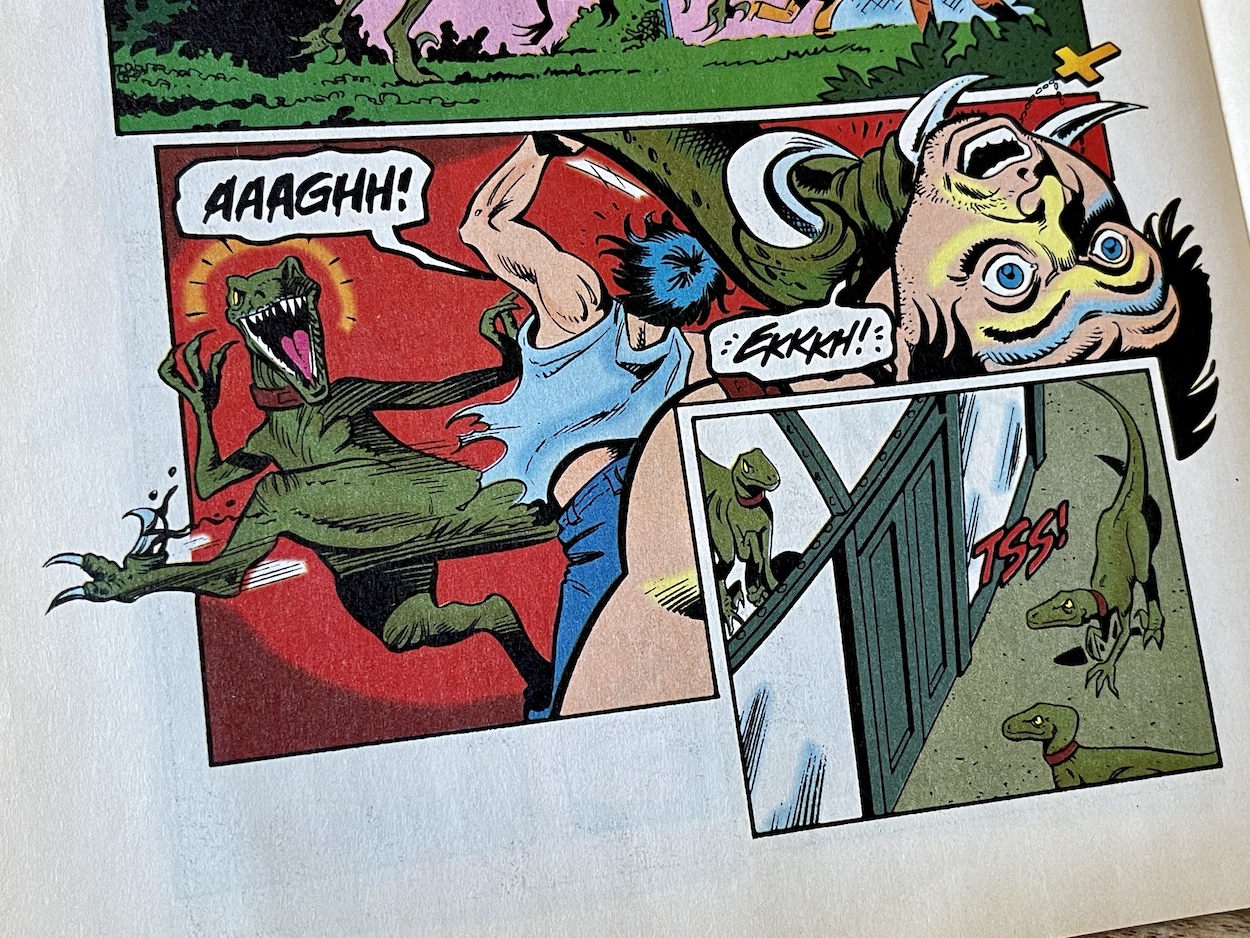
During the attack an electrical cable is damaged which zaps one of them. As the two animals looks quizzically at the electrical sparks they come to realise something and they run off. Rafael’s men can’t take control, somehow the ‘raptors realised the collars were no longer being controlled, the broken power lines causing interference. Free of their painful, torturous shocks they immediately run back to free Celia, taking out with relish the men who previously had all that power over them.

They kick in the large metal doors holding their sister and in no time at all everything has changed. Rafael had thought he was in control, but during the execution of his own plan something unpredictable happened and within minutes all three of the dinosaurs are free to roam and hunt, killing Rafael and the remainder of his men as they unsuccessfully try to shock them into submission once more.  Another perfect example for Ian Malcolm’s Chaos Theory.

We see Celia wince from the shocks, but the others’ collars no longer work well enough to stop them. When Alan and Ellie come out to see what’s happening and make their own escape they’re cornered by the three ‘raptors. Alf and Betty prepare to pounce, after all these two humans are just another part of all this, but in a surprising moment Celia steps up to stop her sisters, even though she isn’t the alpha herself.

I remember this aspect of the story. Celia stopping her sisters from attacking Alan and Ellie would resurface and emphasised (once again) how the Jurassic franchise treats its dinosaurs as real animals rather than simple movie monsters. Was this also why she wouldn’t ‘kill’ the hay dummies? Does she no longer see all humans in general as prey? Either way, it’s clear the ‘raptors saw Rafael as a means to an end, to get out of the compound to freedom. The sly looks at each other and the development of their own characters over previous issues now clear with hindsight.

This was even before the Tyrannosaurus rex got off Isla Nublar to run amok through San Diego looking for his baby

The story ends on a superb cliffhanger as they take off into the jungle; three Velociraptor out in the wild, on the loose! Of course, this is now the conclusion to Jurassic World: Fallen Kingdom and the starting point for the final film in the series, Dominion, but this was published in 1994. As a teenager this was even before the Tyrannosaurus rex got off Isla Nublar to run amok through San Diego looking for his baby in The Lost World: Jurassic Park, so I can’t emphasis enough how excited I was for the next issue back then.

Despite the unnecessary return of Muldoon this was a hugely enjoyable adventure strip for Jurassic Park and one of the best so far, reading like the proper sequel to the original film it was intended as. It’s certainly a worthy follow up, continuing to build upon its story month after month and now, with the new art style bringing a freshness, a larger sense of excitement and better representations of the characters, I’m looking forward to seeing where it all leads.

After a huge chunk of dino action the issue is rounded off with Foundling, our nine-page back up Cadillacs and Dinosaurs strip. A quick glance at the first page will show regular blog readers this is actually Xenozoic Tales (second back up in six issues from #4) under a new name. The Cadillacs and Dinosaurs cartoon series was based on creator/writer/artist Mark Shultz’s cult comic and had just started broadcasting on the Cartoon Network in the UK, so while the strips were still the same, the cover and contents page changed the name to try to entice fans of the cartoon.

Christine Courtier is back on colouring duties and, while I miss Steve White’s colours, in an episode told mainly in flashback Christine’s darker, more atmospheric palette perfectly suits the story. Again Jurassic Park is selective about which stories from the original comic series to reproduce (page count could be a major reason) and in this case we jump forward to #6 of Xenozoic Tales, missing out a handful of tales from the last time we saw Tenrec and Hannah.


“I could feel his hot breath on my neck, then he galloped past me as if I wasn’t even there.”

Hannah Dundee

At points the story is actually a flashback within a flashback. Hannah is telling Tenrec about Maia Abrelatas, a lady whose son went missing years before when he was only three-years-old. She’d begged the governors to renew the search but they’d refused and Tenrec apparently just looked on as they did so. Within this flashback we flash back again to the time when the boy went missing out the back of her home. Later they’d found hyena tracks and blood and concluded he’d been dragged inland, where it was too dangerous for humans in this future world populated by dinosaurs.

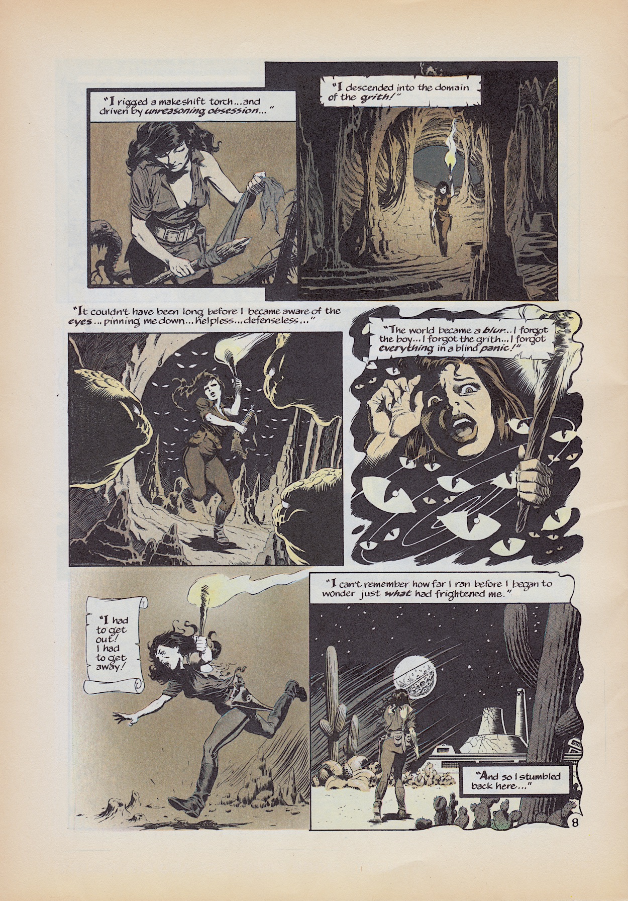
Back to the original flashback and Hannah went out to track him after Maia saw him at her window. The governors dismissed this claim but Hannah found a child’s footprints and tracked them. She was almost about to turn back after a day when she eventually found him. Unable to speak, the boy instead drew words using stones, each letter inside a square. This instantly reminded Hannah (and me) of the Grith using Scrabble tiles to communicate with Tenrec. Just like them the young lad can understand her but can’t speak.

Above, the dinosaur that charged her was just a distraction (she does comment how this was strange for that animal) because she then lost the boy in the think forest, spotting him latter with the Grith far off in the distance. Continuing to track them to the entrance of a cave the scene below is terrifically designed by Mark, full of atmosphere and thrills. The story ends with Hannah confronting Tenrec, his association with the Grith and apparent nonchalant attitude earlier leading her to the conclusion he knew about the boy all along.

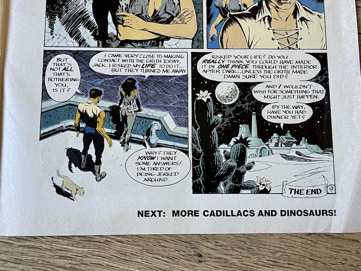
It turns out the Grith saved the boy after he was mauled by the hyenas and raised him, but now they can’t let him return home because he knows too much about them, even thinks like them. However, he’s at that age where his curiosity is putting him in a dangerous position as he tries to find out more about his origins, so the only solution is for them to take him far away from his mother and for Tenrec to continue the lie. What started out as another adventure strip ends on this heartbreaking reveal, which is a complete surprise.

Then, so it doesn’t end on too much of a downer the last two panels reveal all that horror faced by Hannah was actually the Grith trying to make sure she found her way back home, all finished off with Tenrec being his usual, casual self and asking about food. I’m sure any child buying the comic after watching the cartoon would’ve got a bit of a shock at the tone and the mature storytelling. As a Jurassic Park comic reader this is a great return to the unique and original Xenozoic Tales, no matter what name the editor gives it.

The last three pages are all advertisements, beginning with the latest issue of Manga Mania which I mentioned earlier and the first issue of a new comic based on the Street Fighter II videogame which was all the rage. I saw this and thought that couldn’t have lasted long but I was wrong, Manga Publishing in the UK released 16 issues altogether, the same as Jurassic Park in the end. I know which one I thought deserved to run longer though.

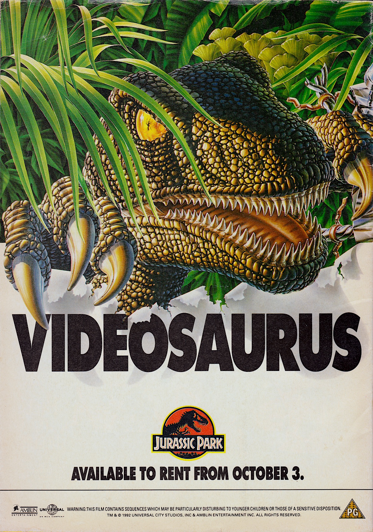
Finally for this month there was big news for fans of the movie on the back page.

I love the way the Velociraptor‘s eye is made to look like the amber that was so important to the film’s plot. Even though I visited our local rental store every single Saturday (because it was closed on Sundays you had the tape for twice as long for the same price) I never rented Jurassic Park. The reason was simple, I knew I was getting it for Christmas to own so I wanted to wait for my own copy before seeing it again for the first time since the cinema. So I waited (im)patiently instead.

While getting a much lengthier main strip was exciting I still prefer the comic’s three-strip format. To this day my favourite issues belong in that first handful after the sequel began in #6. But with hindsight, knowing we’ve only two issues left I’m very glad it changed so we could get three more full stories before the rug was pulled. The next of those stories will be reviewed inside Jurassic Park #15 on the blog on Thursday 6th October 2022.

iSSUE 13 < > iSSUE 15

JURASSiC PARK MENU

OiNK! #36: CHANGES ARE A-TROTTER!

Percy Plop isn’t wrong, although while the comic would present the changes as a result of a temporarily crazed editor in reality they were permanent. With Fleetway Publications now having bought IPC Magazine’s comics they decided to publish all titles on the same paper stock, which meant a good upgrade for the others but a downgrade for OiNK. I didn’t complain though, which I’ll get to soon, and the theme for this issue was a stroke of genius.

A bit like when the skeleton staff made a hash of #8 this issue sees some strips printed upside down, others drawn by the wrong artist, some are coloured incorrectly and other such randomness occurs. Some strips, even if they don’t have something deliberately ‘wrong’ with them, seem more zany than usual, which is saying something for this comic. Jon Langford’s cover may not be the best the comic ever had but this is one of the very best issues as a whole.

So what did the team think of the physical changes and did Fleetway enforce any other alterations? “We were all disappointed initially with the changes but, fortunately, it didn’t dampen our spirit so it was ‘business as usual’ producing the best content within our means,” co-creator/co-editor Patrick Gallagher told me. “Though the publisher changed from IPC to Fleetway, Bob Paynter still held his position as Group Editor and it was him we were answerable to, with the same amount of creative freedom as before. It was still fun to produce.”

Maybe to soften the blow for fans of the glossy paper (now on thicker matt stock, slightly thinner in width) or maybe to publicise it for new readers as the publisher pushed their new purchases, this and the next two issues had these fun stickers which ended up all over my house as a kid (and on my fridge and home office door as a 40+ year-old). The logo shifted up into the corner in a colourful banner and this too would be kept, although initially shifted about and resized from issue-to-issue, emphasising the random nature of OiNK.

“The logo change,” continues Patrick. “We were running short of pink ink so we decided to reduce the size of the pink logo to economise.” Typical Patrick response, that. “Only joking. I think we just wanted to experiment and give more room to the cover illustration, knowing we could always change back to the bigger logo, which we ultimately did.” That would happen when OiNK went weekly in the new year. I really enjoyed the way it looked over these issues though and it did indeed give more space to some fantastic covers, as you’ll see soon.

So what was the comic’s reason behind the sudden changes we readers found in our hands?

Written by Mark Rodgers and drawn by Ian Jackson Uncle Pigg introduces himself to new readers the way he did in the soft relaunch issue, #15 (which also gave away the first of three free gifts). This normally happened when a comic got a new look, something I enjoyed every time it happened with Transformers, for example. It’s understandable and didn’t detract from the strip for established pig pals. As Percy says in that final panel anything could happen, and everything did! On the very next page is an upside down strip, along with the image of Percy I showed at the top of this review, commentating on the new paper.

We’ll get to possibly the craziest strip OiNK had produced up to this stage in a minute but first comes something of a spiritual successor to last issue’s Arctic Adventure, although I’m sure it’s more of a coincidence. Either way, Tarzham the Apeman is a fantastic, funny strip I just had to include. Written by Tony Husband and drawn by Chas Sinclair, the same winning partnership behind semi-regular Lashy the Wonder Pig, it’s another tale taking shots (no pun intended) at cowardly animal hunters.

Tony is a huge supporter of animal rights and conservation, often sharing his opinions on hunters on social media in his inimitable style, using funny cartoons to make his point. I think the first speech balloon on the second page sums up those sorts of people, and the solution to the problem not only highlights the stupidity and greed of hunters but it genuinely made me laugh out loud. The ending is similar to Simon Thorp’s last time but both strips work so well I’m glad we got both.

Contributing to 40 issues of OiNK altogether, Ed McHenry would become best known for two particular things: his regular strip Wally of the West, a character I thought was in OiNK a lot more than he actually was (in reality only appearing in 12 and not until #53) and OiNK’s quiz pages, examples of which I’ve shown in the reviews for #6 and #12. However, we also enjoyed a selection of one-off characters from Ed, such as The Loon Ranger and his horse Radish.

Strips like these from Ed would become more regular during this period, yet another reason why this is my very favourite period in OiNK’s run. Below this is a quick three-panel Hadrian Vile which is a bit strange for one of the comic’s main characters. The excuse given is that the crazed Uncle Pigg ate Hadrian’s diary but in reality the next chapter in his story would perfectly fit the next issue’s theme instead, so for this issue a quick stop gap was needed so they could postpose his strip until his three pages next time. There’s also a tiny Frank Sidebottom strip about the end of the school term, apparently printed ten months too early according to the note underneath.

If all that sounds crazy you haven’t seen anything yet. Jeremy Banx’s strips are known for their surreal humour and random daftness. He’s always able to take a ludicrous idea that really shouldn’t work and turn it into pure comedy gold. Already peculiar on a regular basis, how could a Burp strip stand out in an issue themed around being peculiar? How about a story involving him wanting a Cary Grant tattoo on his meters-long tongue? This includes a panel that I never forgot after seeing it. I’m sure you’ll be able to tell which one.

Funniest moment? Oh that’s far too difficult to narrow down. How about a tattoo parlour having a free trial offer? Or the tattooist’s blank eyes and small balloon text as he reacts to what he’s just been told? The way he straddles Burp’s tongue, or even shouts after him for his tip? Already hilarious, already weird, already daft, somehow Jeremy is able to ramp it up even more in those final panels, cramming in so many insane moments you feel like you need to catch your breath while reading it.

I do like the seal of approval on Pete’s strip, a little dig at W.H. Smith

Both of Jeremy’s regular strips, this and Mr Big Nose had a knack of surprising us with endings that just came out of nowhere, and while completely random, out-of-nowhere end gags can sometimes fall flat in other comics this was never a problem for Jeremy. He nailed it every single time. This next handful of fortnightly OiNKs would see Burp’s strip regularly expand to two pages with some of the best strips the comic as a whole ever produced! I can’t wait to see them again.

A quick look at some other highlights before we move on. On the Grunts letters page there’s a quick glance at a new piece of merchandise coming very soon indeed and the results of #27’s Pop-Star Lookalike Contest with Frank Sidebottom had a particularly fantastic entry from reader Graham Fenton and blog reader Tim Fee. Elsewhere, both Rubbish Man and Pete and his Pimple are victims of the issue’s peculiarities, although I think Rubbish Man came off worse. I do like the seal of approval on Pete’s strip, a little dig at W.H.Smith moving OiNK to the top shelves due to just two complaints.

Our smelly alien isn’t the only person to get two pages this issue. Lew Stringer’s Tom Thug gets to enjoy a bit more space to cause bovver in. I’ve mentioned before how OiNK’s high quality, glossy paper stock not only allowed gorgeous painted artwork, the black and white strips could also benefit from intricate shading, Lew in particular applying grey washes to his. While the paper from this issue onwards was a downgrade, it was still a cut above the newsprint OiNK’s contemporaries had been using up to this point.

“The quality of print on the matt stock paper was pretty good,” Patrick told me. “In my view it gave it more of a retro comic feel and warmth, which I liked.” I concur. While the gloss was lovely, and the plan was always to have the Holiday Specials use it, I really liked this paper but was struggling to articulate why until Patrick described it like that. This high grade matt was capable of the same techniques Lew had always been using, but you’ll notice its conspicuously absent from Tom’s strip.

“Yes, I think I expected it to be like newsprint so I avoided doing a grey wash on the strips until I saw that it was a better grade of paper than I thought it would be,” Lew explained too me. “I thought it was a shame the paper was downgraded from glossy but that wasn’t the first time budget cuts had affected a comic so it was inevitable I guess.” Lew would return to his usual style pretty quickly and we’d see OiNK’s most popular character shaded once more.

But what about the rest of that story? Well, Banx’s strips were great when he’d pull a conclusion seemingly out of nowhere but above it appears crazy Uncle Pigg giving the cartoonist a holiday, forcing him to rush the ending of Tom’s strip, has had the opposite effect. Our editor’s assistants The Plops have no choice but to allow Tom to finish his strip himself. Well that’s just inviting disaster, isn’t it?

My favourite bit is the fact the re-use of a panel from #17 (the previous Christmas issue no less) is an actual reprinting and not just Lew drawing it again. Go and check out that previous issue’s review to compare them if you don’t believe me. An ingenious strip and giving Tom two pages in an issue set up to attract new readers was a great idea, seeing as how popular he was (and would be in Buster for years to come).

Underneath Lew’s Pete and his Pimple strip were a couple of plops drawn by Ian Jackson who, along with some bad (as in groan-inducing) spotty puns, commented on everything that was going wrong with the strip. They appear throughout the comic, getting increasingly worried about what’s happening right up until we get the delight of seeing Harry the Head drawn by J.T. Dogg.

Normally drawn by his creator Marc Riley, we’ve become used to seeing Harry in Marc’s simplistic but energetic fashion, so to see him rendered by Malcolm Douglas (J.T.’s real name) like this is a sight to behold. There’s no writing credit but I think it’s safe to assume Marc would’ve still been responsible for the script. Oh, and that little image at the bottom leads to Uncle Pigg exploding on the next page!

Well, sort of. When he blows up screws and metal bits and bobs come flying out and the real Uncle Pigg soon reappears to explain with some “handy plot explanation”.

What an issue! It’s been an absolute delight to read this one again, it’s more than held up to the fond memories I had of it from 35 years ago. In fact, I can remember walking back from the newsagent with it in hand in 1987. Walking very fast actually, because I was thrilled with these exciting changes to my comic and couldn’t wait to see what this would mean on the inside. (I’m sure the stickers helped quicken my pace too.)


“Fat! Floppy! Fun! The biggest news ever for pig pals!”


A fabulous start to OiNK’s Golden Age (my own term, see here for more on that) and one of the best all round issues so far. It feels brand new again, like a fresh start in the same way #15 did. Also, all the best issues are the ones with a strip continuing through the comic in fun and original ways, such as #3‘s Star Truck and our editor again in the festive #17. The next edition is the Happy Families issue and I remember the fun Mike Higgs cover, the cut-out game and most of all the three-page Hadrian Vile strip!

You’re going to get sick of me saying this over the next few months, but I can’t wait for the next issue. Speaking of looking forward to things, the inside back cover finally revealed what had been hinted at for months. So that’s me looking forward to Christmas now too!

The review of OiNK #37, the Happy Families issue will be published on Monday 19th September 2022.

iSSUE 35 < > iSSUE 37

OiNK READ THROUGH MENU

OiNK FREE GiFTS MENU

MAiN OiNK MENU

COMiNG UP: OiNK! #36

A few days ago I published a blog post called ‘OiNK’s Golden Age’ where I explain I believe the issues that make up the rest of this year are the very best of OiNK‘s run. It all kicks off with #36, the OiNK Goes Peculiar issue! New paper, new size and a new cover design signal the beginning of the time I’ve been looking forward to since I started this real time read through in April 2021, and to celebrate Uncle Pigg even gave us some free stickers.

The issue itself is one of the best OiNK produced with highlights including the craziest Burp yet, Tom Thug taking control of his own strip and J.T. Dogg bringing his art style to a character you wouldn’t expect. I’ve distinct memories of this issue and many of the ones to come between now and the end of the year. To say I’m excited for this would be a massive understatement. Let’s hope it lives up to those memories! You can find out in the review, which will be here from Monday 5th September 2022.

GO TO iSSUE 36

OiNK iSSUE PROMOS MENU

‘MORE OiNK’ MENU

MAiN OiNK MENU