Category Archives: Creating Comics

CHiLLiNG CHAT: ALAN LANGFORD & SUPER NATURALS

Have I got a special treat for all you Super Naturals fans this Hallowe’en! One of the highlights of the short-lived comic for me was the incredible art by Alan Langford in stories Mount of Athos and The Curse. Alan brought a mature, horror-centric style that made the battle between good and evil feel truly epic and the evil characters feel properly horrific. His art really showed the potential of the franchise in my eyes.

Finding anyone who worked on the Super Naturals comic has been difficult, finding those who remember doing so has been near-impossible. Even Barrie Tomlinson, while he mentions it in his book Comic Book Hero, wasn’t sure it was definitely his title. Thankfully Alan remembers it well and he very kindly agreed to a chat about contributing to this underappreciated comic. So today, on the 38th anniversary of the premiere issue, here he is!

A full-time member of the Society of Equestrian Artists, today Alan produces truly stunning pieces of art with the graceful, beautiful animals at the centre of each one rather than holographic action figures. Given how elaborate his contemporary work is on his website I was curious how he found working on a licenced comic. In the Adventure Book we saw Sandy James’ character studies which the comic stated other artists used as reference when beginning work. Not so, according to Alan.
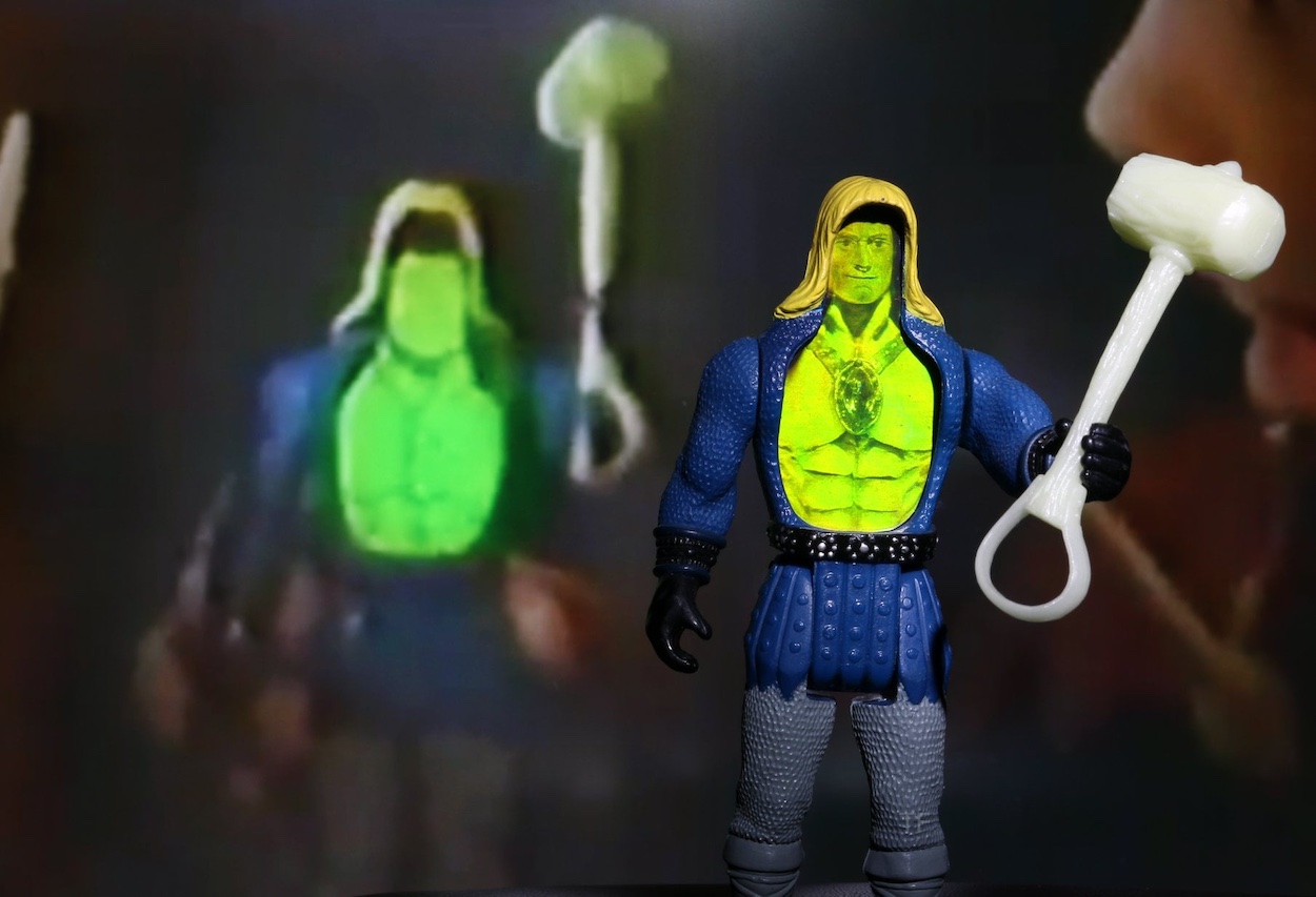
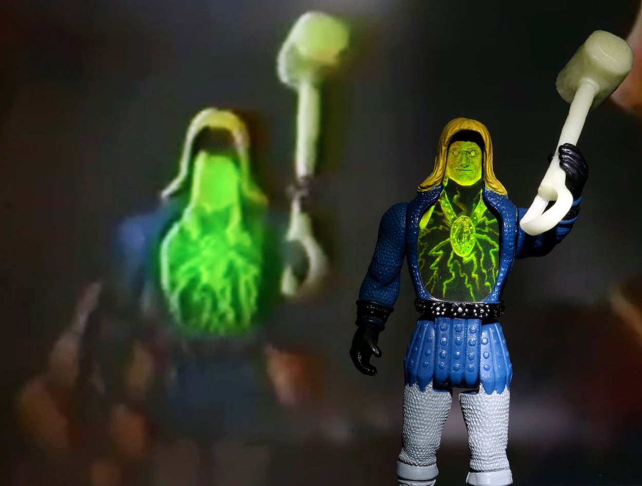
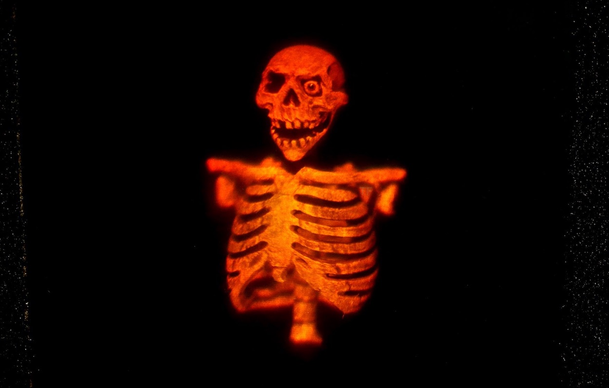
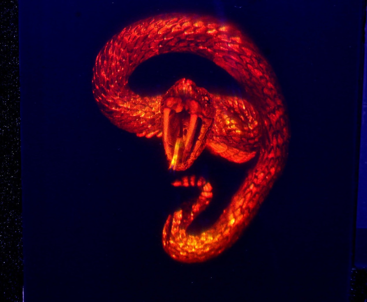
“I recall receiving a parcel full of all the Super Naturals models and their extraordinary vehicles to use as references for the comic scripts I had to illustrate”, Alan told me. “Of course they were of invaluable assistance when sketching out my roughs and depicting the finished artwork.” Above are examples of the action figures themselves (in this case, Thunder Bolt) and one example each of the intricate holographic images for Skull and Snakebite that Alan so expertly translated to the page.

As far as this particular licence was concerned, its characters are what stood out to Alan the most. “Well naturally you have to follow the flow of the script,” he explains. “But it was always interesting if the script conjured up imaginative imagery that you felt compelled to draw. I particularly enjoyed depicting Lionheart and his macabre nemesis [Skull], since they were both larger than life, extraordinary characters.”
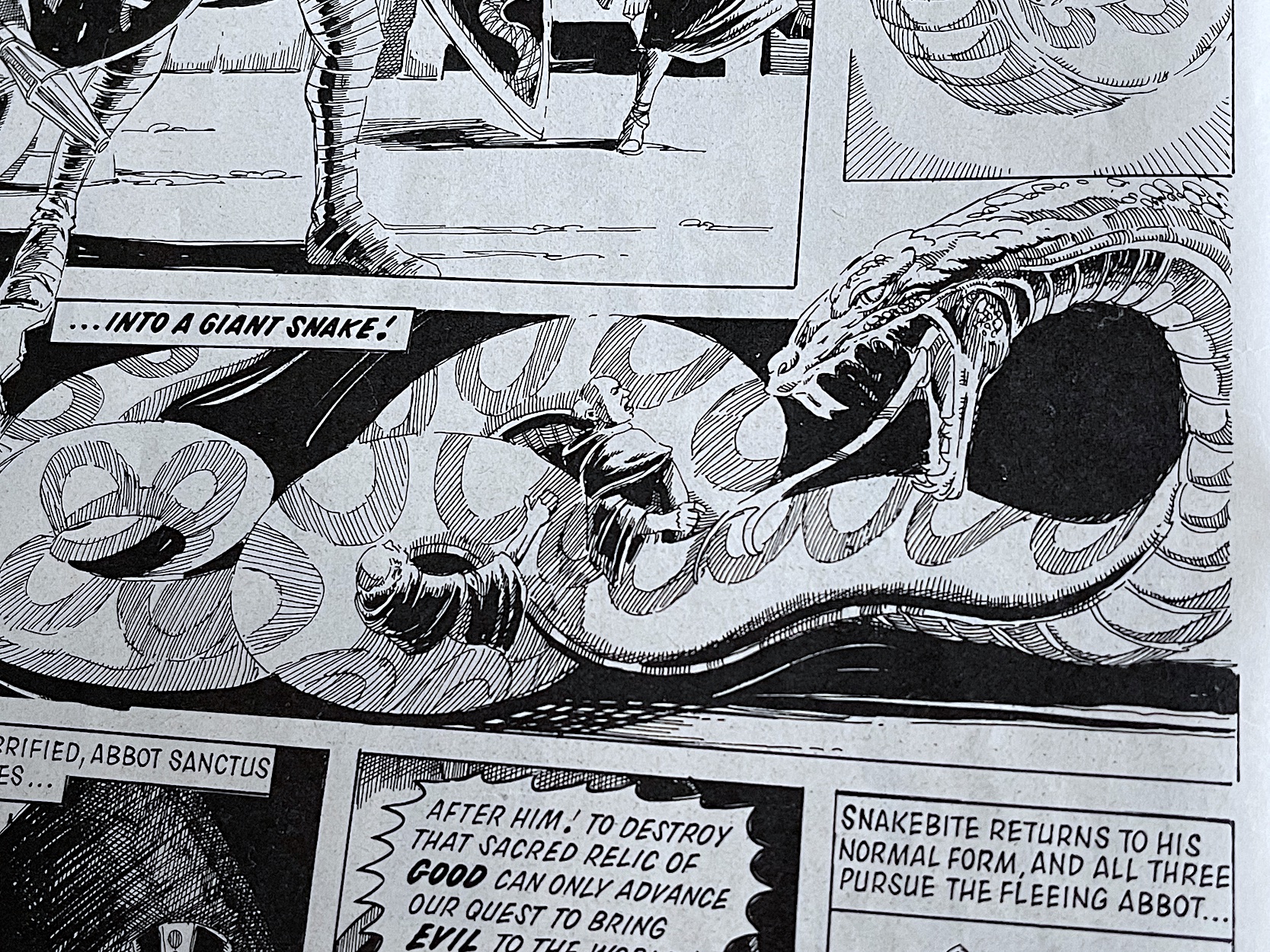
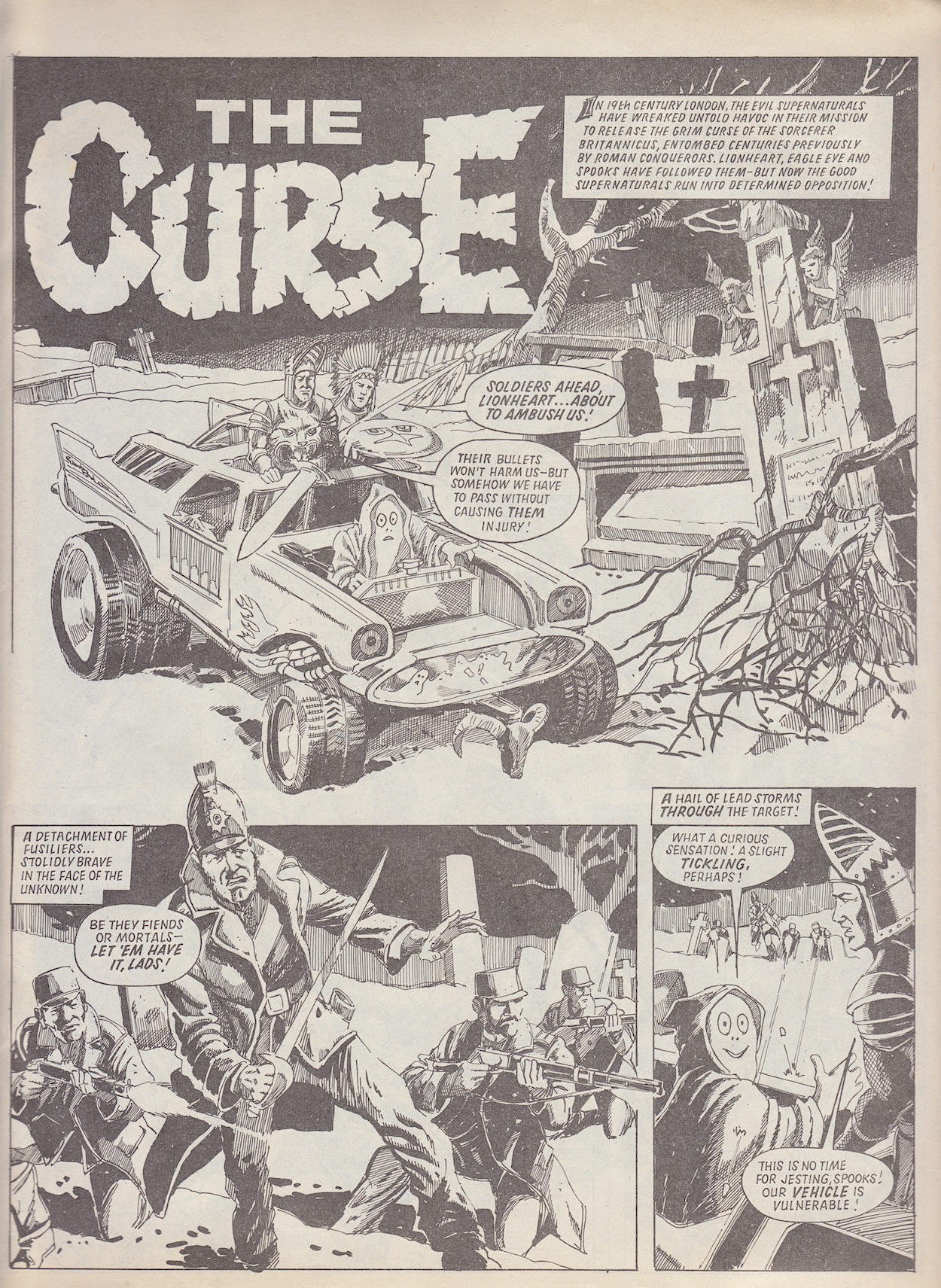
Indeed, Alan’s depictions of the two in battle were truly memorable. More than any other strip, Mount of Athos gave us a sense of the epic nature of the battle between the supernatural elements of good and evil battling across time, mainly thanks to Alan’s art. The first page in #1 (first strip image above) is all the proof you need. With Alan’s style seemingly leaning more towards horror, especially in his depictions of the evil characters, I was curious if the genre was a favourite of his to draw.

“I’ve long been fascinated by horror since my teenage years when Hammer movies were the regular unmissable attraction at the cinema. Christopher Lee’s portrayal of Dracula was particularly convincing. However, when it came to depicting horror in comics, there was only one real master of the genre and that was the extraordinary fantasy artist Frank Frazetta, whose cover art depicted in oil paint on board illustrated the covers of Eerie and Creepy magazines.”

“A more competent and helpful editor would have been hard to find”

Alan on Barrie Tomlinson

Indeed, regular blog readers may recognise a couple of names there. In Dark Horse International’s Dracula comic from 1993 (originally a tie-in with Francis Ford Coppola’s movie), from #4 onwards classic Vampirella stories were pulled from the archives to act as the back up strip. These were originally published in Creepy in the 1960s, and #5’s additional Creepy classic, Werewolf was stunningly illustrated by Frank.

“Beautifully painted,” Alan continues. “Excitingly composed, remarkable masterpieces that drew the eye in an instant and had you searching through your small change to purchase the exciting mags whose cover art was so instantly recognisable. There was no doubt about it, Frazetta was an extraordinary genius, who has left an indelible mark on fantasy and horror art.”
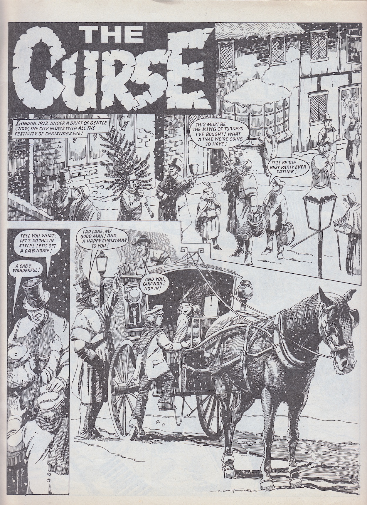
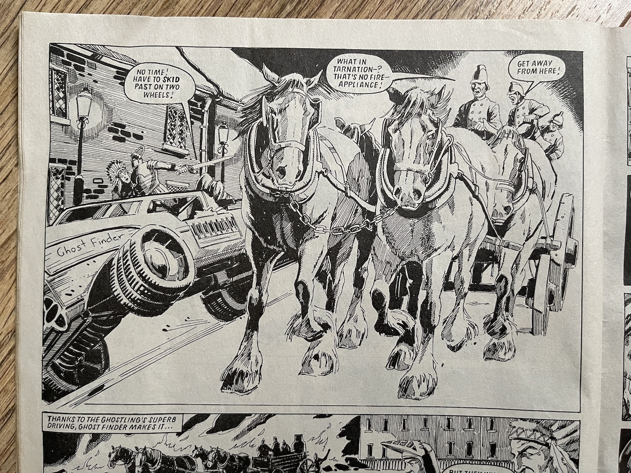
With his influence well and truly established, we headed back into the world of the Super Naturals. The idea behind the Tonka toy licence was that these characters could show up in any place or time throughout history to cause havoc. The Curse was set during a Victorian Christmas, which seems to have been right up Alan’s street with its horse drawn carriages and the like. Alan agrees. “Yes, particularly as you suggested, because I enjoy drawing equestrian scenes. I particularly recall the opening splash page with children climbing into the Hanson cab.”
Above is one of the “extraordinary vehicles” as Alan puts it, expertly inserted into this Victorian Christmas tale. It’s great to finally talk to someone who remembers working on the comic. As such, I just had to ask him if he could clarify if legendary British comics editor Barrie Tomlinson was indeed the editor of Super Naturals and if he recalled the names of anyone else that contributed.

“Yes, Barrie was definitely the editor of Super Naturals. Unfortunately that is the limit of my knowledge [in regards to others who worked on it]. Save to say he was a most obliging and encouraging character. I believe that most of us worked as freelancers under the direction of Barrie, a more competent and helpful editor would have been hard to find. I had worked for him before on a one-off story of Doomlord for the Eagle Summer Special. He has now retired and publishing his memoirs of his long career in comics, most notably his involvement with the famous comic character Roy of the Rovers in his book The Real Roy of the Rovers!”
I hope you’ve enjoyed this rare insight into the making of what was a superb licenced comic, an anthology that deserved to run and run. Of course, when a comic is licenced a lot rides on the popularity of the brand and unfortunately the high quality toys just didn’t take off. The preview, nine regular issues and two specials are well worth tracking down, especially those featuring Alan’s strips. You can find highlights of them all right here on the blog, of course.
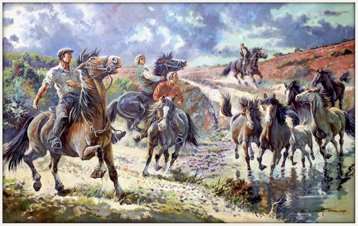
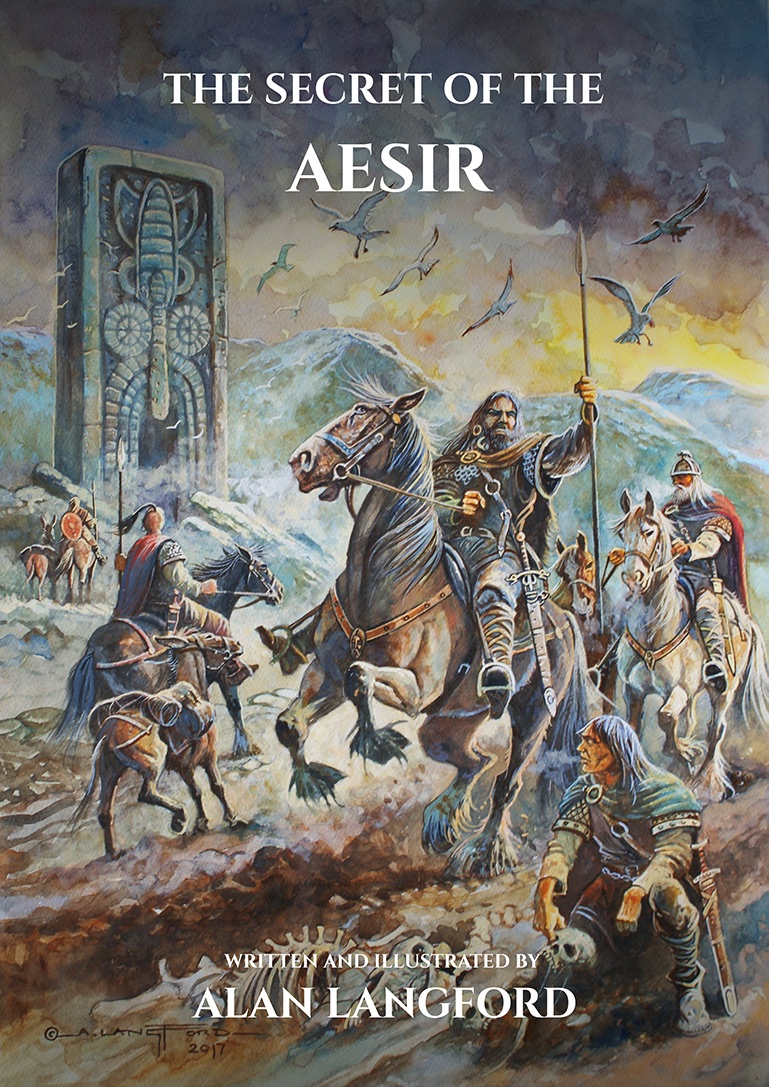
Alan’s website is well worth checking out for his watercolour, oil on canvas, and pen and ink work. It’s all stunning! There’s also a book available of his equestrian art. However, even more excitedly for comics fans Alan has produced his very own graphic novel, The Secret of the Aesir. Writing and illustrating it himself over three years, the 132-page book is set in the 8th century in the icy wastes of Scandinavia and tells the story of a long and arduous viking journey and the discovery of an ancient mystery.
I would just like to thank Alan for taking the time to chat with me about his time on Super Naturals, a time which unfortunately for us all was cut short but which still produced incredible artwork for a comic with much potential.

Thanks also to Brett Nutto of the Super Naturals Facebook group (of which I’m a member) for the images of the toys and holograms.

SUPER NATURALS MENU

RiNG RAiDERS LiCENSEE STYLE GUiDE: PART FiVE

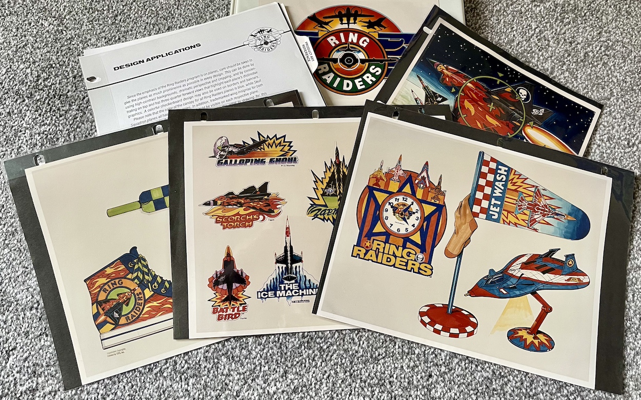
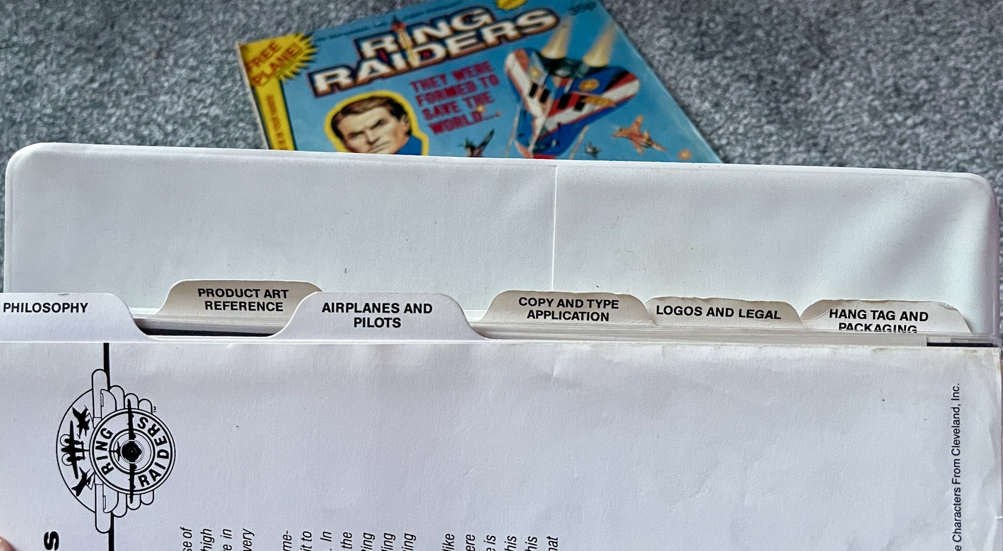
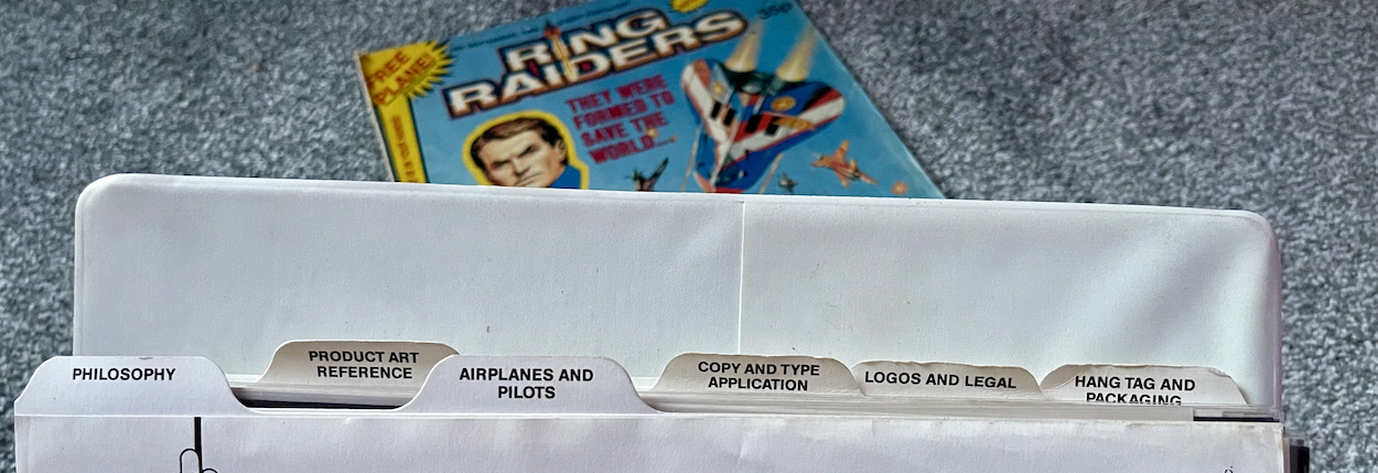
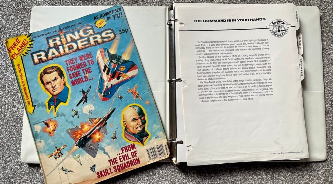
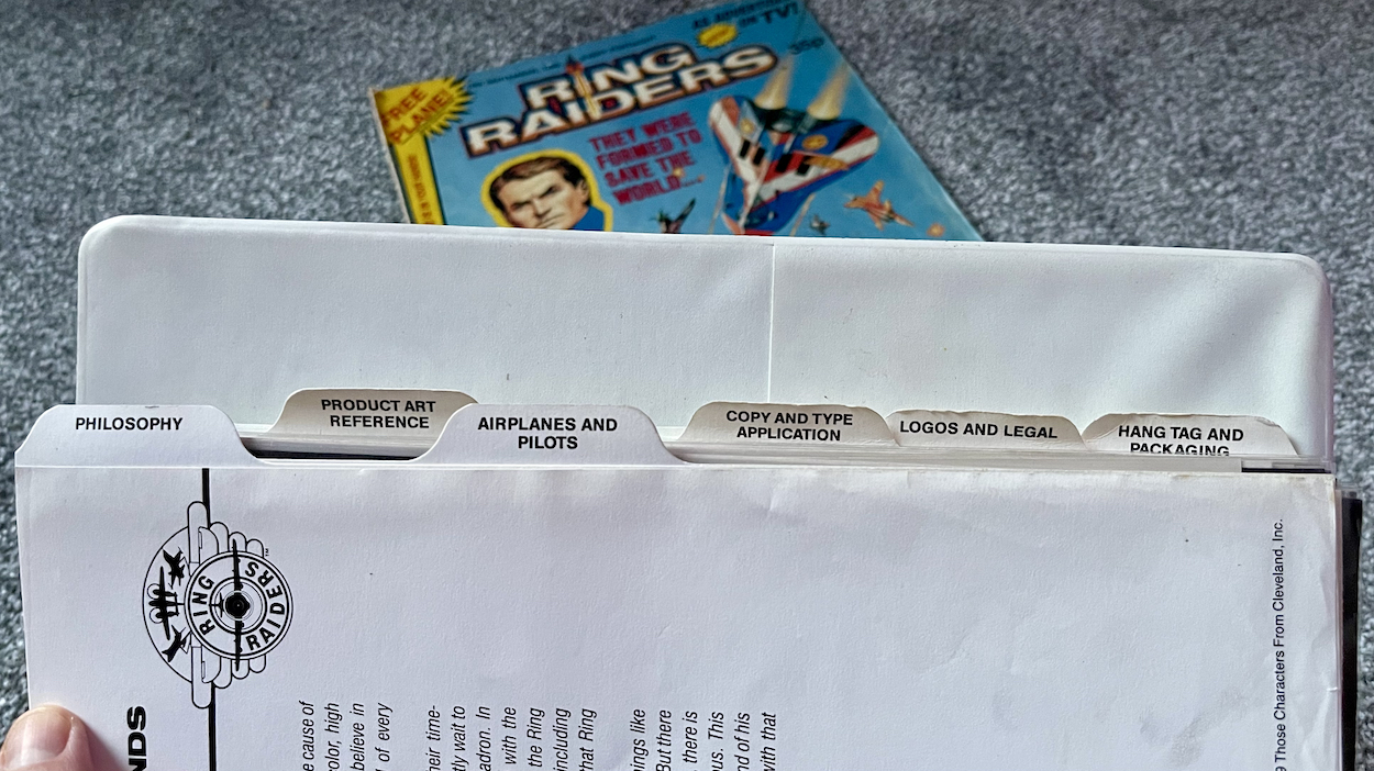
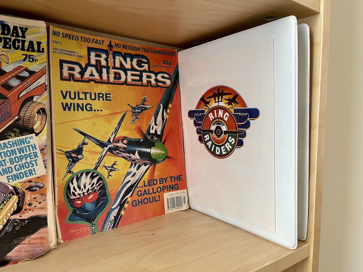
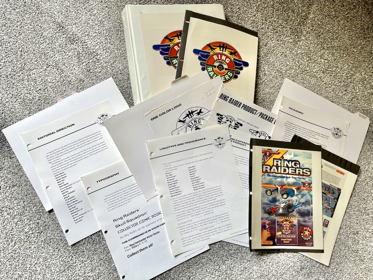
Here we are at the end of this monthly series already. It’s been really interesting looking at this Ring Raiders Style Guide sent out to all potential licensees by the copyright holders Those Characters From Cleveland (TCFC) back in 1989. Judging from the feedback I’ve been getting on socials it seems like you lot agree. The final 12 pages are all here and as you can see from the photo above they make for a meatier read this time around.

There are three sections to round off the folder and we start with ‘Copy and Type Application’, which amounts to two whole pages about fonts. Yes, really. It’s something I never really considered but now that I see all of these examples I can remember each and every one of them on the packaging (which you’ll see further below) and on the toy advertisements in the comic produced by the editorial team.

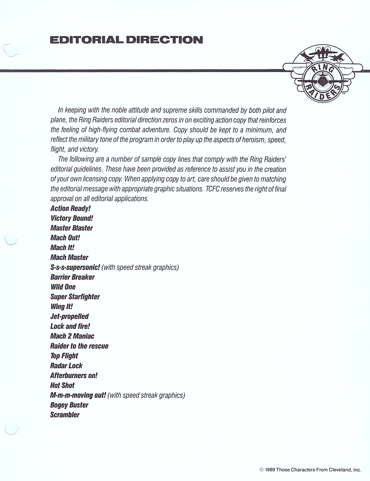
The page of suggested taglines sound like they’ve been written by committee. A committee who has no idea about aircraft. They’re cringe-worthy and thankfully weren’t used on the toys themselves or in the comic. You can also see all potential designs were subject to TCFC’s approval, however the comic’s editor Barrie Tomlinson said the people behind Ring Raiders were more open than most to what licensees could bring to the franchise, and they were very happy with what Barrie and his team were producing.

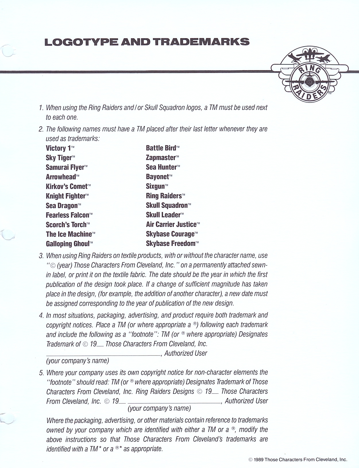
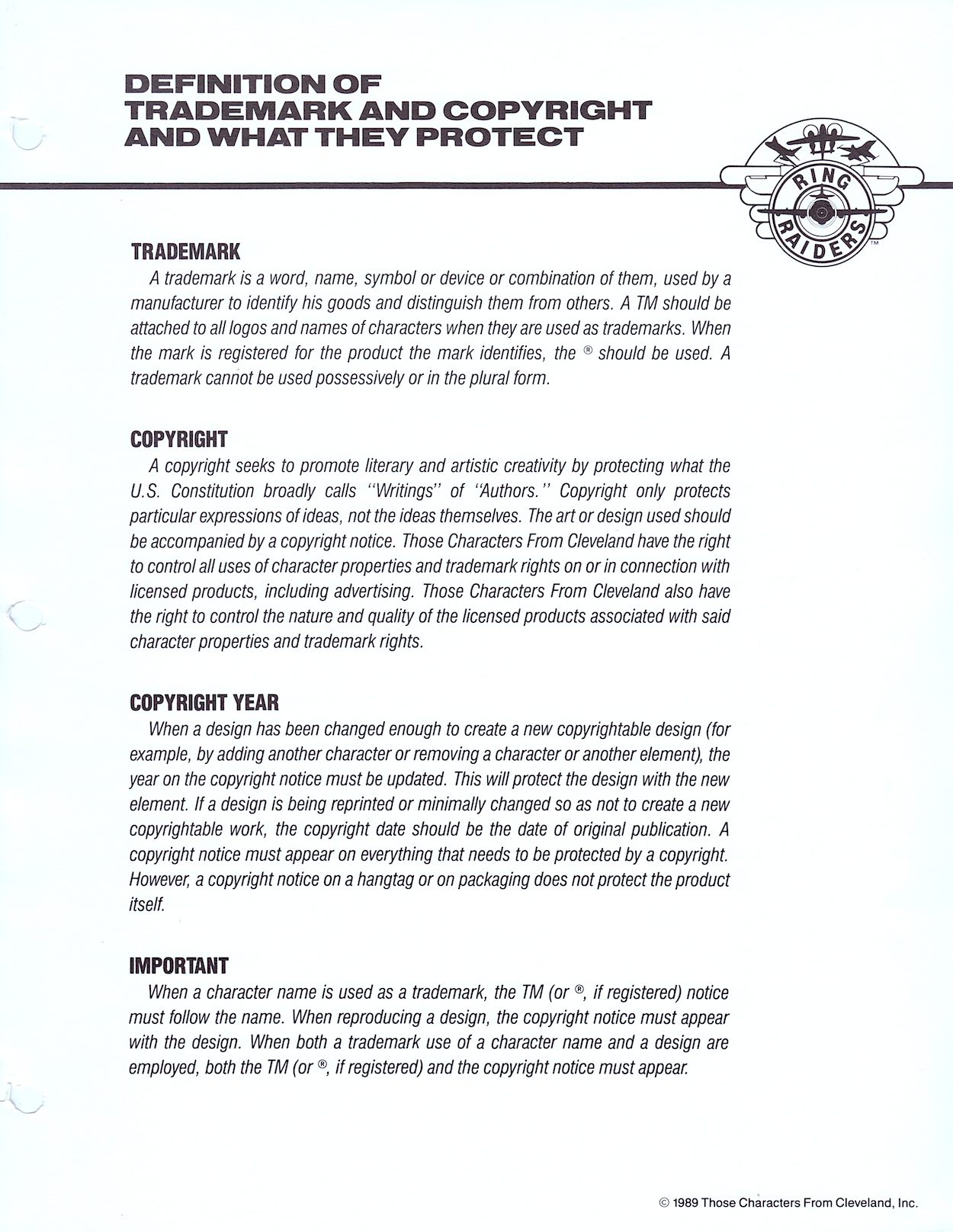
Logos and Legal’ is the next part of the binder and they’re a weird combination, like they’ve only been shoved into the same section because they start with the same letter. It kicks off with a lot of detail about how to use trademarked names and exactly how every piece of merchandise should be labelled appropriately. If you’ve ever wondered what the difference is between the ™ and the ® symbols you’ll find that answer here too.

Even textile manufacturers get their own paragraph detailing how their products should be labelled. This was most likely the same information found in similar style guides for all of TCFC’s (and other’s) ranges but it’s still an interesting read. You’d see these little footnotes in all of our licenced comics too and I always thought it was up to the publisher how they were worded, especially for their own trademarks, but it looks like that wasn’t the case and it was the licence-holder’s wording. Although, to be fair, it’s a pretty standard format.

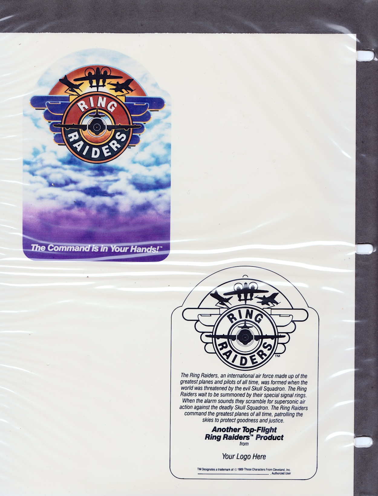
I simply loved the full colour Ring Raiders logo

Want to know the difference between a trademark and a copyright? Or why the year mentioned can sometimes change and sometimes remain the same? It’s all there for you. As most of my comics reading post-OiNK as a kid was based around licenced titles the nerd in me found this of particular interest. Then we move on to the second part of this alliterative section and the variations on the franchise’s logo that were permissible to use.

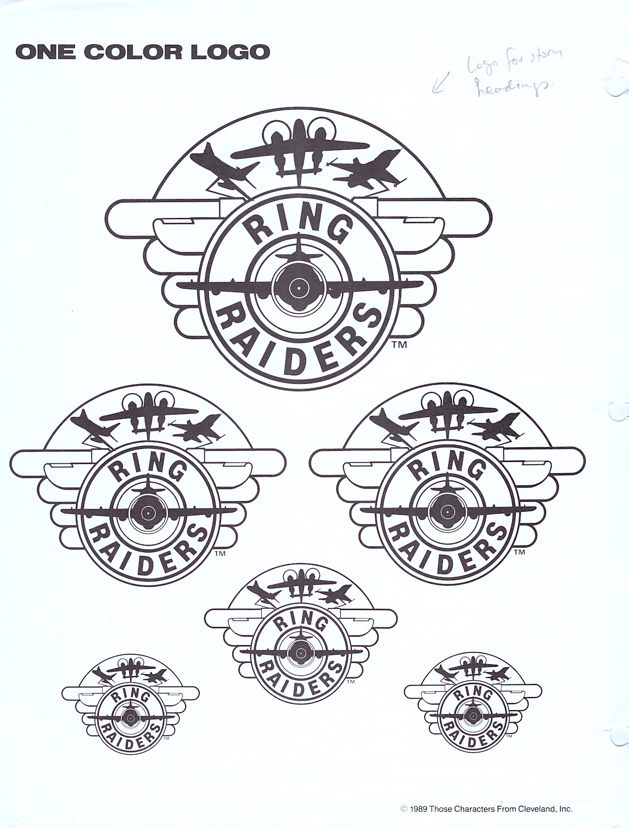
I thought the ‘Ring Raiders’ main title was a brilliant design and the accompanying logo the perfect embodiment of the toys. I simply loved the full colour Ring Raiders logo. I still feel the same, they’re just great designs! Below you’ll see the one-colour (that is, black and white) version of the logo, the same one in various sizes taking up a full page for some reason. You’ll see a handwritten note by Barrie too, highlighting how they’d use this particular version.

On the next page is a selection of variants for both the Ring Raiders and the Skull Squadron (quaintly described as “Good Guy / Bad Guy Logos”). The top two were used as the individual logos for each side on toy packaging and across any and all merchandise. The next row down are the in-universe logos used by the characters themselves on their planes, bases and uniforms.

The smaller, circular logos had specific uses in the toy range. The first two on each row were used on the tiny plastic rings we’d slip on our fingers, the planes attached via a thin, posable plastic rod. The star and skull circles were on the front of the rings while the ones with the lettering encircled the ball-shaped attachment on the top. The final one is exactly what it says, a miscellaneous combination of both to be used as they saw fit.

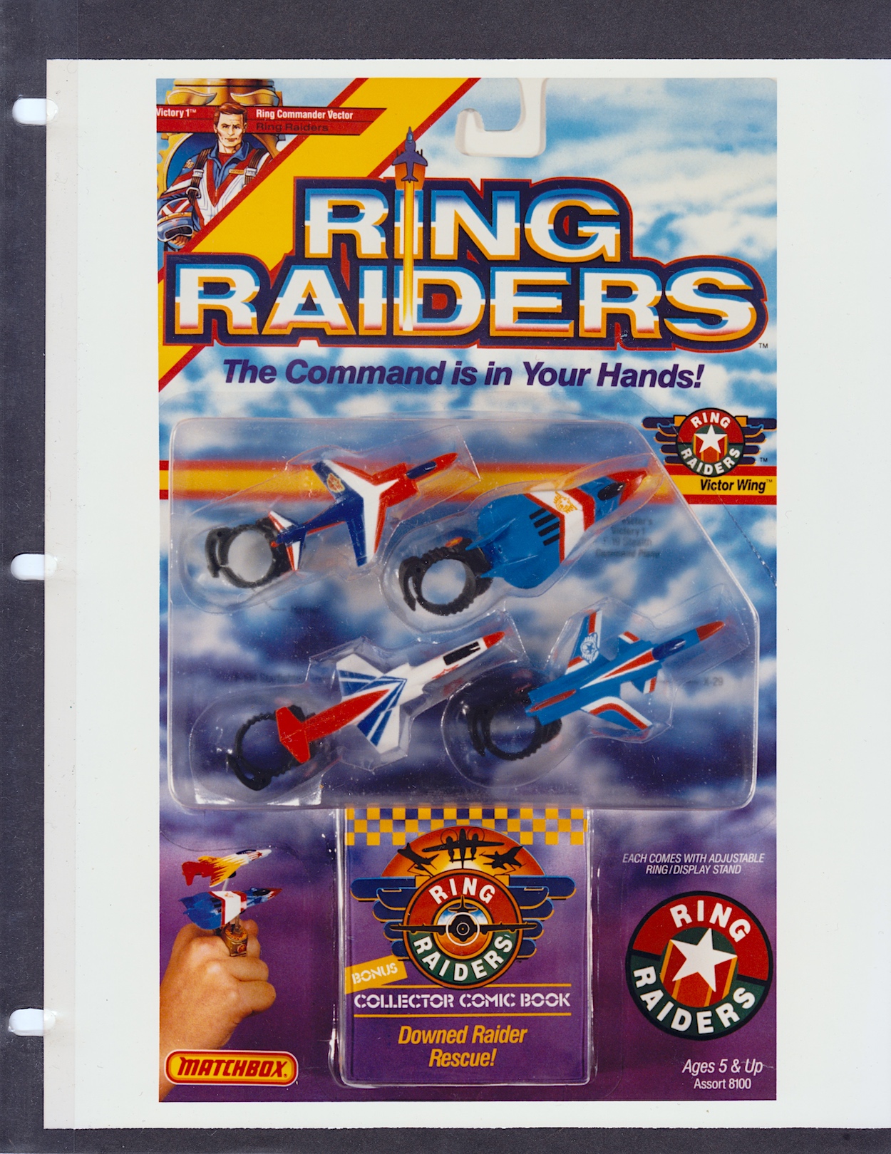
Anyone who collected these very collectible toys at the time should prepare to have their memory cells jolted as we move on to ‘Hang Tag and Packaging‘, namely the packaging used for the Matchbox toys themselves. First there’s more criteria, although these are more like suggestions and designers are encouraged to explore what might suit their product the best. These apply to all packaging, whether that’s by Matchbox or anyone else, right down to the sky background. There’s also mention of bold visuals such as colour bands trailing after the planes and you can see examples in the previous section’s merchandise concept drawings.

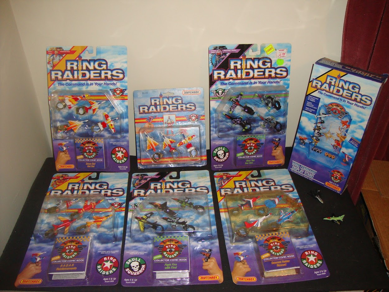
These card displays with the planes tucked away inside moulded clear plastic take me right back. From discovering my first two-plane starter set to excitedly collecting all the packs I could in every toy shop I visited, as well as receiving gifts during the festive season or from visiting family members from Scotland. I have a particularly fond memory of coming home from school to find my sister was visiting and I hadn’t been told, so it was a surprise. After a while she told me she’d brought me something and it was a huge eight-plane set featuring all the Wing Commanders.

I think back and my parents must’ve had to coordinate with my siblings and family friends because I never received any sets I already had (although there was some overlap in the range like those Wing Commanders planes, each of which would also be in their Wing sets). I’ve no idea how they managed that without me knowing. Anyway, yes, these photos are bringing all the smiles right now.

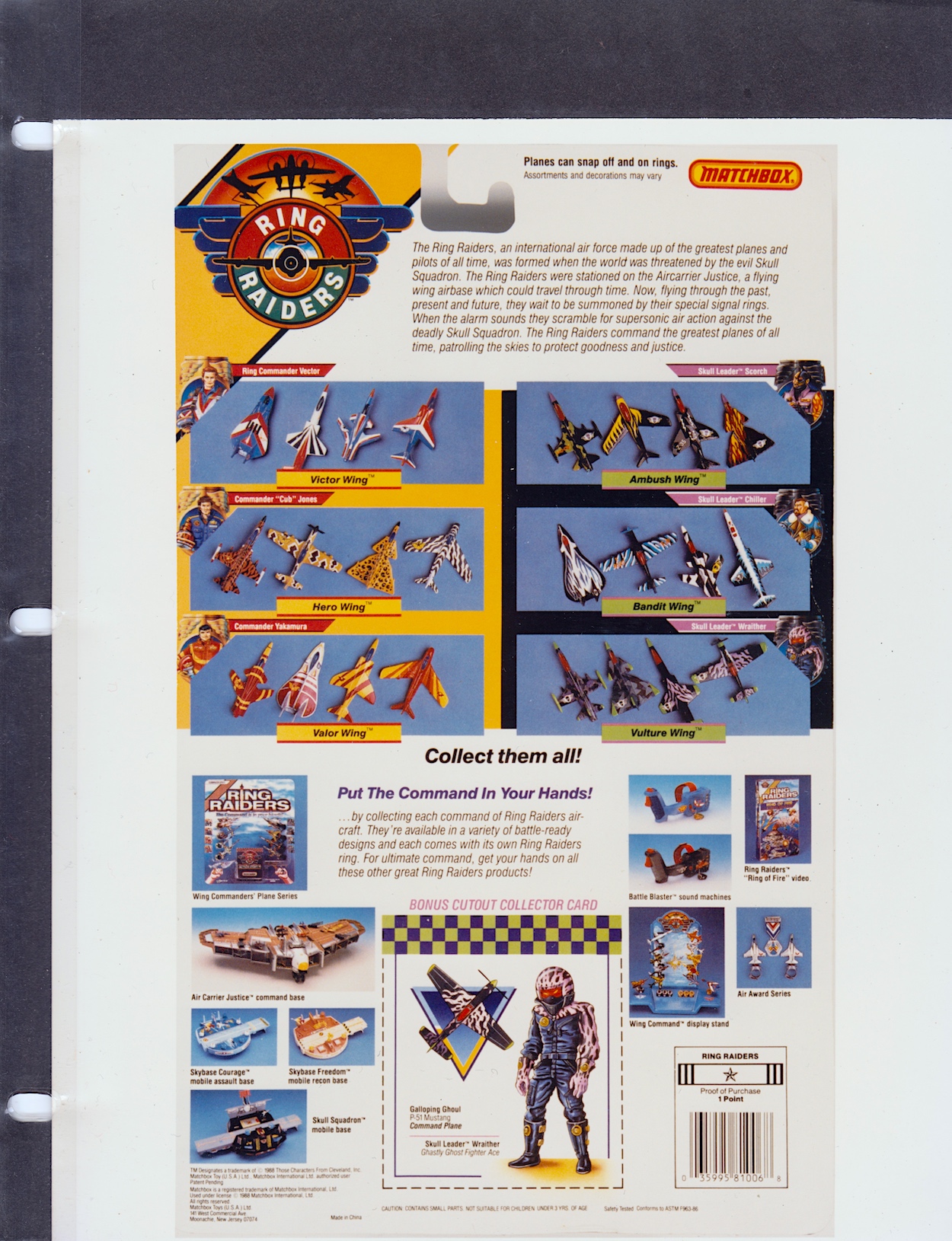
The rear of the packaging reveals more sets and a huge array of extras. As you know the franchise never took off, but over the course of a year (actually, mainly over the course of one summer and Christmas) I was able to collect everything here (plus most of the additional plane sets not shown here) except the gigantic Air Carrier Justice and the black version of the Battle Blaster. Ah, good times.

In case you’re wondering what we could redeem those barcode points for the answer is simple: nothing. It was possibly something for consideration at some future point but nothing ever came of them within the time the line lasted. According to online sources there were second and third series of planes, although I only ever remember seeing a second series the next summer which just made me more frustrated that the comic hadn’t lasted, because I thought the release of more toys meant they’d been a success.

Of course, with hindsight I know the second series would’ve already been in production before things fell apart. But I never did buy any more after that initial year and then in my later teens mine were handed down to a young nephew and subsequently destroyed through his playing. I kept the yellow and red X-29 as it was my first, and my favourite, but even this was given away to a girl in my late teens. (Hey, I was young and she’d taken a shine to it.)

Ring Raiders had that “gotta collect ‘em all” quality

After the hangtag (an example of what a product could hang from in a store) things are rounded off with a large scale image of that beautiful, full-colour logo. It’s the same page that’s been slipped inside the front of the folder which I’ve shown in a few photographs, but I’m including a proper scan of it to end on as requested by blog reader Terry in their comment under part three of this series. You’re right Terry, it is sweet!

With that the folder is finally closed and placed back on the shelf alongside what was, and still is, my favourite non-OiNK childhood comic. The toy line may have only lasted about a year and I was quick to move on to my next obsession, I’m sure, but what an obsession these were. I come away from this series of posts with one key takeaway; the Ring Raiders were robbed of being a hit franchise.

Before Pokémon, the Ring Raiders had that “gotta collect ‘em all” quality. They were great toys, the comic had great characters and action, there was variety and adventure and a ton of fun in all aspects of the franchise and it had more potential than most others in my opinion. They have a special place in my heart all these years later and, dare I say it, I don’t think I’m finished with them yet.

Once again, thanks to former IPC/Fleetway editor/writer Barrie Tomlinson and his writer son James for kindly sending me this folder in the first place.

BACK TO PART FOUR

LiCENSEE FOLDER MENU

RiNG RAiDERS MENU

RiNG RAiDERS LiCENSEE STYLE GUiDE: PART FOUR

Have you ever found out something about your childhood many years later and wondered how you never noticed even though it was so glaringly obvious? In the case of this blog it could be how I never clicked that the TV show Round the Bend was created by OiNK’s editors! As for the Ring Raiders it’s something small but even more obvious, the colour of the canopies on all of those planes I collected.

Welcome to the fourth part of my look at every single page of the Ring Raiders Style Guide sent out to licensees in 1989. We’ve covered the introductions and details of the range, the characters and their all-important aircraft and now we move on to the Product Art Reference section. Here, Those Characters From Cleveland (TCFC) described how they expected their creations to be shown and a concept artist drew up some fun merchandise ideas, making this my favourite part of the whole folder.

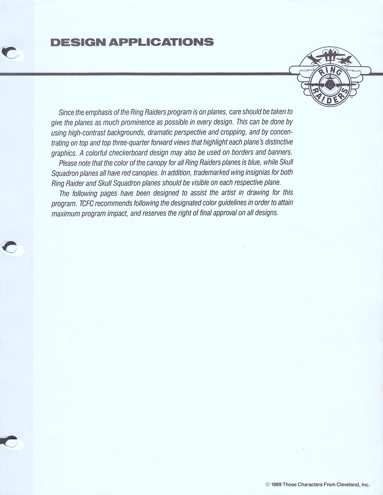
The introduction reminds licensees the planes are the focus, which is an obvious point since it’s all based around those superb Matchbox toys. Of course, Barrie Tomlinson’s comic understood the significance of focusing on and developing the characters in order to tell good stories with those planes. Coming to this as a fan of the comic I initially found it strange how they were trying to tell artists specific ways to draw their creations, but of course this wasn’t aimed at dynamic comic strips. Instead, this was for those making other merchandise based solely on static representations of the aircraft.

In fact, when I spoke to Barrie about the Ring Raiders comic he told me how some licence holders didn’t understand the medium and would analyse every single frame as if it were an individual image instead of a sequential piece of art. Thankfully TCFC were apparently much more knowledgeable about comics. This page mentions my point about the canopies, how the Ring Raiders all had blue canopies and the Skull Squadron‘s were all red. A quick glance on eBay proves this point and I’ve no idea how I didn’t notice that pattern as a kid!

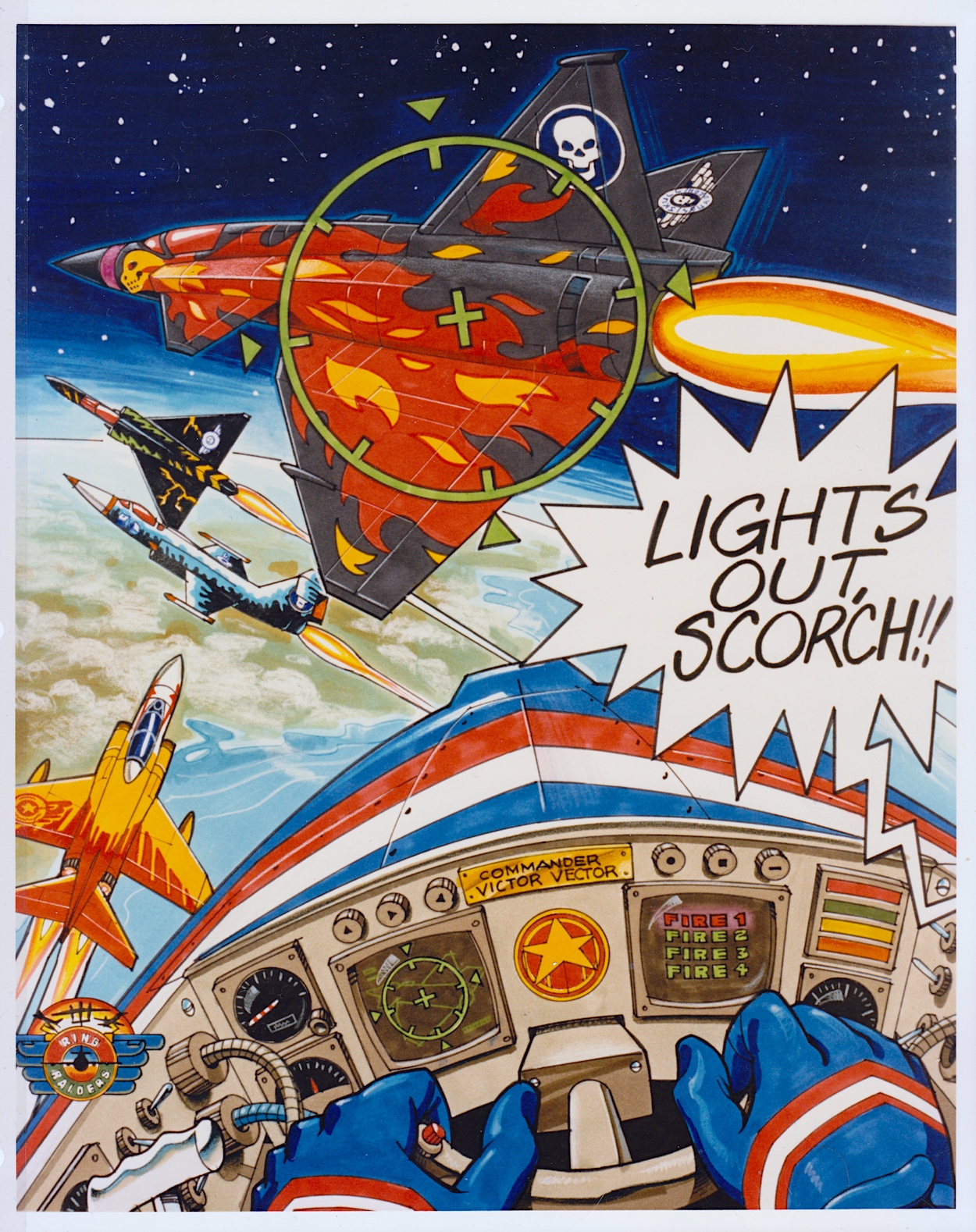
This full-page piece shows how some of the aerial action could be portrayed and I think it’s a great scene! It’d certainly make for an awesome poster if it was blown up a lot larger. I particularly like the lighting on Scorch’s Torch and seeing inside Vector’s cockpit. In fact, it’s only upon seeing this that I realised the airplane controls weren’t something we really saw in the comic, apart from the sci-fi element of the rings. Yes, I just love this and it’s a shame we don’t know who drew it.

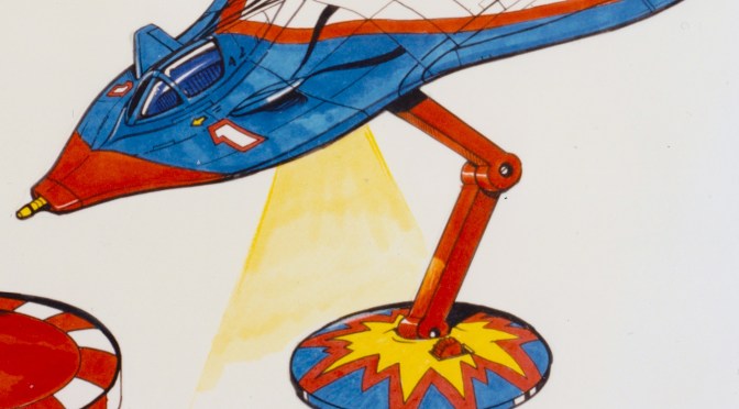
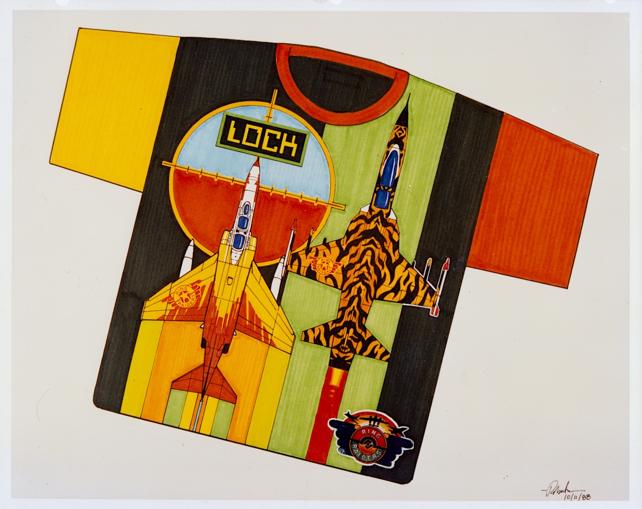
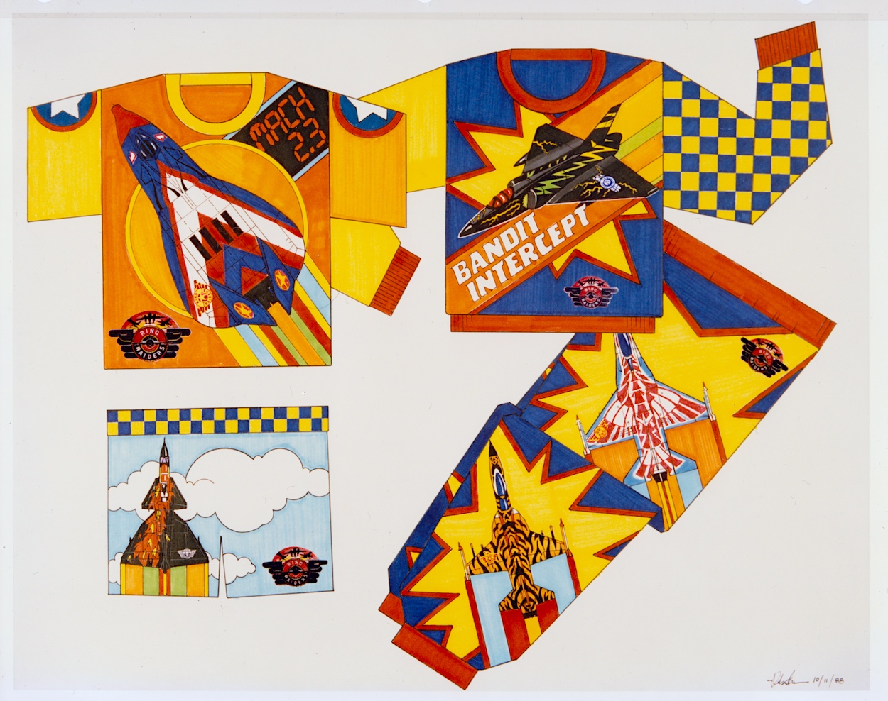
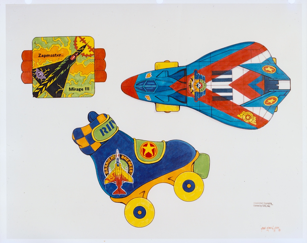
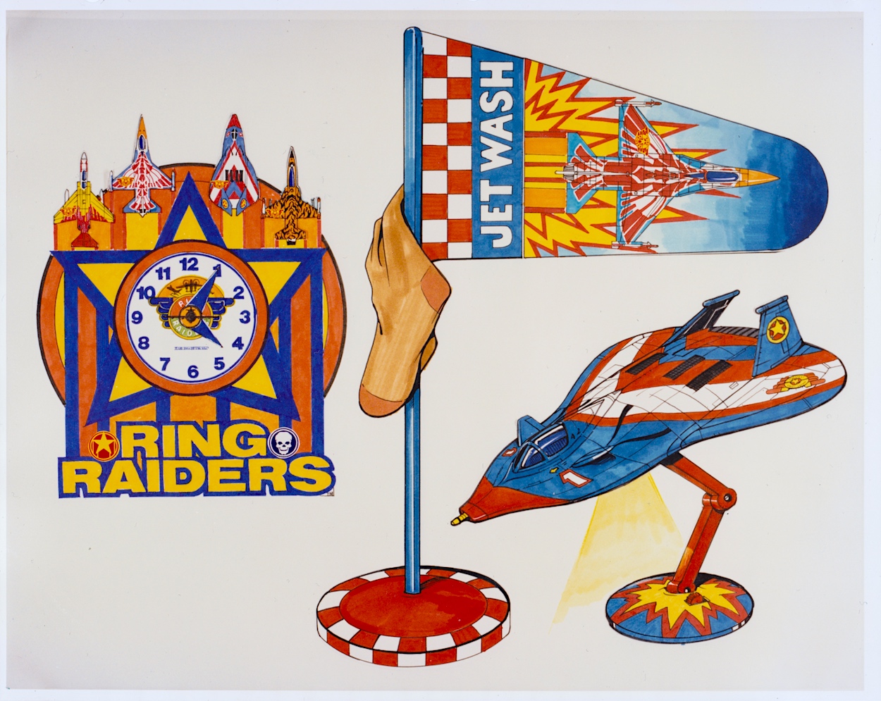
The next five pages are my favourites because they give me an insight into all of the cool (and not so cool) things I no doubt would’ve wanted to adorn my bedroom (and my body) with if the franchise had taken off. These weren’t officially released, TCFC used these to promote possible ideas to companies as a way of convincing them to work on the franchise. Unfortunately I don’t know the artist whose signature is on these pages. Hopefully I’ll be able to find out in the future.

In the introduction to this section colourful checkerboards were mentioned as a way to add borders and banners where needed and the artist shows how these could work on some particularly gaudy clothing. Hey, it was the late 80s and in their own way Ring Raiders may have been ahead of their time as we slid into the 1990s. I mean, have you seen the fashions of that latter decade? We even wore shell suits for goodness sake!

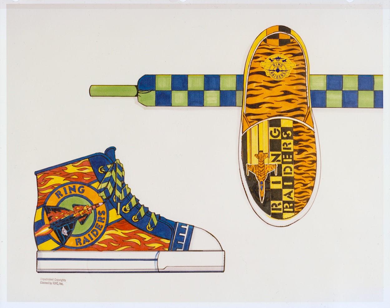
I started secondary school in the autumn of 1989, the year of the range’s launch, so I doubt any of these clothes would’ve been aimed at my age range. I also doubt any of my friends would’ve let me forget if I’d turned up wearing any of them. However, given how retro inspired clothes are all the rage today, and it seems the more colourful trainers are the better, I think one of the items below might still sell to a select audience.

Okay, so those who are still fans of the Ring Raiders may make for a rather niche market but when you look at some of the celebrity ranges or those based on other retro franchises they don’t look too out of place. The slippers and their tiger design (to match that of “Cub” JonesF-5) might also work without that green and blue strap; I certainly know a friend who loves animal print, although the plane might put her off!

On the final page of wearables, is there anything more 80s than roller-skates and sweat bands? Initially I thought the top-down view of the Victory 1 F-19 Stealth Fighter was a more custom skate, but when I couldn’t figure out where you’d put your foot in I clicked it’s actually one of those novelty skateboards that were so popular back then. As a kid I wasn’t really into sports so these wouldn’t have been on my Christmas list, but that’s certainly not the case with the items on the next page.

How much do I want that lamp even now as an adult? I remember cutting out the main title logos from my toy packaging and sticking them all over my room alongside the posters from the comic, I even had a large one on the door to my room instead of the usual name plate. I was crying out for more official merchandise to be released. As such, that clock would have looked good on my wall and I think modelling a laundry basket on an airfield’s windsock is ingenious. It may even have helped keep my room tidy!

While these are just a way of throwing out ideas for licensees to work from, I think they’re great fun. In the Ring Raiders: In Real Time introductory post you can see some of the official merchandise that was released at the time and you’ll see that checkerboard pattern plenty too. Also in that post is a photo of a mocked up child’s bedroom where everything seems to have the branding of the range. It’s a somewhat ambitious photo on the part of TCFC but you have to aim high, right? Plus (again) it was the 80s! This was the way of things.

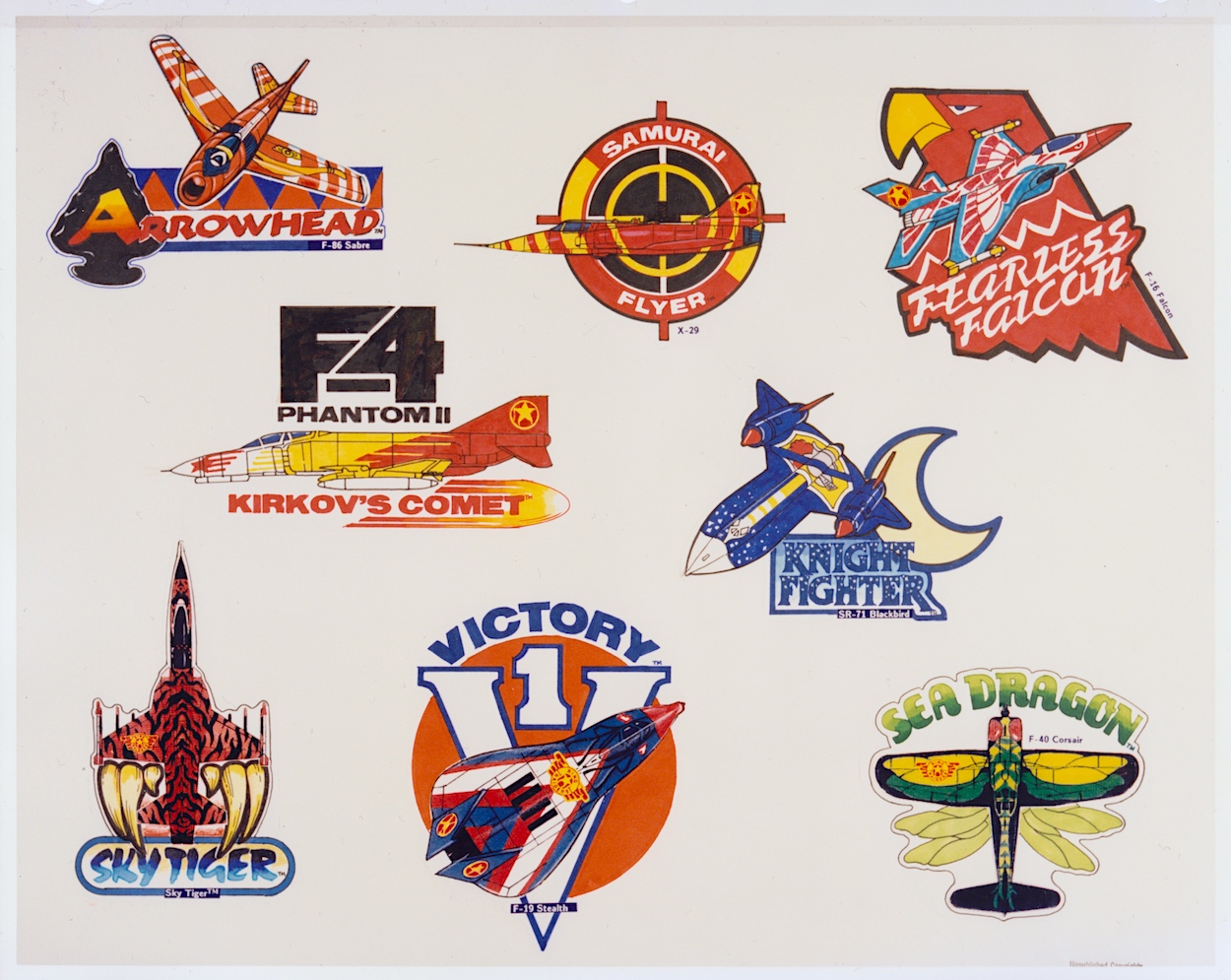
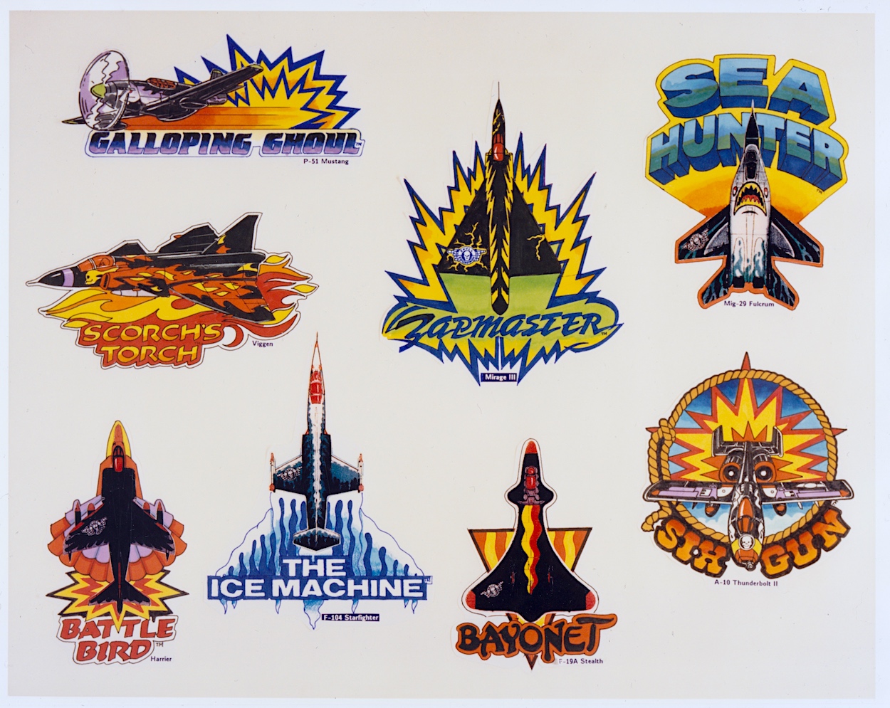
These two pages round off this section of the folder and show the great idea of having different emblems for each of the leader craft. I never saw these on any of the toy packaging or in the comic so I’m assuming they never ended up as an official part of the branding. While each Commander’s aircraft was accompanied by three other planes in a pack, I like the idea of the lead planes being promoted this way.

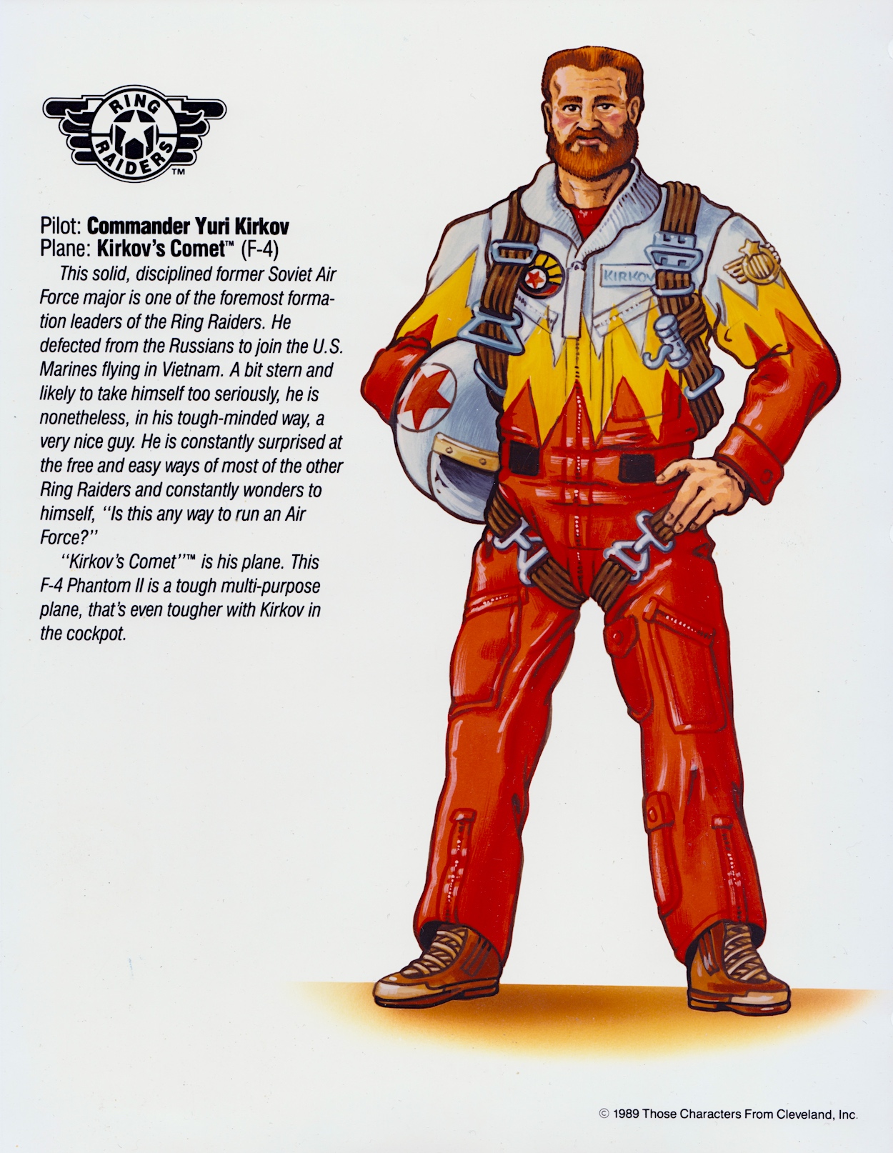
I can imagine some of these being turned into badges or, to be really 80s/90s they could’ve been material patches to be sown on to denim jeans and jackets. I particularly like the ones for the Galloping Ghoul P-51 Mustang (a favourite from the toy range), Kirkov’s Comet F4 Phantom II and the Sky Tiger. This whole section sums up the fun manufacturers and us kids could’ve had with the Ring Raiders as the next big craze of childhood.

Where has the time gone? We’ve only got one more part of this monthly series to go. The final few pages deal with more serious stuff like trademarks and the legal side of things, as well as approved logo variations, typography and some samples of the packaging that would be adorning toy stores around the country and the wider world. So make sure you fly back here on Monday 13th May 2024 for the final landing.

PART THREE < > PART FiVE

LiCENSEE FOLDER MENU

RiNG RAiDERS MENU

RiNG RAiDERS LiCENSEE STYLE GUiDE: PART THREE

We reach the halfway point of this five-part series of posts detailing every single page of the Ring Raiders licensee folder, a style guide for the whole franchise. The introductions are out of the way, you should all be up to speed with the intentions behind this new toy range and familiar with the background story and all of its far-reaching potential, and last month we saw the leaders of the eight Ring Raiders Wings and their respective high-tech airplanes.

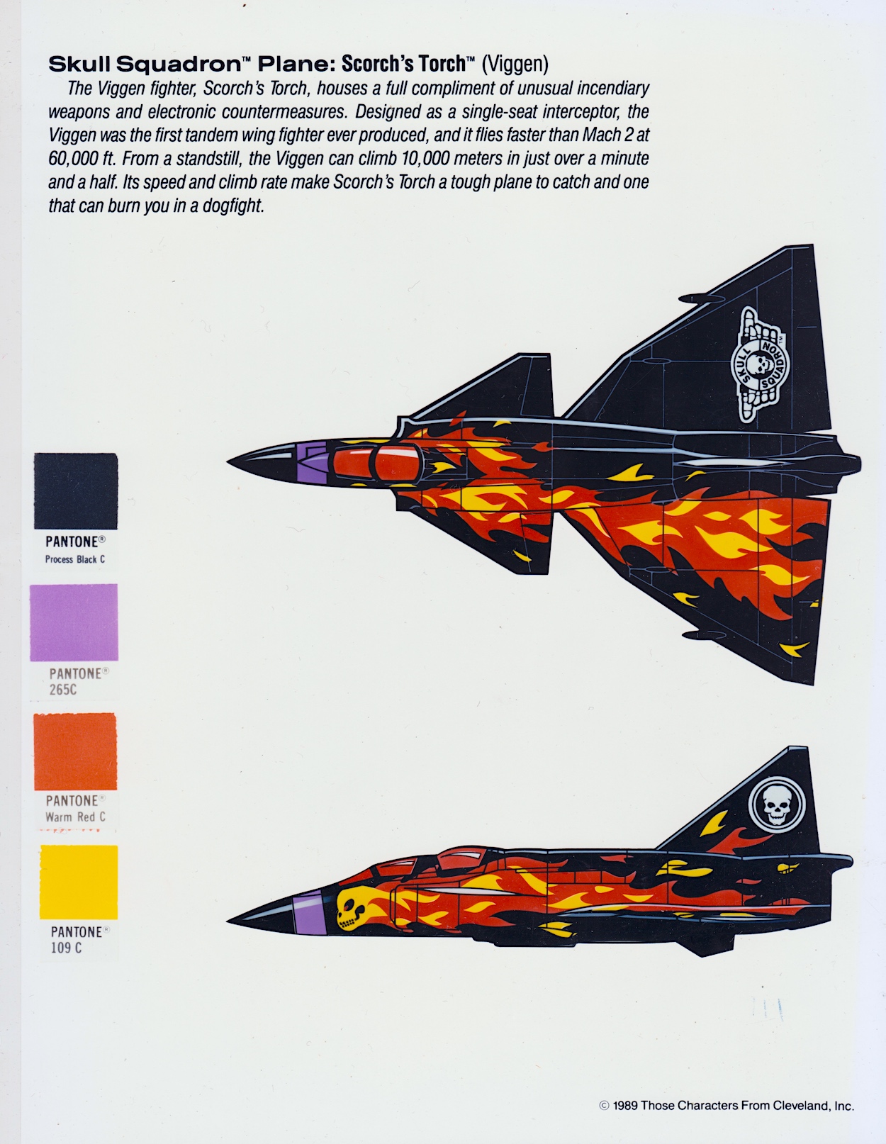
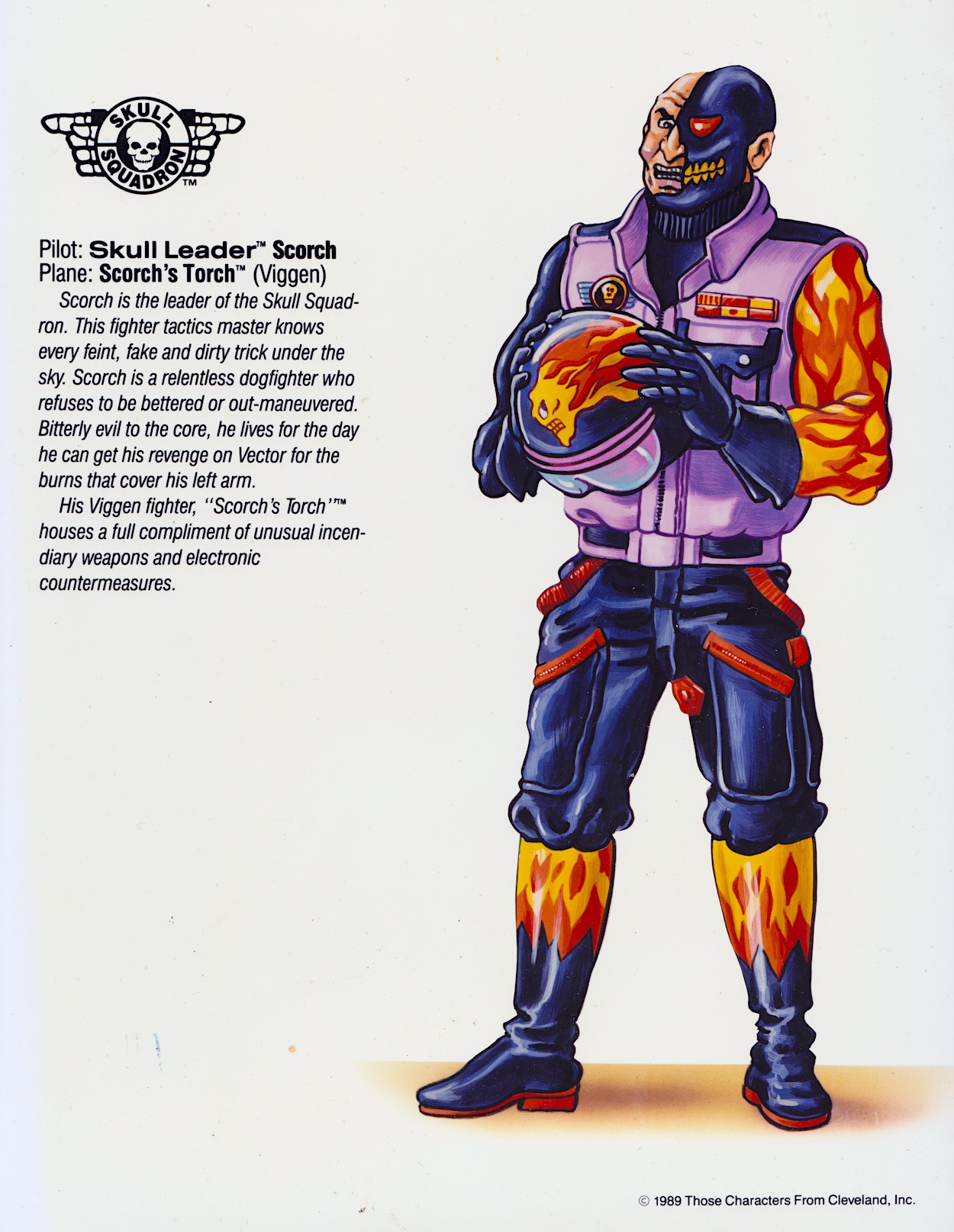
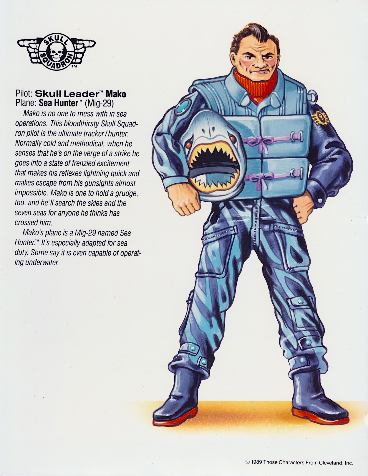
Now it’s time for the flip side of the coin, it’s time to meet the baddies. In the story the Skull Squadron formed first, the Raiders doing so in response to the threat posed throughout all of time by this army of evil. They were led by Scorch and interestingly we find out that severe burns cover his arm but I’m assuming what we see here is part of his flight suit. I assume they also cover at least part of the same side of his face under that mask, mirrored by the flame design being on one side of his aircraft.

So these injuries must’ve happened after the Raiders were formed, or perhaps he and Victor Vector were enemies (or even friends?) in their previous lives. Unfortunately the comic didn’t last long enough for us to get any more depth to this origin story, in fact this is the only time I’ve seen it mentioned. Some interesting details about his Viggen Scorch’s Torch too, such as the real plane being the first to ever include two sets of wings.

More consistently successful in his evil plans than the Decepticon, Chiller was everything Starscream wished he was

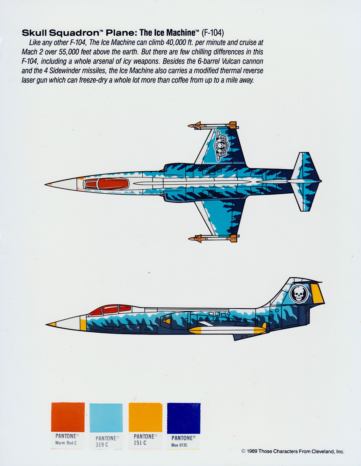
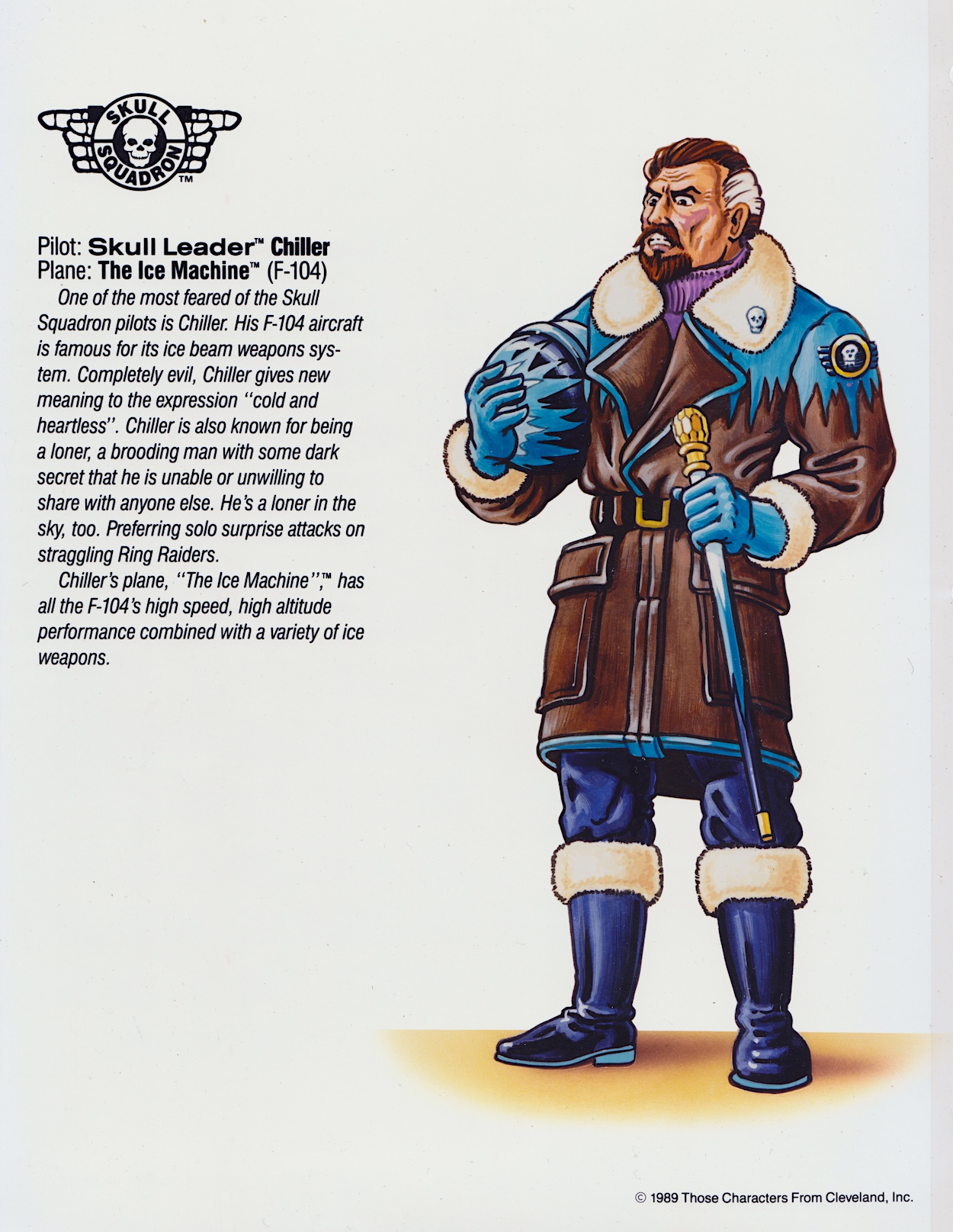
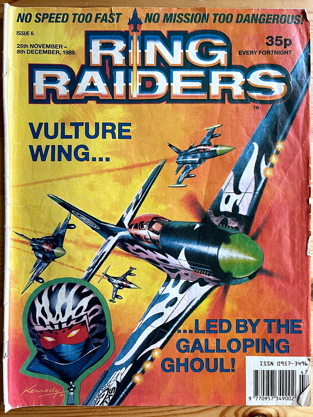
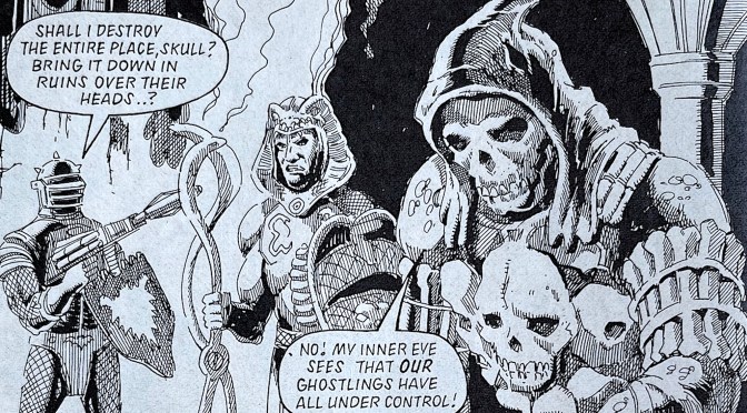
Alongside Scorch is his own version of Starscream, in a way. Although much more consistently successful in his evil plans than the Decepticon, Chiller was everything Starscream wished he was as a second-in-command. He also had some particularly brutal moments in the comic, particularly in his origin story. Was this the secret mentioned here? His plane was a favourite too, but I think that was probably because I loved the character in the comic so much. His F-104 Ice Machine also made for a fantastic Ian Kennedy cover to the Ring Raiders Special.

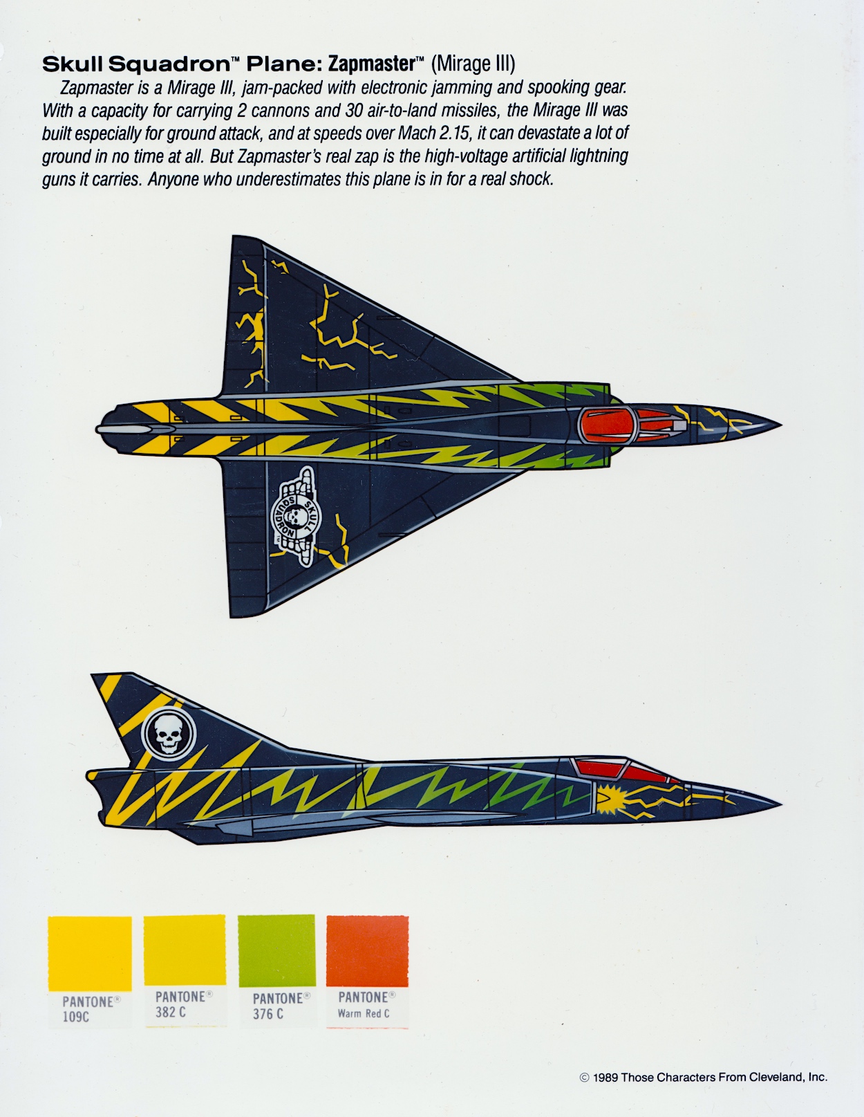
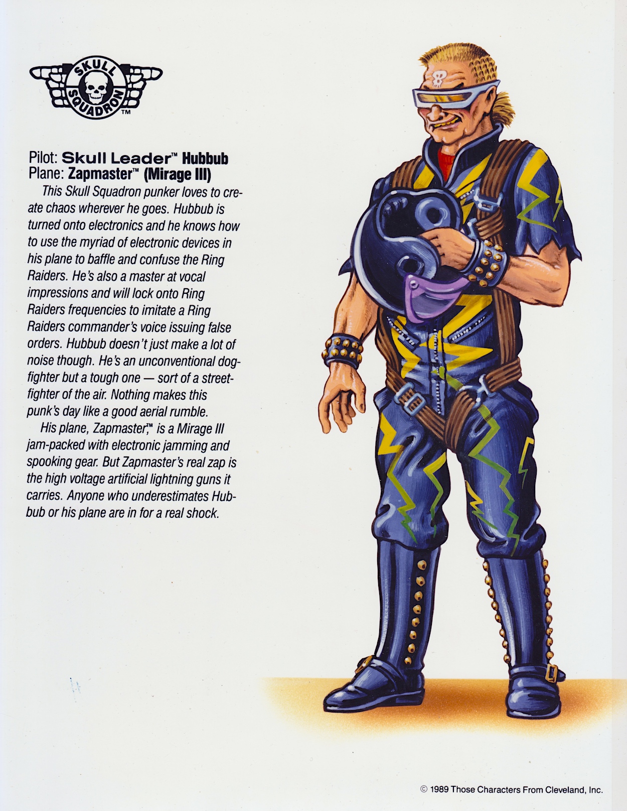
Hubbub and his Mirage III Zapmaster had starring roles in one of the first serials in the comic and while I wasn’t a fan of the handful of cartoon episodes released I do remember his character making me laugh upon occasion, his outspoken nature producing some awkward moments in the Skulls’ HQ. In the comic he’s just as chaotic as his profile makes him out to be.

Both Hubbub and Mako are perfect examples of what the comic did so well. Unlike the cartoon which (arrogantly, in my opinion) made up their own versions of these characters, comic editor Barrie Tomlinson and his team never contradicted what was set up by the original creators. They embellished, they added more depth, they developed their personas, but they clearly began with what was already established in the toys.

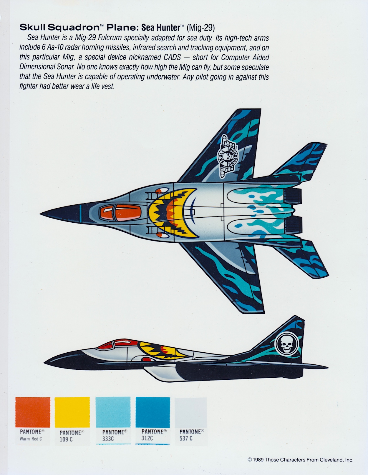
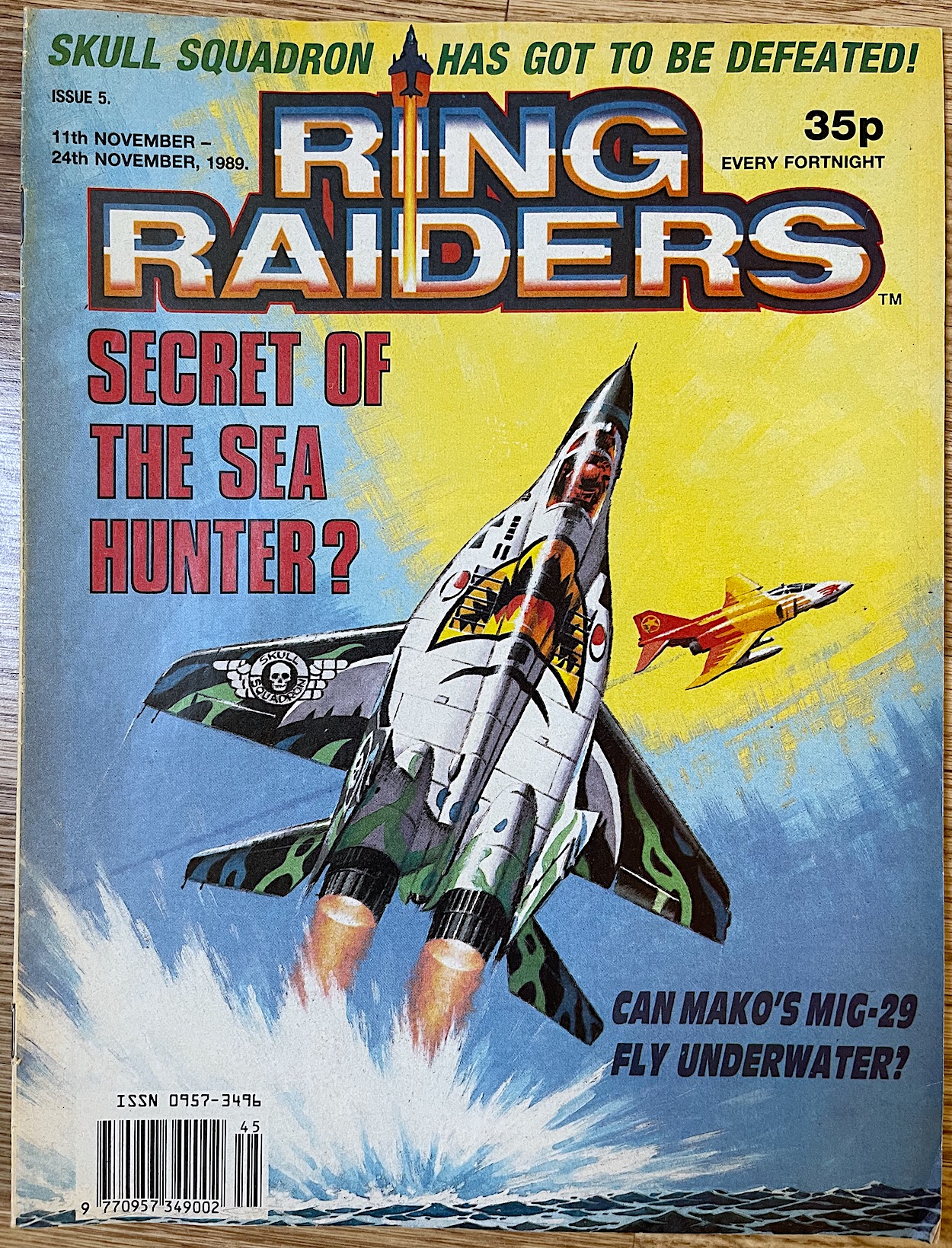
We never did get to see the chaos Hubbub’s impressions could’ve caused, but readers were treated to the Mig-29 Sea Hunter’s underwater capabilities, even if it was still a mystery to the Ring Raiders themselves. As a child a certain image of this was a particularly strong one, resulting in that poor toy being dunked in many a bath or bowl. The CADS system mentioned is also based on a real life radar system which was brand new and partially still in development at the time.

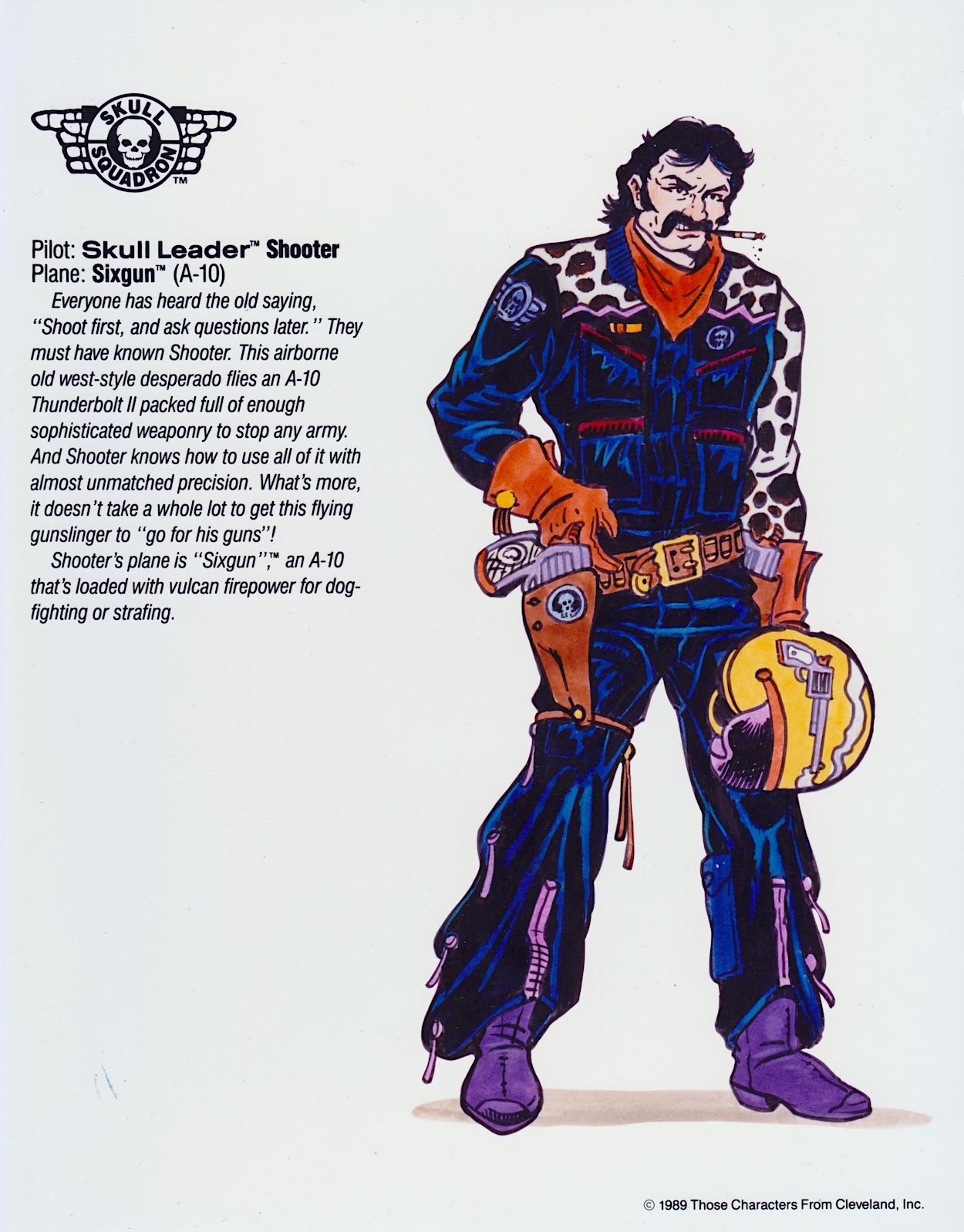
The first of two characters who never made it into the toy line is up next.

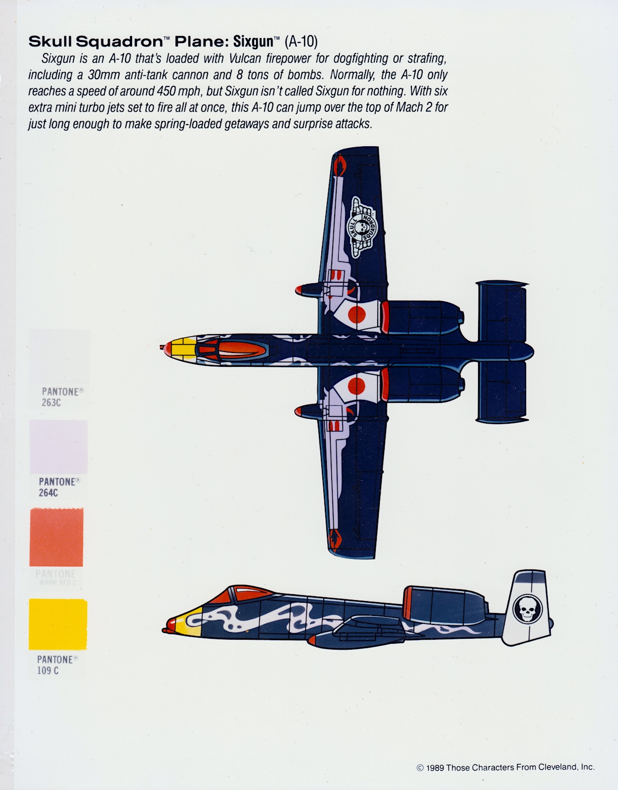
I know we’ve had some clichéd characters in this folder already but Shooter surely takes the medal. I doubt even the excellent comic team would’ve been able to save this one. The only saving grace for him is his plane. The A-10 featured in some of the other Wings throughout the toy range but this particular one, with its Airwolf-like boosters and fun gun design on the wings could’ve been a favourite if it’d actually been made by Matchbox.

Blackjack was a vicious character superbly written by Angus Allan in the comic

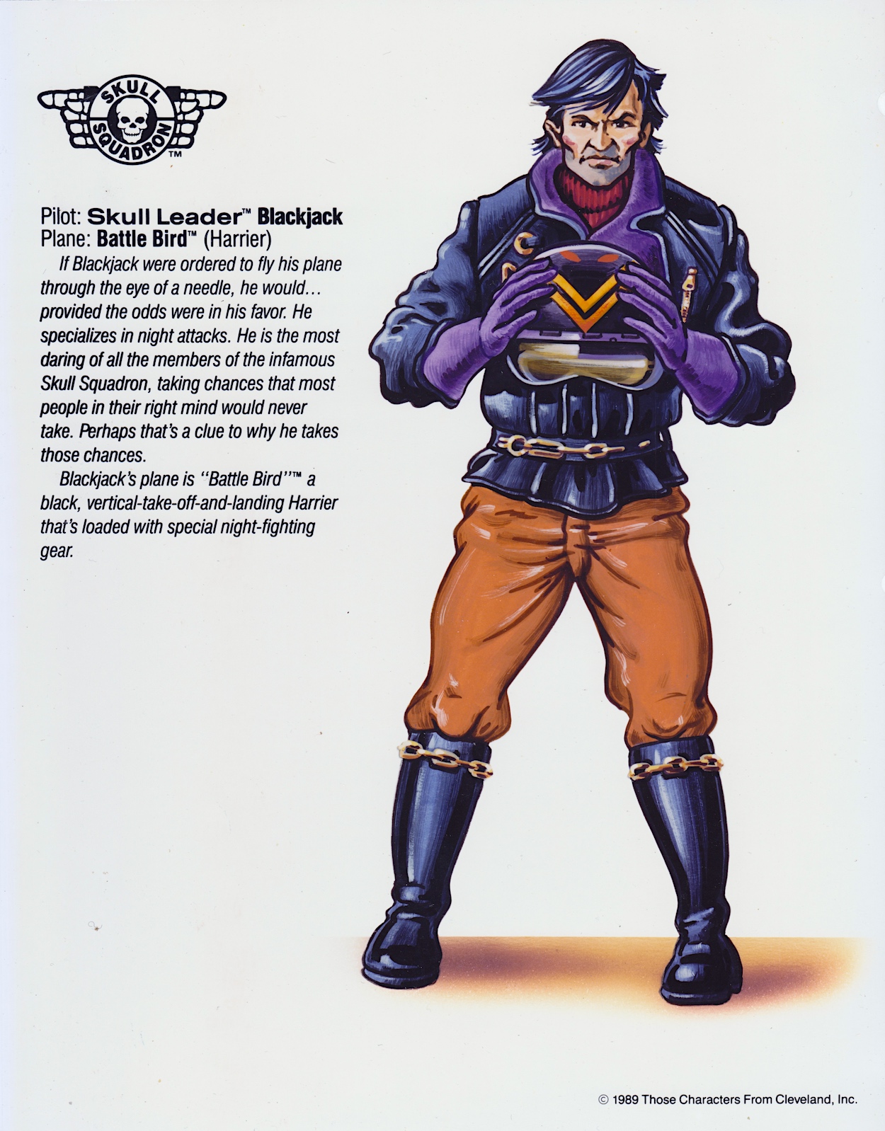
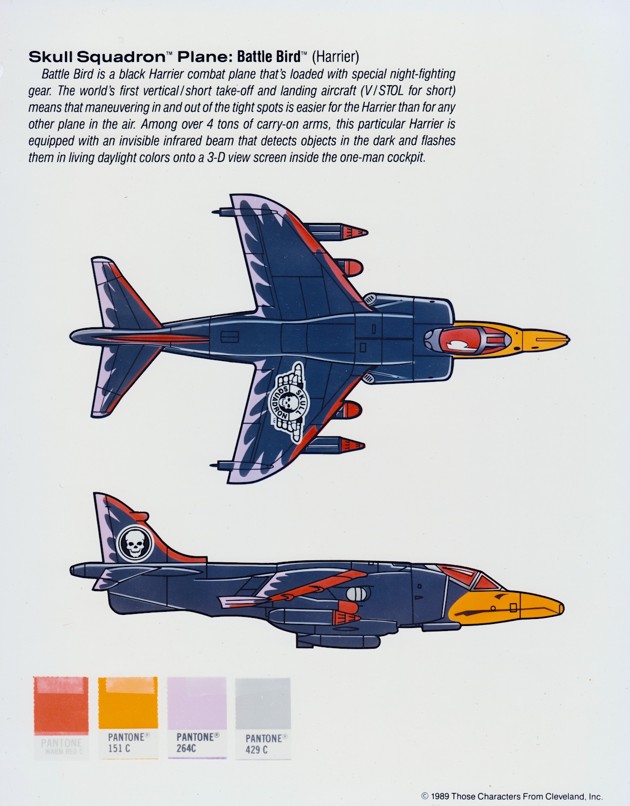
Someone who’s plane I definitely owned was Blackjack, his Harrier’s vertical take off and landing wowing me from the first moment I saw one in Bond movie The Living Daylights a year or so before Ring Raiders. After that I made sure to add his Wing quickly to my collection once I began buying them. Blackjack was a vicious character superbly written by Angus Allan in the comic’s epic 11-part Trackdown story, the character quickly becoming a favourite too.

Interestingly, the Battle Bird‘s fact-file is all about its nighttime capabilities but in the comic the main attribute that set it apart from other military Harriers was Blackjack’s ability to fly it remotely. There’s no mention of that here, not until we turn the page to the last of our characters who never appeared in the toy line (or the comic).

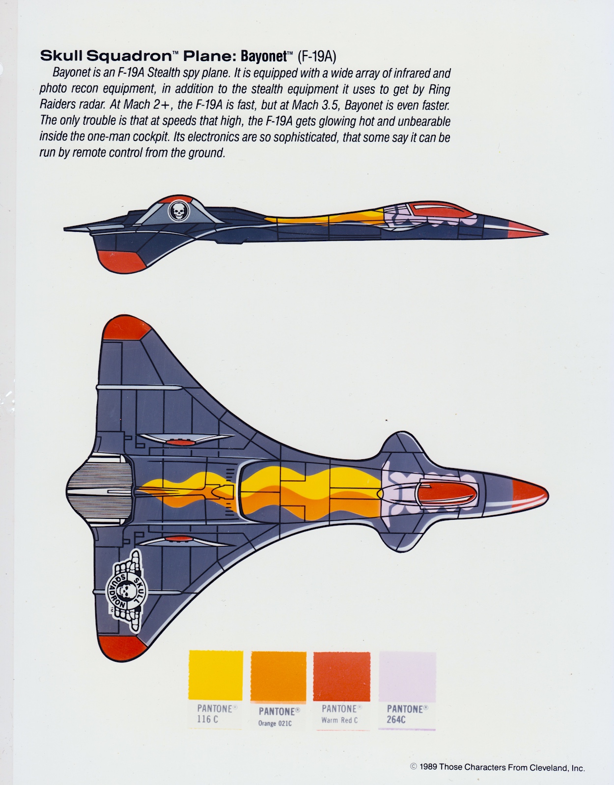
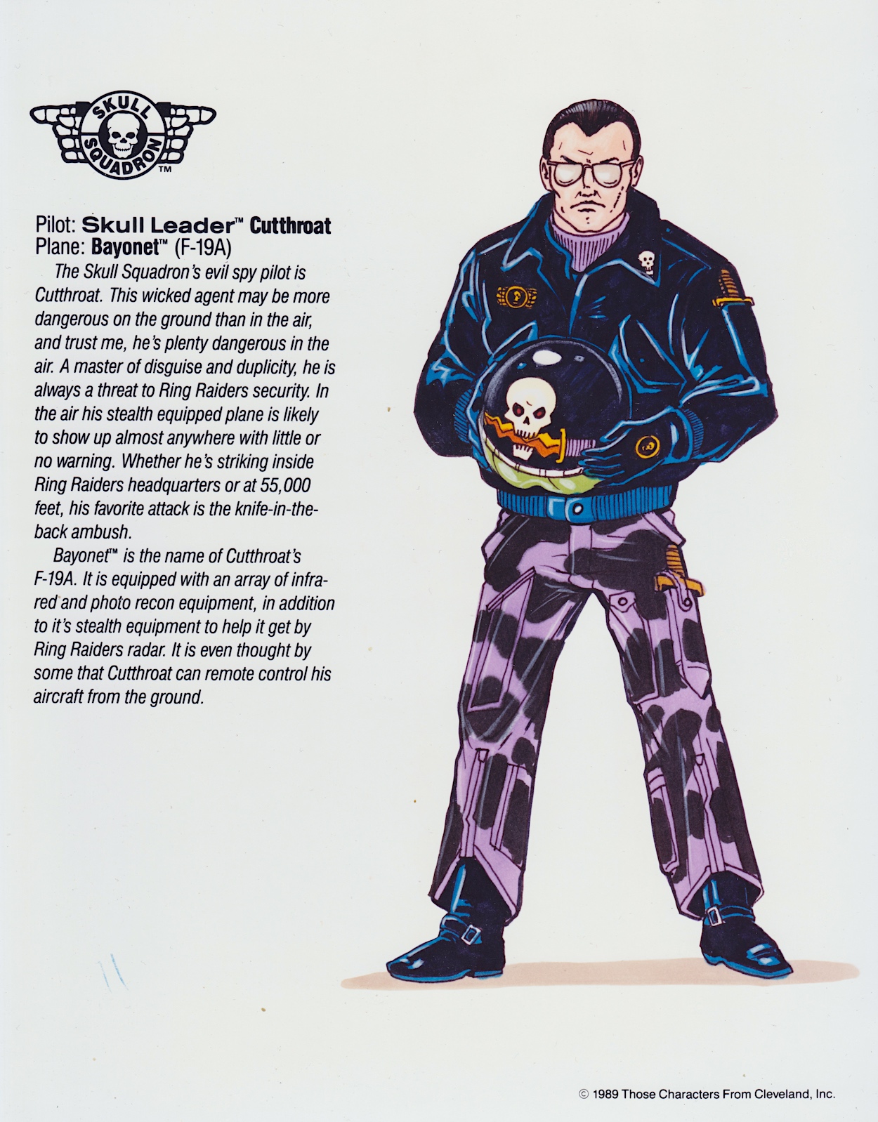
As you can see Cutthroat’s unbelievably fast F-19A Bayonet can be controlled remotely and actually has a reason as to why this was installed. Two reasons if you count the fact that the pilot is a spy and described as even more deadly on the ground. (Imagine an evil spy with that as their key gadget!) I made a point above that the comic kept to the details here and elaborated on them. Could this have been an error then, attributing an ability of one aircraft to another? It didn’t matter, as kids none of us knew anything about the Bayonet or Cutthroat.

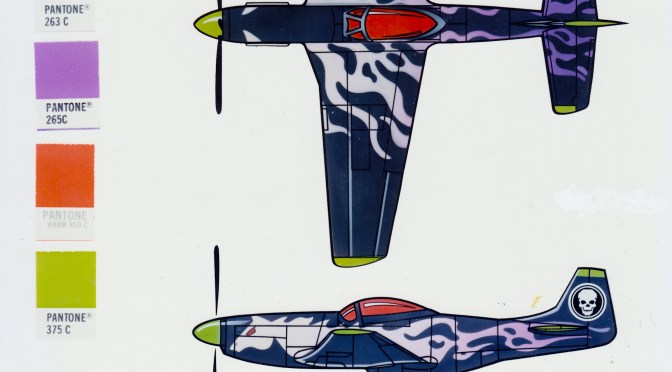
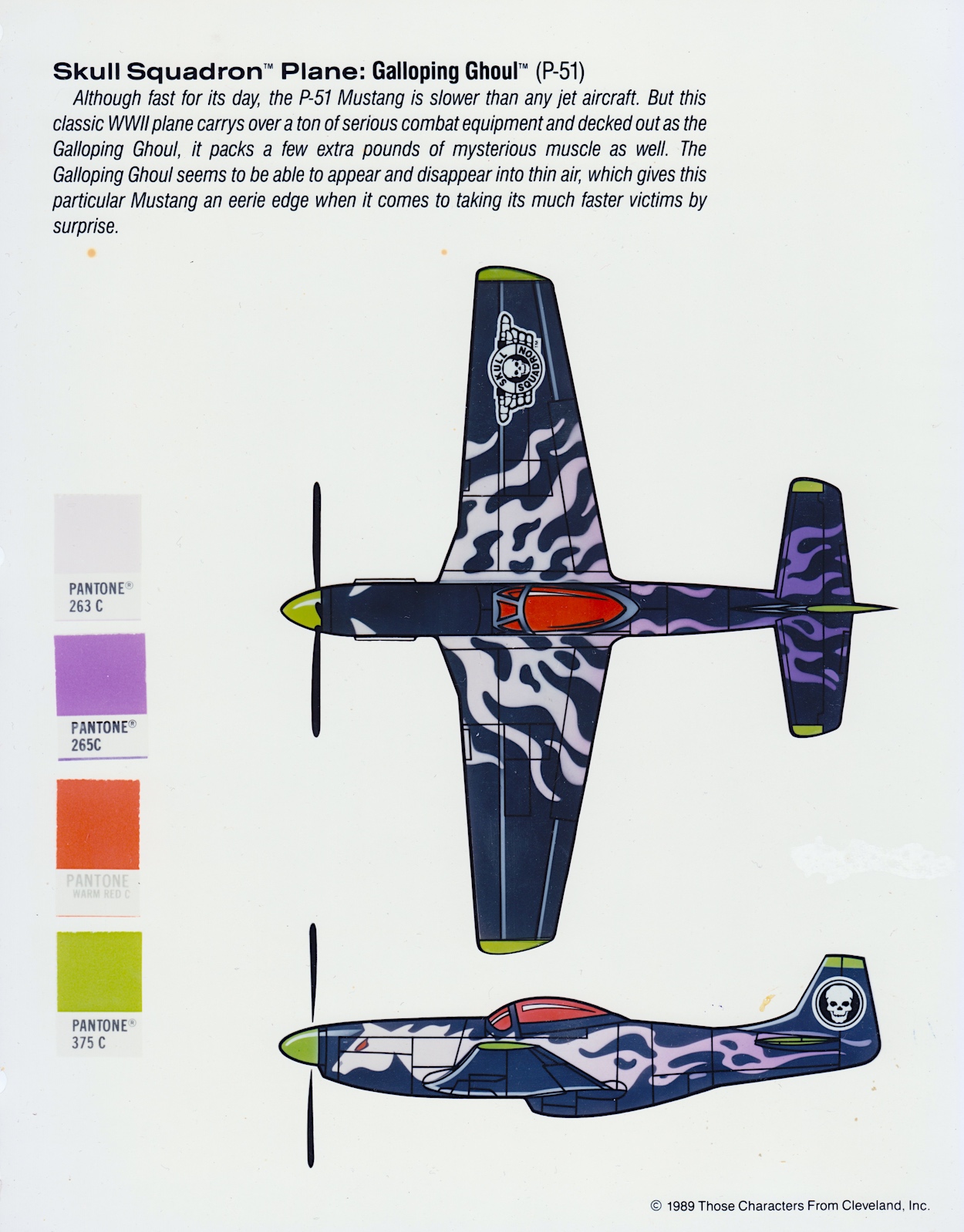
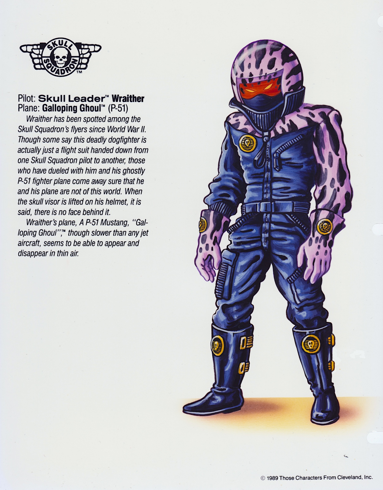
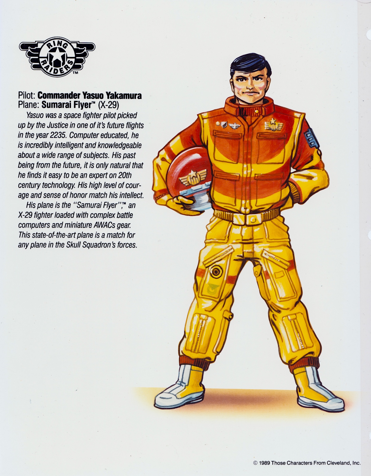
Finally there’s my favourite Skull Squadron pilot and plane, which I got alongside Yasuo Yakamura’s X-29 Samurai Flyer (see last time) in a special two-plane Starter Pack, beginning my obsession with all things Ring Raiders as a child. I love the possible theories of Wraither’s origin, something the comic never got to explore before it was prematurely cancelled, although we did get some hints about how the P-51 Galloping Ghoul was able to disappear and reappear the way it did. More than any of the others, Yasuo and Wraither bring back a warm, fuzzy feeling when thinking about how much I loved these toys, so it’s appropriate this part of the folder ends with one of them.

Don’t forget the Ring Raiders themselves, and their associated profiles and Pantone colours, have already been covered in part two. As much as I’ve enjoyed reliving these characters and planes though, I’m even more excited to show you what’s next in this folder. The Product Art Reference section will show us a really fun and imaginative array of designs for potential merchandise.

As a fan I fell in love with some of the designs in the next section, imagining how many of them I’d have owned as a child if the franchise had been a success. You’ll get to see all of them, from clothes to lamps, from laundry baskets to roller skates! Then there’s a selection of icon designs for each of the Wing Commanders and their aircraft too. I can’t wait to show the next pages to fellow fans on Saturday 13th April 2024.

PART TWO < > PART FOUR

LiCENSEE FOLDER MENU

RiNG RAiDERS MENU

RiNG RAiDERS LiCENSEE STYLE GUiDE: PART TWO

I’m back with the second part of the Ring Raiders Style Guide folder sent to licensees of the potential hit franchise in 1988, this particular copy very graciously given to me by Barrie and James Tomlinson, father and son editing and writing team behind Fleetway’s short-lived but awesome Ring Raiders comic. I previously covered the introduction to the toy range, the background story and a couple of examples of the mini-comics packaged in with the Matchbox planes. Now we move on to the meat of the folder.

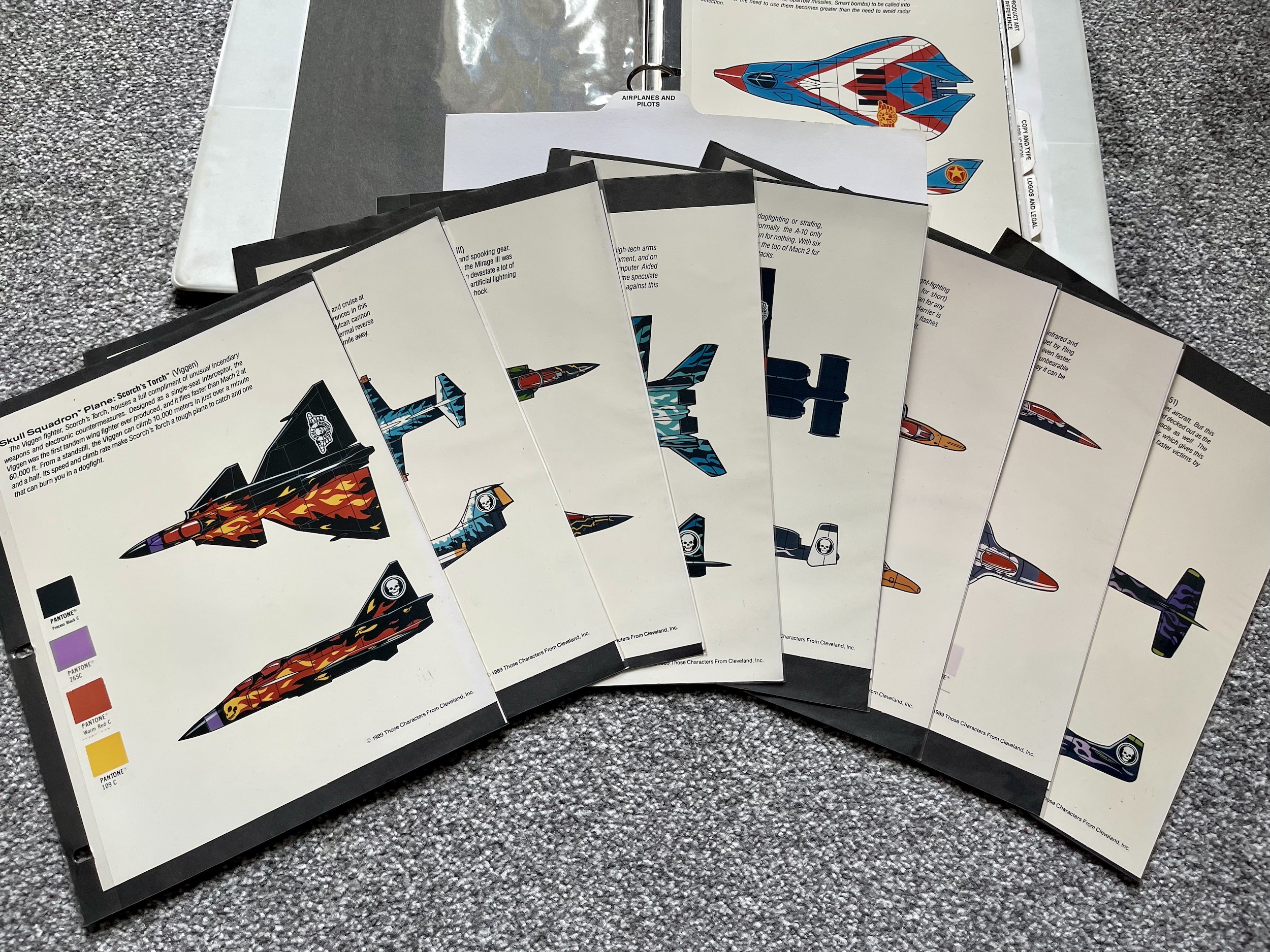
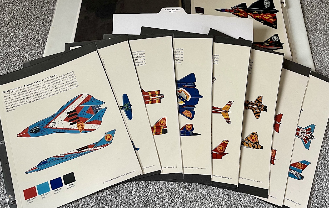
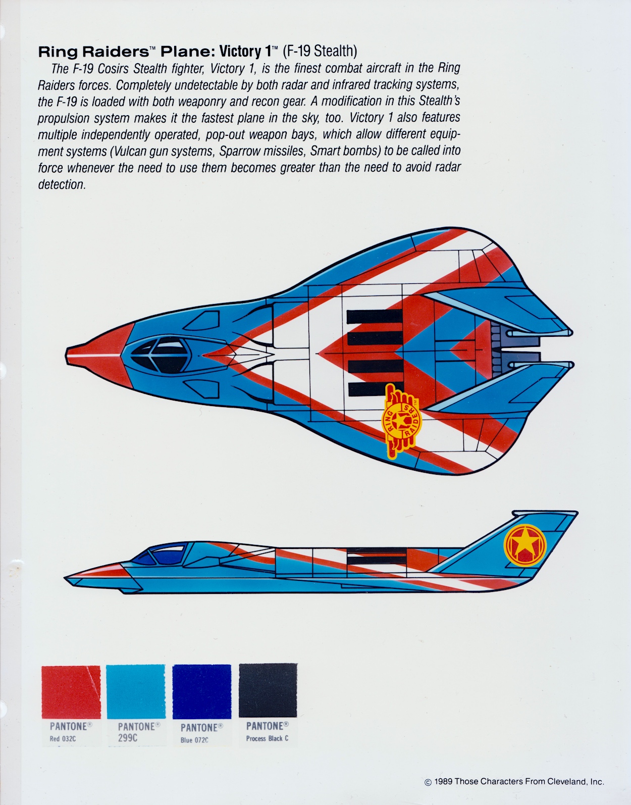
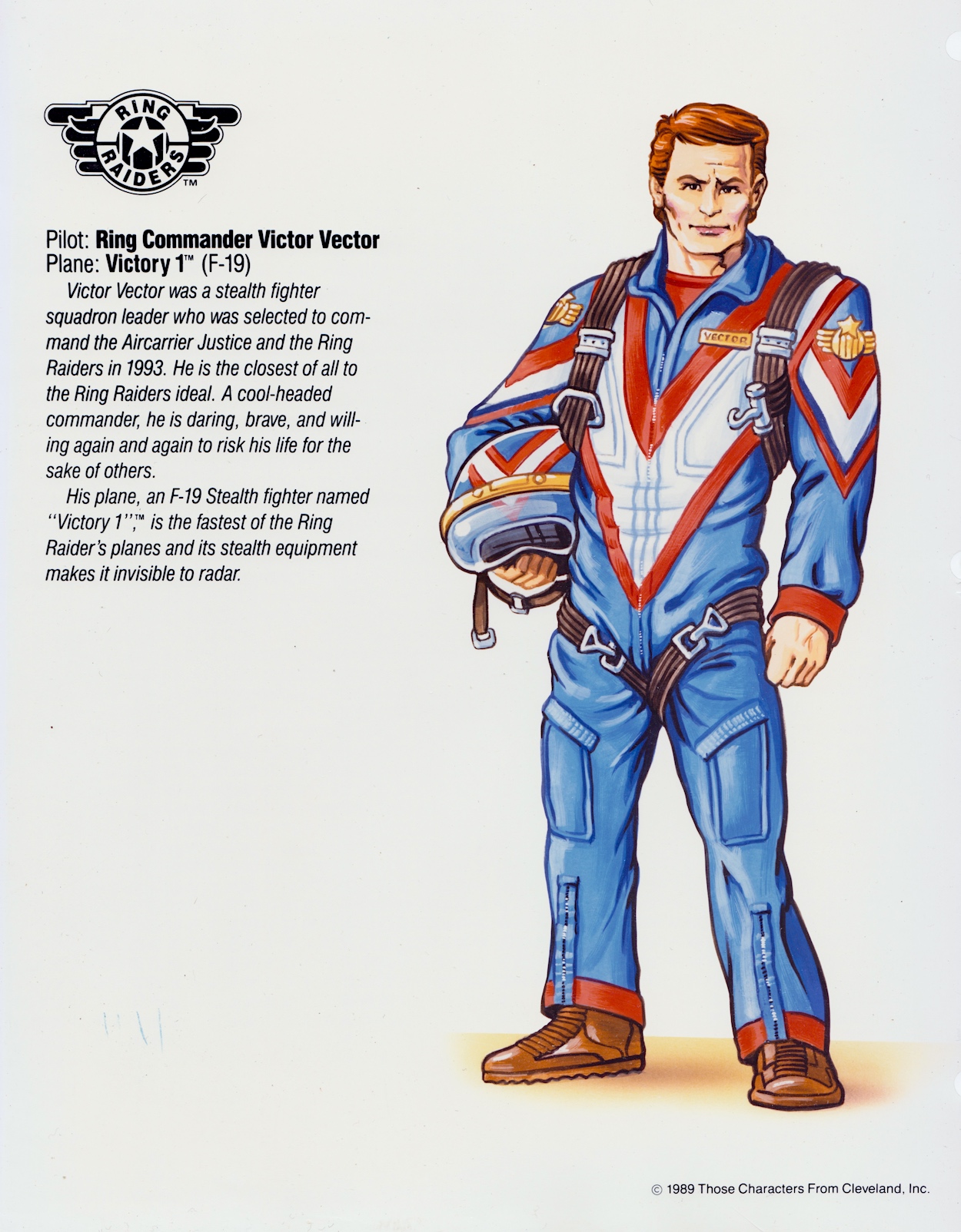
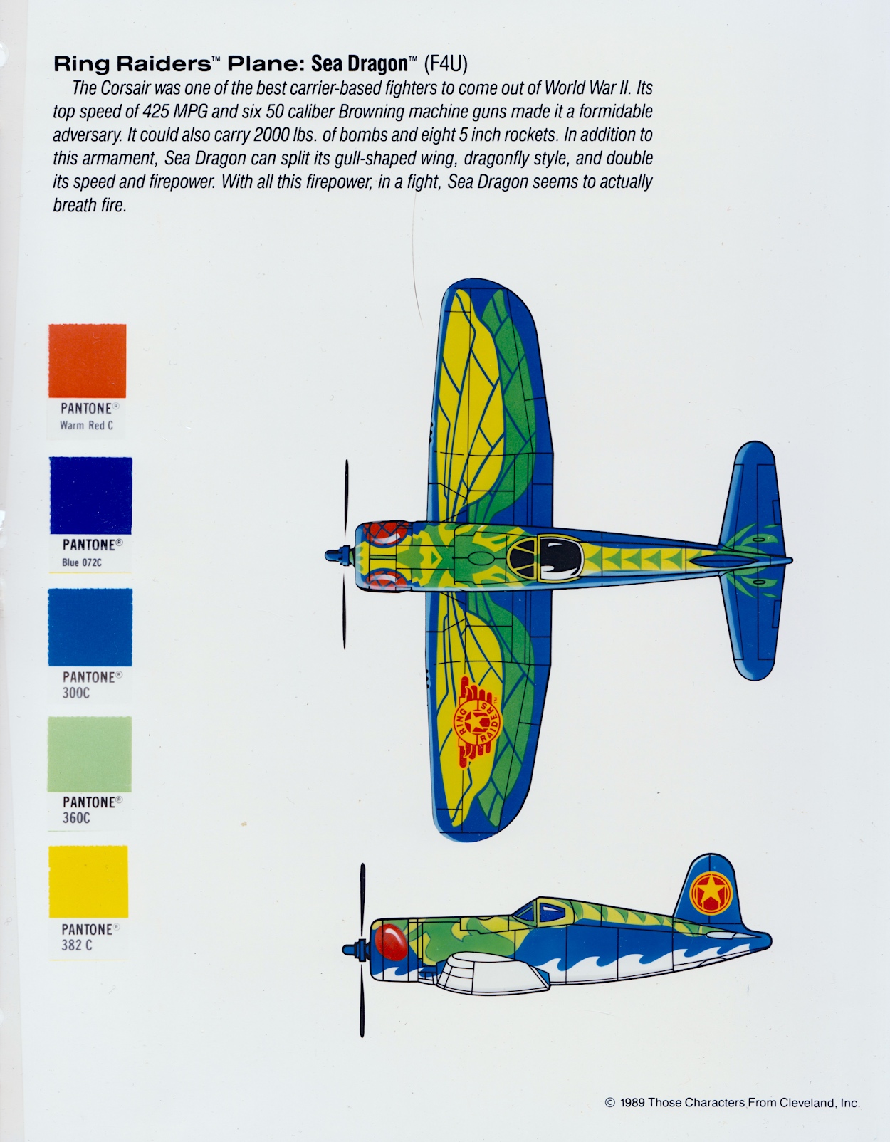
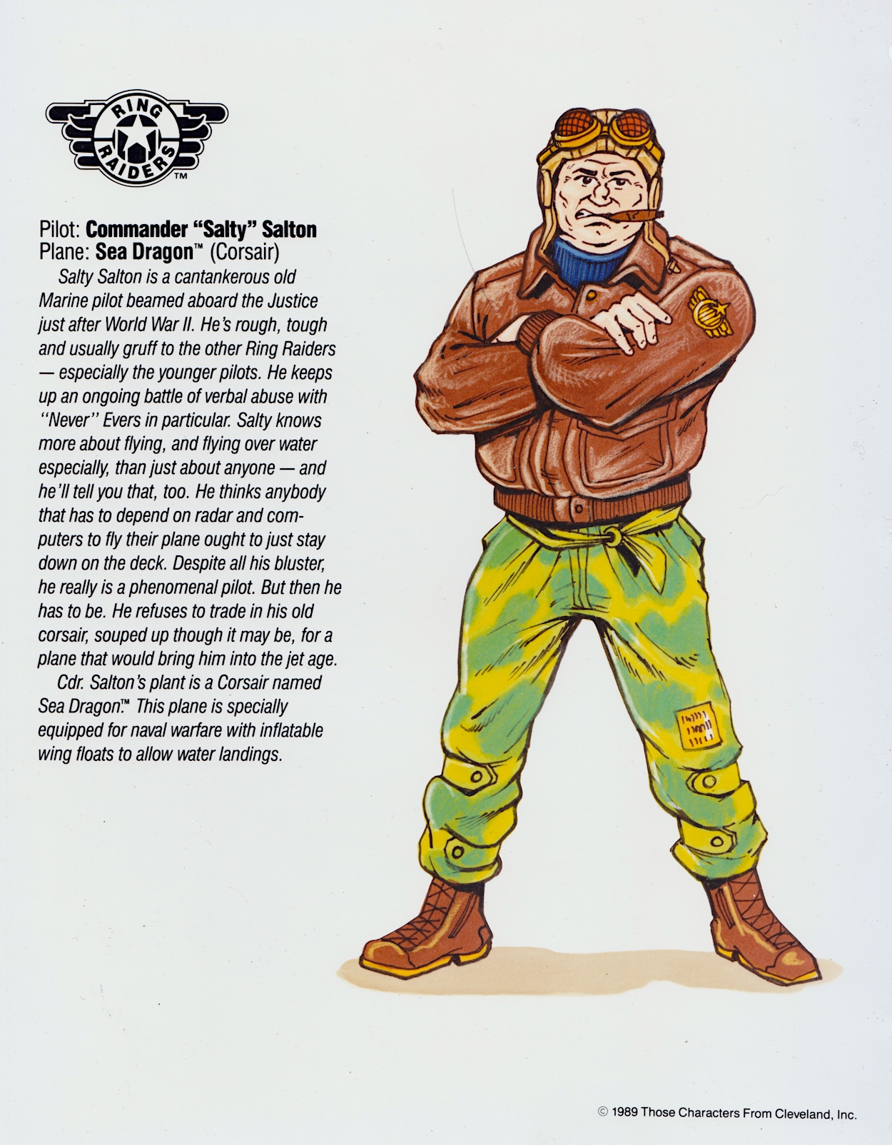
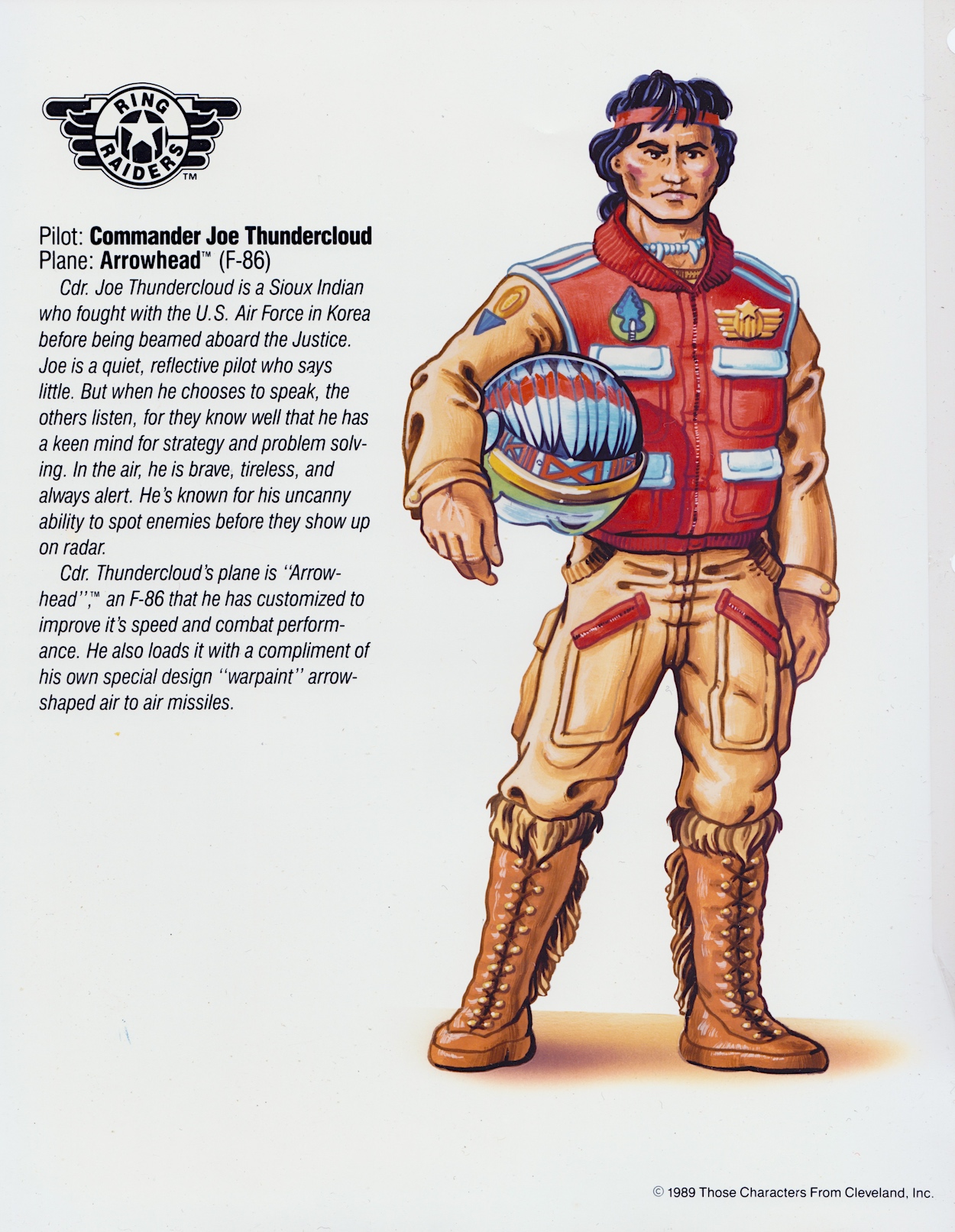
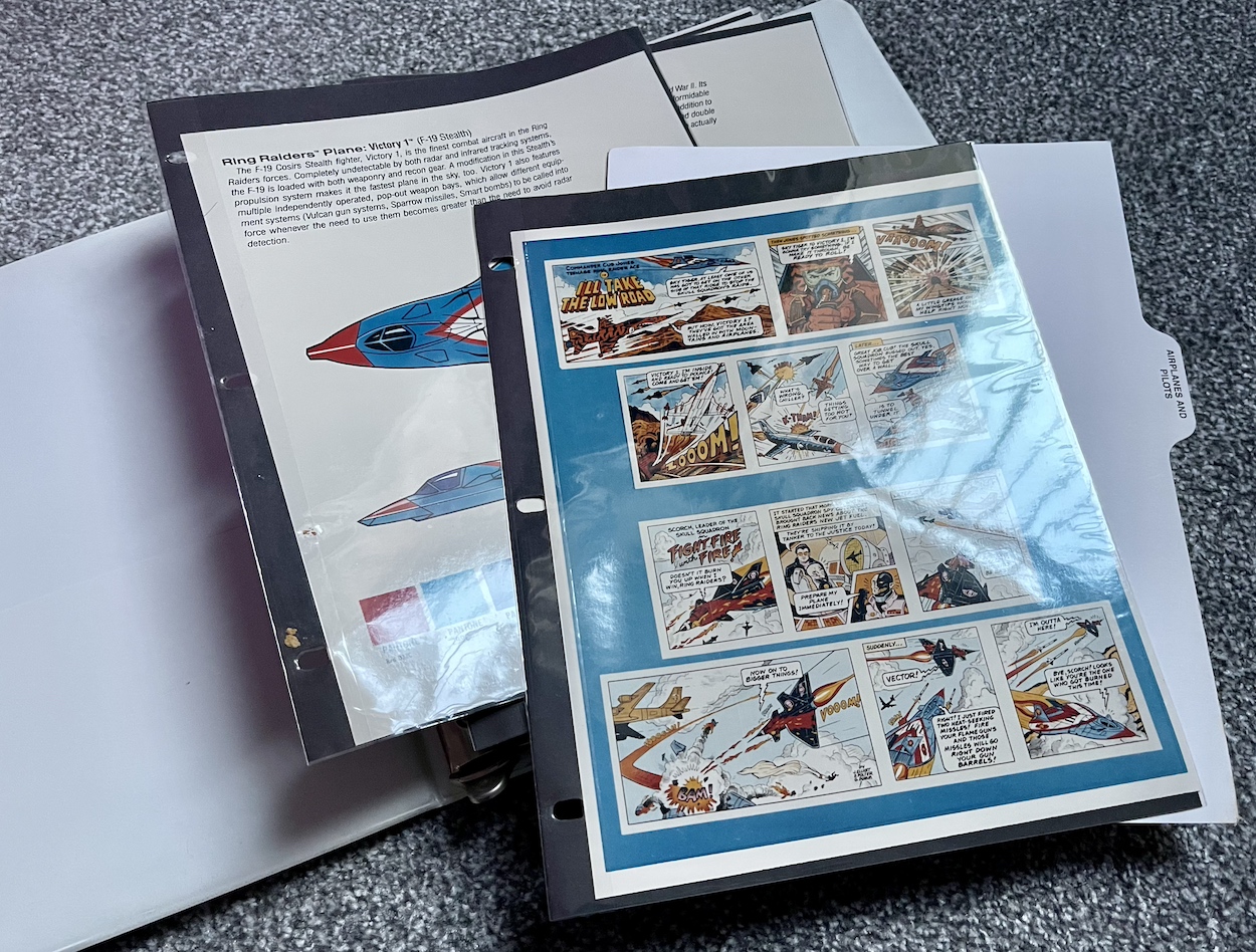
The next section is all about the planes and their pilots and there’s so much here I’ve decided to divide it into two parts, this month focussing on the heroic Raiders themselves. Included are eight of the Wing Commanders and their aircraft over sixteen pages, including top and side views of the planes and a full view of the pilot with a little bit of written information about each of them. We begin with their leader, Ring Commander Victor Vector and his F-19 Stealth fighter codenamed Victory 1, and “Salty” Salton with his Corsair Sea Dragon.

The basic details about the human element of each pairing would be elaborated on by the comic although the basics remained. It’s fun for me to remember all of those little details about the planes, such as weapons panels that were meant to slide open, wings that could split in two or underbellies that had inflatables built in. Of course the Matchbox toys were so dinky none of these were actually included but in our imaginations they were there and deployed often, not that it mattered with Salty because he was never a toy! More on that below.

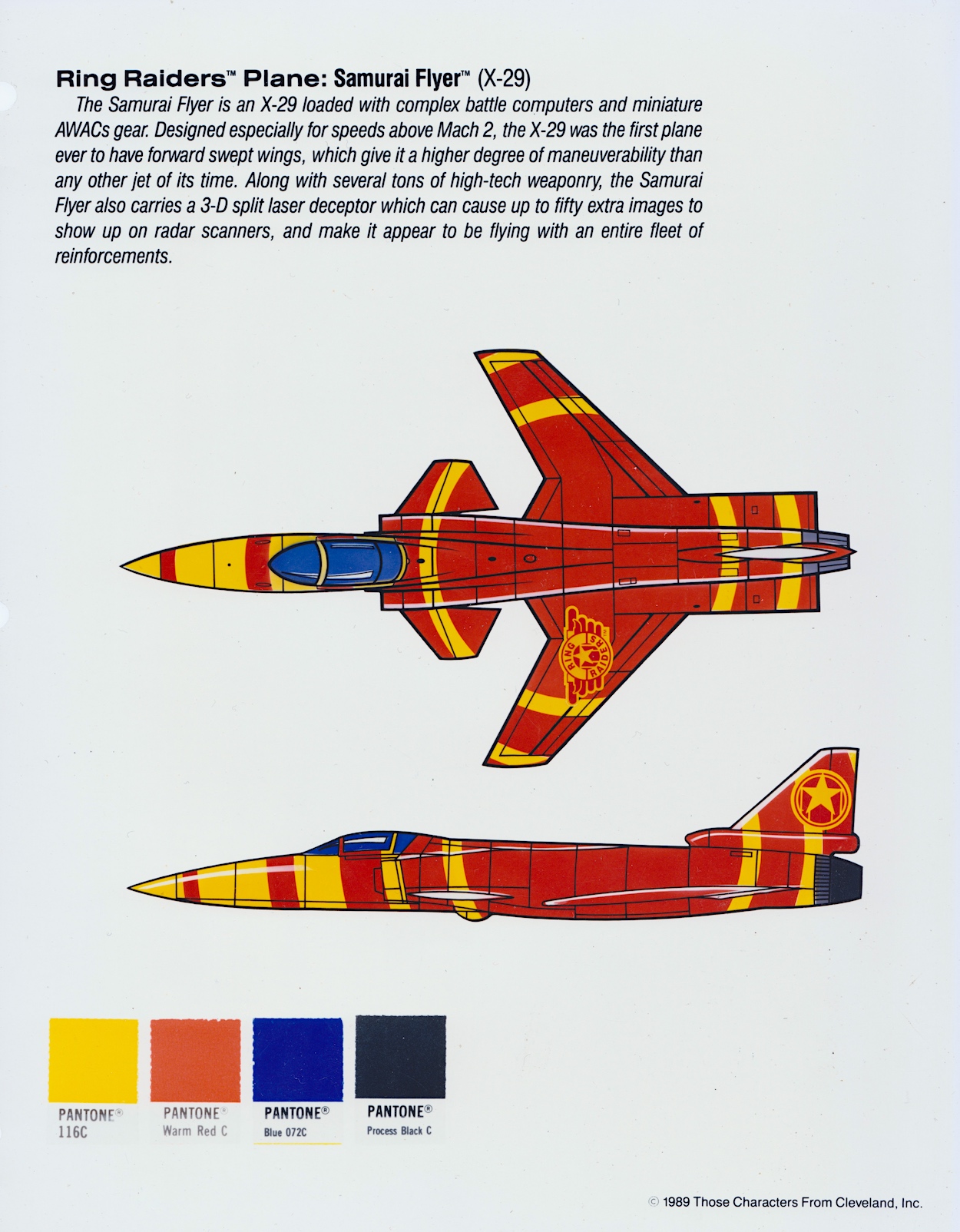
For such small toys they had intricately moulded details. The panels may not have opened, but they were all there; the bodywork of the planes looked and felt authentic in our tiny hands. What else would you expect from Matchbox? The next couple includes my absolute favourite, the X-29 Samurai Flyer flown by Yasuo Yakamura, the first plane I owned (alongside a Skull Squadron plane I’ll show you next time). It was just the coolest toy ever!

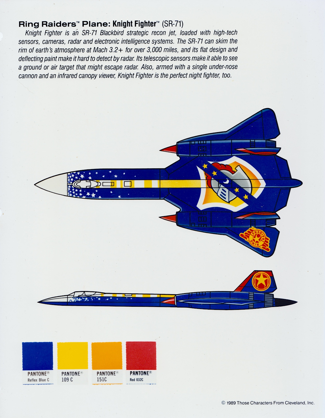
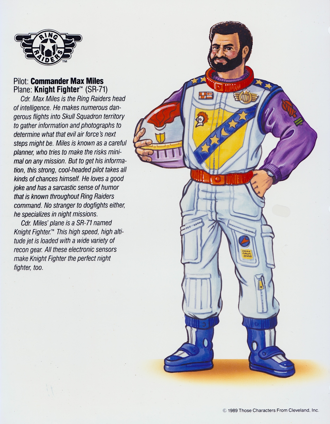
I had most of the wings from the first series, although at the time I never thought about the coincidence that the Knight Fighter was flown by a pilot called Max Miles. The coincidence I’m thinking of? Knight Rider and one of its characters, Devon Miles. Maybe one day I’ll find out if there’s more to that than just coincidence. For now, what about those colour codes?

Even if these pages were sent in black and white it wouldn’t matter because the artist could use the Pantone code

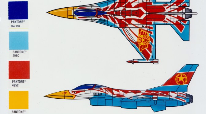
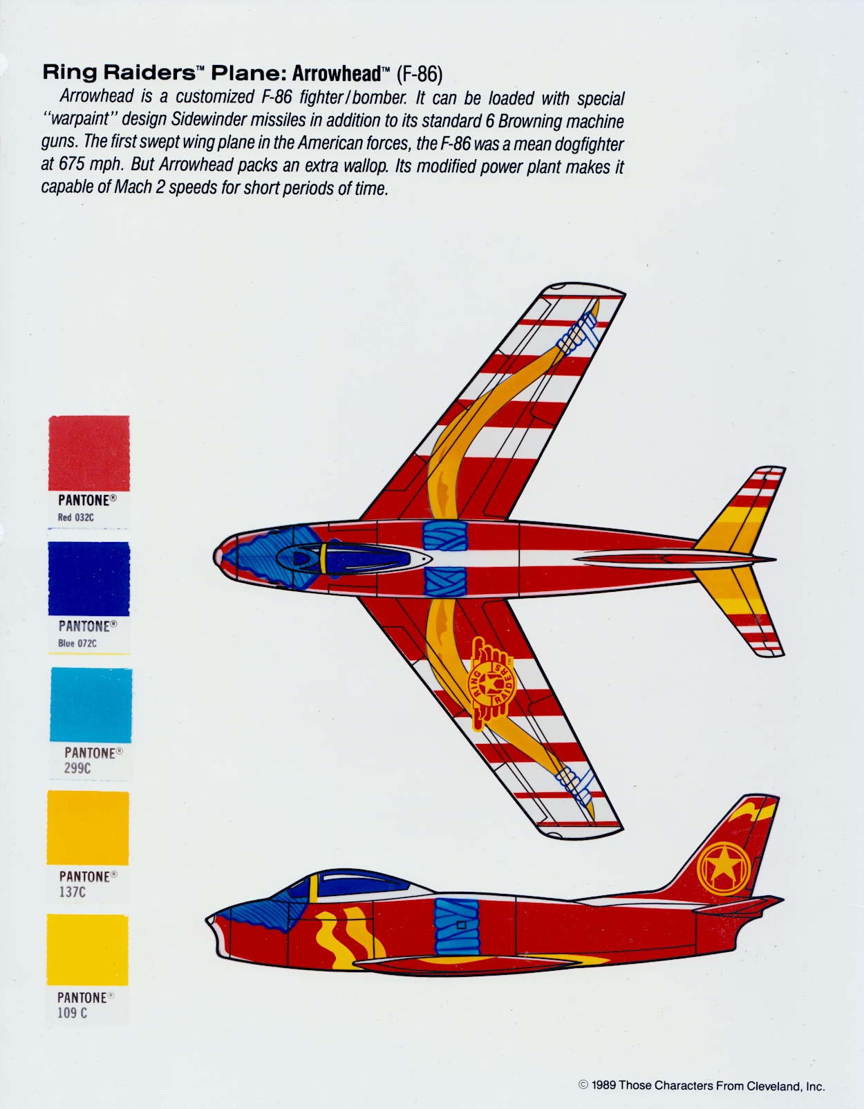
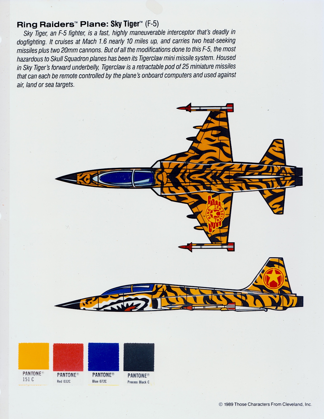
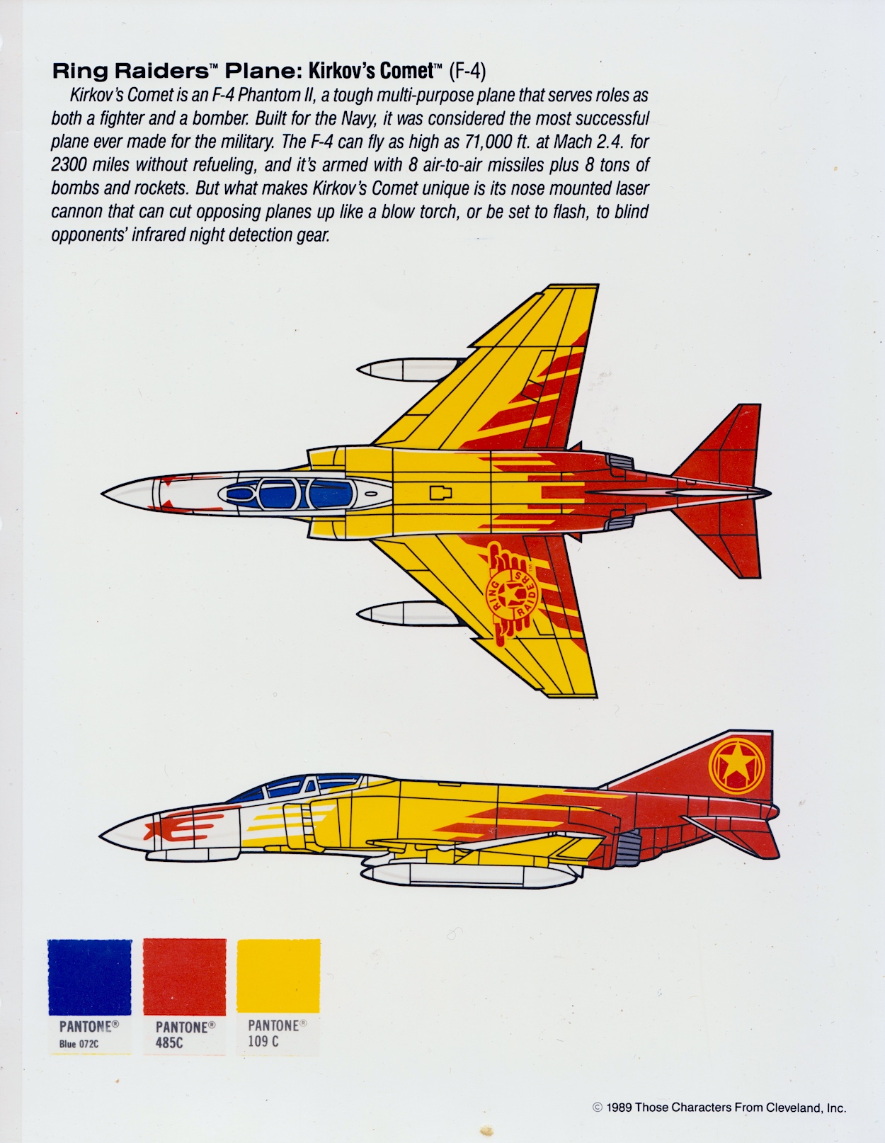
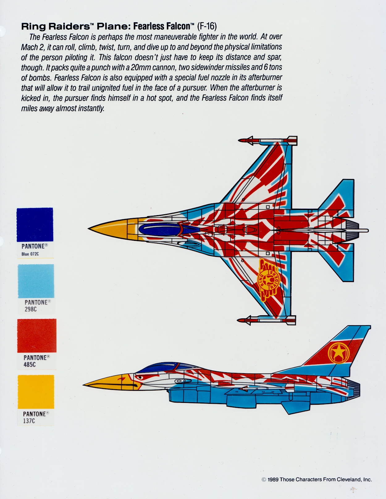
The Pantone company’s Pantone Matching System is a standard colour chart used across various industries. It ensures correct use of exacting colours and licence holders Those Characters From Cleveland have used it here. They understood how important it was that all those little Matchbox toys were exactly as designed and that every bit of merchandise, like our comic, didn’t deviate.

I’d never given a thought to how precise things like this would have to be but it makes perfect sense of course. It’s a level of detail in this folder I didn’t expect to see. By using this system and its naming of the tones it also stops any accidental colour changes, for example if these pages were photocopied or faxed to the artists. Even if they ended up being sent in black and white it wouldn’t matter because the artist could use the Pantone code.

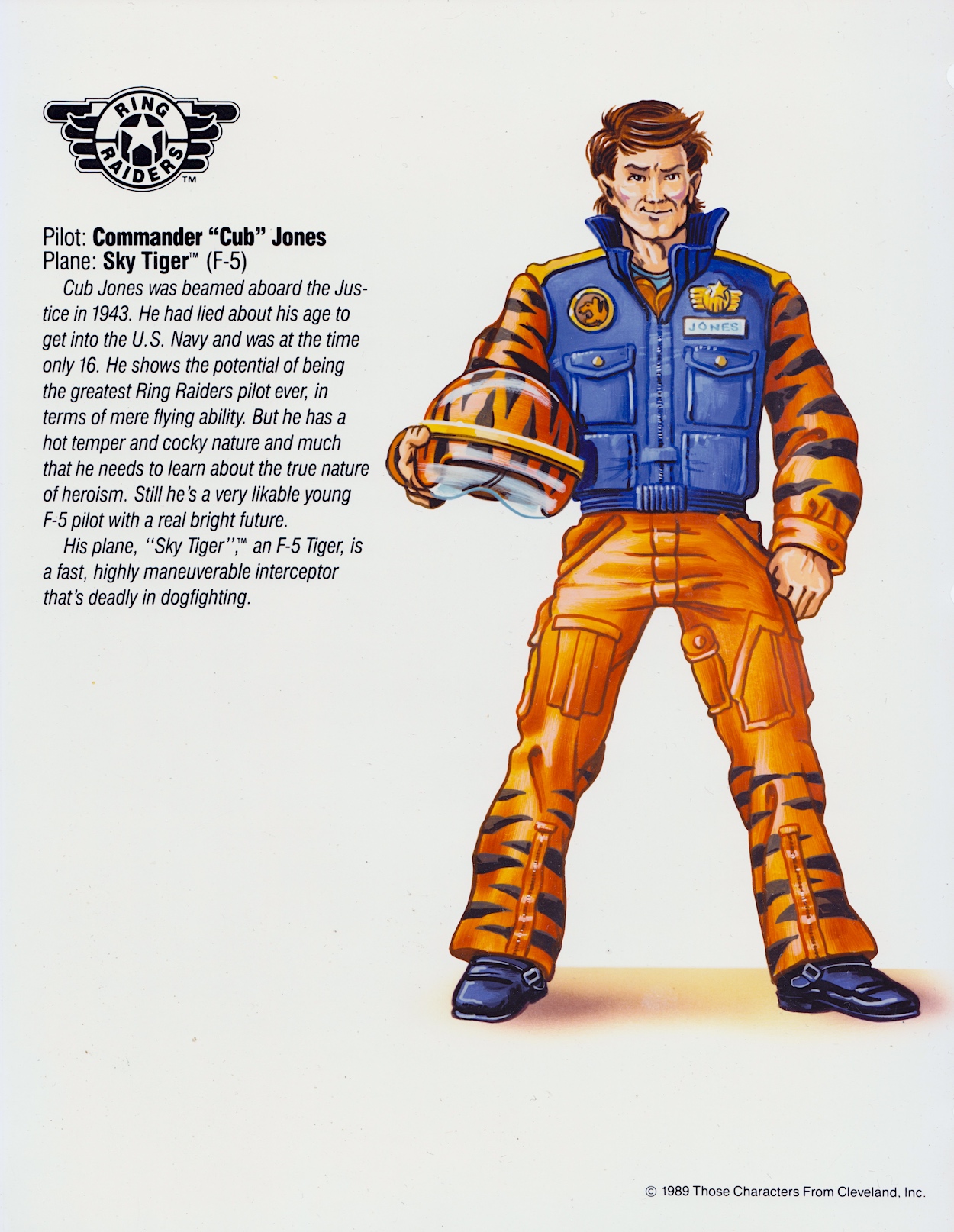
When you consider how small the planes were it’s pretty incredible to see precise colour codes for such teeny tiny details as the darker blue outlines of Joe Thundercloud’s F-86. “Cub” JonesF-5 Sky Tiger with its animal markings was a really cool plane to own at the time. Note that the page also mentions the mini missile system, something else our imaginations ran with. James actually wrote it into a script, brought to life by artist Don Wazejewski.

Cub’s background was also one I enjoyed and it brought a personal touch to the World War II story featured in the early issues of the comic. However, for whatever reason the cartoon did away with this completely and made him a modern day rookie Ring Raider pilot. I’m surprised they were allowed to change a key element of a character so drastically. The comic proved this original version could be so much more interesting.

Finally for this month are Yuri Kirkov’s F-4 Comet, a favourite toy of mine. In fact, his entire wing was a favourite, the colour scheme of the lead plane used across the three accompanying aircraft (like most of the wings), they really did look quite incredible to my young eyes. I was thrilled to see his Wing getting a starring role in a gorgeous Sandy James strip.

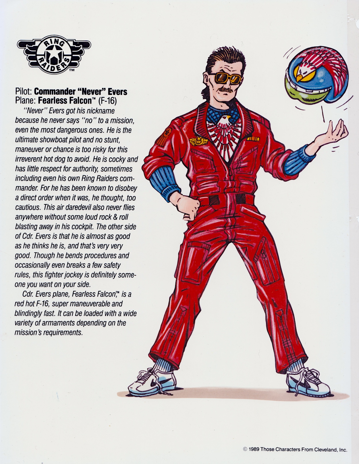
Go check that out to see just how brilliant Sandy was at bringing this toy to life. It’s the perfect example of what the comic could do. Before writing this post I thought Commander “Never” Evers and his F-16 Fearless Falcon was that rare thing, a Ring Raiders set I didn’t actually own. I thought, looking at its design, that I’d really missed out. But a fellow fan informed me that Evers and Salty were never actually released as toys, despite being official characters and planes, both featuring in the comic and the cartoon. How strange.

That’s the first half of the Airplanes and Pilots section covered, all the leader craft and characters in the toy range for the good guys done and dusted. I’m excited about doing the same for the Skull Squadron next month, even more excited to show fans what’s to follow after that. Whether you were as obsessed as I was with Ring Raiders or you’re interested in the production of licensed comics, I hope you’re enjoying this series so far.

The Skull Squadron takeover happens on Wednesday 13th March 2024.

PART ONE < > PART THREE

LiCENSEE FOLDER MENU

RiNG RAiDERS MENU

RiNG RAiDERS LiCENSEE STYLE GUiDE: PART ONE

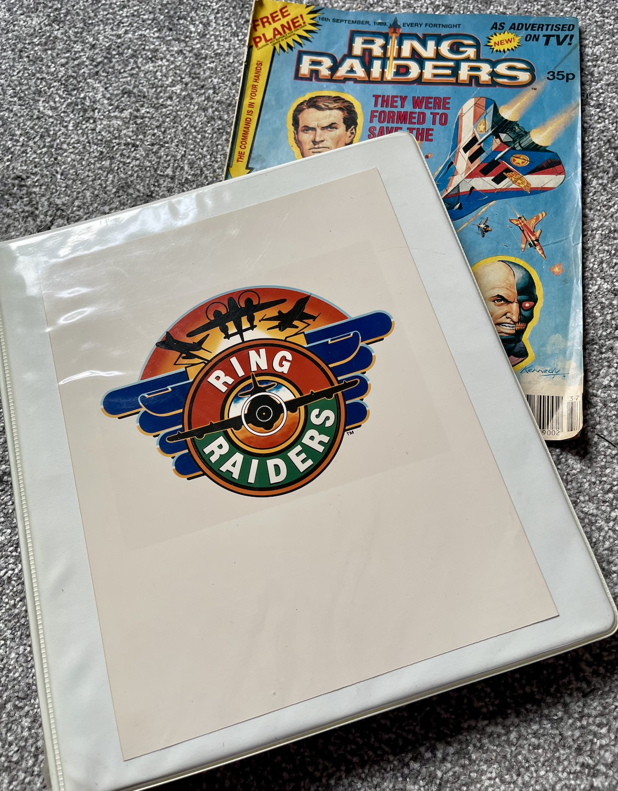
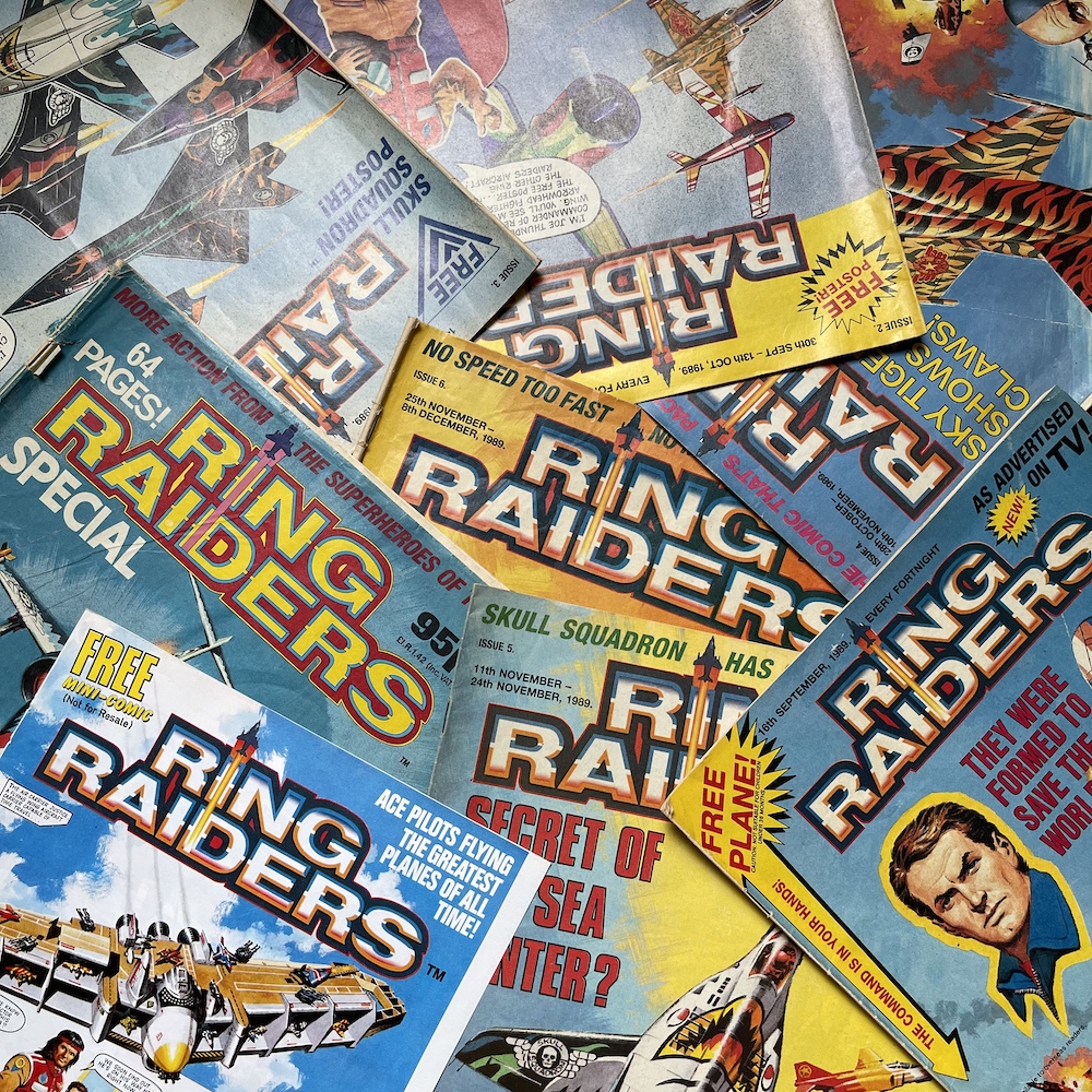
A few years ago the wonderful former UK comics editor Barrie Tomlinson and his writer son James Tomlinson very graciously answered my questions about a favourite childhood comic of mine, the very short-lived Ring Raiders, based on the Matchbox toy planes of the same name. Created by Those Characters From Cleveland and with a range of merchandise, a UK comic and even an American cartoon, Ring Raiders was set to be the next big franchise.

It wasn’t to be but I still loved the toys and I collected a mountain of them including all of the extras I could get my hands on. I also owned whatever videos were made available over here but the comic was far superior. I’ve covered the series already and you can read all about it, as well as the interviews with Barrie and James, in the Ring Raiders section of the blog. However, chatting with me wasn’t the only thing these two gentlemen very kindly did. They also sent me this folder.

This is the official licensee folder sent to Fleetway Publications (and other companies wishing to produce anything related to the franchise) in 1989 with all of the information needed to create an accurate depiction of the characters, their aircraft and the world they inhabited. A ‘Style Guide’ if you will. It includes details on the backstory, the individual pilots and even the correct colour codes to be used on each plane to ensure the exact right tone of each was used.

It goes much further too, showing a selection of suggested merchandise 12-year-old me would’ve given his right arm for, images of how the packaging would look on shelves, and logos and the variations allowed. It even contains the legal side of things, guides to marketing whatever the companies were producing and fun promotional ideas for children’s favourite planes if it had all been successful. As a fan this is a bit of a holy grail, but I think a lot of blog readers may find it just as interesting.

A lot of the comics covered on the OiNK Blog are based on franchise properties such as toys and cartoons. These licenced titles made up a huge part of my childhood and were quality publications in their own right. Each would’ve had their own variation on a folder like this, so I thought it would prove to be a fascinating look into producing a licenced comic, not only for Ring Raiders fans but for those of licenced comics in general.

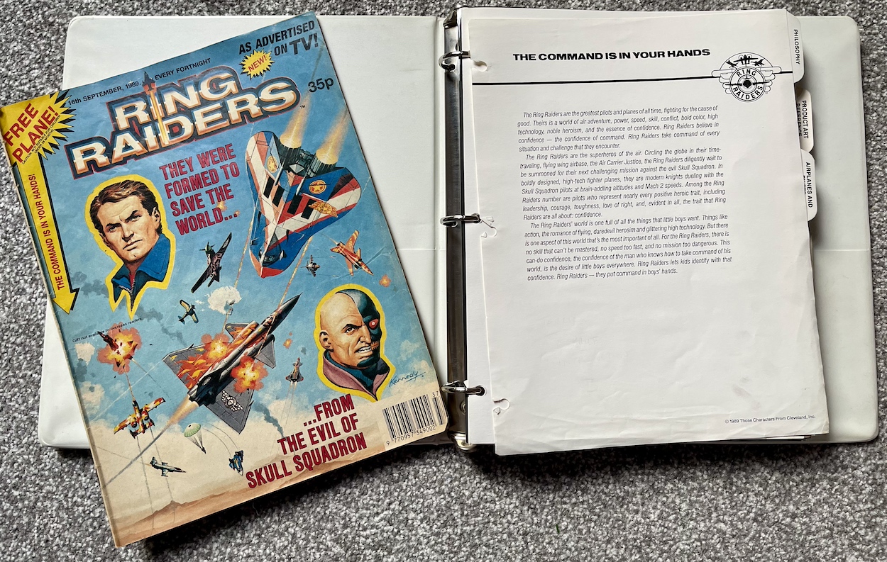
Over this and the next four months (on the 13th of each) I’ll break down the folder into its separate parts and show you all of the details within, from designs to copyrights and beyond. We begin this month with the introductory section, under the banner ‘Philosophy’. This contains the background information on the potential franchise and its storyline; a storyline that both the cartoon and the comic would pull from, despite producing two very different final products.

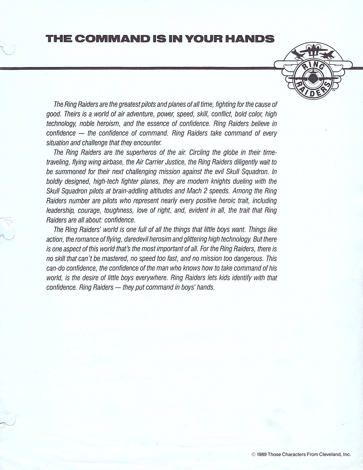
First up is this ‘The Command is in Your Hands’ page, which was the tagline for the toys. Now, remember this was the late 1980s, a time when toys were marketed strictly at one gender or the other. This continues today of course but thankfully to a much lesser extent and with much more crossover. There’s less stigma today with boys and girls just playing with whatever they want, which is much healthier in my opinion. This first page sums up not just the thoughts behind Ring Raiders but all so-called “boy’s toys” of the time.

That last paragraph in particular is a bit cringe-worthy 35 years after the fact, but you can just imagine how other toys such as Transformers and Masters of the Universe may have been similarly marketed, can’t you? The regular use of the word “confidence” is a rather strange one to focus on for a children’s toy, is it not? For me, they were about a pre-Pokémon kind of “gotta collect ‘em all” mentality as well as the time travelling storyline, which was used to explain the huge variety of aircraft in the collection.


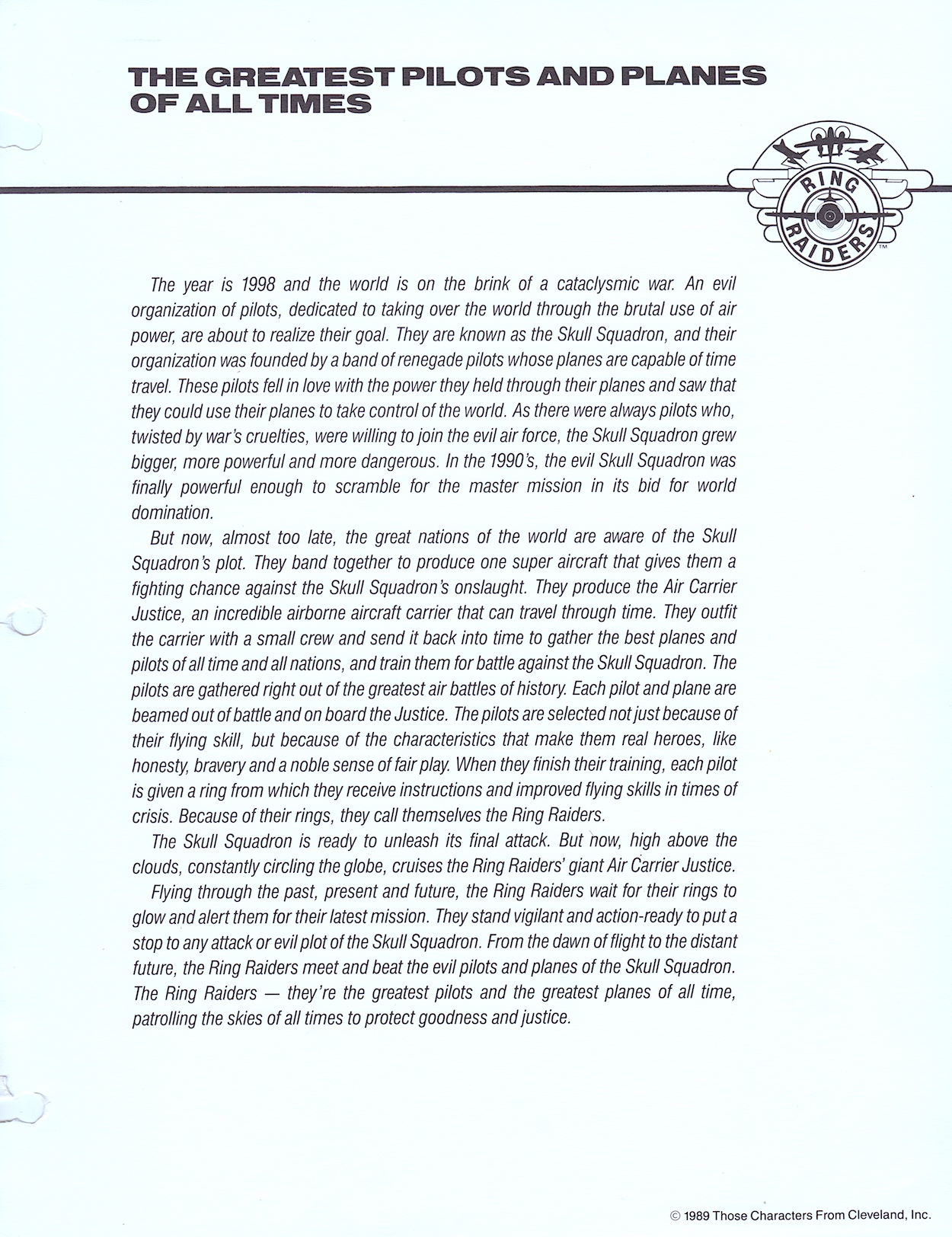
The year is 1998 and the world is on the brink of a cataclysmic war. There were always pilots who, twisted by war’s cruelties, were willing to join the evil air force.

The then-future storyline of Ring Raiders

Next up is the overall scenario, which I’ve covered before during the real time read through, detailing how the comic changed some elements, such as giving the individual Ring Raiders planes the ability to time travel. Originally it was meant to be this interesting set up including the major difference between how the two sides conducted their time travel. But it felt like a natural progression in Barrie’s comic and an obvious one for the stories included. The comic also introduced a range of gadgets tucked away inside the rings which as a kid really fired my imagination (I constantly wore one of them that winter).

Again there’s a focus on the noble elements of the characters involved, something the various licensees could pull from to appeal to parents I’m sure, while we kids focussed mainly on the action and the dogfighting in the palms of our hands. We’re only two pages into the folder and I can already see (even before any images or photos of the toys) how this could’ve stood out at the time amongst the vast array of other wannabe franchises vying for position.

They fired up the imaginations of kids just like me and gave us ideas for our own bedroom battles

Unfortunately, the late 80s and early 90s were awash with unsuccessful toys that at other times could very well have been hits. Even a lot of toys that had been enjoying success were floundering by then; a bit like the UK comic scene in those same years, when over saturation helped to dilute the success of individual titles. Ring Raiders would succumb, the comic and cartoon cancelled after only a few outings, although the toys would continue throughout 1990 with two more series of planes to collect.

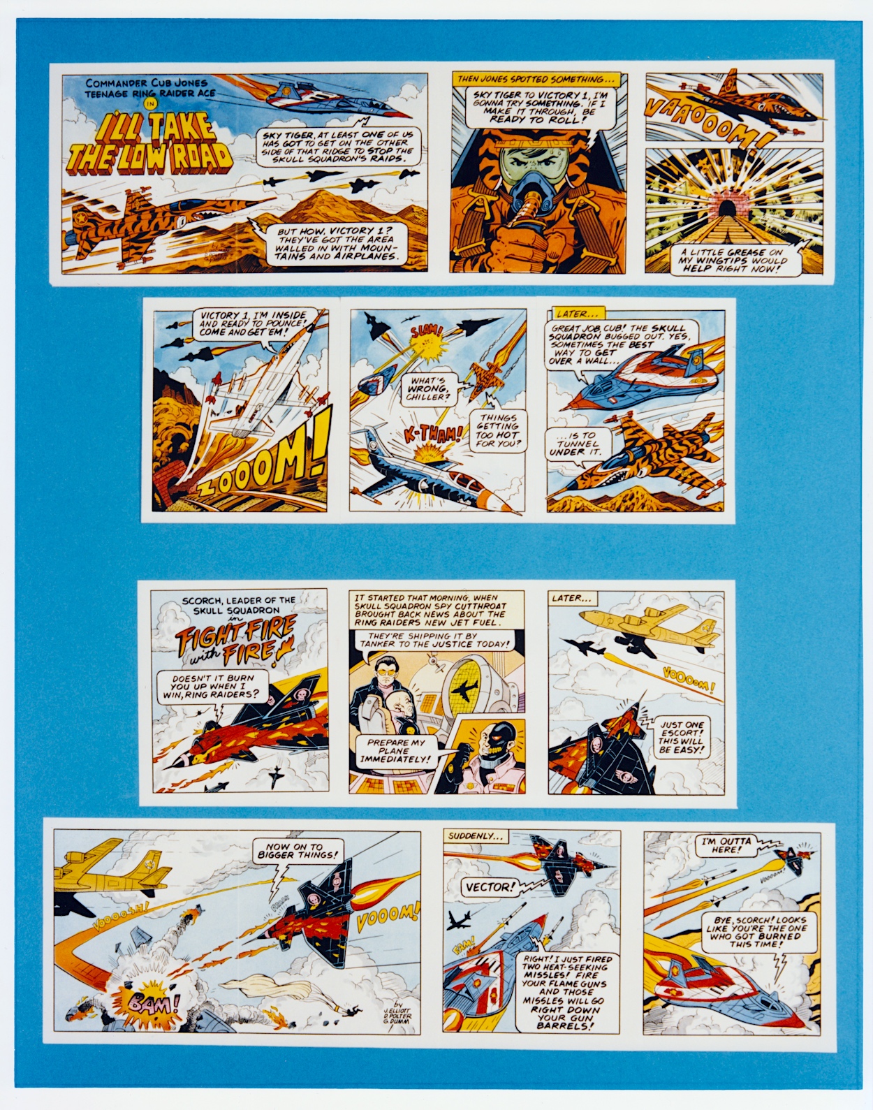
However, as you’ll see later in this series the Ring Raiders were meant to be on far more than just the toy shelves. For now, I’ll finish with these two examples of the fold-out mini-comics that came bundled with the plane sets. They fired up the imaginations of kids just like me and gave us ideas for our own bedroom battles.

Of course this was before Barrie’s comic came along and blew us away with its incredible battle scenes coupled with three-dimensional characters and epic twisty-turny storylines that only a full-sized 24-page comic could do justice to. Having Barrie, James and a plethora of top UK comics talent (Ian Kennedy, Angus Allan, Carlos Pino, Don Wazejewski, John Cooper, John Gillatt, Sandy James, Scott Goodall, Tom Tully, Geoff Campion and Terry Magee) didn’t hurt either!

That’s it for this month and that’s just the introduction out of the way. Next month I’ll show you all of the leaders’ planes in the Ring Raiders half of the range, each with character introductions the comic would develop further, as well as the colour codes and details that the artists would have to abide to. That’ll be here for your delectation on Tuesday 13th February 2024.

GO TO PART TWO

LiCENSEE FOLDER MENU

RiNG RAiDERS MENU

DRAWiNG THE KNiGHT RiDER: DAViD LLOYD iNTERViEW

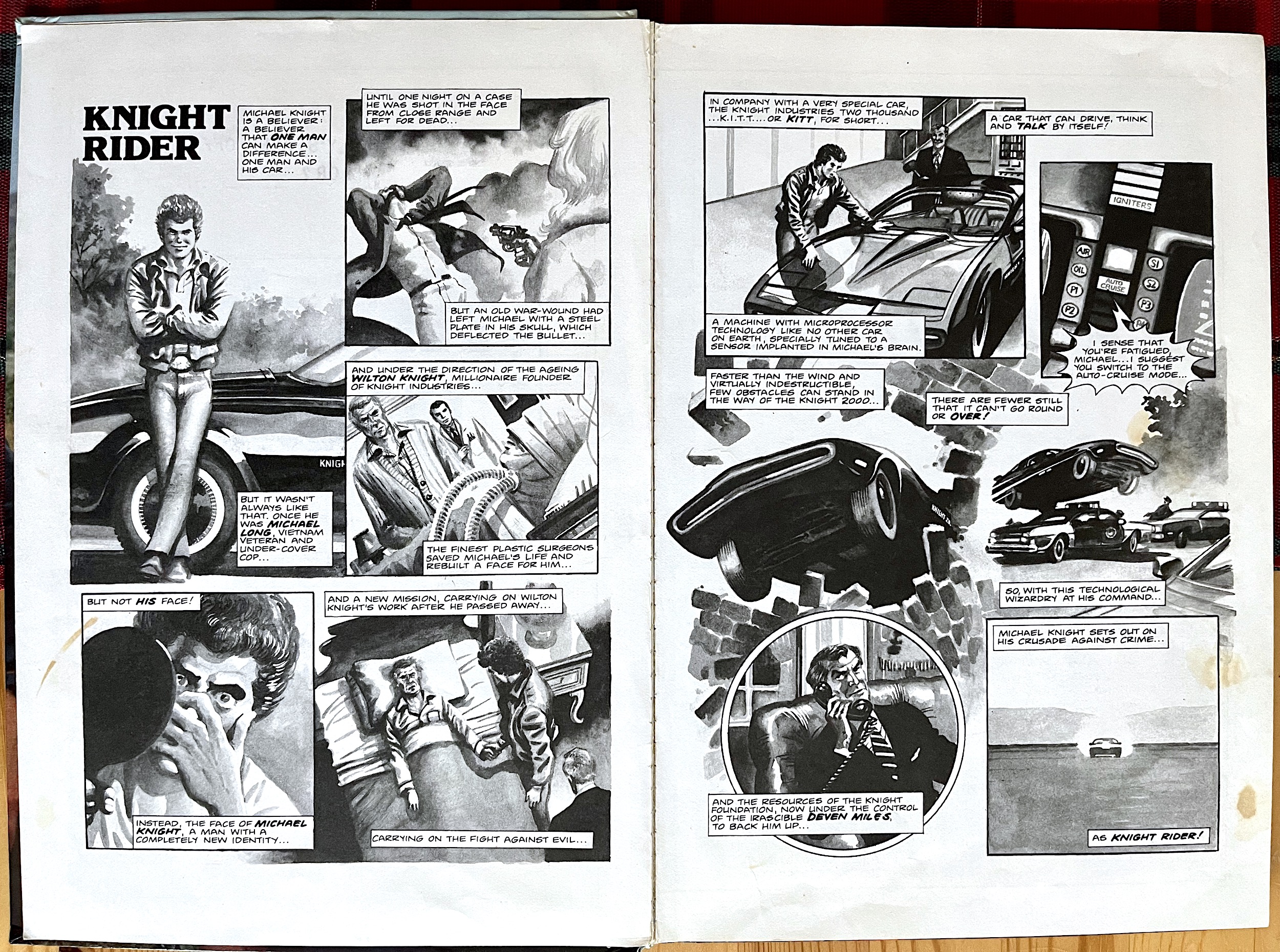
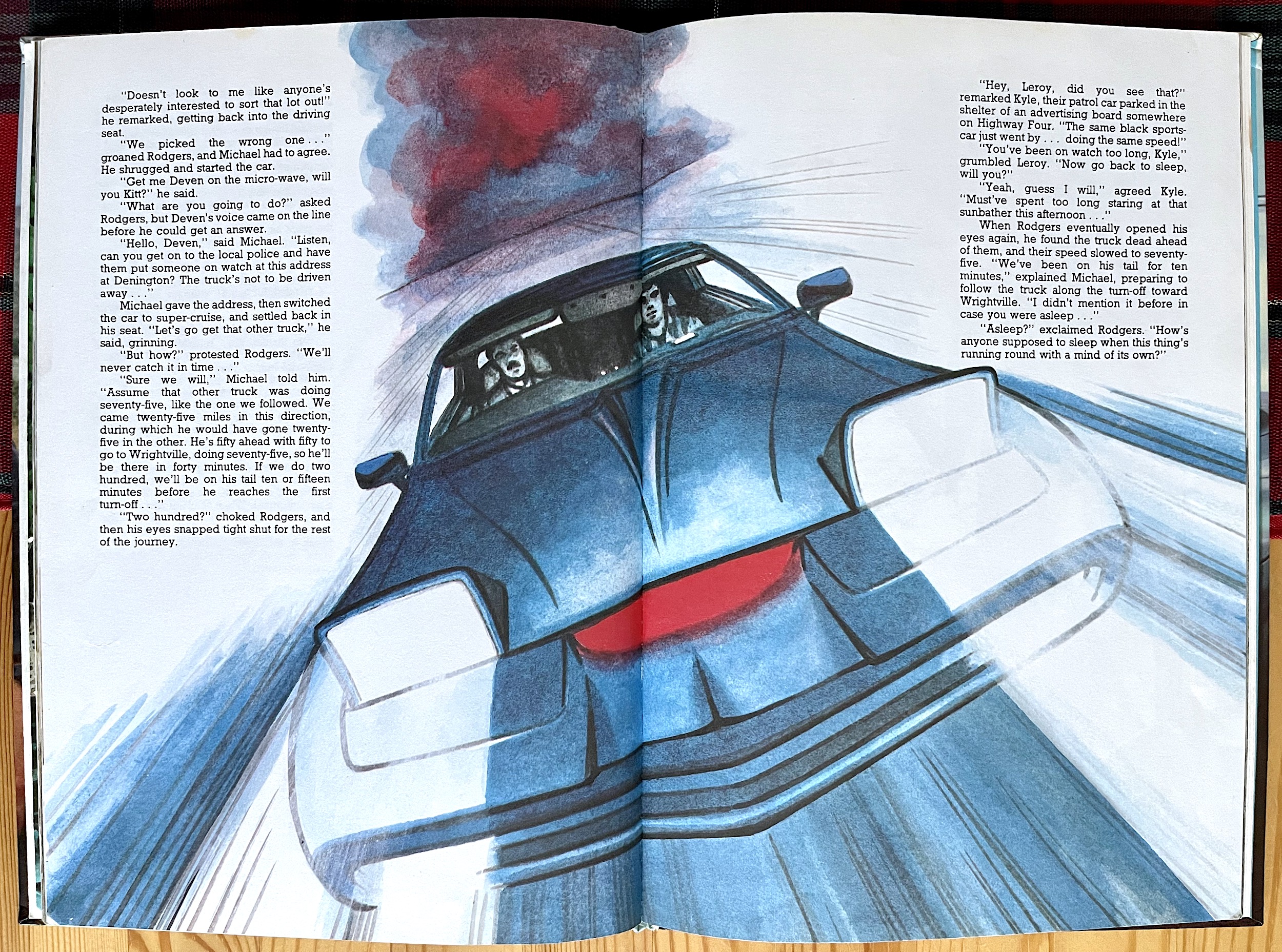
I was elated to discover how well the first Knight Rider Annual held up today when I reviewed it a few days ago. Any fears I had of a cheap cash-in were quickly dispensed with when I saw the comic strips inside. They were simply gorgeous. Coupled with fun prose tales and backed up with interesting articles featuring photographs which enthralled me as a kid, it was a superb package and one I felt proud of as an absolutely massive fan of the show.

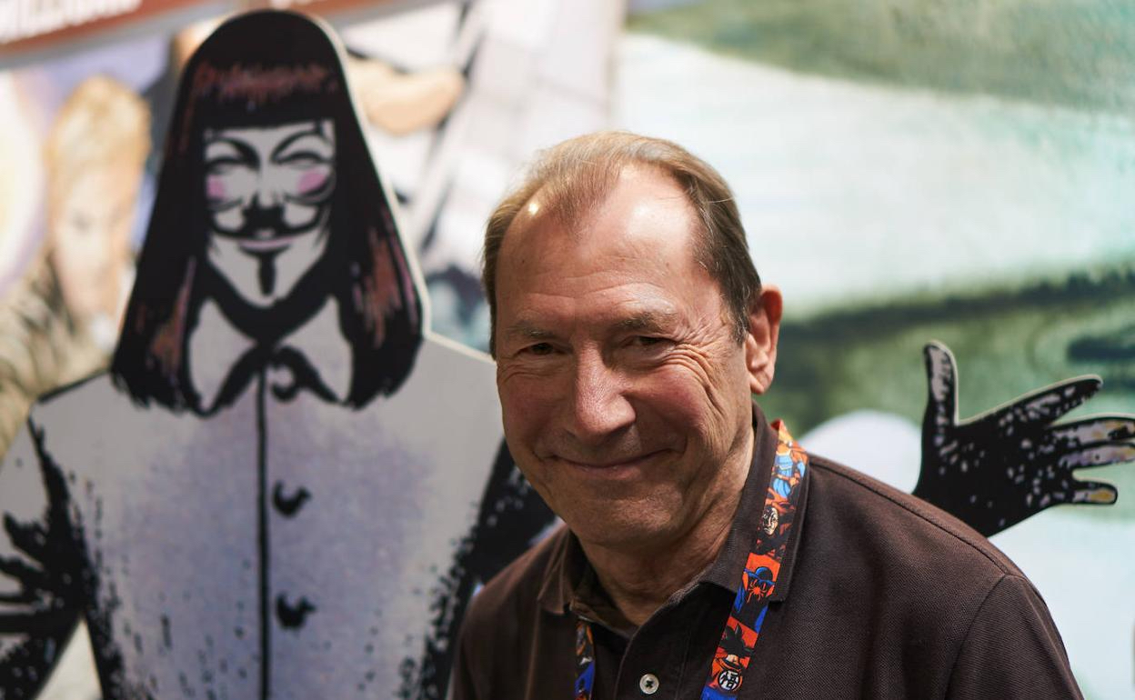
I was thrilled to find out none other than David Lloyd (V for Vendetta, Wasteland, Hellblazer) was responsible for all of the art, both the strips and the illustrations for the prose stories. David is the editor of Aces Weekly, the superb digital anthology comic which has featured on the blog before. I thought I’d reach out and ask David if he’d be willing to answer some questions about his time working on the Knight Rider books. He said yes!

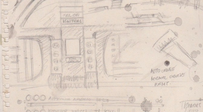
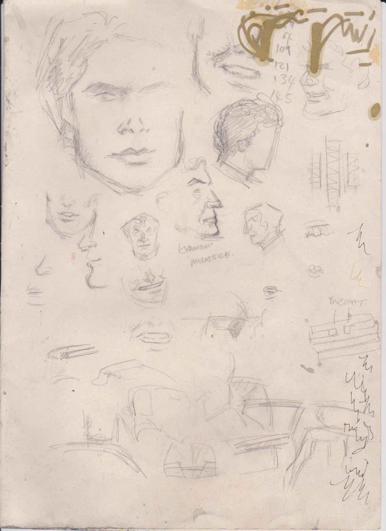
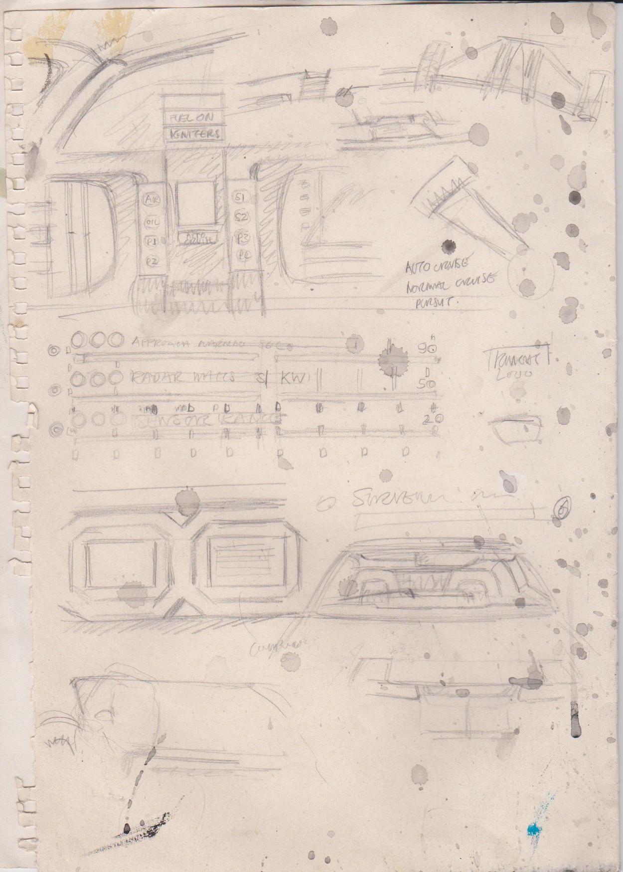
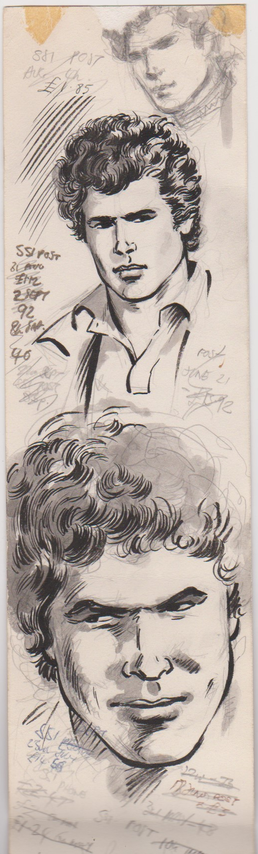
Not only was David very forthcoming with some fascinating information he also sent over scans of some of his early sketches, drawn while watching a recording of the series. These show his initial designs for K.I.T.T. and Michael, including a study of David Hasselhoff. I’m thrilled to include this post on the blog and I’m sure it’ll be as interesting to comics and Knight Rider fans alike.

OiNK Blog: I was (and I’ll admit still am) rather obsessed with Knight Rider. The show was a massive hit with families and kids of all ages. How familiar were you with it before working on the strips?

David Lloyd: I liked Knight Rider at the time too, though not quite as much you, obviously!

OB: I just love the finish of the drawings you did for the first two annuals, especially on the strips, they seemed to capture the darker atmosphere of the pilot movie in particular.

DL: I have particularly good memories about the first annual because I was very happy with the work I’d done on the wash drawing. Loved using wash and there were few places you could use it in regular comics art at the time. I had fun with the illos (illustrations in the prose stories – Phil), too.

OB: The show couldn’t have been on for very long when you started work on this, did that hamper you in any way?

DL: No problem with it not being long-running [yet] and no one’s going to wait for you to become familiar with it all before you can draw an adaptation of it. You do your job and get on with it as a professional! And anyway, annuals were usually planned during a first season of a new series in expectation of some success, enough to justify the publishing of them, and also as part of some package of various launch/promotional agreements that might have been made, so you’d normally be drawing one for a new series before it had become massive, if it was going to.

OB: The show’s newness may not have hampered David but he did have to get creative in gathering references.

DL: By the way, to add some detail, I did that first KR annual before I had a video recorder, so I asked the help of a friend who did have one, and went round to sit and sketch some details from one of the shows I’d asked him to tape for me – pausing to sketch dashboard detail, etc. If you’re interested I can scan some of those scribbles, and some Hasselhoff studies I did before starting the job. I think you’d probably like to see them.

OB: What did a study entail?

DL: Just trying to study the likeness and get his face right enough. You’ll see these were hanging around for a while on my drawing board, which is why they have all kinds of notes and stuff on them!

OB: There were no credits in the Grandreams annuals but David has let us in on who wrote the strips and prose stories.

DL: The comic scripts and the shorts were all written by the brilliant Steve Moore. In fact, he wrote everything I ever drew on all the annuals I did for Grandreams. He was so good he could write any character to be exact to their personalities in any TV show he had to write stories for. And in some of the annuals, I think his stories were better than the TV scripts.
OB: I haven’t heard of the name Steve Moore before but you’re right, his stories in these were fantastic, especially the text stories. One in particular involving an art heist would’ve made a fantastic episode and I completely agree, some of his stories were better than some of the TV scripts! He definitely got the funny partnership between man and machine perfect.
DL: I’m surprised you hadn’t heard of Steve as I’d imagined you knew a lot about Brit comics as someone running a blog named after OiNK. Everyone who was around at the period of that particular comic were mostly aware of the general scene in Brit comics at the time and its denizens. If you have heard of Alan Moore, though, then you should know that Steve – no relation but a long-time friend – taught Alan how to write comics. Steve was a great writer but never busted through into making a great international profile for himself as some including Alan were lucky enough to do. He was just a fabulous craftsman in a specialist field of writing. And he wrote a book on the I Ching called the Trigrams of Han. No ordinary guy.
OB: David went on to name some of the other titles Steve wrote for, many of which were published before I started collecting comics as a young child with OiNK (and so haven’t been covered on the blog). These titles are classics through and through.

DL: On Steve Moore – he did most of the backup strips in Doctor Who magazine that I did, he created Laser Eraser and Pressbutton for Warrior, amongst other things, and Abslom Daak Dalek Killer and Hercules comics. Check them out if you can sometime.

OB: As far as choosing which parts of those wonderfully written prose stories to illustrate…

DL: The brief on the short stories in Knight Rider, and on all the other annuals I did, was to do a bunch of scenes that you could pick yourself, so it was very freeing creatively to do those. And I had particular fun using coloured inks on the KR stuff.

OB: Can I just ask about your drawings of K.I.T.T. himself? After the first two annuals another artist took over and (I’m not just saying this) the artwork was nowhere near as good or as detailed as yours. How difficult (or indeed, fun) did you find drawing the Trans-Am in these action strips, especially that complicated dashboard?

DL: Not difficult, though I’m no great fan of drawing cars. If you have a good story to tell and enough reference to do it well and you can enjoy yourself with good characters and settings, it’s fine. I sketched enough of what I needed to sketch and used what I could from elsewhere. I don’t know who did the following KR books but annuals publishers generally used talents of varying quality – some straight out of art school, some who were just jobbing illustrators who had no real feeling for comics art, and sometimes guys who knew exactly what they were doing : ) I did a Knight Rider colouring book, too, so if you’re a completist and want to seek that out from somewhere! (I’ll add that to my eBay searches then – Phil)

OB: Of course it wasn’t just K.I.T.T., the character of Michael was just as important and thankfully you and Steve realised this too. Can I just ask you about your process for drawing the strips? They’re unlike anything else from the time that I read. Most used more standard line work, whereas yours was completely different. How did you achieve the finished look?

DL: I can’t say much about the process it would take too long. It still begins with some degree of line drawing to start with except the shading that might be done in line drawing only – with cross-hatching, etc – is substituted with black watercolour washes of varying strengths. As I said, there wasn’t much wash drawing used in most comics at the time, as you attest, so it was good for me to be able to take the opportunity I could with KR. 

OB: Just one more question, all of the images of K.I.T.T. (drawings and photos) have “Knight 2000” on his bodywork somewhere, no matter the angle. This was never the case on the show, he was meant to blend in, but I remember all of my toys as a kid had the same thing. I’m guessing it was to differentiate between Knight Rider and Pontiac Trans-Am merchandise in licensing, can you remember this being something you had to add and why?

DL: The car branding, I don’t remember any instruction about that and there are drawings of mine in the strips and illos where it isn’t added – so I forgot about it if I had been – but I think it must have been a requested requirement from the licensor because on the second page of Crime Buster K.I.T.T. in the second annual the car has the branding, but badly done, so it wasn’t done by me.  Yes, so, perhaps a contractual need from Trans-Am.

I just want to say thanks so much to David for his time, I can’t begin to describe how appreciative I am to have the chance to chat to him about Knight Rider and a book which brought so much joy to not only six-year-old me, but also to the 44-year-old who now writes about these childhood comics and books. To see more of David’s work from the first Knight Rider Annual you can check out the full review and then wait (patiently or impatiently) for the next one in twelve months’ time.

Don’t forget to subscribe to David’s Aces Weekly too, the digital anthology comic. Each volume is made up of seven weekly issues for only £7, that’s just £1 each! The entire back catalogue is also available on the website and even features work by OiNK cartoonists David Leach and Lew Stringer. So don’t miss out, click on the title below and off you go!

ANNUALS MENU

CHRiSTMAS 2022

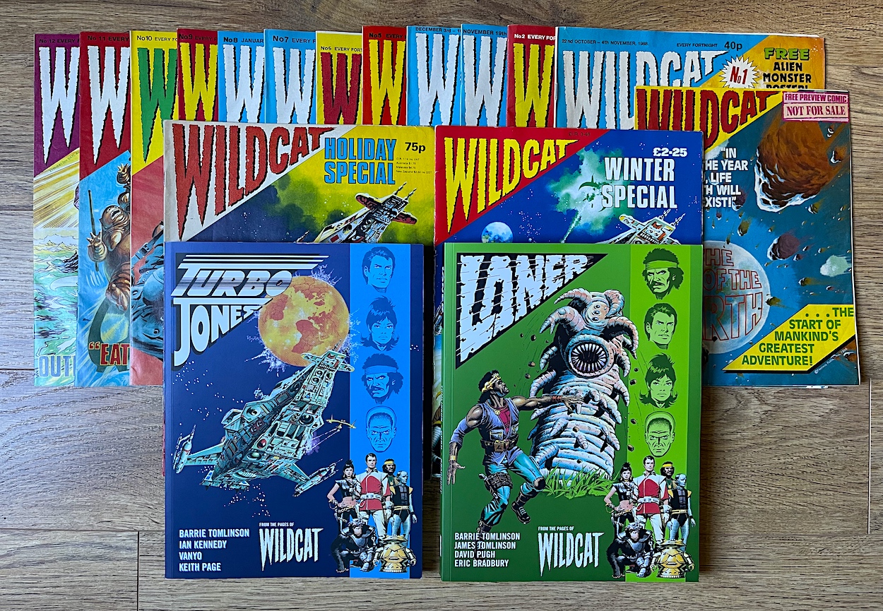
CREATiNG THE END: BARRiE TOMLiNSON WiLDCAT iNTERViEW

I was only one of countless people who grew up on the amazing comics of editor Barrie Tomlinson. Whether you were a football fan and followed Roy of the Rovers, engrossed in science fiction and fantasy and had a regular order for Eagle, or were caught up in all the early 90s hype and rushed to the newsagents every fortnight for the next Teenage Mutant Hero Turtles Adventures. These were just three of a huge catalogue of comics Barrie brought to life.

Personally, it was three of Barrie’s shorter-lived titles that hooked me and you can read all about Ring Raiders, Super Naturals and Wildcat on the blog, their respective real time read throughs already complete. I’ve previously asked Barrie questions about Ring Raiders and now he’s kindly agreed to chat with me about the latter of those three terrific comics, the post-apocalyptic Wildcat, the whole premise of which Barrie created.

The very last issue of OiNK contained the free preview issue of Wildcat, like a passing of the baton for me and I was hooked right away. It’s the year 2492 and Earth has been destroyed. Thankfully, the foresight of Turbo Jones meant several hundred humans were able to escape in search of a new home aboard the massive Wildcat spacecraft. After a long search a planet capable of supporting human life (and the comic’s stories) was found and we followed different teams as they explored the surface, as well as keeping up to date on the happenings back on the surprisingly dangerous living quarters of the ship.

The comic still feels fresh and original today. Barrie’s story is set up to allow five completely different stories every issue while also progressing an overall story arc. I was gutted when it all came to a premature end with #12 and merged into the pages of Barrie’s Eagle. It certainly wasn’t due to a lack of editorial quality, it just never found its audience. But I’ve really enjoyed reliving it and to celebrate finally reading the Winter Special for the first time let’s welcome Barrie back to the blog.

OiNK Blog: Hi Barrie, how did Wildcat first come about? It was marketed as a “younger person’s 2000AD” but was this the intention? What were the reasons behind the creation of this very different comic?

Barrie Tomlinson: The management asked me to produce a science fiction comic for a younger group than 2000AD. I went away and thought about it and decided to have one storyline running through the whole comic. I thought it would make it a bit different.

OB: Can you tell us anything about the character choices? Wildcat showed true diversity which wasn’t as regular a sight back then as it should’ve been. Were they permanent characters or interchangeable as time went on?

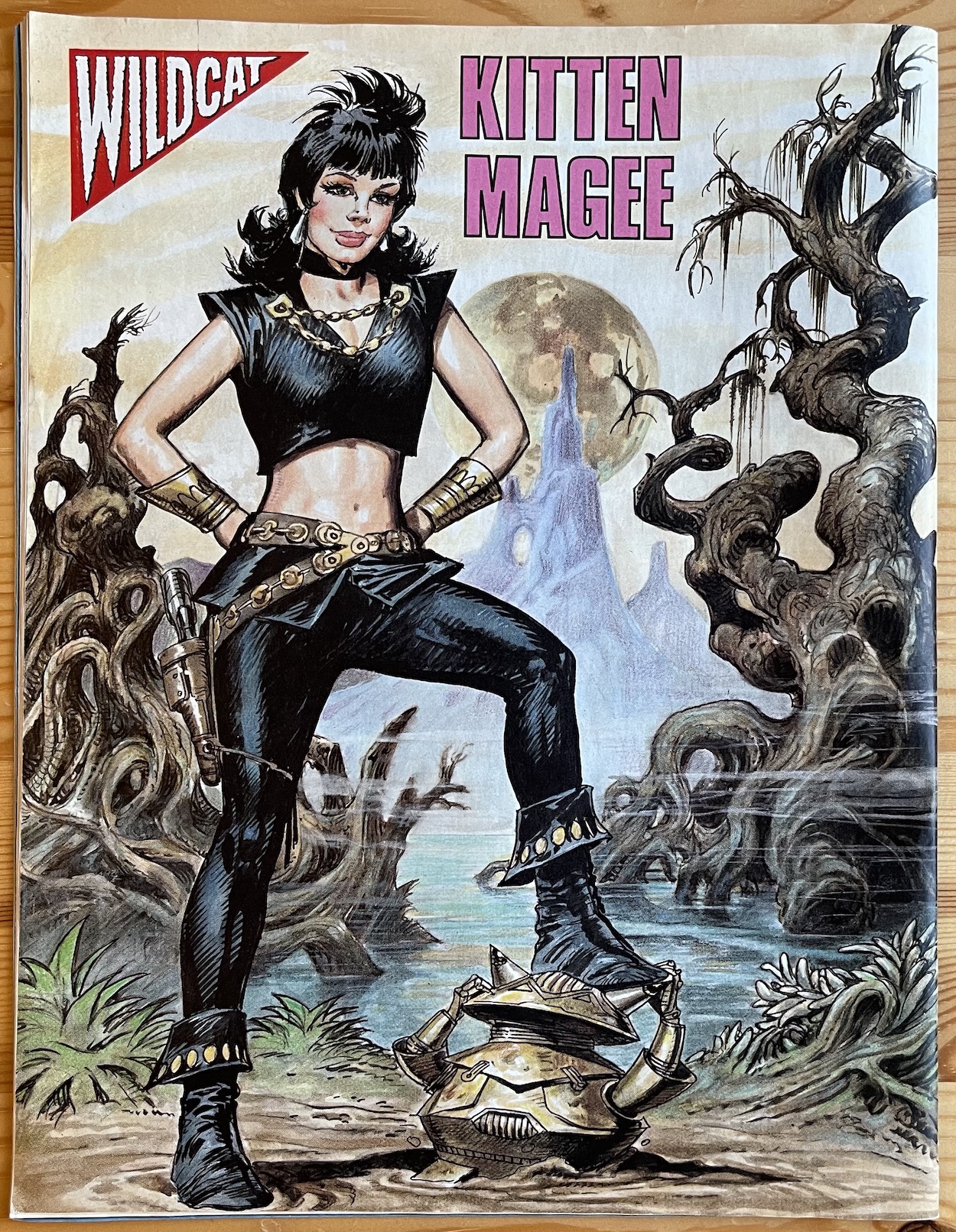
BT: I thought up the characters and wanted to reflect what was happening at the time, which is why I created a black hero and a female warrior. Girls had not been featured very much in boys’ comics so I decided it was time that they were! The characters were intended to be permanent ones.

OB: Is it true Loner was created specifically with David Pugh in mind as the artist? Also, is it true he’s said Loner was his favourite character he’s ever worked on? I hope that’s true!

Barrie: I really wanted David Pugh to be one of the artists and the Loner strip seemed just right for his talents. I hope Loner was his favourite character. He did fabulous artwork on that story and on Dan Dare in Eagle. (David has confirmed Loner is his favourite character and spoke about drawing the strip in the introduction to the Wildcat: Loner graphic novel from Rebellion – Phil)

OB: Did you have an idea of how the story would pan out in the long term? Were they to settle on that planet, keep finding new places to explore on it, or even fly off to discover a new planet every-so-often?

BT: The plan was they would fly off to other planets and there would be a long search for the right one.

OB: Can you give us any insight into who was in the writing team behind the comic and if you wrote any of the strips yourself?

BT: I wrote the script for the preview issue, to set up the storyline and the characters. For the regular comic my son James (under the name James Nicholas) wrote Kitten Magee. I wrote Loner. Joe Alien was by a new writer, David Robinson (Eagle, The Unbeatable Squirrel Girl, Army of Darkness/Xena) who later changed his name and has done a lot of writing since then. I’ve been searching but I can’t find anything [about the name change]. If I do I will let you know.

OB: Do you have any specific memories of your time on the comics covered on the blog you’d like to share with readers today? Anything at all you could tell us to give fans a little personal insight into what it was like to work on them?

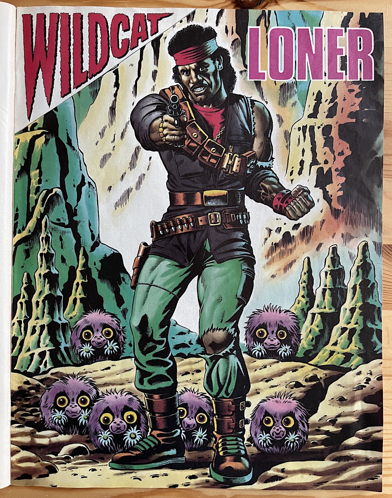
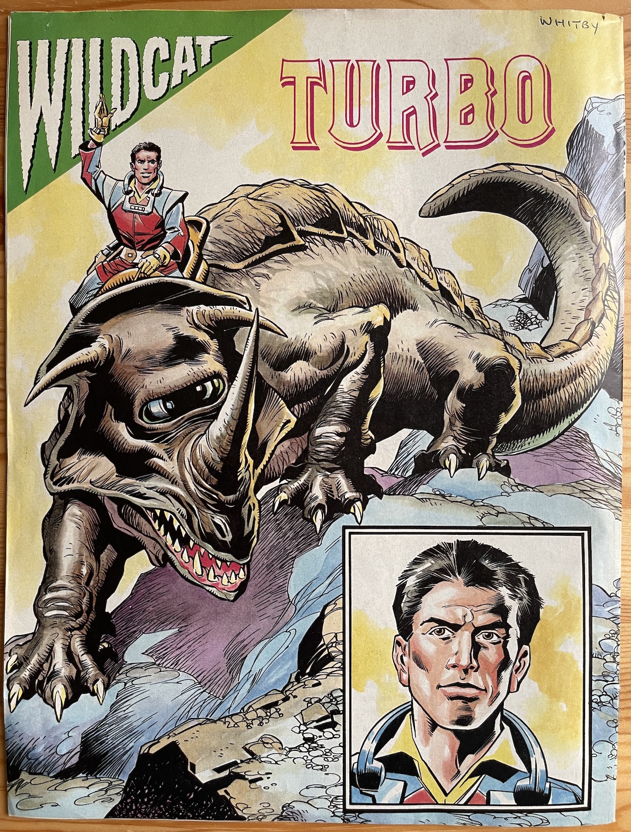
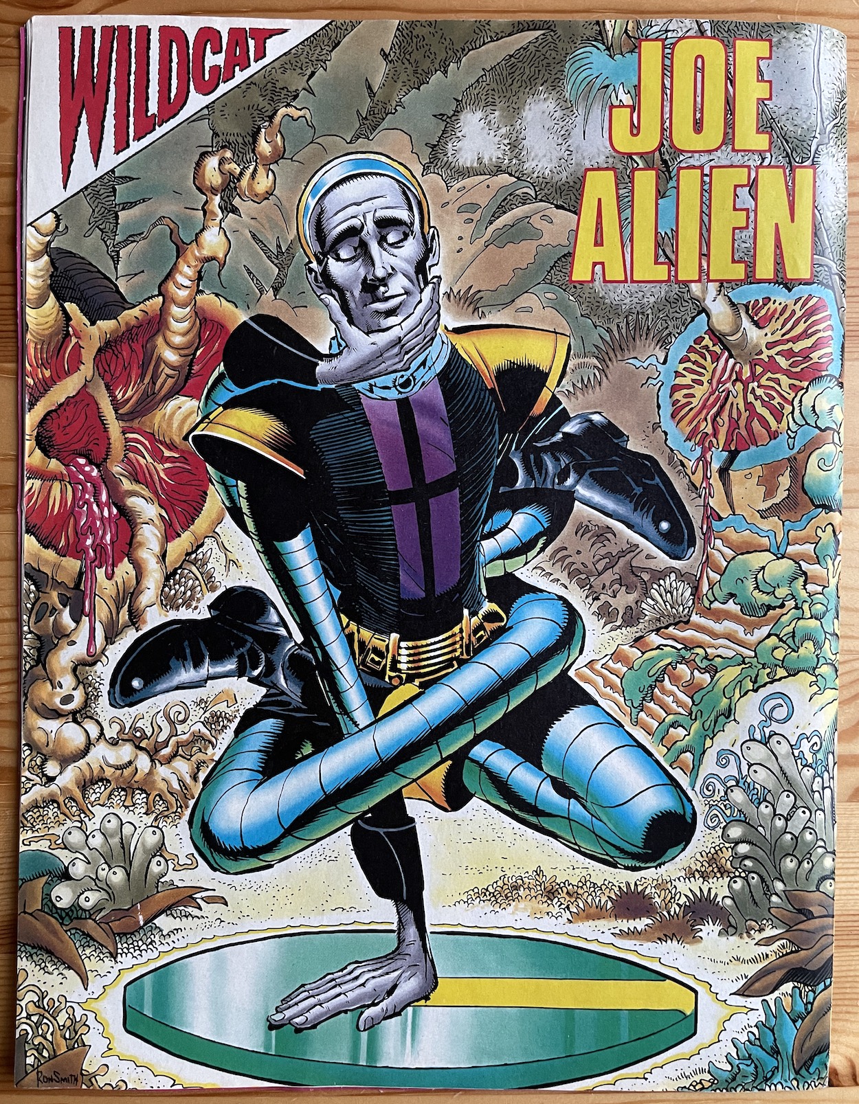
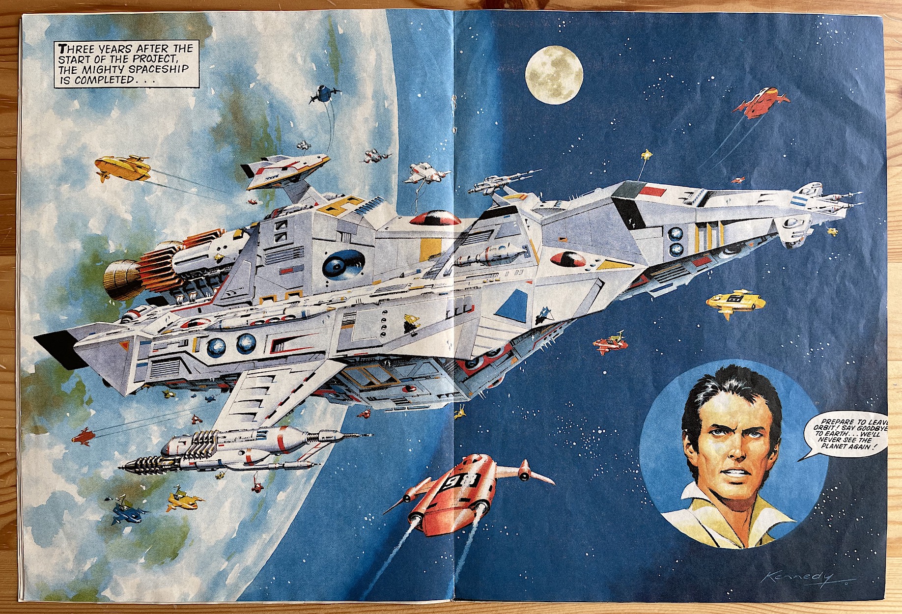
BT: It was great fun working on both those titles (Wildcat and Ring Raiders).  Wildcat particularly so, as it was all my idea, they were my characters and my storylines. It was very rewarding when the whole thing came together in a good first issue. I particularly enjoyed designing the free gift, which was a giant poster of The Alien Zoo of Targon-5. Each fortnight, readers could collect stickers which they would stick on the poster. The artwork was by the brilliant Ian Kennedy and featured not only the zoo but also the main characters Turbo Jones, Loner, Kitten Magee and Joe Alien.

It was an absolute delight to be able to ask these questions of Barrie. As always, he was a complete gentleman and very enthusiastic about his comics, which I found wonderful. I’d originally wondered if he would want to talk at all about two comics which ended only a few months after they began, but Barrie was completely open about how proud he was (and still is) of both Wildcat and Ring Raiders, the chat regarding the latter you can also read here.

WiLDCAT MENU

WRiTiNG RiNG RAiDERS: JAMES TOMLiNSON iNTERViEW

With its huge ensemble cast, near limitless storytelling possibilities and its ability to turn small plastic airplanes on rings into thrilling war machines piloted by dynamic, three-dimensional characters Ring Raiders was (and still is) my favourite non-OiNK childhood comic. Editor Barrie Tomlinson had assembled the very best talent to bring my latest obsession to life in 1989 and this included his son James, who went by the pen name James Nicholas at the time.

James was an acclaimed writer for Eagle, Battle and Scream! and would be the person responsible for one of my favourite stories in Ring Raiders. According to Barrie, James has always been an “aviation nut”, so surely this would seem like the perfect comic for James to write for.

“With the aviation connection, Ring Raiders really did stand out for me amongst so many ‘here today, gone tomorrow’ titles,” James told me. “This does bring back some great memories of marvellous times long ago. So good to hear that Ring Raiders was, and still is, appreciated so much by those that read, and continue to read, the title. It makes us writers (and artists I am sure) so nostalgic and proud. It was indeed so sad (I’d use the word tragedy, but that may be a bit too far!) Ring Raiders lasted only a handful of issues, it deserved a longer print run for sure. Many others clearly think the same!”

James very graciously (not to mention rather excitedly) agreed to answer some questions about this brilliant comic which unfortunately launched at a time when comic sales across the board were in decline, when it seemed no matter which one I started to collect it didn’t last long. The fact Ring Raiders remains a favourite all these years later is testament to its quality. So with an ace publication based on a childhood obsession and a fan of all things aviation at the helm of some of its top stories, I was really looking forward to this interview. James was not to disappoint.

OiNK Blog: It was great to hear you’re still an aviation nut and have fond memories of your time working on Ring Raiders. Were there any particular aspects of the idea that stood out for you?

James Tomlinson: Yes indeed, I’m still very much an aviation nut after all these years! Rather than just one story, I think it was the whole concept that really stood out for me. Pilots and aircraft from different eras locked in mortal combat in contrasting time zones all over the globe. It really had the makings of a long-running and thrilling sky-based adventure which seemed to be just what the kids back then would have loved. Well, that’s what I think anyway!

OB: What was the process like when a new licence came through, to get up to speed on everything you’d need to know about something like Ring Raiders? I imagine it wouldn’t have been a very long timeframe before you’d start producing stories?

JT: With these sorts of stories, based on toy products, there’s really no definite answer to this one. It varied so much. Sometimes we were given a lot of information about the characters and storylines, other times there was much less for us to go on. Of course, in the latter scenario, this could be a good thing as it allowed writers to use their own imagination more and pad out things with their own ideas. Again, the amount of time we got to read up and prepare for something new like Ring Raiders varied hugely. Often there had to be a very quick turnaround with the stories, on other occasions we had months to get things just right.

OB: You very kindly sent me a folder from the licence holders you used (look out for this at a later date) and it was very scant on details for each character, basically consisting of the information on the toy packaging and focusing more on the decals of the planes. Did you get anything more to go on, or was it up to you as a writer to embellish them as you saw fit?

JT: From what I recall there was indeed not a great deal to go on with the characters from Ring Raiders, so it was a case of each individual writer embellishing the characters. Obviously, if the licence holders didn’t like what the writer had done with the characters they could object and ask for changes, which did happen on a fairly regular basis (although not so much, thankfully, with Ring Raiders).

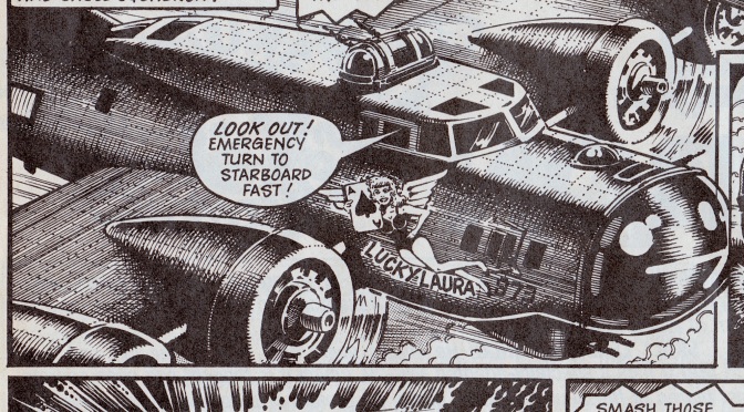
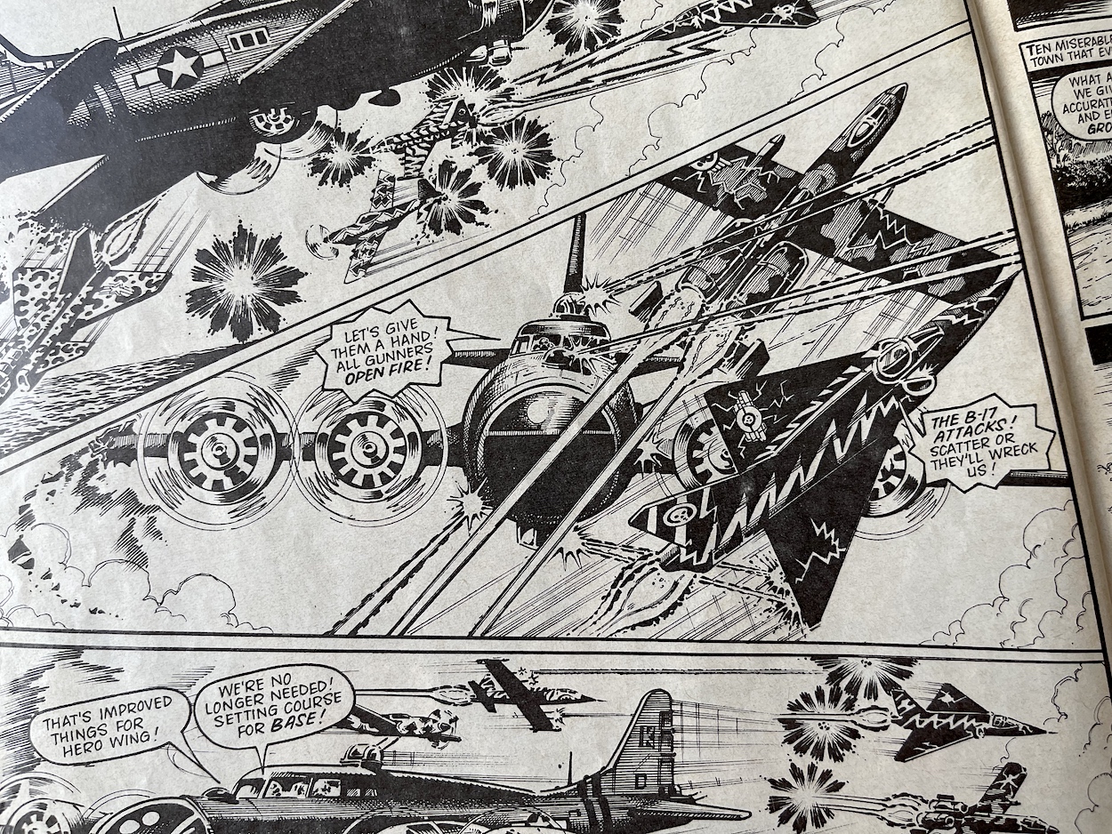
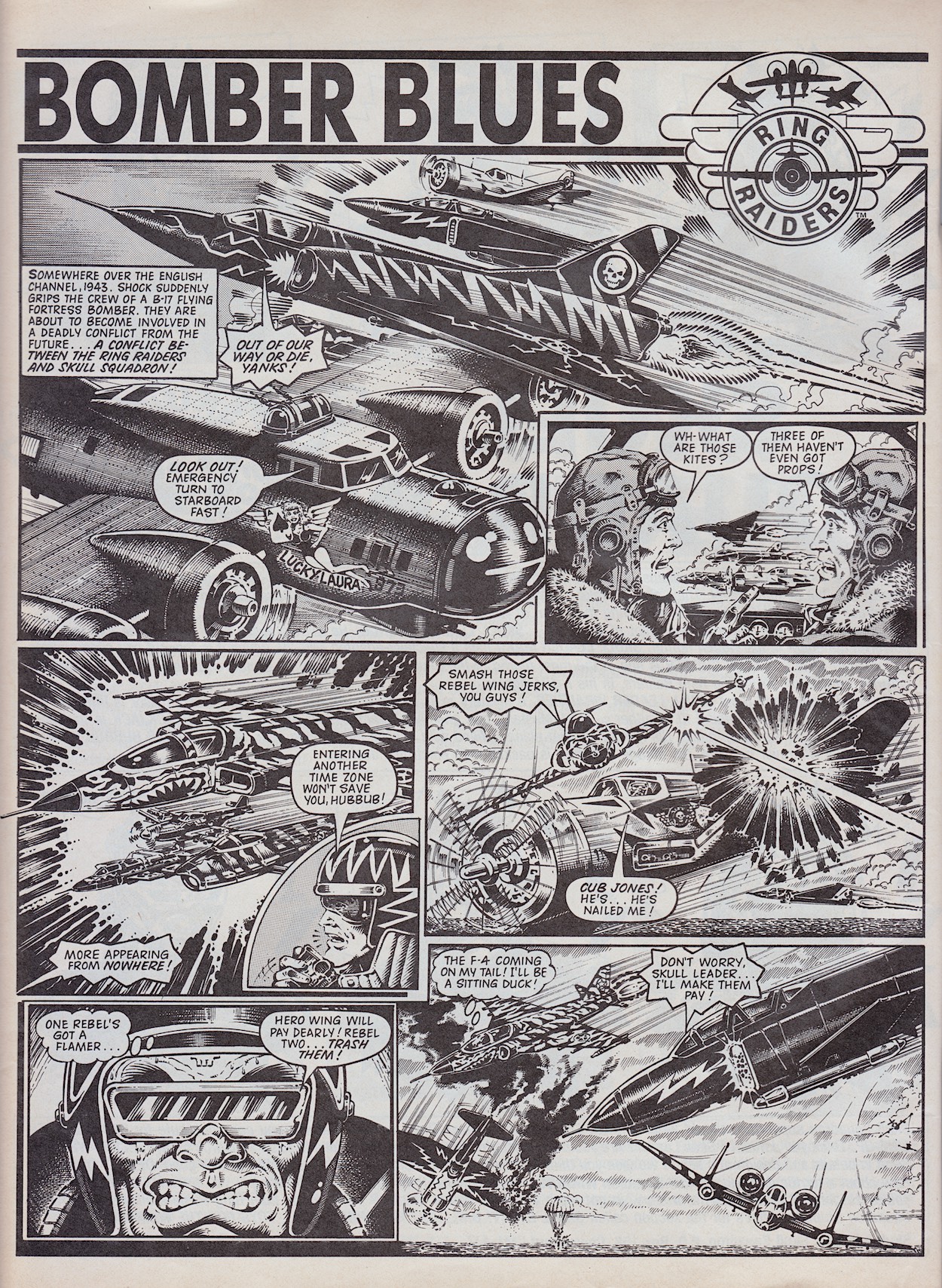
OB: It was like an anthology comic in many ways. Who came up with the story ideas and chose the characters you’d focus on? Your first story was set during World War II at a time linked to the origin story of the ‘Raider featured, Cub Jones. It’s also chock full of B-17 Fortress Bombers fighting modern day jets and classic prop planes. How very you.

JT: I think most of the basic story ideas came from the writers themselves, apart from those that, say, focussed on the early life stories of the individual heroes and villains. Those were probably more down to editorial decisions. Bomber Blues was very much my sort of story, with all my kind of ingredients. I’d always been a fan of stories about the Flying Fortress of WW2. This big plane with a big crew and a ton of guns really caught my imagination. Searching my dusty old memory banks, I seem to recall there was a serial story in Battle about an American Flying Fortress squadron flying out of wartime England which I always enjoyed. To have a Flying Fortress going up against jet fighters from the future was just perfect in my eyes. I’m sure I had a lot of input into this story choice! 

OB: Both of your published stories were beautifully illustrated by Don Wazejewski, how did that come about? Did you write your stories and they were assigned to Don or did you work together more closely to produce the final product?

JT: It was just luck that a great artist like Don Wazejewski was chosen to illustrate Bomber Blues. Certainly, in my time writing I never worked closely with the artist who would eventually illustrate my work. We always worked very much apart. Many lucky artists lived abroad in the sun anyway and it wasn’t so easy to keep in touch as it is today; no internet, emails or social media back then! I always thought the many different artists who converted my (sometimes difficult!) ideas to a finished visual work did a superb job. I wish I could have produced work half as good as they did. Unfortunately I’ve never had any drawing talent at all (always a bit of a drawback if you want to become an artist). Artists like Joe Colquhoun, John Cooper and Sandy James were at the top of their game. (The latter two also produced some stunning work for Ring Raiders – Phil) I take my hat off to their much missed talents!

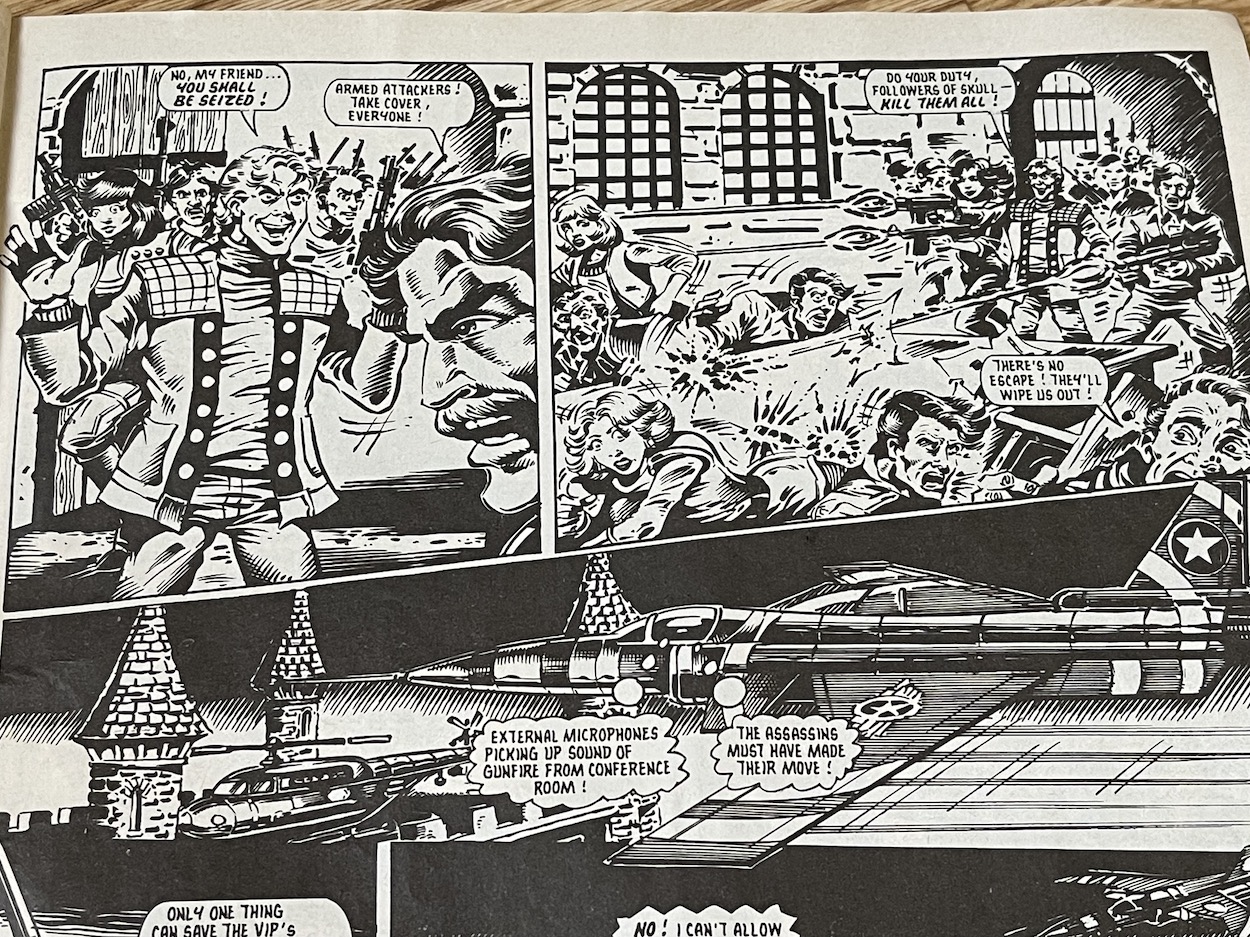
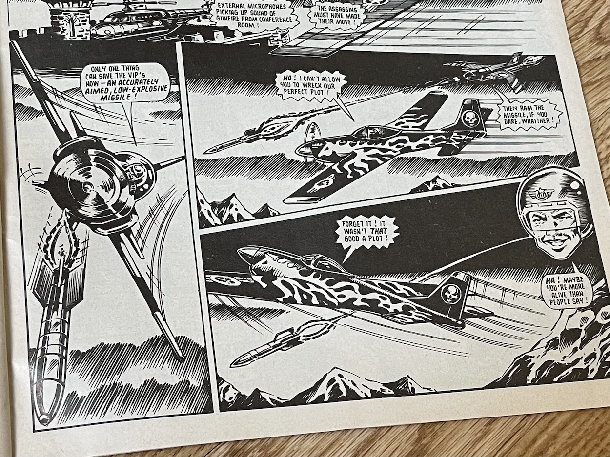
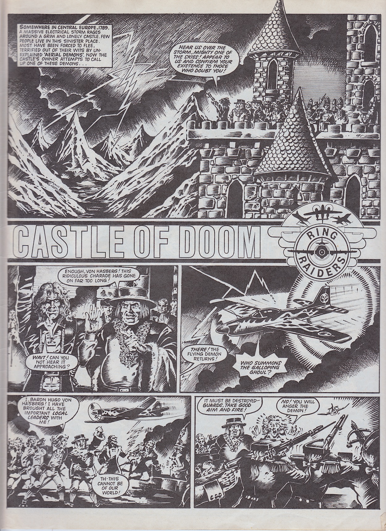
OB: Your second story ‘Castle of Doom’ involved more time travel into the past and a plot by Skull Squadron to undermine the formation of their arch enemies. It seemed to be setting up a larger scale story in the background. Was this the idea, something you could return to at a later date? Or am I reading too much into it?

JT: Once again, Castle of Doom was just my cup of tea when it comes to a story. Travelling back in time to change what will happen in the future has always intrigued and interested me. Maybe because I watched a lot of Doctor Who and The Time Tunnel when I was a youngster! I really don’t recall if there was any plan to make this story part of a long-running adventure (like my story Operation Deep Cover which I wrote for Battle Action Force) but it’s an interesting idea. Perhaps you should have been on the editorial team and suggested it, Phil!

OB: Oh if only! Once the ‘Raiders perfect time travel I’ll see you back then!

OB: In that story the main characters are the Ring Raiders’ Yakamura (X-29 fighter) and Skull Squadron’s Wraither (P-51 Mustang). These two characters’ craft were in a two-plane ‘Starter Pack’ which was how I started collecting the toys. Was this deliberate?

JT: I’m almost certain that the Yakamura X-29/Wraither P-51 Mustang were deliberately chosen to go up against each other in this story given they could be bought together in a Starter Pack. The idea was probably to encourage youngsters (such as yourself!) to go and buy the X-29/P-51 combo (then available in all good toy shops) and re-enact the dogfights from Castle of Doom. Whether this decision was down to Those Characters From Cleveland/Matchbox/someone in editorial or even the humble writer is lost long ago somewhere in the clouds!

OB: My inner fan just grinned from ear-to-ear! For UK fans your comic was responsible for developing the characters beyond the toys. Did the licence holders ever request alterations that affected your work? Barrie has told me they were more understanding than most.

JT: I’m glad the then young UK fans appreciated our efforts to flesh out the characters from what was perhaps a not-so-detailed starting point. Licence holders could often be very fussy about things and ask/demand/insist that changes were made. Usually this was at the script stage, although when deadlines were tight sometimes the artwork had already been completed. I’m thinking of Teenage Mutant Hero Turtles Adventures here rather than Ring Raiders. Last minute changes to the actual artwork were usually impossible, given that many artists lived on distant shores and there was just no scope to alter things late in the day. We’d usually say we’d take on board their comments and make sure we did things properly next time!

OB: You were responsible for the Photo File series, which we only got two parts of in #6 and the Special, unfortunately. The comic seemed to get a new found confidence with that sixth issue so I was gutted it was the last one. Can you remember any plans you or the team had for stories or the comic as a whole beyond these early issues?

JT: Yes, I was behind the Photo File series, I’d produced similar types of aircraft fact files for other titles in the past. Again, this was right up my street as I obviously had more than a little(!) interest in the subject matter. I was disappointed only a couple of these were completed, the P-51 Mustang and the F-104 Starfighter, the latter for the Special. The Starfighter was another of my all-time faves, a really special plane which had the nickname ‘The Rocket With A Man In It’! I do agree that Ring Raiders was getting better all the time and the sudden end of the title was a real shock to us all. What the long-term future held for the title is difficult to say with any certainty. I would have hoped it would have gone from strength to strength as we got more used to the characters and expected storylines. There was just so much scope with all that dogfighting action through the centuries!

OB: Finally, Barrie gave me some details of unpublished stories which were being worked on when the comic was cancelled. There was apparently a Christmas story and another called ‘Blow Bubbles’, both written by yourself. Can you remember anything about them?

JT: There were at least three of my stories for planned future issues which were sadly unpublished. Apart from Blow Bubbles and the untitled Christmas story, there was also a story called Hijacked. Unfortunately, I don’t recall anything about any of them! I’m not even sure what stage the stories had reached, whether I’d finished or even started writing one, two or all three. I’m afraid the three tales have disappeared into ‘The Bermuda Triangle’ of unpublished writing!

Thanks so much to James for this brilliant interview and his detailed, enthusiastic answers. It’s been great to bring this comic back to life through the blog and to give it the appreciation it so clearly deserves. If it had continued I’ve every faith it would’ve evolved into an epic title to rival any licenced fare in the UK, including even Marvel‘s Transformers. Sadly, it was not to be.

But we’re here to celebrate this comic, not mourn it and I’ll leave the last word for James:

“It’s been a pleasure spending time revisiting the history of Ring Raiders. Those were great days!”

Just last week I published an interview with Ring Raiders‘ editor Barrie Tomlinson and before the month is out the long-awaited review of the Ring Raiders Special, so stay tuned!

RiNG RAiDERS MENU

EDiTiNG RiNG RAiDERS: BARRiE TOMLiNSON iNTERViEW

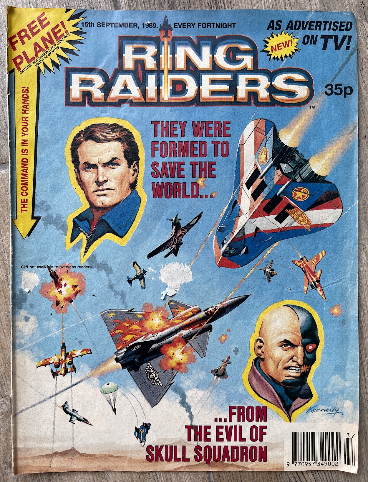
My very favourite non-OiNK comic from my youth may have only lasted six fantastic issues and one brilliant special in 1989/90, but that didn’t stop me from being hyped to read Ring Raiders again as an adult for the blog. They may have been based on obscure toys that weren’t the success they were expected to be, but the comics hold up incredibly well today, full of character, fun stories and high octane action.

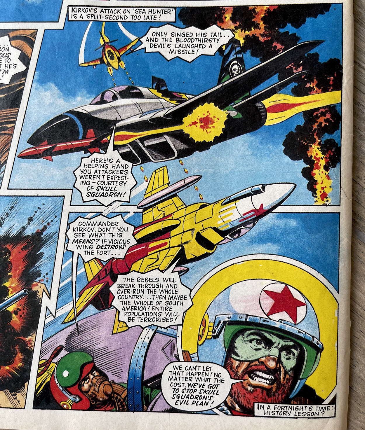
In the then-near-future of the late 90s Skull Squadron were a terrorist organisation on the brink of world domination. Capable of time travel and made up of the most sinister of pilots plucked out of various eras they planned to use this ability to destabilise the world order, with them in control. In response, the governments of the world formed the Ring Raiders, an elite airforce formed in a similar way, each equipped with a special communication and energy ring.

The gotta-collect-’em-all toys came with small comic books featuring basic dogfights, but it was no small feat to transform those little plastic Matchbox planes into compelling strips with fully formed characters. While the toys may seem to limit what a comic could do, the opposite was true of that background storyline which was almost endless in scope. Fleetway Publications were going to need a top editor to craft their new fortnightly comic, so they naturally turned to Barrie Tomlinson (Eagle, Tiger, Wildcat).

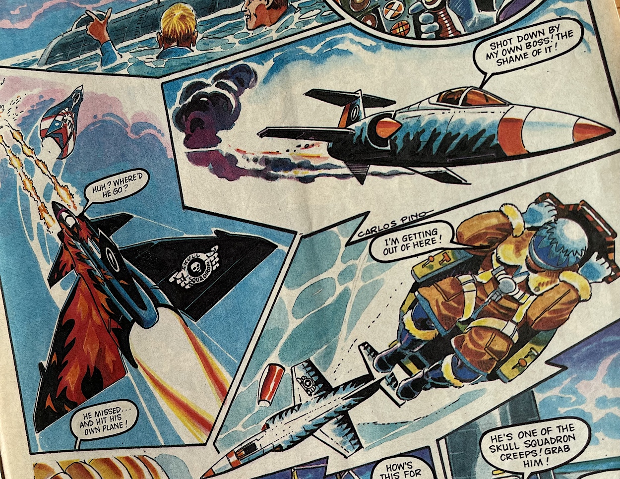
Barrie formed a team of the very best in British talent; Ian Kennedy, Carlos Pino, Angus Allan, John Cooper, Scott Goodall, John Gillatt, James Nicholas (Tomlinson), Don Wazejewski, Tom Tully, Sandy James and Geoff Campion. I must’ve read each issue dozens of times and was gutted when it (and the toys) ended so prematurely.

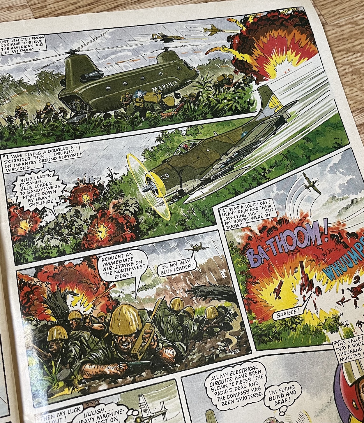
The Ring Raiders comic genuinely surprised me with just how brilliantly it read for the blog reviews. It was exciting and had masses of potential to explore an epic storyline. Within its short lifespan it covered World War II, Vietnam, the threat of nuclear annihilation, futuristic sci-fi battles, murderous back stories, civil wars and even an homage to a certain 80s 3D movie I’m a big fan of. I loved the range and I think as an adult I appreciated the character development at the centre of such fanciful tales even more.

I was so excited when Barrie agreed to answer some questions for me and I came away from our chat delighted at how proud he was of this licenced comic fave.

OiNK Blog: Hi Barrie, can you remember what made Fleetway choose the Ring Raiders licence? Looking back they were just tiny Matchbox planes with only minimal character drawings on the packaging.

Barrie Tomlinson: Fleetway Publications was a massive organisation. The first I would hear of a new licence would be from the Editorial Director. It would have been negotiated by a non-editorial department and presented to us. I just had to grab all the info I could find about the storyline and characters and make myself an instant expert on the subject.

OB: There’s a similarity between Ring Raiders and Wildcat. Both have an anthology feel while wrapped up in an overall theme. Was this a conscious decision or was it just befitting the licence?

BT: It wasn’t a conscious decision. I would have just wanted to use the characters I had been presented with and turn the comic into something which was liked by British readers.

OB: Were you personally responsible for selecting the writers responsible for fleshing out these characters?

BT: Yes, I would have been responsible for selecting the writers. It’s really unfortunate that the detail books for Ring Raiders were not kept. They would provide a wealth of information. My son James, who wrote under the name ‘James Nicholas‘ was one of the writers. He was a natural, as he is an aviation fanatic! I’ll have to guess at the others. Probably Tom Tully was one. I can’t remember writing any of those scripts myself… but I probably did! (He did indeed as we later found out during the read through, as well as the names of the others – Phil)

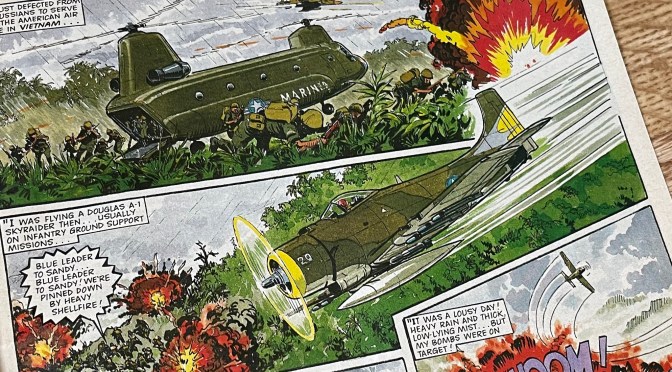
OB: There were some mature themes in there, such as Vietnam. This strip in particular wouldn’t have looked out of place in a classic IPC war comic. The setup allowed stories set in the past, present or future, time travelling, fantasy of historic tales. It sounds like a writer’s dream title! Did you feel you had that freedom in a licenced comic?

BT: Everything we did had to be approved by agents of the copyright holder. Each script and piece of artwork had to be submitted and approved so we always had to stick closely to the original material we had been sent.

OB: There’s a feeling of a larger scale story developing in the background too. Was anything worked out in advance or were you winging it (pun not intended) and seeing how they developed over time? Can you remember any plans you had if the comic had continued?

BT: There were not any massive plans. It was always a rush producing titles like this as everything had to be approved. Once we had taken on board all the story/character details it was just a question of talking to writers, recruiting artists and getting on with it. I was pleased with the high quality artwork we achieved on this title, using artists who were greatly experienced in working for my department.

OB: A cartoon series was also in development which was very different to the comic in basically every way, going down a more sci-fi route with clichéd characters. I preferred the flawed characters in your comic by far.

BT: We didn’t have any contact with the cartoon series. We could develop the characters to a certain extent but everything would have to be approved.

(Below, Castle of Doom was written by Barrie’s son James and featured plenty of time travel and the beginnings of a larger overall story arc.)

OB: Speaking of those approvals, were there any requested changes or outright rejections? There was very little established in the toy line so for me the comic was really creating these characters.

BT: Occasionally, they would ask for alterations. Nothing too much. Some of the other toy comics were much more hands-on. I had to train people doing the approving that it was a comic. At first, they were looking at each individual frame as if it was a one-off poster. Eventually they got to realise these were small frames and the slick comic artwork was very different to that used in a giant poster or on a toy product. As I recall, we didn’t have that problem with Ring Raiders.

OB: It seemed at one stage almost every comic I began collecting got cancelled very quickly. Having read back over some of those titles it certainly wasn’t because of a lack of quality! Why do you think so many excellent comics were cancelled so early in the late 80s and 90s?

BT: I think it was just that the comic era was coming to an end. Television and computers were taking up children’s time. Once upon a time, the delivery of the weekly comic was a big event in a child’s life. It was delivered with the morning paper. Dad read it as well. Then children became more sophisticated and they wanted something more than a comic. They were growing up faster.

OB: Finally, the late Ian Kennedy always said his favourite subject to draw was airplanes, especially fighter planes. Ring Raiders seemed like a perfect fit for him. Was he contracted to work on covers for Fleetway or was he selected by you personally? Can you remember any comments from him on his time working on Ring Raiders?

BT: Yes, I would have selected Ian to work on the title, he wasn’t contracted for covers. I think I remember him being disappointed when Ring Raiders came to an early conclusion.

I was delighted that Ian worked on Ring Raiders and other titles in my group. His recent passing was a sad occasion for the world of comics. Greatly missed but his art will live on!

OB: Thanks so much for your time and insight Barrie, it’s been a pleasure to read this comic again, thank you for producing such a quality read for fans at that age.

BT: It’s great to know that the title is so well remembered. It’s a great tribute to the writers, artists and editorial staff who worked on Ring Raiders. It may not have lasted long but I think it looked good as a comic in its own right.

If you’d like to find out more about Ring Raiders and read the real time reviews just click here.

At the time of writing the final edition, the whopping 64-page special will be reviewed later this month and next week watch out for a wonderful, lengthy interview with Barrie’s son and Ring Raiders writer, James Tomlinson (or James Nicholas as he was known at the time).

RiNG RAiDERS MENU