Tag Archives: Dick Hansom

ALiENS #22: GAME OVER, MAN. GAME OVER!

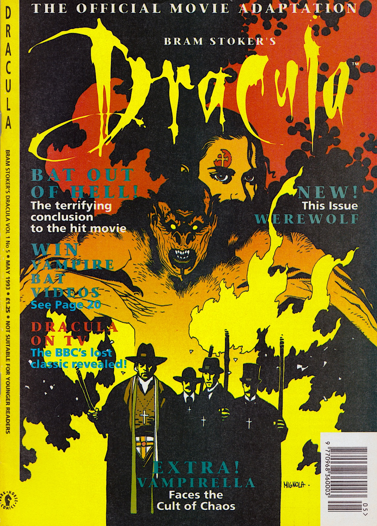
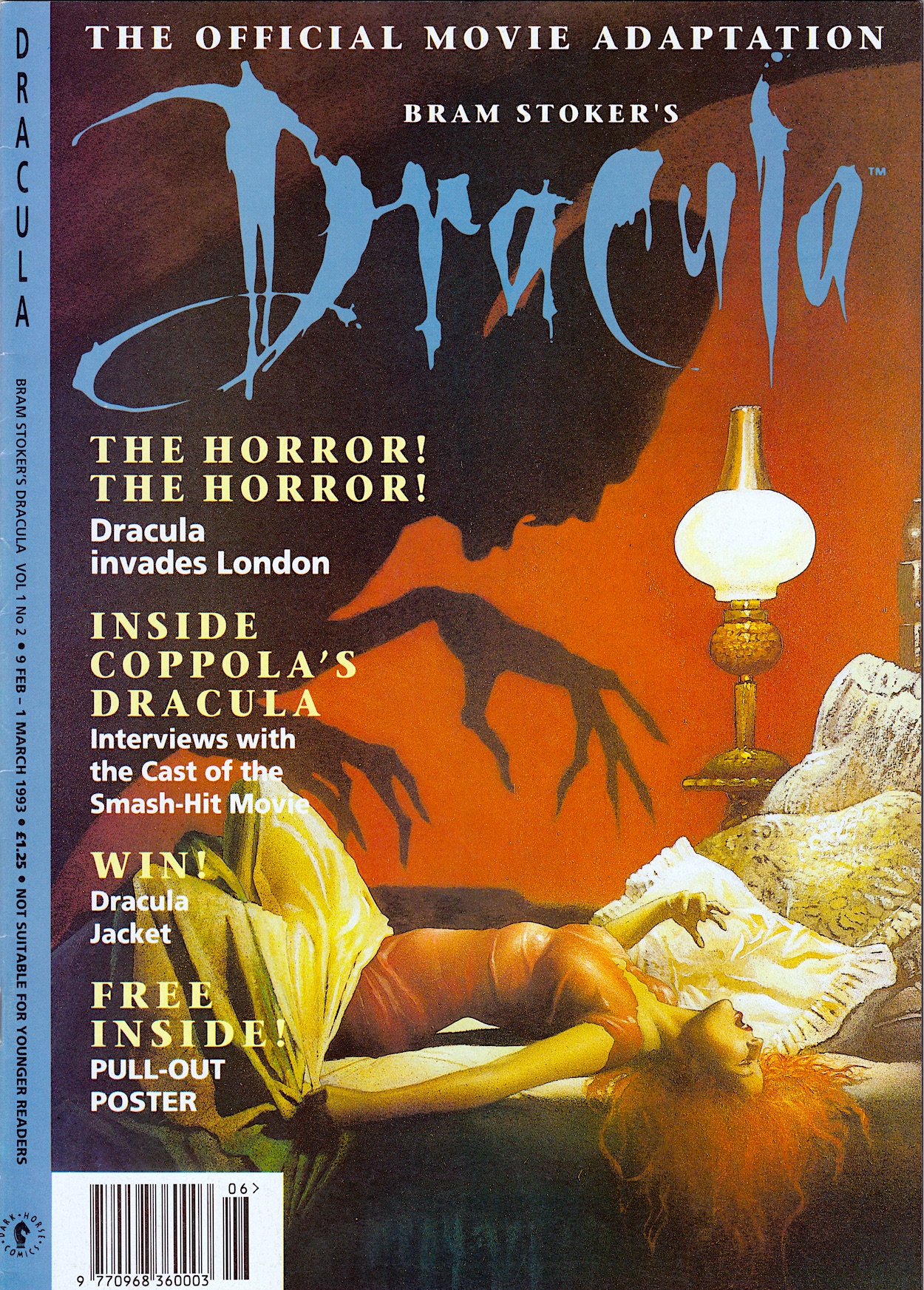
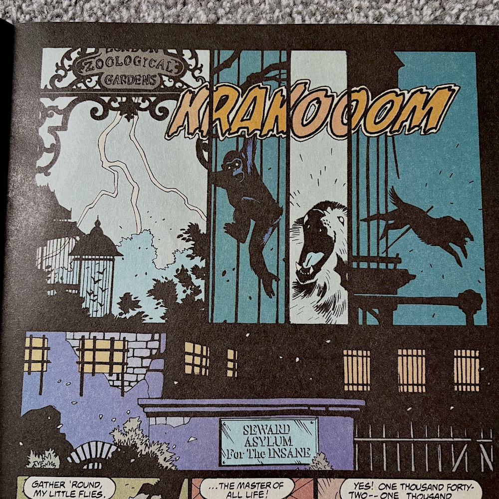
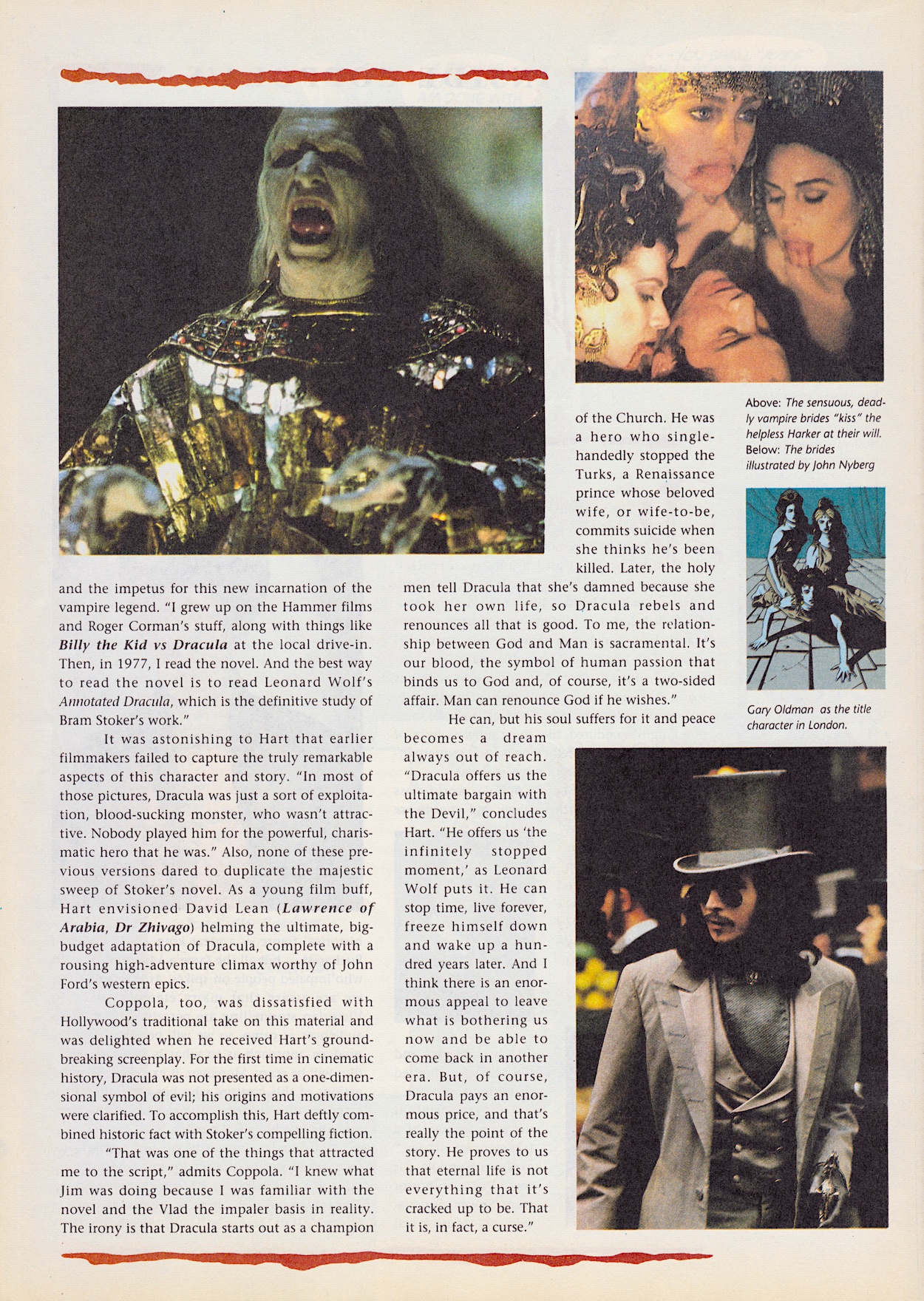
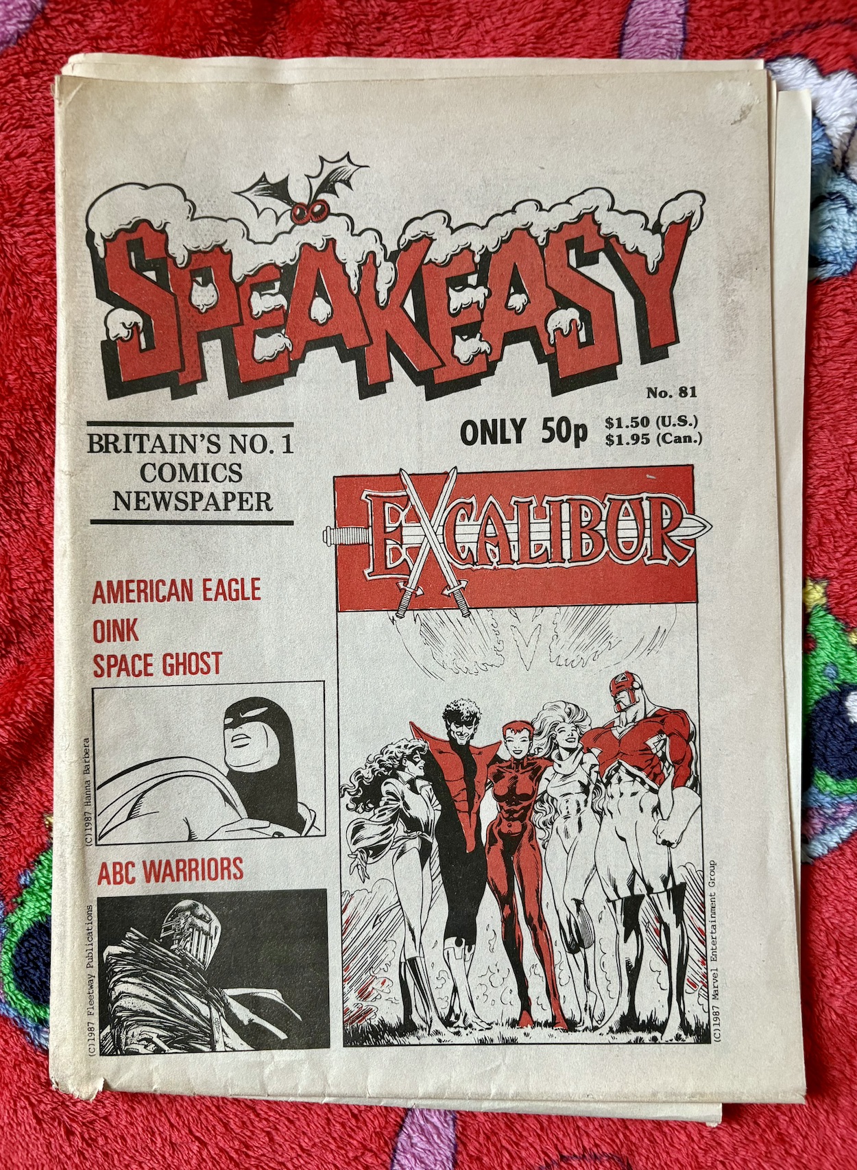
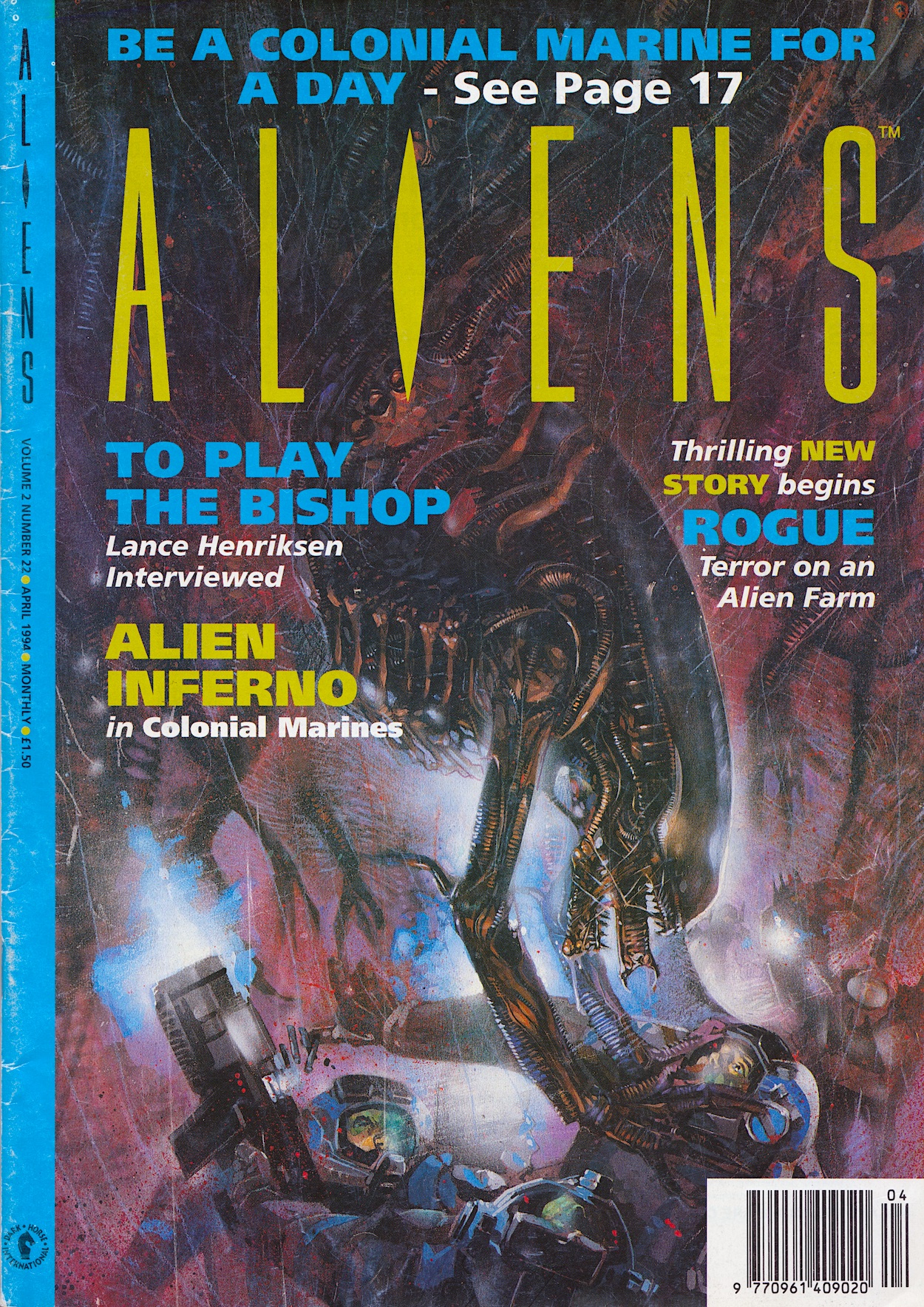
This Duncan Fegredo (Crisis, Hellboy, Lucifer) cover takes me back to travelling through Scotland on a train during an Easter holiday as a teenager. I’d flicked through a close friend’s issues before but this was the first Aliens I owned. I’d never read anything like it and I loved every page, even if I was a bit lost in the continuing stories at times. It’d be the only one I’d read until 2024 because it was also the last before its publisher, Dark Horse International went bust.

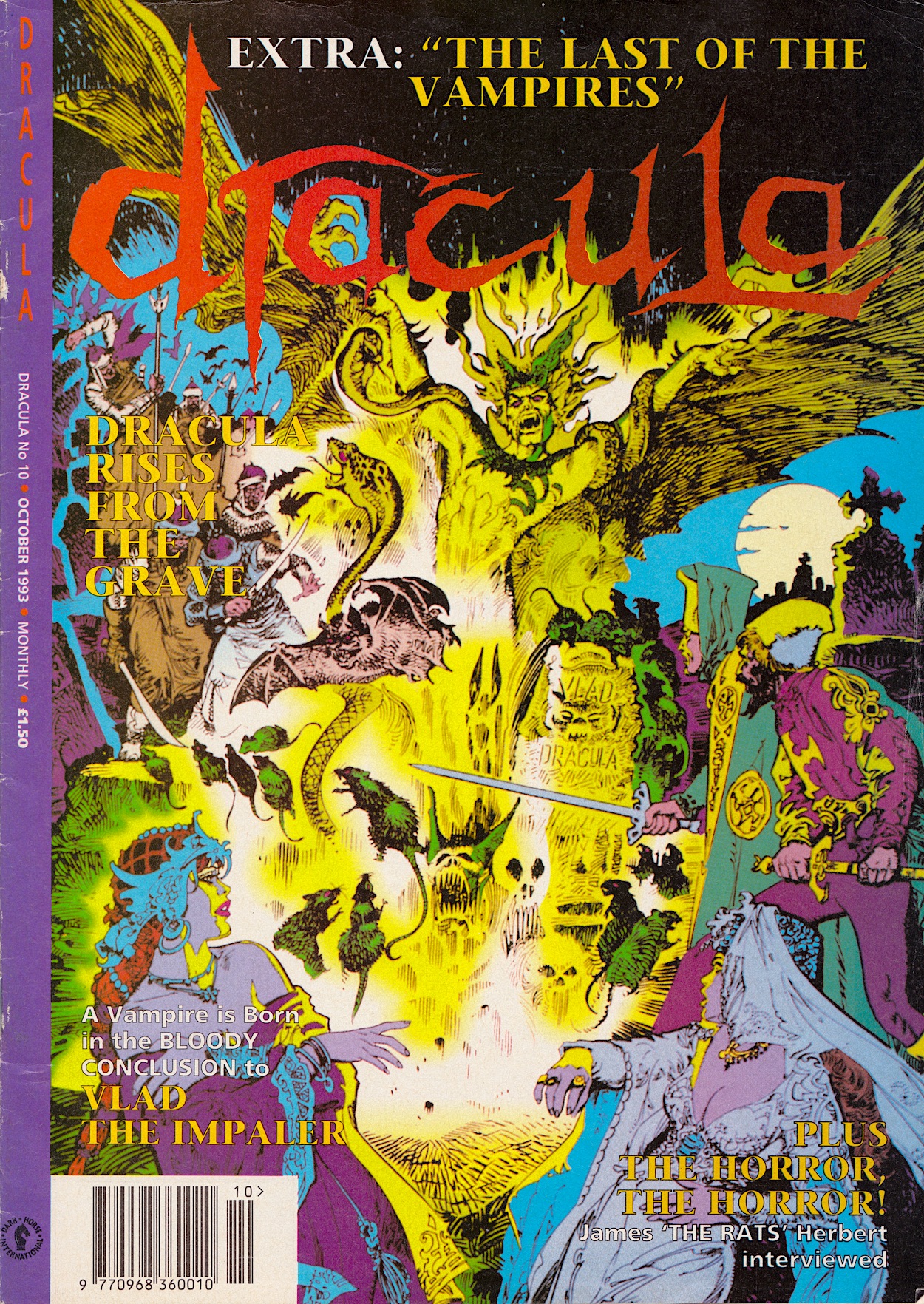
While Jurassic Park would get a reprieve and return after a few months under the Manga imprint (at least for a little while), DHI’s flagship title wasn’t so lucky and #23 would never appear. As you can see from the editorial it must’ve happened quickly because it’s business as usual. With hindsight, there’s even a somewhat unfortunate opening sentence from Dick Hansom, standing in for regular editor Cefn Ridout for the month.

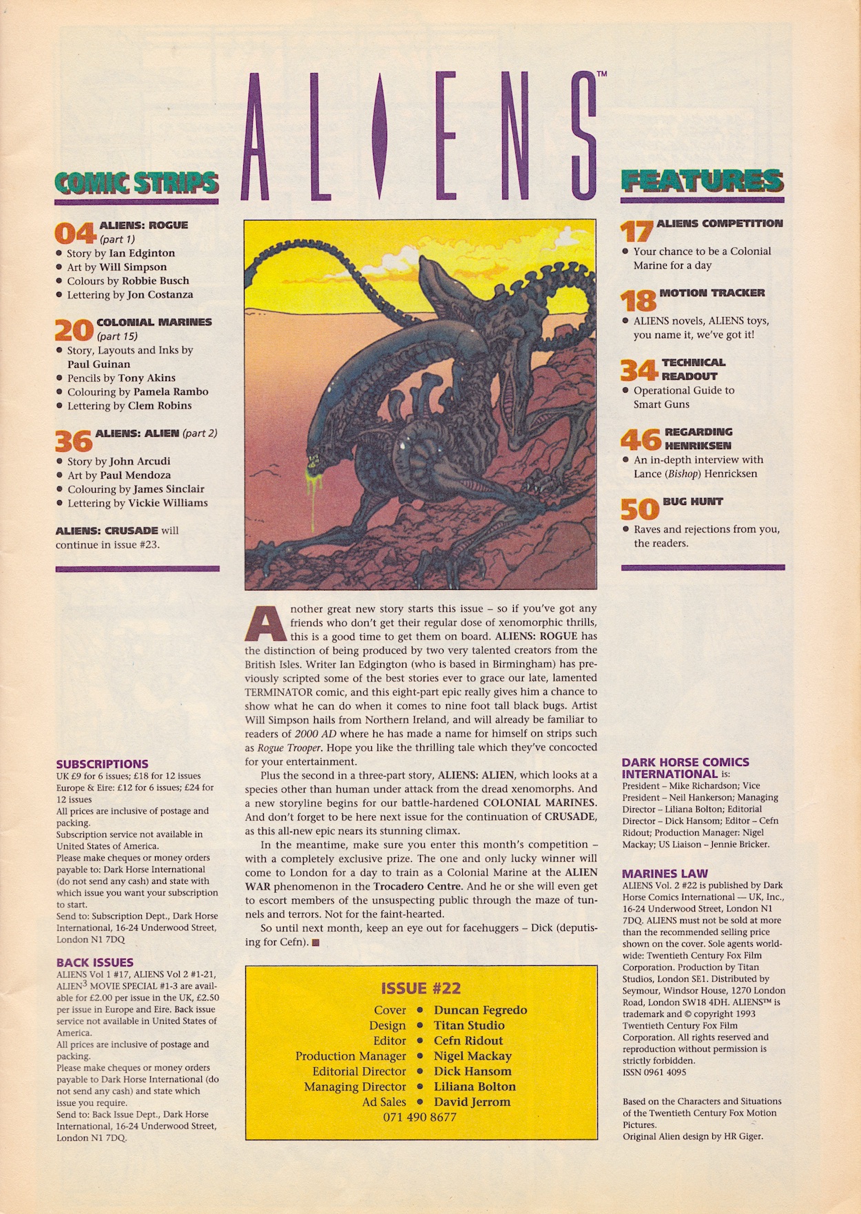
Despite previous promises, Crusade hasn’t returned so we remain two parts away from the end, Colonial Marines has been with us since #9 and we’re still several months of issues away from wrapping that up, and there’s a new eight-part UK strip from Ian Edginton (Batman: No Man’s Land, The War of the Worlds, The Terminator) and wonderful Transformers artist (also Judge Dredd, Hellblazer) Will Simpson. Nice to see Northern Ireland get a wee mention, too. Although I was mistaken back in #9‘s review when my ageing memory told me this last issue also had a prose story!

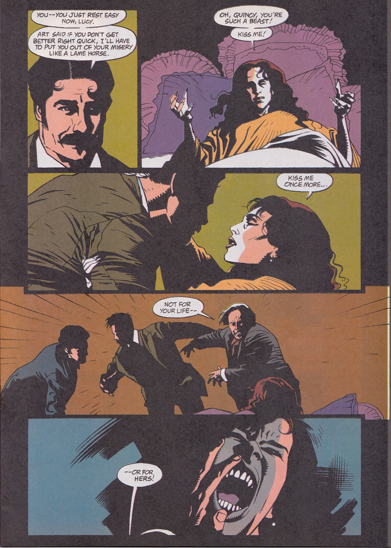
Rogue gets 13-pages to spread its wings yet very little of consequence happens, but that’s only a complaint in the context of this being the final issue. Normally, I’d be praising it for the characters it establishes really well here, particularly the two female pilots. But knowing this is all we’ll get does affect things, which is unfair on the strip I know, but it can’t be helped.

One thing I really don’t like isn’t unique to Rogue, it’s across the whole Alien comics franchise (and the fourth film, Resurrection) and it’s how the aliens are now seen as a commodity. Yes, I know the company is always after them for their biological weapons potential but in a lot of the strips that’s already been successfully accomplished. They’re even milked (for want of a better term) for a recreational drug, reducing these supposedly terrifying monsters to cattle.

The best stories have been those that remember how the aliens are meant to be seen, in my eyes anyway. The human politicking, the nature of human greed and the associated social commentary are some of my favourite aspects of the Alien series, I just think it can be done without desensitising us to the xenomorphs. In fact, Rogue begins with a narration that explains humanity have forgotten we were once the prey instead of the predator, but it only acts to remind me of my above points.

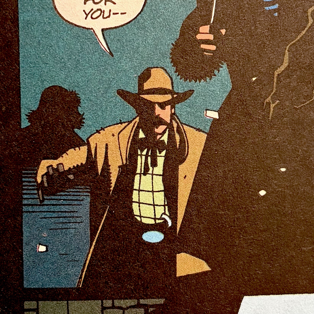
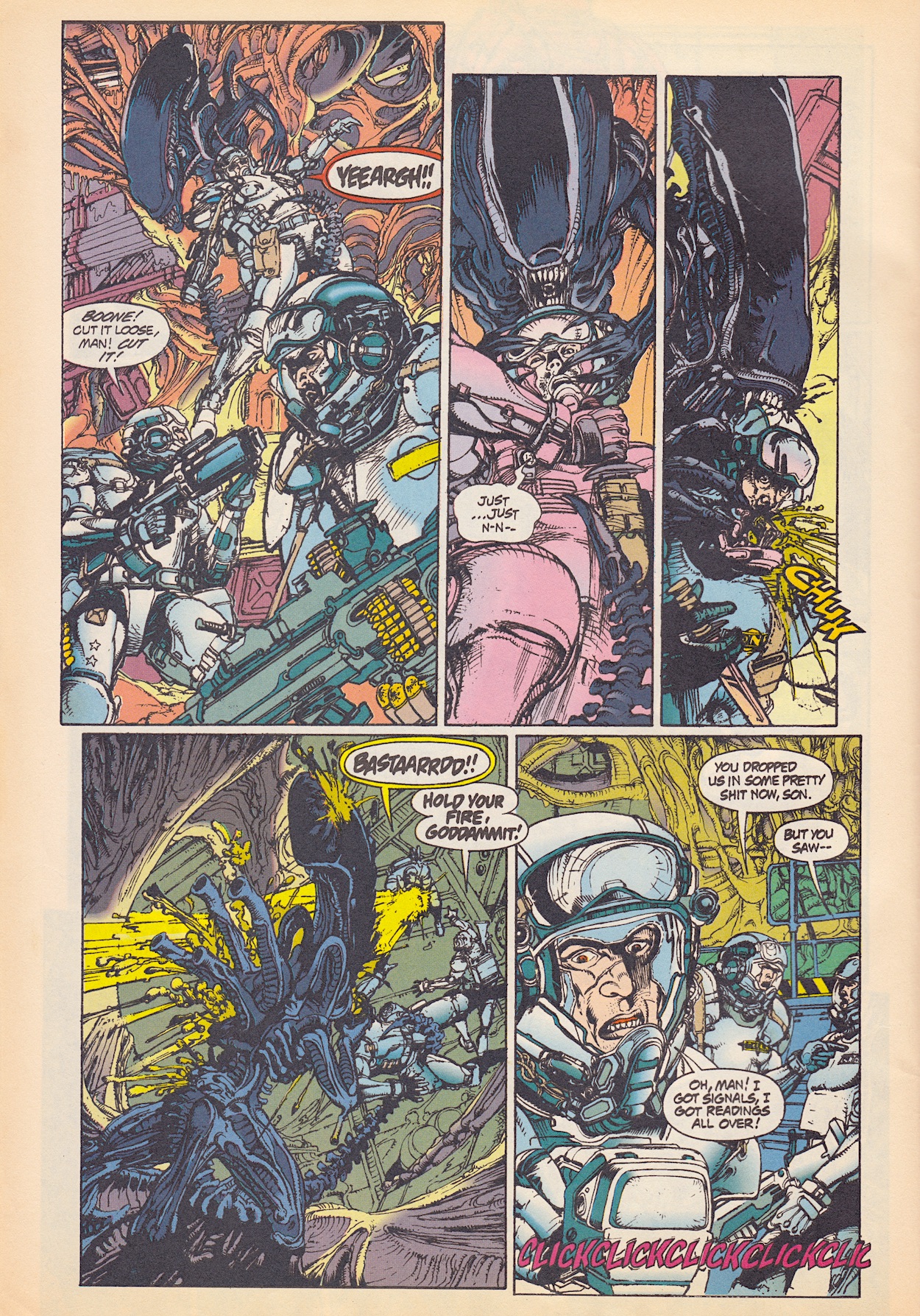
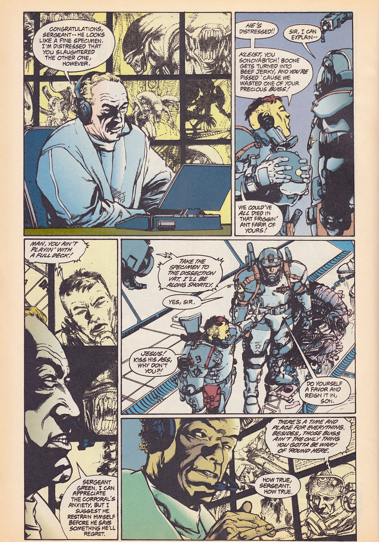
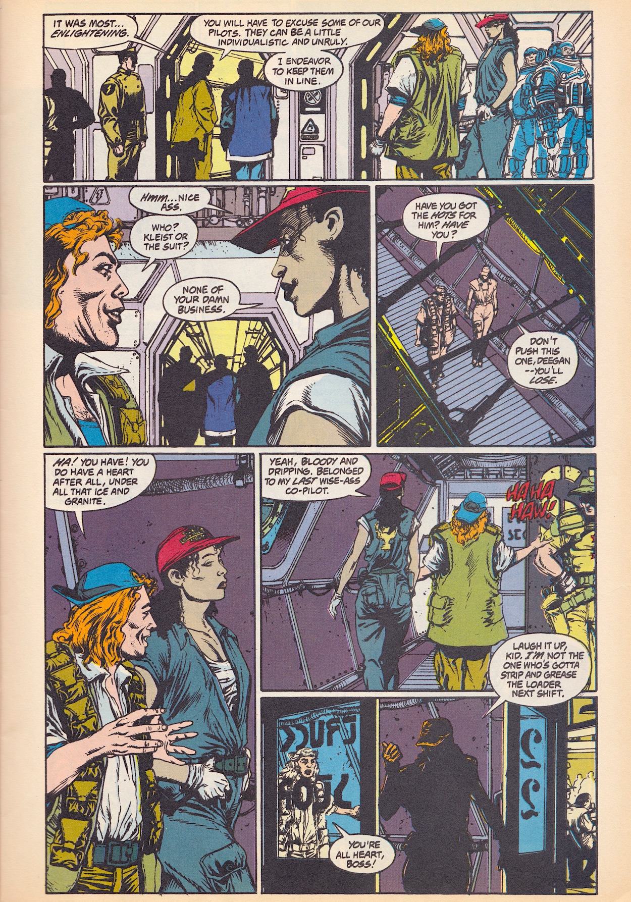
One such boss, Ernst Kleist has sent Marines to recover an alien and berates them when one is killed, despite the fact it had ripped one of them apart! Will’s art, coloured by Robbie Busch (Babylon 5, Black Panther, Huntress) is great and pilots Zajer and Deegan are enjoyable. I assume they’ll end up fighting for their lives at some point as the main characters. For now, their banter is enjoyable while they bring a man called Mr. Kray to meet Kleist, although there’s no indication yet as to why. However, he does describe his trip with them as “enlightening” to Kleist, who just looks down his nose at the pair.

There’s definitely potential here. If you’ve read the full story (or indeed, any of the unfinished tales here) please don’t tell me what happens, I intend to finish them someday. After this there’s a competition to be a Colonial Marine at Alien War, despite the criticisms the comic had levelled at it. Then it’s on to our final slice of contemporary sci-fi news. I’ve enjoyed Dave Hughes’ Motion Trackers and my trips back to the mid-90s, the latest releases and the predictions for the then-future. Here, the Aliens toys do look fun but the column even states these are for kids so you have to wonder why they existed when the films were all ’18’-certificates.

That ‘Pixelvision’ short isn’t some cool retro-styled computer graphic film, despite its name and the fact it prominently features a computer game. It was a children’s film camera manufactured by Fisher Price, believe it or not. Director Michael Almereyda’s short documentary-of-sorts is on his website, although don’t expect to be too thrilled by it and prepare to struggle to hear what the two boys are saying. Frustratingly, you’ll want the camera to sit still while showing clips from the Alien³ game instead of all the stylistic shaking.

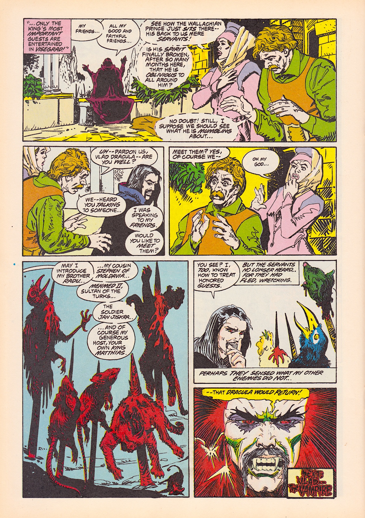
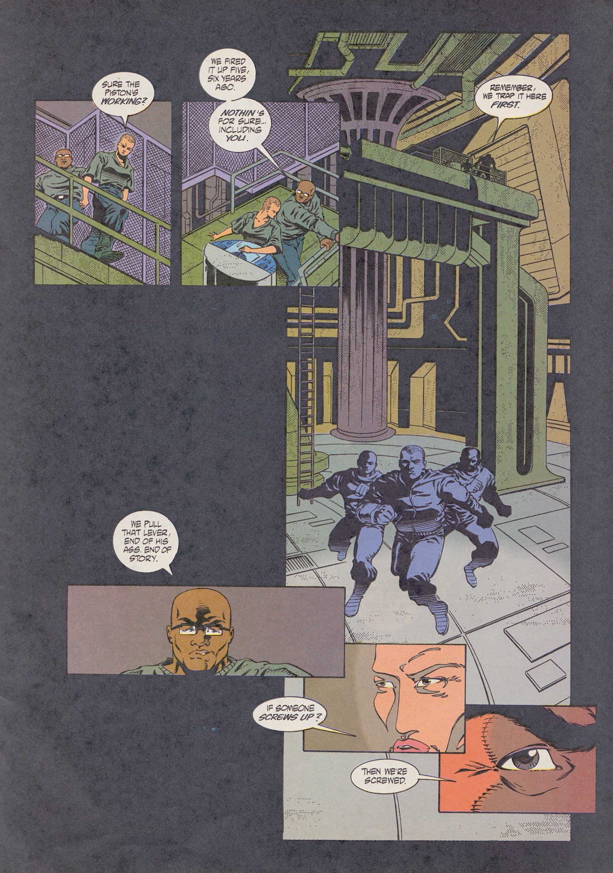
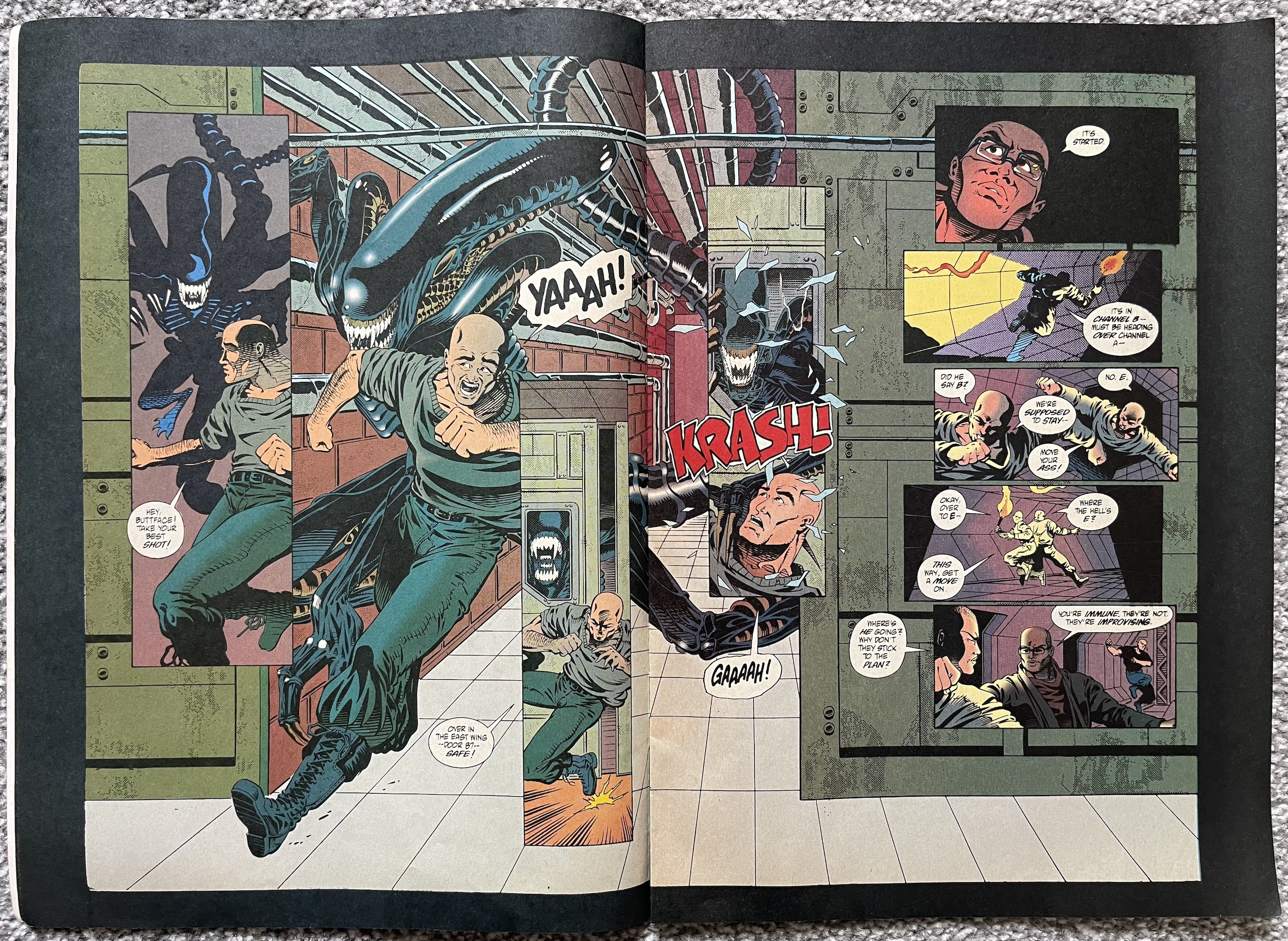
Colonial Marines starts a new chapter and it’s all change for the creative team. For the UK comic this is part 14 of what was meant to be a 24-part series and isn’t it typical that one of the best episodes of the whole thing so far arrives in the final issue. Writing, layouts and inks are by Paul Guinan, pencils by Tony Akins, colouring by Pamela Rambo (Preacher, Star Wars, Y: The Last Man) and lettering by Clem Robins

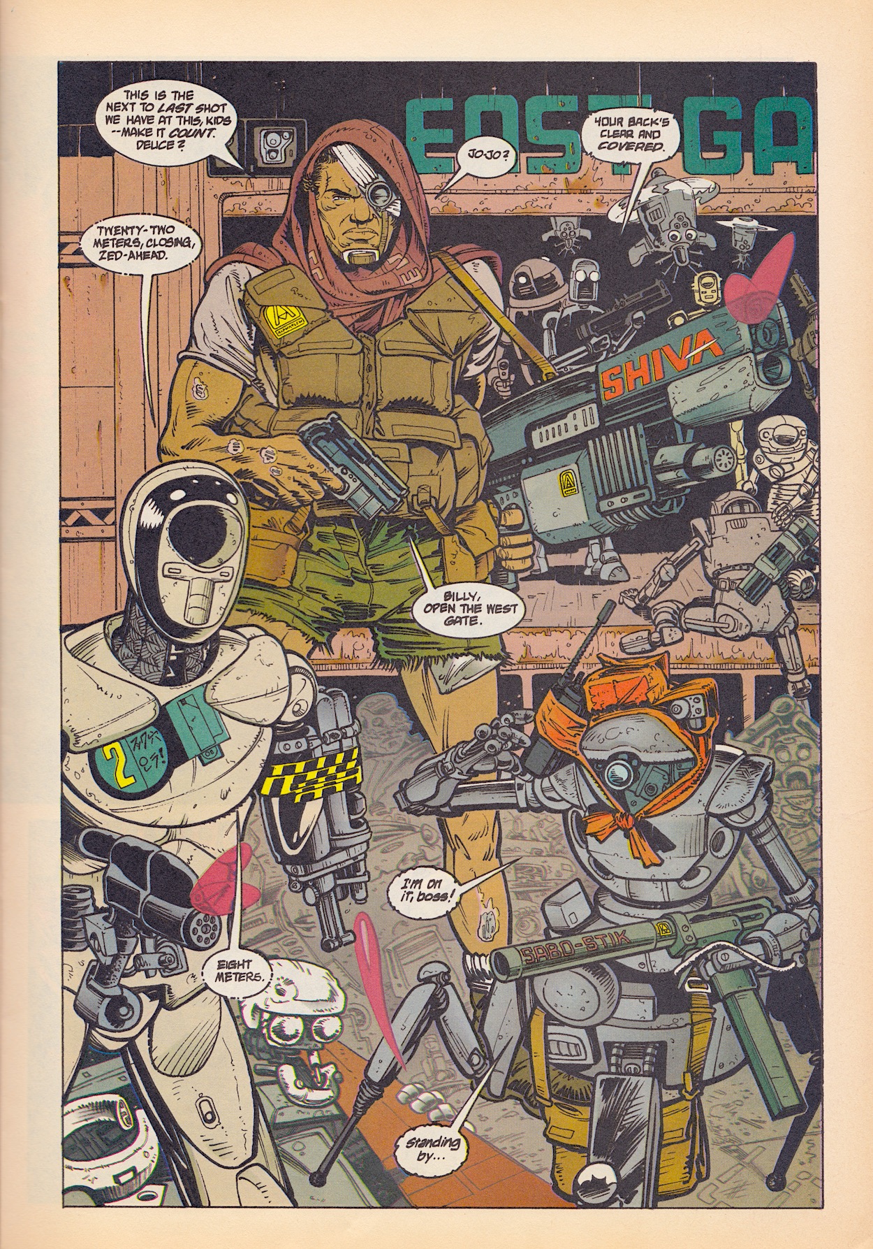
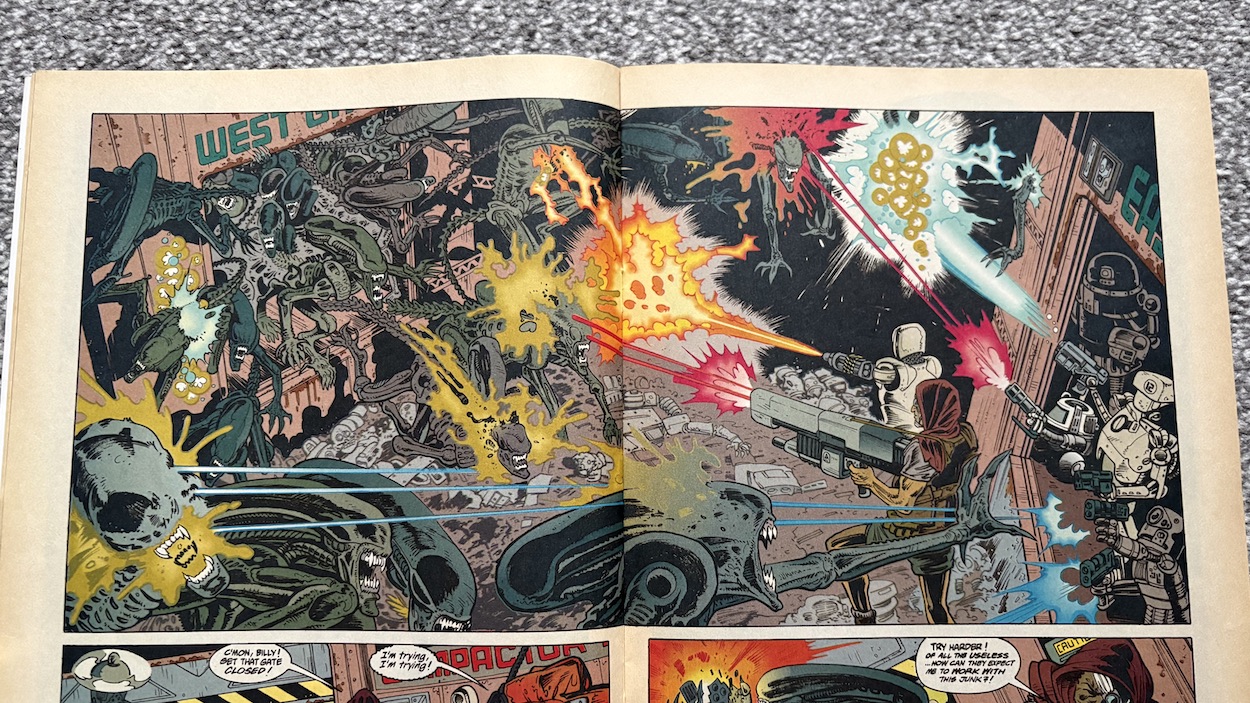
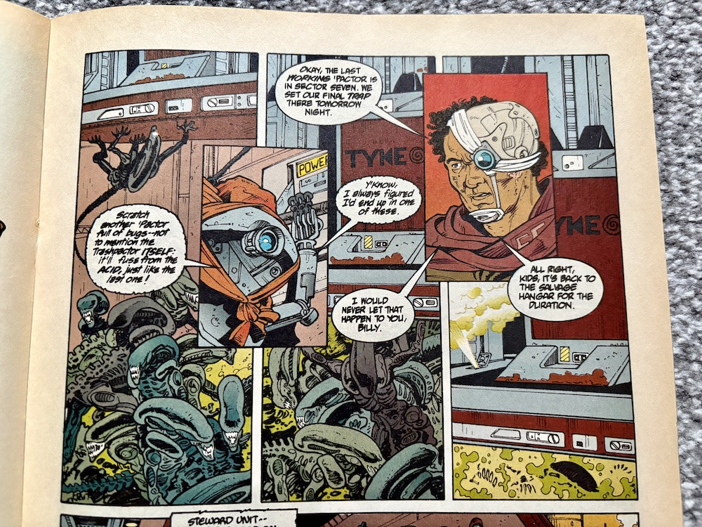
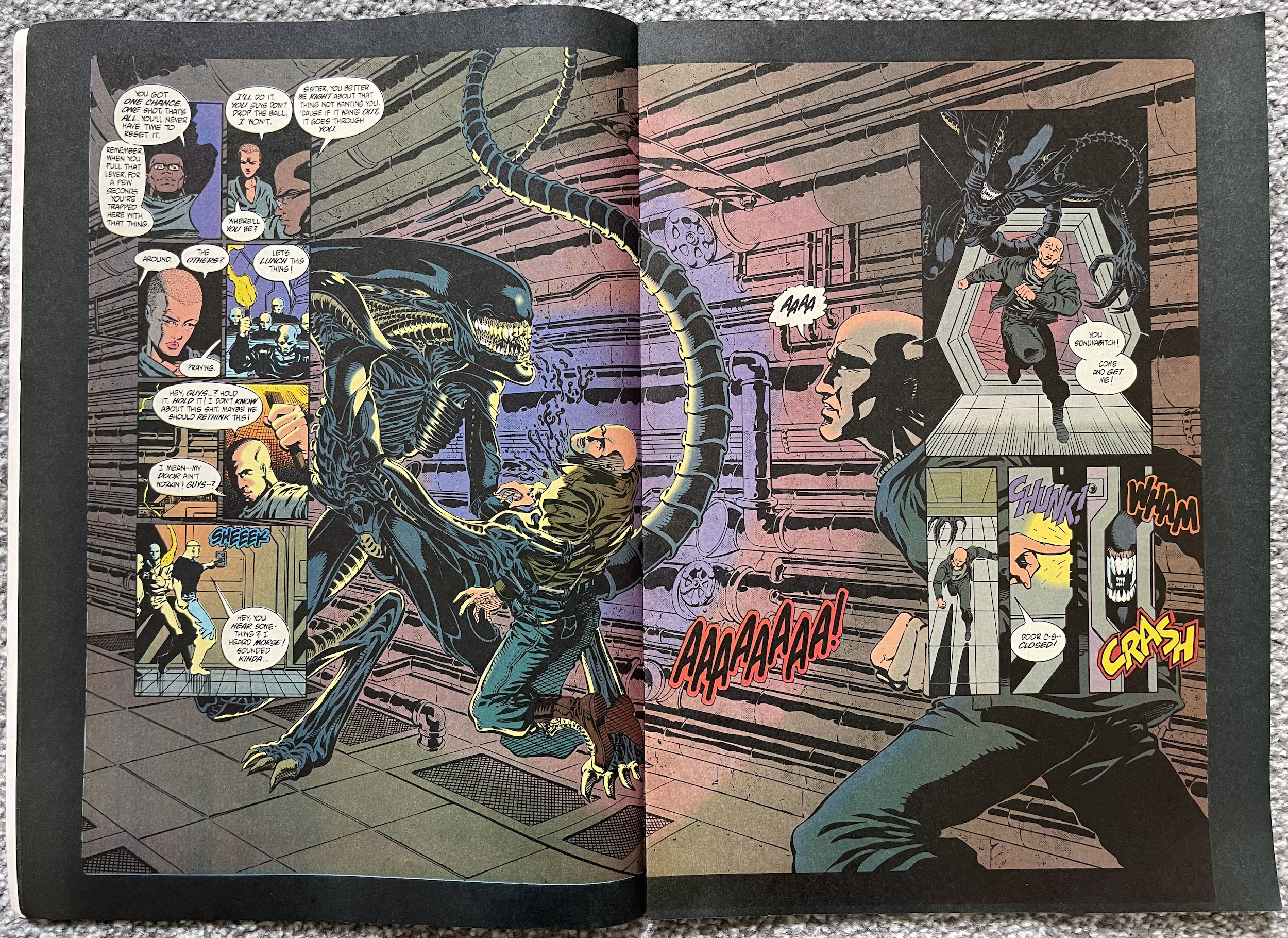
There are some great new characters here. I’m simply loving all of the robots who bring much needed levity to the comic. The art is a huge step up too and the human characters are once again easily identifiable so things are easier to follow. But why did they have to do the dirty to Billy? He could’ve been a star! These new robots and the synth are part of Beliveau’s secret group hiding out on a dirt ball orbiting the planet, where he’s stashed a secret supply of his company’s weapons for the inevitable fight ahead.

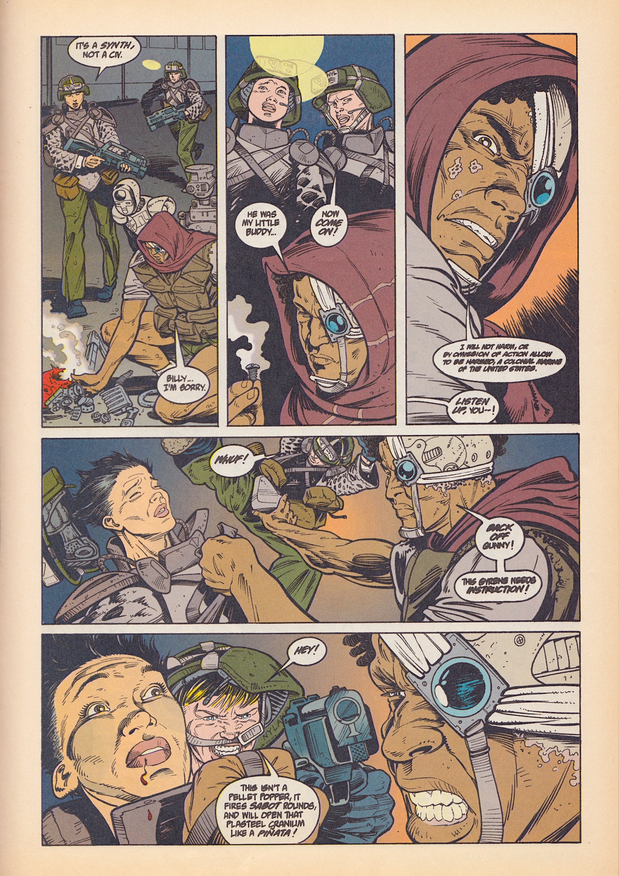
So, I thought he was the obvious mysterious bad guy to begin with but I couldn’t be happier to have been proven wrong. I love well-written misdirection. Marine Chen’s addiction to the alien jelly almost causes more disaster but I was less interested in that than the introduction of this hideout and its wonderful array of new additions. Like Rogue before it, this is about establishing characters and a scenario more than moving the plot forward.

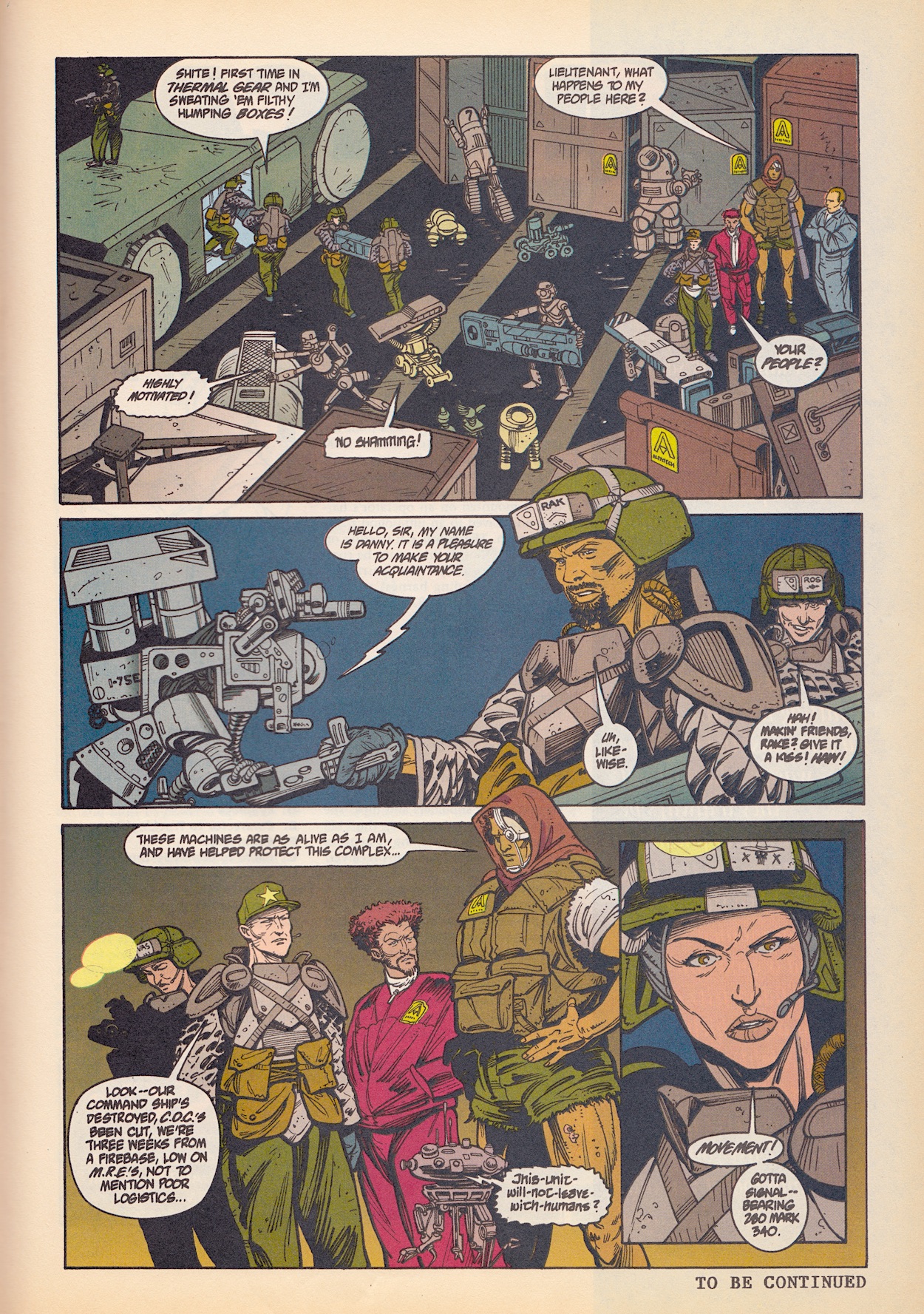
But it still had me gripped thanks to this mechanical ragtag team and I’m gutted I won’t see them develop further. The overall Colonial Marines story had gone a bit stale in my opinion, possibly from the lack of an overall guiding hand (as I detailed last time) but this has reignited my interest again, just in time for us to say goodbye. I won’t forgive them for Billy, though.

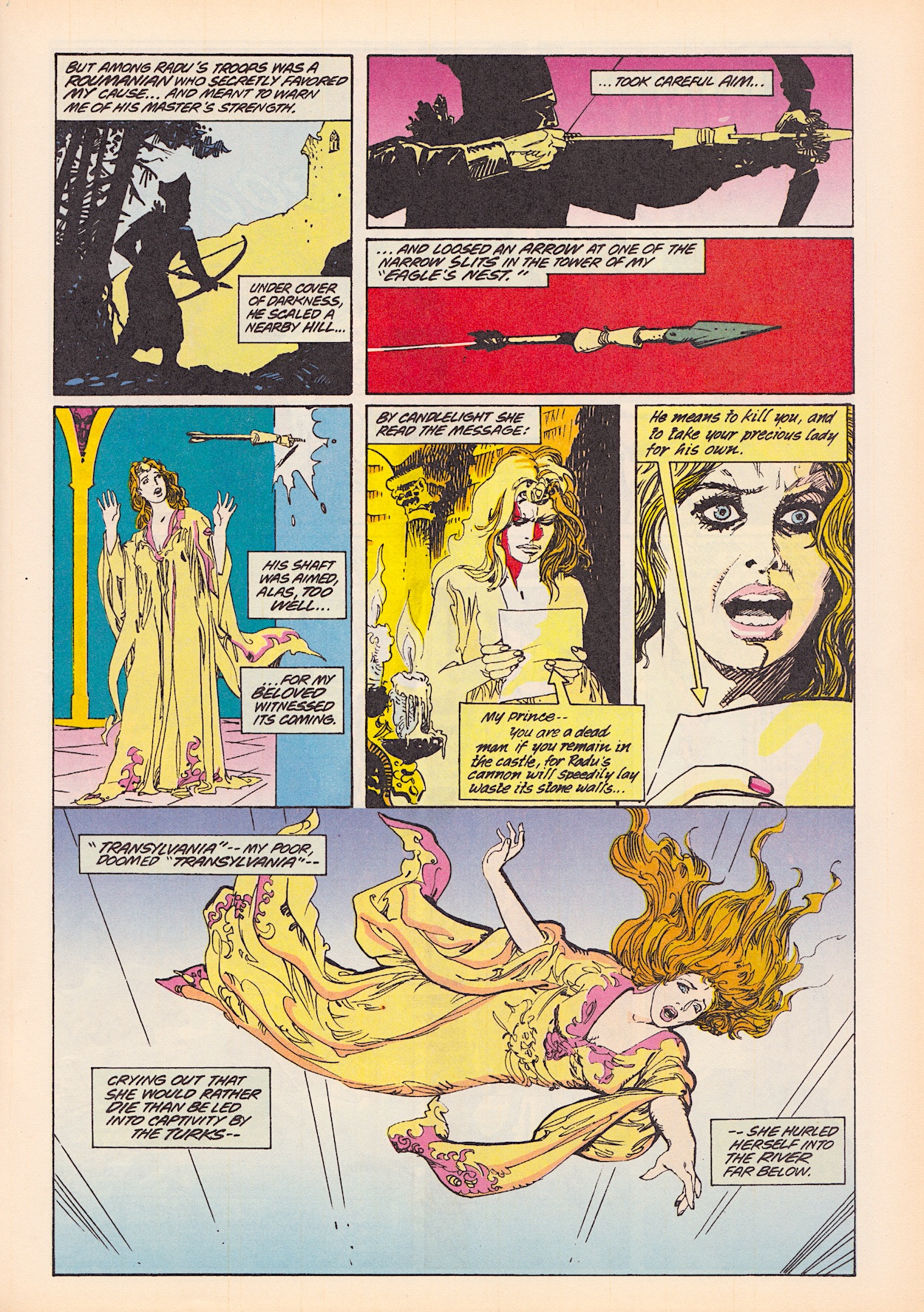
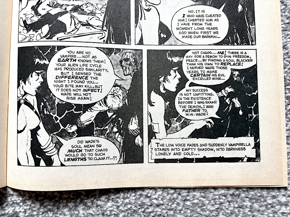
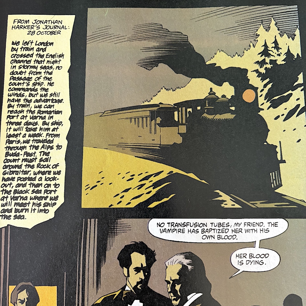
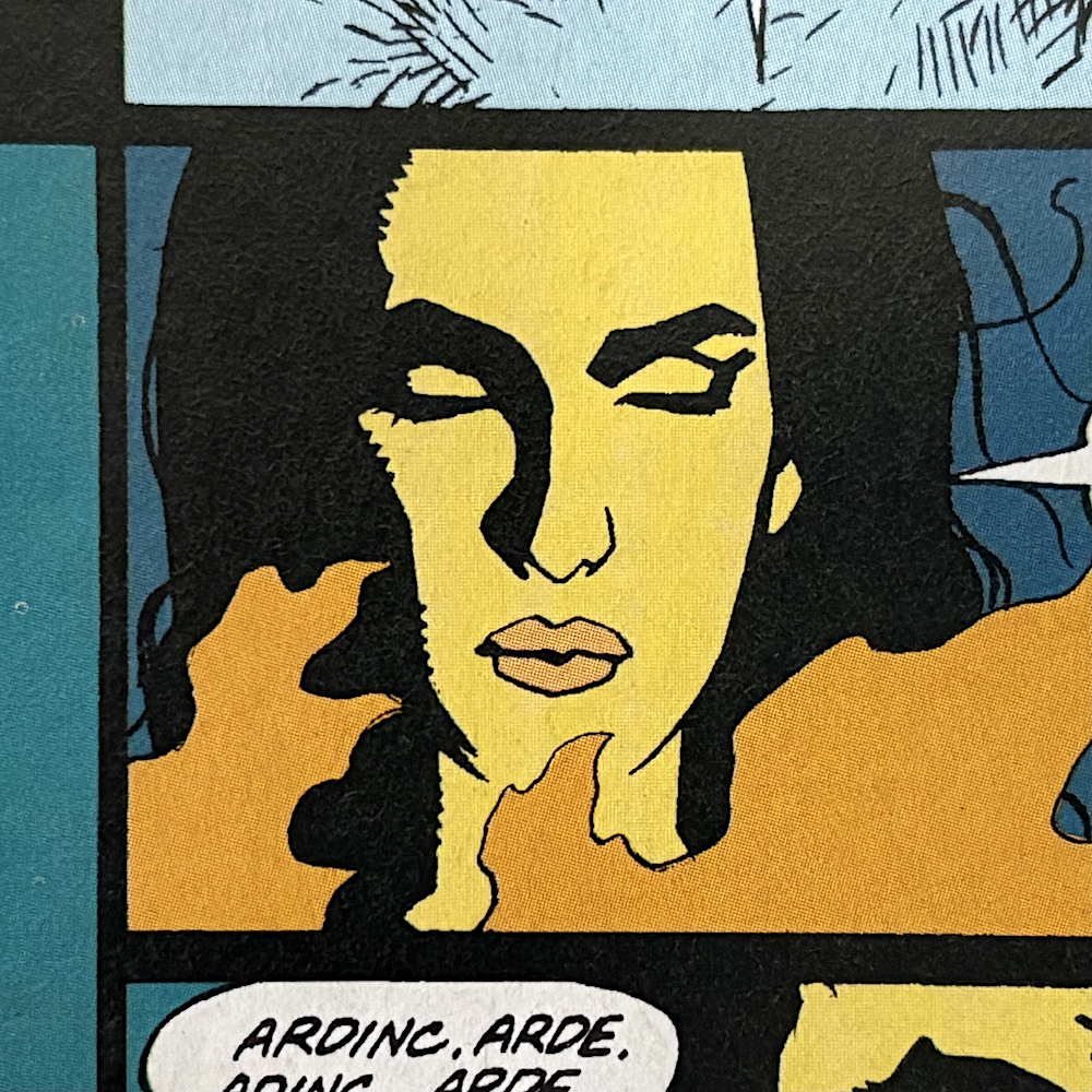
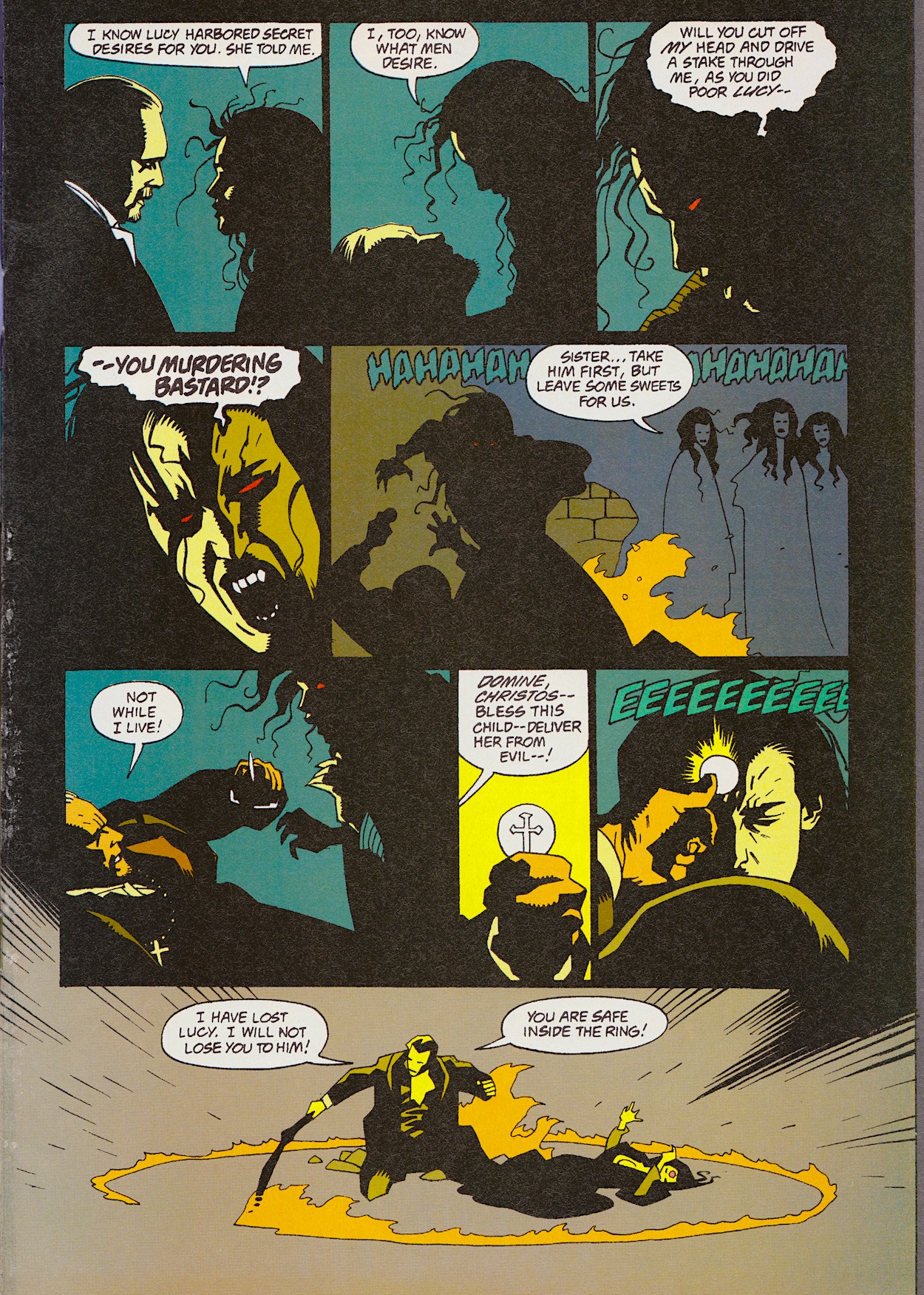
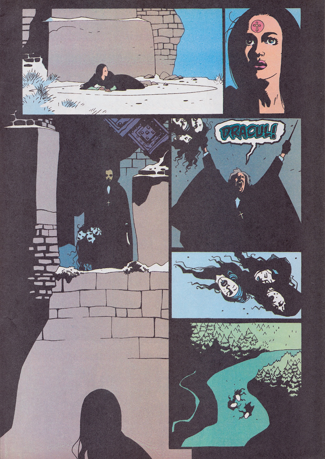
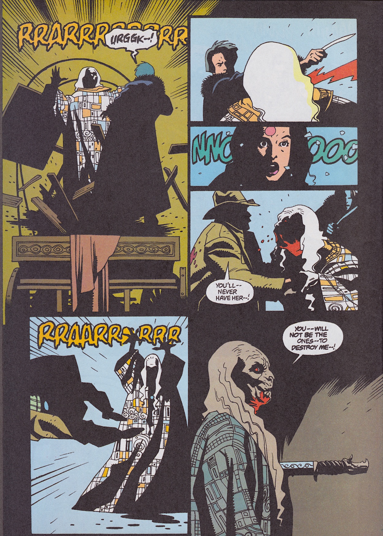
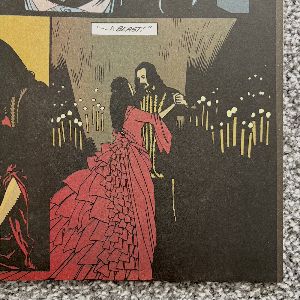
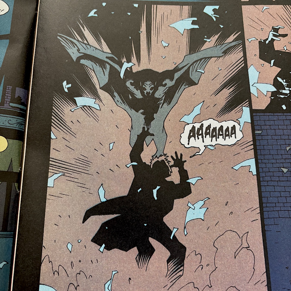
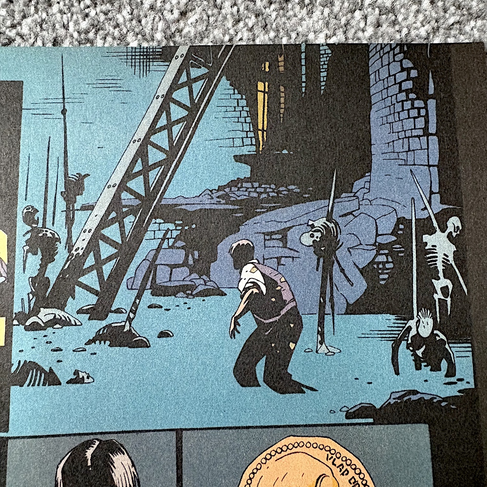
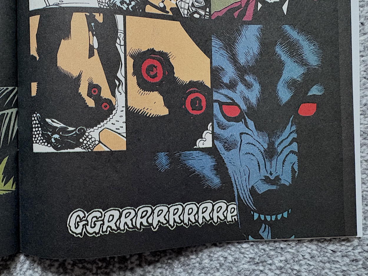
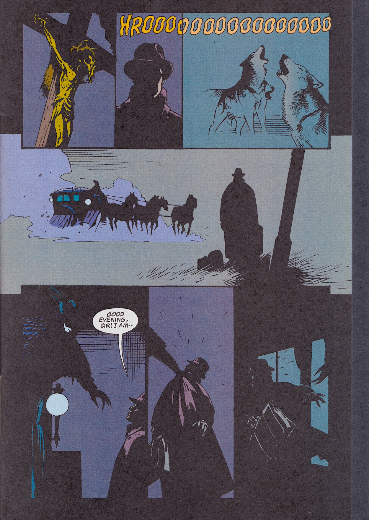
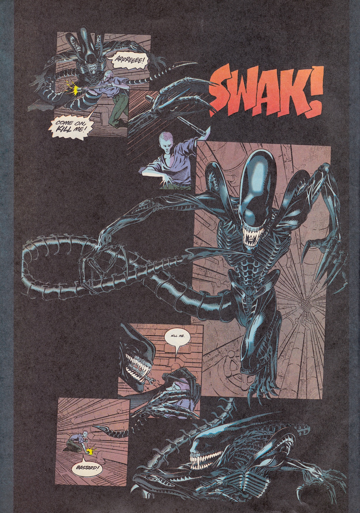
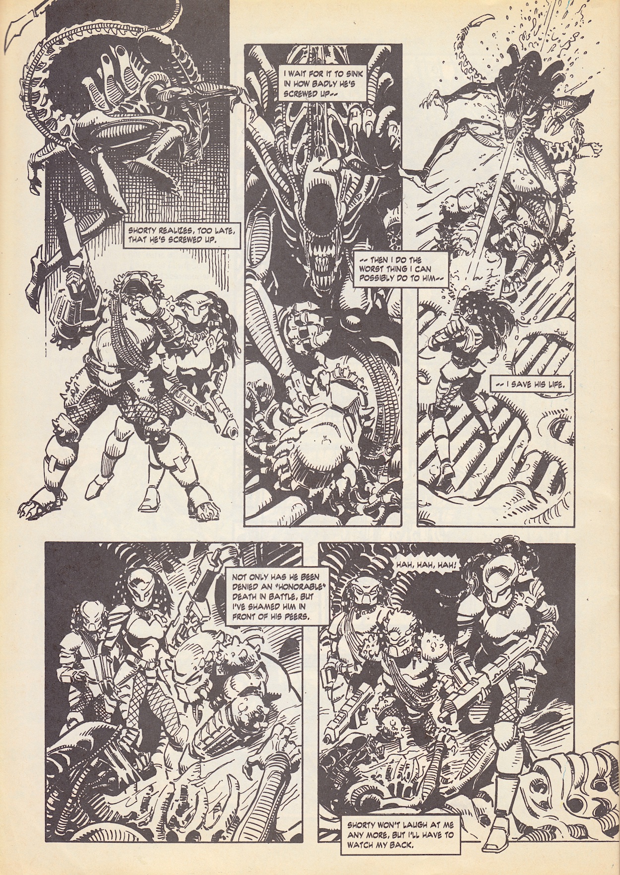
The last Technical Readout is for those big-ass guns used in the movie that had to be attached to their users by a hip mechanism, then it’s time to move on to our final strip of the read through, the still-confusingly titled Aliens: Alien. Just eight pages but there are some great moments here. The hunting party keep failing to track the alien properly but for the readers its presence is always felt in neat little panels like this one below. You can also see what I meant last time about how Vickie Williams’ lettering hints at an alien tongue.

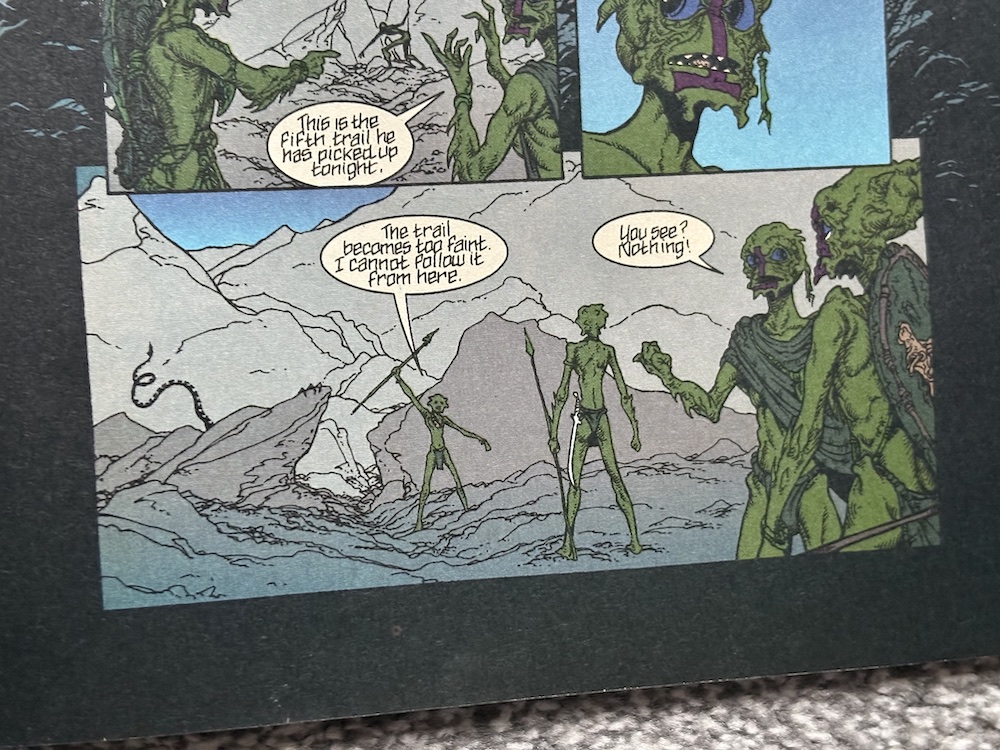
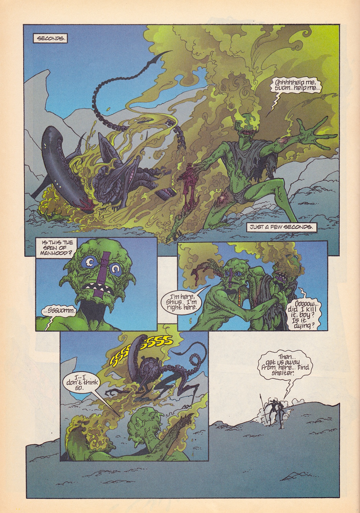
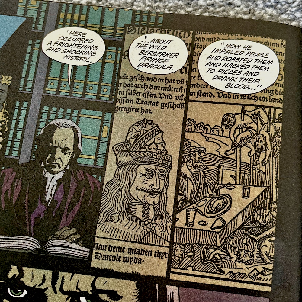
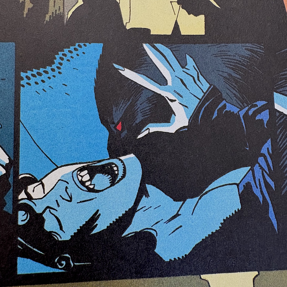
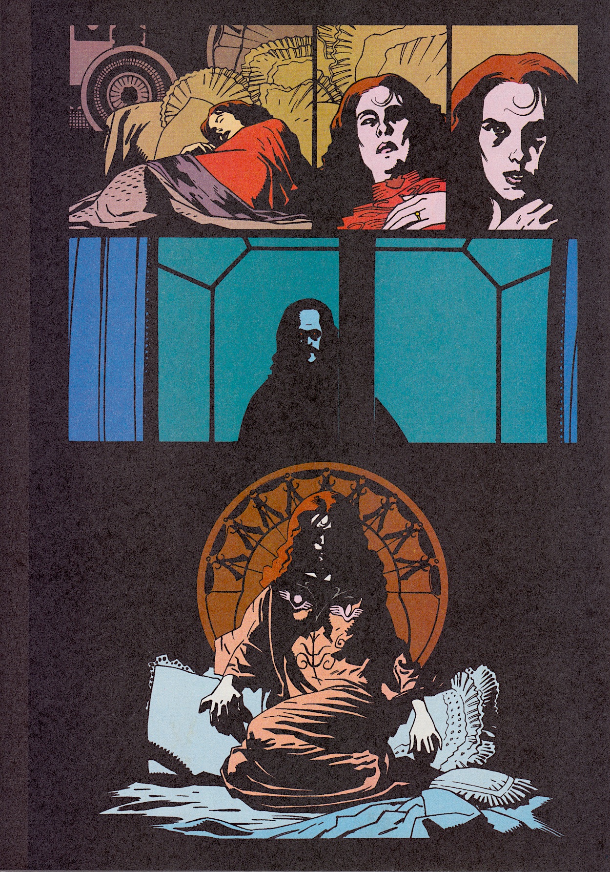
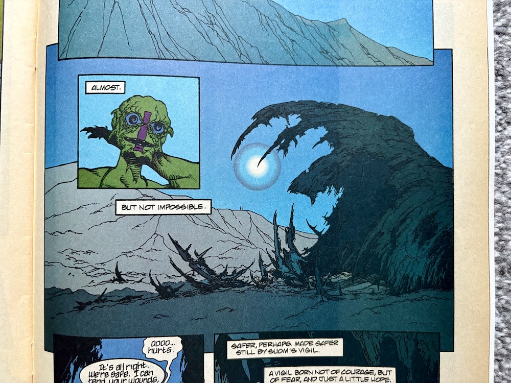
The teenager sees the men gruesomely taken out one-by-one, and even when they do manage to spear the monster they’re unaware of what its body contains. He tries to save his mentor by dragging him across the desert, desperate for somewhere to hide in the barren landscape. While the xenomorph retreats to heal, they come across a strange, alien (to them) structure in which they take shelter. But this sanctuary has more to it. In the morning he steps outside and, while he doesn’t realise it, we can see it’s a crashed spaceship. We also see a broken sleep chamber and the source of the xenomorph, which he remains blissfully unaware of.

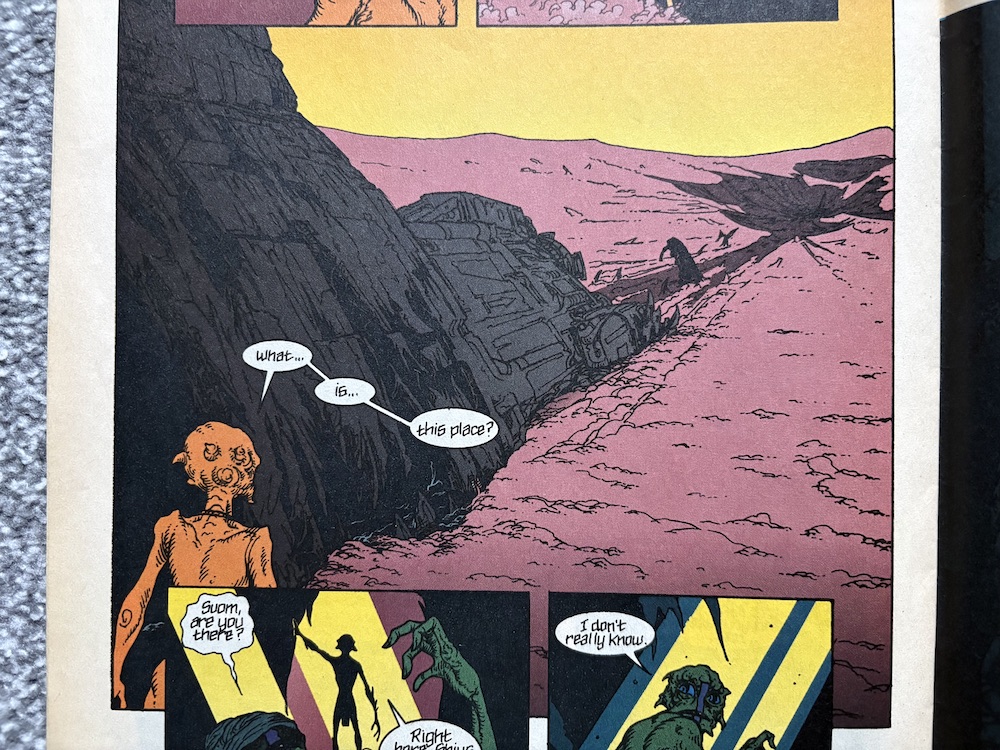
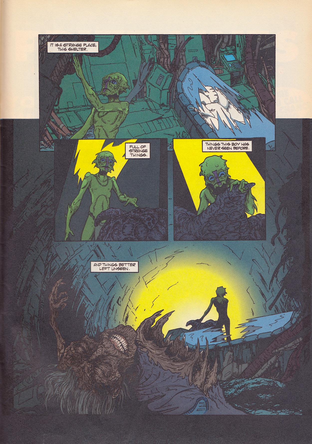
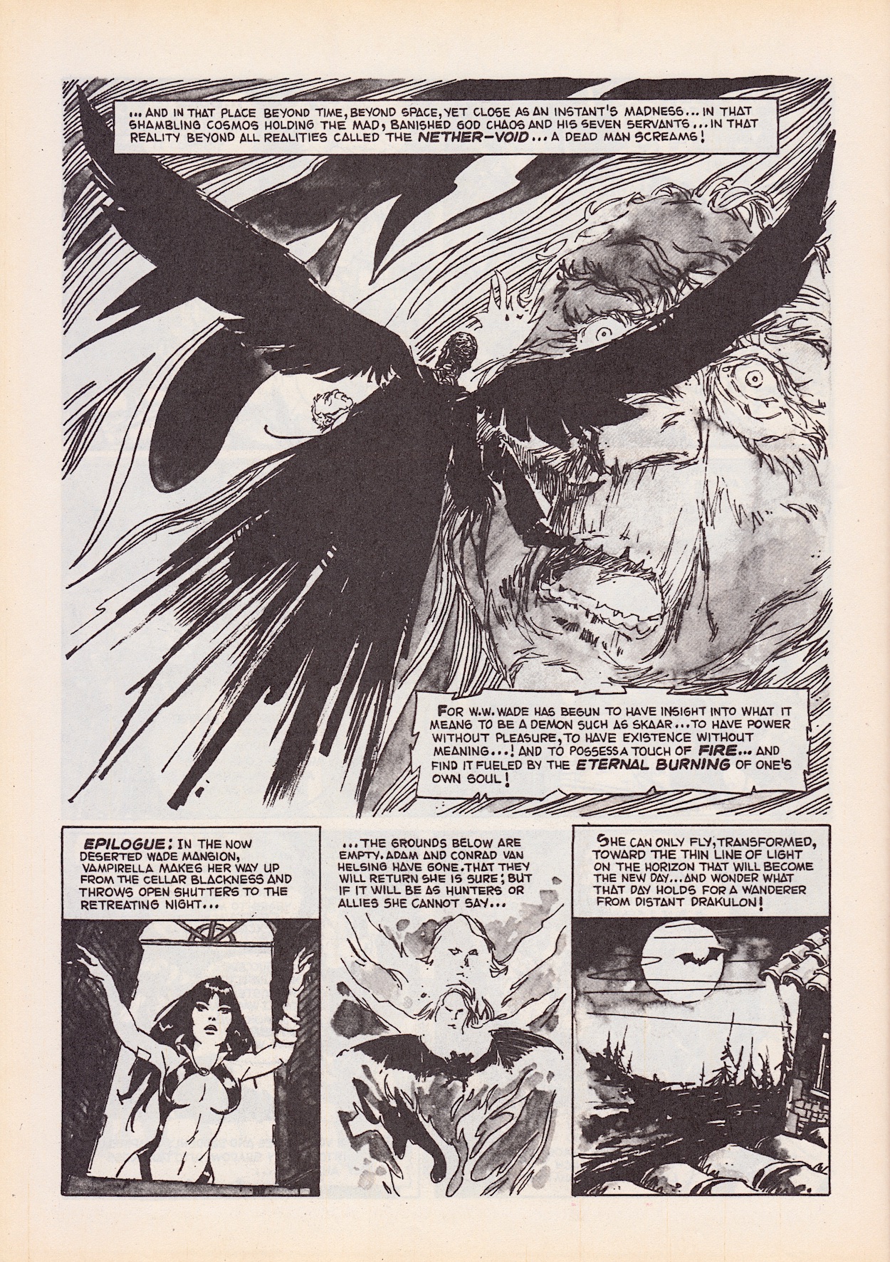
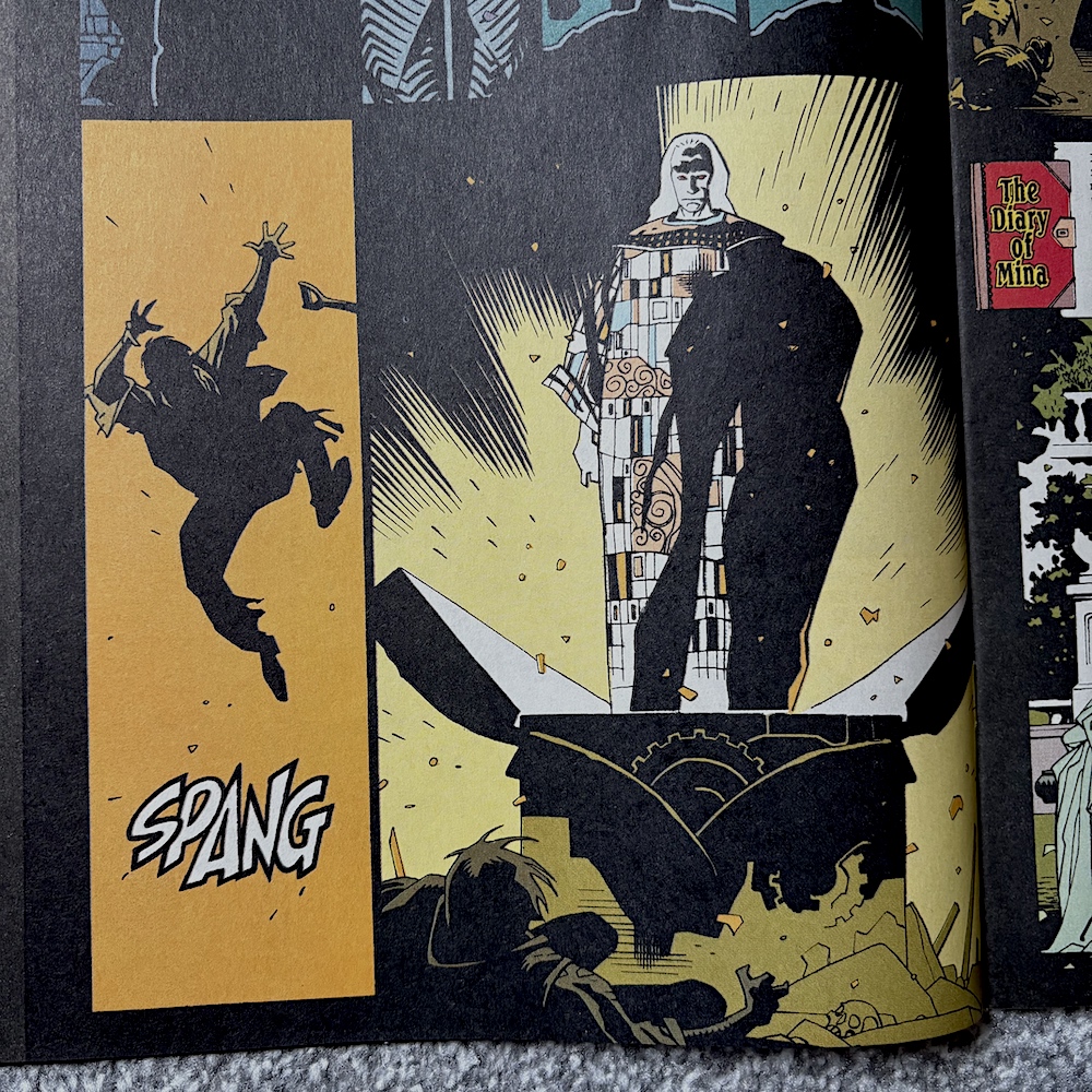
This moment is a classic bit of Alien atmosphere. Things end when he spots a human in their full space gear, face obscured, making their way back. With a “To be concluded next issue” adding to my frustration, this neat this tale leads us into a four-page interview with no less than Bishop himself, Lance Henriksen. When I bought these comics for the read through I thought the cover was familiar, but it was the inclusion of this interview that confirmed this was the issue I’d bought as a teenager.

It’s a fascinating read, although it does annoy me somewhat that Dave Hughes concludes Alien³ didn’t work when he’s been happy to promote it in the comic and even work on the spin-off mini-series. I’m saddened that Lance didn’t like the film and I wonder what he’d have thought of the special edition released later, which also confirmed the Bishop cameo mystery. I’ve a funny memory of this article. Back in 1994 I was disappointed his role in the Super Mario Bros movie wasn’t mentioned anywhere, but seeing as how his cameo in that amounted to one line and about ten seconds of screen time I can understand why.

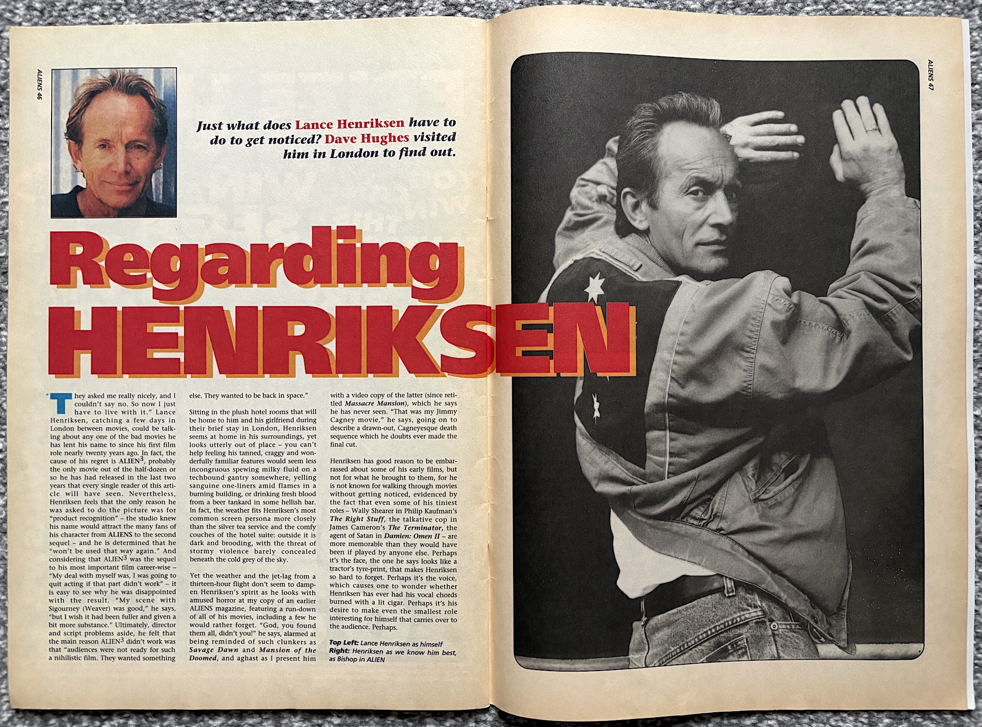
While I remember my surprise at seeing Bishop pop up briefly in Close Encounters of the Third Kind, I’d forgotten all about him being in The Terminator until I saw it for the first time in years a few weeks ago on TV. There are a multitude of roles that sound interesting here, as well as some truly awful schlock horror. I’m intrigued with the idea of what The Terminator could’ve been like with him in the title role, although of course I think Arnie’s depiction is perfect.

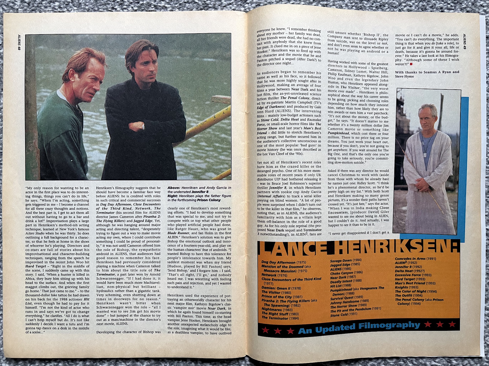
Lance states the audience’s familiarity with him playing villains kept them on their toes with Aliens, but I think he’s selling himself short. That was the first film I saw him in and how he played the role did that anyway. I agree completely with him about that scene with Hudson, too. With the gift of hindsight of what he later directed (including the restoration of his original Alien³ vision), leaving David Fincher out of the great directors list doesn’t seem fair. It’s an interesting interview nevertheless, before we round things off with Bug Hunt and the Checklist.

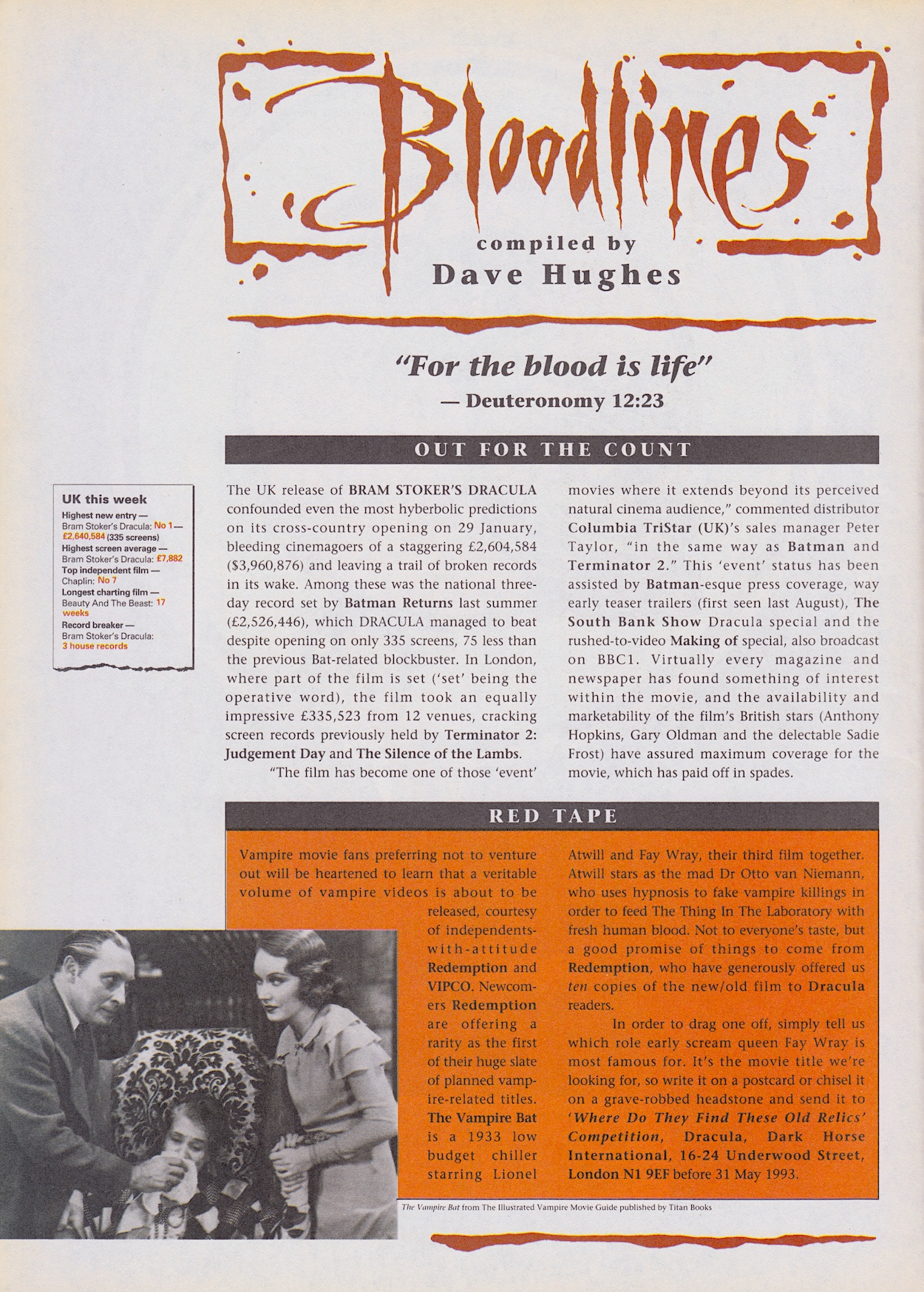
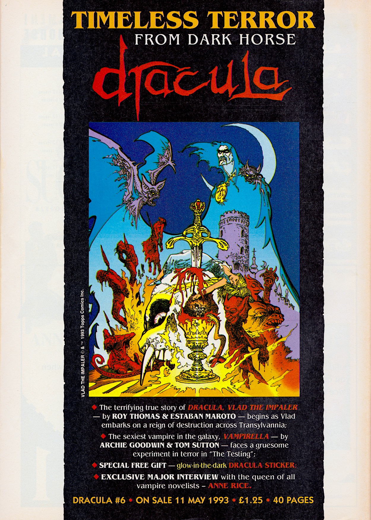
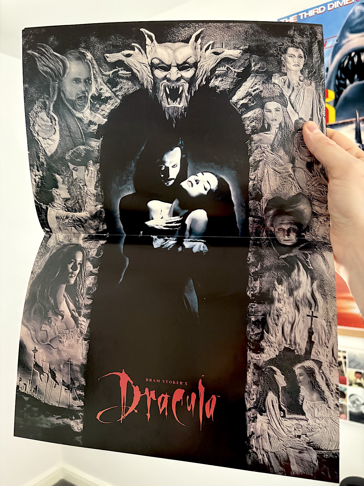
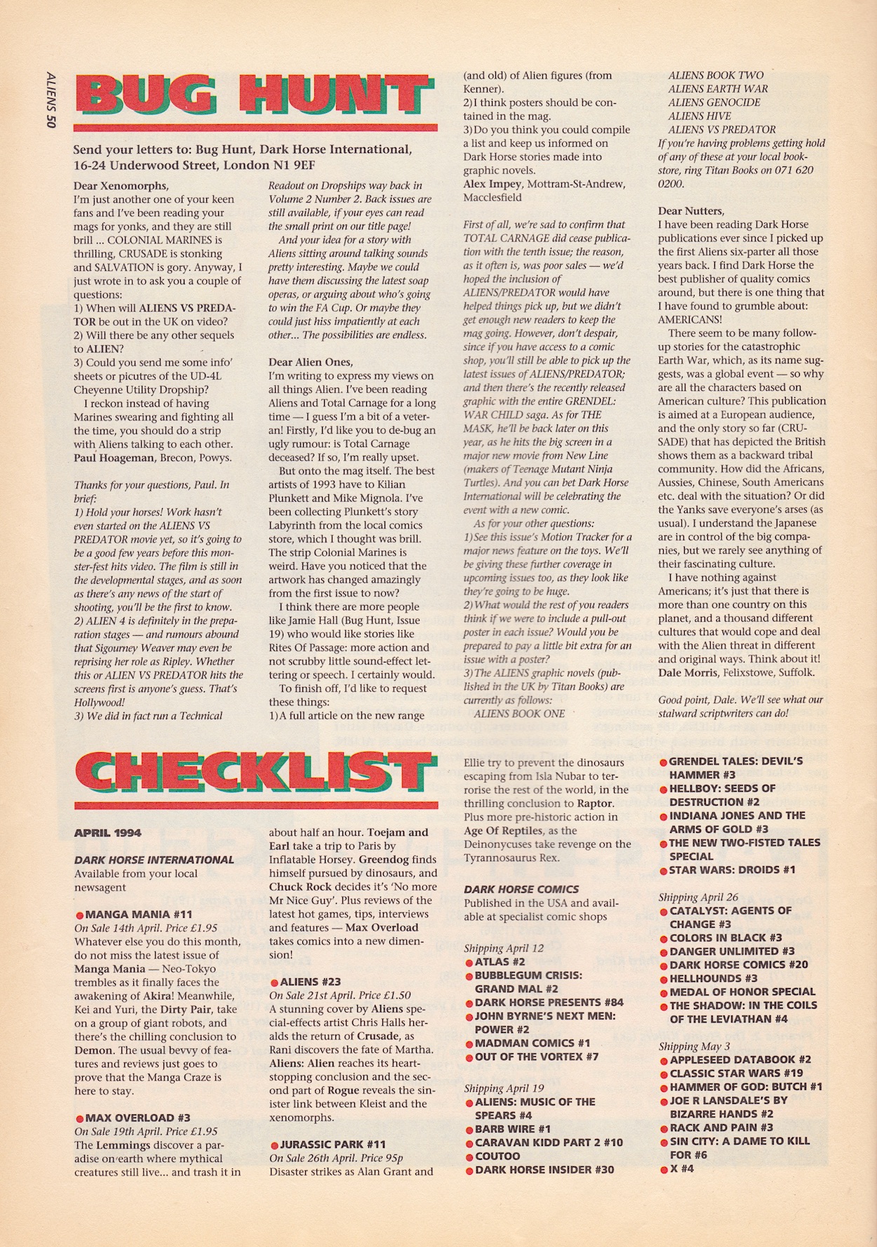
As with Star Wars and Dracula before it, Total Carnage bit the dust after ten issues, and after we had to miss out on the AvP strip so it could print it instead! Gotta say Alex Impey’s complaint about “scrubby little sound effects or speech” ruining the strips is… a unique opinion. The Checklist shows us what might’ve been with #23. Crusade, Rogue developments and the conclusion of the teen alien’s story. Even a Chris Halls cover! Damn. Then, just to confuse things further the next page rounds the final issue off with subscription offers for all of DHI’s freshly canned range.

I have mixed emotions about the end of Aliens. It’s always disappointing when a comic just ends with no proper conclusion, even more so when it’s an anthology. All-in-all it’s been a fun ride. Nothing truly scary but plenty of atmospheric moments. The stories didn’t always hit the spot, but when they did they really did and the good definitely outweighed the bad. It ended because the publisher itself imploded, so its premature end shouldn’t reflect on its quality.

As it stands, Dark Horse International’s UK Aliens comic wasn’t just a flagship title for the publisher, for me it stands as a flagship for the UK comics scene of the 90s. Big, bold, brash, adult, gripping and, despite its limited subject matter, hugely varied. I’m so happy I finally got to read it all. I just wish teenage me hadn’t missed out. He’d have been thrilled with it!

BACK TO iSSUE 21

ALiENS MENU

DRACULA #10: VLAD THE SAD

Esteban Maroto’s glorious cover gives the impression of a comic in rude health. Dark Horse International’s usual penchant for almost unreadable headlines hides what sounds like a particularly exciting issue for those that had stayed with Dracula this long after the association with the movie had ended. However, upon opening the issue we’re met with an editorial containing the round up of what’s happened in the main strip (instead of it being given its own page) and a “special message”.

Respect to editor Dick Hansom for telling the readers the truth rather than the next issue not appearing, something many comics in the 90s did, including DHI’s own titles. Although, he says readers can continue to read imported Topps Comics Dracula comics. Having researched these, alongside Vlad the Impaler (which concludes here) I can only find a Dracula Versus Zorro mini-series from the same year. Perhaps cancellation was the preferred option after all.

What Has Gone Before is part of the editorial to make room for the 28 pages of To Rise Again from the usual team of writer Roy Thomas, artist Esteban, colourist Paul Mounts and letterer John Costanza. It begins with Vlad beheading a King’s guard who tried to forcibly remove a thief from Castle Dracula who had begged for sanctuary. The guard insists the thief hadn’t asked permission. However, the guard also hadn’t before placing his foot across the threshold.

The King of Hungary, who had kept Vlad captive up until now, gives him an army to lead against the Turks, hoping Vlad’s viciousness will help him in his dire situation and lead to more impalements across the land. However,  another of the King’s allies, Stephen Bathory wants Transylvania as thanks for his own help and Vlad is left with Wallachia, which he becomes ruler of again after his younger brother, Prince Radu dies of syphilis. 

On a few occasions Vlad’s narration laments his own decisions, defending himself by reminding us he was only human at the time. For example, he didn’t know he had only two months left to live and wishes he’d made better choices, in particular with his family; he’s now married to the King’s cousin, they have two children and are in love as opposed to his previous wife who he’d forced into a relationship.

He realises his enemies (and allies) are amassing against his bloodlust and he takes drastic measures. He orders all of his wealth be amassed before leaving for a secret destination. Even his loyal assistant Cazan is left behind. Vlad shows a surprising amount of love for the man in these moments, telling the reader he was hurting because he’d left his friend with the wrong impression. You see, once all his worldly goods were buried (in an area where he’d dammed a river, then released the water again to hide the burial site) he impaled everyone involved. He didn’t want to have to kill his friend too.

But he would’ve.

Someone claiming their village was destroyed by Vlad’s enemies comes to swear allegiance and, despite Cazan’s vocal suspicions, the man is allowed to join the army in a top advisory role. Vlad admits to the reader he had his own doubts but in a moment of “grim fatalism” he took in “a suspected viper to my bosom”. We’re reaching the end here. In the build up to the final battle against his hated foe, Danesti he’s unsurprisingly betrayed and Cazan takes a knife to the chest as he leaps to Vlad’s defence. Even though Vlad is also killed, his narration continues from beyond the grave and it’s here that the story goes on a tangent from known history. 

Beheaded by the assassin, after the battle is over pious monks take his body to be honoured by the Catholic church, which praises what this monster of a man achieved in the name of Christianity. However, that night the chapel is destroyed by a wild, unforeseen storm. This leads many of the faith to believe he’ll never be allowed to rest in peace because of what he did in life.

That was only his body, though. His head gets its own story. It was taken to Mehmed the Conqueror. However, over the course of just one night it becomes so badly decomposed it’s no longer recognisable to the people who come to see it impaled on a spike. We also find out that Vlad’s illegitimate son, Mihnea became known for terrorising the lands, cutting off the noses and lips of his enemies, with Vlad’s narration full of pride for the next Prince of Wallachia.

We then suddenly jump forward 150 years and a hooded stranger (actually a descendant) arrives at the church where Vlad’s decapitated body is buried; on orders from the Pope it is to be moved because it was buried too close to the altar. There’s a mention of Vlad’s wife’s suicide damning her for all eternity, which should be at least a bit familiar to fans of the film. However, unlike his supposed head a century-and-a-half earlier Vlad’s body hasn’t decayed.

After the spread above, his actual head (which we learn is not decomposed either) is placed on to his body, the stranger recites some ancient texts in a foreign language and Vlad rises again, instantly biting the neck of his descendant, energising his body and beginning his life as a vampire. While the story ends with an image of him declaring himself as the Dracula of Bram Stoker’s creation this origin story, even the resurrection part, is very different from the novel. In fact, it’s only one of a few possible stories about Vlad’s body after he died.

This has been a curious strip. We know that Stoker had very limited knowledge of Vlad the Impaler, that particular part of the world or indeed that point in history and he simply picked at scraps of information to build his character. (Not forgetting his own supposed xenophobia which may have contributed to the story.) This strip seems to dangle somewhere between actual history and the novel. After accurately chronicling the historical character (as much as a comic can), this final chapter commits itself to neither the truth nor Stoker’s imagination.

There’s a lot of ambiguity surrounding the events of his burial so Roy has decided to fill in the gaps as he saw fit, and that’s fair. Personally though, I’d have preferred to have had the mystery remain. It could’ve still ended with how it began four months ago, with Dracula relaying the story to the reader and letting them fill in the blanks. The mystery could’ve added to the spookiness, the unknown adding to the fear instead of it being filled in for us.  Overall though, I’ve really enjoyed it and it’s peaked my interest in the real life man. I’ve found myself reading about him at length because of this comic.

It’s a shame the sales figures dropped so sharply after the adaptation finished, although I’m not sure what they could’ve printed anyway. This last issue also sees Vampirella unceremoniously dumped (she never did get her own cover as promised) and the small back up strip is rather unremarkable. But I wanted to concentrate on the main story anyway.

Overall this has been a quality comic and a pleasant surprise from start-to-finish. From a brilliantly realised movie adaptation to a fascinating look at the man behind the myth. From an initially clichéd Vampirella origin to a captivating story and character I’d never read before. From interesting news on the film’s release to a series of remarkable anthology back up strips. I didn’t expect too much from what was essentially a movie tie-in, but Dark Horse International’s Dracula has been a great read from start to finish, including when changing form like its titular character.

It may not be well remembered and doesn’t sell for very much on eBay, but that just means it’s easy for you to pick up and enjoy for yourselves. I highly recommend that you do.

BACK TO iSSUE NiNE

DRACULA MENU

DRACULA #9: VLAD THE MAD

So much for the Vampirella cover. We were told last month there’d be one and I assumed it would be a classic reprint, what with the comic’s cancellation at #10 decided but there being a need for an extra cover this month, the second half of an American strip taking the lead position inside (and they probably didn’t want to pay out for a new cover for a cancelled comic). But instead, #9 of Dark Horse International’s Dracula has this very basic (it feels rushed) cover by Woodrow Pheonix, letterer on Crusade in Aliens.

Lying to people about “sovereignty” and “losing control” in order to gain power… that wouldn’t happen today, surely?

On the editorial page we’re told the next issue will include a “feature-length” chapter of Vlad the Impaler to finish off this real-life prequel strip. With hindsight we know this was because it would be the final issue. At least they knew ahead of time so they had the chance to properly finish off the imported Topps Comics strip. First up, this penultimate issue contains the next 16 pages of chapter two, as ever written by Roy Thomas, drawn by Esteban Maroto, coloured by Paul Mounts and lettered by John Costanza.

The mass murdering Vlad has allied himself with Christianity while his enemy Mehmed the Conqueror allies himself with none other than Radu, Vlad’s younger brother. The plan is to annex Wallachia and install Radu as the Prince. Radu promises the people sovereignty of their country but only if they back him. Lying to people about “sovereignty” and “losing control” in order to gain power… that wouldn’t happen today, surely?

After losing a series of battles, Vlad pleas with other countries to come to his aid but to no avail. However, this doesn’t stop his Religious Crusade as he slices across Europe killing thousands in the name of the Christian god, the people suffering as a result. “My poor peasants moaned at their loss,” a caption upon an image of the slaughtered poor says. “But commoners cannot appreciate the measures a besieged Prince must take on their behalf.” Those who ignore history are doomed to repeat it, as they say.

Instead of helping diseased peasants he uses them, sending them into other countries and military troop gatherings to infect and weaken them. His callousness and self-interest drive the story and I must say it’s compulsive reading, even if everything about him disgusts me. His tactics look like they could be working until a mis-timed attack fails and only serves to rouse Mehmed from his complacency, putting Vlad on the back foot and leading to a desperate, horrifying action.

Originally intending to take Wallachia by force, The Forest of the Impaled shocks Mehmed into retreating for the first time, leaving Radu behind to become Prince on his own. Elsewhere, we find out the woman Vlad captured and forced to be his “love” is now named ‘Transylvania’. He describes her as being, “Near at hand, yet some part of her forever unattainable, uncontrollable”. This is very different to Mina. This woman is a slave, forced into a physical relationship with the Prince. An arrow does bring a message that ends with her suicide but as you can see it’s not a message from an enemy lying about the death of her one true love.

Instead, the thought of her horrible existence becoming even worse is the reason she takes her own life. This tears Vlad apart and he leads his pitiful army to Hungary and an ally, but the Hungarian leader has no stomach for war. Instead, through a convoluted pretence he separates Vlad from his troops and imprisons him, albeit in a palace! Forged letters are sent to all of his allies and enemies telling them he’s back on the side of the Sultan. With this news and his lonely existence he slowly goes crazy.

The cliffhanger is dreadfully forced. We know where this particular retelling of history will end up and I think it would’ve been more suspenseful to just finish it with him in his crazed state. The battles are also beginning to become much of a muchness but Vlad’s overall arc and the elements that (sadly) mirror politics in our modern world are fascinating. The final chapter should be interesting.

The Bloodlines news pages are light on much of interest, however Sound Bites does quote the legendary Christopher Lee who of course played Dracula earlier in his career (although to me he’ll always be Scaramanga). Such a shame his quote shows up the fact that he either hadn’t seen the film or wasn’t paying attention, as he attributes Anthony Hopkins to the title role. Whoops.

The second and final part of Vampirella: Death’s Dark Angel is shorter than last time but packs a lot in. With no blood substitute she knows she’ll not be able to control her urges and she’ll end up feeding on Wade. But this is just what he wants, so she continues to fight against it. Adam and Conrad Van Helsing are also in the cell and she finds herself opening up to the younger of the two (Conrad was knocked unconscious by Wade). However, having been shot, Adam collapses and the blood from his wound forces some primal instinct inside Vampirella. She breaks free of her chains but as she’s about to feast on her new ally she sees his face and with all her strength pushes back against the urge.

Of course this is when Conrad awakens and for the umpteenth time he gets the wrong idea and tries to kill her, but ends up killing the corrupt cop as he enters their cell and Adam and Vampirella let him believe he’s staked her instead. I like Adam and I understand part of his likability comes from the predicament he’s found himself in between his dad and a good vampire, but Conrad is just an annoying caricature by this point. Even Von Goosewing wasn’t this inept in Count Duckula! And why can he no longer sense her like he did before?

The demon, Skaar attacks the Helsings then suddenly just disappears. This is because Wade has finally forced the starving vampire to bite him! But as Skaar explains, Vampirella isn’t from Earth; she’s an alien, and her race can’t transform people, only kill them. It turns out Skaar was originally a human, namely Wade’s father! Having spent many years as a demon serving penance for his own life, he wasn’t serving Wade. Rather, he was merely waiting for his son’s death because only a soul blacker than his own could take his place and finally release him from his demonic prison.

This was a surprise ending! It’s solemn and moving before becoming horrifying on the final page, although Wade deserves everything he gets. However, does this mean Vampirella did kill the man on the plane? I assumed before the serum she could take what she needed without killing. A question for another time. I hope we get one final outing for her in the final issue. (UPDATE: We do not.) Given how she’s dressed I’ve been surprised at how maturely written and interesting the stories have been, eradicating my initial misgivings.

This month’s author interview is with Kim Newman so that promised series of female authors is disappointingly dead in the water. I remember Newman as a film reviewer on TV back in the 90s and I never liked him. To me, he was the kind of clichéd reviewer who thought they were right and everyone else was wrong and this plays out in this interview with the comic’s Dave Hughes.

Kim’s novel, Anno Dracula is a sequel to the original book set in an alternate world where Dracula wasn’t killed by Van Helsing, instead wooing Queen Victoria and carrying out his dastardly plan to turn England into a kingdom of vampires. He wooed Victoria? What about Mina? Kim admits he mainly used other authors’ fictional characters (Sherlock Holmes, Dr. Jekyll etc.) in the book, yet at the same time criticises other Dracula sequels for copying moments from the original book! That’s a bit rich. He also calls everyone who didn’t like his book “fat anoraks”. So yep, he’s definitely the person I remember.

Much more interesting is a look at the Mega-CD game of the film. We were promised last month (and on the contents page of this issue) a review of the game but instead it’s very much a reworded press release compiled by Amiya Lopez, complete with a guide to what a Mega-CD actually was for the uninitiated. The last sentence of the main article kind of gives it away that they hadn’t actually played it.

I’ve very fond memories of that time, of reading those first years of Edge magazine and getting excited at the sudden leaps in videogame technology. While I personally invested in a Panasonic 3DO (and loved it), I have a fondness for most of the tech from that time and the constant add-ons for the Sega Mega Drive always fascinated me. They’re very much of their time and I enjoyed this little look at a game I’d never seen before, even if it was apparently terrible.

To round up, despite hindsight telling us the editorial writer knew cancellation was on the way, the letters page still asks readers to write in with suggests of how they’d like the comic to evolve over the coming months. They were in for a shock four weeks later, and not of the good kind. We’ll see how things are (hopefully) wrapped up on Sunday 14th September 2025.

iSSUE EiGHT < > iSSUE TEN

DRACULA MENU

DRACULA #7: TALES FROM THE CRYPT

On this day back in 1993 came the seventh edition of Dark Horse International’s Dracula comic, now firmly in its post-movie adaptation stage. Irish artist Kilian Plunkett’s cover was unique to the UK comic, what with the issue containing part two of the same American issue of Topps Comics’ Vlad the Impaler from last month. Blog regulars should recognise the name too, as Kilian contributed the superb cover to #8 of Aliens in a completely different style.

The 13-page second part of Roy Thomas’ strip kicks off with defeat. Vlad’s time in his late father’s role of Prince of Wallachia was short-lived after the Sultan who raised him to be a brutal warrior died. The sultan’s son, Mehmed the Conqueror sought to invade and take over all of Europe, so Vlad allied himself with the Hungarians to defend his home of Transylvania against Mehmed’s ally and the man who killed his family, Danesti. After more history book-like retelling of battles he chases him down.

But Vlad’s actions weren’t to protect the people of the land. As a plague hit the country the poor were ignored and left to die so that he could march to defend Christendom and avenge his father’s death. That’s right, he was fighting for power in the name of god while ignoring those in need. Some things don’t change. At one point he sees a comet in the sky and in a rare bit of fun he tells readers how he wouldn’t know anything about it until he met someone called Halley hundreds of years later.

After this, a brief moment of what appears to be open-minded kindness takes over Vlad. He doesn’t hunt down Danesti’s supporters, instead explaining how he knows they simply believed in their leader and did as they were told. He invites the royal court and their families to an Easter feast and begins to describe the castle he wishes to have built in his name, Castle Dracula. Then the other shoe drops. He shall force them to build it.

The art is just as superb as it was last month. Esteban Maroto’s line work and Paul Mounts’ colours lend a seriousness to it all. The grotesque moments really are grotesque and the power behind the man is palpable when he launches into a tirade against those who sucked up to him the first chance they got, when they’d previously called for his death.

All of a sudden the rich and powerful, who were all too happy to stomp over those less fortunate than them to retain their positions, are pleading for leniency. The elderly ask to be left behind, to be spared the many years of hardship ahead. In response, Vlad beheads and impales them as an act of treachery and it’s this image that’s left to imprint itself on our minds as the final page of the strip this month.

While the script still feels like those strange little historicals found in year one of Marvel UK’s Transformers (Dracula’s script brought to the page with skill by letterer John Costanza) the art once again elevates it. The fact the story slows a bit to concentrate on one battle and its aftermath helps too. It no longer feels rushed and it’s beginning to develop a bit of depth to its main character. That in particular bodes well for future issues.

On to the Bloodlines news pages. The film was a “loose adaptation”? Oh dear, is Dave Hughes turning against the movie he hyped so much now that the comic is no longer a tie-in? Francis Ford Coppola’s movie updated the racist undertones of the original novel to modern sensibilities, but to describe it in this way is rather odd. I’d forgotten all about the fact the movie brought a brief resurgence in monster movies and I’d like to see Robert De Niro as Frankenstein’s monster, so that might be one for this Hallowe’en.

I wonder if The Mummy film mentioned here is what would eventually become the Brendan Frazer and Rachel Weisz movie released six years later? What would Dave have made of it not being a horror film? That section under ‘Neck Romancers’ really hasn’t aged well and it’s shocking to see this reported on as something normal, and yet again the writer’s obsession with Sadie Frost returns, despite the actor being English, not Eastern European.

The Mega-CD game is generously described as receiving “rave reviews”. In reality, UK magazine Mega Power described it as, “One of the best movie tie-ins to date, but still an appallingly bad game.” Given how the game would only work on a Mega-CD, which was a very expensive add-on to the Sega Mega Drive, it’s a rather niche prize. Sadly, it also looks like the promised series of interviews with female horror writers is already making way for men.

The Vampirella back up strip, still written by Archie Goodwin and drawn by Tom Sutton, sees Adam and Conrad Van Helsing (the latter of which is confirmed as blind) catch up with the alien vampire heroine but the younger Adam is incapable of killing her. We’ve seen hints that his newly developed psychic powers may be picking up clues as to her good nature but Conrad doesn’t want to hear it and fears she’s hypnotised him.

The Carnival of the Damned sees Vampirella head to a wonderfully atmospheric fun fair like something out of an episode of Tales of the Crypt. We meet Pendragon, a drunken mess of a magician who fears the Crimson Chronicles book when he sees it in the hands of Vampirella. She explains she made a promise to a dying man to hunt down all who follow it. The Van Helsings are also here, Conrad convinced Vampirella is evil because he can sense evil so strongly around him. Um, Adam? You maybe want to explain the carnival to him? 

It seems the carnival’s owner summoned one of the servants of chaos to save him from financial ruin but he soon discovered he was being tricked in order to bring forth demons, so Pendragon burned the book and it destroyed the carnival. With only half his power brought forth, the demon is the new owner and can hold back the flames to stop killing everyone but in doing so they’re trapped, unable to leave.

While searching for Vampirella, Adam enters the House of Mirrors and sees a vision of his mum being killed by a vampire! He tries to break the glass to get to her and gets sucked in. We find out Ashton (the human form of the demon) feeds off souls in this way to slowly gain enough power to break through into our world. Sensing Vampirella, he’d planted a mental vision in her head to entice her to find the carnival.

If he can get her to read from the book he can access all the power he needs. It’s a complete tale told in 14 pages and I’ll hand it to Archie, it contains enough story to fill a strip twice the length without feeling crammed in. It has that horror anthology feel and I think it works a treat. Her first strip may have been forgettable but since then she’s been the highlight of the comic. I also like the fact this doesn’t boil down to an action scene, instead it’s a battle between the minds of Ashton and Vampirella. 

On TV this would’ve needed impressive acting so it’s a brave move for a comic and Tom pulls it off brilliantly; it’s suitably tense and horrific. The Van Helsings also escape while the carnival burns and it’s here that I have my only gripe. Conrad is convinced Vampirella set the fire to kill them, yet when they thank Pendragon for saving them he doesn’t take the chance to clear her name, instead giving a cryptic “I was just following another” response.

After a brief interview with Anne Billson (which is nowhere near as in-depth and interesting as last month’s with Anne Rice) comes the letters column, Fang Mail. However, the highlight of the page is the first mention of Jurassic Park in the comics checklist. Like Dracula it’s three-weekly to begin with, the first two issues detailed here and on the back page is the full-page advert for the launch.

Dracula continues to be a unique comic, one that I’m enjoying a lot. A thoroughly interesting history lesson followed by a classic horror anthology strip (of sorts) is about as different to anything else I’m ever likely to include on the blog, so I’m going to enjoy it while it lasts. I hope you are too and that you’ll come back for #8 on Sunday 13th July 2025.

iSSUE SiX < > iSSUE EiGHT

DRACULA MENU

BRAM STOKER’S DRACULA #5: FiNAL(E) BITE

More and more headlines adorn the front cover of Dark Horse International‘s Bram Stoker’s Dracula as  strips and features are added, the comic morphing like the Prince himself on this great Mike Mignola image. Gone is the glossy cover, replaced with a good quality matte paper throughout that seems to suck up the ink magnificently, and you’ll notice a lack of specific dates on the spine. That’s right, the comic is now an ongoing monthly title instead of a limited series of three-weekly issues. Not that anything is made of this in the editorial. More on this below.

Our main strip runs to 17 pages, concluding the adaptation and again it’s the art that really stands out. The spectacular moments during the final 20 minutes of the film must’ve been daunting for penciller Mike, inker John Nyberg and colourist Mark Chiarello. The minimalist style flies in the face of the film’s production design but it works perfectly, such as with this opening scene above. The carriages aren’t even drawn but it works. (Accompanied by John Costanza‘s lettering of Jonathan’s diary.)

In fact there are some small, incidental panels of individual characters which, if combined in a grid, could make for a lovely minimalist poster for fans of the film. Look at these images below of Jonathan (Keanu Reeves), Arthur (Cary Elwes), Mina (Winona Ryder) and Quincy (Billy Campbell) and imagine that large poster made up of these and likewise panels for all of the others.

The first half of the strip concentrates on the journey to Dracula‘s castle and the inner fight of Mina’s as she struggles between her love for Jonathan, the enforced lust for the Prince and Helsing‘s attempts to save her. As with previous chapters the only negative here is the memory of these scenes from the film making for an unfair comparison. The horseback gunfight was an absolutely thrilling moment as our heroes fought the setting sun, accompanied by Wojciech Kilar‘s booming score. Reading it instead of watching it accentuates just how much their music brought to the scene! Also, the key factor of the setting sun is completely missing apart from one mention in text.

Meanwhile, further ahead at the castle Helsing battles with Mina’s soul. The powerhouse performances by the actors is replaced by some dramatic poses, which are highlighted wonderfully by the lack of detail, the silhouette of Mina over Helsing with the three vampire women scrawled in the background being my favoured panel here. A couple of pages later (after Helsing is seen entering a crypt post-sunrise) we see the ultimate fate of the three watching horrors. It’s surprisingly gore-free given what we’re actually looking at. In fact, gore is something that’s largely been missing throughout the adaptation.

Not that the film relied on gore for its scares, but the comic really dials it down to little more than the odd splash of bold red, such as in Dracula’s final moments after Jonathan slits his throat. From here on it pretty much follows the film shot-for-shot, word-for-word. Well, why would you want to change such a perfect ending? Throughout these months there have been other changes made to the overall film, and there was no way it could match the atmosphere or looks, but what this series did differently to other adaptations was make bold artistic choices.

What we’ve been treated to over these first five issues is nothing short of a work of art. An adaptation of a work of art into another, in fact. For fans of the film it’s just such a unique take, a love letter to the movie. It feels like the team has created a tapestry of the film in comic art and as such it transcends a mere “comics adaptation of the current blockbuster movie”. It’s best enjoyed as a piece of art in this way and when it is it’s the best movie adaptation I’ve ever seen.

Dave HughesBloodlines news pages are chock full of goodies this month (although we’ll try to ignore the creepy description of actor Sadie Frost as “delectable”), beginning with the box office takings of the film so far. Until beginning this series I’d no idea it was this big at the time! Saying “set is the operative word” when describing where it was made is a reference to the fact the whole thing was filmed on huge soundstages. Even the outdoor scenes were elaborate sets, something I wish the comic had delved into in more depth.

There isn’t exactly glowing praise for something they then immediately give away in a competition, I wonder if Coca-Cola had anything to say about the ‘Cult Classic’ logo used on the Evil Force video cover, and after reading the Sound Bites it’s no wonder Gary Oldman loves playing Jackson Lamb so much these days. One last thing of note, I have no idea how that “natural conclusion” was made in the ‘Scarlett Woman’ news item! (Oh, and I’ve given up on the promised Sadie interview ever appearing now.)

Vampirella‘s strip (written by Archie Goodwin, drawn by Tom Sutton) is reduced to seven pages to make way for a second back up, although personally I’m quite glad there’s less this time. The place she found herself in happens to be where a cult is trying to bring forth a demon of chaos and the scantily-clad alien vampire is to be sacrificed in order to do so. The man she fell in love with after five minutes turns out to be the soul of a warlock in a dead man’s body. He saves Vampirella and decides the evil nurse woman will be used as a vessel instead. How romantic. However, when she says no to him he turns on her (which sadly sounds rather familiar these days) and soon he’s trying to sacrifice her again.

She’s saved by the monster from her visions, who is actually the soul of the deceased man inside the withered old body of the warlock. You keeping up? The summoned beast has come for their souls but instead devours all of the cult and the place crumbles under its power. It’s left up in the air whether it made its way through the portal and the strip ends with the revelation that Van Helsing is making his way around the graves of the crashed airplane’s passenger list, staking them all until he finds the vampire he knows was on board. (Such a shame the comic’s ‘Previously’ round up describes this despite it not being mentioned in the previous issue, ruining the twist.)

As my first delve into the world of Vampirella I’m not particularly underwhelmed because I had low expectations (see last issue’s review to find out why). I know it’s an old strip and it’s very much of its time, however I’ll admit there’s intrigue with Helsing’s mission and the chaos demons, so we’ll see if the characterisation of the lead develops more next time.

There’s a fascinating two-page article by Adrian Rigelsford about a forgotten BBC Count Dracula production from the year of my birth, 1977. (The article begins with a play on words based on the pop rock band Transvision Vamp so I was sold immediately!) I didn’t think I’d be interested in some older Dracula adaptation but as soon as I found out Octopussy‘s Kamal Khan himself, Louis Jourdan played the Count I was, ahem, sucked in.

It all sounds fang-tastic (sorry). Originally shown as a three-hour movie and then split into episodes for repeats, at the time of this comic’s publication it was thought to be one of those “lost” BBC shows, which as a Doctor Fan I know all about. However, in a spooky coincidence, in the same month this issue was released the BBC repeated Count Dracula as a two-parter, possibly spurred on by the success of Francis Ford Coppola‘s movie. It hasn’t been broadcast since but was released on DVD in the early 2000s, so there may be a little second-hand purchase for Hallowe’en this year.

Finally, there’s a second six-page back up strip simply called Werewolf. I sighed when I saw a credit for Vampirella’s writer but this is an error, it was actually written by Larry Ivie (Eerie, T.H.U.N.D.E.R. Agents, artist on Castle of Frankenstein) for #1 of Creepy back in 1964 by Vampirella’s Warren Publishing. This story follows a complete asshole of a big game hunter (aren’t they all?) but he’s by no means the hero of the story. Treating local tribespeople like simpletons and beating his assistant, the ultimate outcome of the strip is satisfying as a result.

He’s been hired to track down a fabled immortal beast that’s said to transform into a human during the day. It has never killed but its evil apparently infects those around it. In the end he does indeed track it down and empties bullet after bullet into it to no avail. Not until he hits the one tiny white spot on its body does it fall to the ground. It then turns into a previous animal hunter, who had been cursed to live as the beast until someone else skilled in killing innocent animals could take it down.

The hunter of the story then transforms into the werewolf, doomed to live this way for hundreds of years just like his predecessor. The moral of the story is clear and it’s always fun to see someone who hunts animals for fun get their commence in my book. Or in my comics, I should say. A simple, straight-to-the-point story with some gorgeous art by Frank Frazetta (Famous Funnies, Conan the Barbarian novel covers, album covers and movie posters), this bodes well for the comic’s choice of any additional back up strips from here on. Speaking of which, time to check out that back cover.

There’s a full-page Next Issue back cover just like Aliens had in its #8 and this too was used as advertising across the range. With four more pages (is this where Aliens’ four pages wandered off to?), the origin story of our main character, more Vampirella and an interview (fingers crossed) with Anne Rice, the comic is about to continue morphing into something quite different, heralded by the change in logo away from that of the movie’s. All for the same price though. Which of course is free for you lot, just tune into the OiNK Blog from Sunday 11th May (four weeks from now instead of three).

iSSUE FOUR < > iSSUE SiX

DRACULA MENU

BRAM STOKER’S DRACULA #3: iCONiC EYE CANDY

Mike Mignola’s cover may not be as intricately painted as last month’s but through clever used of colour, and the changing of the logo to suit, we’ve another atmospheric introduction to the latest issue of Dark Horse International’s Bram Stoker’s Dracula. This third edition went on sale this day 32 years ago and continues with its regular format for now, with a 28-page chapter of the movie adaptation and four pages of extras bringing up the rear.

I have to say I still love the comic’s editorial page every issue. Written in the style of the Van Helsing character from the film it’s an inventive and fun way to kickstart things every three weeks. It certainly makes the plain contents pages of DHI’s Jurassic Park comic feel like a wasted opportunity. Here, Anthony Hopkins’ voice reminds us who some of the other characters are who’ll be featuring heavily in this issue, an issue with a surprising amount of iconic imagery, which I’ll get to later.

After such a great start in the first two editions, as we get into the meat of the second half of the film it feels like the strip is having to play catch up. It’s racing along, jumping back and forth between scenes after only paying lip service to them. Even as a fan of the film who watches it every Hallowe’en it felt confusing, like it’s been hastily chopped up and squeezed in rather than being properly adapted to another medium.

Don’t get me wrong, thanks to an interview with the writer of The Lost World: Jurassic Park’s adaptation we know how difficult it can be to adapt a movie to comic form and this film in particular couldn’t have been easy! I get that. So please do not see any critiques as being critical of writer Roy Thomas, this must have been a next-to-impossible task, it’s an incredibly visual film and delivers a lot of its thrills through original direction.

There are moments where I’d defy anyone who hasn’t seen the film in a long time to instantly recognise what’s happening. I last saw it only a few of months ago and I still had to reread some pages and look longer at some panels to remember what was meant to be going on. The problem is it’s suddenly trying too hard to follow the film moment-for-moment, instead of adapting it like we know the team is more than capable of from the previous issues .

As the film used its quick cuts, speeded up moments and dramatic music we easily followed what was going on while at the same time feeling bombarded and breathless, as intended by Coppola. But trying to do that with still images just isn’t going to work. However, the quieter moments between Dracula and Mina are again the highlight of the issue and highly enjoyable.

Special mention again to letterer John Costanza for the various forms of diary entries. A pattern emerges as I continue to read. The human moments are handled particularly well but the horror elements fall flat and end up confusing. Thankfully, there are some dramatic moments that come from the more chatty human scenes instead of the visual flair of Coppola, and in these instances the comic’s potential shines.

I mentioned iconic imagery, but what do I mean by that? Simply that there were certain images in the film that perfectly captured its intent as a whole. There are also fan favourite moments, as well as scenes which perfectly summed up Francis Ford Coppola’s vision with just a quick snippet.

These are largely intact here and the first is that iconic moment when the Prince and Mina dance by candlelight, Winona’s character in that elegant and memorable red dress set against the darkness, perfectly capturing the colour palette of the film and thus encapsulating more than the moment itself. These were moments also used in the marketing at the time and ever since for good reason.

The ancient texts telling the story of Vlad, Sadie Frost’s Lucy character receiving her final bite to transform her and the giant man bat moment that the behind-the-scenes feature below actually talks about. All of these and more are present and correct, and all are brought to the page superbly by penciller Mike, inker John Nyberg and colourist Mark Chiarello.

The creepy, terrifying crypt scene involving the now undead Lucy takes up a good chunk of the end of this issue’s chapter and I love Mark’s decision to not use any shading whatsoever when drawing her. As a result she stands out from the page as an ethereal entity, the contrast of the blood feeling all the more gruesome.

Don’t get me wrong, I’m still enjoying this but in a different way than it was intended. Instead of reading it like a normal comic and being drawn into its story it’s like a love letter from the artists to the film. I’ve spoken at length in the previous reviews about how the artists have been able to craft the same atmosphere through a brave, original stylistic choice and it continues here. But you might struggle if you’re hoping the comic can tell the story on its own.

Dracula was released in the UK right at the beginning of 1993 and 32 years later as I began this real time read through a certain other movie was released, coincidentally enough. This timing passed me by until I read these panels below, which are our final highlight of the issue’s strip.

To the extras now and as usual things kick off with Inside Coppola’s Dracula and this time Gary Gerani is focussing on the special effects of the film. Famously, director Francis eschewed the new CGI trend and very deliberately used old fashioned movie-making techniques to give it the feeling of something made around the time in which it was set. Imaginative and genius use of classic “smoke and mirrors” techniques were used and interestingly we get the origin of that phrase here too.

The comparisons to Lucifer are interesting in explaining the use of a literal bat man rather than the usual, clichéd tiny bat in basically all other vampire films up to that point. The explanation here makes so much more sense. The transformation into a wolf was new to me when I first saw it as a teenager, werewolves were a completely separate entity from Dracula as far as I was concerned, so it was a surprise to be proven wrong. 

“Two newish magazines with more than a passing interest in the orthodontic removal of corpuscles via the jugular vein.”

Dave Hughes

But what about that hand prop? I’ve never seen any photo or video of it but I can’t help but think of the hand effects from the short-lived 80s TV series Manimal. There’s a blast from the past! I think the prop for this film would’ve looked quite a bit better though, to say the least. Moving on to the Bloodlines news pages and Dave Hughes certainly doesn’t hold back with some of his reviews this time around.

Interesting to read that some comics prices really weren’t that much different to today (despite complaints about today’s prices), Ellen Datlow’s anthology books certainly sound interesting and on the second page some quotes from Winona Ryder and Gary Oldman are missing the context given to them last issue and so unfortuanately come across as tabloid-like here. That’s a shame because otherwise this is the most enjoyable Bloodlines yet. Written in a more relaxed and chatty style it’s really rather fun, even if it is missing the promised interview with Sadie Frost that I was particularly looking forward to.

We’re obviously approaching the end of the movie’s storyline and after such a promising and atmospheric start I find myself more excited about what’s to come after the main strip ends rather than it’s climax. The comic still offers up that art though and the extras are fun, then there’s that mysterious future for the remainder of the issues to find out about. That’s enough for me to eagerly anticipate #4 on Sunday 23rd March 2025.

iSSUE TWO < > iSSUE FOUR

DRACULA MENU

BRAM STOKER’S DRACULA #2: HUNGRY LiKE THE WOLF

This evocative cover by John Bolton (Jurassic Park, Aliens, Black Dragon) shows us Count Dracula descending on poor Lucy Westerna (played by Sadie Frost in her first film role) and it has me wondering exactly what the comic will show from certain scenes in the film. We’ll find out as we creak open the coffin lid and gaze upon #2 of Dark Horse International’s Bram Stoker’s Dracula. But first, I assumed my copy would be missing its free gift and was very happy to be proven wrong with this glossy movie poster still attached to the staples!

Returning to the opening pages and again Anthony Hopkins’ voice welcomes readers to the second chapter of the movie adaptation, which three weeks ago I praised for its art direction, style and atmosphere. Although, at times it could be confusing to anyone who hadn’t seen the film in a while. This was because some scenes didn’t translate that well to the page. Fortunately, this time around there’s less of this criticism to be found.

We kick things off with Jonathan Harker (Keanu Reeves) trying to find his way out of the castle and instead traipsing through a living nightmare, before trying and spectacularly failing to kill the Count while he sleeps. (This moment in the film belongs to Gary Oldman!) Over in England a vast storm unlike anything ever recorded has hit the country and we may be missing the powerful music from this moment but it plays in my head as I read the following few pages.

As we see the animals going wild and a wolf escaping the zoo, the rain soaking Lucy and the storm getting worse, we know it’s all because the ship with Dracula on board is getting ever closer, hence his eyes in the sky watching over everything. While the film offered no narration for this moment it was clear what was happening. It’s a very stylised moment, very Coppola, and can’t have been easy to bring to the page.

Any fan of the film will know what’s coming next

It works better than last issue, but of course I’ve seen the film recently so I don’t know how easily it could be followed without narrative captions for new readers or lapsed viewers. I personally like the fact there aren’t captions, just the diary entries now and again. It matches the film in this regard, but in a different medium should it have contained more text? The jury is out, but if you know the film (or even the original story) you’ll enjoy this sequence and the lovely, shadowy art once more by penciller Mike Mignola, inker John Nyberg and colourist Mark Chiarello.

Any fan of the film will know what’s coming next and it relates to what I said about the cover. While there’s no obvious nudity it’s still surprising to see the scene play out in a comic if I’m honest. Although, without all of the dramatic build up and the actual horror and suspense leading up to this moment it feels a bit random and gratuitous.

After this terrifying sexual encounter comes one of my very favourite scenes in the whole film, when Dracula and Mina meet properly for the first time on the streets of London and simply chat. Gary and Winona Ryder were perfect in this scene and it pretty much all plays out in the comic, taking up eight pages in total of Roy Thomas’ adaptation (his script lettered by John Costanza). Of course the medium doesn’t lend itself to translating the slow, deliberate acting in what is a touching, yet mysterious scene (unless you read it that way of course), but the art remains fascinating.

Their initial introduction ends on this image of a bat rising out of the scene against a pure white background. This is an example of the comic taking inspiration from the visuals of the film and producing its own to get across narrative elements of the story it may have otherwise struggled with. Opposite from this is the rear of the poster so coincidentally this feels like a natural chapter end in itself.

The comic has also improved its translation of such moments to the page. Take when Arthur Holmwood (Carey Elwes) comes to check on his fiancée Lucy, who has been in the care of Dr. Jack Seward (Richard E. Grant). The visual moment in question is actually a scene transition after Arthur agrees to bring in Van Helsing, finally admitting to himself there’s something ‘else’ wrong with his love.

Lucy is holding onto her dress collar and we zoom in past it to see the two red holes in her neck where she was bitten by Dracula in his monstrous wolf man form. Just like in the film, as we get closer to the bite marks they turn into his eyes and then into the eyes of the wolf that had escaped from the zoo. This transition takes us back to the London scene, ending with ol’ Drac easily taming the wolf, and the wolf then letting Mina pet it; a key moment in the development of our lead characters’ relationship.

While earlier in this review I did lament how some scenes could’ve done with more explanation and room inside the comic, I’m glad to say the London scene isn’t the only one that gets space to breathe. Some of the smaller moments are actually given prominence, such as when Dracula arrives at the window of Lucy’s bedroom. 

This could’ve been summed up in a couple of panels but instead it’s presented in a way that adds such atmosphere to the comic. In that regard I think it’s the best example to sum up the title as a whole and a page that could be framed for the wall by anyone who’s a fan of the film. Perhaps alongside that poster.

Moving on to the extra features and again it’s made up of Inside Dracula and Bloodlines, the making-of and news pages respectively. It’s here I take issue with one of the headlines on the cover. “Interviews (plural) with the cast of the smash-hit movie”, editor Dick Hansom boasted. What we actually get are two pages with small profiles of six of the cast members. For three of them we get some quotes taken from actual interviews elsewhere and a fourth where the quote is from Francis Ford Coppola instead.

There are some interesting nuggets here, such as Francis’ insistence on a young cast in keeping with the novel (which went against the grain of previous adaptations) and Winona’s role in getting the whole thing started in the first place, which was touched upon last issue. I can sympathise with how reading the novel is described as a “formidable task” and in Sadie’s profile the comic mentions “the much-publicised sensual aspects”, which you just know referred to what British tabloid rags thought were the most important scenes in the film.

Bloodlines rounds up the movie’s takings so far and the glut of vampire flicks which went into production off the back of the news Francis Ford Coppola was making Dracula. News of Tale of a Vampire has a different feel to it now, after we tragically lost the great Julians Sands in 2023. I’d never heard of this film but the role seems just perfect for him so I’ll probably track it down on a streaming service and check it out.

The mystery behind Innocent Blood’s release was probably more to do with its complete flop in the States than with our movie. Described on Wikipedia as a “mixture of the vampire, gangster and buddy cop genres” but with a ton of nudity and gore, it doesn’t scream ‘John Landis’ to me. As for Interview With the Vampire, I can’t find proof of Sting being approached but coincidentally Julian Sands was considered!

Then, on the glossy inside back cover is the first of Dark Horse International’s subscriptions pages for their range, something I would become very familiar with towards the end of the same year when I discovered their Jurassic Park. I started reading that comic from #6 and by then two of the three titles below had already been cancelled and replaced by others, which probably shocked the publisher as much as the readers, given what they were based on.

On the back page is the same Aliens advert from last time promoting #9 of that comic and its brand new UK strip, the review of which will be up on 18th February 2025. For now Dracula slinks back into his coffin to await the next review of his own comic. This is the most promising movie adaptation yet on the blog, so let’s hope #3 continues the trend on Sunday 2nd March 2025.

iSSUE ONE < > iSSUE THREE

DRACULA MENU

BRAM STOKER’S DRACULA #1: DARK ARTS

The first new real time read through for 2025 adds a third title to the Dark Horse International menu on the blog with Bram Stoker’s Dracula from 1993. This was released in the same year as their Jurassic Park comic and follows a similar formula, the movie adaptation taking up all of the comic strip space inside and followed by some extra features. This is similar to the Alien³ Movie Special mini-series from the previous year and has the same description down the left-hand border.

However, much like Jurassic Park, this comic would continue beyond the end of the movie and become an ongoing monthly, albeit with a rather big caveat (which we’ll get to when the time comes). The atmospheric cover by Mike Mignola (Hellboy, Rocket Raccoon, Baltimore) cements the dark, gothic feel of the strip  and upon opening we’re met with a suitably black interior design.

I defy anyone who has seen the film not to read the introduction in Anthony Hopkins’ voice. I note that subscriptions are offered so clearly DHI were hoping the adaptation issues would be enough of a success for them to carry on. However, while it was advertised as a fortnightly in other comics it’s actually triweekly like the aforementioned adaptations.

Edited by Dick Hansom (Jurassic Park, Aliens, Speakeasy), the 36-page comic has a lovely glossy cover with matte interior pages, a 28-page first chapter and two two-page features at the rear. So far, so DHI. The real stand out here is the strip’s art. Regular readers will know how I feel about movie adaptations but to see an original art style filled me with confidence for this one.

The art goes the opposite way of the elaborate, ornate movie. It may have quite simply drawn scenes and characters, but it’s the use of shadow that ties it in so neatly to the film. There’s simply no way of capturing the intricacy of the design and the style of Francis Ford Coppola’s direction so instead it feels like penciller Mike, inker John Nyberg (Action Comics, Doom Patrol, Nexus) and colourist Mark Chiarello (Batman/Houdini, Hellboy, Hush) have gone for atmosphere over detail.

It works. It looks old-fashioned but I don’t mean in an ‘out-of-date comic’ kind of way. I mean the individual panels feel like they could’ve been drawn around the time the story is set and cleaned up for the 90s. Simple, sometimes scratchy line work with a mixture of bold colours for the more horrific scenes and subdued, almost washed out colours for the spookier moments, with the swathes of black in all the panels capturing that claustrophobic, haunted feel of the film, it’s just perfect.

John Costanza (Jurassic Park, The Tomb of Dracula, Red) does an incredible job on lettering Roy Thomas‘ (Conan, Secret Origins, Stoker’s Dracula) script too. Whether it’s historical prose, different handwriting (or typed text) for each character’s diary or his regular style, it’s all very clever and captures the narrative aspects of the film, as you can see above. The original US comic edited by story by Jim Salicrup (writer on Transformers, Sledge Hammer and The A-Team), credited here as story editor.

Sometimes, however, the use of shadow can make it difficult to work out sequences of events and once or twice I found myself perusing panels a few times to work out what was happening, and that’s with me having seen the film recently. Like most comics adaptations the main audience would’ve been those who’d seen the movie already rather than new readers. Even more so with this one, I feel.

I’ve criticised previous movie adaptations for rushing through their screenplays or for being poor copies of their big screen originals, but I’ve also praised those that took the time to properly adapt the story to a different medium. Bram Stoker’s Dracula falls into the latter category. While what’s written on the page is basically verbatim from the script, the art does a perfect job of taking the movie fan back into that world to enjoy it in a different way.

A perfect example of this is the moment when the carriage comes to pick up Jonathan Harker. In the film a massive set was built for this scene and it was full of highly detailed, creepy imagery. Here, all of that is stripped back. Instead, the sparse nature of the art and the use of shadow captures how that moment felt for the viewer. This brings the chill of the scene to the reader much better than any attempt to just copy it ever could have.

The shadow work brings another benefit too. Previous attempts at adapting a movie have had mixed results in portraying the actors. Most times there’s no attempt at all (and that may have been due to rights), other times they’ve tried so hard to capture their likeness they become stilted and expressionless. This team does something different. Through clever use of dark shadows the characters look enough like the actors without having too much detail, meaning they retain their expressiveness and, most importantly (and something Alien³ failed to do) their faces remain distinct from each other’s.

Not all of the film’s iconic visuals translate well to the page though, the best/worst example being Jonathan’s train journey. While that marvellous model shot couldn’t hope to be replicated on the page, the zooming in on the peacock’s feathers makes no sense here and Dracula’s eyes in the sky just look weird. These moments were great examples of the film’s iconic style but I can’t help thinking they’d have been best left out here, or at least have the Count’s eyes elaborated on to make more sense in this medium than the seemingly random panel below.

The first chapter of the story ends on that horrible/terrifying scene with the baby. Anyone who has seen the film will know exactly which moment I’m talking about! Then it’s quite jarring to come to white pages. I kind of wish they’d kept them black, but that may have made them hard on the eyes. As with the first five issues of Jurassic Park, Gary Gerani’s behind-the-scenes feature is in parts and begins with the original source material. I remember at the time some people complaining about what they thought were “changes” to the character (e.g. Dracula walking about outside), so thankfully that’s all put to rest here, confirming this film is the one that follows the book and portrays the character most accurately.

I’m usually one who likes to read opening credits and link the names listed to other films I’ve watched, but I was surprised to find out which family-friendly Steven Spielberg movie James V. Hart had written! Although, I do disagree with him on the best way to read Bram Stoker’s novel. If it’s your first time reading any novel it shouldn’t be the annotated version, or at the very least ignore the annotations until your second reading. They can be fascinating on second reads, but they interrupt the flow of the work and can also contain spoilers for later in the book.

Dave HughesBloodlines is the news feature of the comic, similar to his Motion Tracker pages in Aliens. With Bram Stoker’s Dracula still in the cinemas at the time of publication the comic was keeping us up to date with its takings so far. It would go on to rake in over four times that amount. Also truly placing the comic in the past is the description of Anthony LaPaglia (Without a Trace) as a new actor on the scene! But it’s surely another film release that will catch blog readers’ attentions.

Who knew that silly film would go on to be reincarnated as a hit TV show? A show I really enjoyed until (coincidentally) Dracula turned up. Treating him like an easily-slayed villain-of-the-week was annoying and I remember that season becoming too sombre and lacked the humour of previous years, so I stopped watching. But anyway, it’s another example of placing this comic in our own timelines.

The news pages also mention Malcolm X, another film of the same era that I must revisit sometime, and Anno Dracula, an alternate history novel by Kim Newman which sounds fascinating, although I admit even all these years later I’ve never heard of it. Upon doing a bit of research I found out that in Anno Dracula, the Count’s first wife is called ‘Elisabeta’, a name taken from this film. Also above, you’ll see the usual fun competition and address our comics and magazines like to do at the time.

Rounding off the issue on the inside back cover is this advert for a very 90s jacket tie-in The Master from Doctor Who would’ve liked, and on the back page is an advert for #9 of Aliens. Even though #8 was still to be released two days later, the next one had some exciting new additions and this was also used as a Next Issue page in the Aliens comic itself.

It’s never going to tell the story as well as the film for newbies but this comic was clearly aimed at those who had just enjoyed Bram Stoker’s Dracula at the cinema. In that regard this is the best movie adaptation I’ve come across so far on the blog. That art, that brave decision to create its own unusual style that somehow feels just right, is wonderful. There’ll hopefully be for wonderfulness in just three weeks with #2 on Sunday 9th February 2025.

GO TO iSSUE TWO

DRACULA MENU

SPEAKEASY #81: A CHAT WiTH MARK RODGERS

Just five short months after the previous issue of Speakeasy that featured on the blog came their Christmas issue, complete with snow and holly on the title (as it should be) and our piggy publication got a headline mention too. That’s because inside there was a massive double-page spread all about our favourite comic.

OiNK featured in the earlier issue in a much smaller way. Here, an unknown writer (no credit is given so it could be anyone out of Cefn Ridout, Dick Hansom, Bambos Georgiou and Nigel Curson) chats to OiNK co-creator/co-editor Mark Rodgers and the big news was that OiNK was finally going weekly with #45!

I remember the first time this was announced in the comic and I was absolutely thrilled. The loss of some key characters to a semi-regular basis and a reduction in pages was a bit of a shock though. If I’d been reading Speakeasy I’d have had a heads up and Mark’s explanation about some characters being on a regular rotation makes perfect sense. If only the comic itself had told us this at the time, maybe more readers would’ve stayed around.

There are a handful of previews for the new weekly strips here, showcasing Lew Stringer’s main characters who would now always have full pages to themselves. David Haldane’s are shown in their entirety and Billy Brown’s Black Hole was a one-off but even on such a smaller scale Simon Thorp’s detailed artwork still looks the part. Two-thirds of it are shown here even though we wouldn’t see it in OiNK until #68, the final issue!

“The pigs started taking over. We eventually decided to call it OiNK.”

Mark Rodgers

The piece begins with the well-known tale of how OiNK’s three creators (Mark, Tony Husband and Patrick Gallagher) met and, once we get to the point in the story where OiNK received its name, the writer takes every opportunity to insert a surprisingly well-crafted pig pun. The article focusses on OiNK’s independence and what set it apart from its contemporaries. Most interestingly, Mark likens OiNK to its stablemates when they were younger comics, when they pushed the envelope with their own rebellious senses of humour.

But by the 80s what was once rebellious had become stagnant. OiNK was their attempt at rekindling that same feeling for the modern audience. I’ve no doubt those that complained about OiNK failed to see the similarity to the comics from their own youth. Other interesting tidbits here include Mark admitting the humour was going to be gently changed to appeal to the middle-ground of their readers’ ages, Burp is misspelled throughout for some reason, and the DallasEnders photo strip mentioned wouldn’t actually see the light of day until #63, the first monthly.

“It’s going back to the basics of children’s humour comics really.”

Mark Rodgers

Lew Stringer also pops up towards the end when he’s asked about his involvement with the weekly relaunch. To help with the quicker turnover of issues Lew was asked to design half a dozen of the covers, three of which he would draw himself and the rest would be handed over to others. Lew discusses the idea behind them and it’s interesting that he came up with a theme for them in response to the fact the issues themselves would no longer be themed. Clever.

There’s one point here that’s particularly relevant. Mark talks about some of the more popular characters and how readers could identify with them. They were highly exaggerated versions of us and our likes, dislikes and behaviours of course, but it meant we could laugh at ourselves alongside the celebrity spoofs and random characters inside the comic. In a world where certain corners of the internet bemoan comics (and other mediums) wanting to create identifiable characters for modern audiences, it’s clear they don’t know their own comics history. It’s always been a thing, whether in superhero comics or silly ones about pigs and plops.

It’s time for a quick look at some other little bits that caught my eye as I read this edition of Speakeasy. Some things never change, as some got into a tizzy over new Bible-based comics. They were reported on as “obscene” and “degrading”, created by “perverts who should be prosecuted”. Reported as such in a tabloid that had topless women every day and another that constantly runs bikini photographs of celebrities the second they are of legal age.

A paragraph about the atrocious ratings of a Marvel TV series ends with the first news of one of my favourite shows of all time, the 80’s War of the Worlds. Well, the first season was ace and ahead of its time, a superb sequel to the 1953 movie and which had a clear multi-year arc long before Babylon 5. But then the studio began interfering. When they didn’t get their way they fired show runner Greg Strangis, relaunching it with a completely different season two which was lame, contradicted everything that had come before and killed off any non-white characters (but I’m sure that was just a coincidence, right?). Am I still bitter all these years later? You betcha.

Marvel UK’s licenced comics get an update (the update for Fleetway would have you believe they only published 2000AD), however there’s no word on those Action Force issues being the last. Then there’s a rather familiar name associated with an anti-smoking campaign and I for one would be happy to be incorrectly identified as that person. Finally, Pat Mills and Hunt Emerson brought us a role-playing game book that just might have a point behind it. It’s subtle.

That brings us to the end of another look at Speakeasy, a time capsule for the comics scene of the 80s. I know it was publisher Fleetway’s idea to turn OiNK into a weekly but Mark seems genuinely enthusiastic for its potential. It’s always enjoyable to read about his love of the comic, it’s so infectious. Christmas 1987 was such an exciting time for pig pals, with the very best issues of OiNK the team produced, the first OiNK Book and news of the weeklies to come.

Very happy memories indeed and you can relive them (or discover them for the first time) in the OiNK Real-Time Read Through. Enjoy!

GO TO SPEAKEASY 76

OiNK MEDiA COVERAGE

MAiN OiNK MENU

CHRiSTMAS 2024

ALiEN³ MOViE SPECiAL #3: DOWN THERE… iN THE BASEMENT/ATTiC

On this day back in 1992 Art Suydam‘s cover welcomed us to the final issue of Dark Horse International’s special Alien³ Movie Special mini-series. It’s another 48-pager but unfortunately there are a lot less of the fantastic features that made the first two editions so enjoyable. This is because the movie adaptation comic strip is a bumper final chapter, taking up 33 pages. Even with such an increase in page count it still rushes through and isn’t any better than previous instalments.

Steve Grant’s script (lettered by Clem Robins) continues to be a word-for-word reprint of the movie script, the only time it deviates is when it cuts down key dialogue, even giving some to different characters which makes what happens on the page even more confusing than it already was. I won’t go over all of the reasons why I’m not a fan of this strip again, I’m sure I bored you enough with that last time, but what I do love are penciller Christopher Taylor’s, inker Rick Magyar’s and colourist Matt Webb’s take on the alien itself.

This scene above is part of the moment when Ellen Ripley makes her way into the metaphorical basement of the complex (for some reason referred to here as the “attic” instead) to confront the alien and try to get it to kill her. The xenomorph in this movie was somewhat different to what we’d seen previously as we learned that they change depending on what organism they gestate inside, and I think the art team do a great job of bringing that difference to life on the page.

At some points the xenomorph even seems to be taking some delightful glee in the amount of killing it’s doing. That same amount of delight does not extend to the reader or the human characters, who once again are impossible to differentiate between. Even the settings are confusing, such as this depiction of the lead works below. In my head it doesn’t make sense when thinking about the architecture of the film or what it’ll be used for.

The most thrilling part of the film was always the chase sequence, when the inmates would act as bait to lure the alien down certain corridors before closing off doors, forcing it towards the lead works where they planned to trap it. The use of the alien’s point of view as it sprinted along floors, walls and ceilings at equal speed was incredible to watch the first time and it’s not something that could easily be adapted to a comic strip.

However, while this is one of my favourite sequences from the movie I’d have preferred it if the comic had just taken the essence of the chase and built something new, rewriting the script to tell this important part of the story in a way that made sense on the page. Unfortunately, what we end up with is a load of identical people running around in blind panic.

It’s not even explained well by Dillon and Ripley and in the end what everyone is doing makes no sense at all and it’s pure luck the alien ends up where it should. It’s really, really confusing. I can’t tell what’s going on and that’s coming from someone who has seen the film countless times over the years. In the end we all know how it ends, although there’s another change. Sticking with the theatrical version of seeing the alien Queen bursting from Ripley’s chest as she falls towards the molten lead, there’s an additional neck break thrown in too as Ellen somehow still has the ability to twist the creature and kill it, even though both are about to die anyway.

The art team’s depiction of the alien shows that Christopher, Rick and Matt deserved to have a chance to draw a regular Aliens strip together

I’ve covered a few comics adaptations on the blog by now and only the original Jurassic Park one showed a good deal of promise, but even it dropped the ball with its rushed final chapter. Now, having read the adaptations for it, its sequel and Transformers: The Movie (and remembering others from childhood), this one is sadly the worst yet and has done nothing to win me over to the genre. Comics can be adapted to celluloid but going in the other direction just doesn’t work.

This hasn’t been without its good moments though and the art team’s depiction of the alien shows that Christopher, Rick and Matt deserved to have a chance to draw a regular Aliens strip together. I can only imagine how enjoyable the Aliens Vs Predator II mini-strip could’ve been in their hands. As it stands, it remains a curiosity, written by Randy Stradley with art by Chris Warner.

What’s more curious is how they’ve messed up the order of the chapters, which I noticed upon seeing the ‘To Be Continued’ caption. I wondered if it was skipping Aliens #4, which hadn’t been released yet. I went back and checked Alien³ #2 and it’s caption said the next chapter was to be in Aliens #4, and in it (which I quickly checked) it was to continue back into this issue. So it seems editor Dick Hansom forgot Alien³ was being released every three weeks instead of monthly (or perhaps it was originally intended to be monthly) so this chapter and the one to come next week in Aliens #4 are in the wrong order.

I was wondering why all-of-a-sudden we’ve got named Predators. I thought perhaps they’d been named in the previous story (since this is a sequel) but it might just be because we’ve skipped forward a chapter. I’ll find out next week. In the meantime, it seems it’s shameful to be saved by another Predator in battle and the story is from the perspective of a female Predator. Can you imagine the backlash from horrible, sad little corners of the internet if this was released today?

Thanks to the extended main strip the only behind-the-scenes access we get in this final issue is a three-page feature showing off some of the storyboards used in the pre-production stage of Alien³. Comics artist Martin Asbury worked alongside David Fincher on creating these, which would be shared with all of the creative departments. Martin’s comics work has included Captain Scarlett (Countdown), The Six Million Dollar Man (Look-In) and the tabloid strip, Garth. In films he’s worked on several Bond films since GoldenEye, as well as the likes of Batman Begins and Children of Men. Quite the resumé.

Stan Nicholls‘ feature is more of a general introduction to the art of storyboards and their use in moviemaking, rather than going into any depth on Alien³’s particular sketches. You can see some examples though, of the climax and that aforementioned chase sequence, showing a much better depiction of the scenes in question than the finished comic strip.

To finish off with there was also a competition to win some Alien³ merch and this October comics checklist for Dark Horse International.

The Terminator was quite expensive for a fortnightly comic in 1992, however it seems to be as chock-full of strips and features (and a free cardboard cutout figure, no less) as Aliens. Not sure why it’s fortnightly, but seeing as how this is the first time it’s appeared in these checklists and is already at #14 I’m guessing it’s another comic Dark Horse took over publication of (since the American strips were theirs in the first place). A quick internet search and it turns out it was originally published by Trident too, although The Terminator wasn’t given a fresh new volume to enjoy like Aliens was, for some reason.

It could possibly be another one for the blog at some point in the future, who knows. But for now this issue ends with a double advert on the back page for the brand new Star Wars (which I spoke about in the review for Aliens #3) and #13 of The Terminator. The caption makes the latter sound like a brand new comic despite the issue number.

With that we come to the very end of this three issue run of the Alien³ Movie Special. I was able to pick them all up on eBay for a few quid in total and for that money I’d recommend them for fans of the movie. Not for the adaptation necessarily, rather for the contemporary features and incredible access the comic had to information on the making of the film. For those pages it’s worth the price of admission.

From now on though it’s pure Aliens action every month with the ongoing regular comic, the next issue of which (#4) will be reviewed right here on the OiNK Blog on Tuesday 24th September 2024. I’m sure future issues of it will continue to cover Alien³ in its features now and again so watch out for them as we go along. This is Philip Boyce, writer of the OiNK Blog, signing off.

ALiEN³ iSSUE 2 < > ALiENS iSSUE 4

ALiENS MENU