

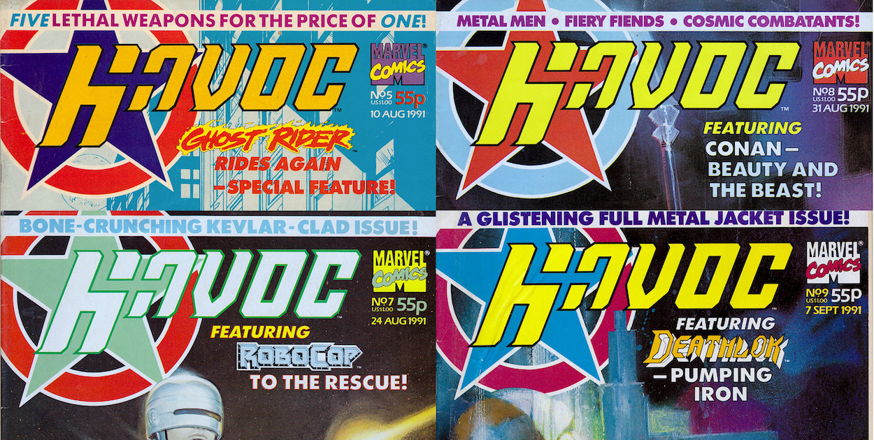
Havoc may not have lasted very long but it left a lasting impression, introducing me to characters I’d never previously heard of as well as giving me the chance to see the comic strip adventures of a favourite TV star. At the time of writing I’ve just finished a real time read through of the comic’s nine issues, during which I was able to have a chat with the person responsible for that terrific logo, Paul Chamberlain.
Paul is currently Creative Director at Pre-Flight Visual Communication Ltd, a company that seems to have designed pretty much every logo and front cover of every magazine I’ve purchased over the last decade! While chatting to Paul I discovered his inspiration behind Havoc’s logo, the other duties he took on and the string of Marvel UK and Fleetway Publications titles he contributed to.
OiNK Blog: So Paul, you created the logo for Havoc. Is there anything about the process you could share with OiNK Blog readers? For example, how did you get the gig?
Paul: It was spring 1991 and I had just returned from backpacking in India and Thailand. Before I went on my trip I had been working with Bernie Jay, the then partner of Paul Neary, at Headway Home & Law developing an idea for a monthly consciousness raising magazine. Headway Home & Law at the time was also the home of Fleetway who were publishing 2000AD and Bernie managed to secure me a couple of freelance jobs with them.
Upon returning from my travels, Bernie got in touch to ask if I would be interested in a bit of freelance work with Paul for Marvel UK. The first of these jobs was to design a logo for Havoc. I was working from home at the time and this was before the days of DTP (computerised Desktop Publishing – Phil) in comics so everything was produced by hand on a table in the corner of my bedroom.
OB: The Havoc logo is made up of a five-pointed star and there are five strips in the comic. Was this part of the design process or just a happy coincidence?
PC: Sorry to say it wasn’t quite as deep as that and just a happy coincidence. It’s difficult to remember my thought process at the time but I do remember having a thing for circles and stars. When I submitted the design to Paul Neary I do remember him saying that he liked it because it reminded him of a gun. I have to say that had not occurred to me during the design process.
I wanted the logo to have a slightly dynamic feel, hence the slightly italicised type. The original type design was very squared-off and blocky which didn’t sit very well with me so I decided to round off the corners slightly and add subtle serifs. A lot about the design was lead by the resources available to me at the time – Rotring pens, a ruler, set of compasses and a drawing board. As we used to do all our colour separations by hand everything had to have a strong black keyline so that this process would work properly.
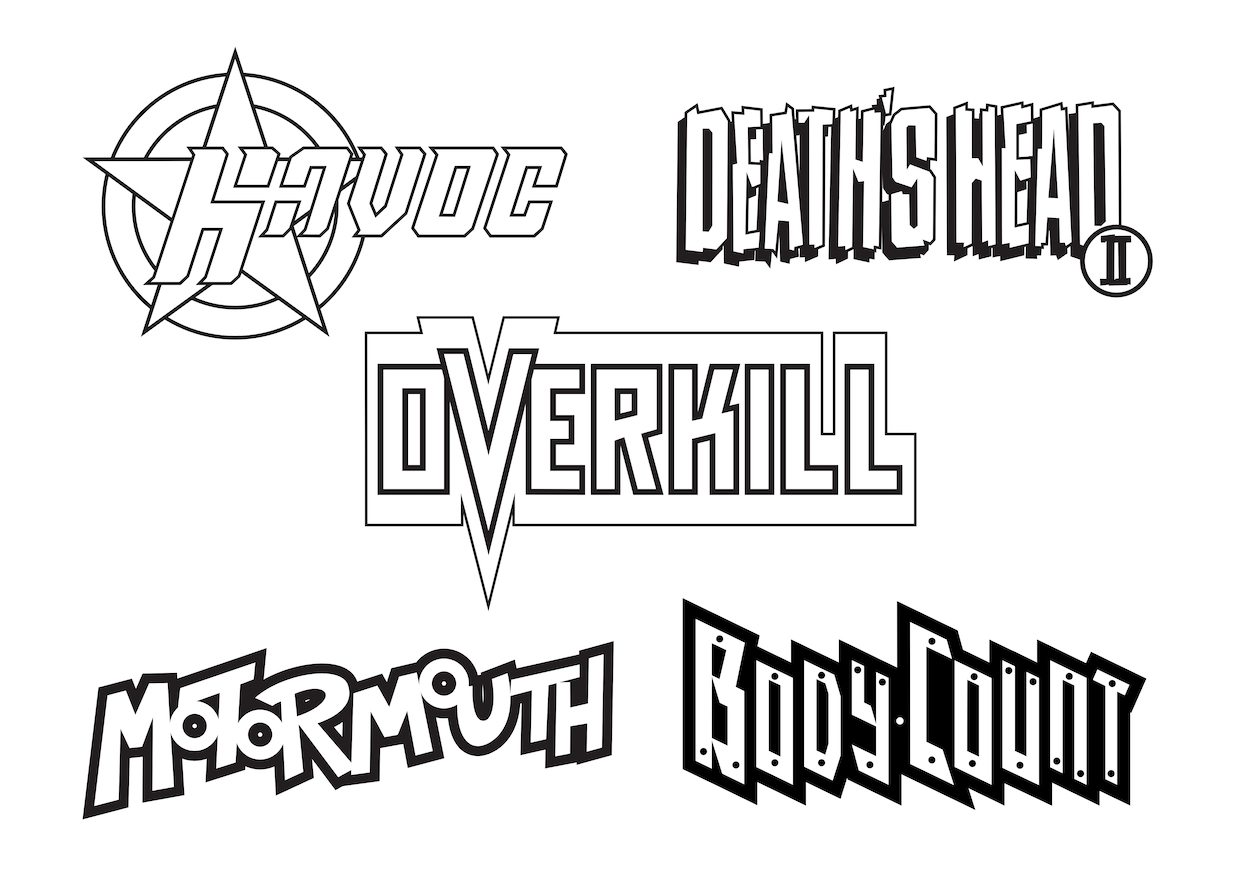
The next job I did for him was to design the logo for Death’s Head II which was created in-house and I had the pleasure of sharing a studio with Liam Sharp as he developed the character visuals.
After that I was offered a full time designer post at Marvel UK where I stayed for an amazing three years before heading off back to India for more travels.
OB: After Death’s Head II what other titles did you work on for Marvel UK and what work besides logos did you do for them? Were there any Fleetway comics you worked on too? I was a big fan of both publishers at the time.
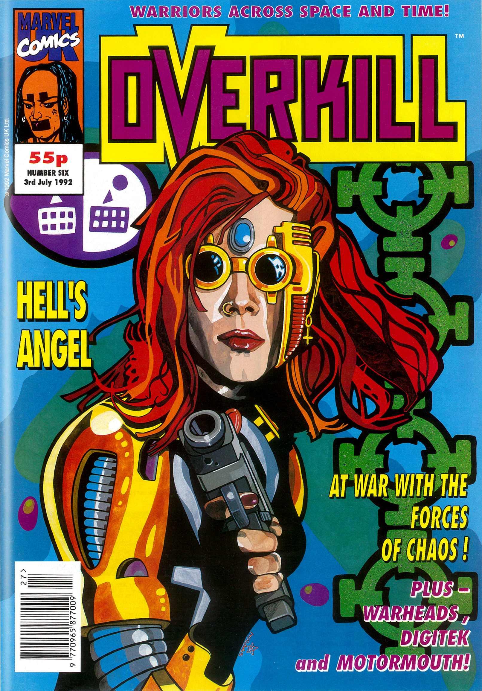
PC: So after Death’s Head I developed the first logo for Overkill and was Art Editor on that for some time. Along with another designer, Ed Lawrence, we became the design team for all the new superhero titles that came out of Marvel UK between 1991 and 1994 – Motormouth, Warheads, Hells Angel (which became Dark Angel), Super Soldiers etc. For Fleetway I produced the designs for The Judge Dredd Mega Collection with another designer, Colin Fox. Upon returning from my second stint in India I secured the post of Deputy Art Director at Titan Books where, amongst other responsibilities, I was the Art Editor for the official Lucasfilm Star Wars Magazine.
(Below, Paul’s favourite Overkill cover with art by Steve Sampson.)
OB: Wow, tthat’s a wonderful selection of titles, it must’ve been such an amazing time! I’ve always been curious, for an ongoing reprint comic what does the role of an Art Editor entail, after all the initial titles and pages have been designed?
PC: You are right. It was odd coming from a consumer magazine background. It was mainly covers and house ads. With the reprint stuff there was some resizing of artwork and new title pages if it was a longer story being broken down. For the graphic novels and collections there were also end pages, chapter dividers and the likes.
OB: Ah right, of course, all those American strips being chopped up into parts in the UK comics. I also noticed new opening panels for some of the Havoc strips so would those have been you, creating them and resizing the original art around them, yes?
PC: As designers we wouldn’t be creating new art but definitely resizing and re-laying out. That would be the kind of thing, but I think Gary Gilbert was responsible for the ongoing design duties for Havoc (like the contents, letters and Eye Level news pages).
OB: Thanks so much for the chat Paul and the insight into one of my most fondly remembered comics.
PC: No problem Philip, anytime.

Above is the complete Havoc collection with its many variously coloured logos. To read all about this wonderful comic and begin the real time read through just click here.

Really enjoyed this – thanks!
(Also those logos really take me back!)
LikeLike
Thanks David, more interviews about various comics coming in the months ahead, glad you enjoyed this one.
LikeLike