Today was to be the day I’d show you documents OiNK co-editor Mark Rodgers’ partner, Helen Jones very kindly sent me regarding the complaint made to the Press Council in 1986. Including the original complaint and a lot of back and forth between the council and IPC Magazines, they make for entertaining reading. However, something struck me that didn’t make a lot of sense.
Some contradictory information in these documents needs more research to ensure everything is factually accurate before I write the post. I’m not trying to be cryptic either, I just don’t want to speculate about things involving OiNK’s team. The blog matters too much to me to do otherwise. So bear with me, you’ll get to see them once I’ve sorted out this seemingly strange new information, and I’ll fill you in on the reason for this delay when I do.
In the meantime, there’s a wealth of new blog content still to come for OiNK and other comics this year, and if you subscribe to the blog (see the subscription option to the right of this post on desktop, or scroll right down below the posts on mobile) or follow along on its socials I’ll let you know once the Press Council post is ready.
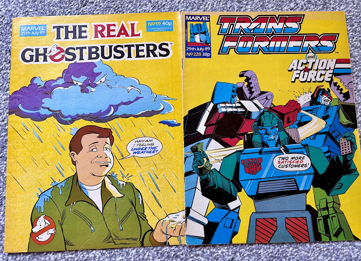
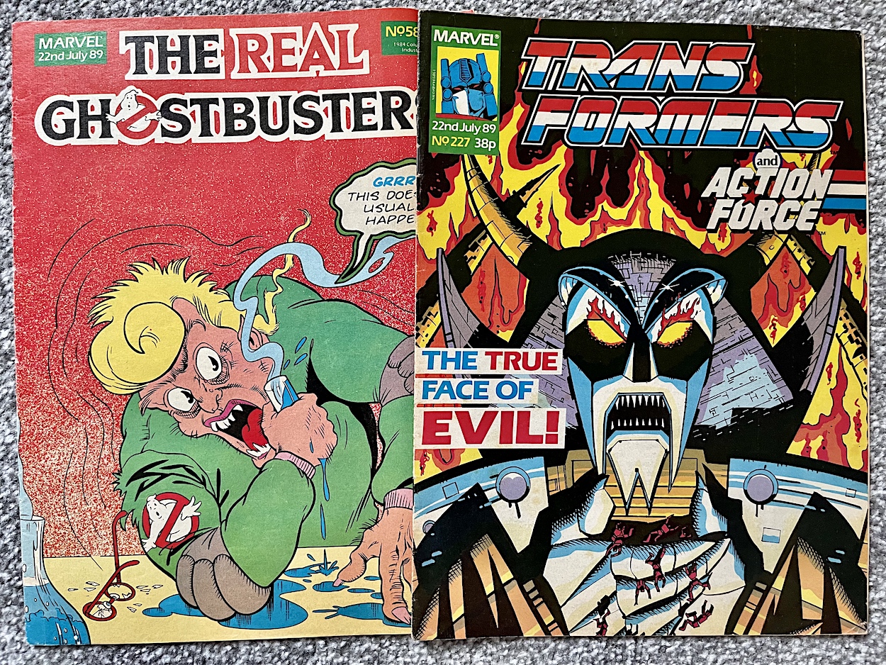
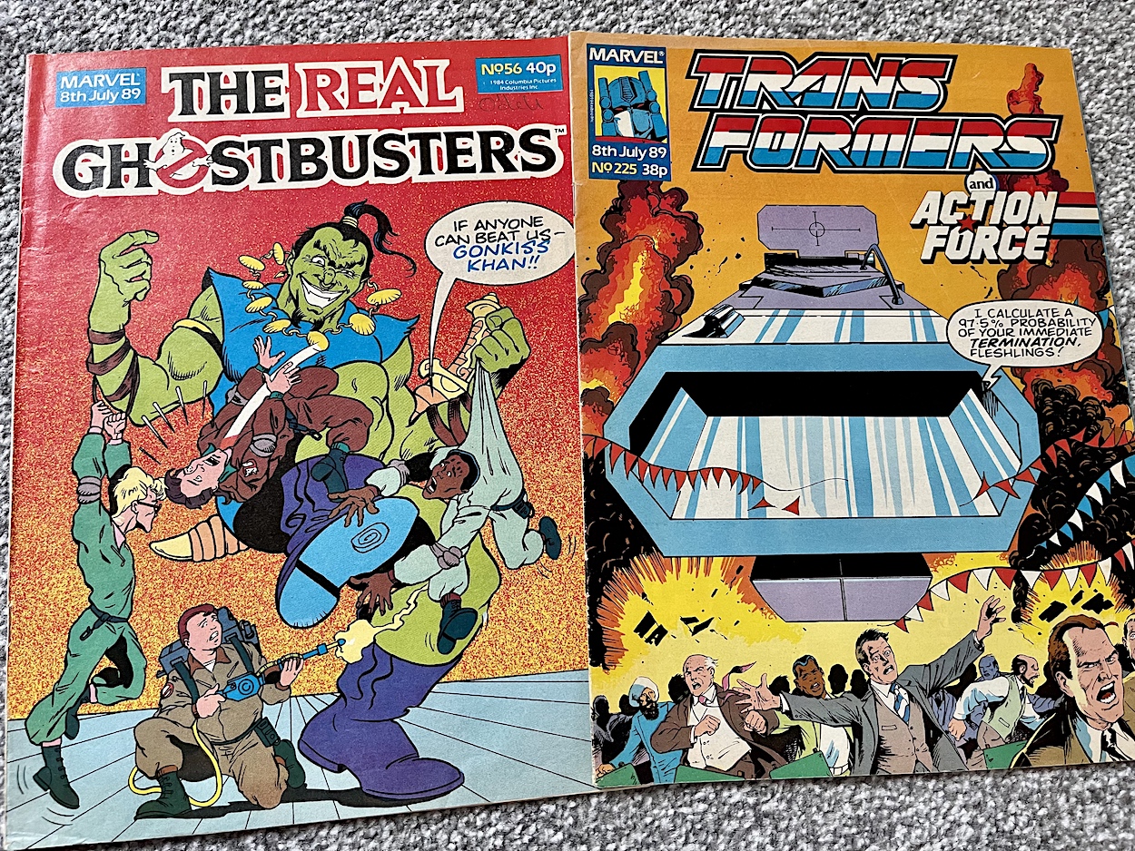
I hope you’re all feeling better than Ray does on John Marshall and Dave Hardwood’sThe Real Ghostbusters cover. Although, unlike on this cover, weather of the opposite sort has a lot us feeling a bit bleh right now. More upbeat is Doubledealer on the cover to Transformers and Action Force by Jeff Anderson.
Inside the first of our two top Marvel UK comics this week the main strip was one of those tales where the ghost busting team didn’t bust the ghost, instead setting it free once they’d found out why it was haunting a particular place. In this case a private art gallery where the ghost’s signature had been removed by a fraudster from the paintings he’d created when alive. I liked this about the comic because having every story – no matter how varied – end with a blast from a proton gun could’ve gotten repetitive and boring.
The UK strip in Transformers this week was truly excellent! Doubledealer was a great laugh. He had no allegiance and instead played both sides in the war off against each other for profit. The strip was also chock full of Micromasters (the teeny tiny Transformers toys) that I was a huge fan of and one of my favourite toys of all, an Autobot Pretender Beast call Chainclaw, was the star. I told you last week I’d be raving about this comic more and more this year! Oh, and in Lew Stringer’sCombat Colin humour strip there’s a blink-and-you’ll-miss-him cameo from none other than OiNK’s Tom Thug! You can check that out elsewhere on the blog already.
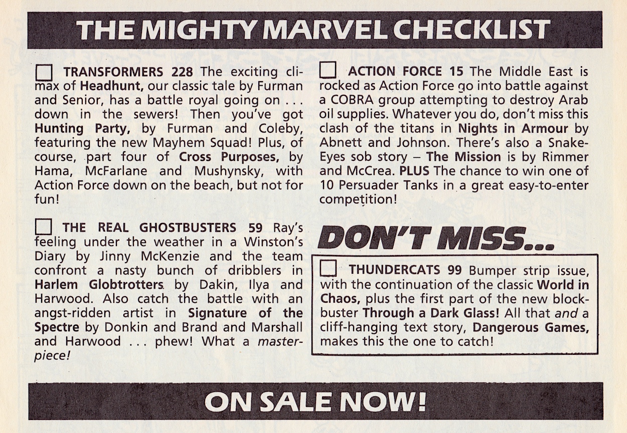
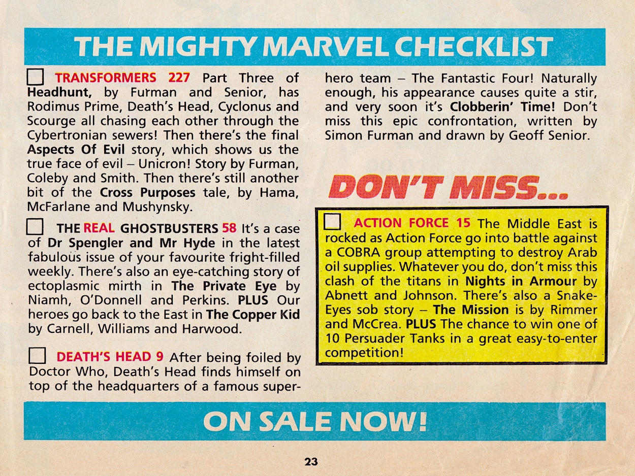
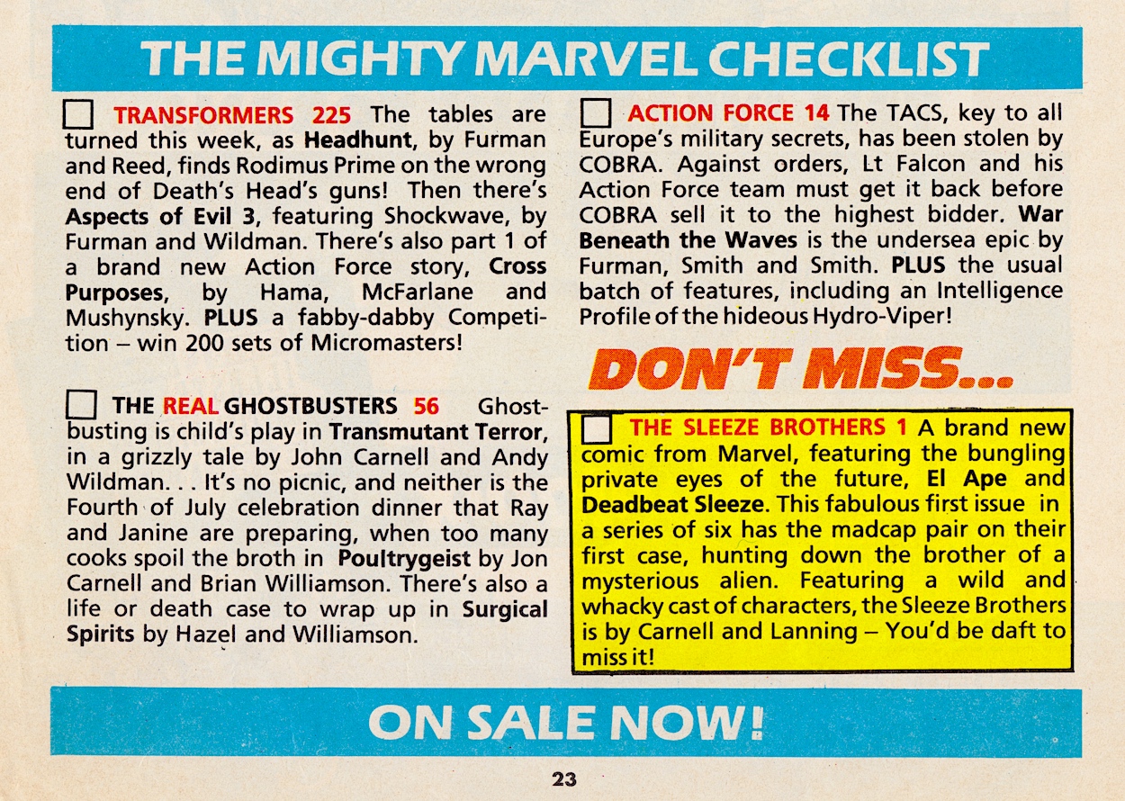
The checklist was absent from The Real Ghostbusters this week, so it’s been taken from the middle pages of Transformers, hence why it’s in black and white.
For all of the excellence inside this week’s Transformers the checklist listed the wrong UK strip, instead detailing one from month’s ago! D’oh. Thundercats made a return to the top spot with what it calls a ”bumper strip issue” even though one of those was a reprint. Cliffhanging text stories when there’s a full month to wait between issues? Ouch. Then we get to Action Force Monthly and it was more important than the checklist made out.
It’s the same issue as we saw in the previous checklist, but in this week’s Transformers the editorial revealed the exciting news that with #17 the comic was to be renamed Action Force Fortnightly and would be presented in a new format. Did this mean it was no longer going to be exported to the States as G.I. Joe The European Missions and would return to a larger UK-only format? Who knows, because the issue in the checklist above would actually be the last, with no indication of such in the comic itself. Instead, readers would only realise when #16 never appeared.
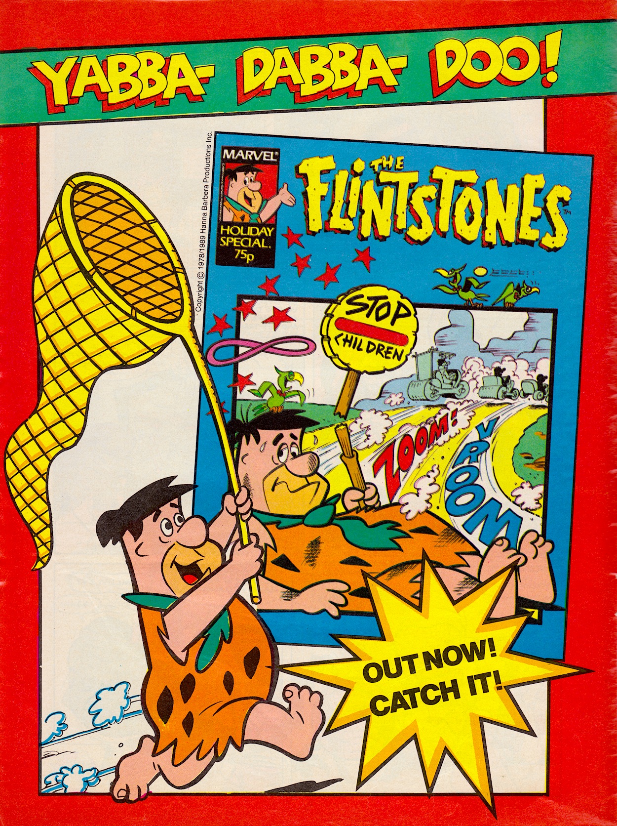
The latest advert was for another Holiday Special, this time starring Fred et all in a comic dedicated to The Flintstones, clearly the most popular characters from Marvel’s fortnightly Cartoon Time. The advert took a leaf out of the previous Tom & Jerry one and used a random image from inside to make a strained attempt at a play on words to market the comic.
Marvel UK’s comics adverts definitely fell into two distinct categories which I’d label the creative and the lazy. Thankfully, there are more of the former to come. Keep your eyes peeled for them on Wednesdays over the next few months, and I’ll see you next week.
“What’s going on inside that head inside that head?”
Jon
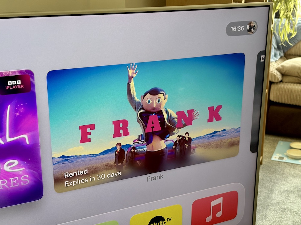
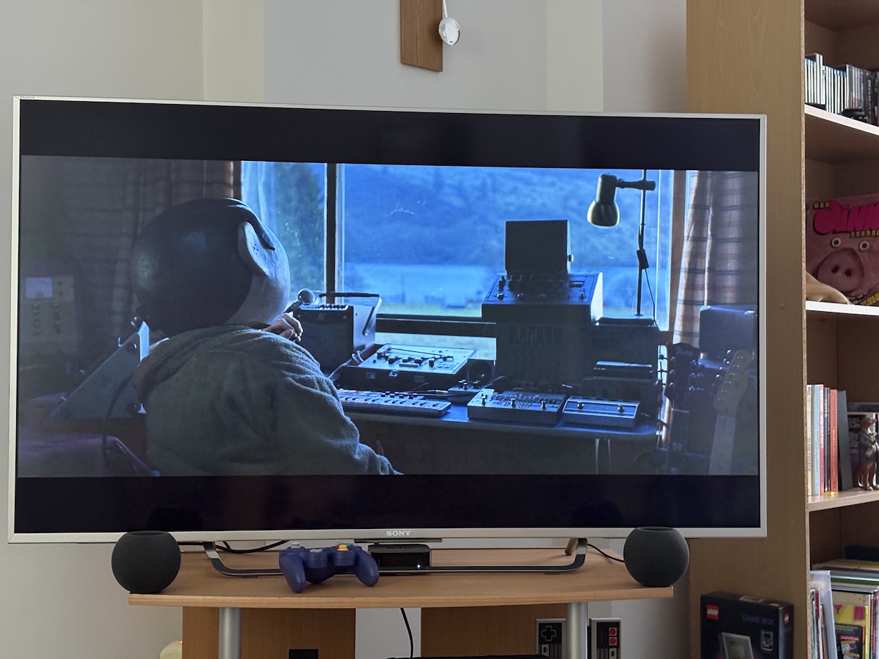
I’ve heard some ill-informed opinions about the movie Frank over the years, particularly when it was first released from people “outraged” that it told a different story to Chris Sievey’s, that the main character had a different voice, that the mask was slightly different etc. The usual kind of gatekeepering you’d expect from other fandoms, but I’m very happy to say that for the most part when the film was explained to them, and more importantly when they watched it, opinions changed. Let me be clear, this film is fantastic. It really is.
It’s co-written by Jon Ronson, a friend of Chris’ and a member of Frank Sidebottom’s Oh Blimey Big Band for three years, his screenplay based on an article he wrote for The Guardian newspaper. Chris okay’ed the script before his passing and, importantly, it was never meant to be a biopic. However, as OiNK writer Graham Exton said, “It had a lot to say about him. It was weird, funny and touching. (I suspect Chris was, too.)”
OiNK co-editor and friend of Chris’, Patrick Gallagher said in response to Graham, “I loved the movie too and you’re spot on, the movie totally reflected Chris. I could identify with a lot of the band scenes as I played guitar in Frank’s Oh Blimey Big Band alongside keyboard player, Jon Ronson. I thought Fassbender did a great job, too!” As I’ve said before, I knew little of Frank Sidebottom beyond OiNK and his children’s TV appearances, and after watching Being Frank a couple of weeks ago I feel this movie also taught me a lot, even if it is fictional. It’s also very funny!
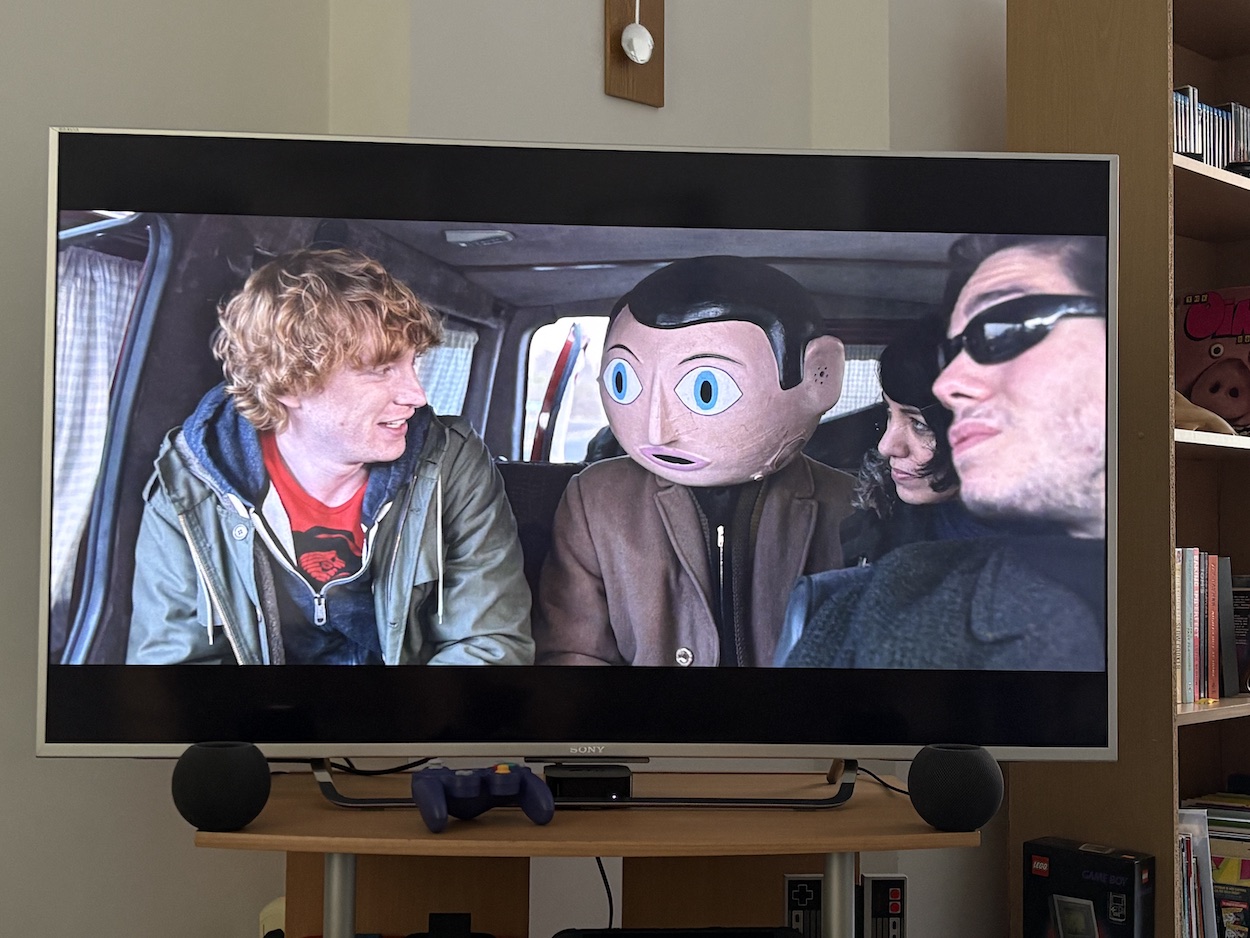
Frank kicks off with the character Jon, played by Domhnall Gleeson (Star Wars, Peter Rabbit, The Revenant) desperately looking for lyrics inspiration in anything around him as he goes about his life, and these scenes had me laughing straight out the gate! How he meets the film’s version of Frank echoes how Jon Ronson met Chris is real life, and throughout there are little scenes and character moments that hark back to their real life friendship.
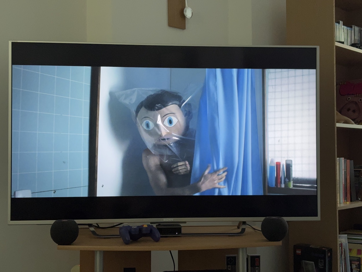
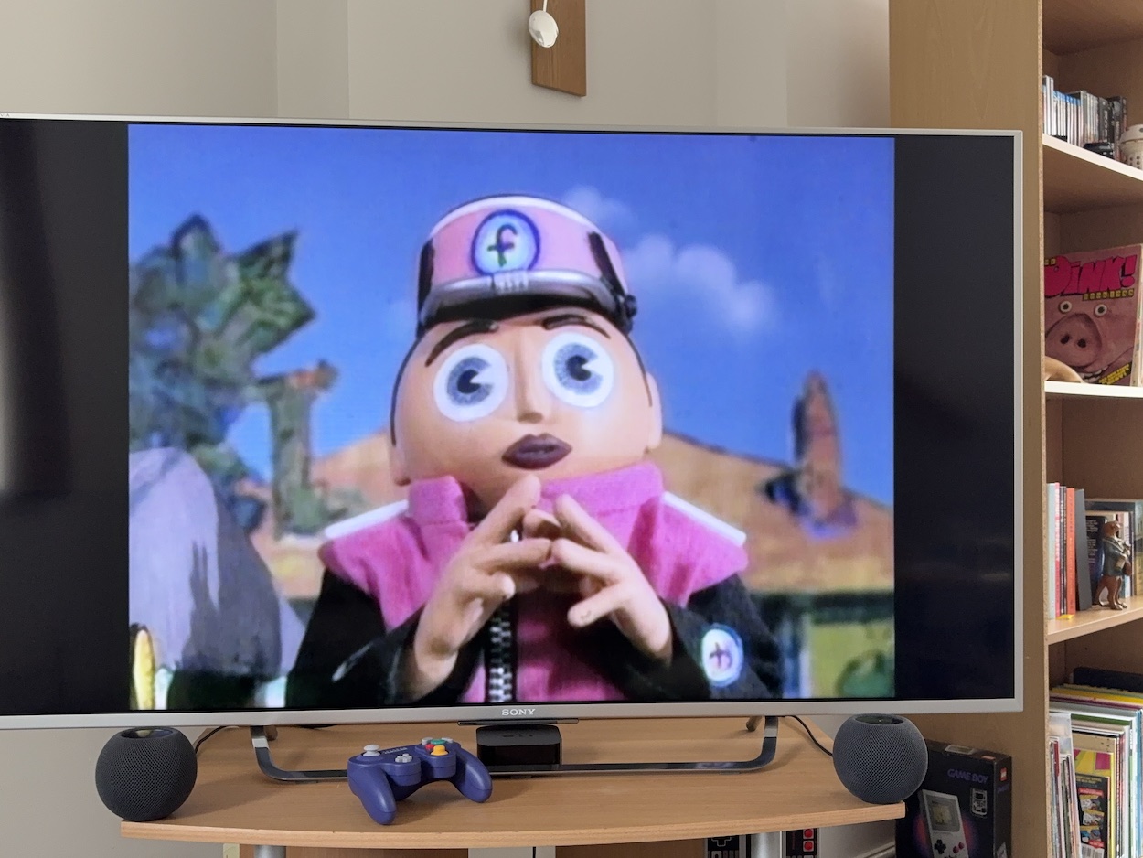
I was surprised how quickly I accepted the voice of this Frank, a regular-sounding, deep (non-nasally) voice with a slight echo. From the moment he first appears on stage at a gig he’s a fully-embodied character and Michael Fassbender (Prometheus, Steve Jobs, 12 Years A Slave) does an incredible job of acting with that huge, static face. From seeing clips on chat shows when it was first released, I’d no idea this was such a full-blown comedy, one that lovers of Sidebottom’s alternative style will adore.
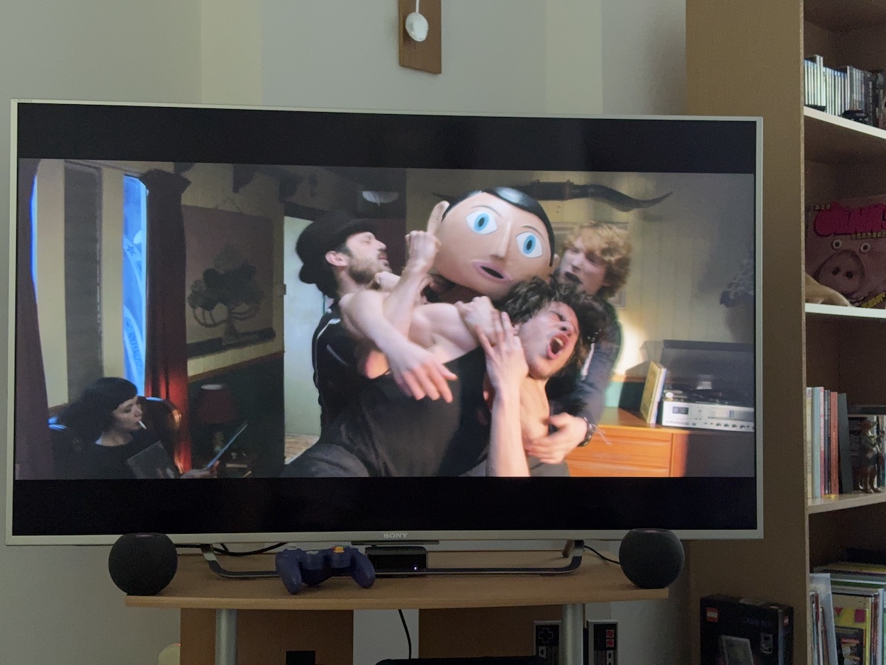
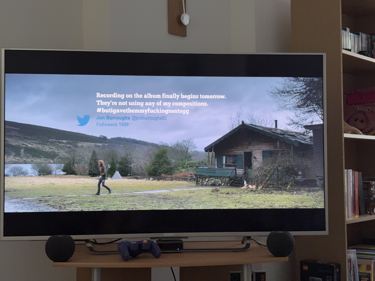
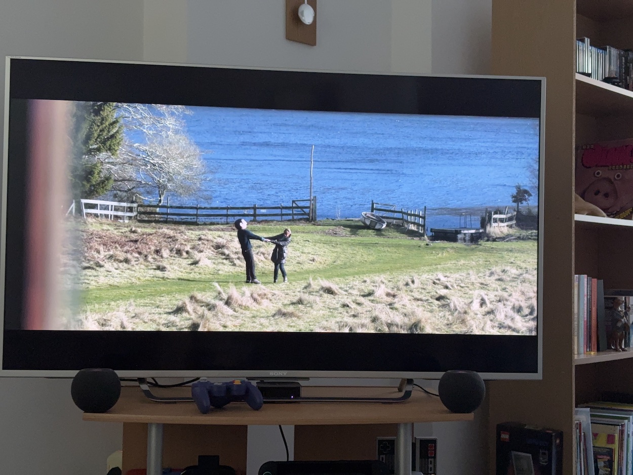
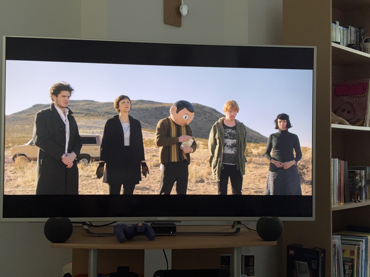
Filmed mainly in Ireland, Jon thinks he’s there for a weekend gig but ends up living with the band in a remote cabin as they prepare (and prepare and prepare) to record an album, the state of his mind over this period encapsulated with his increasingly dire tweets. The supporting cast members are all crazy in their own way, and I particularly loved Maggie Gyllenhaal (The Dark Knight, Donnie Darko, Confessions of a Dangerous Mind) as the gloriously psychotic theramin player, Clara. How these people cope with being in Frank’s band is where most of the film’s darker humour comes from.
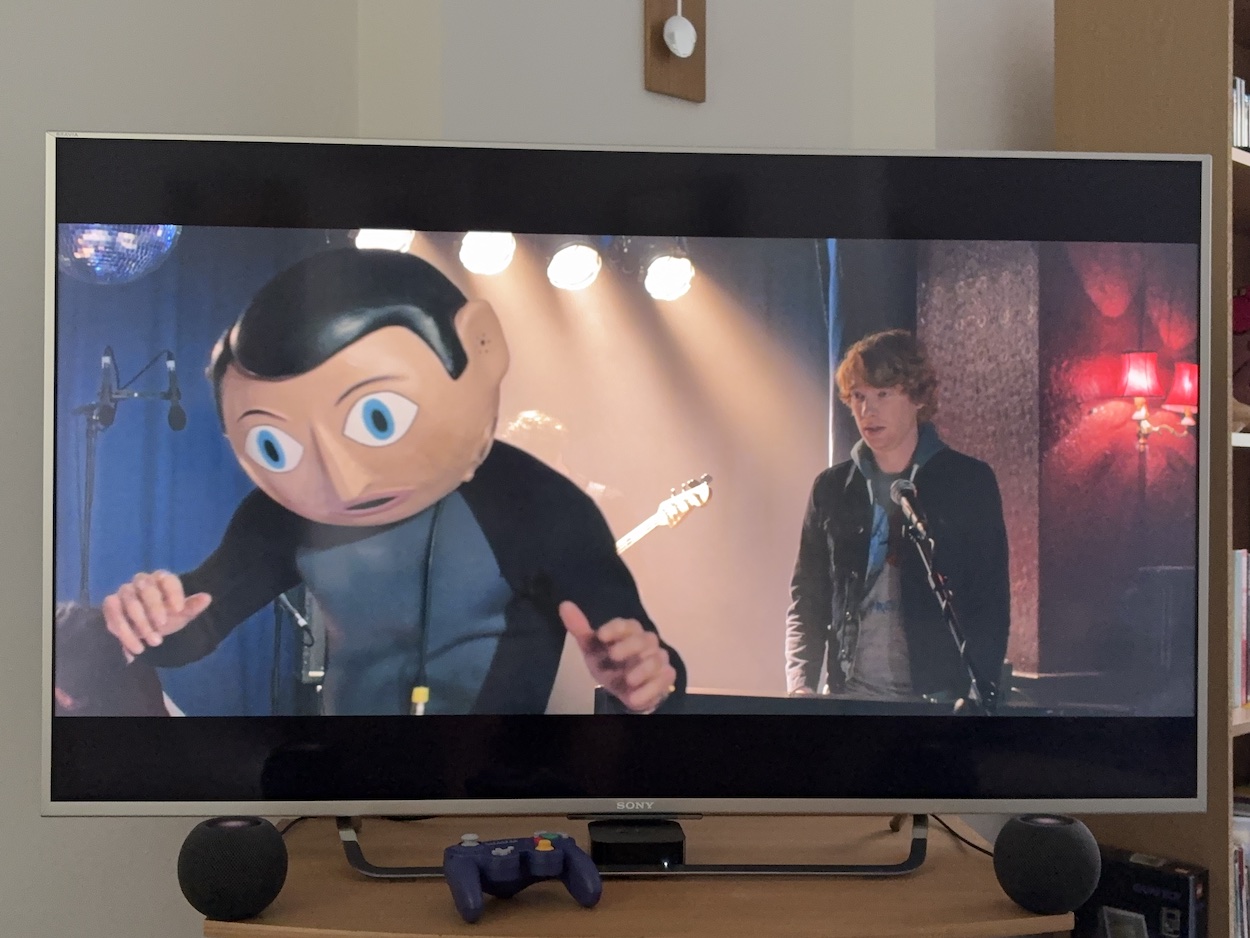
By the time of their first rehearsal I got the impression Jon Ronson was having a ball spoofing his time in the Oh Blimey Big Band, exaggerating key characterisations of Frank while delving into the psychology of someone living behind a façade. It’s completely nuts, yet when the characters of Jon and Frank have their first private chat it’s relaxed and rather sweet, with Frank’s new habit of describing his facial expressions beneath the mask a particularly hilarious addition.
When we see how Frank gets his inspiration, describing to Jon how you can write a song about anything (Jon struggled to write lyrics because he thought he needed a core style), it’s very ‘Frank Sidebottom’ and reminded me of both Chris’ and Frank’s songs we heard during Being Frank. Moments like this are both funny and touching, when this most inhuman-looking of characters shows he’s more human than most. The effect he can have on complete strangers exemplifies this but I won’t spoil those lovely surprises for you.
The music itself feels a lot like our Frank’s, while having its own style. It has that random factor but the finished songs are darker, not the happy, funny ones we were used to in the 80s and 90s. Then again, if the film had tried to copy that style the songs would’ve paled in comparison. While the character can also be somewhat dark at times this makes his lighter, more human moments all the more wonderful.
For example, we become used to the songs they’re producing and their overall style, so when Frank gets to sing his “Most Likeable Song Ever” it reminded me so much of Frank Sidebottom that I absolutely roared with laughter! This is a man who just wants to be liked, but who struggles between wanting to be accepted and keeping true to the music. This juxtaposition leads to both heartfelt moments and great comedy; you genuinely never know where this film is going to go next! Even in the saddest moments there can be a sudden gag that’ll have you laughing with surprise.
This may be a completely fictional character but he’s very much based on our Frank. As such, the film is hilarious, strange and random, and has a heart of gold. It’s a film that’s both heartwarming and heartbreaking. Then, given what I knew about it going in from its marketing at the time, the ending is a big surprise. When it finished I immediately wanted to put it on again because I just know there’ll be more fun to pick up on with repeated viewings.
Any fans of Frank’s work in OiNK and his children’s TV appearances need to watch both Being Frank and Frank. You’ll learn so much about the character and the man behind him from both movies in completely different ways. Frank in particular is a truly unique film experience, the likes of which you’re never likely to have again! When Frank was reviewed in The Guardian, Peter Bradshaw summed it up by saying, “Frank works as satire, as memoir, as comedy bromance, but it works mostly because it is just so weird”. Or as Patrick said to me just this week, “It captured the spirit without pretending to be the man.” I concur completely.
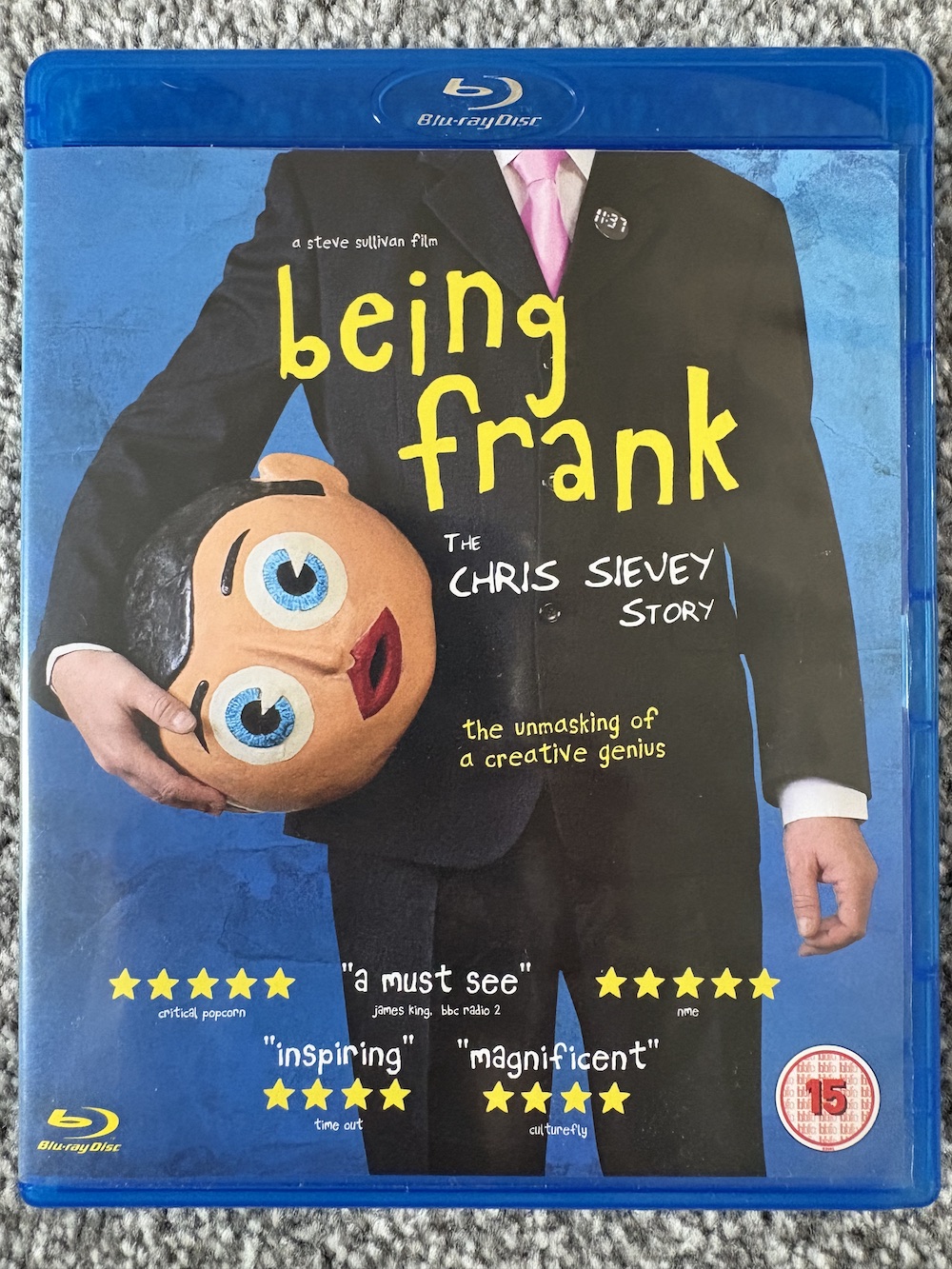
Remember, please support actual shops and independent sellers. For example, at the time of writing Frank is available on DVD from HMV for only £6.99 or you can try various eBay sellers for the BluRay.
Geoff Senior’sTransformers and Action Force cover somewhat overshadows John Marshall’s and Dave Harwood’s one for The Real Ghostbusters. That’s obviously not a criticism of the latter. How can you compete with Geoff drawing Unicron?
With a reprint of a superb Death’s Head story I’d never read before and the return of the God of Chaos from Transformers: The Movie, young me was absolutely thrilled with this issue! This was when I really fell in love with the black and white art thanks to the opening splash page, which got across the size and power of Unicron much more effectively than most of the colour movie adaptation did. Drawn by Simon Coleby and Cam Smith (what a team!), check it out at the link at the bottom of this post.
The Real Ghostbusters’ front page to #58 would be reprinted as the cover for the final issue, #192. Its first outing was for a fun story inside which was basically a retread of (or should we say ”inspired by”) Eddie Murphy movie, The Golden Child. Thankfully, the story concentrated on monsters from Eastern Mythology rather than making a joke out of a people’s history. After last issue’s abomination that’s a blessed relief!
Action Force Monthly nabbed the top spot this week 37 years ago. With the gift of hindsight (as well as just living in the modern world) it seems the good guys may have been on the wrong side of things in their latest issue, and in Transformers their story wasn’t exactly hyped compared to the other strips, was it? At least there was an interesting-sounding Snake Eyes story to back things up.
The Sleeze Brothers took a week off from grabbing all the checklist glory and Death’s Head’s penultimate issue hung around a bit too, but still doesn’t make it to ‘unmissable’ level. With no new comics adverts and a rather basic update to the checklist you’d be mistaken for thinking it was a quiet week on UK comics shelves for Marvel UK, but that Transformers issue does a lot of heavy lifting. I may be biased but it really should’ve got the yellow box!
In fact, Transformers would go from strength-to-strength from here on (not that it wasn’t already superb, of course), so expect a lot of excited text from me over the remainder of the year. There’ll be more of that next week, in fact. See you then.
I had to take Smudge to the vet last week. Normally these trips go smoothly but he had to get some light dental work done and was anaesthetised. After I got him home he was off for the rest of the day and into the small hours; he clearly wasn’t happy with how his mouth felt, didn’t eat much (so I couldn’t give him his pain meds) and the eye drops they used while he was knocked out had turned his vision cloudy. I stayed up very late with him but eventually he wondered off to a quiet corner of the house on his own as cats do when they’re not well. I tossed and turned, worried about my little friend.
Then, around 4:30am I heard a familiar ”Are you up?” meow. He jumped up on me, rubbing his face into mine to give me his unique kisses and hugs, and was vibrating like a jackhammer with the loudest of purrs! We made our way to the kitchen where he ate some chicken (slower than usual but I waited for him) and then he followed me back to bed, curled up on my lap and the both of us fell asleep together for a few hours.
The joy I felt in my heart at a time of night when I’d usually be half awake and stumbling to the fridge for him proved just how much this daft little ball of fluff means to me. Seriously, I was as elated as a child on their birthday! Maybe his mouth felt a lot better than it had even before the visit and he knew I’d taken care of them, or maybe it was simply because the pain and vision problems had gone. Either way, he was the cuddliest, happiest, purriest little cat for days afterwards! I could tell he was so, so happy. Smudge has been living with me for just nine months but I’ve known him and cat sitted him for nearly 11 years now. In fact, it’s his 11th birthday today!
Well, his estimated birthday. When my friends, mother and daughter Elaine and Vicki found and rescued him in October 2015 the vet estimated he was about three months old, so they counted back and decided 12th July would be his birthday (giving me something I actually want to celebrate on that day here in Belfast). Ever since then he’s been treated to pressies on that day and this year is no exception.
I’ve spoken at length about Smudge’s story but to mark the occasion (and after the way he’s been so extra loving this week) I wanted to write a little about how much he’s been there for me this past decade-plus… a thank you to him, not that he’ll know! When Elaine passed it felt like there was still a part of her here in him. She raised him for six years and loved him dearly and it was obvious he really missed her after she passed.
When my own mum and dad passed away within months of each other two years ago, going to cat sit Smudge with all the playtimes, cuddles and cat naps really helped me through. In fact, I was with Smudge when I found out my dad had died. I can remember him jumping up on my lap and while sitting upright and looking right into my eyes he cocked his head to the side, as if asking if I was okay. It wasn’t the only time he didn’t leave my side when I was feeling low that summer.
Earlier this year I was reading a special cat-themed edition of National Geographic Vicki bought me for Christmas, and one of the things I learned was how cats have a special purr they do when they want to help someone (human or cat) who they think is sad or not well. I remember his loud, vibrating purr from when I lost my parents and how he’d snuggle into my chest and turn his volume up! He was trying to heal me.
People do say animals are really good for our mental health and I couldn’t agree more. There’s so much bad news out there at the minute and horrible developments in the world that I’ve often found the stress of it build up, but then I just look at Smudge and it all melts away. The same goes for when someone has annoyed or angered me for whatever reason (it’s been a stressful couple of years on a personal level), when I get home that all dissipates straight away.
Initially, the last thing I wanted was for Smudge to think I was angry or stressed with him so I’d push those feelings down and he’d calm me just by existing in the same space as me. Over time though, living with him has calmed me in general and I find things just don’t annoy me as much to begin with; unimportant things don’t get to me as much because the love I receive from him and his calming nature are just so much more important than all that negativity.
I’ve also become so much more productive! If I’m not careful I can be an awful procrastinator (or a wonderful procrastinator depending on your point of view) and I always tried to schedule writing time every week like a regular job. Not anymore. Since Smudge may want played with or an hours-long cuddle-nap at any time I just write or partake in my hobbies as and when I want and I find doing so has reinvigorated me in a strange way. I’m doing what I love when I want rather than by a work schedule and it’s been working like a dream. When he wants attention I just stop and when I return to it I’m refreshed and ready to carry on.
So thank you Smudge. Thank you for choosing me to be your best friend, for being there for me even if you didn’t quite know why, and for bringing joy and love and a great deal of cosiness to my wee home and my life. I hope I can return the favour and provide you with the best possible retirement home.
I can’t believe we’ve been reliving these checklists for 50 weeks already! What are we marking the occasion with? A Real Ghostbusters cover by Anthony Williams and Nick Abadzis, and for Transformers and Action Force it’s Jeff Anderson again.
It’s a week of two halves as far as our top two comics go. We’ll start off with the bad. The very bad. The strip called A Wok on the Wild Side in The Real Ghostbusters made me cringe even back then. It’s just an excuse to cram in as many Chinese and Buddhist clichés as possible as supposed jokes, and to add insult to injury the normally fantastic Dan Abnett continued these with awful spoof ghost names in Spengler’s Spirit Guide. As a child I thought they were inappropriate, as an adult they’re downright offensive and it leaves a huge red mark against one of my favourite childhood comic series.
Much better this week is the fact Bludgeon makes his debut in the UK Transformers strip. That’s him on the ground in front of Megatron on the cover. He was a Decepticon Pretender and an excellent character for the last couple of years of the comic’s life. He’d eventually rise through the ranks to become leader and even came back for Generation 2. It also doesn’t hurt that Lee Sullivan’s artwork inside is incredible, upping his line work game (not that we thought that was possible) for his black and white strip. An exciting time for a Transformers fan, that was for sure!
Even a new issue of Death’s Head can’t topple The Sleeze Brothers from their perch on the checklist for the third week in a row, a record so far in this series. Then again, by this stage Marvel UK would’ve known Death’s Head’s time was short and they had a brand new property to promote. This penultimate issue of Head’s series was the first one I wasn’t overly excited about beforehand as I’d never read any Fantastic Four comics. They’d just never appealed to me and so all the hype was lost on this reader. But as it turned out it was a brilliant introduction to the characters and their interactions with our sort-of-hero were hilarious. Check out the review with issue highlights at the link below.
Two adverts this week and it’s quite telling that Cartoon Time lists its stories in third place after competitions and puzzles. Even when I was younger and reading Thomas the Tank Engine & Friends (also from Marvel UK) the main draw was always the stories. Maybe I’m an outlier but hyped competitions have never enticed me to buy a comic or magazine. So it didn’t bode well for Cartoon Time for me as a young teen. Yes, I was older than the target audience but still, Thomas did it right!
It’s Wicked! was currently on #7 of its short run and Slimer’s presence still didn’t appeal enough for me to try it out. Perhaps that’s because he worked best as part of a team, as a mascot or sidekick. His small humour strips in The Real Ghostbusters were always fun and in the cartoon the Slimer-focused episodes were used as a great way to give us more insight into the world the ghosts inhabited. But he was proof you could have too much of a good thing. I never liked his own cartoon or comic; the joke ran thin very quickly and tainted an otherwise great character.
Yes, I know he was just one strip in It’s Wicked!, but the way he was used for promotions felt like overkill after his own comic and it merging into The Real Ghostbusters, and his appearances in The Marvel Bumper Comic. I can’t have been alone either because the comic only lasted 17 weeks before cancellation despite the cover star.
Over the summer months The Sleeze Brothers wouldn’t be the only new releases from Marvel UK in 1989. Watch out for adverts for a new mature weekly and a sci-fi magazine, plus the next strip advert and more. See you in seven.
Yes, it surprises me too that it’s taken me this long to watch Being Frank, Steve Sullivan’s 2018 documentary about Chris Sievey’s life and his career behind the papier-mâché mask. It’s even more surprising when I tell you I’ve owned the BluRay for about five years and only took the cellophane off this week. Sometimes we just accrue things we’ve every intention of getting around to but time just sips away. Time to correct this particular oversight.
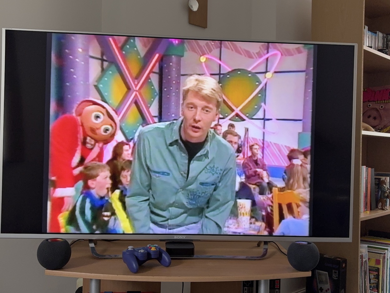
What a brilliant documentary film this is! I’ll admit, all I knew of Frank was from OiNK and his appearances on children’s TV in the 80s and 90s. As such, it swelled my heart to see him walking about with OiNK and No.73 badges as well as clips from the latter and Motor Mouth’sAndy Crane, with Frank sneaking about in the background. So I was feeling like a big child and extra comfy with the film as it got started.
There are plenty of sweet home videos of Chris and the story of how he met his wife Paula is a particular highlight of the early segments. You’ll be amazed at the combined Sgt. Pepper and Dalek bedroom mural he painted for his baby too! You see, this isn’t just the story of the megastar-to-end-all-megastars, this is a very human tale of the man behind the mask and it was all brand new to me.
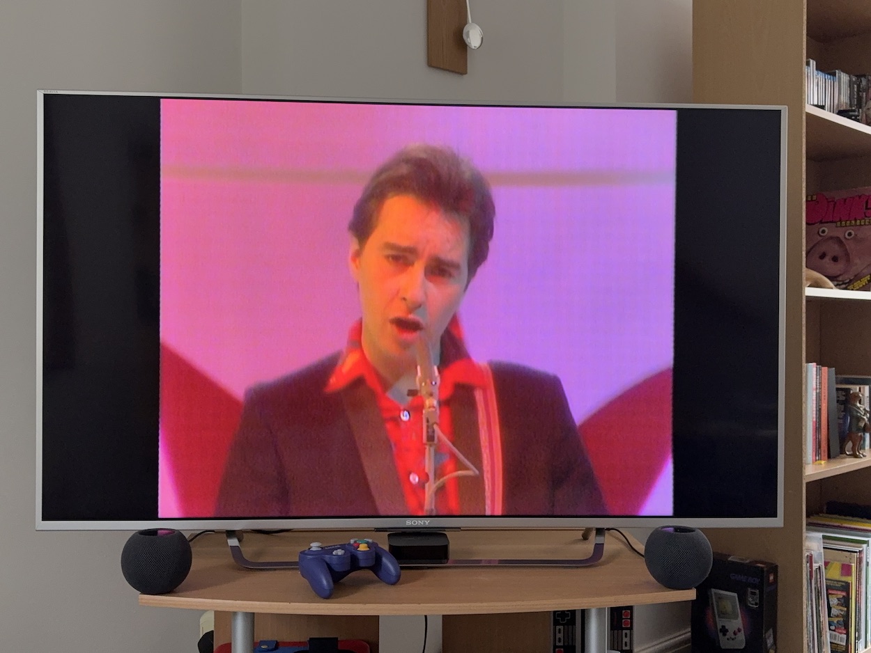
I knew nothing about The Freshies, his band from his early days with “27 consecutive flops”. Chris’ passion never relented despite that achievement. Their music is great but just came at the wrong time, when being “cool” was the big thing in the charts. The Freshies were bright, bubbly and fun, and definitely not “cool”. Their song, I’m in Love with the Girl on the Manchester Virgin Megastore Check-out Desk is dead catchy and was due to be a hit, but events conspired against them. For example, a strike by the BBC’s technical staff cancelled their big Top of the Pops performance to promote it.
There are multiple stories of Chris’ brilliantly planned publicity stunts, such as stealing headed paper from a record company and sending out mass invitations for a secret event. The event was the debut of a new song and music video, but after all that effort Chris brought the wrong type of video cassette. His sense of humour in the face of adversity is truly inspirational.
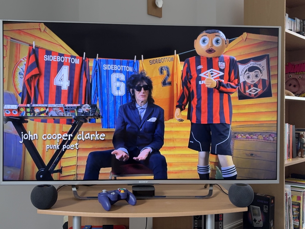
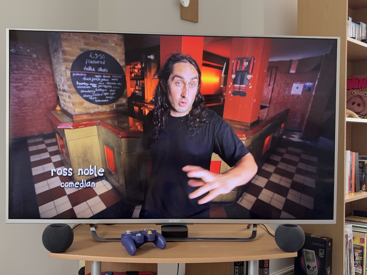
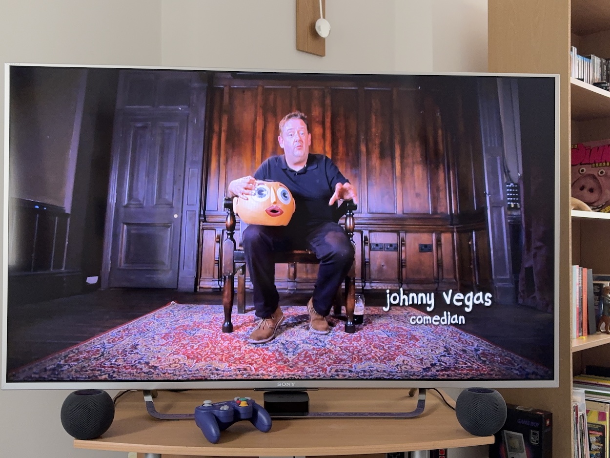
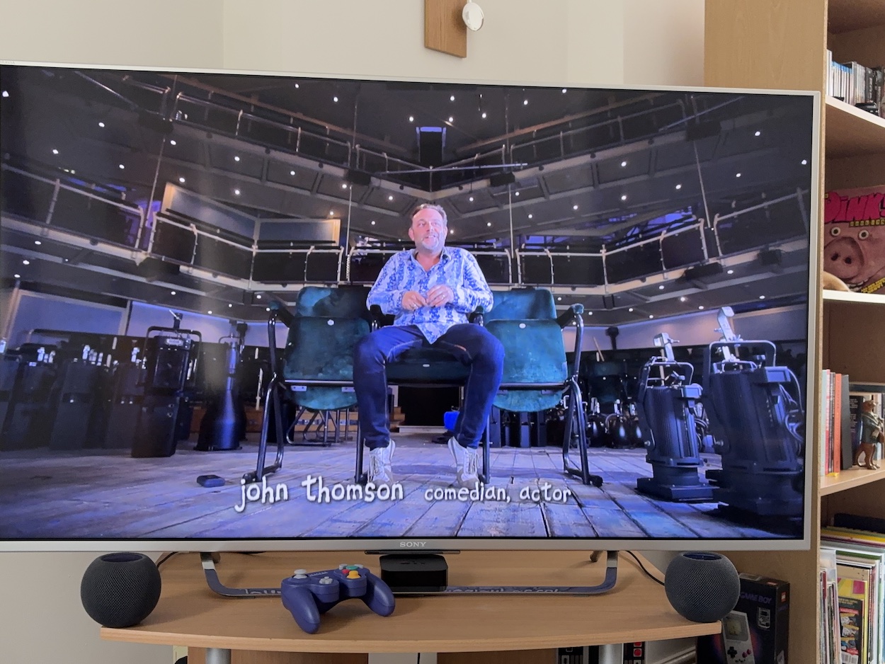
His visionary genius is often on display, like creating a vinyl record with a song on one side and computer programs on the other that could be loaded into a Sinclair Spectrum for an animated lyric video. This was in the early 80s! The selection of talking heads also in awe of him include the likes of poet John Cooper Clarke (who calls him a pop music writing genius), radio DJ Mark Radcliffe, friend and band member Jon Ronson, OiNK co-editor Patrick Gallagher, his brother and musician Mike Gallagher, and comedians Ross Noble, Johnny Vegas and John Thomson.
Frank himself was created as a fancy dress costume for a party and afterwards was intended to be used as a Freshies super fan character, but of course he ended up taking on a life of his own. When the version of Frank we all know and love is properly introduced we visit his hometown of Timperley via the board game featured in OiNK. He could be up all night finishing his OiNK pages, often advised to trim bits off to give himself less work but he never considered doing such a thing.
Patrick reminisces about how often Chris would miss deadlines but the end result was always worth it. And that phone number he often printed in OiNK? That was his real home number, and Paula and his grown up kids remember just how many hundreds of calls they received as a result! Don’t be expecting a long OiNK section but that’s because there’s so much story to tell here. We do see TV clips featuring the comic though and throughout the film there are loads of things he referenced in his pages that you’ll spot and enjoy. For example, seeing his friends dressed just how he drew them in OiNK.
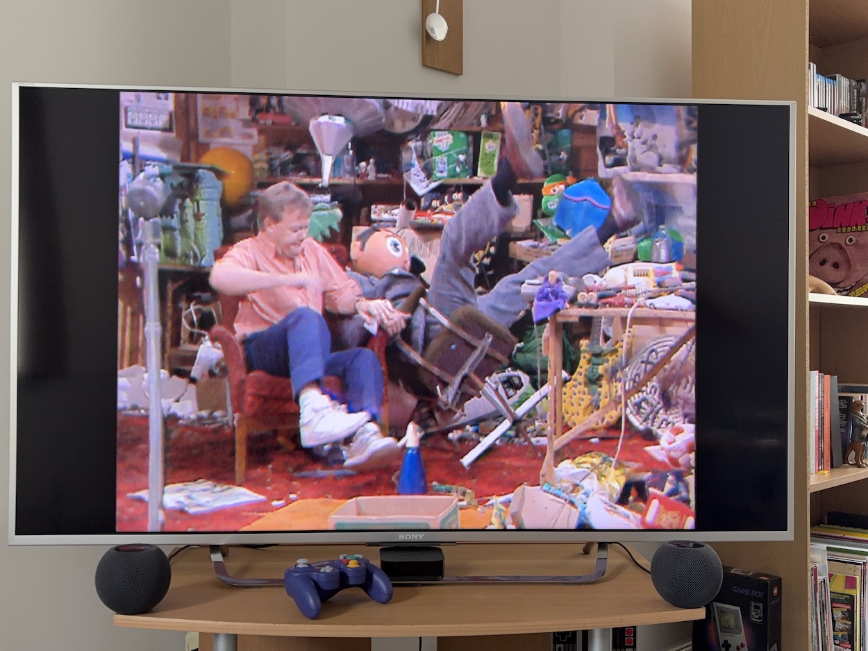
”Badly played, barely rehearsed bad versions of other people’s songs and people loved it,” says Chris’ brother Martin at one stage. How very true of the Oh Blimey Big Band. It’s at this point we get to one of the main themes of the film. His friends explain how Chris was living in an altered reality; when he was Frank he really was Frank. They say he was a genius but they were convinced there were two distinct personalities involved. This would eventually form the basis for Jon’s script for the Frank movie.
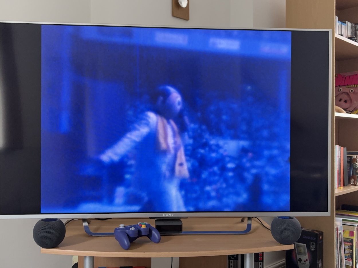
At one stage we actually see him take the mask off, but not before he’s ensured he’s out of sight of his fans and any children. Seeing his nose strapped up to maintain the voice and the amount of sweat pouring off his face, you begin to get the idea of just how hard it was to be Frank. His star was rising, opening for Bros with hilariously disastrous results, then playing the Reading ’92 festival where we hear 10,000 people cheering him on and singing his awful songs back at him!
It’s when we see clips of his Fantastic Shed Show that the story begins to turn, its success leading Chris off the rails with drugs, alcohol and affairs, the break up of his marriage and slipping into depression. After being so happy chasing his dreams for so many years of, for this to happen when he gets there is heartbreaking. This part of the documentary is particularly hard to watch, simply because we’ve grown to love the man so much by this stage and genuinely worry for him.
Eventually a job on the set of Bob the Builder helped get him back on his feet (there’s a funny story about how he got that job too) and he even reconciled with Paula. When he then resurrects Frank it’s all part of a very specific five-year plan, the culmination of which would see him get the credit he deserved for the character, and the film takes us through this phase of his life one year at a time.
The Frank Sidebottom renaissance was fantastic (it really was), with Timperley tours, a new TV show and even an incredible Frank stop-motion animated short! I dare you not to shed tears of joy with Chris’ Christmas present to his son at this point, which I won’t spoil for you. The increasing joy I felt as each year panned out inevitably led to 2010, his final gig on 11th June and his passing on the 21st. The fifth year of his plan was never to be. This was gut-wrenching.
If it sounds like the majority of this documentary with its roller coaster ride of emotions was all new to me that’s because it was. To be honest, I didn’t know how much I’d enjoy it before I put it on. I remember my mum couldn’t stand Frank when he appeared on TV. He was an acquired taste that’s for sure, so would my now-adult brain react as well as young me did to his contributions in OiNK?
The biggest surprise was discovering just how much I would’ve loved him outside of the world of OiNK and children’s telly if I’d known about it; he was an alternative comedian before I discovered the genre in my teens. All the clues were there in OiNK of course, but when it ended I never followed Frank any further. I really missed out. I loved this kind of humour in my teens (mainly thanks to Friday nights on Channel 4 in the 90s) and this realisation, the sheer fun of Chris’ comedy and his joy and passion for life was a delight to discover here, making the sudden end all the more heartbreaking, even though I knew it was coming.
This is a long review but believe me I’ve edited it down as much as possible without losing any of the things I just had to tell you about, and this is just the tip of the iceberg of what’s included in this 100-minute film. Originally a Kickstarter project (the list of supporters at the end is incredible) it’s widely available today. For example, at the time of writing you can buy the DVD for £6.99 or the BluRay for £5.99 from HMV’s online store (please support real shops like HMV, not that other online monopoly).
Just one word of warning before you do settle down to watch Being Frank, though. His Tax Song is awful, truly awful and deliberately so… but it’ll be stuck in your head for days. Trust me!
I just love Jeff Anderson’s cover to Transformers and Action Force #225. Shockwave was the most sinister of Decepticons and always looked terrifying on covers. By contrast, John Marshall and Dave Harwood’s piece for The Real Ghostbusters is as daft as ever.
Inside Transformers, the reprints continued with more Death’s Head tales and the editorial finally came clean about the (gorgeously drawn) black and white pages. That Shockwave strip is actually a rather lighthearted affair, with the young and impudent Hot Rod’s anarchic style in battle raising a few genuine laughs. Aspects of Evil continued to be all the proof needed that the new story format could work a treat. Oh, and it’s all backed up with an Action Force story drawn by Todd (Spawn) McFarlane.
The main strip in The Real Ghostbusters proved extra funny to me this week thanks to who drew it. A story about haunted cars that transform into cuddly bears that come alive? The comedy from this spoof of Marvel UK’s other main comic is heightened thanks to incredible Transformers artist Andrew Wildman being the one to bring it all to life! This reminds me of John Geering drawing spoofs of Whizzer and Chips for OiNK! Two top issues as always. It’s just as well, because according to the checklist they’re the only new ones this week.
The Sleeze Brothers deserves all the glory of the Don’t Miss… spot every single week for the next six months as far as I’m concerned. I don’t remember knowing as a kid that it was a limited series and I’m not sure if that would’ve made me more eager to collect the set, or put off by the fact it wouldn’t run for long. In the end it wouldn’t matter, my attention span went on to the next thing by August 1989.
The advert this week is our first black and white entry. With so much to pack into each week of the new-look Transformers, a small half-page is all Action Force Monthly gets to promote itself. Although truth be told it does a damn fine job. As I said last time there’s more packed into this tiny little advert than most of the full-page ads recently combined! Images from various issues by various artists give us a flavour of what to expect inside. The only thing missing really is Snake Eyes!
It’s the summer, and just like real life things do seem to slow down at Marvel UK HQ over the next while, with the new Sleeze Brothers comic doing a fair amount of the heavy lifting for the checklists. But I do have very fond memories of Transformers and Action Force around this time. Despite how it seems to be generally perceived online, the reality was that it was going from strength-to-strength for me. From this point right here up to the end with #332 is probably my favourite time in the comic’s run, so it’s great fun to revisit it again through these posts.
Watch out for news about Transformers on the OiNK Blog towards the end of the summer, too. That’s all I’ll say for now. Oooh, I’m such a tease!
If you happen to be in a certain English town today then you could always pop along to the Maccpow comic con where there’s a preview screening of the OiNK documentary tonight. But what if you don’t happen to live in Macclesfield? Don’t fret, the OiNK Blog has got you covered, and will throughout the year. You see, tonight is very much a preview screening, a first edit if you like, to gauge audience reaction of the film so far.
Very kindly, filmmakers Claire Bend and Rob Reed of Bread and Butter Films sent me a copy a couple of days ago so that I could give all of you lovely pig pals something of a preview too. Obviously, I don’t want to spoil anything for when you finally get to see the finished product but I can certainly give you a tease of how the film stands so far.
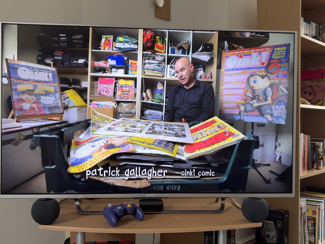
Back in May I interviewed Claire and Rob about Piggs, Puns and Plops (the new name for the film) and was able to reveal those who had been interviewed so far. They included the likes of OiNK’s co-creator and co-editor Patrick Gallagher, Tom Thug’s and Pete and his Pimple’sLew Stringer, Psycho Gran’sDavid Leach, and Helen Jones, Mark Rodgers’ wife and star of some hilarious photo stories in the comic. Oh, and me. Now with an official title no less!
There were others I mentioned too and now I can reveal who else they’ve spoken to in this preview cut.
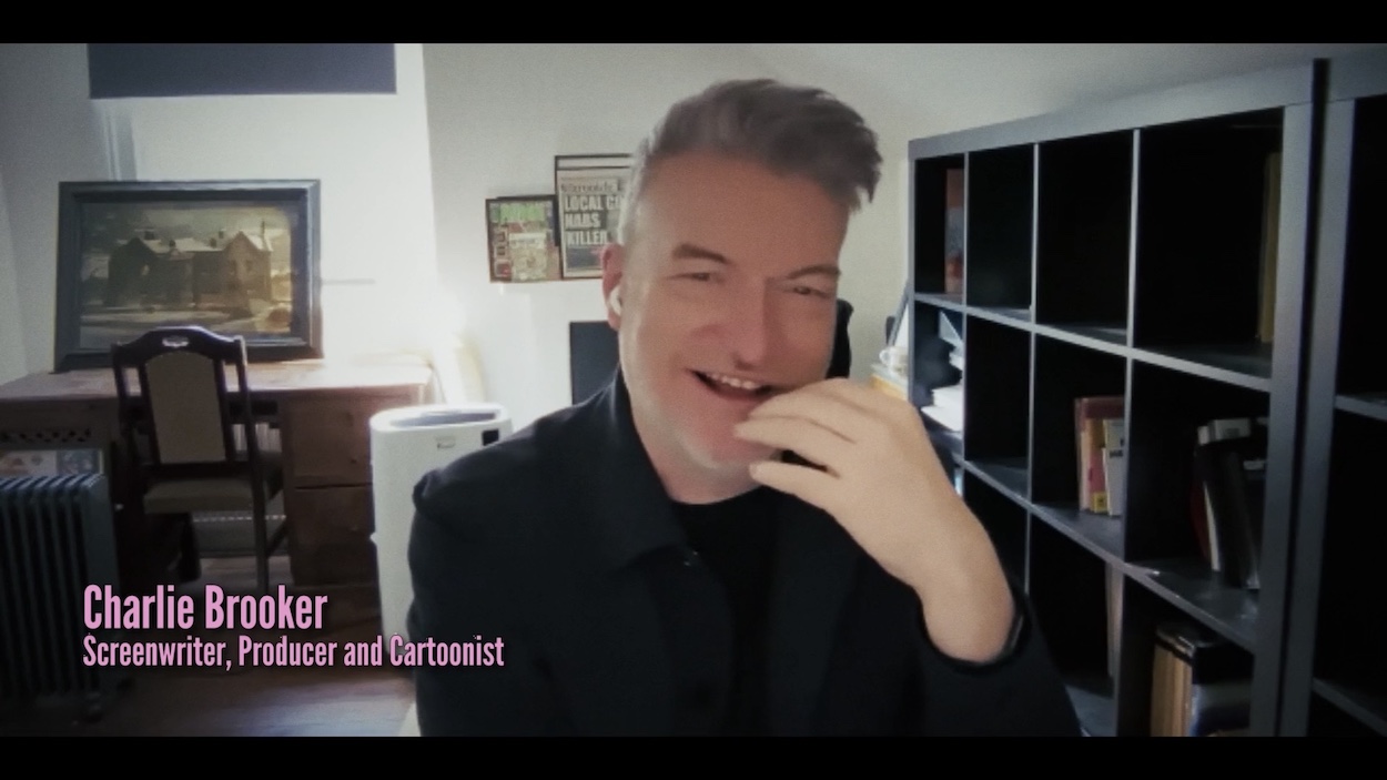
The big news is that the brilliant TV writer and producer Charlie Brooker has been interviewed! Creator of the hilarious Screen Wipe and the compelling Black Mirror, and known to OiNK readers as the mastermind behind The Swinelight Zone, Transmogrifying Tracey and The Adventures of Death among many others. I’ll admit it was a very surreal moment in my life to watch myself share screen time with Charlie bloomin’ Brooker!
I remember several years ago being told that Charlie was embarrassed with his art on OiNK but that was soon dispelled as rubbish and a misquote from when he’d looked back at his first published work. This documentary will put that to bed permanently. His obvious love of OiNK and the three editors who gave him a chance is clear and he tells a great story about how he originally got hired.
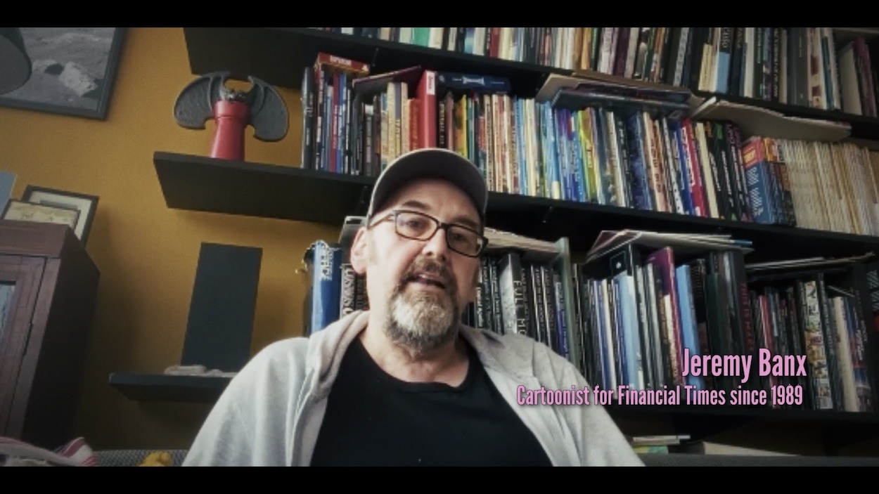
Jeremy Banx has also been added to the mix and regales us about Burp the Smelly Alien From Outer Space, a huge fan favourite. I’ll admit this (somehow) was the first time I’d seen Jeremy’s face beyond his childhood photos and that shocked me. I mean the fact this was the first time, I wasn’t shocked by his face! OiNK was such a silly and fun comic we don’t think of the challenges faced by those creating it and this makes Jeremy’s piece particularly fascinating.
If you think you know everything about OiNK’s story already you’ll be very happy to know you’re wrong. Take it from the guy who has written hundreds of thousands of words on the subject. This is thanks not only to the new additions but also seeing more of the interviews with everyone else. For example, Helen brings a certain detail to the story of Mark and Patrick meeting in a library that I hadn’t heard before and I laughed out loud upon hearing it!
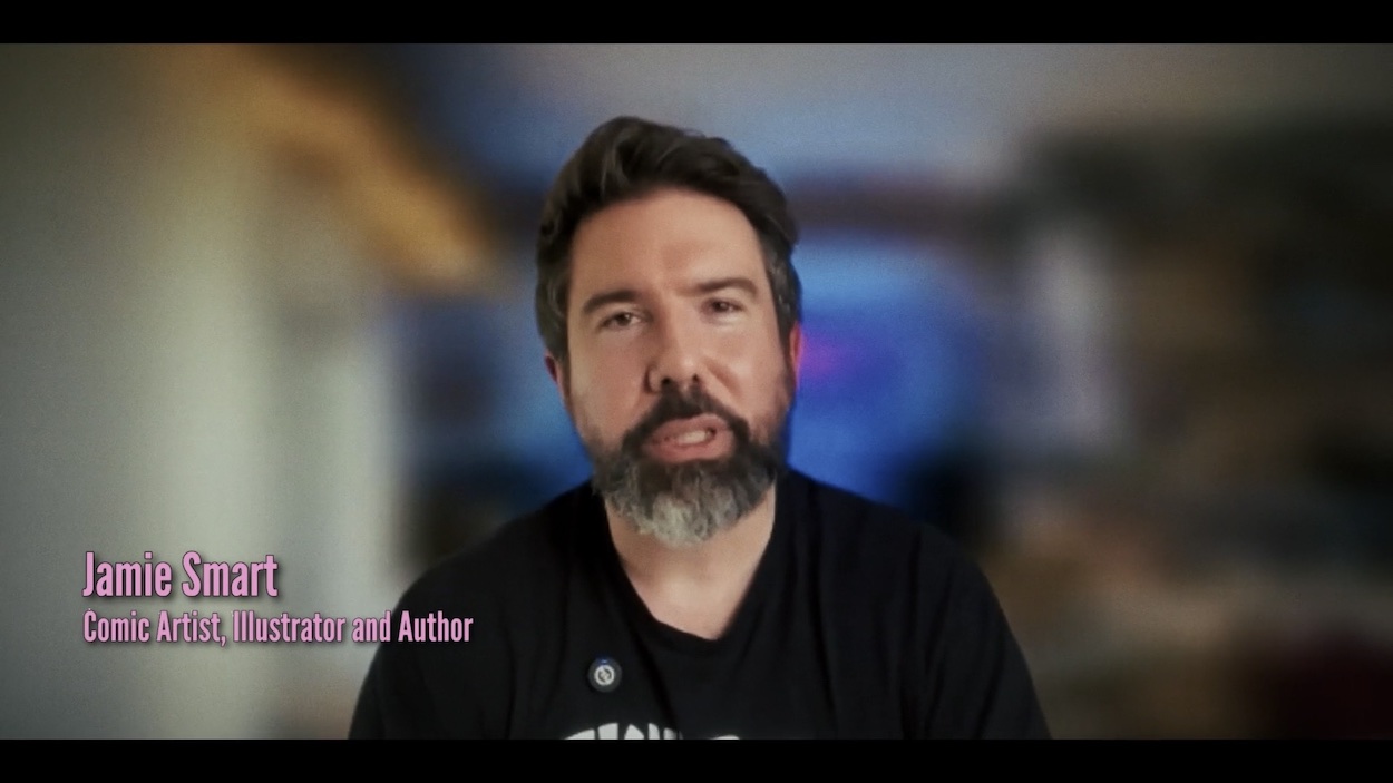
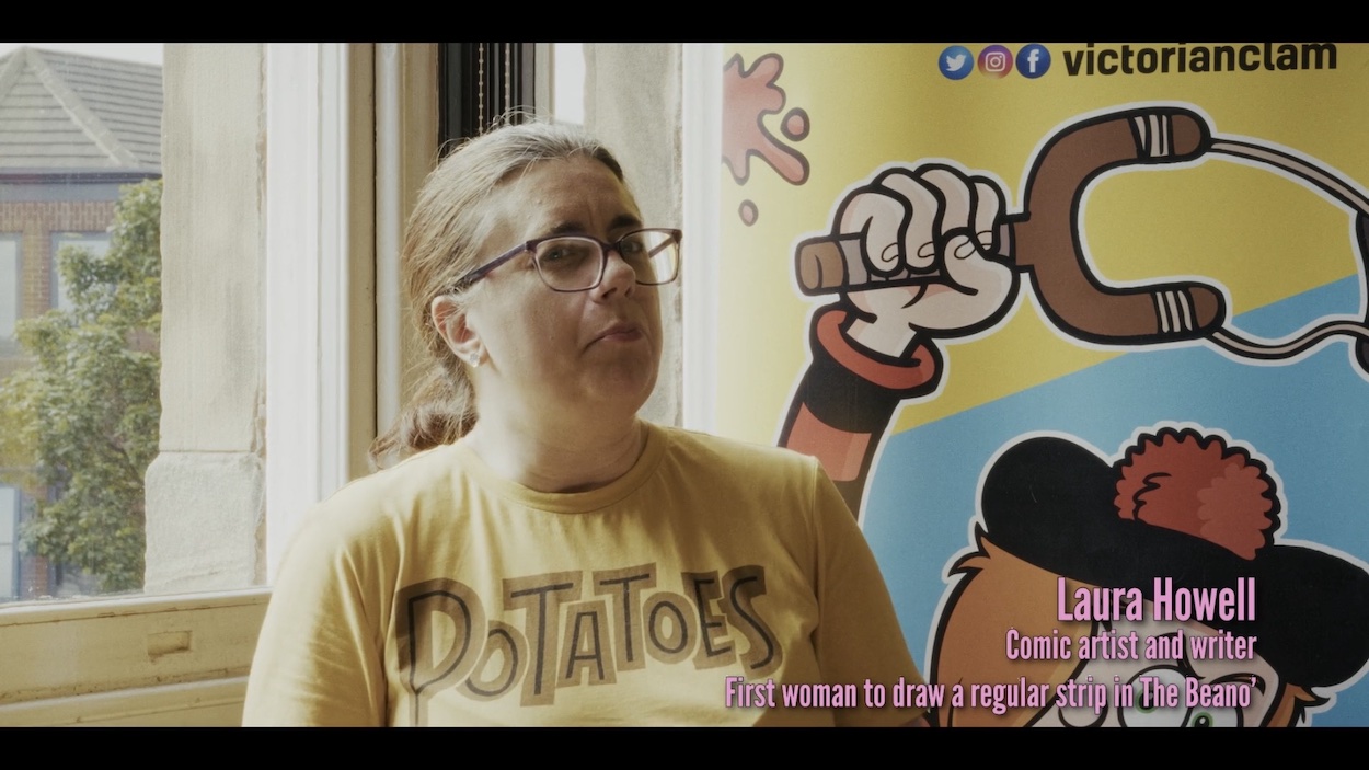
The film also includes two very favourite cartoonists of mine who grew up with OiNK, the crazy contents of which very much influenced their own work, namely award-winning graphic novelist Jamie Smart and Beano cartoonist Laura Howell. Between Laura’s continuing enthusiasm for OiNK decades later and Jamie breaking into spontaneous laughter while reminiscing about it, they’re brilliant additions to the film.
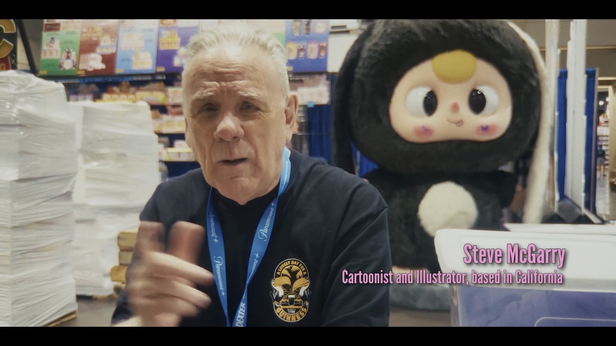
Patrick Gallagher is as passionate about OiNK as he was when he and Mark and Tony were creating it and I could listen to him talk about it all day. Lew Stringer tells us about the creation of one of OiNK’s most popular characters, David Leach wears a hat you’ll all want while describing his big break, Steve McGarry laughs about his most famous OiNK cover and there’s even a nice section about a certain piece of merchandise that’s featured heavily on the blog too. This is all just the tip of the melting-in-this-heat iceberg! Quite a feat for a short film.
There’s so much in this I want to tell you about, so much I want to add to various OiNK posts on the blog, but I’ll not be doing any such thing until you’ve all seen it. When will that be? Well, Claire and Rob have made it very clear they’re nowhere near finished yet. Originally, it was meant to last 10-15 minutes but so far it’s running to 25 and they’ve a lot more they want to add, including more people to interview.
Some have already agreed to take part but I can’t mention any names as yet. There’s also the matter of funding to try to make a longer film and get it distributed and a lot (a lot!) of footage already filmed that’s had to be cut at this point which may be released as fun extras. There are plans to screen it at more comic cons and film fests as it develops and beyond that, when it’s finally finished, plans to release it to your sties.
As always, the OiNK Blog will be the place to find out about all future developments so make sure you follow along by subscribing via RSS or email, or follow along on the blog’s socials. Needless to say, your favourite childhood comic is in very safe hands with Claire and Rob.
(And thanks to both of them for the loveliest surprise addition to one of the end credits.)
Wow, has it really been that long since I said I’d do this Writing Diary regularly? Sometimes life just runs away from us, doesn’t it? There have been changes to my plans for the year and I’m cursing myself for announcing things before being further along with them, but that’s the way it goes; sometimes other writing projects just take on a life of their own.
For a long while now I’ve been eager to produce an ongoing printed publication of some kind, something physical people can get their hands on to read, to slow down and enjoy, and to have new issues on a regular basis to build upon. Several possible topics have popped in and out of my head over the years but none ever seemed to suit what I had in mind.
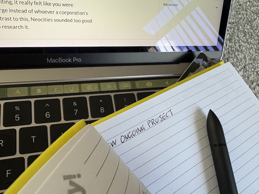
NEW PROJECT
Well, now I’ve landed on one. It’s not comics-related but I’m confident there’ll be a good level of crossover for a lot of readers of the blog. In fact, it’s something I’ve already spoken about on here a few of times, and it was working on the OiNK Blog that got me interested in this particular subject again. All that time searching for something and in the end it was right in front of me.
Of course, learning from my previous mistakes I’m not going to reveal what it is just yet but I can tell you about some exciting developments around it. Well, exciting for me anyway and it’s my diary so I get to decide what’s exciting and what’s not, so there! I was considering expanding the amount of space I purchase from WordPress for this blog in order to create a second site for the new project, but then I discovered Neocities (with an ‘N’).
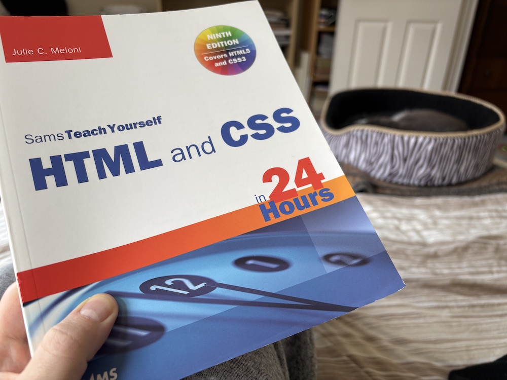
Who remembers Geocities (with a ‘G’)? Back at the turn of the millennium I used Yahoo’s Geocities to create a website of two halves. Half an episode guide to Knight Rider complete with a discussion forum, the other half for my friends including photo galleries of nights out, birthdays etc. I’d buy a disposable camera for nights out, use the whole thing up, develop it, scan all two dozen photos and upload them to the site before the next weekend. This was before social media. Eventually I even stopped using Geocities’ tools and learned how to program it myself using a great book borrowed from the local library.
Called Teach Yourself HTML in 24 Hours it was easy to follow and surprisingly very funny. I was so happy with the end result but after a year or so I moved on; I had been a student at the time and afterwards a full-time job and an income led to other interests. Fast forward to the present and after spending a lovely few days browsing the new Neocities I realised I’d found the online home of my new ongoing publication.
Neocities was created as a modern Geocities, to bring back the freedom and creativity of the internet. The big tech firms have basically walled off the internet; everyone’s social media presence looks and feels exactly the same; everything is uniform and bland by comparison to how it used to be. All while they track every aspect of our lives too. The internet is now a walled garden, and it’s not even that pretty a garden to look at.
Before all this, people created their own spaces which were fun, unique, quirky, interesting. We’d properly surf the internet, not get lost down negative rabbit holes. It was exciting, it really felt like we were interacting with the world at large instead of whoever a corporation’s algorithm decides upon. In contrast to the modern net, Neocities sounded too good to be true, so I took my time to research it.
I couldn’t be more thrilled with what I found. Already there are over 1.5 million personal websites full of creativity, hobbies, interests, and basically people being as quirky as they want; it’s a happy place to share what makes us tick as individuals (and generative AI is banned) and it feels like the perfect place for what I have planned. So much so that I now own a more up-to-date version of that same book I used to borrow from the library two-and-a-half decades ago.
UPDATES
So I’m working on the actual printed publication and its online presence at the same time, rather than producing the publication first and then marketing it on socials. I’m so excited by this but as you can probably guess it’s taking up a lot of my time and so other proposed projects have had to take a back seat for now. Last time, the big news was the Comics 80:99 bookazine. This hasn’t been abandoned, just delayed. By how long, I’m not sure yet.
At least I know Comics 80:99 is a viable project now. The prep work was well advanced (as I talked about last time), but the secret project I’m co-writing with another writer has been put on hold for now. Frustratingly I can’t explain why, I just ask that you trust me when I say it’s going to be of great interest to OiNK Blog readers and as soon as it gets moving I’ll let you know. I’d prefer Comics 80:99 to follow on from that, possibly as a potential annual or bi-annual publication rather than a one-off. It’ll make sense, believe me.
SUMMING IT ALL UP
So that’s where I am. The new ongoing project is taking centre stage and will be demanding most of my time. The co-writing project has been paused for now but hopefully we’ll see movement on it in a few months with an announcement perhaps by the end of the year. Finally, Comics 80:99 has been paused while the ongoing publication is released and the secret project begun, with plans for the bookazine to come at a later stage.
What about the blog? For the remainder of 2026 it’ll concentrate on extra content for many of the comics covered on the blog. There’ll be posts almost every weekend of the year and the Marvel UK Checklists every Wednesday, so two posts most weeks, for now at least. At Christmas there’ll be the usual onslaught of content, with two new real time read throughs for the Annuals section included too.