
Percy Plop isn’t wrong, although while the comic would present the changes as a result of a temporarily crazed editor in reality they were permanent. With Fleetway Publications now having bought IPC Magazine’s comics they decided to publish all titles on the same paper stock, which meant a good upgrade for the others but a downgrade for OiNK. I didn’t complain though, which I’ll get to soon, and the theme for this issue was a stroke of genius.
A bit like when the skeleton staff made a hash of #8 this issue sees some strips printed upside down, others drawn by the wrong artist, some are coloured incorrectly and other such randomness occurs. Some strips, even if they don’t have something deliberately ‘wrong’ with them, seem more zany than usual, which is saying something for this comic. Jon Langford’s cover may not be the best the comic ever had but this is one of the very best issues as a whole.
So what did the team think of the physical changes and did Fleetway enforce any other alterations? “We were all disappointed initially with the changes but, fortunately, it didn’t dampen our spirit so it was ‘business as usual’ producing the best content within our means,” co-creator/co-editor Patrick Gallagher told me. “Though the publisher changed from IPC to Fleetway, Bob Paynter still held his position as Group Editor and it was him we were answerable to, with the same amount of creative freedom as before. It was still fun to produce.”
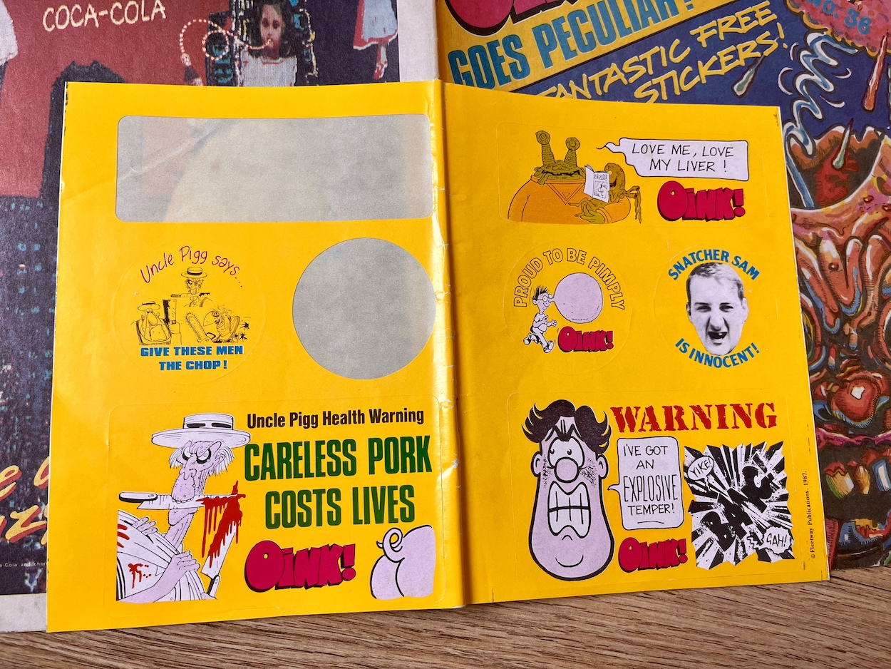
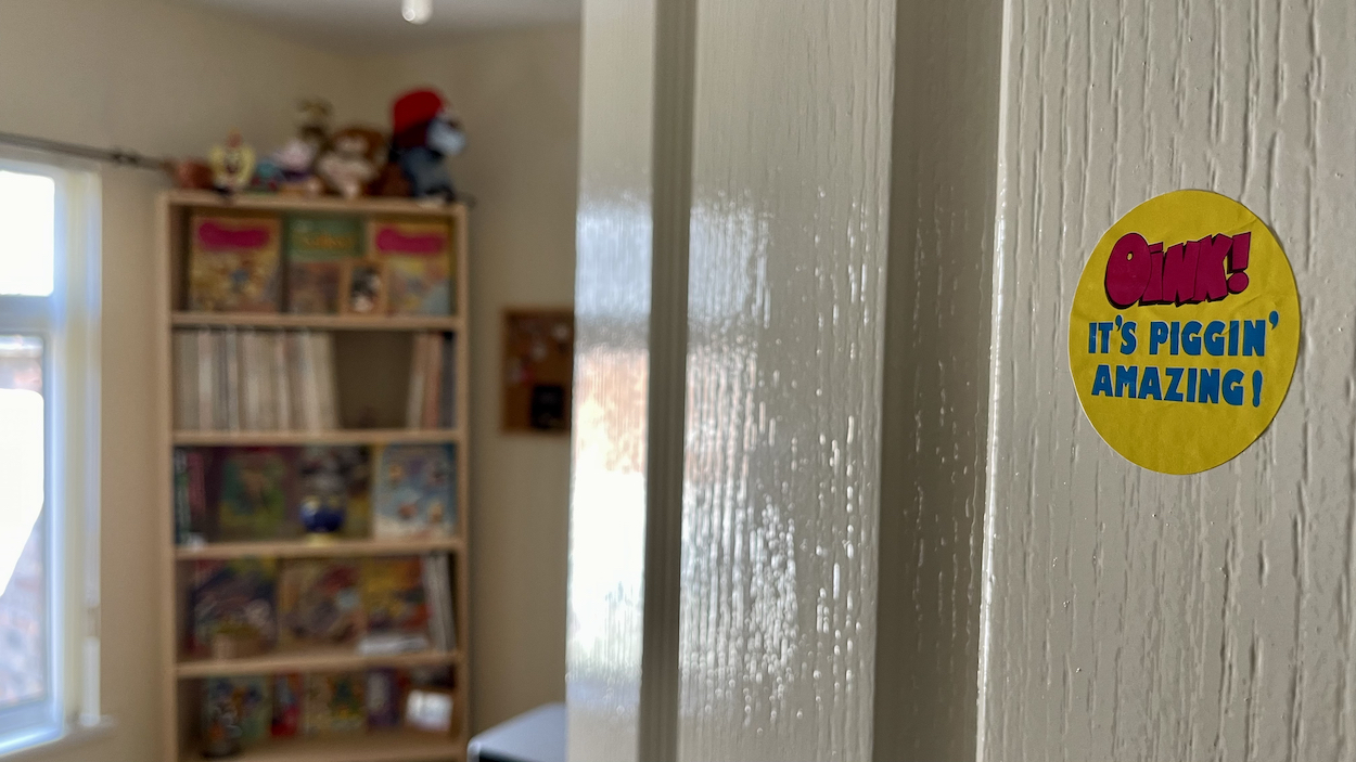
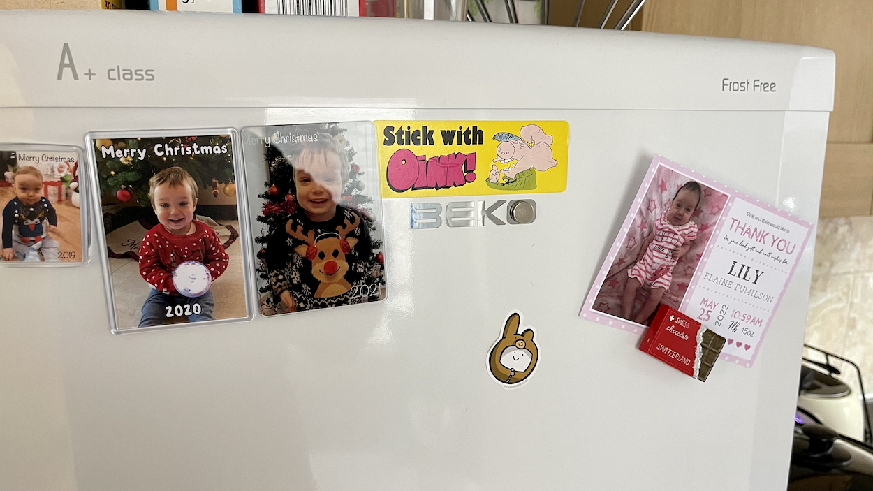
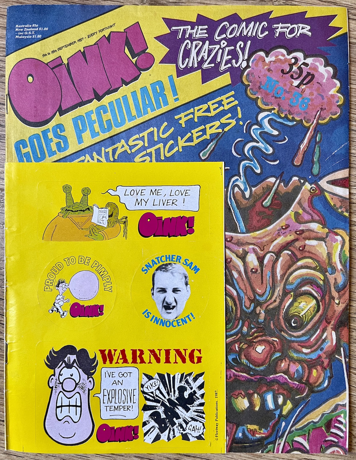
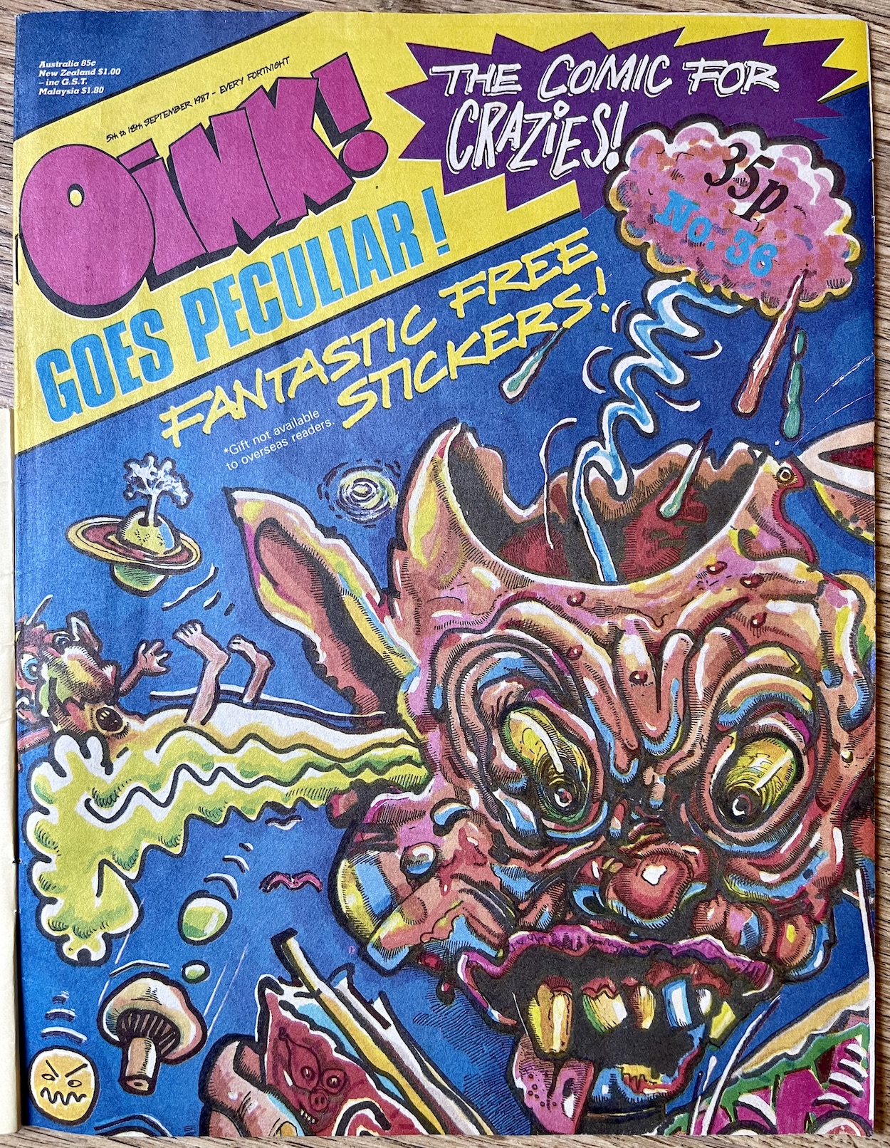
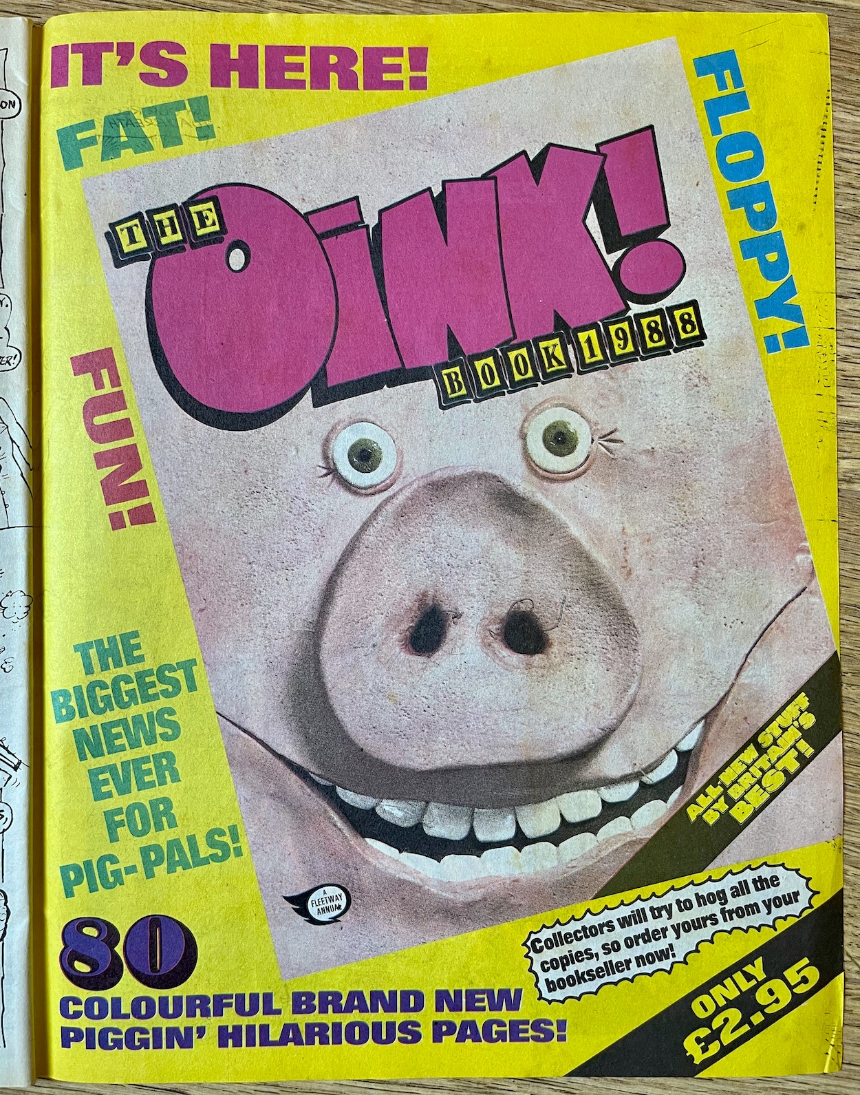
Maybe to soften the blow for fans of the glossy paper (now on thicker matt stock, slightly thinner in width) or maybe to publicise it for new readers as the publisher pushed their new purchases, this and the next two issues had these fun stickers which ended up all over my house as a kid (and on my fridge and home office door as a 40+ year-old). The logo shifted up into the corner in a colourful banner and this too would be kept, although initially shifted about and resized from issue-to-issue, emphasising the random nature of OiNK.
“The logo change,” continues Patrick. “We were running short of pink ink so we decided to reduce the size of the pink logo to economise.” Typical Patrick response, that. “Only joking. I think we just wanted to experiment and give more room to the cover illustration, knowing we could always change back to the bigger logo, which we ultimately did.” That would happen when OiNK went weekly in the new year. I really enjoyed the way it looked over these issues though and it did indeed give more space to some fantastic covers, as you’ll see soon.
So what was the comic’s reason behind the sudden changes we readers found in our hands?
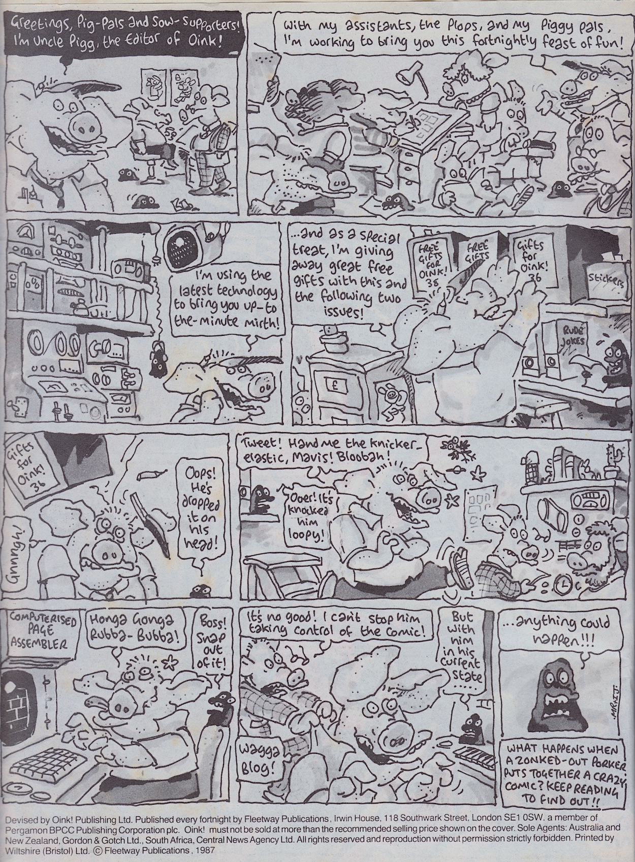
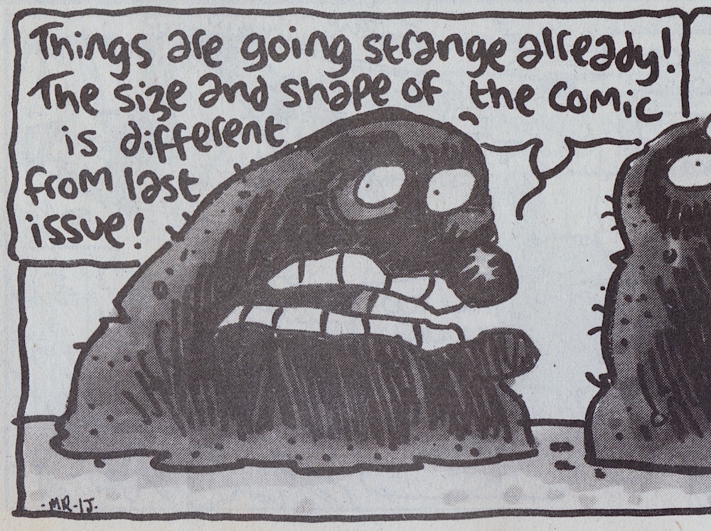
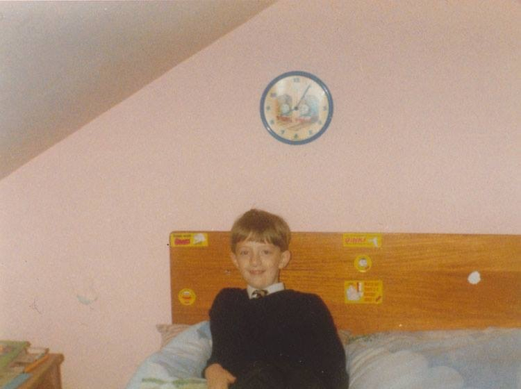
Written by Mark Rodgers and drawn by Ian Jackson Uncle Pigg introduces himself to new readers the way he did in the soft relaunch issue, #15 (which also gave away the first of three free gifts). This normally happened when a comic got a new look, something I enjoyed every time it happened with Transformers, for example. It’s understandable and didn’t detract from the strip for established pig pals. As Percy says in that final panel anything could happen, and everything did! On the very next page is an upside down strip, along with the image of Percy I showed at the top of this review, commentating on the new paper.
We’ll get to possibly the craziest strip OiNK had produced up to this stage in a minute but first comes something of a spiritual successor to last issue’s Arctic Adventure, although I’m sure it’s more of a coincidence. Either way, Tarzham the Apeman is a fantastic, funny strip I just had to include. Written by Tony Husband and drawn by Chas Sinclair, the same winning partnership behind semi-regular Lashy the Wonder Pig, it’s another tale taking shots (no pun intended) at cowardly animal hunters.
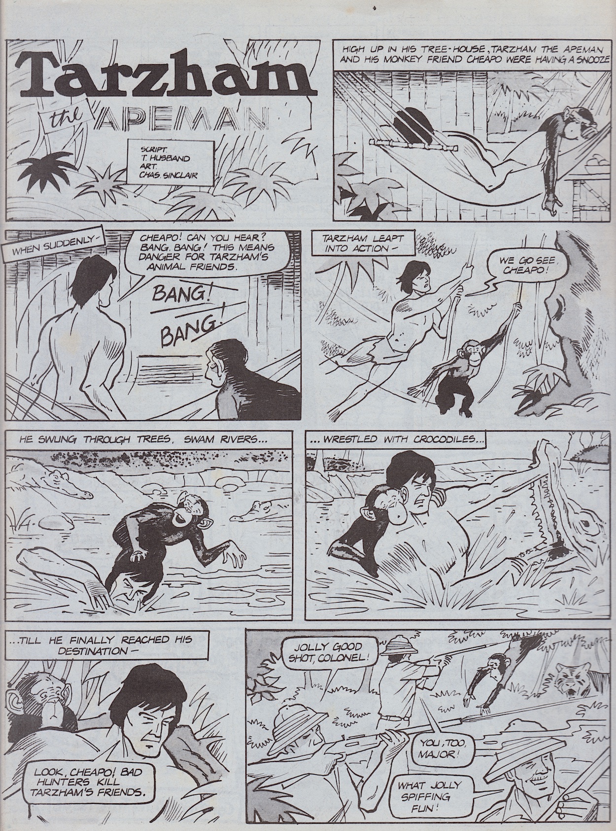
Tony is a huge supporter of animal rights and conservation, often sharing his opinions on hunters on social media in his inimitable style, using funny cartoons to make his point. I think the first speech balloon on the second page sums up those sorts of people, and the solution to the problem not only highlights the stupidity and greed of hunters but it genuinely made me laugh out loud. The ending is similar to Simon Thorp’s last time but both strips work so well I’m glad we got both.
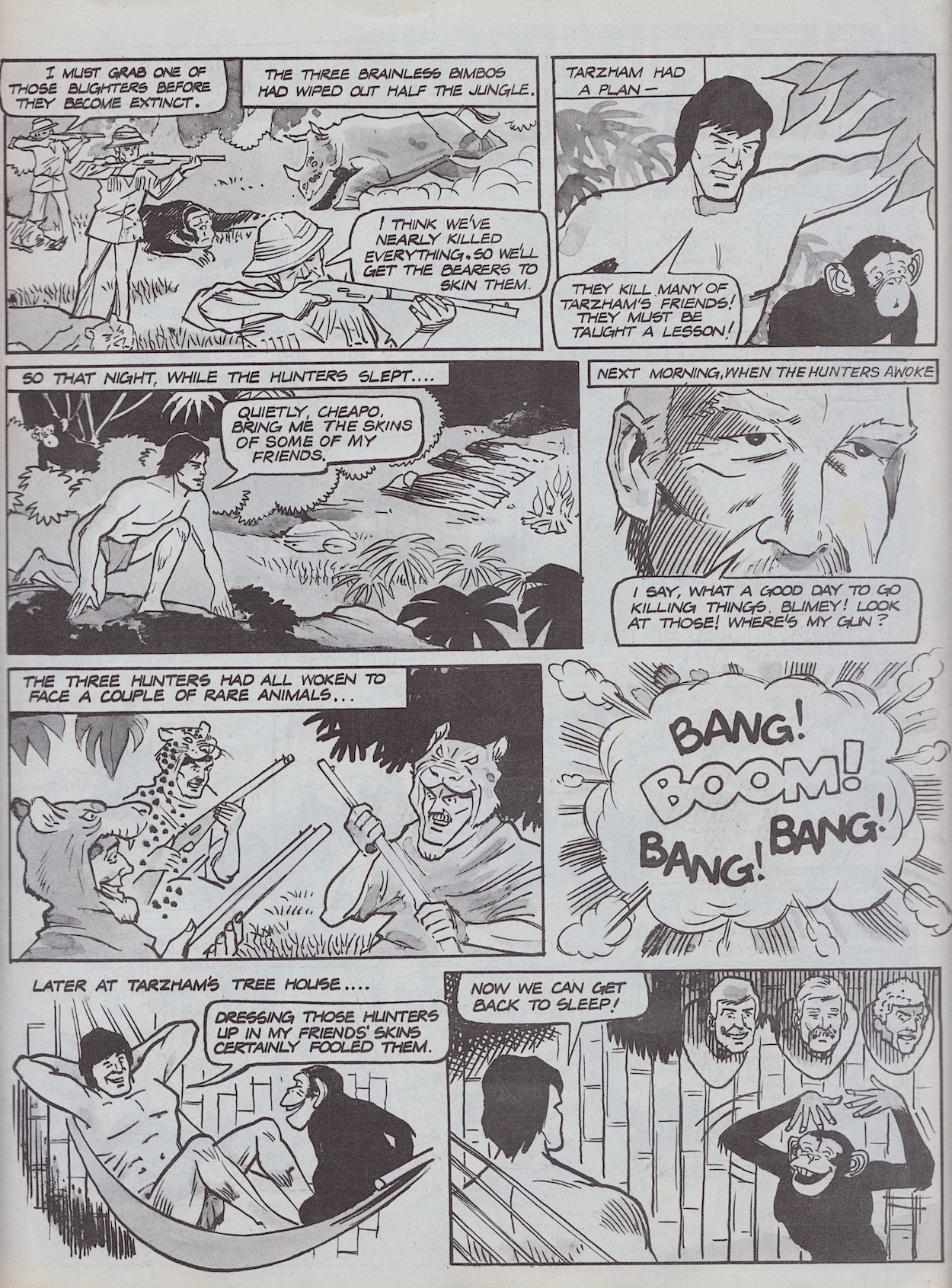
Contributing to 40 issues of OiNK altogether, Ed McHenry would become best known for two particular things: his regular strip Wally of the West, a character I thought was in OiNK a lot more than he actually was (in reality only appearing in 12 and not until #53) and OiNK’s quiz pages, examples of which I’ve shown in the reviews for #6 and #12. However, we also enjoyed a selection of one-off characters from Ed, such as The Loon Ranger and his horse Radish.
Strips like these from Ed would become more regular during this period, yet another reason why this is my very favourite period in OiNK’s run. Below this is a quick three-panel Hadrian Vile which is a bit strange for one of the comic’s main characters. The excuse given is that the crazed Uncle Pigg ate Hadrian’s diary but in reality the next chapter in his story would perfectly fit the next issue’s theme instead, so for this issue a quick stop gap was needed so they could postpose his strip until his three pages next time. There’s also a tiny Frank Sidebottom strip about the end of the school term, apparently printed ten months too early according to the note underneath.
If all that sounds crazy you haven’t seen anything yet. Jeremy Banx’s strips are known for their surreal humour and random daftness. He’s always able to take a ludicrous idea that really shouldn’t work and turn it into pure comedy gold. Already peculiar on a regular basis, how could a Burp strip stand out in an issue themed around being peculiar? How about a story involving him wanting a Cary Grant tattoo on his meters-long tongue? This includes a panel that I never forgot after seeing it. I’m sure you’ll be able to tell which one.
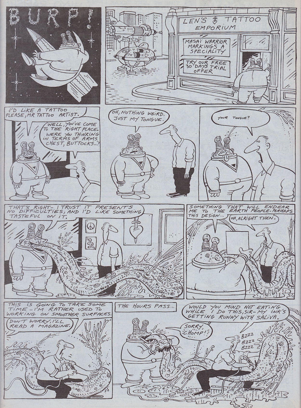
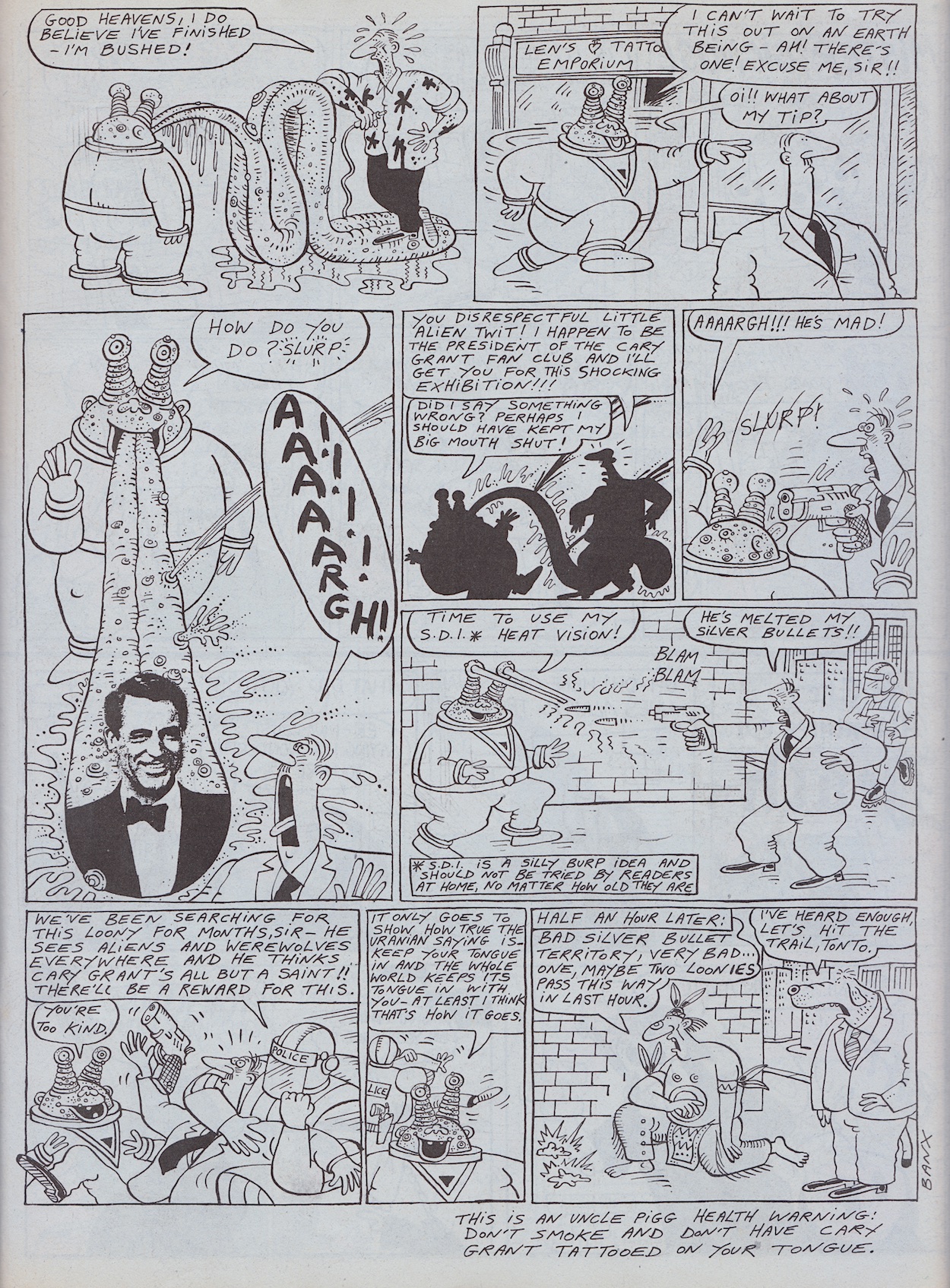
Funniest moment? Oh that’s far too difficult to narrow down. How about a tattoo parlour having a free trial offer? Or the tattooist’s blank eyes and small balloon text as he reacts to what he’s just been told? The way he straddles Burp’s tongue, or even shouts after him for his tip? Already hilarious, already weird, already daft, somehow Jeremy is able to ramp it up even more in those final panels, cramming in so many insane moments you feel like you need to catch your breath while reading it.
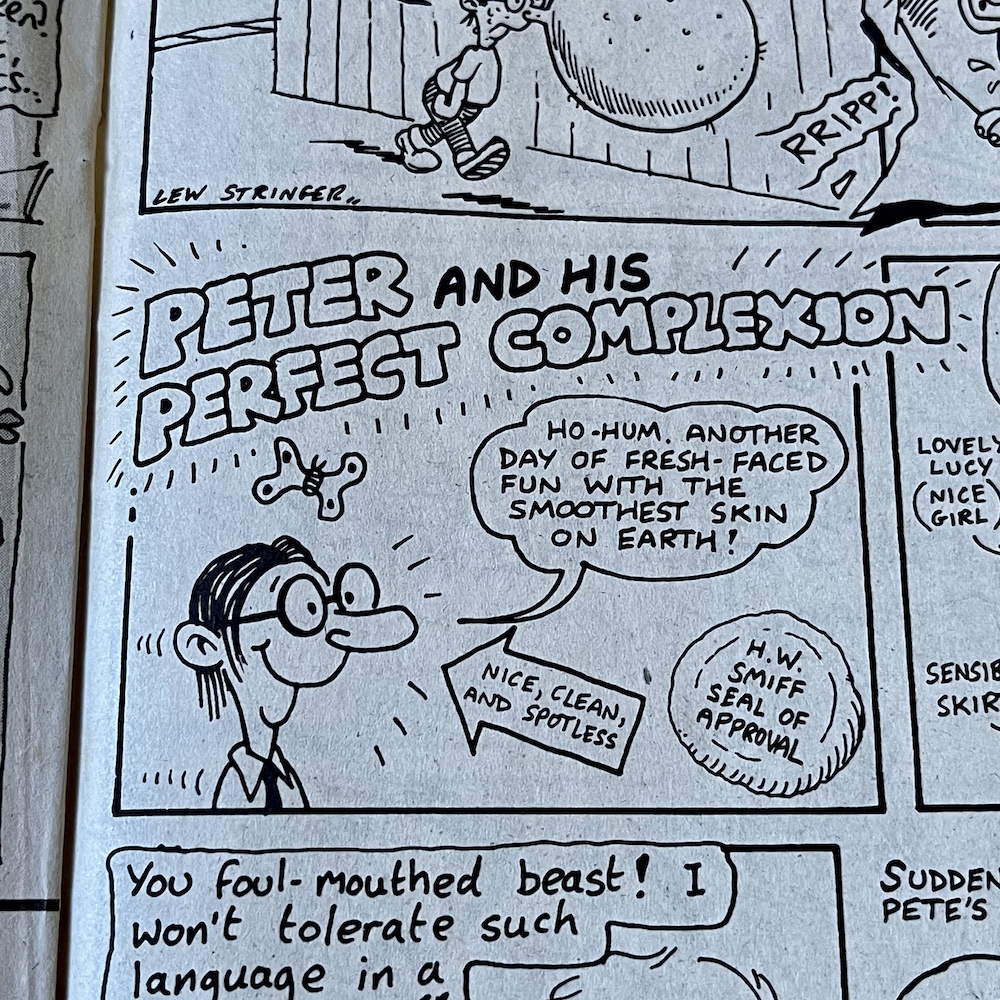
I do like the seal of approval on Pete’s strip, a little dig at W.H. Smith
Both of Jeremy’s regular strips, this and Mr Big Nose had a knack of surprising us with endings that just came out of nowhere, and while completely random, out-of-nowhere end gags can sometimes fall flat in other comics this was never a problem for Jeremy. He nailed it every single time. This next handful of fortnightly OiNKs would see Burp’s strip regularly expand to two pages with some of the best strips the comic as a whole ever produced! I can’t wait to see them again.
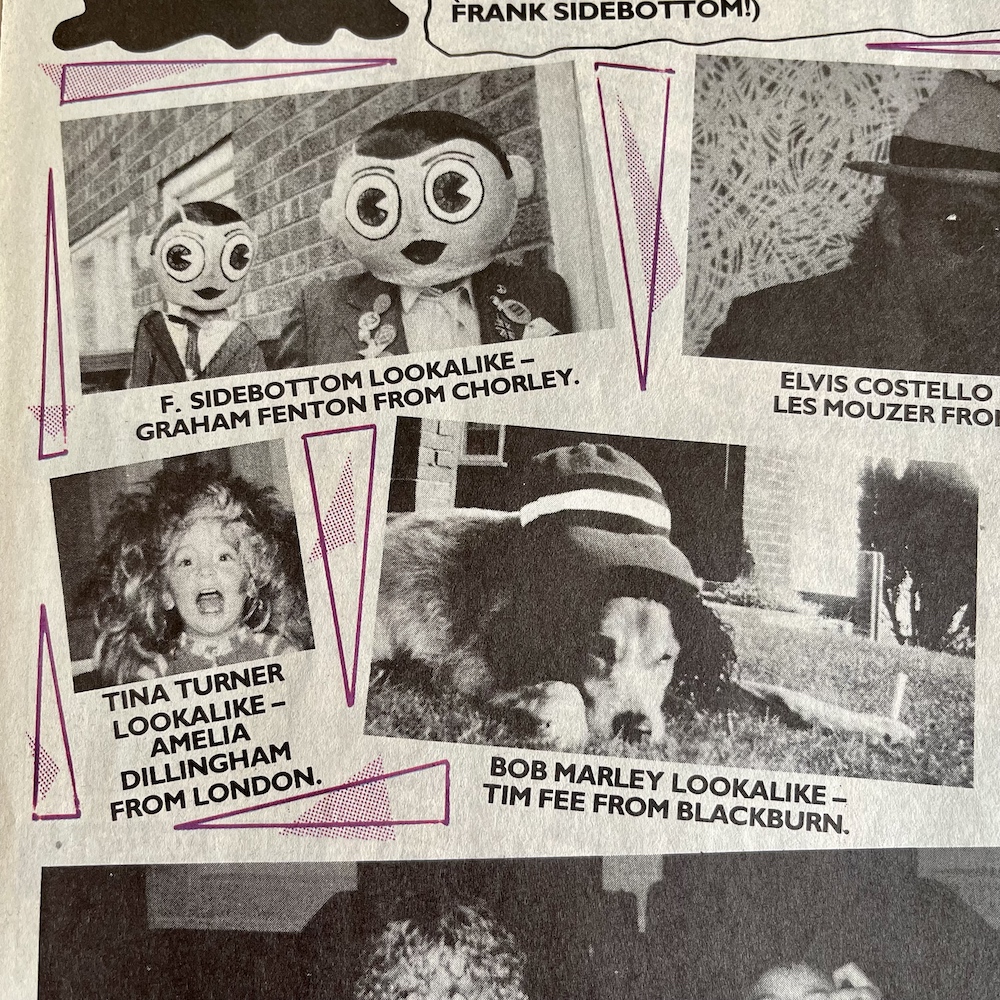
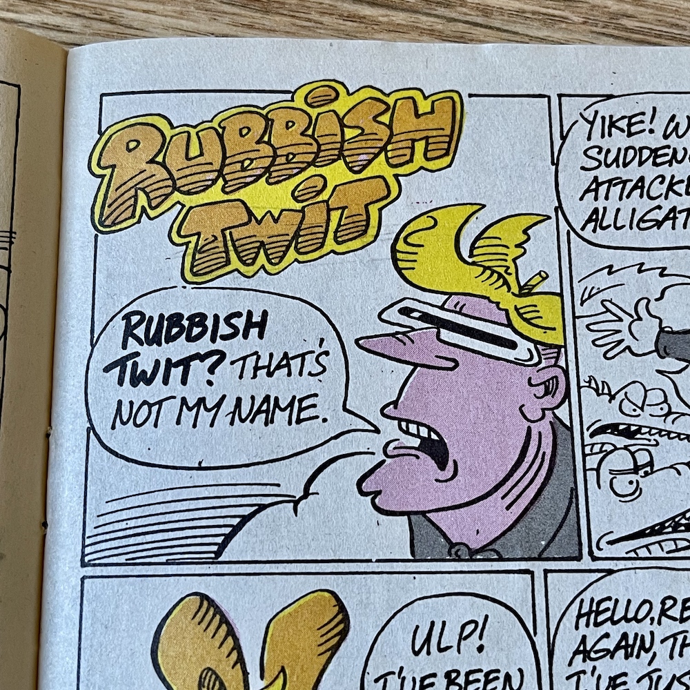
A quick look at some other highlights before we move on. On the Grunts letters page there’s a quick glance at a new piece of merchandise coming very soon indeed and the results of #27’s Pop-Star Lookalike Contest with Frank Sidebottom had a particularly fantastic entry from reader Graham Fenton and blog reader Tim Fee. Elsewhere, both Rubbish Man and Pete and his Pimple are victims of the issue’s peculiarities, although I think Rubbish Man came off worse. I do like the seal of approval on Pete’s strip, a little dig at W.H.Smith moving OiNK to the top shelves due to just two complaints.
Pop Star Lookalikes compiled by Chris Sievey
Rubbish Man by David Haldane
Pete and his Pimple by Lew Stringer
Our smelly alien isn’t the only person to get two pages this issue. Lew Stringer’s Tom Thug gets to enjoy a bit more space to cause bovver in. I’ve mentioned before how OiNK’s high quality, glossy paper stock not only allowed gorgeous painted artwork, the black and white strips could also benefit from intricate shading, Lew in particular applying grey washes to his. While the paper from this issue onwards was a downgrade, it was still a cut above the newsprint OiNK’s contemporaries had been using up to this point.
“The quality of print on the matt stock paper was pretty good,” Patrick told me. “In my view it gave it more of a retro comic feel and warmth, which I liked.” I concur. While the gloss was lovely, and the plan was always to have the Holiday Specials use it, I really liked this paper but was struggling to articulate why until Patrick described it like that. This high grade matt was capable of the same techniques Lew had always been using, but you’ll notice its conspicuously absent from Tom’s strip.
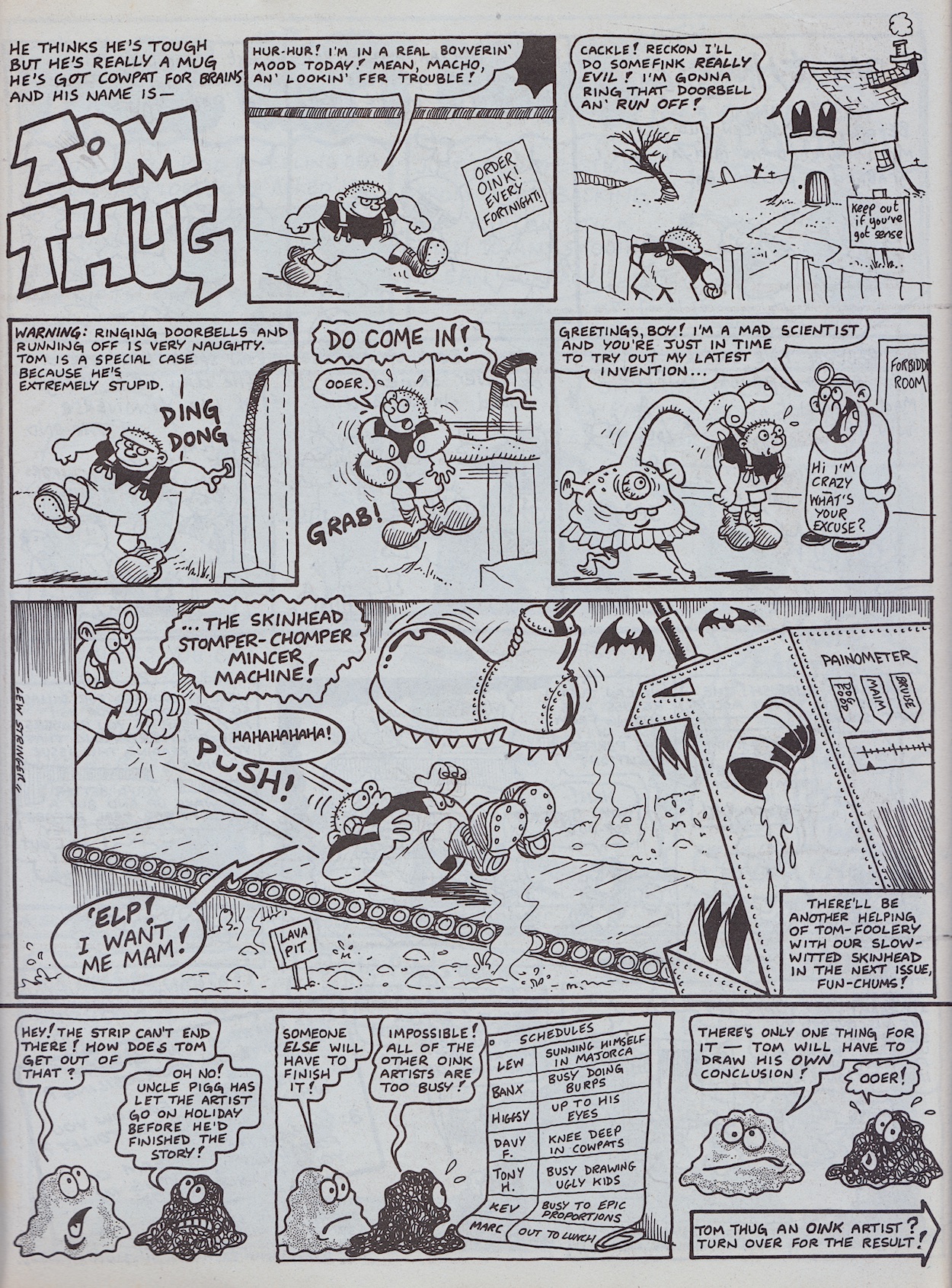
“Yes, I think I expected it to be like newsprint so I avoided doing a grey wash on the strips until I saw that it was a better grade of paper than I thought it would be,” Lew explained too me. “I thought it was a shame the paper was downgraded from glossy but that wasn’t the first time budget cuts had affected a comic so it was inevitable I guess.” Lew would return to his usual style pretty quickly and we’d see OiNK’s most popular character shaded once more.
But what about the rest of that story? Well, Banx’s strips were great when he’d pull a conclusion seemingly out of nowhere but above it appears crazy Uncle Pigg giving the cartoonist a holiday, forcing him to rush the ending of Tom’s strip, has had the opposite effect. Our editor’s assistants The Plops have no choice but to allow Tom to finish his strip himself. Well that’s just inviting disaster, isn’t it?
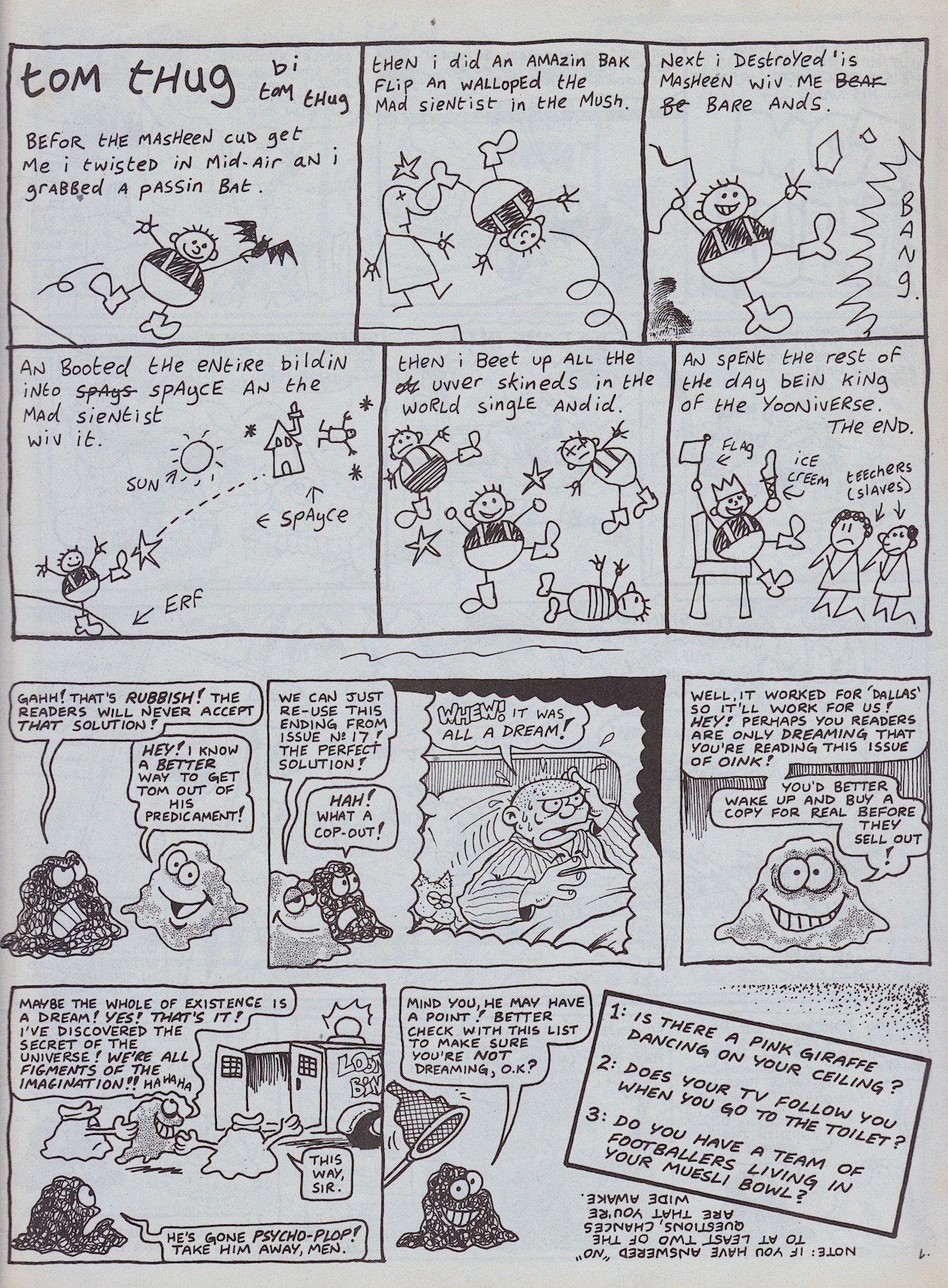
My favourite bit is the fact the re-use of a panel from #17 (the previous Christmas issue no less) is an actual reprinting and not just Lew drawing it again. Go and check out that previous issue’s review to compare them if you don’t believe me. An ingenious strip and giving Tom two pages in an issue set up to attract new readers was a great idea, seeing as how popular he was (and would be in Buster for years to come).
Underneath Lew’s Pete and his Pimple strip were a couple of plops drawn by Ian Jackson who, along with some bad (as in groan-inducing) spotty puns, commented on everything that was going wrong with the strip. They appear throughout the comic, getting increasingly worried about what’s happening right up until we get the delight of seeing Harry the Head drawn by J.T. Dogg.
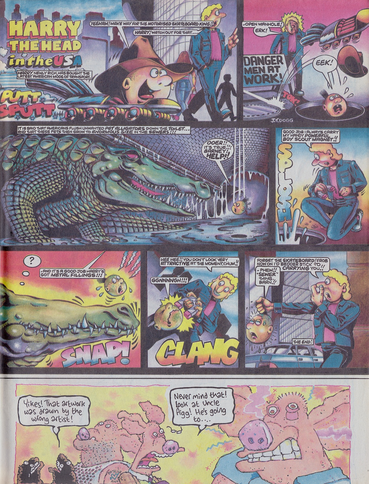
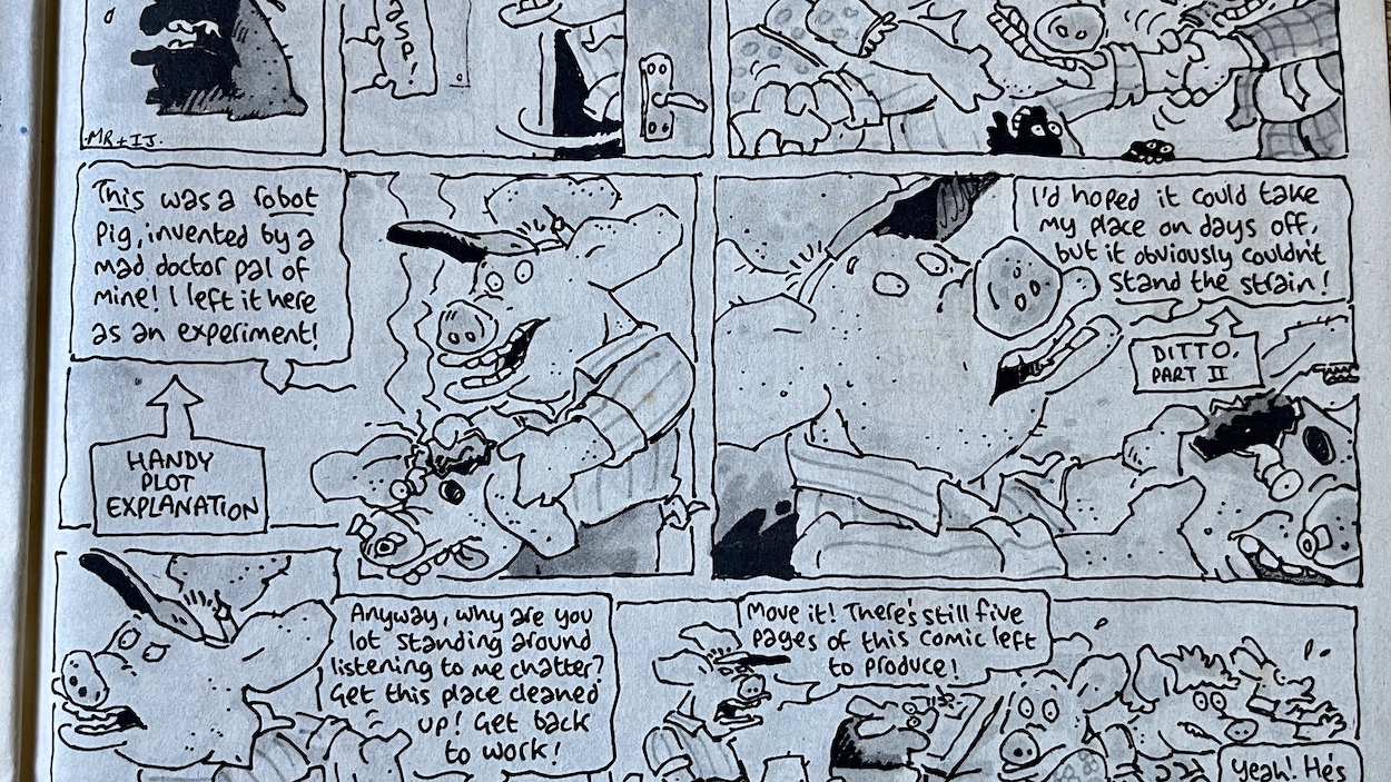
Normally drawn by his creator Marc Riley, we’ve become used to seeing Harry in Marc’s simplistic but energetic fashion, so to see him rendered by Malcolm Douglas (J.T.’s real name) like this is a sight to behold. There’s no writing credit but I think it’s safe to assume Marc would’ve still been responsible for the script. Oh, and that little image at the bottom leads to Uncle Pigg exploding on the next page!
Well, sort of. When he blows up screws and metal bits and bobs come flying out and the real Uncle Pigg soon reappears to explain with some “handy plot explanation”.
What an issue! It’s been an absolute delight to read this one again, it’s more than held up to the fond memories I had of it from 35 years ago. In fact, I can remember walking back from the newsagent with it in hand in 1987. Walking very fast actually, because I was thrilled with these exciting changes to my comic and couldn’t wait to see what this would mean on the inside. (I’m sure the stickers helped quicken my pace too.)
“Fat! Floppy! Fun! The biggest news ever for pig pals!”
A fabulous start to OiNK’s Golden Age (my own term, see here for more on that) and one of the best all round issues so far. It feels brand new again, like a fresh start in the same way #15 did. Also, all the best issues are the ones with a strip continuing through the comic in fun and original ways, such as #3‘s Star Truck and our editor again in the festive #17. The next edition is the Happy Families issue and I remember the fun Mike Higgs cover, the cut-out game and most of all the three-page Hadrian Vile strip!
You’re going to get sick of me saying this over the next few months, but I can’t wait for the next issue. Speaking of looking forward to things, the inside back cover finally revealed what had been hinted at for months. So that’s me looking forward to Christmas now too!
The review of OiNK #37, the Happy Families issue will be published on Monday 19th September 2022.

Great review as ever, Phil!
LikeLiked by 1 person
That was quick Patrick! Thanks as ever!
LikeLike
Hi there
Sorry for the random request but my ol’ dog was a winner in Frank Sidebottom’s Pop Star Lookalike competiton – doing her best Bob Marley! – complete with mum’s hat and Embassy Filter as a spliff was not available. The scan of the page in the above article offers a tantalising glimpse of the corner of the photo – but the rest is alas missing. I’ve been hoping to see this again for ages. Would this be possible somehow!!?
Thanks in hope!
Tim.
LikeLike
Hi Tim, leave it with me and I’ll update the post with a wider photograph to include your entry. I’ll reply here to let you know when I’ve been able to get it updated. 🐽
LikeLike
Hey thanks Phil!
LikeLike
Hi again Tim, sorry it’s taken me so long but I’ve now updated that photo in the review to include your family pooch! Hope it brings back lots of happy memories for you 😁
LikeLike
Phil – you’re a gent cheers! That’s wonderful – very much appreciated. And a shout out in the text too!!
I’d forgotten how fed up the dog looked about the whole sorry situation!! And who can blame her frankly.
Thanks again so much.
LikeLiked by 1 person