All posts by Phil Boyce

ViSiONARiES #2: THE BEGiNNiNG

This gorgeous Andrew Wildman cover (Transformers, G.I. Joe, Venom: Carnage Unleashed) opens the second issue of Marvel UK‘s new Visionaries monthly, released on this day back in 1988, showing some of our heroes and villains surrounded by the magical totems that’ll become part of their very being. We’ll get to that further down the review, but is that a price increase already? It’s only 5p but back then that was quite the hike, especially for a second issue.

Not only is the price increase a bit strange, so is the Vision On editorial which doesn’t mention anything about the issue’s story, instead focussing solely on other Marvel releases. The recap of the previous chapter is then pasted on top of the next page, excising the top third of the strip! It is atmospherically written though.

Last time, Reekon pulled on a lever as a large stone gargoyle rushed towards Leoric, Ectar and Feryl but what the lever did could easily have been missed because of where the story stopped. The metal gates that trapped them with seemingly no hope of survival would have come down at the top of this page. So not only could it have been missed last issue, this time it’s been deleted by editor Steve White.

An even higher grade of paper really does justice to Andy’s cover and the opening pages of the strip

Thankfully the strip itself more than makes up for any shortcomings in repackaging it for UK readers plus the outer eight pages are made of an even higher grade of paper than last time. A shame the rest is of the usual stock because these glossy pages are lovely and really do justice to Andy‘s cover, as well as the opening pages of the strip from penciller Mark Bagley, inker Romeo Tanghai, letterer Janice Chiang and colourist Julianna Ferriter.

Adapted by Jim Salicrup from Flint Dille‘s animated teleplay it’s all action this time around, with the knights from across planet Prysmos now inside Iron Mountain facing the trials of Merklynn the ancient wizard. But that doesn’t mean there isn’t time for humour, as we see when the startled gargoyle runs off like a yelping dog, and then there’s this panel featuring Darkling Lord leader Darkstorm and (the voice of) Mortdredd, his snivelling follower.

In fact the first several pages contain some comedy gold. Below, Cravex hears some apparently noble knights talking of forming what sounds very similar to Leoric’s vision of the Spectral Knights. It’s all talk though, humorously told with mention of their skills and expertise but their actual plans amounting to nothing more than monthly meetings. It reminds me of some office managers I’ve had to work with in the past.

Then, after being surprised by an animated skeleton pushing him over a crevasse, Darkstorm’s superior climbing skills and cool head save him and he finds himself beside a vat of milk from a giant spider, which ominously looks on overhead. Realising that in order to fulfill his ambitions he’ll need underlings he traps three knights in the sticky goo and forces them to pledge their allegiance. Cindarr‘s sole requirement had me roaring.

Hmm, a League of Knights dedicated to Justice? One with a bird-like mask? Could this be a little joke at the expense of the DC Universe? (Thanks to blog reader David Teller for this snippet of information.)

We see some personal rivalries begin here too. The Cryotek-versus-Cindarr fight is interesting as it’s actually the Spectral Knight who loses his temper. Showing a fearsome, darker side and swearing to kill his enemy, his magical totem in the final pages is revealed to be the grizzly bear for his incredible strength and endurance, so I’m interested to see how these two aspects of his personality develop in tandem in future issues. But I want to concentrate on one particular grudge match here.

At the time, having only one or two female warriors was deemed enough in everything from He-Man and the Masters of the Universe to The Transformers. The former at least had a female-centric spin-off but the latter had only one female robot in a cast of hundreds. This has been remedied in the intervening years but we can see now just how woefully inadequate it was at the time. Galadria and Virulina, shown here in a thrilling underwater fight scene, weren’t even toys and were instead creations of Flint’s. I hope they’ll get as much coverage as their male counterparts in future issues.

While the comic’s origin was based on the cartoon’s, there were already key differences. Something that irked me about the same story in the cartoon was the fact only the characters who’d receive the magical powers in the end had the hologram-shaped chest panel. It kind of gave the game away, but in the comic they’ve shown several background characters with the same design. It’s not overly done, we’re always aware of who’s going to make it and who isn’t, but it’s a welcome change.

It may be over three decades later and it may be based on a toy line, but this is still a thrilling read.

Something else a comic can do is expose the inner thoughts of the characters and it’s used here in abundance, and not in that annoying way of just describing what we can plainly see is happening to them. Instead, it’s used to add depth to reactions and portray their inner doubts and fears.

As we approach the final pages a huge climactic battle between the knights is interrupted by a booming voice as a huge wooden door nearby contorts into the shape of Merklynn‘s face. Daring them forward, they’re faced with horrors on the other side.

It’s actually Darkstorm who feels a certain level of familiarity with the screaming souls in front of them. They march on and Merklynn explains this was their final test, the spirits really being mystical reflections of their deepest, darkest fears and in conquering them they’ve conquered their inner demons. It’s quite startling to turn the page over and see this image. It may be over three decades later and it may be based on a toy line, but this is still a thrilling read.

It’s at this point we finally get some more background into the previous Age of Magic. It’s played out over a page previously shown in the preview mini-comic but essentially Prysmos was a planet with a strong-willed race of humans, able to achieve anything they set their minds to for the good of their neighbours. The strongest were the Knights of Prysmos and from these arose the Mages of Prysmos. Only a few were able to predict the cataclysm when the Age of Science came, of which Merklynn was one. By secreting his power inside the mountain upon which his castle once stood he was able to ride out time until the suns aligned again and the ages were reversed.


“Be not afraid, Knights of Prysmos! Accept these totems as your just reward! Only you had the vision it took to succeed in finding this chamber! Truly thou art Visionaries!”

Merklynn the Great Mage

Then it’s on to the finale and the part I, as a fan of the toys and cartoon, had been waiting for. It was time for the new Knights of Prysmos to receive their totems, their magical emblems that would encapsulate each individual character, granting them unique special powers, regardless of their intentions beyond the mountain.

Looking over these particular images sparks happy memories. I had so many of these toys it’s like being reunited with old friends. It’s been a great start and we haven’t even seen any of their powers being used yet. But given what we’ve seen them all achieve as people grasping for the power to rule or rebuild, it’s already a compelling story and I think this is mainly thanks to the way the characters have interacted with one another. They feel real, which is no small feat given they’re based on action figures.

Judging by these beginnings, if Visionaries had proven more popular and had had the chance to develop over the course of a few years, I would say these human characters could’ve risen through the ranks of comics to sit proudly alongside the likes of Larry Hama‘s superlative G.I. Joe creations. I’m well aware I’m saying this after only one story, but I’ve a feeling the remaining issues are going to back that up.

For now The End… The Beginning finishes with everyone safely transported back to the entrance of Iron Mountain, where a rock formation in the shape of its soul occupant’s face (he does like doing stuff like that) ends the proceedings with some ominous words for all those assembled.

After this initial story the comic would diverge completely from the cartoon and I’m looking forward to seeing what direction it goes in, what with the animated series being one of the best of its time. I really do get the feeling all is set for a story unlike any other. The comic team should be proud of their adaptation (I usually can’t stand comic adaptations of films and shows) and now we’ll have to wait a whole month to see what they bring to the world of the Visionaries.

To round off here’s a quick look at the only two non-strip pages in the comic after the editorial. I know how much people love these retro advertisements. This month there’s another Marvel UK monthly looking for attention, then that small promotion in the preview comic for what I’m sure was a superlative poster gets the full back page treatment.

I can remember the whole family sitting down and watching ALF together on the TV every week. We’d giggle along with the canned laughter as we watched the adventures of the Alien Life Form, real name Gordon Shumway from the planet Melmac, taking shelter in the home of the Tanner family after his planet was destroyed when everyone turned their hairdryers on at the same time. I think I can remember buying an issue of the Marvel comic, which was a basic repackaging of the American title along the same lines as Visionaries.

It’s been great fun revisiting this story on the planet of Prysmos so far. I’m eagerly awaiting the next edition and I hope you’ll join me too, #3 of Marvel UK‘s Visionaries‘s review shall be here from Wednesday 19th May 2021.

iSSUE ONE < > iSSUE THREE
ViSiONARiES MENU

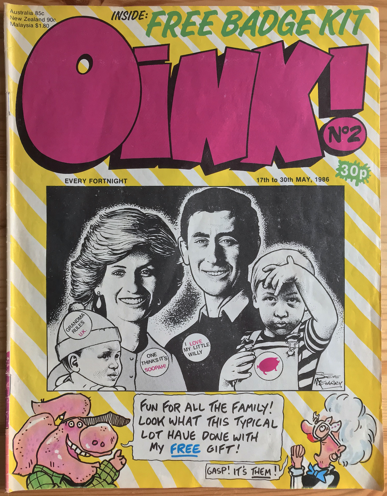
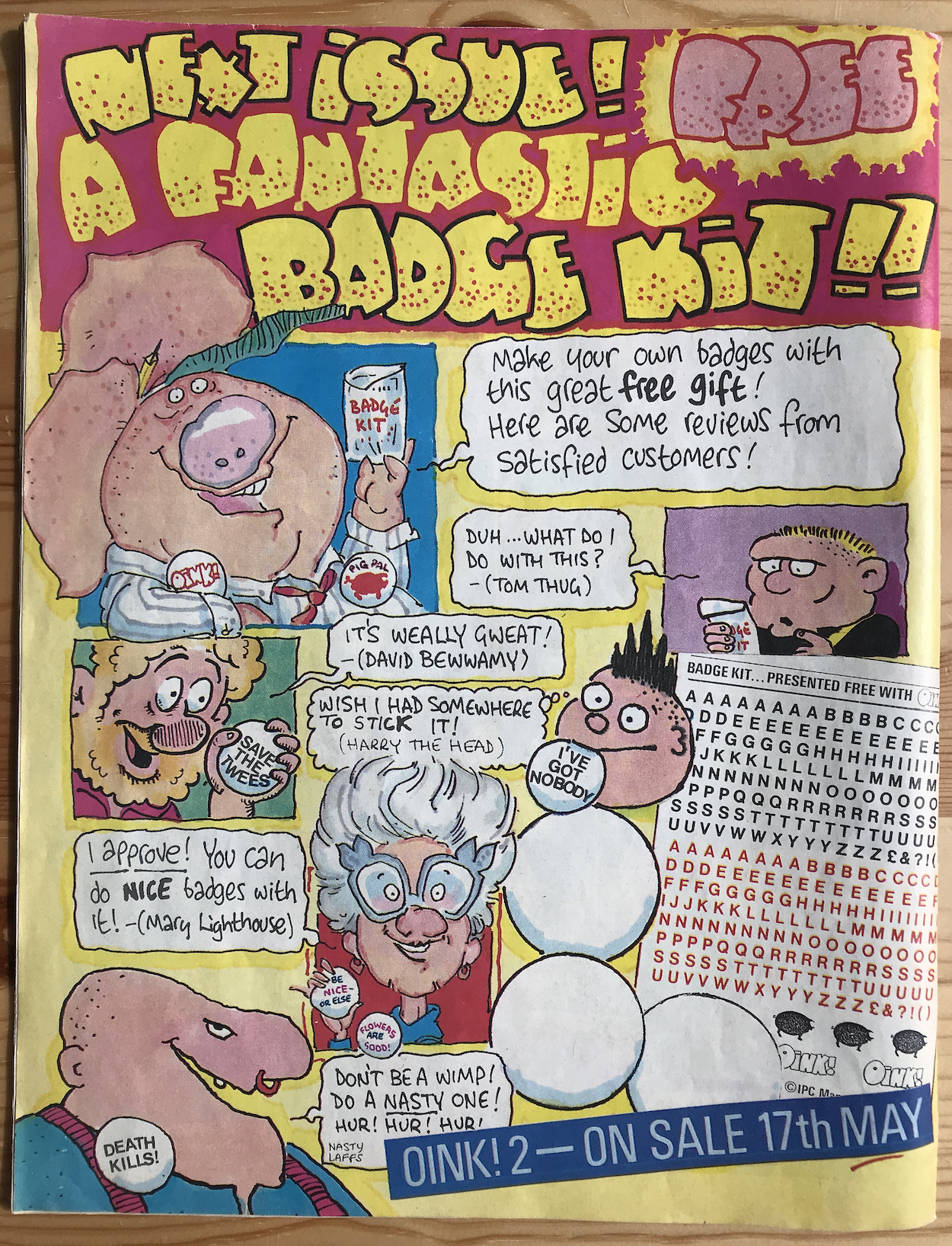
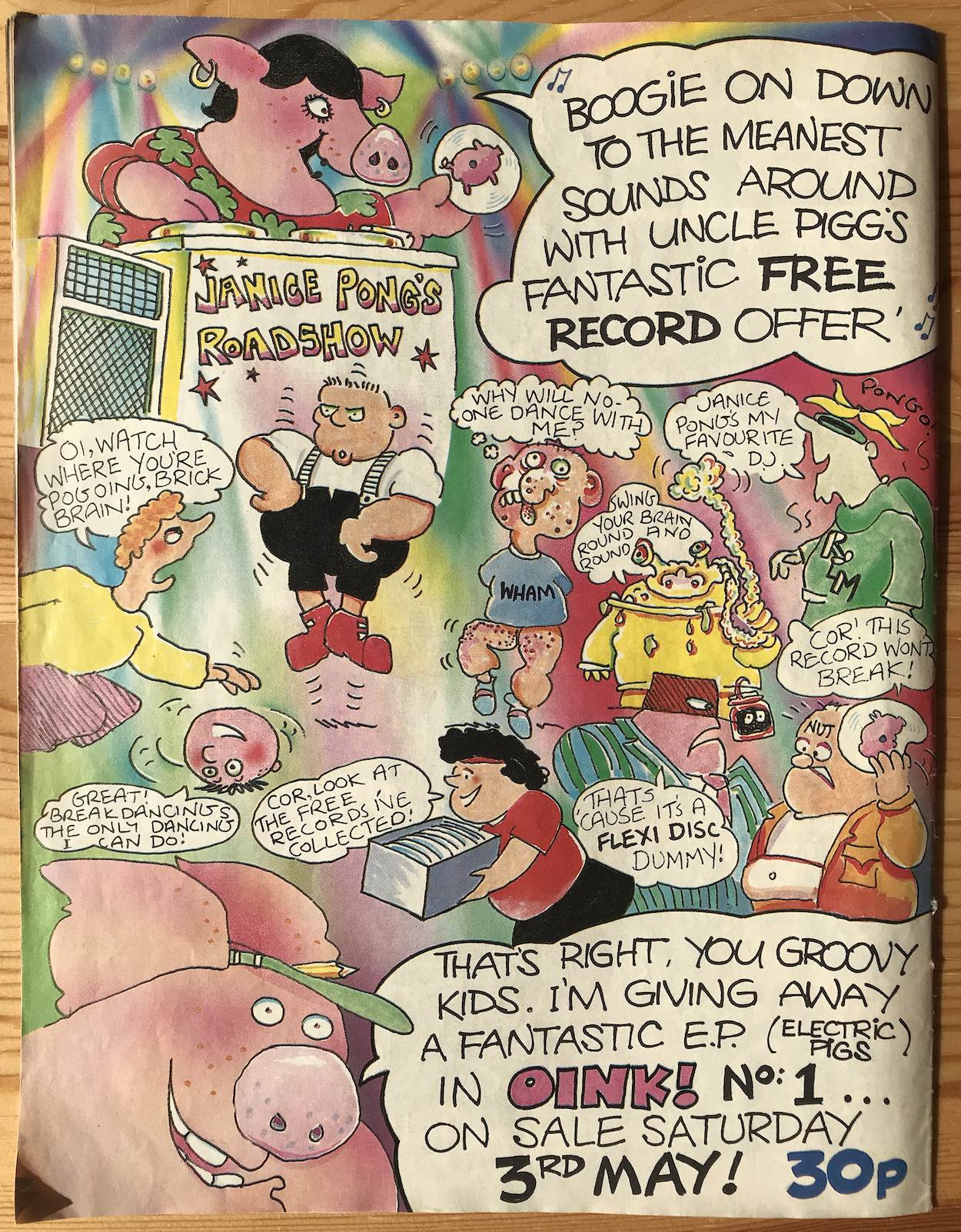
PiGS APPROACHiNG: FREE GiFT ADVERT
On this day 35 years ago a little innocuous banner appeared along the top of the front cover to the latest issue of IPC Magazine‘s Buster comic. But this wasn’t going to be a poster, a badge, stickers or a boomerang as regular readers may have expected.

A boomerang? Yes, if you want to check out a very long list of the freebies given away by Buster throughout its decades-long life you can see that on the Buster Comic website. But for now, back to the issue at hand.

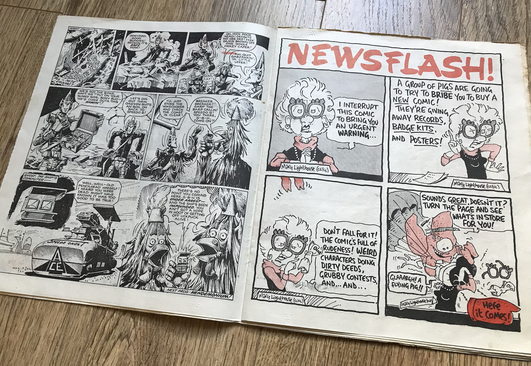
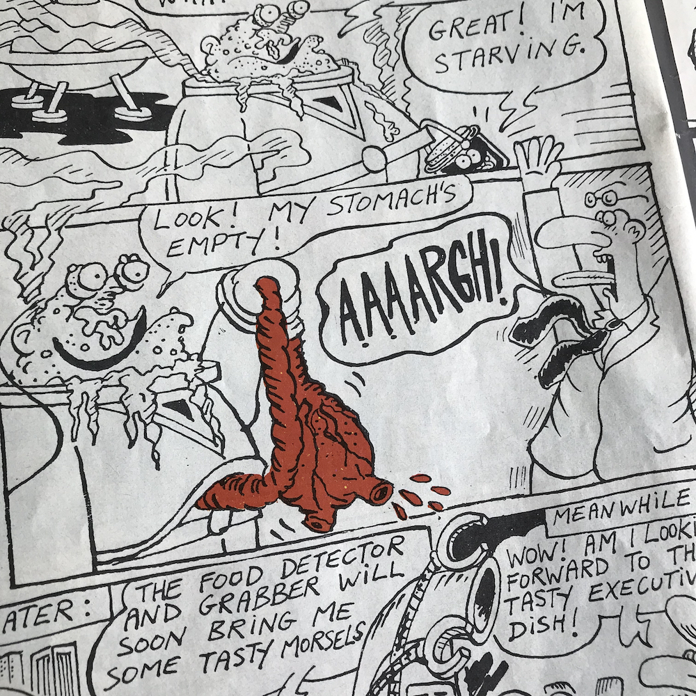
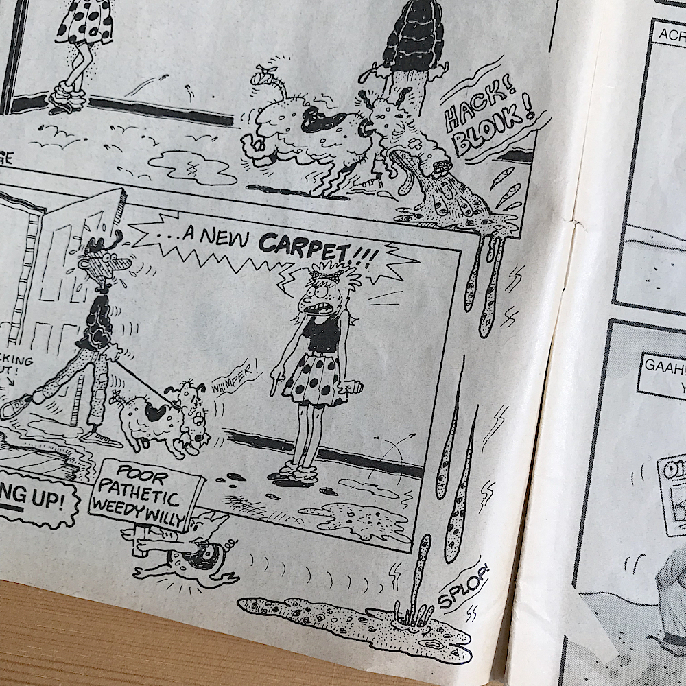
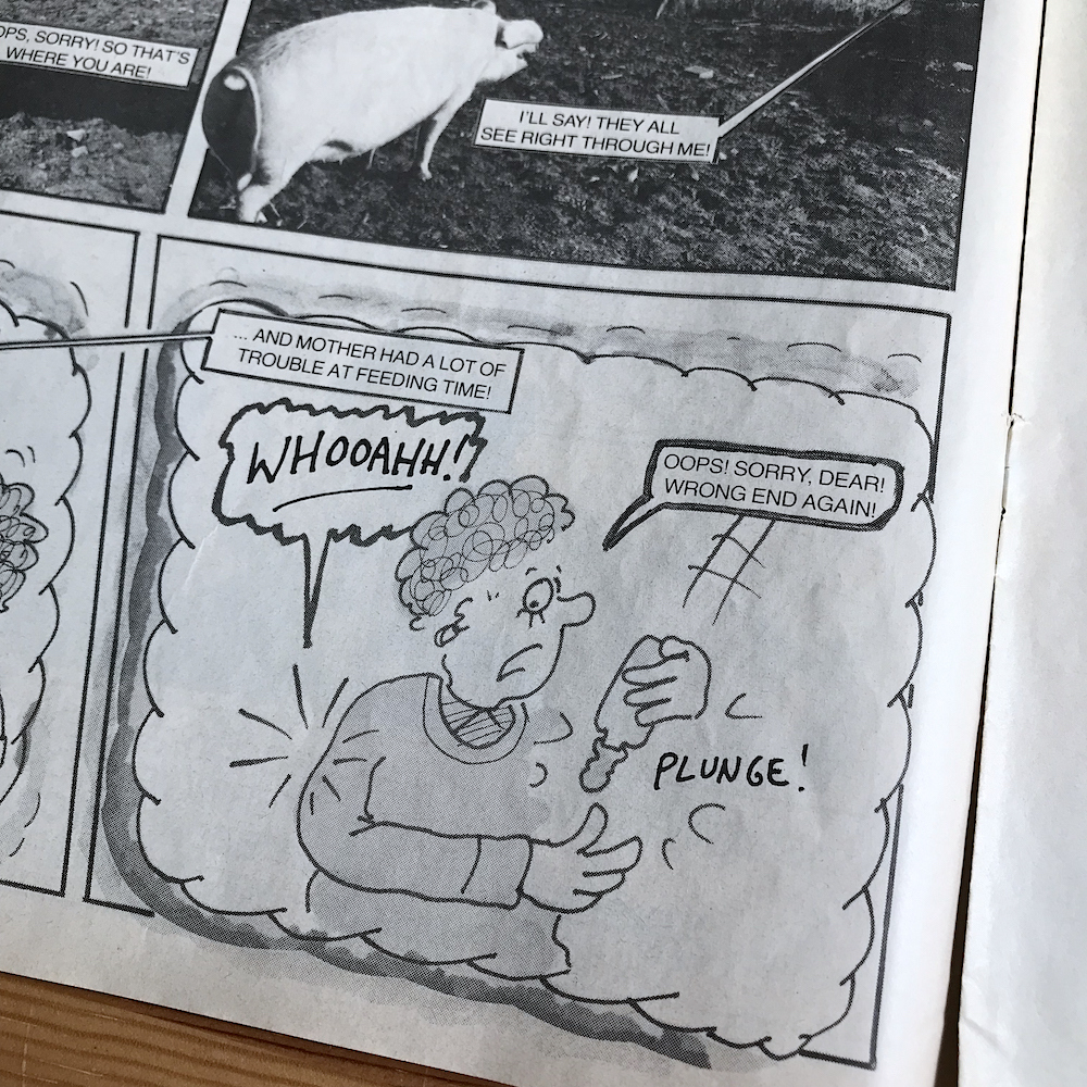
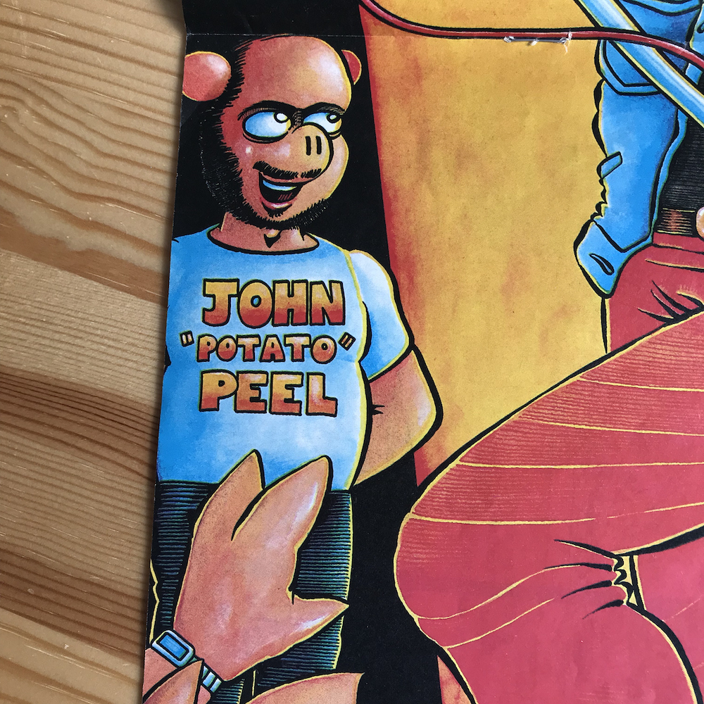
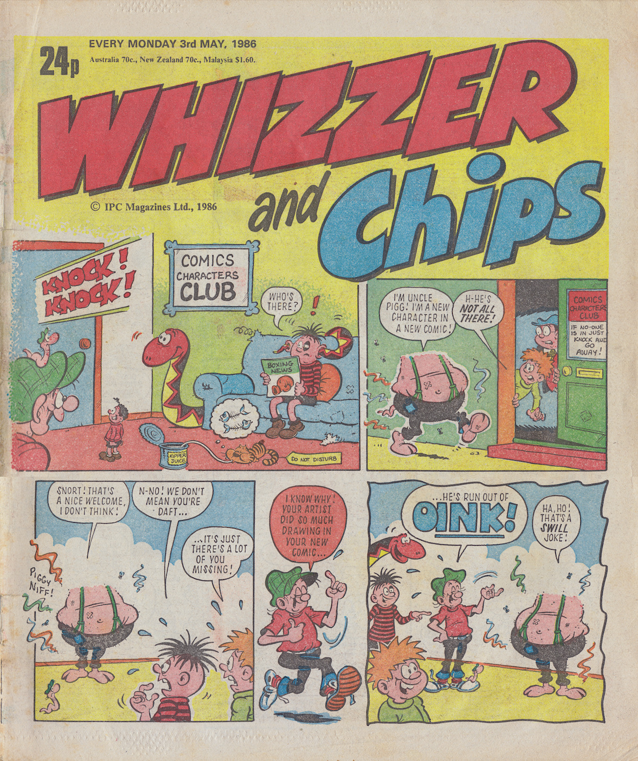
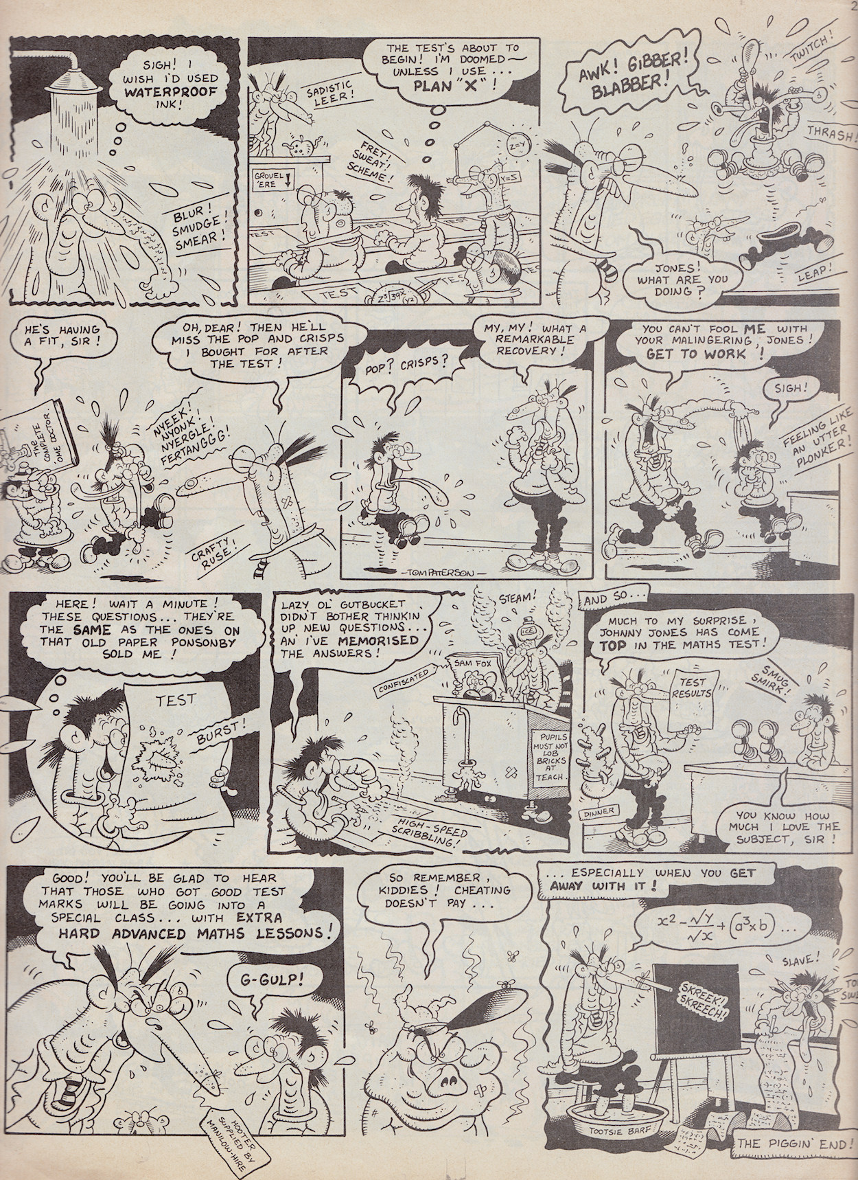
I decided to have a brief read of the comic too, checking out a handful of strips when I either remembered the characters or recognised the artist, such Tom Paterson‘s work above. I was quite surprised to see a handful of strips had signatures, such as Pete Dredge who would also appear in OiNK. It’s only a handful though and no writers are mentioned, something Uncle Pigg would put right very soon.

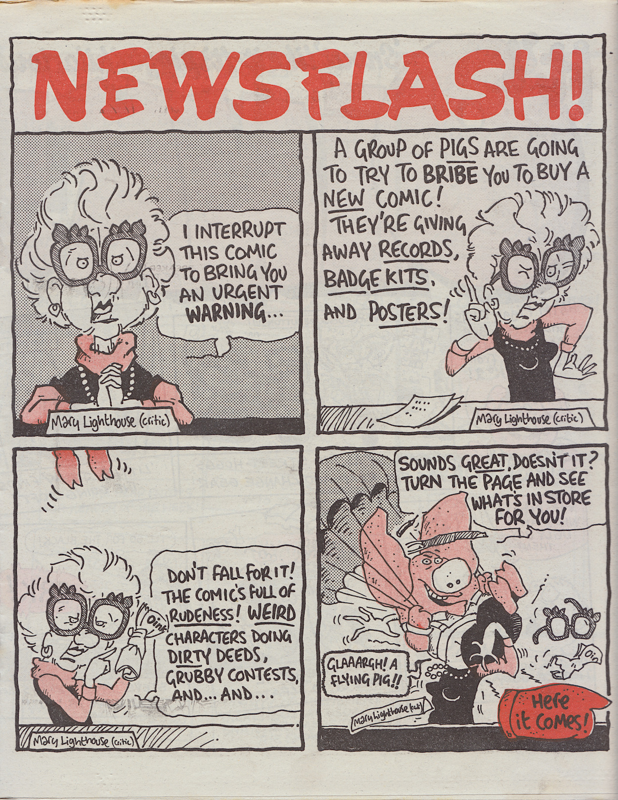
The details mentioned on the cover would amount to a half page advertisement at the end of an X-Ray Specs strip containing a piggy silhouette surrounded by one or two mentions of the new comic’s title.

Of course these could just look like sound effects to the uninitiated, so I like to think it peaked the curiosity of the young readers for what was to come in just seven days. With comics of the day being very similar in style and humour I don’t think anything could’ve prepared them for what they were about to read.

So we’re just seven days away from that free gift and just 14 away from the very first issue in this real time read through at the time of writing! It’s getting exciting here in OiNK Blog Towers and there are some extra treats in store between now and then too, so keep it tuned to the OiNK Blog, pig pals.

OiNK PRE-RELEASE MENU

MAiN OiNK MENU

SPACESHiP AWAY: LEW STRiNGER ‘HAM DARE’ iNTERViEW

The latest issue of Spaceship Away includes a feature which will appeal to fans of a certain OiNK sci-fi spoof strip. Writer of Ham Dare: Pig of the Future, Lew Stringer talks about the creation of the strip and the stellar (pun intended) artwork of J.T. Dogg that brought his creation to life.

On his own blog, Lew states, “The interview is part of a six page feature called The Fake Dan Dare Syndrome by Andrew Darlington which also includes other Dan Dare spoofs and related strips such as Danny Dare from Wham!. The article mentions that my Ham Dare plot bears a passing resemblance to the 1957 novel Wolfbane by Frederik Pohl…. which came as a surprise to me because I’d never even heard of that book until now!”

Lew discusses his working relationship with Malcolm, how they only met once at the OiNK launch party and communicated mainly by phone. Full scripts were sent to Malcolm and it was co-editor Mark Rodgers‘ idea to have him as the artist, lending a more direct homage to Dan Dare to the strip than the cartoonish art Lew had envisioned. He also talks about that dinosaur extinction scene and the emotions he felt writing it, which many pig pals felt when reading the surprisingly touching moment.

If you haven’t heard of Spaceship Away, it’s a fanzine concentrating on publishing brand new Dan Dare strips and new science fiction illustrated tales and prose stories, alongside factual articles on everything from the classic Eagle comic of the 1950s to modern day space exploration and science news.

This issue is #53 and is available for £8.95 or you can take out a year’s subscription for £25.50 (prices for Europe and worldwide readers are £11.50 and £31.00 respectively) and you can order it through their website now.

You can also read more information about the interview on Lew’s own personal blog, Lew Stringer Comics.

OiNK MEDiA COVERAGE MENU

MAiN OiNK MENU

SELLiNG THE STY: NEWSAGENT MARKETiNG

We’re approaching the beginning of my real time read through of this site’s namesake comic and I’ve got another treat in store for pig pals as we count down the days.

Last month I showed you an interview with John Sanders, IPC Magazines’ Youth Group Managing Director from the pages of industry magazine CTN, published in March 1986. Now we’re coasting through April and this month newsagents across the UK received word of that brand new comic John spoke about. OiNK was about to make its appearance but first of all those selling it had to be convinced to place orders, and hopefully sizeable ones at that.

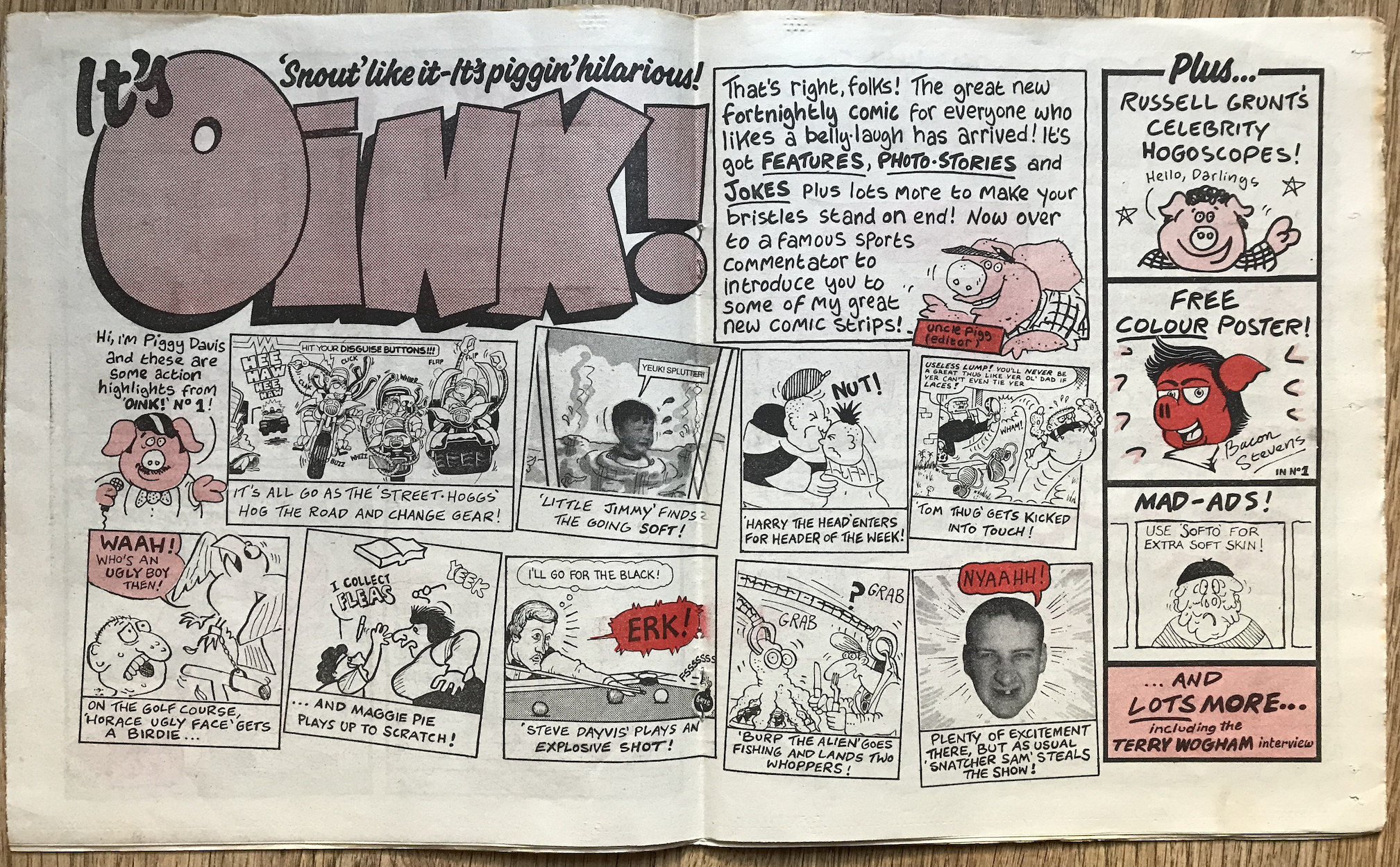
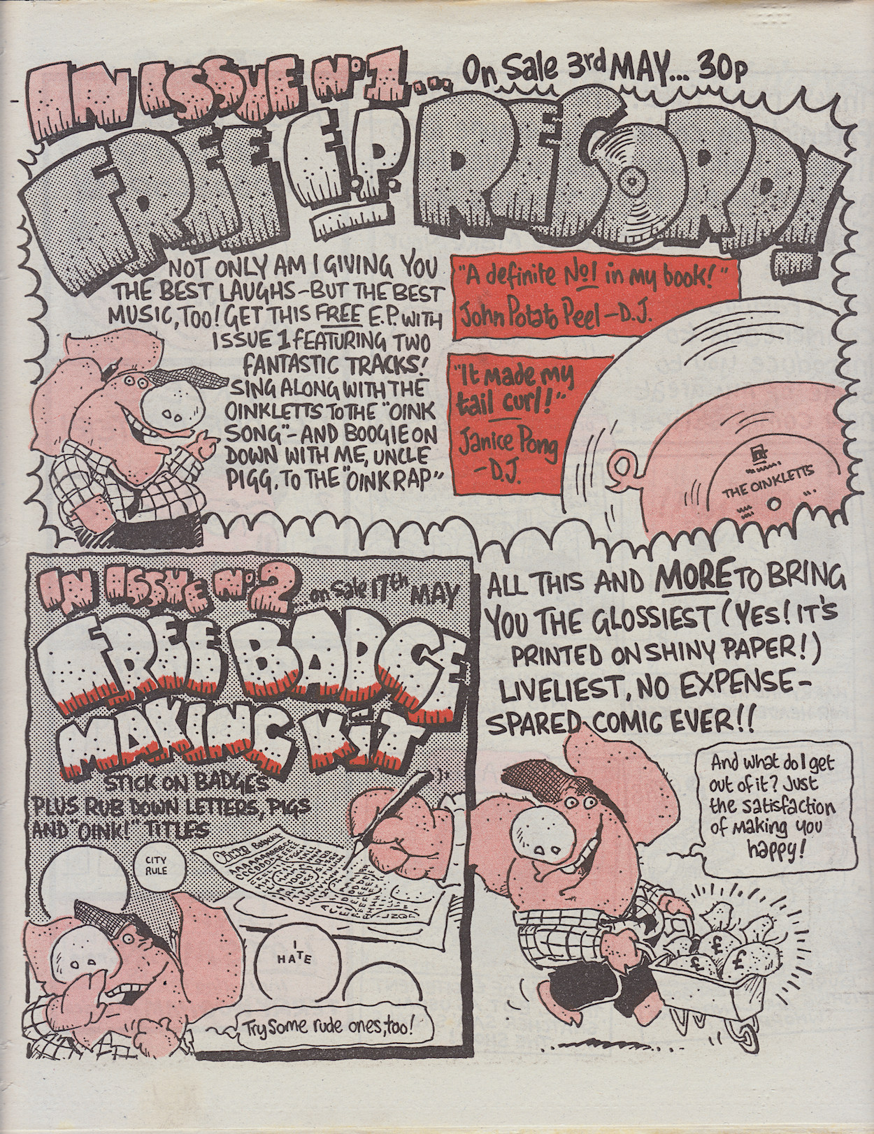
Thanks to OiNK co-creator/co-editor and cartoonist Tony Husband for sharing these original four-page promotional leaflets. They’re certainly bright, colourful and eye-catching.

I love the written description beside the exhausted Uncle Pigg below, especially the “precocious” part. My first issue of OiNK was #14 and it instantly spoke to me, so I’m guessing that was an accurate description of me too. OiNK never spoke down to us, never treated us like little children. It felt like it was put together by a team who just wanted to make each other laugh and us pig pals were part of the gang. I believe this is the reason its humour stands up so well today and can still be enjoyed by anyone of any age.

Above was Tony’s original leaflet, below I’ve been able to get hold of individual page scans that are a bit better in picture quality. You can click on these to take a closer look.

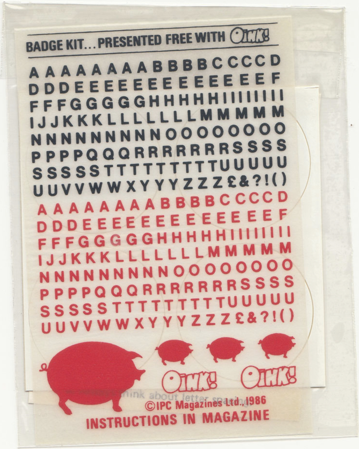
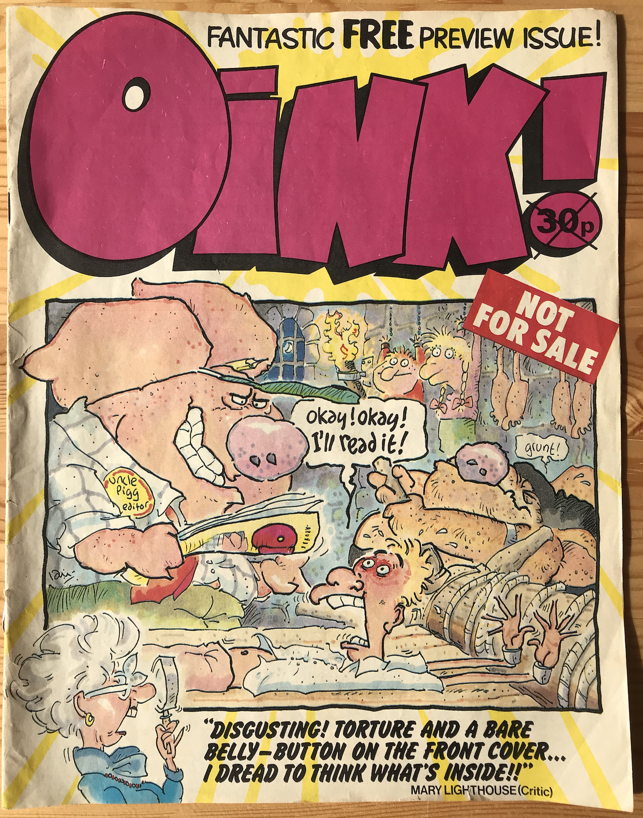
At the time new comics would normally be marketed on television, such as the one for Marvel UK‘s The Transformers I showed you in that John Sanders post. But of course OiNK would be doing things differently and a big deal was made of the fact IPC were giving away their first ever preview issue. Not only that, it was a full-sized, 32-page free comic and packaged inside some of their best-selling titles, namely Buster, Eagle and Tiger and Whizzer and Chips.

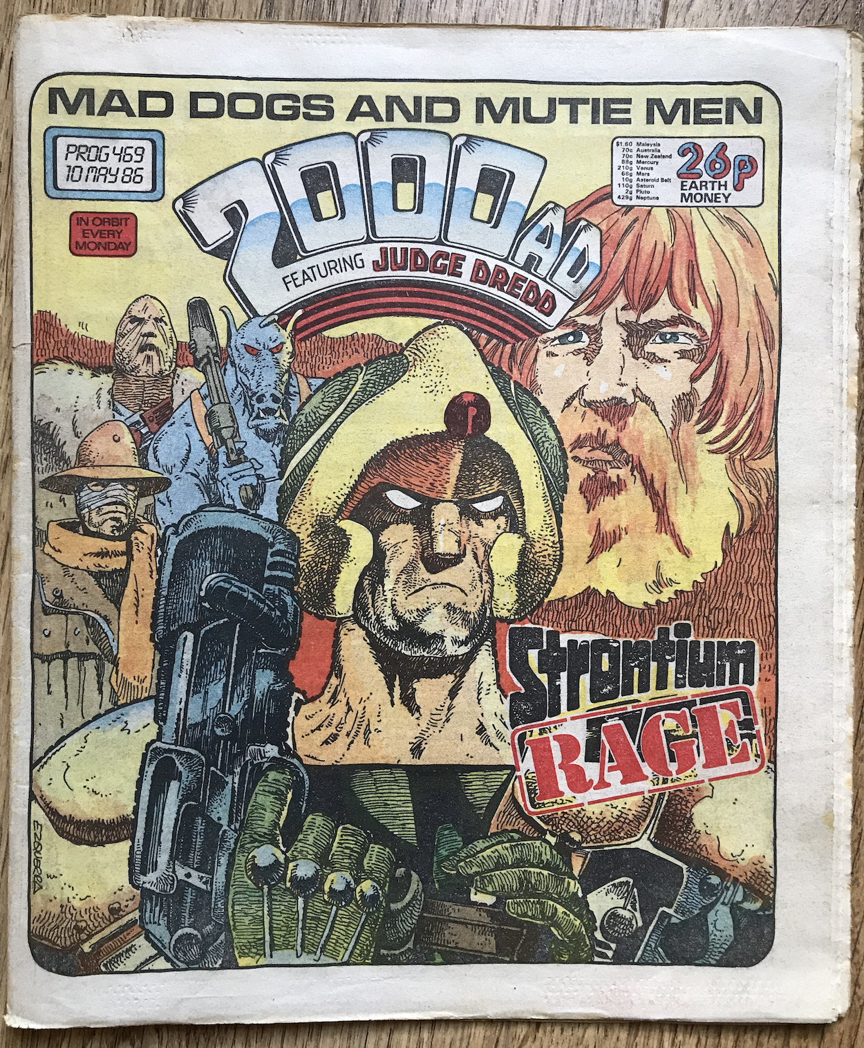
The launch gifts are given prominent space here too, which is understandable when a free record is one of them. Also mentioned are the “Blockbuster Advertisements” which would show up between issues one and two in the pages of the three comics above as well as Roy of the Rovers, 2000AD and Battle. That’s a huge promotional push right there!

In case you’re wondering what “Fully S.O.R.” means, this stands for ‘Sale or Return’ and would refer to newsagents being able to return unsold copies and receive full reimbursement for them. This would encourage them to make bigger orders for those initial issues, safe in the knowledge they could push the comic in their stores with plenty on display without fear of losing any money.

So the comic was on its way and our newsagents were placing their orders. The next step was to make the potential readers aware of that fantastic free preview coming very soon.

OiNK PRE-RELEASE MENU

MAiN OiNK MENU

ViSiONARiES #1: THE END

They were the latest toy line from Hasbro, the latest cartoon from Sunbow and now the latest comic from Marvel, kicking off with this superb Martin Griffiths (Thundercats, The Real Ghostbusters, Knights of Pendragon) and John Burns (Transformers, Judge Dredd, Nikolai Dante) cover. With Transformers and Action Force (G.I. Joe) still riding high what could possibly go wrong? Unfortunately this sure thing wasn’t to last, but while it did the Visionaries brought with them one of the greatest 80s cartoons, some of my favourite childhood toys and what could’ve been one of the greatest comic book epics.

But we’re not here to dwell on what could’ve been, this site is all about celebrating these classics by reading them in real time and on this day back in 1988 #1 of a brand new Marvel UK comic appeared in the shops. While it does have a lovely glossy, high-quality cover it only has 24 pages, the same as the weekly Transformers which seemed strange for a monthly. Inside it was cover-to-cover strip action too; no extra features, no fact-files, letters page, back up story and no sign of a Lew Stringer humour strip. (What kind of comic was this without that?)

What it did have for kids in the 80s was a free holographic sticker. Featuring two images of Merklynn the wizard (one a 2D outline and the other a 3D image of his face) I can’t begin to describe how bloody difficult this was to photograph.

Inside, Transformers colourist Steve White is the editor and welcomes us to the premiere issue with Vision On, an editorial page which looks a lot like the one from The Real Ghostbusters. Other than that, the comic is made up of 19 pages of strip, two Marvel UK adverts, another for the toys and that’s yer lot. It’s still an exciting introduction though and it hypes the strip very well. As a young teen I read this story later when it was printed in the annual so seeing these opening pages transports me right back to Christmas 1988.

The End… The Beginning is adapted by Jim Salicrup (Jurassic Park, Transformers, Spider-Man) from Flint Dille‘s (Transformers: The Movie and G.I. Joe: A Real American Hero cartoons) screenplay of the cartoon’s first episode. In the States, Marvel’s Star Comics released Visionaries bi-monthly (much like their parent company had with Transformers originally). The premiere issue had double the page count, but here in the UK the origin story was split into two and spread over the first two months. This means none of our characters actually become ‘Visionaries’ this issue.

Set on the planet Prysmos, Merklynn the wisened old wizard brings portents of doom as the three suns begin to align, signalling the end of the Age of Science and the beginning of a new Age of Magic. Angered at their reliance on technology, Merklyn states he’s watched humans grow weaker for eons, so he’s obviously a lot older than we think.

He has a point. It would appear that from birth to death technology is on hand to answer to these humans’ every whim. Even in this restaurant, sitting on the side of Iron Mountain, we see people being fed their food by robots, after the robot chefs have cooked it and the robot waiters have served it. They don’t even have to bother their brains with the task of choosing what they want to eat, instead their dietary requirements are scanned by the maître d’.

Then the suns align.

In an instant the world is plunged into darkness. The restaurant crumbles and falls, no longer held in place by the advanced machinery, destroyed completely as it hits the ground far below. To prove to the people around him this is truly the new Age of Magic, Merklynn teleports the diners to safety. All around them their world has changed forever in the blink of an eye. Completely out of their depth, unused to thinking for themselves, the first words anyone utters as the world ends around them is, “Anyone know a good restaurant near here?”. A brief moment of humour before the horrors on the next page. It doesn’t take long before the human race is fighting for survival in this powerful double-page spread.

The Age of Science has ended and the beginning of the Age of Magic is a terrifying and violent place. The once peaceful people of Prysmos, who didn’t want for anything, quickly descend into barbarism. But as society crumbles a new order slowly rises up “cobbled together from bits and pieces of the old”. The useless technology all around them is melted down and used as protective armour and weapons, both now a necessity. From the villages emerge knights, some ruling with iron fists and led by Darkstorm, others aligning themselves with Leoric, the former mayor of New Valarak who witnessed first-hand the scene at the restaurant.

There’s some great imagery throughout this issue, with pencils by Mark Bagley, inks by Romeo Tanghai, colours by Julianna Ferriter and lettering by Janice Chiang. In particular the fight scenes are exciting and during one particularly brutal confrontation the skies light up with a familiar face (inside a familiar free-hologram-like shape) and a booming voice.

Merklynn tells the knights of his Iron Mountain, where the destruction began. Inside, great power resides, enough to rebuild the world and take command in this new age. It’s too much of an opportunity for someone like Darkstorm to pass up so he and his men (the grovelling but loyal Mortdredd and the brutal mercenary-for-hire Reekon) take off to claim the power for themselves.

They believe these times call for a leader unafraid to make unpopular choices for their planet to survive, no matter the cost to the people. On the other end of the spectrum Leoric, Ectar and Feryl believe only by working together can the populace regrow and flourish. We also meet characters like Cravex who wishes to use the political climate to his advantage (he had the voice of Starscream in the cartoon, appropriately enough) and during the final pages we’re also introduced to Galadria, Arzon and my favourite, Witterquick.

With the world building complete we move on to the quest for their magical powers. Iron Mountain’s labyrinthine interior is home to tests of intelligence, fitness, strength, wisdom etc. Just as the toys set out each figure’s abilities, these tests are our chance to be introduced to them in a more natural way than resorting to the kind of long winded exposition we got in the earliest issues of Transformers.

For example, Galadria uses her keen senses to stop herself falling for a trap like the men ahead of her, Witterquick uses his speed to avoid deadly spikes and Arzon’s love of flight has him gliding away to escape danger. We even get a cheeky wink towards their Hasbro stablemates; as a ladder transforms into dozens of intertwined snakes Arzon exclaims, “There’s more than meets the eye here.” Brilliant.

Our original six characters from earlier in the story round things off for this issue when they discover a giant stone gargoyle, snoring loudly in a corner. It’s alive! But at least it’s asleep. Sneaking past it, Mortdredd puts on a weakened voice and tricks Leoric’s team into coming to the aid of an apparently fallen comrade.

There’s actually a nice bit of humour here too. Mortdredd’s character sucks up to Darkstorm constantly, eager to please him by carrying out any sinister task no matter how horrible, keen to have his protection. Darkstorm is constantly exhausted of the grovelling but recognises Mortdredd’s diabolical talents are crucial to his plans.

It’s at this point the story, which has been building momentum nicely from its atmospheric beginning, gets unceremoniously cut in half. Below is the final strip page. If you look closely at the penultimate panel you’ll see a metal portcullis. This is what Reekon is controlling with that lever. This could be easily missed so its effectiveness as a cliffhanger is debatable. From memory of the annual, showing the next panel or two at the top of the next page would’ve been much better, with maybe a ‘Next Issue’ promo filling out the rest of the page.

The overriding feeling I get from this issue is how these are already well developed characters, grounded in a magical kind of reality, their reactions and relationships with each other all very real. It’s a well thought out world full of possibilities for future storytelling and this is before we’ve even concluded the origin story. It’s great fun reading something so full of far-fetched magical elements, action and adventure, yet with such believable characters at its centre. This gives real meat to the bones of the story and something to care about and draw you in.

By the end the lack of anything other than the strip itself isn’t an issue anymore. The story has been very satisfying in its own right. It certainly wouldn’t be the last Marvel UK comic to go this route either. Slimer, Alf, Inspector Gadget and others simply repackaged their American comics on larger paper with a new editorial and maybe a letters page, which perhaps Visionaries would’ve contained eventually.

Speaking of other Marvel comics.

Apart from the cover and editorial, the only non-strip pages are a toy advert (which you can see in this previous post) and two promotional pages for other comics. The Real Ghostbusters had just launched while Thundercats was celebrating its first birthday by this stage. The ‘Cats had also been launched as a bi-monthly in the States by Star Comics, proving popular enough to warrant going monthly from #8 onwards that side of the pond.

Despite knowing in advance a comic won’t last long when I’m covering it, that won’t take anything away from the enjoyment of reading them in real time. I’ve certainly loved reading this one. Although, whole month feels like an agonisingly long time right now. But I shall follow my own rules, and wait.

Issue two shall be read and reviewed on Wednesday 21st April 2021. Join me then, won’t you?

MiNi-COMiC < > iSSUE TWO

ViSiONARiES MENU

REMEMBERiNG J.T. DOGG

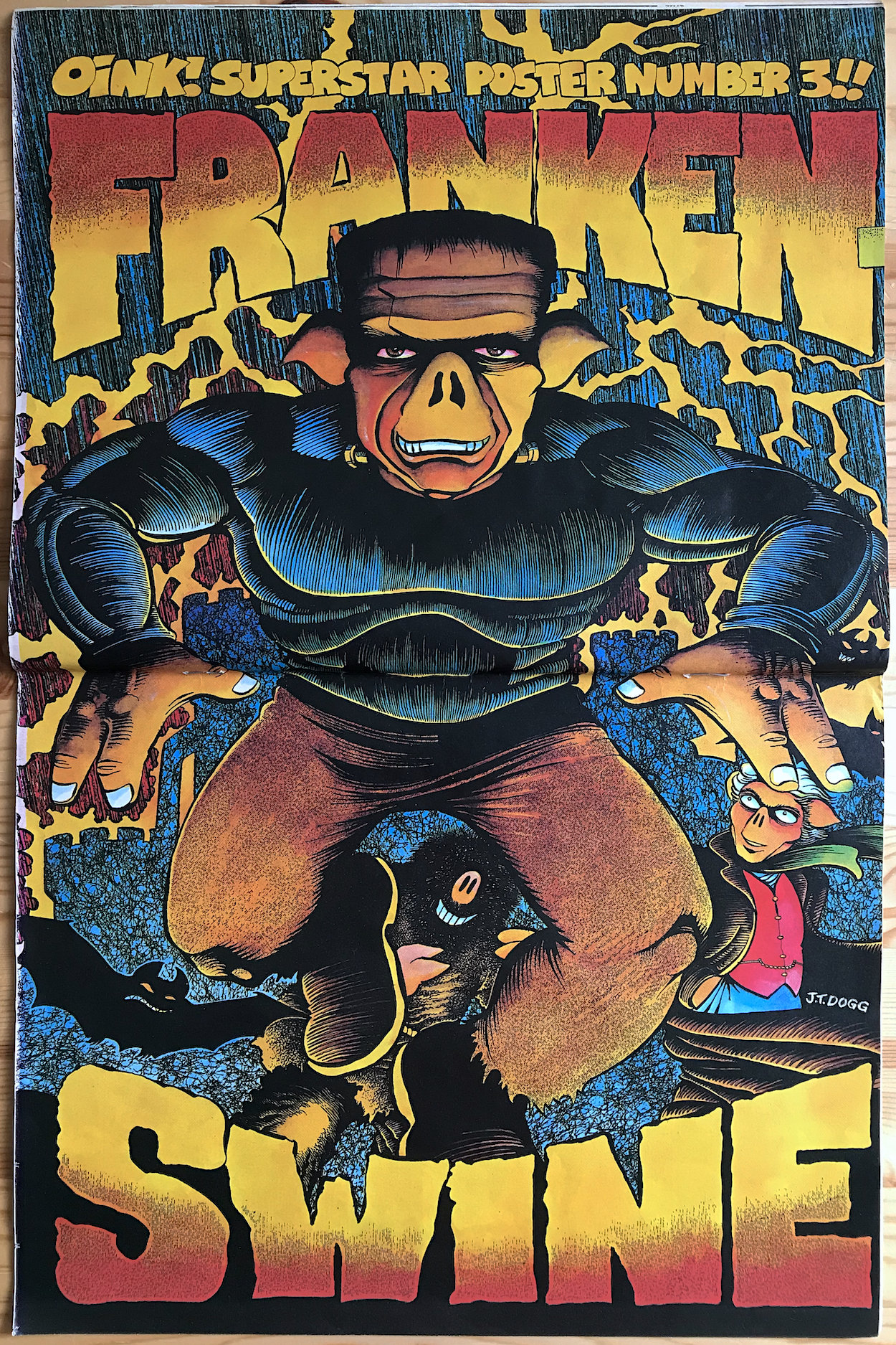
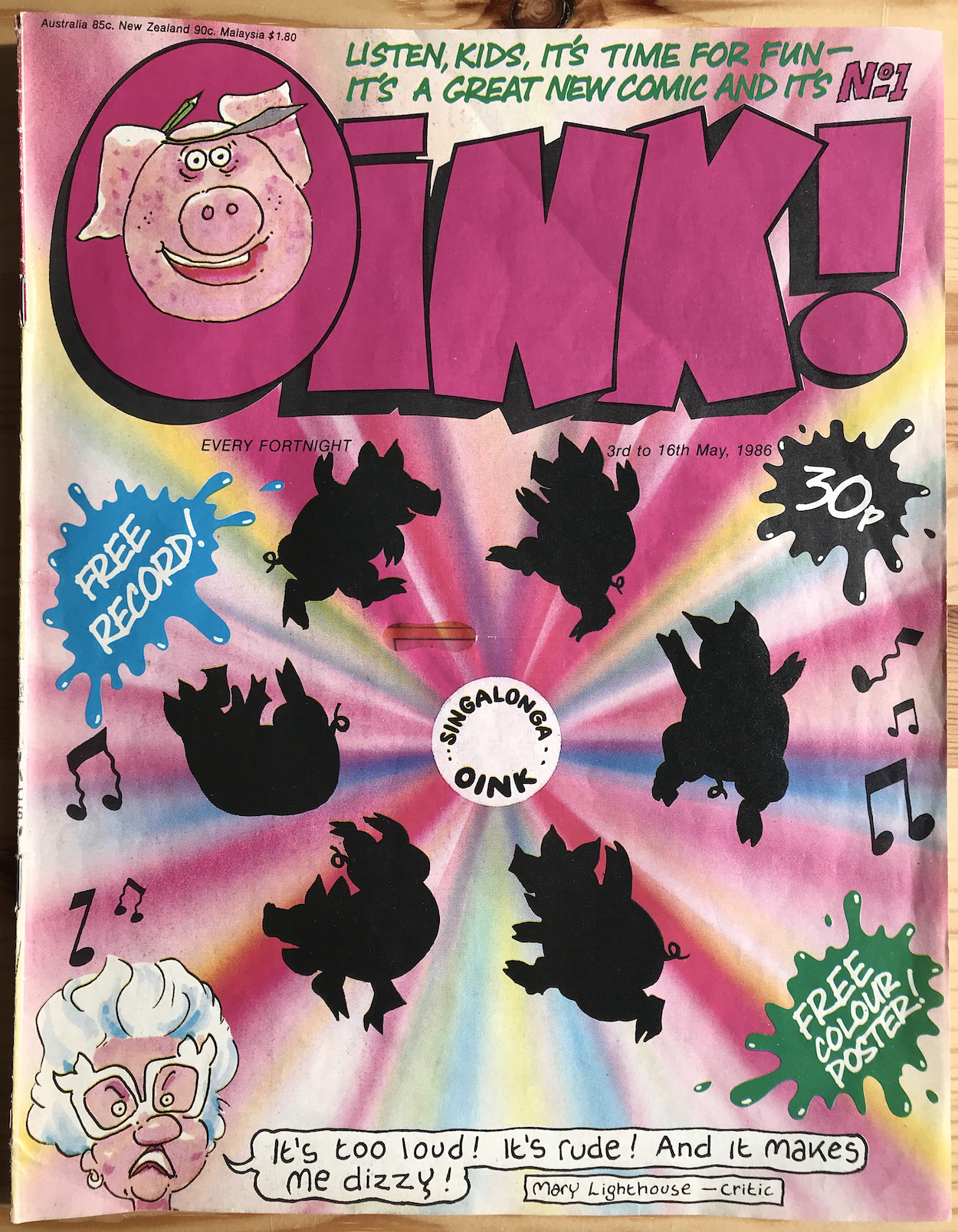
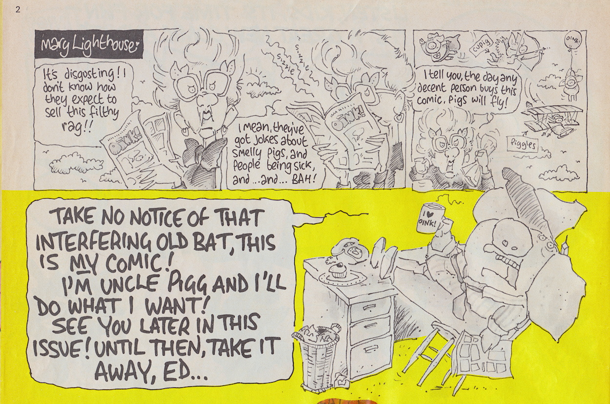
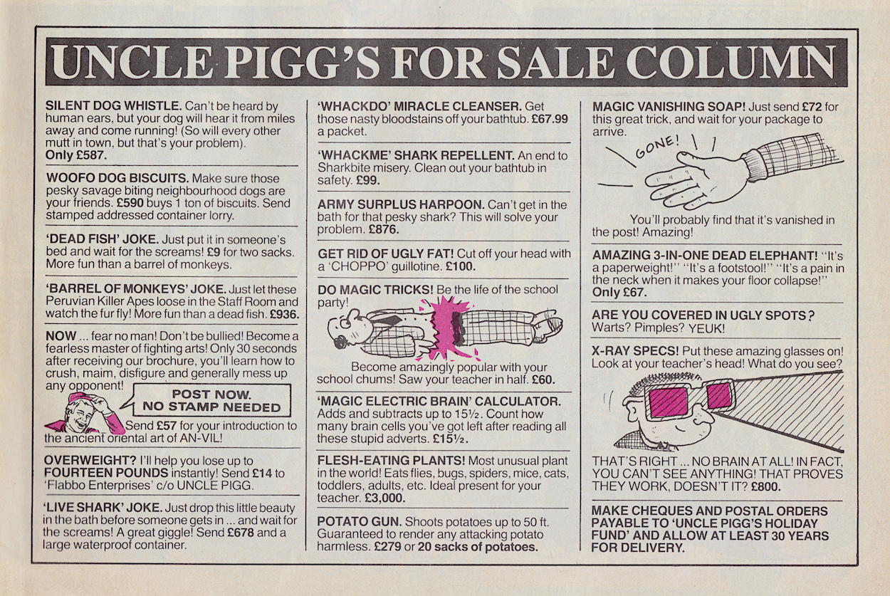
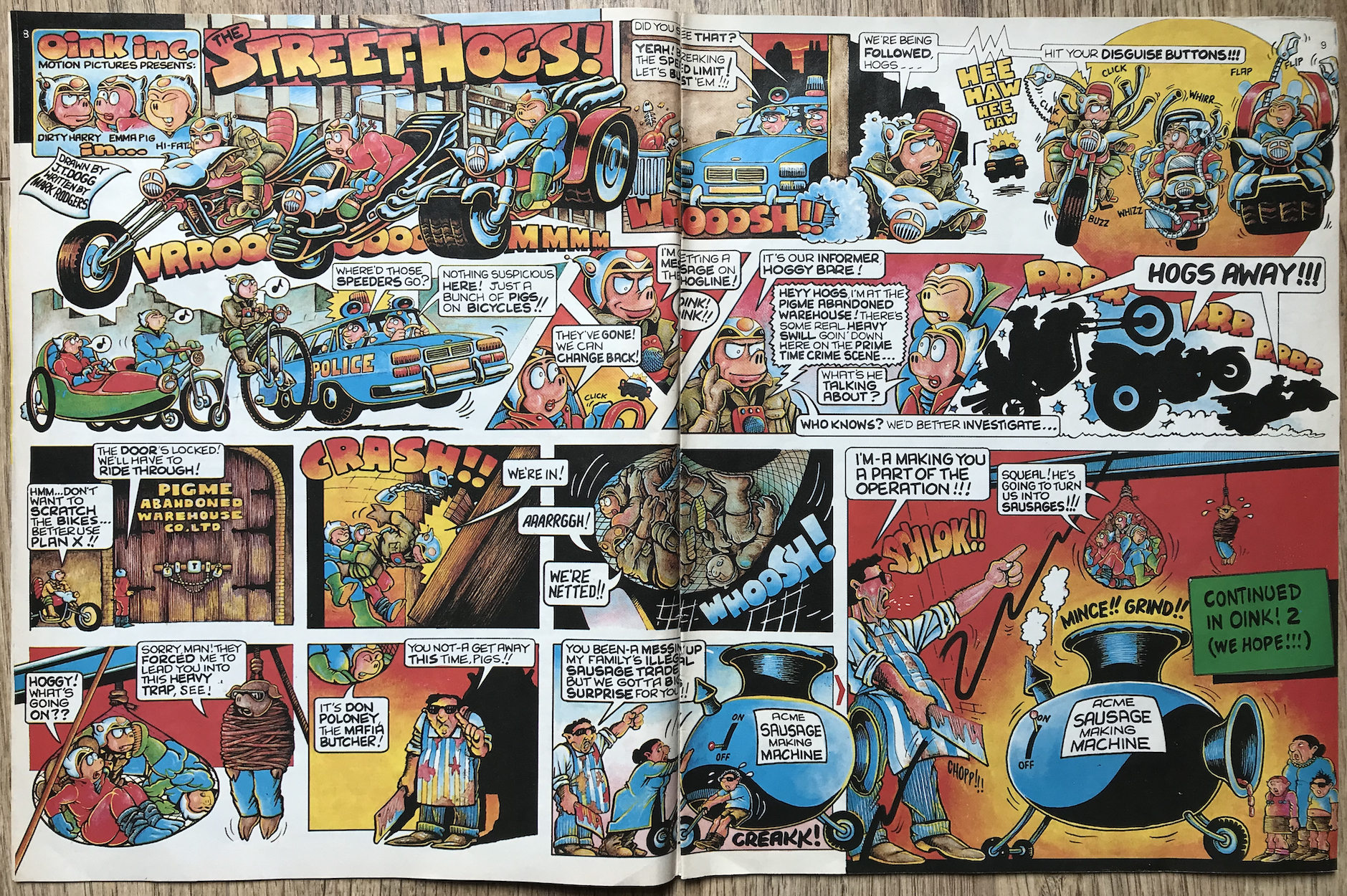
With this pag ein OiNK’s Preview Issue young eyes across the UK were exposed to the insanely talented Malcolm Douglas for the first time. To anyone unfamiliar with the name you may remember him as J.T. Dogg, the genius illustrator behind Street-Hogs, Ham Dare: Pig of the Future and the OiNK Superstar Posters.

Pig pals will have fond memories of his big, bold and gorgeously colourful double-page spreads leaping out at them every fortnight. Within the pages of those early issues Dogg’s work included the original 11-part Street-Hogs story written by Mark Rodgers, and a series of spoof Superstar Posters of Bacon Stevens, Sty Wars, The P-Team, Hambo, Frankenswine and Peter Swillton, as well as Draculard later in the run. His work was undoubtably displayed on many a bedroom wall across the UK.

Malcolm originally became an illustrator when he volunteered to draw for a newspaper run by the Sheffield University Student Union. Discovering he could be paid for his work he developed his style and was published in a wide variety of comics. After OiNK these included Brain Damage and Zit, two titles heavily influenced by the one he’d been such a huge part of.

He also regularly contributed Fred the Red for Manchester United’s match programmes, but his best known work remains all of those beautiful pages found inside OiNK. For example, the conclusion to the first Street-Hogs adventure called for a suitably epic wraparound cover poster, complete with a standout OiNK logo.

When I started collecting OiNK with #14 the ‘Next Issue’ section had a small monochrome drawing of a character called Ham Dare: Pig of the Future, a new multi-part story written by Lew Stringer and brought to life by Malcolm. Knowing of Dan Dare from friends’ comics I was looking forward to seeing a joke version of the character. It would be my first encounter with Malcom’s work. I knew it was going to be funny, I didn’t expect it to be so lush!

Malcolm didn’t receive any professional art training and his skills weren’t limited to drawing either. He was a musical performer and played the mandolin and fiddle among other instruments; performing with various bands he was a regular face around the Sheffield music scene. His knowledge of folk music was encyclopaedic and he contributed to two books about the subject, while a third was being revised before his death.

Malcolm sadly died of cancer on 22nd March 2009 and it is on this date we remember his stunning OiNK work.

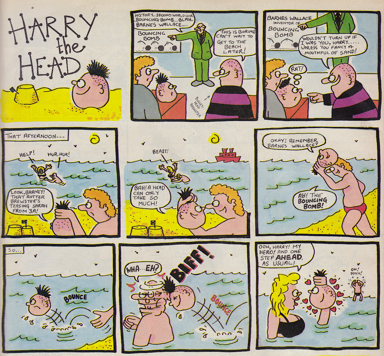
During the two-and-a-half-year run of the comic J.T. Dogg brought us three lengthy Street-Hogs strips, a Ham Dare serial, plus more from the Pig of the Future in The OiNK Book 1988 and The OiNK Book 1989, and in a Holiday Special after the comic was cancelled. Let’s also not forget all of those magnificent posters. He even drew Harry the Head in one issue.

OiNK came to its conclusion in October 1988 and while the second annual was already on sale most of us wouldn’t receive it until that Christmas, a couple of months after we’d said goodbye to our favourite comic pals. J.T. Dogg returned with this glorious cover, a fitting end to the run and a fitting tribute to a man whose talents were second-to-none.

OiNK OBiTUARiES

MAiN OiNK MENU

PiGGY PROMOTiONS: iPC’S JOHN SANDERS

IPC’s Youth Group is trying to change
the face of children’s comics with its
launch next month of a new-style,
fortnightly comic into the
eight-to-12-year-olds market.

John Sanders

So began a piece in CTN, an industry magazine covering the world of magazines and comics on this day back in 1986, a month before OiNK‘s release from the sty. Comics sales had been in heavy decline for a few years with television seen as the cause, although so perhaps was the ever-growing presence of computer games. While other sources of children’s entertainment were evolving, comics hadn’t. They had to do something new and fresh in order to remain competitive.

You should know where this is going. That something was, of course, OiNK. Edited by the “three liberated pigs” of Mark Rodgers, Tony Husband and Patrick Gallagher, IPC Magazines saw in them the chance to reinvigorate the market.

The article in CTN (which you can read in full at the bottom of this post) takes the form of an interview with IPC Magazine’s Youth Group Managing Director John Sanders. That’s him above, surrounded by OiNK page layouts prior to launch. A wish to move away from the “custard pie humour” is cited and the publishers were certainly putting their weight behind this anarchic comic, independently put together for them in Manchester. Hundreds of thousands of copies of the preview issue would be bagged with some of their biggest titles and an eye-watering (for the time) £55,000 was being spent on Blockbuster Adverts.


“Their [children’s] humour is a lot more sophisticated than it was 25 years ago. It is a lot more outrageous, the butt of their humour has changed.”

John Sanders

It’s interesting to note having a preview issue wasn’t something generally used at the time. The normal strategy had been television advertising such as with Marvel‘s The Transformers in 1984, the (very) brief advert for which you can see below. This was news to me when I found out because I remember several preview issues inside my comics but nothing on the telly. Then again, those previews came after OiNK’s. However, even OiNK’s would be different from those that followed. It was a full-sized issue!

The article states the new comic was “aimed very directly at youngsters”. The whole point was to grab the attention of the eight to 13-year-old age group. Yet, here we are, over three decades later with a website all about it and my main audience is all you grown up pig pals discovering just how well it holds up for both adults (and your children reading it) all these years later. IPC’s target audience weren’t just readers of comics by the competition either, such as The Dandy and Beano, it included those buying the company’s own humour comics who they worried could be moving away.

Thanks to Lew Stringer for sharing this scan on his Blimey blog and for the kind permission to show it to you all here. That particular blog is no longer being updated but is chock full of interesting comics tidbits, so make sure to give it a look. While you’re at it, bookmark Lew’s ongoing Lew Stringer Comics blog too, detailing all of his own work both past and present.

(John Sanders has now released his own book, King’s Reach: John Sanders’ Twenty-Five Years at the Top of Comics which chronicles the business side of the industry.)

About a month later the April/May 1986 issue of IPC News (the in-house magazine for IPC Magazines staff) also ran a piece on OiNK’s imminent launch, where it’s affectionately described as “John Sander’s cherished ambition”. It contains much of the same information as the CTN article, including some direct quotes by John, cementing the company’s support of the comic’s ethos and what it was attempting. This following scan also comes courtesy of Lew.

There could be no part of IPC Magazines or the wider UK comics and magazine scene that was unaware of this bold new venture. At least that seemed to be what the company was attempting to achieve, what with the size of OiNK’s marketing push. It gave the impression that the company was completely behind Patrick, Tony and Mark. Of course, any company will want to give that impression when they’re launching a new product but there can be no doubt IPC believed in OiNK.

OiNK PRE-RELEASE MENU

MAiN OiNK MENU

ViSiONARiES: PREViEW MiNi-COMiC

A few days ago I introduced (or for some of you, reintroduced) you to the Visionaries, one of several attempts by toy companies in the 80s to bring back the hologram as The Next Big Thing. While they weren’t successful enough to last beyond one holiday season, the toys and in particular the cartoon make for some wonderful childhood memories. Now it’s time to check our their comic from Marvel UK.

We start with a look at the four-page mini-comic given away free with Transformers and Action Force to promote the upcoming monthly back on this day in 1988.

There was certainly a big push in the pages of this comic but from what I know it wasn’t given away with any other Marvel title. It could be because they knew the chances of it lasting weren’t great with what was happening with the franchise in America and it would most likely end up merging into this one. Or it could simply be because Transformers was by far their biggest selling comic at this point and another Hasbro franchise.

IPC/Fleetway would give away preview issues with several titles at once (beginning with OiNK), but maybe this was just Marvel’s way of targeting the audience most likely to read the new comic. Either way, the Visionaries took centre stage in #158 with an extra four pages of higher quality paper making up the the middle of the comic, and the main part of the Transformation editorial was given over to the Knights of the Magical Light too.

Unlike the previous Action Force (G.I. Joe) mini-comic shown above there’s no new material in the one for the Visionaries. Instead we get highlights of the origin story to come in the first two issues, a look at the toys and a competition. But there’s at least one thing I hadn’t seen before and that’s this cover image.

It really stands out on the glossier paper, in fact the result is just glorious. It must’ve been a real feast for the eyes for youngsters in the middle of their weekly dose of Cybertronian action, something so completely and utterly different to what they’d been reading. The strange thing about this image is that I don’t recognise half of the characters. The two main figures in the middle, the ones on the bottom-left and that craft on the top-left aren’t featured in the cartoon or the toy line. Perhaps it’s an early concept piece.

Before The Real Ghostbusters cartoon was released a beautiful concept art poster did the rounds, with the team speeding along in Ecto-1 but all with the movie’s one-colour overalls, Egon’s hair was still brown and they were ‘busting the ghost who would be known as their friend in the cartoon. These things obviously changed but the image was still used in magazines and comics to publicise the series for a long time, even given away with some toys. The same thing could have happened with Visionaries. (Thanks to Stu Munro for supplying the image below.)

So back to the strip itself, the thing that’s going to draw readers in to the new ongoing comic coming less than a week later. As I said, it’s made up of little snippets from the end of the comic’s first story, The End… The Beginning. It’s a bit weird to show the story’s climax before readers had a chance to read it. It also doesn’t show their powers being used, surely a key ingredient they could’ve shown off, given how that’s the whole point behind the intro to the cartoon.

If I’d been collecting Transformers at this point originally (I didn’t start until #192 as a child), none of these points would’ve mattered though and it’s probably just me being an old fuddy-duddy today. It was all about hype so I guess it did do its job. The bright yellow banners advertising the release date aren’t easily missed either.

No credits are given here but they are as follows: Flint Dille and Jim Salicrup (writers), Mark Bagley (pencils), Romeo Tanghai (inks), Janice Chiang (letters) and Julianna Ferriter (colours). Flint was the scriptwriter of Sunbow Productions‘ pilot episode and his work was adapted by Jim for the comic.

We’ll delve into myths, magic and what could have been

There’s a very brief summary of the story before the strip and then several pages are edited together to make up the mini-comic. We see a couple of characters get their magical totems and a reference is made to becoming them, but I’m not sure how clear this would’ve been to the uninitiated. For the UK audience there was just the one video available here at the time and the series wouldn’t be shown on TV for a while yet. Perhaps a few panels of them in action would’ve been a good idea.

The “Read the further adventures of the Visionaries…” in the yellow bars kind of gives the impression that this summary is all we’re going to get about their origin and the monthly would carry on after this. Thankfully that wouldn’t be the case of course.

On the fourth page we get an image of the individual action figures available with more to come packaged in with vehicles. There’s also an offer for what looks like a brilliant poster and some fun holographic stickers. I’d definitely have been pestering my parents for this if I’d known about it. Finally, that aforementioned video of the first three episodes of the cartoon was the prize in a competition.

The first issue of Visionaries appeared on newsagents’ shelves only five days later. While our weekly comics were regular Saturday releases that wasn’t necessarily the case with Marvel’s monthlies. So the following Thursday was the day this new, potentially epic tale commenced.

It would ultimately be a curtailed epic but that doesn’t mean it’s not worth reading all over again.

Join me for the real time read through beginning Wednesday 24th March 2021. We’ll enjoy an in-depth look at its beginnings, meet its characters, enjoy its world building and delve into myths, magic and what could have been.

iNTRODUCTiON < > iSSUE ONE

ViSiONARiES MENU

ViSiONARiES: iN REAL TiME

For such a short-lived toy line memories of the Visionaries remain particularly strong in my mind. I’d stumbled upon the video of their origin story, which was the first three episodes of their series edited together into one 60 minute adventure. I’d been renting the Transformers videos regularly and noticed this new cartoon by the same people so thought I’d give it a go. I loved it and must’ve rented it a lot because during Christmas 1987 I very gratefully received nearly all of the available toys.

It was a very merry time indeed, but what I didn’t know was that it had all come to an end already. The toys were heavily discounted in bargain bins, hence how my parents were able to get a hold of so many. Hasbro‘s new blockbuster toy line hadn’t busted the blocks. Not that I was complaining at the time because this was how I ended up with three of the four vehicles and I think all but one or two of the figures. I have many happy memories of that Christmas playing with them all day, every day! Below are photos of some of the toys I owned, taken from Toyark and Action Figures & Comics websites.

However, come January 1988 it was a different franchise that caught my attention when UTV began broadcasting The Real Ghostbusters. In the first issue of their comic was an advert for Marvel UK‘s Visionaries but I’d already moved on, such is the fickle nature of youngsters. It was over a year after I’d rented the video that BBC Two finally showed the series on Sunday mornings. It was fantastic. I remember the TV presenters exclaiming it had the best opening sequence and music of any cartoon ever. (I agree.) Hooked, I watched it every week. This didn’t go unnoticed by my parents and I received the Visionaries Annual that Christmas alongside my Ghostbusters toys.

By then I was collecting the Transformers comic and the annual’s strip story, depicting the origins of the Visionaries, was reprinted in its pages a few months later in early 1989. At around the same time I found their Spring Special on the shelves. Forgetting there’d been a regular comic, I thought it was a one-off or perhaps one of a series of seasonal specials. Alas, it was the final release and the Visionaries simply disappeared. Although, the annual was back on sale in our local newsagent the following Christmas and it found its way into my collection for a second time.

The Spectral Knights wished to lead with compassion to save the newly destitute people, and the Darkling Lords wanted to rule with an iron fist to save the ravaged planet

So for the uninitiated, who were the Visionaries? They were the latest attempt at resurrecting the hologram, with 3D images on the characters’ chests, staffs and vehicles. Storywise, their planet had gone through a startling transformation with the coming of the latest Age of Magic and two factions arose; The Spectral Knights wished to lead with compassion to save the newly destitute people, and the Darkling Lords wanted to rule with an iron fist to save the ravaged planet.

The holograms were a sight to behold, even if it meant playing next to a window or with a torch in order to see them. The chest images represented their inner powers and in the cartoon and comic they’d turn into the animals shown. I remember wishing the figures had come with little animal toys but we just used our imaginations instead. The staffs and vehicle holograms also gave the characters super powers for a limited time after reciting a magical incantation.

I loved them, but as with Super Naturals from Tonka Toys they were expensive to produce and needed to be a lot more successful than they ultimately were. After the toys had been released in the US a new comic from Marvel (well, their imprint Star Comics) had been released. Much like the US Transformers comic it was bi-monthly to begin with, however the first issue was double the normal size containing a whopping 40+ page origin story. Unfortunately it was cancelled after just six issues, in the middle of its first multi-issue epic no less.

In order to print the bi-monthly American strips on a monthly schedule with no gaps Marvel UK had to wait until its US counterpart was far enough ahead. So it wasn’t long into the UK comic’s run that the American one was cancelled and ours was wrapped up with #5 and merged into Transformers. An annual was released but its strip was a reprint and that Spring Special, such an exciting find for me as a kid, was actually just a page-for-page reprint of the final issue.

Now, decades later I own the complete UK comic series, all of which had to be bought again, my original annual and special lost long ago. As per the brief for the OiNK Blog I’ll be reliving the series in real time, beginning Friday 19th March 2021 with the special preview pull-out from #158 of The Transformers and Action Force.

The real world origins of the Visionaries may sound familiar to fans of that other Hasbro property; a new toy line was released and a bi-monthly American comic produced to see how it faresd, while 13 episodes of a cartoon were produced and Marvel UK eventually launched their own comic, beginning with the US strips. Unlike Transformers, the American Visionaries comic didn’t turn monthly, the cartoon didn’t get a lengthy second season commissioned and the UK comic didn’t get to the stage of producing their own strips.

But what I would personally add is that the origin story of the Visionaries is more enjoyable than that for Transformers and the cartoon was light years ahead. There was so much potential, but if the toys don’t sell everything else is going to fall apart. Why did they fail? Were holograms just not cool enough? Was it a case of the cartoon and comic being overly ambitious in their depictions compared to what the figures could actually do, leading to disappointment with the toys?

One thing is for certain and that’s just how much I’m looking forward to reading through these comics and becoming reacquainted with the world of Prysmos.

GO TO THE MiNi-COMiC

ViSiONARiES MENU

THE REAL GHOSTBUSTERS: PREMiERE iSSUE ANNiVERSARY

I’ll admit that back in 1988 when I finally got to open my copy of The Real Ghostbusters‘ premiere issue I was a little confused. I’d been looking forward to something more along the lines of Marvel UK‘s Transformers comic, with a lengthy multi-part story and certainly no text stories which I associated with comics aimed at much younger kids. However, any initial disappointment evaporated as soon as I started to read.

By the end of its 24 pages I was hooked and didn’t regret placing the order with my newsagent before even reading it. In fact, I stayed with the comic for the majority of its run. Now, 33 years later I’ve just finished reading issue one for the first time in decades. How does it hold up to reading today?

That front cover is nothing short of iconic, often copied by my young self back in the day on several school exercise books. Andy Lanning (The Sleeze Brothers, Superman, Majestic) and Dave Harwood‘s (Action Force, Swift Sure, Conqueror) introduction to this new title perfectly captures the light-hearted tone of the comic. Unlike the aforementioned Transformers I’d enjoyed reading at my friend’s house, The Real Ghostbusters would focus on smaller, complete stories aimed at getting a chuckle out of its readers. A unique approach, brave even, but they pulled it off and created a comic like no other.

The first issue has no less than three strips and a text story, fact-file, activity page, ghost guide, request for readers’ letters and of course a Lew Stringer strip. (What Marvel comic was complete without Lew?) It’s all introduced on the HQ page which starts the whole shebang off by reciting the movie, setting the tone perfectly for this comedy comic (a term I’ll clarify later). The overall design wouldn’t change, there’d be no ‘new look’ every 50 or so issues, instead the cover and feature pages remained the same almost until the very end.

There’s certainly a confidence about it from the very start.

All of the strips here are written by John Freeman (of Down the Tubes). Editor of Doctor Who Magazine at the time, he was asked by the comic’s launch editor Richard Starkings to supply stories for the first issue. John told me this was literally his first regular writing gig, which is incredible since this was the launch of a brand new comic based on such a hot property. Needless to say, John knocks it out of the park.

As with the other stories, “There’s a Ghost in my House!” takes place with the team already on the job and gives us an idea of the pacing we can expect, as well as acting as an introduction to the Ghostbusters’ equipment, interactions and most importantly their humour. That’s all it really needs to do, but there’s still a twist. The ghost itself is a buggane, a house ghost and harmless if treated right. The homeowner ends up feeling sorry for it and in the end keeps it as a pet!

Dave’s inking added ample shadow work to gloomy, haunted scenes in the annuals

The strip is drawn by Anthony Williams (Judge Dredd, Fate, Sinister Dexter) with Dave Harwood on inking, lettering by future Slimer! artist Bambos Georgiou (Knights of Pendragon, Spectacular Spider-Man, James Bond Jr.) and coloured by Steve White (Transformers, Jurassic Park, editor of Visionaries). One of the other stories, The Ghost Under the Hood is also drawn by Williams but with Dave Hine (Detective Comics, X-Men, Night of the Living Dead) inking and there’s quite the difference. In the annuals Dave’s inking added ample shadow work to gloomy, haunted scenes and made for some atmospheric illustrations. Finally, this strip is coloured by Paul Jacques (Adventures of the Galaxy Rangers).

Again, it’s full of action and humour and plays out like one scene has been plucked from an episode of the cartoon. This was Richard’s intention; each story to take place right in the midst of the action whenever possible. Here, Ecto-1 is out of control, with Egon unable to steer or brake. You can see from the page above the plan isn’t to Peter‘s liking and in the end the car suddenly stops, sending him flying. Now parked outside a Chinese takeaway, their perpetually hungry pet ghost Slimer appears from under the hood.

To establish a scene and scenario, pack in some action, wit, character and a funny conclusion in just three pages is quite the achievement. Indeed, by the time I finished reading the comic I was a little breathless (metaphorically speaking) with the fast-paced nature of the stories and gags.

The humour in their interactions was always well developed and genuinely very funny

The covers were mainly used to illustrate the text stories, doubling up as their title pages inside. So yes, basically we’d be getting two identical pages in our comic but we didn’t care, some of the front covers would have us frantically flicking straight to that story. This was especially true later in the run with some simply stunning cover artwork.

I’ll admit it took me a handful of issues before I read one of the prose stories as a kid because of a false perception they were aimed at younger readers. But I remember discovering just how good they were and reading all the ones I’d glossed over one very enjoyable afternoon. From then on they often became the first thing I would read. Space constraints might have been a factor here, but they would often focus on just a couple of members of the team per story. This would give each individual character time to shine, and in doing so the humour in their interactions was always well developed and genuinely very funny.

None were funnier than the Winston’s Diary series which ran in alternate issues, with Brian Williamson‘s (Doctor Who, Totally Primeval, Batman) panels repeated each time. In this issue, my favourite character takes us through a typical day in the life of the team. Over the course of a few busts Winston’s cool head provides a hilarious contrast to the others. Here’s just one example when a rock star is hearing strange noises in their apartment:


“The apartment was newly decorated and equipped. Egon took PKE readings in all the rooms. Ray spectra-scoped the walls and balcony. Peter explained that he must carefully examine the rock star’s expensive Hi-Fi and video in case the ghost was lurking there. We all heard weird noises, groans and whines. I bled the air bubbles from the newly-installed radiators and the noises stopped.”

Winston Zeddmore (written by Dan Abnett)

This repeats throughout the day. Egon and Ray go to ever more extreme methods of scientific ghost hunting, Peter finds something to distract himself with and Winston solves the problem with common sense. It’s deadpan humour at its best.

Another text feature would also be a highlight every issue.

Spengler’s Spirit Guide appeared in every issue until just before the end. In the film and cartoon Egon would make reference to ‘Tobin’s Spirit Guide’ and this ongoing series was his own version of said tome. These were all written by Dan Abnett (Knights of Pendragon, Death’s Head II, Sinister Dexter), which is no small feat when you think about how the comic went weekly from issue 14 onwards and he created well over 150 altogether! In the first weekly issue which featured The Four Horsemen of the Apocalypse the Guide detailed the other half dozen or so Horsemen that don’t get talked about. I can remember laughing hard at that one in particular!

I’ve found out only recently the little illustration of Egon was drawn by none other than future Marvel US, DC Comics and 2000AD artist Cam Smith (Supergirl, The Incredible Hulk, Gen13). This means Cam’s work appeared in more issues than anyone else’s, technically speaking.

With Lew Stringer at the helm Slimer made his way to Britain for a slap up feed

This issue also contains the first fact-file. As a child I drew a combined figure of the Ghostbusters based on that final sentence. From what I remember Egon was the brain, Winston the heart, Slimer the stomach (obviously) etc. It was a real Frankenstein’s monster which I decided not to send in to the letters page because, well, some things just aren’t meant to be seen.

Once in a while the comic would include what it called Ectoplasmic Activity, such as this membership card and masks in a couple of future issues but it didn’t appear much, unlike Blimey! It’s Slimer. While it wouldn’t be too long until Bambos (letterer on our first strip) took over, at the beginning the little green blob was in the hands of OiNK‘s very own Lew Stringer. Of course, with Lew at the helm Slimer is going to make his way to Britain for a slap up feed. Lew has written a blog post about his time on the comic, which you should really check out.

A review of a classic comic wouldn’t be complete without a look at the advertisements within, especially when they’re connected to the subject matter. I welcomed these action figures into my toy collection during Christmas 1988, along with Ecto-1, Slimer, the Stay Puft Marshmallow Man and a few other ghoulish monstrosities, and I recall I ate far too many packets of these crisps that summer too. They were surprisingly nice for a tie-in.

So how did this 33-year-old comic hold up for this 43-year-old? Brilliantly. I was surprised at how many times I chuckled while reading it, even though I’m not exactly the original target audience anymore.

I called it a “comedy comic” earlier, a term I’ve never used before. The definition of “funny comics” conjures up images of OiNK, Beano, Buster etc. While this is indeed a comic which sets out to be as funny as it can be (and it succeeds) it’s more the sitcom to OiNK’s sketch show. I also think calling it some combination of action/adventure/funny would sell it short. The Real Ghostbusters was a unique comic and remains so to this day.

Finally, just look at this little Easter egg I found in the pages of IDW‘s Ghostbusters Crossing Over comic from 2006!

THE REAL GHOSTBUSTERS RETROSPECTiVE

THE REAL GHOSTBUSTERS ANNUAL 1

RETROSPECTiVES MENU