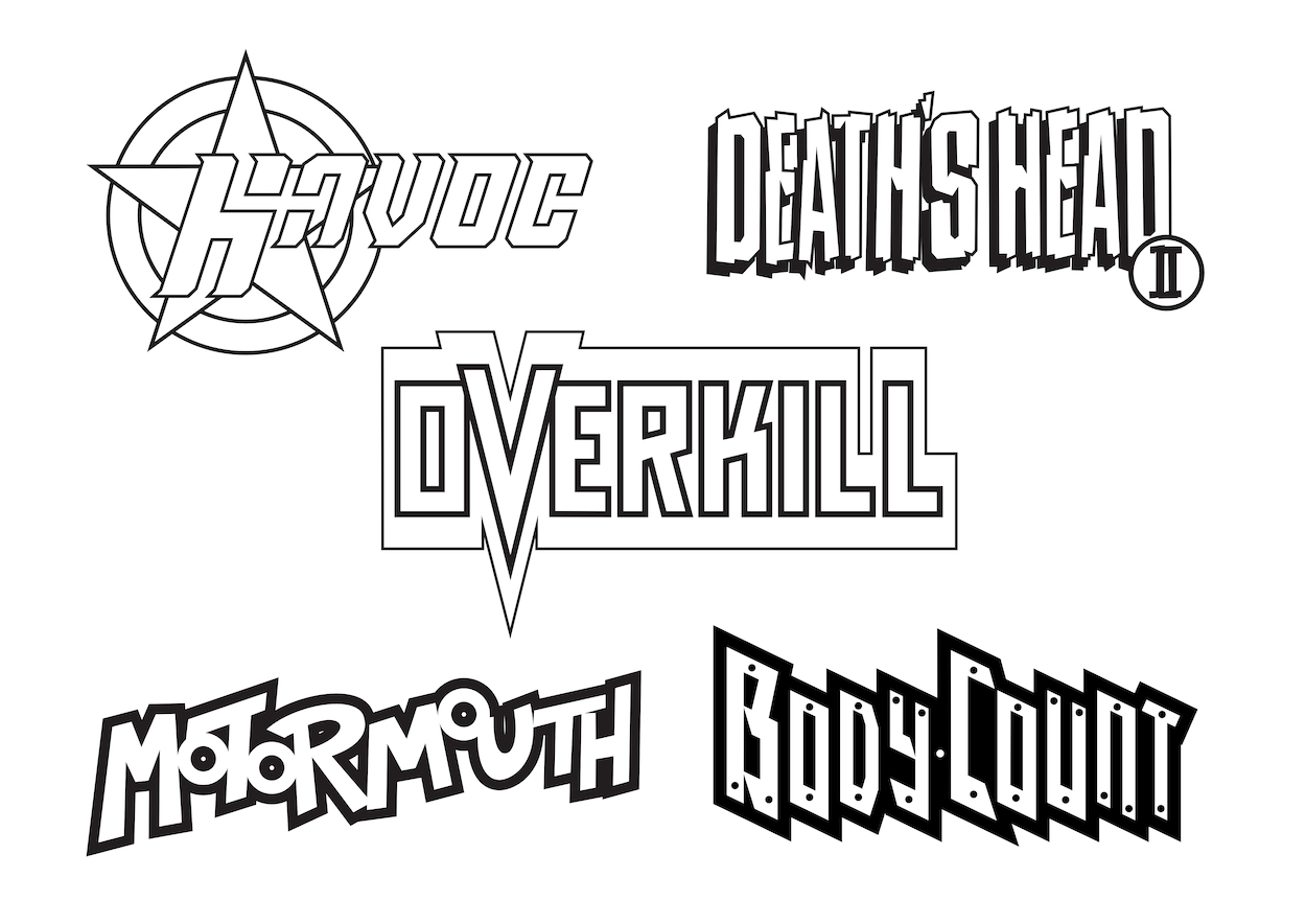
Havoc may not have lasted very long but it left a lasting impression, introducing me to characters I’d never previously heard of as well as giving me the chance to see the comic strip adventures of a favourite TV star. At the time of writing I’ve just finished a real time read through of the comic’s nine issues, during which I was able to have a chat with the person responsible for that terrific logo, Paul Chamberlain.
Paul is currently Creative Director at Pre-Flight Visual Communication Ltd, a company that seems to have designed pretty much every logo and front cover of every magazine I’ve purchased over the last decade! While chatting to Paul I discovered his inspiration behind Havoc’s logo, the other duties he took on and the string of MarvelUK and Fleetway Publications titles he contributed to.
OiNK Blog: So Paul, you created the logo for Havoc. Is there anything about the process you could share with OiNK Blog readers? For example, how did you get the gig?
Paul: It was spring 1991 and I had just returned from backpacking in India and Thailand. Before I went on my trip I had been working with Bernie Jay, the then partner of Paul Neary, at Headway Home & Law developing an idea for a monthly consciousness raising magazine. Headway Home & Law at the time was also the home of Fleetway who were publishing 2000AD and Bernie managed to secure me a couple of freelance jobs with them.
Upon returning from my travels, Bernie got in touch to ask if I would be interested in a bit of freelance work with Paul for Marvel UK. The first of these jobs was to design a logo for Havoc. I was working from home at the time and this was before the days of DTP (computerised Desktop Publishing – Phil) in comics so everything was produced by hand on a table in the corner of my bedroom.
OB: The Havoc logo is made up of a five-pointed star and there are five strips in the comic. Was this part of the design process or just a happy coincidence?
PC: Sorry to say it wasn’t quite as deep as that and just a happy coincidence. It’s difficult to remember my thought process at the time but I do remember having a thing for circles and stars. When I submitted the design to Paul Neary I do remember him saying that he liked it because it reminded him of a gun. I have to say that had not occurred to me during the design process.
I wanted the logo to have a slightly dynamic feel, hence the slightly italicised type. The original type design was very squared-off and blocky which didn’t sit very well with me so I decided to round off the corners slightly and add subtle serifs. A lot about the design was lead by the resources available to me at the time – Rotring pens, a ruler, set of compasses and a drawing board. As we used to do all our colour separations by hand everything had to have a strong black keyline so that this process would work properly.
The next job I did for him was to design the logo for Death’s Head II which was created in-house and I had the pleasure of sharing a studio with Liam Sharp as he developed the character visuals.
After that I was offered a full time designer post at Marvel UK where I stayed for an amazing three years before heading off back to India for more travels.
OB: After Death’s Head II what other titles did you work on for Marvel UK and what work besides logos did you do for them? Were there any Fleetway comics you worked on too? I was a big fan of both publishers at the time.
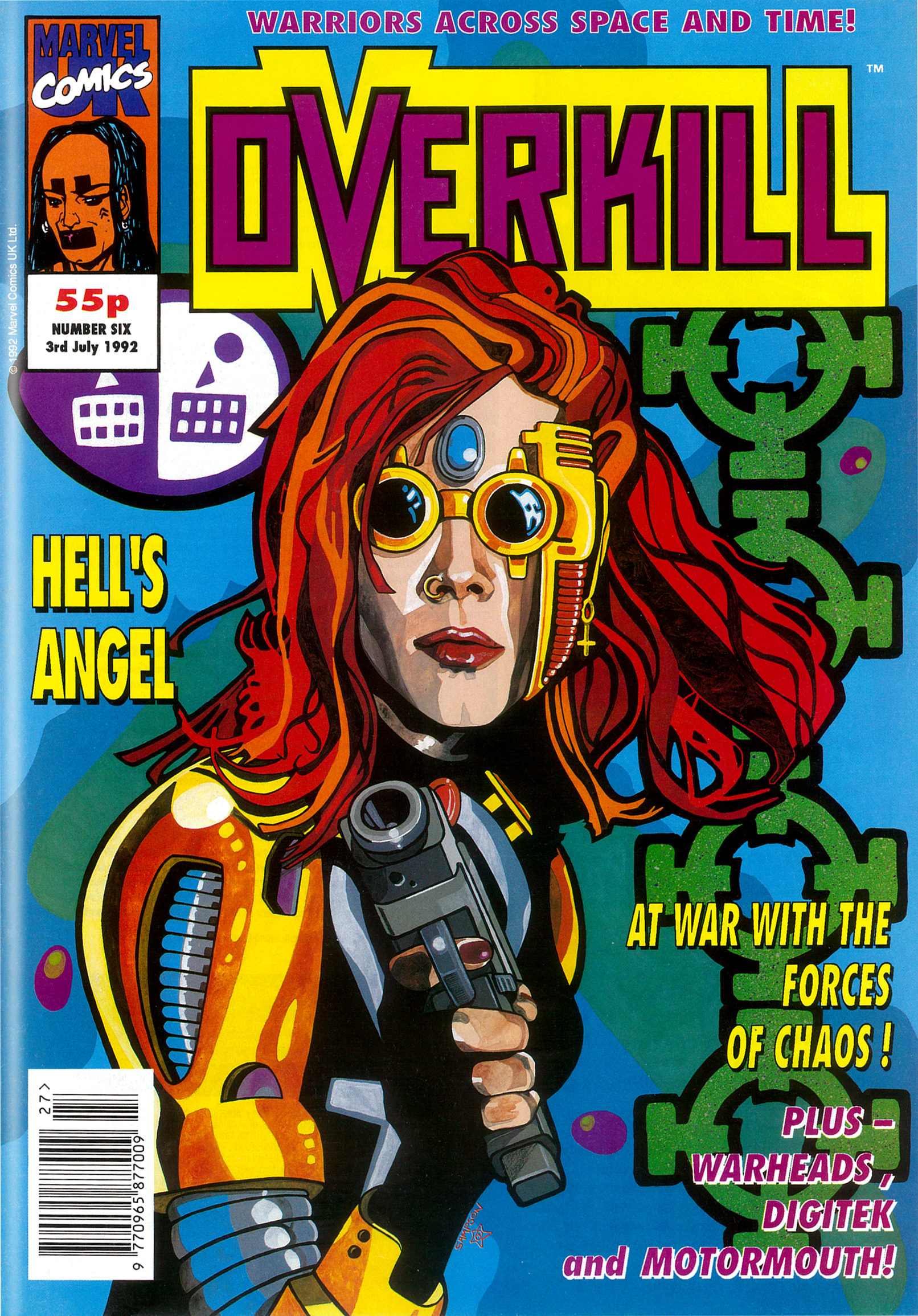
PC: So after Death’s Head I developed the first logo for Overkill and was Art Editor on that for some time. Along with another designer, Ed Lawrence, we became the design team for all the new superhero titles that came out of Marvel UK between 1991 and 1994 – Motormouth, Warheads, Hells Angel (which became Dark Angel), Super Soldiers etc. For Fleetway I produced the designs for The Judge Dredd Mega Collection with another designer, Colin Fox. Upon returning from my second stint in India I secured the post of Deputy Art Director at Titan Books where, amongst other responsibilities, I was the Art Editor for the official Lucasfilm Star Wars Magazine.
(Below, Paul’s favourite Overkill cover with art by Steve Sampson.)
OB: Wow, tthat’s a wonderful selection of titles, it must’ve been such an amazing time! I’ve always been curious, for an ongoing reprint comic what does the role of an Art Editor entail, after all the initial titles and pages have been designed?
PC: You are right. It was odd coming from a consumer magazine background. It was mainly covers and house ads. With the reprint stuff there was some resizing of artwork and new title pages if it was a longer story being broken down. For the graphic novels and collections there were also end pages, chapter dividers and the likes.
OB: Ah right, of course, all those American strips being chopped up into parts in the UK comics. I also noticed new opening panels for some of the Havoc strips so would those have been you, creating them and resizing the original art around them, yes?
PC: As designers we wouldn’t be creating new art but definitely resizing and re-laying out. That would be the kind of thing, but I think Gary Gilbert was responsible for the ongoing design duties for Havoc (like the contents, letters and Eye Level news pages).
OB: Thanks so much for the chat Paul and the insight into one of my most fondly remembered comics.
PC: No problem Philip, anytime.
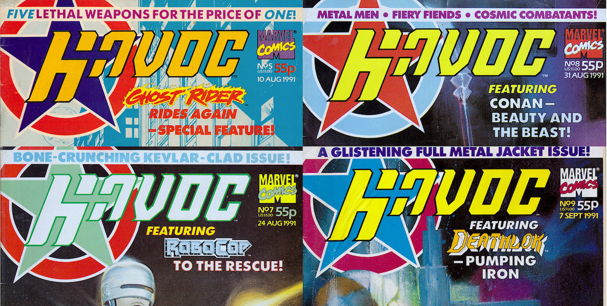
Above is the complete Havoc collection with its many variously coloured logos. To read all about this wonderful comic and begin the real time read through just click here.
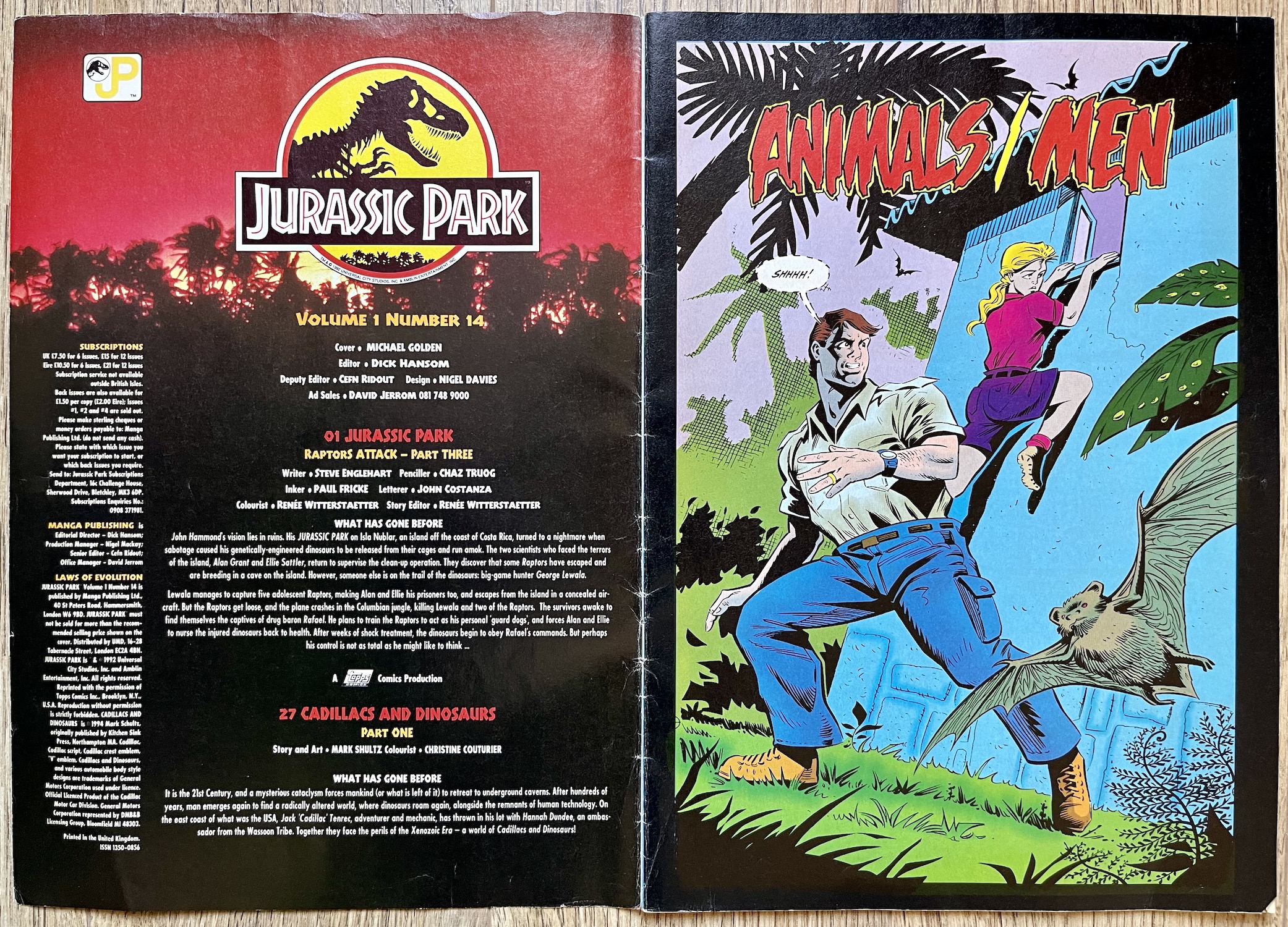
It’s all change this issue as Dark Horse International has now become Manga Publishing. The UK arm of Dark Horse had gone out of business but the success of its Manga Mania comic and the rapidly growing interest in the UK for the art form saw a purchase of the titles and a rebranding across them all. (The company changing hands could account for the delay between #10 and #11.) I’d assumed all their comics were cancelled by the end of 1994 but Manga Mania (at #15) would carry on all the way through to #39. Jurassic Park wouldn’t be so lucky.
But at least this temporary reprieve enabled our comic to reach a decent ending point in #16 instead of just stopping on a cliffhanger (I’m looking at you,Havoc!). Michael Golden’s cover would’ve been better suited to last month’s issue but it’s still a striking image, even if it’s somewhat disappointing to lose that distinctive border on the left. You’ll notice ‘Cadillacs and Dinosaurs’ is mentioned, is this a new back up strip? Not quite, as you’ll see below. Finally, the mysterious free gift mentioned last issue ended up being temporary tattoos, long lost to the mists of time.
The contents page retains its atmospheric design and still offers up subscriptions so the plan must’ve been (initially at least) to carry the comic on for some time to come. In reality, the boast of “Now With Extra Pages” on the cover meant we were up to 40 pages which, while a good increase over the previous three, is only four more than we had in the first ten issues. It does mean we now get a full chapter of the American story per issue though, with the aforementioned back up bringing up the rear.
There’s now a whopping 26 pages of Jurassic Park to enjoy but it’s still listed using the name of the US mini-series comic it was taken from, rather than the name of the story itself. This was confusing because we were unaware of the mini-series’ name, so to the uniformed (like me) it looked like laziness on the part of UK editor Dick Hansom, like he didn’t check what the strip he was printing was called. As you’ll see over the course of this and the next two issues, Animals/Men was the beginning of a trilogy of stories, the title of each a variation on this theme.
It feels very much like the Jurassic Park movie had been given a cartoon makeover in the same way Ghostbusters had with The Real Ghostbusters
As you can see the art team has changed. Steve Englehart is still the writer of this official sequel, John Costanza is still letterer and Renée Witterstaetter remains as colourist and story editor. However, joining them are penciller Chaz ‘Atlas’ Truog (Green Lantern Corps, Animal Man, Coyote) and inker Paul Fricke (The Fly, El Diablo, Secret Origins). At the time I was a little disappointed in the change from the more scratchy, hard-edged artwork but nowadays I absolutely love this.
Even Renée’s colouring appears to have changed to suit the new style, boldly coloured backgrounds highlighting each frame. The cartoonier style put me off initially as a teenager but it did grow on me. Today, it feels very much like the Jurassic Park movie had been given a cartoon makeover in the same way Ghostbusters had with The Real Ghostbusters. It’s great. It’s a lot more animated and dynamic, and as you can see having better defined facial features means our characters now actually look like cartoon versions of the actors.
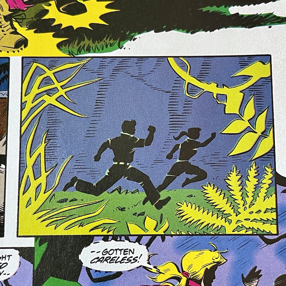
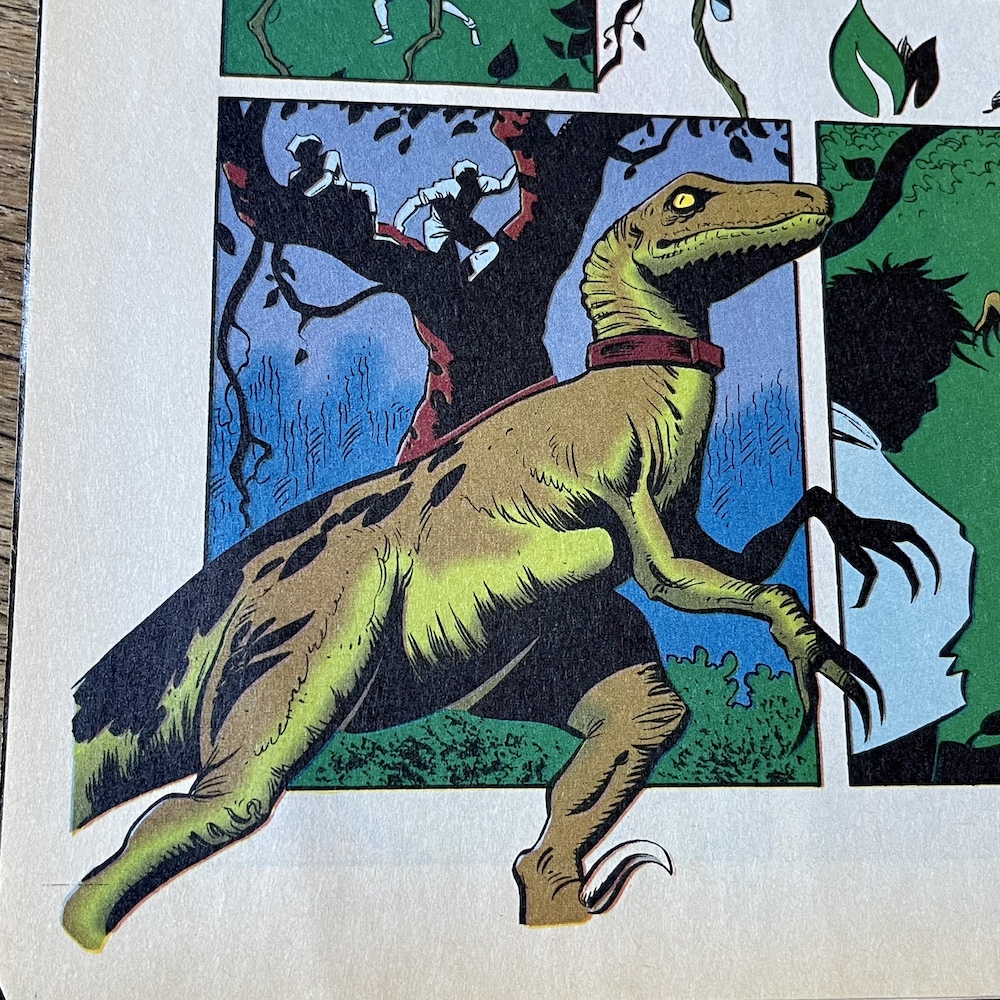
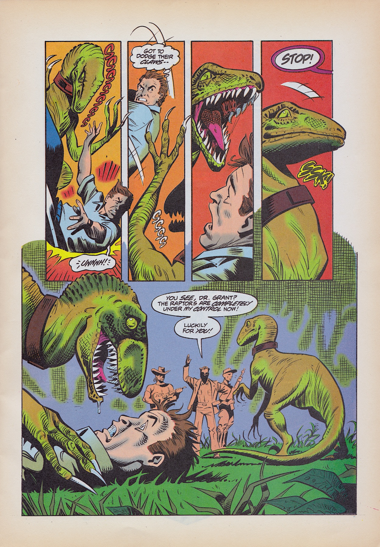
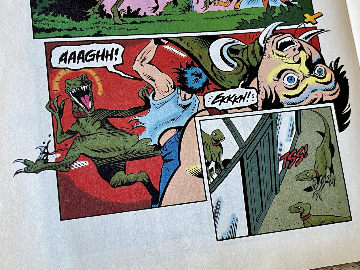
Drs Ellie and Alan Grant attempt to escape from Rafael’s compound deep in the Columbian jungle but accidentally set off a hidden alarm, in response to which Rafael immediately unleashes his supposedly trained Velociraptors. Trying to escape their reach up a tree, a vine Alan clings to is grabbed by one of the ‘raptors and suddenly he finds himself flat on his back, exposed and an easy target. That is, until Rafael catches up.
During the attack we find out Alan and Ellie have named the dinosaurs. The alpha is called Alf, the beta is Betty and the injured ‘raptor who is still within her cage is Celia. If this rings a bell you’re not alone. Much later in Jurassic World, released 21 years after this comic, Owen Grady named his four Velociraptors after the second to fifth letters of the alphabet too (Blue, Charlie, Delta, Echo, with Owen as the ‘alpha’). Was the movie inspired by this comic, or was it just a coincidence? Either option is likely.
Having game warden Robert Muldoon alive and well is just stupid
Ellie and Alan are ordered to return and look after the injured Celia, who continues to let Ellie do so, knowing she saved her life. But our doctors think if she wasn’t restrained they’d be on the menu. They’re very aware of how they’ve romanticised the dinosaurs’ place in nature, but they’re still killers. This leads on to a dark scene in which one of Rafael’s men suggests they take it in turns raping Ellie to relieve their boredom and he’s immediately shot and killed by his boss, telling his men to feed him to one of the ‘raptors, so he clearly wants his creatures to maintain their taste for human flesh. But why?
Then, after all the action, tension and interesting story developments the strip unfortunately takes a turn for the absurd.
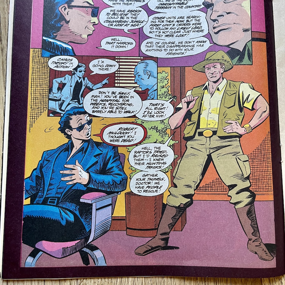
Even as a teenage reader I didn’t find this to be the thrill it was hyped as on the cover and my opinion hasn’t changed since. Having game warden Robert Muldoon alive and well is just stupid. Remember that “clever girl” scene in the movie? He looks awfully healthy after that, doesn’t he? What elaborate explanation is given for him surviving a Velociraptor jumping on top of him and apparently eating his head? He raised them. I hate this. Not only is it ridiculous to think he survived but if he did it completely ruins that whole scene in the movie.
According to #10Ian Malcolm had to spend months in a hospital after his injuries but Muldoon gets the kind of return we’d expect from a superhero comic that finds some trick to retcon a character’s demise. I remember feeling let down by this but thankfully it isn’t dwelled upon beyond this one page (for this issue anyway) so we can get back to the meat of the story which is much, much better.
“It seems ‘raptors can remember a kindness”
Celia’s training commences but she isn’t cooperating. She responds to commands but doesn’t go for the head of the human-like hay dummies like the others, instead biting an arm or leg, never going for the kill. The ever-paranoid Rafael thinks it’s a trick but we’ll find out the real reason soon enough. Meanwhile the government’s leader is planning to announce new indictments against him in the murder of dozens of law enforcement officials, and the next day as the judges leave the courthouse a van pulls up and out of the doors rush Alf and Betty!
During the attack an electrical cable is damaged which zaps one of them. As the two animals looks quizzically at the electrical sparks they come to realise something and they run off. Rafael’s men can’t take control, somehow the ‘raptors realised the collars were no longer being controlled, the broken power lines causing interference. Free of their painful, torturous shocks they immediately run back to free Celia, taking out with relish the men who previously had all that power over them.
They kick in the large metal doors holding their sister and in no time at all everything has changed. Rafael had thought he was in control, but during the execution of his own plan something unpredictable happened and within minutes all three of the dinosaurs are free to roam and hunt, killing Rafael and the remainder of his men as they unsuccessfully try to shock them into submission once more. Another perfect example for Ian Malcolm’s Chaos Theory.
We see Celia wince from the shocks, but the others’ collars no longer work well enough to stop them. When Alan and Ellie come out to see what’s happening and make their own escape they’re cornered by the three ‘raptors. Alf and Betty prepare to pounce, after all these two humans are just another part of all this, but in a surprising moment Celia steps up to stop her sisters, even though she isn’t the alpha herself.
I remember this aspect of the story. Celia stopping her sisters from attacking Alan and Ellie would resurface and emphasised (once again) how the Jurassic franchise treats its dinosaurs as real animals rather than simple movie monsters. Was this also why she wouldn’t ‘kill’ the hay dummies? Does she no longer see all humans in general as prey? Either way, it’s clear the ‘raptors saw Rafael as a means to an end, to get out of the compound to freedom. The sly looks at each other and the development of their own characters over previous issues now clear with hindsight.
This was even before the Tyrannosaurus rex got off Isla Nublar to run amok through San Diego looking for his baby
The story ends on a superb cliffhanger as they take off into the jungle; three Velociraptor out in the wild, on the loose! Of course, this is now the conclusion to Jurassic World: Fallen Kingdom and the starting point for the final film in the series, Dominion, but this was published in 1994. As a teenager this was even before the Tyrannosaurus rex got off Isla Nublar to run amok through San Diego looking for his baby in The Lost World: Jurassic Park, so I can’t emphasis enough how excited I was for the next issue back then.
Despite the unnecessary return of Muldoon this was a hugely enjoyable adventure strip for Jurassic Park and one of the best so far, reading like the proper sequel to the original film it was intended as. It’s certainly a worthy follow up, continuing to build upon its story month after month and now, with the new art style bringing a freshness, a larger sense of excitement and better representations of the characters, I’m looking forward to seeing where it all leads.
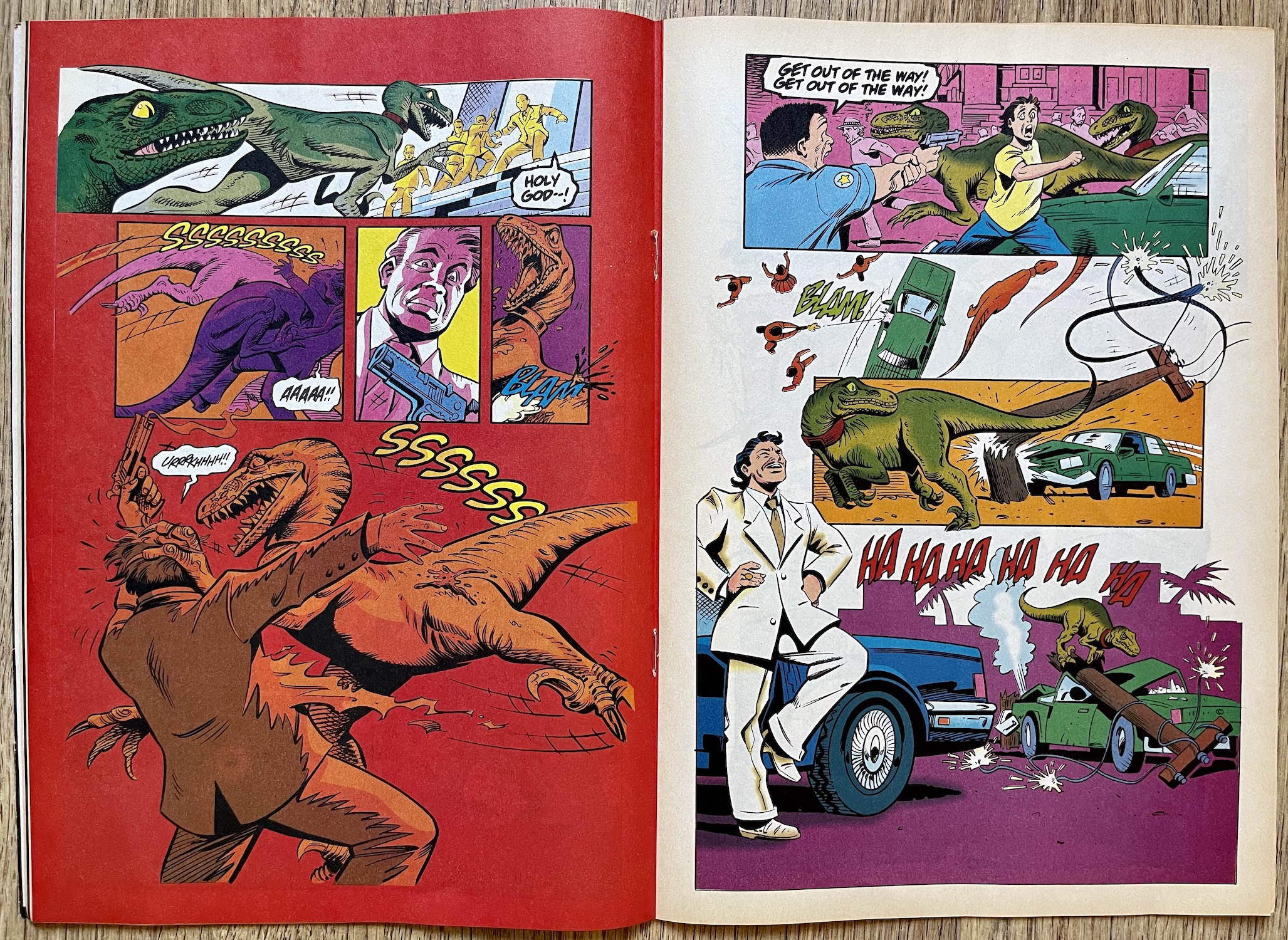
After a huge chunk of dino action the issue is rounded off with Foundling, our nine-page back up Cadillacs and Dinosaurs strip. A quick glance at the first page will show regular blog readers this is actually Xenozoic Tales (second back up in six issues from #4) under a new name. The Cadillacs and Dinosaurs cartoon series was based on creator/writer/artist Mark Shultz’s cult comic and had just started broadcasting on the Cartoon Network in the UK, so while the strips were still the same, the cover and contents page changed the name to try to entice fans of the cartoon.
Christine Courtier is back on colouring duties and, while I miss Steve White’s colours, in an episode told mainly in flashback Christine’s darker, more atmospheric palette perfectly suits the story. Again Jurassic Park is selective about which stories from the original comic series to reproduce (page count could be a major reason) and in this case we jump forward to #6 of Xenozoic Tales, missing out a handful of tales from the last time we saw Tenrec and Hannah.
“I could feel his hot breath on my neck, then he galloped past me as if I wasn’t even there.”
Hannah Dundee
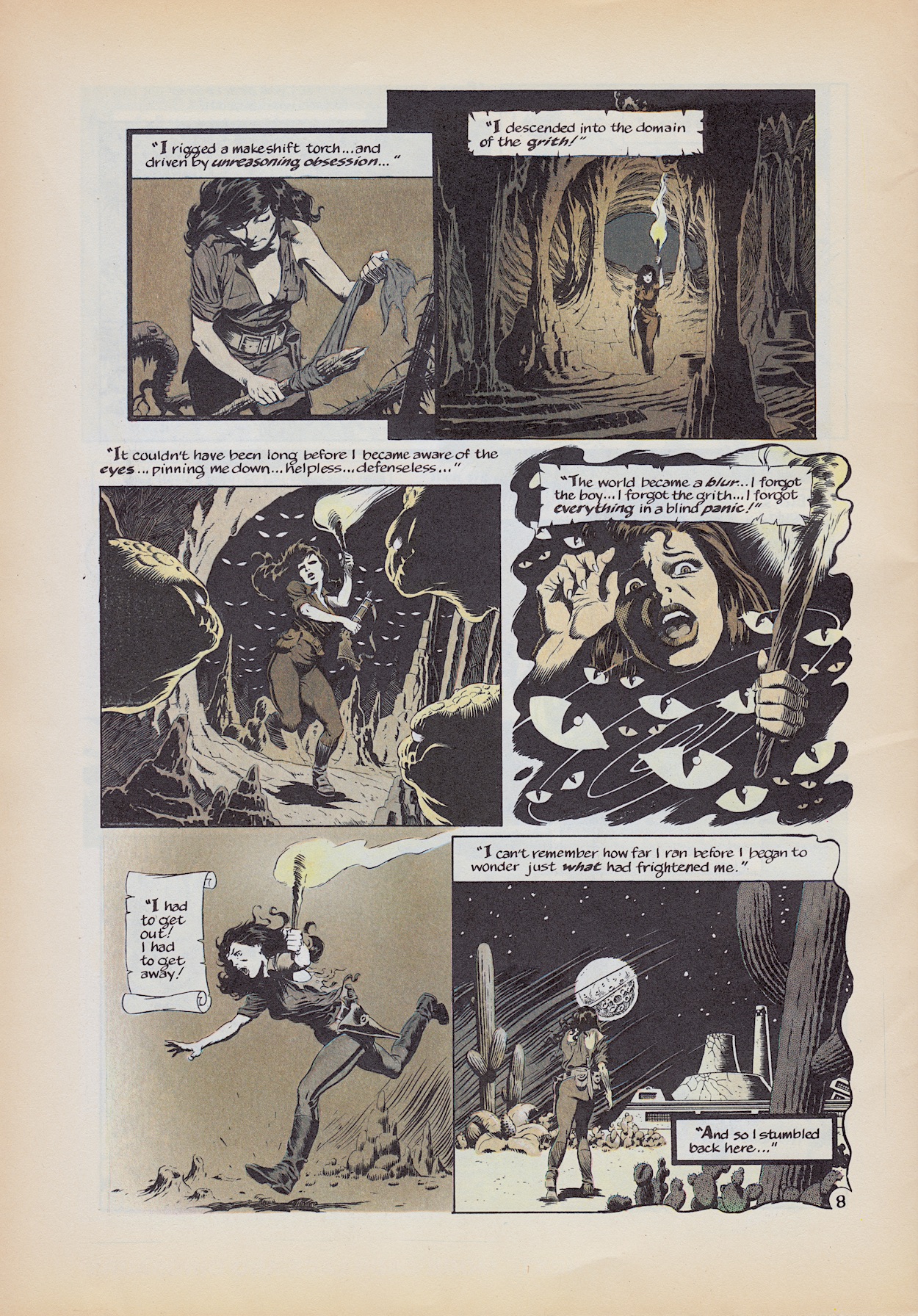
At points the story is actually a flashback within a flashback. Hannah is telling Tenrec about Maia Abrelatas, a lady whose son went missing years before when he was only three-years-old. She’d begged the governors to renew the search but they’d refused and Tenrec apparently just looked on as they did so. Within this flashback we flash back again to the time when the boy went missing out the back of her home. Later they’d found hyena tracks and blood and concluded he’d been dragged inland, where it was too dangerous for humans in this future world populated by dinosaurs.
Back to the original flashback and Hannah went out to track him after Maia saw him at her window. The governors dismissed this claim but Hannah found a child’s footprints and tracked them. She was almost about to turn back after a day when she eventually found him. Unable to speak, the boy instead drew words using stones, each letter inside a square. This instantly reminded Hannah (and me) of the Grith using Scrabble tiles to communicate with Tenrec. Just like them the young lad can understand her but can’t speak.
Above, the dinosaur that charged her was just a distraction (she does comment how this was strange for that animal) because she then lost the boy in the think forest, spotting him latter with the Grith far off in the distance. Continuing to track them to the entrance of a cave the scene below is terrifically designed by Mark, full of atmosphere and thrills. The story ends with Hannah confronting Tenrec, his association with the Grith and apparent nonchalant attitude earlier leading her to the conclusion he knew about the boy all along.
It turns out the Grith saved the boy after he was mauled by the hyenas and raised him, but now they can’t let him return home because he knows too much about them, even thinks like them. However, he’s at that age where his curiosity is putting him in a dangerous position as he tries to find out more about his origins, so the only solution is for them to take him far away from his mother and for Tenrec to continue the lie. What started out as another adventure strip ends on this heartbreaking reveal, which is a complete surprise.
Then, so it doesn’t end on too much of a downer the last two panels reveal all that horror faced by Hannah was actually the Grith trying to make sure she found her way back home, all finished off with Tenrec being his usual, casual self and asking about food. I’m sure any child buying the comic after watching the cartoon would’ve got a bit of a shock at the tone and the mature storytelling. As a Jurassic Park comic reader this is a great return to the unique and original Xenozoic Tales, no matter what name the editor gives it.
The last three pages are all advertisements, beginning with the latest issue of Manga Mania which I mentioned earlier and the first issue of a new comic based on the Street Fighter II videogame which was all the rage. I saw this and thought that couldn’t have lasted long but I was wrong, Manga Publishing in the UK released 16 issues altogether, the same as Jurassic Park in the end. I know which one I thought deserved to run longer though.
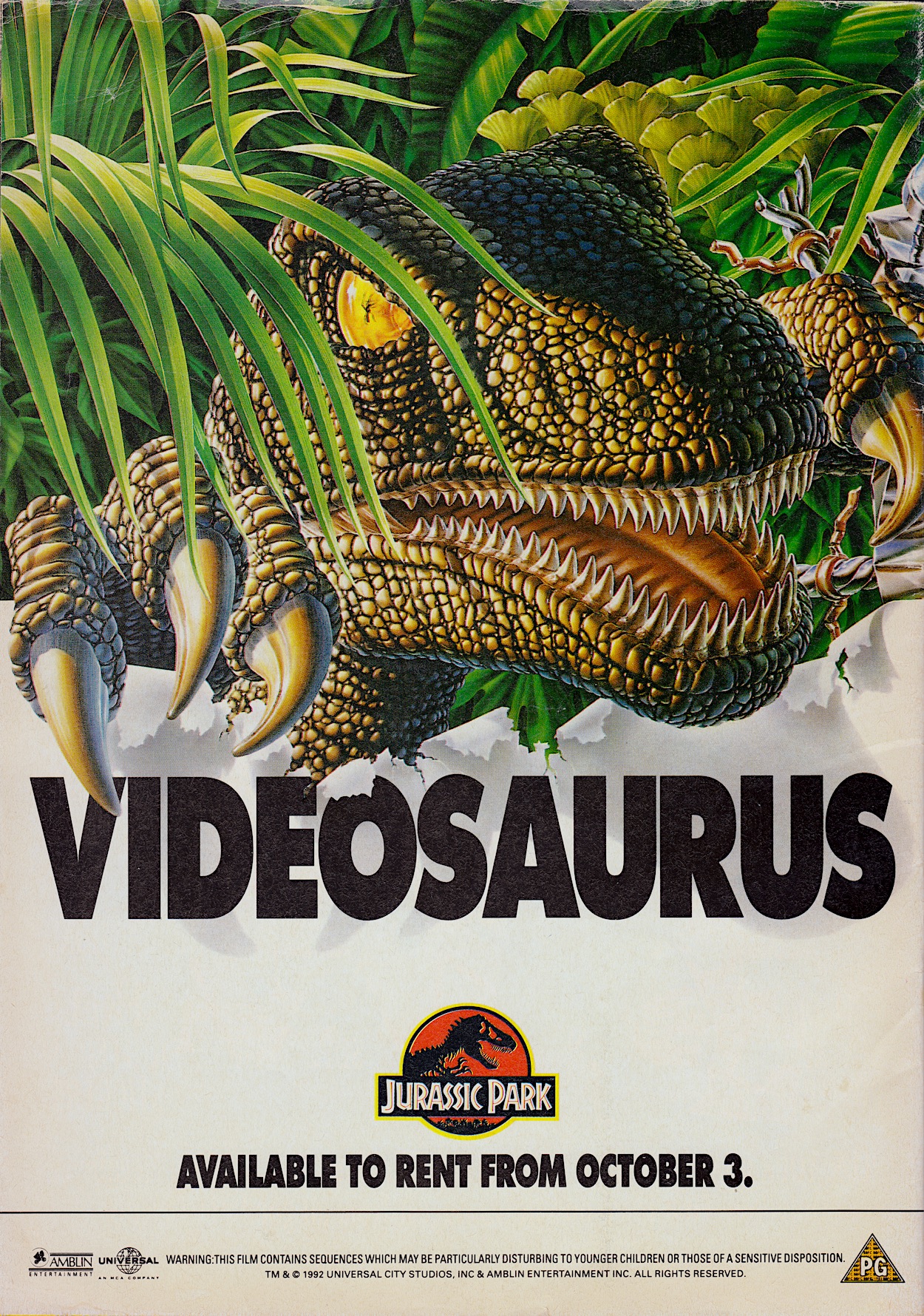
Finally for this month there was big news for fans of the movie on the back page.
I love the way the Velociraptor‘s eye is made to look like the amber that was so important to the film’s plot. Even though I visited our local rental store every single Saturday (because it was closed on Sundays you had the tape for twice as long for the same price) I never rented Jurassic Park. The reason was simple, I knew I was getting it for Christmas to own so I wanted to wait for my own copy before seeing it again for the first time since the cinema. So I waited (im)patiently instead.
While getting a much lengthier main strip was exciting I still prefer the comic’s three-strip format. To this day my favourite issues belong in that first handful after the sequel began in #6. But with hindsight, knowing we’ve only two issues left I’m very glad it changed so we could get three more full stories before the rug was pulled. The next of those stories will be reviewed inside Jurassic Park #15 on the blog on Thursday 6th October 2022.
PercyPlop isn’t wrong, although while the comic would present the changes as a result of a temporarily crazed editor in reality they were permanent. With Fleetway Publications now having bought IPC Magazine’s comics they decided to publish all titles on the same paper stock, which meant a good upgrade for the others but a downgrade for OiNK. I didn’t complain though, which I’ll get to soon, and the theme for this issue was a stroke of genius.
A bit like when the skeleton staff made a hash of #8 this issue sees some strips printed upside down, others drawn by the wrong artist, some are coloured incorrectly and other such randomness occurs. Some strips, even if they don’t have something deliberately ‘wrong’ with them, seem more zany than usual, which is saying something for this comic. Jon Langford’s cover may not be the best the comic ever had but this is one of the very best issues as a whole.
So what did the team think of the physical changes and did Fleetway enforce any other alterations? “We were all disappointed initially with the changes but, fortunately, it didn’t dampen our spirit so it was ‘business as usual’ producing the best content within our means,” co-creator/co-editor Patrick Gallagher told me. “Though the publisher changed from IPC to Fleetway, Bob Paynter still held his position as Group Editor and it was him we were answerable to, with the same amount of creative freedom as before. It was still fun to produce.”
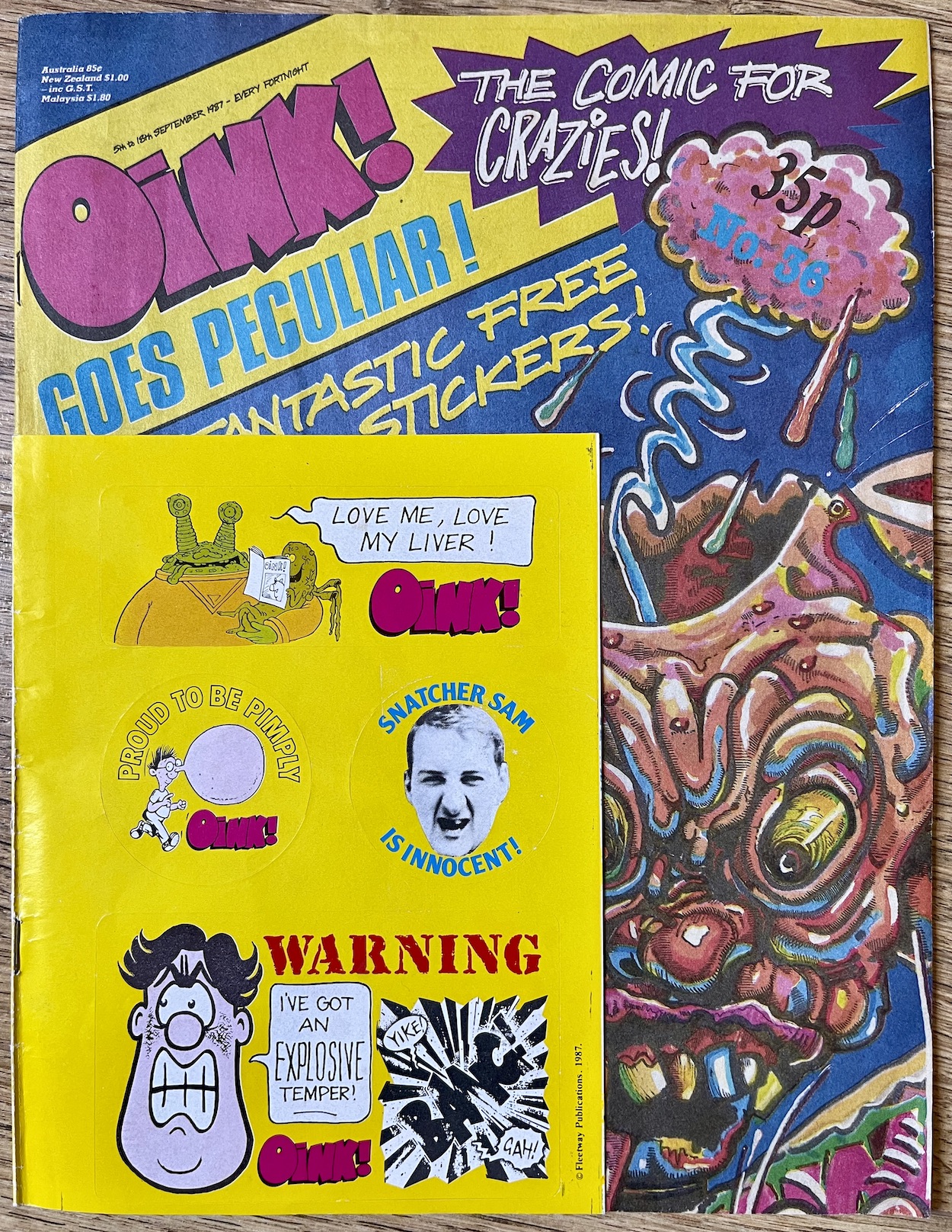
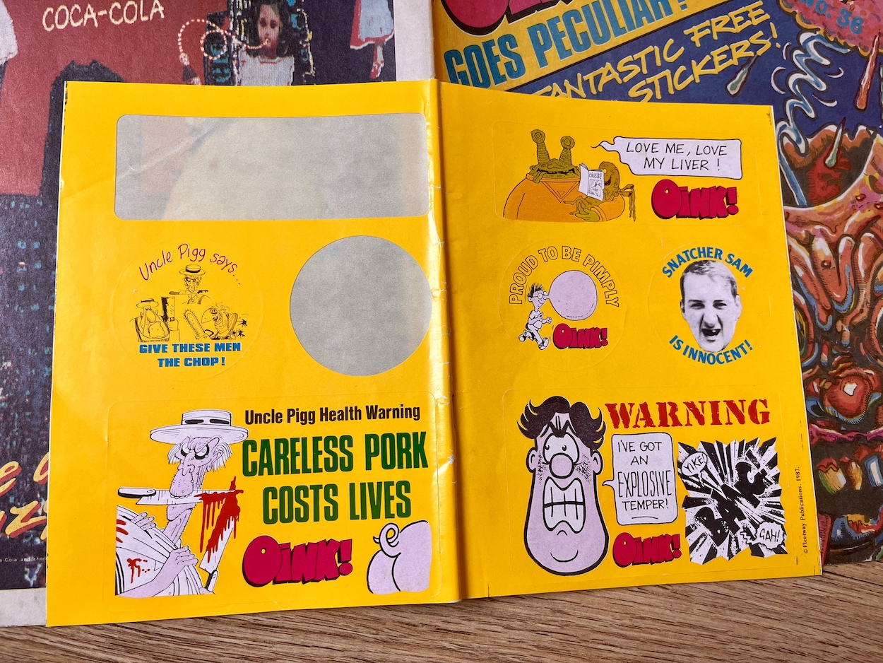
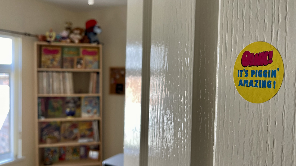
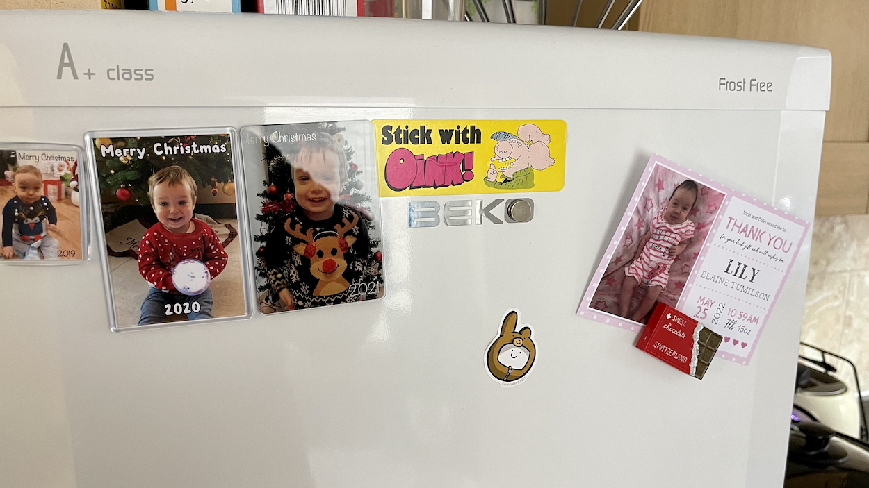
Maybe to soften the blow for fans of the glossy paper (now on thicker matt stock, slightly thinner in width) or maybe to publicise it for new readers as the publisher pushed their new purchases, this and the next two issues had these fun stickers which ended up all over my house as a kid (and on my fridge and home office door as a 40+ year-old). The logo shifted up into the corner in a colourful banner and this too would be kept, although initially shifted about and resized from issue-to-issue, emphasising the random nature of OiNK.
“The logo change,” continues Patrick. “We were running short of pink ink so we decided to reduce the size of the pink logo to economise.” Typical Patrick response, that. “Only joking. I think we just wanted to experiment and give more room to the cover illustration, knowing we could always change back to the bigger logo, which we ultimately did.” That would happen when OiNK went weekly in the new year. I really enjoyed the way it looked over these issues though and it did indeed give more space to some fantastic covers, as you’ll see soon.
So what was the comic’s reason behind the sudden changes we readers found in our hands?
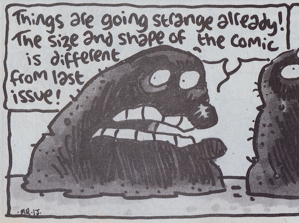
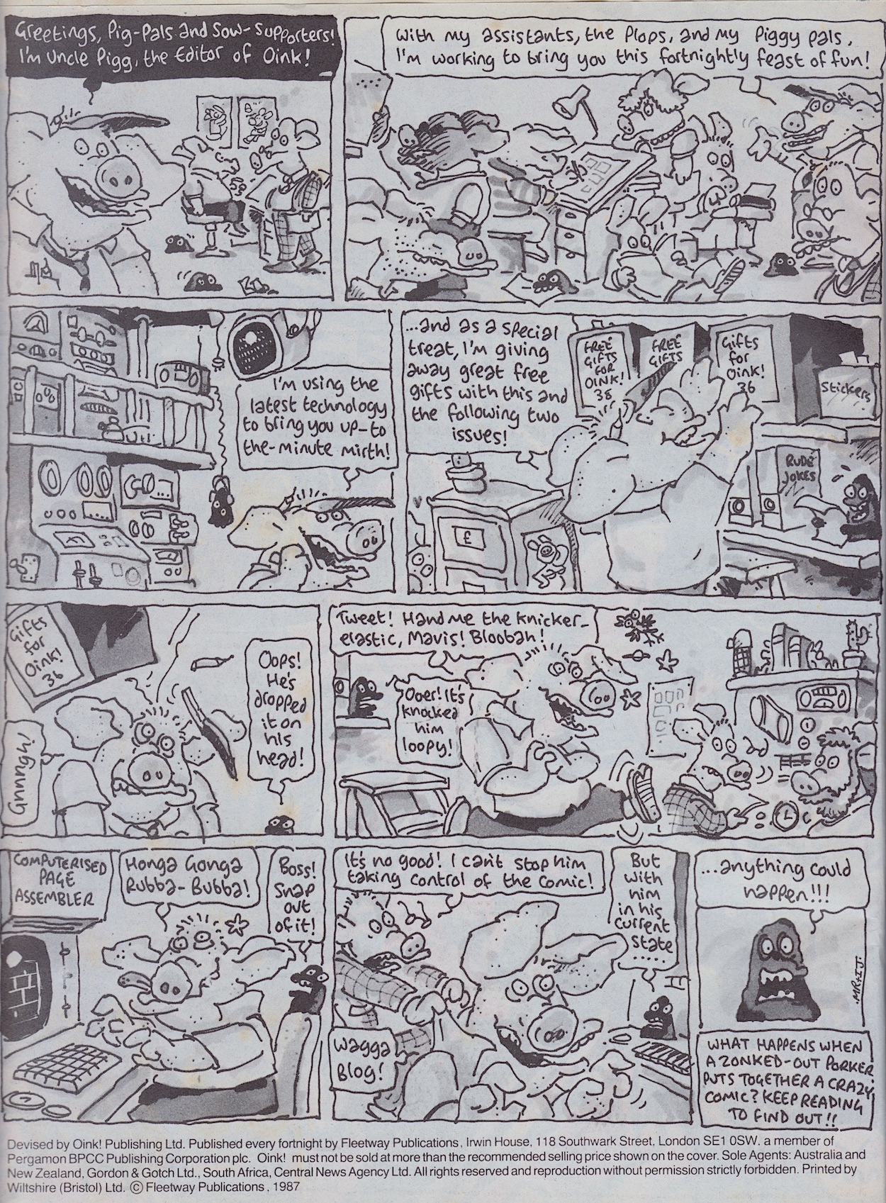
Written by Mark Rodgers and drawn by Ian JacksonUncle Pigg introduces himself to new readers the way he did in the soft relaunch issue, #15 (which also gave away the first of three free gifts). This normally happened when a comic got a new look, something I enjoyed every time it happened with Transformers, for example. It’s understandable and didn’t detract from the strip for established pig pals. As Percy says in that final panel anything could happen, and everything did! On the very next page is an upside down strip, along with the image of Percy I showed at the top of this review, commentating on the new paper.
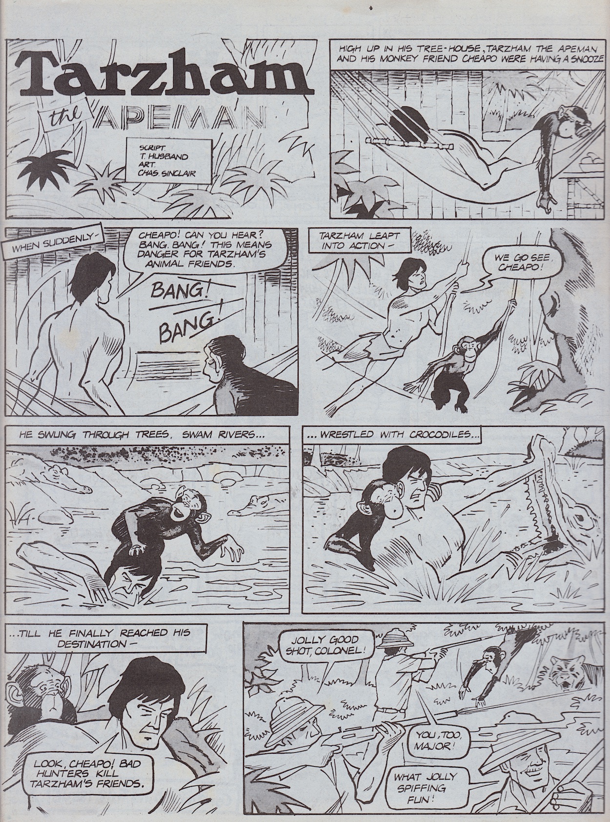
We’ll get to possibly the craziest strip OiNK had produced up to this stage in a minute but first comes something of a spiritual successor to last issue’sArctic Adventure, although I’m sure it’s more of a coincidence. Either way, Tarzham the Apeman is a fantastic, funny strip I just had to include. Written by Tony Husband and drawn by Chas Sinclair, the same winning partnership behind semi-regular Lashy the Wonder Pig, it’s another tale taking shots (no pun intended) at cowardly animal hunters.
Tony is a huge supporter of animal rights and conservation, often sharing his opinions on hunters on social media in his inimitable style, using funny cartoons to make his point. I think the first speech balloon on the second page sums up those sorts of people, and the solution to the problem not only highlights the stupidity and greed of hunters but it genuinely made me laugh out loud. The ending is similar to Simon Thorp’s last time but both strips work so well I’m glad we got both.
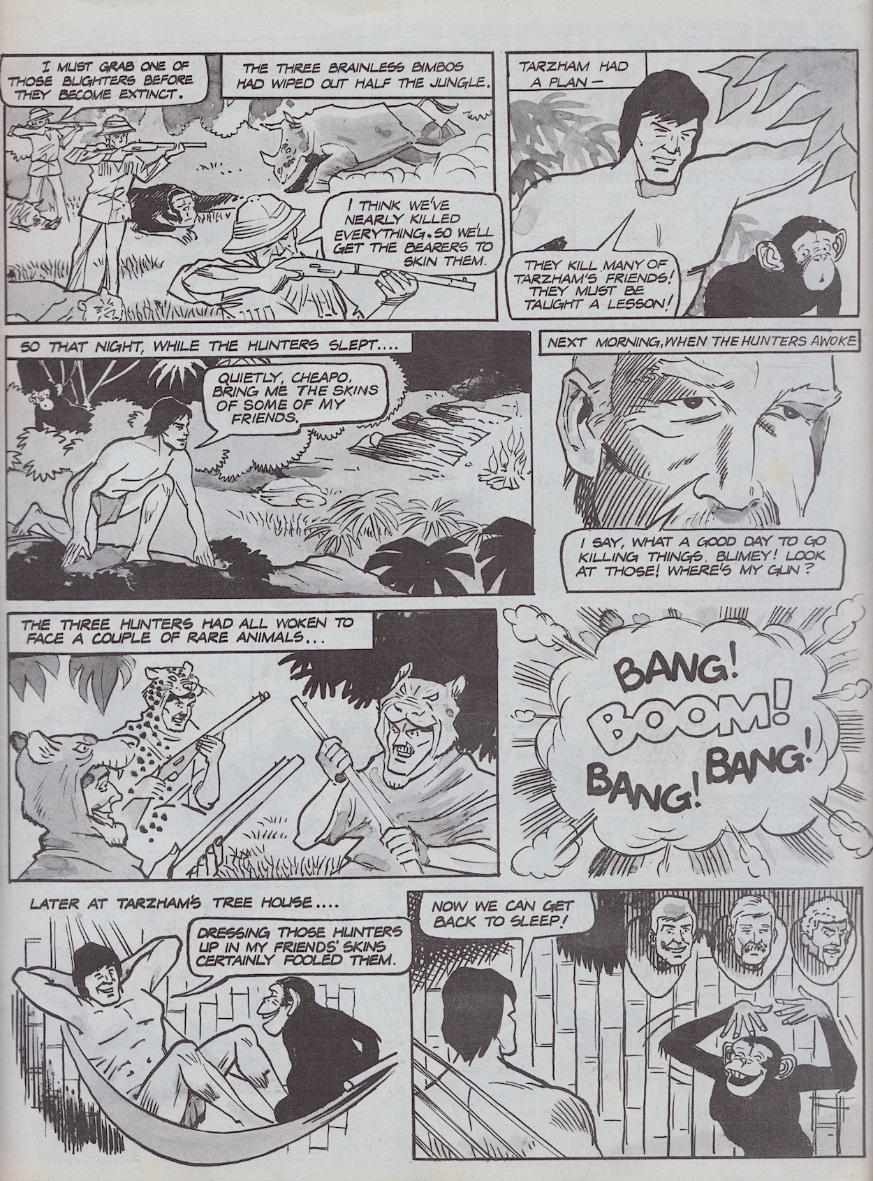
Contributing to 40 issues of OiNK altogether, Ed McHenry would become best known for two particular things: his regular strip Wally of the West, a character I thought was in OiNK a lot more than he actually was (in reality only appearing in 12 and not until #53) and OiNK’s quiz pages, examples of which I’ve shown in the reviews for #6 and #12. However, we also enjoyed a selection of one-off characters from Ed, such as The Loon Ranger and his horse Radish.
Strips like these from Ed would become more regular during this period, yet another reason why this is my very favourite period in OiNK’s run. Below this is a quick three-panel Hadrian Vile which is a bit strange for one of the comic’s main characters. The excuse given is that the crazed Uncle Pigg ate Hadrian’s diary but in reality the next chapter in his story would perfectly fit the next issue’s theme instead, so for this issue a quick stop gap was needed so they could postpose his strip until his three pages next time. There’s also a tiny Frank Sidebottom strip about the end of the school term, apparently printed ten months too early according to the note underneath.
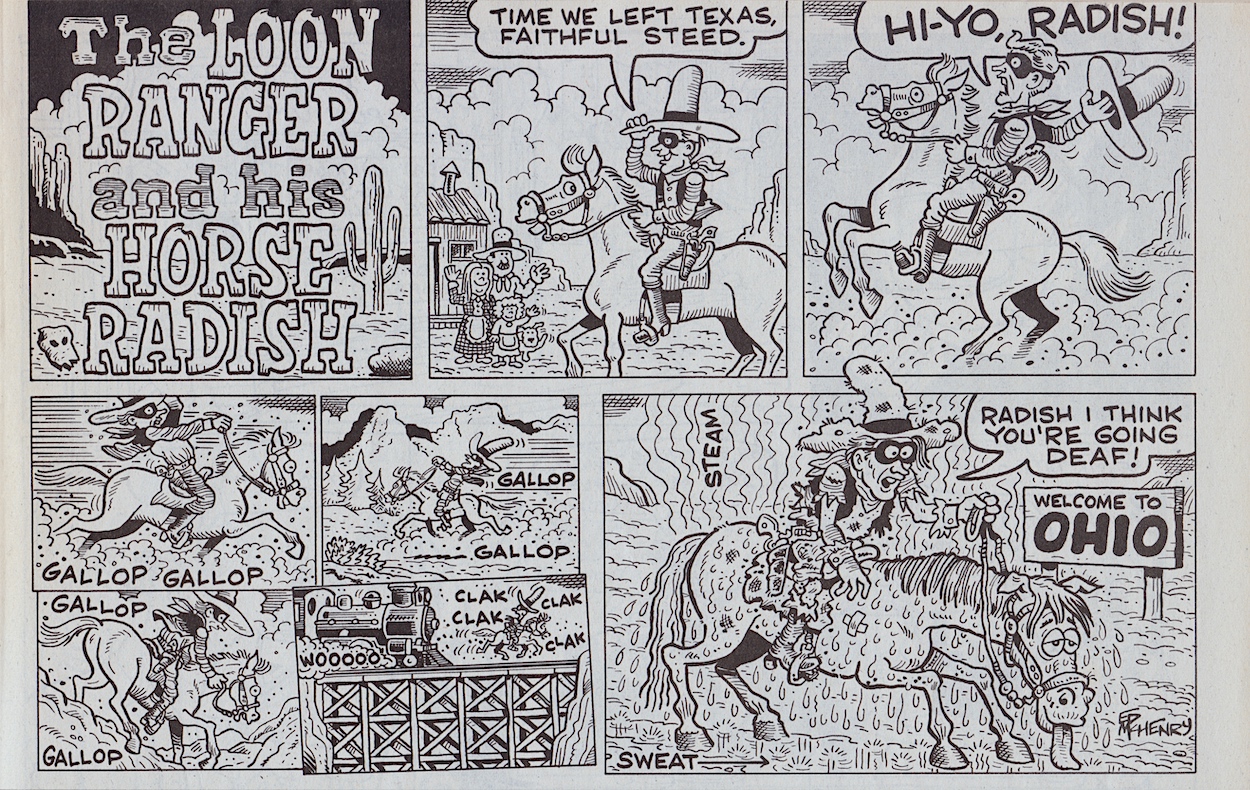
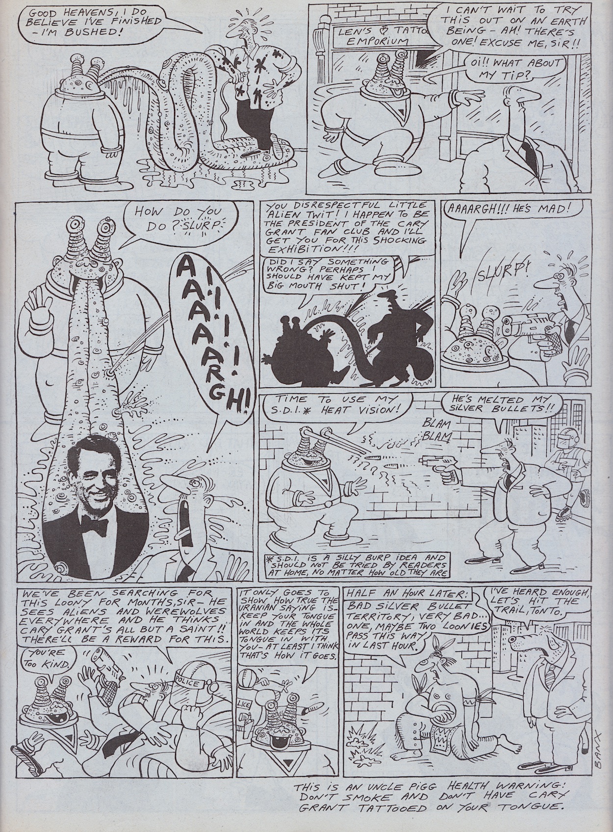
If all that sounds crazy you haven’t seen anything yet. Jeremy Banx’s strips are known for their surreal humour and random daftness. He’s always able to take a ludicrous idea that really shouldn’t work and turn it into pure comedy gold. Already peculiar on a regular basis, how could a Burp strip stand out in an issue themed around being peculiar? How about a story involving him wanting a Cary Grant tattoo on his meters-long tongue? This includes a panel that I never forgot after seeing it. I’m sure you’ll be able to tell which one.
Funniest moment? Oh that’s far too difficult to narrow down. How about a tattoo parlour having a free trial offer? Or the tattooist’s blank eyes and small balloon text as he reacts to what he’s just been told? The way he straddles Burp’s tongue, or even shouts after him for his tip? Already hilarious, already weird, already daft, somehow Jeremy is able to ramp it up even more in those final panels, cramming in so many insane moments you feel like you need to catch your breath while reading it.
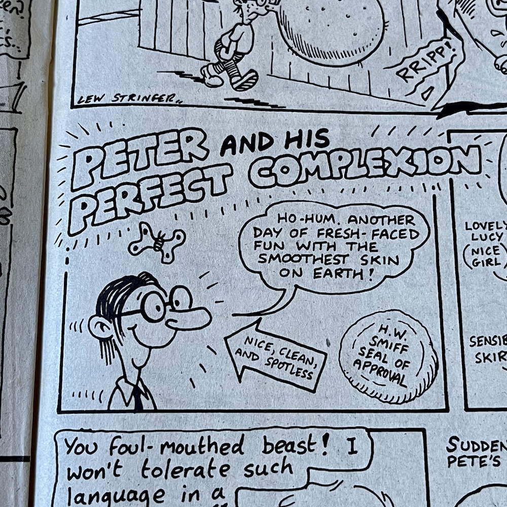
I do like the seal of approval on Pete’s strip, a little dig at W.H. Smith
Both of Jeremy’s regular strips, this and Mr Big Nose had a knack of surprising us with endings that just came out of nowhere, and while completely random, out-of-nowhere end gags can sometimes fall flat in other comics this was never a problem for Jeremy. He nailed it every single time. This next handful of fortnightly OiNKs would see Burp’s strip regularly expand to two pages with some of the best strips the comic as a whole ever produced! I can’t wait to see them again.
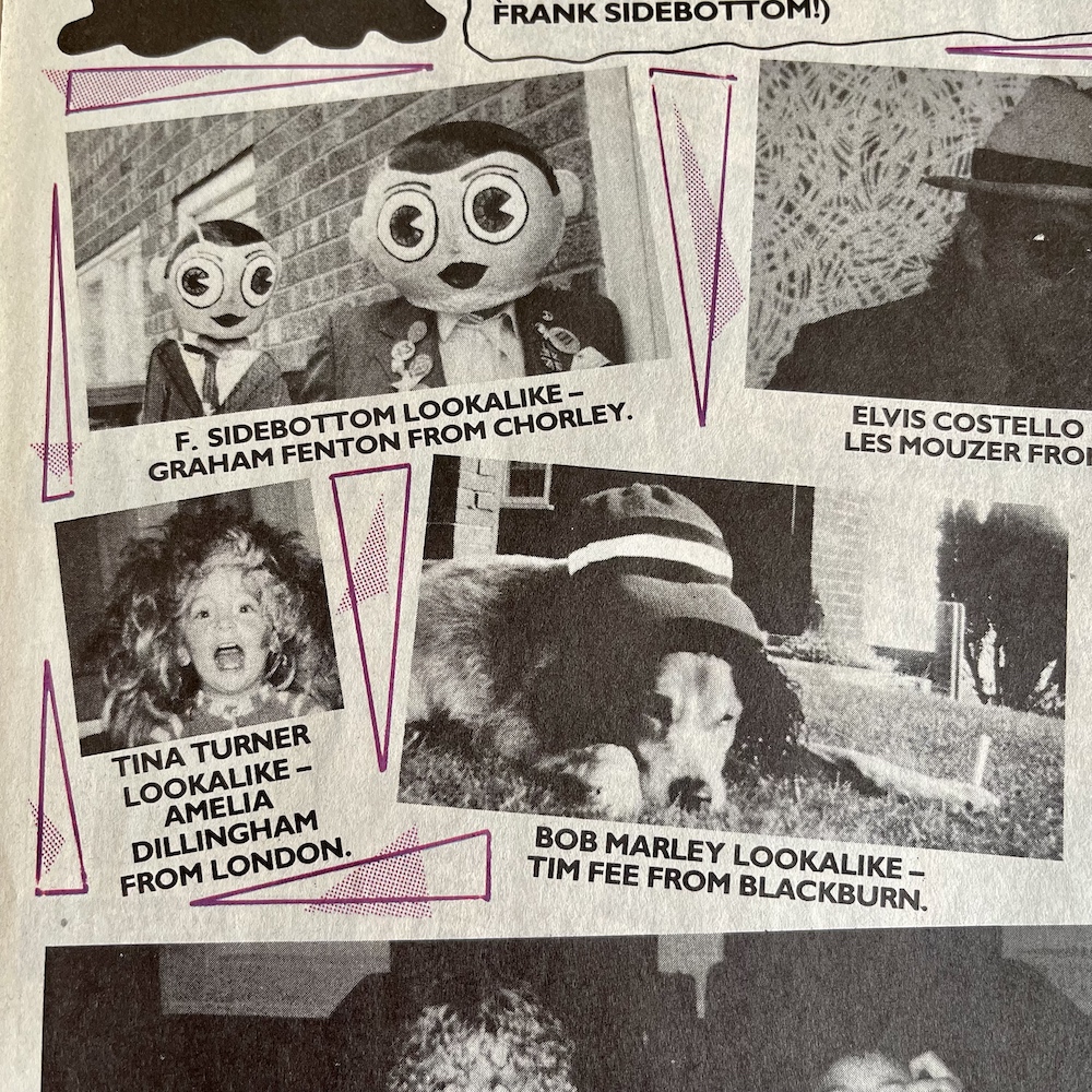
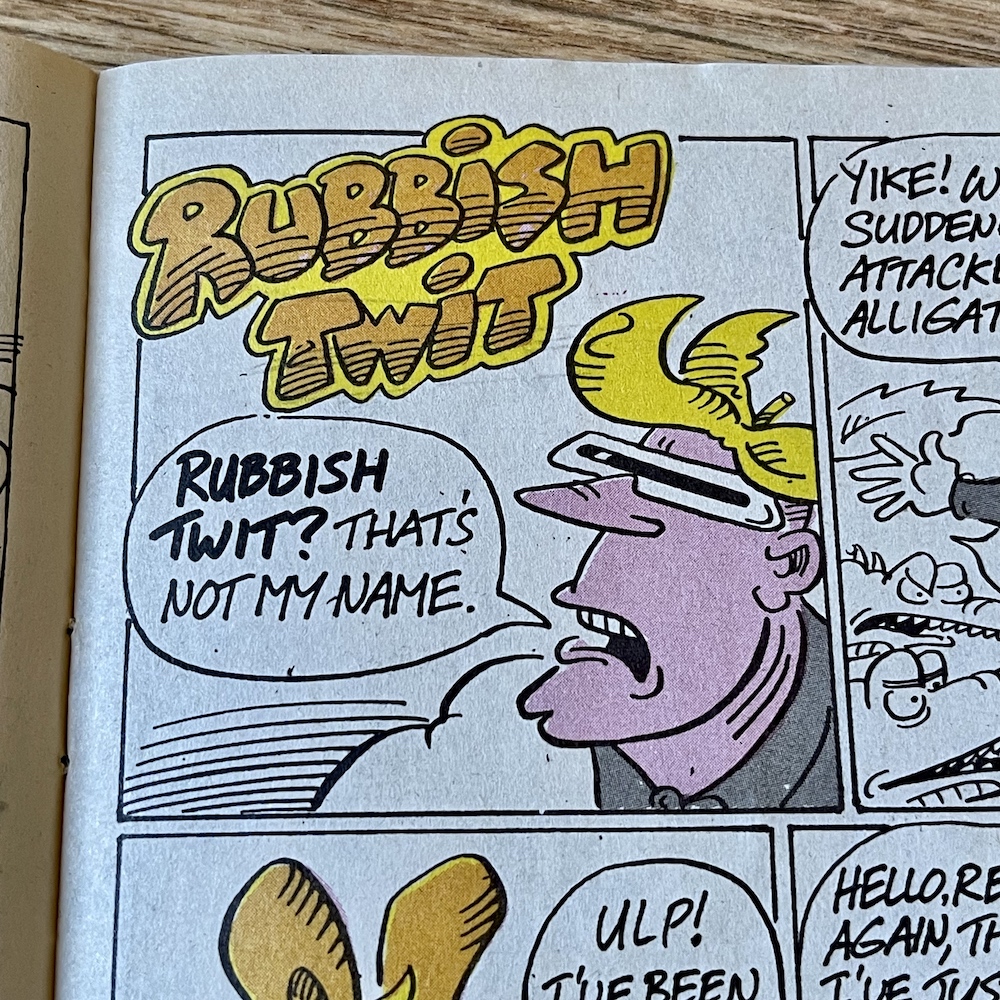
A quick look at some other highlights before we move on. On the Grunts letters page there’s a quick glance at a new piece of merchandise coming very soon indeed and the results of #27’s Pop-Star Lookalike Contestwith Frank Sidebottom had a particularly fantastic entry from reader Graham Fenton and blog reader Tim Fee. Elsewhere, both Rubbish Man and Pete and his Pimple are victims of the issue’s peculiarities, although I think Rubbish Man came off worse. I do like the seal of approval on Pete’s strip, a little dig at W.H.Smith moving OiNK to the top shelves due to just two complaints.
Grunts compiled by Patrick Gallagher Pop Star Lookalikes compiled by Chris Sievey Rubbish Man by David Haldane Pete and his Pimple by Lew Stringer
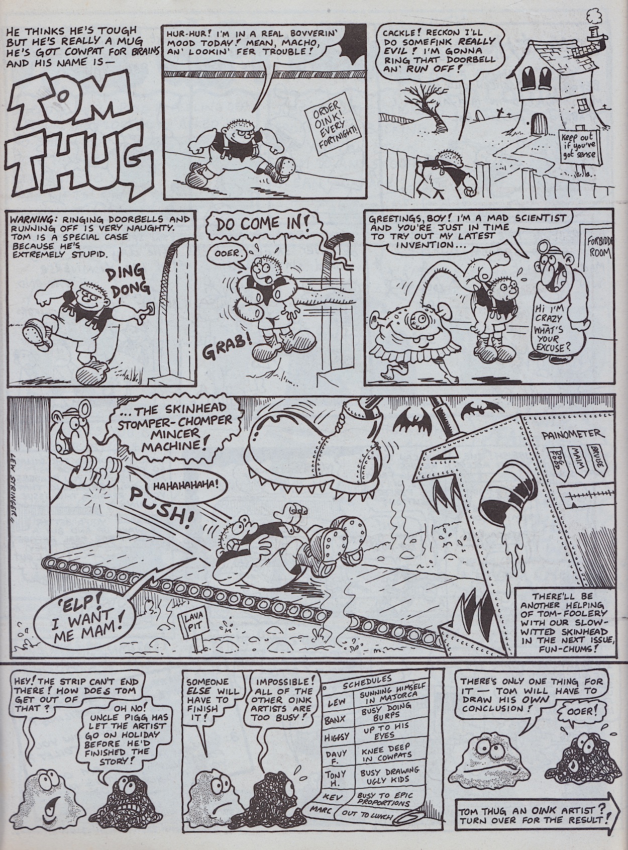
Our smelly alien isn’t the only person to get two pages this issue. Lew Stringer’s Tom Thug gets to enjoy a bit more space to cause bovver in. I’ve mentioned before how OiNK’s high quality, glossy paper stock not only allowed gorgeous painted artwork, the black and white strips could also benefit from intricate shading, Lew in particular applying grey washes to his. While the paper from this issue onwards was a downgrade, it was still a cut above the newsprint OiNK’s contemporaries had been using up to this point.
“The quality of print on the matt stock paper was pretty good,” Patrick told me. “In my view it gave it more of a retro comic feel and warmth, which I liked.” I concur. While the gloss was lovely, and the plan was always to have the Holiday Specials use it, I really liked this paper but was struggling to articulate why until Patrick described it like that. This high grade matt was capable of the same techniques Lew had always been using, but you’ll notice its conspicuously absent from Tom’s strip.
“Yes, I think I expected it to be like newsprint so I avoided doing a grey wash on the strips until I saw that it was a better grade of paper than I thought it would be,” Lew explained too me. “I thought it was a shame the paper was downgraded from glossy but that wasn’t the first time budget cuts had affected a comic so it was inevitable I guess.” Lew would return to his usual style pretty quickly and we’d see OiNK’s most popular character shaded once more.
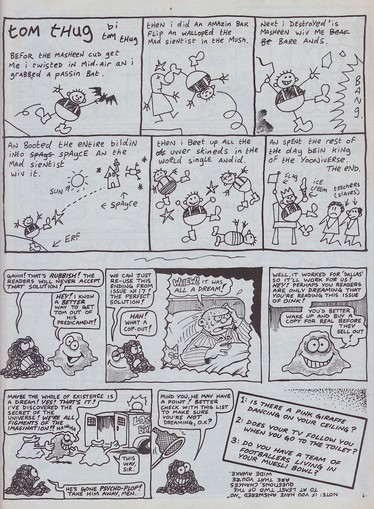
But what about the rest of that story? Well, Banx’s strips were great when he’d pull a conclusion seemingly out of nowhere but above it appears crazy Uncle Pigg giving the cartoonist a holiday, forcing him to rush the ending of Tom’s strip, has had the opposite effect. Our editor’s assistants The Plops have no choice but to allow Tom to finish his strip himself. Well that’s just inviting disaster, isn’t it?
My favourite bit is the fact the re-use of a panel from #17 (the previous Christmas issue no less) is an actual reprinting and not just Lew drawing it again. Go and check out that previous issue’s review to compare them if you don’t believe me. An ingenious strip and giving Tom two pages in an issue set up to attract new readers was a great idea, seeing as how popular he was (and would be in Buster for years to come).
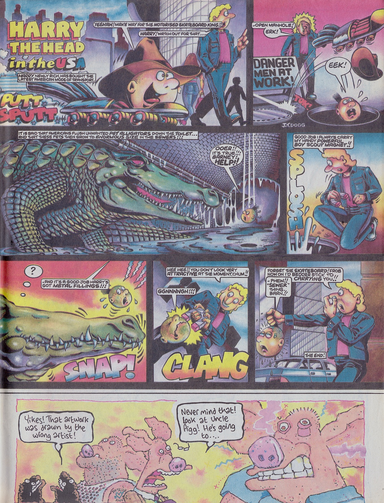
Underneath Lew’s Pete and his Pimple strip were a couple of plops drawn by Ian Jackson who, along with some bad (as in groan-inducing) spotty puns, commented on everything that was going wrong with the strip. They appear throughout the comic, getting increasingly worried about what’s happening right up until we get the delight of seeing Harry the Head drawn by J.T. Dogg.
Normally drawn by his creator Marc Riley, we’ve become used to seeing Harry in Marc’s simplistic but energetic fashion, so to see him rendered by Malcolm Douglas (J.T.’s real name) like this is a sight to behold. There’s no writing credit but I think it’s safe to assume Marc would’ve still been responsible for the script. Oh, and that little image at the bottom leads to Uncle Pigg exploding on the next page!
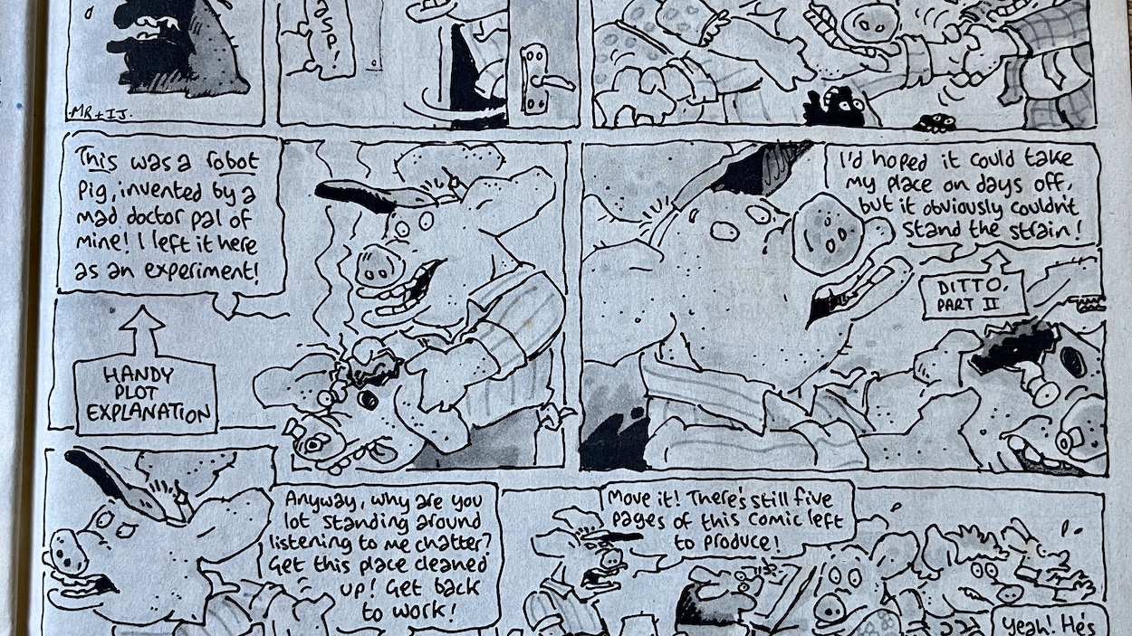
Well, sort of. When he blows up screws and metal bits and bobs come flying out and the real Uncle Pigg soon reappears to explain with some “handy plot explanation”.
What an issue! It’s been an absolute delight to read this one again, it’s more than held up to the fond memories I had of it from 35 years ago. In fact, I can remember walking back from the newsagent with it in hand in 1987. Walking very fast actually, because I was thrilled with these exciting changes to my comic and couldn’t wait to see what this would mean on the inside. (I’m sure the stickers helped quicken my pace too.)
“Fat! Floppy! Fun! The biggest news ever for pig pals!”
A fabulous start to OiNK’s Golden Age (my own term, see here for more on that) and one of the best all round issues so far. It feels brand new again, like a fresh start in the same way #15 did. Also, all the best issues are the ones with a strip continuing through the comic in fun and original ways, such as #3‘s Star Truck and our editor again in the festive #17. The next edition is the Happy Families issue and I remember the fun Mike Higgs cover, the cut-out game and most of all the three-page Hadrian Vile strip!
You’re going to get sick of me saying this over the next few months, but I can’t wait for the next issue. Speaking of looking forward to things, the inside back cover finally revealed what had been hinted at for months. So that’s me looking forward to Christmas now too!
The review of OiNK #37, the Happy Families issue will be published on Monday 19th September 2022.
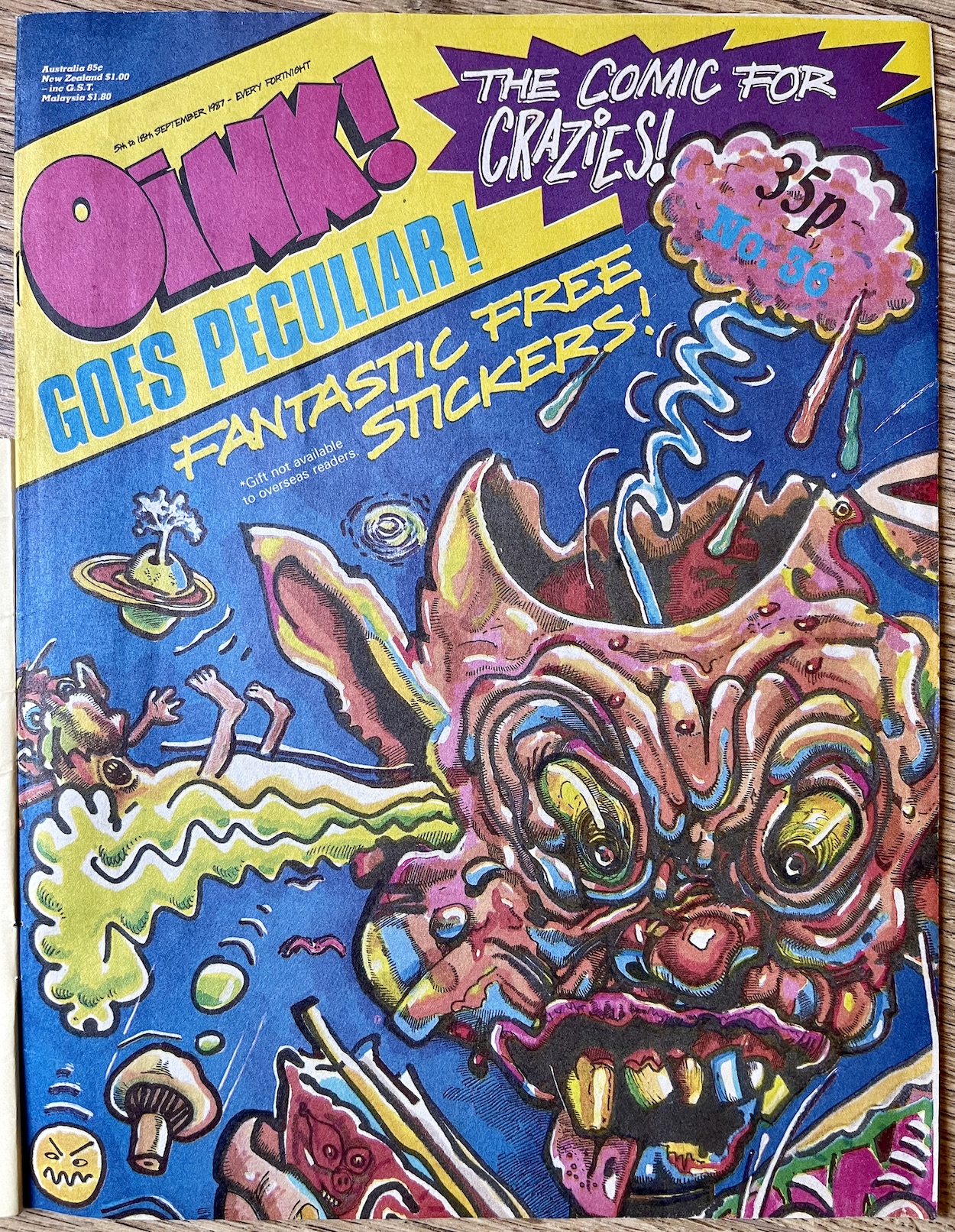
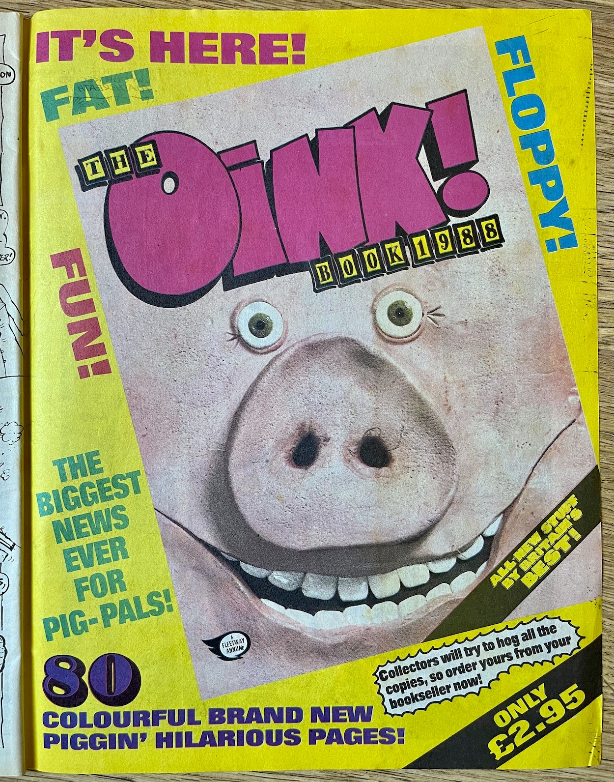
A few days ago I published a blog post called ‘OiNK’s Golden Age’ where I explain I believe the issues that make up the rest of this year are the very best of OiNK‘s run. It all kicks off with #36, the OiNK Goes Peculiar issue! New paper, new size and a new cover design signal the beginning of the time I’ve been looking forward to since I started this real time read through in April 2021, and to celebrate Uncle Pigg even gave us some free stickers.
Both promos by Patrick Gallagher
The issue itself is one of the best OiNK produced with highlights including the craziest Burp yet, Tom Thug taking control of his own strip and J.T. Dogg bringing his art style to a character you wouldn’t expect. I’ve distinct memories of this issue and many of the ones to come between now and the end of the year. To say I’m excited for this would be a massive understatement. Let’s hope it lives up to those memories! You can find out in the review, which will be here from Monday 5th September 2022.
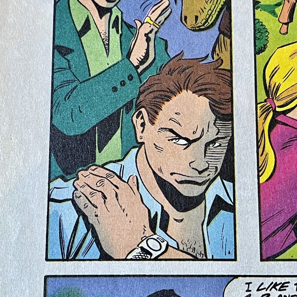
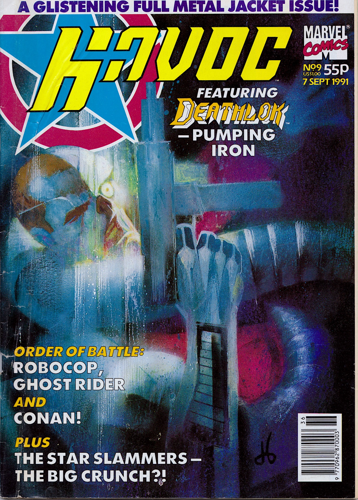
This just isn’t fair. That’s how I felt during September 1991 when #10 of Havoc failed to appear, the comic unceremoniously cancelled without so much as a note to the readers. This issue continues on as normal with cliffhangers and ‘Next Issue’ promos as well as hints of what was yet to come. Clearly pulled after it went to print, Havoc was the latest in what felt like a long line of comics I’d committed to which ended up the same way. Now having enjoyed the series 31 years later in real time I’m left with that same feeling of unfairness as I finish off #9.
If you look at the cover date you’ll see the next issue was due 7th September 1991. With #1 arriving as soon as the school summer holidays had begun, #10 would’ve been the first after the next school year began, Havoc’s brief run perfectly wrapped up in the holidays. When I returned to school I found out several of my friends had also been excitedly collecting it and we ended up sharing our disappointment in its disappearance.
Goodbye Havoc, it’s been a blast and you deserved better
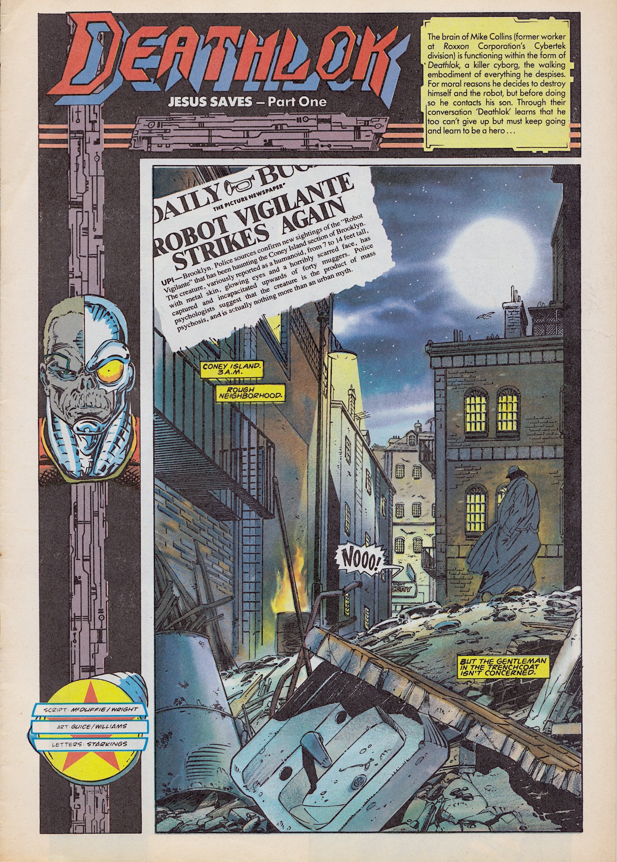
None of the included strips saw a conclusion and two new stories actually begin here, such as the first for Deathlok after Michael Collins’ origin story. Even though it’s the beginning of a new tale we still got a catch up banner to bring new readers up to speed, something no other ‘Part One’ received. Jesus Saves adds new talent with Scott Williams (New Mutants, Superman Unchained, Batman: Hush) joining as inker with Gregory Wright now only writing, and Paul Mounts (Fantastic Four, Friendly Neighborhood Spider-Man, Ultimates) as colourist, although he goes uncredited here. Joining Gregory on writing duties is co-creatorDwayne McDuffie, pencils are by Jackson Guise and lettering by Richard Starkings.
Nice use of the Daily Bugle there, as ever doing what any tabloid does and using exaggerations and shock journalism to strike fears into its readers, with the almost mythical rumours of Deathlok reported as fact on the front page, something Spider-Man fans will be all too familiar with. I’d never read a Spider-Man comic at this point in my life so was completely unaware of the Bugle being a part of the Marvel universe. Through this the strip also establishes our setting as Coney Island.
The Jesus the title refers to is Jesus Badalmente, a homeless man who would end up becoming a roommate and companion to Michael as he battled against Cybertek and tried to find a way back to his body, which he would find out was being kept alive. These are points I only found out in researching who this person was because the way he’s presented here I had a hunch he was being introduced as a regular. Jesus makes robots and is a bit of a cybernetics whiz, which I’m sure will come in handy at some point.
These first five pages of the story basically see Deathlok rescue Jesus from a mugging and in return he’s taken somewhere safe as the police arrive. Jesus’ first reaction is one of fear and revulsion, as will probably become the default as Michael encounters people. But just as he thinks Deathlok has only seen off the muggers so he can kill him, he is then saved by the cyborg from one of the muggers trying to run them down in a car. That’s enough for him to take a chance on this strange individual.
I’ve really enjoyed Deathlok. He was my favourite as a teen and it’s been brilliant to catch up with him again. The origin story was full of character and Dwayne McDuffie and Gregory Wright strike me as writers who’d make sure character development was key to the strip’s success. The action has been great, the interactions between Michael and the computer genuinely funny and I find myself really caring about what happens to them. One to track down for sure.
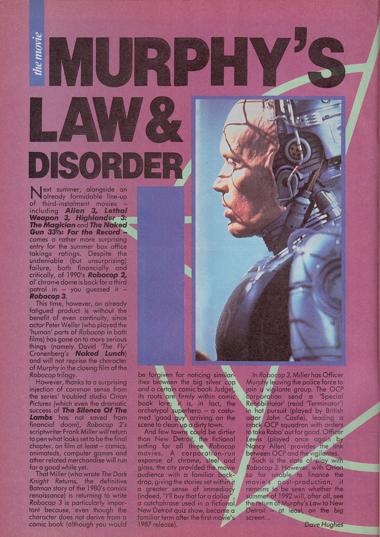
Before Murphy’s strip are two RoboCop features, with a third later in the comic. The first one concentrates on the franchise itself, in particular the in-progress RoboCop 3. The second movie had been released the year before and while it had proved to be a moderate financial success it was generally panned for not living up to the original. I remember being disappointed by it because Robo himself felt flat and boring.
What’s strange here is that Dave Hughes‘s feature describes the franchise as a “fatigued product” in a comic printing strips based on that product! How did that make it past the editor? He also criticises Robocop 2 but praises the fact that its head writer Frank Miller would be returning for the third film. Yes, I’m aware Miller’s screenplay went through various rewrites by other writers but it’s still a strange thing to be thankful for after not enjoying his first RoboCop sequel.
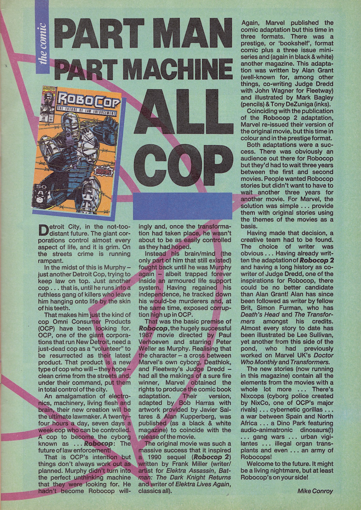
This second feature is meant to be all about the comic strip, a major selling point of Havoc’s anthology. Unfortunately, Mike Conroy really does take his sweet time getting to the stage of discussing them. It’s not really until the third column that he gets into the meat of it all and then it’s over. There really wasn’t a need to reiterate so much of the lore and background to RoboCop for people who would already have been up to speed on all of that.
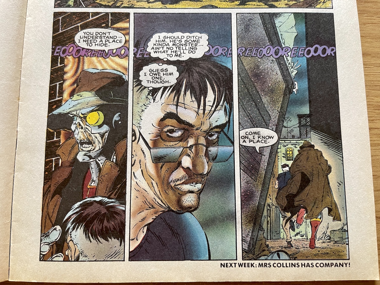
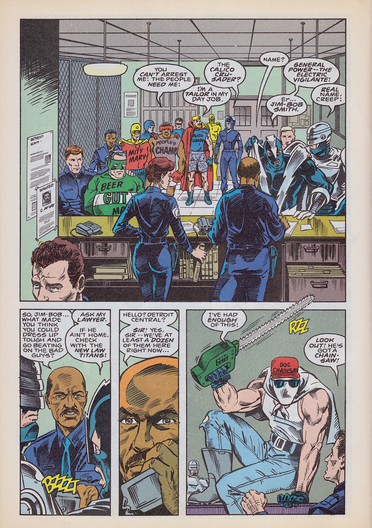
Let’s move on to the strip itself, part two of Vigilante by Alan Grant (with pencils by Lee Sullivan, inks by Kim DeMulder, colours by Steve White, letters by Richard Starkings) and it kicks off with muggers on hover bikes, showing how the comic would go all-in on the future setting, taking the strip more into the sci-fi fantastical than the original movie, which was more grounded. But this is a different medium and it works well to get across the setting and how dangerous Old Detroit really is. After this, the father of the victim complains about how the police are locking up people like General Power from last issue when the city needs them more than ever.
These masked vigilantes’ reputation is a lot better than the reality of the people behind the costumes. Take General Power for example. After frazzling the man he was trying to save last issue he’s brought to the desk of Metro West by Murphy and told to give his name. After declaring himself as ‘General Power’ he’s ordered to give his real name which he hilariously admits is Jim-Bob Smith.
With a precinct full of wannabe superheroes, one of them has had enough and what comes next is a bit of a shock when read today.
RoboCop was set in the not-too-distant future and the first movie and the TV show were, in hindsight, really rather prescient. So much so its surprising at times watching the series to see how well they predicted our world thirty years in the then-future, providing a scary insight into where we could be going. Bear this in mind when you see this next panel of that wannabe you saw in the final panel above, going by the name ‘Doc Chainsaw’.
He says it’s not against the law to “put on a suit an’ prowl the night” (which itself sounds more creepy than I think he intended) right in front of RoboCop. As if his red hat wasn’t enough, his general attire and his choice of words when confronted by Alex would be a bit on the nose if written today!
I don’t think I need to make any more comment on that one. Soon the sarge barks an order; all the vigilantes are to be charged with misdemeanours and set free. This happens much to the chagrin of the officers but has come down from the “very top” and thus the main mystery of the new story begins. Robo leaves to see if there’s something he can do (but we’re not given any more hints as to what this could be) and then we see former mugging victim Dink and his dad settling down to watch the city’s latest reality show, ‘The Detroit Vigilante‘ and that’s where it ends.
Deathlok and RoboCop have similar set ups but they’re handled in such unique ways you wouldn’t think they were unless you stopped to break down what’s at the core of their main protagonists. I was never a fan of the movie sequels to RoboCop so initially had some trepidation about these strips since they were also direct sequels, released before the TV show. But I’ve been pleasantly surprised to find a nice halfway point between the original film and the show, with Alan Grant grasping the character much better than the movie studio did around the same time.
“Pain is inflicted quickly and harshly upon those who would harm innocent children.”
Ghost Rider
It’s hard to judge a comic strip series based on only the first couple of stories but I’ve been impressed with this version of Murphy so far. The first story brought the action, the second concentrated more on the characters and this one feels like it’s settled in more to the episodic nature of the storytelling, this first part setting things up nicely. Normally I’d be eager to see the next chunk but it’s just not forthcoming right now. Sadly, it’s goodbye to another favourite for the time being.
To soften the blow (although this wasn’t the original intention) we get a third feature for our part man, part machine, all cop hero, billed on the contents page as an interview with Marvel UK artist Lee Sullivan who did superb work on RoboCop for the American arm of the publisher. Calling it this is a bit of a stretch though. It reads as if two quotes by Lee were pulled from a general career interview, with one answer about RoboCop and the other about Doctor Who, filled out with information about the artist.
“…and because we know where everything is, we methodically begin to eliminate anything that ought not to be there!”
Star Slammers
Don’t get me wrong, it’s interesting information and a good article but I was looking forward to an actual interview about Lee’s work on this particular strip. That’s two of the three features about this character that feel like they included an awful lot of padding to make up the page count. Such a shame because I do enjoy Havoc’s extras but I’d have preferred those two to have been combined into one and another Eye Level included instead.
There’s mention here of Marvel no longer having the RoboCop licence which again is a strange thing to include when you’re trying to entice readers back for more. About a year before this, Marvel UK’s Transformers announced the forthcoming release of a new RoboCop fortnightly comic. It was never released, with Robo appearing the next summer in Havoc instead.
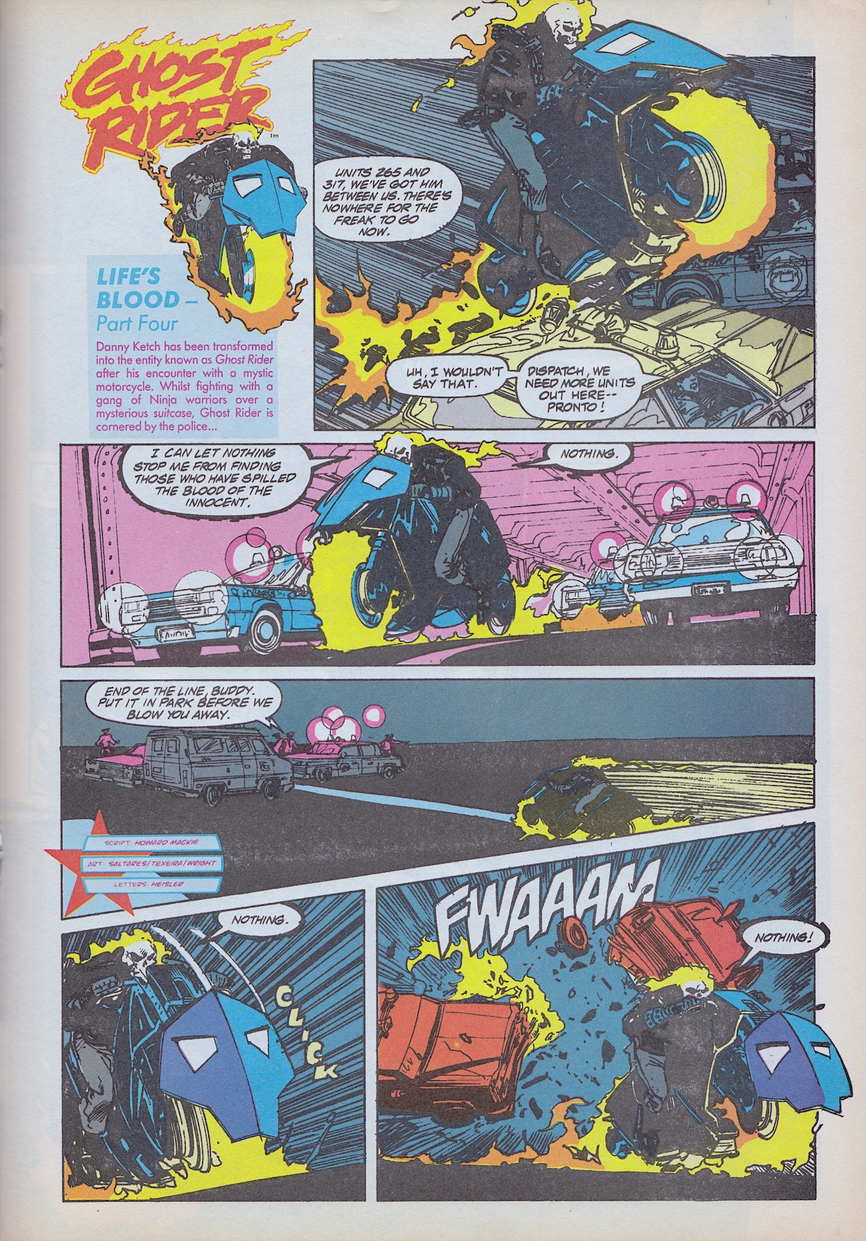
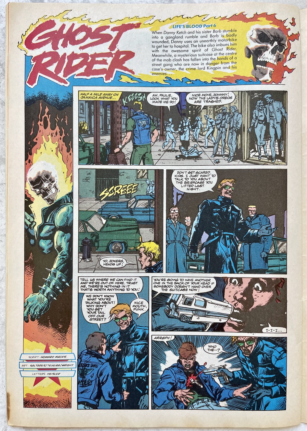
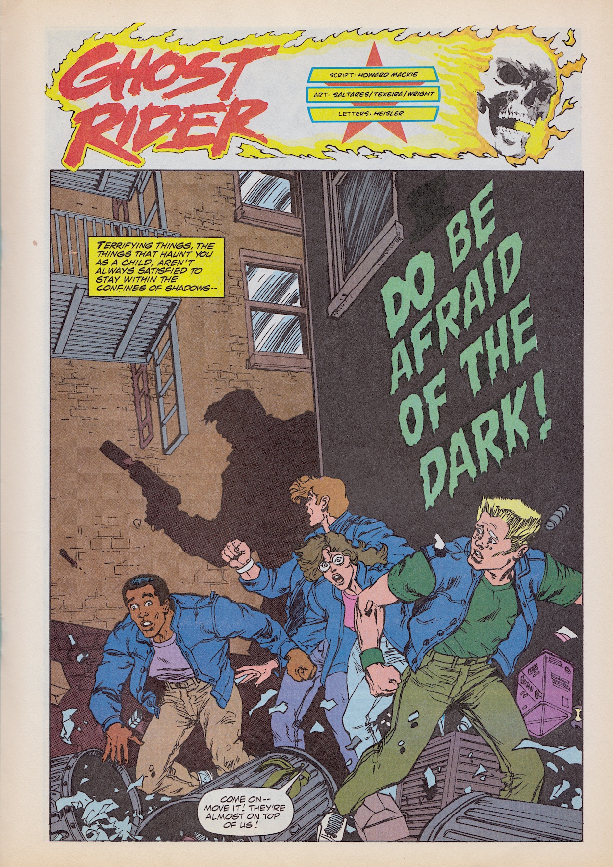
Danny Ketch and his Spirit of Vengeance get the bulk of pages this issue with part one of Do Be Afraid of the Dark (written by Howard Mackie, pencils by Javier Saltares, inks by Mark Taxeira, colours by Gregory Wright, letters by Michael Heisler) which begins with the gang of kids from previous issues, now referred to as the Cypress Pool Jokers, hunted down by who we assume are Deathwatch’s minions. Demanding to know where the canisters are, they’re threatening the lives of the kids at gunpoint when a bright light and roar of a motorbike from a nearby hedge halt proceedings.
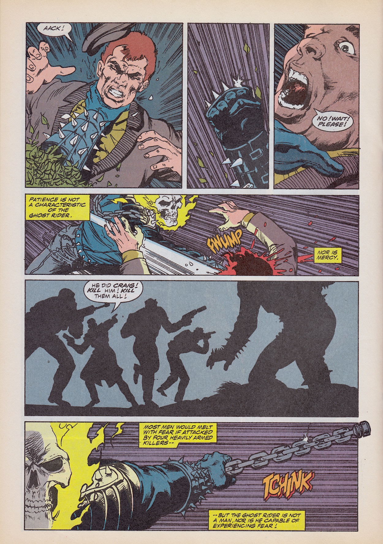
Out zooms the Ghost Rider, glowing against the night sky, only to be met by a hail of bullets. What’s interesting is that everyone knows his name already, his presence in the city plastered all over the newspapers and of course the criminal underworld would be all too aware of him after he took some of them out. Falling off the bike and back into the hedge, the night goes dark again, the Ghost Rider’s flame apparently extinguished. Until the next page that is.
Scenes involving the Ghost Rider when apparently surrounded and outnumbered are always great fun but I can only imagine how awesome these would’ve seemed to a teenage me. (I’m sure they were but my memory has let me down.) I can confidentially say this was unlike anything I’d ever seen before. Brutal but thrilling in equal measure, this first part of the new story really hits the ground running. Essentially a direct follow up to the origin story, it’s unfortunately not clear in these first seven pages whether any other main plot would be introduced.
On the next page it’s stated how Ghost Rider would normally take his time, ensuring to inflict the most pain possible on these men, equal to the pain of each individual’s past offences. But this night he needs answers and so he lashes his magical chain around one of them and drags them away off the back of his bike, the criminal’s body bouncing up and down on the road over the ghostly flames.
Hung over the side of a very tall building Eldon finally admits he’s not part of either criminal enterprise. Instead, he’d heard about Kingpin looking for the mysterious canisters and so he thought he’d take his gang out to find them, present them to the criminal mastermind and get in his good books. Ghost Rider gets no answers but that image of him, followed by the fate of Eldon have me gagging for more.
The kids see him drive off, recognising him now as one of the good guys. “Man, he’s hot!”, exclaims one as he disappears from their sight, and from mine. This appears to be the most serialised of Havoc’s strips rather than individual stories, at least for the time being and I’m gutted this is my cut off point again. As my introduction to Ghost Rider he’s been a brilliant character in a very well written strip illustrated in a scratchy, mature fashion that perfectly suits him. Defintley my favourite part of Havoc and the one I’ll miss the most.
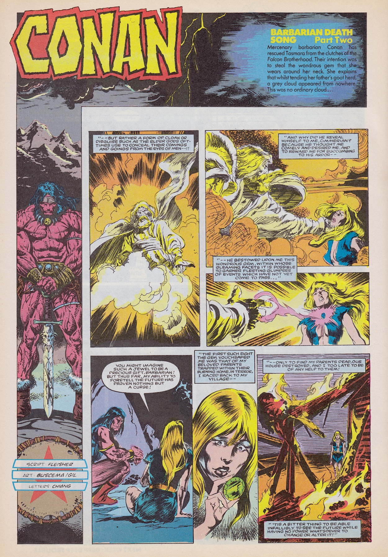
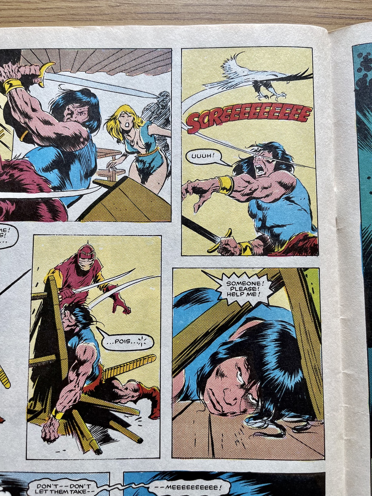
Part two of Conan’s Barbarian Death Song (written by Michael Fleischer, pencils by John Buscema, inks by Armando Gil, letters by Janice Chiang) sees our female guest character finally named (Tasmara) and she explains the cloud from last time was actually some random god who bestowed the jewel upon her neck because he was so enraptured by her beauty. She’s now being chased down by Baron Gerdeg and his Falcon Brotherhood because it gives her the ability to see the future, something she realised through tragedy as you can see above.
This gives this fantastical element a sense of foreboding right from the start; it’s a curse rather than the gift it was intended as. As they chat she sees something else shocking, Conan’s death! Her vision includes his funeral procession, accompanied on either side of his coffin by both allies and foes he’s previously fought alongside and against, taken directly from the poem this story uses as inspiration. For more on that check out last week’s review which explains Conan’s last ever story.
Conan and Tasmara head into the local town to eat and drink before making their way elsewhere, hoping to beat death by getting far away from danger. But the Brotherhood, who also have history of being defeated by Conan, have bribed a dancer in the tavern to dance for Conan using birds they supply her with, their talons tipped with a deadly poison.
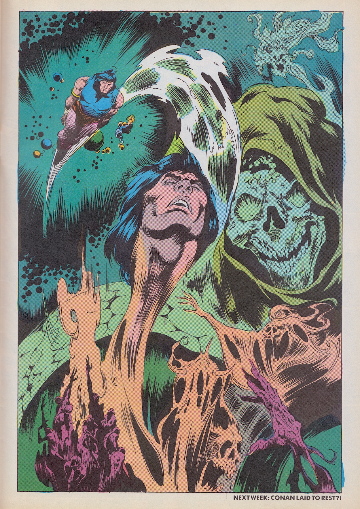
Conan collapses and his last view before he blacks out is of Tasmara being taken. We then see his consciousness slip into another realm, a realm of death and decay by the looks of it. You can see the Next Issue caption at the bottom of this next page. Yes, this is how Conan ends!
It would have been a great cliffhanger normally, but this was where we were left hanging as we desperately waited for #10 to appear. Now knowing it never would makes this all the more frustrating of course. Conan’s first story may have been somewhat outdated and out of place in Havoc, but the second story made up for that somewhat with its humour despite its underwhelming ending. This story seemed to have more going for it and, knowing the poem it was based on, I was eager to see how it turned out. Alas, for now I can’t.
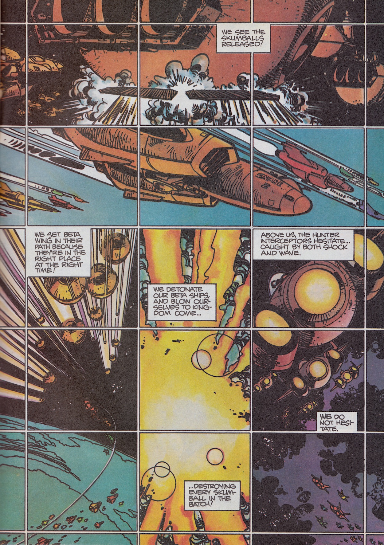
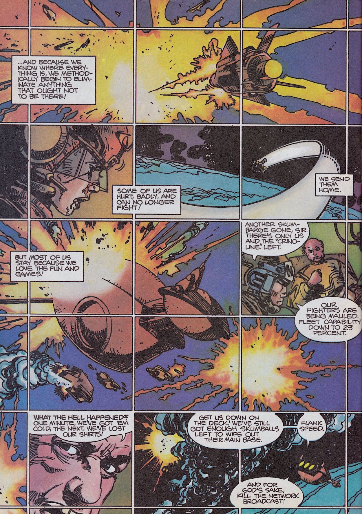
I’ll admit this issue’s Star Slammers (written and drawn by Walt Simonson, colours by Louise Simonson and Deborah Pedler, letters by John Workman) is eye catching, I’ll give it that. Each of its five pages are split up into these smaller panels, carrying on the theme of the Silvermind from last time. In fact, this penultimate part of the story kicks off with Jalaia finally reaching that near death point and activating the hive mind of the Slammers. Suddenly every single one of them can see, sense and hear everyone else, turning the tide of the battle against the Orions. So naturally Admiral Krellik cuts the televised feed to his home world in an attempt to control the narrative.
The way this is depicted, how they’re able to instantly react to the enemy from anywhere in the battle, how it turns on a dime from a slaughter to potential victory much to the shock of the enemy, is really very good. Alien Legion was due to replace Star Slammers in #11, so one week before its conclusion this strip finally became something of interest. It’s a cool few pages but with the lack of characterisation or storytelling in many previous parts it’s just too late to save it.
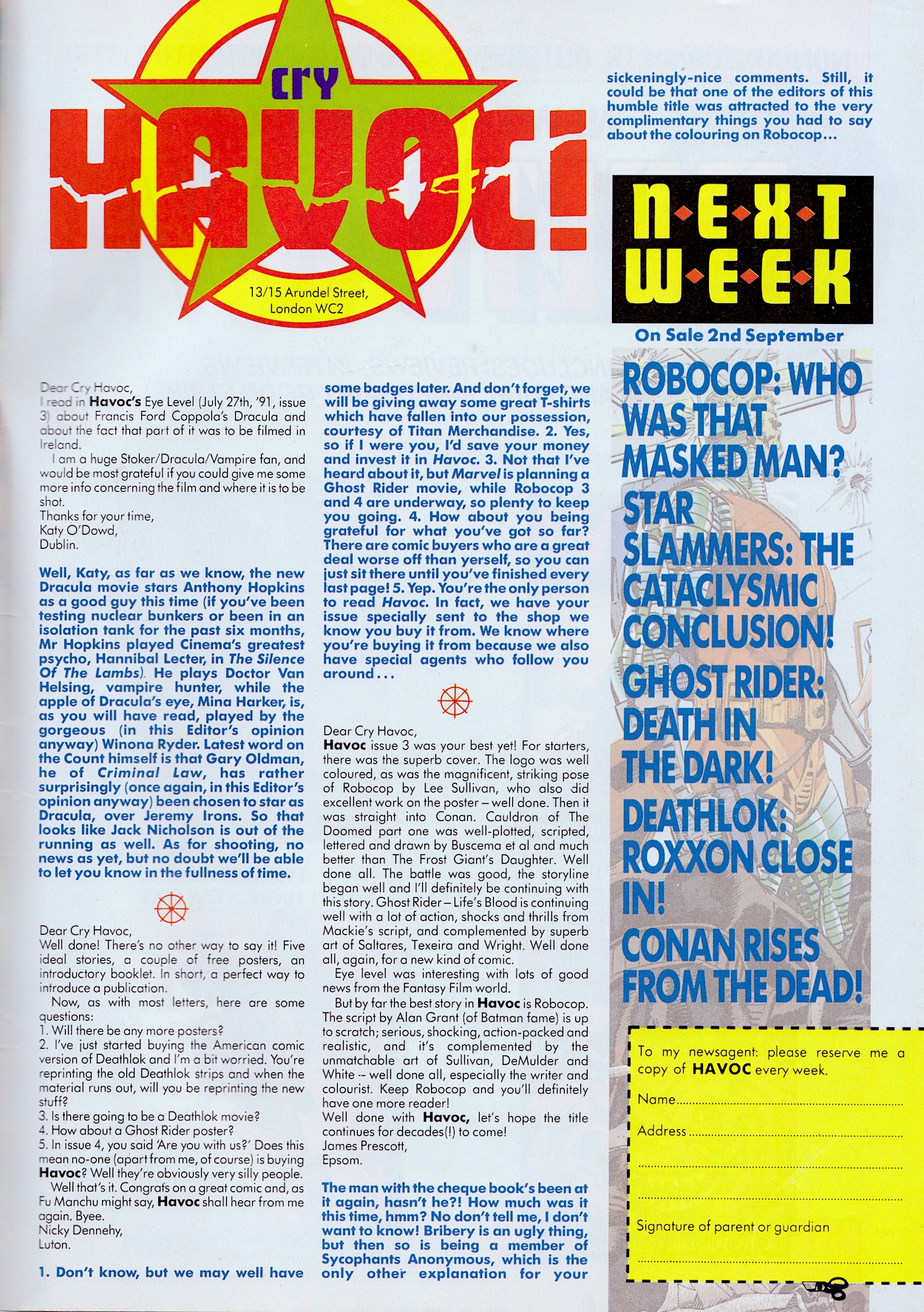
Our last Cry Havoc finishes things off and once more it’s got that exciting fan club feel to it which just makes it all the more heart wrenching that this is the end. But before we go there’s just time for a few more letters and typical Marvel UK-style replies which I loved so much as a kid. Highlights include some dismay at Gary Oldman’s casting in Dracula (oh, how he’d prove the naysayers wrong) and word of an upcoming Ghost Rider movie which wouldn’t actually become a reality for another 16 years.
There are some cheeky answers here too (“How about you being grateful for what you’ve got so far?”) which is very Marvel UK indeed, instructions to invest in the future of Havoc for new Deathlok (oh deary me, you’ll start me off again) and a funny final answer which refers to the fact RoboCop was coincidentally coloured by Havoc’s editor. Then just to rub salt in the wound is the Next Issue box and a reservation coupon. This is not the end this comic deserved.
It took a couple of weeks to realise Havoc wasn’t just running late. With this I became so fed up of fantastic comics with a potentially very bright future being cancelled early that I swore off trying new ones after Havoc, solely collecting Transformers which I’d begun buying years before. I’ll admit this changed when Thunderbirds The Comic appeared in October 1991 but I stuck with it for only about a year before Commodore Format enticed me to the way of magazines. Even Transformers was cancelled just five months after Havoc!
It feels like no time since I took this photo for Havoc’s introductory post and given the potential here it really was no time at all. Havoc deserved to run and run. My school friends who had collected 2000AD for a few years already loved it even more than Tharg’s mighty organ. From the first issue I loved three of the strips and over the course of these nine short weeks I’ve come to enjoy a fourth. The final one was to be replaced soon so I could have been a fan of everything in the end.
As it stands it’s still a remarkable little collection of top quality characters. I think that sums it up best for me. It’s not just a random selection of strips, the stories I’ve enjoyed have all been about remarkable characters. Characters I want to read more of. Look out for a special blog post soon when I chat with freelance designer Paul Chamberlainwho worked on several Marvel UK comics and created Havoc’s logo. Until then, it’s goodbye Havoc, it’s been a blast and you deserved better.