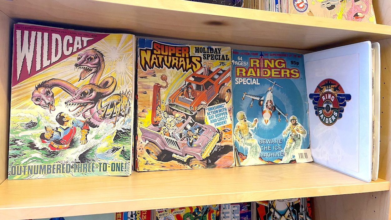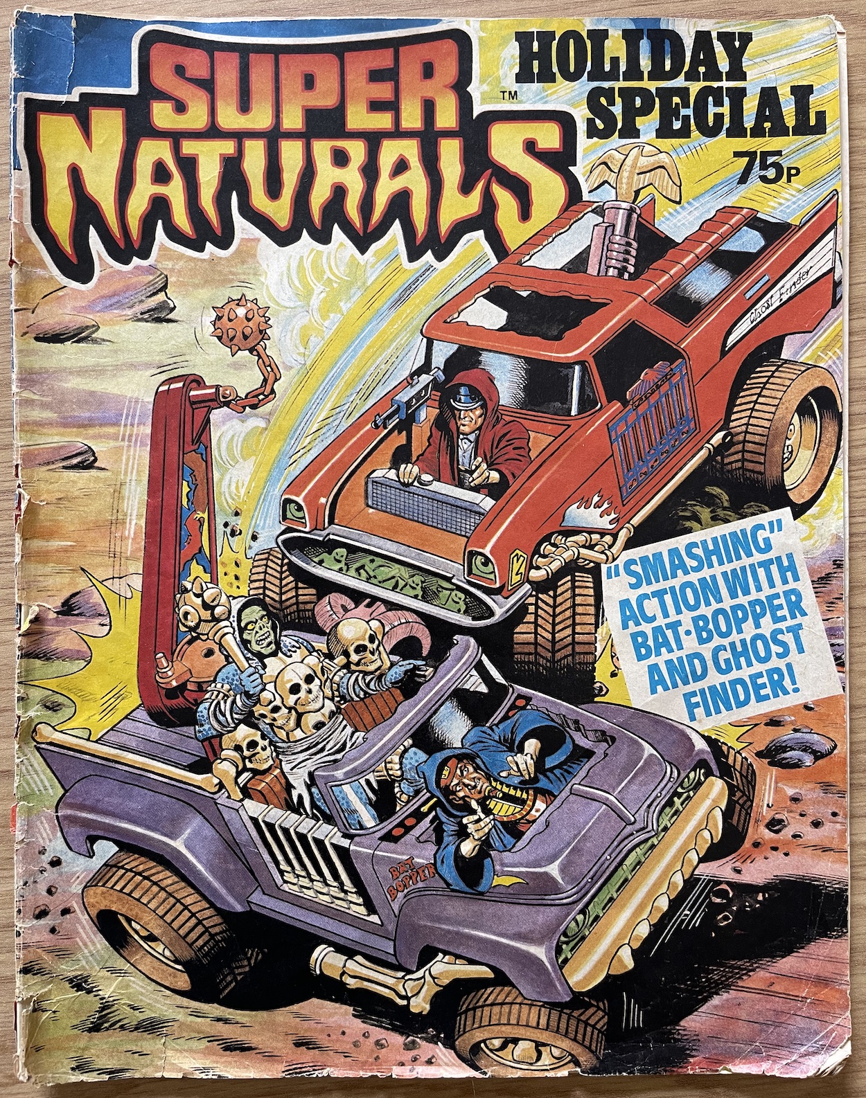
Welcome back to Ghostworld for the very last time. Just a month after the final issue comes Fleetway‘s Super Naturals Holiday Special for 1988, as ever edited by Barrie Tomlinson. Kicking off with a Sandy James cover which would’ve been fun for any kids who received the oversized Tonka trucks for Christmas, here we have 48 glossy pages which, much like the Adventure Book, focus more on the action aspects of the comic rather than the horror.
There are two exceptions (including a reprint from Scream!) which check the horror box for the young readers, but other than that it’s all licenced strips and extras. That means there’s no ventriloquist’s Doll or readers’ suggestions for Scary Cat, both of which were highlights of the regular comic so that’s a shame, especially knowing this would be the last publication in the series. But let’s not get too down, the idea of a Holiday Special was to have lots of fun one-off stories to read while off school. Let’s see how the Super Naturals fare with theirs, shall we?
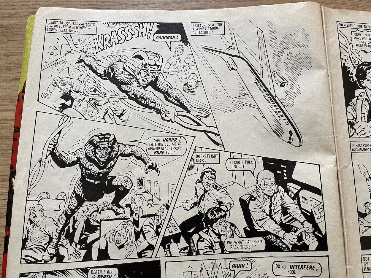
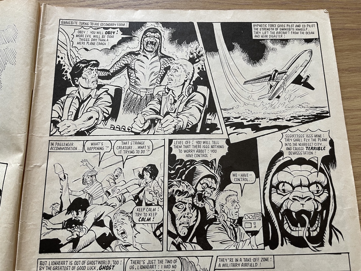
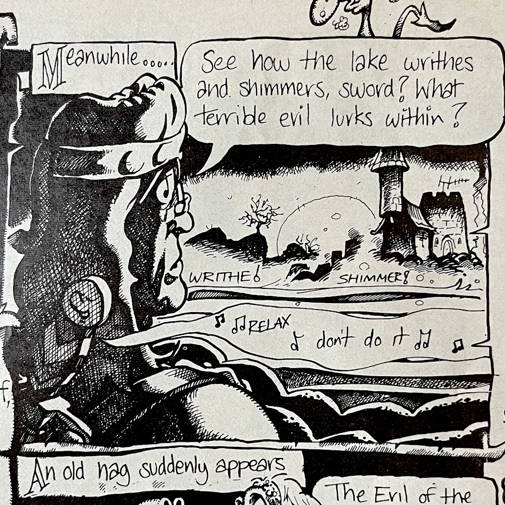
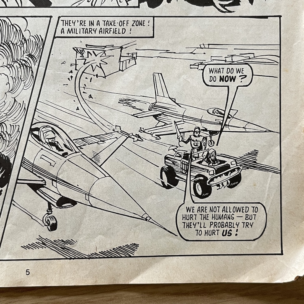
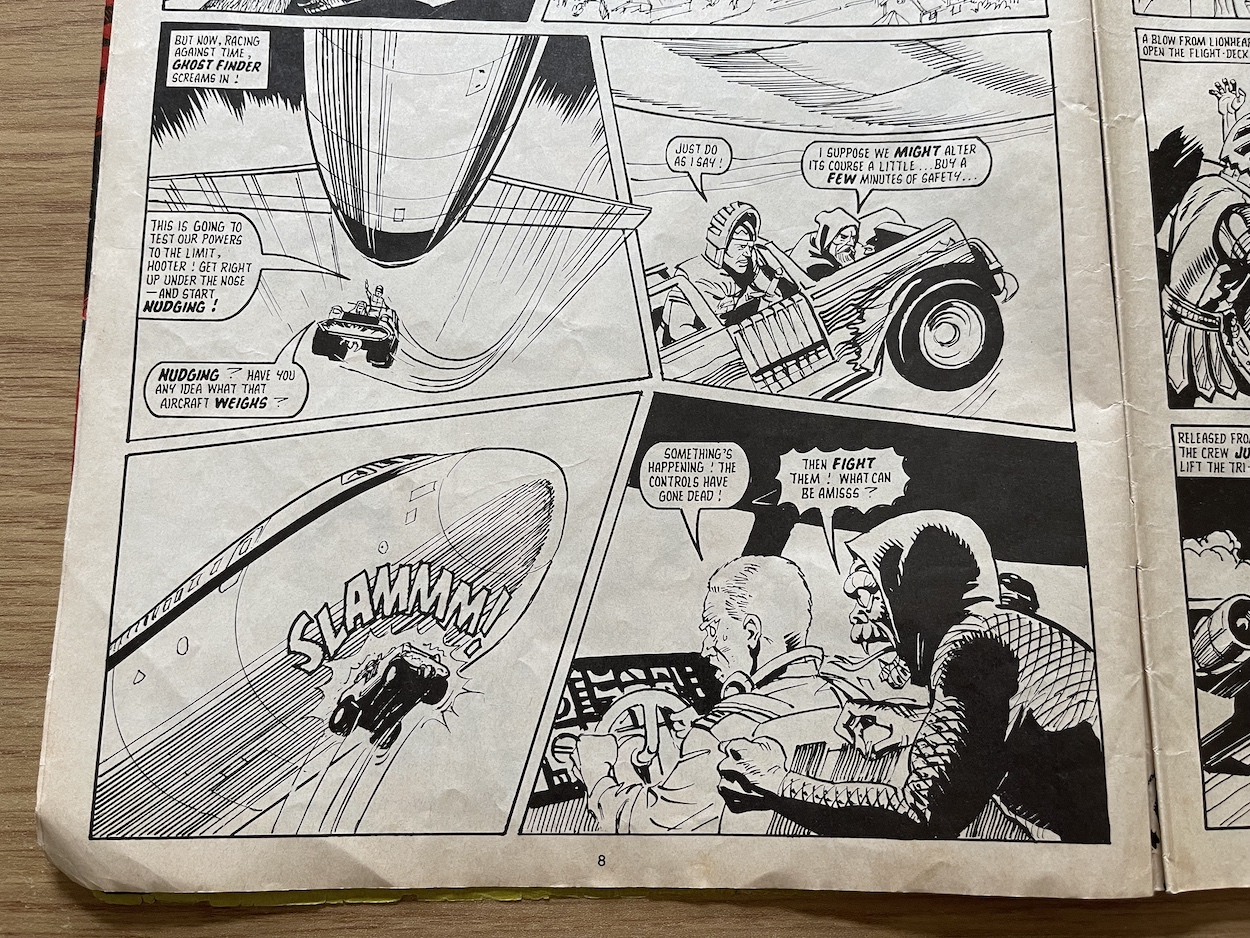
It starts high in the air in SkyJack! The evil Super Naturals flub an attempt to transport themselves into our world, with only Snake Bite able to make it and imaginatively the strip has him crashing through a tiny airplane window, terrifying all the passengers on a transatlantic flight to America. Hypnotising the pilots, he shares his strength with them to save the crashing plane, but only because he wants to use it to dive into Washington which would cause much more destruction in our world.
Snake Bite was always the most interesting of the evil characters and the set up for this story is great. We even have Hooter and Lionheart using the Ghost Finder to nudge the plane up just enough so that it’s trajectory is right for the pilots to take over before Lionheart slashes a hole in the fuselage and throws Snake Bite out, who loses his telepathic control as a result. I like how it’s not an easy, miraculous rescue plan, as Hooter bluntly states. It’s just a shame the artwork doesn’t match the exciting potential of the script.
It’s even more of a shock when you find you who the artist is. It’s Geoff Campion‘s work (Eagle, Lion, Valiant) whose work I’d loved in Ring Raiders, another of Barrie’s titles. However, here things feel somewhat rushed, even unfinished in places, such as when the Ghost Finder crew make their entrance the buildings in the background look like rough layouts. As the story goes on more details are lost and backgrounds become even more sparse, almost like it was hastily finished for a deadline. It’s not the usual exemplary work we’ve come to expect from Geoff and I’m intrigued as to why, but unfortunately that’s a question lost to the mists of time. It’s still a fun story to open with, a really enjoyable complete tale perfect for a Holiday Special.
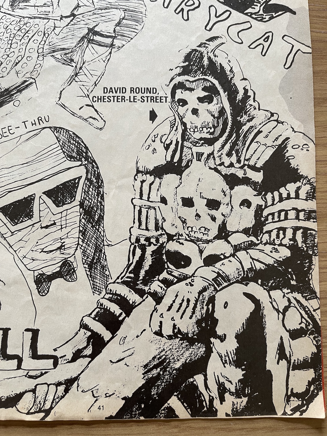
To make a special even more so, there are always a few extras. We have new pin ups of the toys, some of the marvellous posters from the fortnightly have been shrunk down to A4 size, a one-page Ghostling Tale features a thief making his getaway only to board the Titanic and there’s a pretty poor quiz. Much like the one in the Adventure Book it’s just a series of strip panels and the questions are all a variation of “Who is in this picture?”. We do get some lovely reader art in Ghostworld Gallery including a superb rendering of Skull by David Round who was clearly a fan of Alan Langford‘s depiction of the character.
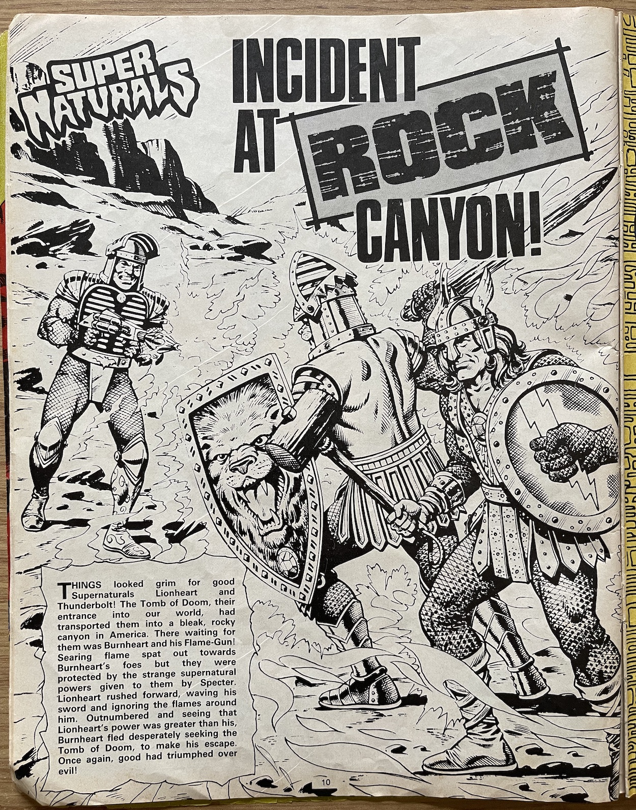
There’s also a page called Incident at Rock Canyon which looks suspiciously like an unused cover. Drawn by Sandy James it clearly hadn’t reached the colouring stage when the comic was cancelled. To accompany it is a short story by way of explanation, reminding me of the inner front page to the Ring Raiders Special printed after that favourite comic of mine also abruptly ceased. It’s a nice addition and it’s always interesting to see work that was still in progress for future issues.
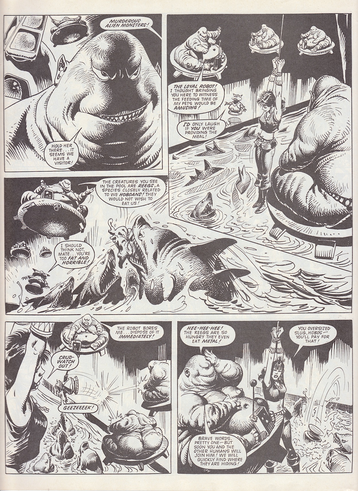
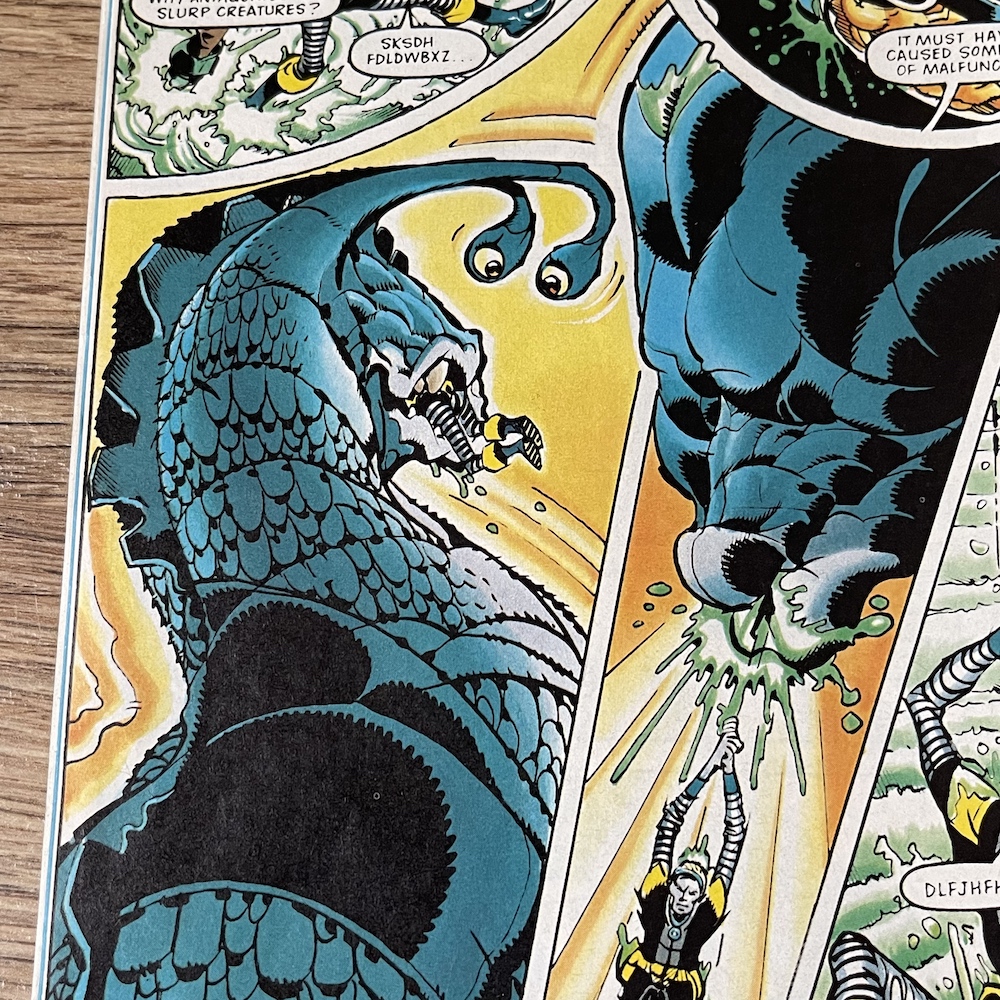
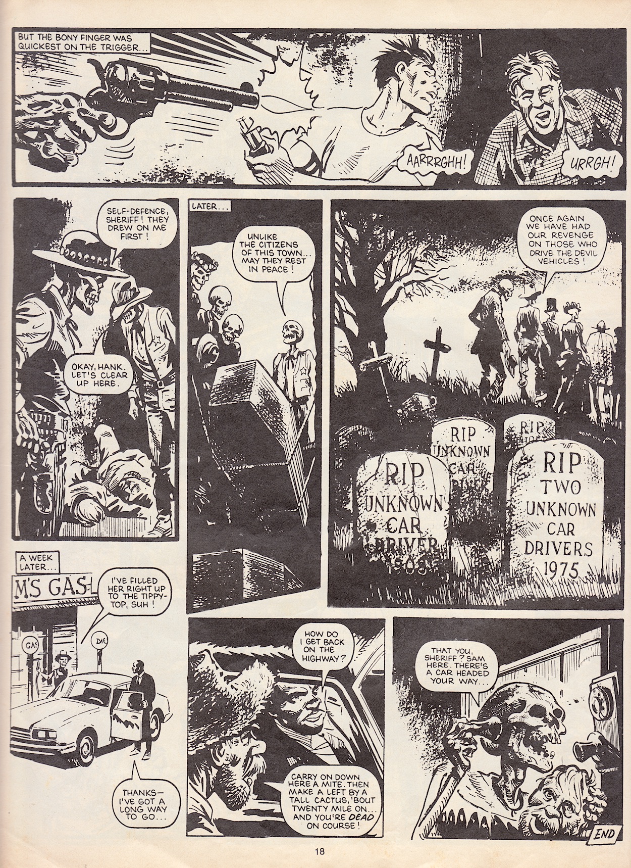
Next up is a Scary Cat Challenge story. This isn’t based on a reader’s idea like some of the very best in the regular series, instead it’s a reprint from Scream! #9. Part of the Library of Death series in the comic, Ghost Town was written by Fred Baker (Roy of the Rovers, Lion, New Eagle) and illustrated by Mike Dorey (Action, Warlord, 2000AD). An old Western town in America witnesses the arrival of its first automobile, which promptly has a brake failure and ploughs straight into a dynamite storage (of course it does), blowing it and the whole town up in a huge chain reaction of explosions. That’s just the beginning.
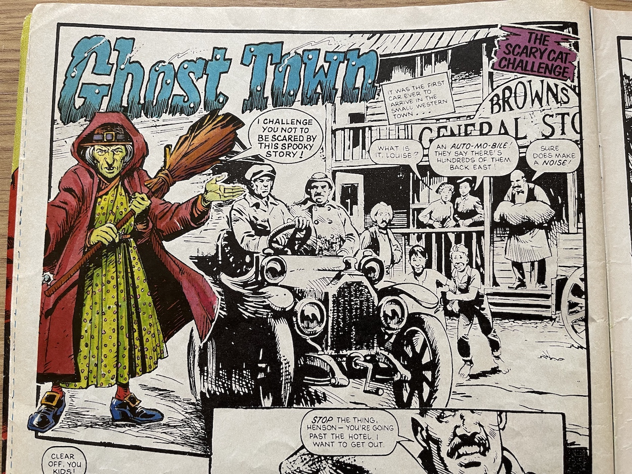
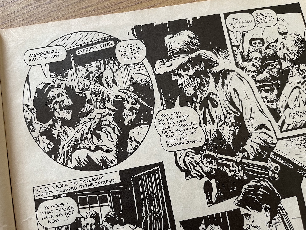
In the then-present day of the 80s two young lads pull up to a gas station in the desert and ask for directions, but there’s more to the little old man who helps them than they realise. They soon find themselves in an old fashioned town instead of back on the highway and are greeted by the sheriff. The only problem is he’s a waking, talking skeleton! Telling the boys they’re going to stand in a fair trial for murder, soon a whole town full of dead bodies with other ideas are chasing them down.
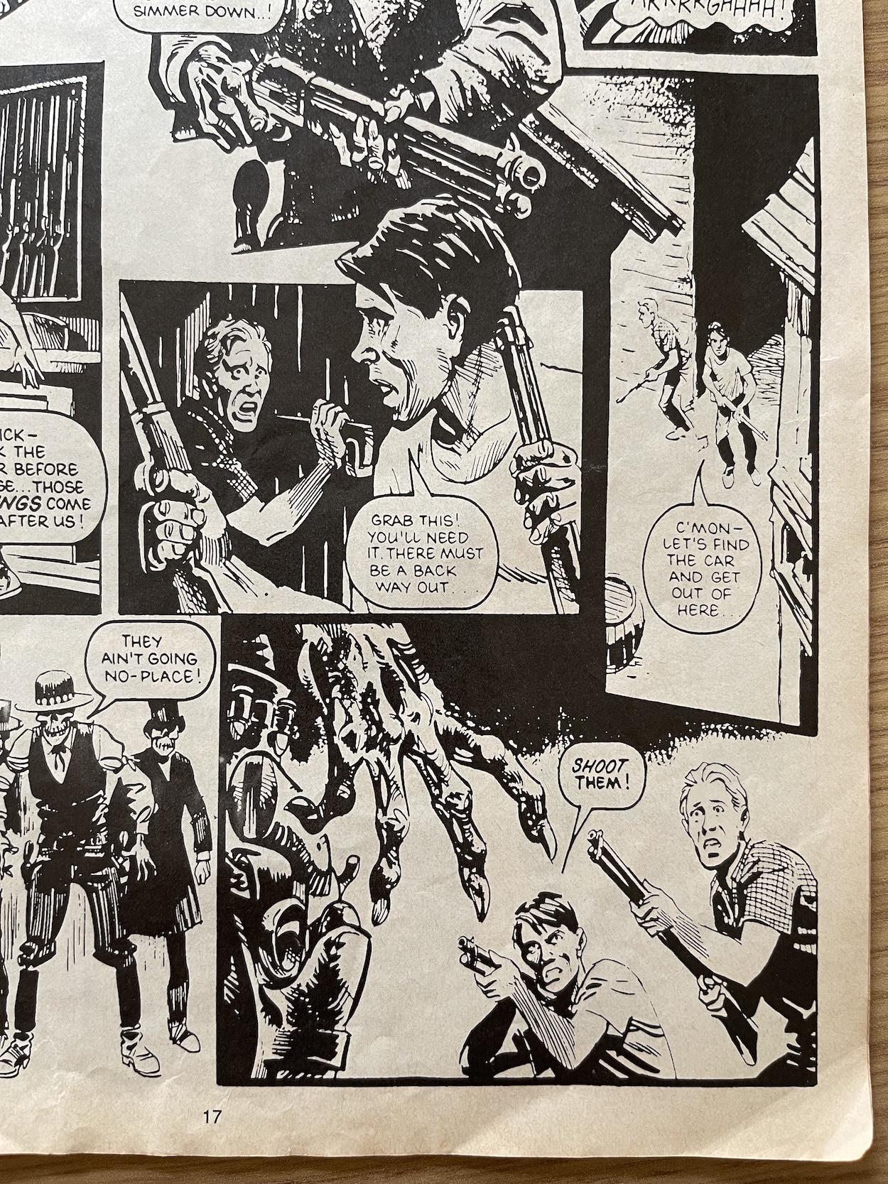
Cornered in the sheriff’s office with his guns, the young men have no choice but to try to shoot their way out and get back to their car, but they’re no match for one of the local gunslingers. Seeing the two innocent lads gunned down was quite the shock when I turned the page! I know it was created for a different comic but to see it in the pages of Super Naturals it makes quite the impact. I never owned this edition as a kid but if I had (and not knowing this was a reprint) I know I would’ve loved this story because of this horrific final page.
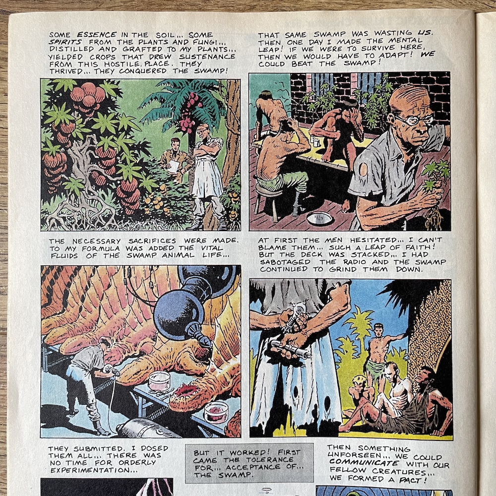
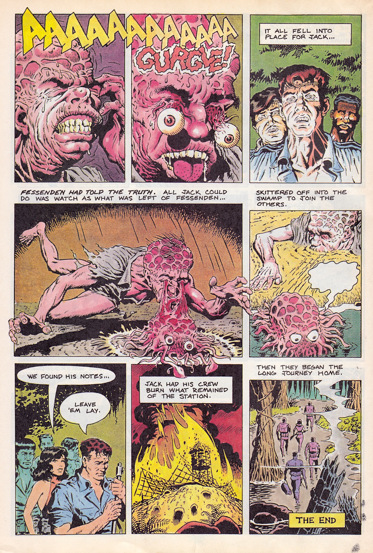
The next strip is the definite highlight of the whole comic, even though it only comes in at four pages. I believe the artist for The Making of Evil could be Keith Page although this is unconfirmed. The middle couple of pages are your typical tale of Skull and Burnheart causing terror and destruction as they set fire to a small Austrian town at the end of the nineteenth century. They’re defeated by Lionheart and Thunderbolt but our main focus is the young boy the evil Super Naturals crash in on at the beginning of the their story.
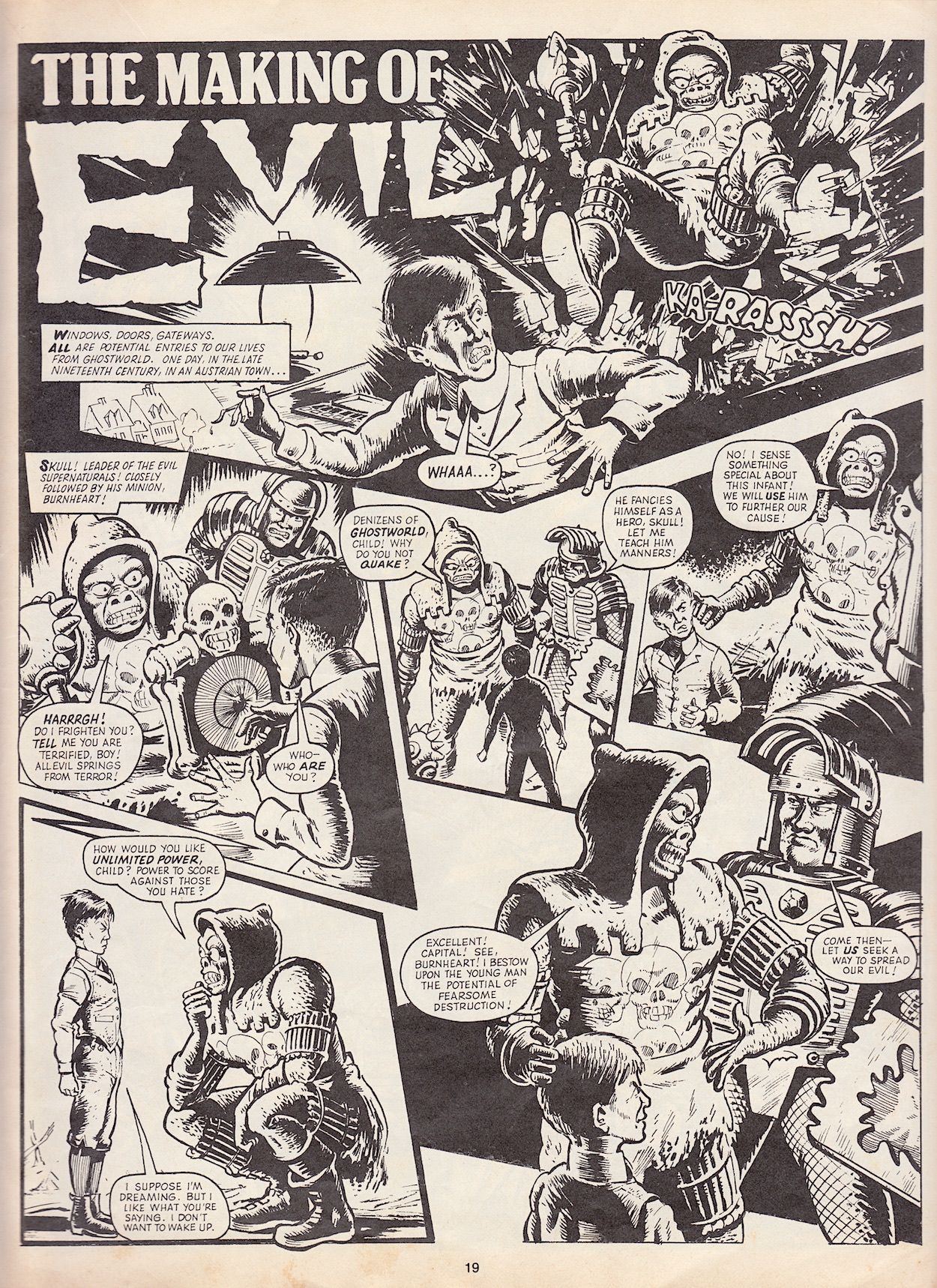
The strip doesn’t explicitly tell us his name but instead treats the young readers with the intelligence to either know straight away who this is, or to piece it together by the end. I was still in primary school when this was released so I wouldn’t have been taught anything about World War II at this point, but some slightly older readers may have, and even if they hadn’t a rereading in a year or two would’ve brought a fresh, terrifying perspective.
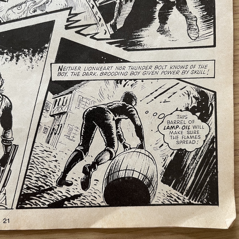
The boy’s reaction to Skull inspires the evil leader to bestow upon him unlimited power to score against those he hates, but even Skull can only hope the boy will spread some form of fear; he has no idea of what he’s actually created. For now we see the boy carry on with their work, helping spread the fire and blocking the streets from help. In the final issue’s review I said how it would’ve been great to see the Super Naturals interact with more myths from our past like they did with the Lady of the Lake, but to see a real-world evil inspired by Skull is something I didn’t expect! It’s a brave move by the comic and an inspired story that once again shows the potential of the franchise.
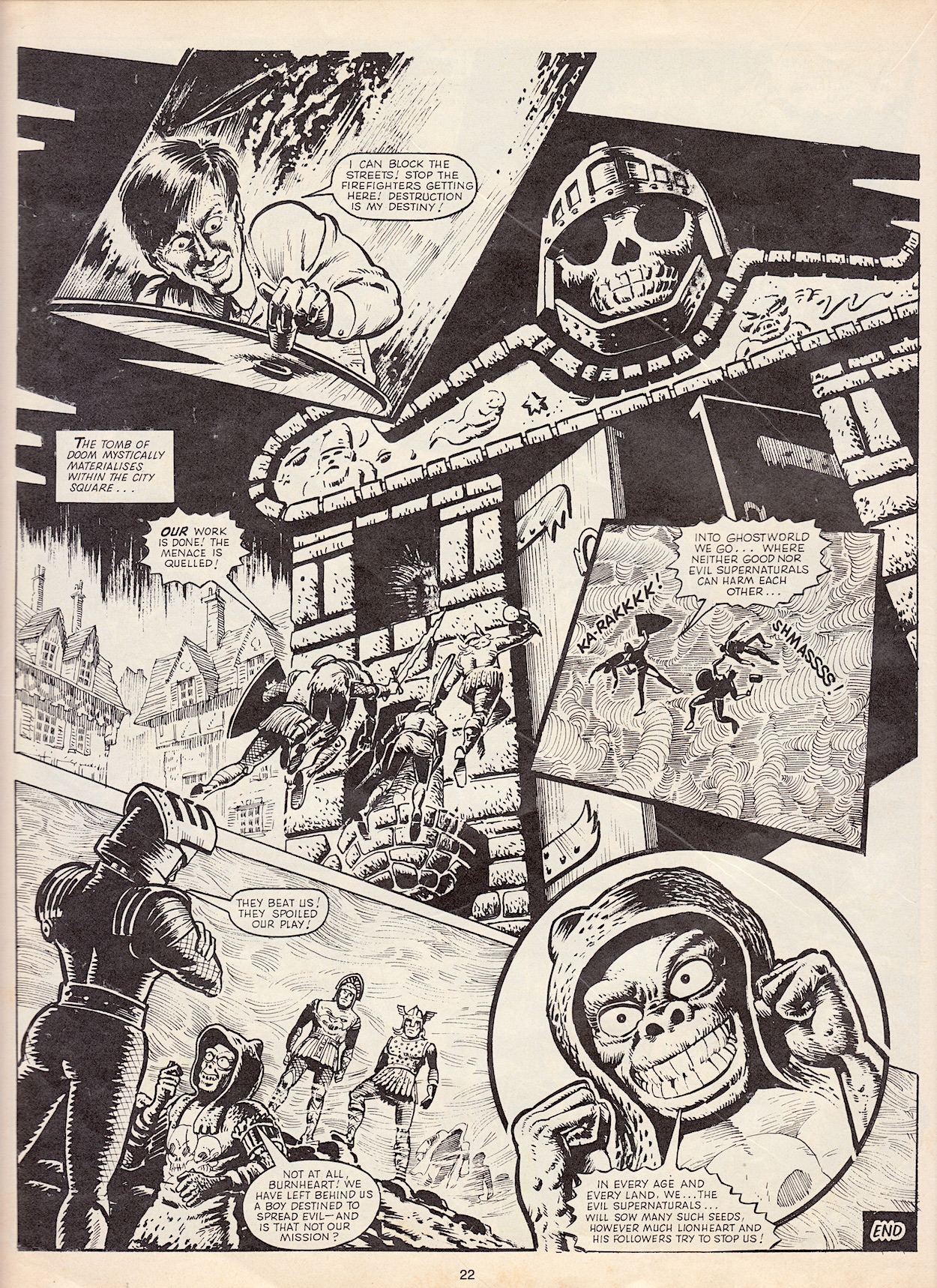
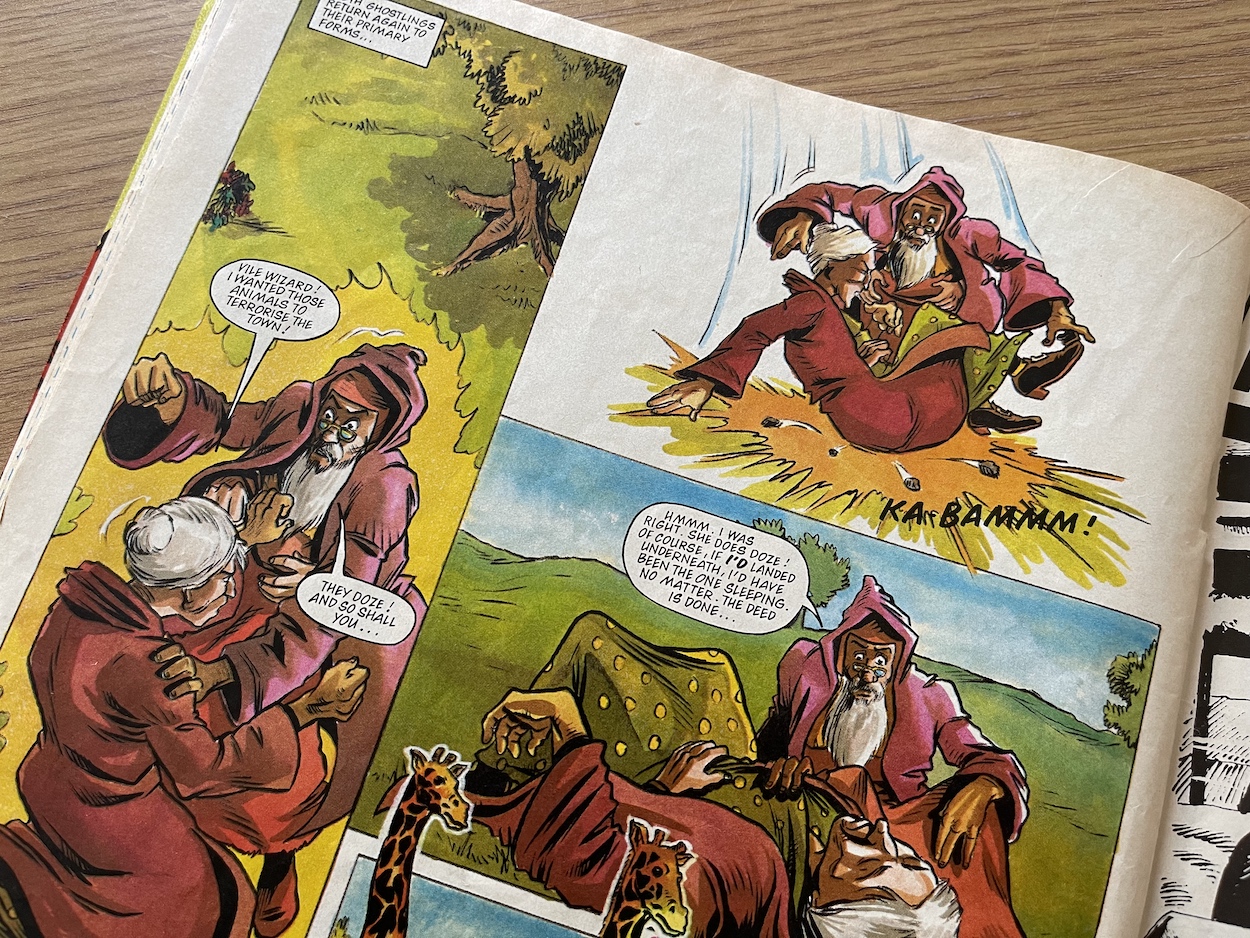
I also adore that awesome Tomb of Doom looming over the characters as they disappear back into Ghostworld, and I wish it had been depicted as such throughout the whole series. Then, after that somewhat creepy tale comes a bit of comic relief in the shape of Ghostlings, this time focussing on Hooter and Scary Cat and as ever it’s drawn by Anthony Williams. The slight plot sees the witch trying to wreck a bit of havoc by having lions escape a zoo close to a town.
Hooter tries to stop her by using his magical sleeping potion but he’s quite a clumsy wizard is our Hooter and he drops it in a mid-air kerfuffle between the pair. But luck is on his side and instead of Scary Cat being put to sleep the animals end up having a doze instead. However, when Scary Cat transforms back to her witch form the hard landing sees her join them in the land of nod. Our hero is then easily able to carry her back to the Tomb. Silly stuff, but then again the best Ghostlings strips always were, that was the whole point of them.
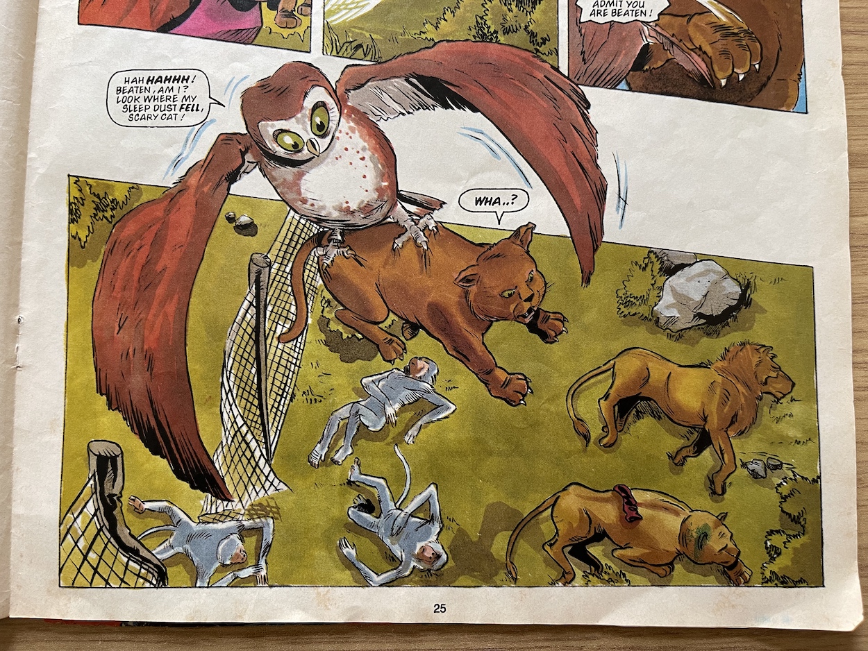
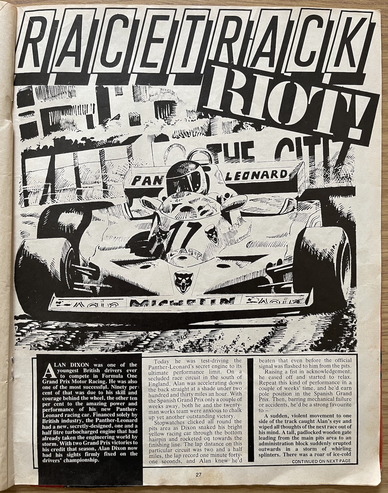
Racetrack Riot is the special’s prose story and follows F1 driver Alan Dixon as he test drives a new super powered engine, which of course Skull wants for his Bat Bopper truck. Alan and his team are kidnapped and forced to remove the engine from their car. Outside Lionheart, Thunderbolt and Hooter (who is making up for being underused in the regular comic by the looks of it) are watching closely. It’s our clumsy wizard who comes up with the plan and after transforming into his owl form he swoops in from the skylight on which they’re perched and seemingly attacks the F1 team.
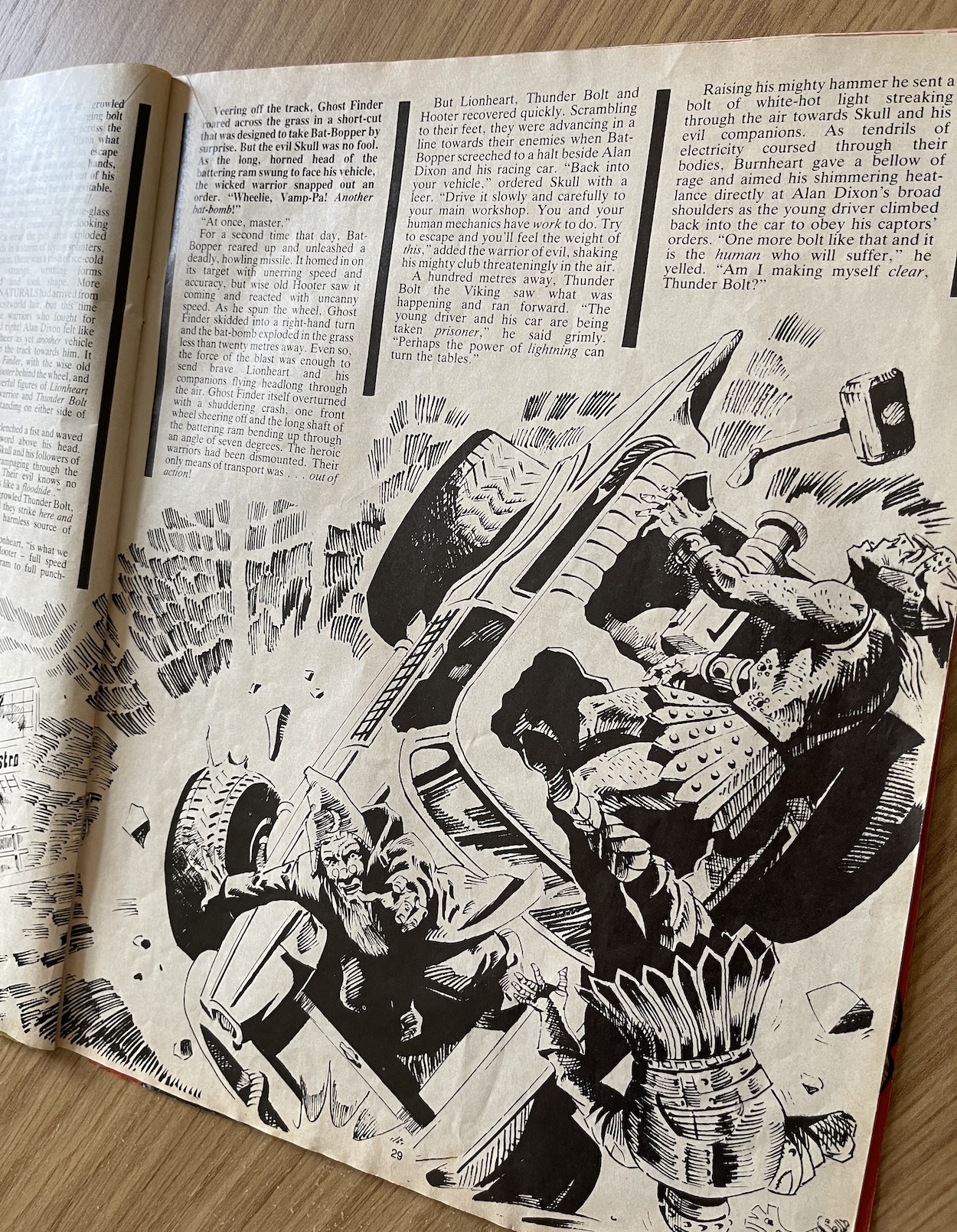
There’s method in his madness of course. It looks like a regular owl, possibly nesting somewhere nearby, has flown in. So the evil characters simply ignore him while at the same time in this form he doesn’t inadvertently scare the humans into freezing in fright for once. Instead, they dive into the maintenance pit under the car for cover. This allows the main Super Naturals to launch an attack and duke it out without fear of harming anyone. It’s inconsequential stuff but entertainingly written by Barrie Tomlinson. Unfortunately though, we’re not sure who the artist was.
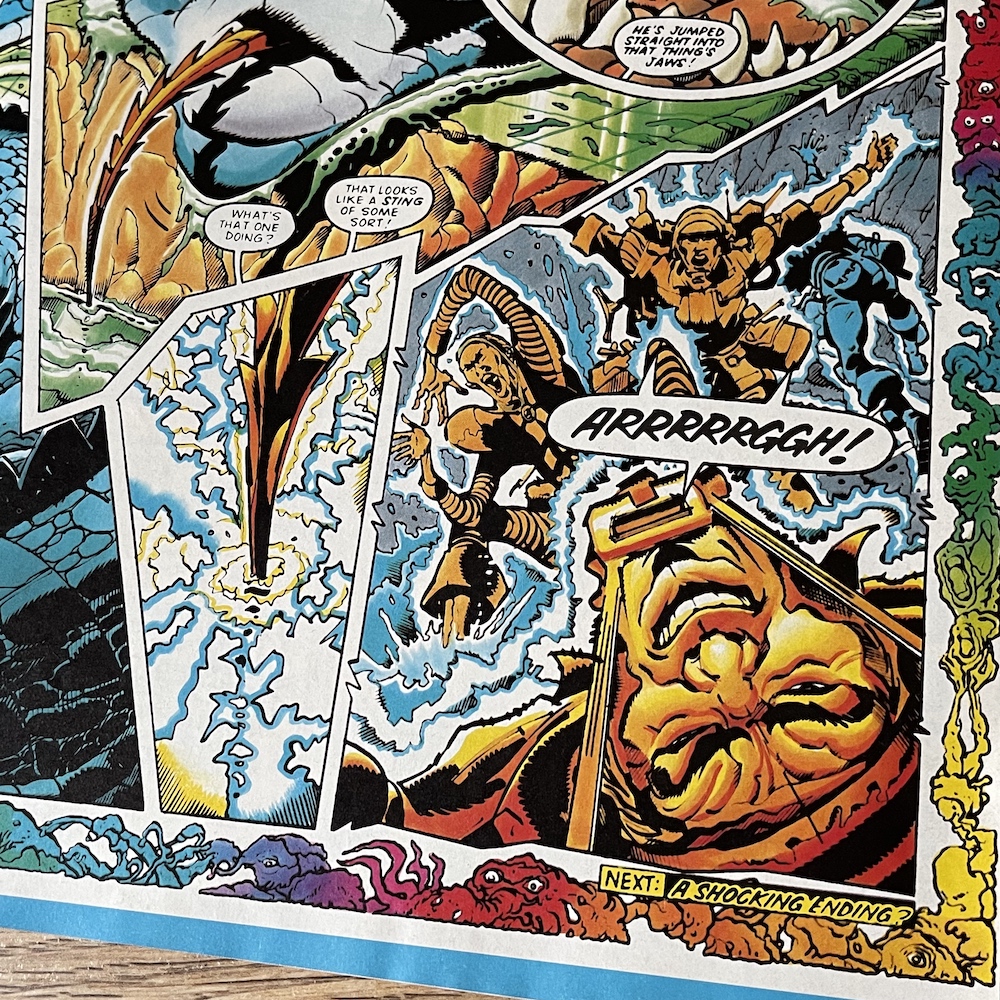
The final story in the comic and for any of these characters is Tooth and Claw and I believe it could also be drawn by Keith Page. I’ve checked with some sources and parts of this (in particular the Super Naturals themselves) seem to be in his style but the jury is out for how the wild animals are drawn. So it could be Keith. Anyway, the story is set in an unnamed country suffering from a drought, its inhabitants hungry and the animals dying. Through a sacred temple emerge Skull, Snakebite and the underused Rags (as someone interested in Ancient Egypt I wish they’d used him more, he’s a Pharaoh who can turn into a cursed mummy) in the Bat Bopper and Lionheart, Eagle Eye and Mr. Lucky in the Ghost Finder.
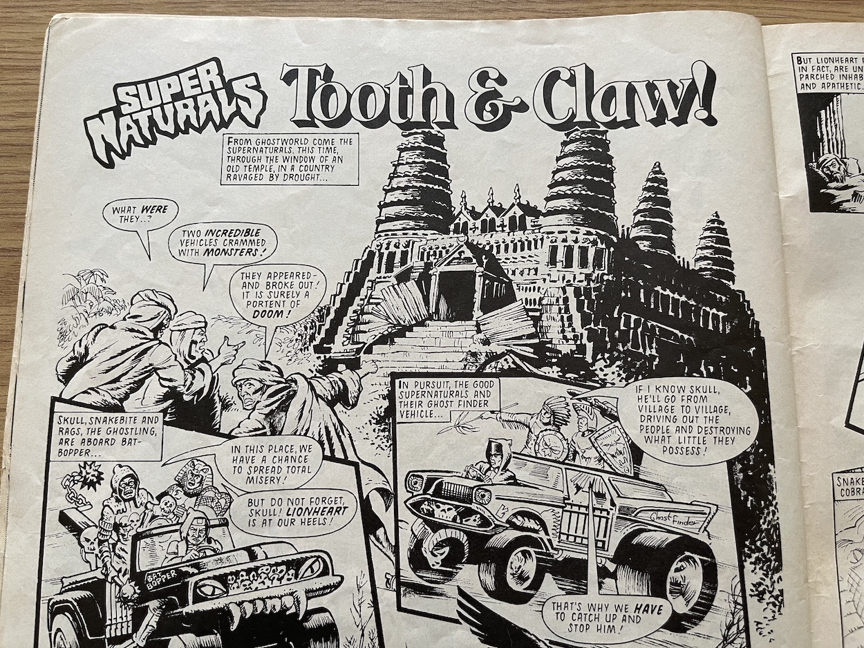
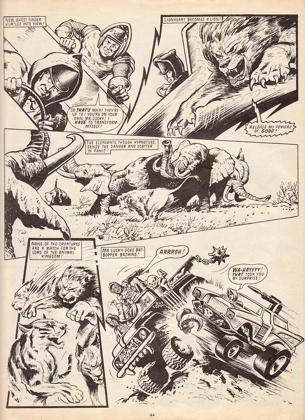
As they give chase the good guys are surprised to see the villages have been left untouched by their evil counterparts, until they come face to face with a wild stampede. Hypnotised by Snake Eyes, the animals have either been forced into a frenzy to chase down and eat the human flesh of the nearby villagers, or into a mad rage to stomp all over their homes and kill them underfoot in the case of the elephants. But the plan hasn’t reckoned on one simple thing, namely Lionheart’s third and final form.
It’s surprising to think the character hasn’t been placed into this kind of environment before now. It’s the kind of story which could’ve been developed into a serial to delve deeper into his mind, especially if he befriended other lions. After all, he was given this lion form by Specter for a reason, could he have found a kindred spirit in them? But then again, the comic was still in its infancy when it was cancelled, so who knows what could’ve happened. I have to say though, it’s fun to see him take to this form with relish, acting like an actual wild lion and fighting off the hypnotised, innocent animals (without killing them). Only a few characters got the chance for any kind of development by the end and unfortunately Lionheart wasn’t one of them. This is like a teaser for what could’ve been.
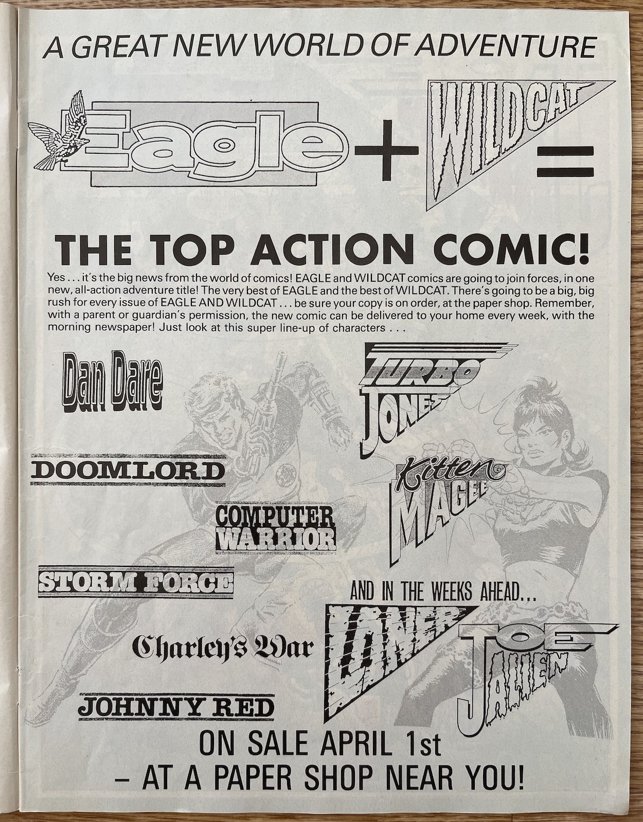
Before we sign off from the last ever edition of this comic there’s just time for a quick plug for some of Fleetway‘s range which may have appealed to the target audience. Battle had merged with the new Eagle after a phenomenal run, Roy of the Rovers was still going strong and another of their licenced comics, Mask had proved a lot more popular, lasting 80 issues and it was certainly a hit with some of my friends. These could be described as the Barrie Tomlinson range, as he edited all of these.
A reprint of a Skull poster with the top and bottom chopped off to fit the inside back cover, followed by the title logo on the rear round things off and that’s it. In an edition which contained a lot more fun and action-orientated strips, the horror stories of the Scream reprint and the Hitler tale really stand out. So does the action-packed Lionheart ending, if only to show what could’ve been as a great example of the licence.
Never again would the young readers see these fun characters and the horror strips that came along with them for the ride. While there seems to be very little to tell from the creative team because memories seem vague when it comes to Super Naturals, keep an eye on the blog for some possible extra content in the future nonetheless. It’s sad to see the comic end and it’ll remain a treasured part of my collection, taking pride of place on the Barrie Tomlinson Trilogy Shelf. I hope I’ve been able to do my bit in keeping the memory of this classic alive.