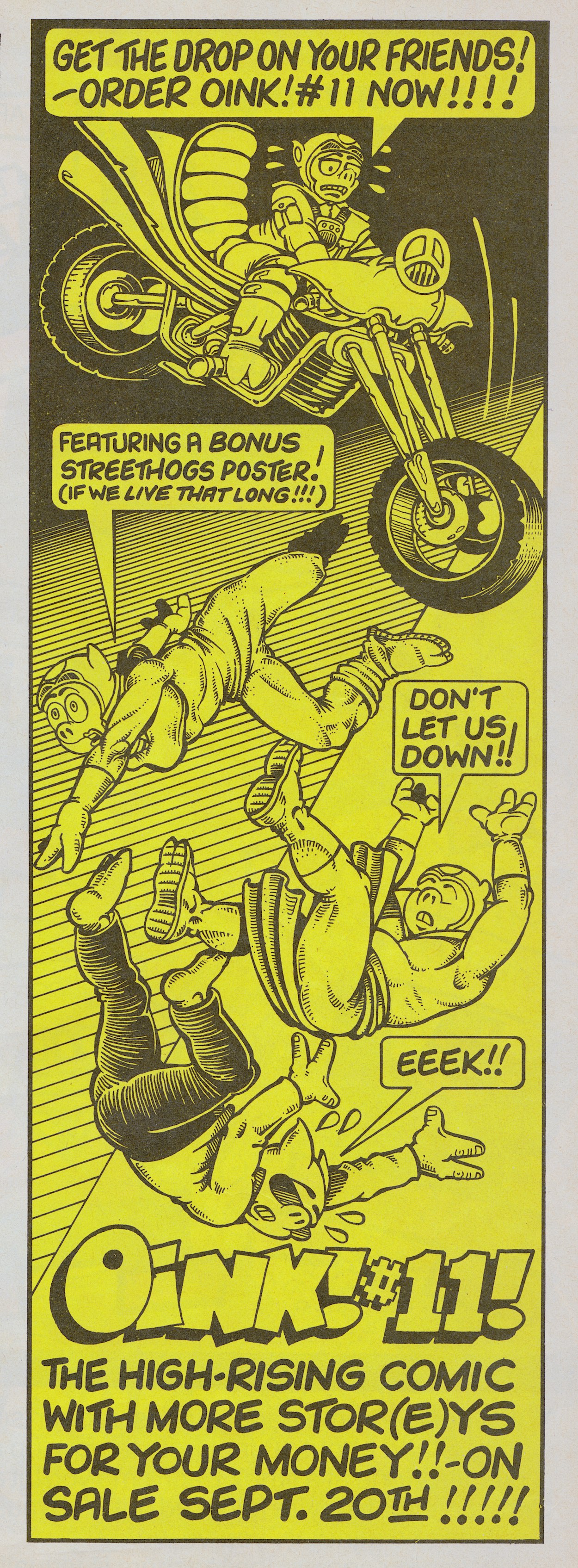
After twelve episodes (including the preview issue) the first epic tale for The Street-Hogs was coming to an end but they were going out with a bang(ers and mash)! Not only would their strip be extra long, they’d be on a special wraparound cover poster and the issue itself would have the theme of motorbikes, biking and general road rambunctiousness. To mark the occasion #10 had this large Next Issue advert.
Promo by J.T. Dogg
As far as we kids were concerned only the most special of comics issues had wraparound cover posters (ask any Transformers fan) so make sure you’re here on Monday 20th September 2021 for the next issue in our continuing real time read through of the world’s greatest, and funniest, comic!
Before then, if you’ve missed the Street-Hogs episode featured already on the blog, you can click here to go and have a chuckle.
When I launched the blog I was nervous about doing my favourite comic (OiNK) justice. The same applies to this one. Ring Raiders remains my other very favourite comic from childhood, fondly remembered and frequently reread. Some might look at it and only see a short-lived comic based on a short-lived toy line and dismiss it, but over the next few months I hope to show you it deserves to be remembered.
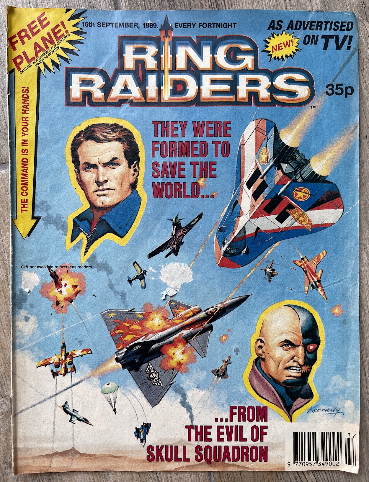
It began for me with this gorgeous cover by Ian Kennedy (Dan Dare, Eagle, Commando). I have very clear memories of discovering it in the newsagents, in awe of how my toy planes had been depicted. I went into this in more detail in the introductory post to this series, where you can also see which plane I got free (it’s the orange one that takes a starring role in the TV advert). I can remember spending a while sitting on the shop floor with all the issues in front of me, deciding which one I’d buy based on the planes. Happy memories.
At 24 pages it was a little thinner than other Fleetway comics but it was all gloss instead of the usual matt paper and contained a lot more colour. I remember the pages felt huge in my hands too. Each issue contained five strips; two colour three-page serials, two black and white four-page serials and a complete five-page colour strip in the middle, then a letters page, pin-ups and adverts for the toys and Next Issue promo. It felt jam-packed. So let’s take a look at each of the stories in turn.
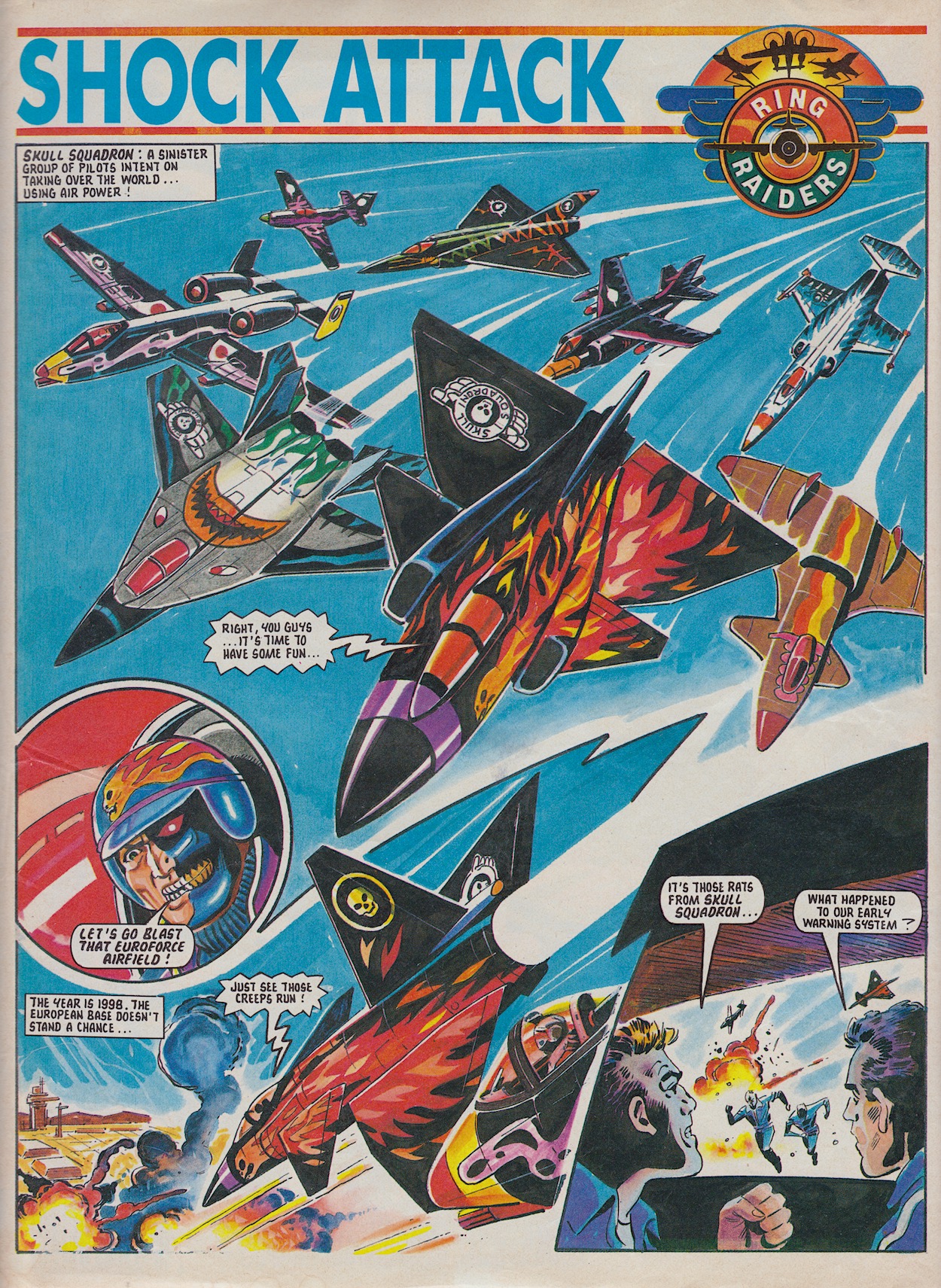
Shock Attack is a quick one-off introduction to the comic written by editor Barrie Tomlinson and drawn by Carlos Pino (Johnny Red, War Picture Library, TV Century 21) and that first panel in the first story of the first issue is really rather good. The story is a quick fix of action which followed on from the preview comic and had the Wing Commanders battling each other again rather than with their designated teams.
Set in the then future of 1998 the Skull Squadron leaders are attacking a Euroforce base but the Ring Raiders swoop in to save the day and the Skulls retreat through time to the age of the dinosaurs. Followed by the Raiders and terrified of having to bail out in this time zone after two of them are hit, they flee.
If the comic had continued this could’ve set up a brilliant way of killing off (kind of) older characters while also keeping things open for a possible return. As you’ll see over these real time reviews plenty of characterisation is given to these pilots away from their planes, so having one trying to fend for themselves out of their time could’ve made for an interesting story on its own later on.
It’s truly epic in scale. I distinctly remember its scope really exciting us
Throughout all this, back in ’98 TV camera crews fill in their viewers (and the readers) on a brief history of the opposing sides. Skull Squadron were formed in the mid 90s and see themselves as a potential new world power, which they try to achieve by manipulating history to their advantage. The governments of the world formed the Ring Raiders and, upon learning of the enemy’s ability to time travel built the Air Carrier Justice, a massive flying base which also traveled in time and recruited the very best pilots from the past, present and future.
This was the main selling point of Ring Raiders, the whole point of this set up and it’s truly epic in scale. It was a nice story idea for the toys and acted as a way to inspire collection of every type of plane. For a comic, I distinctly remember its scope really exciting us.
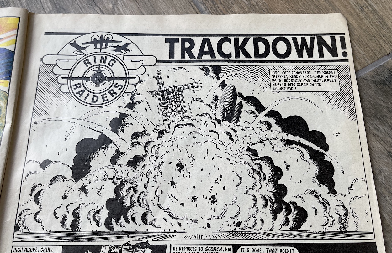
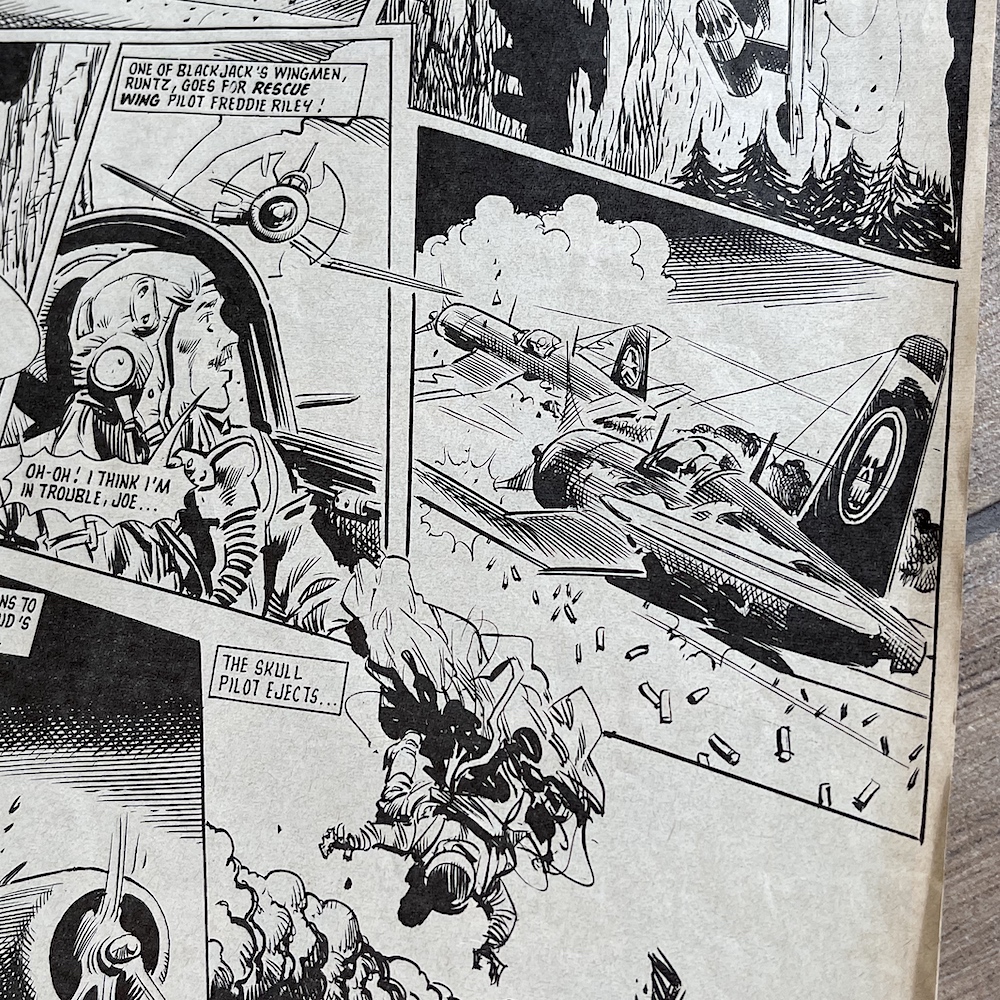
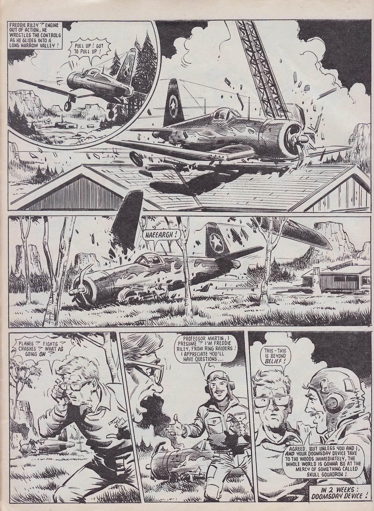
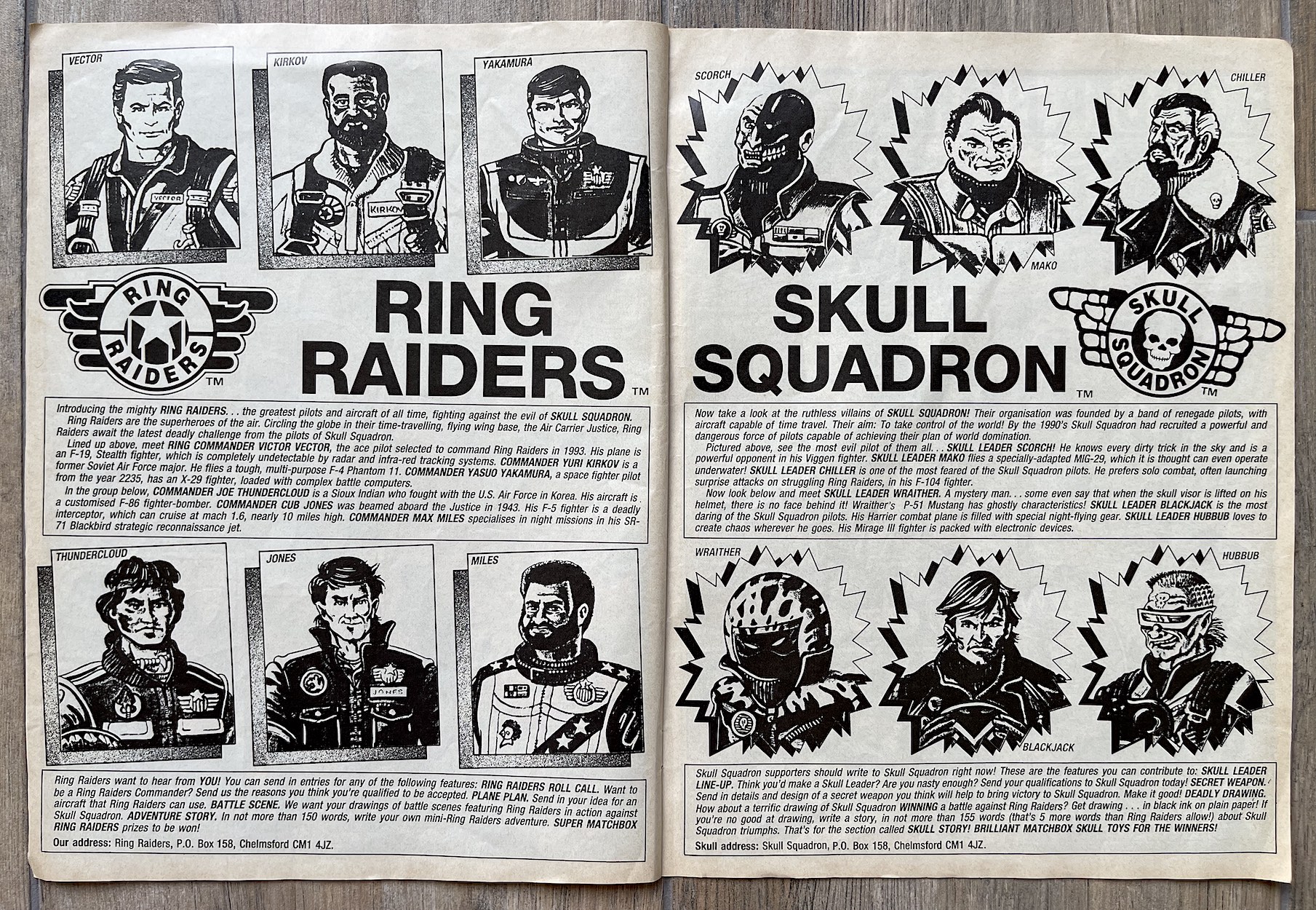
The second strip is the first serial and would be the longest in the whole series at eleven episodes and 44 pages in length. Professor Martin has accidentally created a chain reaction capsule, a Doomsday Device which is being launched into the safety of space when Skull Squadron blow up Cape Canaveral in 1990. With the device now grounded permanently at the prof’s cabin Blackjack‘s Havoc Wing is dispatch to steal it. Aboard the Justice, Ring CommanderVictor Vector (that’s him on the cover with Skull Leader Scorch) sends Joe Thundercloud‘s Rescue Wing in pursuit.
Apart from the tiny little fold out comics that came with the toys, up to this point all we really saw of the pilots behind the planes was the one pose each Wing’s leader had on their packaging. When I read part one of Trackdown for the first time it was such a thrill to see these guys come to life. More than that though, the comic starts to create its own characters for the unnamed pilots who flew the other three planes in each four-plane toy pack.
In fact by the time this chapter ends the main characters are both original comic creations by the name of Freddy Riley of the Raiders and Runtz, one of Blackjack’s wingmen. I certainly didn’t expect one of the hero planes to be shot down in the first issue. It’s a spectacular crash and a really exciting opening chapter for the comic as a whole.
Trackdown is written by Angus Allan (TV-21, Look-In) and brought to life by John Cooper (Battle, Scream, Judge Dredd). As a child it felt like the battle and the crash of Riley’s plane had real world weight to them. This was in stark contrast to the cartoon. I’m reminded of how the G.I. Joe comics of the 80s would feature bullets and characters would often end up injured or worse, but in the cartoon every gun (no matter which model) fired lasers and no one was ever hit. The Ring Raiders cartoon was the same, so to see the toys being treated more seriously here made me an instant fan of this over the animated series.
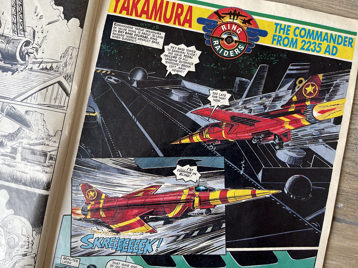
Across the page from that cliffhanger is the first of the complete tales and when seen side-by-side the good guys seem to be having an off day, this story beginning with another rough landing. Yasuo Yakamura was the first character to get a background story and I couldn’t have been happier because, as I’ve detailed previously, his X-29 came in the Starter Pack that began my collection and would remain my favourite, his Wing also being the first that I bought.
I was surprised the leaders weren’t the first to get this treatment but perhaps Yakamura was a fan favourite, or perhaps the fact his past would actually be set in our future, allowing them to have a full blown sci-fi strip for the premiere issue helped with their decision (complete with lovely retro 80s futurism). Over the course of the comic’s life these complete tales would switch from sci-fi to war drama to horror and everything in between.
Yasuo was known for embracing computers, his aircraft kitted out with the latest tech only he could control. Written by Scott Goodall (The Phantom, Commando, Scream) and drawn by John Gillatt (Tiger, Eagle, Wildcat) the story focusses on why he defended the robotic landing system even though it nearly cost him his life. Initially distrustful of automated technology, during a war with an alien race called the Draxion in their Bushido Bats he was forced to take a small robotic co-pilot after losing his partner.
Yasuo seeks revenge but the robot chastises him for putting that above the mission and Yasuo loses his temper, resulting in loss of concentration and they’re shot down. Left for dead by his human comrades he watches as the robot builds him a glider, only to stay behind and fend off the enemy alone, inevitably being blown apart. The story touches on how this set Yakamura on a path to studying robotics and computers and how he became the logical and cool headed pilot Vector would eventually recruit and bring back to our present day.
The serials would develop the characters further over time but these complete stories were the perfect way to delve into a particular aspect of their personality, helping to build layers across the various stories and issues.
No comic of the 80s would’ve been complete without a letters page answered by a fictional character who could be as cheeky or irreverent to the readers as they dared. Barrie’s titles never disappointed. In his book Comic Book Hero he explains how he loved creating various ways for readers to interact with his comics. For this comic he chose to have a different character in charge every issue, switching between the Raiders and the Skulls every fortnight. Instead of letters, issue one had this introductory spread with images taken from the toy packaging.
Barrie was editing freelance from home under the name Creative Editorial Services and had brought in Terry Magee (Commando, Battle, Cor!!) to assist with editorials. Together they thought up some ingenious ways for readers to have their say. There were chances to apply to be a member of either side, or to design a new plane for the good guys or a super weapon for the bad, or they could draw a battle scene with their choice of victor or even write a short story. A very short story. There was a 150 word limit, or 155 words for the Skull Squadron who boasted, “That’s five more words than Ring Raiders allow!”
After a two-colour pin-up and the obligatory Next Issue/newsagent coupon page (boasting of the free posters to come in #2 and #3) we move on to the next two stories.
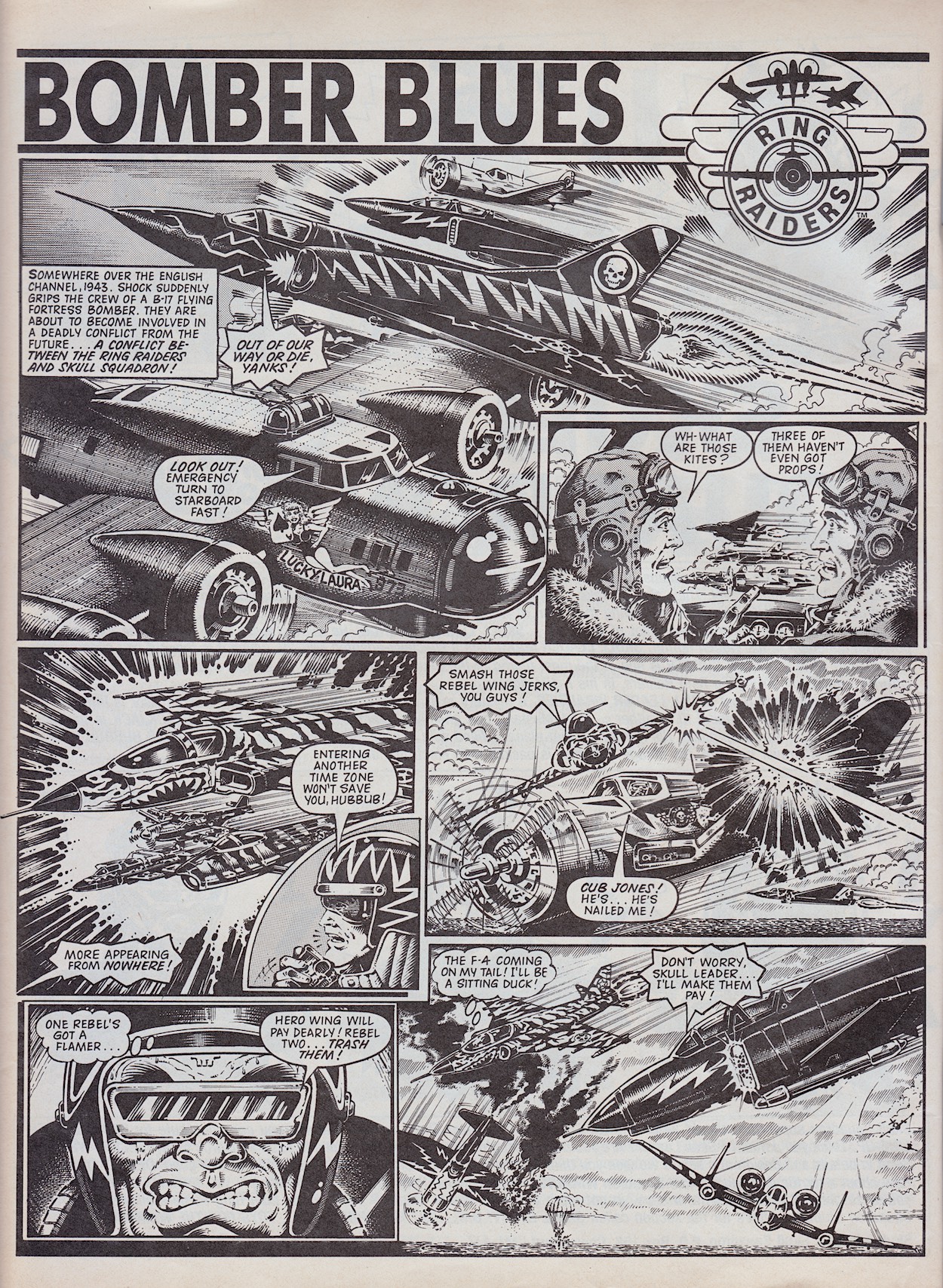
Barrie’s son James Tomlinson (Eagle, Super Naturals, Scream) went by the name ‘James Nicholas’ at the time and is an aviation enthusiast to this day. This is clear in the strip he wrote, Bomber Blues. We’re not sure what began the fight between Wing Commander Cub Jones and Skull Leader Hubbub but it doesn’t matter. Appearing in the skies above the English Channel during World War II, this was just about as perfect an introduction to the whole concept as you could wish for.
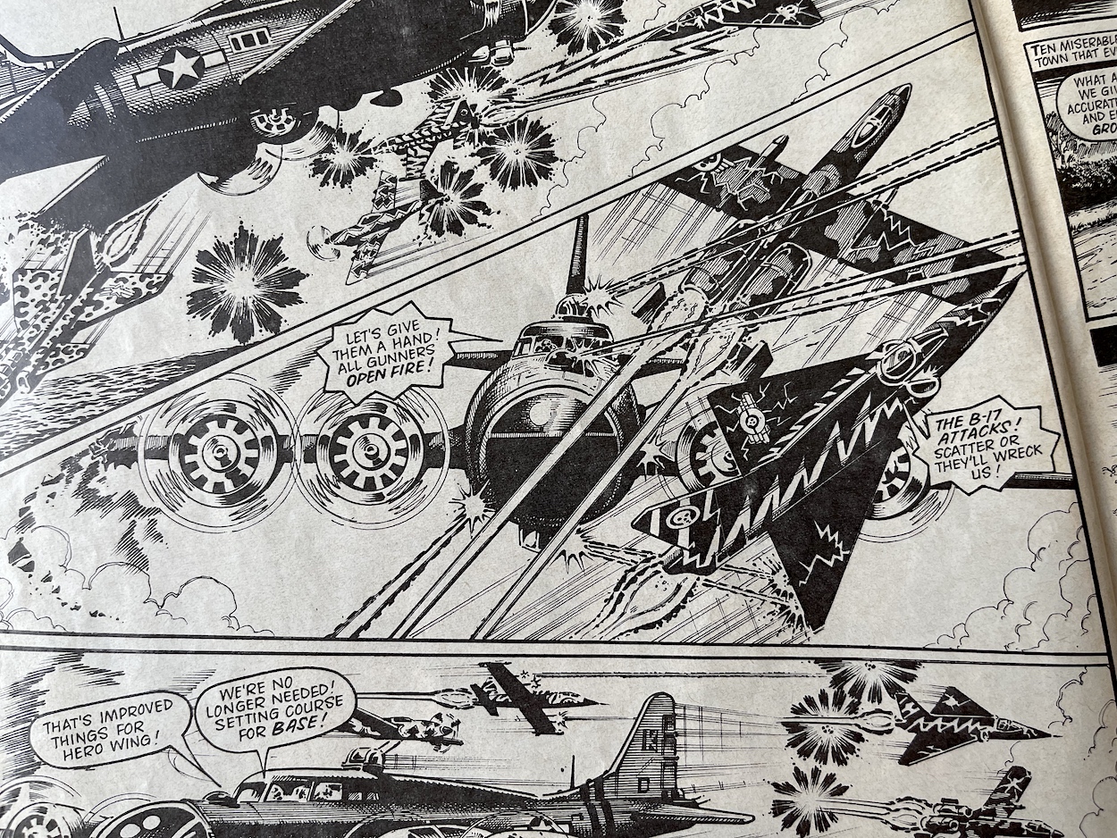
In contrast to the other strips this one takes place entirely in the air and sees a B-17 Flying Fortress Bomber become accidentally caught up in the battle between the futuristic craft. Really, what is there not to love about this? We even see one of the Rebel Wing pilots parachute out, becoming lost in the past just as I theorised above. The action is intense and culminates in one of Cub’s wingmen colliding with the bomber. Damaged but now with a clear sense of sides, the bomber crew come to the rescue of the Ring Raiders. All of this great, original action is brought to detailed life by Don Wazejewski (Battle, Mask). Beautiful stuff.
Fans of the toys who had purchased Cub Jones’ Hero Wing or anyone who had closely read the introductory spread above will have worked out this was set in the same year that Cub was originally beamed aboard the Justice. There’s no direct reference made to this in the story but it’s no coincidence and Cub’s affection for the bomber crew is made abundantly clear in the final panels when he gives them a ring through which they can summon him.
The only slight disappointment is the way the leaders call their wingmen by their identification numbers instead of actual names, which feels a little off after Trackdown went to the trouble of creating new characters. But it’s only a minor quibble.
“Let’s give them a hand! All gunners open fire!”
World War II F-17 Bomber crew rescuing the Ring Raiders
Apart from characters holding their ringed hand aloft as they head to battle this is the first time we see a ring properly mentioned. One of the many uses they had was as a communicator that could cross the globe and periods of time. When the comic was released I knew from the toys some of the other things the rings could do in the story but I like the fact the comic introduces these slowly one at a time. The same goes with the various characters and Wings.
As a result, nothing feels forced, nothing feels like it’s exposition and in that regard the series has a surprisingly mature way of layering in all the information needed to introduce this new world. As you’ll see across these six issues (which would’ve all been regarded as early issues if it had lasted, so kudos to Barrie and his team for hitting the ground running) the layers are added upon slowly, each new issue bringing new character, story and background developments. It’s a far cry from something like the early issues of Transformers five years prior which bombarded readers with everything they needed to know all at once, which felt very forced.
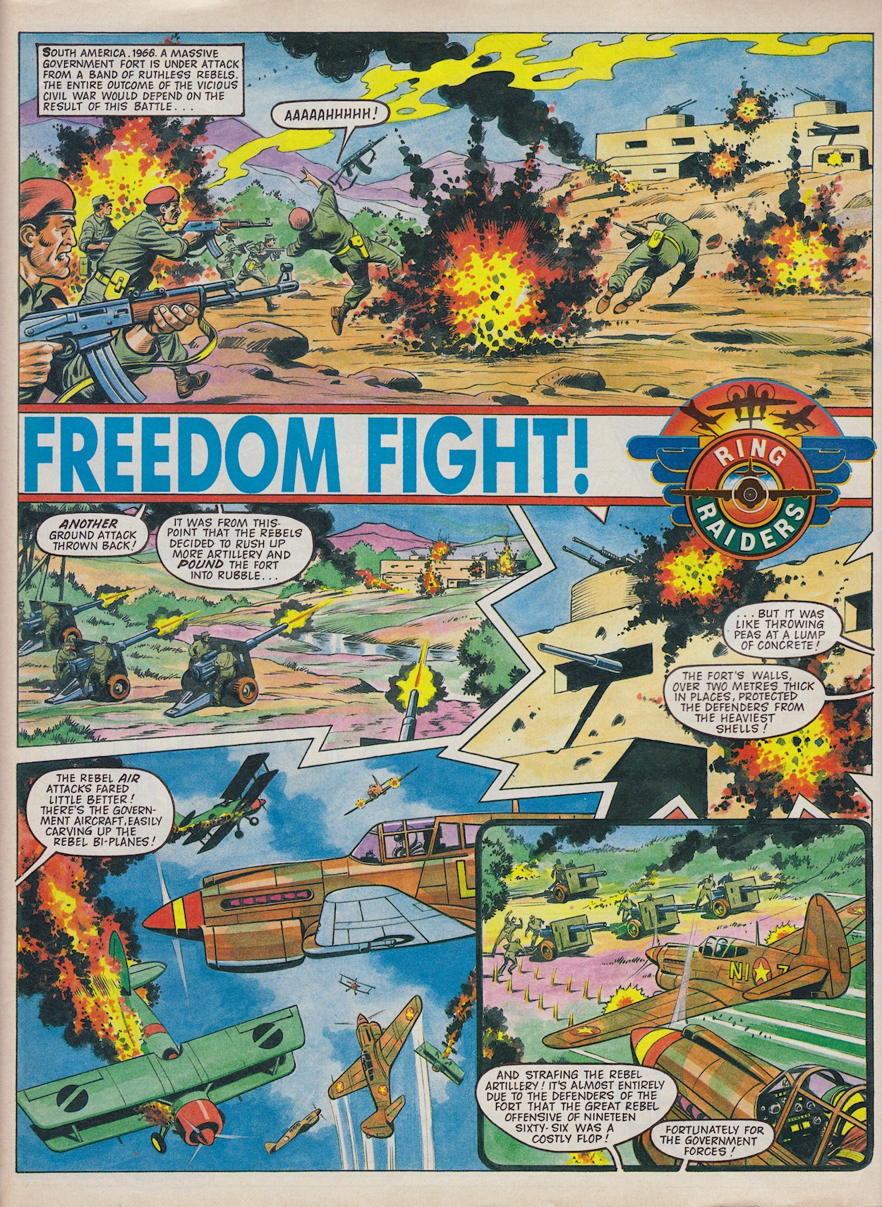
The final story is Freedom Flight, written by another long-time collaborator of Barrie’s, Tom Tully (Johnny Red, Bad Company, Dan Dare). Sandy James‘ art style will also be familiar to anyone raised on IPC or Fleetway licenced comics such as Teenage Mutant Hero Turtles Adventures or Mask. His colouring in particular is just magnificently bold.
The intervention of Skull Squadron is starting to change history, potentially destabilising the future of the country
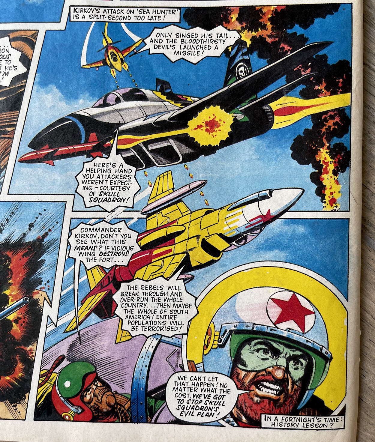
Here the main characters are Commander Yuri Kirkov and his Freedom Wing, who go up against Skull Leader Mako‘s Vicious Wing. The former was an instant favourite among fans given how the final years of the Cold War were still playing out and Kirkov was a Soviet Air Force major who had defected to America before Vietnam. Mako’s MIG-29 was a personal favourite toy with its shark motif and the fact the info on his toy packet stated there were “rumours” it could operate underwater.
History books tell of a South American government fort which easily defeated ruthless rebels in 1966, however the intervention of Skull Squadron is starting to change history, potentially destabilising the future of the country. Kirkov discovers the tide of battle is about to change forever when Mako’s missile hits the fort. The situation is dire. While it’s only three pages a lot happens, with these gloriously dynamic final panels providing not only a superb cliffhanger but the perfect end to the entire issue.
These panels take up about a third of the back cover and it’s a gorgeous display to end the issue on. The action, the distant fire, the detailed face of Kirkov compared to the basic toy design, as well as the interesting plane angles all beg for more.
Barrie explains in his book how he found the fortnightly schedule of Wildcat interesting and wanted longer stories in its 32 pages to hold readers’ attentions for the two weeks, compared to the three-page tales of Eagle. As a result each of its stories were five or six pages in length. Ring Raiders was also fortnightly but had 24 pages to fit in just as many stories. But there was so much packed into each one that we never felt short-changed by any of them.
I was also collecting the weekly Transformers which contained three stories of roughly five pages each. Ring Raiders felt like a much meatier read and after this first issue I was an instant fan. I had already known I would be though and the regular order had been placed when I purchased the issue. I hope you’ll join me on a regular basis too and return on Thursday 30th September for #2 of a bloody brilliant comic.
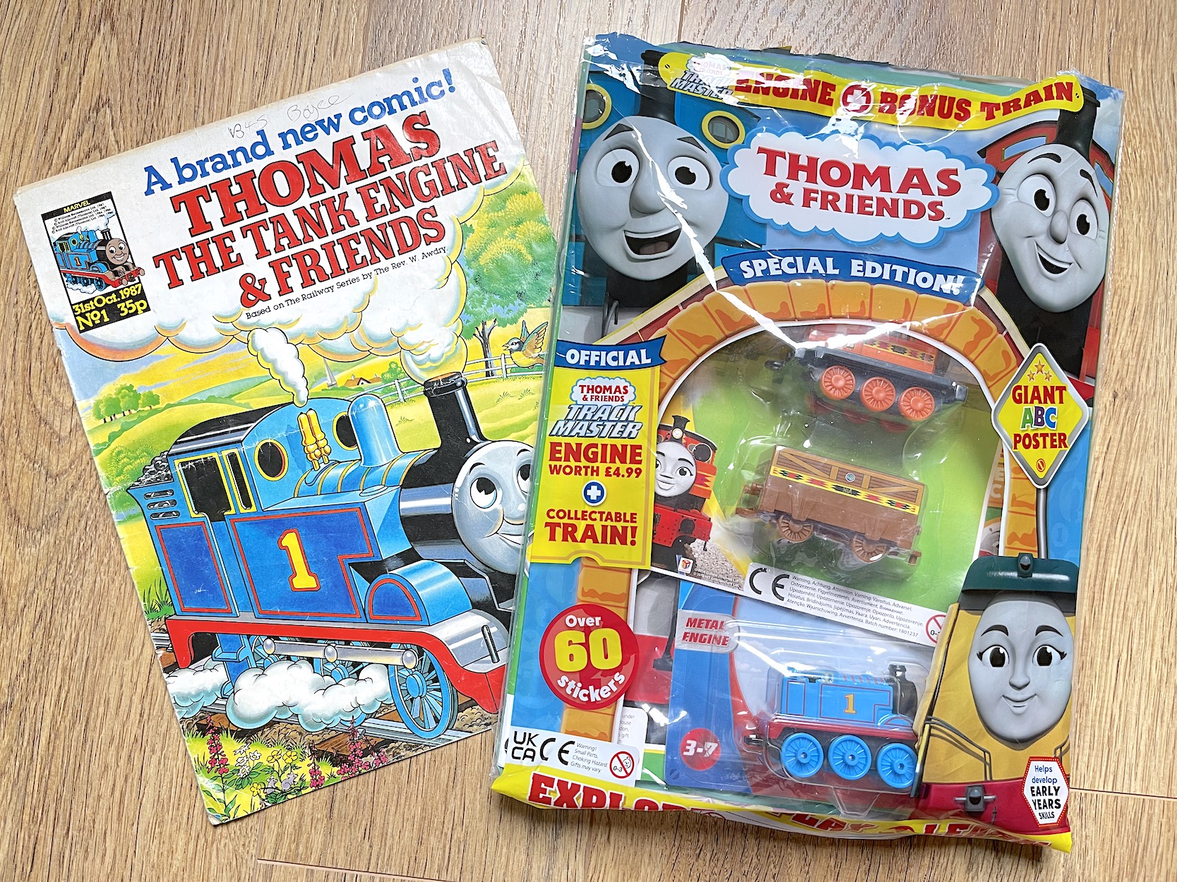
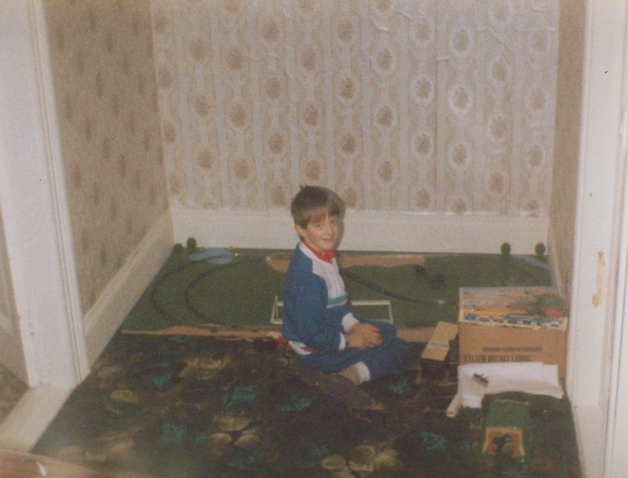
Back in 1987 I was nine-years-old and already a bit above the target audience for Thomas the Tank Engine & Friends, but growing up in a town with actual steam trains (the headquarters of the Railway Preservation Society of Ireland were just around the corner from my house) a lot of the kids in my town loved the original Railway Series books by the Rev. W. Awdry and the subsequent TV series with those stunning model layouts. In October ’87 I found myself in the newsagent to pick up the latest issue of OiNK, the only comic I was collecting at the time and I spotted “A brand new comic” on the shelves.
This was my first ever Marvel comic, believe it or not. I even got my drawing printed in a Christmas issue!
I collected it for about two years before finally moving on but over the years I’ve seen younger family members and friends’ kids become fans just as I had been. Working in newsagents over the years I was aware the comic was still ongoing, surprisingly keeping the original numbering even though it had gone through a couple of different publishers. Then a few months ago while browsing the children’s comics for a friend’s wee boy I discovered Thomas & Friends (as it’s now called) was at #797!
So fast forward to the present and I’ve bought #800 for him and thought I’d open it up to see what’s inside and compare it to the original. But first let’s just dwell on that issue number for a second. The 800th issue! This makes it the longest-running UK licenced comic ever. It’s an amazing achievement and I doubt it’s going to come to an end any time soon, the TV series is as popular as ever.
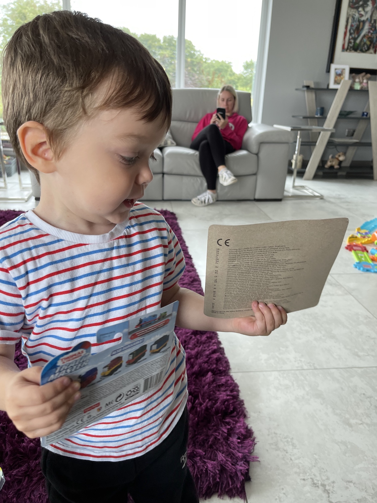
Now, when I mention modern children’s comics there’ll inevitably be a chorus of middle-aged men complaining that they’re “nothing more than flimsy leaflets” with “cheap tacky toys” in plastic bags “pushing the price up”. Well let’s just put this to rest once and for all, shall we? While the comic magazine itself doesn’t mention it’s celebrating the milestone it’s still packaged as a ‘Special Edition’ and contains a die-cast metal Track Master Thomas which on its own sells for £4.99 in the shops. Not a bad start!
For just £1 more than the cost of the toy, for £5.99 (usually it costs £4.99) you also get a 36-page issue printed on really great quality matt paper with a gloss cover and it’s chock full of content for younger fans. There’s also a second, plastic toy set produced specifically for it, a large double-sided wall chart, a poster and loads of stickers which are used throughout the pages as you’ll see below. I’d say that’s a bargain.
Interiors of the first and latest issues show it’s very much the same beast at its heart
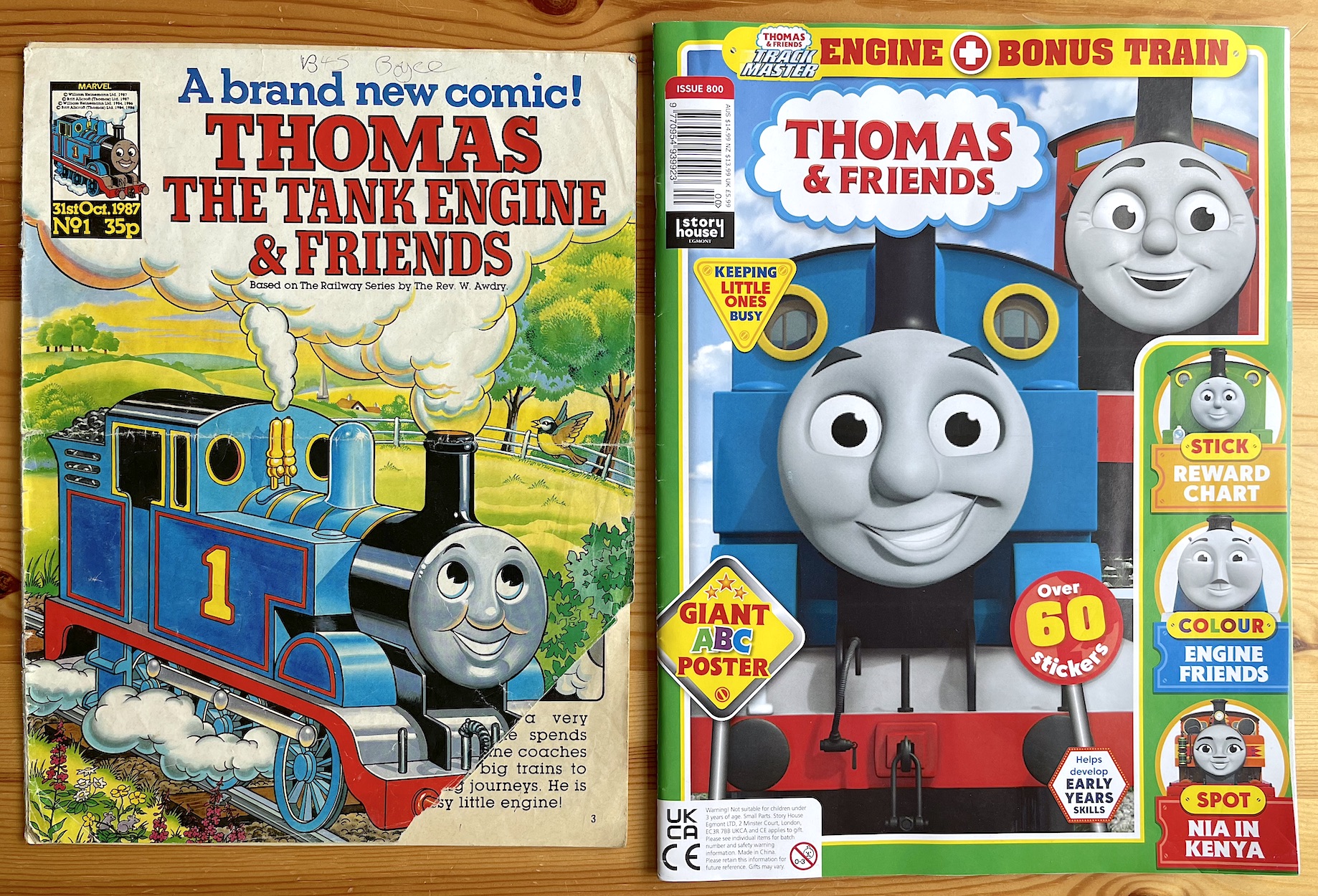
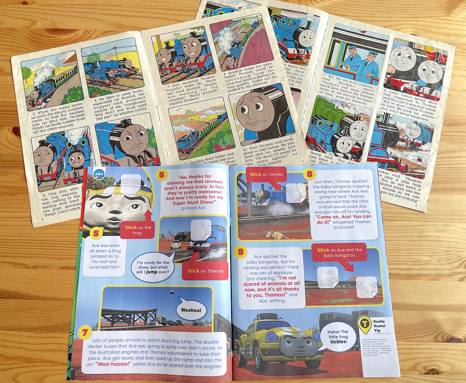
So how does it compare to the original comic I bought for 35p back in 1987? I’m not mentioning the cover price for comparison reasons, it was 34 years ago, of course it’s going to be a lot more expensive, just as 35p was a lot more expensive than comics from 34 years before that. But I thought it’d be interesting to see how things have evolved after 800 issues, so below are some of the interiors of the first and latest issues and as you’ll see, it’s very much the same beast at its heart.
The main element of the original comic was the picture panel stories, which for the first year were adaptations of the TV stories (which in turn were adaptations from the books) then after that were all original, written specifically for the comic, some being adapted back on to the TV. There was also a short prose story every fortnight which readers were encouraged to “read aloud”.
These formats remain although with so many years of the show to pull from now they all seem to be adaptations and use stills from the current CGI series rather than original illustrations. What’s neat is how those stickers I mentioned are used throughout to fill the gaps in stories, features, puzzles and more. For the young readers it’s like a really fun old-school Panini sticker album on top of everything else is contains.
Obviously back when I was nine my attention span didn’t last long enough for me to finish colouring this image of Thomas and it’s remained as such all this time. The activity can be found a few times in the current publication, on two dedicated pages and even the editorial credits page.
As a nine-year-old I was already too old for the comic if I’m completely honest, evidenced by the ABC collection and some very simplistic puzzles such as Henry the Green Engine highlighting other green things the younger readers were meant to identify. I just ignored these and kept to the stories, editorials and letters page, as well as the middle-page spread below. But for the target audience they brought a level of interactivity to the comic and this is something the modern version continues.
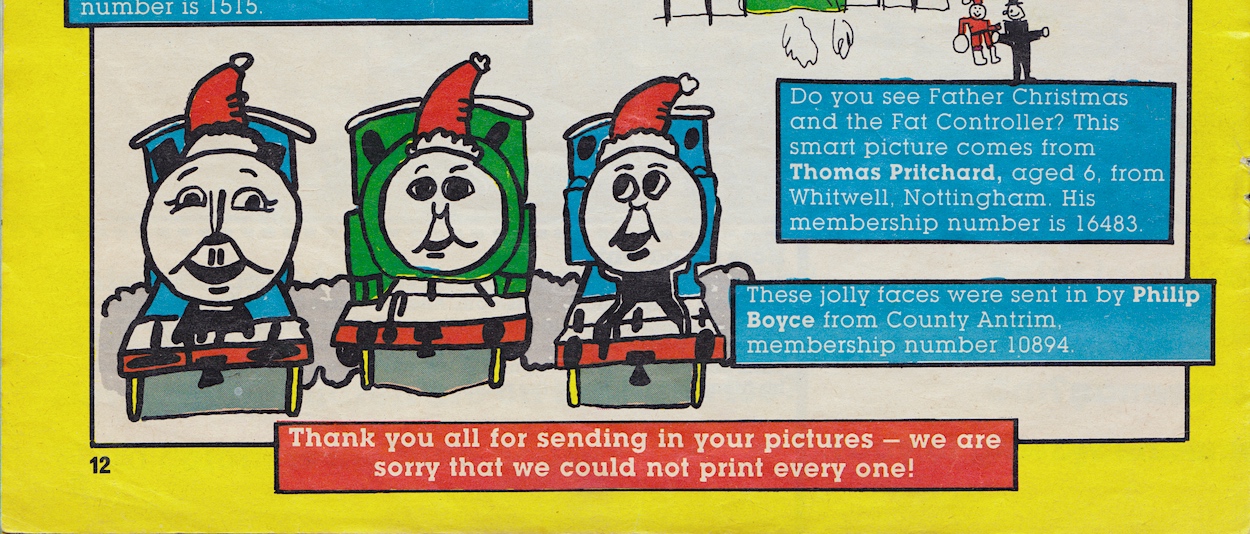
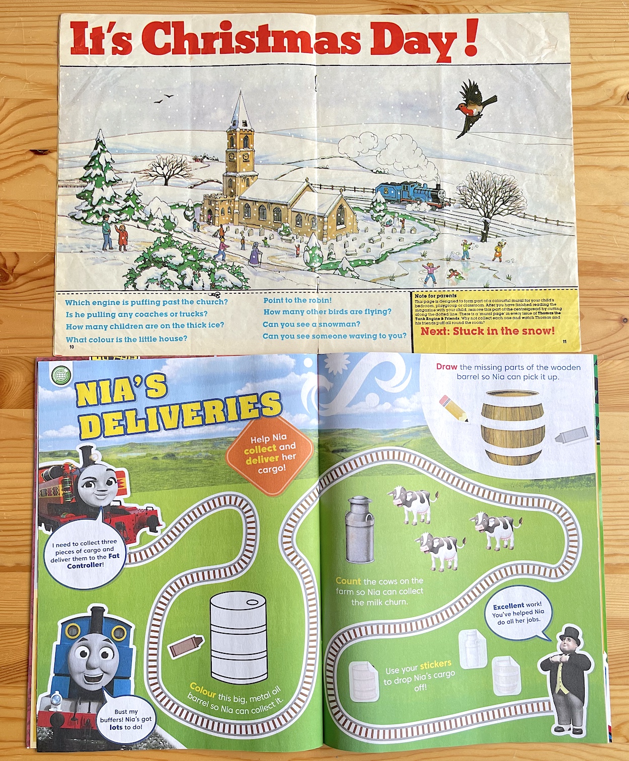
The middle pages of my #1 are missing so this is from the only other issue I kept (#31) which was the second Christmas issue and the one I had my drawing published in. The middle pages had very simplistic questions about what could be seen in the picture but the reason it’s missing from my first issue is because they could be cut out and hung on the wall, issue after issue creating one long drawing around the Island of Sodor, wrapping its way around our bedrooms.
I’m clearly not the target audience so the final word has to go to Ollie
There may not be murals but there are plenty of CGI shots from the show used for spot-the-difference pages, mazes, pin-ups, puzzles and so much more. Even the competition in #800 reminded me of the one we got in #1. Thomas & Friends may look very different from the Marvel comic on first glance but take a closer look and it’s a very natural progression. In fact, I’d go so far as to say I’m surprised just how much it’s kept to the original ideas.
But I am clearly not the target audience so the final word has to go to the little person I bought it for, my friend’s baby boy, Ollie. As you can see, he’s clearly very happy with the gifts that came with it. In fact, three months before his third birthday he saw them and came out with, “Thomas the train”, which he’s never said before! A very cute moment.
His mum Vicki had a look through the comic itself, at the wall chart, stickers and the contents as a whole and remarked at how much was in it. Not expecting it to be much more than an excuse to package the toys in with something, she was pleasantly surprised at the value.
So there you go, if you have a young child in your life who watches Thomas & Friends on TV this is a top comic magazine for them. Usually £4.99 every four weeks, #800 is £5.99 but then again you are getting a toy which is normally a fiver on its own (and by the looks of it #801 has one too). It’s available online but everywhere I looked was charging around £10.00 for it because of bulky postage, but you’ll find it in most newsagents and supermarkets easily enough.
To finish with, here’s a look at the original audience and the current one.
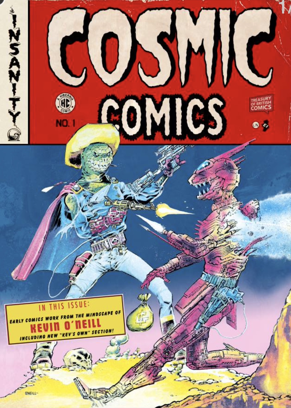
Hot on the heels of the news Rebellion is to reprint some of Tom Paterson‘s OiNK strips later this year in The Tom Paterson Collection, comes the news of a Kevin O’Neill strip from one of the OiNK Books seeing publication again! The strip in question is the brilliant The Truth About Santa, written by Tom Thug and Pete and his Pimple cartoonist, Lew Stringer.
Kevin is probably best known for his 2000AD work, most notably Nemesis the Warlock, as well as Marshall Law and The League of Extraordinary Gentlemen. For OiNK, he contributed to two issues.
First up was a fantastic four-page The Price is Right parody in the 1987 Holiday Special and later that year came the first annual and the highly memorable strip above. Anyone familiar with Kevin’s work and his very unique style might wonder what kind of Christmassy strip this could be. All I’ll say is that you will not be disappointed! Kevin really is one of Britain’s Best.
So anyway, a second edition of Kevin’s Cosmic Comics book has been released by Hibernia Comics in association with Rebellion’s Treasury of British Comics and Gosh. The first version went down a storm but this is more than just a simple rerelease, it contains a lot of extra content too. There are 28 more pages (making 96 in total) and what’s in this new section falls under the banner ‘Kev’s own’, compiled by the man himself.
Lew announced the news on his Lew Stringer Comics blog with the following details:
“[‘Kev’s Own’] is a collection of Kevin O’Neill’s early covers, samples and unpublished work for magazines like Interplanetary News and Legend Horror Classics, as well as Titan books cover designs and the never-before-reprinted 7 Wonders of the Galaxy series from 2000AD and more! Also included in ‘Kev’s Own’ is commentary by Kevin on the art included and his early career.”
Chronicling Kevin’s career and the development of his art over the years this is a must-have for fans, of which there are plenty so if you are one I suggest you get clicking over to the Hibernia shop now and get this ordered, because this is a very limited print run. Priced at £10.49 plus postage it’s also unmissable for any OiNK fans who’d like to support any reprint releases. UPDATE: Unfortunately it appears the comic has now sold out. If I find out of any further rerelease I’ll let you know.
That logo brings back so many happy memories. For a while back in the late 80s and early 90s I was obsessed with the Ring Raiders toys by Matchbox and I even cut out that name from the box of one of the bases and stuck it to the outside of my bedroom door. Some kids had their names on their door, but not me. Like I said, I was obsessed. You can find out more about the Ring Raiders toys (and merchandise) in my introductory post.
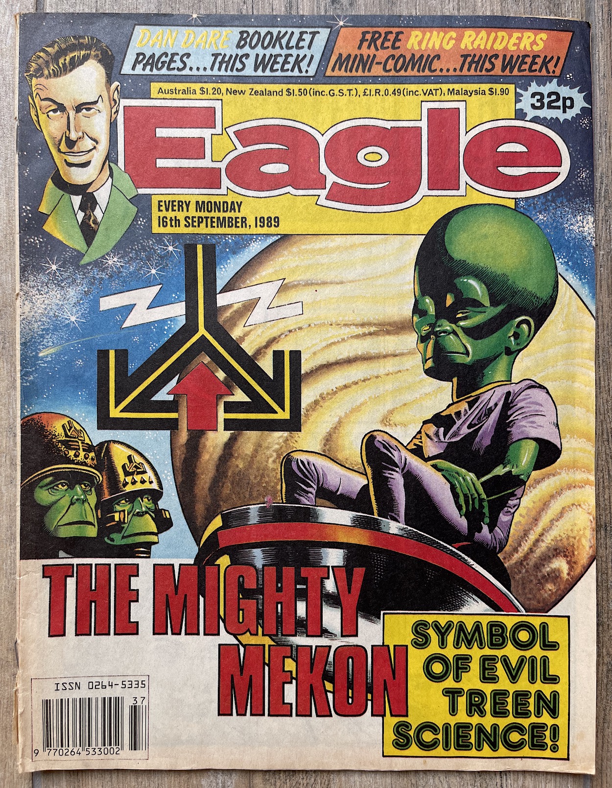
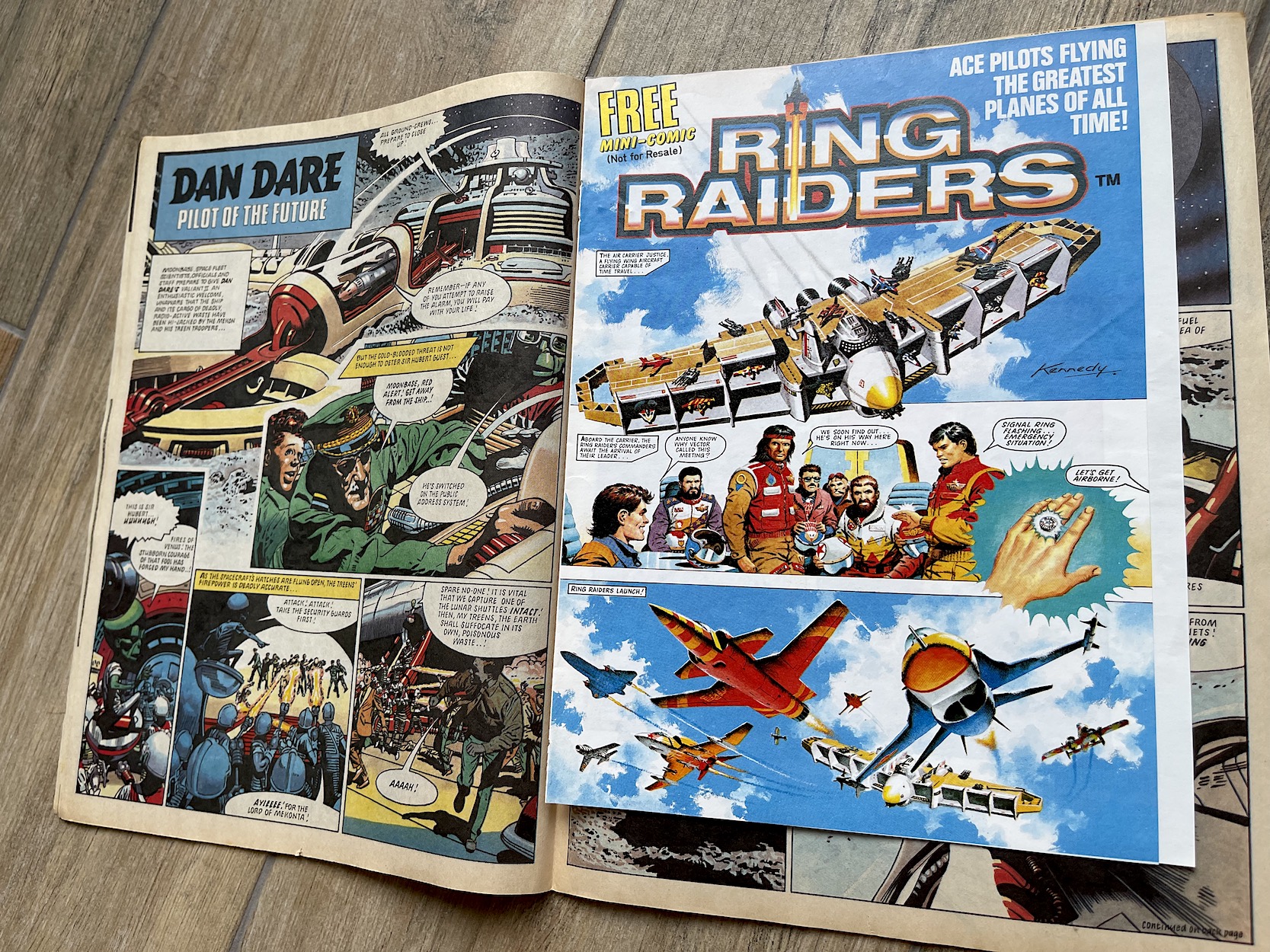
The real time read through of the short-lived but truly brilliant comic series begins today with the issue of Eagle dated 16th September 1989 (on sale 9th September). A banner along the top of the cover alerted readers to the free gift inside, one that would signal the release of the brand new licenced title from Fleetway.
Inside the matt paper of Eagle was a free Ring Raiders mini-comic, printed on higher quality stock that really made it stand out. The bright paper also makes the gorgeous Ian Kennedy artwork really pop! While Ian would contribute to every single cover for the fortnightly this would be the only time he’d produce a strip and it’s certainly an eye-catching piece. I wasn’t aware of this preview’s existence until a few years ago, but if I’d been reading Eagle at the time and saw this upon opening the comic, I think I may have found it hard to breathe with the excitement.
Okay that’s an exaggeration, but probably not as much as you think.
Four pages isn’t a lot, let’s face it. But this was par for the course by this stage in the UK comics market. OiNK was the first for the 80s to establish using a preview comic for marketing a new release and they did so with a full-size, 32-page publication given away free in a handful of IPC titles (who would later sell all their comics to Fleetway). That was in 1986.
In 1987 another of Barrie’s creations, Super Naturals began with a 16-page preview issue with full-sized pages, then in 1988 his original Wildcat comic’s preview was also 16 pages but at a reduced size. In that same year Marvel UK launched its Visionaries monthly with a small four-page mini-comic, made up of an edited down version of the story to be published in the first two issues. So you can see how things had developed over the decade.
It was an exciting read every fortnight and really holds up today as a top quality read
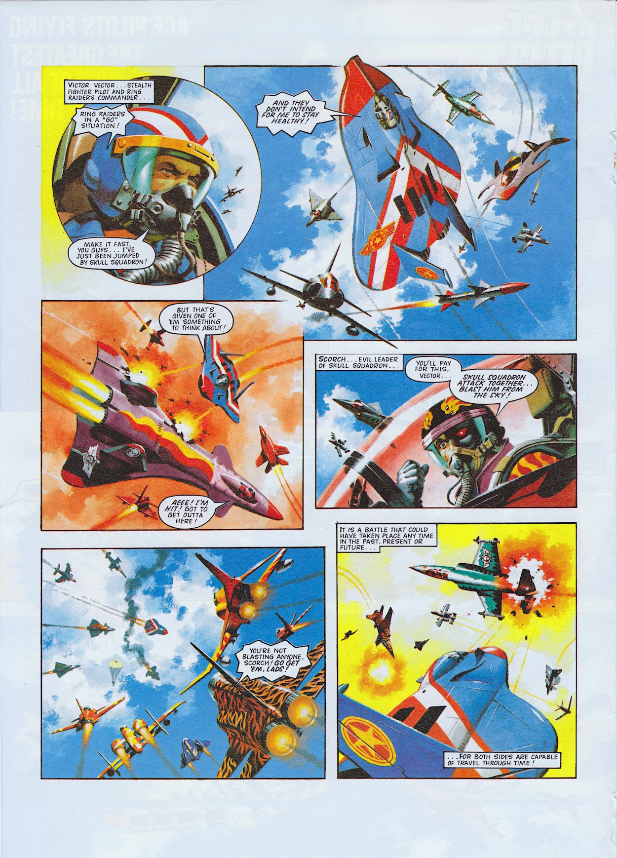
Space was at a premium here to grab the attention of the readers sufficiently enough to get them to buy a new comic, but Ian’s gorgeous hand-painted artwork is certainly bold enough. A basic plot written by Eagle and Ring Raiders’ editor Barrie Tomlinson is just to set up a big mid-air battle between the Raiders and their enemies, the Skull Squadron, in order to show off the kind of action we could expect.
Aboard their time-travelling Flying Fortress the Air Carrier Justice they’re alerted to a mayday from their leader Ring Commander Vector. The person receiving the alert via their ring is actually one of my two favourite characters and pilot of the futuristic Grumman X-29. I talked about this being my first purchase in the previous post. What follows is a double page spread of gorgeous aerial action featuring all kinds of various aircraft from across time, which as an aviation enthusiast must’ve been really enjoyable for Ian to draw.
In the toy line, and indeed in the comic proper, the pilots shown here would each command their own wing of four planes and pilots. But for the benefit of this preview and introducing the readers to the concept it’s best to show as much variety in aircraft type and aesthetic design as possible, so the Wing Commanders of many different wings are used instead. It works a treat and certainly comes across as confident in the concept’s ability to produce dynamic comic action.
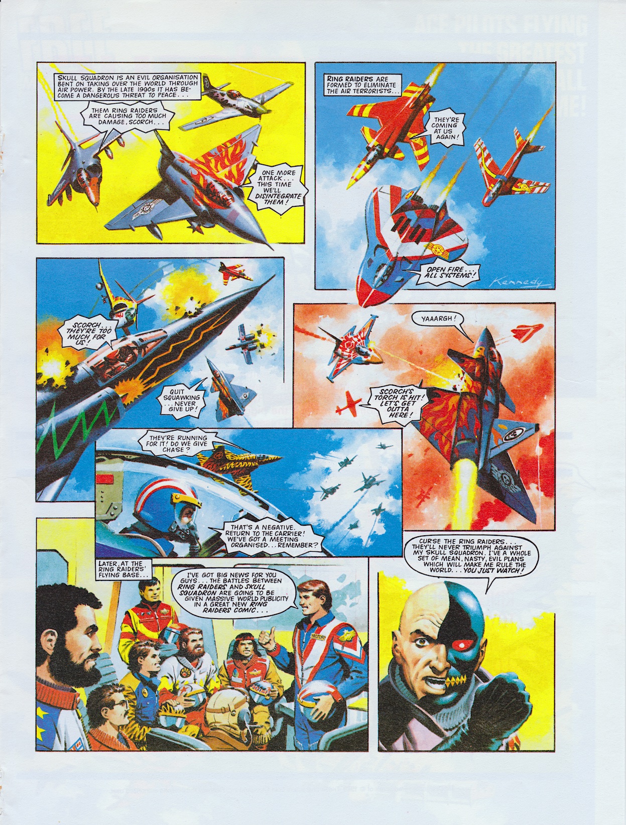
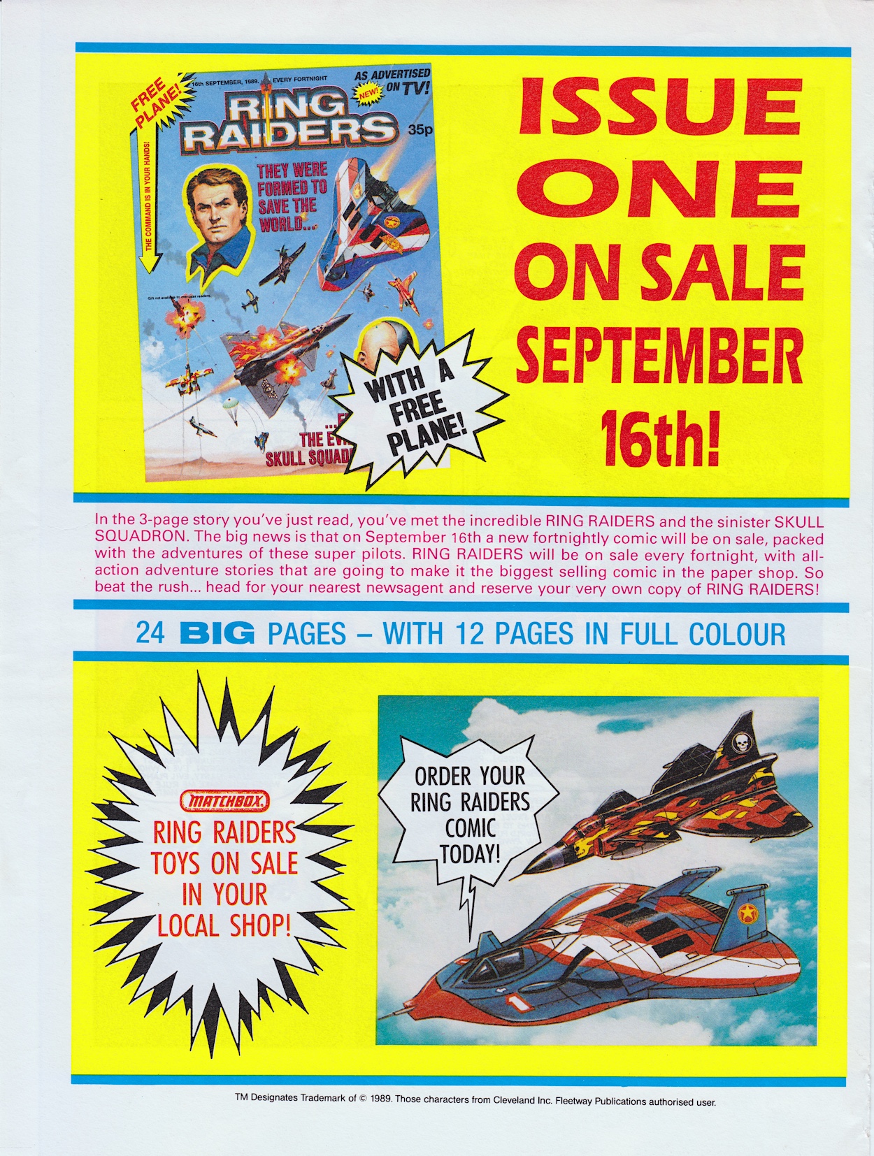
The back page shows Ian’s cover for issue one, the first I saw as a child and mentions the brilliant free gift (an actual Matchbox Ring Raiders plane) and the fact the pages will be bigger, with half in full colour, which is much more than the comic this preview was given away with. If only it had become as big a seller as the hype states here! But that’s something we’ll deal with at the end of the real time read through.
As I’ve said before this remains my second favourite childhood comic, with only OiNK beating it to the top spot. It was an exciting read every fortnight and really holds up today as top quality stuff. There’s some real depth to the characters (which is no small feat given the toys and the outlandish setup), hints of big epic stories to come, loads of action, a sense of humour and exciting artwork.
So for the next few months I’ll be reviewing each issue on the date of its original release, going in-depth into stories, characters and art and giving my honest opinion on reading the comic now as an adult, as well as reminiscing about what it was like at the time, obviously.
212 pages in total, the next 24 of which will be winging (I really do have to stop the plane puns) their way to you on Thursday 16th September 2021. I hope you’ll join me then. The Command Is In Your Hands!