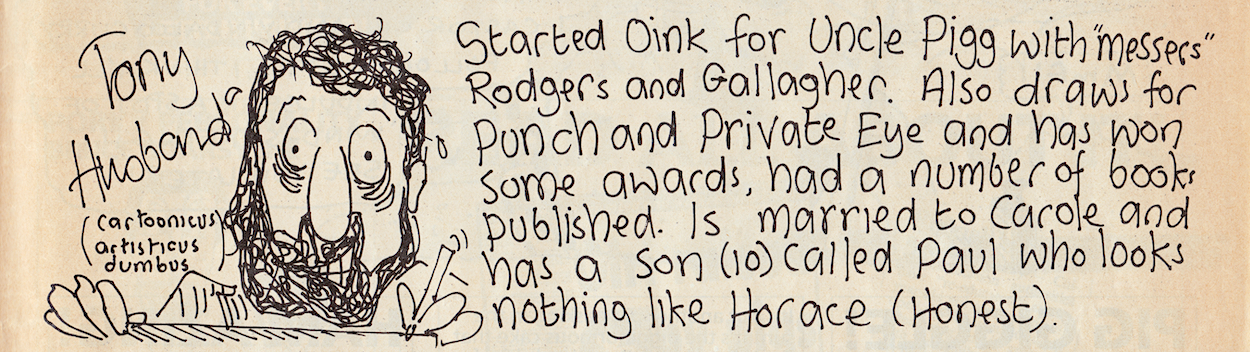
The following post was originally written forThursday 19thbutwas held back afterthesad news of Tony Husband’s passing
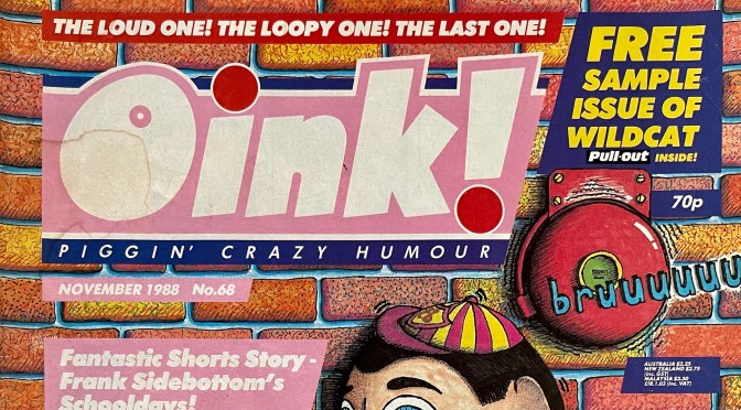
Back in #60 of OiNK the reservation coupon held a hint that changes were afoot, a hint that would only be picked up on with hindsight. Likewise, looking back on last month’s issue the same coupon told a tale by its very absence, replaced as it was by one for 2000AD. At the time we had no idea what was about to happen. Well, unless you also collected Buster and had seen the news up to seven days beforehand. Instead, for us the next issue was all about that Frank Sidebottom cover!
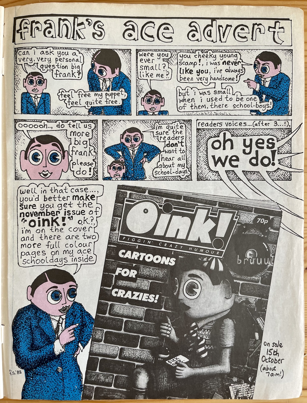
I love Frank’s (Chris Sievey) retort when Little Frank asks him if he was ever small like him and the little bit of extra information about when we could pick up our copy on the day (albeit the issue actually came out between five and seven days later, more on that in the review). Having Frank on the cover meant his strip was to be the main highlight of the next big, fat porker of a monthly OiNK and as a kid I couldn’t wait! You can see what all the hype was about and if it was justified (it was) on Sunday 22nd October 2023.
Thanks to Davy Francis for this brilliant caricature of Tony
I never met Tony Husband in person but I did have the opportunity to speak with him on the phone a few times over the years and online. He was always so enthusiastic about OiNK and everyone who had worked on it. His passion for the comic was infectious, his love for all of its contributors clear as day and he was always so open to chatting and reminiscing.
Tony loved people, adored animals of all kinds and cared deeply for our planet. He often reflected these aspects of his character in his cartoons, not only in OiNK but across the spectrum of his output since becoming a full-time cartoonist in 1984, including publications such as Private Eye, Punch, Playboy and The Spectator amongst others. He also released his own critically-acclaimed books, including the highly regarded Take Care, Son: The Story of my Dad and his dementia.
For me he was best known as the creator of Horace (Ugly Face) Watkins in OiNK, the comic he co-created with Mark Rodgers and Patrick Gallagher. Starting off as a strip in which we’d giggle at the situations he found himself in, it matured over time, developing into an ongoing serial covering Horace’s trials and tribulations as he tried to live a normal life, often while being treated as an outsider. It contained a strong message to never judge anyone based on their looks and delivered this with plenty of laughs, the best way to teach life lessons to children.
In the end Horace became a successful footballer and met the woman of his dreams, with him and Mandy marrying after one last adventure in a Holiday Special after OiNK’s cancellation. Tony’s humour was key in my development as a kid and his messages (always delivered in a way that never felt like important messages) had a profound effect on me. I’m sure I’m not alone in thinking that.
This particular cover brings back happy memories too. Later in OiNK’s run my cousin gave me a few of his back issues that I’d missed and while sitting next to my late nanny at his house she saw this cover, looked at me and giggled like a little schoolgirl. She knew my mum (her daughter) would tut and shake her head, but my nanny found it so funny. I miss her greatly and this is one of my earliest, happiest memories of her. This cover brings a smile to my face for that reason every time I see it, all thanks to Tony.
Of course many know Tony for his cartoons in Private Eye and the like, his quick gags always raising a chortle. When OiNK went weekly for a few months in 1988 a whole page was given over to Tony to bring us that same kind of humour. With a completely different scenario every issue, a quick gag played out in a large format every seven days. I loved them as a kid, they were just so silly. As an adult reading OiNK for the blog, these were just bliss for sixteen weeks.
Tony wasn’t just known for his own OiNK pages, he also wrote the scripts for some absolute fan favourites drawn by a mixture of brilliant cartoonists. The Spectacles of Doom was an incredible serial that spoofed fantasy films of the 80s and was drawn by Andy Roper, The Slugs saw Tony bring his love of punk music to the comic with suitably raucous art from Les ‘Lezz’ Barton and for Tom’s Toe he ingeniously brought in John Geering to parody his own work from other, more traditional comics.
It’s sad to realise everyone involved in these strips is no longer with us. However, Tony’s unique sense of humour, so prevalent in each one, ensures the laughs are never too far away. A deliciously dark side of his humour could also come to the forefront upon occasion, such as when Ian Knox drew Tony’s Crablad, the ending of which was certainly delicious.
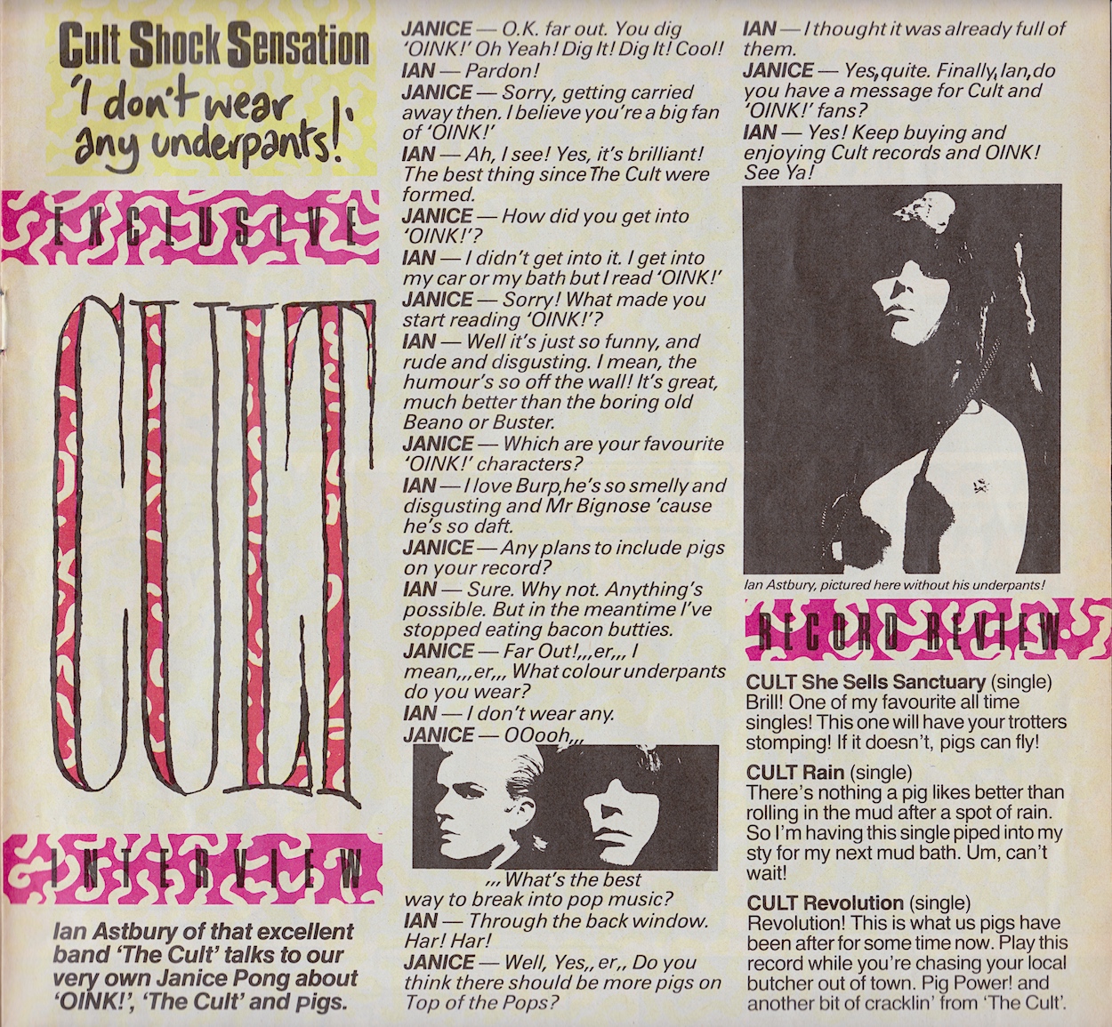
In the first musically themed issue Tony interviewed the lead singer of one of his favourite bands, The Cult after he found out they were fans of his work and of OiNK, something which Tony told me about with such joy in his voice; it was a special moment for him, to be sure. Tony also said he had a surreal moment after the interview when Ian Astbury asked him about some missing OiNK merchandise he’d ordered, which Tony then chased up for him. It was a crazy time.
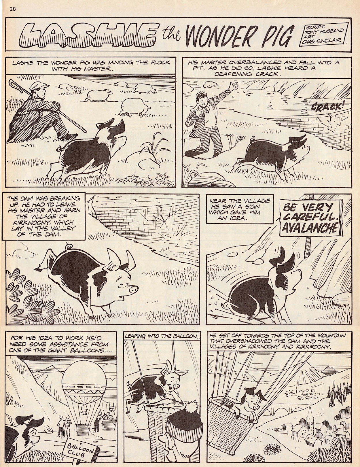
Tony would team up frequently with Chas Sinclair for many a random strip, however he also created serial The Wonder Pig, whose lead character name would have a different spelling in every outing. Chas’s style was the perfect fit for Tony’s loveable, heroic, yet completely daft pig. Most memorable of all their collaborations was Tony’s take on Wuthering Heights, which had one of the most random and thus completely laugh-out-loud funny moments in all of OiNK for me.
Tony won many awards over his career including the prestigious Pont Award and during OiNK’s lifetime the Cartoonists’ Club of Great Britain’s Strip Cartoonist of the Year Award, which the comic proudly told us all about. Just right. He also co-wrote The Psycho Rap for the flexidisc and OiNK 45 record, so all of you pig pals who can’t get “Don’t eat pigs, ‘Cause they’re made from hhhaaammm, Eat that Nast-y Butch-er Man” out of your heads all these years later have Tony to thank/blame.
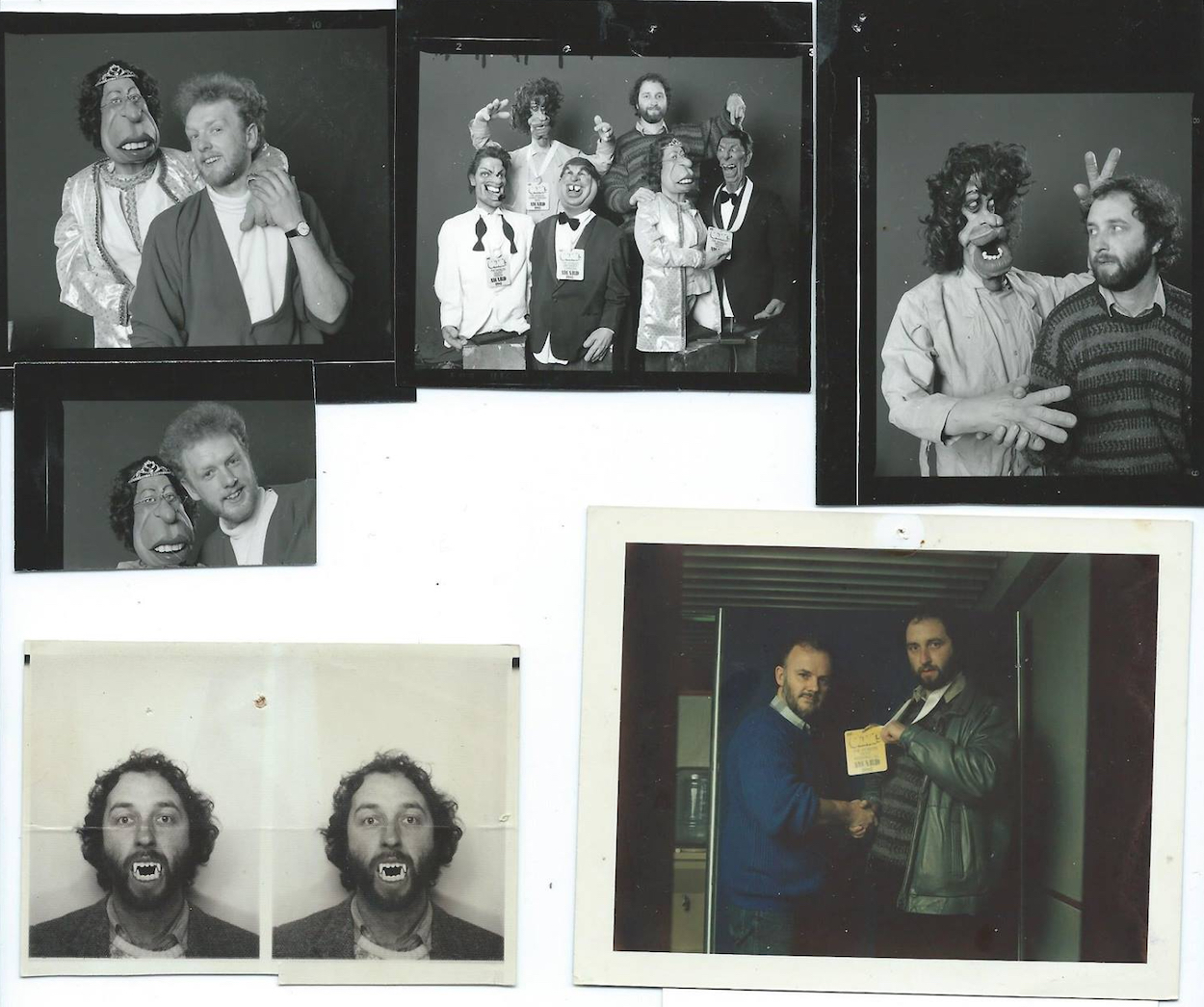
Above are some photos Tony shared (taken by Ian Tilton) of the time they teamed up with Spitting Image to hand out the OiNK Awards to various rubberised celebrities (and the occasional real one). That’s friend of the comic John Peel with him, and a photo taken for early promotional material showing who was responsible for editing the new comic.
After OiNK finished Tony, alongside Mark and Patrick, moved on to create the award-winning Round the Bend TV series for CiTV with the Spitting Image team. I’ve very fond memories of that show. I didn’t know who was writing it, I never looked at the credits at that age, but it spoke to me in a way other children’s comedy shows didn’t, it really made me laugh! I really should’ve clicked who was behind it.
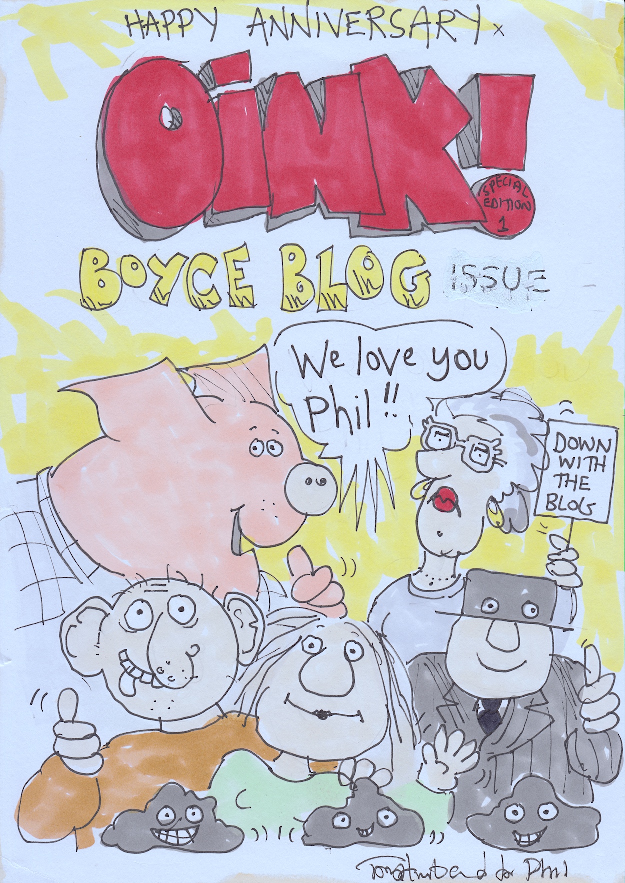
For the first anniversary of the previous OiNK Blog I received a surprise parcel in the post. It was this marvellous birthday card from Tony! I couldn’t believe it when it arrived, I’d no idea Tony had drawn it or that he was even paying that much attention to the blog until I saw this. That was Tony, always thinking of others but never making a big deal out of it. It was just his nature, to be kind and thoughtful.
I wish I’d had the opportunity to meet him and I can’t quite believe he’s actually gone, taken far too early. Tony was such a huge, formative part of my life and his work, his humour and his humanity will continue to be an inspiration to myself and countless others for the rest of our lives.
On that note, I think it’s only fitting to let Tony himself round things off as the sun sets on an incredible life and an incredible person.
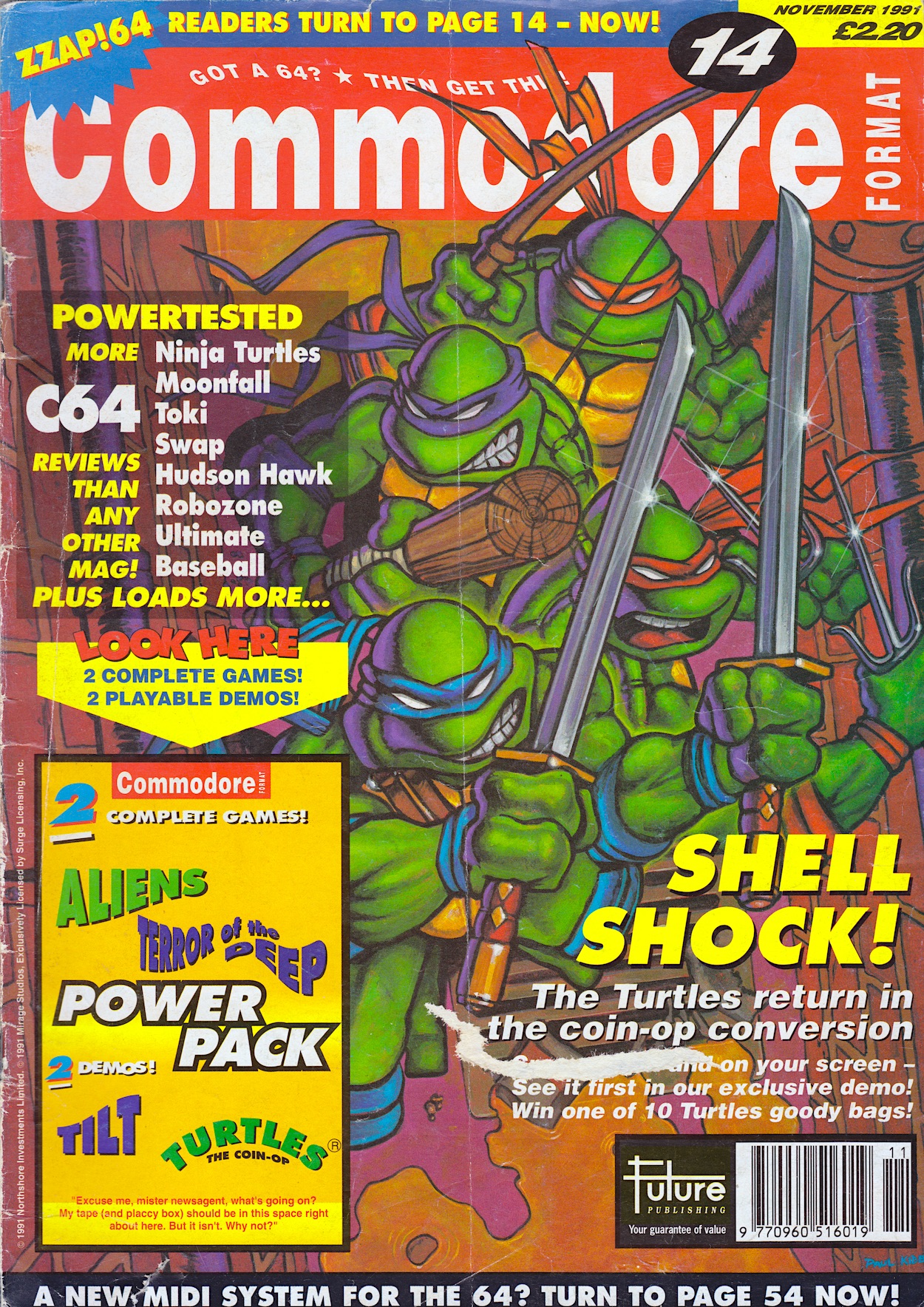
Now here’s a publication, and indeed a specific issue of said publication, that I have a huge soft spot for. It’s my first ever magazine, on sale today 32 years ago. In the summer of 1991 when asked what I’d like for Christmas, and having spent a lot of time playing on my friends’ Spectrum and Amstrad computers, I really wanted something to play computer games on. My parents made me a deal: I could get a computer, not a console. I had to have something I could use for school too.
My mum handed me her Littlewoods catalogue and despite the new, more powerful Atari ST and Commodore Amiga computers on the page I was instantly drawn to the Commodore 64, mainly due to it having accessories I recognised such as cassette players and external disk drives. I’d heard of the machine and knew it was more powerful than the ones I’d been playing with friends so that’s the one I chose.
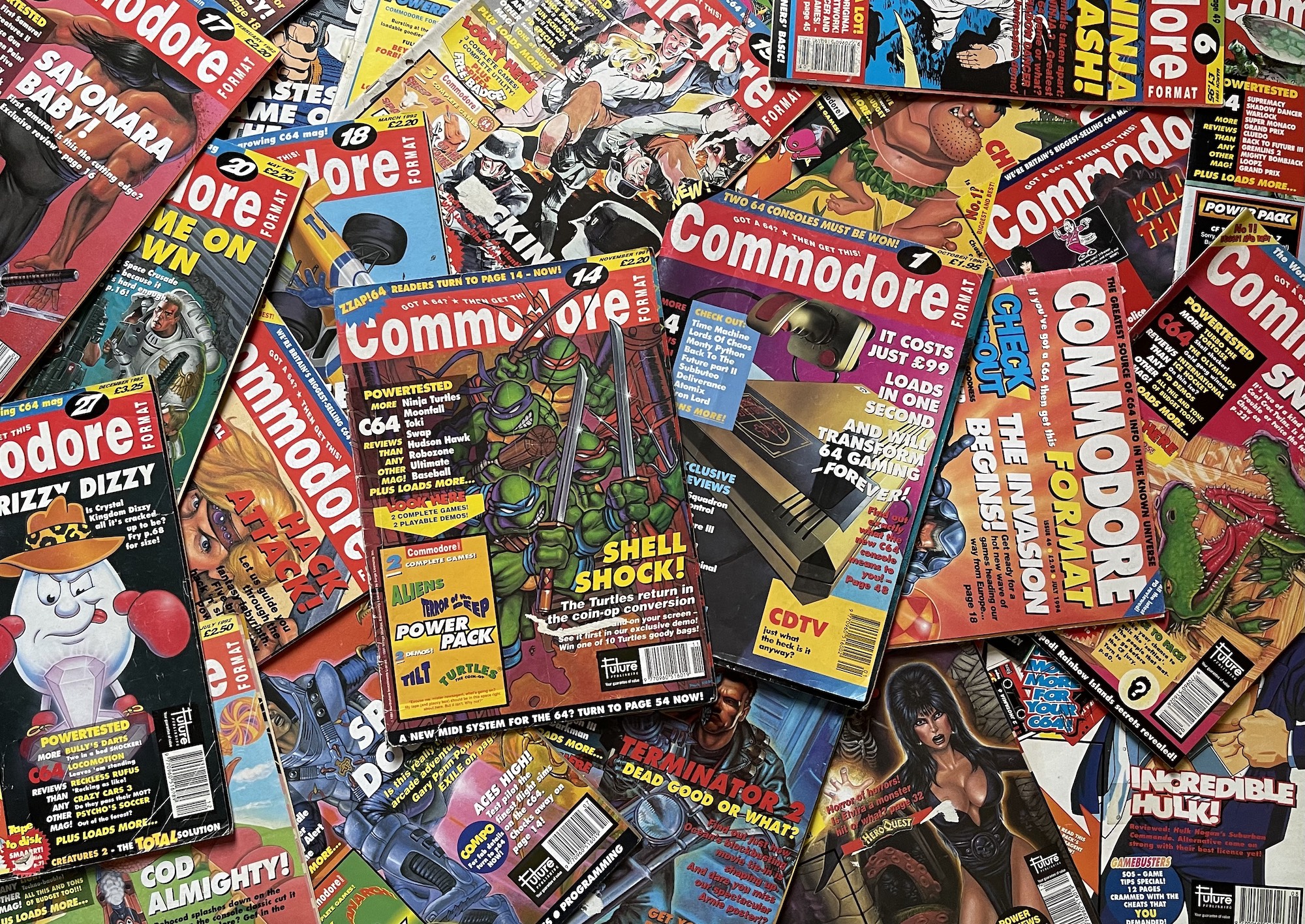
I knew of a magazine called Zzap!64 and decided I wanted to check it out but couldn’t find it at the newsagent. However, I did see Commodore Format and, even better, it had a cassette on the cover full of games, which reminded me of the Story Teller partwork I’d collected years before. I went back the next day to buy it once I’d got my pocket money and it was gone, but I knew from years of buying comics this could mean the new one was due. It was.
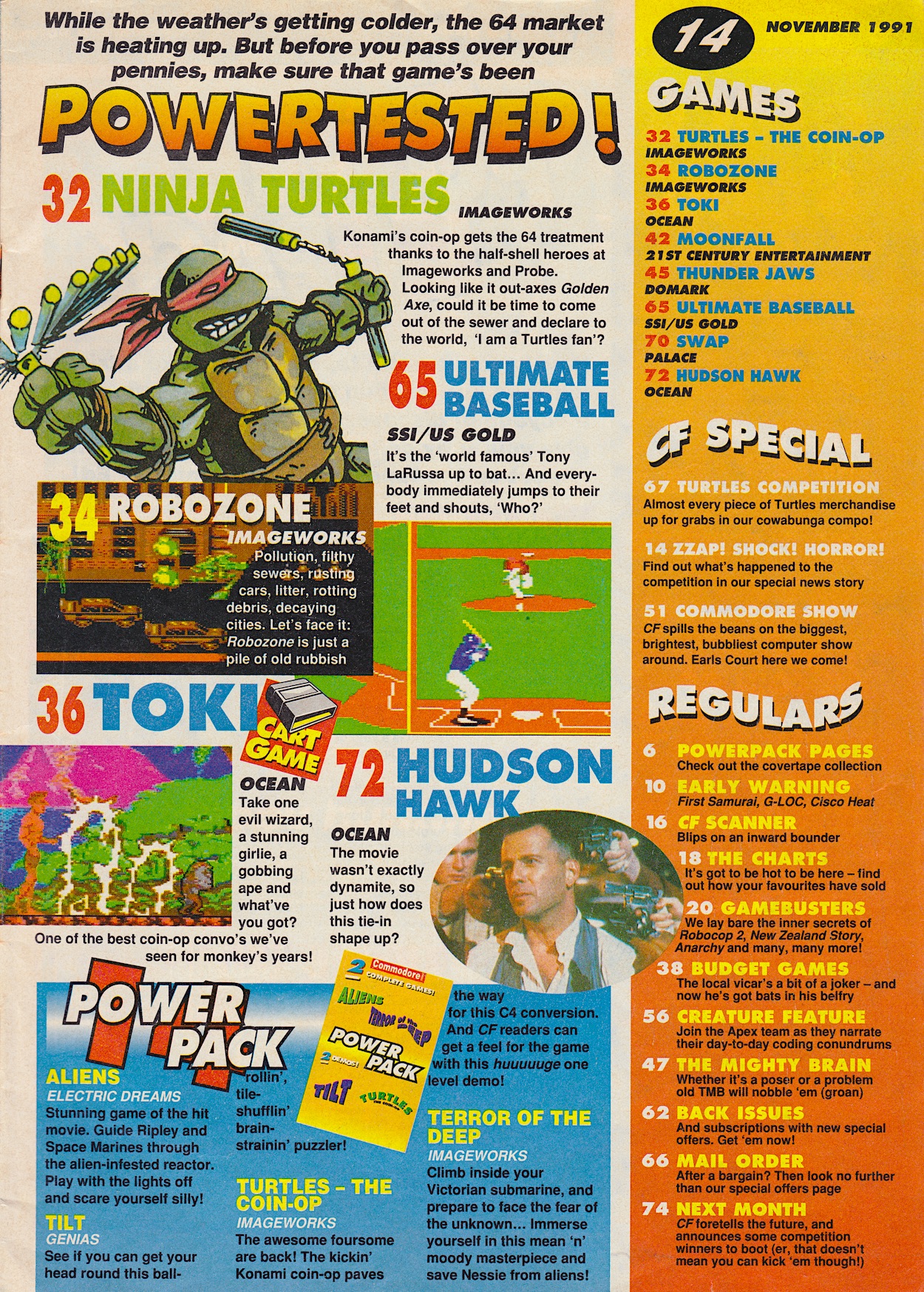
The next day #14 of CF (as readers called it) arrived and featured the Teenage Mutant Hero Turtles on the fantastic Paul Kidby cover, which just excited me further because I was a fan. I devoured the issue, reading it over and over, excitedly anticipating the machine which was still a couple of months away. I’d definitely made the right choice of present! So to mark this issue’s anniversary I wanted to write a special retrospective and explain why I loved it so much.
Edited at this stage by Steve Jarratt, in later years CF would go on to influence me in a key way. It was instrumental in my development in those important teen years, making as big and lasting an impact on me as OiNK had a few years previous, hence its inclusion here. I’ll get to that in a future post, but for now let’s go through what is personally a very special issue. This most superb of 90s magazines had 76 pages packed full of content. There was no filler in sight and every page was rammed full of great writing, information, loads of hype for me while I awaited my computer and a feeling of being part of a form of club, a sense of the magazine talking to me directly. Plus, it had a cracking sense of humour. (Check out the bottom of most pages below for example.)
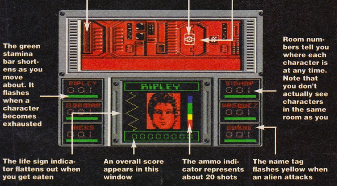
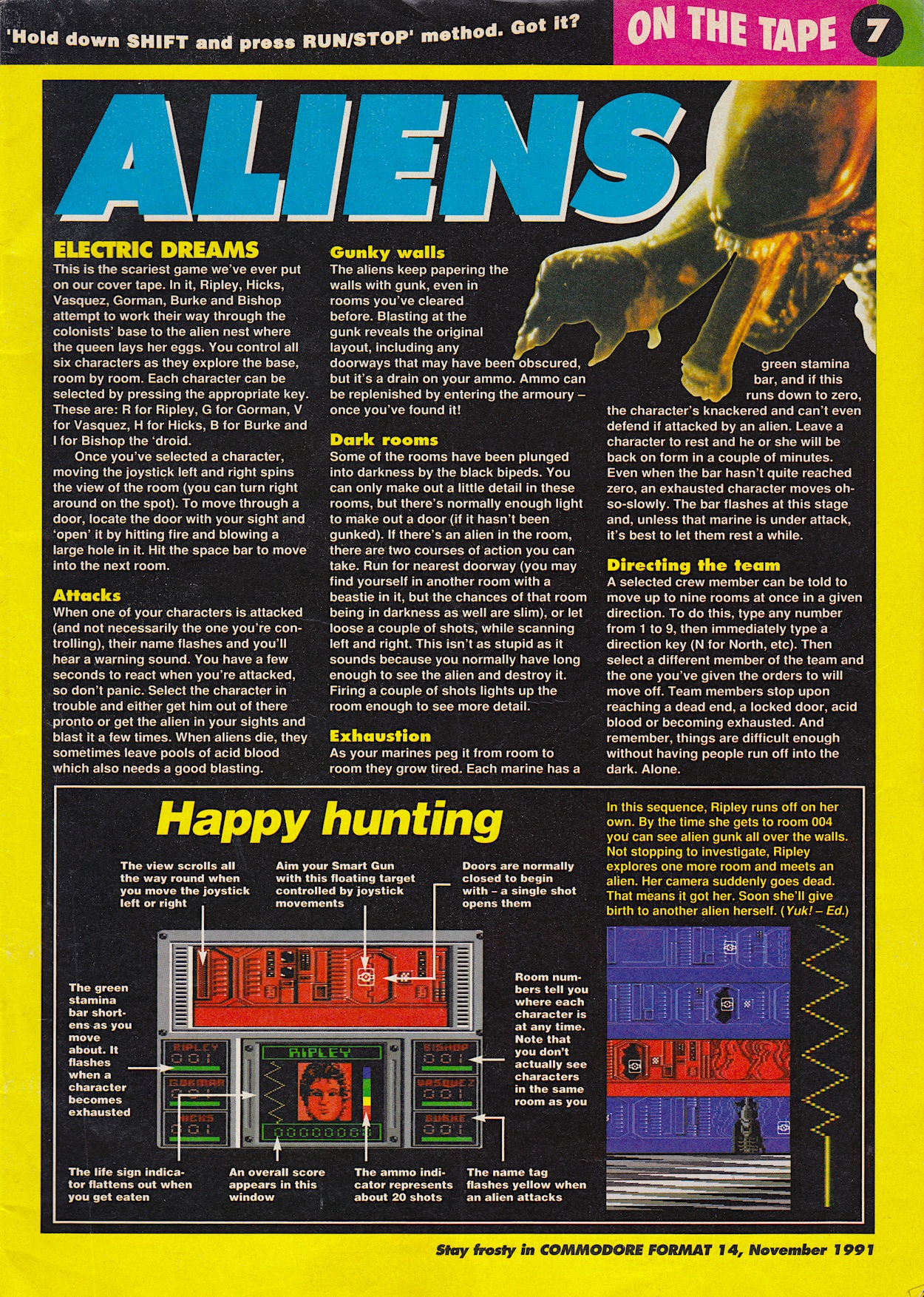
I also couldn’t believe what was on the tape stuck to the cover! I’d loved playing my brother-in-law’s Turtles game on his Nintendo NES, now it was coming to the C64 and this issue’s tape had a free level to play. But better than that was the full Aliens game that had terrified my friends and I so much when we played it late one night in the dark on a mate’s Amstrad. Here I was getting it free with this superb magazine. I was sold on CF within its first few pages.
I have distinct memories of playing this over the Christmas holidays that year; waiting until it was dark I’d turn the lights off and the sound up on my 12” Pye portable TV. I never lasted long before I had to stop! Fast forward 31 years and this year I’ve struggled to play Alien Isolation on the Nintendo Switch for any longer than an hour at a time for the exact same reasons.
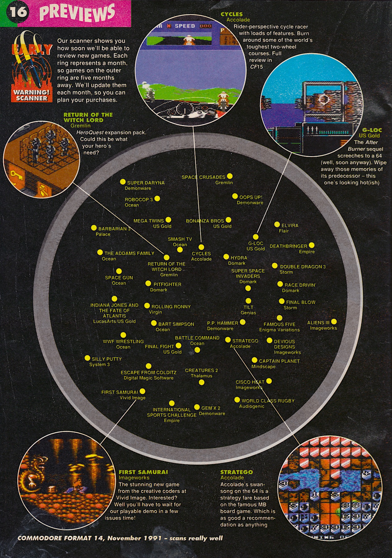
Among the impressive previews there was also a unique page called the Early Warning Scanner which summed up all of the forthcoming releases in a neat radar-type image; the closer to the centre each game was the sooner they were due to arrive. It was so much better than a boring list and kept readers up-to-date on their hotly anticipated games. As a new reader and (almost) owner, I looked at this page and was almost drooling at some of the games to come.
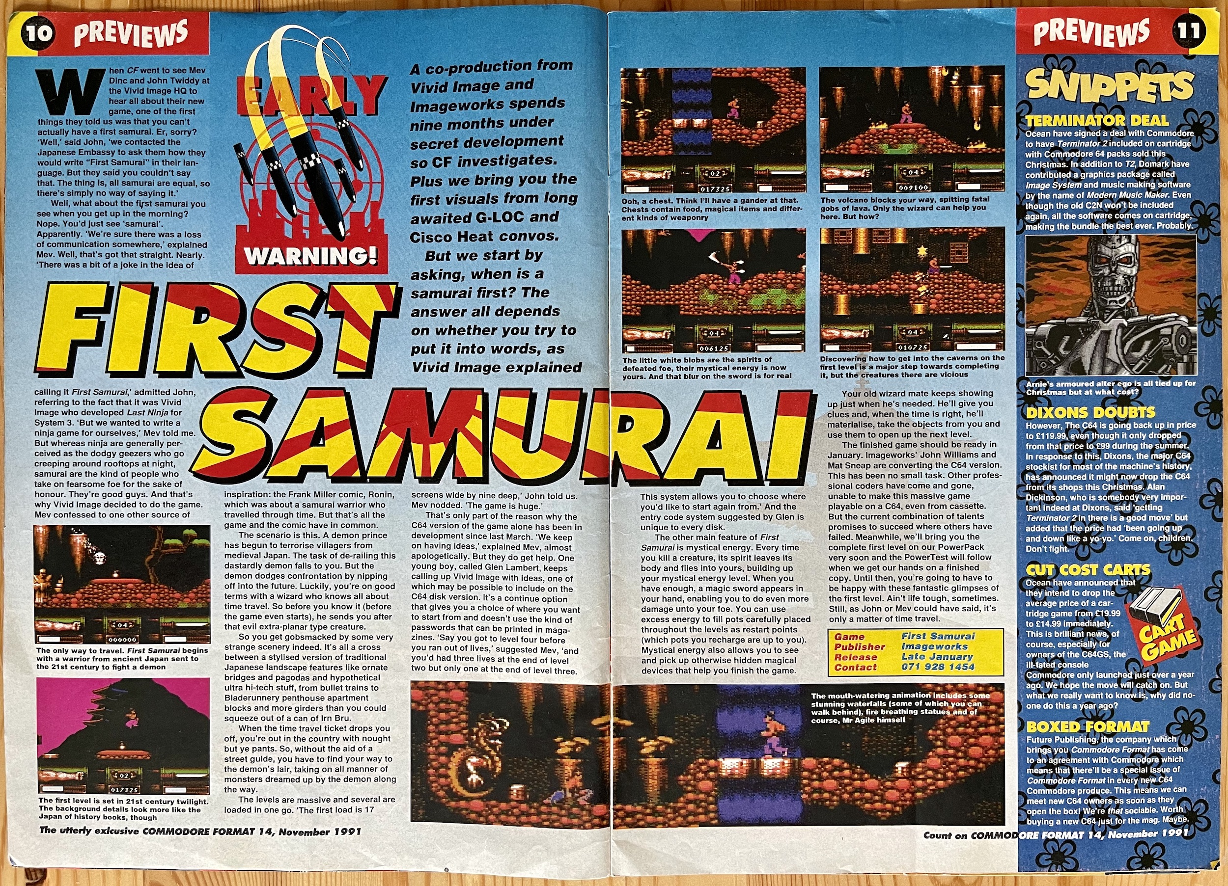
While some people in school mocked me for picking a C64 instead of a more powerful computer, within these pages I was in awe at the graphics this allegedly dated machine could produce. Also, to me the scanner dispelled any notion the format was in its final days. Most importantly, my choice also meant I met a fellow C64 owner in school who became a lifelong friend. (Hi Colin!) Back to the games, and even today something like First Samurai is still impressive when you know it’s running on an 8-bit machine. It played brilliantly too. (I also loved the programmers’ reason for the name, in the preview below.)
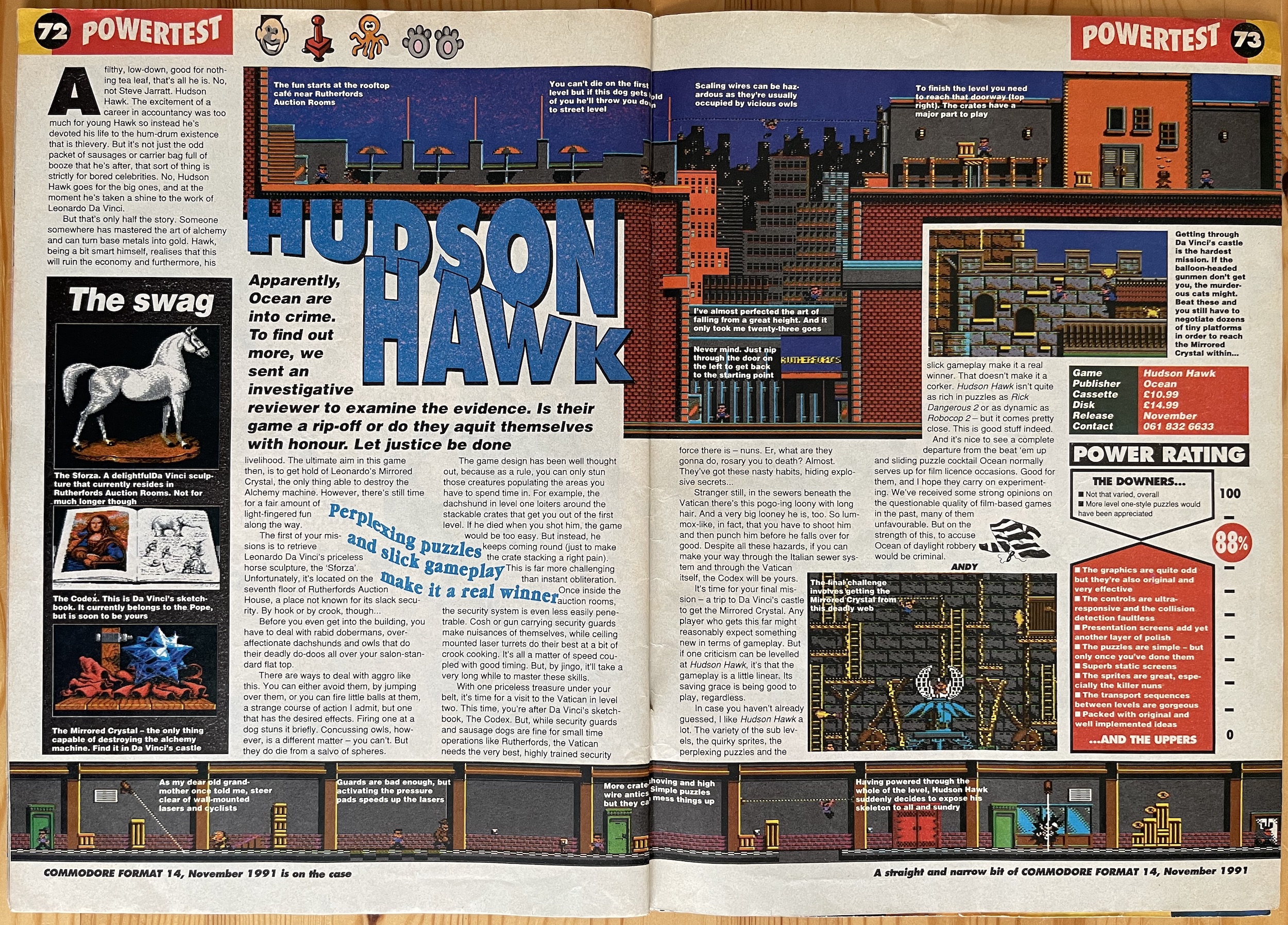
The Turtles arcade conversion may not have been the best example of what the Commodore could produce graphically but I did have fun with the demo although ultimately passed on paying for the full game. The same could not be said of Hudson Hawk. Based on the apparently terrible (I’ve never seen it) Bruce Willis film it looked a lot like the console games I’d played and proved to me this computer could have all the fun of those games at a fraction of the cost. Plus the 64 was so much more than just a games machine at the time, of course.
Commodore Format’s scoring system did away with the clichéd scores for graphics, gameplay, sound etc. and instead replaced them with a simple run down of the game’s main good and bad points at opposite ends of a scale, with the score being where they met. (Games with a score of 90% and higher were awarded the prestigious “It’s a Corker!” award.) It was a sleek design by art editor Ollie Alderton and made for some funny comments during the magazine’s lifespan. When racing game Cisco Heat was so atrocious it received 12% the ‘Uppers’ was just large enough for one comment: “Erm… it comes in a nice box.”
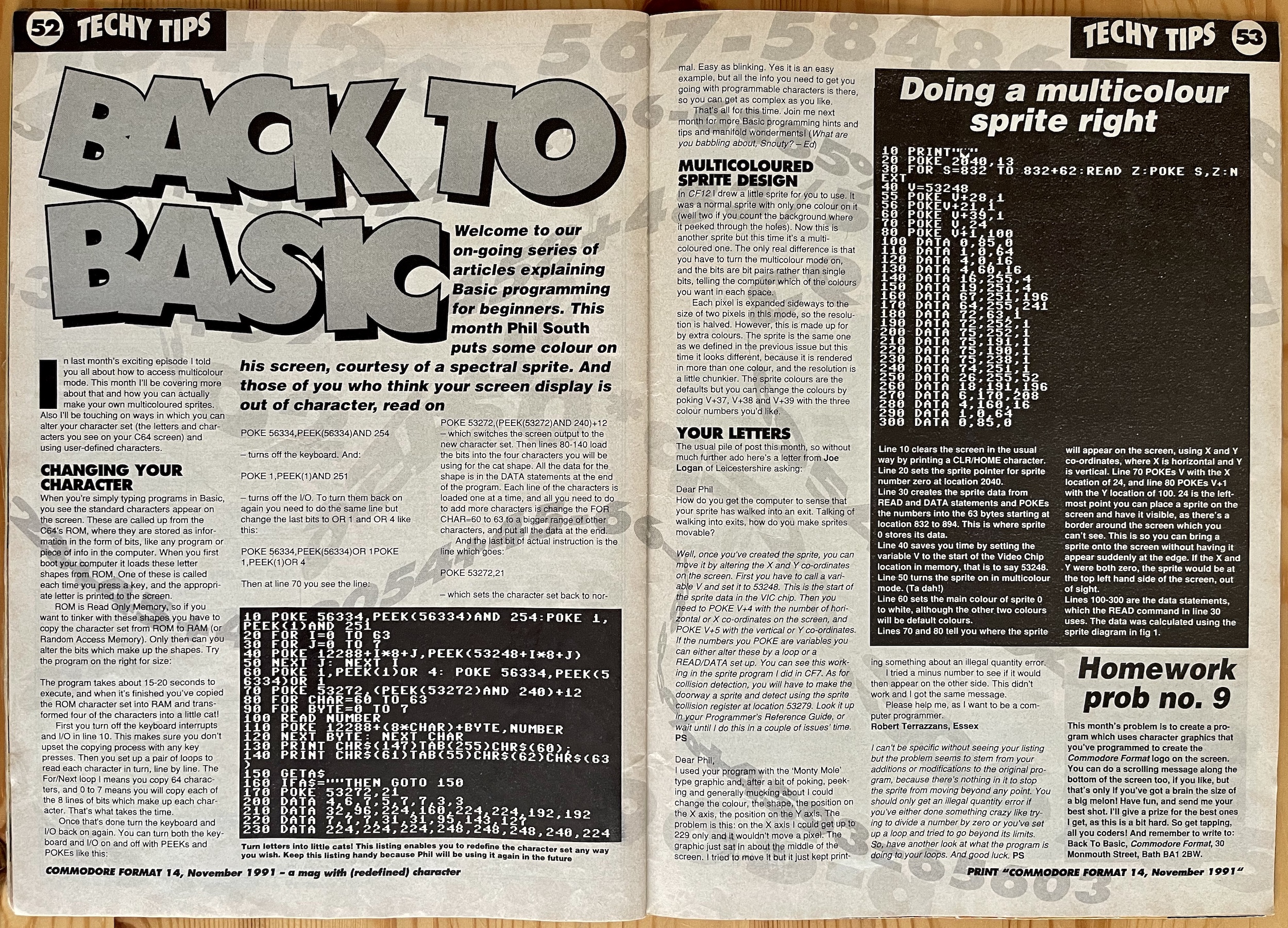
Commodore Format was different to Zzap in other ways too. While that magazine focussed almost exclusively on games, CF followed in the footsteps of its stablemates like Amiga Format, ST Format and PC Format and contained technical features such as an ongoing series of readers’ programming and hardware questions and loads of tips and tricks for the more established coders. For me, I was glad to see Phil South‘s tutorial series for complete newbies. With games on the cover and games all over the inside of the magazine, I made sure to show my parents these pages to prove I wasn’t just getting a games machine.
While naturally my focus was on the games to begin with, I was surprised how quickly I wanted to start digging a little deeper into the computing side of things. Commodore Format was a key part of this and the first three issues I owned before that Christmas were fascinating. I may not have fully understood these tutorials but I read them just as much as the rest, over and over. I was just as excited about that aspect of my new machine as any other.
Speaking of games being a fraction of the cost of their console counterparts, the Roger Frames Buys Budjit Games section collected together all the £2.99/£3.99 cassette games (originals and rereleases of former full-price games) in a handful of funny mini-reviews every month written by the fictional Roger Frames, a tight-fisted miser of a child who detested parting with his pocket money. Accompanied by brilliant comic-style misadventures you can check out this issue’s instalment in the review for OiNK #10. Why? Because Roger was drawn by that issue’s brilliant cover illustrator Mike Roberts, and I’d wanted to show off an example of his CF work I enjoyed so much. Off you pop and check that out before we go on.
Commodore Format led me to Edge and Cube magazines over the years via a detour to the equally fantastic 3DO Magazine
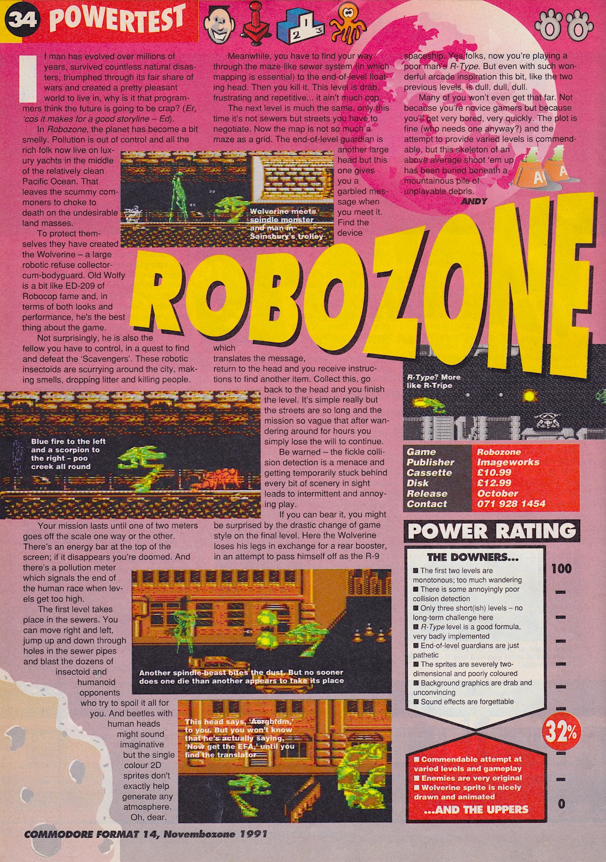
Welcome back. Anyway, Commodore Format also spoiled me for life when it came to review magazines of any kind, from games to movies and everything in-between. Below is a review from this issue for Robozone and by all measures it should be a terrible game that no one would want to spend their pocket money on. But the score is just the opinion of the writer, not a fact, and I always felt the way CF’s reviews were written was more important than the number at the end. Context was key.
In the case of Robozone it was clear why staff writer Andy Dyer personally didn’t enjoy the game but something from his review told me I might. So I bought it a few months later and yep, I did enjoy it. It wasn’t superb, and if I hadn’t got it from a bargain bin maybe I wouldn’t have purchased it, but it was fun for a few weeks. CF’s writers never tried to tell people that their opinions were facts. Throughout my gaming hobby I’ve come across magazines I felt were above their station, who thought what they opined was gospel (a bit like internet comments sections today). CF was never like this.
Commodore Format led me to Edge and Cube magazines over the years (also from Future Publishing) via a detour to the equally fantastic 3DO Magazine. Many others were tried but failed to talk to me on a level playing field like CF did. I’ve actually begun subscribing to Edge again last year for my Nintendo Switch. That’s the legacy of Commodore Format. It never spoke down to us. It never pretended to be anything other than a group of friendly people passing on advice. Well, perhaps one ‘person’ had a bit of an ego…
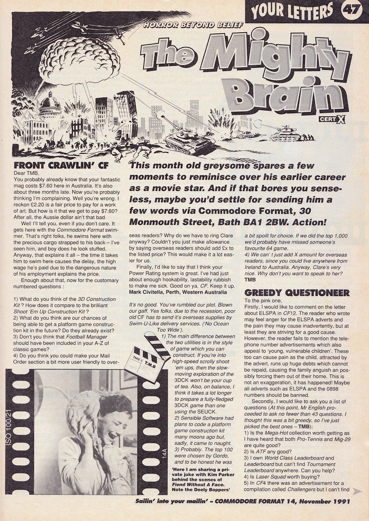
There were a whopping four pages of letters in each of these issues, hosted by The Mighty Brain, a ‘B’-movie star who knew everything in the knowable universe (and beyond). I mean, who better to answer readers’ questions, right? Even though these pages would be answered by different people as the magazine changed over time, his persona never changed and his cocky nature reminded me of the sassy letter answerers in childhood comics such as OiNK and Transformers. Great fun.
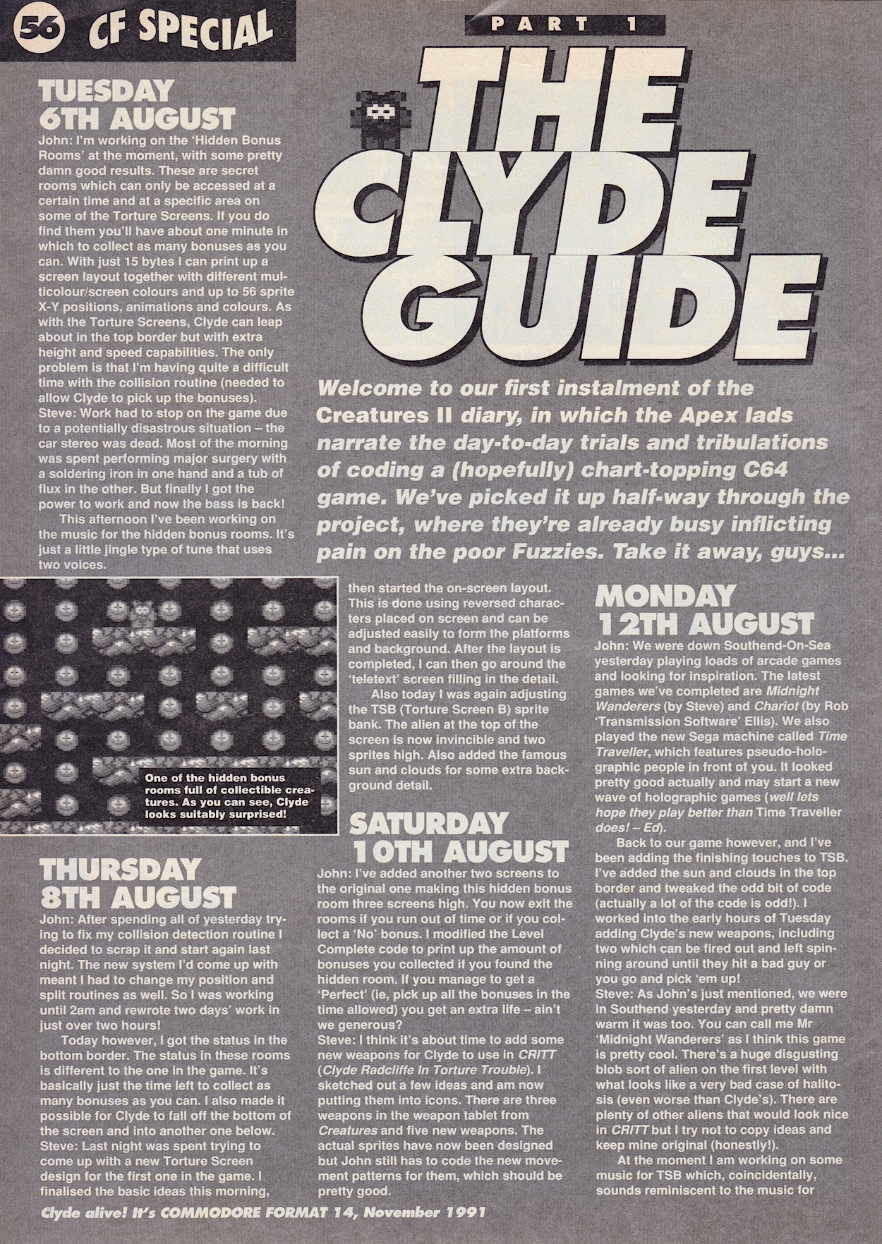
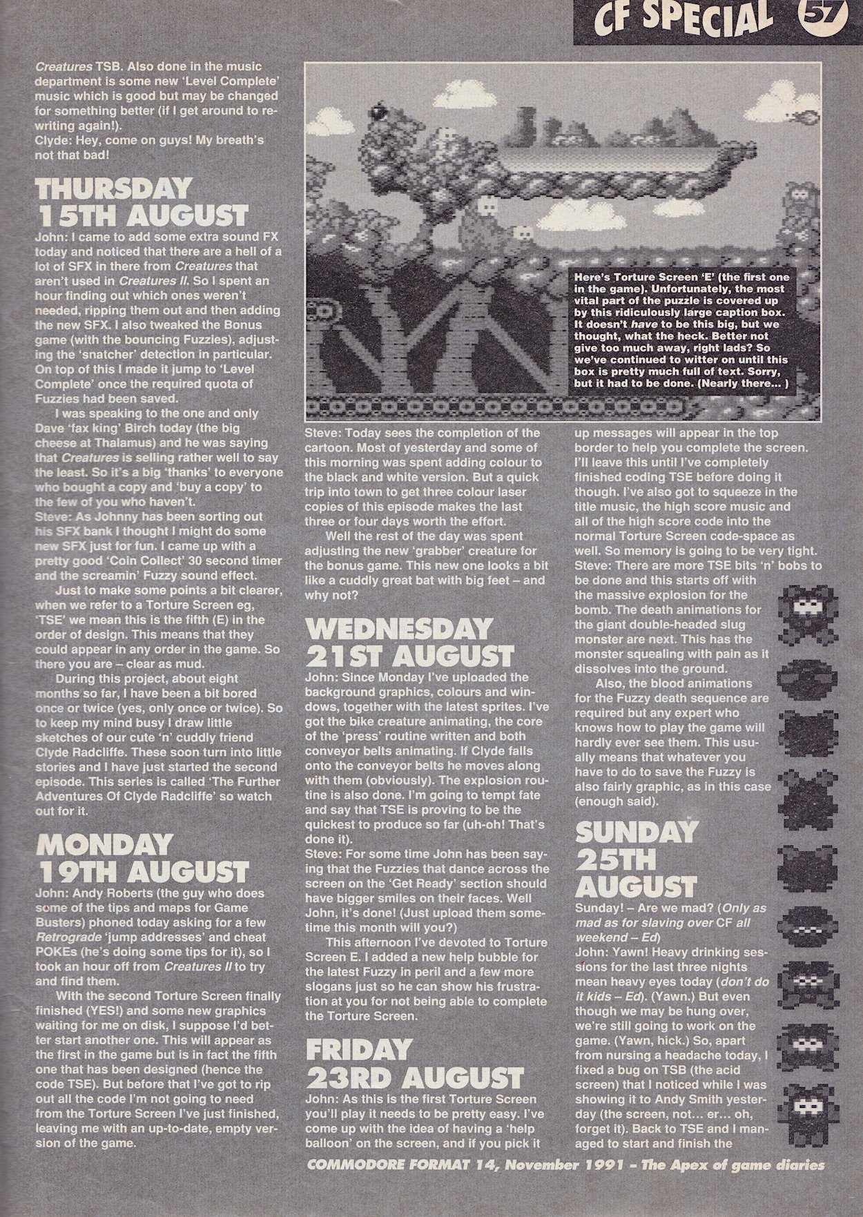
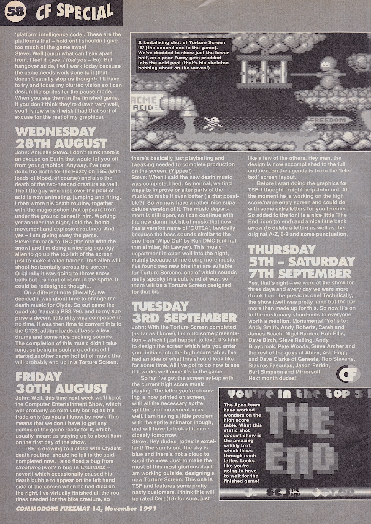
Zzap64’s publisher was going through administration at the time (hence the blurb at the top of the cover) and for a few months CF’s competitor didn’t appear. It worked out perfectly for me because I’d discovered this superior magazine instead and inside a regular feature from the abruptly (and temporarily) cancelled competition made its transition to CF. The Clyde Guide was a Making Of series about the upcoming Creatures II: Torture Trouble, a game that’s still in my top five games of all time on any platform to this day.
A cute and cuddly looking game with devious puzzles, huge boss fights and gorgeous animation, it had a hilarious sense of humour with over-the-top gore that would surprise players when things went wrong. All cartoony and ridiculous gore splashed all over the cute graphics of course, this was still a basic machine compared to today’s after all. The Rowlands brothers John and Steve gave a fascinating insight into the creation of a brand new game, month-by-month. This wasn’t a look back at how a game was made, this was happening in real time.
On a side note, I contributed to Bitmap Book’s Commodore 64: A Visual Compendium for their Creatures II spread
I was hooked from this first chapter (CF’s first chapter but obviously the game was a long way into development by this stage) and it would often be the first thing I’d read in subsequent months. Later in the magazine’s life the brothers would also create the incredible Mayhem in Monsterland game which they’d chronicle in the pages from the very beginning. I’d never read anything like these diary entries before and was amazed at the access the magazine had. On a side note, a few years back I contributed to Bitmap Book‘s Commodore 64: A Visual Compendium for their Creatures II spread.
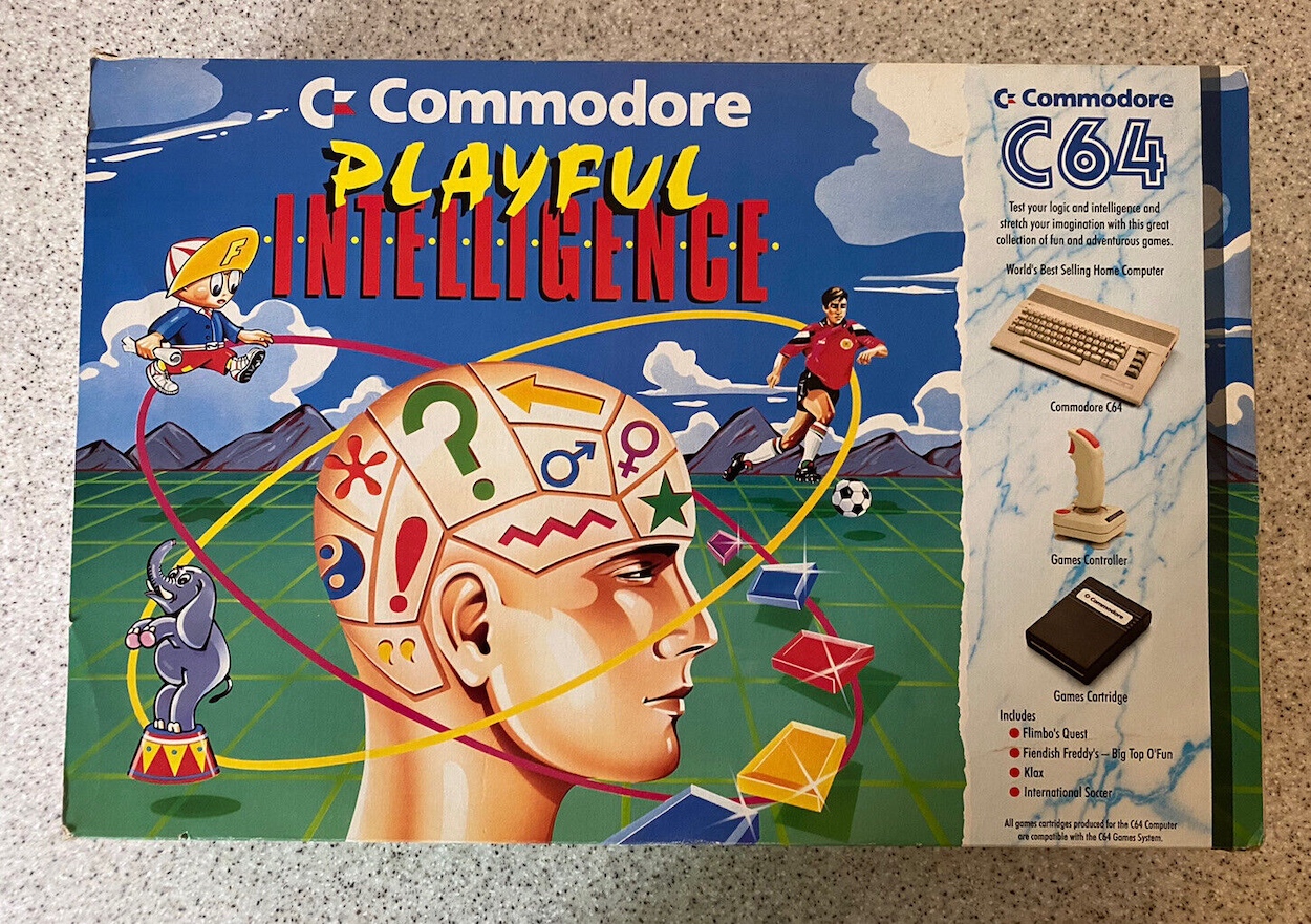
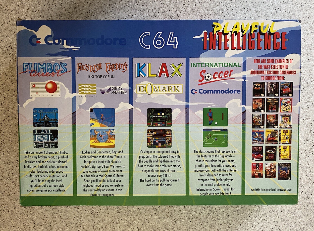
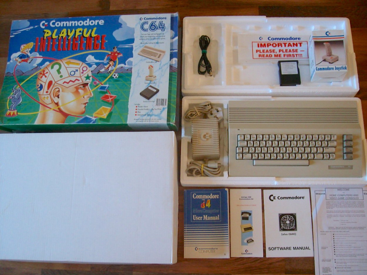
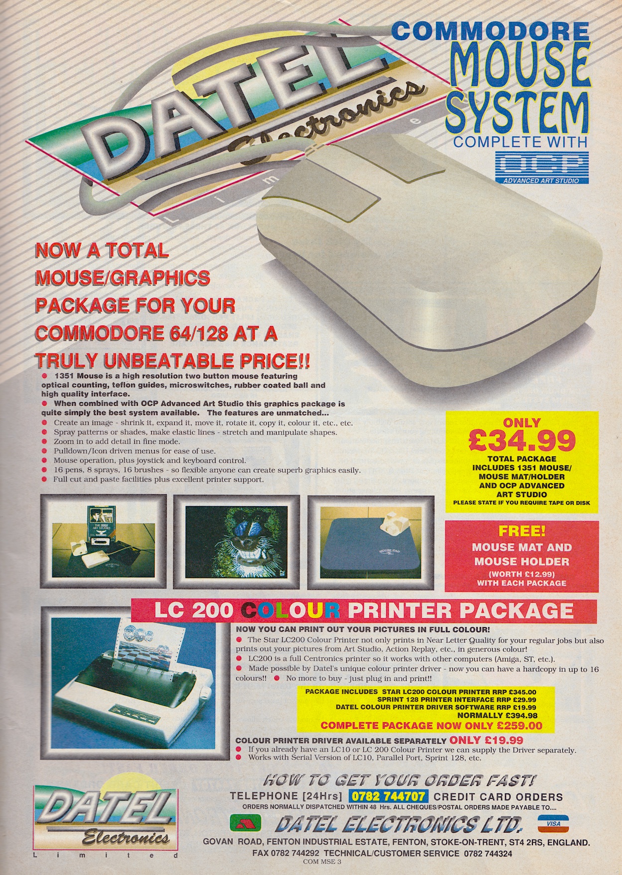
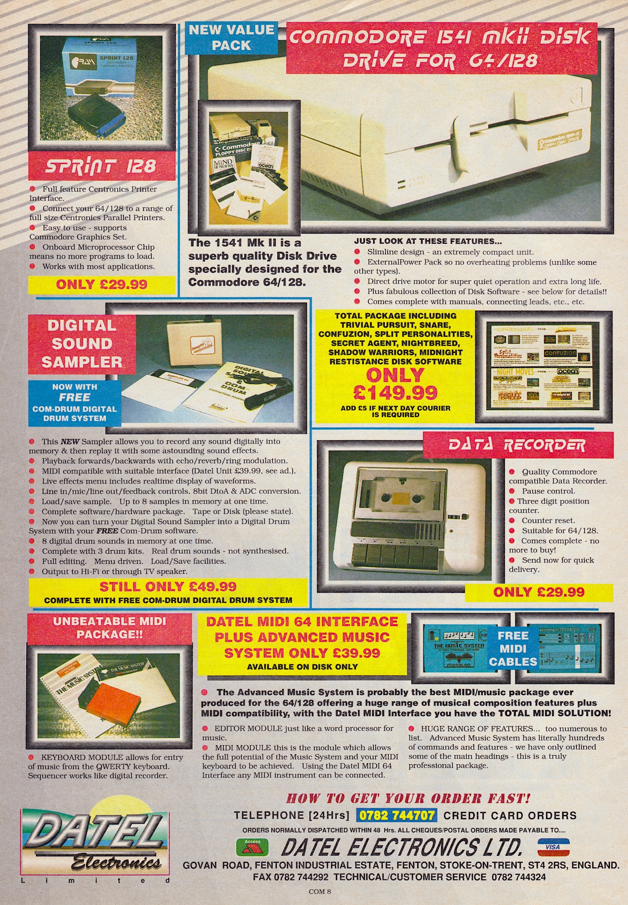
That Christmas I finally received my C64 with a cartridge full of games, a few joysticks and a cassette deck. The following Easter my dad was made redundant and with his payoff I was promised something for my computer. I chose a disk drive after seeing it advertised every month in these Datel Electronics adverts. The following Christmas I also added the printer shown here along with the mouse and art package, all set up on a desk made by my dad in the alcove in my bedroom.
Some friends may have thought the C64 was past it but I was using it for everything! Writing my own stories and magazines, a diskzine (more on that in the specific post I mentioned, coming next year), homework, running a Public Domain software library, making games… In fact, I was using it for a lot more than my friends were using their more powerful machines for. Oh man, the memories are flooding back as I read through this issue again. Those were such enjoyable years thanks to that machine and this magazine.
CF eventually succumbed to a loss of sales only six months before the release of the first Sony Playstation!
Commodore Format was created by Future Publishing when they saw an opening in the market. The C64 was still selling really well as an entry-level computer, while also being handed down to younger siblings. CF was an instant success and soon became the biggest selling C64 magazine in the world! Deservedly so. It would last right up to #61, eventually succumbing to a loss of sales only six months before the release of the first Sony PlayStation! That’s incredible for a machine which people told me was on its last legs before I even got mine.
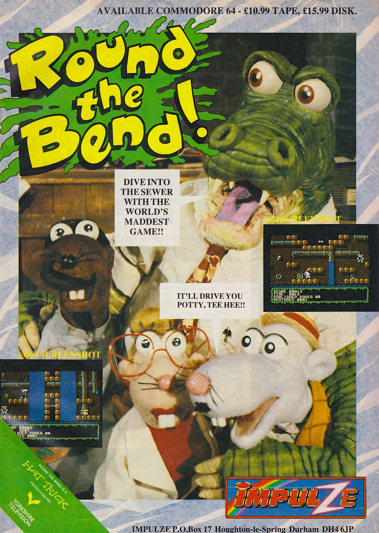
Regular blog readers may have noticed the issue number for my first ever magazine is the same as that for my first ever comic, #14 of OiNK. With that tenuous link I’ll wrap up this retrospective with an advert for an upcoming game pig pals may have been particularly interested in. After OiNK was cancelled the creative team of Tony Husband, Patrick Gallagher and Mark Rodgers went on to create a certain TV show that shared many familiar aspects with our piggy publication.
The game already looks like it’s closer to its inspiration than the OiNK game. Round the Bend would get reviewed in #17 of Commodore Format, so in keeping with the real-time aspect of this blog I’ll show you that very review and take a look at the game itself on Tuesday 16th January 2024.
I feel like I’d need to show you every single page of this issue over a series of posts in order to fully get across just what an impact it had on me and how formative it was. I hope I’ve been able to do it justice. I have an almost complete set of the magazines here at home, despite not owning a Commodore 64 anymore and I’ll never get rid of them; I love to dip in and out and I’ll forever treasure them and the memories they contain.
In the days of magazine contributors being named and photographed for the editorial pages, over time it felt like we’d grown to know these people and we trusted them as a result. This was a key component in that club feeling and later in its lifespan Commodore Format would be instrumental in my life and the person I became! Really. That’s a whole other story for another time, but for now I just wanted to concentrate on a retrospective look at this beloved issue of a beloved mag.
Commodore Format has featured elsewhere on the blog already. The cover cassette of its second edition contained the OiNK game in its entirety as you can see in a post from the game’s coverage. Then in their third issue the team produced maps to help people struggling with the game and I’ve included them on the blog as well. Both posts also take a look at some of the other articles and contemporary adverts featured in those early editions. Finally, the Roger Frames Buys Budjit Games section was a favourite feature of every issue for me and was illustrated by Mike Roberts, a brilliant illustrator who also produced the cover to OiNK #10, and in that OiNK review I’ve included Mike’s art of Roger’s misadventure from this issue of Commodore Format. Enjoy.
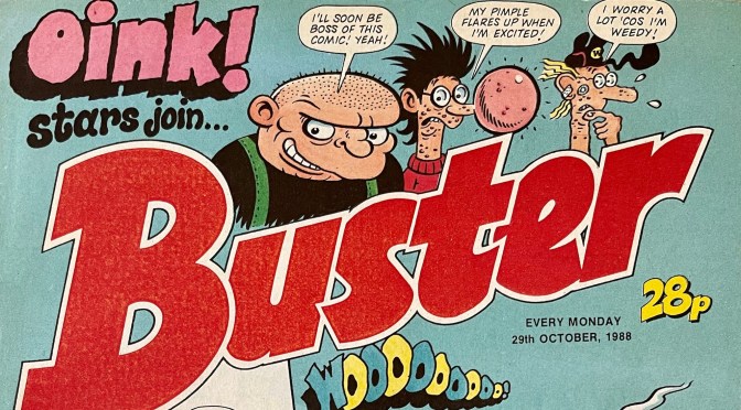
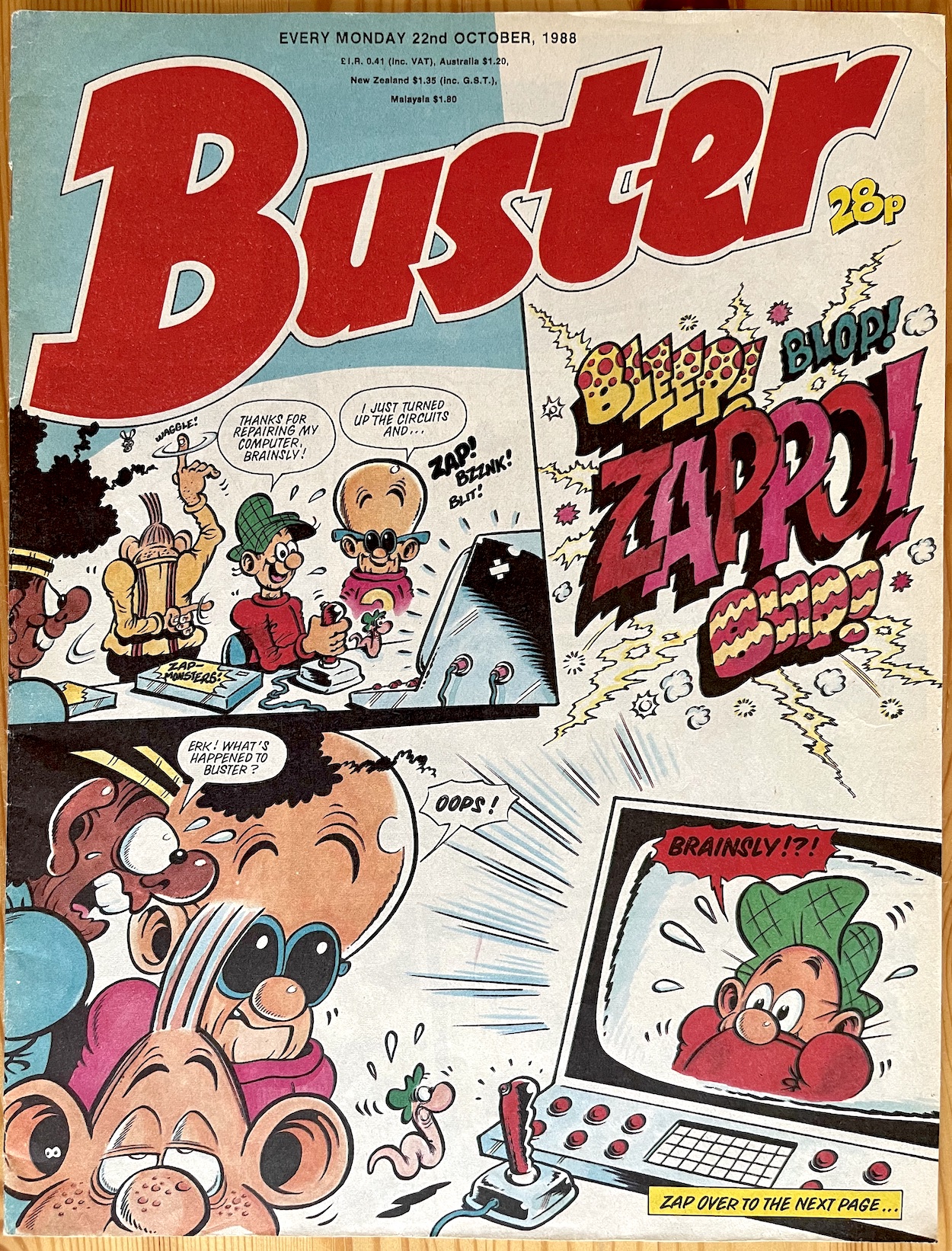
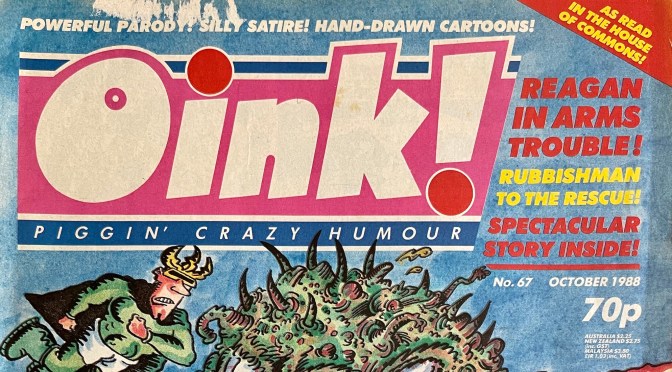
This was the day back in 1988 when the 68th edition of OiNK was due on the shelves, but it didn’t appear. It would be a full week late for me, finally appearing the following Saturday, 22nd October. This was potentially deliberate according to co-editor Patrick Gallagher and I’ll talk about that in the issue’s review. However a week before it arrived, behind this innocuous Tom Paterson cover of Buster, was some terrible news for any pig pals who happened to read OiNK’s sister comic.
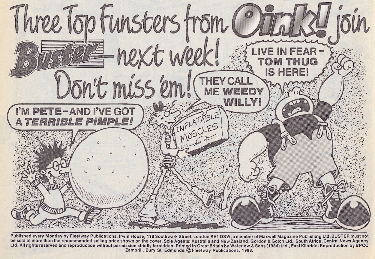
Images taken from previous OiNK strips drawn by Lew Stringer and Mike Green
Describing Pete Throb, Weedy Willy and especially Tom Thug as “funsters” doesn’t give me much confidence that the editor of Buster understood these characters or the sense of humour OiNK readers had. Indeed, Lew Stringer has told me about how he changed some popular aspects of his strips for the merge. Will they still be recognisable as the characters we’ve grown to love for two-and-a-half years? Will they still be just as funny when translated to the pages of a more traditional comic, the likes of which OiNK was created to counter and would often ridicule?
You’ll find out in one week. On the same day as the review of OiNK#68 I’ll be taking a look at the first four issues of Buster to contain these favourites. They were the only issues to feature the name of the comic they came from on the cover and at the time I only ever bought the first of them. Why? You’ll find out in seven days on Sunday 22nd October 2023.
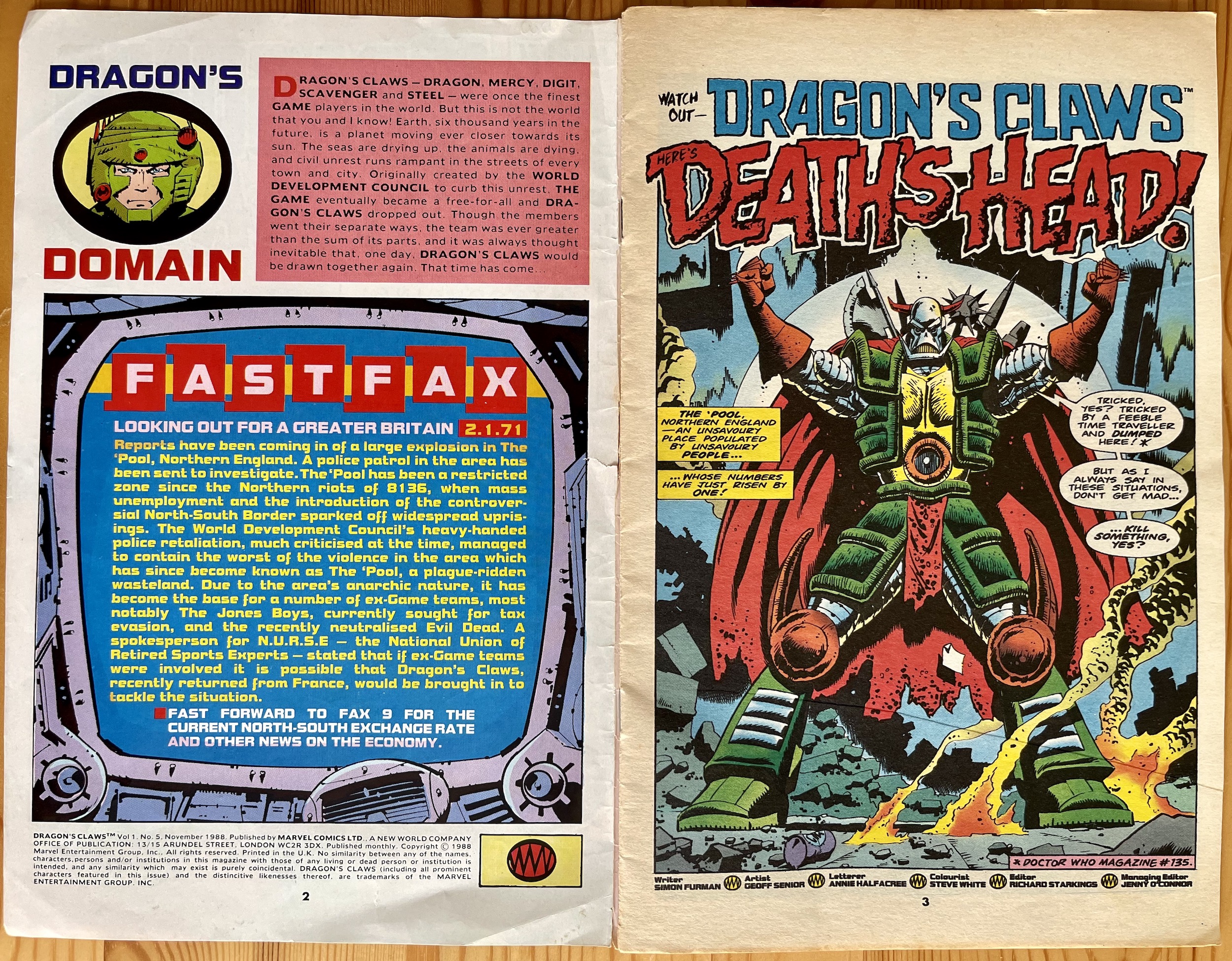
Yes Mr. Head, you certainly will be. Especially with those who picked up your own comic. That particular new monthly from Marvel UK was due to begin a month after this issue’s release. In fact its premiere issue would go on sale the same day as the next Dragon’s Claws. So it was time to introduce him, or reintroduce him to those who’d followed his exciting and funny adventures thus far in Transformers and Doctor Who.
We get a mention of his appearance from the end of the previous issue’s story in the FastFax and it also gives us some interesting information on The ‘Pool (Liverpool of the 82nd century) and the make up of England in this apocalyptic time. In the real world of the 80s the north of that country had felt generally neglected by the main UK government and this is clearly being played up to here. At the time of publication this would’ve been particularly pertinent to readers there.
This blog is named after the hilarious 80s comic OiNK which was produced in Manchester, and I think the editors of that particular riotous publication would be rather happy with the north of England being described as an area with an “anarchic nature”. The dates at the top of the FastFax don’t seem to be making sense anymore. In #1 it seemed to refer to the date of the (original) release of the issue, only thousands of years into the future. That’s no longer the case so I can only assume it was never actually meant to be a date.
While last month’s Next Issue page was drawn by the upcoming Death’s Head comic’s Bryan Hitch, Geoff Senior remains on art duties for his and writer Simon Furman’s Dragon’s Claws, with the regular team of letterer Annie Halfacree, colourist Steve White and editor Richard Starkings all present and correct. The story begins with Death’s Head’s arrival spotted by Game team members who think he’s The Evil Dead’s reinforcements, so they decide to take him down before he can meet up with them. Bad idea.
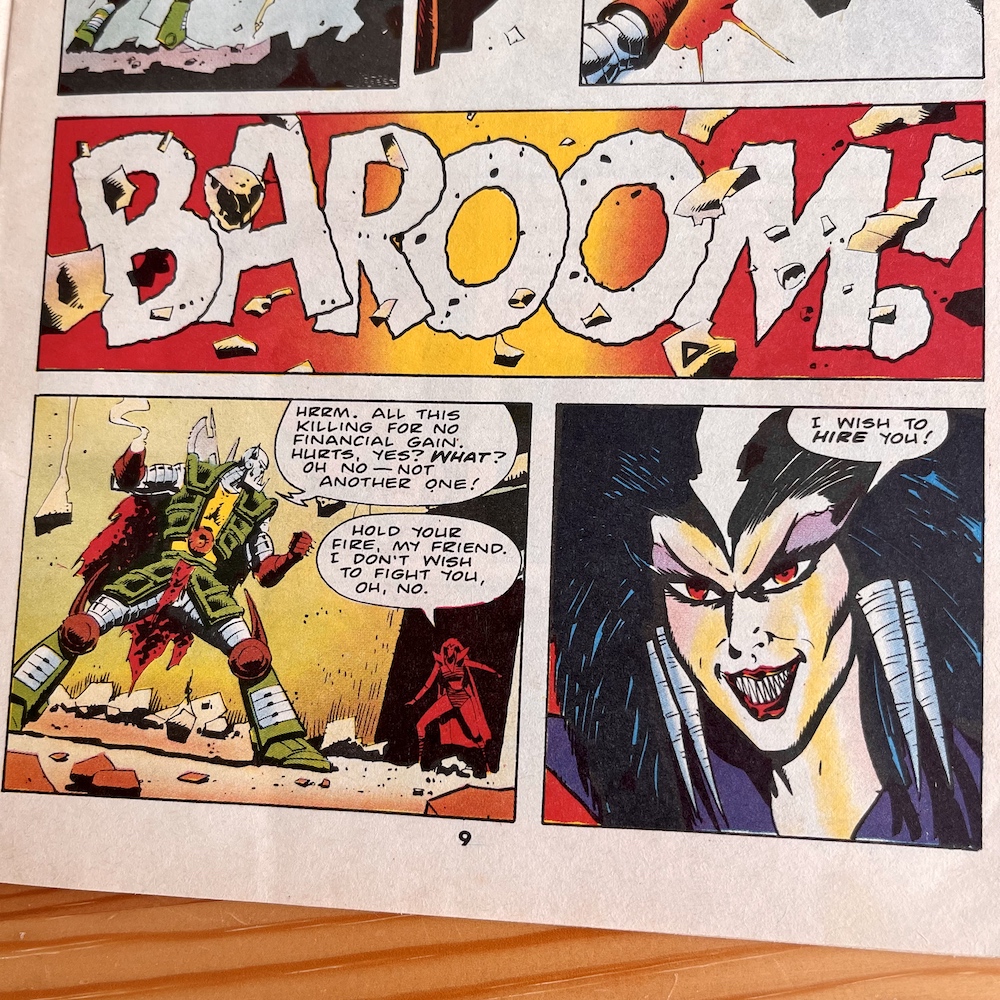
Death Nell’s hiring of Death’s Head is initially somewhat disappointing because we immediately think it’s going to be a contract to take out Dragon but instead it’s for some other Game team that’s become an annoyance to The Evil Dead. That disappointment doesn’t last long. Then, when we catch up with Dragon’s Claws we see the beginnings of a new base of operations for them as the early pieces of a long-running comic series continue to be put in place.
It brings up the question of who is really running the show
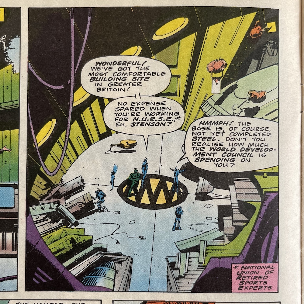
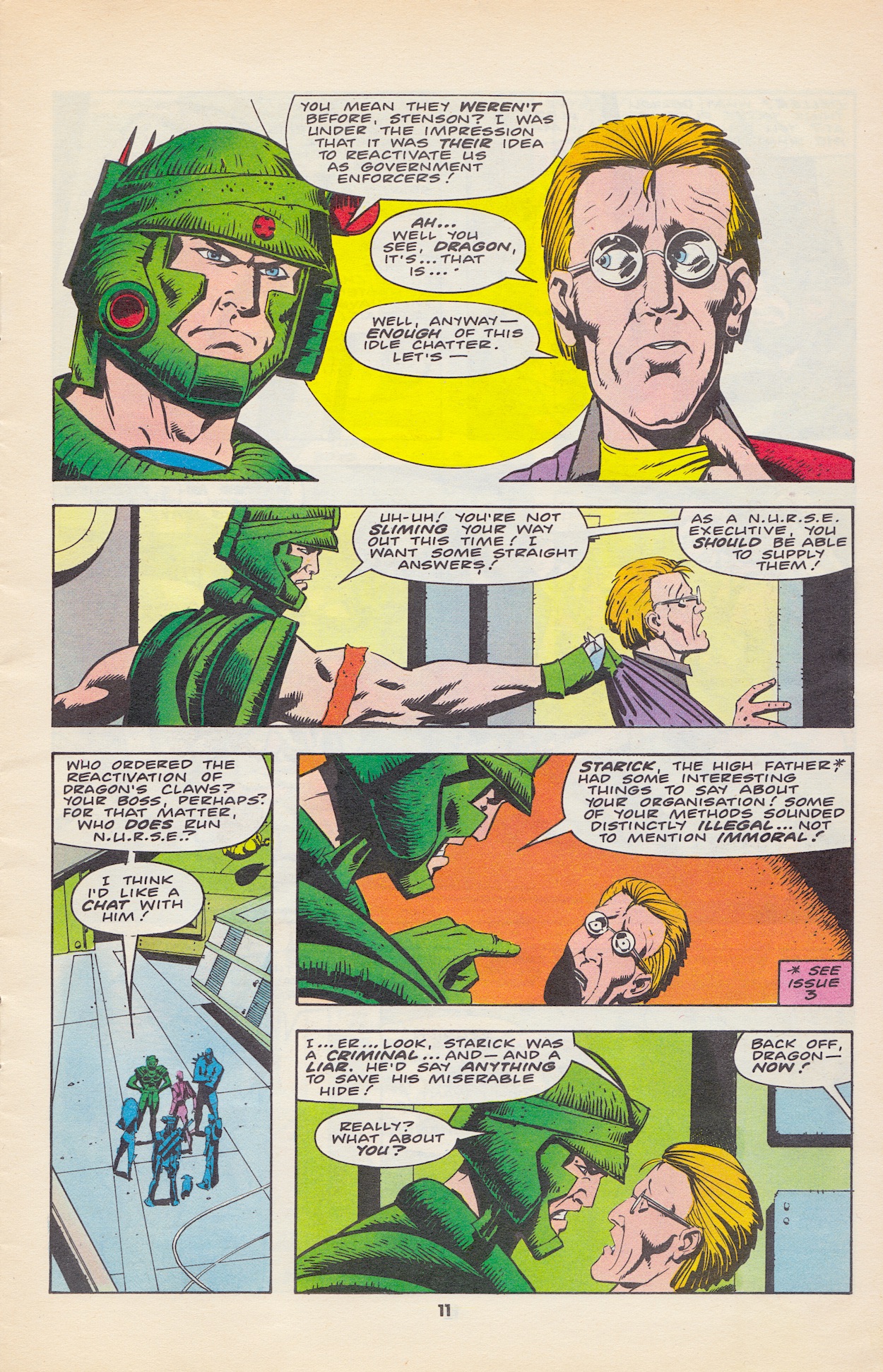
With a new Headquarters cue the heroic Saturday morning cartoon-esque call to action! But not before Dragon and N.U.R.S.E.’s Stenson have had a bit of a barney. Stenson let’s it slip that the World Development Council has only just fully endorsed the team’s reactivation after last issue’s rescue of their ambassador, and Dragon isn’t happy as this is yet more evidence N.U.R.S.E. isn’t telling them the whole truth.
It brings up the question of who is really running the show. Just how corrupt are N.U.R.S.E. and the W.D.C. and is the former actually lying to the latter rather than being in cahoots? Dragon also starts to bring up what The High Father is meant to have told him after #2’s story but unfortunately he gets interrupted by Deller and the Claws have to leave for The ‘Pool.
Back up north Death’s Head is about to be sent in to wipe out the Jones’ Brothers team when we get a quick insight into one of the background plots we know Stenson is up to his perfectly tailored neck in. The inner thoughts of one of the Joneses laments the fact it’s come down to them killing each other, yet he knows they have no choice, that some “non-payment” will have been noticed and that they can expect retaliatory action soon. But from who?
As the fight nears his further thoughts confirm my suspicions. Despite being so heavily armed and more than capable of taking on The Evil Dead (of all people), he’s terrified of N.U.R.S.E.! This is because of how they came after the ‘Dead with Dragon’s Claws. It’s N.U.R.S.E. he’s meant to be paying. The conspiracies, back-stabbing and politics of this comic have got me hooked.
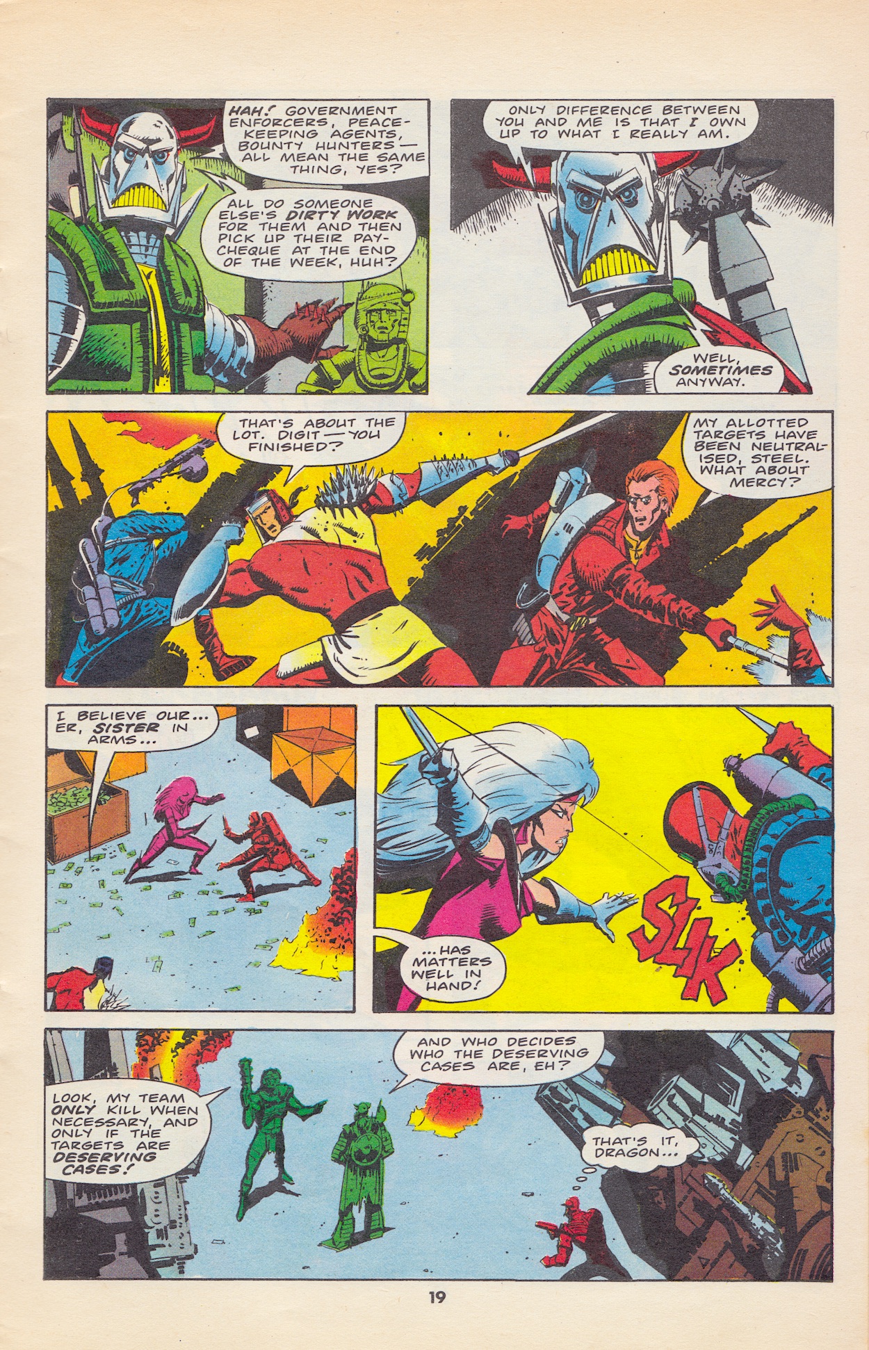
“Government enforcers, peace-keeping agents, bounty hunters – all mean the same thing, yes?”
Death’s Head
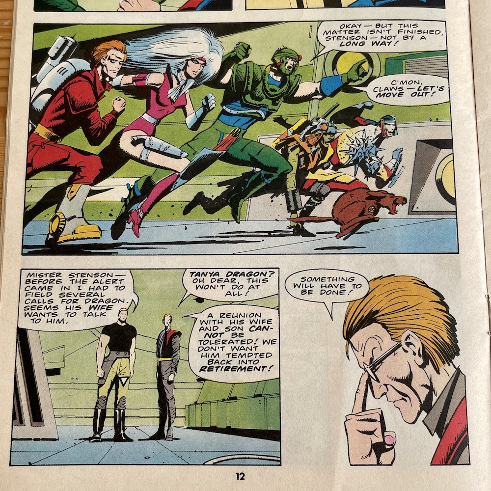
Deller, the jealous man who wants to take over the Claws from Dragon and a stooge of Stenson’s, knows a lot more than he’s letting on too as you can see above when he admits he’s hiding calls from Dragon’s wife, Tanya. He goes along with the team and as usual tries to take over the situation to further his own cause, until Dragon finally explodes at him about his so-called ’sources’ at N.U.R.S.E., just before they see a certain fan-favourite character for the first time.
I love this moment and at this point I actually changed my mind about Death’s Head being given a contract for Dragon, that would’ve been too predictable. As Death Nell helps the still-recovering Slaughterhouse out of their safe house to make a run for it, more plot points are established. He has some theory about the Claws’ role in recent events and by having both the Claws and Death’s Head out for the Jones’ Brothers they can be certain of success for now.
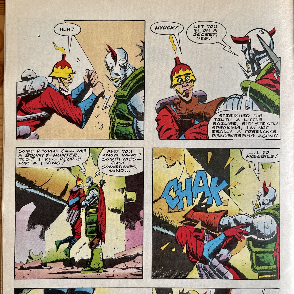
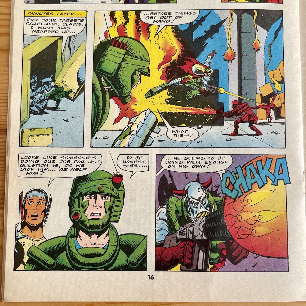
They leave to recruit new players and Slaughterhouse calls the Claws N.U.R.S.E.’s “little puppets” which leads nicely on to a verbal, rather than physical (to begin with anyway) confrontation between the Freelance Peace-Keeping Agent and Dragon. When Dragon saves him from the last of the brothers, Death’s Head isn’t happy and accuses him of wanting to split the bounty. Dragon explains he was trying to help and that they’re not bounty hunters but “legally appointment government agents”, after which is this interesting retort.
That’s Deller sneaking in at the bottom to take out Death’s Head from behind for no other reason than to stitch up Dragon. But this isn’t someone easily taken out, even from behind and he soon gets the upper hand, shooting Deller in the shoulder and grabbing Dragon by the throat, falling for the ruse that Dragon was allegedly keeping him talking while Deller tried to kill him.
Most interestingly here, after Death’s Head says the team “sure sound like assassins to me”, we see Mercy being told by a dying Jones brother that the Claws are being used by N.U.R.S.E. as their hired killers and she just doesn’t care! It seems she’s the most bloodthirsty of the team and I hope we get a chance to see her character develop, as I think this could put her at odds with the rest of them, in particular Dragon and the honourable Steel.
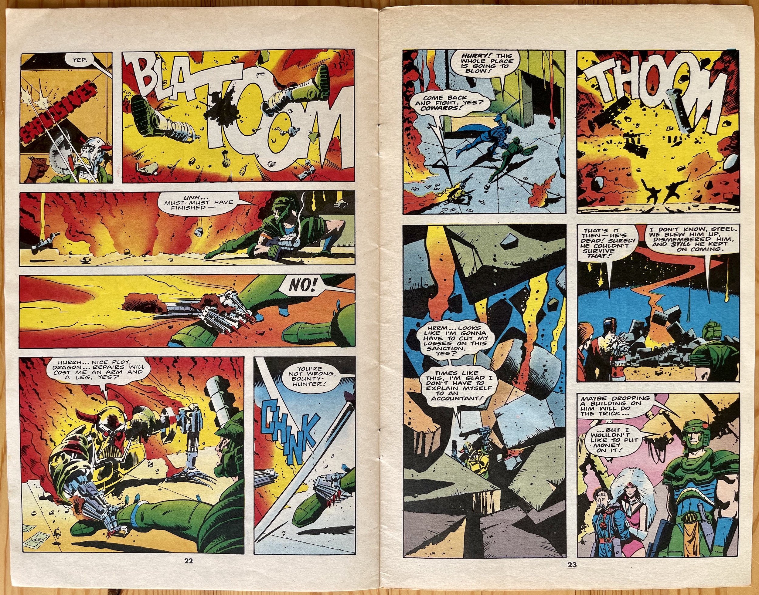
“Times like this, I’m glad I don’t have to explain myself to an accountant!”
Death’s Head
Back to the moment at hand. Steel and Digit attack Death’s Head, freeing Dragon before he orders them to back off and takes aim. The Peace-Keeping Agent mocks him, asking if he really thinks he can hurt him with such a little gun, and after I turned the page the answer to that is more shocking than I ever couldn’t imagined!
It seems his entrance on the last page of #4’s strip wasn’t the only moment we’d see inspired by the Terminator films. I certainly wasn’t expecting to see him in this state, that’s for sure! Even in the face of possible death though, both when blown up and when he’s about to get crushed on the next page, he’s still able to make quips. Moments like this are why I’ve been so looking forward to reading his own comic and it’s almost here. The hype is very real for me right now and I’m sure Marvel UK were hoping for that.
They tell the captured Game player that due to non-payment their entire family will be killed and he’ll be taken prisoner. Harsh.
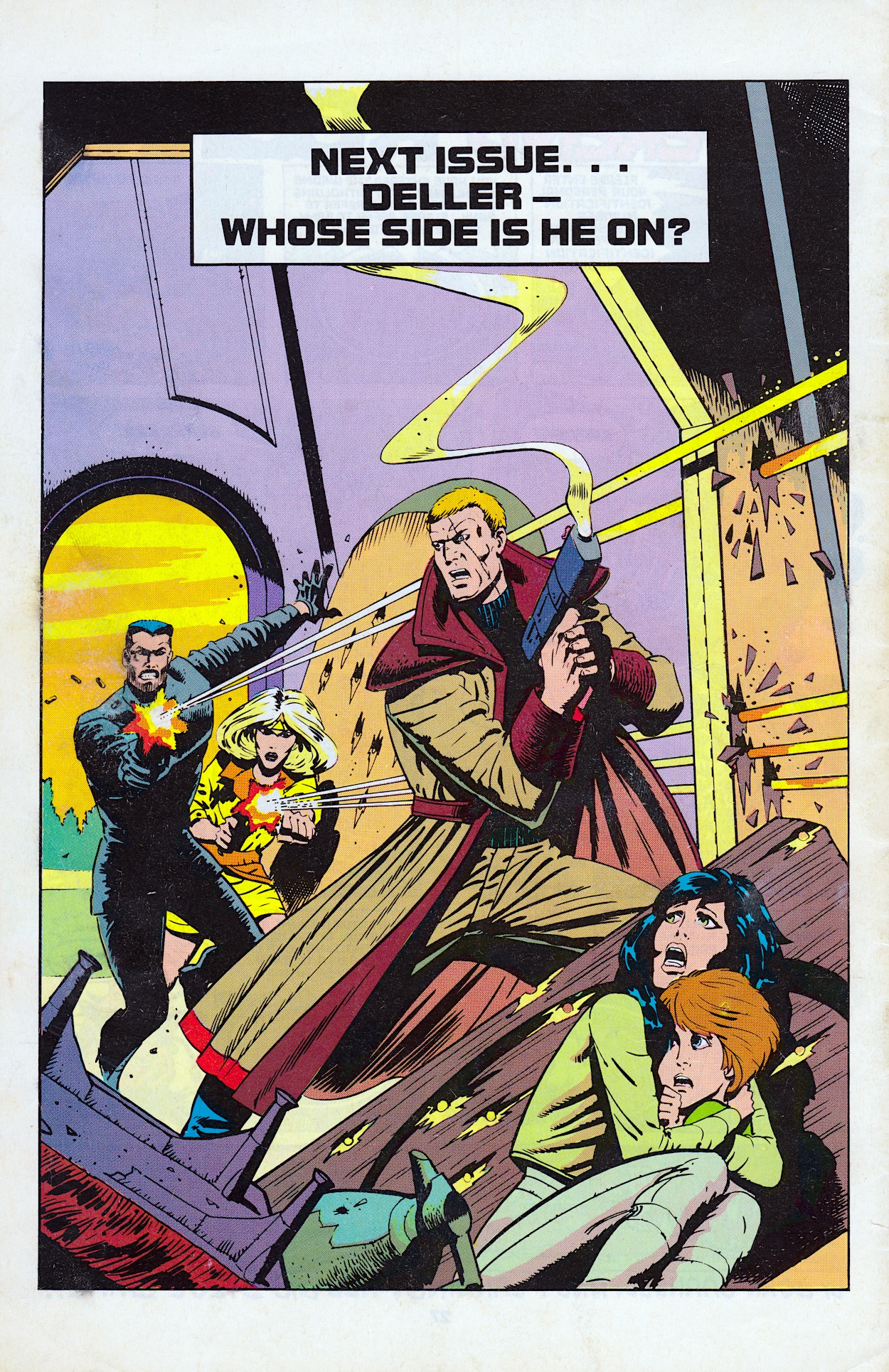
He was to get a bit of a redesign for his own monthly, a fresh lick of paint after a few years circulating around other peoples’ comics and this sets that up nicely. It’s strange they didn’t take the opportunity to mention the new comic coming just one month from now anywhere within this issue though. Anyway, as usual the final page of the strip is left to hint at stories to come, with the final remaining Jones brother being taken before the real leader of N.U.R.S.E.
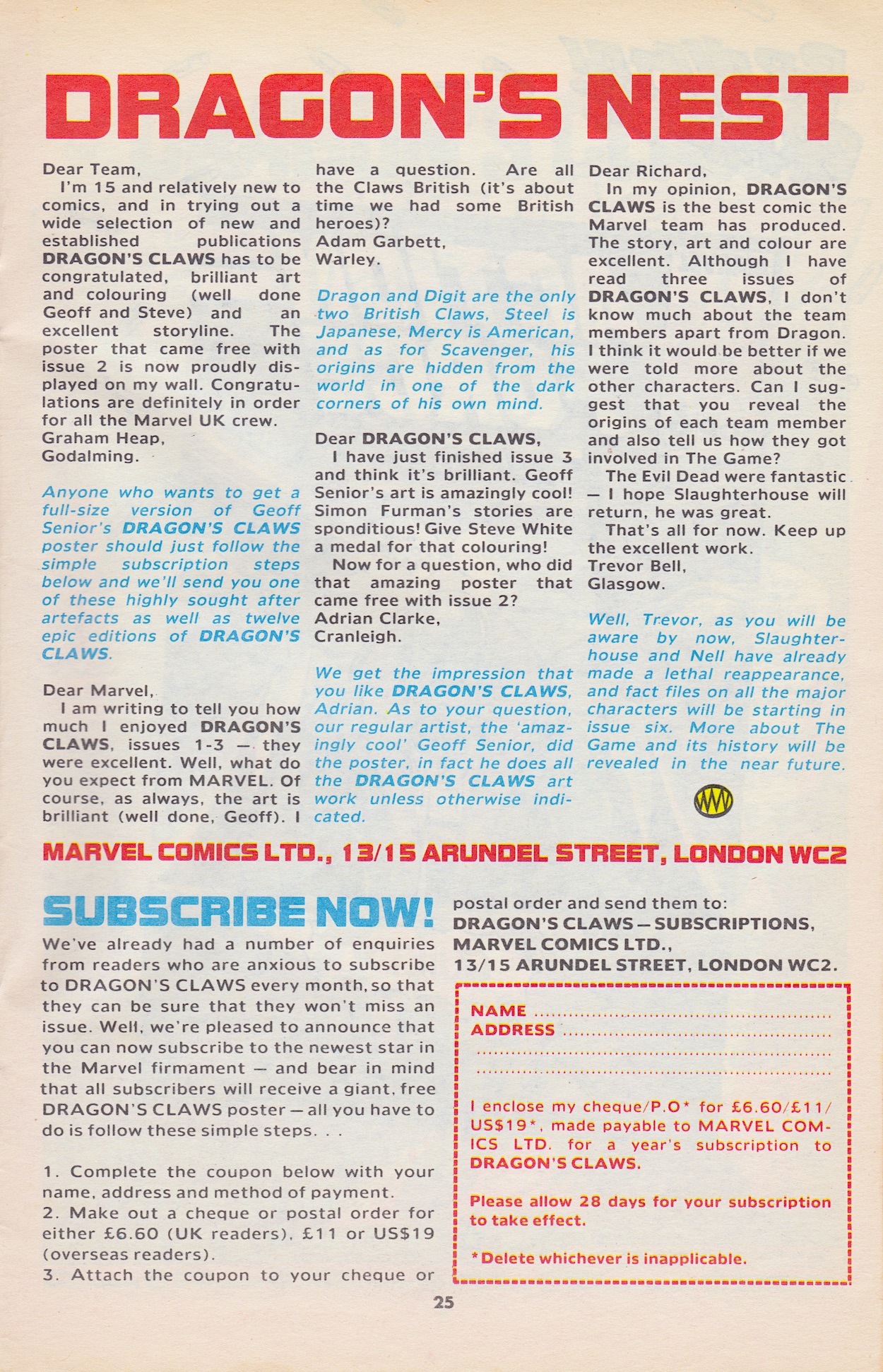
We don’t see this person other than in silhouette as they tell the captured Game player that due to non-payment their entire family will be killed and he’ll be taken prisoner. Harsh. Then the order is given to Stenson to do the same with Dragon’s family before they interfere with their plans, and that’s where it’s left. The letters page also looks to the future, not least by offering subscriptions, none of which would be completely fulfilled.
Some hints about the contents of future issues are dropped too and, just like when Havoc began answering readers’ queries there’s that heartbreaking realisation that all of this potential will come to a premature end. Let’s just hope we get some of it realised in the second half of the comic’s run (yes, we’re already halfway through). There’s so much promise here, between the development of Dragon himself and the slow burning story arcs. I just want to see where it all leads.
We began this read through comparing the first couple of issues to the best 80s action flicks, with some added characterisation for good measure. Dragon’s Claws has successfully emerged from the shadow of its big screen contemporaries to establish itself as an original, absorbing story with plenty of action, some good laughs and characters I already feel like I know pretty well. Not a small feat when it’s only five issues in.
This back page seems to combine more than one subplot too. Deller has been sent to eliminate Dragon’s family while Kurran has caught up with him at the exact same moment. Kurran is the man whose brother was killed by Dragon in #1, and who then found out Deller had paid his brother’s Wildcats team to take on Dragon, knowing they’d be outmatched. Who the woman is I have no idea yet. Questions to be answered and most likely many more to be asked in #6, then.
The release day of the next issue was a particularly exciting one and so it will be again on the OiNK Blog. There’ll be two real time read throughs published on the exact same day, for #6 of Dragon’s Claws and the premiere issue of the brand new Death’s Dead, the only issue I ever read as a child and one which I’m eager to reacquaint myself with after 35 years. So remember, remember to come back to the blog on Sunday 5th November 2023.
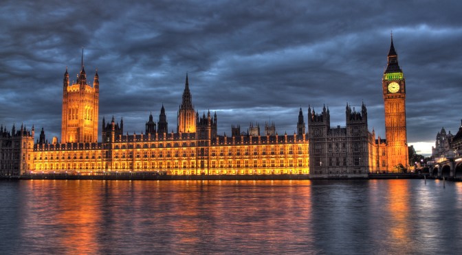
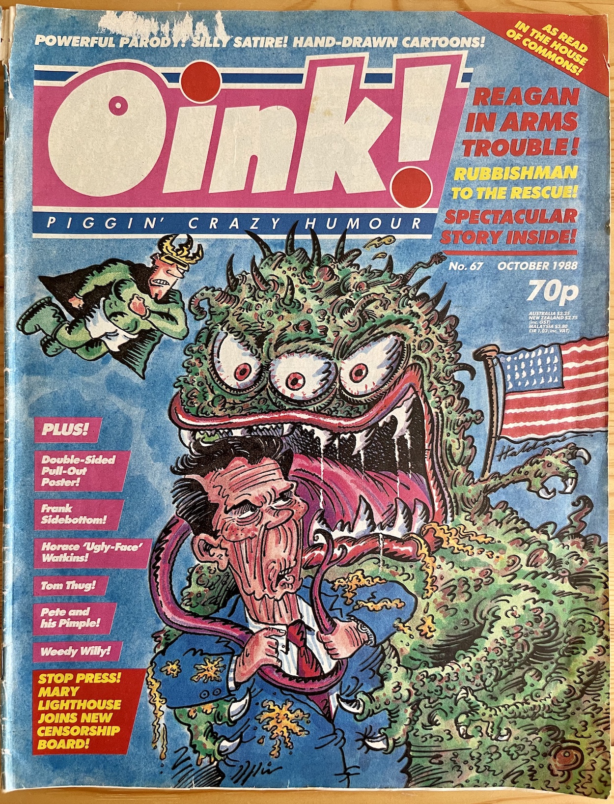
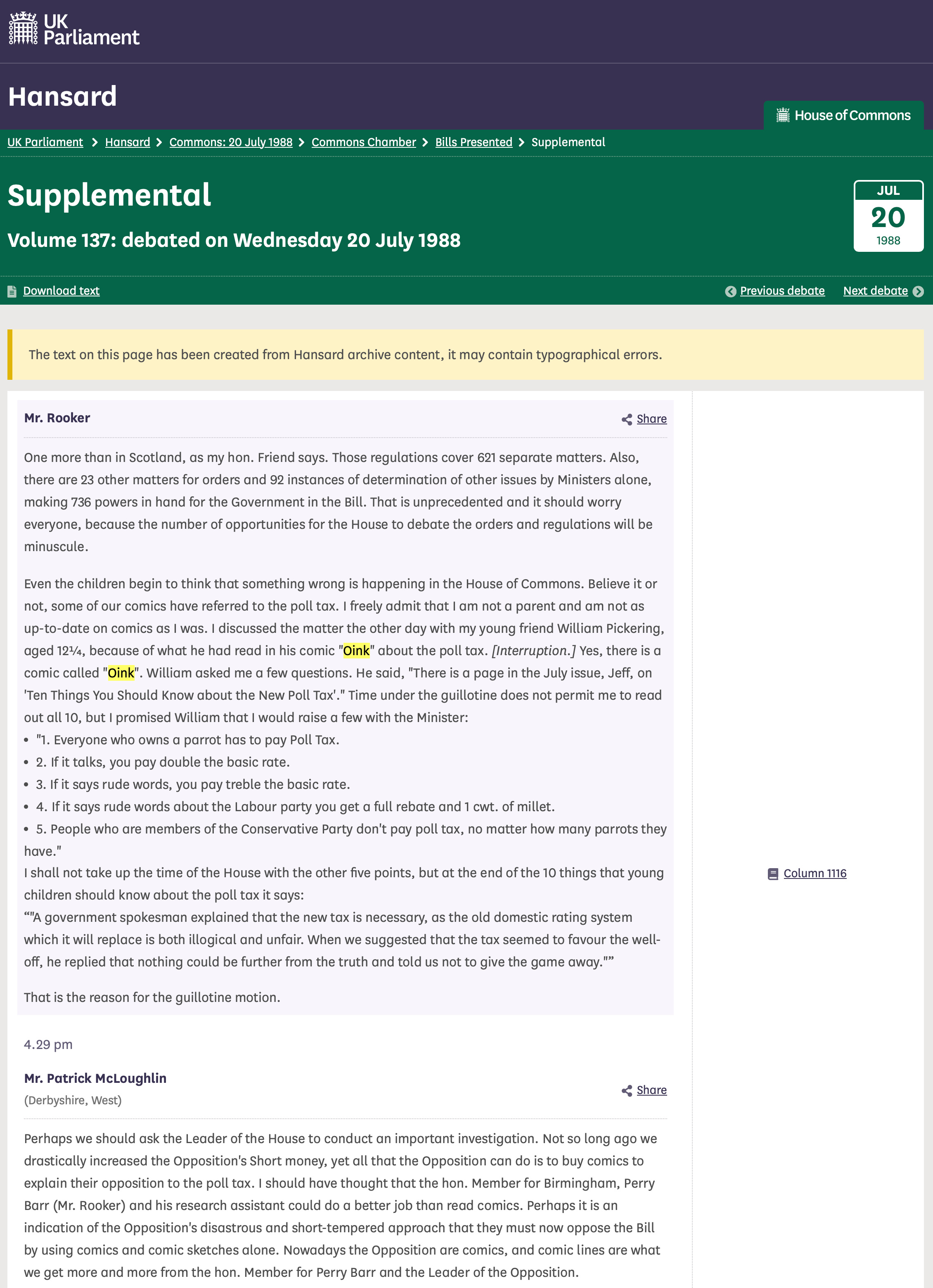
These two issues of OiNK were linked by a somewhat famous incident in the life of the comic when #64 published what was initially just another funny page. However, it resulted in a follow up in #67 when it became the topic of conversation in a rather important place in the UK. I don’t think many of our comics have the honour of being a search result on the government’s website, but that’s certainly the case with OiNK. Let’s start at the beginning.
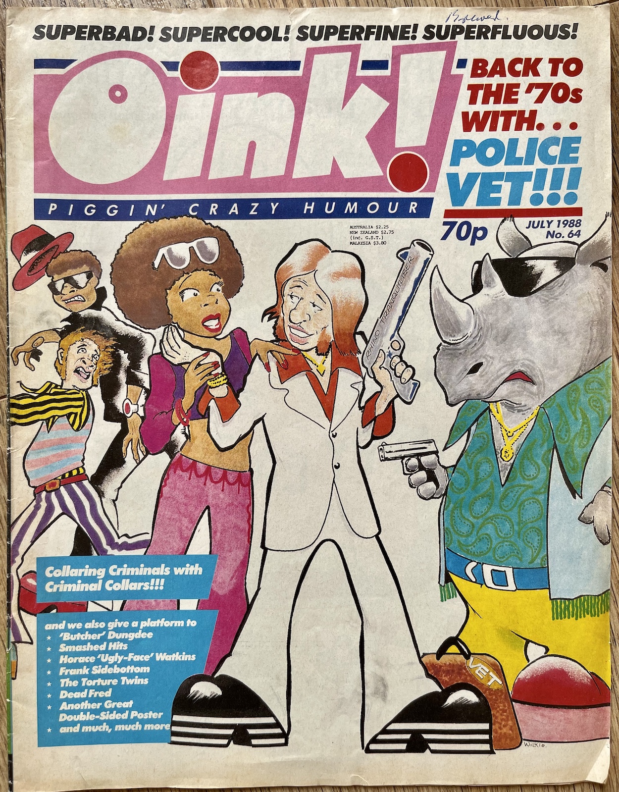
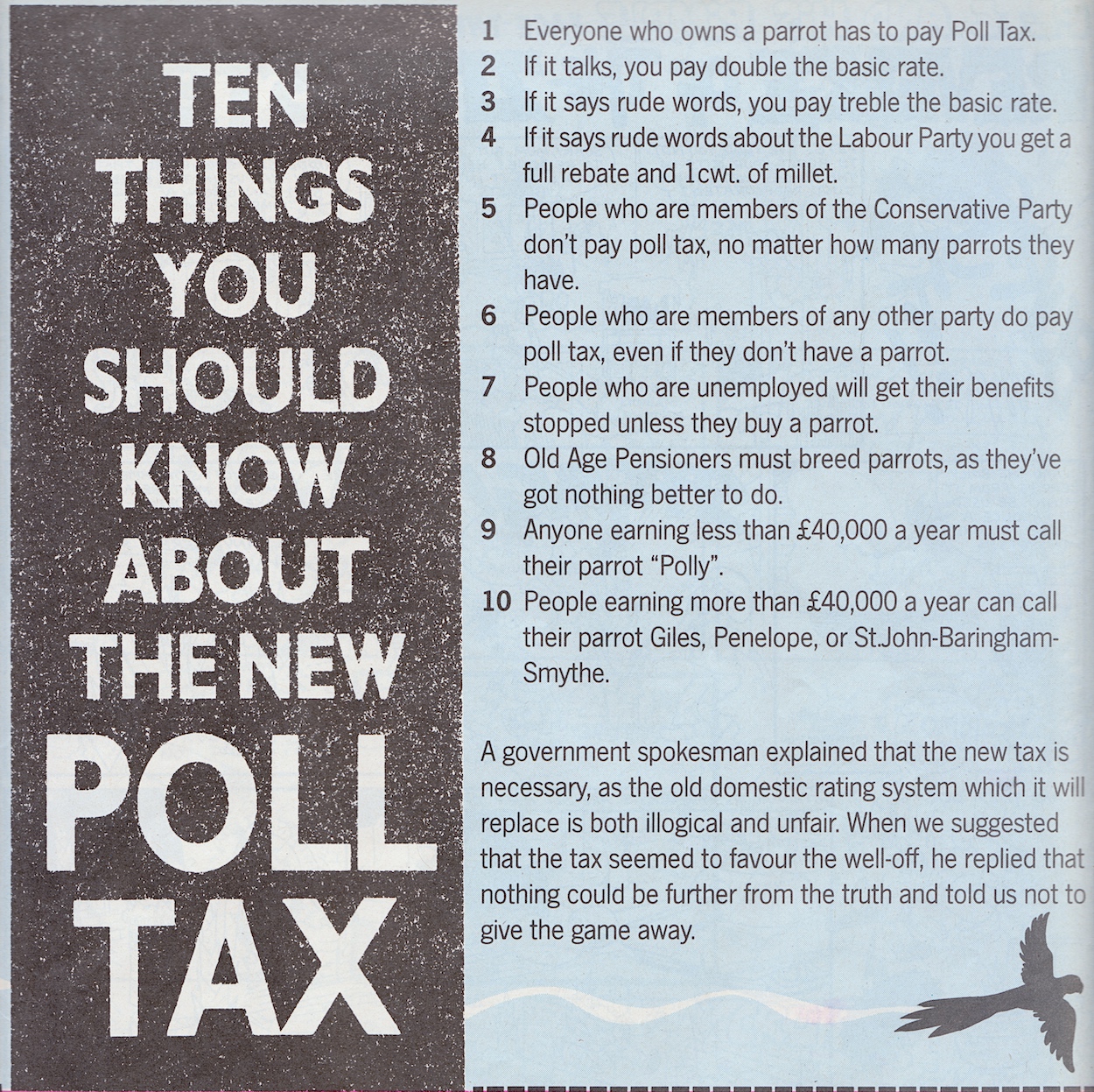
Back in the review for #64 I highlighted writer Howard Osborn‘s Ten Things You Need to Know About the New Poll Tax, retooled as a way of taxing parrot owners across Great Britain, which made about as much sense as the real thing. It was a hilarious piece of satire at a time when Margaret Thatcher’s Poll Tax on the mainland (it never made it over here to Northern Ireland) was getting ridiculed across the media, from the news to Spitting Image. Now a children’s comic was having a go too.
As I said in the review certain points of this feel very prescient, which is actually something I’ve noticed in a lot of OiNK’s more satirical jokes recently. The Poll Tax itself was so universally hated I can remember it being on the news constantly, even though I never paid attention to such things at a young age. The aforementioned latex puppets probably helped in that regard.
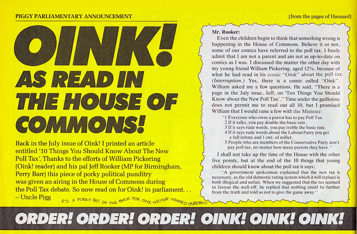
Fast-forward three months and #67 had the blurb, “As read in the House of Commons!” emblazoned on the cover. Inside, Uncle Pigg announced that a young pig pal by the name of William Pickering had reached out to local Labour MP Jeff Rooker, who the comic describes as William’s “pal” and showed him OiNK’s piece, for which Howard finally received the writing credit. Uncle Pigg thought readers might like to know his fine publication was then spoken about (and even quoted) in the corridors of power.
It’s quite funny to think this happened at the time, our little comic being referred to by the government and not in a critical way like some late Northern Ireland politicians who had wanted it banned. Instead the rebellious, anarchic OiNK was being held up by a government official, albeit as an example of the contempt felt by the populace for the party in power. But that’s not the end of this particular story.
OiNK had proved its point beyond its wildest dreams
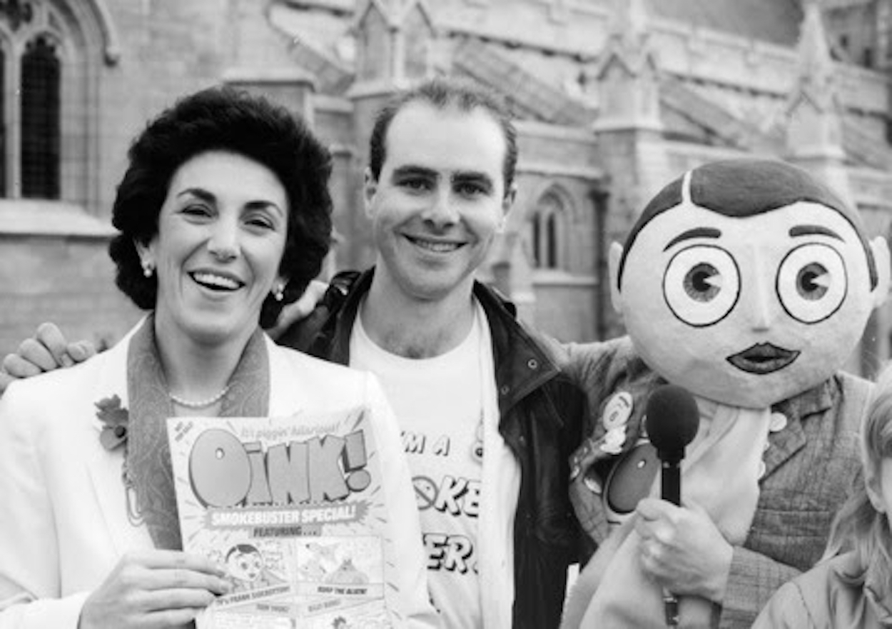
The text is from Hansard, the official record of the UK parliament. “From what I remember, Hansard made contact with us and informed us,” OiNK co-editor Patrick Gallagher told me. “It’s what we pay our taxes for, particularly Poll Tax in this case.” Just for the blog, Patrick reached out to Uncle Pigg on his tropical retirement island for comment, who snorted, “The impression I got was that they [Hansard] were a fan. Don’t forget, we also made an excellent impression on Edwina Curry so we were well respected and talked about in certain quarters of the government, too.” Indeed, here’s a photo from the Smokebuster Special promotion to prove his point.
The parliamentary records are much more accessible today thanks to the Internet and a quick search for ‘OiNK’ in the year 1988 brings up the full session from that day. This includes the complete exchange between Rooker and fellow MP Patrick McLoughlin who, in typical Conservative fashion, completely ignores the point of why the comic was quoted in the first place.
OiNK’s inclusion by Rooker was to show how the tax was so widely unpopular that even children were mocking it. Rooker also clearly explained he didn’t read comics and that a young child of a constituent had pointed it out to him. Despite all of this, the Tory member accuses Rooker of having nothing better to do than read comics, which just showed everyone McLoughlin had no good response to OiNK’s ribbing. He really should’ve just stayed seated and quiet.
So there you go, the day OiNK was read out in the House of Commons. If you’d like to see it on the government’s website for yourself you can check it out at this link, although the screenshot above is all there is on OiNK. I loved the original piece by Howard and seeing the ruling party’s pathetic response just makes it all the funnier. OiNK had proved its point beyond its wildest dreams.
This is a really stinky, smelly, rubbish issue of OiNK. However, as pig pals will attest that doesn’t mean it’s bad. Instead, it’s rubbish with a capital ‘R’ because David Haldane’s Rubbish Man is back after a long hiatus. Originally appearing in every comic, special and book, Rubbish Man disappeared when OiNK when weekly with #45, however David continued to contribute to every issue with his uniquely bizarre sense of humour.
Not intending to do things by halves, Jimmy Bung (our hero’s alter ego) takes up a whopping ten pages of this issue, his adventure split up into five double-page spreads and as you can see by the cover it has a rather famous guest star in the shape of then American President, Ronald Reagan. And a slime monster. Naturally. I love the ‘Reagan In Arms Trouble’ headline, mimicking the newspapers of the day. Interestingly (or coincidentally) the three characters who’d be making the transition to Buster comic in a month are all mentioned on the cover, and watch out for a special blog post next week about that top corner announcement!
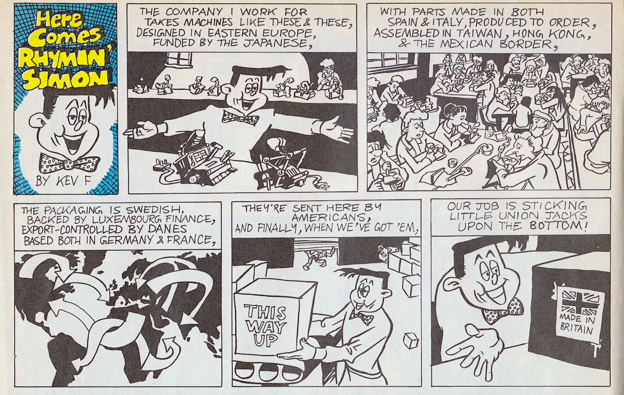
We kick things off right at the top of page two with Kev F Sutherland’s Here Comes Rhymin’ Simon, a one-off character whose name suggests the joke will be based solely on how he speaks. However, we should know by now never to predict a strip by Kev. My point is proven when the story actually takes a dig at the push for ‘Made in Britain’ in the press at the time, something Spitting Image also masterfully took the hand out of. Even at my young age (back then, not now) I can remember my friends and I making jokes about those little stickers.
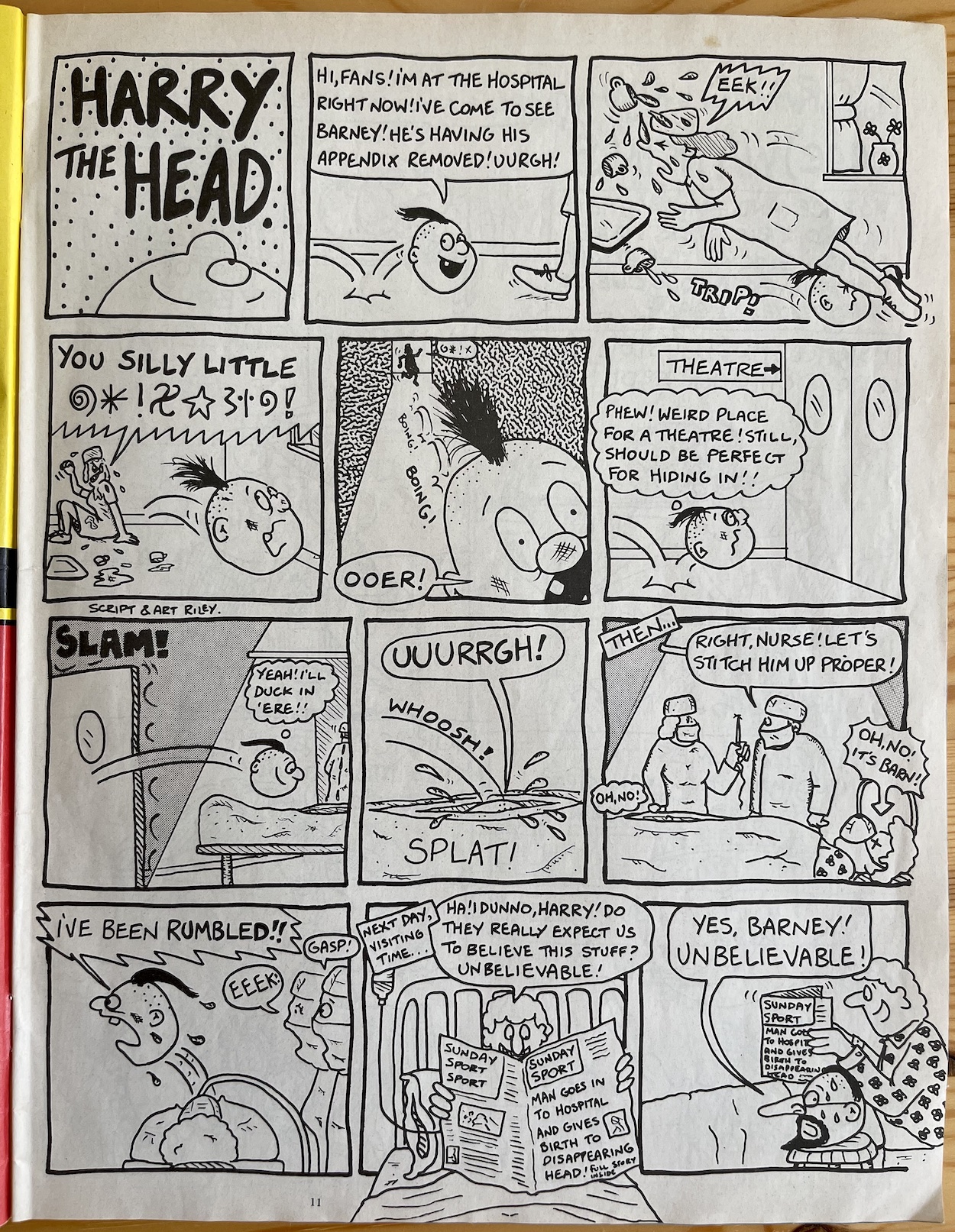
A strong satirical start that this kid definitely appreciated at the time and a few pages later Marc Riley’s Harry the Head returns to top form too. Harry’s strips were always at their best when they were full pages and individual stories. The lengthy adventure serial he had for a few months in the fortnightlies didn’t really work for me and, while his mini-strips in recent issues have been funny, reading this next page reminded me of how strong his entries were right back at the beginning of OiNK.
While having Harry stitched up inside Barney could have made for some (possibly rather disturbing) fun, the end made me chortle. As if Harry being a disembodied head wasn’t a dead giveaway, slapping on a joke shop disguise is just so ridiculous with an already ridiculous character I couldn’t help but laugh. It’s nice to see Marc back to writing for Harry too.
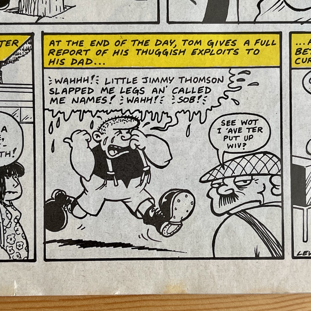
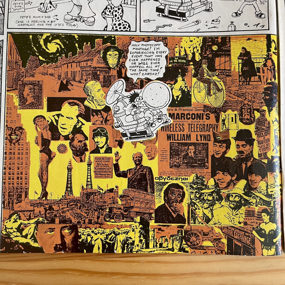
After what felt like a Lew Stringer special last month, the prolific cartoonist returns to a more regular workload. There’s a one-page Tom Thug which rings true, in which we see Tom taking on the true persona of all bullies including the online troll variety. Then Pete and his Pimple’s three-page strip starts off with this imaginative photo collage as he travels into the far-flung future to seek out a pimple cure after a suggestion from reader Matthew Browning of Kent.
A nice little 2000AD reference there too.
The story is a good ‘un if you can track down the issue, with Pete arrested in a world where anyone with spots is jailed for everything that’s wrong with the world, after the government has run out of other minorities to blame. Just to nail the point home, when a robotic claw grabs him it’s named ‘Claws 28’ after Margaret Thatcher’s draconian anti-LGBTQ+ Clause 28 from the late 80s. It’s yet another example of Lew’s social commentary that’s both very funny and unfortunately still very relevant.
Time to see what that front cover was all about and in a distant galaxy we meet the crazy baddie (aren’t they all?) Dr. Blip, the last of his race, and his two henchmen The Glove Puppets From Hell. In order to hold all of planet Earth to ransom for fifty squillion, zillion pounds and a copy of Dire Straits’ latest album he’s kidnapped Reagan and sent the largest monster Rubbish Man has ever faced. How large? Well…
Jings, Rubbish Man! I do believe you’re right! That would’ve been one helluva cliffhanger had the original idea for this strip as a weekly serial been realised. Hinted at back in #52, the plan was for this to be a five-part story but it’s clear David ended up creating it for the monthly format; there are no titles at the beginning of each part (unlike The Street-Hogs in #65 which had been partially drawn before the shift to monthlies) and it all feels very spaced out, like it was created for a larger format.
Below is the page where Reagan is kidnapped by one of Dr. Blip’s hideous monsters just as he’s on the telephone to our smelly hero. The panels are huge and every double-page spread feels like one page of David’s usually packed pages stretched out. The art is gorgeously coloured (a rare thing for Haldane in OiNK) and the grotesque creature is suitably (comically) horrific and very random as per David’s humour, but there’s just not as much to read as we’ve come to expect.
There’s something else missing too. Where’s the mouldy custard squirting out of Rubbish Man’s nostrils? Or the mushy peas spraying out from his fingertips? Or his super garlic breath? While it’s a funny and imaginative strip, apart from one solitary smelly foot none of his powers are present. They were the whole point of the character and why he was so beloved by the children reading the comic.
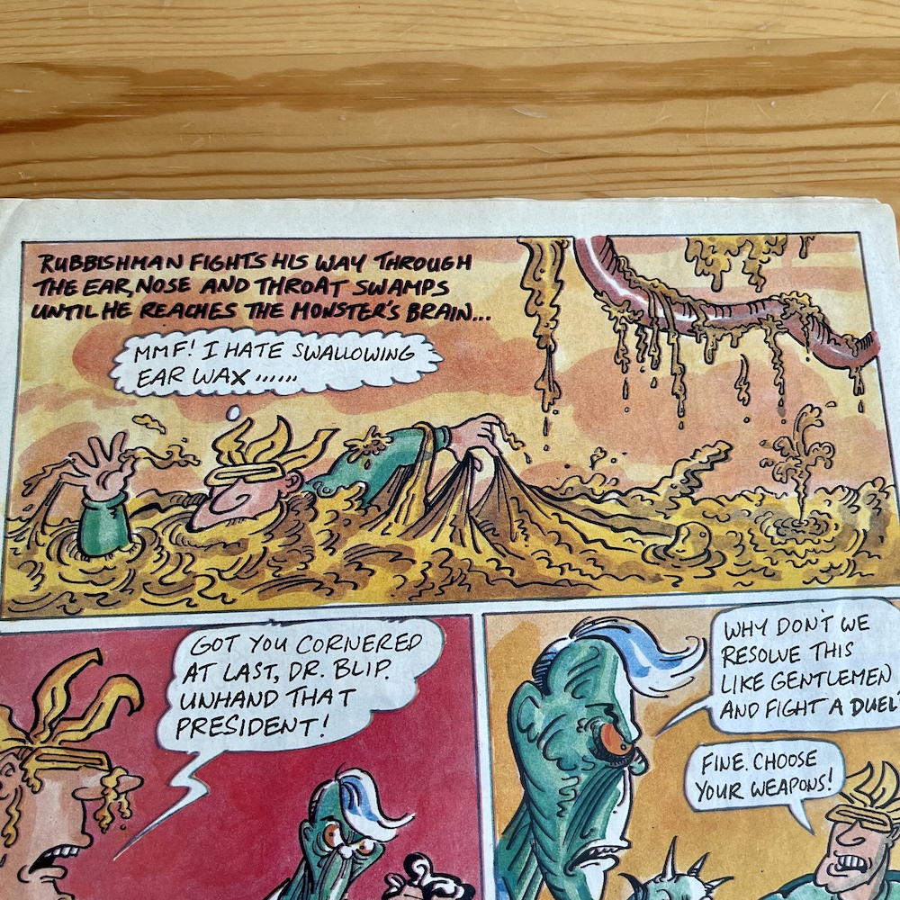
Instead, all of the gross out humour is reserved for the stomach of the planet devouring beast and hordes of undigested carrots. Or rather, a “hungry horde of psychopathic, semi-digested, blood-crazed diced carrots”. It may not feel like a classic Rubbish Man story but I can’t fault the imagination on show and where else would you find a superhero not only swimming through a swamp of ear wax, but also commenting on how this isn’t his first time.
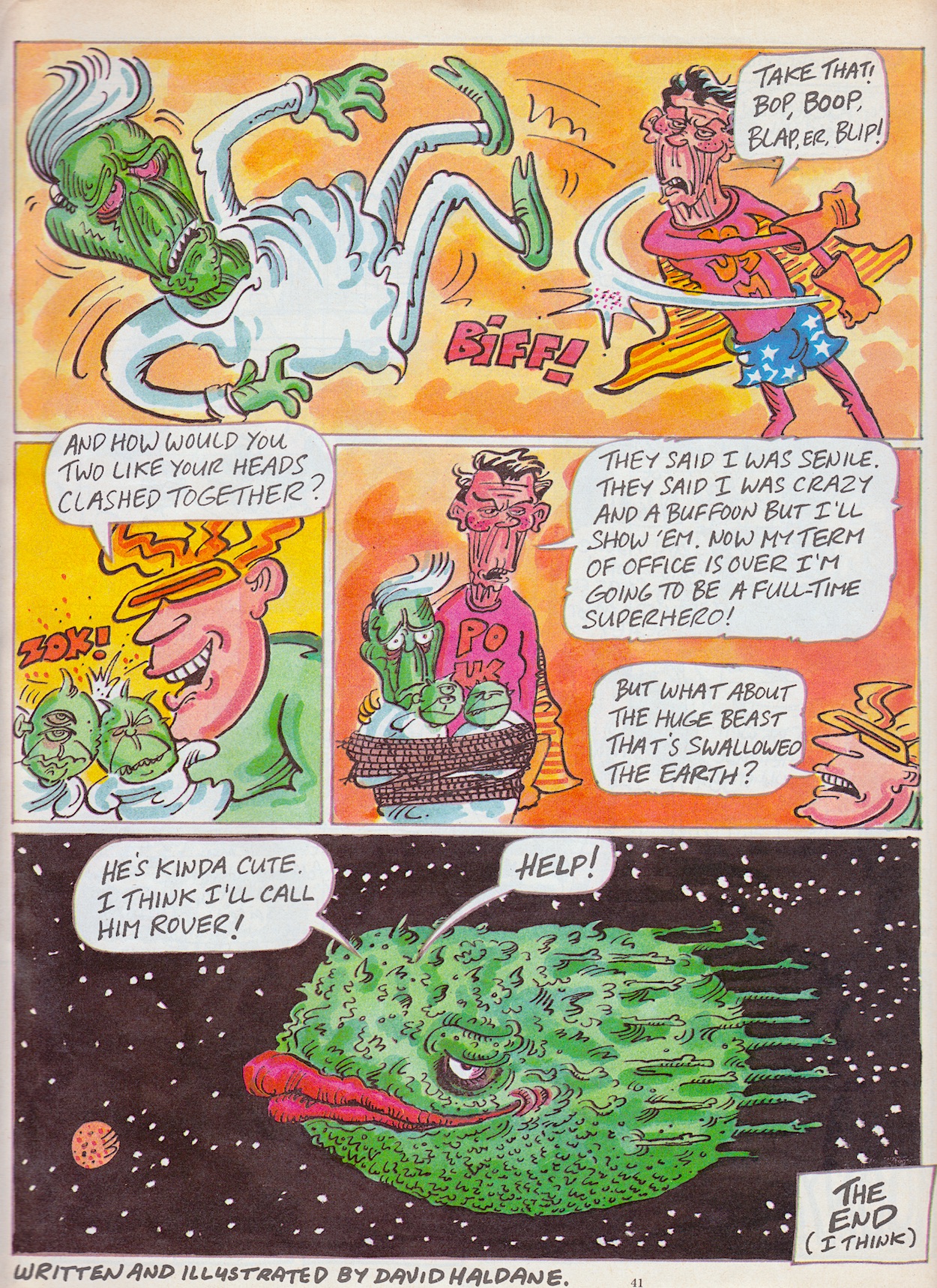
The story comes to its conclusion when Reagan utters some magical Presidential words told to him by his wife Nancy earlier that day (“Jumpin’ Jellybeans!”) and turns into President of the United States Man. Yes, really. With a simple, single superhero punch Dr. Blip (himself modelled on a certain 80s English politician) is defeated and Rubbish Man takes care of the Glove Puppets from Hell he’d been forced to wear in equally easy fashion. Of course there’s just one more issue to mop up.
Or not, as it turns out.
With the new target audience of teens and students it’s strange to see the absence of the smelly and unhygienic nature of the character. (Surely they’re an even more perfect group of readers for him!) As it stands it’s a fun strip which I think needed about half the space it took up here and I can only imagine the extra laughs it could’ve contained had it been written as five individual strips in the weekly OiNK. As an epic adventure for this particular character it could’ve been so much more.
This was his penultimate strip, with a similarly lengthy story to come in the OiNK Winter Special next year, then there’s a reprint in the OiNK Summer Collection the year after. He doesn’t even pop up in the forthcoming OiNK! Book 1989 (see further below). It’s such a shame because he was a real highlight of those early issues, my favourites to this day still being the colourful Kentucky Fried adventure from the very first issue and the multiple laughs to be had in #9’s bonkers entry. Farewell for now Jimmy, it’s been a whiffy blast. Meanwhile…
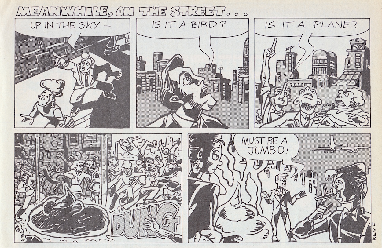
This Meanwhile… from Kev F reminds me of a smaller strip by Vaughan Brunt and Mike Green from #31 and just like Vaughan’s debut this was also repeated umpteen times in the school playground to anyone who’d listen. Nice little cameo by one of Kev’s Three Scientists from last month’s highlights, too. From a spoof of one classic comics superhero to a spoof of another classic comic’s adventure strip, this time of the British variety.
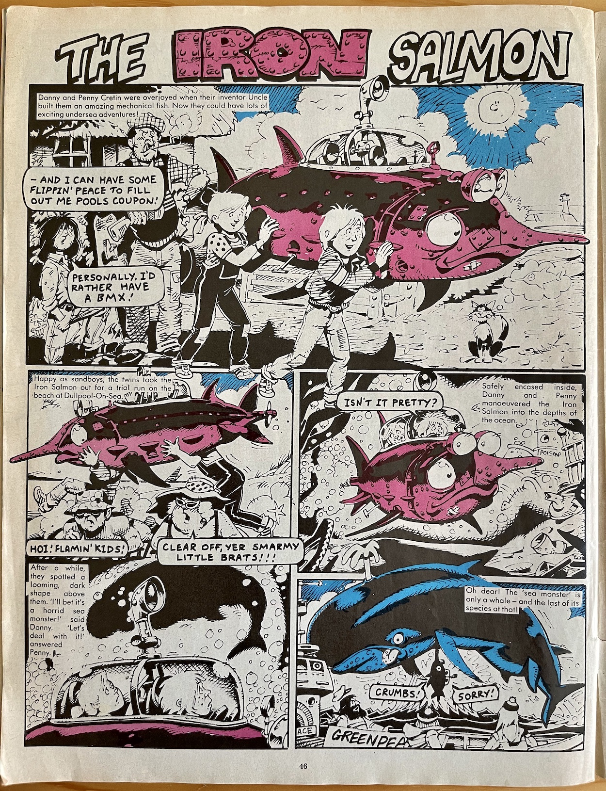
Danny and Penny Cretin were overjoyed when their uncle built them an amazing mechanical fish
The Iron Salmon, Lew Stringer
Back in the 60s Beano would have a couple of adventure strips in amongst the silliness and OiNK cartoonist Lew Stringer’s favourite was The Iron Fish, a tale of two young children who owned a fantastic metal submersible in the shape of a giant, dynamic-looking fish in which they’d have various adventures. A couple of decades later and Lew teamed up with artist Andy Roper to bring life to The Iron Salmon, a rather more cumbersome and sorrowful-looking vehicle.
The two children may have the same forenames as their Beano originals but their surname was changed to one Lew felt better suited the rather wet personalities of Beano’s pair. While the adventure strip had them poke their noses into things to save the day, here their nosey nature causes disaster after disaster, neither of them having the intelligence or self-awareness to know they’re the ones causing all of the problems to begin with. This is great fun.
Andy’s art is perfect for spoofing classic comics. He did so with OiNK’S take on Rover‘s and Victor’s Tough of the Track and of course let’s not forget his main contribution to our comic, the phenomenal Spectacles of Doom. The fact the original Iron Fish’s headlights looked like ferocious eyes is brilliantly transformed into big cute ones instead, with a further set of headlights making it look even more gormless. Sadly no longer with us, you can see more highlights from Andy’s time on OiNK including his Scruff of the Track, in his obituary.
You can also check out Lew’s posts about The Iron Fish on his old Blimey! blog, including some of the earliest ones he read as a child, its reinvention for Buddy comic and even a real-life version, The Seabreacher!
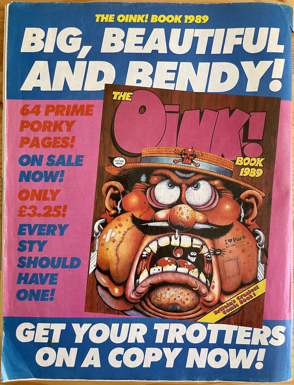
As a kid this was the first monthly I spotted strips (as opposed to the posters, which I’d missed the first time) I’d originally read a year or two earlier. This disappointed me but was by no means a deal breaker. Including those posters there are eight pages of reprint material here, more than the previous issues but on the back page came news of something glossy and new! The OiNK! Book 1988 had been so incrediblethe previous Christmas I’d eagerly awaited its sequel. Now, word finally reached pig pals of the 1989 volume.
It was great to see the old logo again. As a kid I hadn’t realised I’d actually missed it until I saw this superb J.T. Dogg cover. His illustration made up for the disappointing news it contained 16 less pages than the previous book, especially disappointing given the regular comic now had 48! As a result, the book having only 16 more pages than the comic it was advertised in felt rather stingy when I originally saw this advert. I could only hope it wouldn’t disappoint on Christmas Morning. We’ll find out in a few short months.
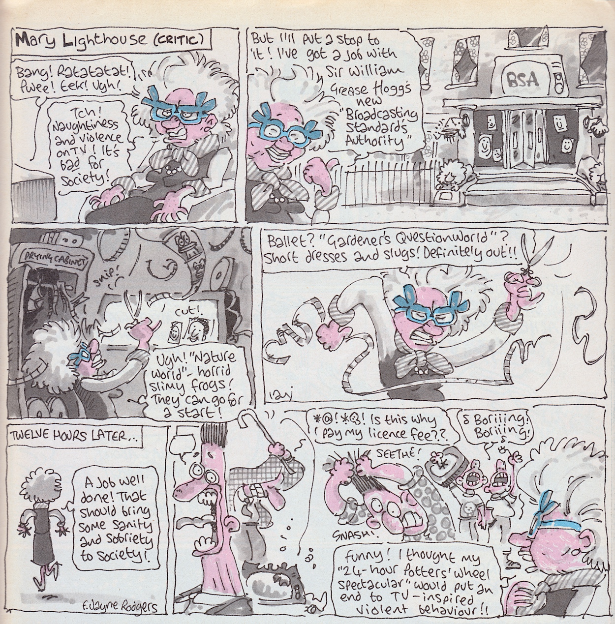
We’ve missed you Mary, and we’ll miss everyone very soon
There’s a surprise return to strip form for one more character before I sign off this review. I’ll end on that but first the Next Issue page (which you’ll see in its own post on Friday 20th October 2023) contains a gorgeous Frank Sidebottom cover which sadly adorns what would be the last issue of OiNK. I can’t believe we’ve come this far already. Don’t worry though, there’s a ton of OiNK content still to come, both in the immediate future and for years yet on the blog.
For example coming next week is that post promised above, on Sunday 15th October you’ll see how Buster comic announced the merge to come the following week, then on Sunday 22nd October you’ll have two reviews to read, one for OiNK#68 and another for the first four Busters starring three of our favourite characters. Then it’ll feel like no time at all until The OiNK! Book 1989 is reviewed on Christmas Day. For now, as we approach the end it feels fitting to have Mary Lighthouse (critic) back in the pages again, here written by F. Jayne Rodgers (co-editor Mark’s sister), her sole contribution and drawn as ever by the irreplaceable Ian Jackson. We’ve missed you Mary, and we’ll miss everyone very soon.
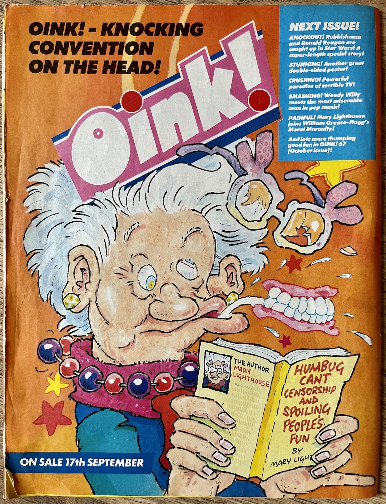
Finally Mary Lighthouse (critic) is back in an honest-to-gosh comic strip in the next issue of OiNK! A regular occurrence during the fortnightly issues, she’s only made fleeting appearances on the likes of the Grunts letters page for a long time now. That situation is about to be corrected in a few days. However, she may have had the Next Issue promo from #66 all to herself but it’s a certain smelly superhero who’ll be the cover star, backed up with a mammoth ten-page story.
Promo art by Ian Jackson
That’s right, #67 sees the long-awaited return of David Haldane‘s Rubbish Man to the pages of the comic in an epic dose of silliness. Marc Riley‘s Harry the Head is back at full strength too in a full-page funny, Kev F Sutherland continues to dominate the monthlies, and Lew Stringer and Andy Roper team up for a superb spoof of a 60s Beano adventure strip. It’s definitely not to be missed, so plop back here on Sunday 17th September 2023 for OiNK #67, our penultimate issue no less!
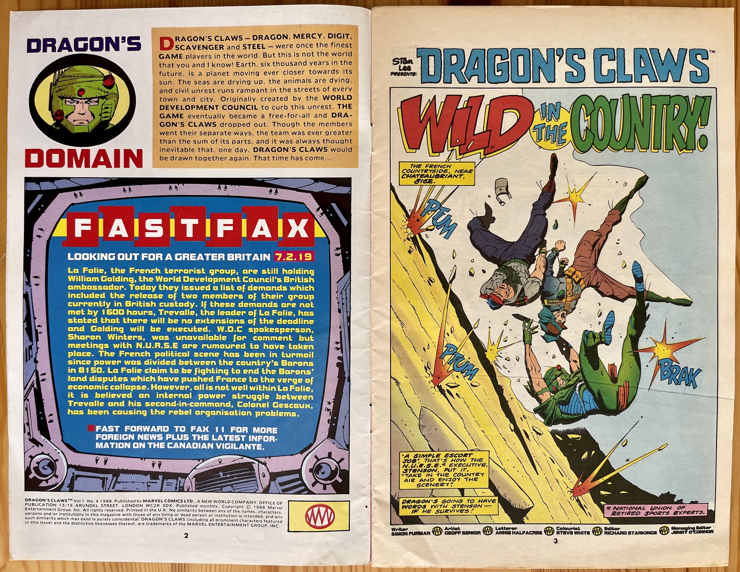
Another month, another foray into the far future with Marvel UK’s classic Dragon’s Claws. It may look like there’s an ancient oriental theme to the story this time around if the cover is anything to go by, but actually Steel here is facing off against one of two French armies. This month’s exciting comic is just that: exciting! It pushes the background intrigue and shocking story arcs from last time aside and concentrates instead on a self-contained tale that’s no less thrilling.
A quick mention of the editorial page first and that opening paragraph doesn’t change from issue-to-issue, remaining as a quick introduction for any new readers. It reminds me of how American TV shows of the 80s and 90s would’ve had a spoken narration at the beginning of their opening credits, so it feels perfectly of its time. Think Knight Rider, Jag and Babylon 5. These were (and still are) all favourites of mine so this gets me hyped every month.
As usual the in-universe Fastfax gives us a little bit of background to the story before it starts on the opposite page. It’s interesting to get some insight into how the wider world outside Greater Britain is faring and it appears France isn’t doing so well, with the rich carving up the country for their own benefit, the rest of the populace suffering as a result. The rebel group La Folie appear to be getting painted as a terrorist group here, so I’m pretty sure that won’t be the case as the story unfolds.
Of course, we know already who’s going to be selected to do the prisoner exchange between the World Development Council and the rebels, don’t we? I’m also intrigued by this mention of a Canadian vigilante, seemingly innocently slotted in there at the end. Perhaps a character we’ll get to in a future story. These Fastfax updates throw out hints and character references every month, painting a lovely three-dimensional world crafted by writer Simon Furman which I hope we get time to explore in the ten issues.
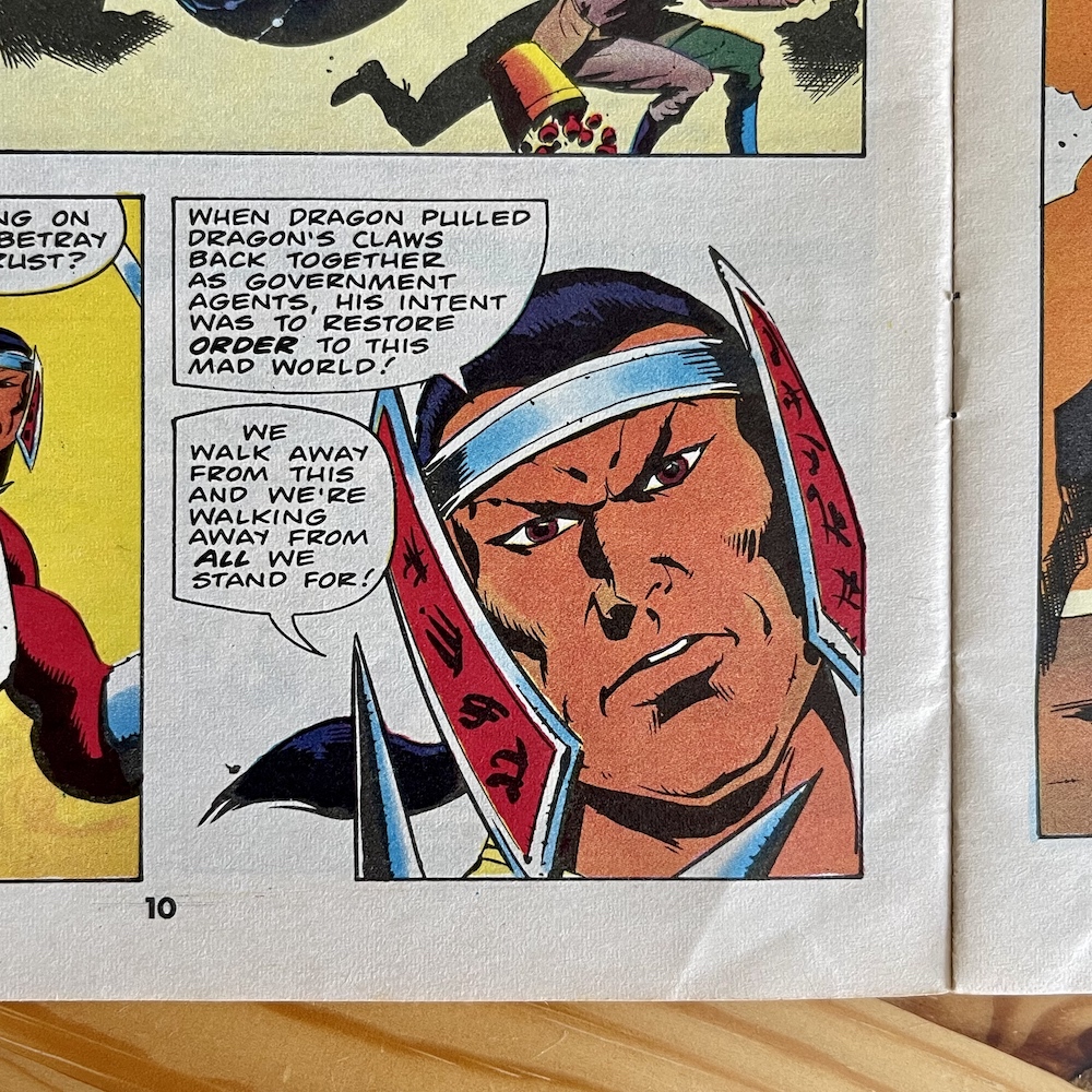
“When Dragon pulled us Dragon’s Claws back together as government agents, his intent was to restore order to this mad world!”
Steel
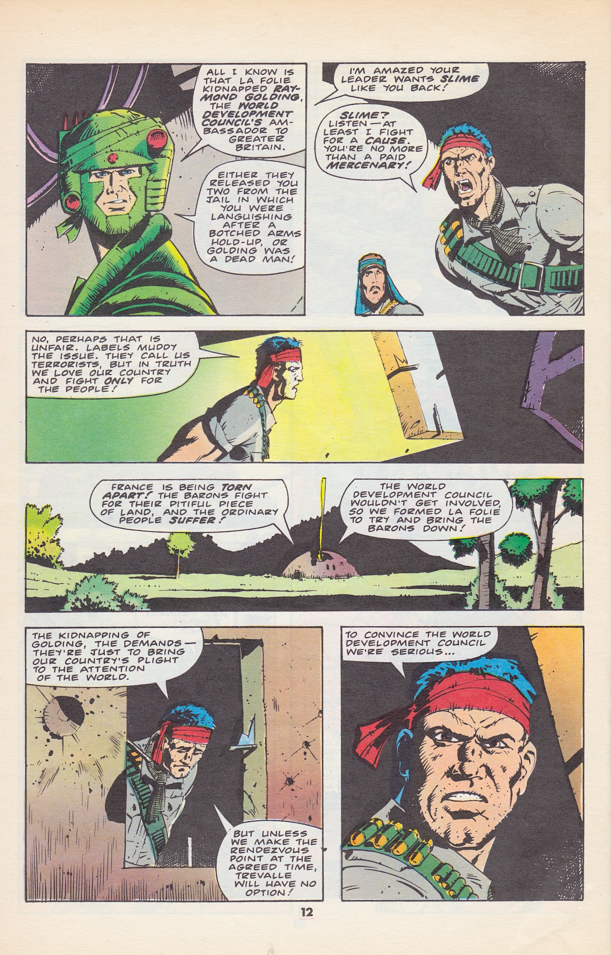
The first half of Simon’s story (drawn by Geoff Senior, lettered by Annie Halfacree, coloured by Steve White, edited by Richard Starkings) is heavy on the action while not wasting any time in developing the story. It may be a little predicable in the end but that could be down to the fact it’s 35 years old. At the time I’m sure it kept readers guessing until the end. So the barons mentioned in the Fastfax are battling all over the country, tearing it apart and killing hundreds of thousands of innocent bystanders in order to advance their power. La Folie are being painted as terrorists instead of freedom fighters because this suits the governments of the world.
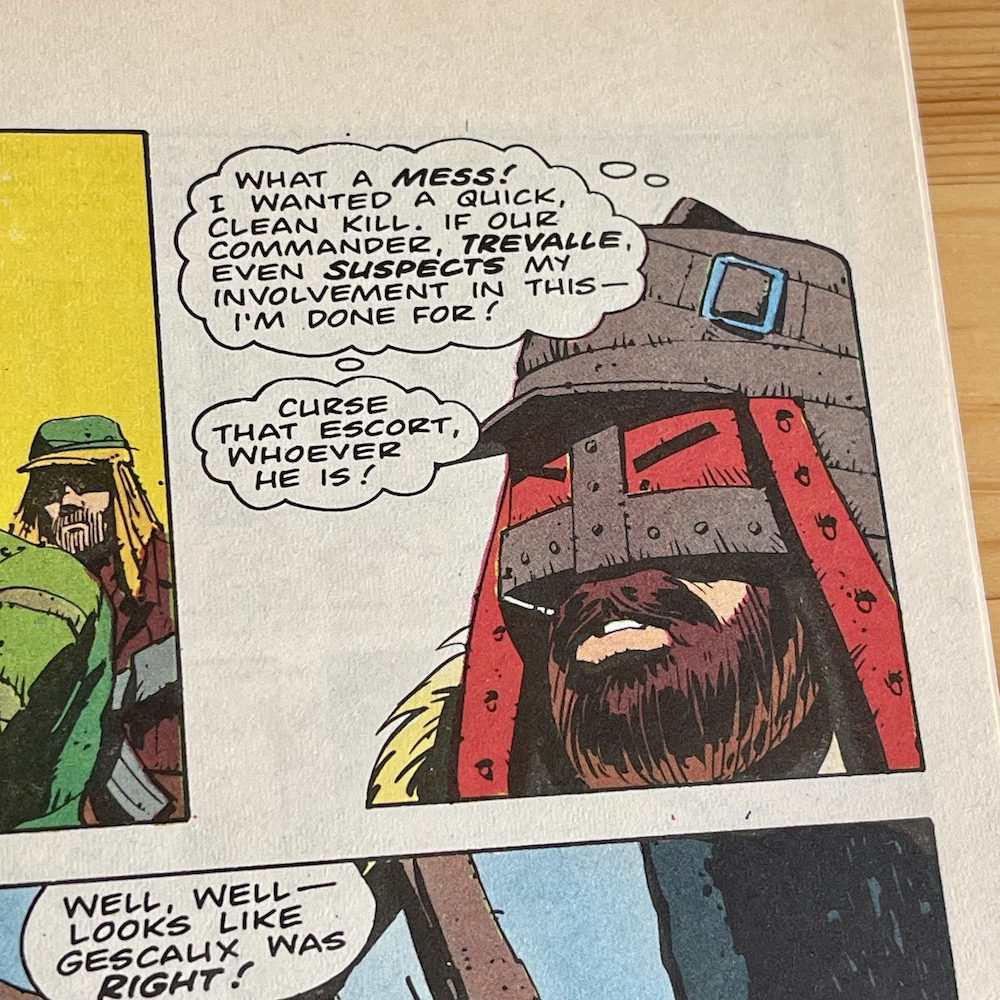
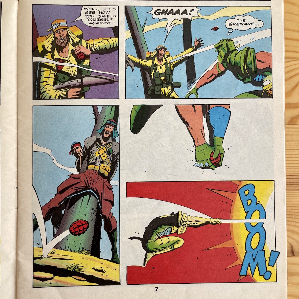
Dragon’s Claws have been assigned to return La Folie’s two members in exchange for the government’s man and Dragon himself is on route to rendezvous with his team with the prisoners when he comes under attack by La Folie’s second-in-command Colonel Gescaux. He wants to kill prisoners Legris and Ostleur as they seem to know something that their leader can’t find out. Straight away Dragon seems to know all is not as black and white as the governments are painting it, even throwing himself into harm’s way to save the so-called terrorists from a grenade.
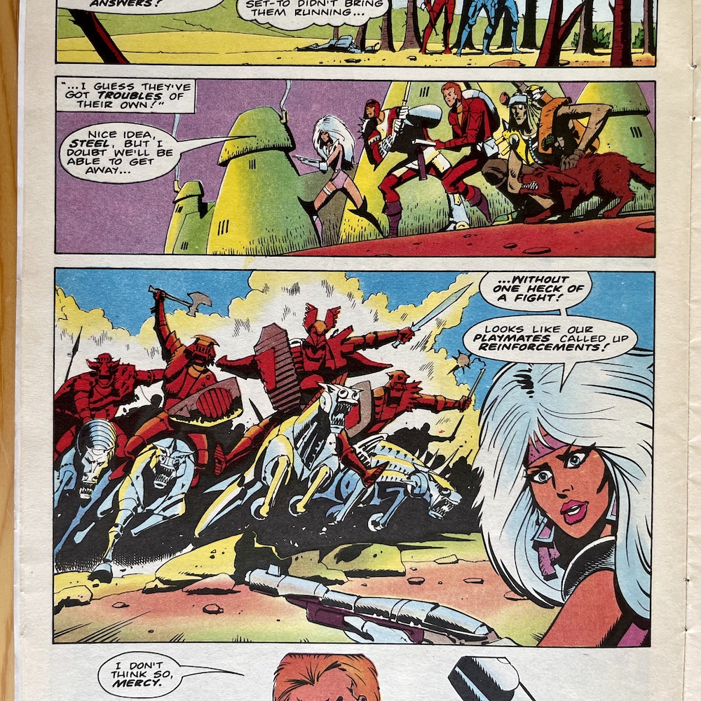
Meanwhile, the rest of his team find themselves between two warring factions. Mercy is all for abandoning the area, it’s not their fight after all, both sides are in the wrong as far as she’s concerned and can wipe each other out. But as Steel points out the local town is being devastated by their battle and given why Dragon reformed the team as government agents (the first time his reason is explained) it very much is their fight. Hence the cover.
Legris takes a moment to have it out with Dragon in a scene where they end up surrounded by Gescaux’s men. Before Dragon battles his way out, entrusting Legris and Ostleur to help out and not make a run for it, he realises he has respect for Legris, that he’s a man of integrity and belief in a cause. Gescaux just wants La Folie for himself, to turn it into the criminal organisation the world already thinks it is in order to further his own schemes. These two men know this and Gescaux knows if their leader found out he’d be a dead man.
Turn the people against each other to enrich the rich even further. Sound familiar?
The story revolves around the point that Greater Britain and the wider World Development Council will happily ally themselves with corrupt world leaders in order to advance their own personal interests, not those of the people they’re meant to serve. They don’t care who gets scapegoated, ostracised from civilisation or killed, as long as no one knows what’s really going on in the corridors of power. Turn the people against each other to enrich the rich even further. Sound familiar?
So while this chapter in the adventures of Dragon’s Claws may not advance any of those plots I found so intriguing over the first few issues, it’s beginning to paint a wider canvas for future stories to take part in and I do hope we get to see more of the world, or even revisit France at some point. (UPDATE: We don’t.) Speaking of which, let’s get back to that battle between the warring barons the rest of the Claws couldn’t walk away from and a surprising moment of comedy thanks to my favourite character, Scavenger.
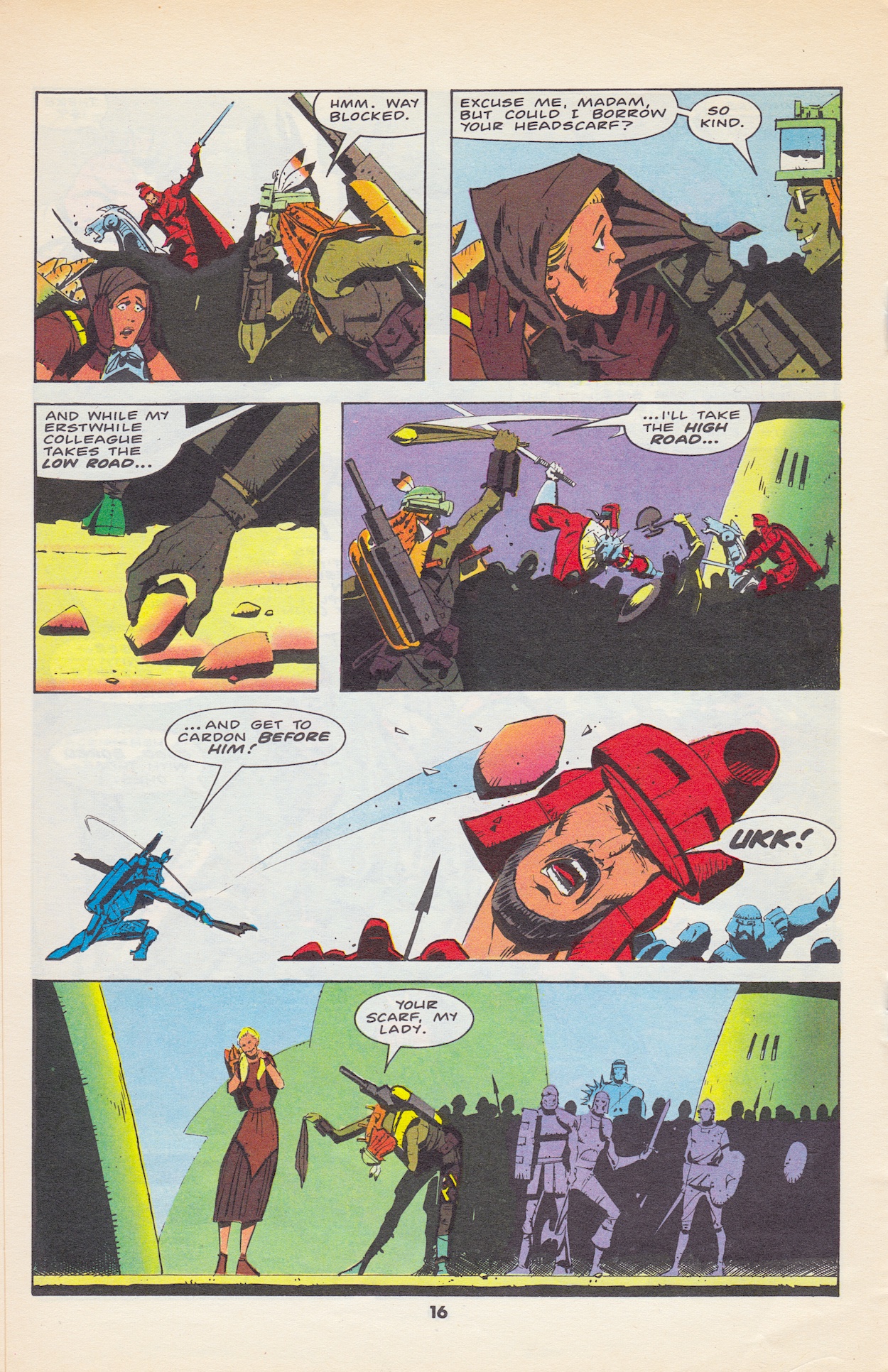
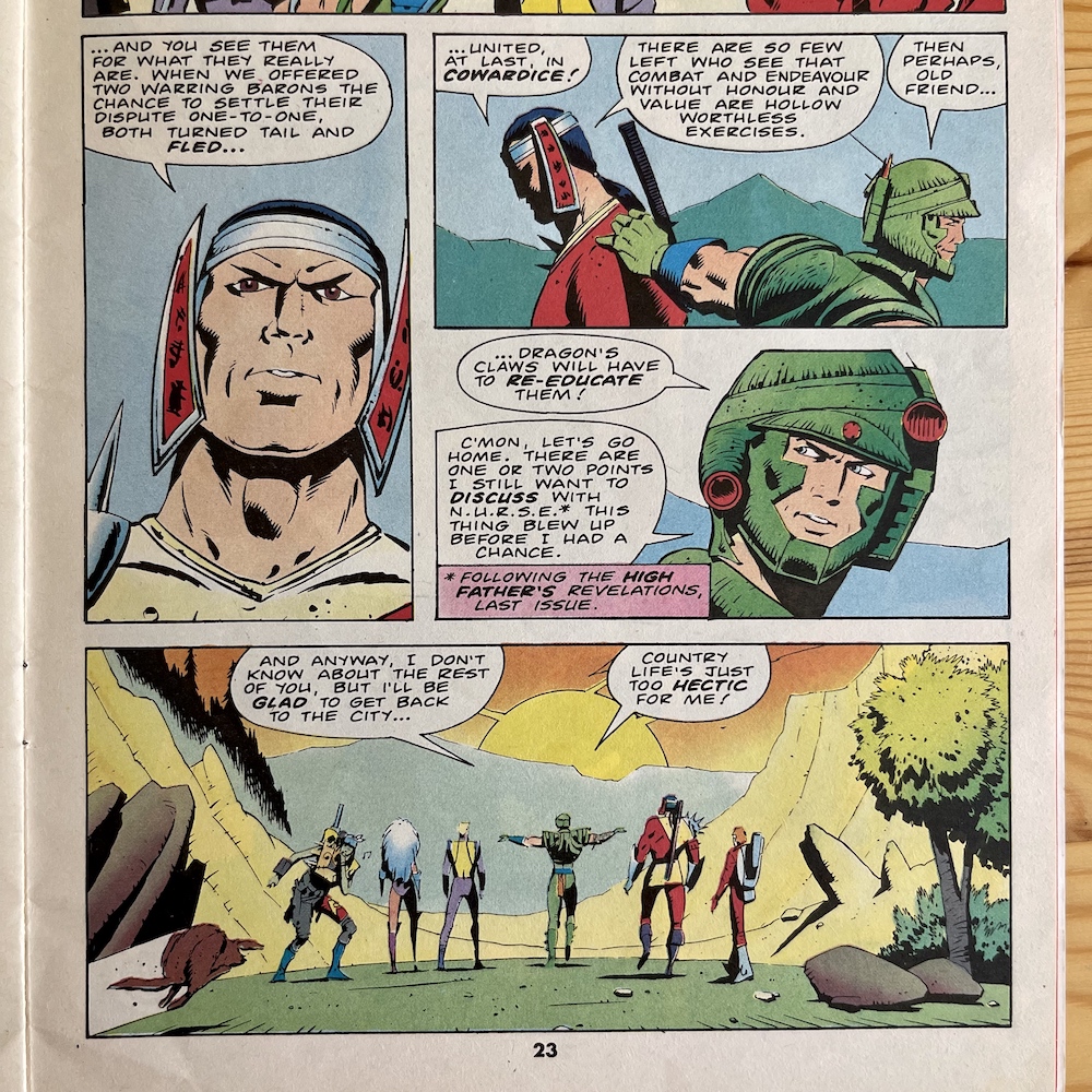
I love this moment so much. The person he hit thanks to the lady’s headscarf was one of the leaders, the plan being to take down one of them so their followers would flee, creating an opening to do so with the other leader, thus saving the town. Steel stops Mercy from killing the other baron, instead putting weapons in front of them both and telling them to fight it out to the death instead of sending their troops into battle for them. Naturally, they show themselves up as the cowards they are and run away instead.
The main thrust of the story ends with Dragon taking on all of Gescaux’s minions, who then tries to escape instead of fighting on (again, typical) and he jumps onto their vehicle. However, Dragon notices the fuel tank is ruptured and about to blow. He still tries to save Gescaux but he’s too late and the terrorist gets blown to smithereens. After an arduous wait to see if the freed prisoners will keep to their word (Dragon let them go to the exchange alone), Ambassador Golding turns up. The other, so-called ‘terrorists’ kept to their word, this honourability proving most important to Steel.
With a little acknowledging nod to the previous story arcs we reach the end for now. After learning of Dragon’s reason for agreeing to become an agent of the World Development Council (and N.U.R.S.E.) earlier in the issue, his comment here about re-educating people isn’t just a throwaway line. Instead, it’s a true heroic statement and one that’ll hopefully lead to many exciting adventures to come, swiftly followed in the next moment with him cracking a joke. A great ending.
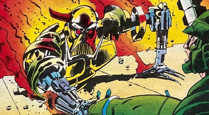
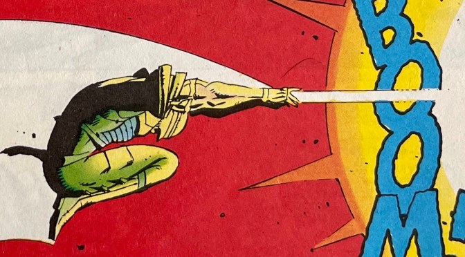
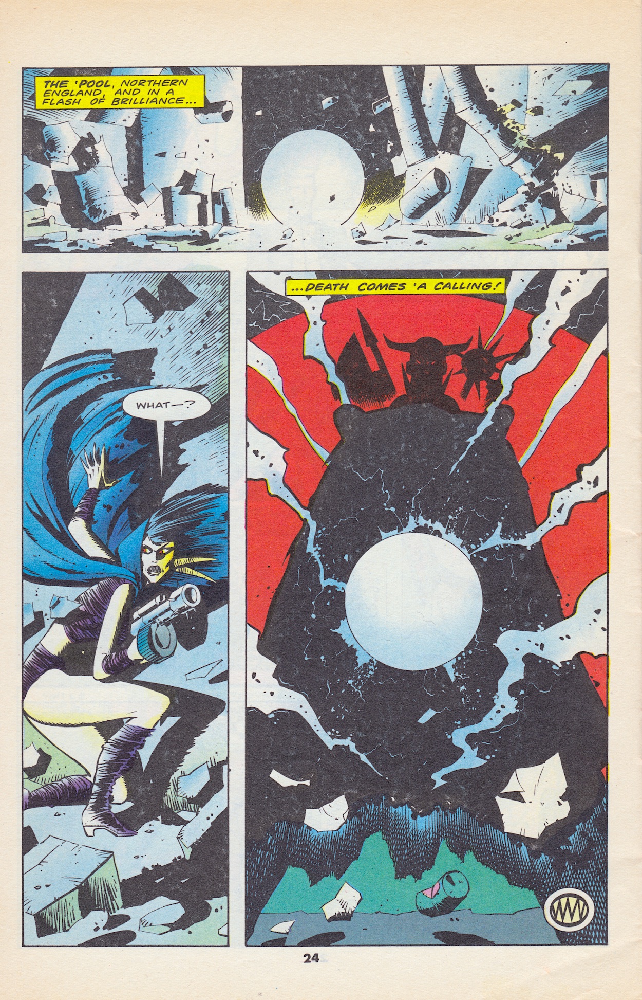
Well, there’s actually one more page to go. Last issue’s story also finished but then had a final page hinting at things to come, it’s something of a trademark for Simon’s comics if this and Death’s Head are anything to go by. So as we turn to the final page we get another surprise cliffhanger. In a moment that’s reminiscent of The Terminator films a bright ball of electricity signals the arrival of a futuristic robotic character, appearing in The ‘Pool (Liverpool) next to The Evil Dead’s Death Nell, one of only two apparent survivors of that Game team from #2. This is a particularly exciting entrance!
Anybody who’s been following the Death’s Head real time read through will know all about the character created in the pages of Transformers by Simon Furman and Geoff Senior. After a few appearances in that hit comic and discovering the origins of the Cybertronians he disappeared through time (after a battle with Unicron) only to appear in Doctor Who Magazine.
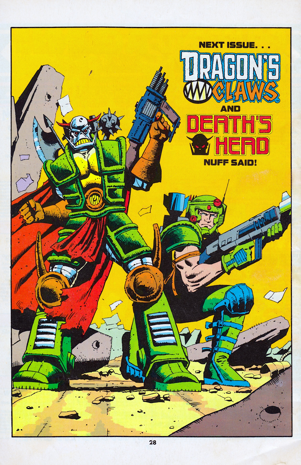
There he was brought down to human size by the Seventh Doctor (Sylvester McCoy’s) in a funny strip in #135 of his publication and then tricked into jumping to Earth in the year 8162, a very familiar time for readers of Dragon’s Claws. Now, with Death’s Head’s own comic due for release before the end of the year it’s time for him to make his reappearance in Marvel UK’s lineup at last and I for one can not wait! Check out the very back page of the comic below, drawn by Bryan Hitch rather than Geoff, so I wonder who is drawing the next chapter. Interesting, and a superb choice of artist.
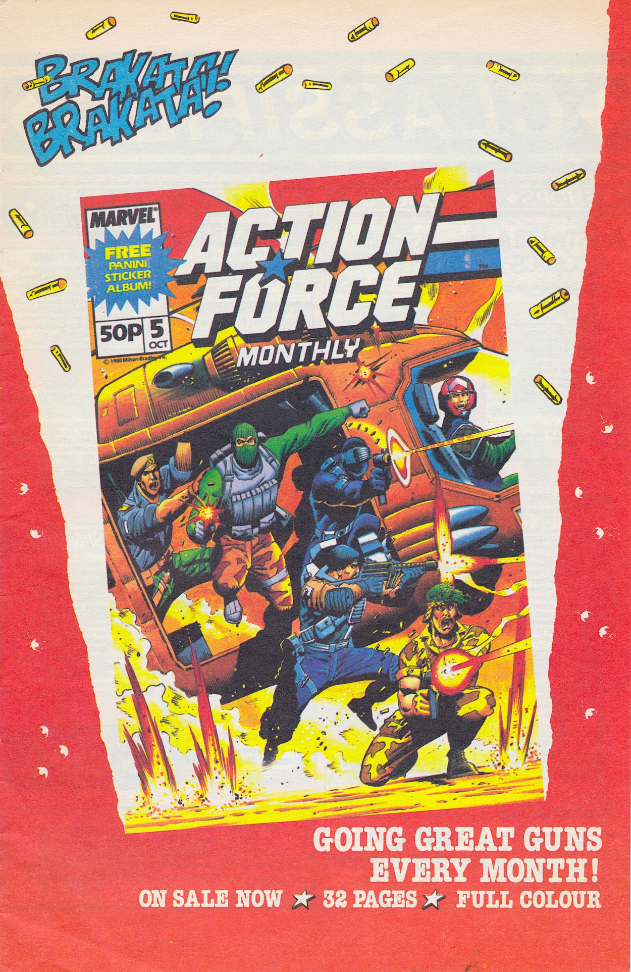
I really am sick and tired of that “’Nuff Said” phrase though. Between Dragon’s Claws, Havoc and Transformers it was so overused by Marvel UK and every single time they did it just felt like a cop out, like the editor couldn’t be arsed saying anything else. At least Action Force were getting much more exiting covers for their monthly than they were a few issues back, with more superb Geoff Senior artwork to gawk at.
With page 28 sufficiently gawked, it’s time to wrap things up for Dragon et all for another month. This continues to be an extraordinarily fun comic, full of action, character and world building that’s second-to-none. With a crossover event next month and the background arcs set to return, I don’t know how they’ve managed it but I’m getting ever more hyped every month for the next issue. Come back on Sunday 8th October 2023 for Dragon’s Claws #5 to see if that trend is set to continue.
It’s been a while since fan favourite OiNK cartoonist Lew Stringer released one of his excellent collections. At the time of writing the only one reviewed so far on the OiNK Blog since I relaunched this site in 2021 is Derek the Troll (definitely check that out). Beginning next year in a new series of posts I’ll be getting caught up with a myriad of releases from Lew and many other OiNK contributors, something I’m particularly looking forward to.
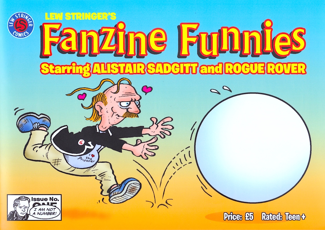
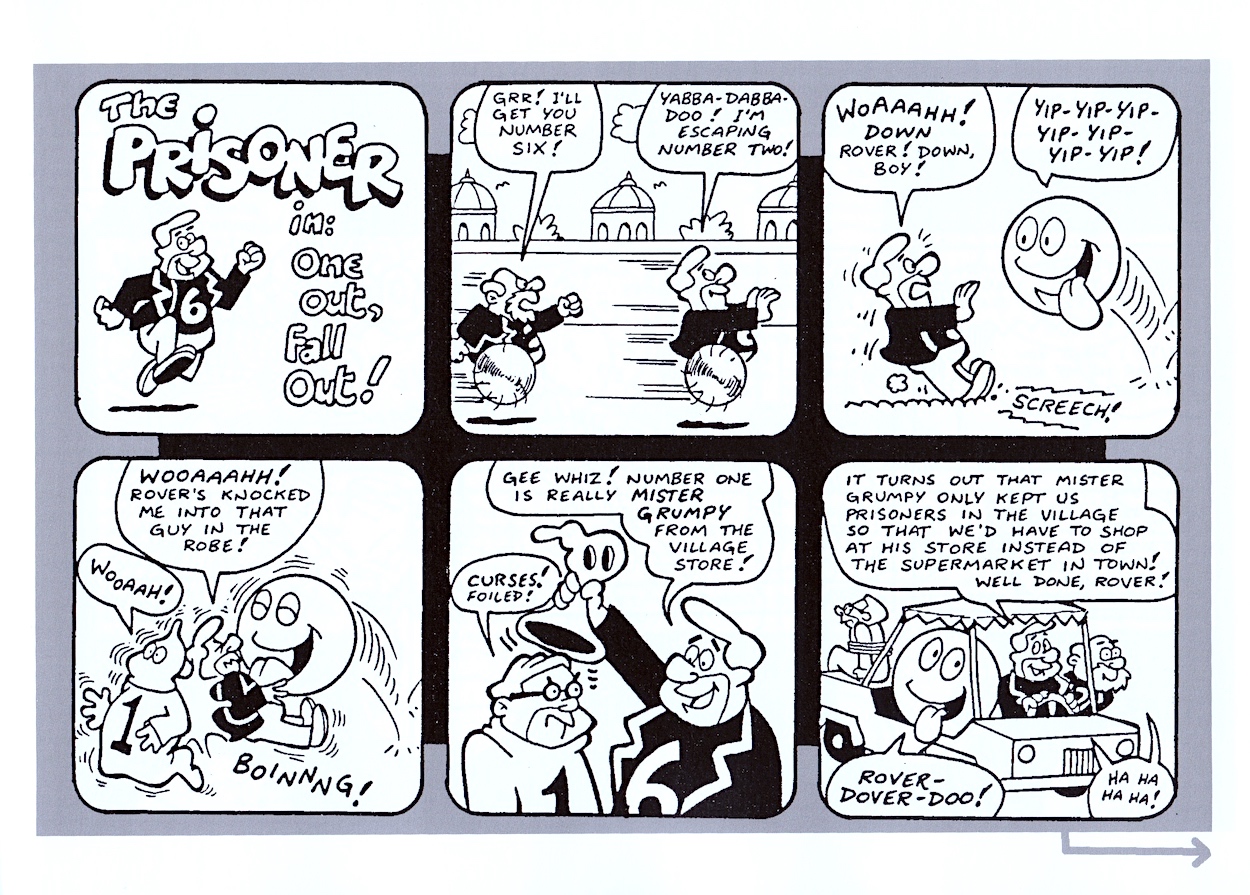
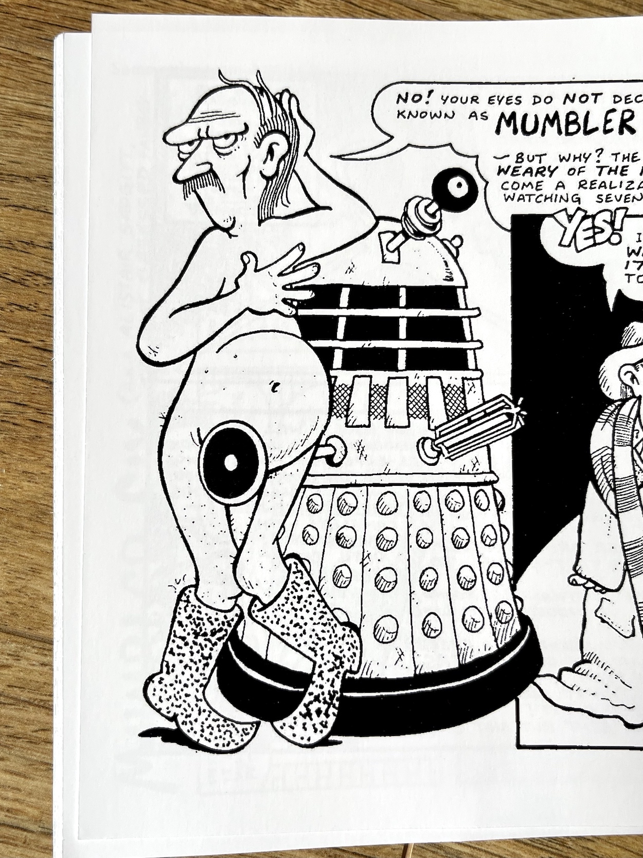
For now, back to Lew’s Fanzine Funnies. Between 1991 and 2006 Lew created a series of daft comic strips for Camera Obscura, a fanzine for a small branch of Two and Six, a fan society for the classic 60s TV show The Prisoner. Originally based around the eponymous white sphere from the series and later focussing on a fictional obsessed fan, in the opening editorial Lew hopes readers will still find them amusing even if they’re not familiar with the subject matter. Having finished this collection I can assure you this is most definitely the case.
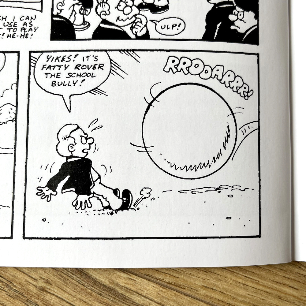
The Prisoner may have only had 17 episodes but a devoted fanbase grew up around it and Patrick McGoohan’s Number Six character. It may also have been broadcast ten years before I was born but its signature phrase, “I am not a number! I am a free man!” was still being used in everything from comedy sketches to television commercials, as was Rover the huge white ball-like creature (apologies if that’s an erroneous description, I’ve never seen it and am writing from memory) who is first up in these strips.
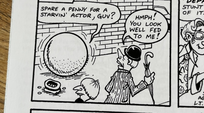
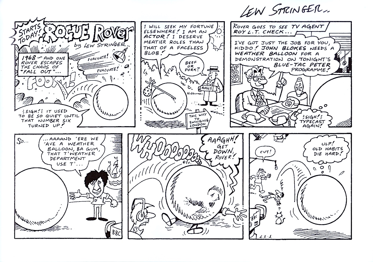
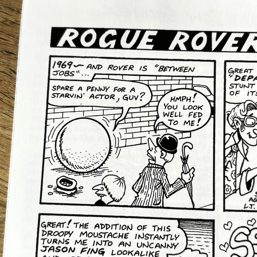
Taking one of these ‘Rover’ sentries and redefining him as an out-of-work actor after the series ended is a genius idea and opened up a myriad of possibilities. These include ludicrous auditions for new roles, a rabid fan following for what is essentially a giant balloon, time travelling to 1992 to escape these people only to appear at a reunion for the fan society and getting his own Saturday morning cartoon show, Hanna-Barbera style.
Lew even ties The Prisoner in with his own ‘Lewniverse’ of characters in a way. Rover has an agent, and that agent’s name is Roy L.T. Check, who may be familiar to fans of Combat Colin from the pages of Transformers. Alongside all of this daftness are a range of special additions like a Prisoner clothing line, a Doctor Who page and even that old Lew staple, a board game.
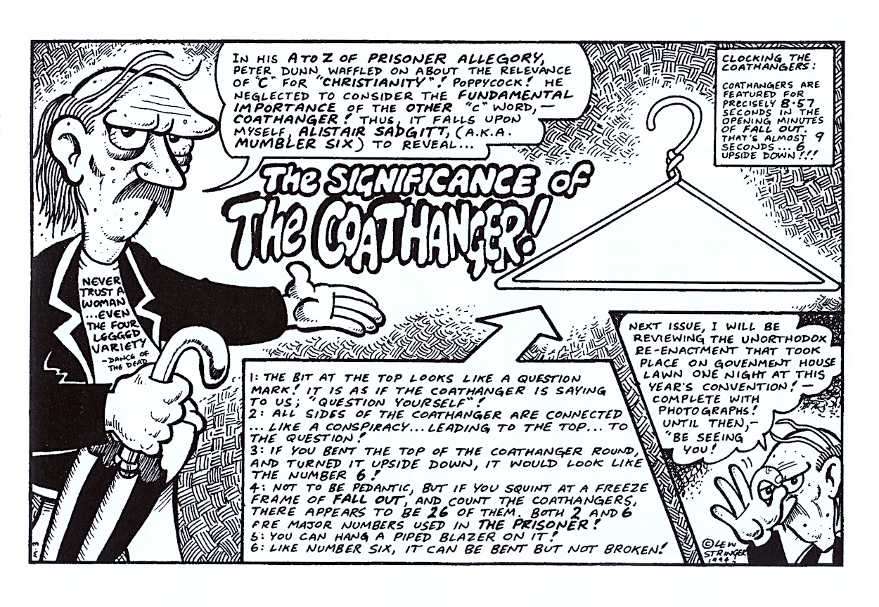
“Coathangers are featured for precisely 8.57 seconds in the opening minutes. That’s almost 9 seconds… 6 upside down!”
Alistair Sadgitt
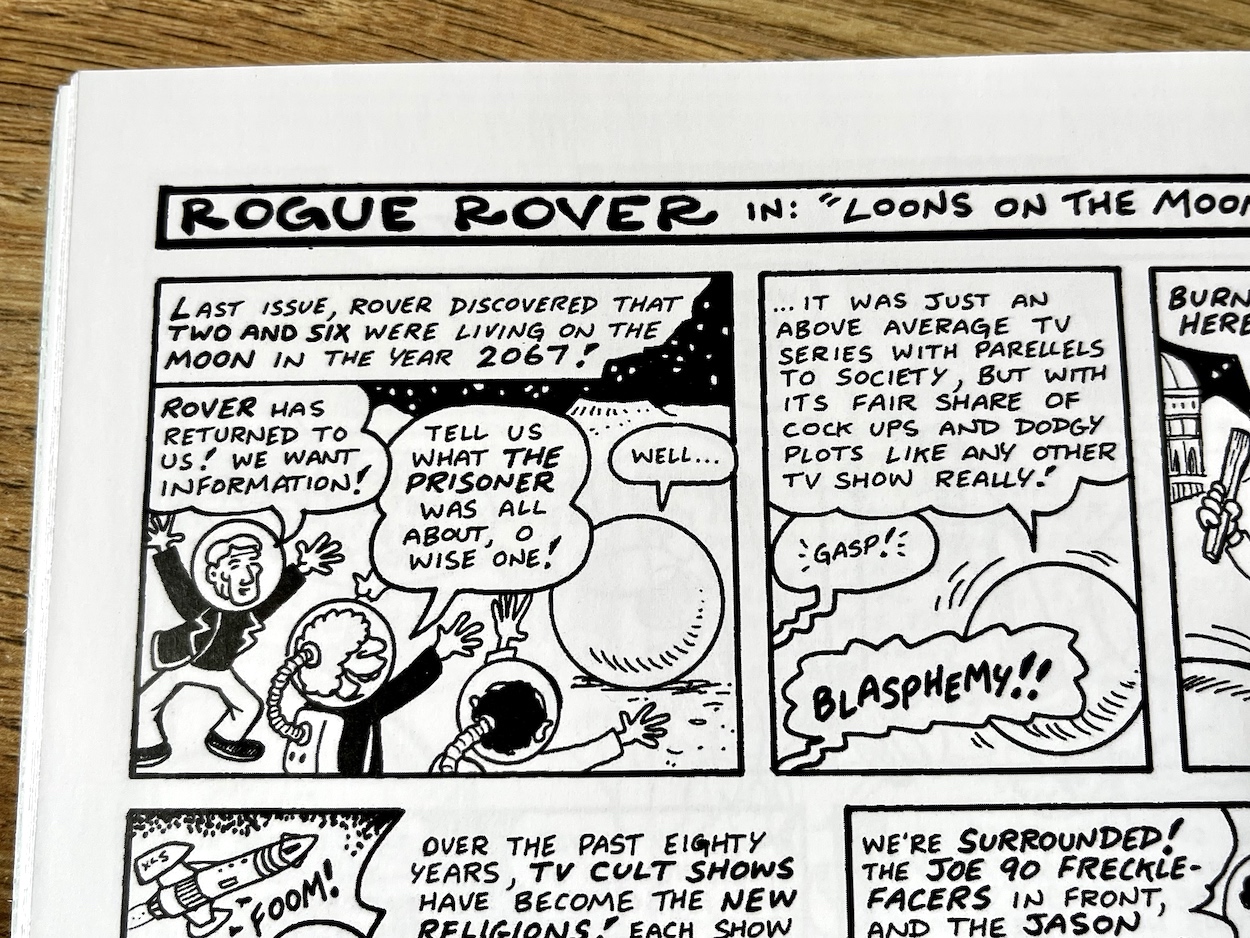
The fans in the society even have a bit of fun poked at them. For example, in the future they hold their meetings on the moon (because Portmeirion in Wales where the show was filmed has been moved there to protect it from pollution) and Rover is bluntly honest when he tells them what he really thought about the show. It’s all in good jest and shows the fans could have a giggle at themselves and not take things too seriously.
However, I’m sure we all know from our own personal acquaintances over the years or from social media those fans that do take things far too seriously; the intense fanboys that like to try and lord it over the rest of us and who are simply best ignored. The second half of this collection focuses on Lew’s version of one of these people and he’d give any of them a run for their money. Meet Alistair Sadgitt (sad git).
While there are plenty of Alistair strips I think this page perfectly sums up the character. The show ended with so many open-ended questions that fan theories and discussions have continued ever since, often picking out supposed clues and running themes from the episodes to try and explain the unsolved mysteries. However, as you can see Alistair takes this to the nth degree.
Complete with his Number Six-like jacket (not actually tailored, it has masking tape for its trimmings) his overly-obsessive ways are the funniest aspect of this collection. I may not be familiar with The Prisoner but I certainly am with the type of person Lew is taking the hand out of here. On a related note, it’s mentioned that he’s 42-years-old. I’m 45 at the time of writing! Either Alistair’s ways have aged him or I’m a lot older than I feel!
Towards the rear of the comic are a selection of strips and images taken from other publications or created for fan events, my favourite being one in which the main character of the show is retooled as a traditional humour comics character, called Number Six and his Unmutual Tricks! As a fan of OiNK, which turned traditional comics on their heads, this reads like as much of a spoof of those comics as it does The Prisoner.
Any fan of Lew’s (or indeed funny comics in general) should find plenty to enjoy here, and plenty to laugh along with. However, for fans of The Prisoner it’s an essential purchase. Presented in landscape format with 32 pages in total, all printed on top quality paper stock and a card cover it’s a high quality piece of self-publishing, just like all of Lew’s other collections. All of this for only £5 plus postage? Bargain.
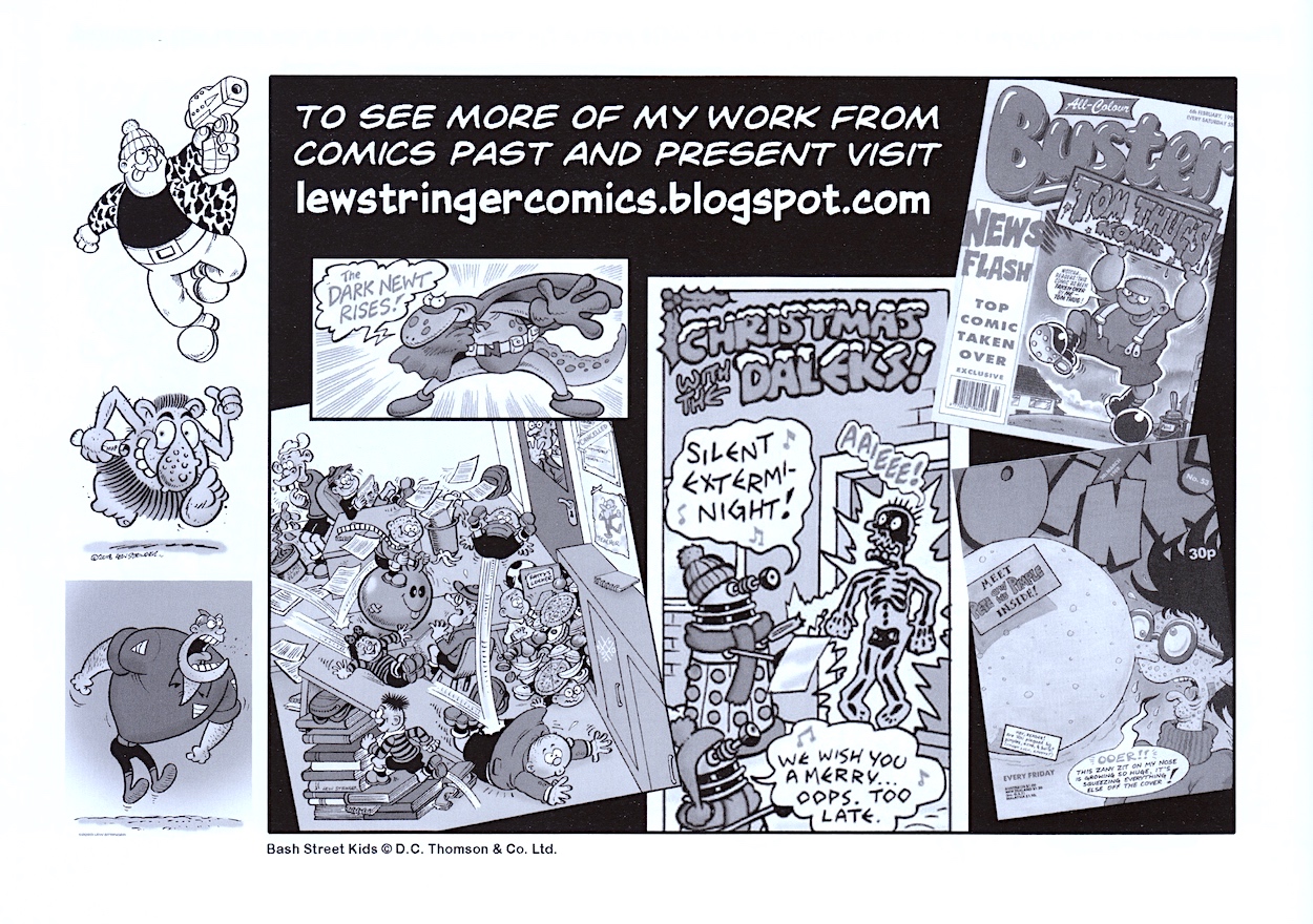
To order your own copy just head on over to Lew’s eBay seller’s shop where you can also sometimes find original art and more for sale. Lew accepts all forms of payment and not just PayPal either. At the time of writing, Fanzine Funnies had only been released a couple of weeks ago and is already on its second printing. You could definitely do worse than bookmarking Lew’s eBay page and keeping a regular eye on it to see what else pops up, he sometimes reprints some of his sold out comics further down the line, and don’t forget his personal blog where new comics are obviously announced first.