As part of the marketing push for the first issue of OiNK, IPC Magazines sent out a lot of “blurb” (as co-editor Tony Husband put it) and one particular piece of this caught my eye recently. Thanks to a friendly pig pal I can show it to you.
I spotted a photograph of Steve Fitch‘s OiNK collection online and on top of the comics was a special folder wrapped around his copy of the first issue. While the inclusion of #1 means this isn’t technically a pre-release piece of marketing, for whoever it was intended for it was to be their first taste of the comic; it was being used to promote the launch and so that’s the section of the site I’m placing this under.
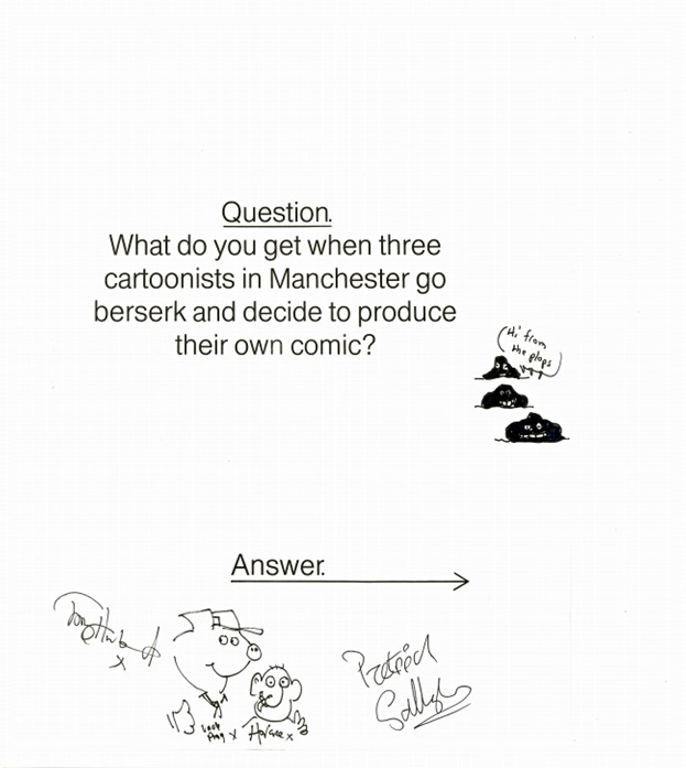
Lucky enough to find it on eBay, Steve had stumbled upon something sent out by IPC as part of the publicity campaign for their new comic. Titled “What do you get when three cartoonists in Manchester go berserk and decide to create their own comic?”, it contained the complete issue one and its free flexidisc, further cementing the publisher’s commitment to OiNK’s launch.
Although Steve isn’t sure how its previous owner originally obtained it, it’s a rare and special piece of OiNK history indeed. So special in fact, Steve sent it off to both Tony and Patrick Gallagher who were kind enough to sign it for him.
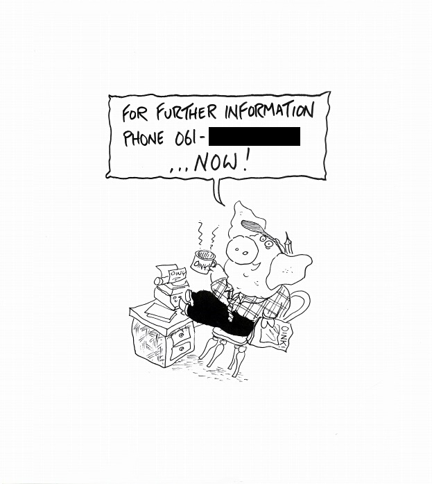
On the back of the folder was a little drawing of Uncle Pigg and IPC’s telephone number for enquires, perhaps for additional distributors, independent shops, the media etc.
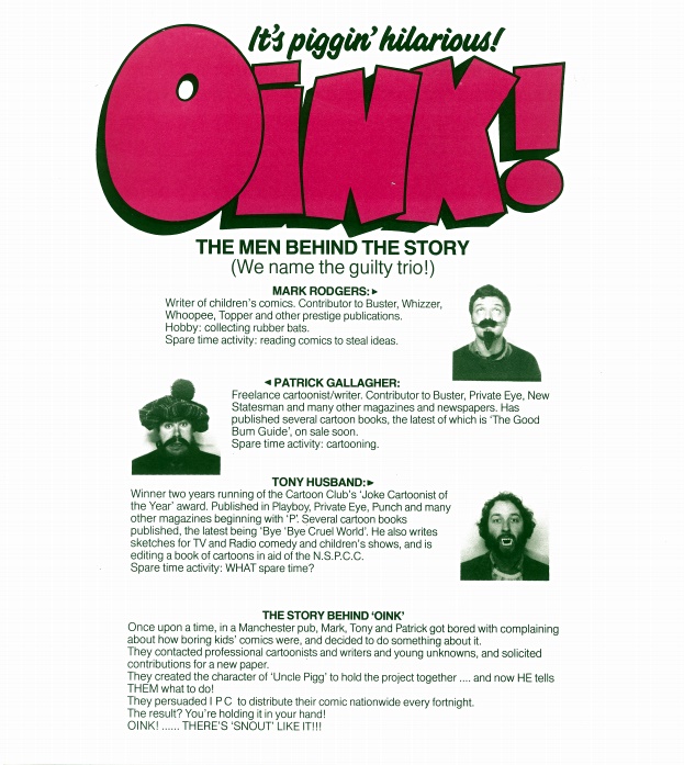
The main highlight for me though is the included information on OiNK’s three creators, namely Tony, Patrick and Mark Rodgers. With their serious business faces on, the three share secrets about themselves such as Mark reading other comics to steal ideas, Patrick’s new book and Tony’s complete lack of free time.
Mainly nonsense of course, but the actual facts included here are really interesting. The pedigree behind OiNK’s editorial team was second-to-none, reassuring anyone unsure of this barmy new comic which was so different to anything else on the market.
I also love the idea of them hiring Uncle Pigg, only for him to take over and force them to work for him! Thanks again to Steve for sharing this and sending me the images of the contents.
I hope you’ve enjoyed this look at another part of OiNK’s launch and don’t forget to check out all of the other pre-release posts which include everything from contemporary interviews and articles to advertisements and comic crossovers.
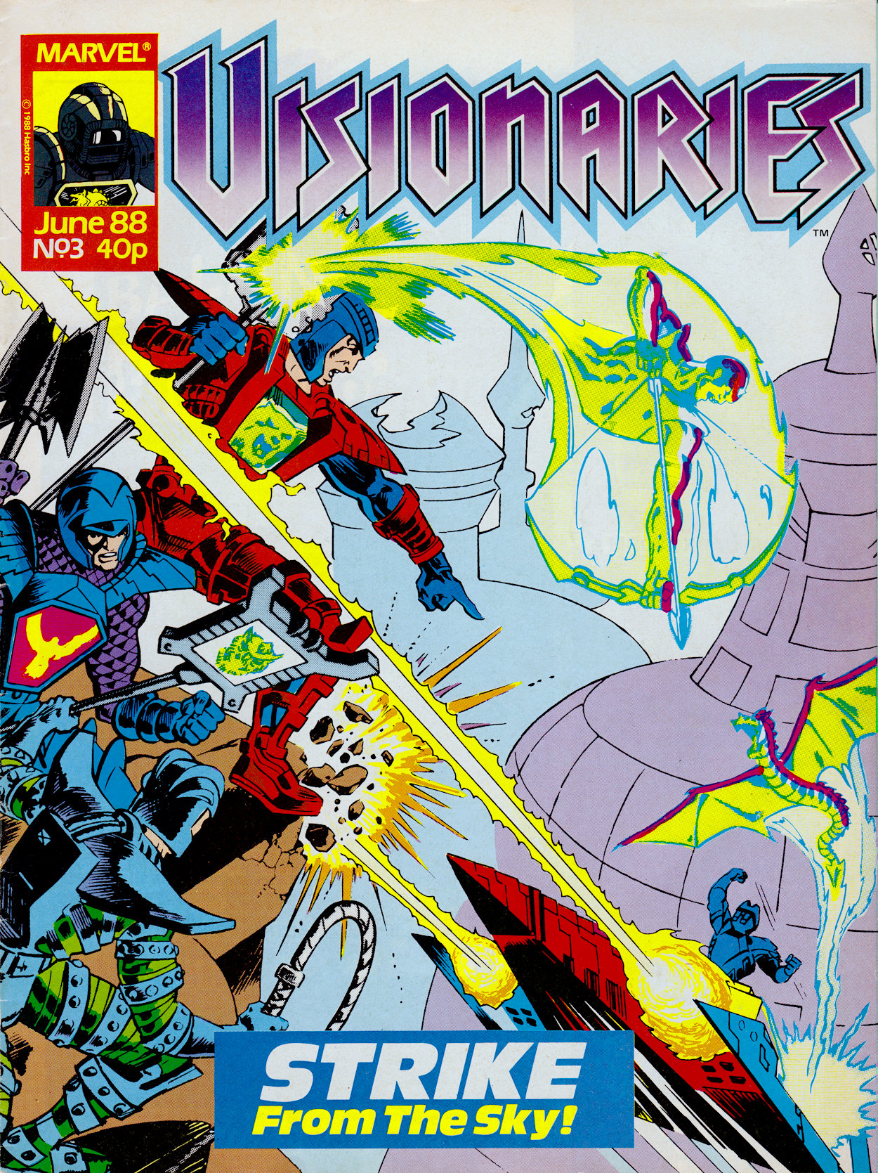
Starting with this third edition of Marvel UK‘s monthly Visionaries are stories I’d never read before collecting them for the blog. The origin story I felt I knew almost verbatim, but now the comic was diverging away from the cartoon and forging its own path. Having missed the regular comic as a kid, I’ve looked forward to finally getting to read these stories.
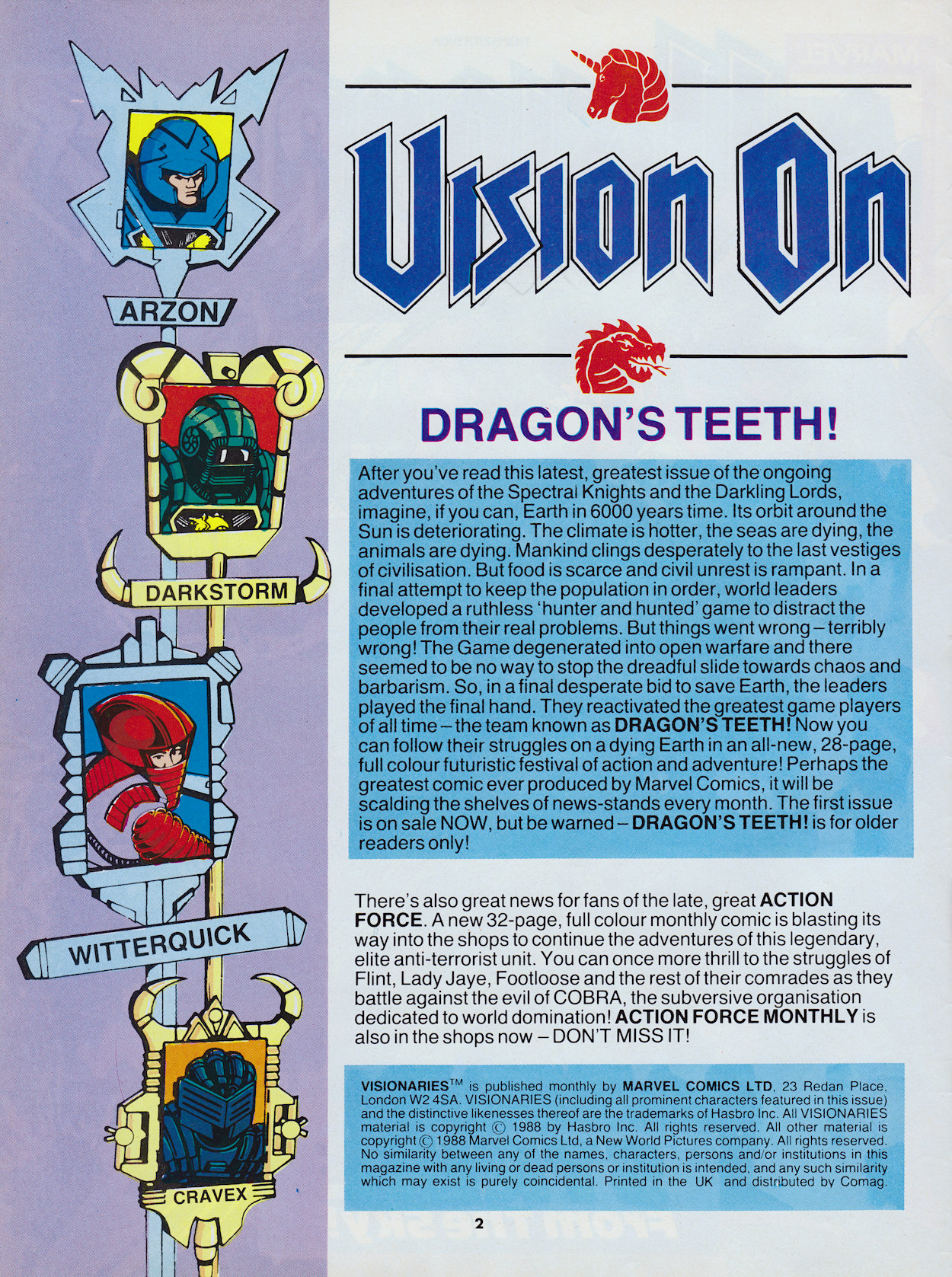
Being original creations and something fans of the cartoon may have been eager to read, it’s confounding to see once again the editorial page not mentioning the story at all. Even though it’s called Vision On it’s basically an advertisement for other titles again, this time the new Action Force Monthly and Dragon’s Claws (called by its original name here which was changed just before its release), both of which were of the smaller American format and designed to try to sell UK material back into the US market.
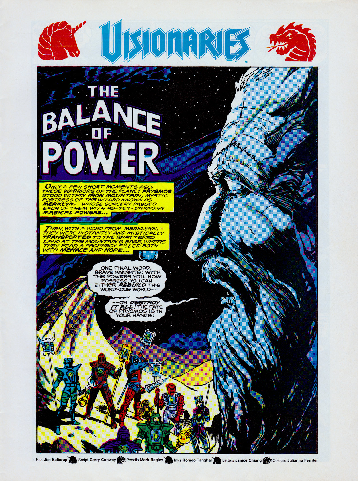
Next to the editorial the first page of Balance of Power is a bold image. On it, Merklynn‘s stone face stares down at the assembled Knights and reiterates the words from the end of last month’s story. Jim Salicrup, who adapted Frank Dille‘s teleplay origin story has created the plot this time around but full scripting duties fall to Gerry Conway (The Punisher, Spider-Man, Transformers and G.I. Joe cartoons, Diagnosis Murder) who would take over as the comic’s sole writer from the next issue.
The art team are the same as the previous story, with pencils by Mark Bagley, inks by Romeo Tanghai, letters by Janice Chiang and colours by Julianna Ferriter. Unfortunately, it’s in this final category that the issue is let down a little bit. There are quite a few colouring errors, which is something you don’t want when you’re still introducing characters and the colour of their armour is key to seeing who is doing what and to whom in battle. It’s a shame because at times it can really ooze atmosphere, such as with that splash page above.
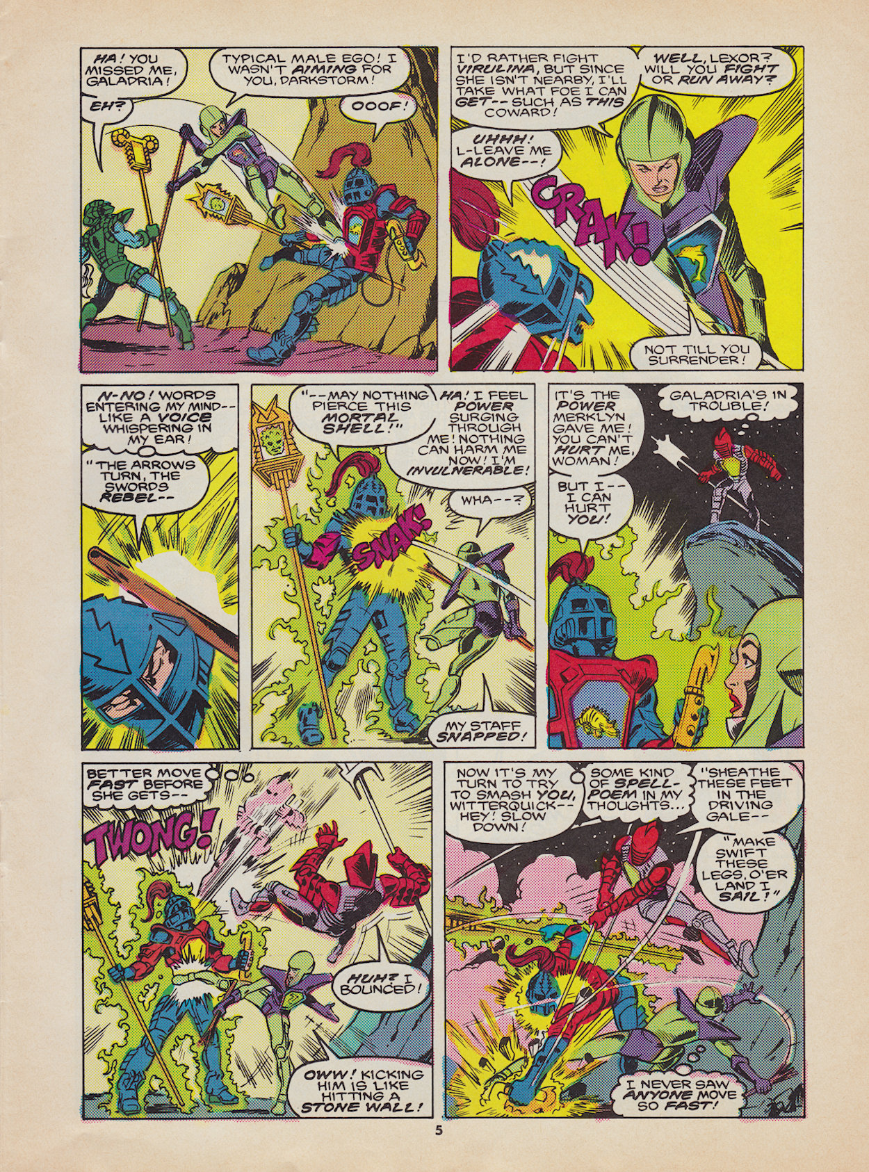
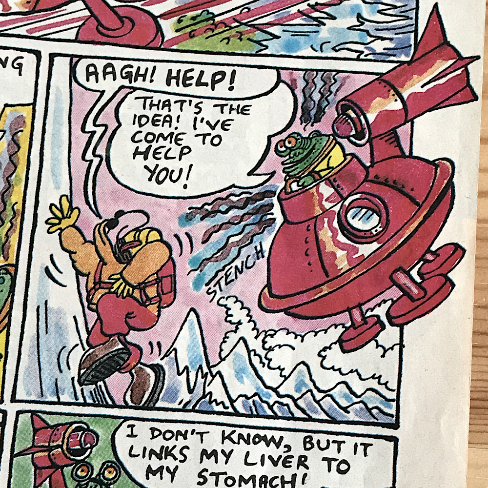
Something else this issue has in plentiful supply is action. As soon as Merklynn finishes his prophetic speech the Knights turn on each other, wishing to finish off the battles started inside Iron Mountain. Galadria gets the best line, then some of the characters start hearing a voice inside their head, telling them of incantations to summon the power of their magical staffs. Reading these again brings back memories of learning them off-by-heart from the toy packaging.
This is where some fundamental changes between the comic’s universe and that of the cartoon become apparent. Here, the staffs just sort of produce the desired effects, like making Lexor invulnerable, Witterquick superhuman fast and Cindarr‘s unleashes a mini-earthquake. But in the cartoon the holographic image on the staff materialised in the real world, for example a cyclone around Witterquick’s body or a giant monster wielding a club for Cindarr. Even the cover of this issue shows Cryotek’s archer, but none of these would appear in the strip. They’re missed and without them it’s not particularly clear what’s happening at times.
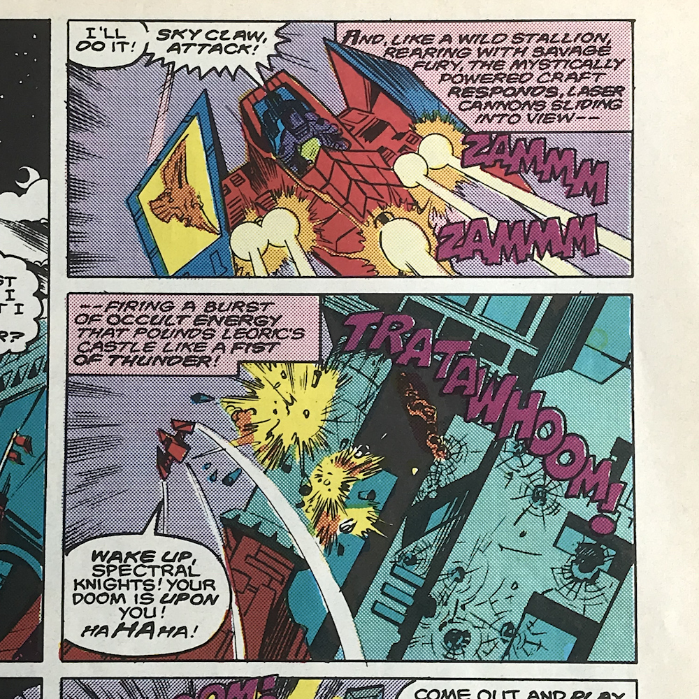
“And, like a wild stallion, rearing with savage fury, the mystically powered craft responds.”
Description of the Sky Claw
It also doesn’t help that when some of the characters transform into their magical animal totems these are mistakenly referred to as “magical powers”, when that’s actually what the staffs contain. Instead, the totems are an embodiment of their individual personalities, which they can change into, physically becoming said animal and harnessing its abilities (the actual animal rather than a magical representation like the cartoon). However, their magical powers are that of speed, strength, healing, decay, knowledge etc. Fans of the cartoon or toys would be able to follow along and it’s clear these are the intended audiences, but it must’ve been very confusing for anyone reading without prior knowledge.
The plot is rather basic this time around. Even though both sides have yet to even experiment with their new powers and totems, Darkstorm insists he and Leoric’s Knights are now too evenly matched. How would he know this? Surely they should train with their new magical abilities before coming to that conclusion. He wants an advantage and, annoyed with some of his people complaining about their lack of staffs, he sends stealth master Reekon and the grovelling Mortdredd to find a new weapon to given them that edge.
It all feels rather convulted. Given the cover we know what they’re going to find, but the pacing is all wrong. If this had come later in the run, or even if we’d jumped forward a few months and they were having difficulties managing their powers and wanted something more conventional, it would have made more sense. The saving grace here is the world building in the background. Wanting to rebuild his world no matter the cost to anyone else, Darkstorm’s castle overlooks slums where the poor and hungry struggle to survive, through which Reekon and Mortredd trot along, uncaring of the devastation around them.
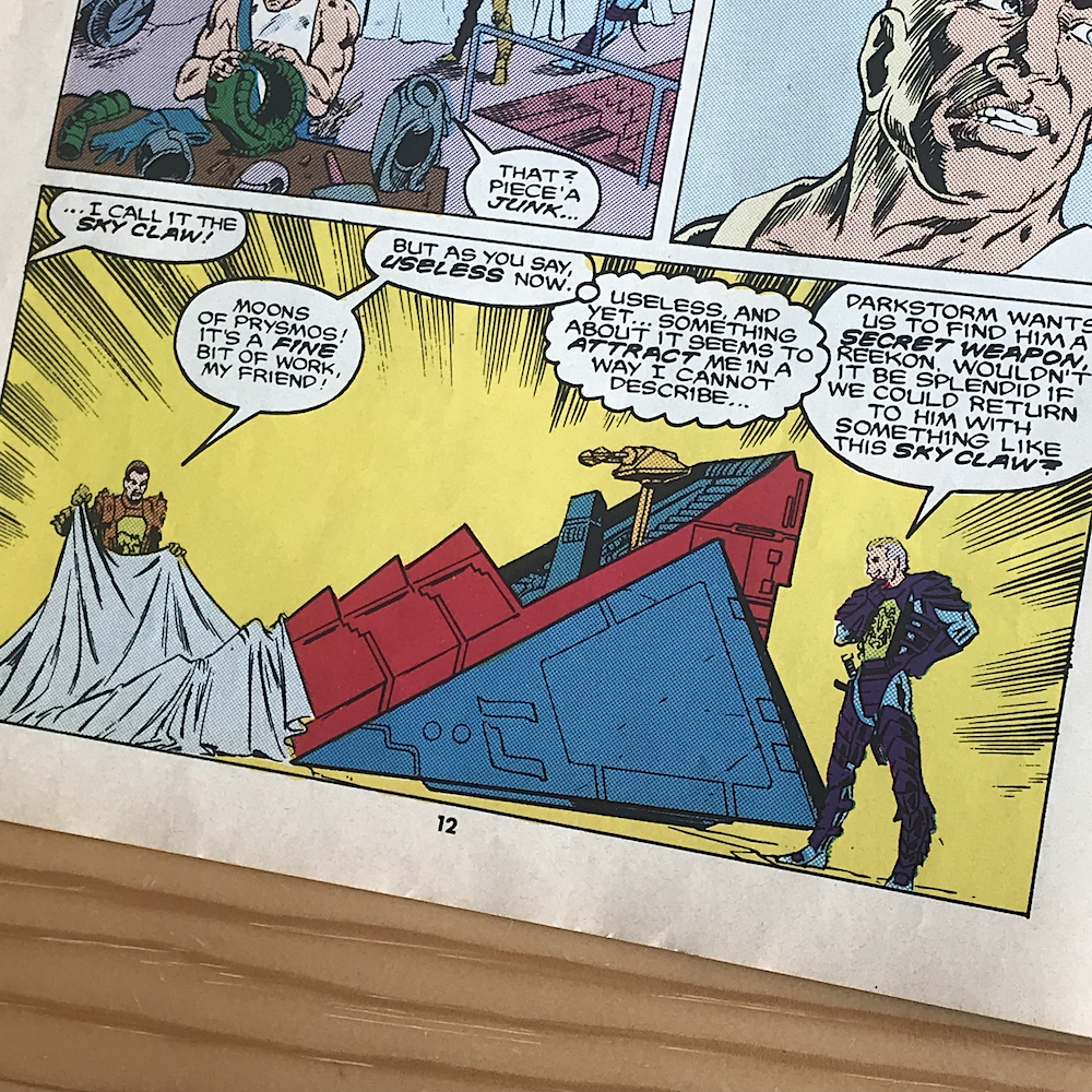
They make their way to a contact of Mortdredd’s at Harkon’s Blacksmith Shop. An engineer by trade, Harkon found himself without work in the new Age of Magic and retrained as a blacksmith, where he won the contract to repair and replace armour for the Darkling Lords. Underneath tarps scattered about his workspace are high-tech vehicles which are now nothing more than useless relics of the past.
I recognised the one above as soon as its covering was pulled back. It’s the Sky Claw. It was one of the large vehicles from the toy range and one of three that I personally owned. Covered with large holograms and movable levers and wings concealing a variety of awesome weaponry, it was a favourite childhood toy. It’s the whole raison d’être for this story so my excitement levels have been turned up a bit now.
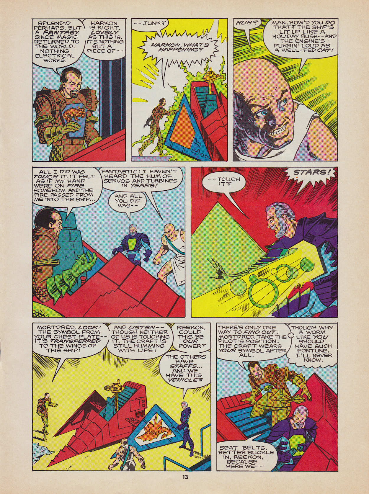
The machine responds to the energy of Reekon’s magical touch, but it’s Mortdredd’s proximity that really brings it to life. While the statement that the symbol from his chest plate transferred to the craft is completely wrong, it’s still a fun way of introducing it. I particularly like how magical powers erupt from Mortredd’s chest, while his hand almost disappears into the holographic panel, becoming nearly skeletal-like. Although, why does Harkon say he hasn’t heard the sounds of an engine in years when this follows on directly from the previous origin story?
Able to control it with but a thought, Mortdredd is eager to prove himself to his Lord and Master. Darkstorm wants to wait, plan, gather information before a strike (again, no mention of learning their new skills) and this leads to other Knights calling him a coward. Defending his leader’s honour, Mortdredd attacks the others but find it’s he who ends up pushed out. Seizing the moment, he takes the Sky Claw and launches a devastating attack on Leoric’s castle, hoping to show he’s worthy of his position within the Darkling Lords. None of the vehicle’s magical powers are used though, just the weaponry which is a shame because I was looking forward to seeing those holograms come to life again.
The descriptive panels here are excellent. In fact, throughout the comic they’re a unique mix of science fiction and what feels like medieval storytelling. The latter in particular sets it apart, the comic playing up to this aspect of the characters and setting particularly well. This attention to detail is great.
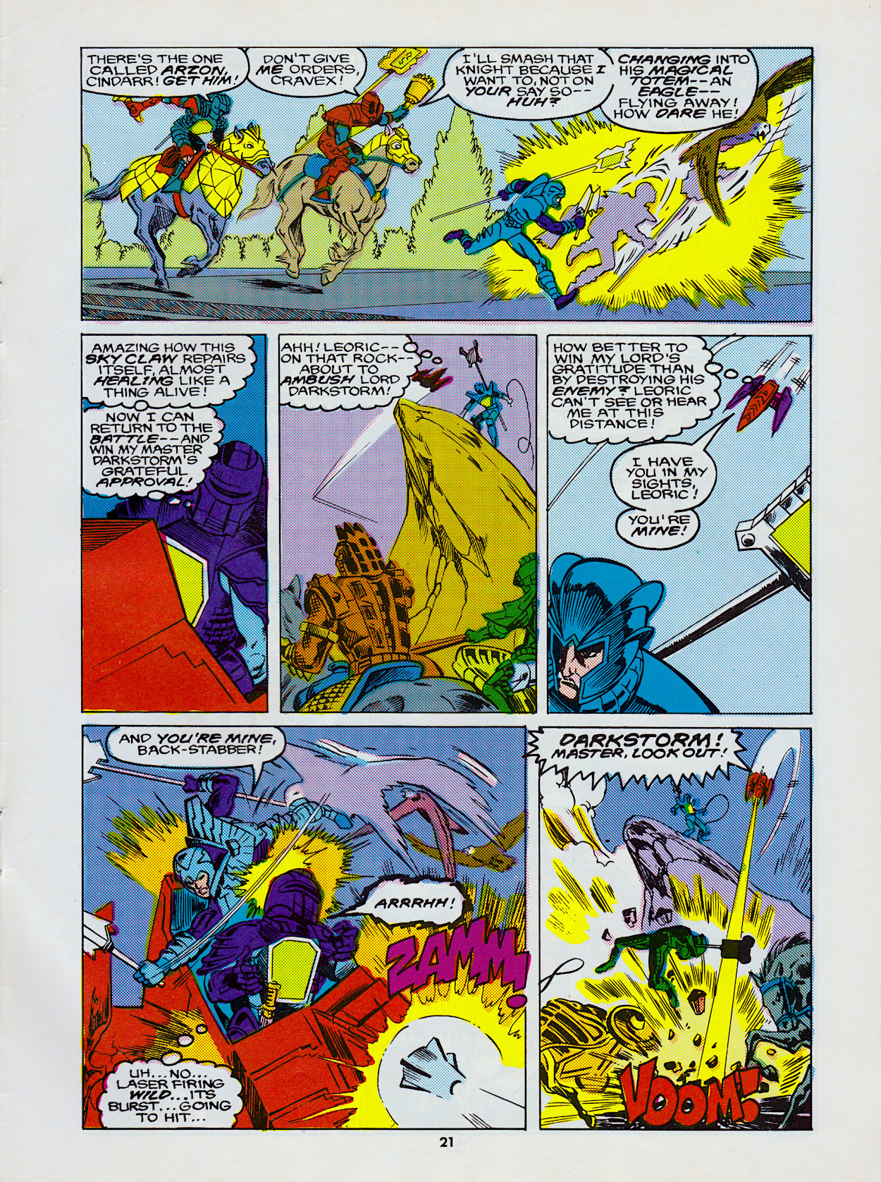
One of the more interesting magical powers makes an entrance here and that’s Arzon‘s power of knowledge, even though he’s incorrectly drawn as Ectar but we’ll skip that detail for now. He recites his incantation to find out what the Sky Claw is, because there has been no flying vehicle since the Age of Science and it takes them by complete surprise. However, he not only discovers the information he seeks, suddenly everything he’s ever known in his whole life temporarily returns to his mind.
Everyone having completely different powers […] could make for some epic battles
This could’ve set up some brilliant stories for the future. I could see something like that opening up old wounds, thoughts he’s tried to suppress or even things that he doesn’t wish to know. Unfortunately I can’t see this being explored in the short run the comic ultimately had.
On the surface a power like this could seem to give an individual an unfair advantage in any fight, but with everyone having such completely different powers, all with some form of vulnerability built in if not used correctly, it could make for some epic battles.
It all comes to a head when Arzon transforms into his eagle form and attacks the cowardly Mortredd from above. From there it all falls apart for the Darkling Lords, who had shown up to finish what the Sky Claw had started. Disobeying orders and nearly killing his leader sees Mortdredd locked up in the dungeon of Darkstorm’s castle at the end of the story, but not before he’s made reference to the Sky Claw feeling alive when it repairs itself during a moment away from the battle. It’s a passing comment for now, but if memory serves me right this could tie in to some revelations yet to come about all of the Visionaries’ magical powers.
The Balance of Power feels very much like an extension of the previous two issues and the cynical might say it’s nothing more than a couple of extended action scenes. There’s little in the way of characterisation but the main point here is to see more of this world and the characters inhabiting it, to see their magical powers and how they could turn the tide of battle. Hence the name of the story.
With Jim having set things up and established the potential for future stories, the authorship is handed over to Gerry for him to develop the comic as its full-time writer. So let’s wait and see what he brings to the table and if all that potential is realised. The next chapter’s review will be here from Wednesday 23rd June2021.
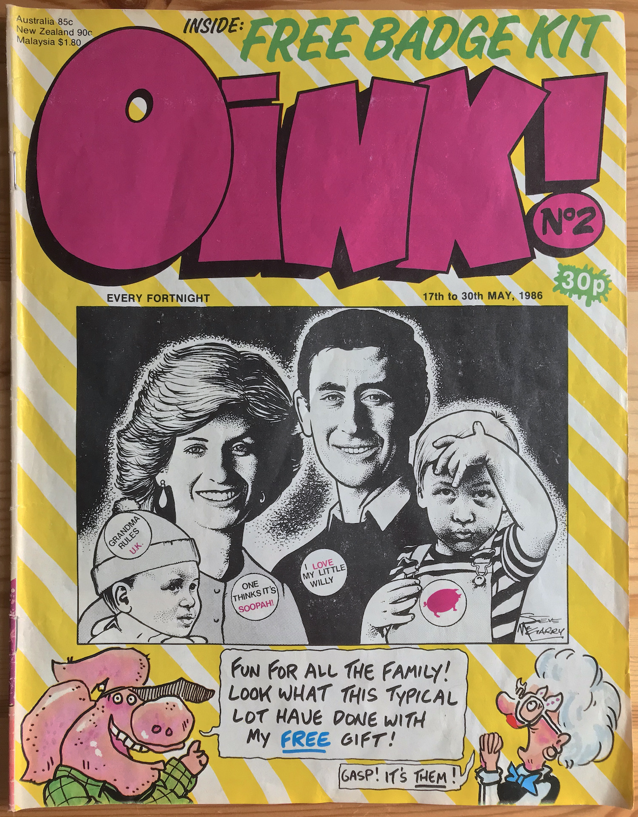
it’s time for the second issue of the world’s funniest comic and the cover sets the ball rolling in typical OiNK fashion. Using the same design as the preview issue, of an artist’s illustration framed above Patrick Gallagher‘s Uncle Pigg and Mary Lighthouse, this has proved to be very memorable over the years amongst fans.
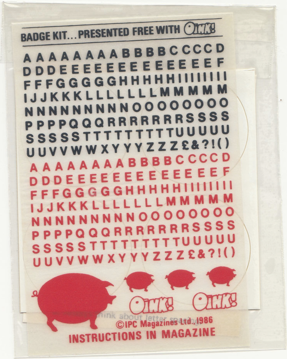
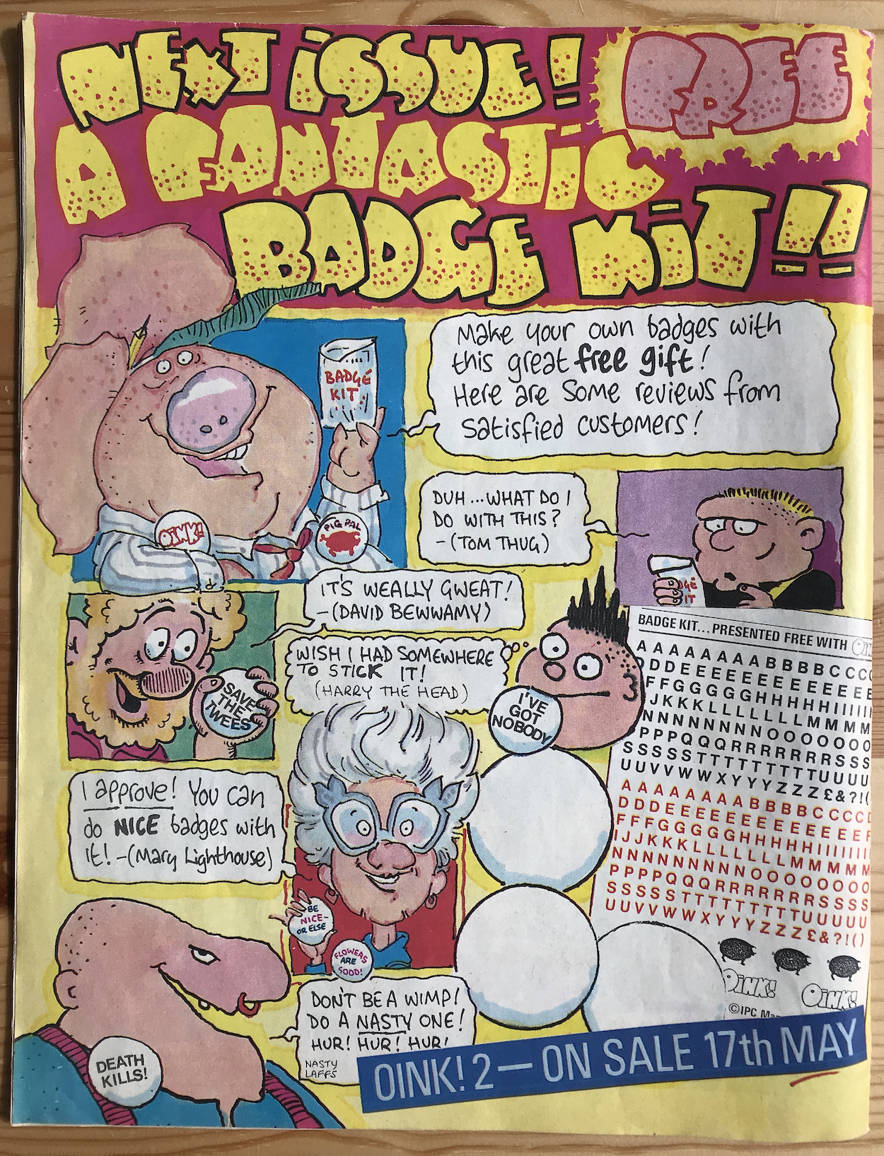
Let’s try to forget about how old the image of those two boys makes us feel and instead concentrate on the funny picture by Steve McGarry. This was all to promote another free gift, a set of blank sticky badges with letters, numbers and images which could be rubbed on to create anything the young readers wanted. They’re a bit like those old pretend tattoo rub-on transfers we had as kids, which never transferred in one piece and would look a right mess on our arms.
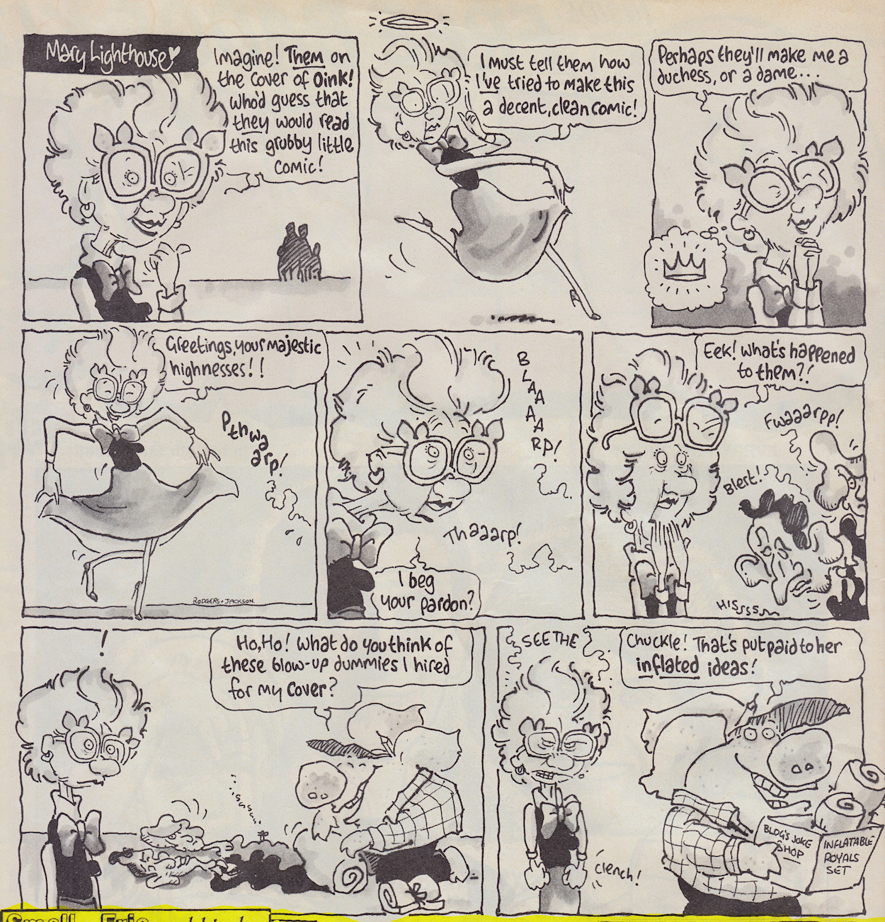
Of course there were other cheeky examples of what could be created inside the issue and a request for pig pals to send in their ideas. As we open the issue it’s again up to critic Mary and editor Pigg to introduce the comic, this time by following on directly from Mary’s quite startled discovery on the front page.
It’s not often you’ll see a Royal fart joke. Again, Ian Jackson‘s artwork is the star here and he really does epitomise everything OiNK was about. I’d call it a breath of fresh air but that might not be the best phrase to use given the subject of Mark Rodgers‘ script. Mary’s face in the final panel brings out a childish grin on my own face every time I see it.
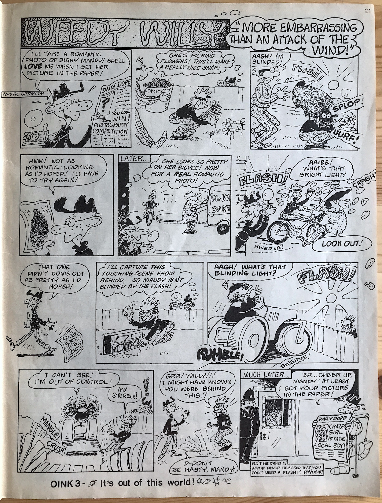
It’s time to meet another regular star of the comic. Weedy Willy was introduced in the preview issue as “So Pathetic It’s Embarrassing”. Cowardly, insanely weak and lacking any kind of social skills, Willy’s continued optimism led to us cheering him on through mishap after mishap. Most of these would involve his unrequited love of local girl Mandy, who’d often fall foul of his misplaced affections.
While Willy’s weediness (expertly rendered by Mike Green) was the subject of the humour, he was never portrayed as a victim. Yes, we could laugh at his inability to lift the lightest of objects or his fears of the cutest, cuddliest babies, but whenever the strip put him up against a bully he’d always come out on top, even if it was inadvertently. He even started to date Mandy later in the run. His positivity was infectious and the moral was clear, albeit delivered in an original OiNK fashion.
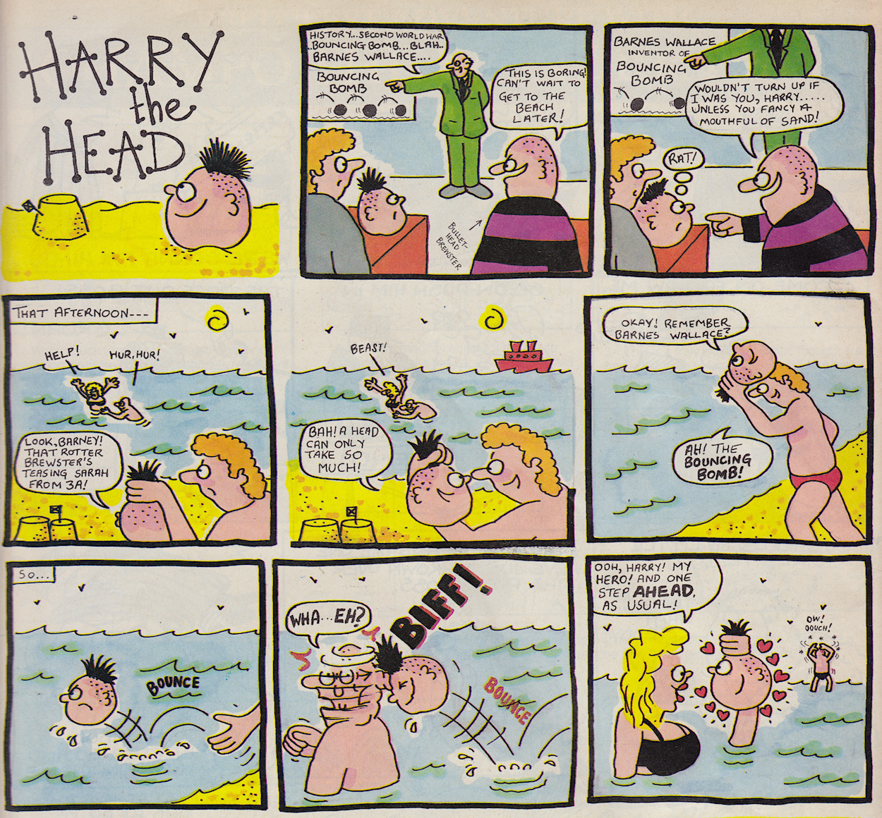
Harry the Head paid tribute to the Dambusters, believe it or not
The comic had an anarchic feel to it which I always loved, not only in its humour and artwork but also in how it was organised. Other humour comics would have certain strips on the same pages every issue, always taking up the same amount of space. OiNK mixed it up, placing its regulars on different pages, sometimes even giving them varying amounts of space from issue-to-issue. Co-editor Mark Rodgers said strip length was one of the rules they no longer wished to be confined by.
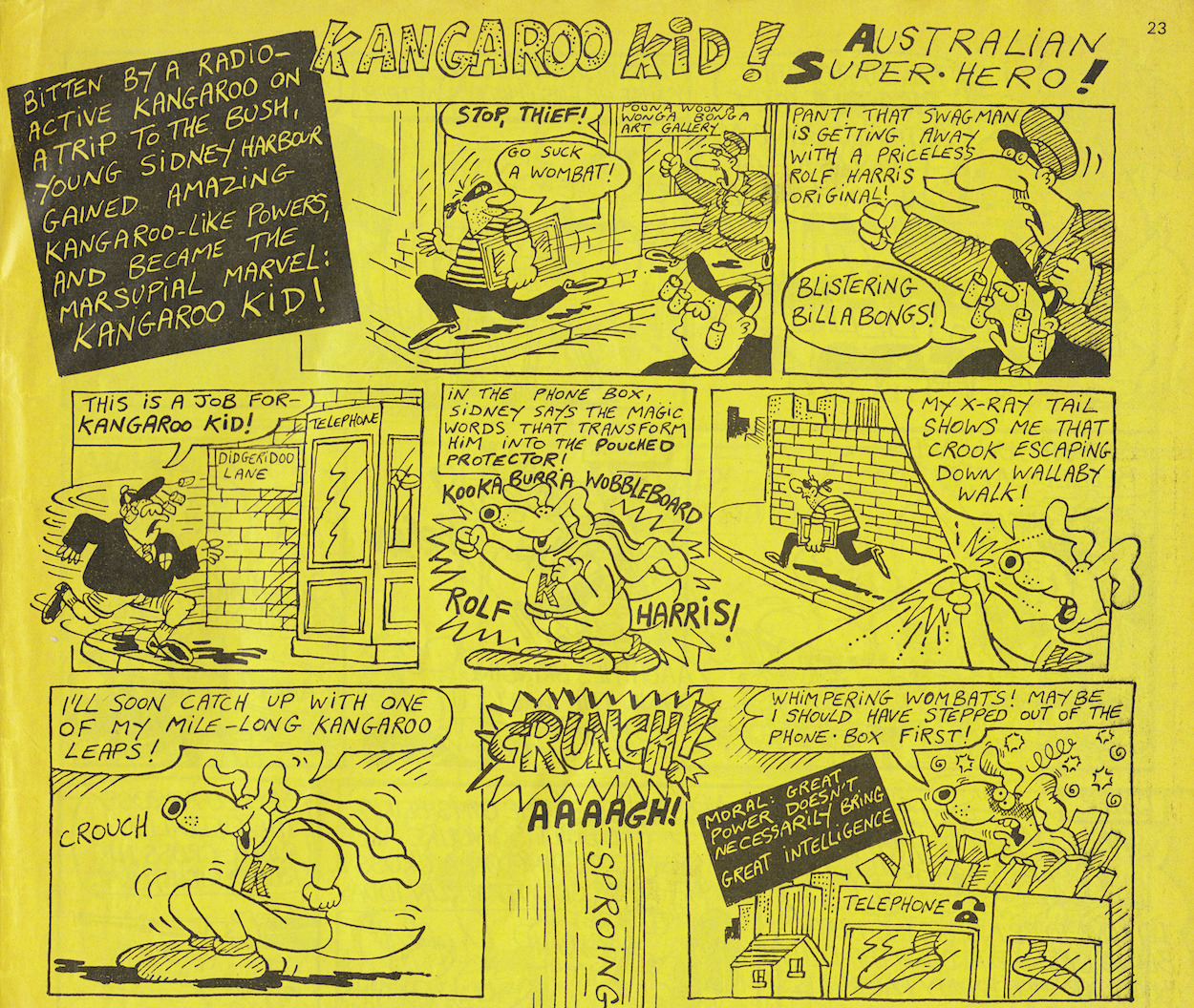
This variation carried over to the one-off strips, which could be anything from a quick three-panel gag to a detailed multipage story. This strip, which takes up two-thirds of a page, is one such example and a definite highlight of this issue.
Burp and Mr Big Nose creator Jeremy Banx‘s Kangaroo Kid leaps (sorry, I couldn’t resist) off the bright yellow page, ending with the reader actually taken by surprise with the blatantly obvious fact he hadn’t exited the phone booth yet. A brilliant piece of misdirection and comic timing.
How could I not show off this masterpiece?
Compared to the newsprint comics of the day, OiNK’s shiny paper was a revelation. While action comics such as Transformers were mostly printed on full colour glossy paper, OiNK’s was much bigger and of a higher grade, meaning even these one-colour pages feel more vibrant when held. Its printing process also meant black and white strips didn’t have to be quite so simple anymore and shades of grey could be used to really bring them to life in a way we hadn’t seen before in humour comics, which artists like Lew Stringer used to their benefit.
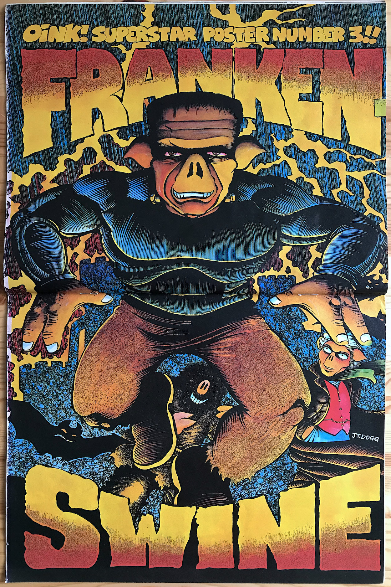
But of course, OiNK also had more striking full colour pages than any other funny comic and none would use this to greater effect than J.T. Dogg, so while we’re on the subject here’s his latest Superstar Poster, Frankenswine!
I know I’ve included one of these before but how could I not show off this masterpiece? I hadn’t discovered OiNK at this stage but I remember having these up on my wall back in the late 80s, from a mix of issues given to me by my cousin and reprints from much later in the run. I have a couple up on the walls of my home office now!
Other highlights of this issue include The Street-Hogs as they continue to fight Don Poloney, not-so-subtle in-jokes in Cowpat County, a wonderful full colour Burp and a Rocky-inspired Golden Trough Awards, complete with catchy musical monologue. Be warned, you may not get the original tune out of your head after you read this.
Street-Hogs written by Mark Rodgers, drawn by J.T. Dogg Cowpat County by Davy Francis Burp by Jeremy Banx Golden Trough Awards written by Tony Husband, drawn by Ian Jackson
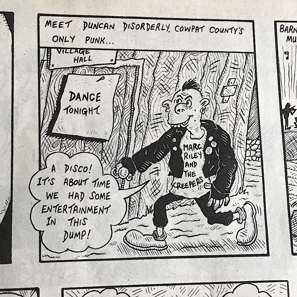
One of the main contributors to OiNK had never worked in comics before, but was the lead singer of the band that received a little promo above in Cowpat County. Marc Riley is better known today as a BBC Radio 6 Music presenter, previously of Mark and Lard fame on Radio 1. Just for the record, our Marc was ‘Lard’.
“With Marc all hunched over dressed like this, passers-by and car drivers were stunned and puzzled.”
Tony Husband
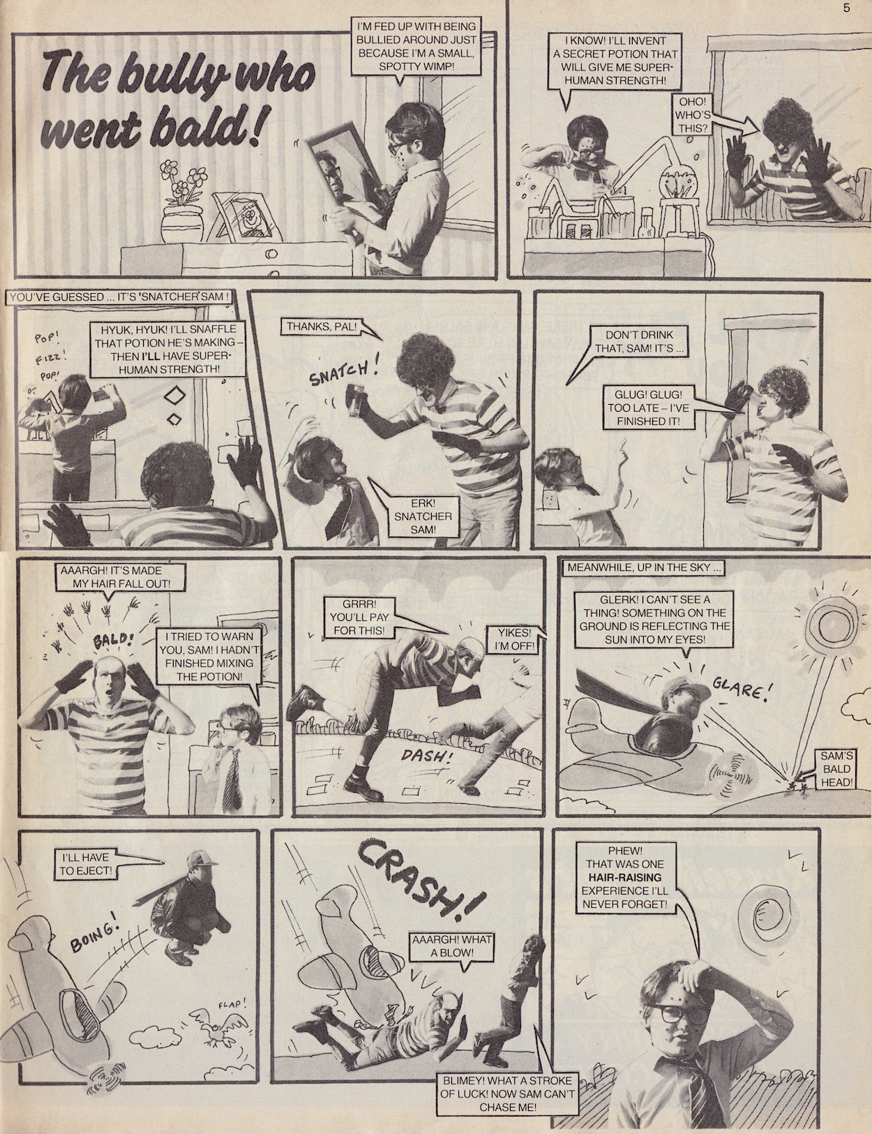
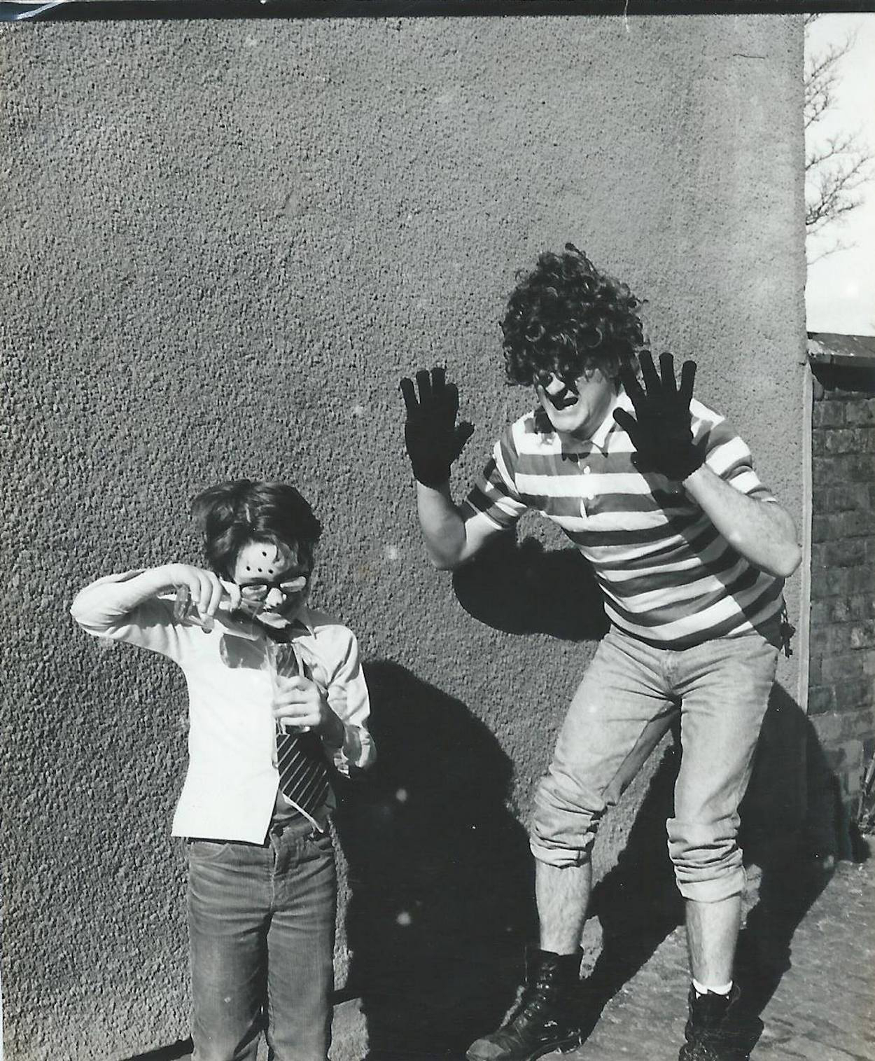
An old friend of Patrick’s (still good friends with both him and fellow co-editor Tony Husband to this day) Marc could be heard singing on the free flexidisc from #1 and would star as Snatcher Sam in many photo stories, often appearing alongside Frank Sidebottom. Later stories are set outside or on makeshift sets, but in these early days Marc would be pasted onto hastily drawn backgrounds.
The Bully Who Went Bald is one such story. It also features Tony’s son Paul (previously seen in the preview issue) as Sam’s intended target and Patrick as an innocent airplane pilot who just happens to be passing by. The rough sketches and cut-and-paste nature adds to the amateurish look, which in itself highlights the fact these were spoofs of photo stories found in the likes of Eagle and women’s weeklies of the 80s.
This behind-the-scenes photo has been shared by Tony, who said that after the shoot Paul walked down the lane holding Marc’s hand. “With Marc all hunched over dressed like this, passers-by and car drivers were stunned and puzzled”, says Tony. Also, according to Paul himself the photographer was none other than Ian Tilton, who has worked with legends such as Iggy Pop, The Stone Roses and whose Kurt Cobain photographs were hailed by Q Magazine as among the best rock photographs ever taken.
Who would’ve thought this crazy comic could be educational too
We stick with Marc for the back page and our final highlight. Probably Marc’s most fondly remembered creation after Snatcher Sam was Harry the Head, the tale of an ordinary boy who just happened to be a disembodied head. In the preview issue Harry’s parents were also just heads but a later strip would change this to involve a genie, a greedy young boy and a lesson learnt.
Quite a severe lesson to learn! But Harry did just that and ended up kinder and less selfish, earning himself a good friend in Barney (who would diligently carry Harry around by the hair) and decided to live life to the full. Later he would go off on an adventure around the world over multiple issues but his best strips were the self-contained ones where he’d use his predicament to his advantage, such as in this one which paid tribute to the Dambusters, believe it or not.
Who would’ve thought this crazy comic could be educational too. Well okay, I’m pushing it but this strip actually saw publication on the 43rd anniversary of the Dambusters raid, which occurred on the night of 16th-17th May 1943.
With that we come to the end of our second review (third if you count the preview) of OiNK in this real-time 35th anniversary read through. The next issue is the first of the themed editions. These were another example of how OiNK stood out from the crowd and another reason it was a favourite among so many. The first subject is space, so watch out for chicken aliens, pigs behind the moon and even a cameo from The Doctor. Issue three takes off on Monday 31st May.
Tomorrow sees the 35th anniversary of OiNK‘s sophomore release and just like the previous issue’s promo in the preview comic, the advert for #2 (on the back cover of #1) concentrated on the free gift. This time it would be a selection of stickers to make your own badges. The front cover of the next issue would provide some of the funniest examples, but if you can’t remember them you’ll just have to wait for the review.
Promo by Ian Jackson
So come back for #2 of OiNK any time from Monday 17th May 2021 onwards, for more highlights, more character introductions and definitely a lot more laughs from the pages of the greatest comic ever created. See you then.
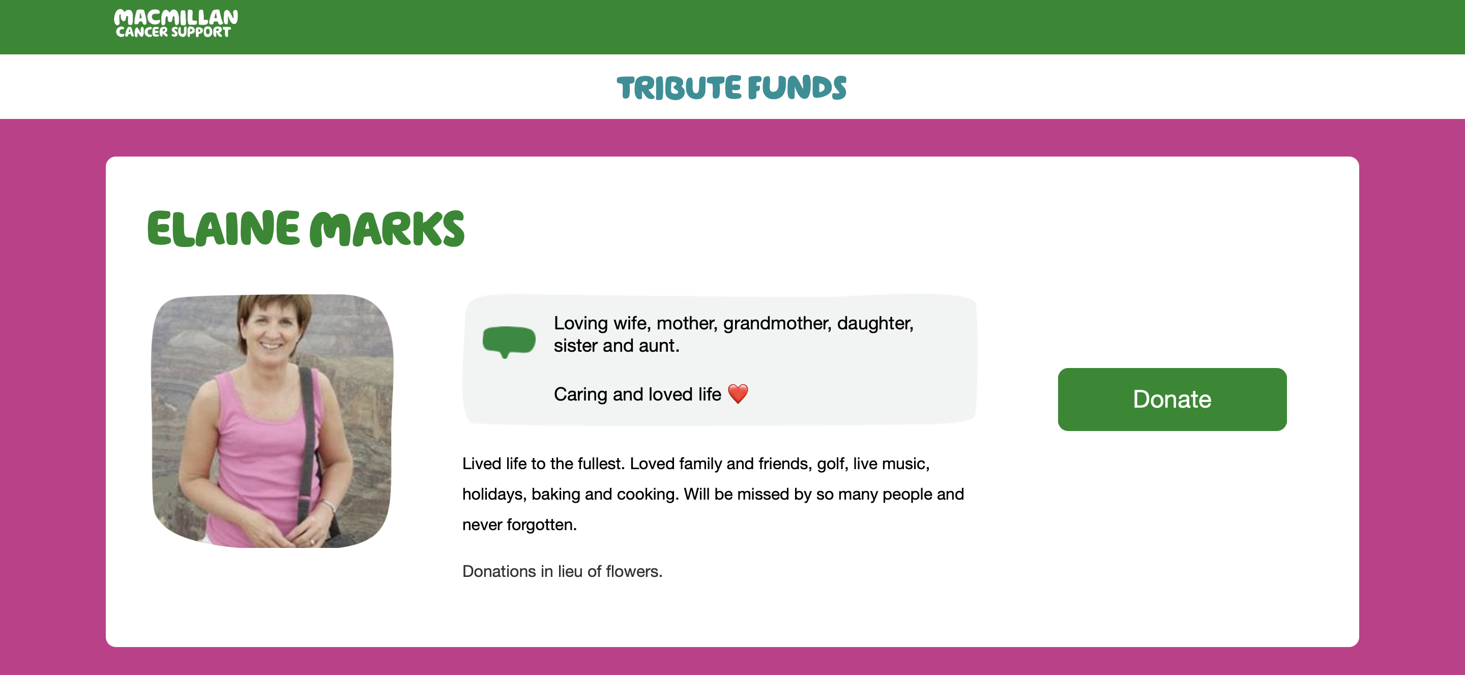
This week has been a really hard one. I lost a dear friend to cancer, someone who I had known for over half my life. The funniest, kindest, most generous soul, I’m missing Elaine terribly. If I could have a moment of your time, I’d like to tell blog readers a quick story.
Last year Elaine was asking me about what I wanted to do for the rest of my life after I’d lost my job. I’d always wanted to create for a living but hadn’t got anywhere. Elaine asked me what I thought I needed to do and I knew the answer was simply “figure it out”, but I always followed this with excuses and doubts. I basically had no faith in myself to take those creative juices I felt when writing or cooking and turn them into something.
She had heard this all before from me and so her advice was simple and blunt. She looked me straight in the eye and simply said, “Just do it”. It was the shortest, most blunt, yet best piece of advice I’ve ever received. Thank you Elaine. ❤️
When I feel the procrastinator in me surfacing, or when I feel like being lazy, or when I’m struggling with writer’s block or struggling to come up with the next food creation, I know I’m going to hear her voice saying those words. I know they’re going to make all the difference, because in her memory I’m going to make sure they make all the difference.
This weekend is Elaine’s funeral and in lieu of flowers the family have asked people to donate to Macmillan Cancer Support, who provided support and who Elaine arranged fantastic Coffee Mornings for.
My best friend, and Elaine’s daughter, Vicki has set up a donation page in her name which you can find right here. I know readers of this blog won’t have known my friend, but I can’t stress enough how important Macmillan’s work is, from providing support to cancer patients, to end of life care and running hospices.
It’s something that has touched the lives of so many of us, so if you can spare even a little, no matter how small the amount, please do. Macmillan are doing wonderful work in helping cancer patients and their families and we never know when we may need their support.