DEATH’S HEAD #5: KEEP CALM AND CARRiON

This striking John Higgins (Transformers, Batman: The Killing Joke, Before Watchmen) cover welcomes us to the fifth issue and, after reading it, the midway point of Marvel UK’s Death’s Head. When I collected together this run of comics I noticed a lot of crossovers with other Marvel characters on the covers, especially in the later issues. No, I never read anything inside (just counted the pages to make sure it was all there), but the covers do reveal a lot of who is to come.

I remember thinking it seemed there were an awful lot of what would normally be seen as ‘event’ stories, perhaps to raise the profile of the comic with potential readers, however I was surprised to see this issue has the first non-Dragon’s Claws crossover character. Okay, so he’s a minor character from one Doctor Who strip but it was still a nice surprise to see the Doctor mentioned again after he was so instrumental in Death’s Head’s own story.

Keepsake appeared in #140 of Doctor Who Magazine (August 1988) when a distress signal lured him to a planet where he originally just wanted to salvage the crashed ship for parts. Instead, he ended up enjoying the actual rescue thanks to working with the Doctor and at the end of the story the Doctor left the rescued medic, Bahlia, in Keepsake’s care. This is where we pick things up.

Oh, and he has a pet vulture who reminds him of his wife.

John drew Keepsake’s DWM adventure and is also the artist for our strip this month, coloured by Nick Abadzis and lettered by Annie Halfacree. You’ll see even more of John’s work soon because he was one of five(!) artists when The Sleeze Brothers made their Doctor Who Magazine debut. Watch out for that later this month. Back to the issue at hand and speaking of Keepsake’s wife it looks like she’s hiring a certain Freelance Peace-Keeping Agent to track him down, promising a somewhat large reward too.

Not that Death’s Head is easily swayed, of course. Meanwhile, Keepsake is meeting with gangsters looking for the second half of a map to the aforementioned gold shipment. Editor Richard Starkings told me, “‘Half the map’ was my idea, as was ‘half the gold’ in Death’s Head #5. Never waste a good gag.” Keepsake doesn’t come across as the smartest of scavengers and is easily double-crossed, so the men make off with both halves of said map.

Death’s Head is very much the lighter-hearted comic of the pair, while Dragon’s Claws can be much darker

After reading the penultimate issue of Dragon’s Claws the contrast between the two titles has never been clearer. Despite being created and written by the same person, and despite the fact this comic has the word “Death” in its title and follows someone whose job it is to kill people, Death’s Head is very much the lighter-hearted comic of the pair, while the one about a game team gone rogue can be much darker. Not what people may expect, and I’m here for it!

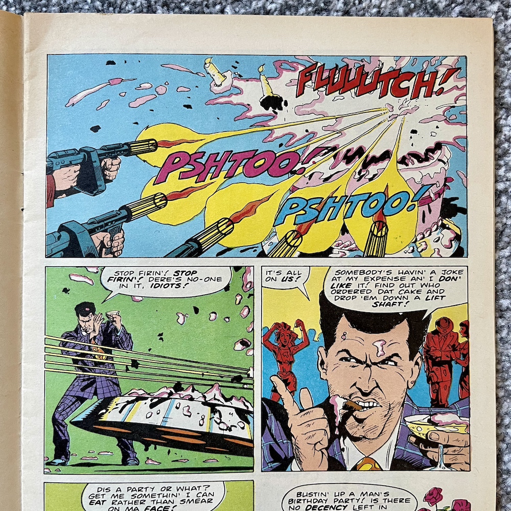
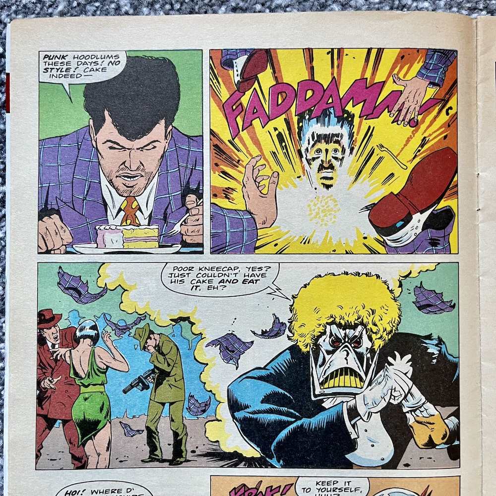
Case in point below, as we get a lot of exposition from Thea about how Colt (the gangster) and Keepsake had double-crossed each other in the past over this shipment (hence the two parts of the map) and a seemingly endless amount of further double-crosses involving Thea and her husband, leading to this point. Clearly, no one can be trusted. But it’s Death’s Head’s reaction to this intriguing story that made me laugh, never mind Keepsake’s pet sneakily sampling what they thought was Colt’s water.

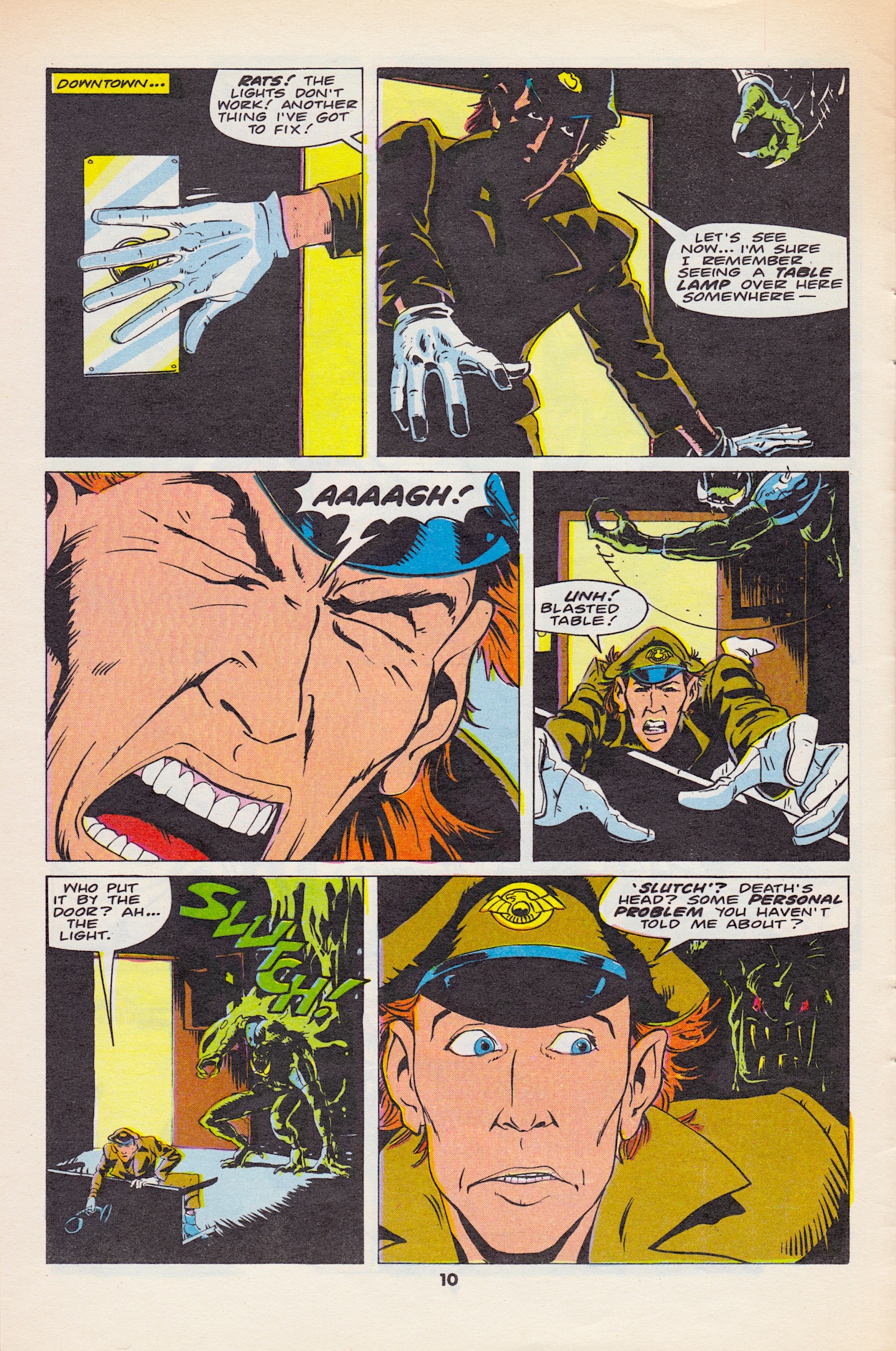
With Keepsake easily cheated out of his piece of the map he sits about moping, making him an easy target for our Peace-Keeper, however first of all we get a funny interlude of some of the more rudimentary detective work our anti-hero has to do in order to find his targets. Remembering this is the same mechanoid who helped take down the giant Lord of Chaos Unicron just makes this sequence all the funnier, especially the last two panels; the question mark, the hint at the top of the penultimate panel and the final reveal.

This seems to be a trend in the comic, at least for what makes me laugh the most. Take his name, his appearance and his occupation and you’d expect something completely different than the situations writer Simon Furman consistently places him in.

Death’s Head catches up with the sullen Keepsake and calls in Thea to meet him at the bar, where he’s trying his best to ‘persuade’ his target. Just before this Thea saw Colt kidnap Bahlia outside, clearly as protection against the salvage expert as they dive for the treasure out at sea. It looks like Keepsake’s pet wasn’t much use as protection either.

Our strange little threesome (Spratt is conspicuous by his absence this month, perhaps still recovering from his ordeal last time) soon track down the gangsters not far from the shore in a tiny boat, Bahlia tied up and a gun held on her. At this point I thought Death’s Head would be going alone to take on everyone involved but I was pleasantly surprised to see his plan involved all three of them. I was even more pleasantly surprised to see how well they worked together.

While the old trick of sending in the attractive woman to distract three male idiots wasn’t exactly new even in the 80s, for me the jokes come from how Death’s Head and Thea handle the men after that. There’s one particular guy who won’t be forgetting the impact Thea makes (literally) for quite some time, I’m sure. It’s the perfect example of the comedy-action this comic does best and there’s more to come that genuinely had me giggling.

The first two panels really did have me laughing, the sight of Death’s Head’s daring rescue coming so completely undone so quickly

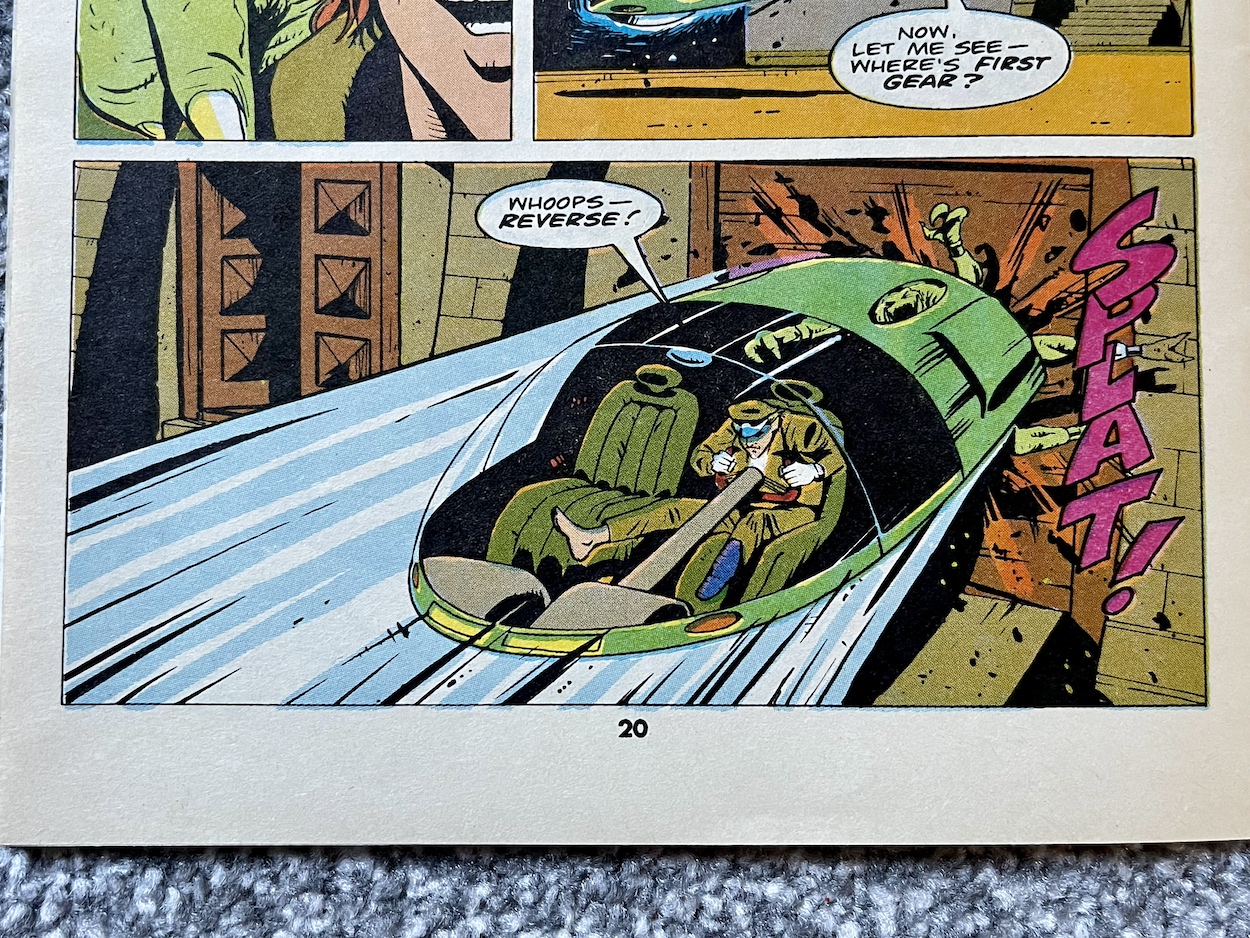
As they make their way out on a boat to rescue Bahlia and recover the gold, Keepsake hovers overhead in his aircraft, ready to assist. But one previously concealed rocket launcher lends a sinking feeling to the first part of their plan. The first two panels below really did have me laughing, the sight of Death’s Head’s daring rescue coming so completely undone so quickly, and this image of what the notorious hunter of bounties (I didn’t said it!) is reduced to is hilarious.

He then uses thrusters in the soles of his feet to blast off and use his body as a different form of rocket launcher, although clearly the end result wasn’t quite his intention.

So far it’s been a comedy of errors but it’s swung generously in his favour. As the man on the boat desperately seals the hole with pieces of wood and some form of foam glue he doesn’t see Bahlia being hoisted to safety, taking all of the gold with her. Below the surface Death’s Head subdues the remaining divers before taking off again with his feet… right through the patched up hole. So far, so funny, but the page below contains something which didn’t sit quite right with me.

Death’s Head has always honoured his contracts. This was the first of the rules he established in #1, rules he always abides by. They’re part of what makes him and his stories so interesting. Think about when he was fighting Dragon in #2 even though he respected the man. He kept fighting until the exact second his contract with the villain of the story ran out and then he just stopped. That was such a great part of that story and told us a lot about his character (this aspect had already been well established in Transformers). But here a quick whisper in his ear from Keepsake and he chucks his client out the side.

After this, Death’s Head then double-crosses Keepsake and ends up with all the gold himself. That I can live with since Keepsake was a snake and not his client, but Leah was. Even though he didn’t like her, this is so out of character that it undermines things already established in earlier issues. It’s a strange inclusion, that’s for sure.

Again, the cliffhanger is underwhelming as we see a group of apparent mercenaries called Sudden Impact being introduced and recalled from a firefight for “a vitally urgent job”. Last month’s final page introduced another man with a gun called Big Shot but there’s no sign of him this month. Are all of these clichéd, hyper-muscled alpha males going to team up against Death’s Head? I trust Simon’s writing but so far I’m not particularly impressed with these potential adversaries.

So another brilliant issue, even if it was let down a bit by the final couple of pages, but I won’t dwell on them. This feels almost like an interlude story of some kind, especially with the lack of Spratt. In an action-comedy comic series this one leaned more towards complete farce and I was fine with that (until the ending). Enjoyable but forgettable then. I still can’t wait for the next issue though. That’ll be right here on Monday 1st April 2024.

iSSUE FOUR < > iSSUE SiX

DEATH’S HEAD MENU

PiTCHiNG TO PiGLETS PART ONE: MOViES

Welcome to the first in a new occasional series of posts taking a retrospective look at the contemporary advertisements found within the pages of OiNK between its launch in 1986 and its final special in 1990. The real adverts that is, not the spoof Madvertisements. During the comic’s real time read through I found it wasn’t just the antics of the comic’s gangster-led mail order company GBH that transported me back in time, these real ads often brought back many happy memories too.

I’ve separated the adverts into six categories. Coming up you’ll see marketing for 80s food and drink, toys, electronics, comics and books, then finishing with a miscellaneous collection to round things off, but we begin with movies. This was an easy selection to make because there were only five of them featured throughout the comic’s entire run. I present them here in the order of their release, and first up is one I’d never heard of before.

The 80s saw a resurgence in 3D movies for a few years, my favourite being Jaws 3D, a fun sequel to my favourite film of all time which has proper, American theme park style in-your-face 3D. Star Chaser: The Legend of Orin was a cartoon but used a combination of traditional art and computer generated animation to produce its effects. Advertised as the first 3D animated film (it was actually the second after a small Australian movie) the story revolved around human slaves being ruled by a ‘God’ who turns out to be a human masquerading as one.

It sounds quite Stargate-like and starred Stargate SG-1’s Carmen Argenziano (Jacob Carter). However, it was it’s very close resemblance to Star Wars’ story which saw it panned in reviews at the time and it flopped at the cinema, which wasn’t great when it was more expensive to produce than other cartoon films. The advert appeared in OiNK #3 in May 1986 and that summer a much more successful movie sequel popped up in the pages of #7.

Once again starring Ralph Macchio and Pat Morita, The Karate Kid: Part II’s box office not only eclipsed Star Chaser’s, it equalled the original movie’s and spawned a couple more sequels in the original series. While researching for this post I discovered it never actually filmed in Okinawa, the location that was a major selling point for the film. In reality, the heavy military presence there led the filmmakers to choose Hawaii instead.

The first scene in Part II was originally written to be included at the end of the original so, like James Bond’s Quantum of Solace did many years later, this literally picked up straight after the previous film. I recall my brother renting these from our local video store and I can remember the action, the famous training scenes from the first film and some bits and pieces here and there, but mainly it’s the memory of enjoying them with the family that remains.

I finally succumbed to the years of friends talking about how great David Bowie was as the King of the Goblins

The next film (advertised in #15) completely passed me by as a kid, although as the youngest of five siblings I’m sure they rented it at some stage for themselves or at least watched it on TV during more than one Christmas. It was only during this last festive period (2023) that I finally succumbed to the years of friends talking about how great David Bowie was as the King of the Goblins and sat down to watch it on the BBC one afternoon.

Not only did I love David Bowie (his interactions with the goblin puppets producing some wonderfully funny moments), Jennifer Connelly was also superb. I’ve become a fan of hers through the Snowpiercer TV series in recent years and it’s just incredible to see such a great performance at only 14-years-of-age, especially considering the characters she was interacting with. As for the film, directed of course by Jim Henson (and written by Terry Jones, although rewritten by uncredited others) it still flopped but that hasn’t stopped it from gaining in popularity ever since.

For me personally, it was a fun movie although I do think I’d have loved it more as a kid; the imagination on show is brilliant and very 80s. I really loved the fantastic M.C. Escher-inspired staircase scene too. There’s one movie out of these five I adored from the moment I saw it on VHS at a friend’s 11th birthday party in October 1988, almost a year after this advert for its cinema release in OiNK #16. I’m really not sure why we didn’t go to the cinema as a group when it was out!

I didn’t really get into The Transformers until the following year, but once I did this movie was rented a lot! It was basically a way for Hasbro to refresh the toy line, hence killing off most of the TV series’ original cast, Optimus Prime’s death famously upsetting children in American and resulting in an added narration at the end when it reached these shores, promising his return. It also flopped (there’s a theme here) at the time and has been derided by critics ever since as a glorified toy advert.

The Transformers: The Movie is also notable for being Orson Welles’ final film, believe it or not

If you’re already a fan of Transformers you’ll love this, if not then it’s not really going to win you over. As an adult I can appreciate its retro goodness, especially its 80s soundtrack, although I find it does work much better as part of the animated series than a standalone film. I just wish they’d stop cutting the top and bottom off it every time they remaster it. It was created in a 4:3 ratio but every time it gets rereleased they seem to think people will only want to watch it in widescreen, the full-screen version usually left to languish, non-remastered, in the extra features. Such a shame.

It’s also notable for being Orson Welles’ final film, believe it or not. Over the years it’s been said he hated it but in reality he really liked the script; he accepted the role after reading it and was happy to be working on a children’s movie. He may not have fully understood all the characters and their relationships with each other but which adult of a young Transformers fan ever did? As a fan of the modern films (Transformers, Dark of the Moon and Bumblebee being my favourites) this can feel quaint today but during my recent read through of the original Marvel UK comic the 1987 film was an epic, dramatic and really fun part of the experience.

To any readers living outside of this part of the world this poster might be a bit confusing, but this is indeed Harry and the Hendersons, advertised in #42. It was renamed for the UK market, perhaps to better describe what Harry actually was to potential cinema goers not familiar with the legend in the States. John Lithgow seemed to pop up in every American film when I was a child but I never complained, he was always funny in every role he took on. The film was essentially E.T. with a big hairy fella instead of a short, wrinkly alien but I do remember finding it very funny as a child, although I’ve never seen it again since.

There we go. There may only have been five movie adverts throughout OiNK’s run but they’re a nice snapshot of the films that would’ve appealed to young readers at the time and their retro artwork is a joy to look at. There are a ton of adverts for the next category of food and drink though, including everything from crisps and fizzy drinks to Marmite and bread! Look out for that during the summer later on this year.

GO TO PART TWO

OiNK’S REAL ADVERTS

‘MORE OiNK’ MENU

MAiN OiNK MENU

RiNG RAiDERS LiCENSEE STYLE GUiDE: PART TWO

I’m back with the second part of the Ring Raiders Style Guide folder sent to licensees of the potential hit franchise in 1988, this particular copy very graciously given to me by Barrie and James Tomlinson, father and son editing and writing team behind Fleetway’s short-lived but awesome Ring Raiders comic. I previously covered the introduction to the toy range, the background story and a couple of examples of the mini-comics packaged in with the Matchbox planes. Now we move on to the meat of the folder.

The next section is all about the planes and their pilots and there’s so much here I’ve decided to divide it into two parts, this month focussing on the heroic Raiders themselves. Included are eight of the Wing Commanders and their aircraft over sixteen pages, including top and side views of the planes and a full view of the pilot with a little bit of written information about each of them. We begin with their leader, Ring Commander Victor Vector and his F-19 Stealth fighter codenamed Victory 1, and “Salty” Salton with his Corsair Sea Dragon.

The basic details about the human element of each pairing would be elaborated on by the comic although the basics remained. It’s fun for me to remember all of those little details about the planes, such as weapons panels that were meant to slide open, wings that could split in two or underbellies that had inflatables built in. Of course the Matchbox toys were so dinky none of these were actually included but in our imaginations they were there and deployed often, not that it mattered with Salty because he was never a toy! More on that below.

For such small toys they had intricately moulded details. The panels may not have opened, but they were all there; the bodywork of the planes looked and felt authentic in our tiny hands. What else would you expect from Matchbox? The next couple includes my absolute favourite, the X-29 Samurai Flyer flown by Yasuo Yakamura, the first plane I owned (alongside a Skull Squadron plane I’ll show you next time). It was just the coolest toy ever!

I had most of the wings from the first series, although at the time I never thought about the coincidence that the Knight Fighter was flown by a pilot called Max Miles. The coincidence I’m thinking of? Knight Rider and one of its characters, Devon Miles. Maybe one day I’ll find out if there’s more to that than just coincidence. For now, what about those colour codes?

Even if these pages were sent in black and white it wouldn’t matter because the artist could use the Pantone code

The Pantone company’s Pantone Matching System is a standard colour chart used across various industries. It ensures correct use of exacting colours and licence holders Those Characters From Cleveland have used it here. They understood how important it was that all those little Matchbox toys were exactly as designed and that every bit of merchandise, like our comic, didn’t deviate.

I’d never given a thought to how precise things like this would have to be but it makes perfect sense of course. It’s a level of detail in this folder I didn’t expect to see. By using this system and its naming of the tones it also stops any accidental colour changes, for example if these pages were photocopied or faxed to the artists. Even if they ended up being sent in black and white it wouldn’t matter because the artist could use the Pantone code.

When you consider how small the planes were it’s pretty incredible to see precise colour codes for such teeny tiny details as the darker blue outlines of Joe Thundercloud’s F-86. “Cub” JonesF-5 Sky Tiger with its animal markings was a really cool plane to own at the time. Note that the page also mentions the mini missile system, something else our imaginations ran with. James actually wrote it into a script, brought to life by artist Don Wazejewski.

Cub’s background was also one I enjoyed and it brought a personal touch to the World War II story featured in the early issues of the comic. However, for whatever reason the cartoon did away with this completely and made him a modern day rookie Ring Raider pilot. I’m surprised they were allowed to change a key element of a character so drastically. The comic proved this original version could be so much more interesting.

Finally for this month are Yuri Kirkov’s F-4 Comet, a favourite toy of mine. In fact, his entire wing was a favourite, the colour scheme of the lead plane used across the three accompanying aircraft (like most of the wings), they really did look quite incredible to my young eyes. I was thrilled to see his Wing getting a starring role in a gorgeous Sandy James strip.

Go check that out to see just how brilliant Sandy was at bringing this toy to life. It’s the perfect example of what the comic could do. Before writing this post I thought Commander “Never” Evers and his F-16 Fearless Falcon was that rare thing, a Ring Raiders set I didn’t actually own. I thought, looking at its design, that I’d really missed out. But a fellow fan informed me that Evers and Salty were never actually released as toys, despite being official characters and planes, both featuring in the comic and the cartoon. How strange.

That’s the first half of the Airplanes and Pilots section covered, all the leader craft and characters in the toy range for the good guys done and dusted. I’m excited about doing the same for the Skull Squadron next month, even more excited to show fans what’s to follow after that. Whether you were as obsessed as I was with Ring Raiders or you’re interested in the production of licensed comics, I hope you’re enjoying this series so far.

The Skull Squadron takeover happens on Wednesday 13th March 2024.

PART ONE < > PART THREE

LiCENSEE FOLDER MENU

RiNG RAiDERS MENU

YOUR SINCLAiR #27: SLOW PORK

There I was, thinking I’d pretty much covered the OiNK computer game as much as I could have when I spotted the name of our favourite comic on the cover of this issue of Your Sinclair from 1988. One quick eBay purchase later and here we are, exactly 36 years to the day of its release and ready to check out another contemporary review of the game.

Previously we’ve seen how Commodore 64 magazine Zzap!64 and multiformat magazine Computer + Video Games thought it was a fun game and represented good value for money, with three very playable mini-games for the price of one full game. The problem was that it basically had nothing to do with OiNK. However, reviews were still generally very positive and so was I when I eventually played it decades after its release. So how did the Sinclair Spectrum conversion released six months later stack up?

As you can see, YS’s design was a bit basic to say the least and it’s rather sparse in the screenshot department (even for games it rewards big scores to like Gryzor), but from this one uninspiring picture of Tom Thug’s game we can see it’s a million miles away from the original C64 version. It’s not just the graphics that suffer either, it runs very slowly by comparison and while the C64 version loaded everything in at once, here each of the mini-games needs a few minutes to load individually.

This continues the general feeling that it had very little to do with the comic but as a game in its own right it was fun to play

Duncan McDonald’s review was written when the game was first released at full price (usually a tenner on cassette, around five pounds more for disk). Like most games of the time on these machines it would be rereleased in a smaller cassette box as a budget game for a few quid about a year later. The main complaint here is that each of the games already feels like a budget game rather than part of a full price release, but bundled together it’s not bad and is quite fun, hence the decent score overall.

This continues the general feeling about the game, that it really had very little to do with the comic but as a game in its own right it was fun to play and good value for money. You’ll also see here that Andy Capp’s game was reviewed on the same page, which is quite fitting since he’s very loosely linked to OiNK. When Buster comic was first released the character of Buster was billed as Andy Capp’s son, and as we know OiNK merged with Buster when it was cancelled. Nice little coincidence there.

As normal when checking out these magazines I decided to take a look at the rest of the contents and this Street Life double-page was right up my alley. As well as the obligatory sales charts it also takes a look at the 80s culture readers may have been interested in. Yes, there are a lot of daft space filler things here too but there’s some interesting contemporary snippets.

There’s a comics chart, although it’s focussed on specialist stores importing American titles rather than UK comics. Alongside this is a chart of the most popular arcade games back when such venues were everywhere and a review of two new movie releases, one of which would go on to spawn two awful sequels, a television series I loved and a comic series which was printed in Havoc in the UK and reviewed right here on the blog.


“[The graphics] are simply amongst some of the best I have ever seen on the ol’ pregnant calculator.”

Tony Worrall

Two other pages which may interest comics fans are an advert and review for a Dan Dare computer game, Dan Dare II: Mekon’s Revenge. To say the screenshots on the advert are small is an understatement. Maybe they’d have been fine for me at the time but to these 46-year-old eyeballs they’re so tiny they tell me nothing about the game whatsoever, the details lost to me. I do like how the advert has a 1955 date and price as if it’s a Dan Dare comic cover.

It appears Tony Worrall is a bit of a fan of the game. It may not look like much compared to today’s graphics, or even those found on my beloved C64, but for the Spectrum (which a friend of mine owned at the time) it does look ace and sounds like it would’ve been quite fun to play. If you read the review and find the sight of thumb-sucking mini-Mekons a funny idea check out the first screen shot closely and look at the two cryogenic chambers, you should be able to make out the animation. Fun stuff.

When I looked back at my first ever magazine, namely Commodore Format #14, I showed you a large double-page advertisement from Datel Electronics, a company renowned for quality hardware accessories for the home computers of the 80s and 90s. The CF adverts were slick, the accessories wowed teenage me and I ended up collecting much of what they offered in just the first couple of years of my Commodore ownership. But a few years previous, the same couldn’t be said of their Spectrum ads.

That’s not really fair of me to compare the two, over the next four years new developments in Desktop Publishing saw leaps forward in magazine design and the advertisements changed with the times. For this fan of retro gaming and computing it’s interesting to see what the Spectrum range offered in terms of add-ons, although it does appear to be somewhat limited to devices which would give these British computers access to things their competitors already had built-in.

As the end of the 80s approached a new breed of 16-bit machines was beginning to make its mark, the Atari ST being the first. The Commodore Amiga would soon be advertised all over the magazines aimed at the 8-bit owners and many would be enticed away, so it was quite the feat that Future Publishing’s Your Sinclair (they bought the title in 1990 from Dennis) continued until 1993, Amstrad Action until June 1995 and Commodore Format until October 1995, just six months before the release of the 32-bit Sony Playstation!

I simply adored my Commodore 64. I also had great fun playing a friend’s Amiga, but it was always Atari’s machine which fascinated me the most out of the 16-bits. I think it’s a lovely machine and nicer aesthetically than the Amiga, but I think it was mainly due to a friend’s music set up that I rightly or wrongly thought the ST was the better computer.

He had a guitar, a keyboard and some massive speakers all hooked up to his ST and what he could do with it was phenomenal. This friend was a particularly adept musical genius as far as I was concerned, but the ST was known for its music creating abilities and what he produced in the 90s in front of us in no time at all thanks to that computer wowed us. Plus we played Worms and Lemmings afterwards. Some great memories thanks to the Atari ST.

John is being sarcastic, using the language of what we’d call ‘incels’ and ‘trolls’ today to take very deliberate aim at toxic male views of the world

Page 98 is the last before the back cover and it’s an article called Backstabbin’ by freelance writer John Minson about the subject of girl gamers. Firstly, remember this is in a magazine from 1988, a time when everything for children was very explicitly split between what was for boys and what was for girls, with no overlap. Thankfully that’s changed a lot but at the time computer games were seen (incorrectly) as the exclusive domain of boys.

When you start reading this article you’d be forgiven for thinking it’s a patronising piece aimed at placating any female readers. However, keep reading and you’ll see John is being sarcastic, using the language of what we’d call ‘incels’ and ‘trolls’ today to take very deliberate aim at toxic male views of the world (in this case the world of home computing). The fact Your Sinclair was edited by a woman (Teresa Maughan) should tell you there’s more to this than you initially think.

It’s disappointing that something like this would ever have needed written in the first place, but at the same time it’s quite a delightful surprise to see it in Your Sinclair of all places, and way back in 1988. It rounds off a fun look at another retro computing magazine, a genre I never thought I’d be covering when I started this blog, but one I’m enjoying immensely. Don’t forget there’s a lot more coverage of the OiNK computer game on the blog already, just click on the link below to go to the full menu.

OiNK COMPUTER GAME MENU

OiNK MERCHANDiSE MENU

MAiN OiNK MENU

DEATH’S HEAD #4: DOG-GEDLY BRiLLiANT

The front cover to this fourth issue of Death’s Head may be drawn by the familiar team of Bryan Hitch and Mark Farmer but inside Plague Dog is drawn by renowned Transformers artist Lee Sullivan (also Havoc (RoboCop), Doctor Who), with Annie Halfacree on letters, Nick Abadzis colouring and Simon Furman writing of course, with Richard Starkings editing. While I love Geoff Senior’s art being in every issue of Dragon’s Claws, I like the mixing of styles here.

Last month we saw Death’s Head’s new office wasn’t the perfect purchase Spratt seemed to think it was, having spent his new partner’s hard earned cash before he’d earned it. This issue sees that picked up and developed into two separate stories, one for each of our main characters. While our mechanoid anti-hero is hired by one gangster to hunt down and kill his rival’s pet mutt, Spratt comes face-to-face with it in their new property.

We kick things off with Death’s Head arriving at Jules ‘Kneecap’ Venici’s birthday party in his usual understated style. A huge birthday cake arrives but Venici has seen this movie before and fills it full of lead. Surprised at finding no one inside he still insists on killing whoever sent it because his own actions have made him look stupid. He then sits down to eat a slice, not noticing the highly conspicuous waiter in his latest in a long line of ridiculous wigs.

Predictably a huge shoot-out occurs between all of the gangsters and our lone hero, although even in this dire situation there’s time for some comedy. Elsewhere, Spratt is checking out their new digs and the lights are out. After we see a clawed hand swiping down in the darkness he lets out a blood-curdling scream and we’re led to believe the hand has made contact, until you read the following caption. Simon once again playing with our expectations.

I particularly like Spratt’s reaction to the sound effect of the plague dog, the alien monster used by Venici to take revenge out on those who wrong him. Last month we saw someone who looked like an undertaker sell the office to Spratt and in this issue we find out he is in fact called The Undertaker, a killer-for-hire whose method of assassination is somewhat gruesome.

But yes, that sound effect. We get all sorts of wording to describe sounds in our comics. Sometimes they’re downright bizarre to say the least. The fact Spratt correctly names this rather random sound effect is very funny and just shy of the character breaking the fourth wall and identifying he’s in a comic. It genuinely made me laugh. Back in the other half of the story, as the issue constantly flicks back and forth between the two scenes, Death’s Head is still at it even when cornered and out of ammunition.

Death by cocktail sausages! As a form of getting back at the bad guys it seems appropriate for this blog. Death’s Head isn’t the only one up against the odds, nothing to shoot with and having to use his ingenuity to get out of a tough scrape. As the rotten internals of the office building collapse around him, Spratt is trying desperately to escape but is hopelessly out of his depth.

In fact, the crumbling of the building saves him on more than one occasion, luck playing a huge part in keeping him alive. He could be learning a thing or two from his new boss though, or perhaps they’re just more suited than the mechanoid realises, because despite his fear (or perhaps because of it) he can’t help making quips.

Slipping out of his boot and shoving it into the monster’s mouth (complete with another joke) he makes a run outside and finds a car parked (well, hovering, it’s in the future after all). This is Spratt’s speciality. Quietly boosting cars is a particularly useful skill that Death’s Head needs him for. There’s a little bit of tension here as Spratt struggles to get inside, panicking as the plague dog bears down on him.

The engine doesn’t immediately kick in either and the tension rises further as the thing makes a leap for him and crashes through the rear window, clawing at the interior, getting closer and closer to Spratt until it finally places a claw on his shoulder. The escape vehicle now seems to have become a death trap. We know Spratt can’t die, but even if he takes off surely the thing’s head and arm are already inside so what can he do? Well…

Just like last month when an accidental slip of the hand by Spratt turned the tide of battle, here his mistake with the gears sends him rocketing backwards, squashing the monster against the building. Fuel tank ruptured, the dog roaring out to his “Foood!” as it starts to push the car off itself, Spratt characteristically can’t help but bask in his glorious victory, no matter how accidental.

The final spread of the issue sees The Undertaker making a phone call, apparently to activate the plague dog at its lair. So are we to assume he actually sold the lair to Spratt? His job also done, Death’s Head makes his way to the office and finds chaos has ensued, although Spratt seems somewhat subdued and not showing off for once. Of course, our mechanoid friend can always turn a situation around when money is concerned and our story ends.

On the next page a somewhat tacked on cliffhanger has The Undertaker hiring someone called Big Shot, a muscly man with a big gun. I can’t help but be a little underwhelmed with this after last month’s ending. Surely having a plague dog lying in wait was the more dramatic cliffhanger. I’m aware I haven’t read the next issue to see how good this guy is with his gun, but I feel this is a bit of a muted ending by comparison and the two should’ve been the other way around.

Head to Head is the comic’s new letters page and there’s an anonymous letter from my home city of Belfast. Although, if this person had actually read Death’s Head’s adventures in Transformers and properly understood them I don’t see how they could think he’s commonly seen as a full-blown villain. Not too sure who “Bob” is that the first letter is addressed to (Richard Starkings is the editor and Jenny O’Connor the Managing Editor) but there’s definitely a lot of high praise here and I agree with it all.

I just wish Lierne Elliot had been right when he said “seems we have a hit here”. Of course, it may have seemed that way at the time, especially since this was a comic based on a very popular character from another Marvel UK title, but alas the sales figures wouldn’t be good enough to make up for the cost of producing the comic, as Richard explained to me in the introductory post to this series.

But let’s not dwell on that, we’ve another six months of this to go!

On the back page is an advertisement for a new fortnightly Marvel comic that would never actually appear. The William Tell TV series was apparently shown on ITV, although I don’t ever remember seeing it advertised. There’s a chance it either wasn’t broadcast on Northern Ireland’s UTV or it didn’t last long before ITV pulled the plug, despite it running for three seasons of 72 30-minute episodes in France and elsewhere, where it was known as Crossbow.

I remember this comic advert alerting me to the TV series and yet I still never caught it in any TV listings magazines. Marvel’s confidence must’ve been knocked as the plan for a fortnightly changed to a Summer Special, an annual and a run of strips in the Marvel Bumper Comic, plus a collected graphic novel, the strips for all of these already created for the defunct fortnightly. This is why I think the show must’ve failed to pick up viewers here in the UK, as Marvel suddenly realised the audience wasn’t there for what they’d assumed was going to be a hit.

You just might see some of it on the blog at some point though, as the Bumper Comic is on the cards for the future, I just don’t know when yet, but you heard it hear first! (As if you’d hear it anywhere else.) For now, that’s us finished with another outing for Death’s Head… well, really more of an outing for Spratt this month. We return to Earth of the far future on Monday 4th March 2024.

iSSUE THREE < > iSSUE FiVE

DEATH’S HEAD MENU

Classic Comics in Real Time