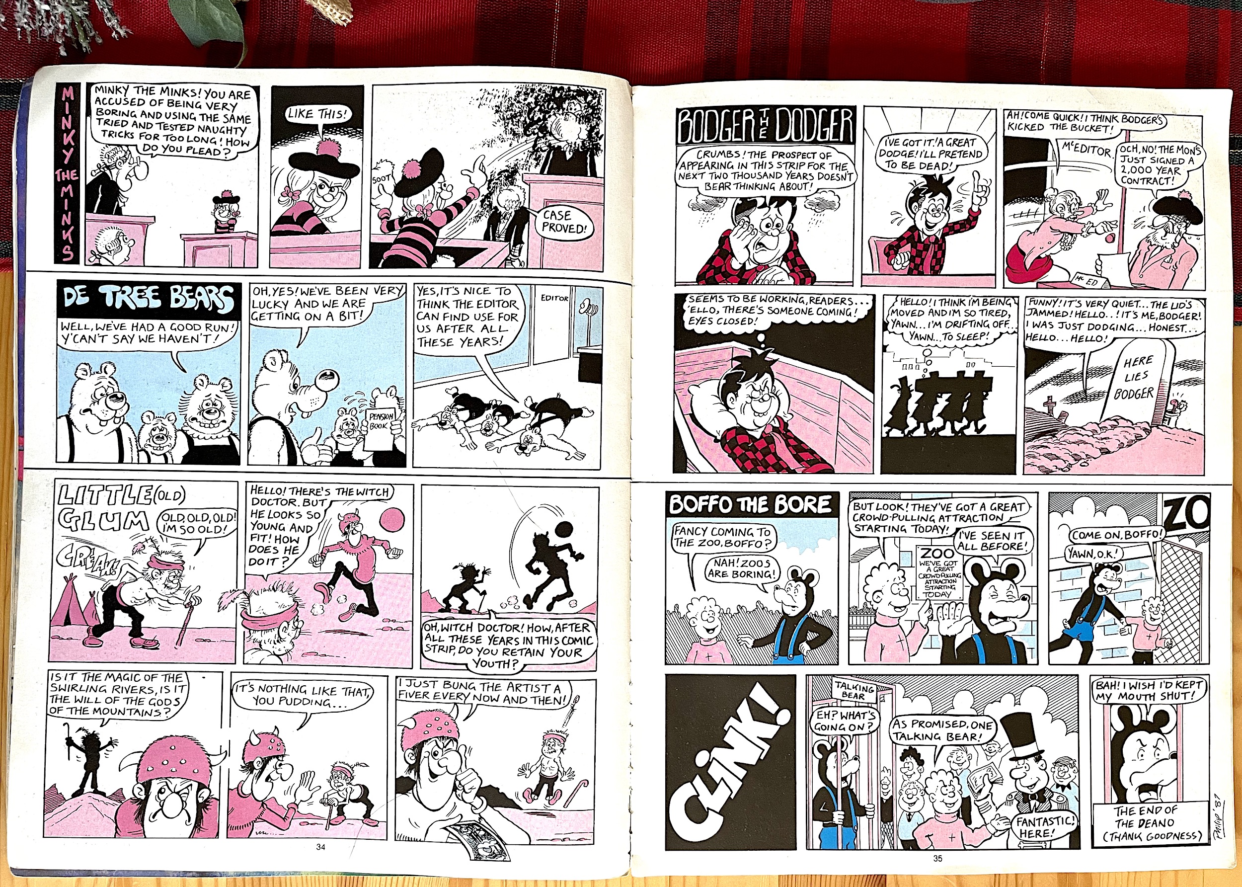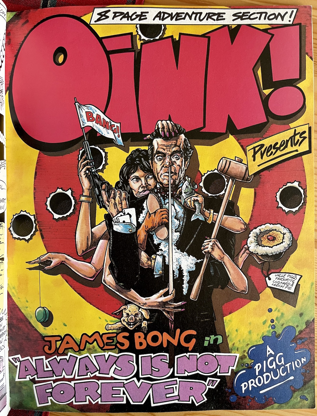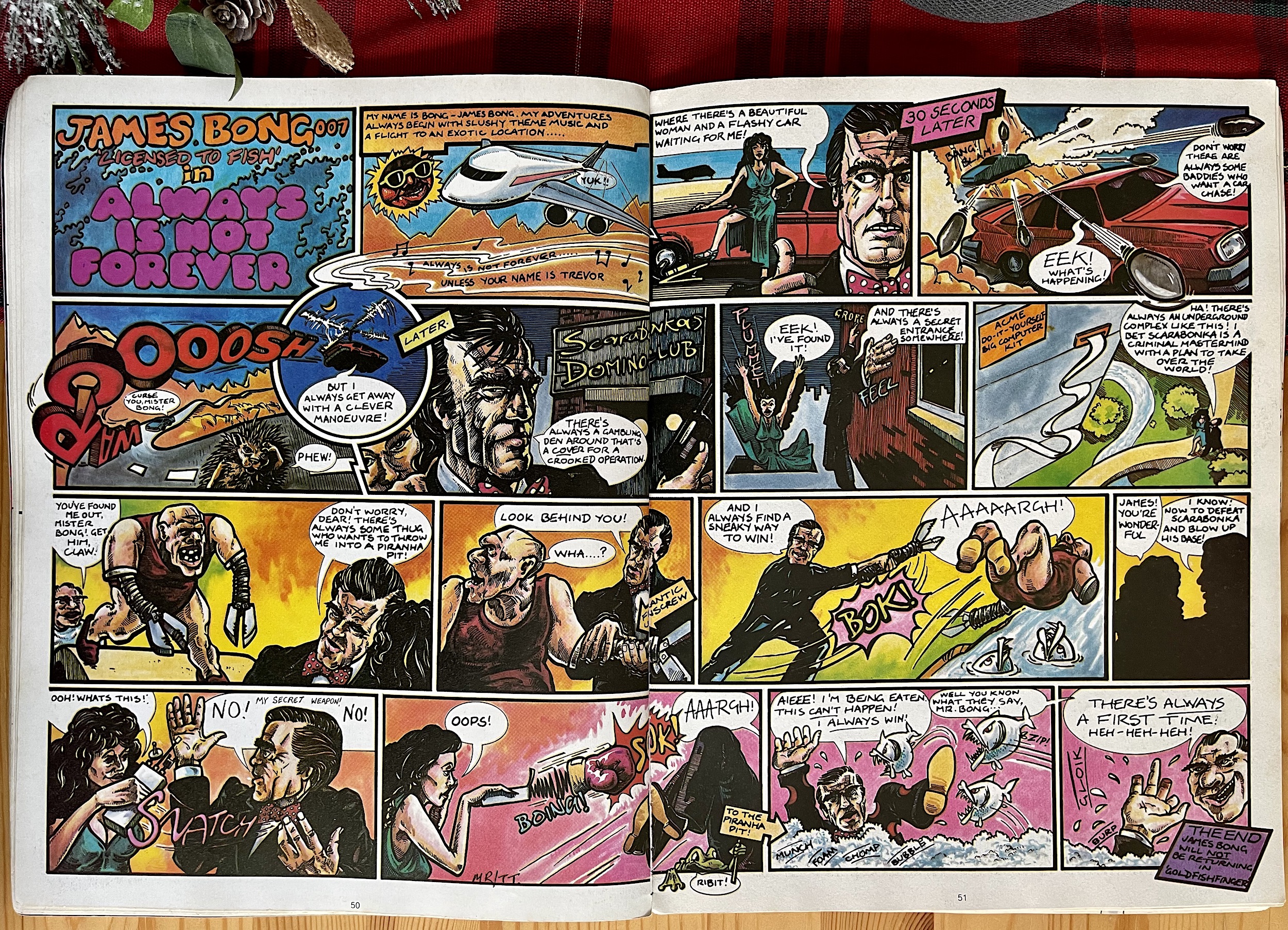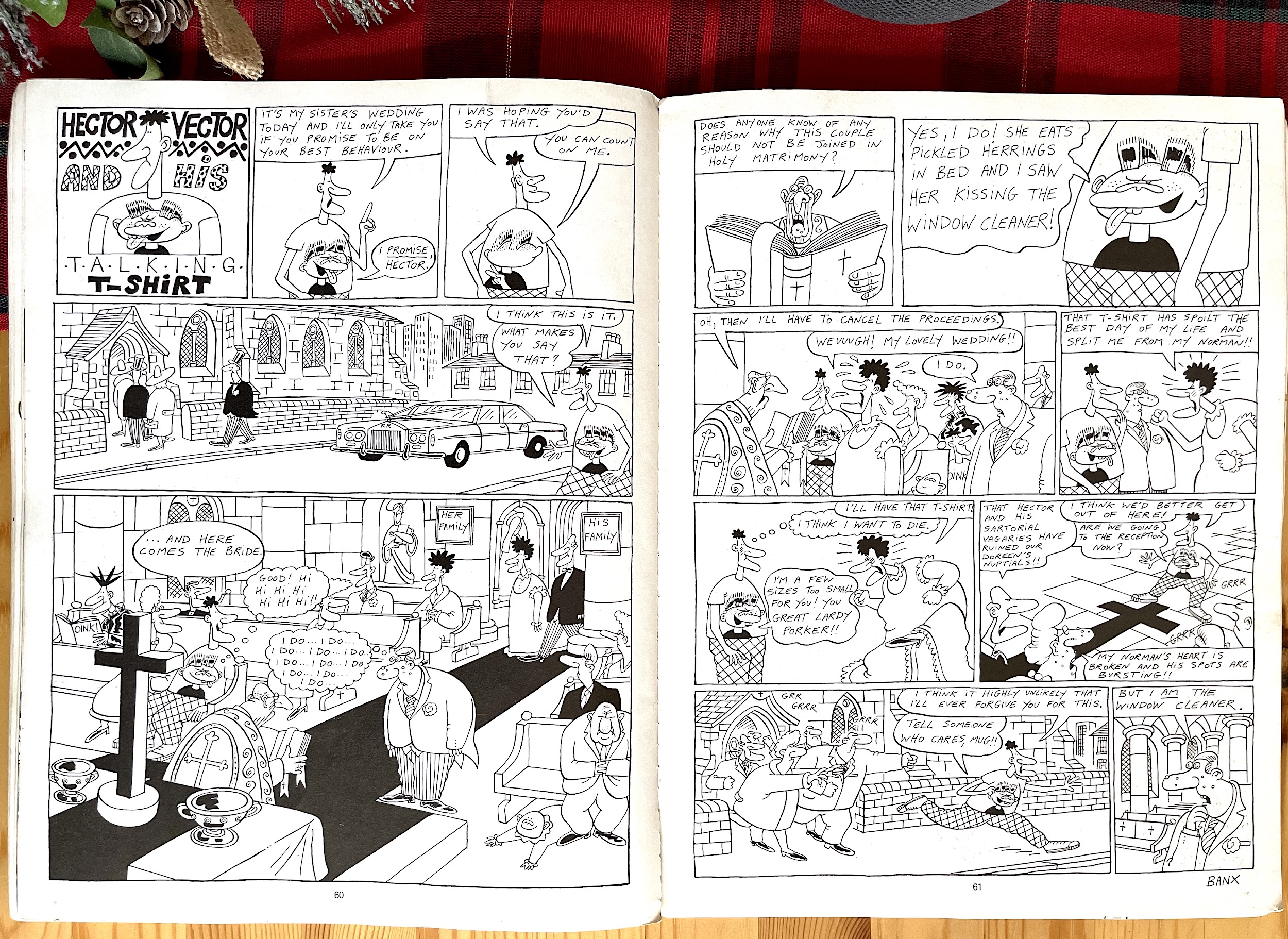
Category Archives: Annuals

THE OiNK! BOOK 1989: SHORT BUT OH SO SWEET

Released towards the end of the summer in 1988 and advertised in the final two issues of OiNK, after the comic’s cancellation it felt like a long time coming for The OiNK! Book 1989 to finally fall into my trotters on Christmas Day that year. As I mentioned in the preview post, with a reduction in pages from the previous annual and a thinner paper stock it really does feel a lot smaller this time around. But it’s still 68 pages (including cover) of prime pork. That’s got to be reason enough to celebrate, surely?

The cover by acclaimed OiNK illustrator J.T. Dogg (real name Malcolm Douglas) is equal parts gorgeous and gruesome, with some little icky details for kids to pour over. It’s bold and brash and certainly stood out amongst the other children’s annuals, just like OiNK always had. In fact, it stood out even more than it had in the adverts because they decided to swap the colours of the logo around, possibly because it would work better against that dark brown background. I think it works much better this way (and we still get the pink regardless).

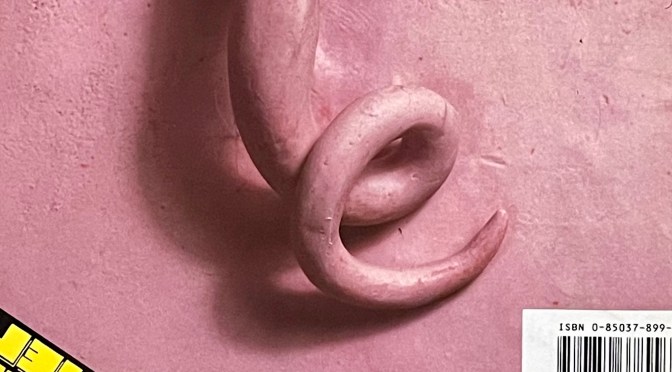
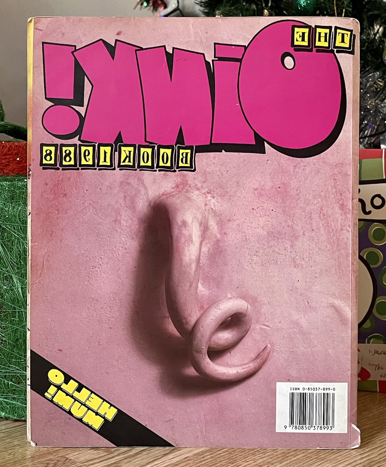
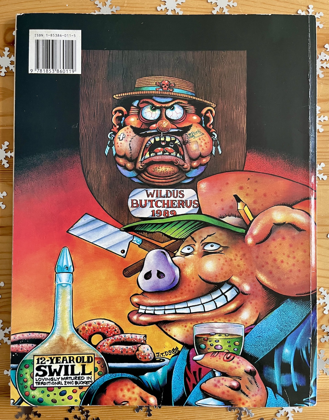
That background gives a hint as to what was on the back cover. I remember seeing it in the shop and half expecting it to be the rear of the butcher’s head, this cover clearly being a riff on the piggy face from The OiNK! Book 1988 and I laughed quite loud when I turned it over that first time. We’ll get to that at the end, we’ve the insides to cover first, beginning with the obligatory welcome page with something you’d only see in OiNK at the time: credits.

Genius scriptwriting from Lew after he was told by co-editor Mark Rodgers only the first two pages would be printed in colour

Uncle Pigg may be relying on more easily managed cards rather than an artist chiselling the names into stone like last year, but this bright and colourful welcome was just what the piggy ordered when I opened it on Christmas morning. Even today it feels like reuniting with old friends. Yes, the comic may have only ended two months ago but Ian Jackson’s contributions were becoming rarer so this is a wonderful return to form. It’s great to see certain names back too, especially Jeremy Banx who had left when the comic went monthly. 

Halfway through reading the book it was clear to me what I was going to highlight first and it’s more gorgeousness from J.T. Dogg, this time written by Lew Stringer. That combination can only mean one thing, it’s Ham Dare: Pig of the Future. Last seen in The OiNK! Book 1988 I’d always remembered Ham and Pigby in serialised stories, yet only their first one was published that way. Here they get a three-page tale with a genius piece of scriptwriting from Lew after he was told by co-editor Mark Rodgers that only the first two would be printed in colour.
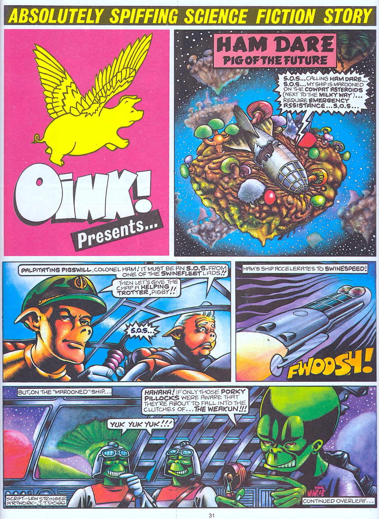
Normally a comic would just carry on regardless on to the black and white page but if something is “normally” done then we should really know by now that’s not what OiNK would do. Actually having it referred to is genuinely funny and Malcolm’s work is no less lovely. The third and fourth panels of that page in particular had me roaring, between the name of the weapon beam (and the reason for it) and the name of The Weakun’s henchman!

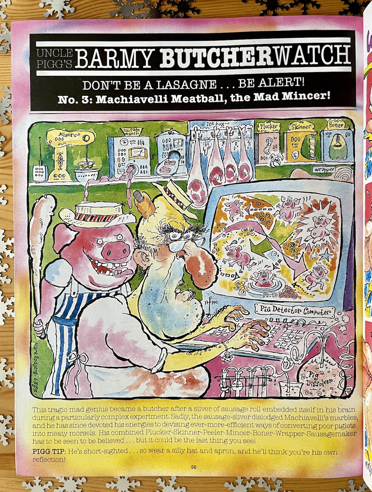
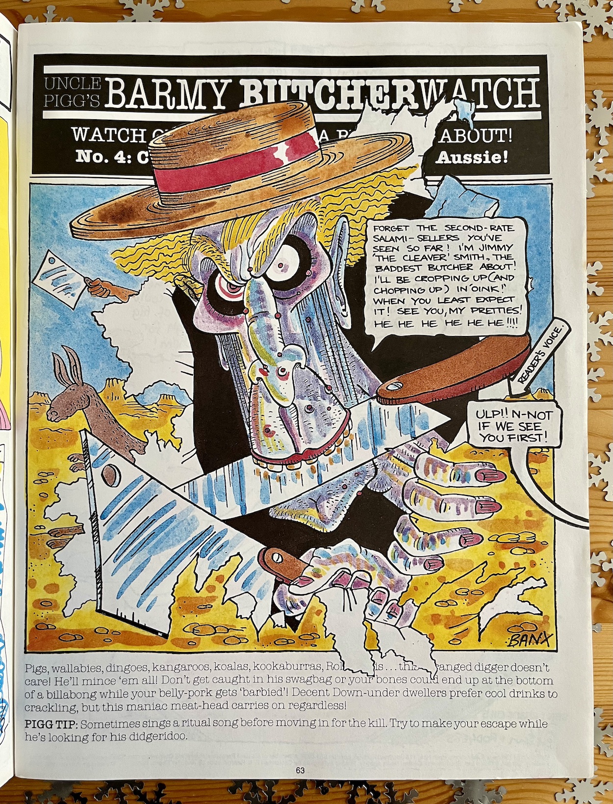
Ham Dare would return in the OiNK! Holiday Special 1989 the following year and make the cover for the only time, with a story originally written as his second serial and I for one can’t wait. There’s another serial of sorts in here, a set of four mini-posters based on Jeremy Banx’s original Butcherwatch idea, however this time each one is drawn by a different artist. Eric ‘Wilkie’ Wilkinson, Mike Higgs, Les ‘Lezz’ Barton and Banx himself. What a team! Of course, Jeremy has to have the last word, right at the very end of the book.
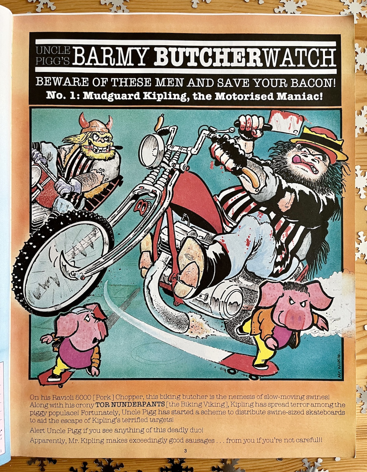
We just never knew when Jimmy ‘The Cleaver’ Smith would pop up, did we? While there are still three special editions of OiNK to come between now and April 2025 this book feels like an end to the regular comic. Yes, this was already in the shops and Santa already had it saved for me, but with Jimmy bursting through to threaten pig pals at the end it felt like the perfect way to wrap things up. It was like he was telling us he was always going to be about, even if the comic wasn’t.

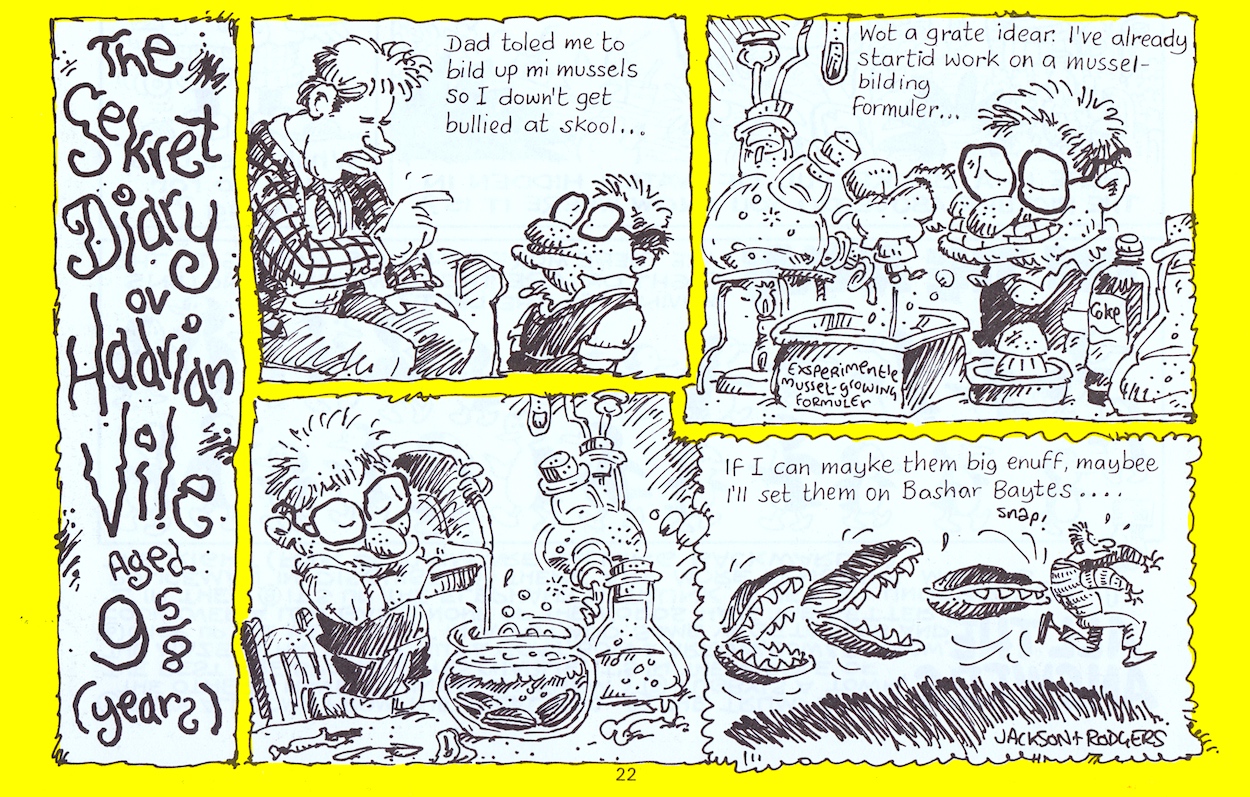
Obviously what he says about OiNK was no longer going to be the case, but that’s because this page was created a long time before the book was published, long before the comic even went monthly, back when Jeremy was still contributing. Someone else from back in those mists of time who makes a rather brief return here (courtesy of Ian Jackson again, written by Mark Rodgers) was Hadrian Vile and his diary. It may only be half a page, and the captions aren’t typed out, but boy was I happy to see him again no matter how briefly.
Way back in the preview issue’s review I mentioned how Burp’s story in OiNK would culminate in an epic tale that taught a very young me about puberty. You may have thought I was joking. Well, maybe it was a slight exaggeration. Raging Puberty is a huge eight-page Burp strip from Banx, set in the far future and recounting an ancient rite of passage amongst the alien species, using our pal (their “lost son”) as an example.

I read and enjoyed this strip during Christmas 1988, particularly the daft fight that takes place, the imaginative weaponry and the funny designs. However, skip forward a few years and a young teenage me decided to reread the book for the first time since. I saw this next strip in a completely different light. I thought, “How did they get away with this?” on more than one occasion while outrageously laughing (before taking it to school to show to all my friends, obviously).
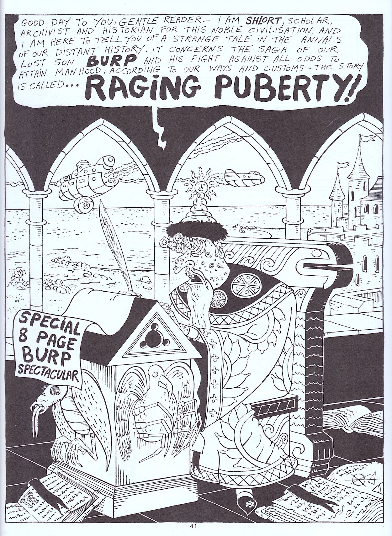
Straight away the descriptive captions are classic Banx, reminiscent of some absolutely brilliant Burp strips in the later fortnightlies when he was often given a double-page spread to fill with his unique style of storytelling. Even though this is a comic strip the words alone paint such a picture that the images are barely needed. But what on Earth (or elsewhere) has this got to do with the title and the reason I found it so funny a few years later? The answer is found on the next page.
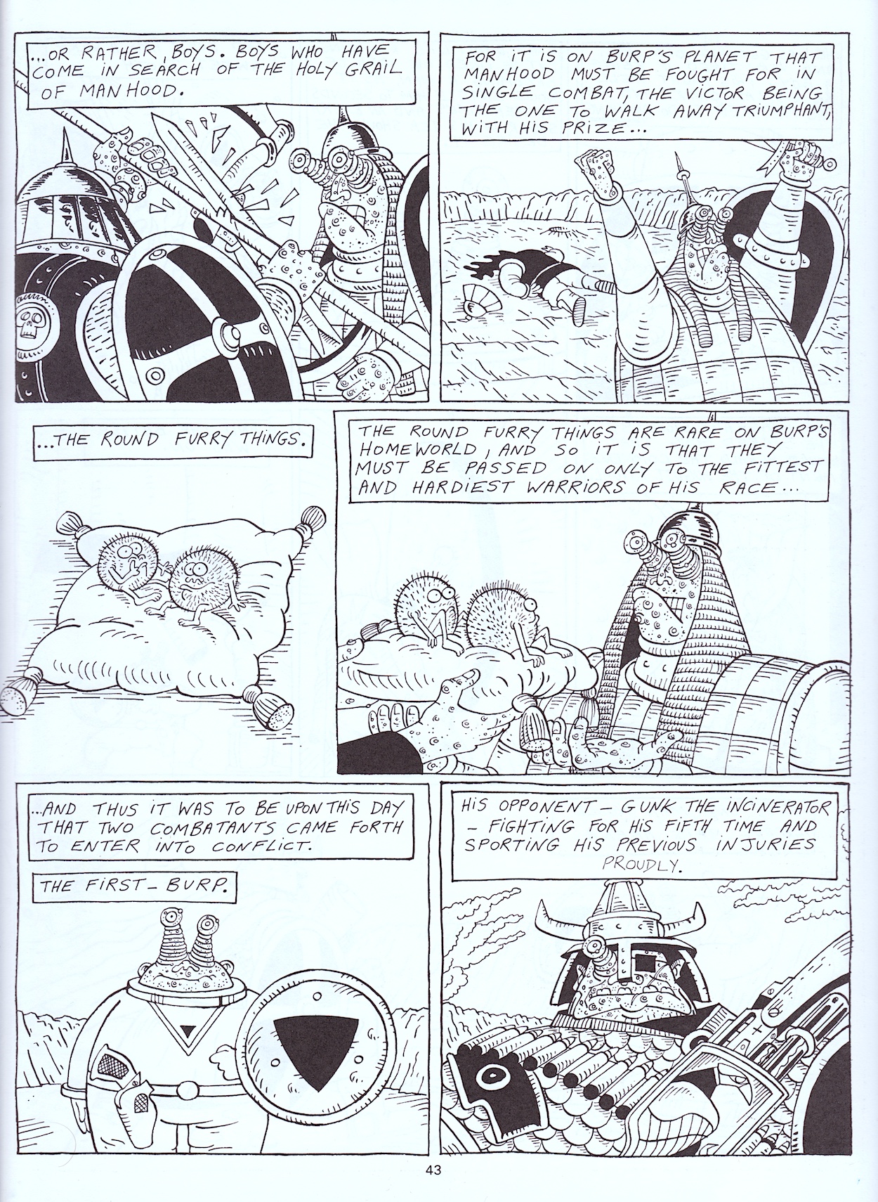
Not exactly subtle and that’s why I couldn’t believe OiNK, a children’s comic, got away with this. But even beyond The Round Furry Things there’s so much to laugh along with here, such as the grizzled old warrior who was tired of being a boy and Burp’s innocence at what he thought being a grown up was all about. Then there’s the dramatic change in angle with the lone caption, “and Burp had a very sweet tooth.” It reminds me of that famous, “and the dolphin’s name was Keith” moment from Jeremy’s Mr Big Nose in #22.

I’ve really missed his work in the comic.

I’m not sure if it’s just a good gag or if Jeremy was making a bit of a point with the first panel on the fifth page, but I think it’s both funny and poignant that battle cries and fear sound exactly the same. Then the story takes a brief break to detail Gunk’s weapon of choice, the Mauser! Only Jeremy could come up with a gun that feeds electricity to a small rodent’s fear receptors to provoke it to do a literal death stare. The silencer is just the icing on the cake.

Arguably the next page is even funnier. The fight escalates, Burp using his unique bodily functions we’ve all come to know and love and be grossed out by, then as it’s all building to a climax the story casually breaks again to have a closer look at another animal-based weapon. Burp is usually a pacifist but it suits him, doesn’t it? We even get a bit of Marlon Brando from On the Waterfront, although that would definitely have gone over my head in 1988.
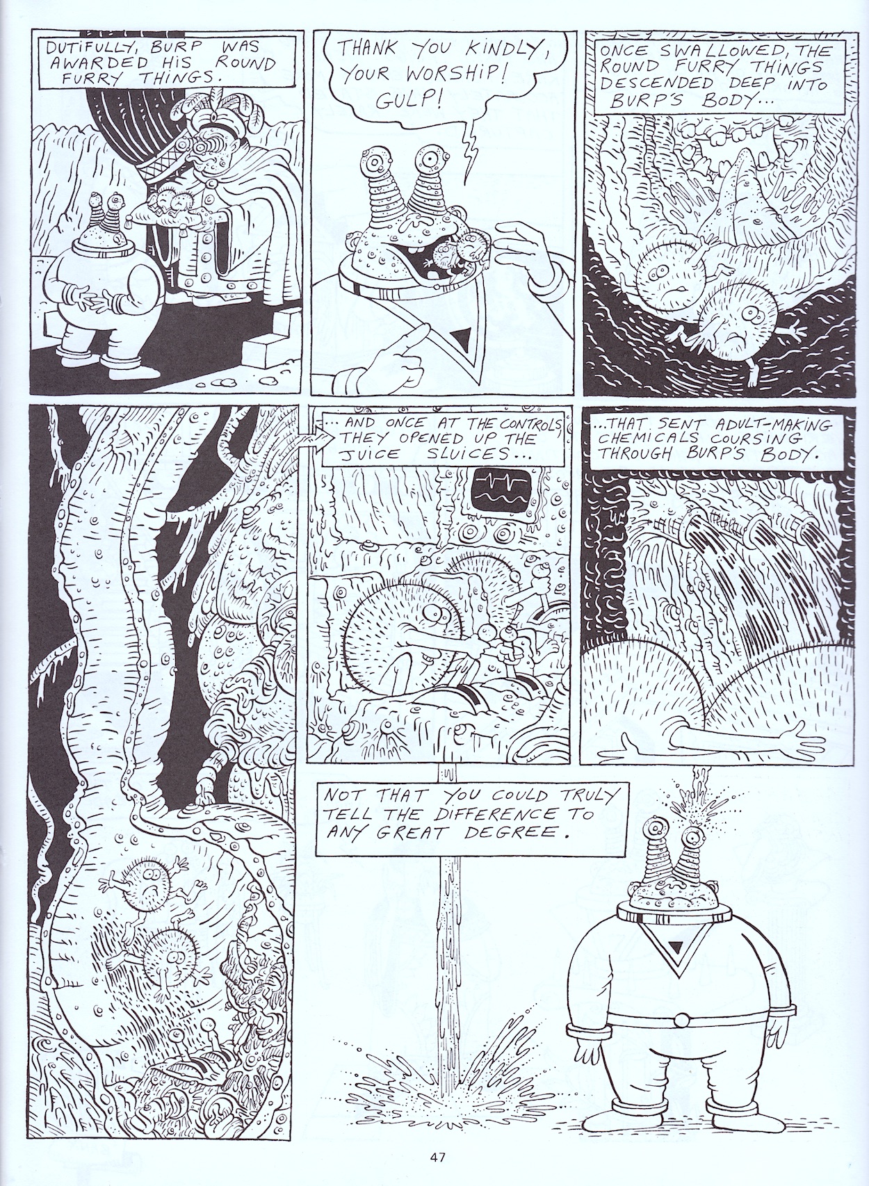
It all has to end in an even sillier manner and it does so with aplomb. As a fan it’s fun to see the insides of Burp’s body again and how the little fellas do all their hard work for nothing. On the final page is a message that as a kid I took to mean we should never want to grow up, that adults are just silly, so why would we want to be them? As an adult now and looking around at the world today, I think that message is pretty much on point.

Jeremy Banx was both shocked and dismayed, joking about how concerned he was for my wellbeing

So anyway, a few years later I hit that time when things start to change and life can feel very confusing. It wasn’t something we talked with our friends about, we didn’t realise what was going on after all, but then I happened to read this again. I’m not going to say things suddenly made sense! (Did you read it?!) But it was enough for me to realise I wasn’t alone and it could be something to look back on and have a giggle about, so it couldn’t be all that bad.

I once mentioned to Jeremy how a young and impressionable me viewed this strip in my early teenage years and he was both shock and dismayed, joking about how concerned he was for my wellbeing. Typical Jeremy response. So, having been mentioned in the very first OiNK review on the blog we’ve now finally covered it and finished our regular read through, coming full circle. I’ve loved seeing this again after all these years.

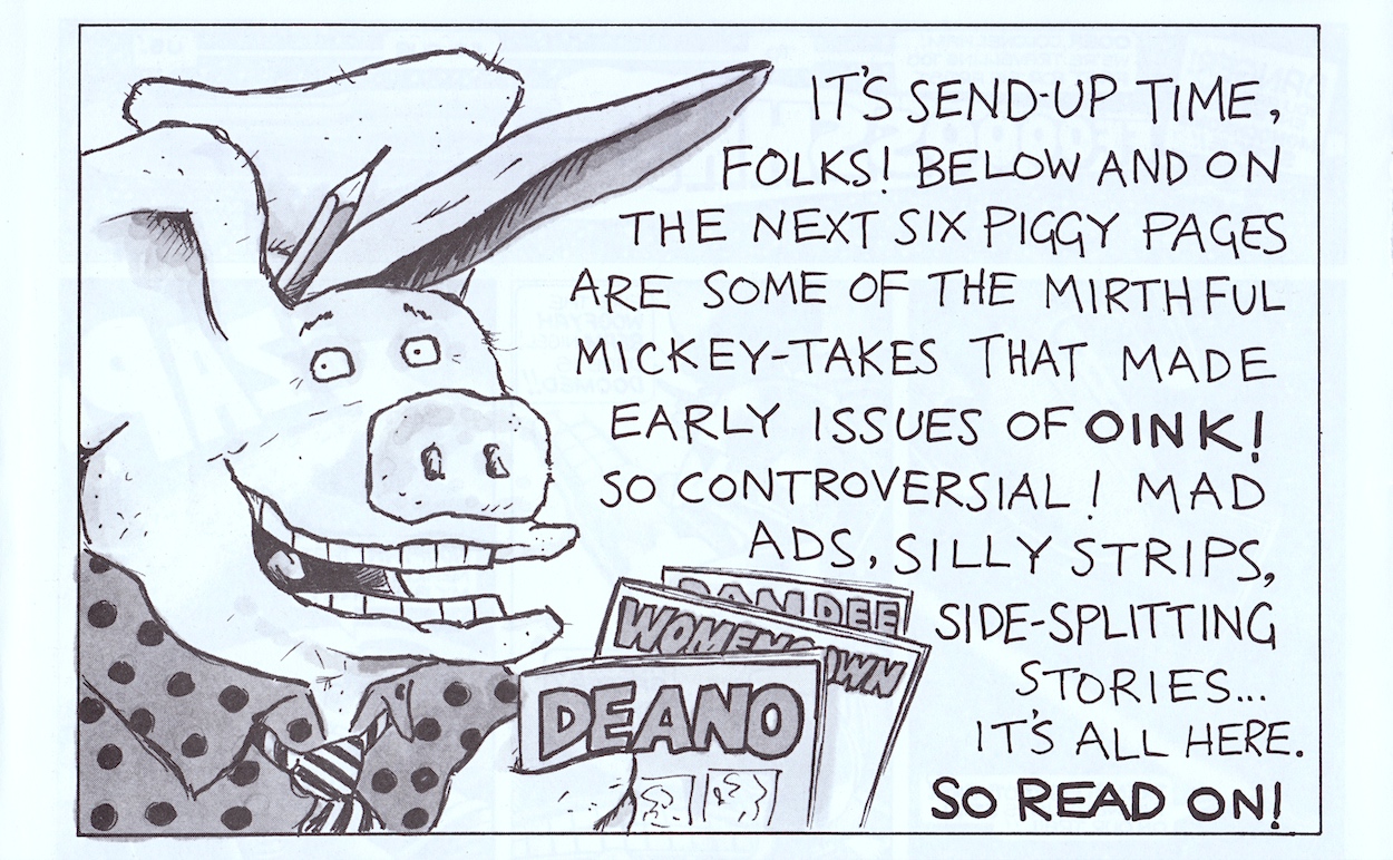
Moving on and yes, the dreaded reprints we saw a handful of in the monthlies have even made their way into the annual, introduced by Uncle Pigg, promoted as a way for readers to check out what they may have missed out on. Even though I’d only started reading OiNK at #14 as a child there were still a few strips here I’d read before. But, even though I hadn’t read the majority I still felt these dampened the book as a whole, especially considering there’d already been a page cut.

As it turns out there are ten pages of reprints, meaning there are actually only 54 interior pages of new content. That’s only six more than the recent monthly issues or a Holiday Special. Even as a child I was very aware of this. These reprint pages are really the only place you’ll find mini-strips too. The rest is made up of much larger fare. There’s even a three-page Psycho Gran and a five-page Spectacles of Doom (which you can see some of in artist Andy Roper’s obituary).

The new content here is superb, second-to-none and some of the very best OiNK ever produced

This means the book is a rather quick read, especially if you skip the reprints. According to co-editor Patrick Gallagher cost cutting is partly to blame after Fleetway Publications took over from IPC Magazines (who had published the first half of OiNK’s run including the first book) and OiNK had survived the first round of cancellations. There’s a chance all the larger material here was already complete when Fleetway started to see the comic’s fortunes in a more negative light during the latter weeklies/early monthlies, and maybe the plugged was simply pulled on the rest of the book.

When OiNK’s stablemate titles such as Buster and Whizzer and Chips had 112 pages in their annuals for the same price (albeit cut down from 128) you couldn’t help but feel short changed as a pig pal. The new content here is superb, second-to-none and some of the very best OiNK ever produced! But I can’t help but wonder how amazing this book could’ve been! It could even have topped the previous one. With silly pages like this next one, it’s easy to see how.
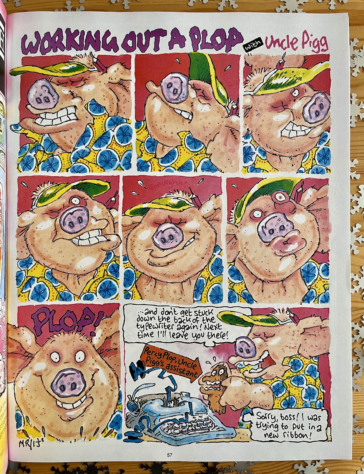
Only in an OiNK Book could such a simple, cheeky gag like this take up a full page and be illustrated and coloured so gorgeously. However, even with all of these brilliant highlights I think I may have saved the fan favourite for last, at least as far as my memories are concerned. That’s because in 1988 it was so exciting and so funny to see two of Lew Stringer’s creations in the same strip, especially when they’re Pete and his Pimple and…. Pigswilla!

Actually, we even get Tom Thug popping up too (alongside his own snowy, Christmassy strip elsewhere), so that’s two-thirds of the Buster mergers included and it’s nice to see Pete reading OiNK again instead of that other comic. Ignore the heartbreaking caption about OiNK still being a periodical and watch as Pete’s pimple becomes the latest giant monster that only an equally giant robotic pig can save the world from.

I just love that panel showing us the pimple “terrorising the cities”. It may only be a small cameo for Pigswilla’s final appearance but we did get a superb epic strip for him back in #66 so this is a nice little addendum to say goodbye. Not that it would’ve been written as one but it works nicely anyway. When reading children’s stories to my friends’ kids I think I’ll stick to the moon being made of cheese, though. (Also, did you ‘spot’ the slightly obscured dig at W.H. Smith?)

I hope you’ve enjoyed this look at just some of the highlights from The OiNK! Book 1989. In more recent years I’ve seen some pig pals online somewhat dismiss it as nothing more than an inferior version of the first one. I hope I’ve been able to enlighten you a little on why some of the changes may have occurred and, most of all, shown you that the content in it is top notch OiNK all the way. Yes, it’s a little frustrating because this could’ve been a classic OiNK Book through and through, but the team still produced some of their very best work for it. If you see it on eBay you should definitely splash out the few quid it’ll cost you for some of the best laughs you’ll ever get from a comic book.
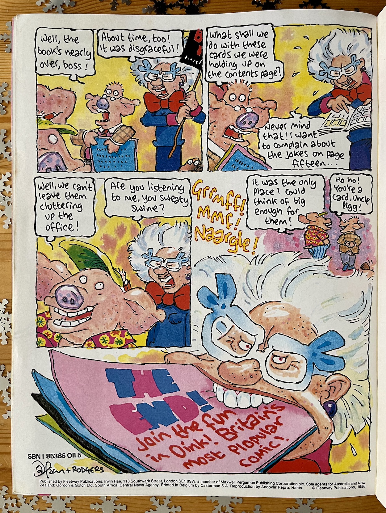
Just like last year the outro concludes what began earlier and, while it’s yet another example of the book publicising the ongoing comic after it was canned, it’s another great page by Ian Jackson. It’s always funny to see Mary Lighthouse get her comeuppance too, isn’t it? With superb script work throughout, plenty of laughs to be had, some stunning artwork and some gorgeous colours, The OiNK! Book 1989 may feel a little unfinished but as a way of ending the regular run of OiNK during the festive season it’s a pretty perfect piggy publication.

Just that back cover to go before I let you get back to that selection box you promised yourself you wouldn’t open again until Boxing Day. That hint on the front I alluded to earlier looked a bit like a wood effect finish behind the butcher’s head, don’t you agree? There’s a good reason for that.
BUSTER MERGE < > HOLiDAY SPECiAL 1989

OiNK READ THROUGH MENU

OiNK SPECiALS & BOOKS MENU

ANNUALS MENU

MAiN OiNK MENU

CHRiSTMAS 2023

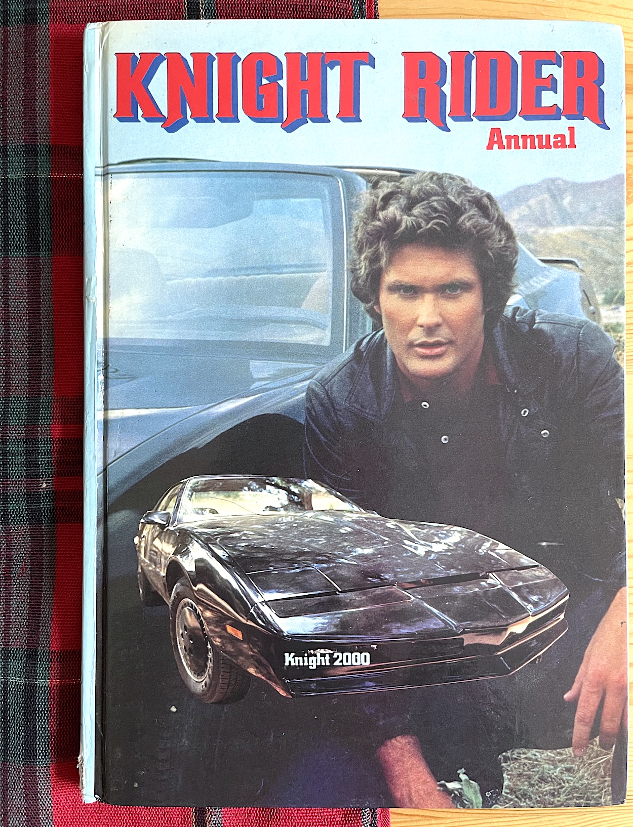
KNiGHT RiDER ANNUAL #2: KRiSTMAS K.I.T.T.

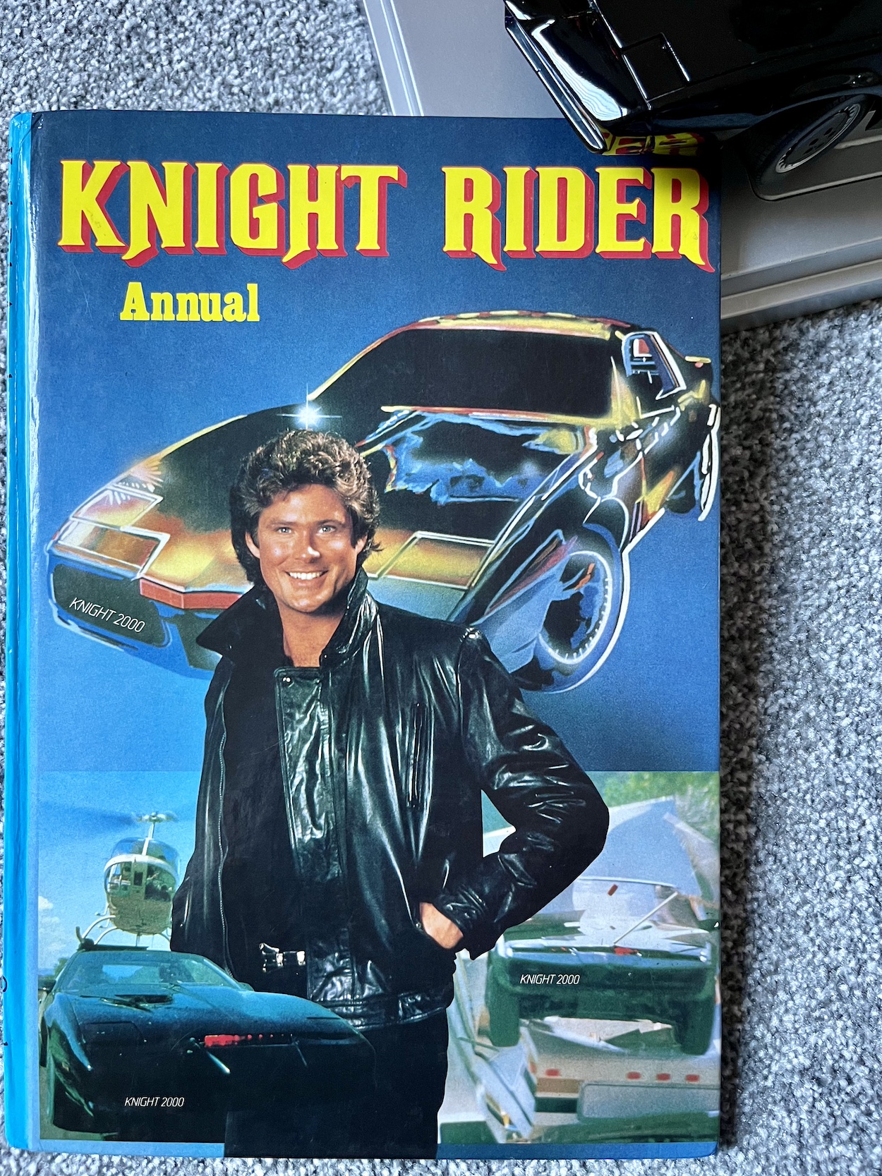
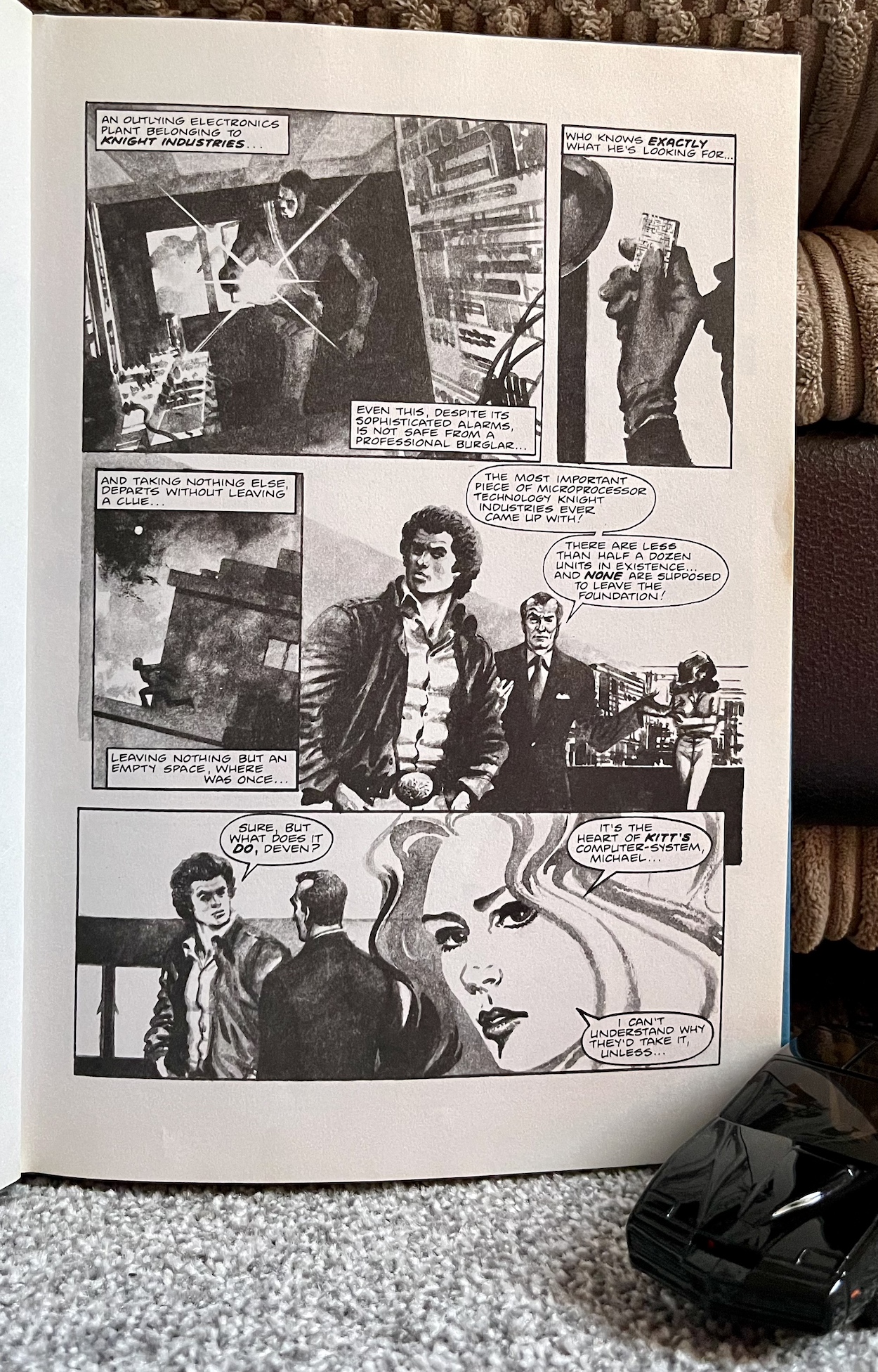
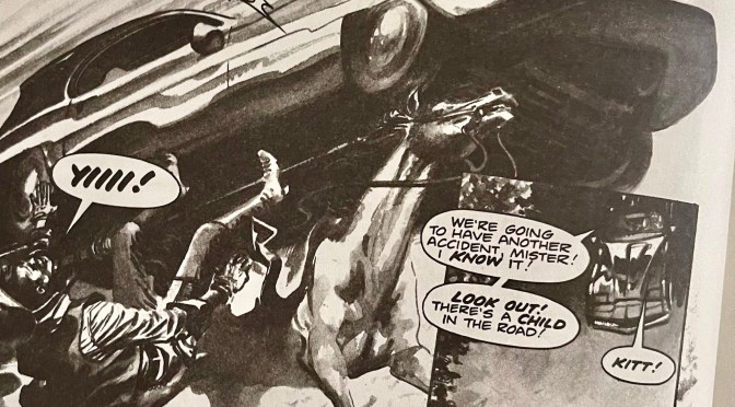
By the time this second Knight Rider Annual was being written the team had had more of a chance to become acquainted with the series and it shows.  Don’t get me wrong, the previous book was a fun read with some simply beautiful David Lloyd artwork and writer Steve Moore had nailed the early characterisations of both Michael Knight and K.I.T.T. from the pilot movie. However, this year the stories definitely benefited from the broadcast of more episodes. K.I.T.T.’s capabilities have also been expanded and Michael feels more rounded.

Released in the summer of 1984 for that festive season, this annual is set during the second season of the show. In the UK, where programmes would normally begin airing about six months after the US back in the 80s, Knight Rider had proven to be such a phenomenal success for ITV that they broke with that tradition, moving straight on to season two the week after season one finished. So Steve and David had a wealth of episodes to work from and as a result there’s a different feel to this book. Let’s begin and I’ll show you what I mean.

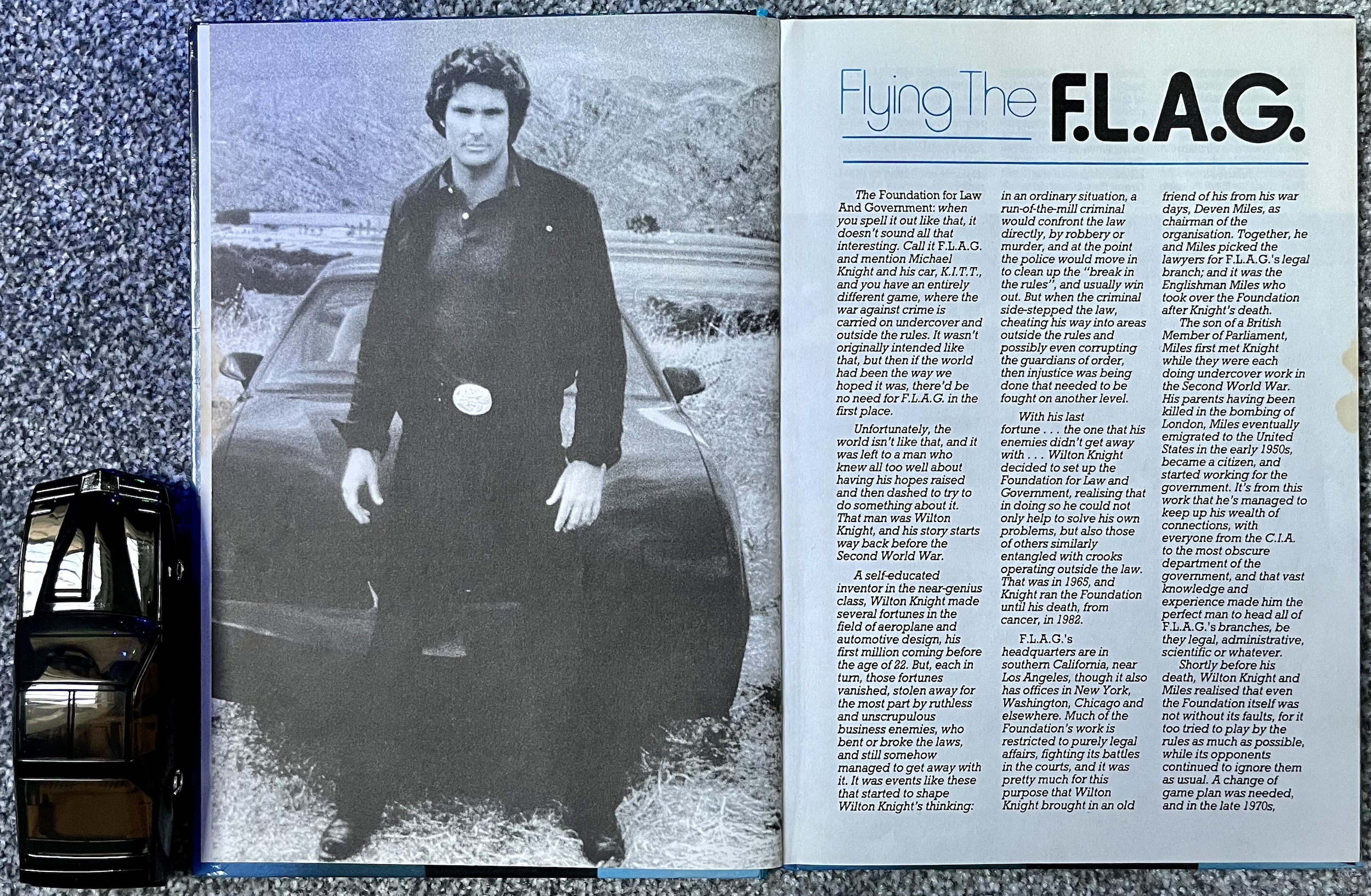
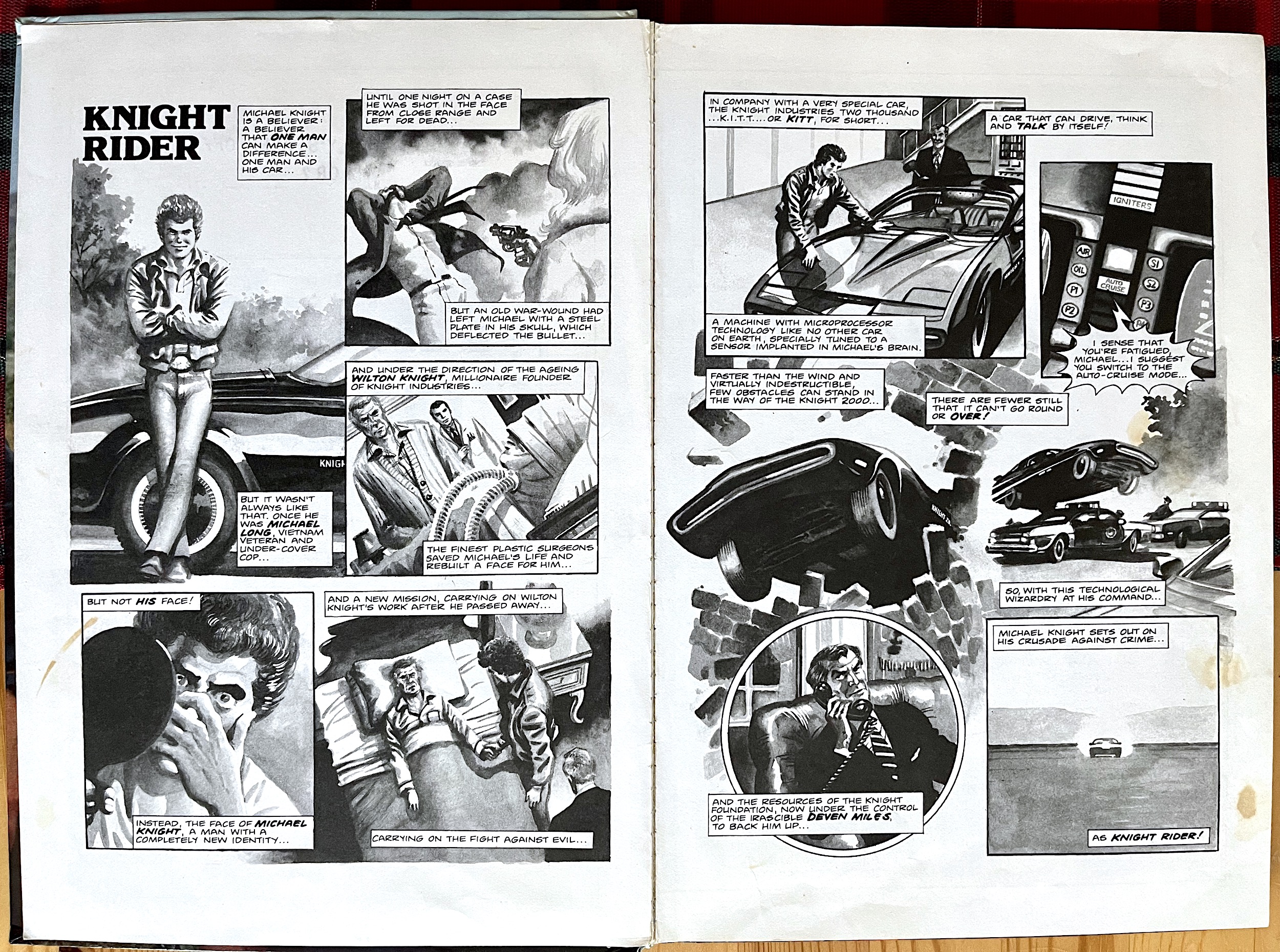
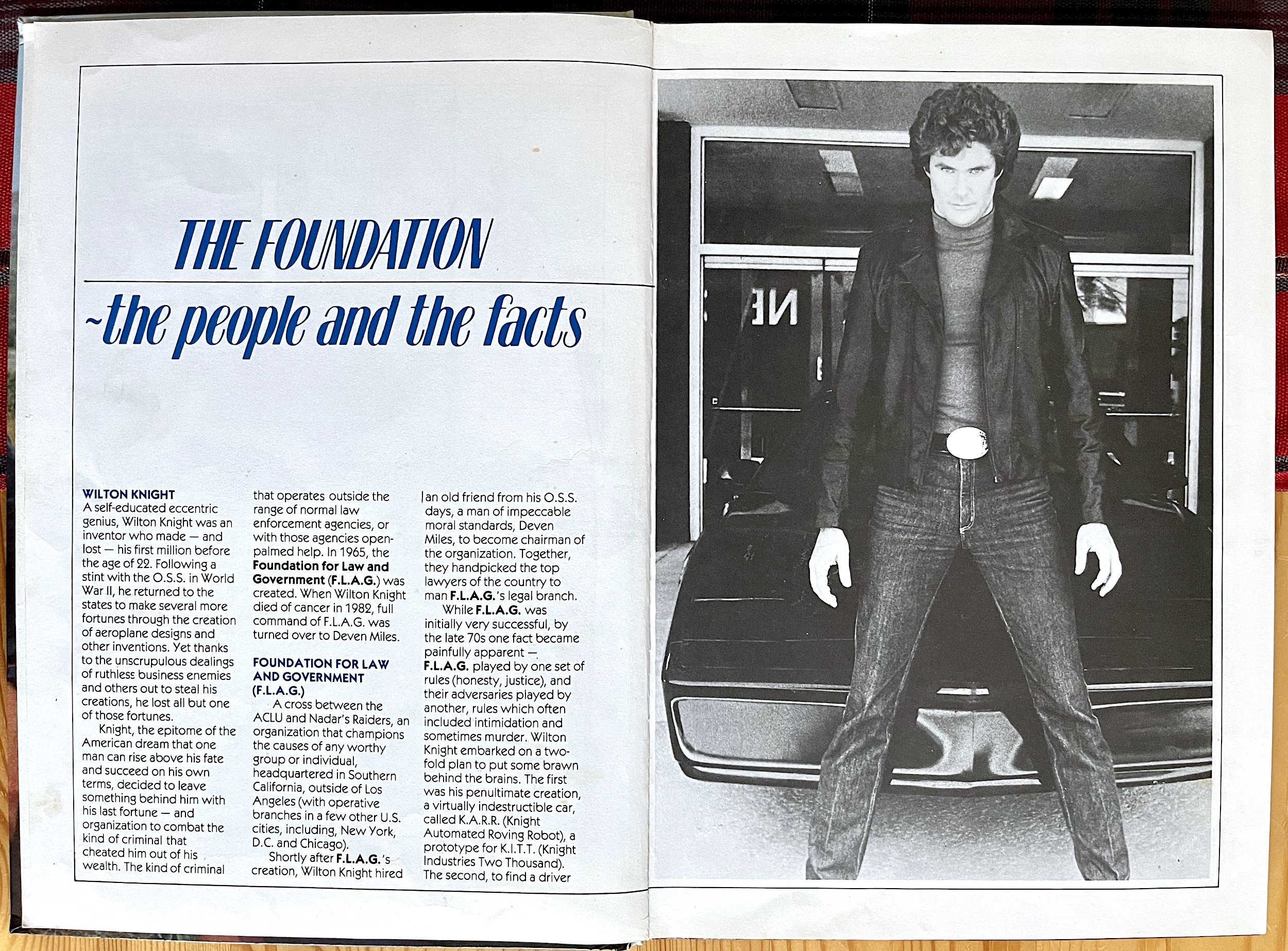
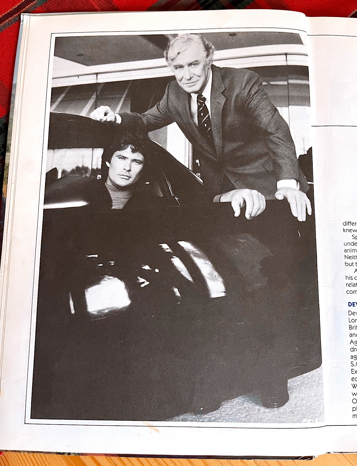
This year’s origins feature focuses on Wilton Knight, the millionaire philanthropist who created Knight Industries and its F.L.A.G. (Foundation for Law and Government) division, who saved Michael from certain death before passing away himself in the pilot movie. Wilton was played so memorably by Richard Basehart (Moby Dick, Voyage to the Bottom of the Sea, La Strada) his commanding vocals were heard every week in the opening credits.  The feature tracks his history back to World War 2 and the origins of that famous “criminals who operate above the law” line.

It’s also the first time it’s confirmed that it was cancer that killed him, though it was implied in the pilot movie.  Apart from continuing to misspell Devon Miles’ name as ‘Deven’ this is a flawless introduction to the show and with all of the extra information it’s something fans should hunt out the book for. After Devon’s immigration into the US we find out there were flaws with how F.L.A.G. operated at the beginning. Remaining inside the same rules the criminals flouted was leading nowhere, so from the late 1970s research into a new project began, which would eventually lead to K.I.T.T.

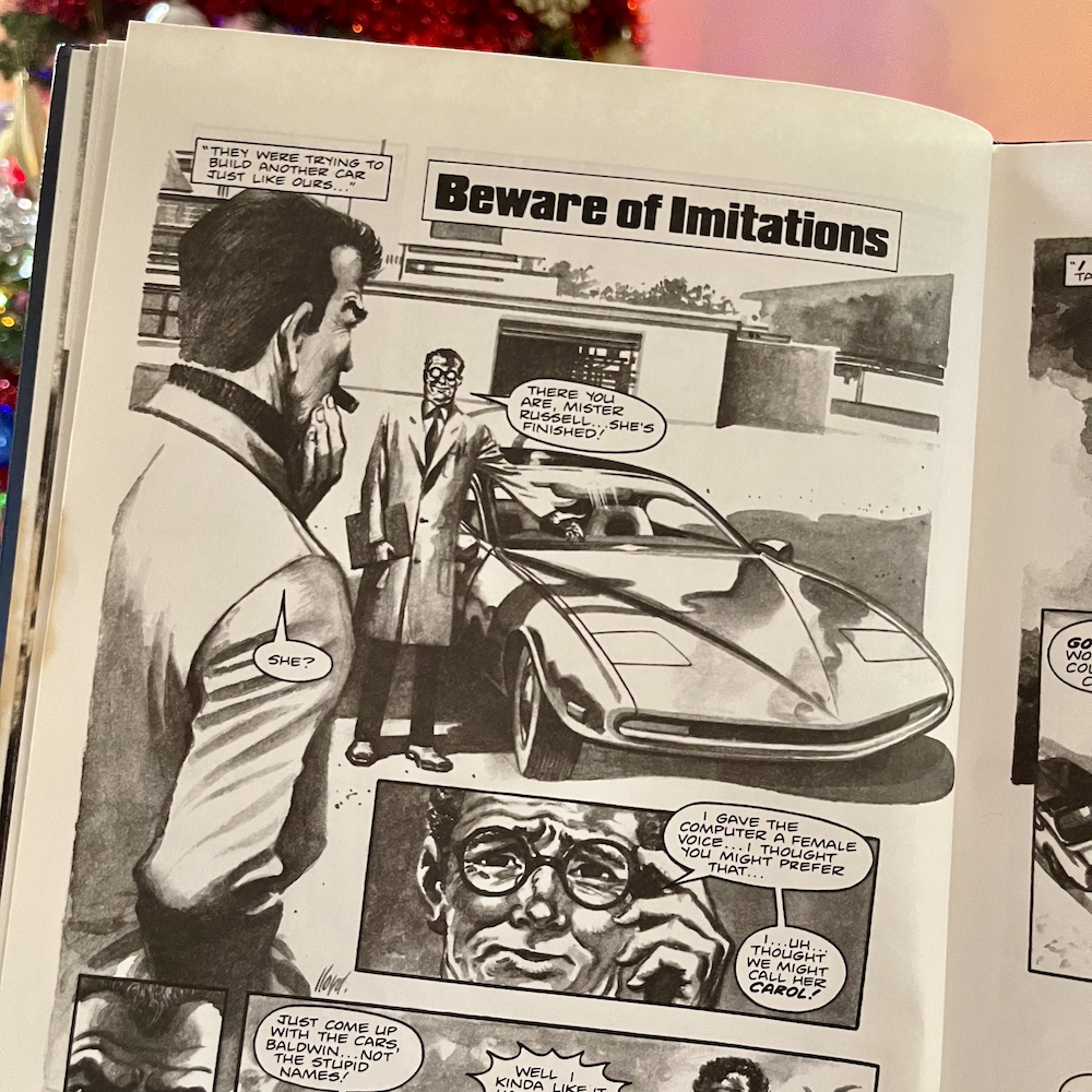
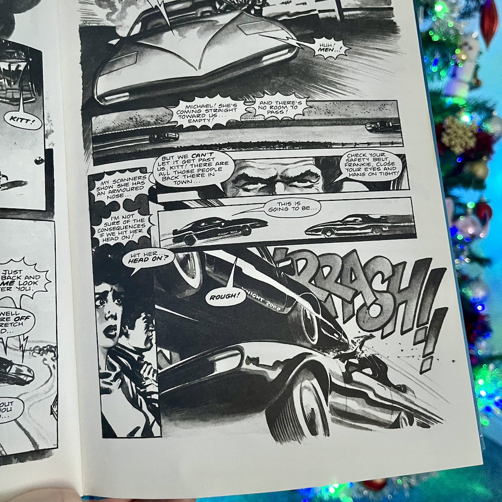
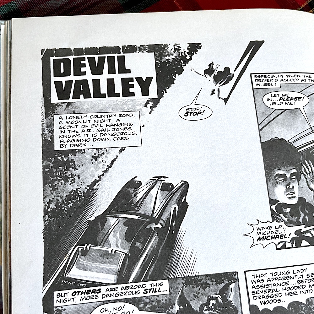
It’s a brilliant start and benefits from extra research into the background of the series’ story. So it’s weird that the first strip, Beware of Imitations, is a rip off of a very popular story from the TV show. In the programme, K.A.R.R. was the prototype for K.I.T.T. However, while K.I.T.T.’s primary directive was the preservation of human life, K.A.R.R.’s was self-preservation (originally thought to be the best way to protect the driver). Here, we’ve got another ‘twin’ for the supercar. There’s a wonderfully atmospheric first page but then it boils down to a new female version of K.I.T.T. being prepared in record time, completely contradicting the introductory feature on the previous pages.

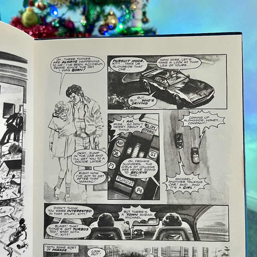
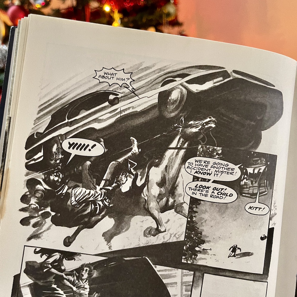
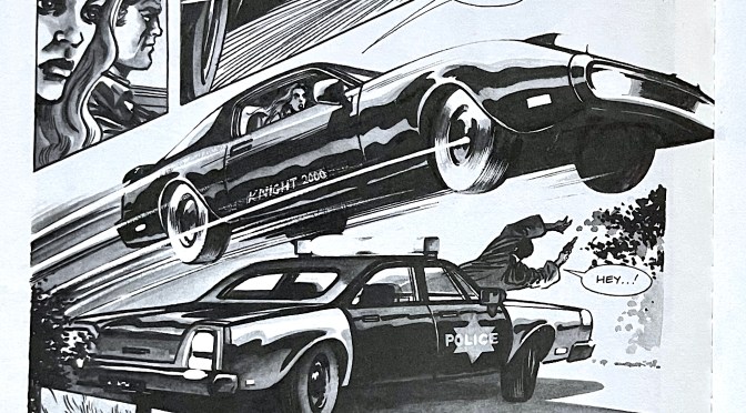
There are mentions made of the shortcuts taken and the fact only the nose of the car is armoured, but seeing it turbo boost etc. makes it seem like K.I.T.T. (and by extension K.A.R.R.) isn’t all that special after all. It’s not even all that fun, other than the solution to stopping the car is K.I.T.T. landing a turbo boost on top of it! Beautiful artwork from David Lloyd again though, with loads of fast action and big, impactful panels of destruction at the hands (tyres?) of the female car.

The first prose story is called Games People Play and involves industrial espionage in the video game industry, something else we’d have seen in the series by this point. However the episode in question, Nobody Does It Better, wouldn’t have aired when this was written so it’s more of a coincidence. Also, back in 1984 the video game explosion was in full force and it was a subject ripe for this hi-tech TV show.

The mission seems simple enough to begin with. Michael needs to protect Dr. Lesley Kelly, a gaming company’s lead engineer until she can complete the first build of their next hit title after some failed kidnap attempts. Michael is instantly attracted to Dr. Kelly but Lesley makes it crystal clear the feeling isn’t reciprocated, but she warms to K.I.T.T., speaking to him on a level footing and adding an enjoyable character dynamic between the three of them.

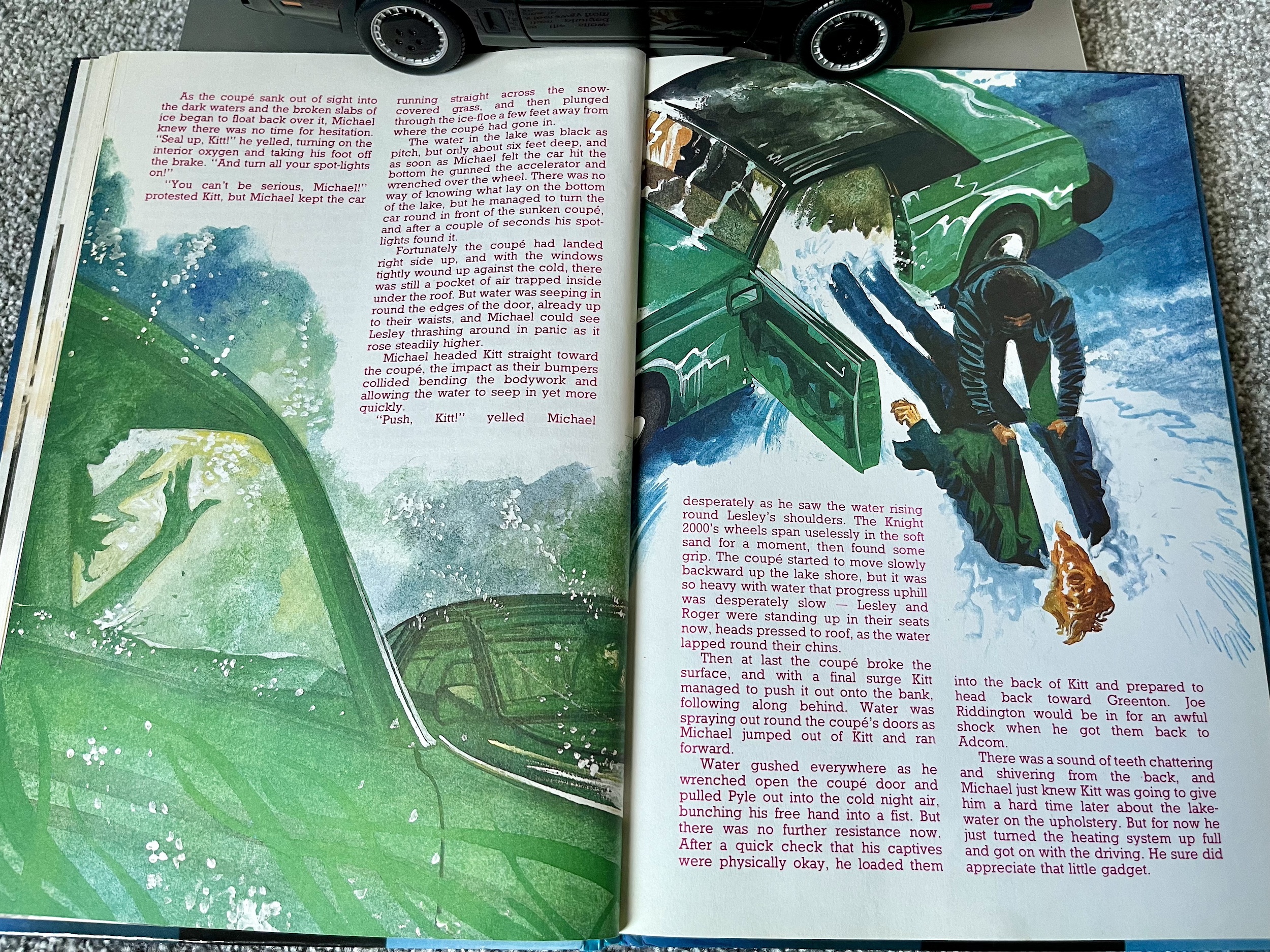
There are lots of little clues for the reader to pick up on before the big reveal of what’s really going on. It’s just a shame the person behind it all is revealed to be awfully similar to that of the aforementioned episode, an unfortunate coincidence in this case because viewers will see the shock ending coming a mile off. This doesn’t make it any less enjoyable though, with Michael resorting to stealthy tactics to protect someone who doesn’t want his protection, K.I.T.T. delivering some killer lines and it all comes to a climax below a frozen lake! It’s a scene the series simply wouldn’t have had the budget to handle properly and is exactly the kind of story these books are perfect for.

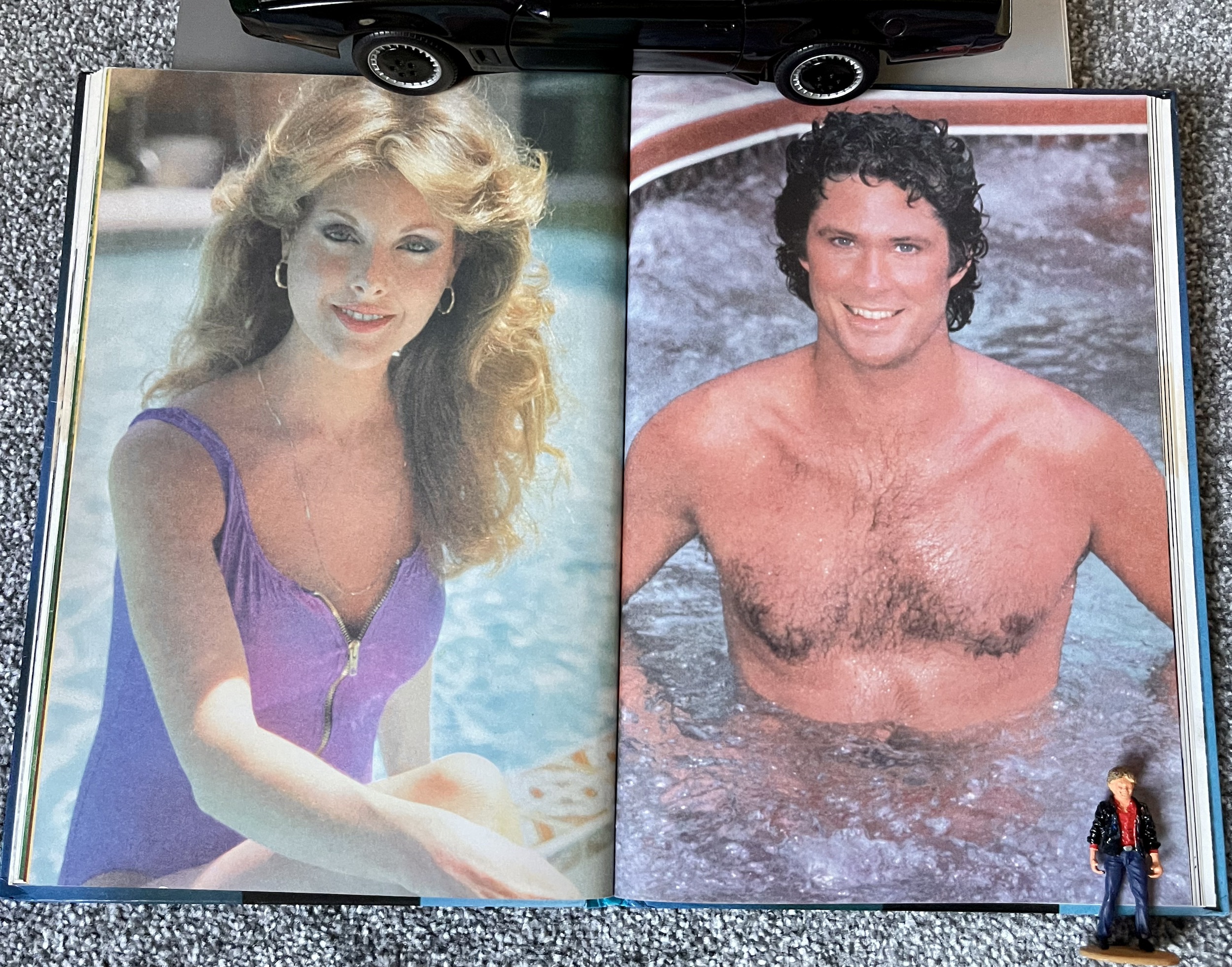
Back in the 1980s we had to rely on magazines to keep us abreast of the latest news about our TV shows or to find out more about our favourite celebrities. One such title was Look-In, the ‘Junior TV Times‘ mentioned in the previous Knight Rider Annual review. Alongside the weekly strip there’d be occasional interviews and features about the show, as well as full-page photographs of its stars, automotive and otherwise, which this second annual has in abundance. That’s right, cue some very 80s pin-ups.

Other such pages include photos of Rebecca Holden (who played K.I.T.T.’s Cyber Technician April Curtis in season two) on a cross trainer in her living room and Michael Knight himself David Hasselhoff in his running gear. Clearly the team behind the annual believed the teen audience wouldn’t appreciate some photos of the superb Edward Mulhare and leaving out K.I.T.T. seems criminal! It feels like the book is trying to appeal both to the readers keen for action stories as well as those who’d buy Look-In for the attractive celebrities inside.

While I wouldn’t have had any interest in cutting these out, this shift in focus from the first annual does bring something else Look-In was great at. In here are two brilliant interviews with none other than The Hoff and Rebecca themselves. Quite the scoop. In A Knight and His Damsel David talks about his relationship with fiancée Catherine Hickland who played Stephanie Mason, the fiancé to Michael Long before he died and was reborn with a new life and identity. She’d appear in a trilogy of episodes across the four seasons, including the episode that would act as the finale. As such it’s strange her guest role isn’t mentioned at all here.

But what is here is fascinating, telling the story of David’s rise to stardom, the tragic loss of his agent, how he and Catherine met and how she kept his feet firmly planted on the ground, especially when Knight Rider took off. There are even some funny anecdotes about Catherine’s reactions to the times David would do some of his own stunts, such as high speed driving or even hanging from a helicopter. Just as an aside, the couple married at the end of season two, their wedding day reproduced for that final episode in season four. They then divorced a few years later and in 1992 Catherine went on to marry an actor by the name of Michael E. Knight!

Anyway, back to the book.


“Cathy gets mad when [female fans] approach me in the street and I can’t blame her. These women tell me they think I’m gorgeous or something like that and invite me home… right in front of her. I tell them that Cathy is my fiancée but it doesn’t put them off.”

David Hasselhoff

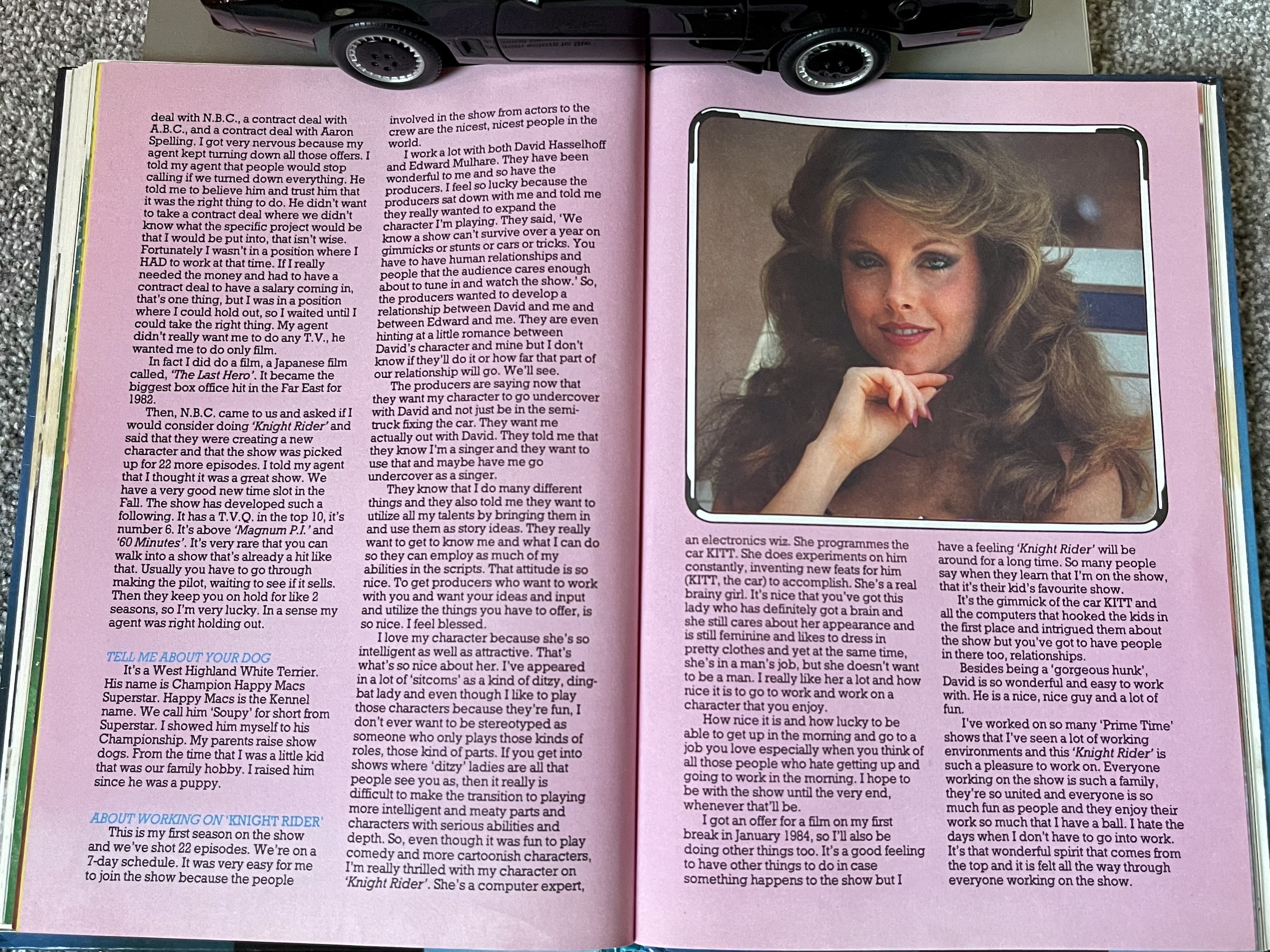
This next feature was a very pleasant surprise. I’ve bought quite a few Knight Rider books in my time, mostly fan-written and while some of them are great they’re usually quite light on depth, offering up nuggets of information episode-by-episode gleaned from obviously much longer interviews. I long for a book with plenty of in-depth discussions with the writers, cast and crew which doesn’t feel the need to break it down like that. So you can imagine my joy when I came across five garishly coloured pink pages and a proper, lengthy interview with Rebecca Holden.
Despite having the ever-so-80s and cringeworthy subtitle of ‘The Beauty With Brains’ it’s a great read covering Rebecca’s past, her family life and her career. She talks at length about what it was like to work on Knight Rider, especially coming on to an already established show and replacing a popular character. Most interestingly, or perhaps frustratingly for fans of April, we find out some plans the producers had for the character in later years, but of course this was her only season, with Bonnie returning in season three.

It’s clear Rebecca was incredibly proud of the character she portrayed and was looking forward to developing April more, emphasising how rare it was for a strong female character to feature as a regular in a series like this at the time. Certainly, the show explored April’s character more in one year than in all three seasons with Bonnie and while the latter will forever be a fan favourite, I’ve a soft spot for April. I think that has a lot to do with Rebecca herself and her ability to switch naturally between the technical, the dramatic and genuinely funny moments in an instant.

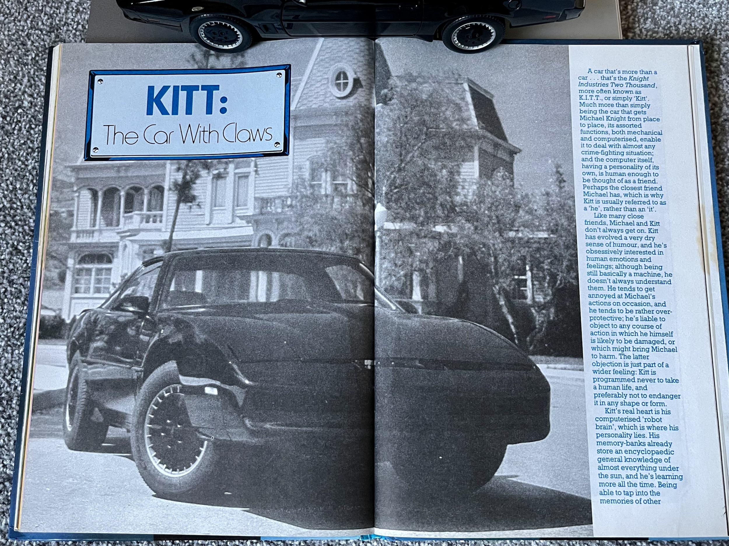
Talking about what the fans wanted, as I touched upon last year it’s hard to describe to those raised in a world of the internet just how exciting it was for us to see photos of K.I.T.T. It was a huge selling point for any magazines which featured him, such was the pull of the show and of this car. If you didn’t have a VCR you’d see the show once a week and that was it, so you relied on books and magazines to get your fix. I remember at some point during the four years Knight Rider was on we got our first VCR and a year or so later for Christmas Santa Claus brought me my very own 3-hour blank VHS cassette. I was so excited! It meant I could now record and rewatch Michael and K.I.T.T. over and over and over again.

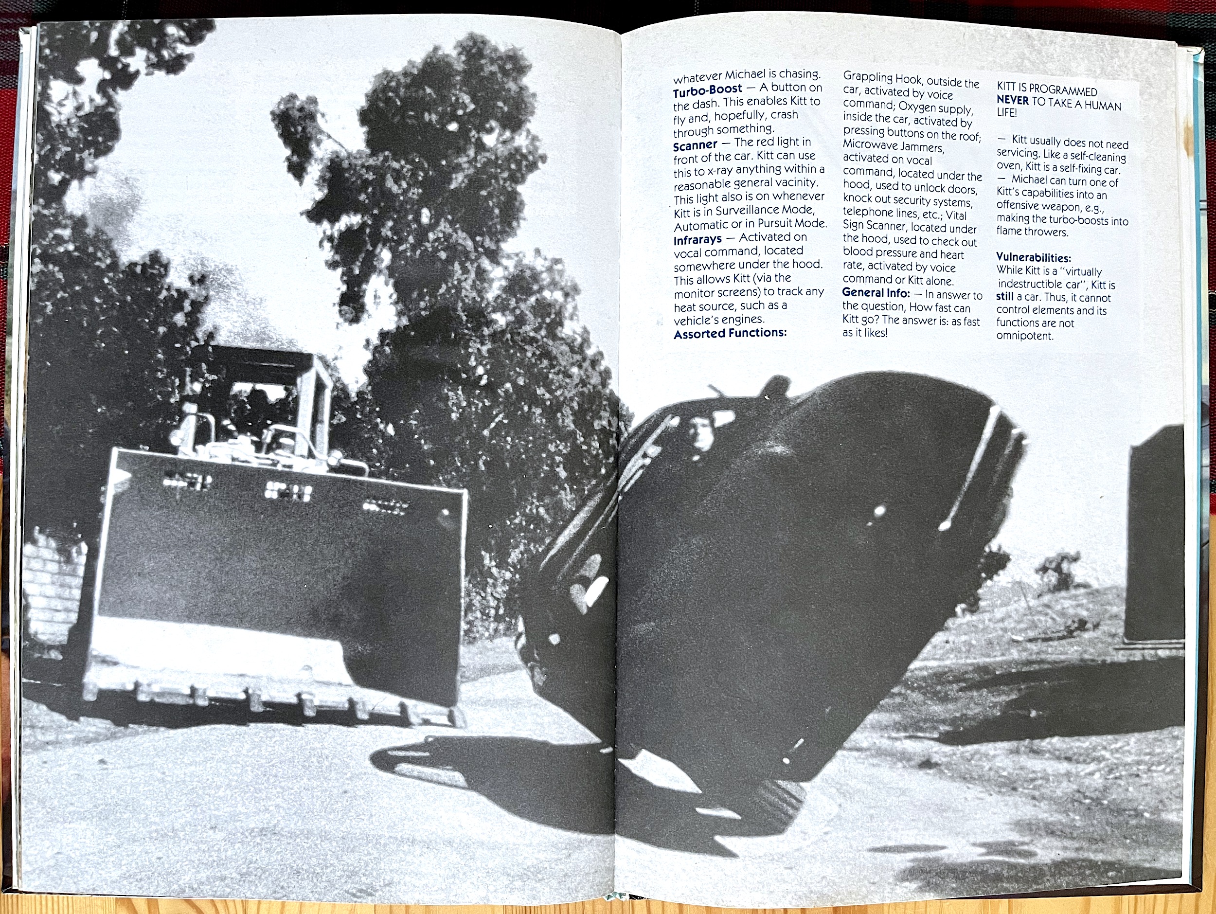
All this made features based around him even more exciting, even if he only got three pages to himself this year. What we do get is a fun little look into how his personality changed over the first and second seasons, a more accurate representation of his capabilities and limitations compared to the previous annual, as well as the physical gadgets of the car in which he resides (such as Turbo Boost etc). Although, it’s a bit of a stretch to say he “is also self-repairing, and rarely has to go into one of F.L.A.G.’s garages for servicing”. While this sounds more in line with the 2008 sequel series, it’s actually a reference to his ability to self-diagnose, a highly advanced feature of high-level computers at the time.

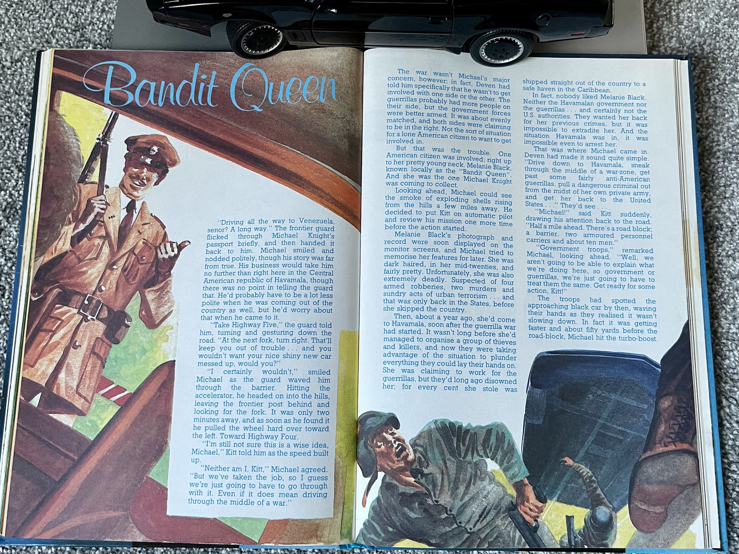
Back to the fiction and prose story Bandit Queen is another standout.  The fictional Central American Republic of Havamala has been at war for a while now, the government and guerrillas pretty evenly matched and neither side making headway. The once beautiful country has been devastated by battles and Melanie Black, the ‘Bandit Queen’ has used this as the perfect cover. Originally pretending to be on the side of the guerrillas, they disowned her after discovering she’s wanted in the US for armed robbery, murder and terrorist offences. With no hope of official extraction in the middle of a war, Michael and K.I.T.T. find themselves crossing into this dangerous land to find Black and bring her back to America for trial.

Straight away the dialogue between our two heroes is perfect. The way they speak to each other matches the rhythms of the series in such a way I could hear David’s and William Daniels‘ voices as I read it. The journey to Black’s compound is equal parts action and lovely descriptive moments of the tragedy of war as Michael sees the potential in the country and its people destroyed by the fighting. It’s a surprisingly mature outlook on the consequences of war and completely fitting for the character of Michael. He’s a Vietnam vet and clearly recognises this scenario.

The second Knight Rider Annual is a perfect example of the genre and offers depth and interest beyond what you’d probably expect

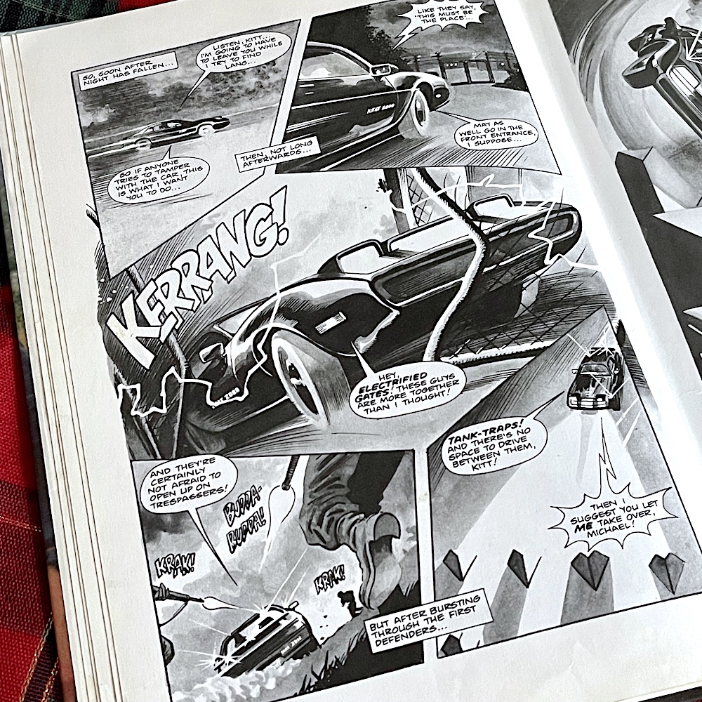
So, under the cover of night, and with Black’s compound shrouded in darkness with no lights to give away its position to enemy aircraft, we’ve the perfect set up for this unique partnership to strut their stuff. Using K.I.T.T.’s sensors to sneak up on the gate, Michael disabling the guards while K.I.T.T. disables the electronic alarms, scanning for their target, deducing possible routes through the buildings, analysing their tactics together, it all feels just right. It’d make a hell of a great episode too, especially when, just like the best TV stories, it doesn’t go as expected.

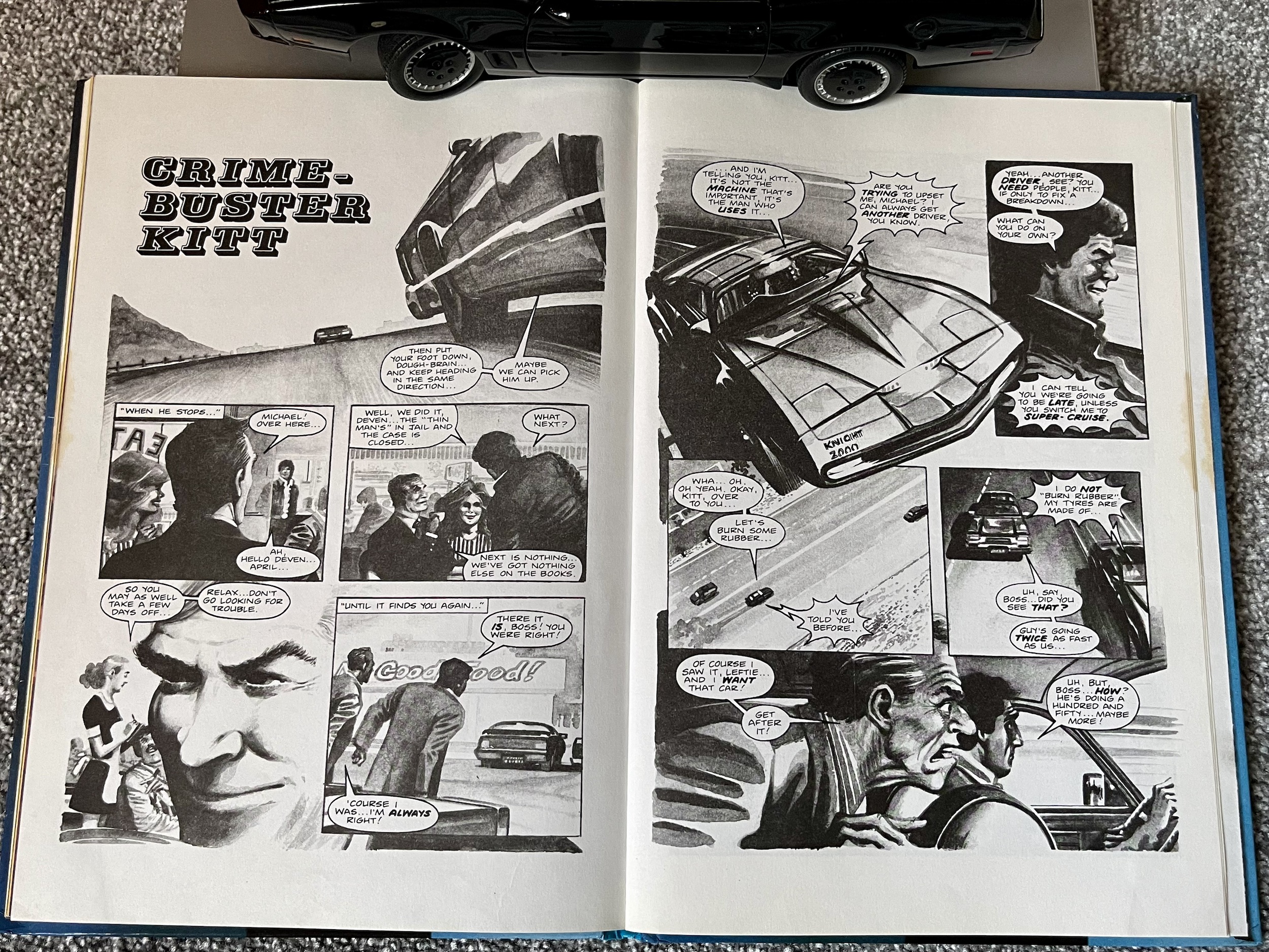
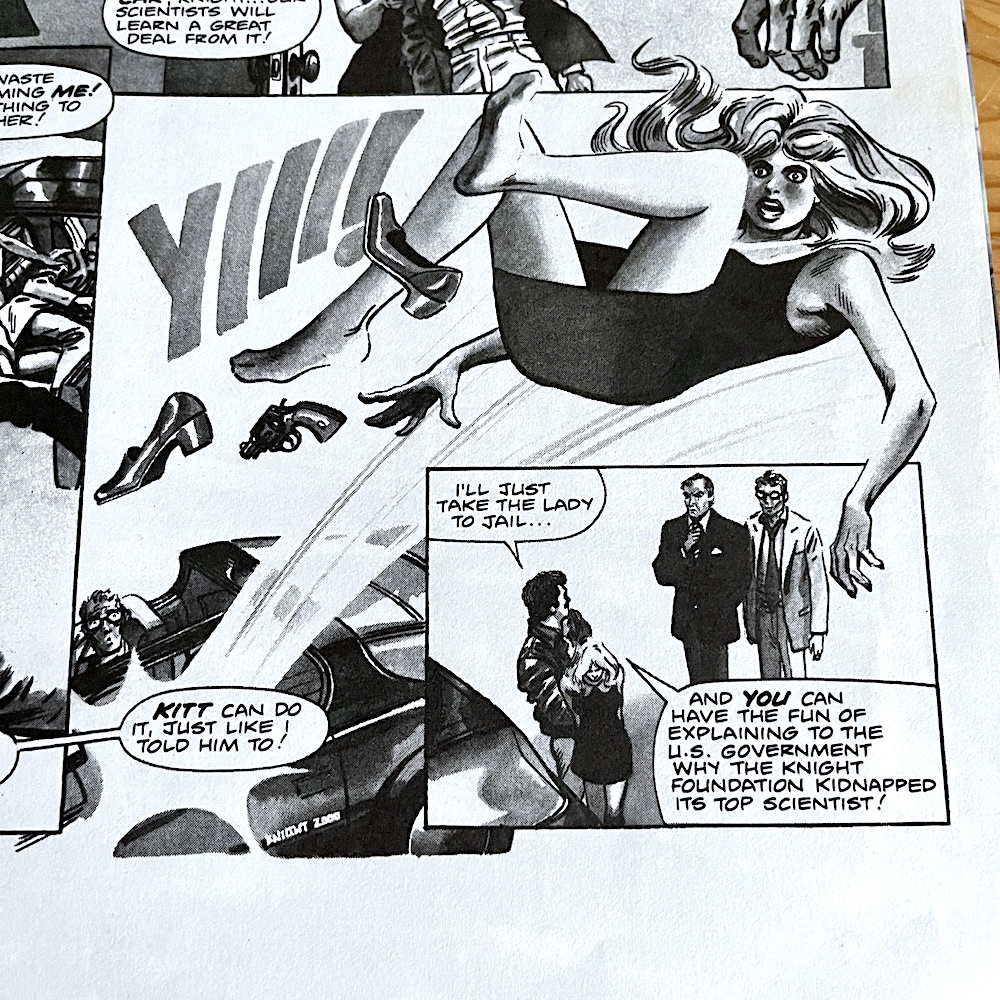
A last minute upset means the carefully worked out plan is thrown out and they have to act by the seat of their pants, or the treads of their tyres. It’s great fun and rockets towards the end without sacrificing any of the earlier depth or characterisation. By contrast the final strip, Crime-Buster K.I.T.T. is a fun little distraction, even if it is another idea taken direct from the television, as two criminals con their way past Michael to steal his car.

We can’t say this is a coincidence this time because right back in the pilot movie Jackson and Browne (hilariously played by Michael D. Roberts and Bert Rosario) tried a few times to steal the shiny new Pontiac Trans Am and eventually succeeded. What K.I.T.T. put them through, and how he got rid of them in the end by driving to a police station and literally ejecting them into the hands of the law, is exactly what happens here, albeit with different characters. This similarity makes the strip rather forgettable, it would’ve been better as a fun reenactment of a favourite scene for younger viewers. But hey, any excuse to get such lovely David Lloyd artwork is fine by me.

The second Knight Rider Annual is a great book for fans and curiosity seekers of 80s retro goodies. This is a perfect example of the genre of 80s TV tie-ins and offers depth and interest beyond what you’d probably expect. It feels like a proper progression of what came before, despite the lack of K.I.T.T.-based features, but we did get plenty of them last year. What will the rest of the series contain? As Knight Rider is my favourite thing in the universe I can’t wait to find out, and you’ll find out right along with me during Christmas 2024.

Don’t forget there’s also a special interview with David Lloyd already up on the blog, in which he reminisces about working on these first two books and shared some of his original design sketches.

ANNUAL 1 < > ANNUAL 3

ANNUALS MENU

CHRiSTMAS 2023

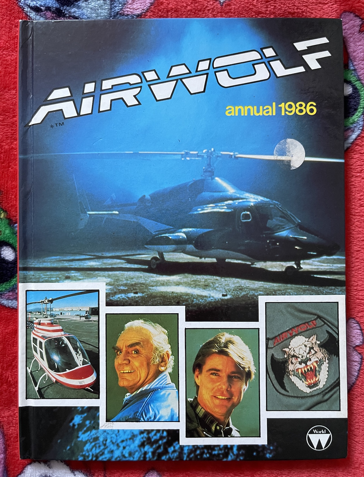
AiRWOLF ANNUAL 1986: FLYiNG HiGH?

The almighty trinity of 80s TV shows for me were Knight Rider, Airwolf and The A-Team. A finer trilogy of series would be hard to find. With Michael and K.I.T.T. already enjoying their own yearly real time read through it’s time to move on to Stringfellow Hawke, Dominic Santini, Michael Coldsmith-Briggs III aka Archangel and their supersonic hi-tech helicopter, Airwolf. Unfortunately there was only ever one Airwolf Annual, released for Christmas 1985. Is it a goodie?

Unlike the majority of licenced annuals I read as a kid this one wasn’t produced by Grandreams or Marvel and instead was published by World International Publishing. I recognise the logo but am unaware if I ever owned any of their annuals to gleam what this might be like in comparison to Grandreams’ Knight Rider books for example, so the only way to find out is to nose dive right in.

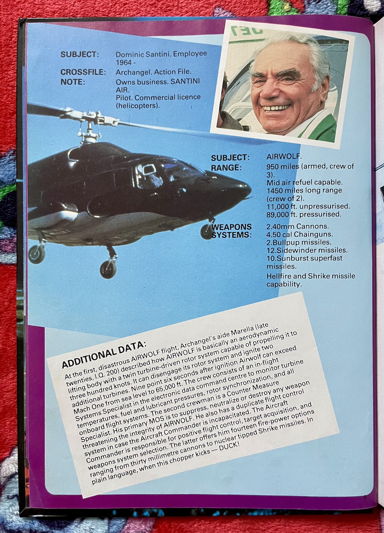
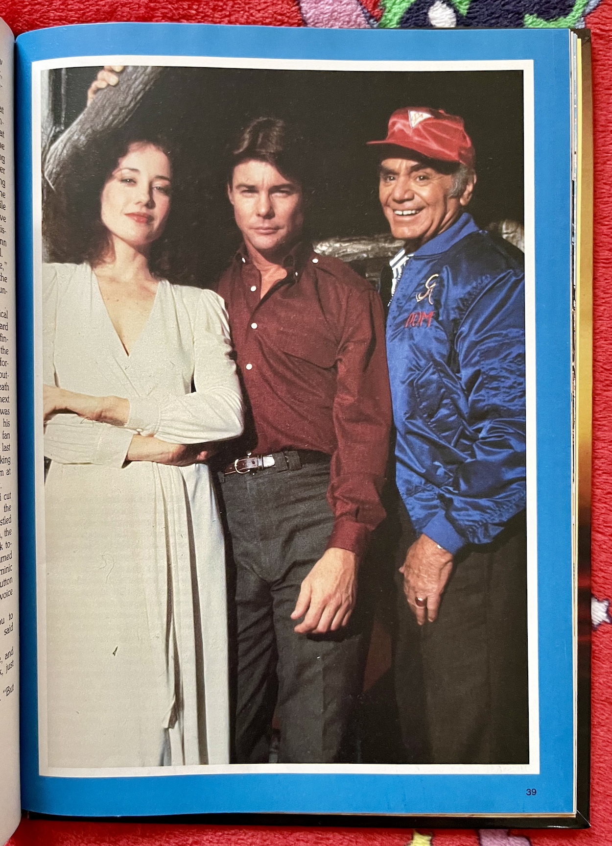
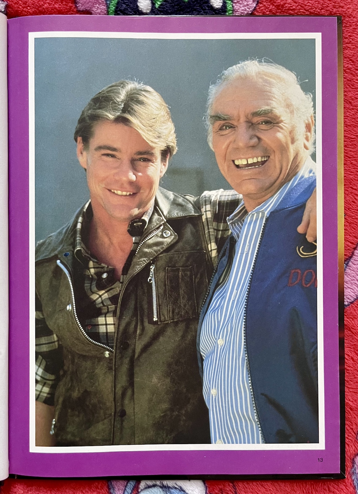
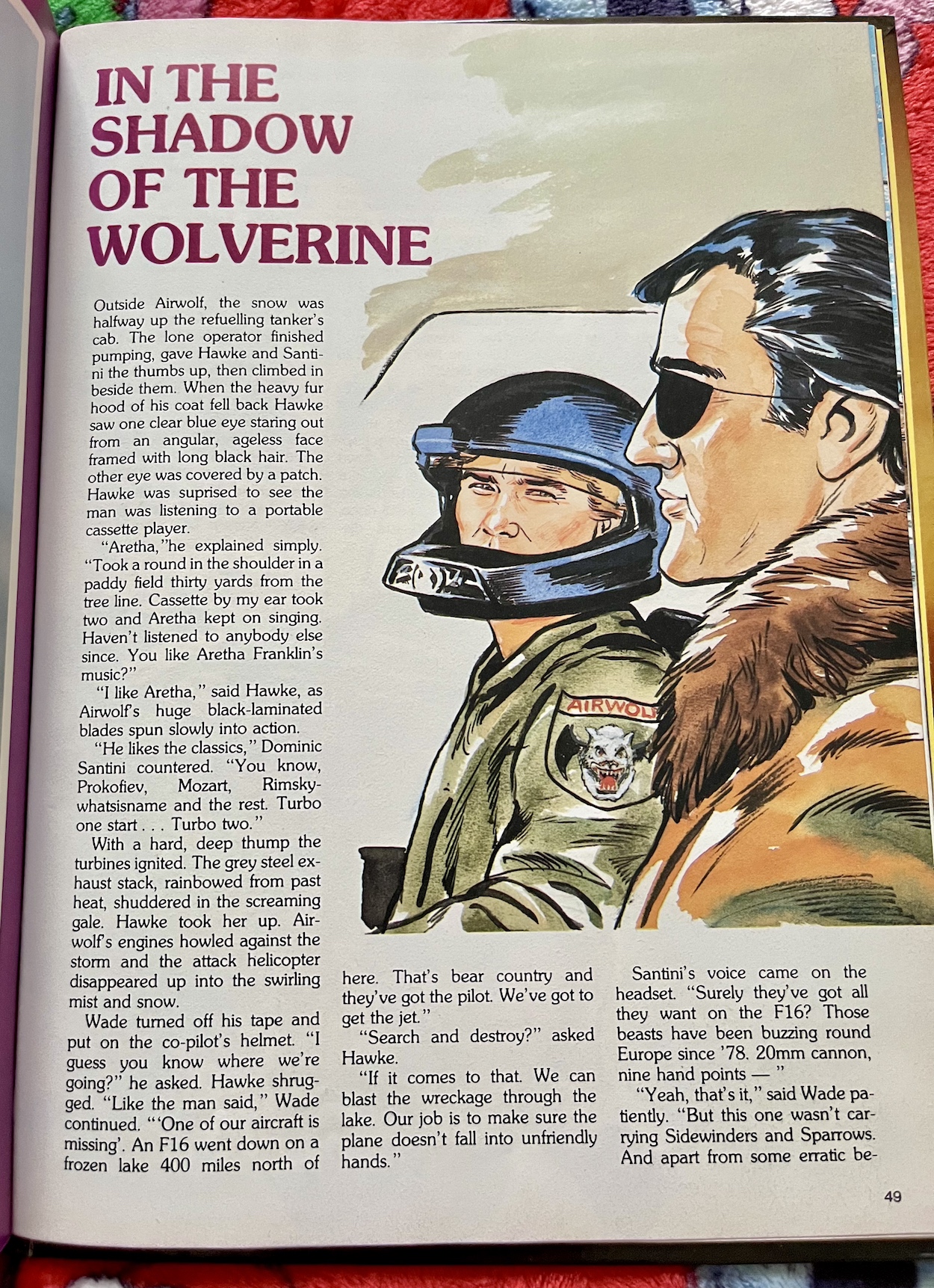
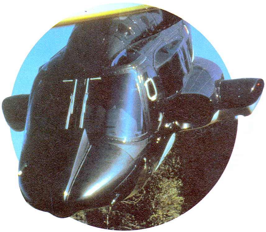
The opening spread is a good start, with a rare behind-the-scenes photograph from the series. Airwolf itself (or “herself” as the characters would have said) was a gorgeous piece of production design. Underneath it all is a standard Bell 222A chopper, not that you could tell! A few years before Airwolf the writer of the Blue Thunder movie, Dan O’Bannon, described that film’s helicopter as a “fast, black wasp” in his script, then described what appeared on the screen as a standard helicopter with a whole bunch of crap hanging off it.

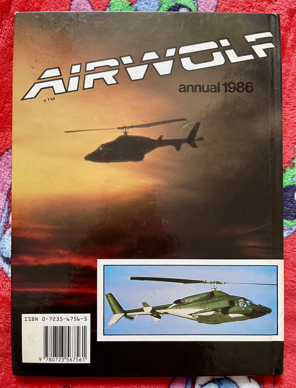
Airwolf definitely fitted his original idea much better. The idea behind it was a wolf in sheep’s clothing (hence the uniform patch you can see on the cover). It was meant to look like an executive helicopter until battle commenced, when guns and missile launchers would slide out, and inside was a control centre full of technology for use on covert operations that made us 80s kids drool.

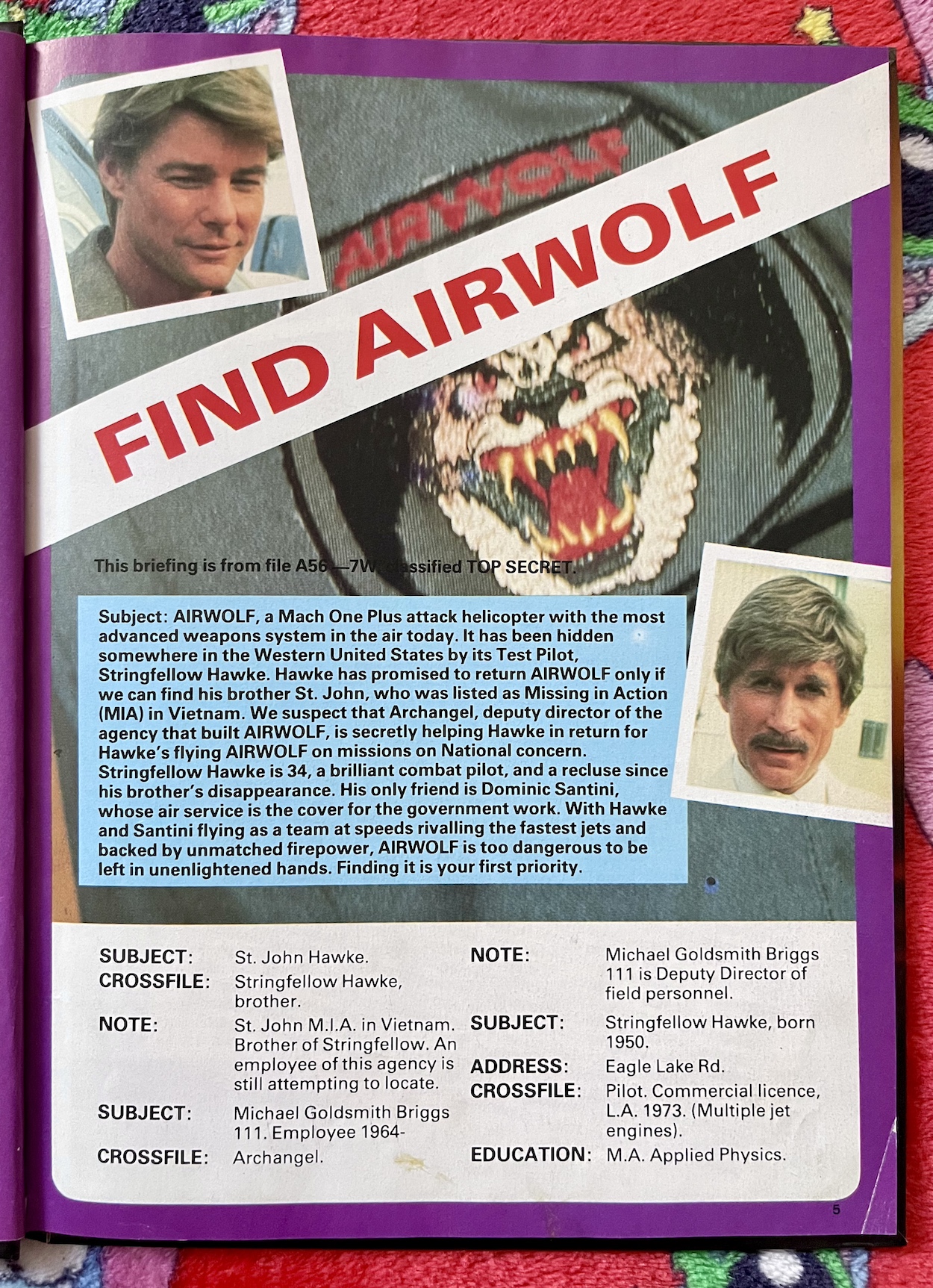
The book kicks off with a quick two-page fact-file feature. It’s not brilliantly designed but does include the introduction used as part of the opening credits in season one and a word-for-word recreation of Marella’s (Archangel’s top assistant from The Firm) description of Airwolf from the pilot movie. Well, it’s almost word-for-word. Apparently the original ending of “Airwolf is a Mach 1+ chopper that can kick butt” was too much for the annual. Really?

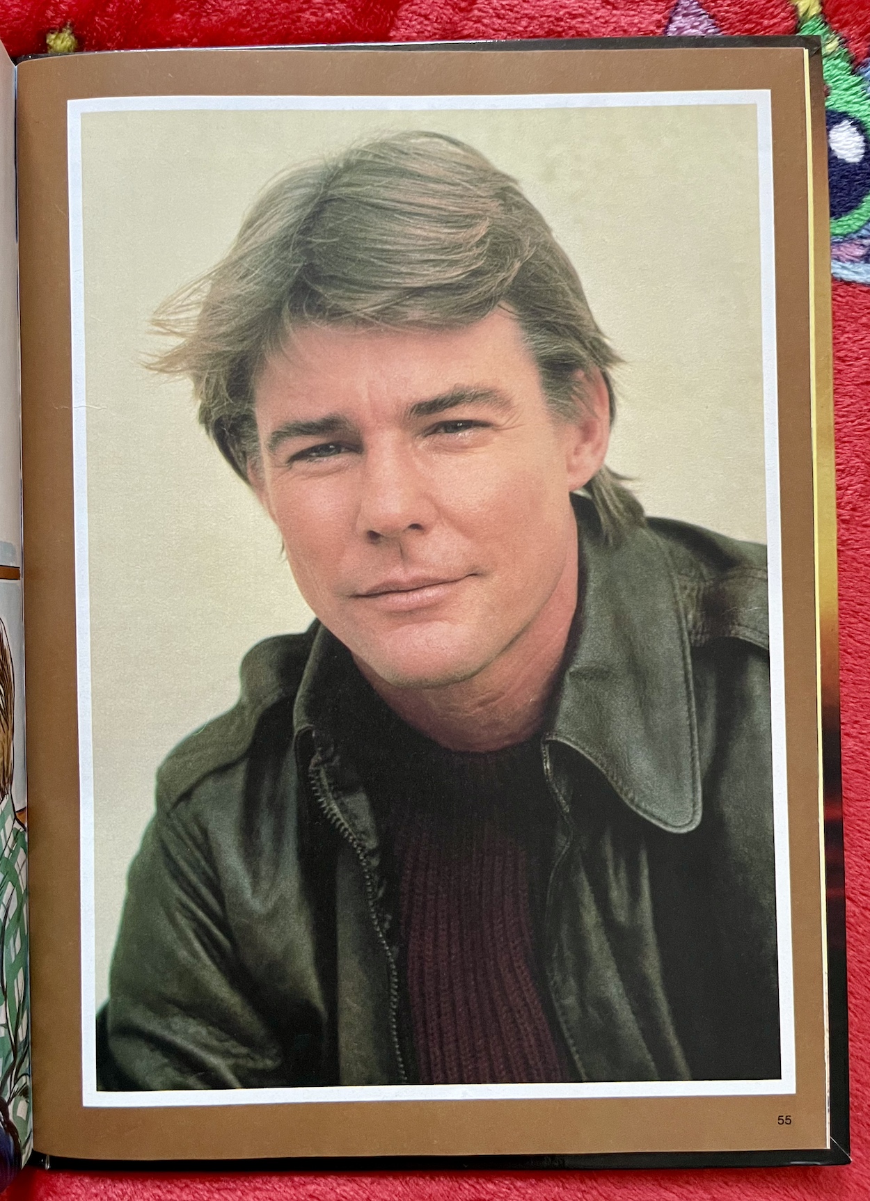
Unlike the Knight Rider annuals which had a pretty even mix of gorgeous comic strips and prose stories, pin-ups, interviews and behind-the-scenes features, Airwolf’s annual is more basic in its list of contents. One lone strip is accompanied by no less than seven text stories. There are a small handful of pin-ups, a basic board game, a helicopter name wordsearch and a two-page look at some other helicopters from the real world (not exactly ‘exclusive’ content).

So yes, the prose stories are the main (turbo) thrust of this book and in general they’re very good, each one reading like the final act of a really enjoyable episode. There is a big caveat with that though, which we’ll get to in a bit. Unfortunately there’s no indication inside the book of who wrote these. Whoever it was seems to have had a good handle on the show, at least the first season which was probably all that had been shown in the UK when this was written well in advance of its publication date.

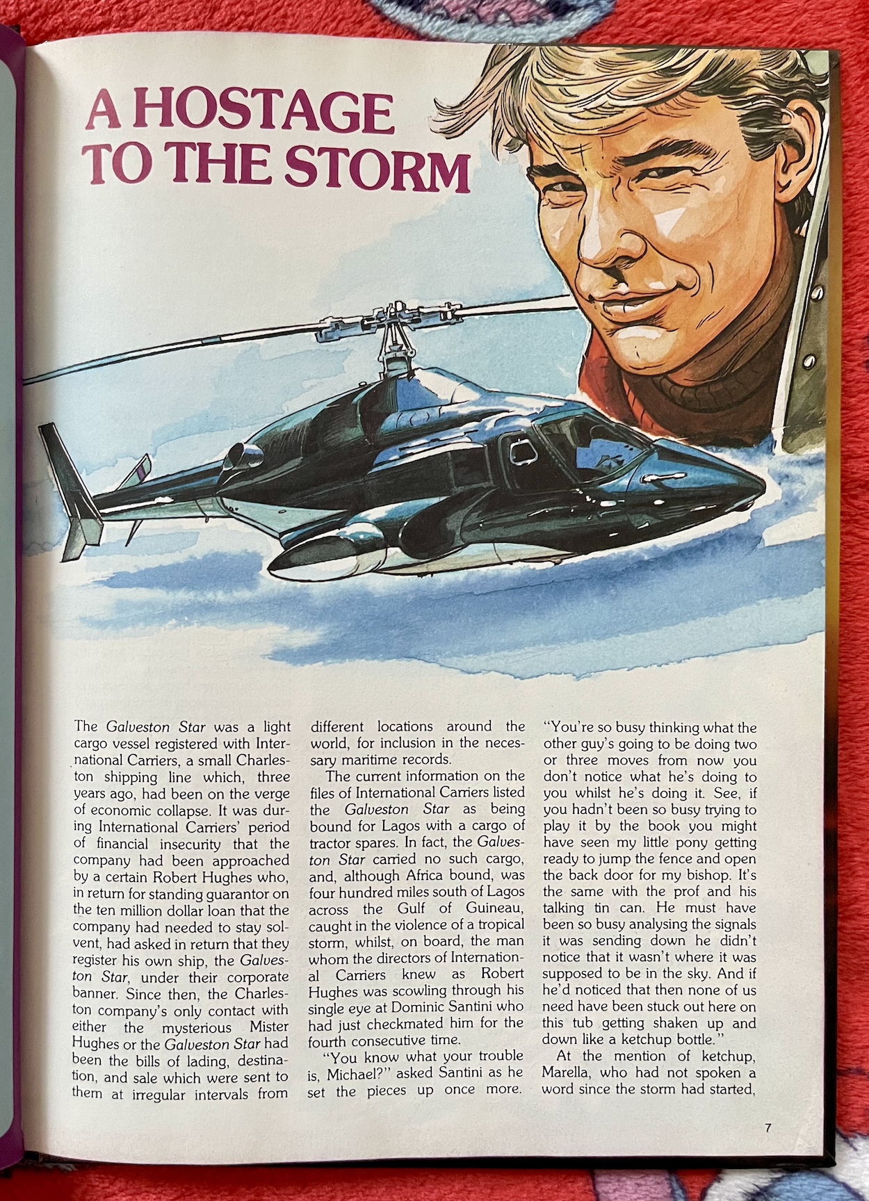
The best stories are A Hostage to the Storm and Border Incident. The former is the first in the book so we’re off to a great start. It has an interesting setup in which the cargo ship Galveston Star makes its way through a buffeting storm, described as a vessel procured by a mysterious man called Robert Hughes, who paid off the shipping company’s $10 million loan in return for registering his ship with them. Apparently used to shift tractor spares around the world no one has ever been able to confirm this.

In reality Robert Hughes is Archangel and the Galveston Star is used to ferry Airwolf to far off countries, kind of like how the semi-trailer truck transported K.I.T.T. in Knight Rider. I love this idea and wish the series itself had implemented it. The Firm has lost contact with a weapons satellite and are taking its creator, Professor Viljoen to Angola where he’ll go up in Airwolf to try to reestablish contact before it falls into enemy hands. Except, it’s all a ruse.

The Professor’s son has been missing since Vietnam and he’s exhausted all his options to find him. Even the government seems to have given up. He thought once The Firm was in Angola where he’d safely landed the satellite (after finding out his son had been taken there) and he told them his story, they’d have no choice but to help a desperate father. Of course Archangel fumes about the betrayal but String and Dom think they can help.

The scene is something the show just wouldn’t have been able to reproduce, so it’s exactly the kind of thing fans would love to read

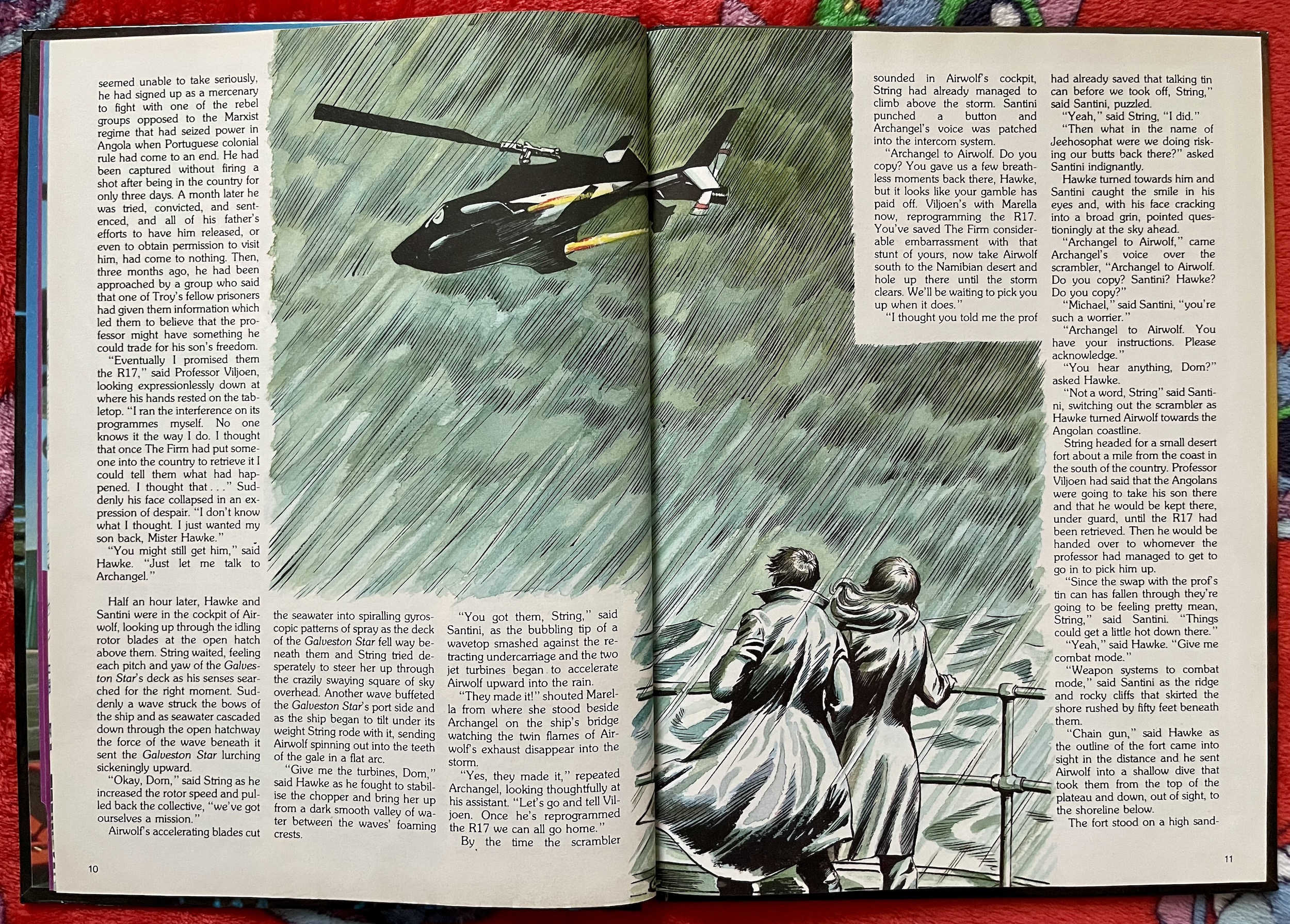
With Angola, Cuba and Russia all involved in the plot the writer is very familiar with the Cold War stories of the show’s first year. There are also plenty of great character interactions, everyone acting just as they would on TV, especially our Airwolf crew’s patter and the way they’re able to manipulate Archangel into doing the right thing. There’s also a thrilling take off from the cargo bay of the ship in the middle of the storm, the ship swaying wildly while Hawke expertly counters the movements as they hover inside the ship and finally take Airwolf out into the safety of the sky.

The only real problem here is the choice of images to illustrate the story. The scene I’ve just described in particular is something the show just wouldn’t have been able to reproduce, so it’s exactly the kind of thing fans would love to read. However, it’s illustrated with a rather bland image of Airwolf moving away from the ship with Archangel and Marella apparently watching. I say apparently, because we only see them from the back.

This leads me on to the main problem with the annual: the art illustrating the prose stories. Any images of the characters or of Airwolf itself are copied straight from stills of the show, as if they’ve been traced from a television screen. With every single image I could point you towards the episode and scene in question (I’m a huge fan if you hadn’t guessed) that has been passed off as original art. It’s like an 80s version of all that terrible A.I. art.

It means very few of the illustrations relate to the plots of the stories. Any that are original are pretty poor and have as little detail in them as possible, such as above with characters facing the other way. In another drawing in the book String, Archangel and Marella are recoiling from an explosion and they all just happen to have their hands covering their faces so the artist doesn’t have to draw them. Although, you can see enough of Marella to see she’s been portrayed as a white woman! This is just laziness (and offensive).

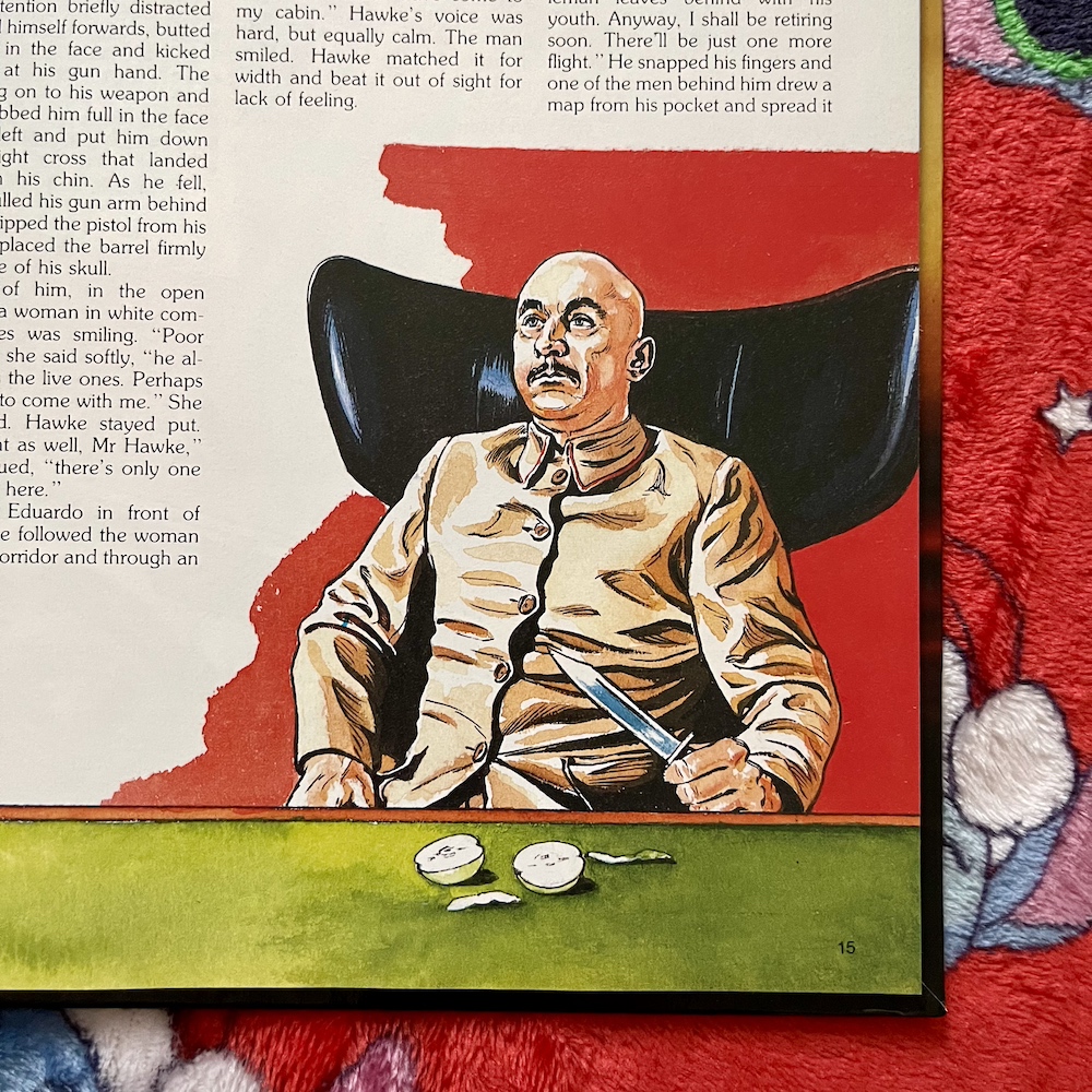
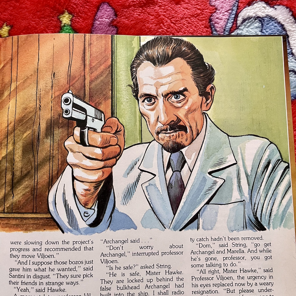
Then we get to the villains. Obviously these are original characters so surely they have to be drawn properly? Have a look at these three examples. No, I didn’t realise Donald Pleasance‘s Blofeld, Gert Frobe‘s Goldfinger or Peter Cushing were all Airwolf characters either. (Thanks to OiNK‘s David Leach for helping me name Peter here – he was on the tip of my tongue!)

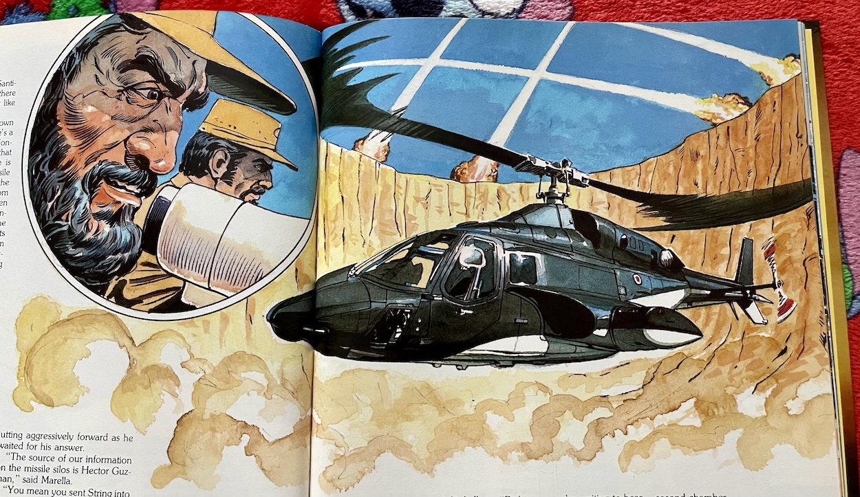
For a show that was so visual, that had such incredible aerial photography, the annual falls drastically short in this regard. The artist chosen to illustrate the vast majority of a book based on such a TV show seems to be completely out of their depth. Thankfully renowned IPC/Fleetway artist Sandy James steps in for the six-page comic strip tucked away in the middle of the book, called Snow to Eskimos. However, it appears even one of my favourite Ring Raiders artists isn’t that familiar with the source material either.

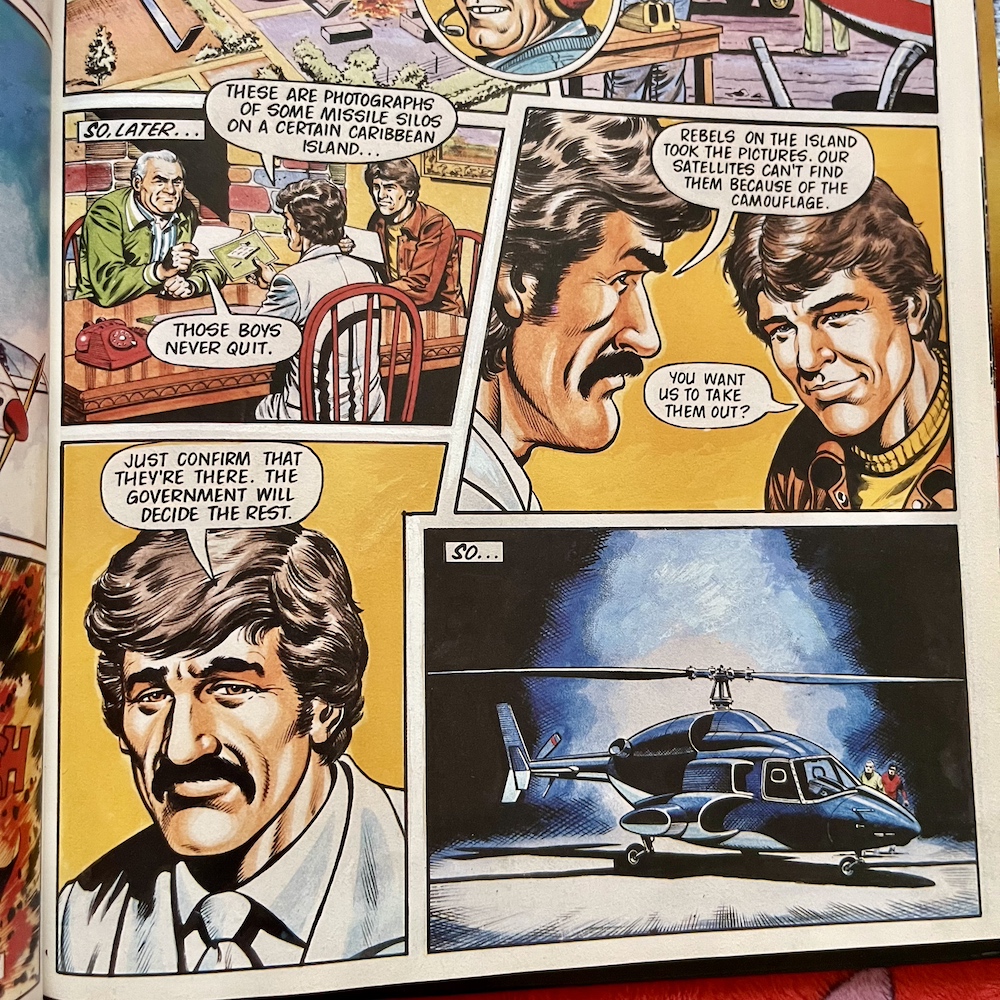
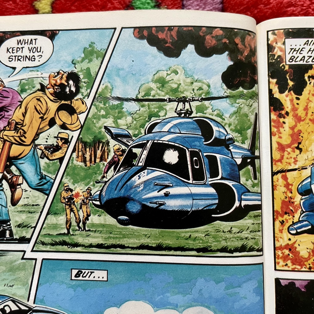
This first image brought me a lot of hope. Despite Airwolf being completely the wrong colour at least it looks like itself and Sandy hasn’t resorted to copying images from the show. However, as fans will see below, it all goes downhill from there. What is that interior all about when the missiles are actually launched from the flight stick? Since when did Airwolf have DeLorean doors? Where is Archangel’s eye patch?

That last panel in particular makes me think Sandy had never seen the show, which is fair enough, but after David Lloyd told me all about the research he did in order to draw the Knight Rider annuals it’s very disappointing. If Sandy was only working from a script then it was clearly written by someone unfamiliar with the show and not our prose stories author. It’s a truly terrible script, with dull, robotic dialogue and little of consequence happening.

However, the annual’s main writer definitely knew their stuff! Let’s have a quick run through of the other stories before I tell you more about my second favourite. 

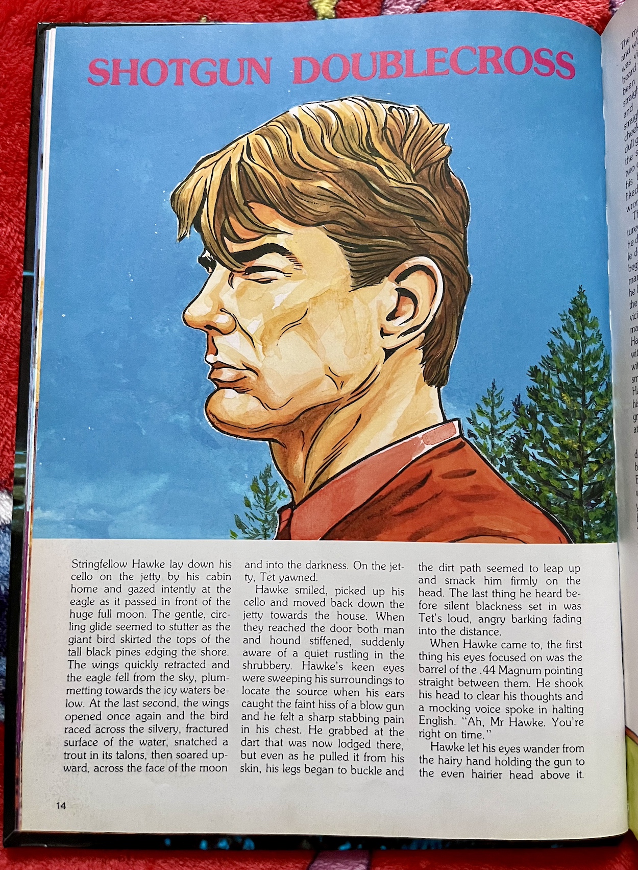
Shotgun Doublecross starts with all of the key Airwolf visuals. The cabin. The lake. The eagle. The cello. Tet the dog. Hawke’s insanely good hearing. He’s kidnapped from his home and told he must use Airwolf to help traffic some planes across Mexican airspace for a cartel because his long-lost brother Sinjin is also on board. He goes up against The Firm for this one and there’s some great dialogue between the key players. You can almost hear the actors saying their lines.

Desert Death Trap is a basic rescue mission story but is imaginatively portrayed, the action playing out just like one of the show’s thrilling dogfights, painting exciting pictures in the readers’ heads (to make up for the ones on the page). Flames Over the Water revisits the death of Hawke’s family on the lake, something only touched upon in the pilot movie. The opening page in particular is surprisingly beautifully written for an annual.

The so-called villain of the piece is seeking revenge on the US because of the death of his one true love by indiscriminate American bombing campaigns, placing the Airwolf crew in a more sympathetic position. Then In the Shadow of the Wolverine involves a covert op for The Firm gone wrong, a Cold War prisoner swap in a blizzard and a brilliantly written character whose allegiances kept me guessing to the very end.

It paints a wonderful picture of serenity when the cabin didn’t feel like an isolated place but was instead full of warmth and love

Then there’s Day of the Hunter which is a very silly story right at the back of the book, so unfortunately the whole thing ends on a low note. Believe it or not it involves Airwolf, a train and another helicopter all inside a railway tunnel. No, really! If the rest of the prose stories feel like grittier season one fare, this is straight out of the still enjoyable but much lighter third and fourth seasons.

But back to that other story I’d listed as a favourite. Border Incident kicks off with Dom reminiscing about happier times, when all of the Hawke family were alive, happy and at home. It paints a wonderful picture of serenity when the cabin didn’t feel like an isolated place but was instead full of warmth and love, and the portrayals of String and Sinjin as children are both funny and feel completely accurate even though we never saw their younger selves on the show.

String has taken Airwolf on a mission alone. Now, fans will instantly think this isn’t possible because Airwolf needs at least a two-person crew. Unfortunately there’s no explanation of how that’s achievable, and some of the ‘copters abilities used here would be impossible without Dom being in the rear cabin. But we’ll forget about that and put it down to a simple misunderstanding on the part of the writer because the rest of the story is fantastic.

It’s an uncharacteristic but deliberate decision by String, setting the reader on edge right from the off. As it turns out this particular mission once again involves the possibility of Sinjin being found. But String was doubtful about the source of the information and wanted Dom to work the case from the outside, where the villain character wouldn’t be watching. Dom could go undercover and find out the truth, while being ready just in case they needed to fight their way back out.

Knowing Dom would never have allowed him to go alone he took Airwolf and then cheekily got Archangel and Marella to pick up Dom and tell him. There’s a very funny scene where Dom is ranting and raving to the two Firm operatives, not listening to a word of their explanation about the mission, until they tell him String knew he wouldn’t have allowed him to go alone. To which Dom suddenly calms down, basically says, “Yep, that’s right” and heads off on the mission!

There’s an exciting climax involving Airwolf down a booby-trapped mine shaft which again would never have been seen on TV, at least not without those very unconvincing models some of our action shows used back then. Again, there are no images to go with it, the closest being the one above which is basically the annual’s opening spread image of Airwolf with some poorly drawn cliff faces around it.

After all these years I never thought I’d get to discover any new Airwolf material

In conclusion, for fans this is really a book of two halves: the writing and the art. While it’s nice to see any artwork of Airwolf these days it’s instantly forgettable, however that shouldn’t put anyone off buying it. There are no introductions for those unfamiliar with the plot of the show but for those up to speed there are six great stories here (and the other two are easily forgotten). After all these years I never thought I’d get to discover any new Airwolf material so that in and of itself has been a joy.

For most fans season one is the best of Airwolf and the closest to creator Donald P. Bellisario’s vision (before the studio started interfering from season two onwards). The annual keeps to the Cold War theme of that season and the humour of the interactions between the main characters is present, cutting through the drama and intrigue perfectly. On the one hand it’s a shame there isn’t more variety to its contents, but now that I’ve finished it I wouldn’t want to sacrifice any of those six great stories to fit other things in.

The book is easily found on eBay for a few quid, so if you’re an Airwolf nut like me you really shouldn’t miss out on this. Reading it can be bittersweet at times when we remember we’ve lost all three of the main actors in recent years, but the memory of their characters lives on. For me that’s through the BluRay set on my shelf, now proudly accompanied by some superb writing in the Airwolf Annual 1986.

ANNUALS MENU

CHRiSTMAS 2023

NO.73: COME ON iN

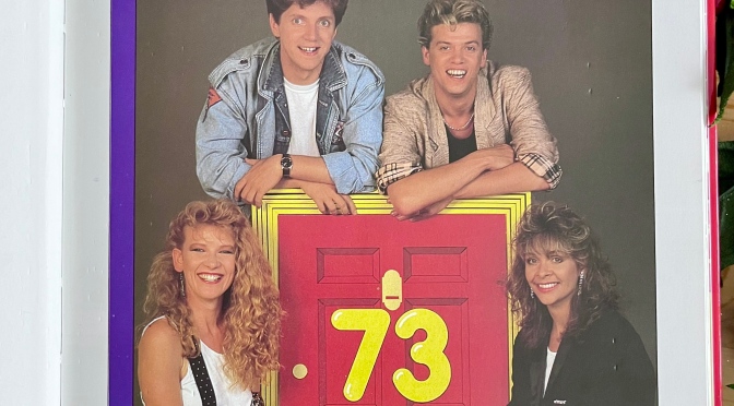
This hardback book cover brings back memories of many a childhood Saturday morning in front of the telly, hence why this post is being published on a Saturday morning. No.73 was a fictional house in an unknown street where Sandi Toksvig played the tenant Mrs Ethel, surrounded by a cast of young up-and-coming talent, including Neil Buchanan who would go on to present the insanely good Art Attack in later years. A certain papier-mâché-headed OiNK superstar also popped up now-and-again and thus you have the reason for this book’s inclusion, despite the fact it contains no comic strips.

Sadly the book also doesn’t contain any Sandi. I loved her on the show, although I always knew her by her real name (she was one of the main writers too) and I don’t remember the fact she played a character. Her ad-libbing (often as herself and not in character) and dead pan humour was brilliant and to this day I’ll pretty much watch anything with her in it (QI has never been better). Being a fan of Sandi’s all started with No.73, however this book was produced in 1987 and she had departed the series in 1986 after four years as the lead.

Now, those who have been paying attention will know this isn’t the first time No.73 has been mentioned on the blog.

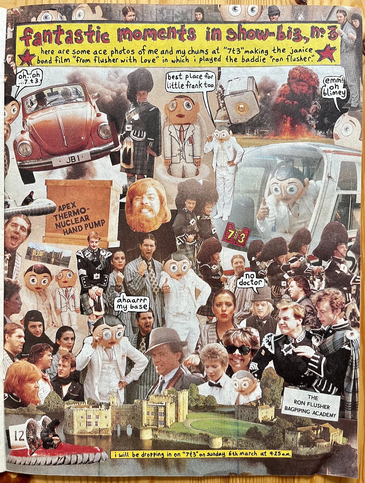
This montage was taken from Frank Sidebottom’s time filming during the show’s final year, when it was renamed ‘7T3’ and had an American Wild West theme (which I remember being terrible), although Frank is seen here taking part in a very British James Bond spoof. As I mentioned in #52’s review I loved seeing Frank pop up on No.73 and in my head he appeared at the breakfast table or in the shed many times. Imagine my surprise when I found out he only appeared in nine episodes!

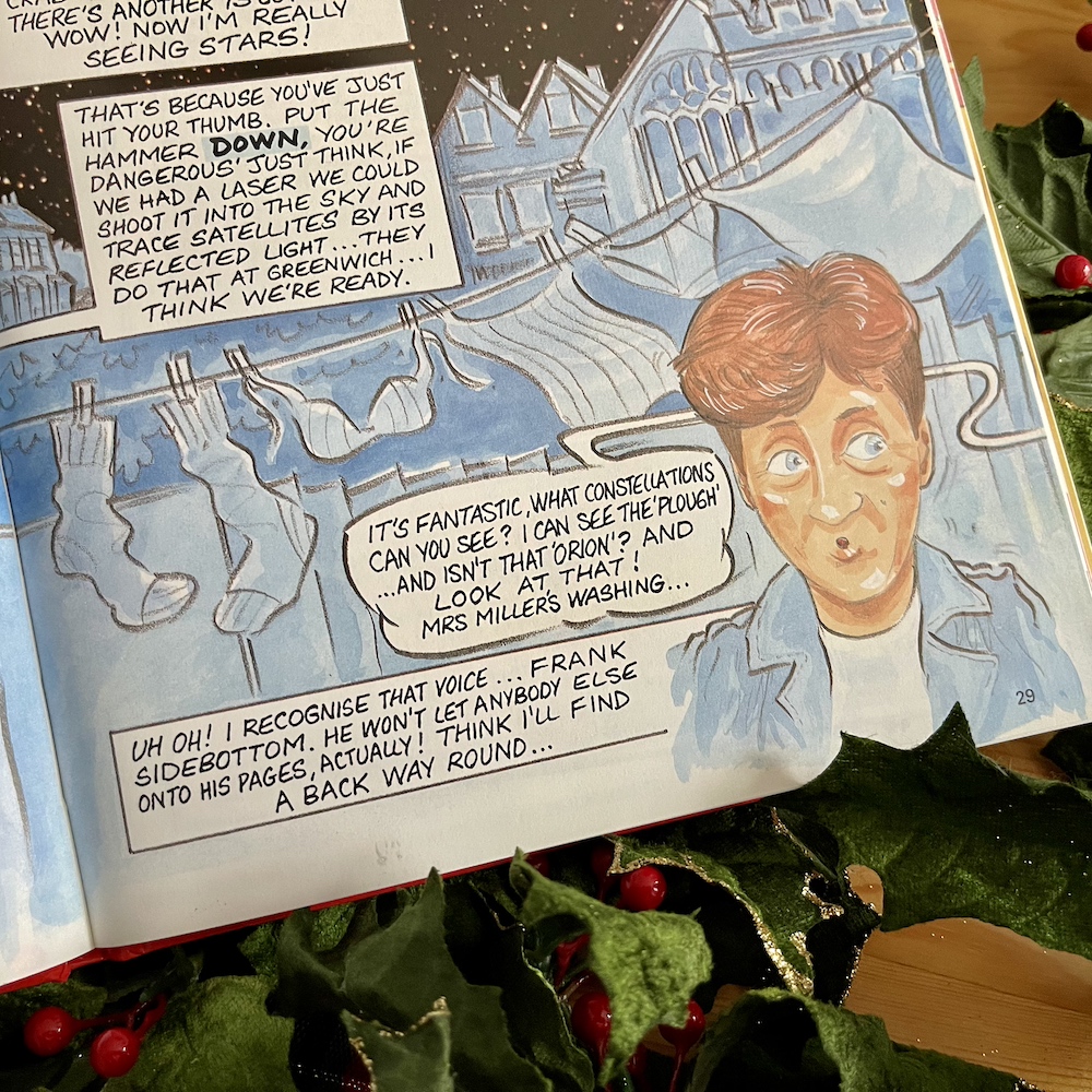
Anyway, I said there’d be a special post to come later in the year and here we are at last. Just before Frank’s double-page spread the book shows readers how to make their own space observatory but, like a lot of such things on the show, it was more of a spoof of what you’d see on traditional children’s shows. As such, take a saucepan, shove a football in it and sellotape a pair of binoculars on top and you’ve got a rotating observatory! Neil is star gazing in the garden of the house when he hears a certain nasally voice.

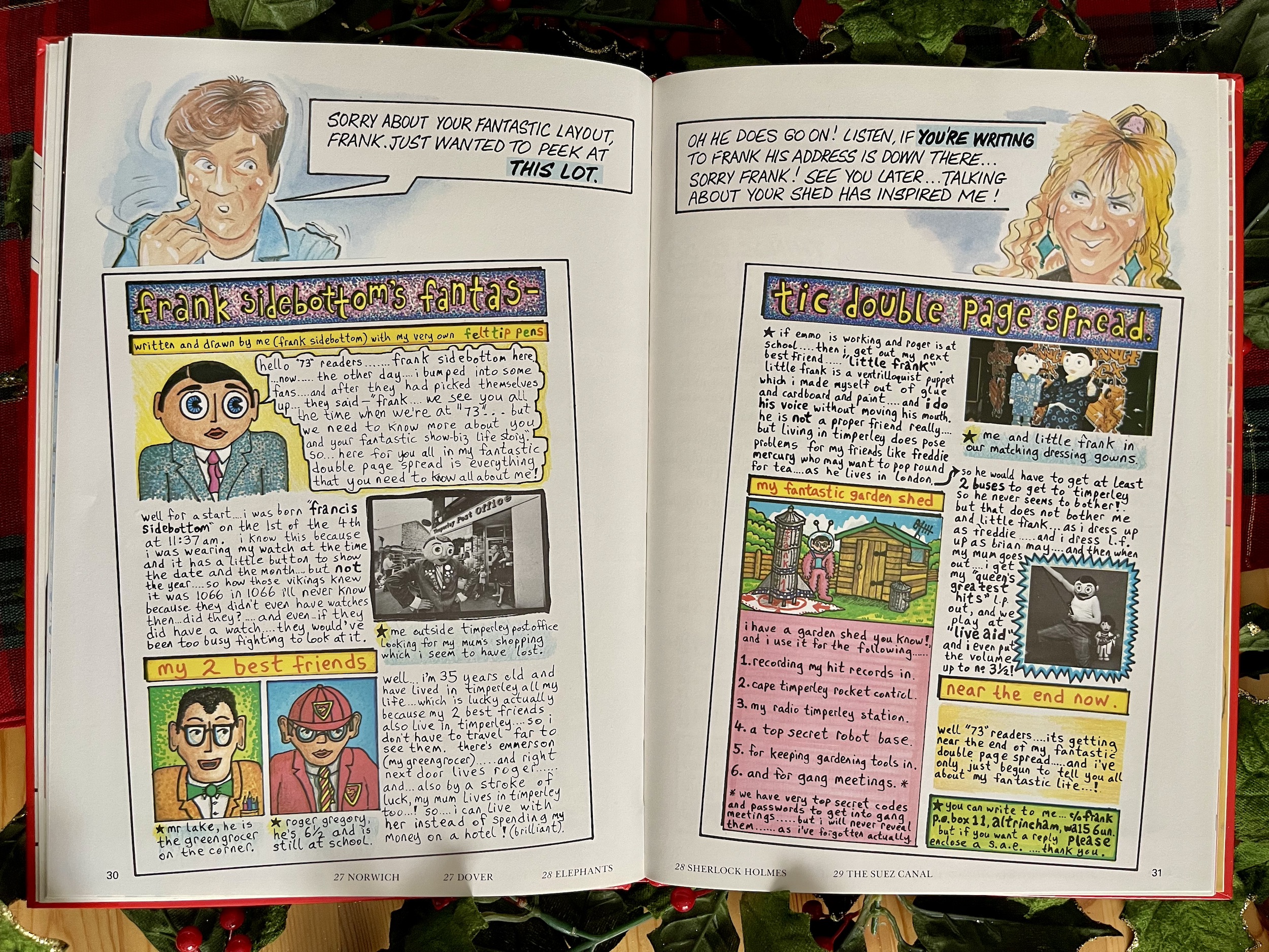
The book has 64-pages and every single one is illustrated by Don Seed, except for the next two that is. Unfortunately Frank’s pages, which are very similar to those he was producing for OiNK at the time, are reduced to fit in pictures of Neil (who played an exaggerated version of himself on the show) and Dawn Lodge as played by Andrea Arnold (now OBE).


“I was born ‘Francis Sidebottom’ on the 1st of the 4th at 11:37am. I know this because I was wearing my watch at the time and it has a little button to show the date and the month.”

Frank Sidebottom (Chris Sievey)

Andrea is now a filmmaker, has won an Academy Award, and more than one Jury Prize at Cannes as well. Amongst all of her other work she also directed all of the second season of Big Little Lies. As for Neil, alongside Art Attack I remember enjoying Finders Keepers and Motormouth as a kid, and his art was so good he even had to deny he was Banksy in 2020. Anyway, back to the star here.

This acts as an introduction to Frank for those who had seen him on the show and wanted to know more about him. It includes staples of his OiNK contributions such as Timperley (and its Post Office), Little Frank and his celebrity lifestyle. For the latter we get a superb reason why none of his celebrity friends ever seemed to visit him.

I love the volume he dares turn his music up to in his mum’s house when she’s not there and let’s not overlook that fantastic shed of his. This often featured in OiNK, he had his own TV show based around it and here we get a little list (he did like lists in OiNK) of the things he does in there. This leads on to the next spread in the book from Dawn, who has one or two ideas of her own.

Well, I say one or two…

I think this is a great follow up and it even mentions Little Frank in there too.

It was great to see two new Frank pages after getting to the end of OiNK’s regular run in October because, yes, I’m missing him already. The man behind the mask, Chris Sievey, gets a mention in the credits at the start of the book, although the four main cast members only get thanked so I’m assuming they didn’t write any of this themselves. Seeing as how they played fictional characters (or fictional versions of themselves) I guess there was no need to get them involved.


“You’re a mucky lot mankind, it’s time you grew up and started cleaning up after yourselves. Mother Nature’s got her work cut out coping with you as it is.”


There’s a large list of contributors with no indication of what each brought to the book, however it’s edited by Richard Morss who was a writer on the final two series (seven and eight) of No.73, the seventh being the one on TV when this book was released and the final to actually feature the house itself. The long list of contributors includes regular guests from the series such as animal experts and magicians etc. It was a varied show!

Unlike other Saturday morning programmes No.73 told ongoing storylines and character arcs over the course of each series which formed the backbone of everything else, even celebrity guest appearances were worked into these scripts rather than having straight interviews. There was even a fictional film company called Front Door Productions within the setting which was responsible for the sketches and video shoots spoofing whatever was popular at the time.

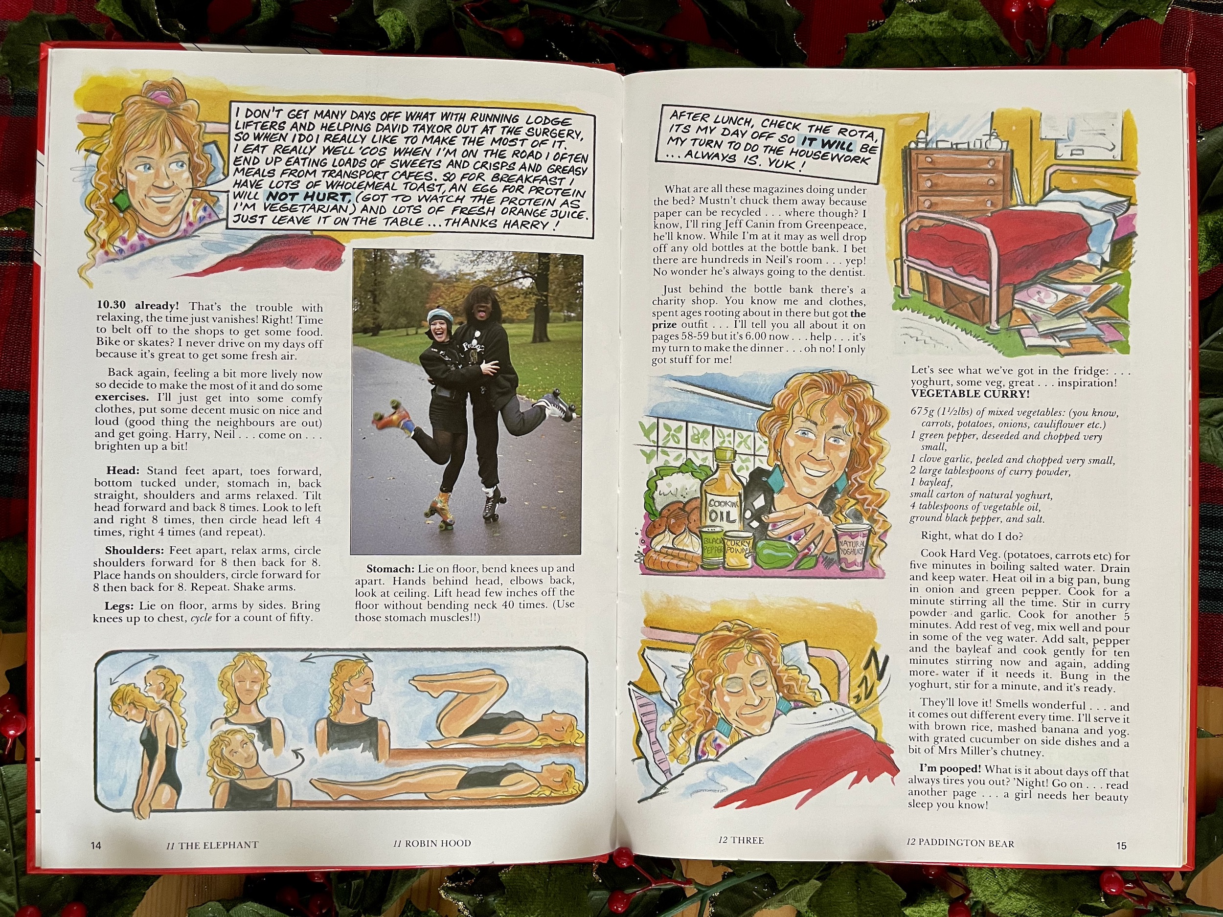
Long-time character Dawn helped out at the local vet’s and was a vegetarian, which was something not represented very well in the 80s, especially on children’s television. Her healthy lifestyle would be very on-trend today so you could say it was way ahead of its time. In fact, having someone follow an exercise routine and be a vegetarian was deemed so noteworthy we were treated to a day-in-the-life diary!

Kim Goody was, like Neil, playing an exaggerated version of herself on the show. Kim is a singer and songwriter, although the song she’d recorded at the time and talks about here (the show being a hopeful springboard to success) was a Tina Turner song and one I personally recognise as an Aswad and Ace of Base tune. It was not successful (as she candidly tells us here) despite her popularity with the viewers.

Nowadays, Kim has a composition and publishing company and owns Soho Square Studios, a post-production company. She’s married to former The Hollies band member Alan Coates and together they wrote the music for many BBC productions including those pounding BBC News scores. The final member of the team was Nick Staverson who played the character of Harry Stern, who I have absolutely no recollection of.

Harry appears the most throughout this book and seems to be a bit of a clichéd harmless idiot character. The actor portraying him doesn’t appear to have had as much success as the rest of the team, with his only real credits to date being No.73 itself, something called Fish Tank and a charity Telethon. He appears on this next spread with Neil and Dawn in one of the many pieces with an environmental or animal theme.

Alongside the spoofs of The A-Team and James Bond, the magicians, Frank Sidebottom, pop music, games and general chaos No.73 also drove home some important messages to its captive audience, messages which are sadly still needed just as much (if not more so) today. Watching No.73 was like watching several children’s shows at once and in particular during its Sandi years it was also incredibly funny and clever.

What’s here is an interesting snapshot of 80s children’s television in general

Obviously it’s been decades since I saw it; Saturday morning children’s magazine shows aren’t exactly repeat fodder. All I have to go on are my rose-tinted memories and this book. Judging by the book the variety had remained but the humour had changed after Sandi left. There’s none of the sarcasm and clever wit here that I remember, although when viewed as a variety programme what’s here is an interesting snapshot of 80s children’s television in general.

There could be moments when a book like this could feel very of its time, if you know what I mean. Thankfully, No.73 was created by a bunch of very nice people who seemed very progressive in how they lived their lives. So, the difference between Chinese astrology and that more often used in the UK being referred to as “theirs” and “ours” may make me cringe a little today but that’s literally the only time anything remotely like that happens in the whole book. It’s also a fun spread to read.

Anyone who knows me will know how much I love cats, so it’s a bit disappointing to find out that not only was I not born in a Year of the Cat, but that the animal would not suit me at all. I was pleased enough with being a snake… until I was called a skinflint! Oh, and if you’re wondering what all of the random words and phrases are along the bottom of every page, there’s a huge quiz at the back with so many answers they’re spread throughout the book, each one listed by their page rather than question number. It’s something a little different and that pretty much sums up No.73.

If you grew up with the programme I’d heartily recommend tracking down this book for a wonderful trip down memory lane. Its humour stands up well today, and while there are no comic strips I think a lot of it reads quite like OiNK, with its randomness, spoofs of more traditional children’s entertainment, digs at 80s culture and of course there’s a bit of Frank. This blog is all about reliving childhood favourites and this is as close as I can get with No.73. Reading this has been a blast.

ANNUALS MENU

CHRiSTMAS 2023

BiG COMiC BOOK 1988: TOME FOR CHRiSTMAS

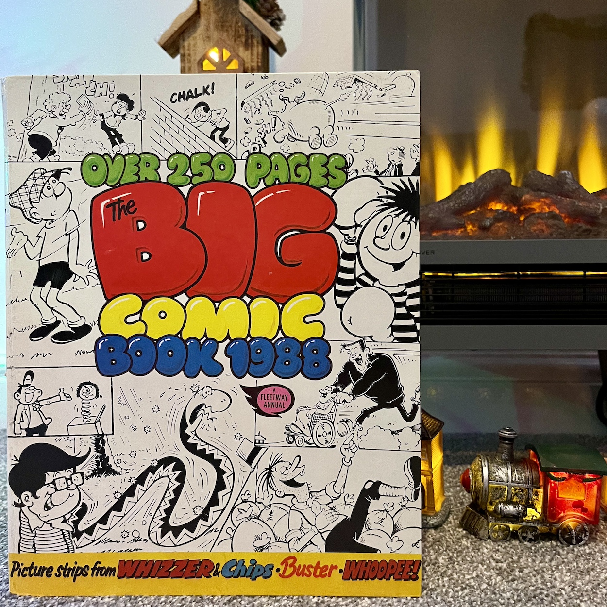
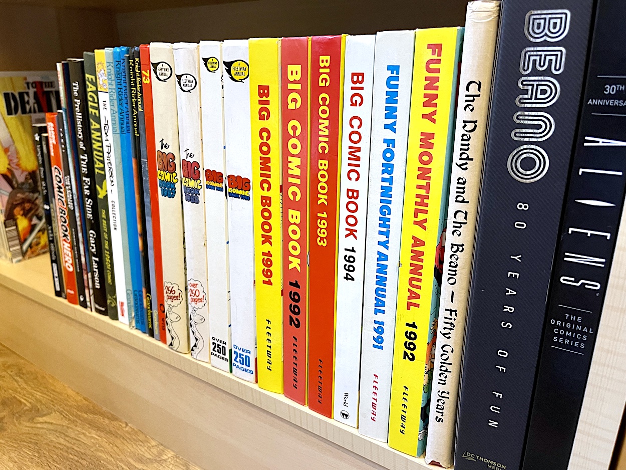
I may have covered the first in this series of giant tomes last Christmas but as a kid this volume was the first time I discovered Big Comic. This book would also lead to the release of Big Comic Fortnightly in June 1988 which I also collected for a couple of years. Christmas 1987 was the first year I received my own comic annuals and I’ll admit it was a while before I read this that festive season because I’d also received The OiNK! Book 1988! Eventually I sat down with what felt like a humongous read at that age and got stuck in.

Once again it sticks to IPC Magazine‘s (taken over by Fleetway Publications) Buster, Whizzer and Chips and Whoopee comics but it was all brand new to me. I’d been collecting OiNK for over a year by this point, a title that often took the hand out of these older comics. However, Big Comic Book 1988 contained a feast of goodies and plenty were still hitting the mark, producing enough smiles for me to see it all the way to the end over the New Year. There’s definitely a marked improvement over the choice of strips compared to last year’s book. With the hindsight of reading this in 2023 more of it holds up to the passage of time too.

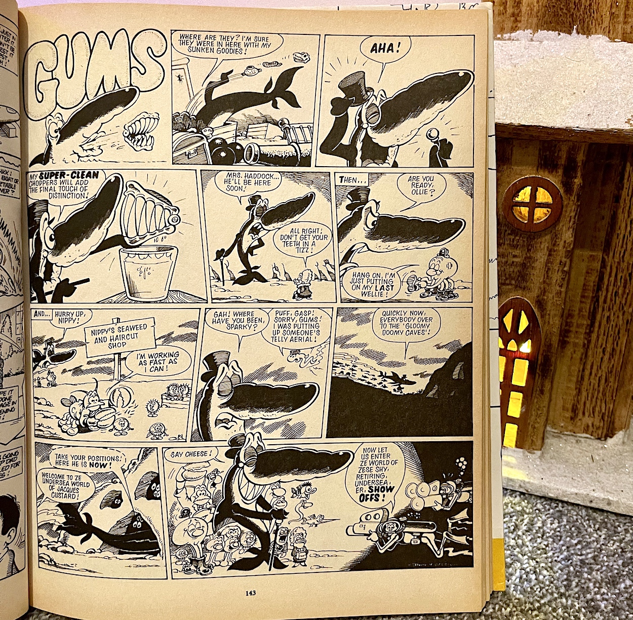
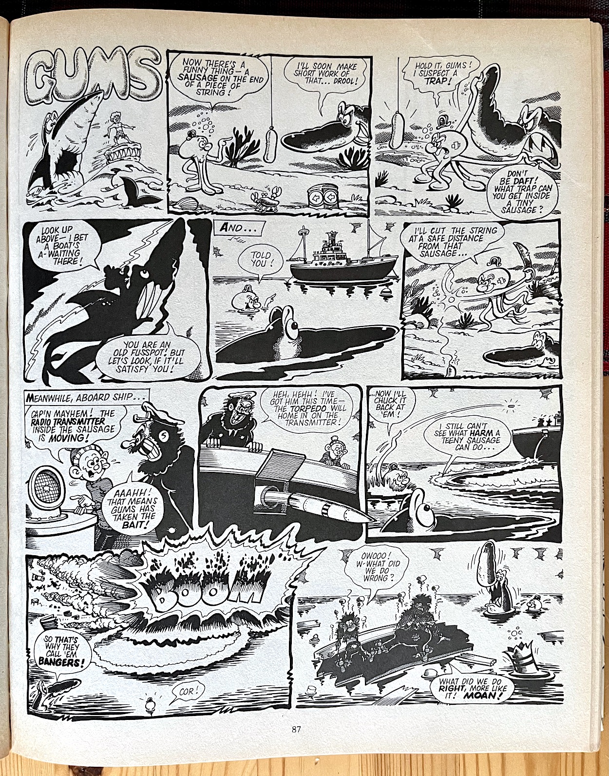
I’d say let’s dive right in but that might be too on the nose given my first highlight. Yes, it’s the same as last year and probably will be again next year. Gums was always a favourite in these books and the fortnightly comic, so chances were John Geering‘s strip from Monster Fun and Buster was always going to get included here. Like last year (and as with other characters) he’s in the book several times but this one stood out for me. As obsessed with sharks as I am I’m used to documentaries, books or even Instagram accounts detailing how preparations are made behind the camera when filming these wonderful creatures, but we humans aren’t the only ones who have preparations to make.

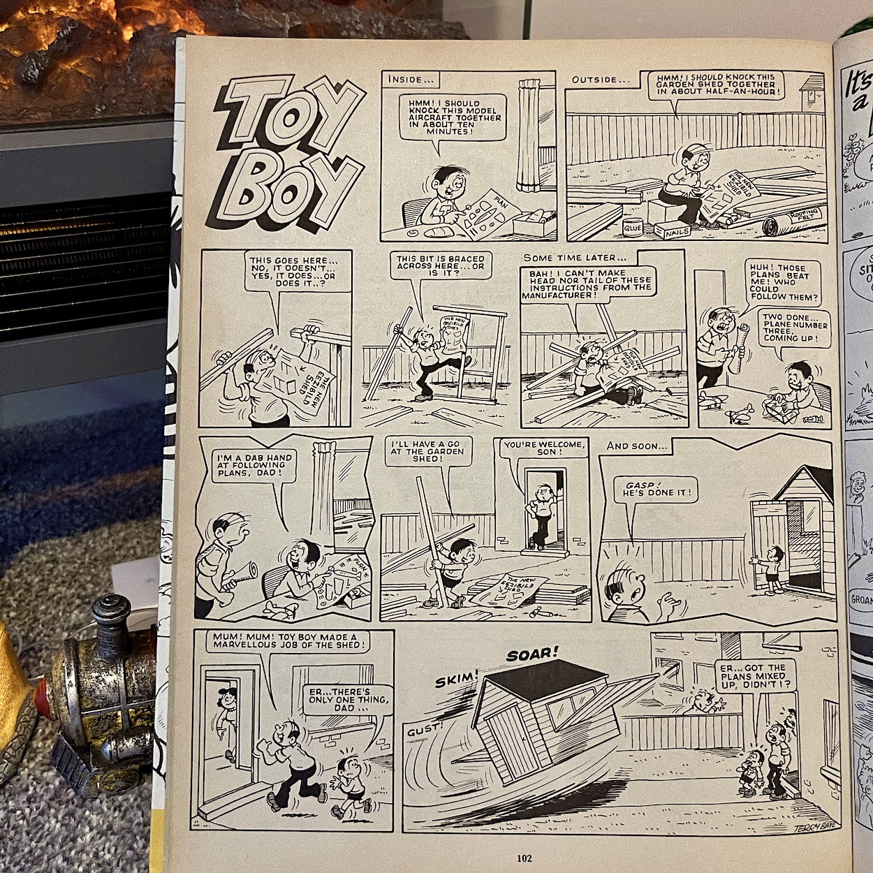
What a fun start! Another character I always enjoyed was Toy Boy from the late, great Terry Bave. Appearing originally in Whoopee then Buster from 1985 onwards, it surprises me to find out we never knew his name. Obsessed with playthings of any kind whatsoever he’d often frustrate his well-meaning parents when toys got in the way of their day-to-day lives, or his playing about stopped him from doing something important. Sometimes the toys would help though, so we never knew how the strip was going to go.

OiNK writer Graham Exton wasn’t exactly a big fan of “that bloody snake”

Such is the case with this next highlight. Terry’s art style is just lovely and instantly recognisable from the round faces of all his characters. It’s sad to think he’s no longer with us. He was also one of the few whose signature appeared in these comics at a time when this was frowned upon by the publishers.

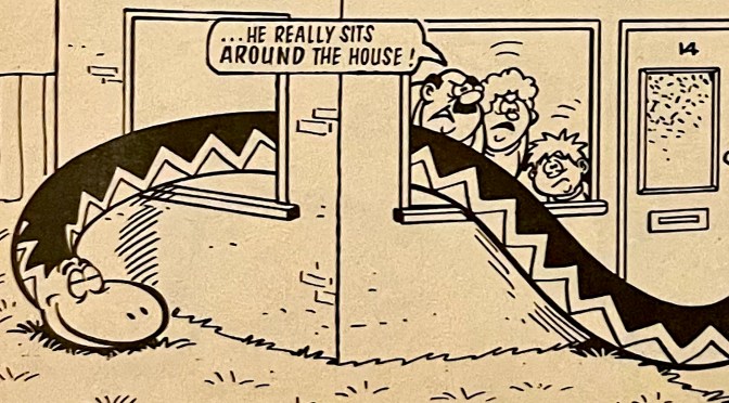
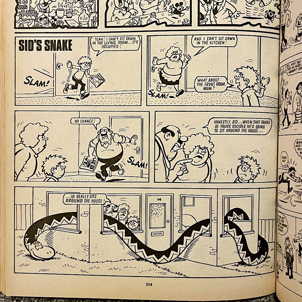
OiNK writer Graham Exton wasn’t exactly a big fan of writing for this next character (“That bloody snake”). According to Graham and others I’ve spoken to, Sid’s Snake was often used by the Whizzer & Chips editors as a testing ground for new writers. It was assigned to them to prove their capabilities and hone their skills before moving on to other characters or comics. Drawn by the renowned Mike Lacey, whose work I particularly loved from the covers of each issue of Funny Fortnightly (reprints of his Krazy covers), Sid’s Snake could be very hit and miss.

This could be because the writer kept changing, or maybe it’s simply a difficult idea to get a consistent gag out of. What it always was though, was simple, inoffensive fun and at least in this instance very definitely smile-worthy. I can remember very little from the character in the pages of Big Comic Fortnightly, so this one stood out as something a bit more memorable and funnier than usual.

Another Mike Lacey highlight is up next in the form of Shiner, also from the pages of Whizzer & Chips, first appearing way back in the second issue. However, even being the leader of the Chip-ites (the characters from the inner ‘Chips’ part of the comic) wasn’t enough to see him move to the pages of Buster when his comic folded in 1990. Shiner was an amateur boxer whose mother disapproved of his interest and she was constantly trying to stop her son from getting injured.

That doesn’t sound like a bad thing and it’s why I particularly liked this entry in the series. In this story he would’ve gotten away with it but ends up in a rather worse state than he was in the first place, and all thanks to his mum! Elsewhere on the blog make sure you check out a clever and very funny Buster strip written by Mark Bennington and drawn by Mike in one of the first issues after the OiNK merge.

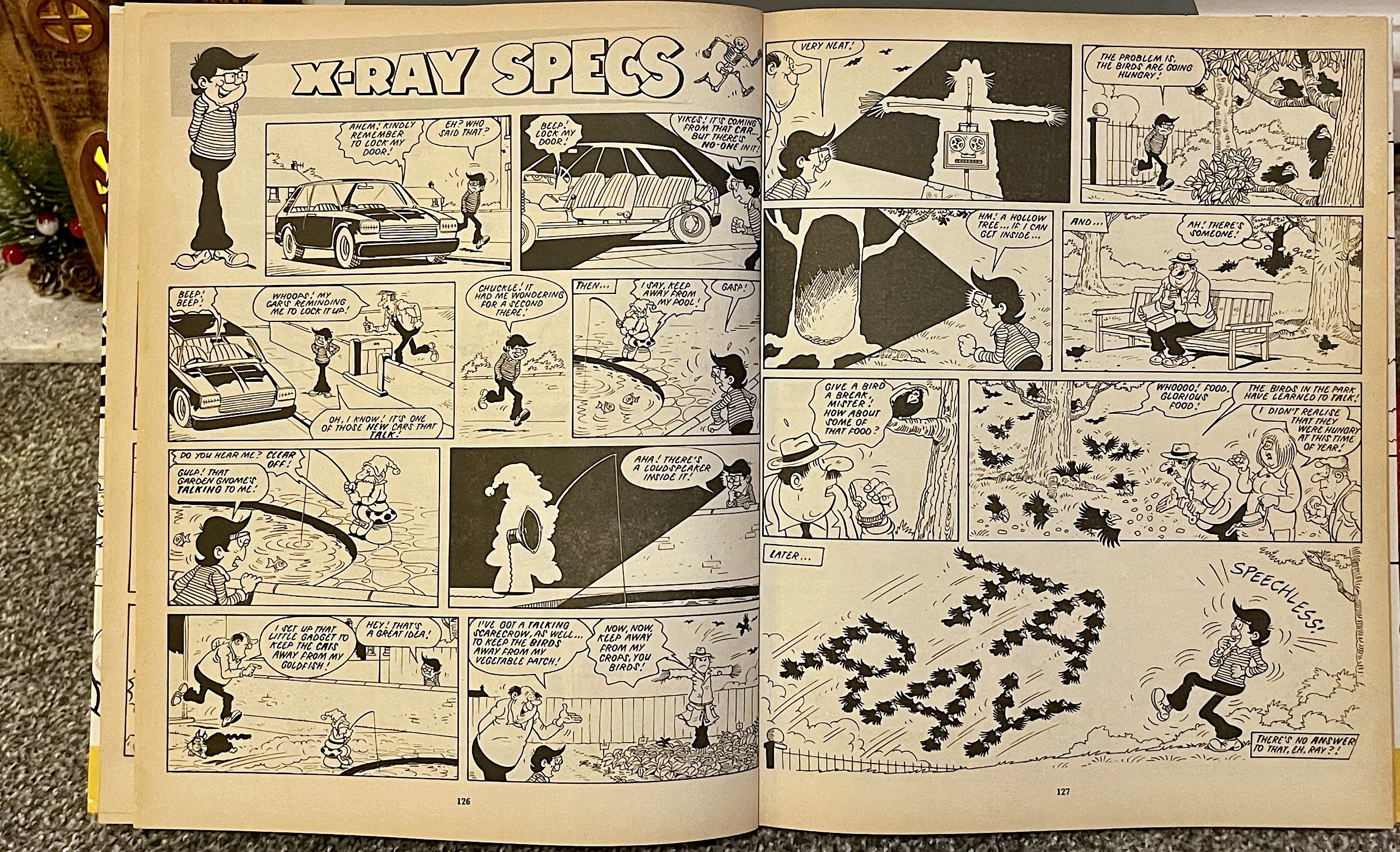
X-Ray Specs used to be a favourite of mine in the regular reprint comic. He stood out for a couple of reasons. The first was the most obvious: those glasses. These were the unique selling point for the character; a pair of super-powered glasses which could see through anything, although somehow used to various levels of strength. For example, sometimes he used them to see through whole walls, sometimes just the contents of a person’s pockets.

These were paired up with a character who could use them for feel good endings like catching burglars and cheats etc. but also for his own selfish reasons, which was always funny. In the hands of a lesser creative team it could easily have become a very predictable strip but Ray could often surprise us. Below is a good example of what drew me to his pages before many others in these books. Once more we’ve got some Mike Lacey art to enjoy too.

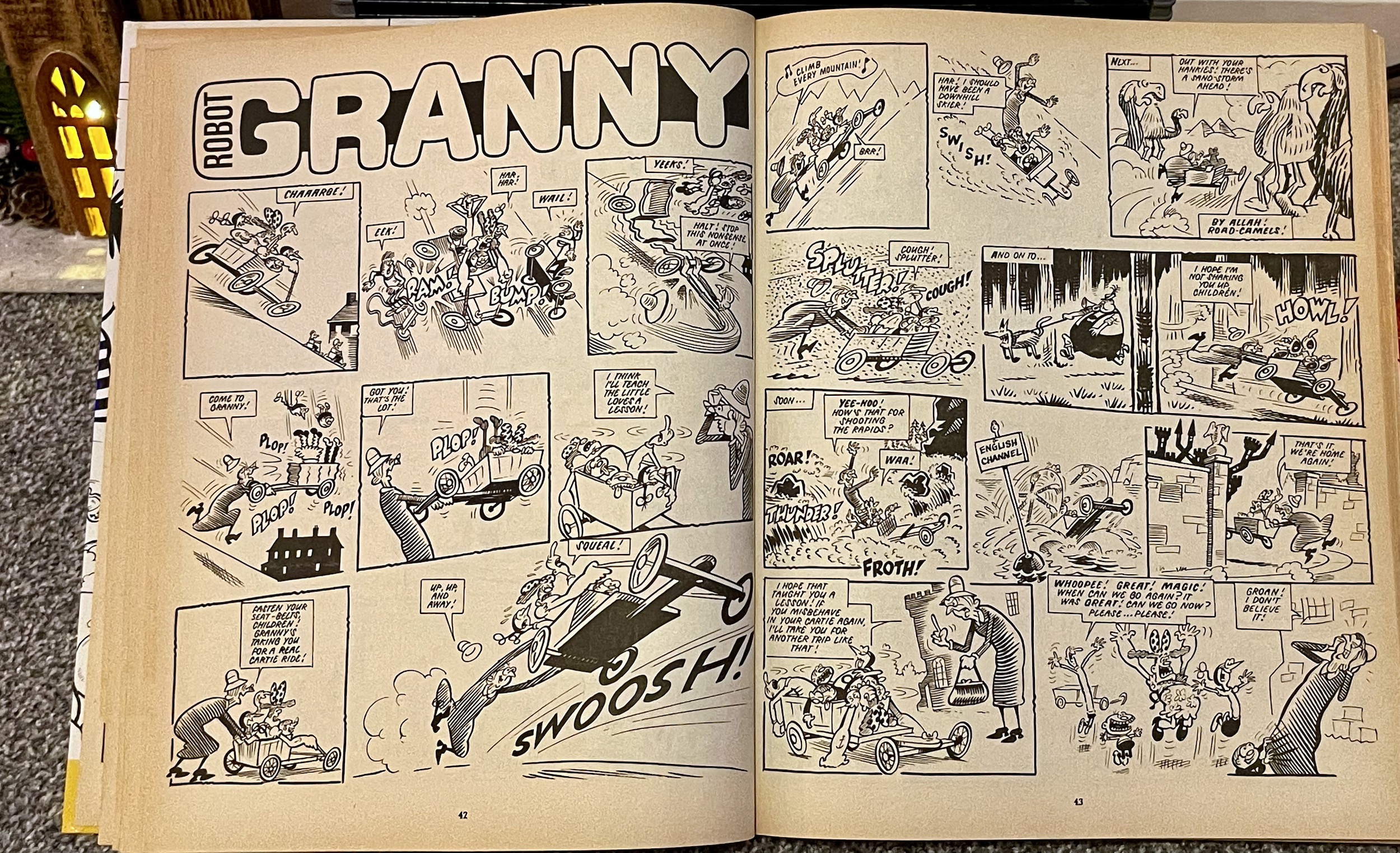
My next choice is a character who appeared in the very first edition of Cheeky Weekly, later making the move to Whoopee! She was drawn by a favourite OiNK contributor, fellow Northern Ireland native Ian Knox (Roger Rental, He’s Completely Mental). Robot Granny was a state-of-the-art mechanical person originally crafted in top secret by a mysterious team of inventors. However, people were quite scared of how it looked, so in order to keep it secret and fit in with humans it was disguised as a little old lady.  The strip started life as ‘Six Million Dollar Gran‘ so no prizes for guessing the influence here.

It was later renamed again as Gran’s Gang, however here the reprints are from the middle years of the strip and tell the tales of how this seemingly innocent and quiet retiree is just trying to fit in with her much younger friends. I’ve yet to read any of her stories that don’t raise a big smile. That might be because she somehow reminds me of my own late nanny, who always seemed to have so much more energy than all of us kids when we were younger. The strip may be far-fetched but it rekindled some lovely personal memories and that’s another reason I’m including her here.

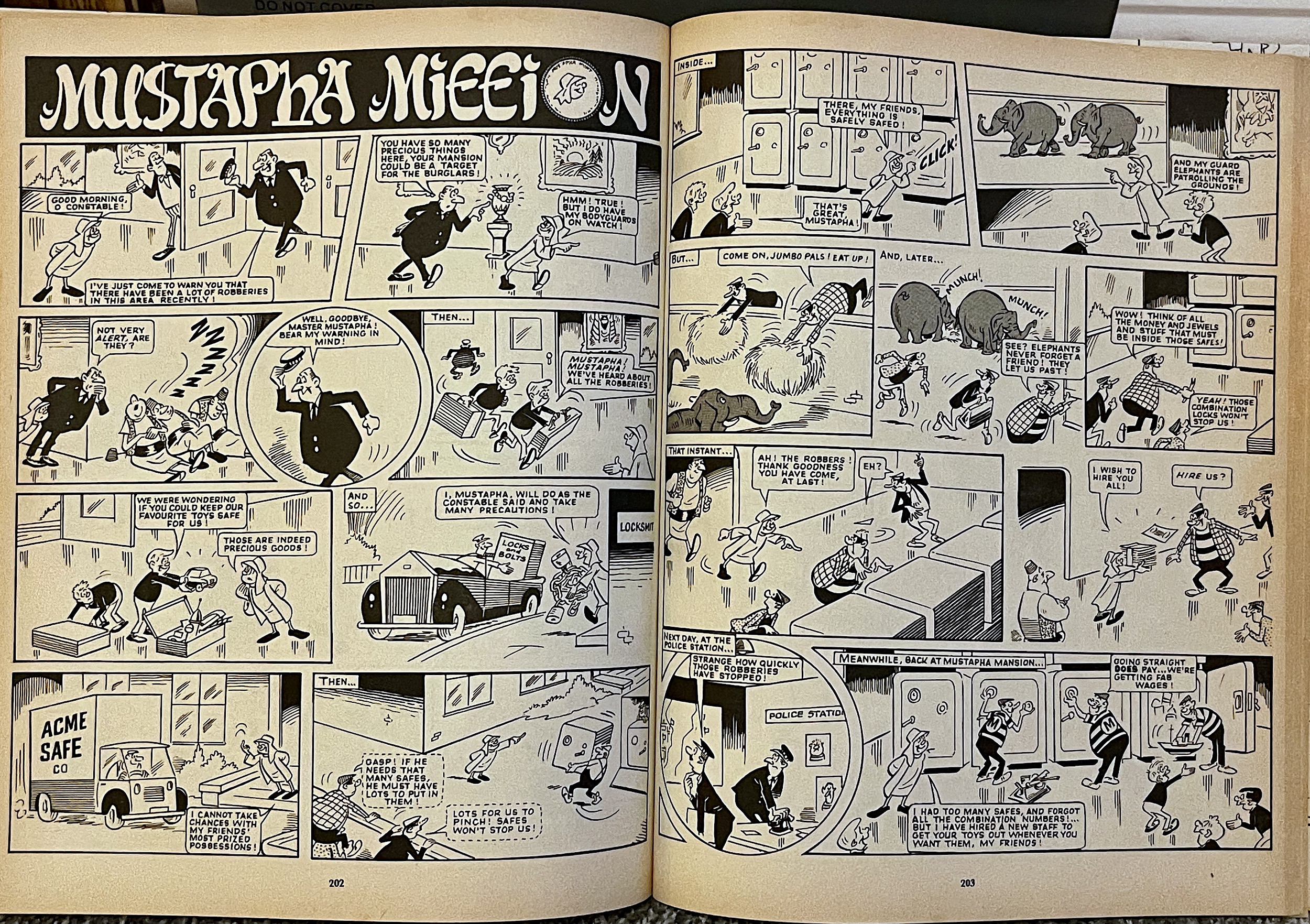
Granny’s stablemate from Cheeky Weekly and Whoopee! comics, Mustapha Mi££ion also has a handful of strips in this book. He made a further transition to Whizzer & Chips too when Whoopee! folded, such was his popularity.  Having discovered oil, making him and his father extremely wealthy, his dad sent him to the UK for his education and supplied him with a mansion, land and staff to keep him occupied. Originally drawn by the legendary Reg Partlett, the early stories had him desperately trying to fit in and often misinterpreting the needs of others, going far beyond what was actually needed because he had the wealth to do so.

Joe McCaffrey soon took over and his strips are reprinted here. In these stories Mustapha was the opposite of all the filthy rich kids we’d normally find in our comics; he was kind hearted, playful and would do anything for his friends. I do mean anything. Nothing was too much for this young boy as far as treating his friends was concerned. Most importantly, it never felt like they were taking advantage of him; they were always shown enjoying his company whether he was being extravagant or not. But of course the strip had to have the indulgence, that was the whole point and in the McCaffrey years it was all about Mustapha simply having fun.

After he moved to Whizzer & Chips, Frank McDiarmid took over and apparently (I’ve never read them) there wasn’t always a happy ending. From what I’ve found out, sometimes Mustapha would do things with his wealth that would annoy his friends at the end of the stories, but for me the boy in the strip above is the one I know and love to this day.

The final selection from the 1988 book I have for you took two strips with two main characters each and merged them together into the mouthful of (deep breath) Ivor Lott and Tony Broke with Milly O’Naire and Penny Less. The two male characters started off in the pages of Cor! comic, eventually making the shift into Buster (everyone seemed to at some stage), while the two young ladies ended up in the same comic after making the transition from Jackpot in 1982.  The girls may have left again in 1987 but Ivor and Tony stayed put and would cling on all the way through to the final Buster in the year 2000. Despite the final years being all reprint material, that’s still an incredible 30 year lifespan for their strip.

It looks the part on any book shelf rather than a pile of comics in a cupboard somewhere

Originally brought to the page by Reg Partlett, it was Sid Burgon who nurtured them throughout the years and it’s his work you can see below. When reading up on these characters I was surprised to find out they started off very differently. Originally Tony Broke was a very bitter young boy and Ivor Lott would get away with all manner of mischief simply thanks to having lots of money. That doesn’t feel right to me so I’m happy they changed into the characters we have here, where Ivor would come a cropper from showing off his spoilt lifestyle, while upbeat and lovable Tony would always show us that money can’t buy happiness. 

This particular strip of theirs stood out for inclusion on this blog. I’ll leave it up to you to figure out why.

I know there are an awful lot of characters I haven’t featured but there’s simply not enough space to show them all. I was able to pick up this huge book on eBay for about a fiver and that can only be described as a bargain. The 1988 book seems to pop up the most so you shouldn’t really have any difficulties in tracking it down. While last year’s book was really enjoyable I’d opt for this one over it. It feels like a more considered selection, the strips complimenting each other that little bit better. Or it could be because I’ve a personal fondness for this volume.

Whatever the reason for my recommendation it’s a great book and reads well even today. For a ‘Best Of’ collection of some classic comics you can’t do better than this one. 256 pages with an impressive hardback cover, it also looks the part on any book shelf rather than a pile of comics in a cupboard somewhere. Whether it’s for yourself or as a perfect surprise gift for a comics fan in your life, you really should check out The Big Comic Book 1988.

1987 BOOK < > 1989 BOOK

ANNUALS MENU

CHRiSTMAS 2023

ANNUALS: iN REAL TiME

Classic comics in real time. It’s what this blog is all about, it’s right there under the title at the top of the screen. Each issue of the various comics are reviewed on the dates we originally would’ve got our hands on them. Normally that means on the date they were released, but applying the rule to this section of the blog poses a bit of a problem. So we’re going to do things a little differently here. Just a little.

As anyone who collected books like these as a kid will know, they went on sale around the time we’d return to school after the summer holidays, usually mid-September. But we didn’t get our trotters on them until Christmas Day when the jolly man himself would bring them down our chimneys. So when do I review them? On their release dates or when we got them? Those aren’t the same dates for annuals.

I’ve fond memories of looking endlessly at the huge variety of annuals on the shelves of my old hometown’s newsagent’s, or their large table displays set out at just the right eye level for kids. But as tempted as I was I never looked inside any of them, believe it or not. I didn’t want to ruin the surprise of finding out what they contained during my very favourite time of the year. Instead, I’d let the anticipation build over those few months until I was looking forward to them just as much as the toys and games (and the food)!

So I’ve decided to review these during the festive season. They were always a Christmas treat, many of them including themed content and even if they didn’t they were still very clearly marketed for that time of the year. So this is where I bend the rule a little. As much as I love you all I’m not going to be spending my Christmas Day every year writing a handful of reviews, not even for Knight Rider (my favourite thing in the universe)! Many of the reviews will be spread over the month of December, with any relating to an ongoing comic series published on The Big Day itself (so they’re in the right position in their own read throughs elsewhere on the blog).

A section of the blog I have a particular fondness for

Patience will be a virtue with this particular section. The books were released once per year (the clue is in their name) so depending on the amount of books in a series they could take quite a while to cover. Also, the overall collection of reviews won’t be listed in the order in which they’re written for obvious reasons (they’re essentially all different read throughs).

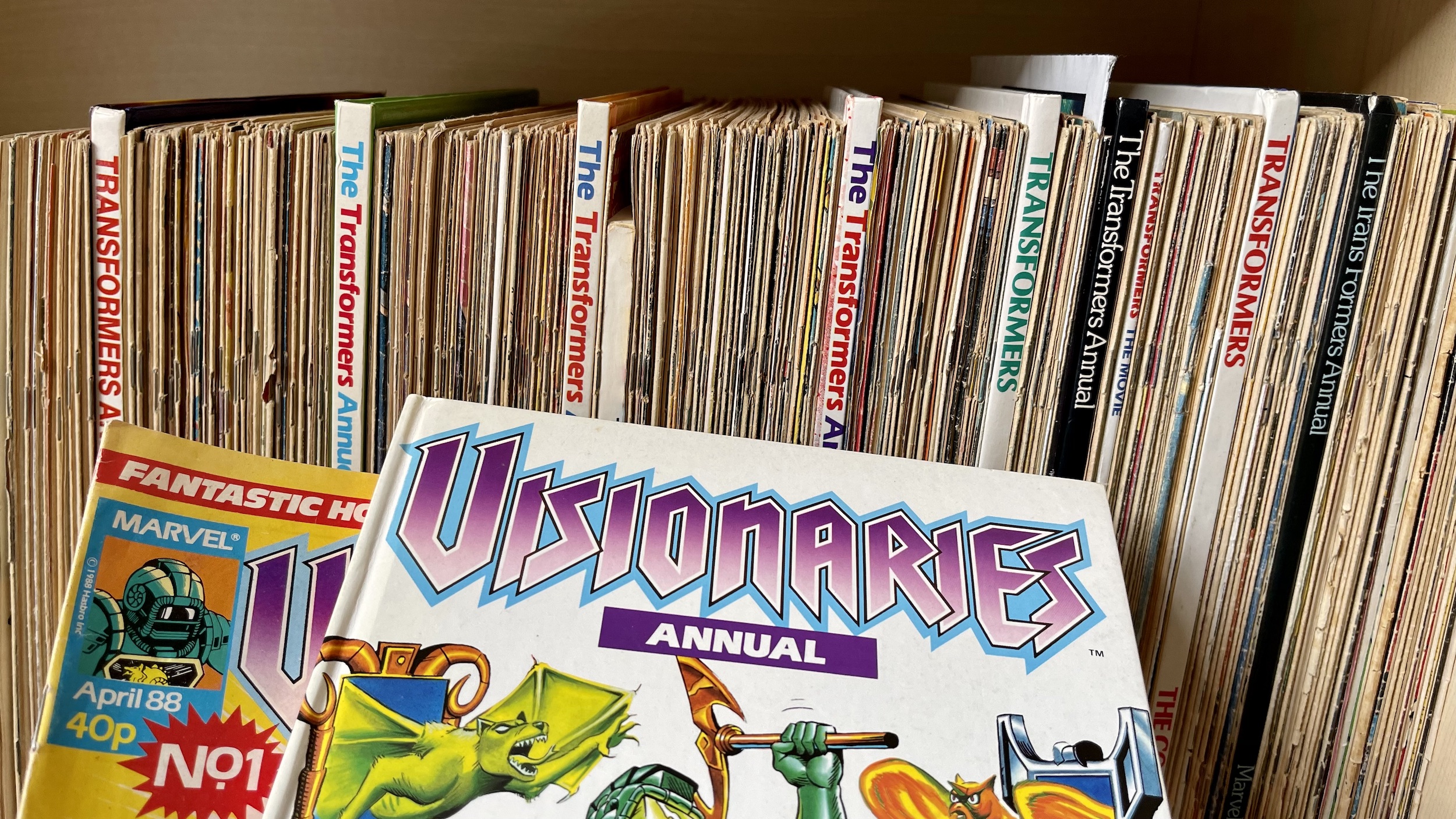
Instead they’ll be listed in original release order, meaning you’ll be able to take a trip right through the years covered. Perhaps you’ll remember those holidays when you received these books, or check out ones you recall from those newsagents’ tables, or discover ones you never knew existed. (For example, a lot of people contacted me about the Visionaries Annual after the review asking if I had a spare, having seemingly slipped under the radar of many fans in 1988.)

All these years later I’m still just as much a fan of Christmas as I ever was, perhaps more so. As such, this is a section of the blog I have a particular fondness for and the fact I have to wait so long between new additions just makes it even more exciting when the time comes around again. So, even though it’s a once-a-year thing you can expect just as much attention paid to these as anything else, including the occasional special feature.

As you’ll see it won’t just be annuals based on comics, although those based on other properties such as televisions series will have comics content. You can expect a nice mixture of the books I collected at the time and those I wished I had. This is going to be a really fun section of the blog. I’ve a shelf full of content just waiting for each year to roll around (the will power is strong with this one, it has to be) and more on the horizon.

I hope you’ll enjoy this section of the blog as much as I am.

ANNUALS MENU

THE OiNK! BOOK 1988: PiGGiN’ PERFECTiON!

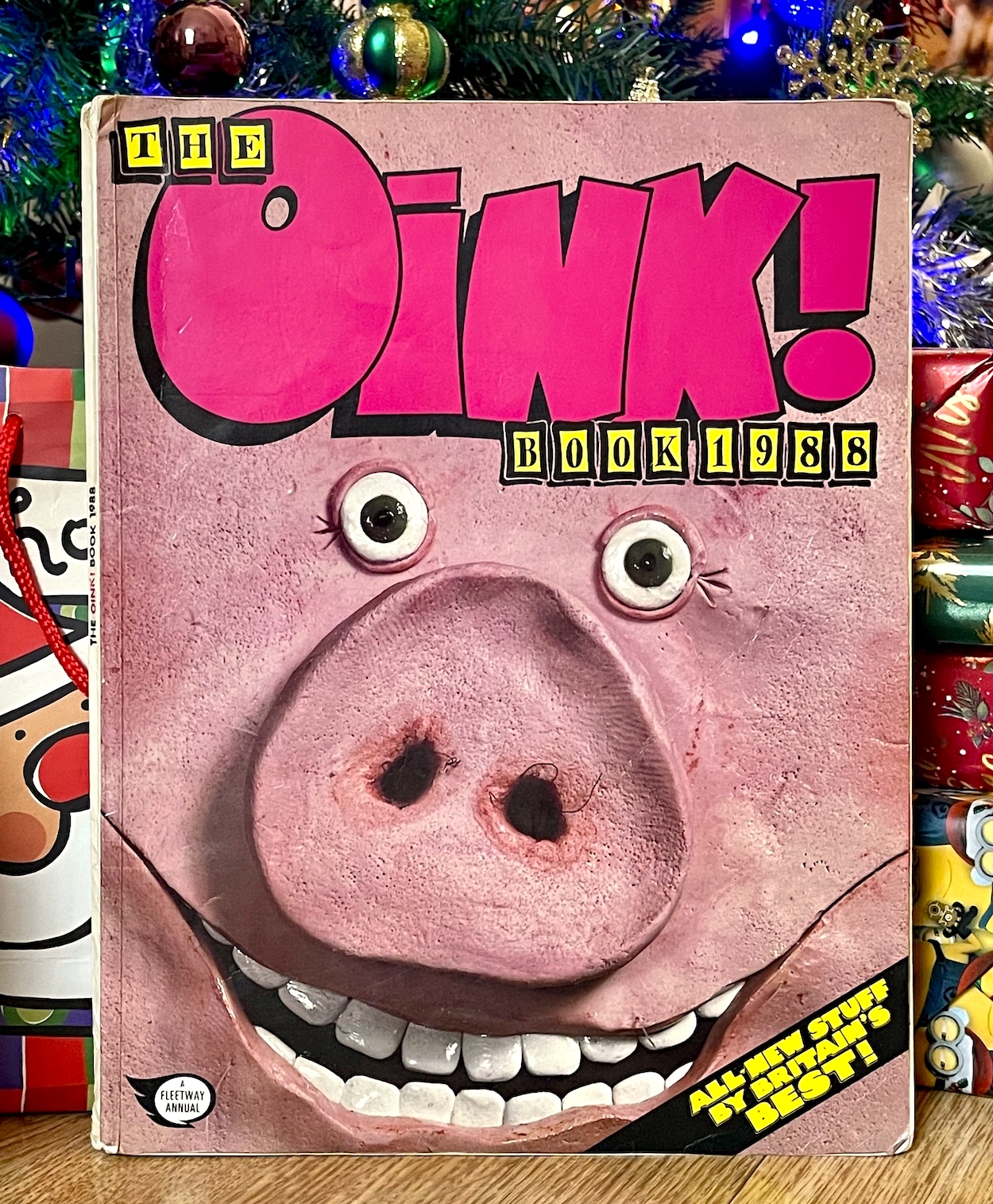
How many of you can remember coming downstairs on Christmas morning and seeing this cheery face staring back at you? I’d been giddy at getting my hands on this ever since I saw it in my local newsagents a few months previous. It really stood out with its glossy soft cover in the sea of cardboard hardbacks. Inside, all 80 interior pages are made of a thick, high quality stock, giving the book a heavy, expensive feel. Co-editor Patrick Gallagher tells me, “The higher-quality paper stock of the book was the idea of Bob Paynter at Fleetway. Bob was completely on our wavelength and knew it would appeal. The floppy glossy cover and back also seemed to really suit the enlarged shots of the plasticine pig face and bottom models Ian Jackson made by capturing the detail so well.”

UPDATE: I’ve since spoken with Ian (some three years later) and the cover wasn’t made by him! You can read more about this and see the original rear cover in a special post of when I chatted to photographer Ian Tilton.

Before this I’d read some of my brother’s Beano annuals but to my young mind they felt just like regular stories but with bigger panels to fill more pages. But The OiNK! Book 1988 was, as ever, different. This first book packed in as much as it possibly could to every single page. As a result, it may have had roughly 30 pages less than its contemporaries but it had so much more in there to read and enjoy. It all began with that famous cover, especially when you flipped it over but we’ll get to that later. While it didn’t really sink in as a kid, that claim on the bottom right is bold and of course completely correct. Inside, a special bookend of Uncle Pigg and Mary Lighthouse introduced that team to readers.

This was innovative for a time when signatures in humour comics were rare, but OiNK’s young readers knew the names of their favourite cartoonists thanks to its creators Patrick Gallagher, Mark Rodgers and Tony Husband and their wish to shakes things up. As an adult I can’t help but look at this page in wonderment at the list of talent involved. It really was a selection of Britain’s best and it was all for us kids. We were spoiled. I also love how the chiselled words work their way around the characters and speech balloons, which makes zero sense to the chiseler!

It’s a wonderfully varied read, containing strips from our favourite regulars, some returning stars of early issues, spoofs of those other annuals I mentioned, puzzles (not filler here but typical OiNK-style funnies) and even letters and drawings from readers, something annuals just never included. So how on Earth am I going to choose a few highlights? There’s just too much brilliance on offer. It’s been painstaking but I hope I can do it justice with this selection.

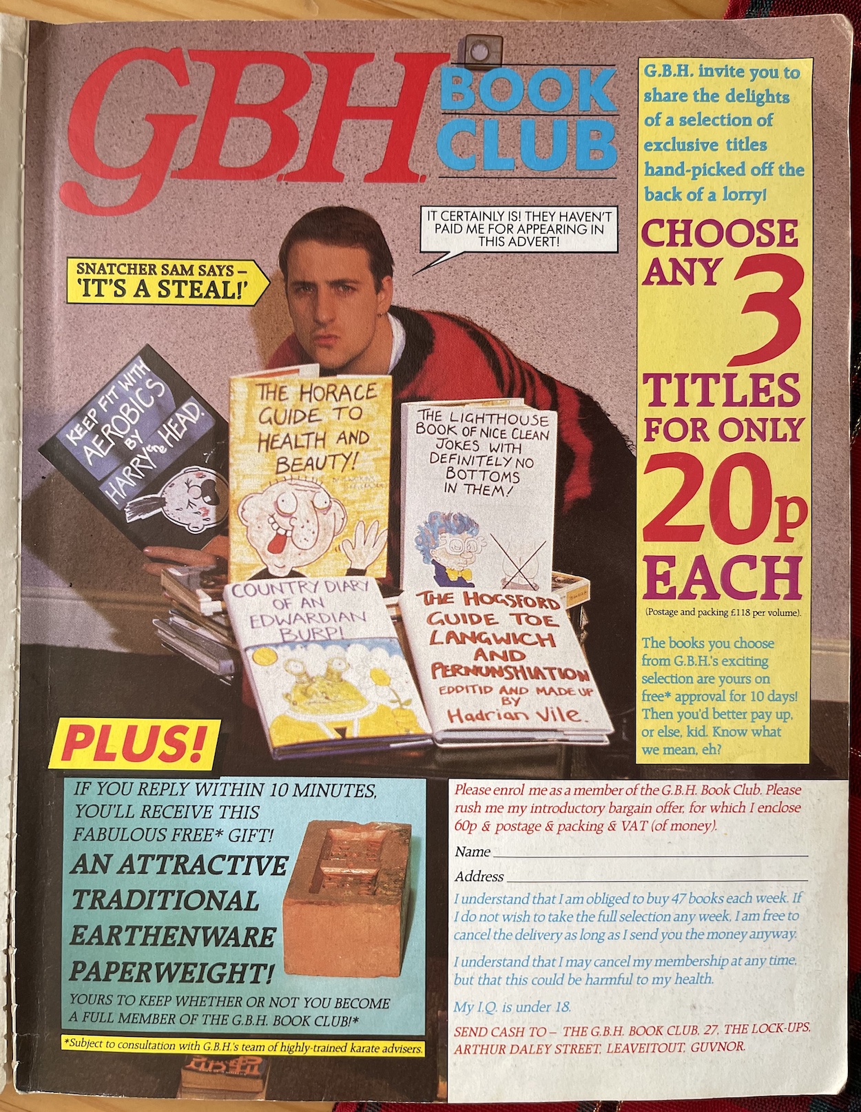
This is one of my most memorable pages, with Marc Riley as the not-at-all inconspicuous burglar, Snatcher Sam in GBH’s Book Club, a take on those book and video clubs that were so popular in the 80s and 90s. Magazines and comics were filled with them, promising cheap titles to begin with as you sign yourself up to buying a certain amount at full price over a year. I was a member of the Britannia Video Club, remember them? That’s why I loved this so much, along with the usual over-the-top nature of the GBH madverts and just look at all those book covers they’ve created for the photograph. Now, 35 years later it’s the effort put into these daft pages that I really appreciate.

Released for Christmas 1987, this was the year I would turn ten-years-old in the festive season and I was hearing a lot of rumours in the playground about Santa Claus. Thankfully I soon found out they were just rumours when he left my book under my parents’ wardrobe before Christmas because demand for it was so high and he didn’t want to disappoint me. The rumours of his existence were conclusively put to bed with a script by Lew Stringer that’s spectacularly brought to the page by 2000AD stalwart Kevin O’Neill, who we sadly said goodbye to earlier this year. There’s more to The Truth About Santa than we probably wanted to know as ten-year-olds.

There’s an image that’ll stay with you. Or haunt you. I remember this being the strip any friends who read this book at the time seemed to laugh at the most. I may have been the only one of my closest friends who collected OiNK but they all enjoyed reading my issues and in particular this book. In fact, in the year 2000 when I decided to return to college at the age of 23 the book ended up shared around that class too. I can’t remember how it came up in conversation originally, but I dug it out from my cupboard and it made its way around most of my fellow media students, each one of which found it just as hilarious as I had.

To this day it’s still one of my favourite books (of any type) of all time and definitely my favourite from childhood. In fact this is my original copy from back then, only one of three OiNKs that survived various clear-outs (by my dad) and moving out years later. Its timeless comedy is a testament to the talent it boasted about on the cover. Just like the regular comic it sets itself apart from other annuals. While they’d have had huge multi-page versions of their regular strips, here for the most part OiNK kept them to the size they’d normally be, meaning there was a hell of a lot more of them packed in.

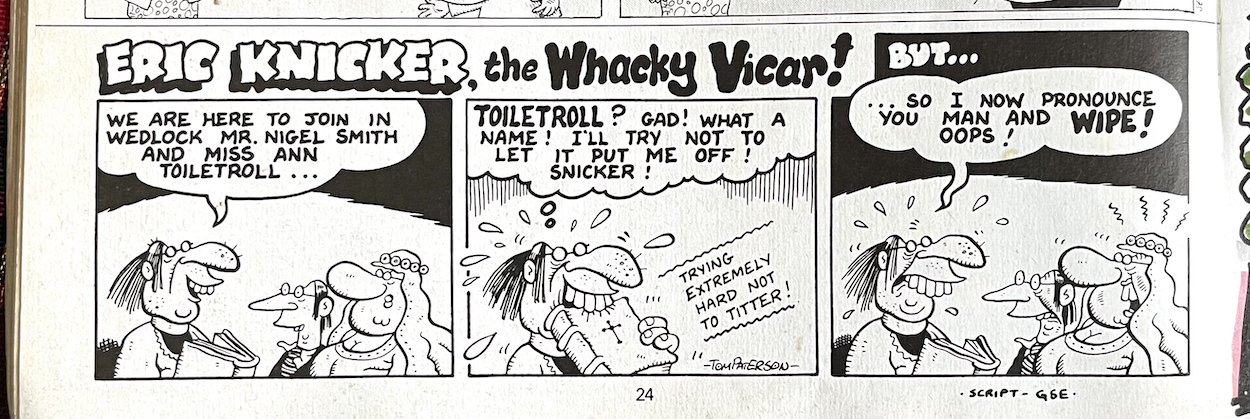
Annuals are created far in advance of their release dates so when this one was being put together the ever fantastic Tom Paterson was still a contributor to the comic. Written by the pun-tastic Graham Exton, Eric Knicker the Whacky Vicar may only have been a tiny quarter-page strip but it left a lasting impression on little me during Christmas 1987 as I tittered and giggled and shared the joke with friends and family. A lot better than any cracker joke.

So yes, the annual kept to the format of the comic, only more so. It’s a delight to see the creative team took the opportunity to simply cram much more in of what made OiNK so great in the first place. For a child of ten there was just so much to enjoy. We even got a short Ham Dare strip. His two-page story is a hoot and is followed by this even funnier, wonderful cutaway of his and Pigby’s ship.

Written by Lew Stringer and drawn by the incredible talent that was J.T. Dogg (Malcolm Douglas) it’s chock full of little details that my young eyes really enjoyed pouring over. My favourite parts are the comfy chair and its very dangerous sidestool, and the middle of the spacecraft showing the difference between our heroes, with Ham’s gym next door to Pigby’s very full pantry.

A quick note about the title box at the top of the spread. It makes a great point! My Transformers and Real Ghostbusters annuals would have had “pin-ups” and “mini posters” and I always wondered if anyone actually cut up their fantastic annuals, losing whatever was on the backs of those pages to the walls of their room. I’m glad I wasn’t the only one at the time who thought this was a ridiculous idea.

Hadrian Vile’s usual diary entries take a back seat to a selection of pages chronicling his Interleckshual guide toe Nacheral Histry

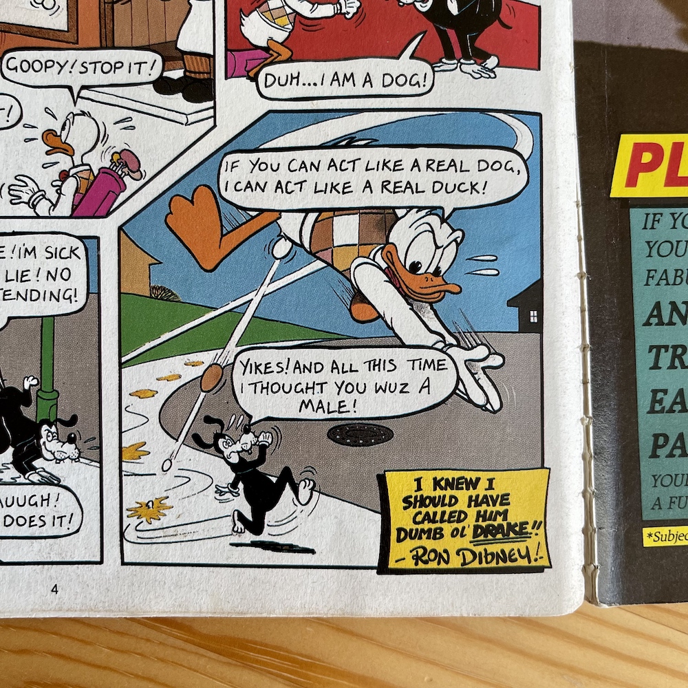
A quick glance over some other highlights now. Ron Dibney’s Dumb Ol’ Duck reveals another side to himself, Police Vet makes his debut (he’d return in the monthlies the following year) many years before Jim Carrey took on a similar role and Star Truck makes a very welcome return. Just as in #3 the crew make their presence felt throughout the book in between chapters of their own strip. Here, Mark Rodgers literally pops up as Captain Slog in one of Horace (Ugly Face) Watkins‘ pages.

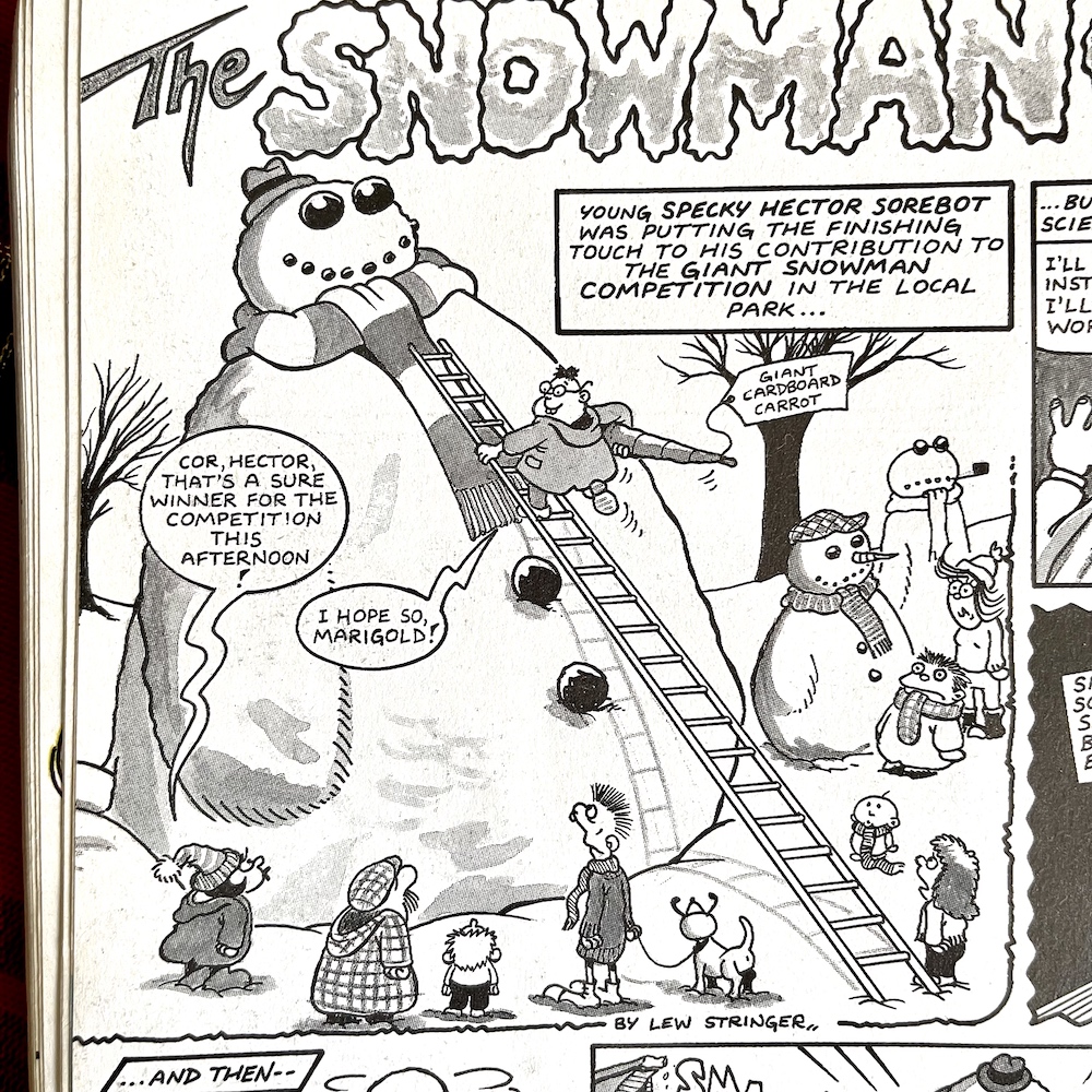
Pigswilla only appeared in seven issues of OiNK altogether but he was still a firm fan favourite, so naturally he had to appear in the annual, with Specky Hector Comics Collector (with added surname) making a funny cameo I’d forgotten all about. Early in the book Frank Sidebottom found out Little Frank had used up all his felt tips and gave him until page 69 to fix the situation, which he does, sort of. It appears young me at least started to lend them both a hand.

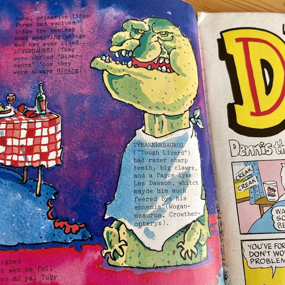
Hadrian Vile’s usual diary entries take a back seat to a selection of pages chronicling his Interleckshual guide toe Nacheral Histry, although he does take some short cuts to get from the evolution of life to the 1980s. His usual know-it-all persona is, as always, hilariously wrong in almost every way. In his fortnightly diary he was the most intelligent person in any room. Well, in his own mind anyway and here his guide to everything from dinosaurs (the hilarious looking Tyrannosaurus rex above is a highlight) to Ford Sierras.

In fact, after spending the first two parts of his guide covering prehistoric Earth he only has one page left to finish up and so this third page makes the leap from the ice age to the aforementioned car in the blink of an eye, clearly skipping millions of years as completely uninteresting. It’s all as hilarious as you’d expect from Mark Rodgers, made all the more special with full colour Ian Jackson art. In fact, so good is it that when the weekly comic itself gets going the diary will eventually be replaced with a series of similar guides.

1987 also saw the 50th anniversary of The Dandy (with Beano’s to come in 1988) hence why OiNK took aim at DC Thomson’s comics with regular digs about how old the characters would really be, such as #38’s Deano. In fact, I received the commemorative 50th anniversary book alongside my OiNK! Book (and The Big Comic Book 1988), although in hindsight I think it was originally for my brother but he stopped reading comics not long before Christmas. Oh well, his loss was my gain.

Returning to that spoof comic name, here the OiNK team take it to even greater heights (although this was probably created first) with a mini-comic inside the annual featuring such characters as Dennis the Pensioner and his dog Flasher, Desperate Old Man and the The Lash St. Old People. All are very funny and then we get a double-page spread of no less than five spoof strips which as a kid were funny, but as an adult are hugely surprising because four are drawn by none other than John Geering!

John was a regular artist for DC Thomson, in fact that’s the publisher he’s most closely associated with, most famously for Bananaman and Puss’n’Boots. To see him take on some of DCT’s characters in OiNK just makes these even funnier than they already were in my opinion. I do remember showing these to my friends who were huge fans of The Beano at the time. Can you blame me?

Unfortunately, I simply don’t know who ‘Philip’ is at the time of writing. His work only appeared in two OiNKs (this and #9), here with Boffo the Bore and two other like-minded strips called Georgie & Zip’s Party and Postman Fat and his Slightly Flat Cat. He’s not mentioned on the intro page either, but needless to say I’m always on the hunt for more information on OiNK’s creation so when I find out I’ll let you know. After The Deano and a ‘Fun-Hour’ pre-school comic we get another special section for adventure fans.

Eagle-eyed blog readers may recognise the brilliant caricature of Roger Moore on the first page from a previous issue (although I didn’t spot this first time around). If you go and take a look at the TV listings page in OiNK #17 you’ll see a tiny part of this image was used the previous Christmas. In it you can even see the OiNK logo behind Roger’s face so it just goes to show how far in advance this was created. This is something that continues to this day. If you follow the likes of Lew Stringer on social media or his own blog he’ll often show us snippets of annuals he’s working on over a year before their release, for example.

I’ve been a huge James Bond fan since all the Goldeneye hype hooked me in the mid-90s and I started renting out whatever films I could from the local video shop. It was discovering Timothy Dalton as Bond that sold me on the whole franchise, whose first film had only just been released the same year as this book, so the previous 007 (and his films) was still the target of this fun, frantic strip written by Mark Rodgers and drawn by Tim Thackery.

This was Tim’s sole contribution to OiNK. An illustrator and graphic designer he actually went on to work on CBBC animated series Minuscule Milton with Ian Jackson. Tim told me how he sees this James Bong strip now looking back: “A long time ago, but yes, that was me. Not my best work, but I was a bit pushed for time on it and had to knock it out at a fairly rough level.” Personally I love the art style here as it matches the nature of the strip and brings a real sense of pacing and chaos to the proceedings. You can check out Tim’s official website here.


“She eats pickled herrings in bed and I saw her kissing the window cleaner!”

Keith Disease

The Adventure Section also contains that Police Vet strip I mentioned above, a GBH madvertisement for their ‘Personal Hand-Glider’ capable of speeds of up to 100mph (downwards) and another strip, Ena Blighty’s Five Go Adventuring Yet Again. An annual will never have a theme in the same way as the regular comic did at the time, although the festive season does come up a lot for obvious reasons. These dedicated sections feel like mini themes, three for the price of one in fact, and are some of the best pages in the whole book.

One character (or rather two) I always found incredibly funny were Hector Vector and his Talking T-shirt. Unfortunately, Jeremy Banx’s strip made its last appearance in #35, disappearing when the comic changed publishers and gave itself a bit of a face lift. With new characters and cartoonists and the very best issues the team ever produced, I hadn’t even noticed these two weren’t in amongst the madness until they popped up here in this brilliant, larger strip.

As pig pals knew, this wasn’t a strip where the brat got his comeuppance at the end of each story; we never knew who’d come out on top between the pair. For their very final appearance I have to admit I was happy to see it was Keith Disease (the t-shirt) who had the last laugh as those stories were the best examples of Jeremy’s creation. There were plenty of laughs to be had in this particular strip but it was always that very final panel that had me in creases. It still does.

It’s with a heavy heart but a smile on my face that we come to the end (almost) of the review of the very best edition of OiNK the team created. This has been both the most fun and yet hardest thing to write so far on this whole blog. It’s been great fun to finally get the chance to reread this book and to tell you all about it, but incredibly difficult to pluck out just a few highlights to try and sum it up. I hope I’ve been able to do that. Two more chuckles to go though. First up, the opposite page to that great opener drawn by Ian Jackson.

A couple of puns, funny art and a grinning Uncle Pigg reminding us (and telling those who were introduced to OiNK with the book) of his fortnightly comic, even if it wouldn’t be fortnightly for much longer. It’s a perfect end to a perfect book. It’s such a treasured item for me these days that it came with me to a comic con where Lew Stringer and Davy Francis signed it for me, and when Patrick Gallagher visited me at my home a few years back he added his. I intend to get the inside covers covered with as many squiggles as possible.

With that, I’m going to close the back page over now and here’s why ten-year-old me pestered my parents, my siblings and any visitors to our house over the holidays that year to have a look at my new book.

The plasticine cover was a step up from Ian’s already brilliant one for the first OiNK! Holiday Special and is probably the most iconic OiNK cover of all, with a story to match. “When we sent in the transparencies of the pig face and bottom with the artwork for the printer to process, Bob Paynter at IPC didn’t spot that the pig’s star-shaped bum was partly exposed and not completely hidden by the pig’s curly tail,” explains Patrick. “It was only when the proofs came back from the printer that Bob spotted it and deemed it too rude to be published. So we had to get photographer Ian Tilton to retake the shot with the pig’s tail completely obscuring the star-shaped bottom.” (You can read all about that and actually see those original transparencies in my chat with Ian.)

It’s still a cheeky cover and perfectly encapsulates OiNK’s unique, naughty yet innocent sense of humour.

From showing off its covers and hearing the raucous laughter of anyone I could grab over that festive season, to rereading it in my 20s, 30s and now 40s, and lending it to friends many years after OiNK was a distant memory… this book will never, ever get old. It’s OiNK in its purest, most concentrated form. Every page feels fresh and new, like it was written this year, not 35 of them ago. Receiving my favourite issue of the regular comic, the Christmassy #43 and this back-to-back made my Christmas in 1987, and reliving them has done it again in 2022. If you’re reading this post on the day of publication I hope you have a wonderful day and a very Merry Christmas!

iSSUE 43 < > iSSUE 44

OiNK READ THROUGH MENU

OiNK SPECIALS & BOOKS MENU

ANNUALS MENU

MAiN OiNK MENU

CHRiSTMAS 2022

KNiGHT RiDER ANNUAL #1: MAKiNG A DiFFERENCE

“No matter what’s going on in the world or in my life, putting an episode on can bring a huge smile to my face. Don’t we all have something in our lives that does that? This is mine.”

My late grandad Ted came to my house one Sunday morning when I was a child and asked my parents if I’d seen the film on TV the night before about the fantastic car that was filled with computers, could talk, drive itself and even jump in the air. My mum hadn’t heard about it but luckily enough my grandad knew it was going to be a TV series starting the next week and he thought I might like it. He wasn’t wrong. Thus began a lifelong obsession with Knight Rider.
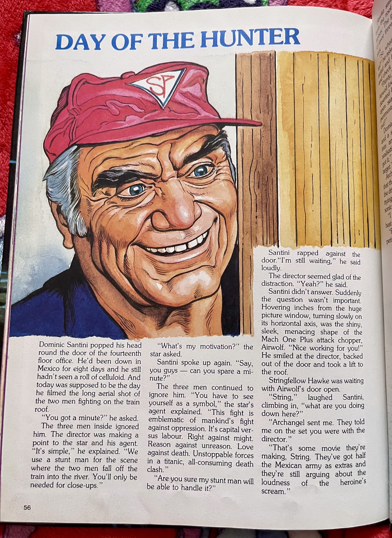
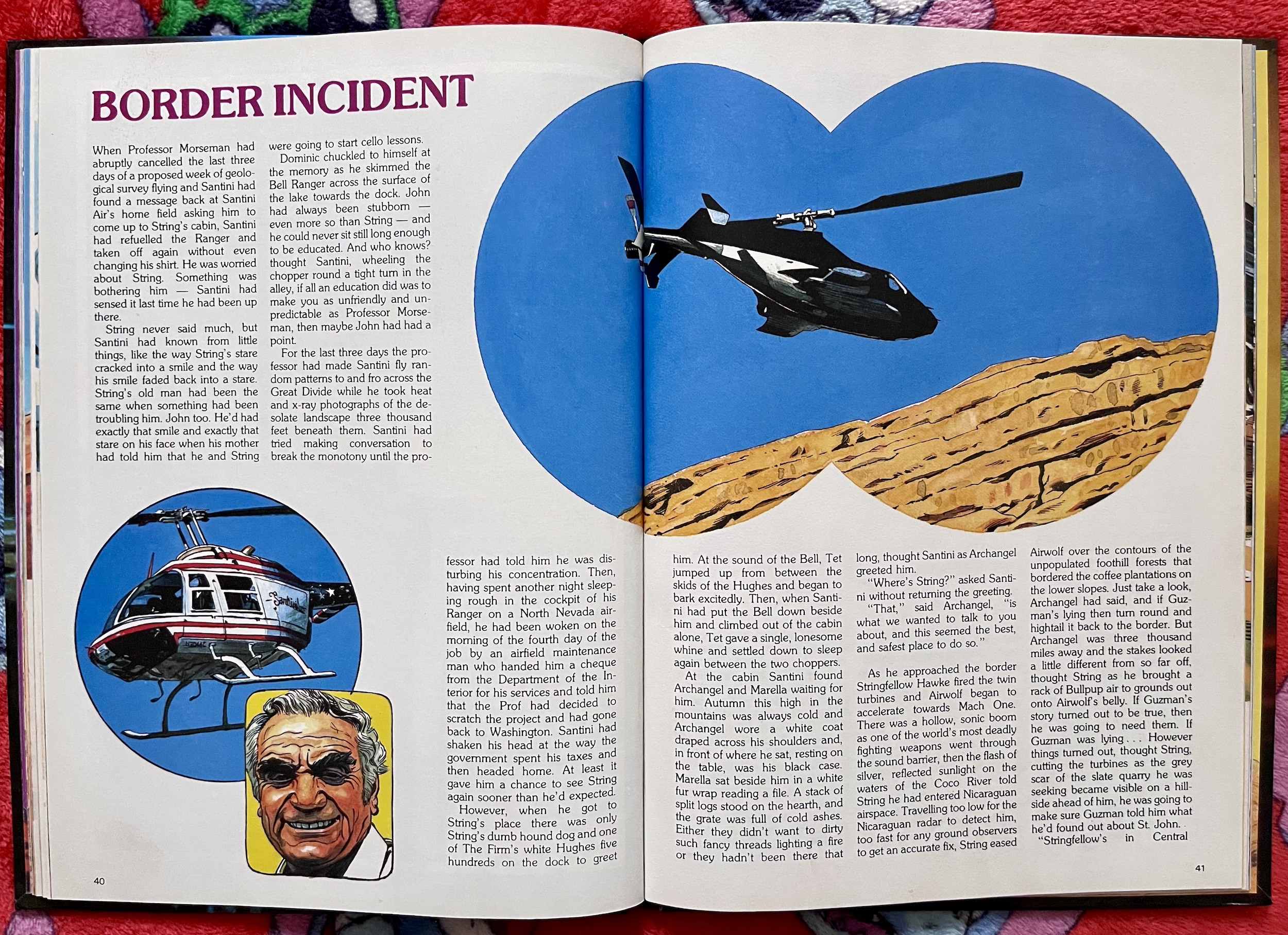
I may have grown out of it temporarily by the late 80s but when repeats began airing in the mid-90s my love for Michael and K.I.T.T. returned and has never gone away. Every decade since may have brought its own obsession, from Babylon 5 to Stargate SG-1, from Doctor Who to NCIS, but Knight Rider has a special place in my heart and, no matter what’s going on in the world or in my life, putting an episode on can bring a huge smile to my face. Don’t we all have something in our lives that does that? This is mine.

There wasn’t a Knight Rider comic because the trend at that time was to feature popular series in strip format inside our magazines such as Look-In, a young person’s TV guide which featured the series alongside the likes of The A-Team and Airwolf. But between 1983 and 1987 Grandreams released five Knight Rider annuals filled with strips, prose stories, puzzles, pin-ups and behind-the-scenes features and interviews. I think I only ever owned this one from 1983 though.

The series debuted this side of the Atlantic in February 1983, with the first annual released at the end of the summer and my eager young hands got a hold of it that Christmas, hence why I’m reviewing it now as part of the blog’s festivities. I remember reading the two-page Look-In strips in my sister’s magazine, with their weekly cliffhangers similar to the 60s Thunderbirds comics. However they were line drawings, not the gorgeous greyscale wash we get here.

Upon picking this annual up for the blog I wasn’t sure what to expect. I really hoped for something entertaining but over the years I’ve seen some horrible annuals quickly thrown together in order to cash in, without much love nor care for the property. As long as this wasn’t like that I’d be happy. What I didn’t expect was something of such high calibre, with an excellent creative team behind great stories illustrated with gorgeous art, alongside some fun articles. I couldn’t be happier Knight Rider received this treatment.
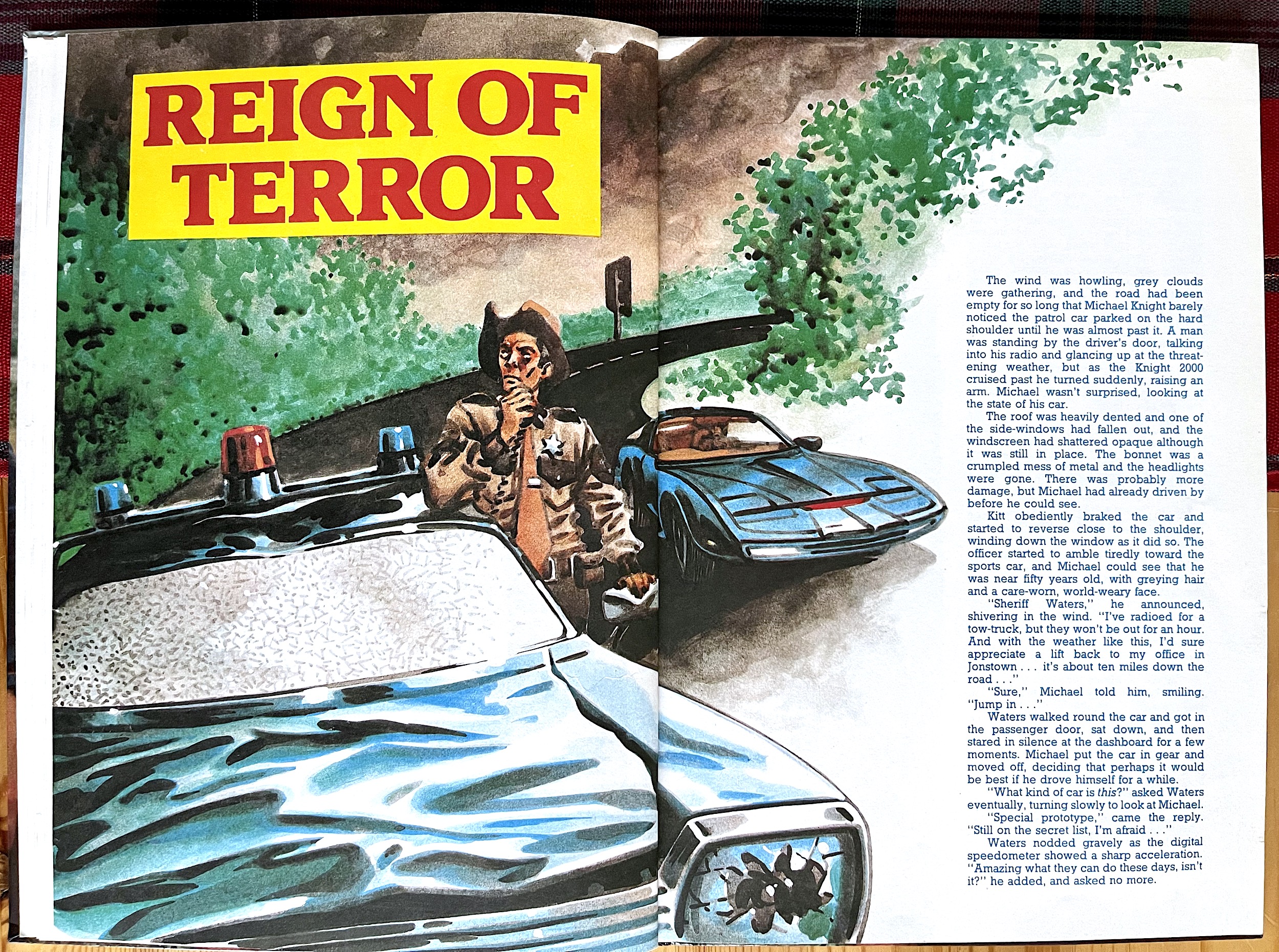
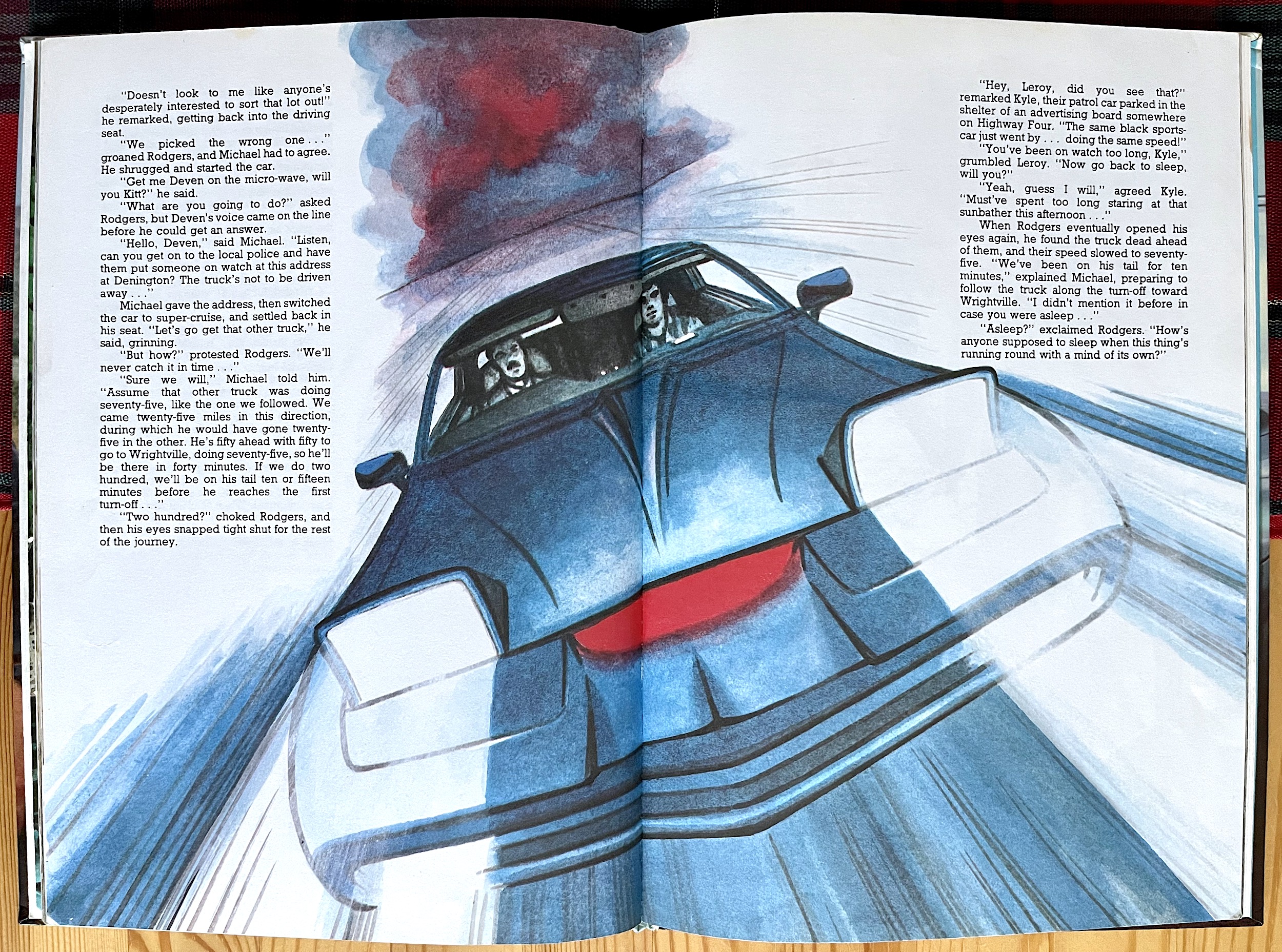
When I opened the book and saw the two-page introductory strip above which recaps the set up for the series not only was I in awe of the art, I was instantly transported back to that Christmas. Quickly telling the tale of Michael Knight’s original identify, being double-crossed, shot in the face and left to die, and the reconstructive surgery which resulted in his new identity and new life, we’re instantly up to speed and ready to get stuck in to what promises to be a much better book than I thought it was going to be.

The intro strip is followed by a feature explaining the background to the characters, the Foundation for Law and Government (F.L.A.G.) and the story behind the series. Some of the details here didn’t even make it into the show and were pulled from the series bible, put together by Glen A. Larson when the show was created. For the uninitiated, Wilton Knight’s Knight Industries set up F.L.A.G. as a non-profit arm of his company to help ordinary citizens fight those untouchable criminals who operate above the law.

Court battles and legal wrangling made up the majority of their work (though for obvious reasons we only heard about these happening off camera) but sometimes “direct intervention” was called for and that’s where the Knight 2000 project came in; one man in one car, that car offering him all the funding and resources of the Foundation to make a real difference in the lives of people the justice system had let down. Sounds like a good set up for a show, doesn’t it? Well, it sure was.

Of course, that one car was K.I.T.T., or rather the Knight Industries Two Thousand artificial intelligence inside the Knight 2000 car. That’s something the show (and I’m glad to say this annual) made perfectly clear; K.I.T.T. wasn’t the car, he was the A.I. inside the car; a car that could jump, drive on two wheels, create fog and oil slicks and so much more, all inside the near-indestructible molecular bonded shell capable of 300+ kph. Add in K.I.T.T. who could control all of this, drive it, remotely hack computers (a big deal back then) and give Michael computerised, forensic and scientific resources that’d make NCIS envious.

There’s even information which was new to me today. It’s full of wonderful little details fans will lap up

Knight Rider was that rare thing, a television show my whole family gathered around to watch together. It was unlike anything anyone had seen before. My sisters may have had David Hasselhoff posters on their walls, but mine were adorned with K.I.T.T., shelves packed with models of the car, books, electric toys… you name it, I had it. I remember when ITV repeated the show in the 90s and my mum, dad and a then-teenage me would still watch it together. Today, the remastered HD Blu-Ray collection takes pride of place in my own home. My love for this show will never wane.

So, intros out of the way and my obsession detailed, I can happily declare this opening feature is anything but a basic round up. Michael’s boss Devon Miles (played by the excellent Edward Mulhare) may be misspelled ‘Deven’ but there are details here from the series bible the show didn’t elaborate on until later seasons, so it must’ve been fascinating reading it in 1983. There’s even information which was new to me today. I never knew Devon originally met Wilton on a mission in France for the British S.O.E., or that his parents were killed in the blitz. Technician Bonnie Barstow’s father was a pilot who worked for Wilton and she has a Masters in Computer Science and a Doctorate in Robotics. It’s full of wonderful little details fans will lap up.

This image is taken from the first strip, Break-Out. There are two strips in the book, both of which act like the final part of an episode, so all of the detective work and build-up is out of the way and the strips can concentrate on some fun action. For example, here we see the results of the supposed damsel in distress trying to double-cross Michael only for K.I.T.T. to quite literally eject that plan. So who was behind these exciting, fun stories and the simply gorgeous, atmospheric art?

I was thrilled to find out my favourite thing in the universe was handed over to none other than David Lloyd, he of V for Vendetta fame (as well as Wasteland, The Territory and Hellblazer). Yes, that David Lloyd! His unmistakable style and that lovely wash suit Knight Rider perfectly. The original pilot movie was rather dark with a lovely atmosphere and David’s art is reminiscent of the direction of that particular episode. With Marvel UK’s Transformers letterer Annie Halfacree bringing her talents to the page the only question left to ask was who wrote these?

While speaking with David recently (more on that at the end of this review) I was finally able to find out it was Steve Moore (Abslom Daak Dalek Killer, Hercules, Warrior) who wrote many of the stories for Grandreams tie-in annuals at the time. Steve nails the characters of Michael and K.I.T.T. and, best of all, their dynamic interplay. This evolved as the series progressed and at this early stage could still be quite antagonistic at times, Michael’s patience sometimes wearing thin with the analytical and logical computer. I’m very happy to say that’s here in spades.

The prose stories, beautifully drawn and coloured by David, are lengthier than any in Marvel UK’s annuals, giving Steve the scope to give us a more detailed adventure for our heroes. Although, I must note Bonnie is conspicuously absent outside of the features. This could be because the stories had to be written so far in advance that the pilot movie was all Steve had to really go on (Bonnie didn’t appear until the first regular episode). But then again the stories take place out on the road already, so by this stage in the episodes it would be all about Michael and K.I.T.T. anyway.

Reign of Terror uses that old 80s staple of the bad motorcycle gang, one the show itself used in its first season. In fact, the episode Good Day at White Rock would’ve been broadcast months before this annual hit the shops. Also, K.I.T.T.’s functions are limited to those shown in the pilot movie, so again I think these were written before much of the series was broadcast. Given this, it’s nothing short of incredible how well Steve nails everything from the characterisations to the tone.

The distinction between K.I.T.T. and the car are particularly enjoyable, especially since this was something the series would only really begin to highlight in season two (after it was set up in the pilot). For example, in one paragraph here, “K.I.T.T. brought the car round the buildings and came up behind them.” It’s enthusiastically written and I get the impression Steve was having fun with this. Michael and K.I.T.T. throw everything at the bikers and it’s not just a checklist of the car’s functions, there’s a proper plan here, perfectly thought out and executed with panache, a plan that could only be achieved by this unique partnership.

Reign of Terror’s plot may not have been all that original but it paints an entertaining picture. The other prose story, The Long Chase is a more original idea. The US Customs Department asks F.L.A.G. for help in an art forgery case, where they believe a legit art business is also smuggling stolen works. They’ve tried tracking their trucks but are always met with car accidents, traffic jams, road blocks etc., too many to be a coincidence. Enter Michael and K.I.T.T.

In the end it boils down to a situation where they have a choice of two trucks to follow, each going separate ways on the highway. They deduce which one to tail and are met with the same impediments, but they’re no match for these two and we get a wonderfully written sequence of them barging their way through everything thrown at them, much to the terror of Marshall, the Customs Agent along for the ride.

These images have a lovely retro feel to them that many would pay good money to have painted and framed today

When it’s clear they’ve followed the truck with the legitimate art (sent on a wild goose chase with the diversions) Marshall is about to quit, what with the other truck now hundreds of miles away. But this is a challenge our pair relish. There are some really nice scenes involving Michael and K.I.T.T.’s burgeoning partnership. It’s intriguing, well-paced and all round a thoroughly entertaining little tale. There are also some brilliant night scenes drawn by David, my favourite being a double-page spread of K.I.T.T. coming head on towards the reader, scanner and headlights cutting through the night. These images have a lovely retro feel to them that many would pay good money to have painted and framed today.

Alongside a brief bio of The Hoff there are two features centred around our other main character. K.I.T.T. – The Car and the Stunts is pretty self explanatory and is apparently based around an interview with one of the producers, although they go unnamed and give inaccurate information, which is odd. I wonder if the book did speak to someone involved with the show or if they got these details from elsewhere and reprinted them.

There’s a reference to turbo boosting on to the back of a truck being done for real, but the scene in question was actually achieved through clever editing and effects.  The ‘producer’ also says the only thing that isn’t done for real is the ejector seat, but in reality this was really installed into one of the cars used on the show. Indeed, since this book there have been numerous interviews with the stunt people on the show which have been very funny, especially the story about when they were trying to calibrate the ejector seat for the first time and the stuntman went flying into the air higher than a palm tree next to the car! Unfortunately, this isn’t referenced here.

But at the time of this book it was just exciting to see photos of K.I.T.T. in action. You have to remember this was way before the internet. Even VHS video recorders were only starting to be installed across the UK. That meant the only way to see your favourite TV show was when it was broadcast or repeated, and the only chance to see photos was in printed publications. There may not have been any photos of him turbo boosting over anything which I remember being disappointed with, but there are explosions, a ski mode (up on two wheels) and a very memorable chase where the stunt performer jumped from a flying helicopter right down into the driver’s seat of the speeding, self-driving (on the screen at least) K.I.T.T., all without wires!

What’s interesting is how the book credits actor William Daniels as K.I.T.T.’s voice when the show didn’t. In fact, Daniels insisted he not be credited so as not to ruin the illusion for the kids, so given who the target audience is for this book it’s strange to include his name. The second car feature, K.I.T.T. – Equipment and Functions deals specifically with the fictional side of the car, meaning its artificial intelligence and futuristic abilities.

There’s a particularly well written introduction to this part of the annual, especially when discussing the different ways he interacts with the human characters.

“Michael and K.I.T.T. are true partners: they bicker, they rib one another, but they are fiercely loyal to each other. K.I.T.T. is a little bit of a know-it-all. He’s pragmatic, sometimes arrogant, often fussy and peevish. And since he’s (yes, he is described as a “he”) completely logical, he has a difficult time understanding this most illogical of humans, Michael Knight.”

Of course he’d soften as his character developed over the series, as he learned from his human companion and their missions together.

“K.I.T.T. has a great sense of humour and he is incessantly interested in human emotions and feelings, things he seems to pick up on as time goes on.”

It’s clear these details were taken from the series bible because when this was written they were the future plans for the character, rather than anything seen yet. Also, maybe an early draft of that document was used because even here there are some inaccuracies, such as claiming K.I.T.T. can’t have independent thought unless put into surveillance mode. This mode is for scanning the area, K.I.T.T. always had independent thought. (Elsewhere in the same article this mode is described correctly.)

It’s rather strange that the publishers obviously had access to information from the show itself yet these errors still slipped in. Could it be the series bible was further refined as the pilot was created but after it was handed out to licensees? Or perhaps the book elaborated where they thought they could, not thinking they were contradicting anything. Most glaringly are the two oft-cited errors that peeve fans off: no, turbo boost does not enable K.I.T.T. to fly and no, he does not have offensive weapons.

Saying all that, as a child I really didn’t care. We were much more forgiving back then. Books such as this were the only way we could see photos of the super cool car and enjoy new stories away from Saturday evenings in front of the family telly. My own copy of this annual disappeared many, many years ago and I remember it falling apart from being read that many times. It rarely left my side for months after Christmas 1983. I’d even clutch it tightly while watching the latest episode.

To finish this childhood favourite is Devil’s Valley, our second gorgeous strip and it’s even better than the first. It may have been a family show but Knight Rider never shied away from dealing with issues you’d see in more adult dramas, such as murder, kidnap, drug dealing and terrorism. All defeated by one person making a difference of course. Another topic it would touch upon more than once, which this strip also does, was racism.

A variation of the Ku Klux Klan seem to have kidnapped a young lady to make some sort of religious sacrifice. She escapes and runs out in front of a self-piloting K.I.T.T. (Michael is having a doze). Once again, it plays out like the final scenes of an episode and all of the car’s capabilities are the same as the movie but it’s huge fun. The spread above is an exciting collection of panels and shows the potential a regular Knight Rider strip could have had when coupled with a deeper story.

One thing I have noticed throughout the book is the incessant need to have ‘Knight 2000’ plastered all over the car. It looks like it’s been added later and David confirmed he can’t remember any instruction to do so. (It’s particularly jarring on the cover.) I remember any toy K.I.T.T.s I owned as a kid had stickers of this all over them and I’d always remove them. After all, K.I.T.T. was meant to blend in. It could be a licensing thing, to separate merchandise for Knight Rider from that of car manufacturer Pontiac, but adding it to the strips feels unnecessary.

As you can see this is only the first of five Knight Rider Annuals and if this one is anything to go by I’m glad I’ve finally been able to track them all down (those later ones seem to be somewhat rare) and I’m really looking forward to the next one. When will that be? Why, next Christmas of course! This blog is in real time after all. It’ll be an agonising wait but nope, I won’t be reading ahead, it’ll make the experience all the better for it.

For this year however, I have a very special treat in store for both Knight Rider and comics fans in general. Artist David Lloyd very kindly agreed to answer questions about working on the annuals and not only did he supply some fascinating insights, he also sent me some of his original sketches for K.I.T.T. and a Hasselhoff study! You’ll be able to check all of these out in just a couple of days on Saturday 17th December 2022. For now, I’m off to have my yearly viewing of the show’s sole Christmas episode, appropriately enough titled ‘Silent Knight’.

“Straight ahead.”

GO TO KNiGHT RiDER ANNUAL 2

ANNUALS MENU

CHRiSTMAS 2022

BiG COMiC BOOK 1987: STOCKiNG FiLLED

As a child one of my regular orders at the newsagents was for Fleetway’s Big Comic Fortnightly, which I collected from #1 for a couple of years after receiving a giant book the previous Christmas (the 1988 volume). Only when deciding to collect the books for the blog did I discover there’d actually been another the year before; when it had hit the shelves originally I hadn’t even discovered OiNK (my first comic) yet. Now I’ve been able to complete the collection of eight huge tomes that make up the Big Comic Book series, released between 1986 and 1993.

While they’d have been available since the end of the summer, it was Christmas Day when most of us would’ve received these so I’m going to cover one each festive season. (At least you know the blog will be about for a bit now.) While OiNK was more in tune with my sense of humour than more traditional humour comics, that doesn’t mean there aren’t plenty of smiles and a few chortles to be had here. With 256 pages it’s a cliché to say it but there’s something for everyone. Here are a few of my own highlights.

I can’t remember these first characters from the fortnightly or books as a kid, but that’s probably more a lack of memory on my part. Happy Families is drawn here by Dick Millington and I’m sure it can resonate with many of us around this time of year. The Happies are made up of Mum, Dad, Grandad, Sharon and the twins Vicki and Dicky and the scenario is much like the rest of the book’s comic strips, a simple but effective one; a small disagreement over something very unimportant would escalate until the whole family was at war with each other.

As with much of the contents in the book this is only one of several Happy Families strips, although most of the others end up so rowdy the police get involved. The stories can vary from them all being at each others’ throats by the end, all of them being punished in some way, or one or two of them getting sweet revenge on the rest of the family. Yet at the start of each new strip they’re back to loving one another again. Families, eh? These strips may even have been somewhat cathartic for some readers’ parents or older siblings on Christmas Day.

Regular blog readers will know I’m a sucker for a comical shark in the pages of OiNK due to my obsession with the creatures. This stems from my favourite movie of all time, Jaws, which inspired teenage me to read up on the real fish and decades later I’m still fascinated. In fact, my favourite ever page of OiNK was a parody of Jaws in #4 but even the top comic of all time has to take a bow to the following star of Monster Fun.

When I started collecting Big Comic it would still be a couple of years before I’d see the best film ever made but I always loved Gums. I was reading this funny strip very obviously inspired by that movie before I saw it. After I did eventually watch Jaws I just enjoyed this toothless version even more so as a result. Gums was originally created by writer Roy Davis and artist Robert Nixon. The above strip is taken from Buster after Monster Fun folded and is drawn by John Geering (who also contributed to a handful of OiNKs).

To me he was always a Geering character. John gives such fantastic, expressive gestures to Gums who thought he was a terrifying monster of the deep, but the cast of recurring characters who lived with him weren’t exactly quaking in the depths. The best thing was that Gums would sometimes triumph in his schemes which kept things fresh. With quite a few strips in this one book, it’s clear he was a fan favourite. Our next character also originated in Monster Fun.

Kid Kong’s original artist was also Robert Nixon, although this Buster strip is drawn by Rob Lee and alongside Gums he lives on today in Rebellion’s new Monster Fun in new stories by new artists. Originally an escapee from a zoo and much larger, he was shrunk down to make it easier to write stories in a family home setting, although still having to stoop down to fit inside Granny Smith’s house. Granny was chronically short-sighted and hard of hearing, mistaking Kong as her own.

As enjoyable as these have been so far, not all of the contents hit the spot as much as these examples. Some haven’t aged well, in fact some hadn’t even aged well by the late 80s. But whether it was the latest book or the fortnightly comic there was enough content to ensure plenty of enjoyment and the odd chortle from a favourite character. The sheer size of Big Comic meant every reader would have some favourites and get a lot from each volume. Just don’t be expecting OiNK levels of guffaws. Unless you’re reading Gums, of course.

In recent years Ken Reid’s Faceache has had something of a resurgence, from a gorgeous hardback collection to new strips alongside the two stars above. Created for Jet comic but (yet again) a later star of Buster, Ken’s style is instantly recognisable and upon first glance may seem very traditional, very DC Thomson-esque to the uninitiated. But you soon realise these are very different to pretty much everything else in this book.

Ken’s work really pops, really stands out, which is no small feat in such a huge book

The humour has a different feel to it, not least thanks to the creative ‘scrunges’ Faceache pulls off. This juxtaposition works, the strips feel fresh even today with a unique art style. Ken’s work really pops, really stands out, which is no small feat in such a huge book where everything is black and white on cheap paper stock. However, if you’re scanning through a Big Comic Book these really do stop you in your tracks.

I’ve happy memories of the following family from my time with the fortnightly comic and they’d often be the first strip I’d read, the endings almost always guaranteed to raise a laugh. The Bumpkin Billionaires originated in Whoopee and told the tale of a family of Beverly Hillbilly types who had won billions of pounds on the pools (the family-friendly weekly sports betting which predated the lottery, kids – Phil) but who hated the lifestyle changes the money brought. Every story would show us another hare-brained scheme of Ma, Pa, Billy and Daisy‘s to get rid of all their cash, much to the disgruntlement of their bank manager.

Mike Lacey brought these loveable rogues to life and the physical comedy of the main characters was always funny. Most of the time the family’s plan would fall apart in the final frame or two and they’d somehow end up with even more money than they started with. I’ve included the one above because it was one of those rare occasions when things actually worked out in their favour. Well, I’m assuming these were rare occasions, I certainly can’t remember this happening regularly and I’ve fond memories of trying to work out what was about to go wrong for them.

Do you remember CBBC programme Grange Hill? My siblings watched it but I never did, although the theme tune is still seared into my mind. Whizzer & Chips came along with its own interpretation, Strange Hill, which as a name I absolutely love. Teech was the poor sap trying to educate the wee monsters who in this case actually were little monsters; a class full of spooks, ghouls and tiny versions of famous Hollywood creatures. I thought this particular example would be a good one to include on this blog, can you tell why?

Tom Paterson, who brought us a few ingenious early OiNK strips is the perfect choice for these manic pages with such a varied ensemble cast and his trademark smelly socks, little squigly creatures and descriptive word bombs are all evident by the bucketload. These little extras always made his strips classics for me and his were the only ones I read in my brother’s Beanos.  I’ve always said it’s unfortunate he was too busy to contribute more to OiNK where surely his work was a perfect fit.

Drawn by Sid Burgon, Lolly Pop was an entrepreneur with an endless range of businesses and an equally endless supply of money. However, while his businesses thrived the same couldn’t be said of his relationship with his son Archie, who was a regular kid after a regular life, who just wanted to play and spend time with his dad. With his dad being so preoccupied with his factories, Archie’s unsupervised attempts of leading a normal life and wanting to win his father’s attention would inevitably lead to a variety of disasters.

It also didn’t help that despite being an obvious millionaire Lolly Pop was rather miserly to say the least, preoccupied with saving his wealth, leading to Archie being somewhat neglected. Although to be fair it was only attention that Archie felt starved of. Originally in Whoopee, Lolly Pop is one of the stronger series in this book and there are stories involving Lolly Pop Toffees Ltd, Lolly Pop Movie Studios, Lolly Pop’s Garage, Pop’s Tyres, Lolly Pop Wood Products and Lolly Pop’s Record Company over five 2-page strips.


“Ha! No playpen can hold Sweeny!”

Sweeny Toddler

To finish the review there’s one perennial favourite surely everyone loves no matter which generation they’re from. Another character appearing in new strips today, even illustrated by one of his original artists, Sweeny Toddler was the tearaway baby who would cause havoc in not only his own home but all across town, with his ever faithful canine friend Henry by his side. Sweeney was originally created for Shiver and Shake comic and drawn by Leo Baxendale, then through mergers he’d go on to star in Whoopee, Whizzer and Chips and (of course) Buster.

There’s a reason Sweeney lasted as long as he did. Quite early on the brilliant Tom Paterson took over drawing duties and OiNK’s very own Graham Exton became Sweeney’s writer in the early 80s. They made the perfect team and during that time the strip rose to ever greater heights. The strip below is drawn by Tom but is before Graham’s time with the character. When Graham joined Tom’s style had developed to include all those lovely little sight gags he became synonymous with, like those in Strange Hill.

Overall, the first Big Comic Book is a success. Financially it was a huge success! It (and its fortnightly spin-off) cost next to nothing to produce since Fleetway owned the rights to all of the contents (we would never have seen any OiNK material as a result since most of it was creator-owned) and used cheaper paper stock, enabling the books to be much thicker with a retail price similar to a regular annual.

While some of the strips haven’t stood the test of time as well as others, there’s not really any that won’t at least raise a smile, making it a very pleasant reading experience. Needless to say, if you see this on eBay or in a second-hand charity store snap it up. With this amount of silly comics stuffed inside you should find plenty to keep you amused no matter your tastes.

GO TO BiG COMiC BOOK 1988

ANNUALS MENU

CHRiSTMAS 2022