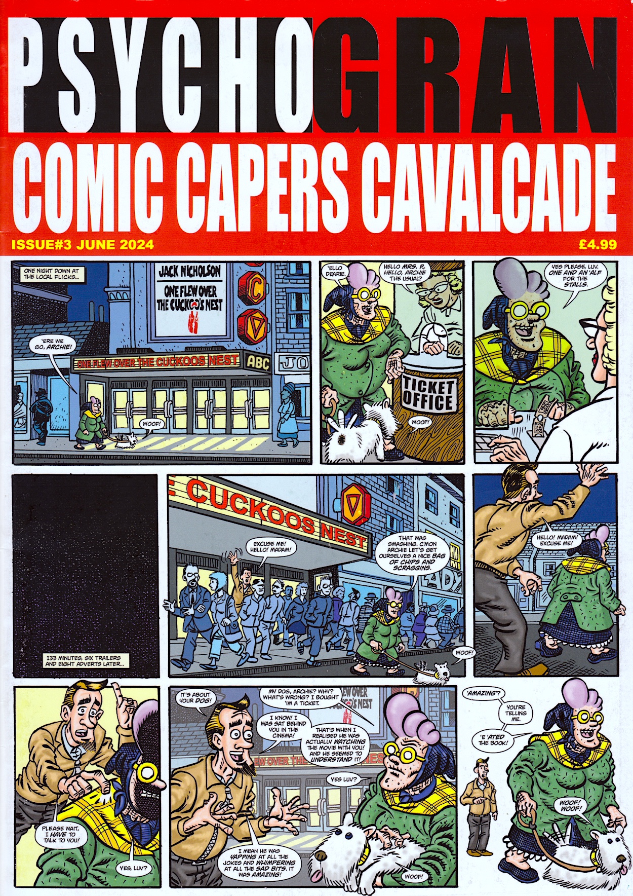
Before you go and search through the blog to find reviews of the first two issues of David Leach’s Psycho Gran Comic Capers Cavalcade I’ll tell you know you won’t find them. Yet. This blog was relaunched in 2021 and the previous two editions were released before that. Psycho’s earlier Cavalcades will eventually get included but for now I’m concentrating on the brand new issue that David has released through Dead Universe Publishing. Featuring a selection of strips originally released digitally in Aces Weekly this is their more natural home, on the printed page. And what lovely printed pages they are; 36 high grade glossy A4 pages and a thin card cover, really bringing David’s gorgeous colours to life.
Presented in “Widescreen Psycho Vision” the original landscape format for the digital comic means the reader has to turn this on its side, making the pages feel much larger when held, almost like a Psycho Gran broadsheet! It adds to the appeal and uniqueness of the comic and feels like a natural fit for what David has produced for us.
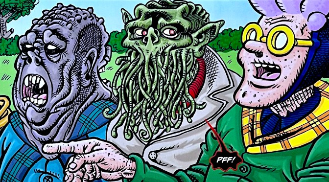
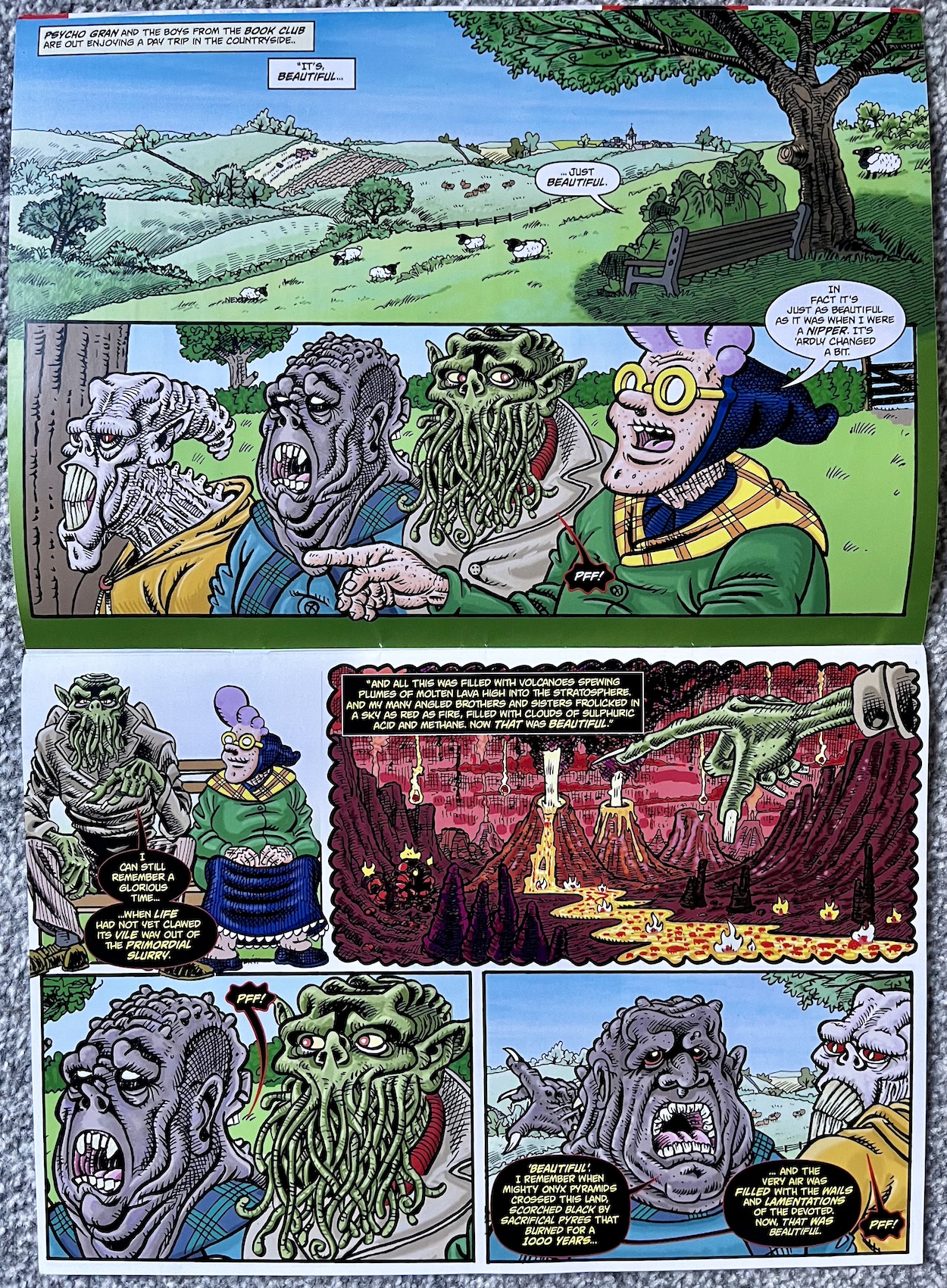
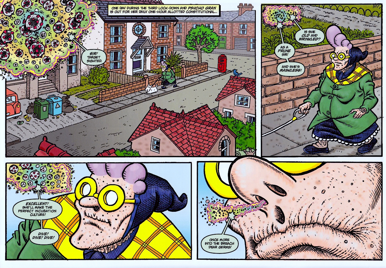
There’s a bit of a theme with some of the stories (all multi-page affairs apart from the front cover) as we meet some of her friends from the Netherworld who make up her book club. This seems appropriate given how it’s been emphasised before how old she must be and yet she just keeps on going. Speaking of her innate ability to give a middle finger to the Grim Reaper she goes up against what is surely her biggest foe to date: Covid.
As an obvious fan of the character from right back when she first appeared in OiNK #15 (my second issue as a kid so she was there from the beginning for me) is it just me or for a split second do you almost feel sorry for the virus here? Just for a second though. I won’t give anything away but you know she’ll come out on top of this fight. It’s how she manages it that makes us laugh. You’ll just have to buy the comic to find out for yourself. This strip is worth the entry fee alone.
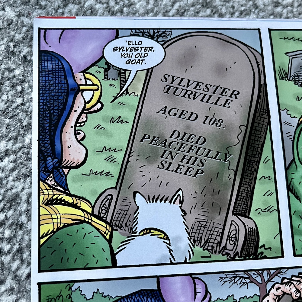
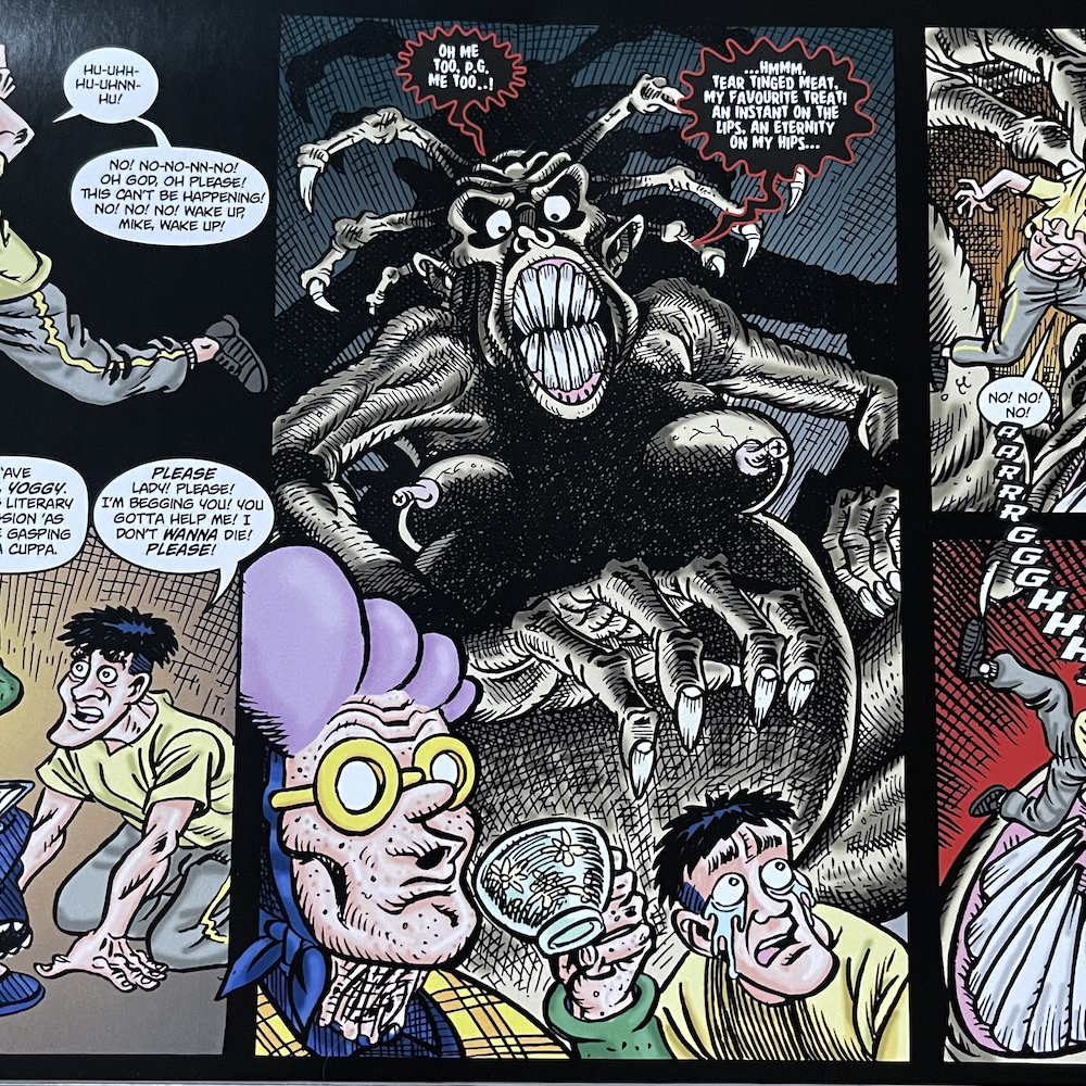
Among the remaining stories we see her visit the grave of her deceased husband in what starts out as a surprisingly touching strip that slowly begins to wander back into familiar territory, bringing with it an ever-broadening smile from the reader. Her book club then returns in the largest strip of the issue with some imagery which definitely wouldn’t have made it into the pages of the kid-friendly OiNK!
This particular story also involves a trademark of Psycho Gran as she takes revenge out on those in the world that really deserve it, like in previous issues where she went up against pavement jumping cyclists or footpath hogging joggers. There’s a feeling these are being ticked off David’s own personal hit list of pet peeves and they’re always the funniest of all the strips.
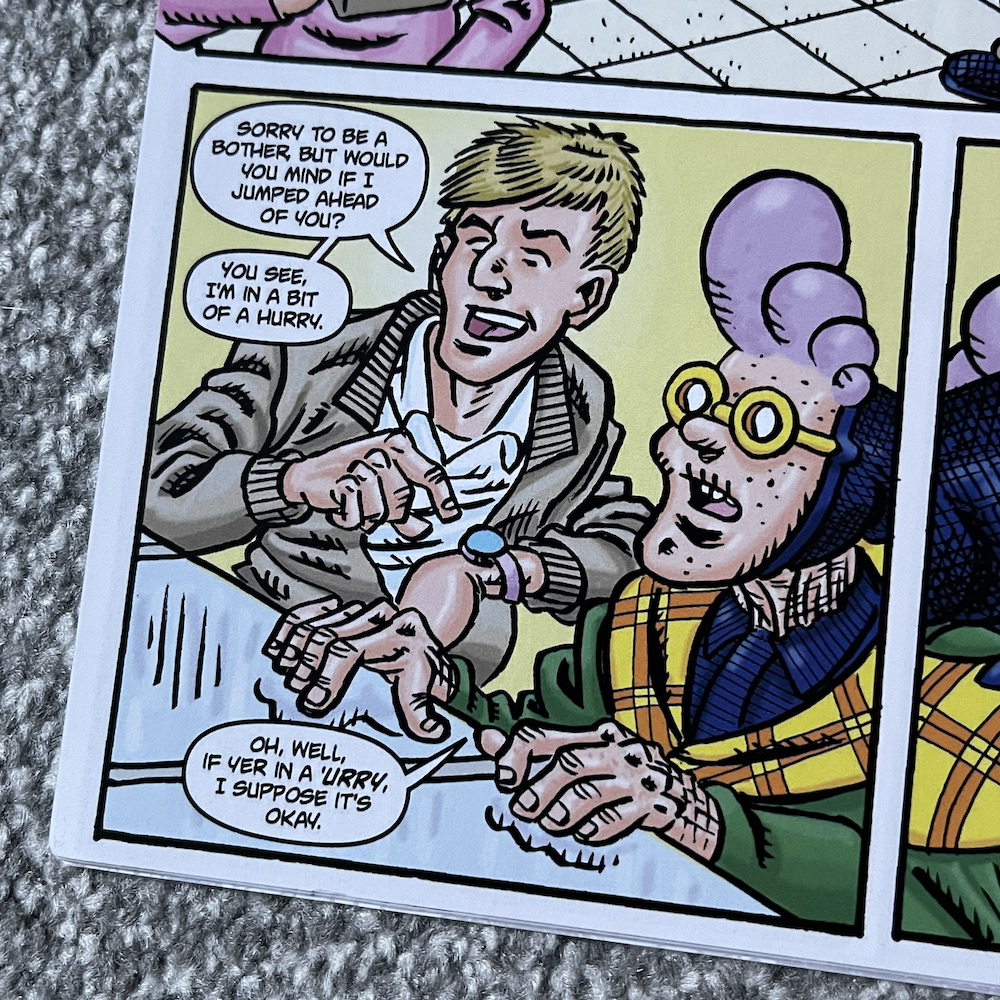
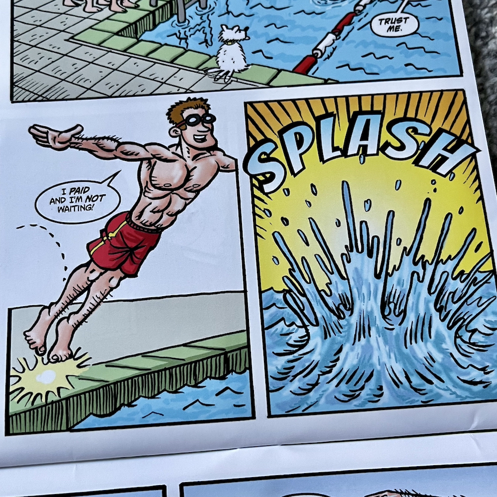
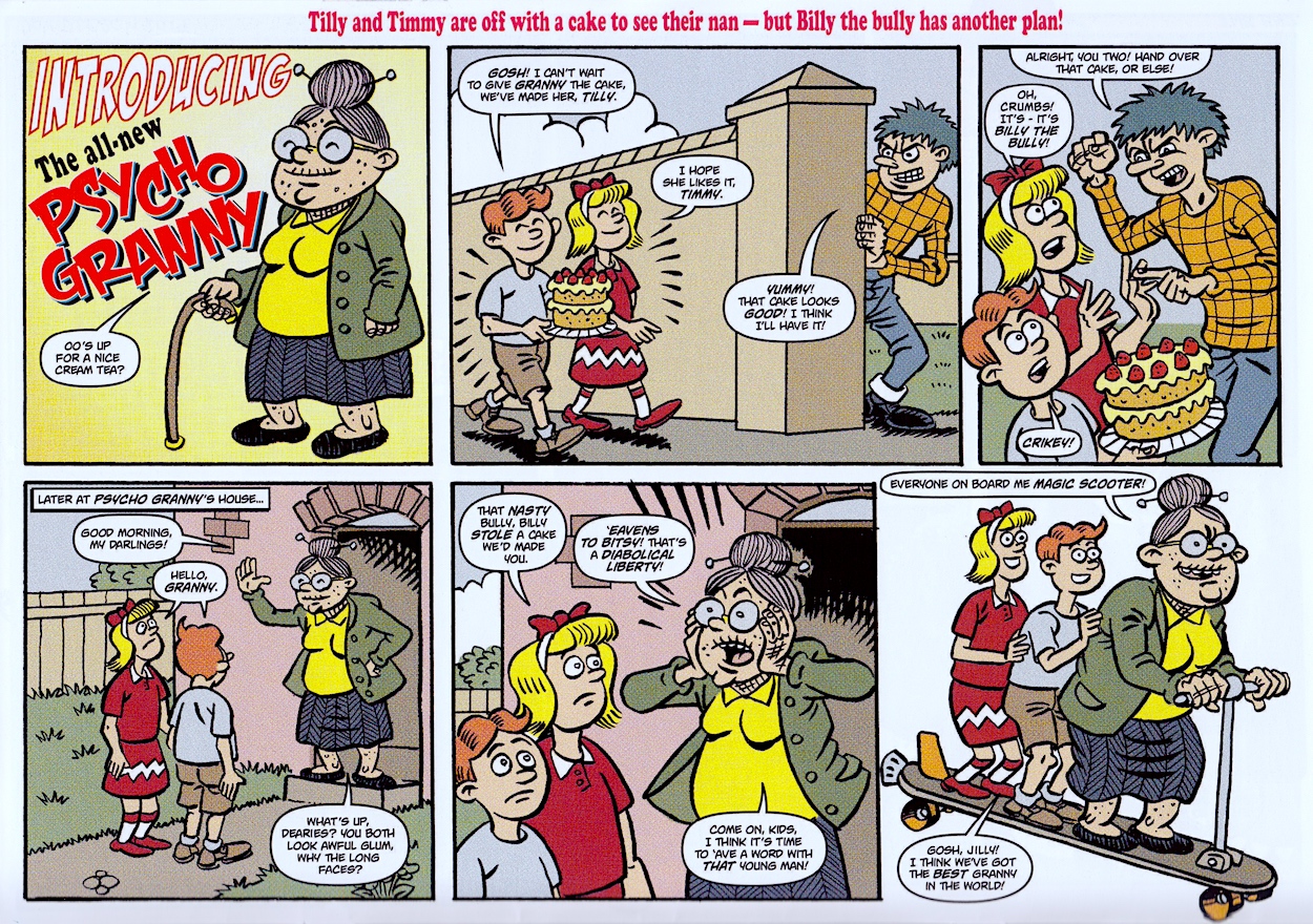
Those who con little old ladies out of their money, polite queue jumpers in supermarkets and show-off swimmers in the local pool should all watch out from now on. Then, just as you think the comic couldn’t possibly surprise us any more it brings a brand new look to the character with a cheery, saccharine reboot as ‘Psycho Granny‘ in the style of old school traditional British humour comics, the type that OiNK itself was created in response to.
As it is this is already a funny take on the whole premise, never mind the ending which I won’t spoil for you, although I’ll just say it’s another reason for pig pals to get their trotters on this comic. So how do you do so? Aylesburty comic shop Dead Universe Comics have published the Psycho Gran Comic Capers Cavalcade series for David and if you’re not in the area you can order from them by giving them a bell on 07852 836307.
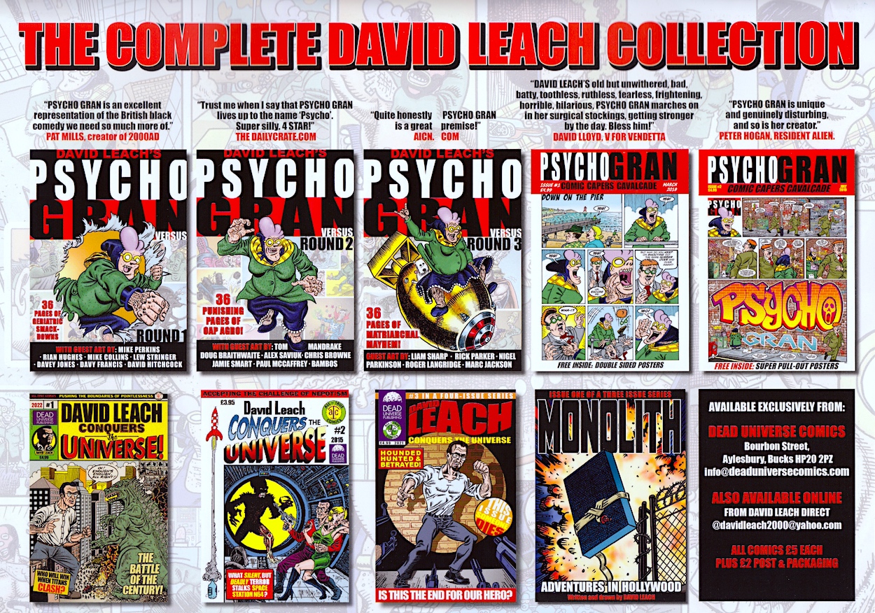
At £4.99 this is a bargain for all OiNK fans and fans of highly original, genuinely very funny comics in general. On the inside back cover is a comics checklist of sorts, of all of David’s physical releases to date. Psycho Gran Comic Capers Cavalcade #3 is the perfect starting point for anyone wanting to get into the modern publications from anyone in the OiNK team and an absolutely essential purchase for dedicated pig pals.
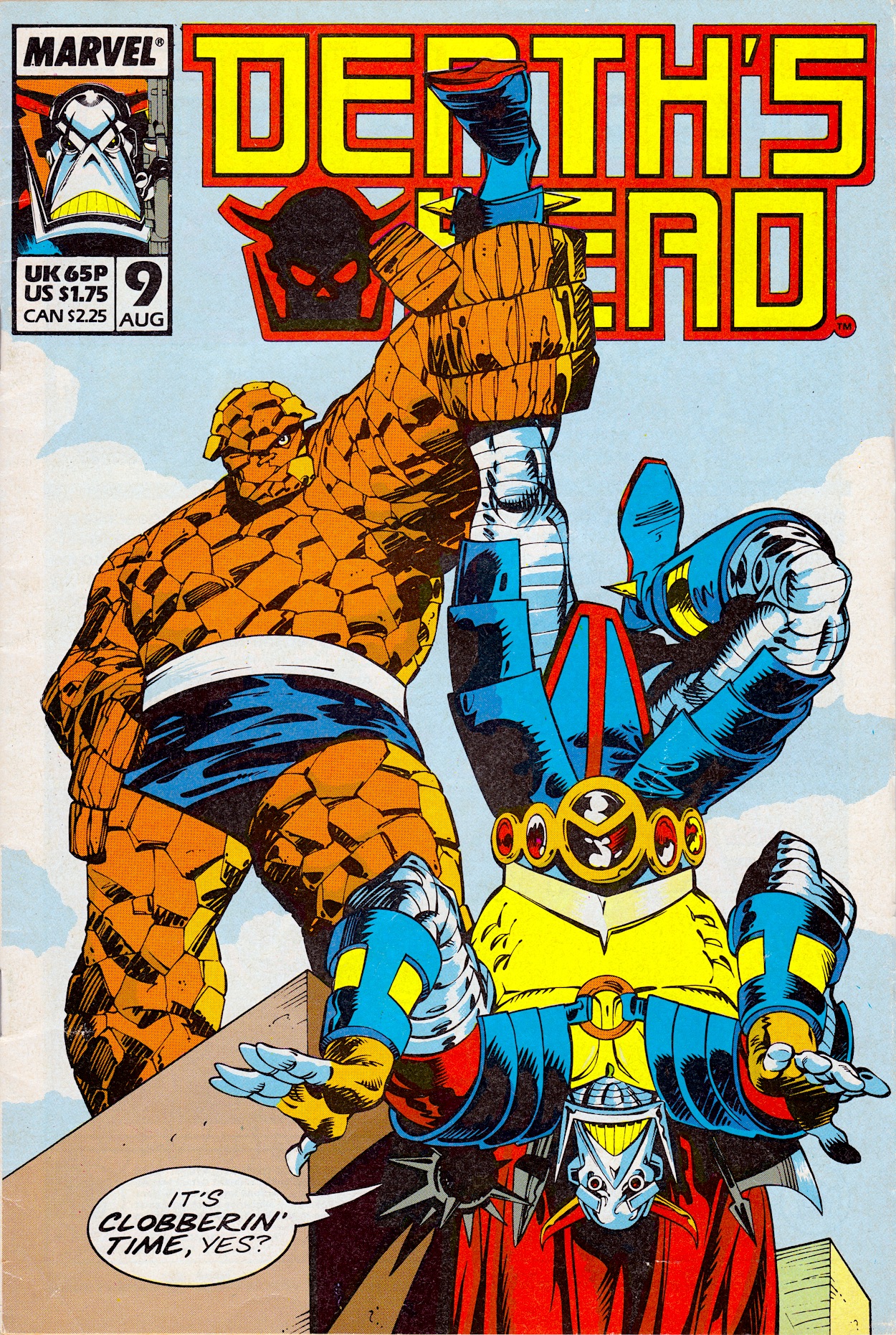
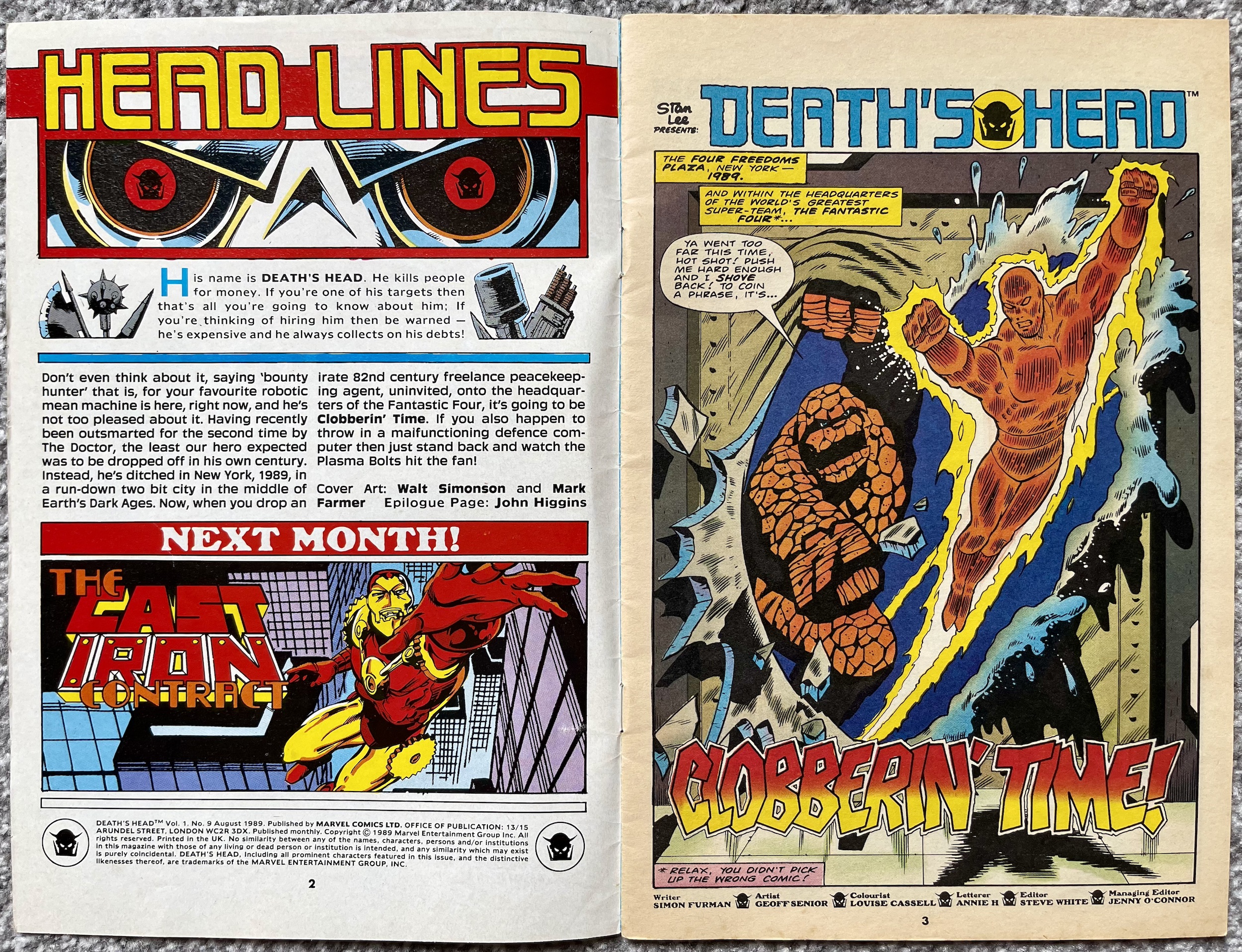
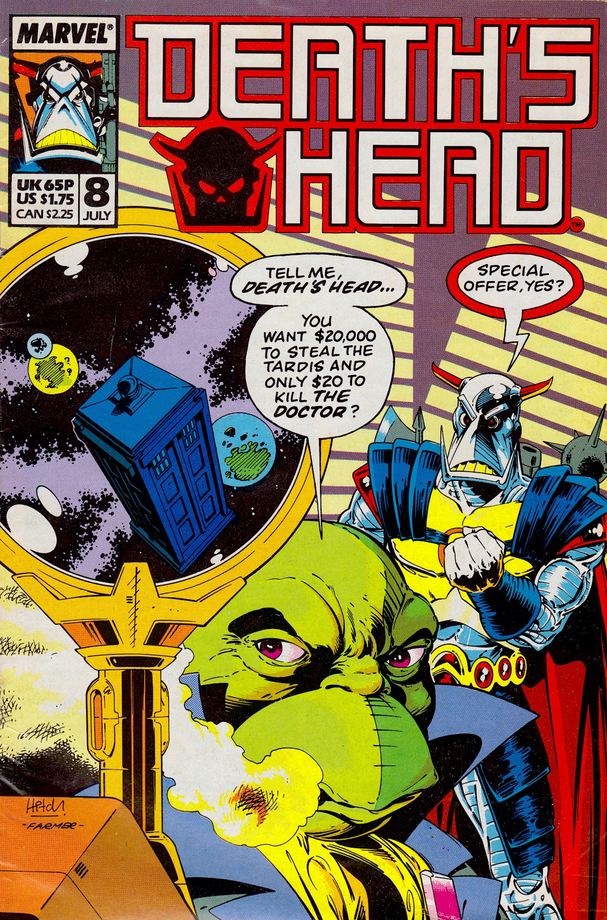
With a cover by none other than the legendary Walt Simonson (Thor, Star Slammers, Jurassic Park) and Mark Farmer, the penultimate issue of Death’s Head contains no official warning that the comic was about to come to an end. There’s a bit of a hint on the editorial page which has a ’Next Issue’ panel in place of the usual subscriptions offers, not that readers at the time would’ve picked up on this as they’d have been too excited at the prospect of our Freelance Peace-Keeping Agent meeting Iron Man next month.
After a price rise last issue we got another one this month too, by 5p again. I remember the second half of 1988 and into 1989 my comics always seemed to be increasing in price, such were the struggles of an industry at a time when readerships were declining in the face of competition from television and computer games while production costs were soaring. Death’s Head would become a casualty of these changes soon enough but let’s enjoy the issue at hand first.
The editorial describes how last monthThe Doctor dropped off Death’s Head in the middle of Earth’s Dark Ages, which is actually 1989. Given writer Simon Furman‘s Dragon’s Claws took regular swipes at the 80s UK government (in the comic’s future vision of Britain) this could be more about accuracy than a quick joke. Simon is back after a month away from the comic and co-creator Geoff Senior finally makes a very welcome return as artist.
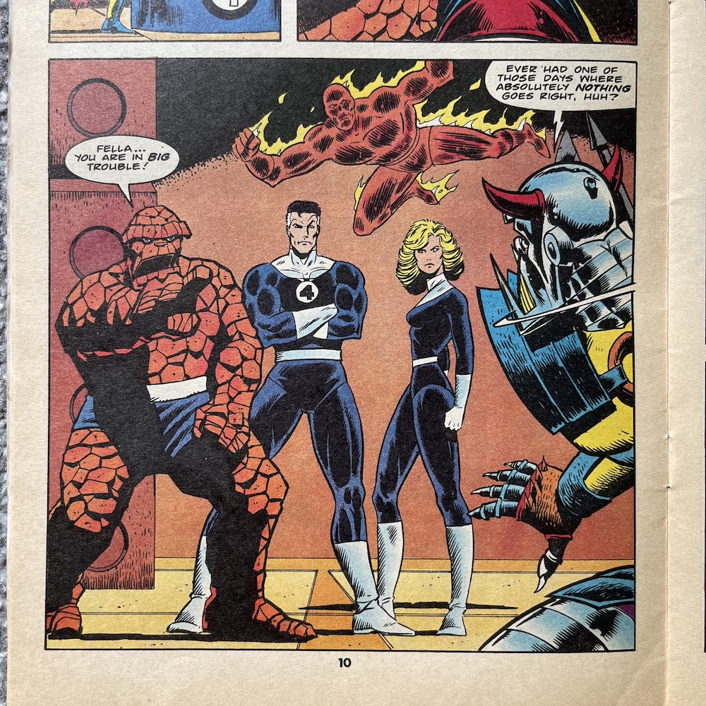
I didn’t even know the big rock guy is the leader!
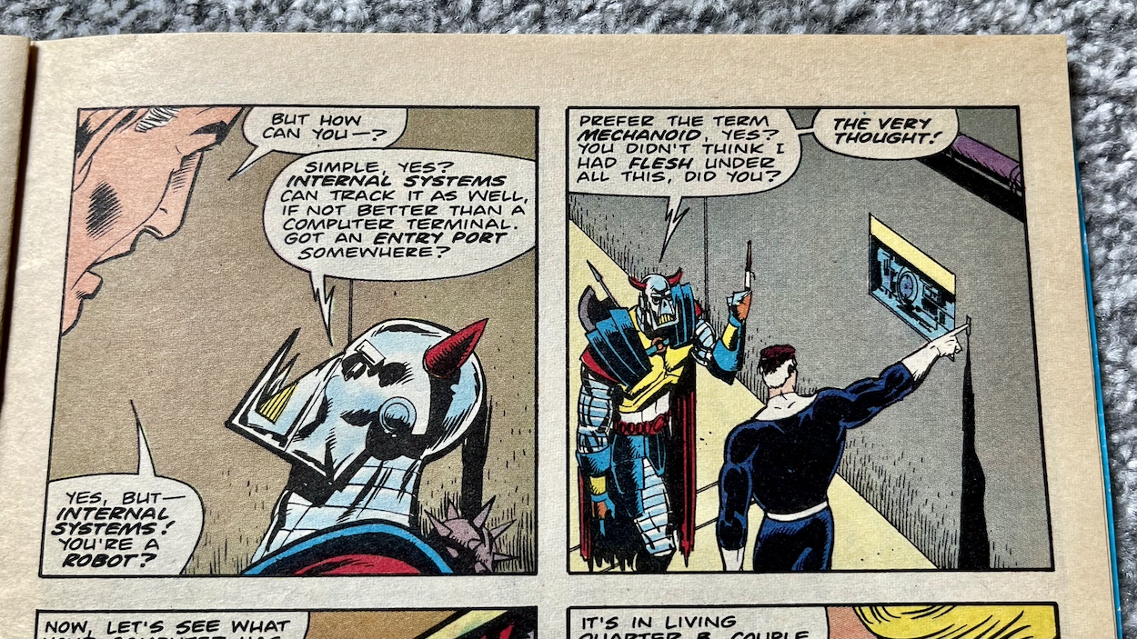
As you can see The Fantastic Four are the special guests this month. I’ll admit this is the first comic featuring them that I’ve ever read. I’ve never seen an issue of theirs and never saw the cartoons as a kid or any of the movies, so I really am going into this blind. I didn’t even know the big rock guy is the leader! It starts off very light-hearted with The Thing and The Human Torch bickering in a very superhero way.
Clobberin’ Time continues new editor Steve White’s brief time behind the wheel, with regulars Louise Cassell and Annie Halfacree on colours and letters respectively. That title soon becomes tiresome though. I understand it’s The Thing’s catchphrase but he uses it so frequently I feel like shouting, “Okay, okay, I get it, kids are meant to be copying him!” at the pages. Perhaps this is keeping within character but it’s just so annoying. What is good is the funny moment this sequence ends with, where it looks like they’ve made up.
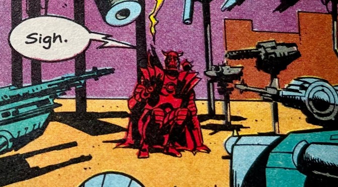
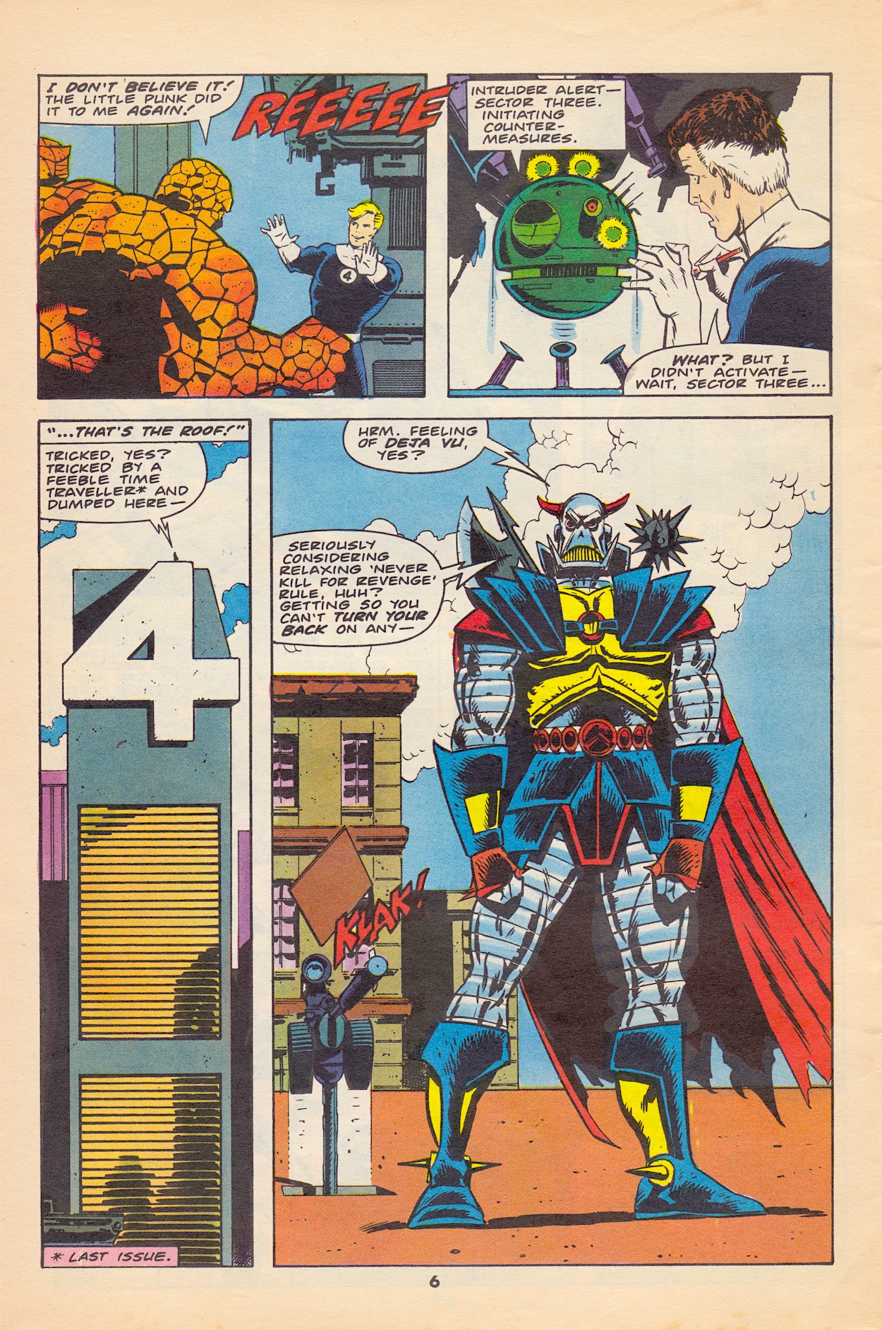
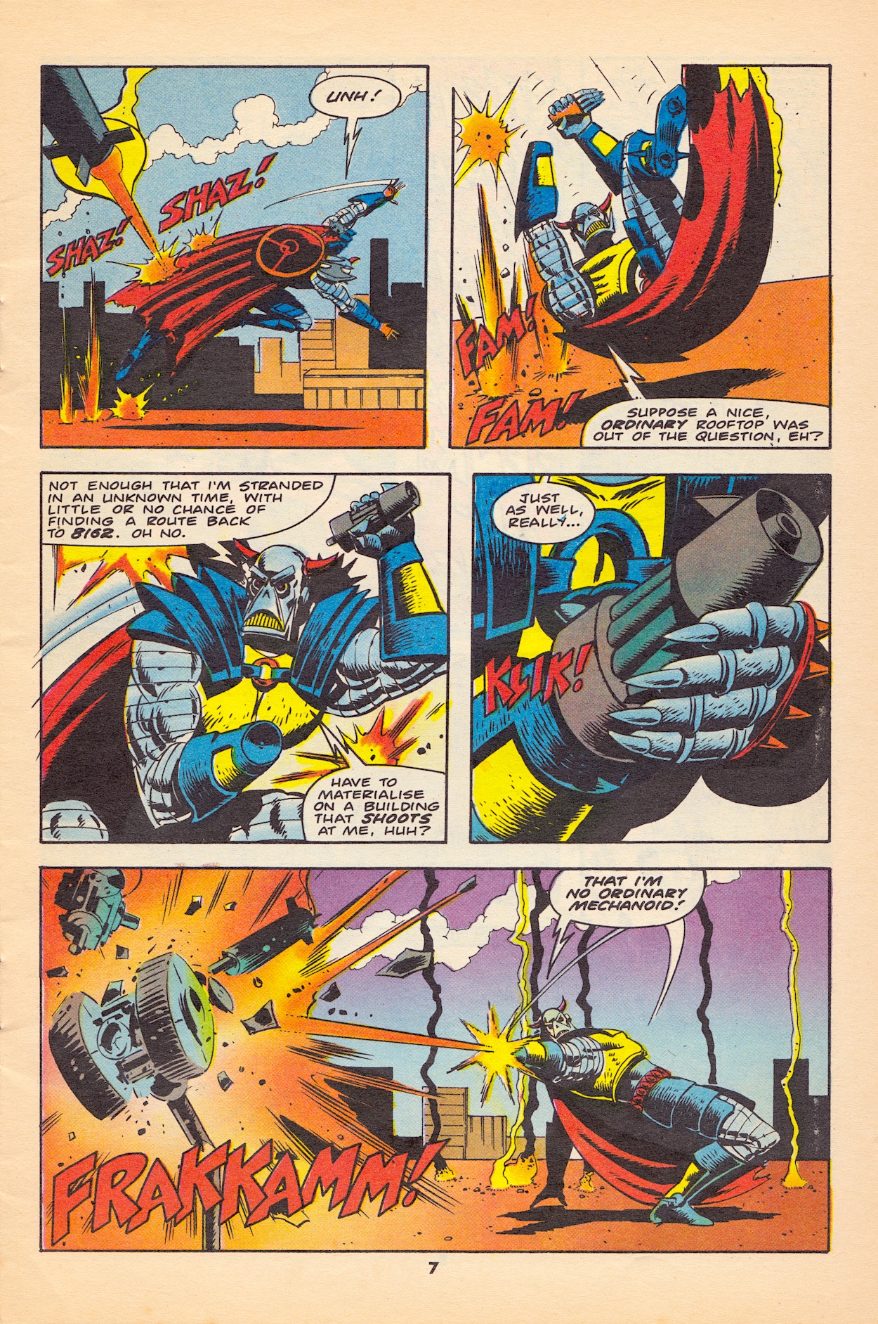
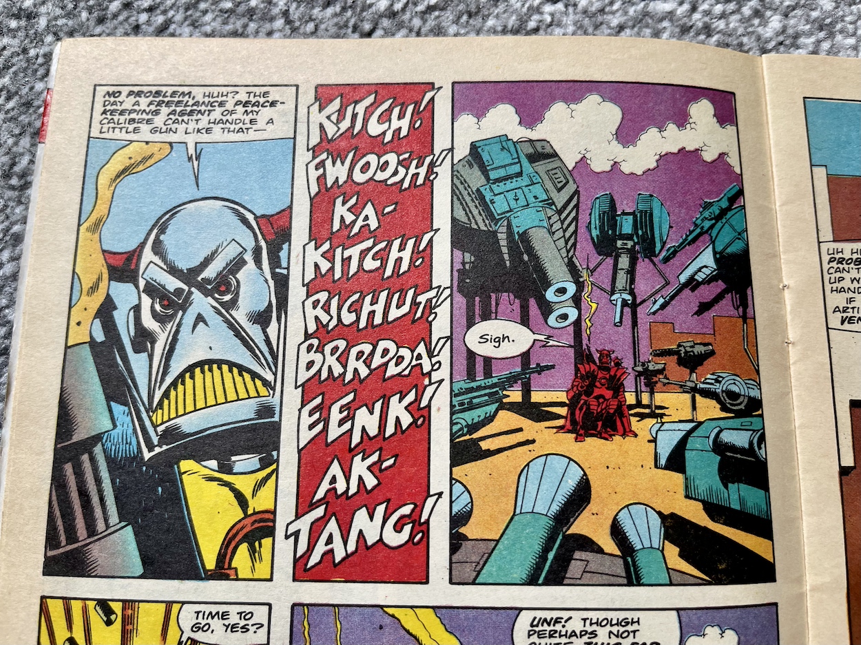
Meanwhile, up on the roof someone isn’t too happy at being dropped off in the wrong time again, much like how he ended up in 8162 in the first place, even if he did settle in there and made it his (lucrative) home. However, not only is he out of time he’s also in precisely the wrong place as The Fantastic Four’s security system automatically opens fire. I have to say for the good guys their security system is very much shoot-first-and-ask-questions-later. Although it does lead to a laugh or two thanks to Death’s Head quips and his long-running bad luck.
Their building is a bit naff though, as huge holes are blasted open and its roof is destroyed as the automated weapons try and fail to take down Death’s Head. You’d think their HQ’s walls would be a bit more secure, that they’d stand up to their own security. But it’s all a bit of daft fun so we’ll not get caught up in the details (this isn’t Twitter). Using his rocket boots to fly through one of the aforementioned roof holes he finds himself in what could be described as their garage, full of hi-tech gadgets and transport.
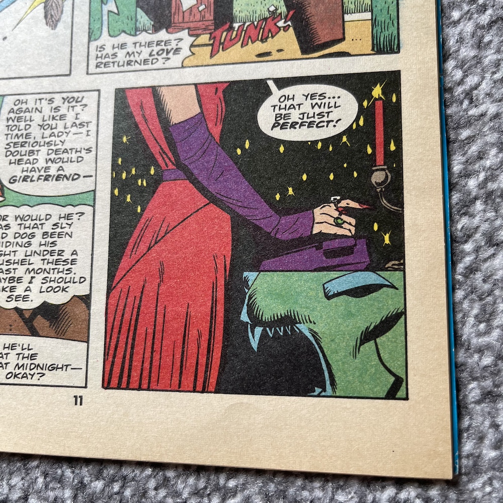
Convinced this level of tech on 1980s Earth could mean they’d have access to a time machine, Death’s Head thinks aloud, “Just hope they’re nice, sane, normal people…” when he gets a rock hard tap on the shoulder. Meanwhile, back in the Los Angeles of 8162 Spratt is still fighting with their pet vulture (see #5) and takes another phone call from the mysterious woman in previous issues who’s been proclaiming she’s his business partner’s love. This time we also see part of her attire.
I’m still none the wiser although I’m assuming she must be a known character, given how she’s slowly being introduced. The Evil Dead’s Death Nell? If you remember the identity of the caller please don’t tell me in a comment or on socials; no spoilers! Hopefully I’ll find out in our final issue. As for this special crossover event it boils down to The Fantastic Four’s not-so-fantastic security program going rogue and dispatching a hovering droid to see off everyone.
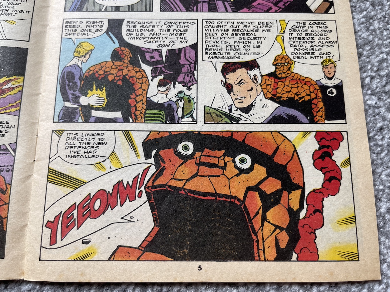
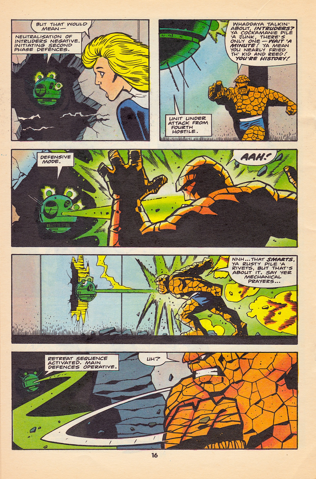
At the beginning of the issue Reed Richards is working on one of the computer chips powering it and he was interrupted by the infighting, inadvertently making a mistake and corrupting the programming. At least this is the suggestion that’s thrown out by Reed, it’s never actually confirmed. With their bickering and the over-zealous zapping at Death’s Head having destroyed a lot of the building, it goes into full defensive mode.
During a protracted fight between the team and their new visitor it becomes clear that Death’s Head’s supposed fighting back is a case of mistaken identity. It was actually the computer attacking them but they were too busy assuming it was Death’s Head that they didn’t see the obvious. Between these reactions and the way their system was programmed I don’t have much faith in this superhero if my first impressions are anything to go by.
Eventually they calm down and think rationally, realising they need to team up with this comic’s lead character when Reed and The Invisible Woman’s child is put in danger. With Death’s Head being a mechanoid and able to hack the system that’s trying to kill them, soon it comes down to our ruthless hunter of bounties (I didn’t say it), a paid assassin, a mech programmed for self-preservation, to rescue a child.
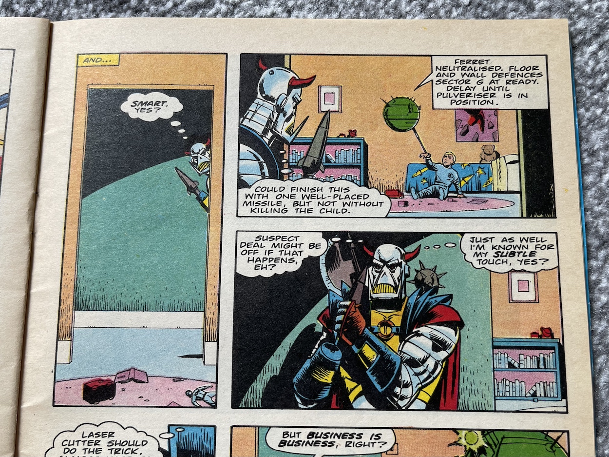
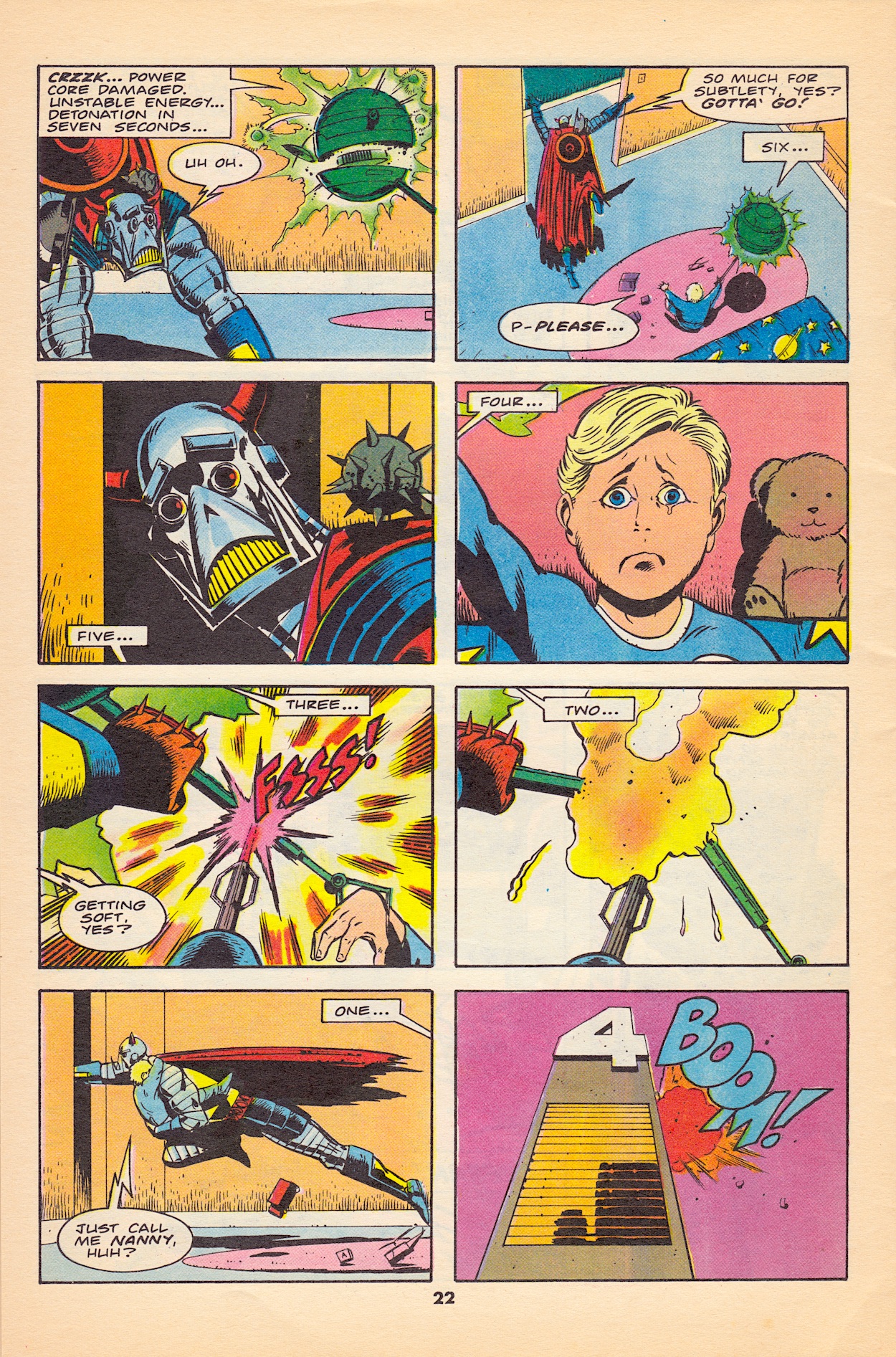
The droid has handcuffed itself to the young boy in his bedroom, coldly using him as a bargaining chip. Now, our anti-hero isn’t exactly known for being subtle. Clicking a laser cutter onto his arm to snap the connection to the boy he leaps into the room and actually ends up damaging the droid and setting off its self-destruct! For a brief moment we see the Death’s Head we’d expect to see if this were any adult human, but it appears there’s a glimmer of a soul behind the facade.
That third image says it all and with the constant countdown you can feel the palpable sense of desperation in that penultimate panel. Superb, exciting stuff that Geoff’s penmanship is just perfect for. This may be the printed page but somehow he’s always able to make his art feel so animated when the script calls for it. After the umpteen pages of fighting earlier in the comic, after the build up in the story prior to this, this is single-handedly the most dramatic and exciting moment.
The panic it sets off is key to what’s next, the story for our final issue
Yes, Death’s Head had to save the kid in order to gain access to their time machine but you can tell that’s not the reason he put his own life at risk. Ultimately though, this brave and heroic moment earns him the trust of The Fantastic Four and they set up their machine to take him back to 8162, a device that transports him in a green bar of energy from the feet up.
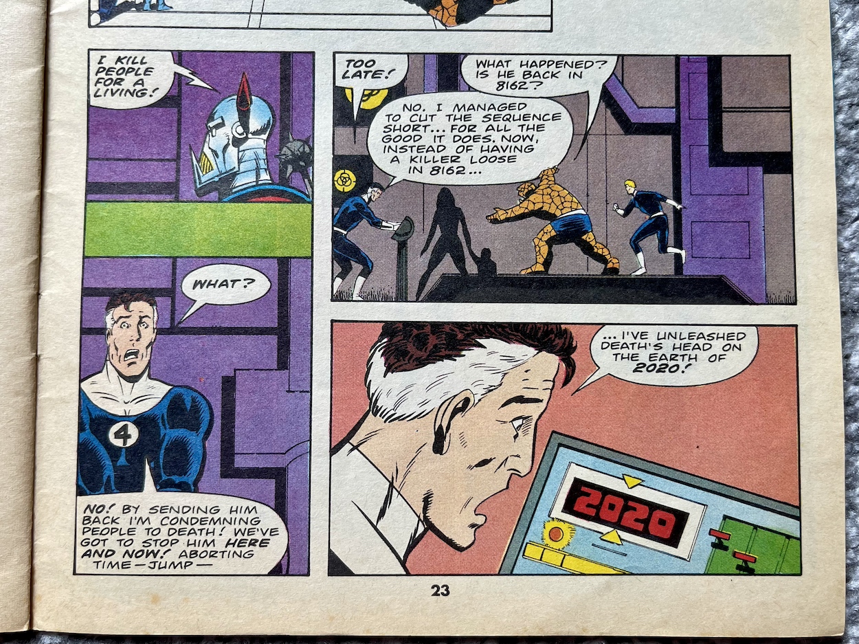
As he disappears, The Thing tells him that he had him all wrong, that the mech must be “what passes as a superhero in 8162”, to which Death’s Head tells him no, he was right all along. He then finally introduces himself by name and tells them what he does for a living…
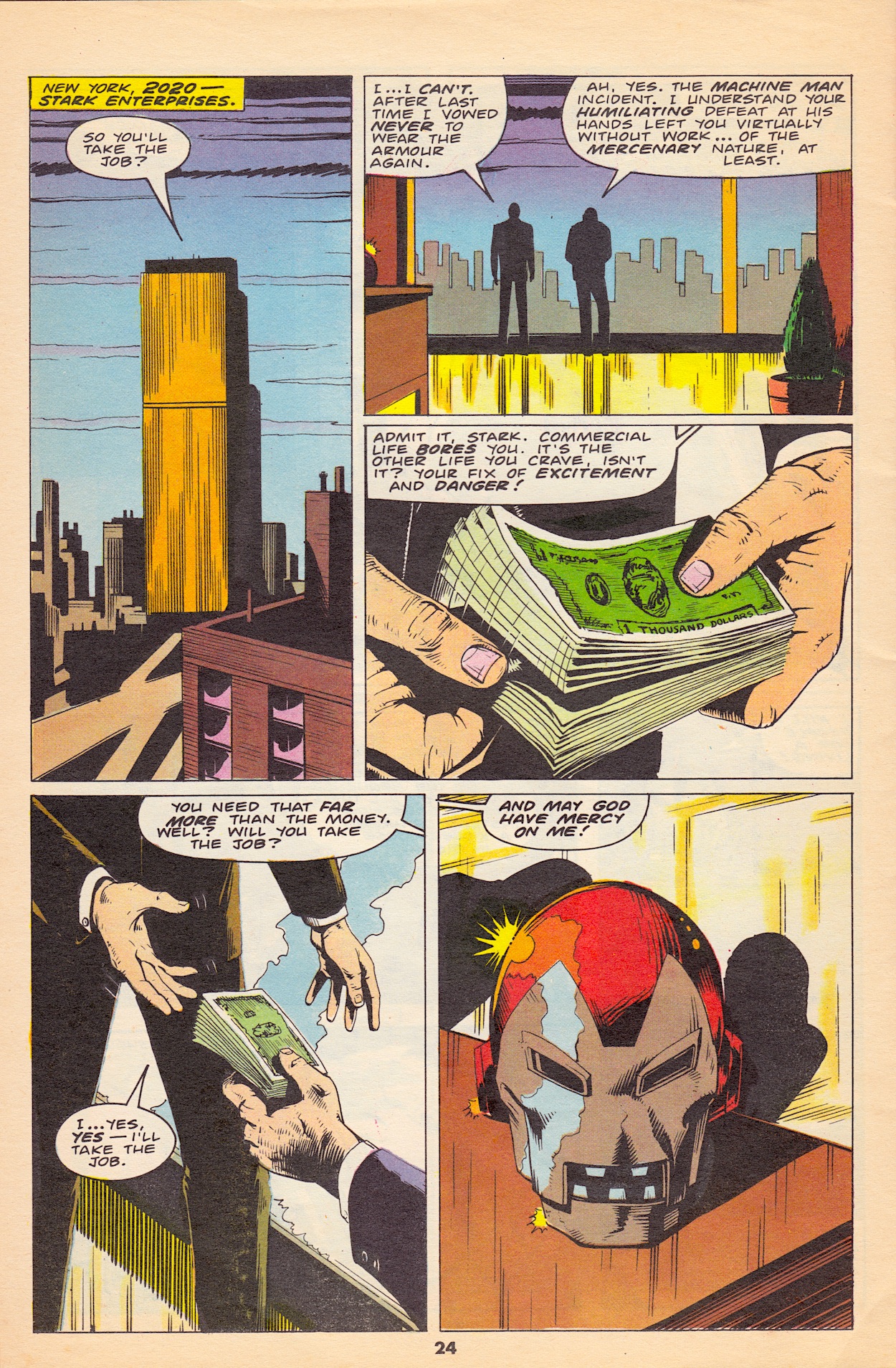
This was a suitably funny final line for the character and the panic it sets off is key to what’s next, the story for our final issue. Back in the earlier days of reading Marvel UK’s Transformers for the blog’s Instagram the Machine Man of 2020 back up strip introduced a future-version of a certain main character in the publisher’s lineup. The hero’s identity had been completely taken over by another person. In the year 2020 Iron Man was no longer Tony Stark, he was Arno Stark.
No longer a hero, the Iron Man of 2020 was a mercenary-for-hire (which should make things interesting next month) and after being defeated by Machine Man he reappeared in a Spider-Man comic (also published in Transformers) when his family were held hostage by a killer and he had to travel back in time for the story’s resolution. The story ended in disaster, with Arno losing and seeing his city of the then-far future destroyed. His next appearance after that was in #10 of Death’s Head.
I knew Iron Man was to be the special guest star in the final issue but I had no idea it was this version and I’m super excited to see what happens. I really loved his two stories in Transformers. He was clearly the bad guy in his first appearance and for all intents and purposes was exactly the same when he returned. He was forced into a position of doing the right thing but in doing so went up against an actual hero, so young readers’ loyalties were tested. It made for fascinating reading.
I’m hoping for more of that kind of storytelling in Death’s Head next month. The pieces are certainly in place for an explosive finale and a suitably powerful send off for what has been a brilliant comic series. If it’s as good as it has been so far, and as good as those Iron Man of 2020 appearances were, then it’ll certainly take the edge off having to say goodbye. The final contract is on Monday 5th August 2024, right here.
With this issue of G.I. Joe (or, to give it its full title, G.I. Joe starring Snake Eyes and Transformers: Generation 2 – phew!) we start down the path to the new Transformers series proper. There may only be one Cybertronian in the tale but it’s Megatron, so you know he’ll be centre stage. The cover by Chris Batista (Steel, 52, Robin) and Chip Wallace (The Legion, Justice League Task Force, Star Wars: X-Wing Rogue Squadron) sets the tone perfectly and throws a hint for both the plot and Megatron’s new body as Transformers fans wouldn’t have missed the fact he’s rather green and blue. More on that below.
As always with G.I. Joe the story is written by the legendary Larry Hama although this issue the art team are completely different. While pencils are by Chris, you’d swear it was another Andrew Wildman/Stephen Baskerville masterpiece but that could be because Stephen’s inking work is so identifiable. There are no less than three other inkers alongside him this month! They are Chip, Keith Williams (Alpha Flight, Action Comics, Sensational She-Hulk) and Donald Hudson (Punisher Kills the Marvel Universe, Forever Amber, Wolverine). Rick Parker and Bob Sharen return for letters and colours respectively, with Bob joined by Jurassic Park story editor Renée Witterstaetter (Silver Surfer, Jason Vs. Leatherface, Savage Sword of Conan). That’s a lot of people. So what are the results of their collective skills?
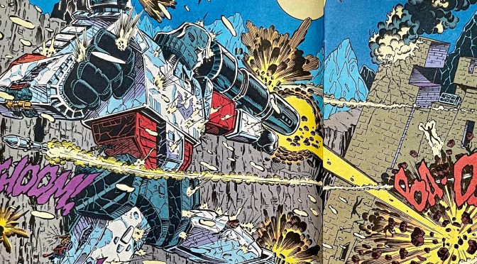
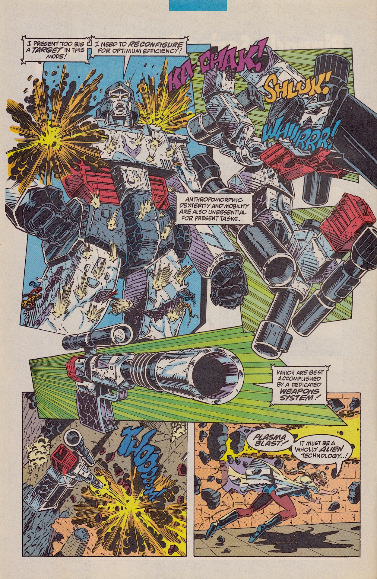
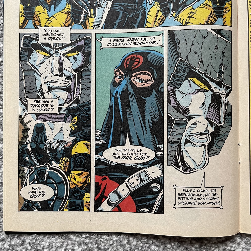
Personally, I think this opening spread is just incredible! Megatron’s savagery is spot on, and the pages may be a good bit smaller than those that UK Transformers fans were used to but the sense of scale is magnificent. He truly comes across as a terrifying entity. In their own comic it was easy to forget their size because in its later life it all but forgot about human characters (or being in disguise). Facing up against Cobra the might of Megatron feels palpable. I love the little details too in his openly damaged body, in the firepower hitting him and the cracks throughout his frame.
Scarlett is in bad shape after being stabbed by her love Snake Eyes last time, and despite what they saw Slice is still suspicious of her motives. The story kicks off with Cobra Commander making a run for it, aghast that Megatron would open fire when Cobra was just trying to make a deal with him. But as Zarana points out, what could a robot want? “It’s the currency we’re talking about, not the amount!”, realises Cobra Commander. Intriguing.
I just love big transformation pages and this is right up there with some of the best we ever saw in the Transformers comic. Megatron’s voice patterns are somewhat different than normal but it isn’t so drastically different as to take away from anything. He always did love the gravitas of his own voice. Him and the human leader here have that in common at least.
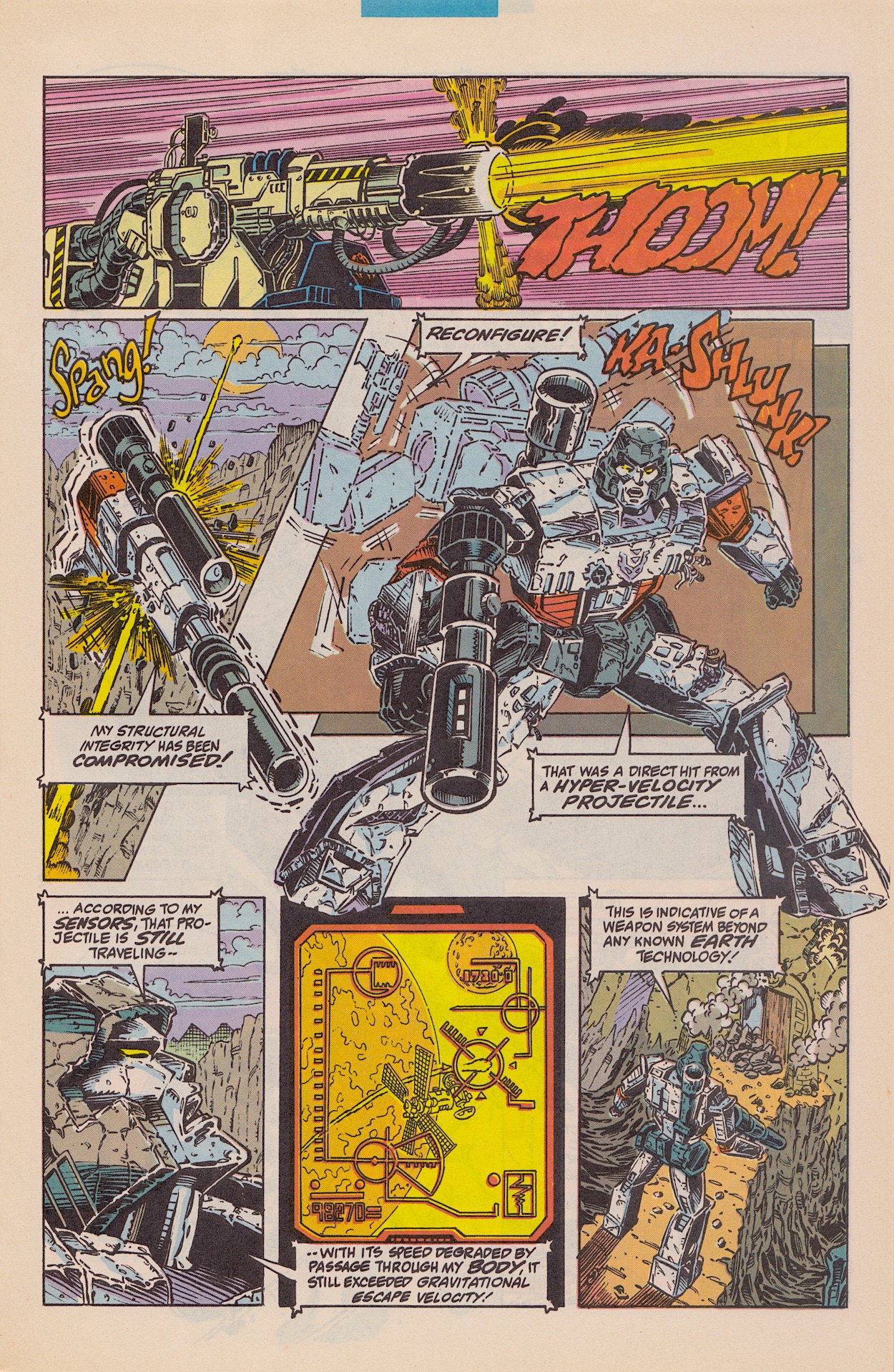
Doctor Biggles-Jones reckons her specially crafted Hyper-Velocity Rail Gun could go up against “that folding robot” (love that, it’s so close to swearing), noting that just because Megatron is alien tech doesn’t necessarily mean he is better tech. She grabs a H.I.S.S. Tank with the gun attached and let’s rip on the Decepticon leader. It hits him but goes straight through with such velocity that it continues travelling until it’s outside of Earth’s atmosphere!
The action is great so far. It does calm down after this to focus more on the negotiations between Cobra Commander and Megatron, which are just as entertaining to read, but the first handful of pages are quite breathtaking in their relentlessness. The only thing that’s ever so annoying is the American comic’s insistence to shove adverts on to nearly every-other page, interrupting the flow somewhat.
Convinced the technology is of alien original, Megatron goes in for a closer look, grabs the doctor and squeezes her. It looks like she’s about to die when a voice calls out. Pausing momentarily to listen to Cobra Commander, Megatron is told that the “fleshling” he now holds is the designer of the very-human weapon that damaged him. Instantly, Megatron changes his tune about negotiating.
Acknowledging that these particular humans could actually have the ability to repair and upgrade his damaged body, a deal is struck. There’s a palpable sense of foreboding to this collaboration, one we know won’t be of mutual trust. As the issue goes on, both leaders’ inner thoughts betray their intentions to the reader while their outer speech is cleverly worded to twist those thoughts for the benefit of their partner-in-crime. Larry Hama is just superb at writing this pairing.
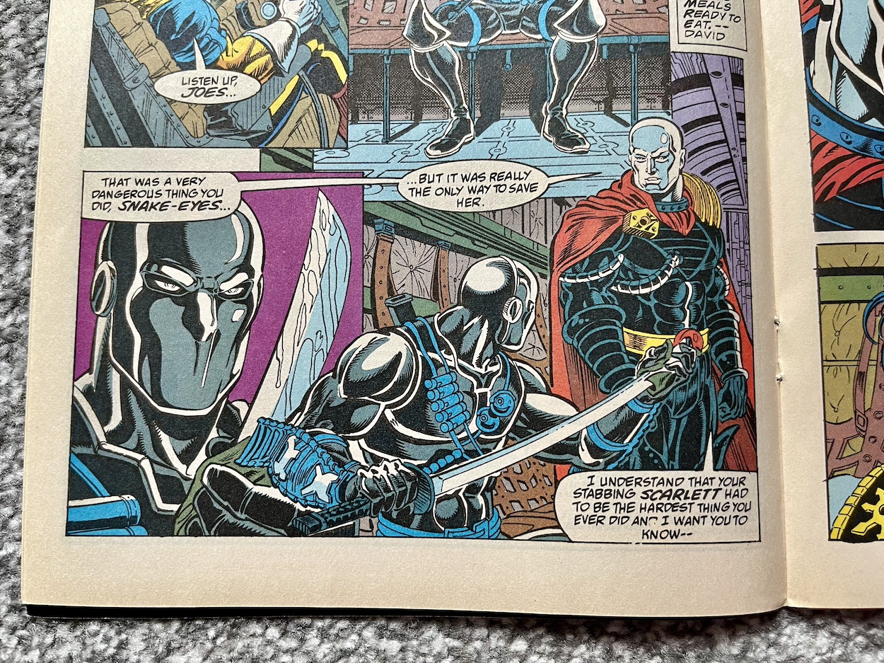
Meanwhile, up in the air in their C-130 the Joes, Destro and the Baroness are making their way home. Snake Eyes and Destro are two of my favourite characters (alongside Scarlett and Stalker, also featured in this crossover) so to see them together in Scarlett’s undercover and Destro’s defection storylines is a joy. I just wish I had more issues to enjoy this to the full. (Thankfully that’ll soon be rectified.)
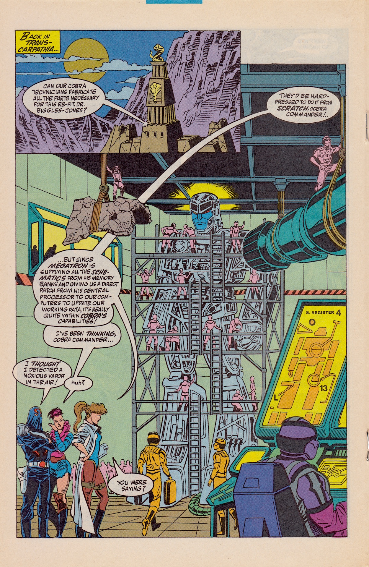
While this storyline continues we pop in on Cobra Commander and Megatron to see how their deal is shaping up, in an image that brings back memories of the first live-action Transformers movie with Megatron surrounded by scaffolding (albeit not in cryostasis this time). I knew going in that Cobra was responsible for rebuilding him (while the Joes were responsible for killing Bumblebee in the American continuity – in ours it was Death’s Head) but I was worried about how that would be depicted. I shouldn’t have been concerned.
Zarana’s vapour-inducing thought on the next page is that they should keep on dismantling Megatron so they can change the deal completely in their favour, however Cobra Commander shuts down the idea, at least until they get their hands on the goodies aboard The Ark. Unbeknownst to them (although surely you would assume) Megatron is listening in and simply smirks to himself.
Doctor Biggles-Jones is a character I’d never seen before until reading the previous issue, so I’ve no idea how long she’s been in the comic or anything about her background. She’s a technical wizard to put it very mildly, responsible for the most destructive of Cobra’s weaponry, and now the rail gun that damaged the giant Cybertronian is going to be installed in him, replacing his previous arm cannon. Things are building nicely towards Generation 2.
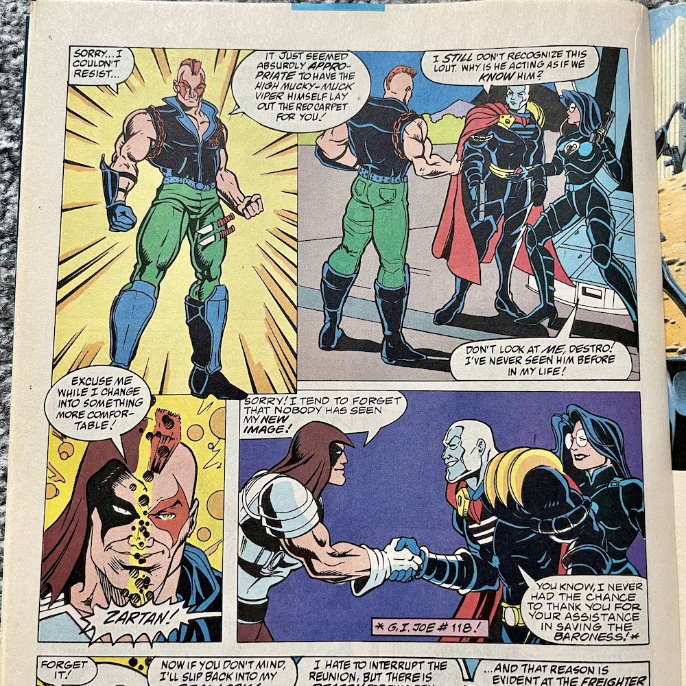
Biggles-Jones heads off to stop Slice from killing Scarlett after it’s confirmed the stabbing by Snake Eyes wasn’t accidentally non-fatal, it had been done with precision. Meanwhile, Destro and the Baroness have been taken back to Cobra Island by the Joes which at some point has been abandoned. Again, this is something I’ve missed between the time the stories appeared in Marvel UK’s Transformers and this. They’re rather shocked to find Cobra Commander waiting for them! Until, that is, he starts to glow and change…
… into Zartan, the master of disguise. His “new image” is clearly a reference to a new toy model Hasbro had created for him, and it’s clever of Larry to write in a quick panel or two to show readers (particularly this one who wasn’t aware of the change) his original look. All reacquainted now, Hawk explains why they’ve all been brought here.
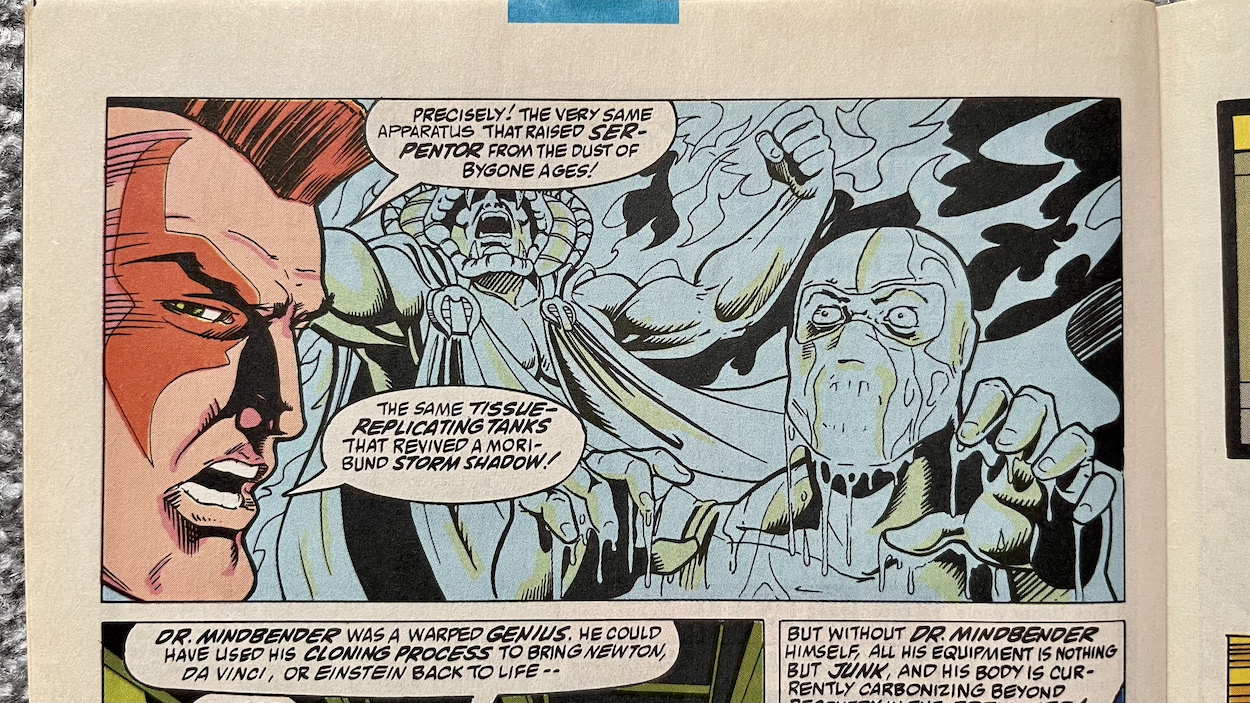
On one side of the island is a cave that’s permanently on fire. Apparently when they left the island Cobra had drilled down to an oil deposit and lit it. Zartan mourns the loss of life, the bodies inside unrecoverable ash. That is, unrecoverable without Dr. Mindbender’s Brainwave Scanner and cloning vat, the former being an infamous device in the comic’s lore used to torture more than a few Joes. His cloning vat is missing, which had been used to create Serpentor from the remains of the greatest military leaders in history and resurrect Storm Shadow, both stories I remember fondly from Transformers.
There’s a funny moment here when Destro laments the fact Mindbender’s warped genius wasn’t used to resurrect Newton, Da Vinci or Einstein, while the Baroness would have preferred Elvis! There’s a passing mention of Mindbender having died but his body could’ve been moved along with a computer program able to resurrect the man himself. Having read IDW’s continuation of the story decades later in which Mindbender turns himself into a mad, mobile, weaponised computer system (yes, really) I’m assuming this is the start of bringing that character back into the comic.
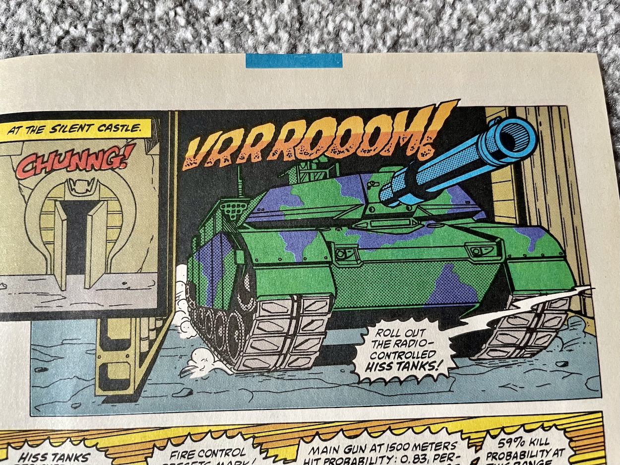
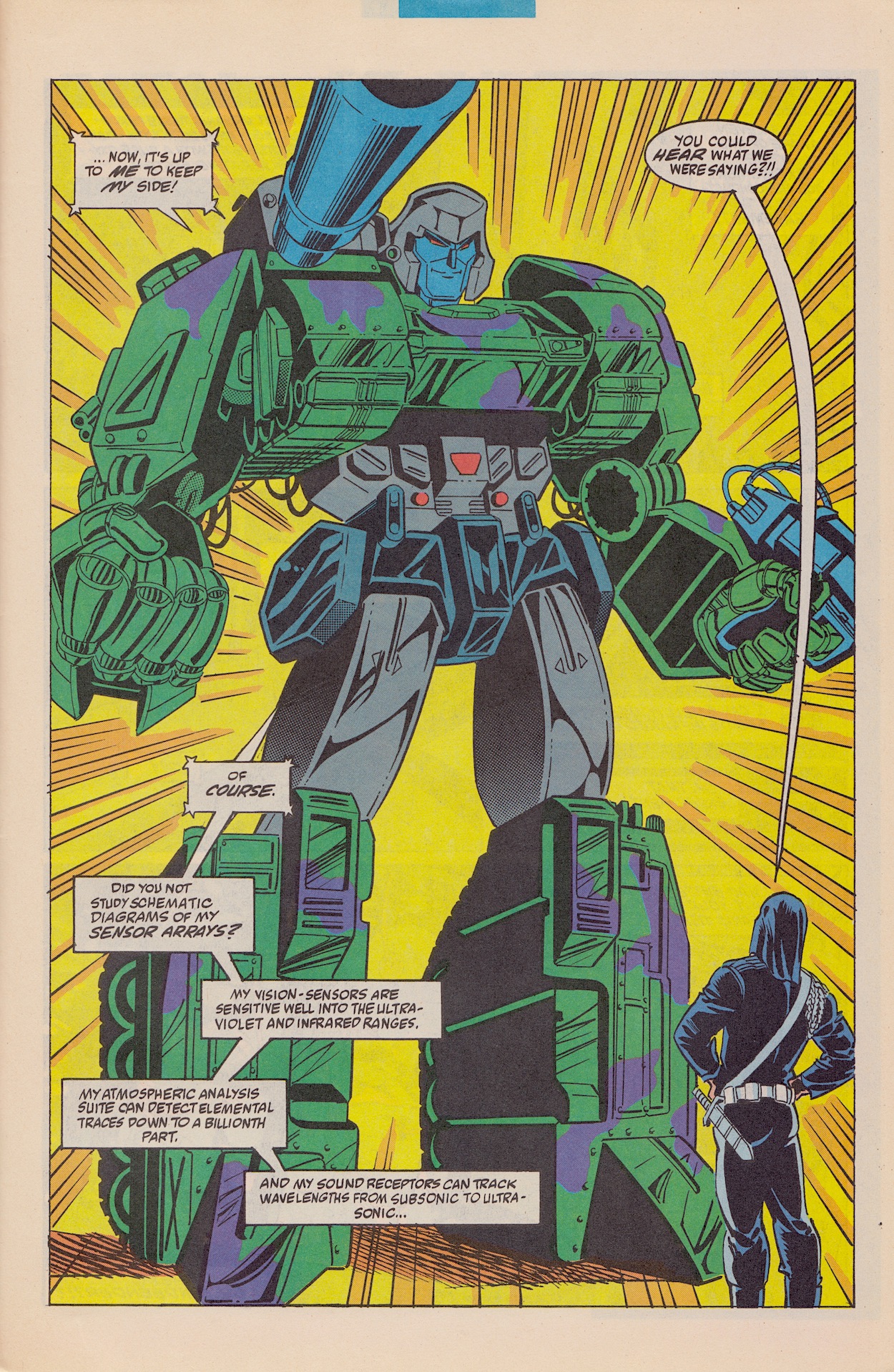
To finish off this month’s chapter we return to the headline event for Transformers fans as a door slides open at Cobra’s current base and a huge green and purple tank rolls out. It makes light work of three H.I.S.S. tanks; we see its artillery slice through them like butter and continue out the other sides of them. This means it’s equipped with the rail gun, which means this is the new alt mode for Megatron! In case there was any doubt the tank shifts and changes on the next page to reveal his new body.
I have to say I really like the new look! It suits him. Cobra Commander gets a rude awakening as he realises Megatron could hear what they were saying all along. Yes, they’d only been praising the doctor on her great work a distance away from the test, but it means Megatron heard everything earlier too. How will this affect their deal or their mutual distrust of each other? We’ll find out soon I’m sure.
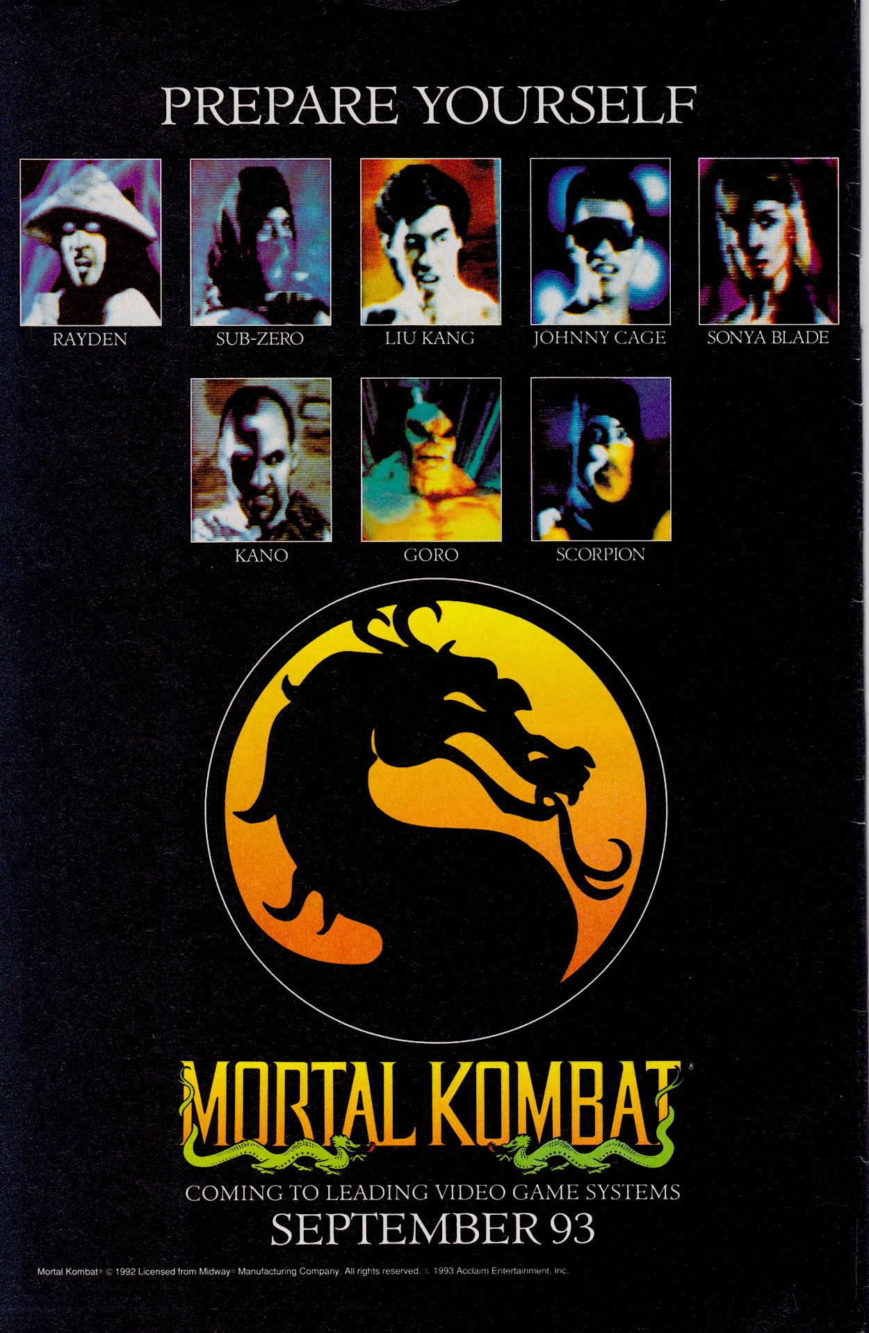
After he gives a quick run down of his stats the story ends with Megatron telling them his sensor arrays have located an experiment in the basement of the castle. Cobra Commander tries to dismiss it but Megatron warns him it’s started breathing… and we see Dr. Mindbender suspended in liquid with electrodes attached to his naked body. I knew it. Just to finish off, we’ll take a look at the back page advert which once again places the comic in the timeline of my life.
I remember all the fuss over Mortal Kombat at the time but I’d never been a fan of one-on-one beat-‘em-up games (I’m still not) and when a friend rented out a copy for his Mega Drive from the local video store we were both left feeling rather “meh” about it. That didn’t stop shows like GamesMaster and Bad Influence wetting themselves on an almost weekly basis over it though, or the British press making a whole overblown hoo-ha over its unconvincing digitised gore.
Not only have I enjoyed the Transformers aspects of this issue, it’s been a blast to read new (for me) adventures of the Joes and Cobra. Recently on the blog I’ve written about Skybound Entertainment’s Kickstarter in which they’ll be collecting the whole of Marvel’s run in a gorgeous hardback collection. These two issues so far have really whetted my appetite for that collection to arrive next year. For now though, I’ll look forward to the next part of this particular story in #140 of G.I. Joe, which you’ll see reviewed here on Sunday 28th July 2024.
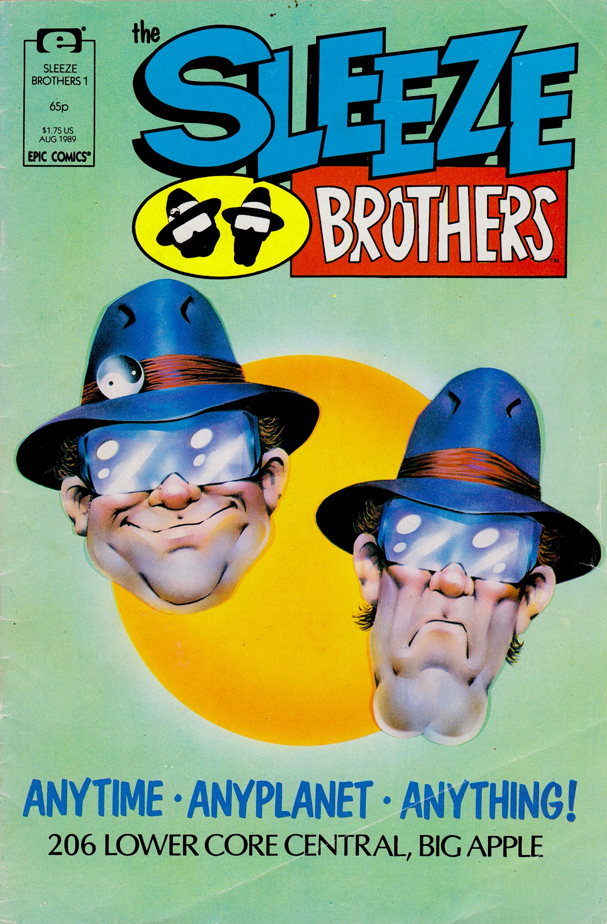
I can remember the day I bought this issue of Marvel UK’s (under the Epic Comics imprint) new monthly, The Sleeze Brothers. Sitting in my Aunt May’s house with my mum certain images were seared onto my retinas, in particular the strip’s title spread you’ll see further below. It’s been months since the brothers popped up in Doctor Who Magazine, so just how will they translate to full 22-page stories? Incredibly well is the answer to that.
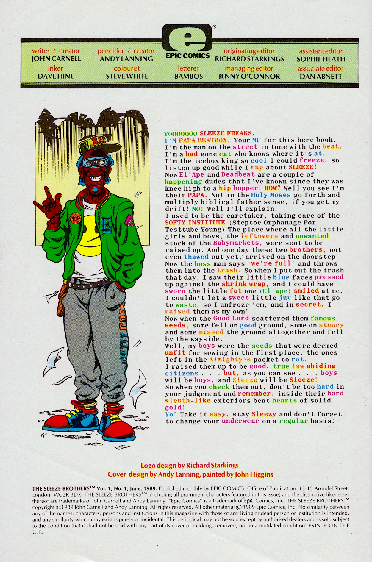
The editorial is ‘written’ by a stereotypical Huggy Bear-type called Papa Beatbox, some form of MC who gives us a sort of origin story for El’ Ape and Deadbeat. Discarded test tube babies, Beatbox raised them as if they were his own and, despite their gruff, selfish, greedy exteriors they apparently have insides of pure gold. We’ll see about that.
I didn’t realise Dan Abnett (Knights of Pendragon, Nova, Sinister Dexter) was associate editor until now. As I list those credited with working on The Sleeze Brothers I won’t be mentioning The Real Ghostbusters after their individual names. Just take it for granted that whoever I mention also worked on that comic unless I say otherwise! This was the main reason I loved this issue so much as a kid and why I’ve been really looking forward to it on the blog, because that aforementioned comic was such a childhood favourite.
Only a few pages in and the art team have definitely nailed it
So anyway, on to our strip which is called Nice ’n’ Sleazy. Written by John Carnell (Doctor Who, DC’s Hitchhiker’s Guide to the Galaxy comic) and pencilled by Andy Lanning (Digitek, Nova, Death’s Head II), they also created these characters. Inks are by Dave Hine (Zoids, Mambo, X-Men), colours are by Steve White (Xenozoic Tales, Transformers, editor on Visionaries, Havoc and Death’s Head), letters are by Bambos Georgiou (Slimer, co-creator of Speakeasy and Aces Weekly) and it’s all edited by Richard Starkings (Death’s Head, Dragon’s Claws, Elephantmen) who designed the comic’s logo and chatted with me in the introductory post about the comic’s creation and the Epic label.
After the plethora of artists behind the Doctor Who strip, the comic settles into its art style and I’m loving it from the very first page. This future world is so intricately designed by Andy, and he and Dave are an excellent partnership in bringing out all of the fun details, with Steve’s bright and often gaudy colours really making the pages pop more than anything I’ve read on the blog so far. Only a few pages in and the art team have definitely nailed it. What about the plot?
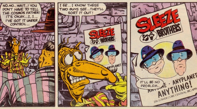
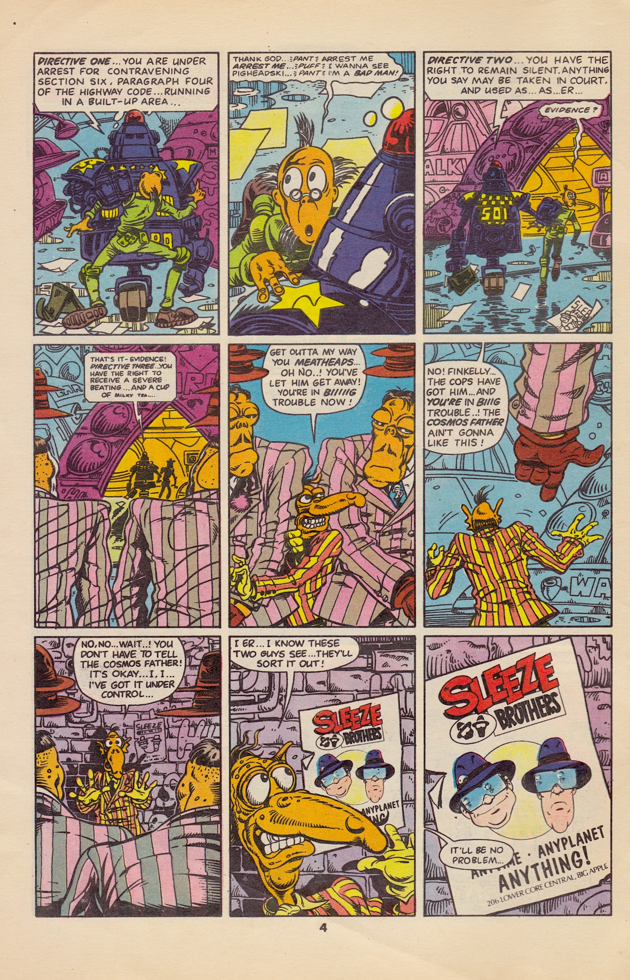
It’s a simple story but it’s the first issue so it’s main purpose is to introduce the main characters and the world in which they inhabit, with all of its grime, corruption, many and varied alien life forms and the comedic ineptitude of everyone (and everything – we see a police robot forget its directives mid-arrest) that make up the Earth of the future. The Sleeze Brothers actually get involved by accident here, when Finkelly lets a key witness against the Cosmos Father escape and, backed into a corner by his goons, he spots a flyer for the brothers’ detective agency (which doubles as the front cover) and pretends like he knows them.
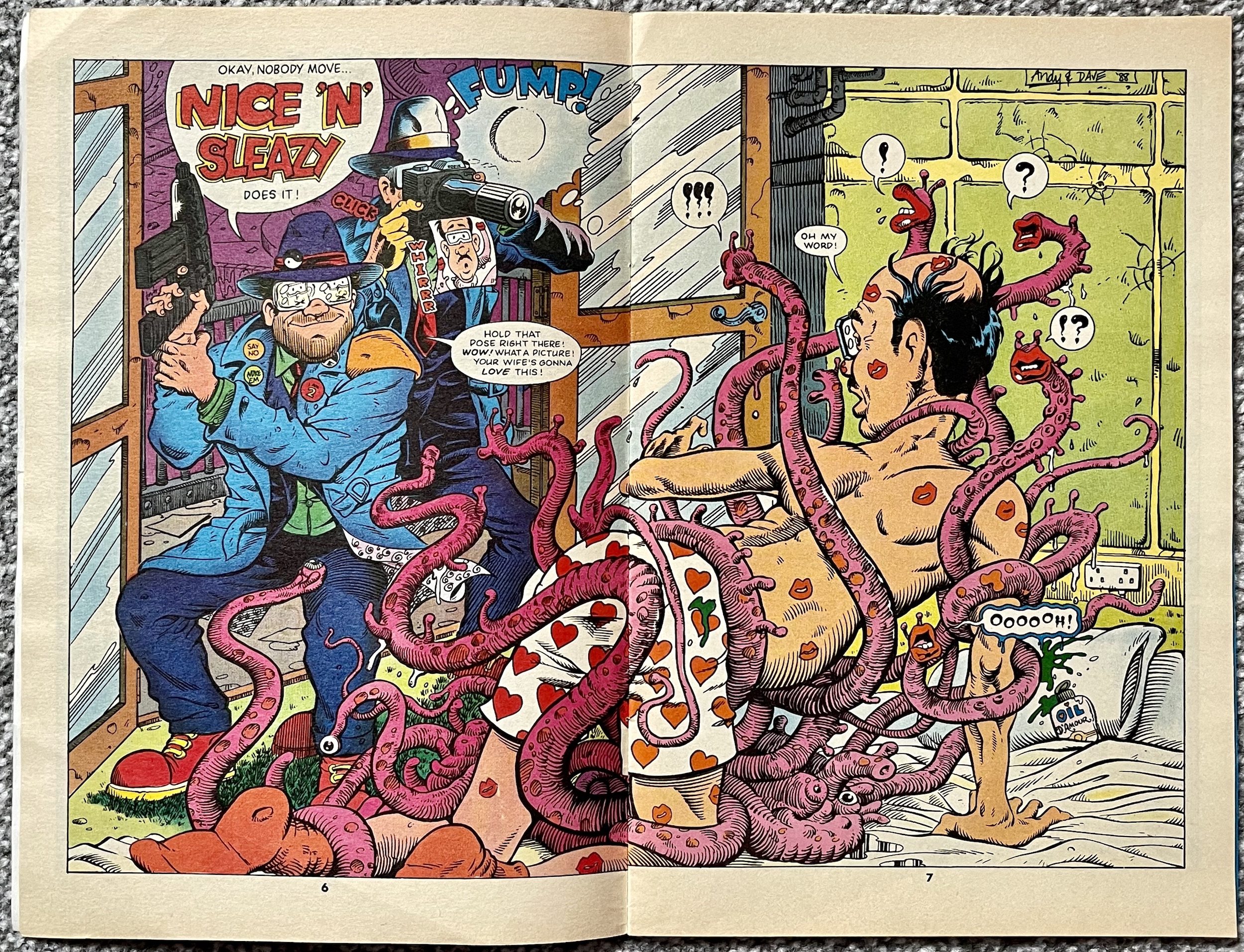
We then get to meet up with El’ Ape and Deadbeat as they bust in on a husband partaking in some very extracurricular activity. This is the spread I mentioned above and I think you’ll be able to see why it was so memorable to my young eyes! I love the little details here too, such as El’ Ape’s pin badges, the fact we see the photo Deadbeat takes sliding out of the camera and even the husband’s surprised look reflected in El’ Ape’s sunglasses.
Thinking this proves that being private detectives is paying off, El’ Ape’s excitement is cooled when Deadbeat reminds him how much the camera, film and skeleton keys cost, then their last few remaining notes are ripped from his hands by their landlord. Deadbeat is sure they’re not going to earn enough in this line of work but El’ Ape is optimistic and says something always turns up “in these types of stories”. Is this a hint that they’re acknowledging being inside a comic? Even if it’s not, it’s funny.
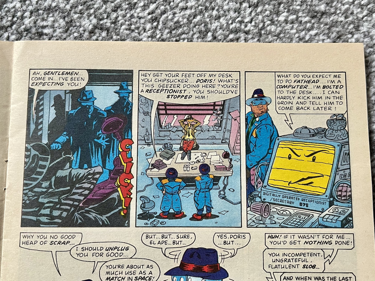
Back in their office we meet Doris, their receptionist. Well, sort of. You see, she’s a computer and, despite this being set in the far future, Doris is an antiquated desktop complete with cassette deck, so completely unable to move about and do much of a receptionist’s job. She’s just one example of the insane characters John and Andy come up with throughout the issue.
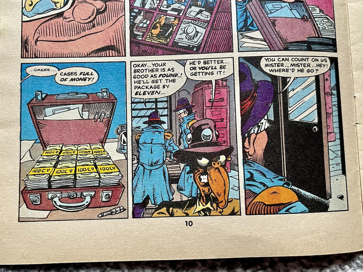
Finkelly hires them to find his twin brother, showing them a picture of the runaway witness and obviously they look nothing like each other. “He parts his hair on a different side to me”, explains Finkelly. This and a suitcase full of cash is enough to convince the Sleezes the case is legit, despite Doris calling them out on it. Yes, these two aren’t exactly the sharpest, just in case you missed their misadventure with the Doctor.
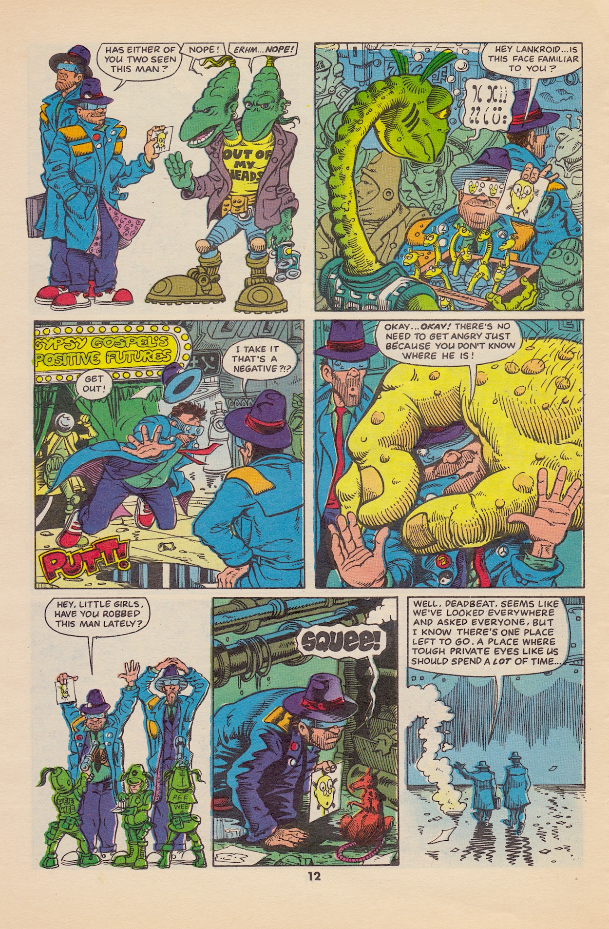
In a scene that reminds me of a funny page in #5 of Death’s Head they start asking around and run into a whole bunch of weird and wacky folk, giving Andy a chance to draw up a variety of inhabitants of the city. This page should give you some indication of the imagination on show throughout the comic and this is only the beginning. Unsurprisingly, asking random strangers doesn’t work out. Without any other ideas they head off to Wong’s Air Bar.
The Air Bar plays up to our legitimate worries of climate change, hypothesising that in the future fresh air is such a luxury it’s bottled up inside pressurised bottles and sold like beer. Not that alcohol is in short supply either, El’ Ape throwing about the cash from their suitcase as if they’ve already solved the case. When the photo accidentally falls out the bar’s proprietor is able to point them in the right direction at last (after some eyes-down-the-barrel-of-a-gun persuasion).
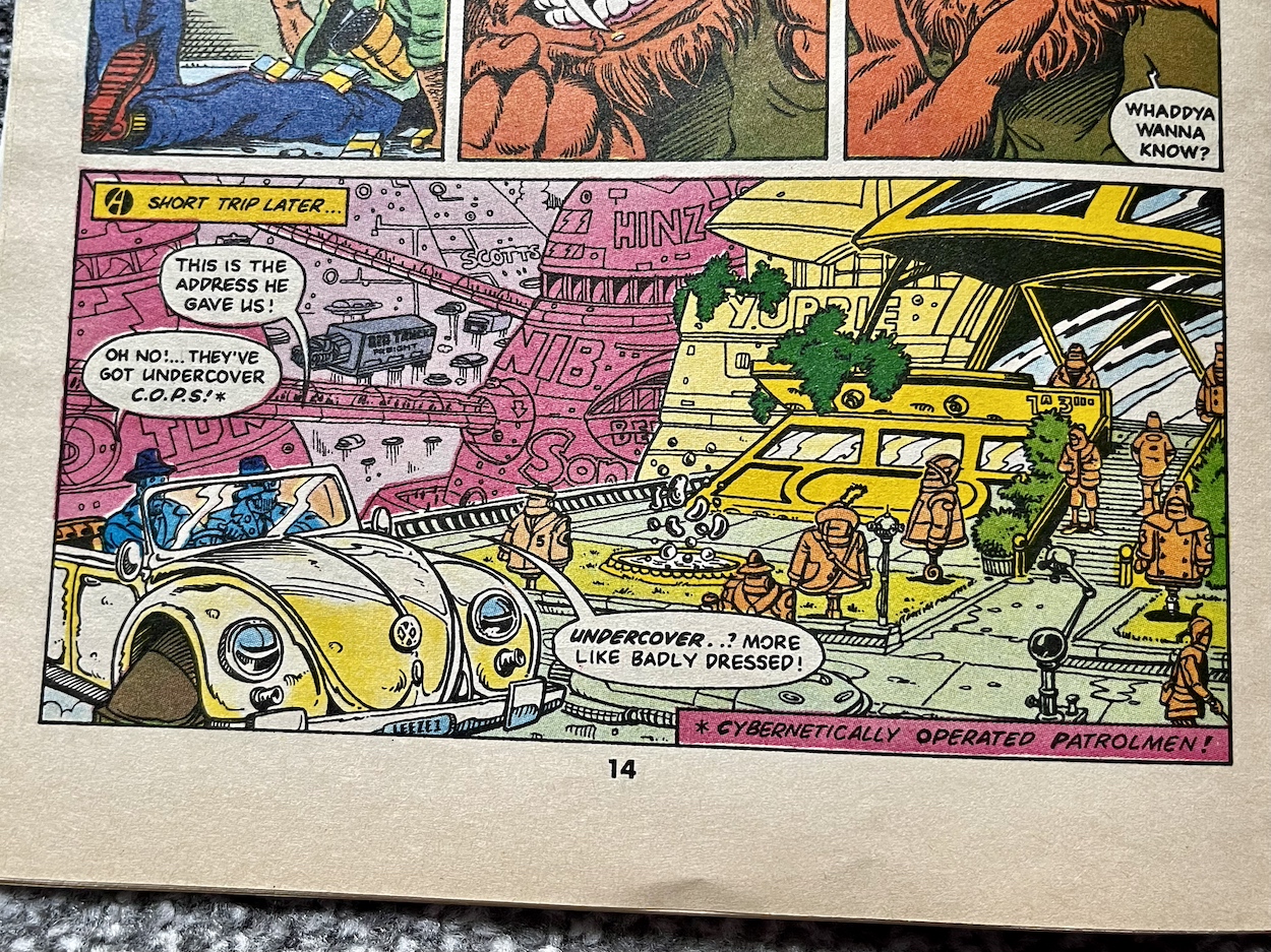
I have to say I laughed at this panel above. The city is very much a spoof of Judge Dredd’s MegaCity One. As well as the so-called “undercover C.O.P.S.” (neither undercover nor decent cops) the brothers’ car is just a Volkswagon Beetle with hovercraft piping instead of wheels, delivery trucks use the same configuration and on other pages we see regular electrical sockets and other contemporary technology, giving it a lovely feel of a future world poking fun at the depictions of the future seen in 80s movies of the day.
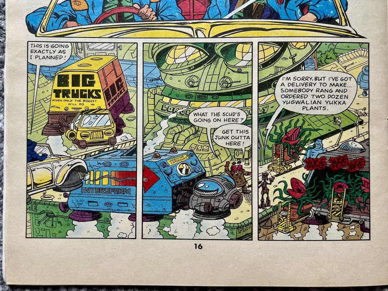
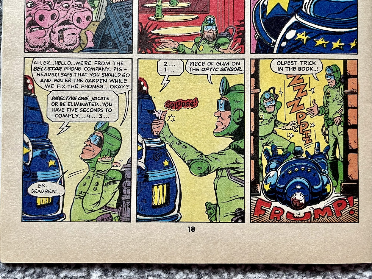
The biggest thing that’s purposely out of place for me are public phone boxes (and not a mobile in sight). Here, Deadbeat explains all the technological security these have in order to stop tampering, theft, fee dodging etc., all of which he bypasses by simply sticking a bit of chewing gum on one of its parts. “Oldest trick in the book”, he says. Placing a call to several delivery companies for the building housing their target (that uncanny resemblance to a frog above), it’s bombarded with trucks which keeps the police occupied. The two-headed chief calls for phone line repairmen, who of course end up being the brothers in disguise. It’s a ridiculously convoluted plan and I love it. Although, they’re quickly caught by one of those inept RoboCops.
So that’s two oldest tricks in the book. The ludicrousness of this future world is what has delighted me the most. I had it in my head that the world itself would be more like that in Death’s Head, with some background gags and funny social commentary but for the most part it would play the straight guy to the main characters’ comedy. But in fact the inept duo, one being a loud mouth reactionary and one quiet and thoughtful, are actually the closest we get to normality. And that’s saying something!
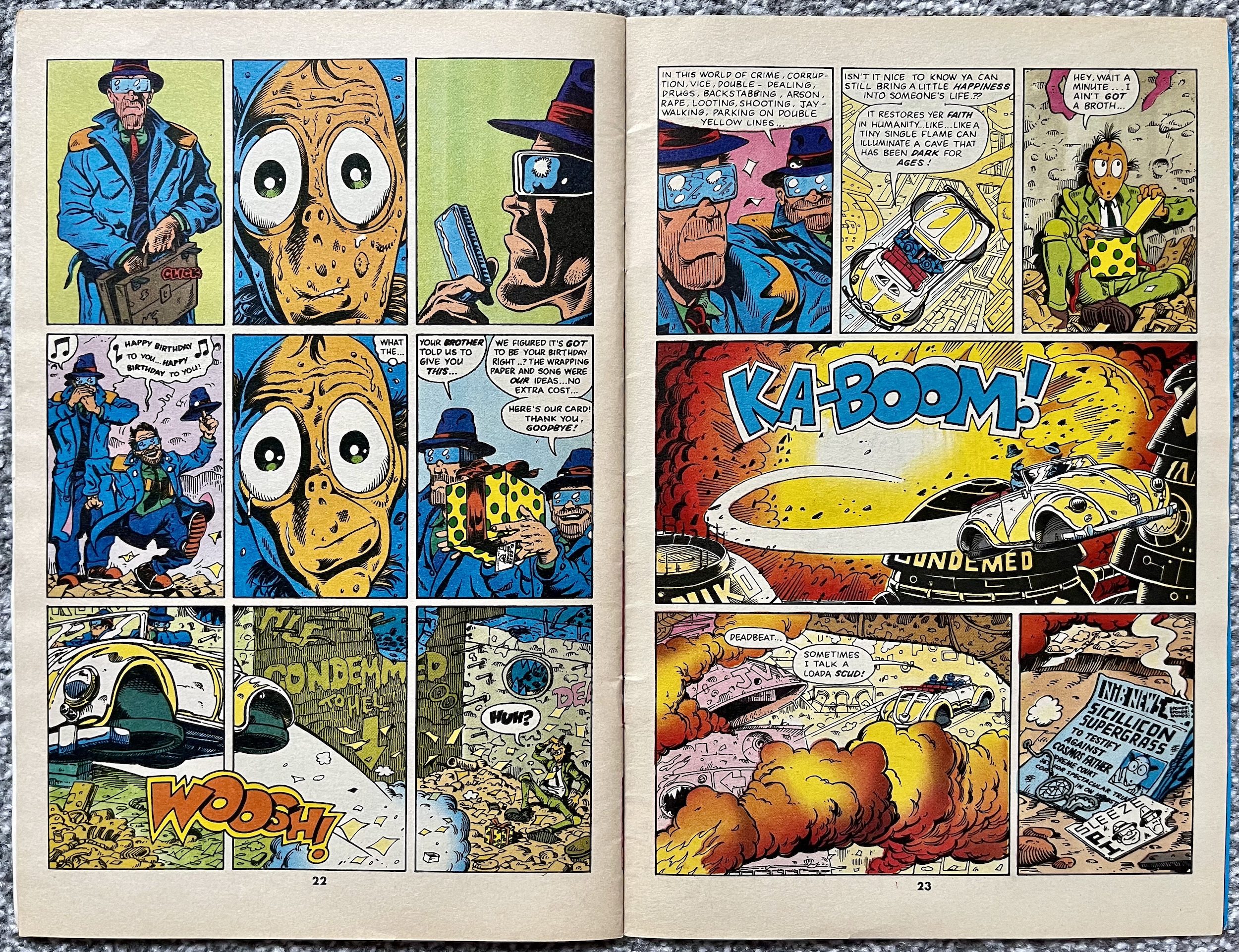
Through a chase involving a comedy of errors our detectives catch up with the witness. Not that they know he’s a witness. Cornered and terrified, he whimpers at the end of a back alley while El’ Ape and Deadwood approach. El’ Ape grins. Deadwood is stoney faced as per usual. He clicks open his briefcase and it looks like a professional hit to the defenceless victim, until we see what Deadbeat was reaching for. What happens next over a double-page spread at the end of our story perfectly sums up the humour of the comic.
It’s been a wild and crazy ride and this is only the first issue. You’d be hard pushed to find a comic with a premiere issue that works as perfectly as this one. It feels like a fully developed comic, as if this were the sixth or so issue in its run. Of course, with a predetermined length of only six issues John and Andy had to hit the ground running. They’ve sprinted! Every page is packed full of fun, every gag lands, the leads feel fully formed and the world in which they inhabit is just as big a character as they are.
Let’s hope the remaining issues over the course of the rest of this year live up to the exceptionally high standard this premiere has laid out. It’s also got me thinking about finally finishing off my collection of The Real Ghostbusters to enjoy more of John’s and Andy’s work after this read through is finished. For now I’ll look forward to whatever they have in store for The Sleeze Brothers #2, which will be reviewed right here on the blog on Monday 29th July 2024.
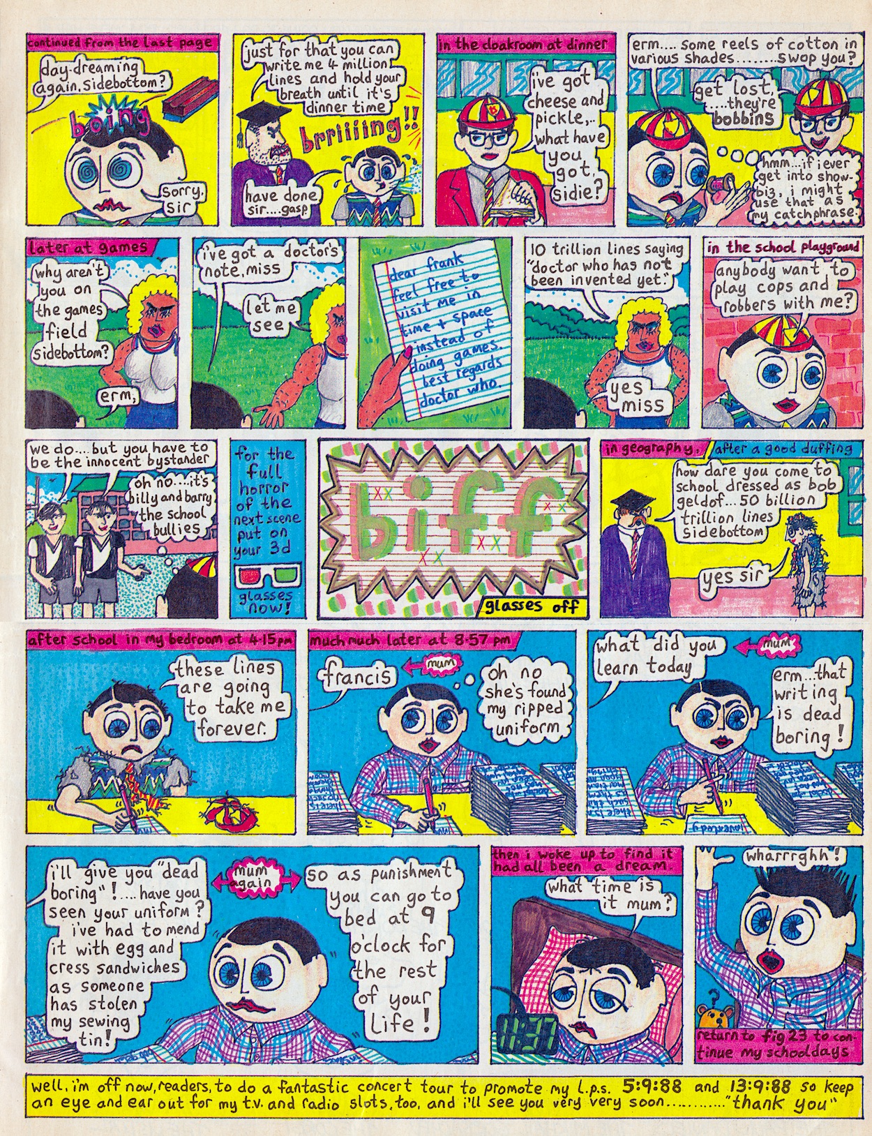
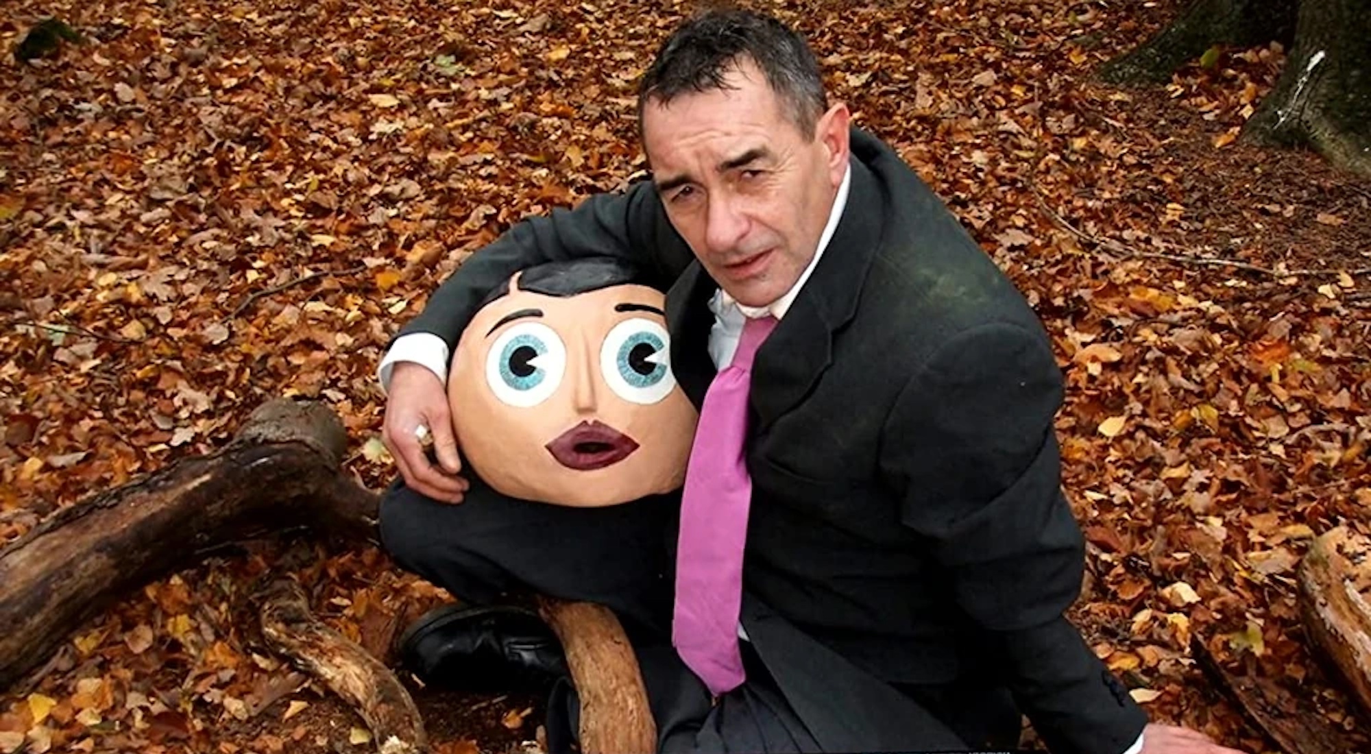
On 21st June 2010 the sad news broke of the passing of musician, comedian, artist and comic cartoonist Chris Sievey, better known to the wider world as the papier-mâché headed Frank Sidebottom. Upon reading the news I hunted out my few remaining issues of OiNK to read his contributions. I enjoyed them so much I began collecting all the other issues of the comic, and the rest is history. All thanks to Chris. All thanks to Frank.
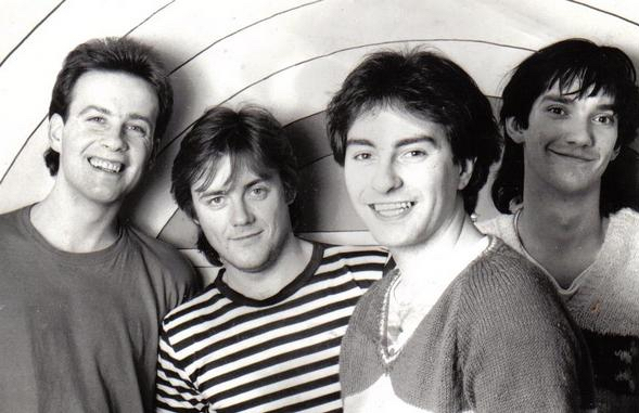
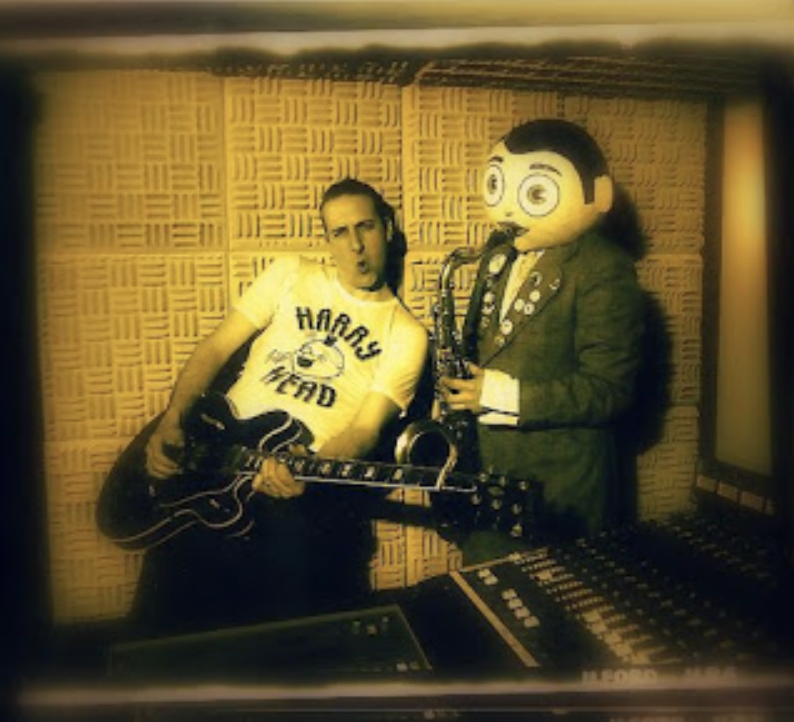
Chris was born on 25th August 1955 and over the course of the 70s and 80s was the frontman of his band The Freshies (he’s second from the right above). However, during the 80s he developed the character of Frank, an aspiring pop star with his famous nasally voice who portrayed himself as living the celebrity lifestyle when in reality he was living at home with his mum in Timperley. A regular star of kid’s TV in the 80s, I was very aware of him when he popped up in my third issue of OiNK, #16.
“Chris was laborious with his artwork,” OiNK co-editor Patrick Gallagher told the Dazed website. “He could have made it easy for himself by colouring in flat colours, but instead he used this stipple effect done with a felt tip pen. He would take three hours to paint a page which would usually take 15 minutes, but he liked detail and he would always go the extra mile.” That extra mile was always appreciated by this pig pal.
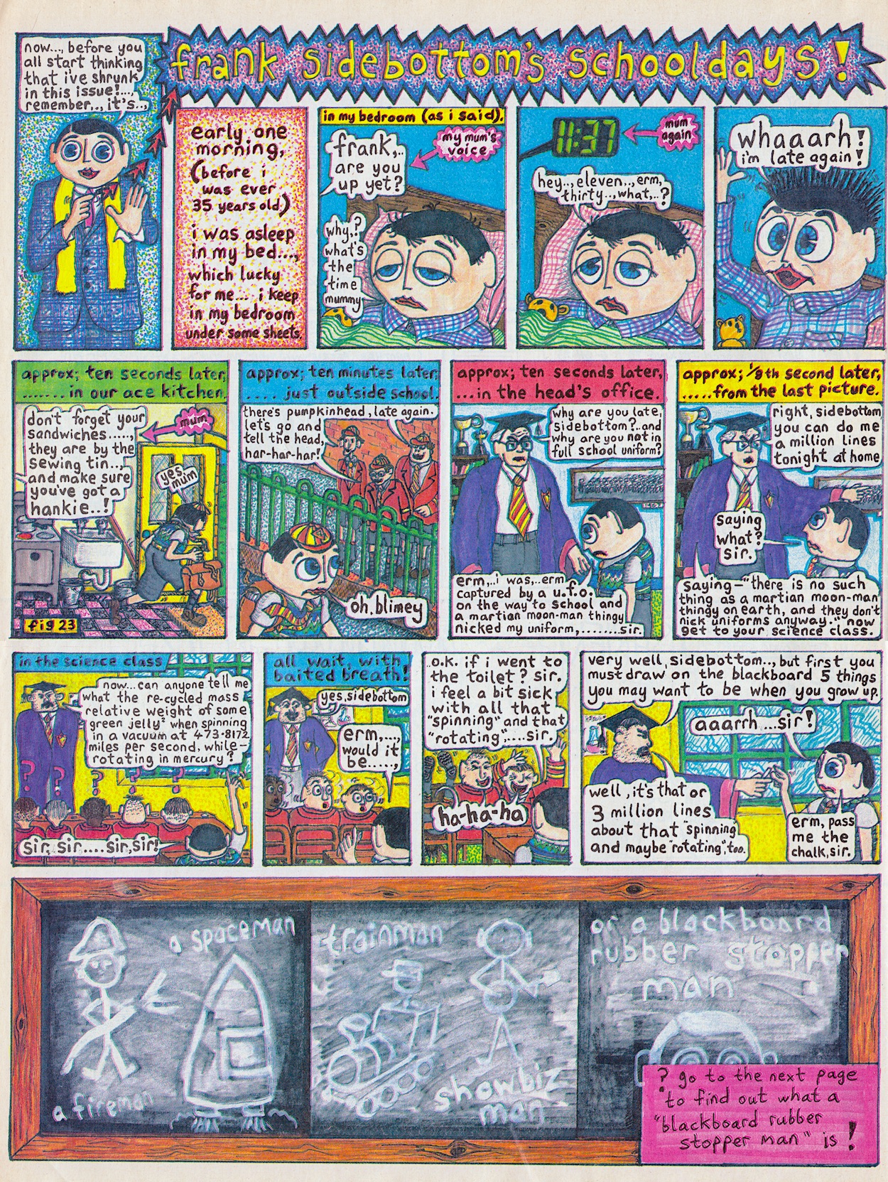
“Having Chris on board was great because it meant that as well as his unique artwork, we also had a real life character [Frank] to front the comic. We had someone out there publicising OiNK who was gaining more recognition,” says Patrick. Indeed, at the time it felt like readers were part of a secret club that those who only saw him on TV weren’t aware of. A secret club that gave us insights into his home life, celebrity friends and musical career. Even his school days.
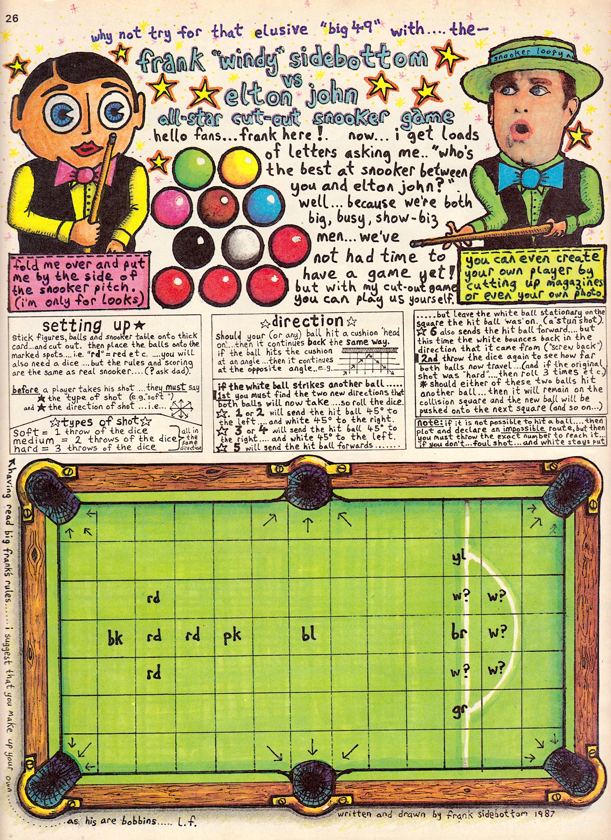
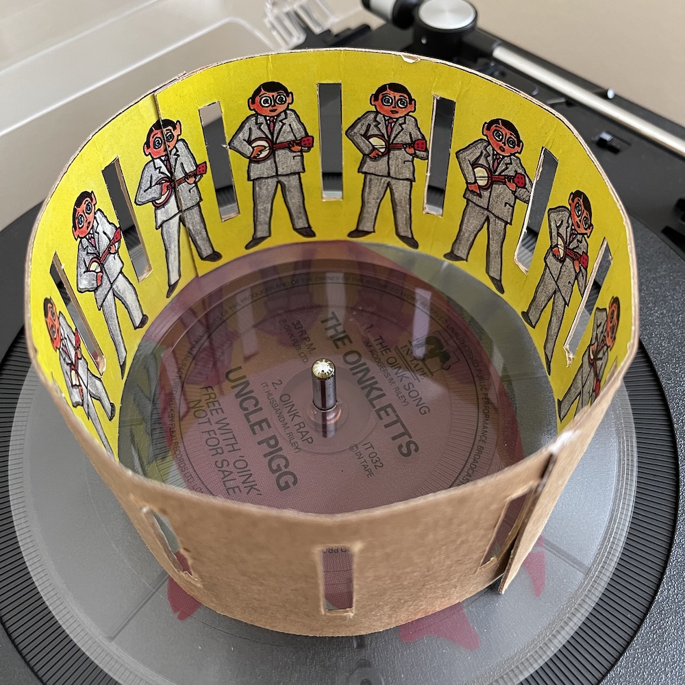
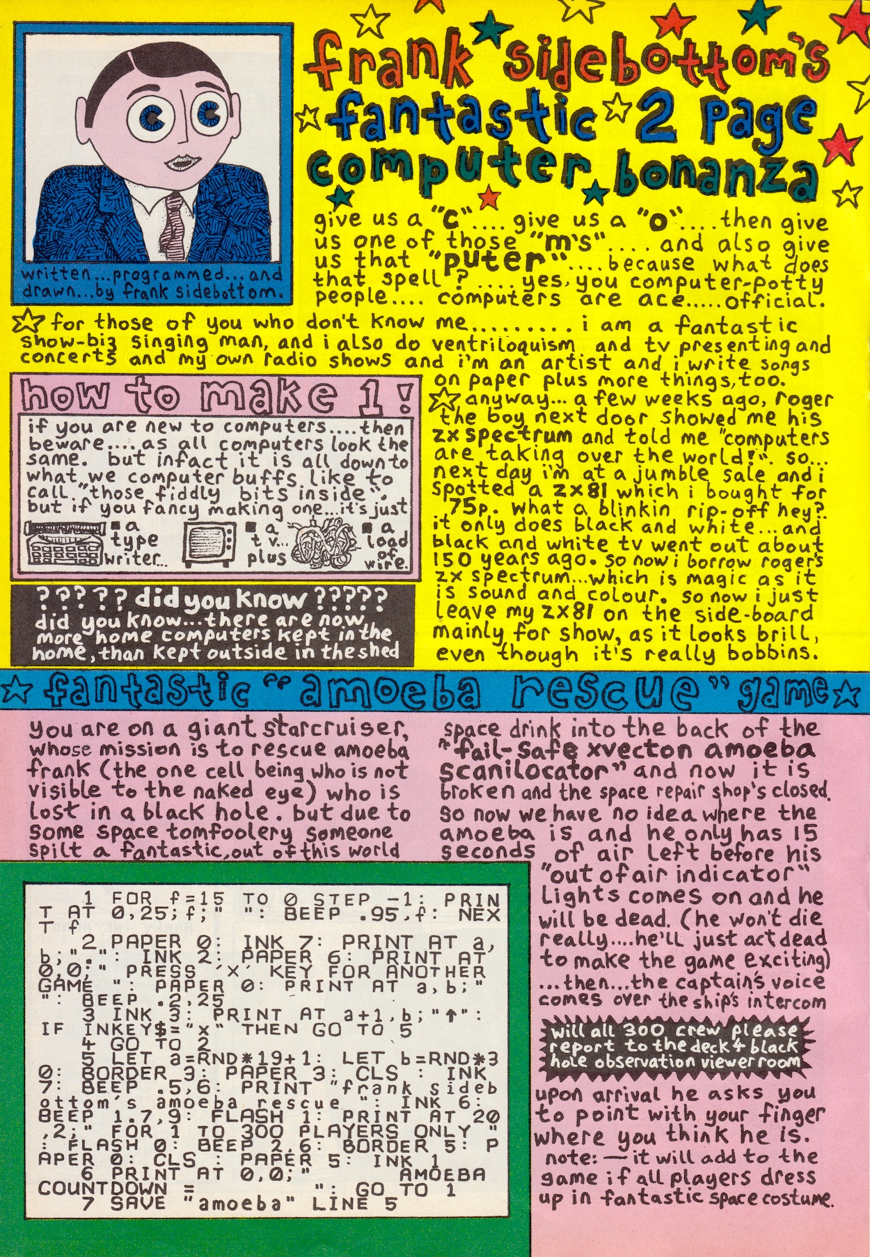
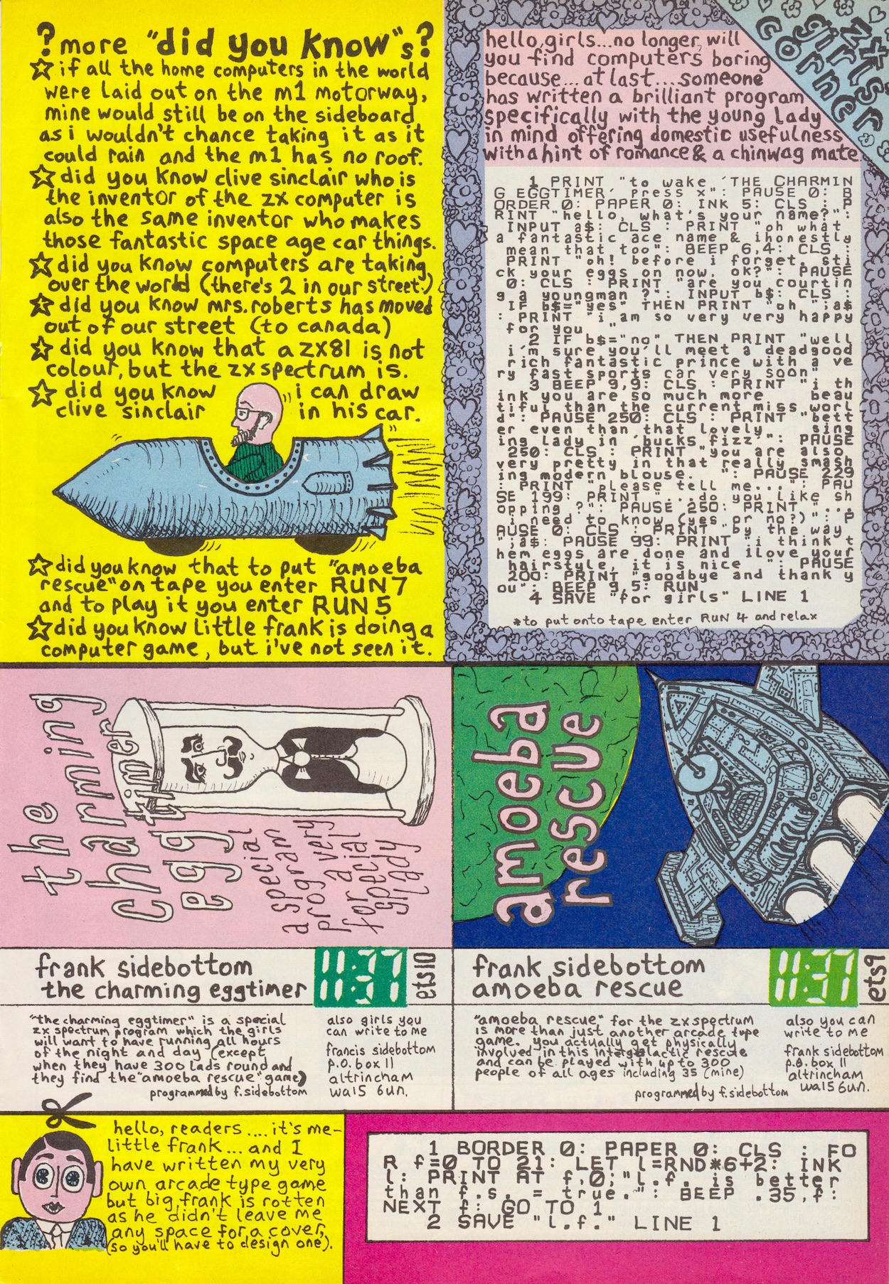
His contributions to OiNK would vary wildly and included comic strips, celebrity gossip columns, hand-written computer programs, elaborate D.I.Y. board games and even a cut-out zoetrope. With the huge variety of pages he could create, and all so intricately put together, it was clear he put in a lot of time and effort for us young readers and that he enjoyed working on OiNK.
Frank’s stand-up comedy was family friendly, even if it was very random and ‘out there’, and he’d go on to be a semi-regular on Saturday morning TV shows No.73, Motormouth and What’s Up Doc?, as well as creating his own Frank Sidebottom’s Fantastic Shed Show. After retiring the character of Frank, Chris would continue producing work for children on shows such as Bob the Builder and Pingu.
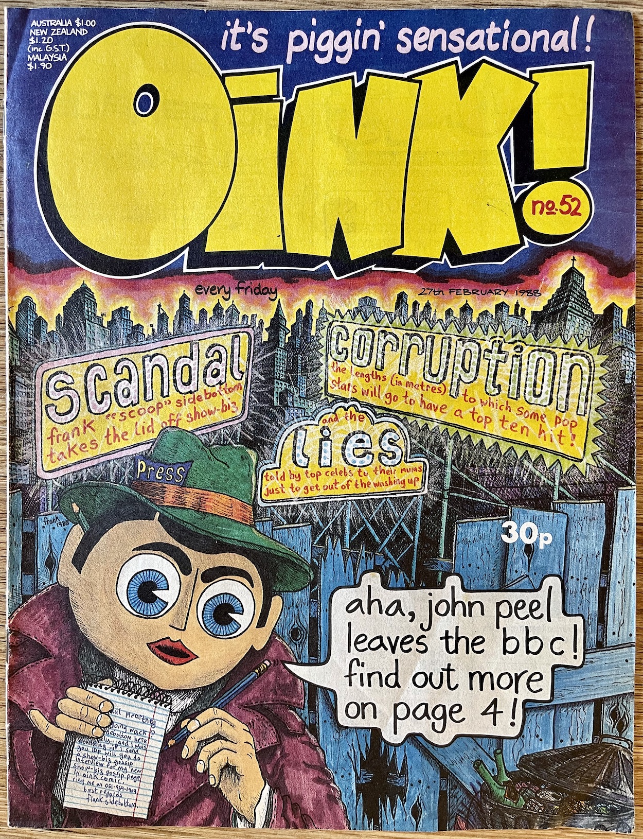
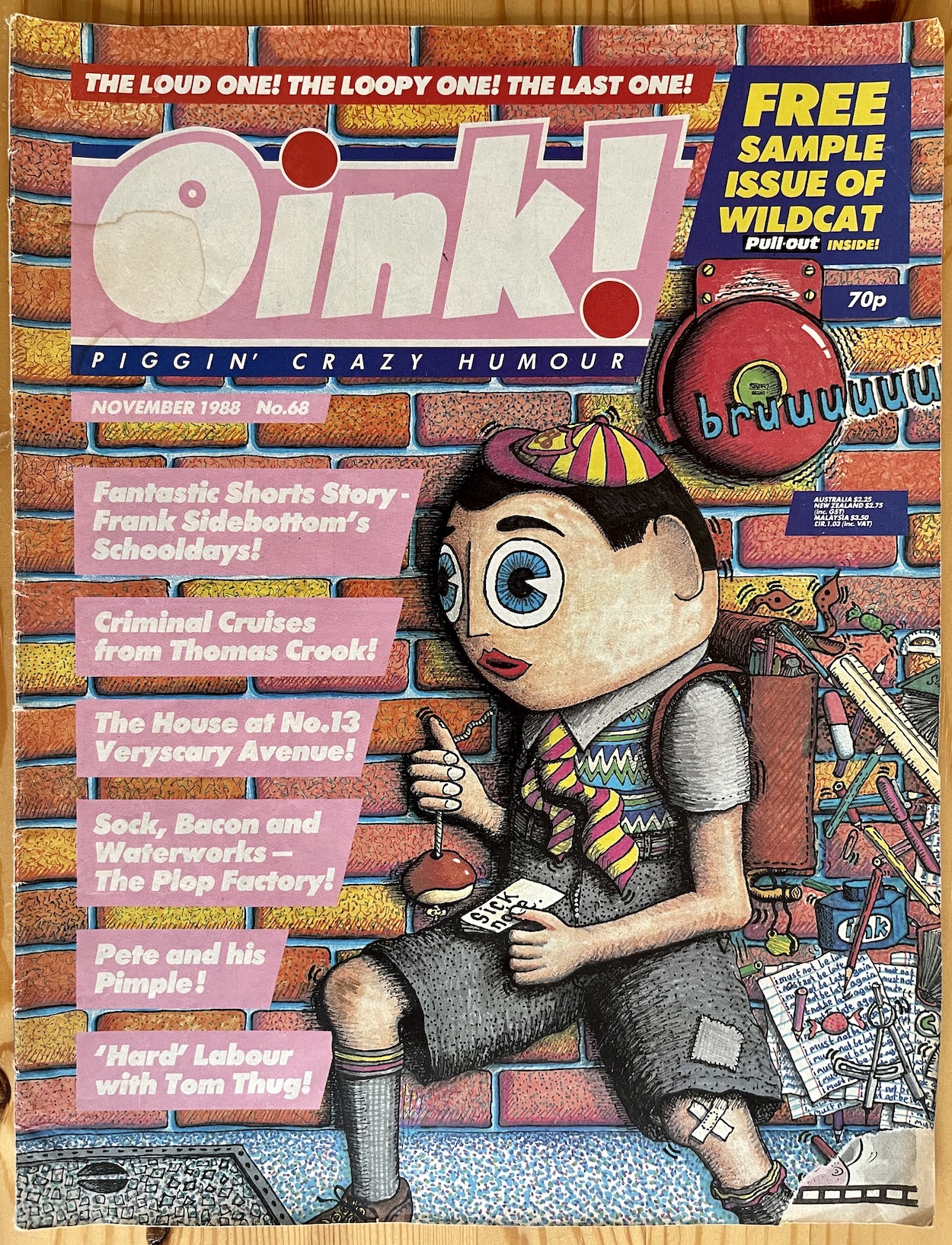
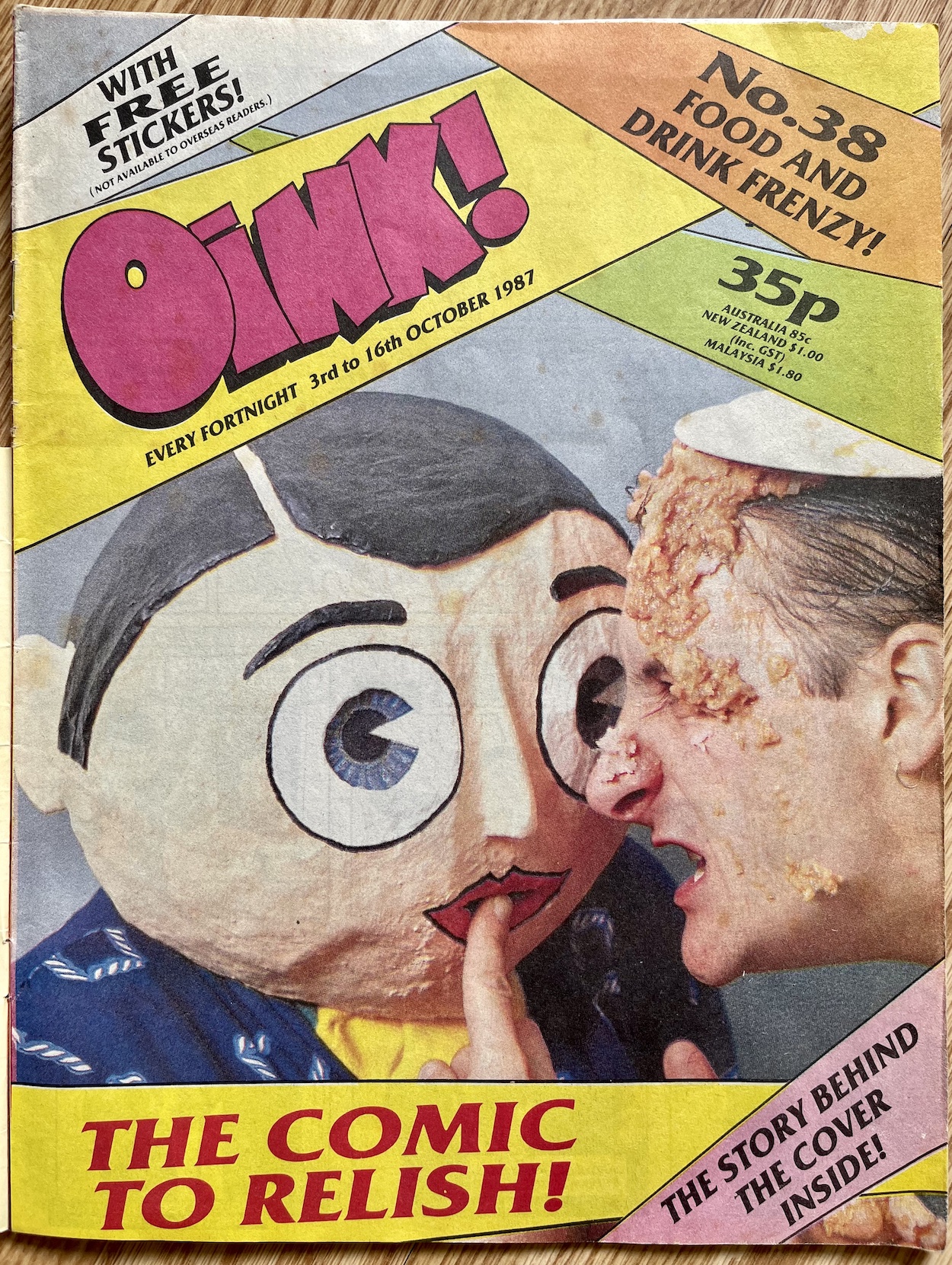
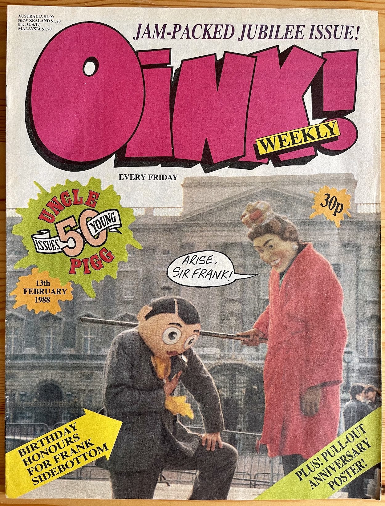
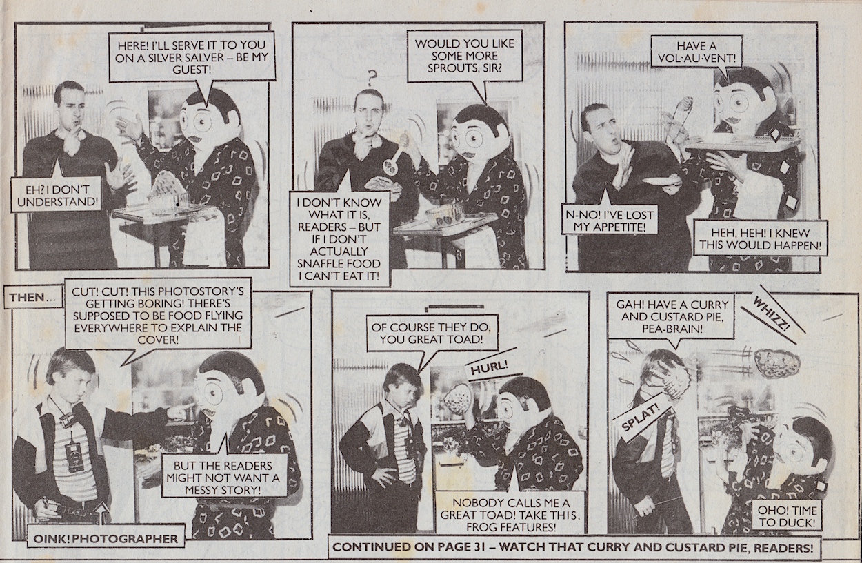
He was good friends with Patrick and they even moved in together when their marriages broke up. Fellow OiNK cartoonist and musician, Marc Riley would often work closely with Chris on OiNK, producing many photo stories starring Frank and Snatcher Sam together, as well as recording the OiNK 45 record. He also starred on four OiNK covers. Two were drawn by Chris and Frank popped up in photo form on the other two occasions, once with Mark and another with Her Majesty. Sort of.
“We needed a shot for our honours and awards issue, so we thought Frank being knighted outside Buckingham Palace would be perfect for this,” continues Patrick. “I had this Queen mask with me and I’m looking for someone to put it on so Frank could get down on his knee for the photo. Only one kid would do it so we had him with the Queen’s face on and Frank being knighted. He [Chris] paid twenty quid for it but obviously it was worth nothing. Frank got ripped off. Sometimes adventures with Chris became nightmares.”
The cover with Marc led to a strip inside too, which perfectly showcases their humour when they got together.
Patrick would also play bass in Frank’s Oh Blimey Big Band (far right in the photo below) alongside Jon Robson on keyboards who would go on to write the Frank movie starring Michael Fassbender inside the head, playing a new character based on our Frank. According to accounts Chris was very pleased with the script. Then in 2019 the Kickstarter-funded Being Frank documentary film covered Frank’s entire life and also included Patrick talking about Chris’s OiNK work.
Chris sadly died of cancer in 2010 at the age of 54. When it was revealed he died with very little money to his name fans gathered together to raise funds to give him a proper funeral, raising over £6,500 in a few hours and a total of over £21,500 in the end. In his home town of Timperley a Frank statue was also erected in his honour and he’s still there, standing with his thumb up in the middle of the high street.
As a kid, Chris’ work on OiNK as Frank Sidebottom was a highlight of the entire run for me. There was just nothing like those pages in any other comic. There’s still no one else like him in the world of entertainment.
Off we go with the latest real time read through and this one is rather different than anything that’s been covered on the blog so far, being the first aimed at a mature audience. After licensing their Aliens comics to Trident in the UK, Dark Horse US decided to set up shop in London and print their strips in their own titles. Thus Dark Horse International was created. This was their first, and flagship, title.
I’ve already covered one of their comics. Jurassic Park not only adapted the movie into comic form it also contained the first ever official sequel to the film and book. Similarly, Dark Horse US’ Aliens continued the story of James Cameron’s amazing hit movie and lasted for decades, only coming to an end in recent years when Marvel rebooted it now that Disney owns both the comic publisher and 20th Century, the company behind the films.
As much as I do love the new Marvel series (it really is superb) I’ve been really excited to sink my teeth (just the one set) into these original stories. As explained in the introductory post I’m concentrating on the comics after Dark Horse International took over with Volume Two. At least for now. This is because these were the comics my friends collected at the time and the one I owned was part of this series too. So let’s get down to reliving it.
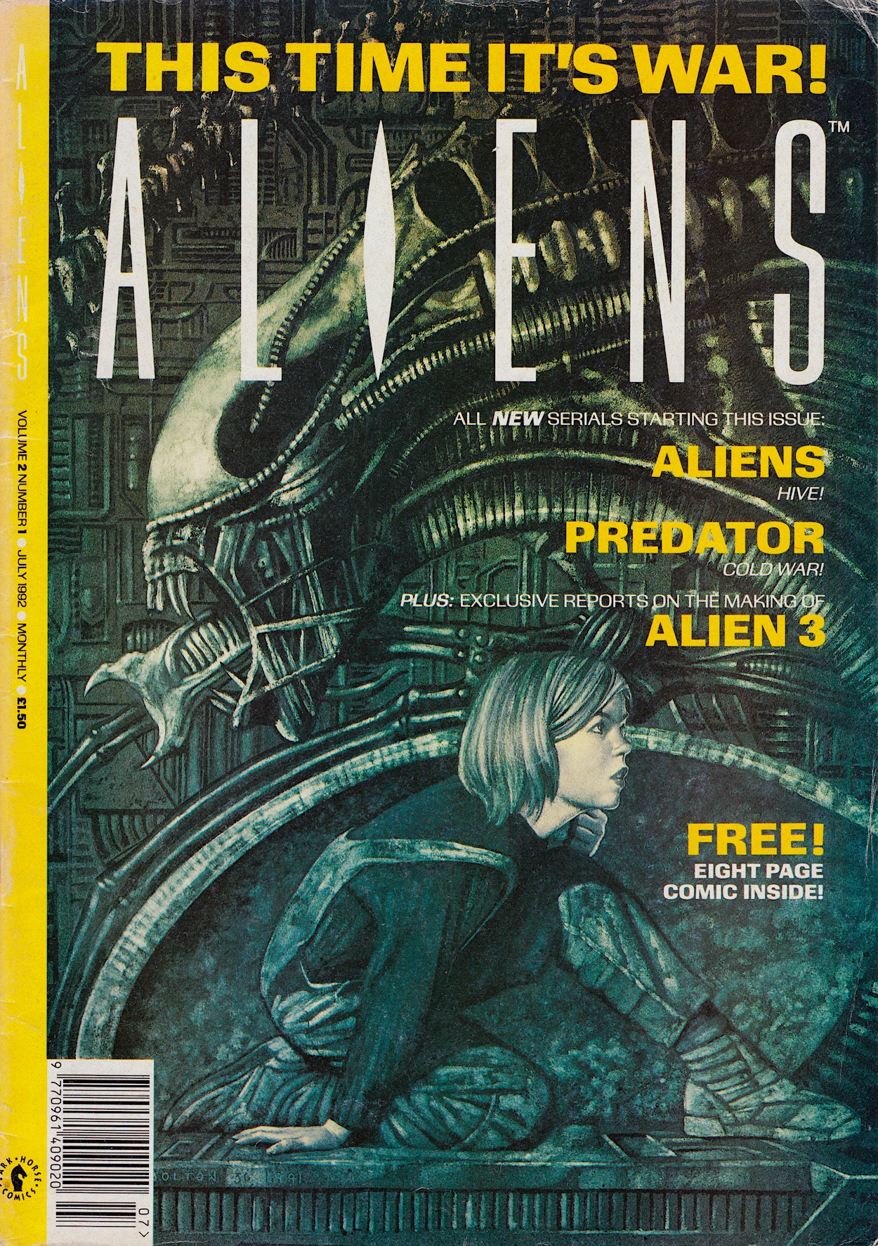
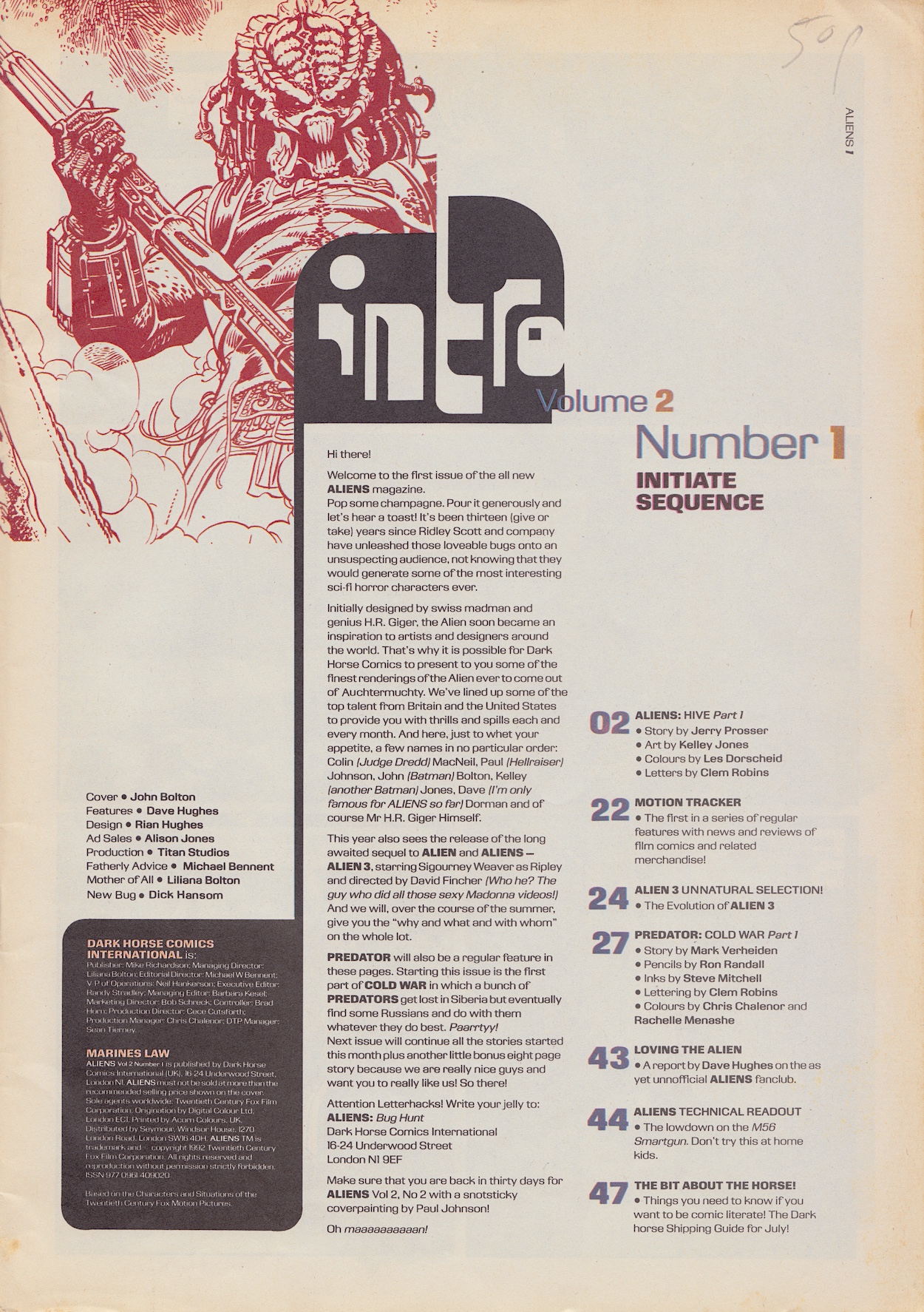
After John Bolton’s (Hellraiser, Man-Bat, The Evil Dead, and one of the first British artists to work on American comics) incredible, exclusive new front cover the editorial welcomes us to Dark Horse’s vision of what an Aliens comic should be, with Jurassic Park editor Dick Hansom given the title of ‘New Bug’. To place the comic in its time you can see Alien³’s release was imminent and in fact Dark Horse would publish a three-weekly, three-part (bit of a theme there) special series to commemorate. More on that movie as we go along.
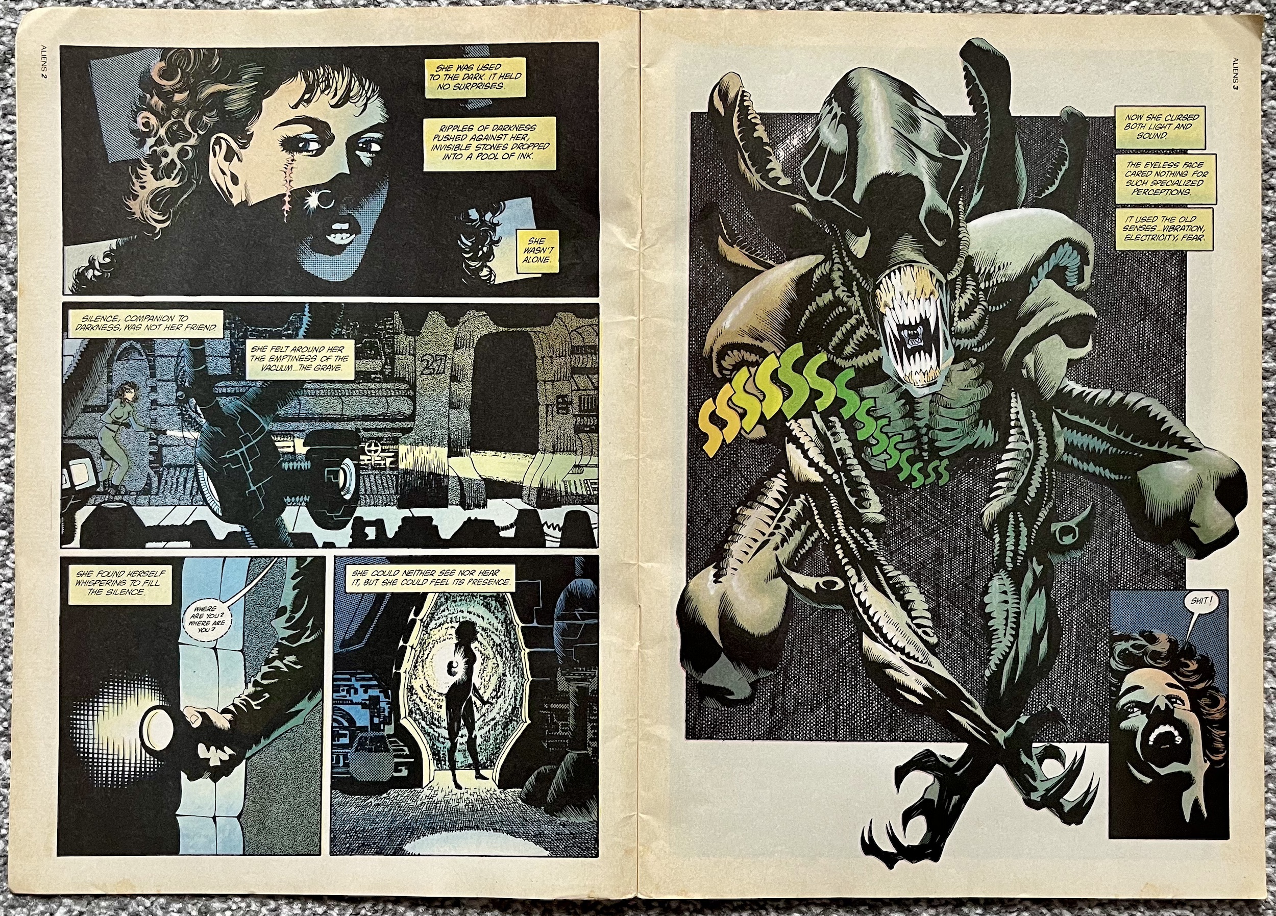
So the first strip in the read through is Hive, part one of which takes up 20 pages. Altogether there are 52 pages with a good quality gloss cover and a matt stock inside, all in colour apart from the occasional advert. There’s also a 16-page Predator back up and a good selection of features, the overall format making it a very UK comic indeed. Let’s get started with Hive first of all. In the States each story was released as a mini-series whereas here they’d be printed in an ongoing comic, much like Jurassic Park. It opens with this scene-setting spread below.
This is the perfect opening for the first issue, feeling very much like the movie, complete with the heroine having a somewhat Sigourney Weaver-esque look. The Alien is brilliantly realised by Kelley Jones (The Sandman, Batman: Endgame, Micronauts), with Les Dorscheid’s (Dungeons & Dragons, Deadman, Nazz) muted colours adding to the atmosphere and Clem Robins‘(Amazing Spider-Man, Ghost Rider, Guardians of the Galaxy) letters. Of course in the film the Aliens are black, but conveying that in comic form can be difficult. Les’ use of colours here is inspired, fooling us into accepting this creature as black even though it has to be coloured differently for its details to stand out on the page.
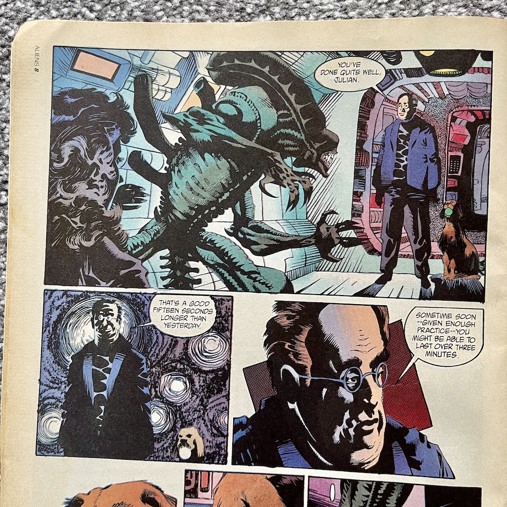
Jerry Prosser’s (The Crow, Predator, editor on Sin City: A Dame to Kill For) story begins with Julian Lish trying to escape from an Alien in a scene that could’ve been lifted straight from the movie with its tight, dark corridors, motion tracking sensors and in the end the alien’s second jaw sliding out for the kill. That is, until an “Override Code” is announced over a loudspeaker and it just… stops.
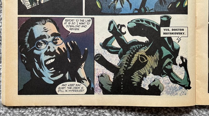
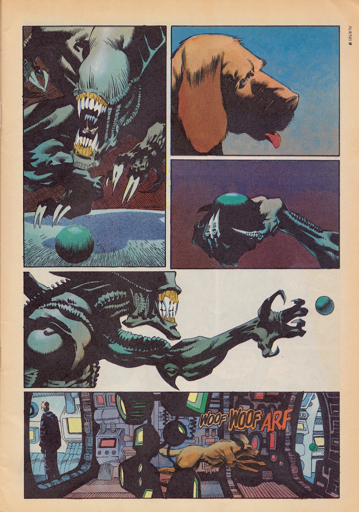
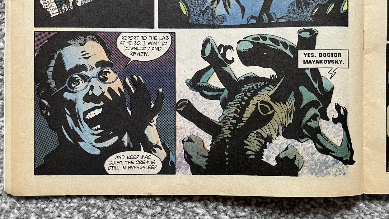
This is Dr. Stan Mayakovsky and any initial confusion you might feel from this turn of events was echoed by me. That’s the whole point. He enters with his dog in tow who seems completely nonplussed with the H.R. Giger creation standing over them. What happens next continued the confusion as the dog drops their ball from their slobbery mouth and it rolls underneath the alien’s legs.
Didn’t expect that, did you? What with this bit of alien playfulness and our two human characters just standing next to it, even after it looked like Julian was about to be its victim, something is obviously amiss. (It hadn’t been released yet, but the dog in the original cut of Alien³ certainly didn’t get this treatment!) On the next page the alien sizes up to the professor, baring its teeth and hissing, my mind instantly remembering the accompanying scary sound from the films. Then it takes off down the corridor and… well…
I admit I laughed at this! And laughter is not something I thought this comic would produce a lot of. Yes, the film had its moments but those definitely didn’t come from the alien side of things. It does explain things though with its clearly robotic speech bubble. As ridiculous as it sounds to have a robotic alien in the story we must remember this is set in a future where completely convincing human androids also exist, so why not?
We get an insight into his addiction to a particular drug, a raw form of the slime produced by the aliens
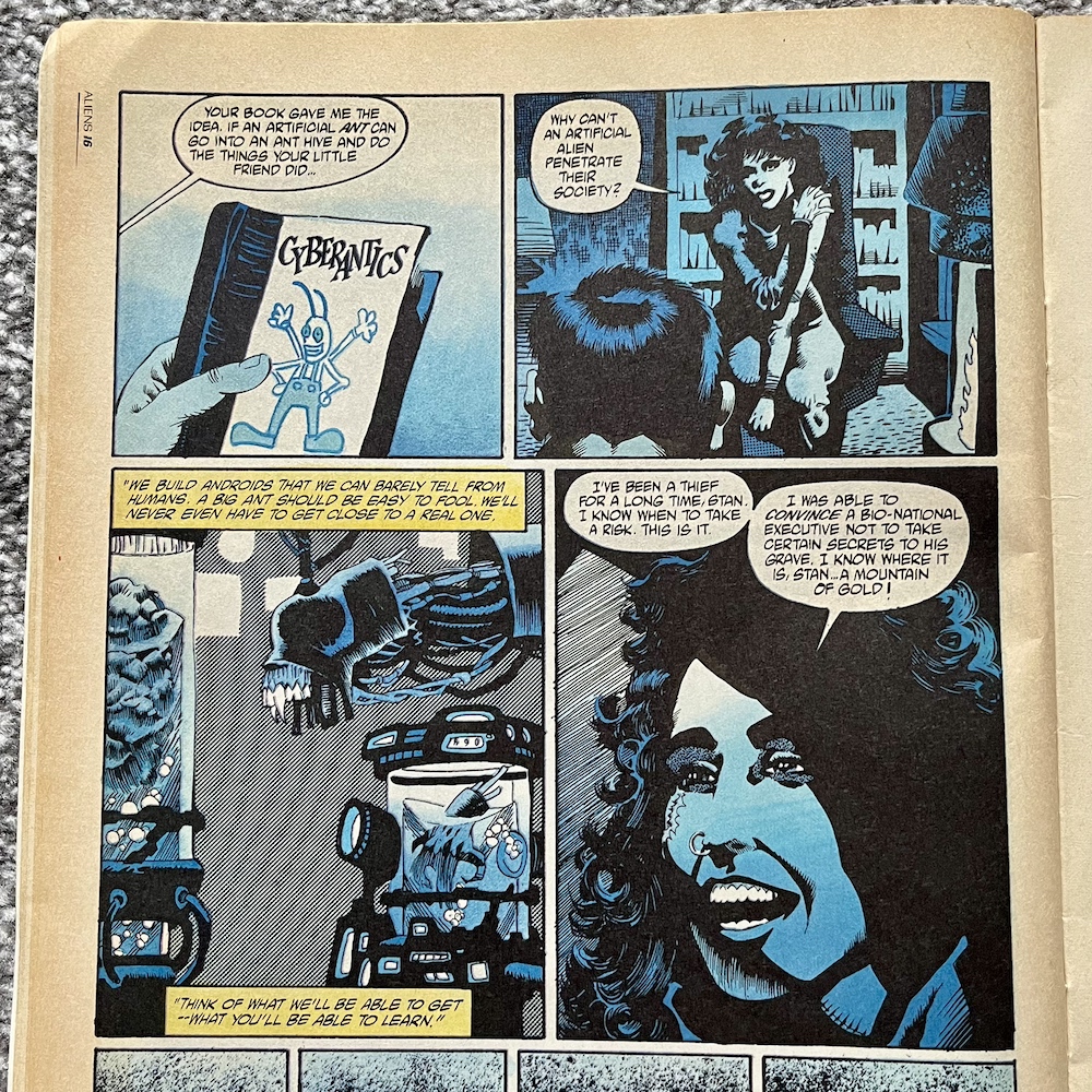
The question is, why exactly has this thing been created? Not only that, but it’s being trained to hunt humans, or at the very least act convincingly like a killer. Called XL1, an out-of-breath Julian tells Stan it keeps getting better, that she’s struggling to stay ahead of it anymore, which pleases Stan immensely. However, Julian wonders what 10,000 of them would be like! It’s a terrifying thought and we know that the plans of greedy humans always lead to disaster in the film series. So what’s the reasoning?
It’s not clear yet if the professor works for the Weyland-YutaniCorporation from the films but we do get an insight into his addiction to a particular drug, a raw form of the slime (or “jelly” as it’s called here) produced by the aliens. It relieves his cancer symptoms and puts him into a sort of trance state where time slows down, his world goes blue and he revisits his memories of how he got to this point. It’s essentially a bit of exposition for the readers.
Having to buy the substance from drug dealers, he eventually met Julian and devised a plan to build an alien android to infiltrate a hive (that explains the reference to thousand of aliens and the title) and bring back the jelly. Stan is in it for himself, Julian appears to be in it for the money, and their mutual desire for the same outcome results in a passionate, mutually selfish love affair. Using the example of ants above and the aforementioned ability to make convincing androids, it’s an interesting set up for the first story in the comic series. There’s also a funny moment when Julian even suggests naming their alien ‘Norbert’!
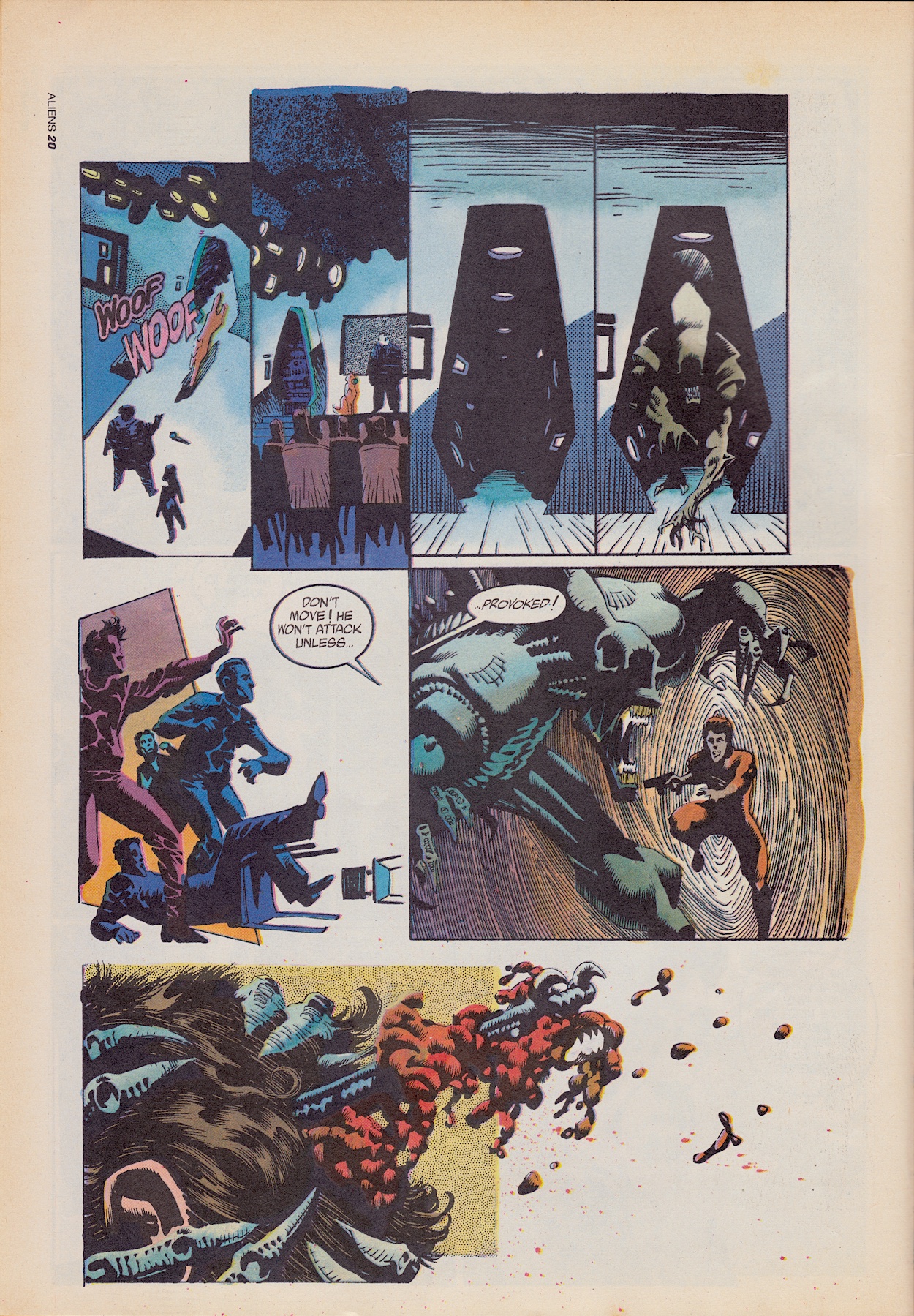
In their ship The Dolomite they take a crew to a far-flung planet called A6 454 upon which humans have never set foot, and Stan and Julian stand up in front of their crew and ask for volunteers before showing them what they’re there for. As a bit of foreshadowing, revealing their android goes horribly wrong. Not that either seems to care.
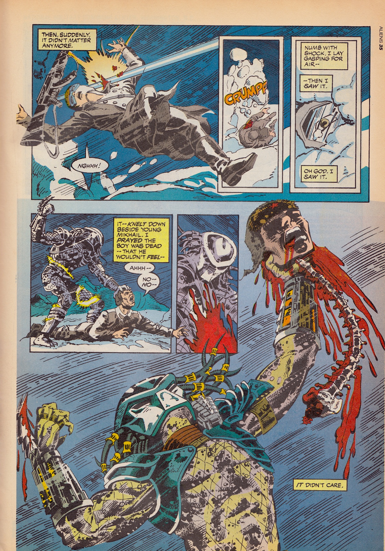
I remember seeing scenes like this when I flicked through my friend’s Aliens comics as a teenager and being amazed it could show such images. I’d never seen anything like this in comics before. Anyway, Stan finally uses his override command to stop his android from continuing its killing spree and the final image of the strip has it holding another man’s head and looking directly at Stan. Whether this is where the original first part ended in the US comic or this is where the UK’s comic has cut it off is difficult to say, although the sudden end makes it feel more like the latter.
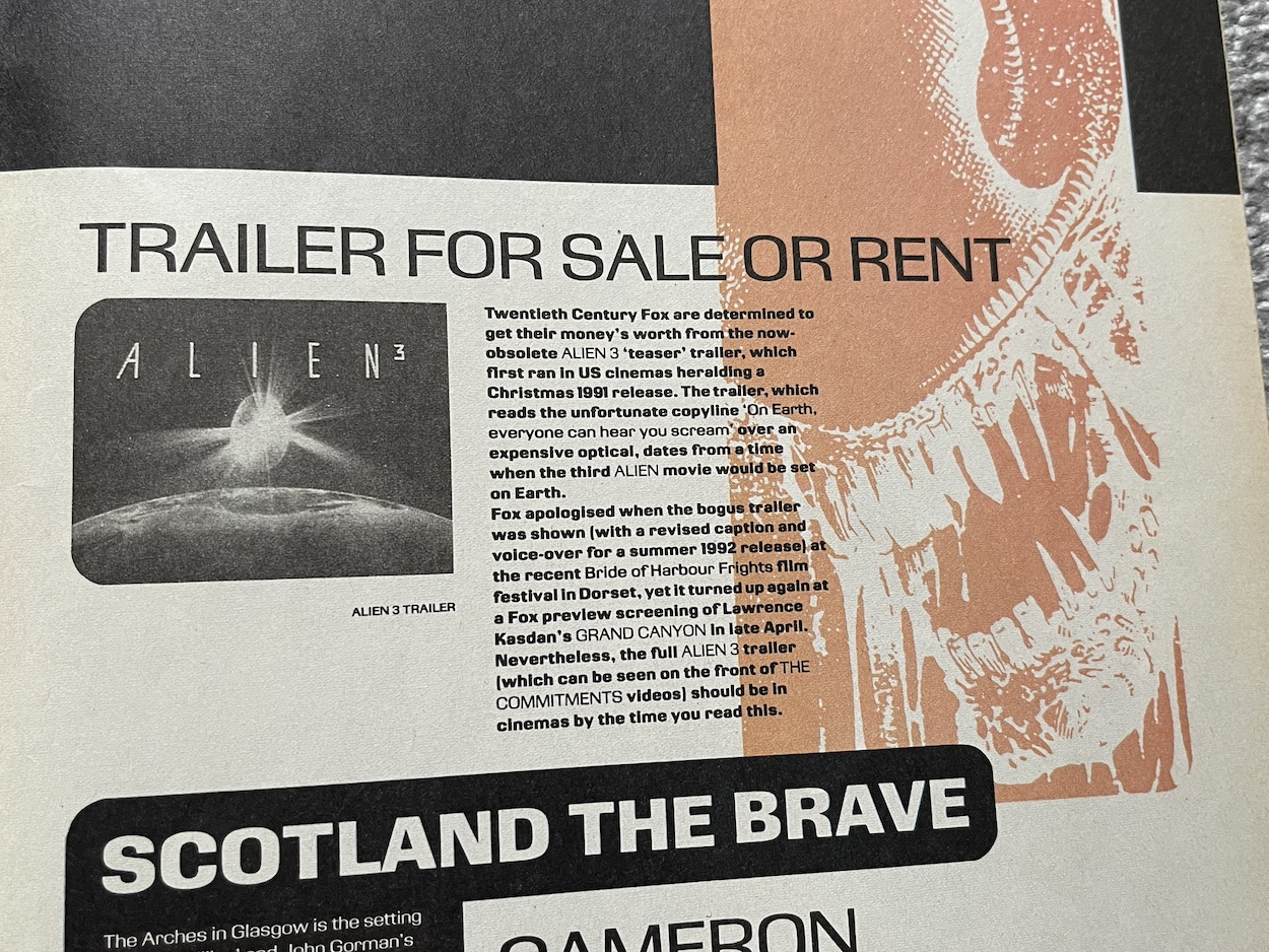
The first part of Hive is intriguing, full of atmosphere, has plenty of horrific moments and really sucked me into its world. It’s a fantastic start to the comic and this already has the potential to be an excellent read through. As a teen it was no wonder I loved the one issue I picked up if this is anything to go by. It would’ve shocked and scared me, and I would’ve been loving every page of it. Before moving on to the back up strip there’s a bit of news in The Motion Tracker segment and a middle-page spread about the making of Alien³.
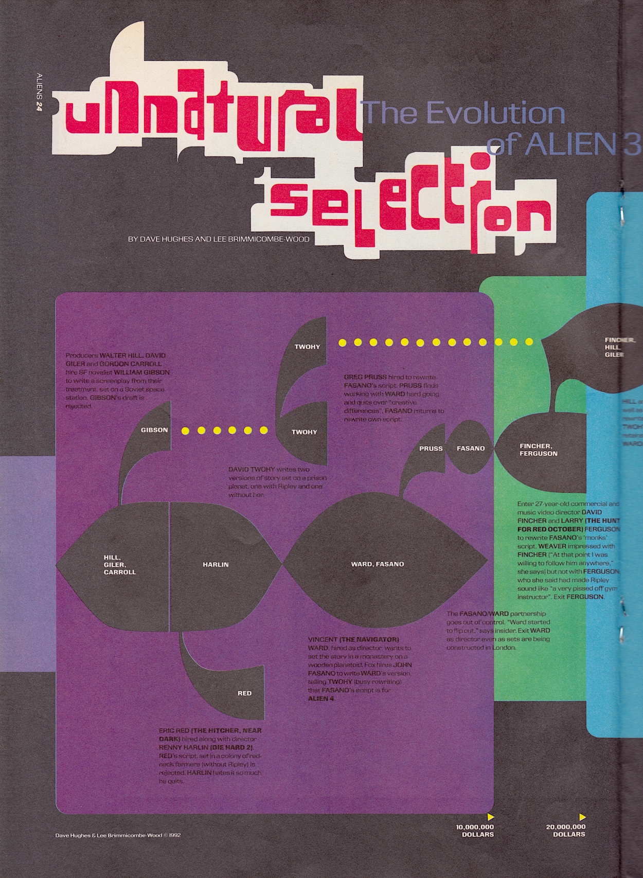
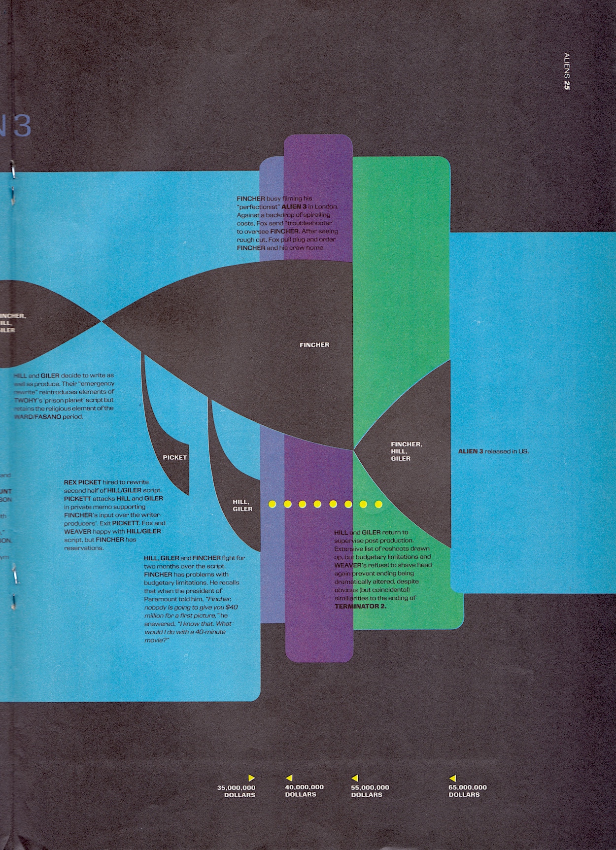
I wonder if anyone actually went and rented The Commitments back then just to get a glimpse of the film? It’s interesting that there was a different direction for the film originally planned, so much so that a teaser was made. The Unnatural Selection spread isn’t the easiest to read but it does explain a lot of the infamous difficulties in making Alien³. I’m particularly interested in the various writers and script drafts and the evolution (hence the subtitle) of the story over the years before filming began. If this is an indication of the extras the comic will contain I can’t wait for future issues.
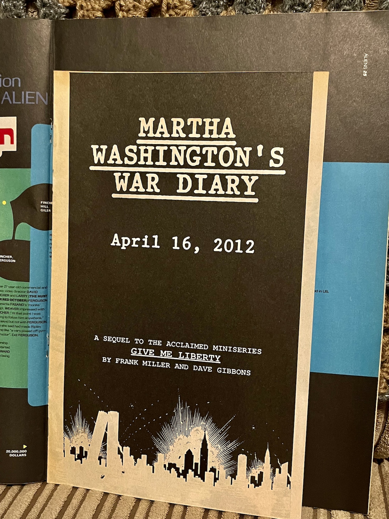
In case you’re wondering, the “Free Comic” on the cover is a sequel to Frank Miller and Dave Gibbons’ Give Me Liberty (which I’d never heard of until now despite it being a best seller) and nothing to do with the Aliens franchise. While the Predator movies would eventually cross over into the Aliens universe, at the time they had nothing to do with the franchise either. However, in comics they were always closely related and thus a perfect choice of back up strip.
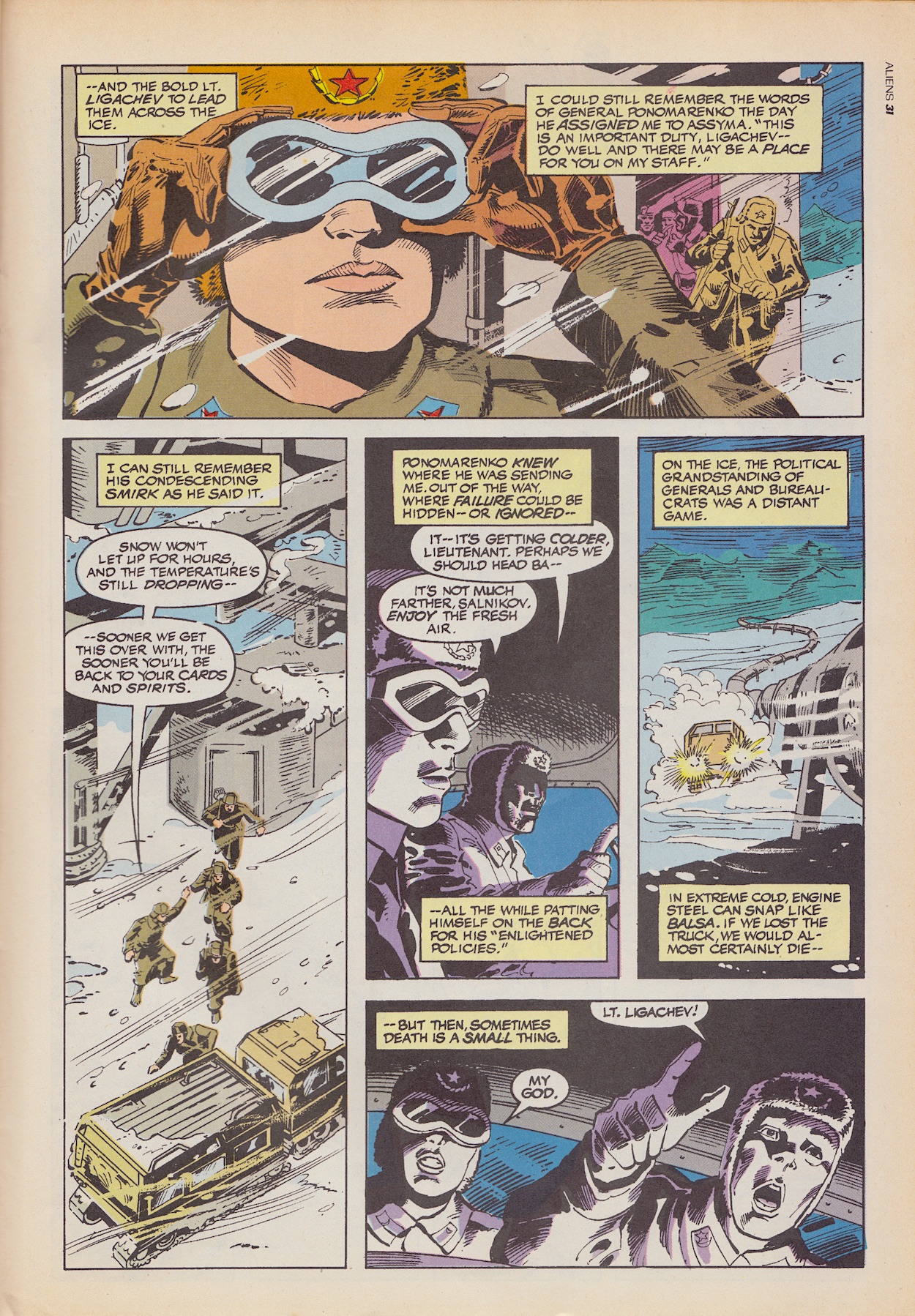
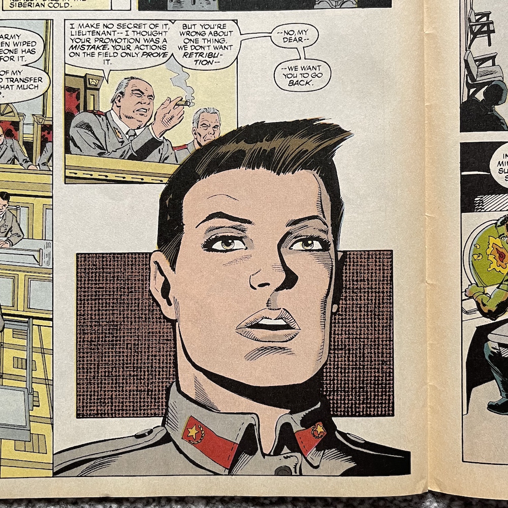
Predator: Cold War is written by Mark Verheiden (Phantom, co-executive producer on Battlestar Galactica and Falling Skies), with pencils by Ron Randall (The Dreaming, Action Comics, Supergirl), inks by Steve Mitchell (Aquaman, Batman, G.I. Joe), colours by Chris Chalenor (Barb Wire, The Mask, Hieroglyph) and Rachelle Menashe (The Terminator, Icon, Virus), and letters are by Clem Robins again. Lieutenant Ligachev has been promoted by a General of her army just so he could send her to take charge of an oil field pumping station in the middle of the Siberian nowhere. When their equipment discovers large seismic activity accompanied by high levels of radiation they go to investigate, discovering the decapitated body of a local deer herder, strung up on a pole as if he’s on display, like an animal at the end of a successful hunt.
Soon they’re under attack by a Predator and, upon being hit and half buried in the snow, Ligachev can only watch as her young team are cut down one-by-one by this strange creature. Setting the beginning of the story in desolate ice fields adds a level of desperation to her plight but we soon find out she’s recounting it to a military tribunal who wants to send her back!
If this is anything like Aliens then she’s probably being sent back out to face certain death in order for the government (rather than a private company) to get access to powerful weapons. As someone who has only ever seen the second movie a long, long time ago this plays out like a typical 80s monster movie, which is no bad thing of course. More interesting is how the rest of this 16-page chunk of the story tries hard to tie it in closer to the film series.
The American military have picked up on the weapons fire and automatically assumed the Soviets were test-firing nuclear weapons, so they reach out to General Philips. He was played by R.G. Armstrong in the first film although here he’s described as having something to do with the “business in New York last summer” and I’m not sure what that’s in reference to. After all, the first film was set in Central America and the second in Los Angeles.
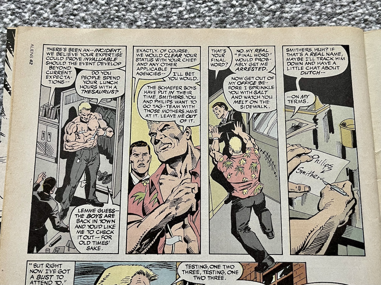
A second character, a New York sheriff, is seen having flashbacks to being attacked by a Predator (while at the dentist no less, so double the horror!) so maybe it’s in reference to an earlier Predator comic, perhaps one printed in Trident’s first volume. Meanwhile, the general goes to meet a Detective Schaefer who turns out to be the brother of Arnold Schwarzenegger’s character Dutch, still M.I.A. from the first film. As you can see he’s drawn as another version of Arnie and basically feels like a way of getting the big name star into the strip without actually doing so.
So far, as someone who knows next to nothing about Predator the opening scenes were exciting but the introduction of Schaefer feels a bit like the Jurassic Park comic’s own desperate attempt to get another character from the film into its sequel strip, when it reintroduced Robert Muldoon who had clearly been killed by the Velociraptors in the movie. I’ll not dwell. Going into the Predator strips essentially blind means I can just enjoy them for what they are.
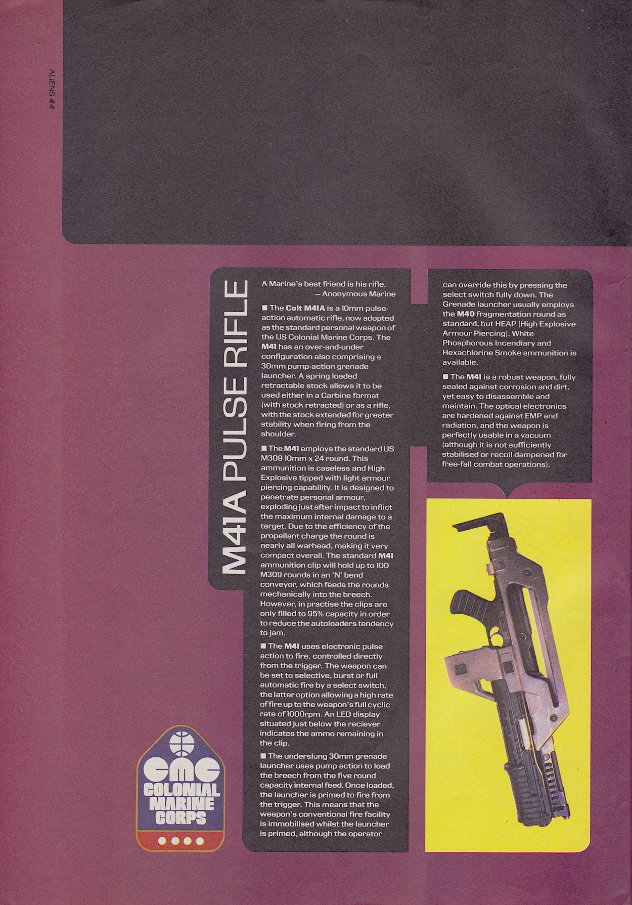
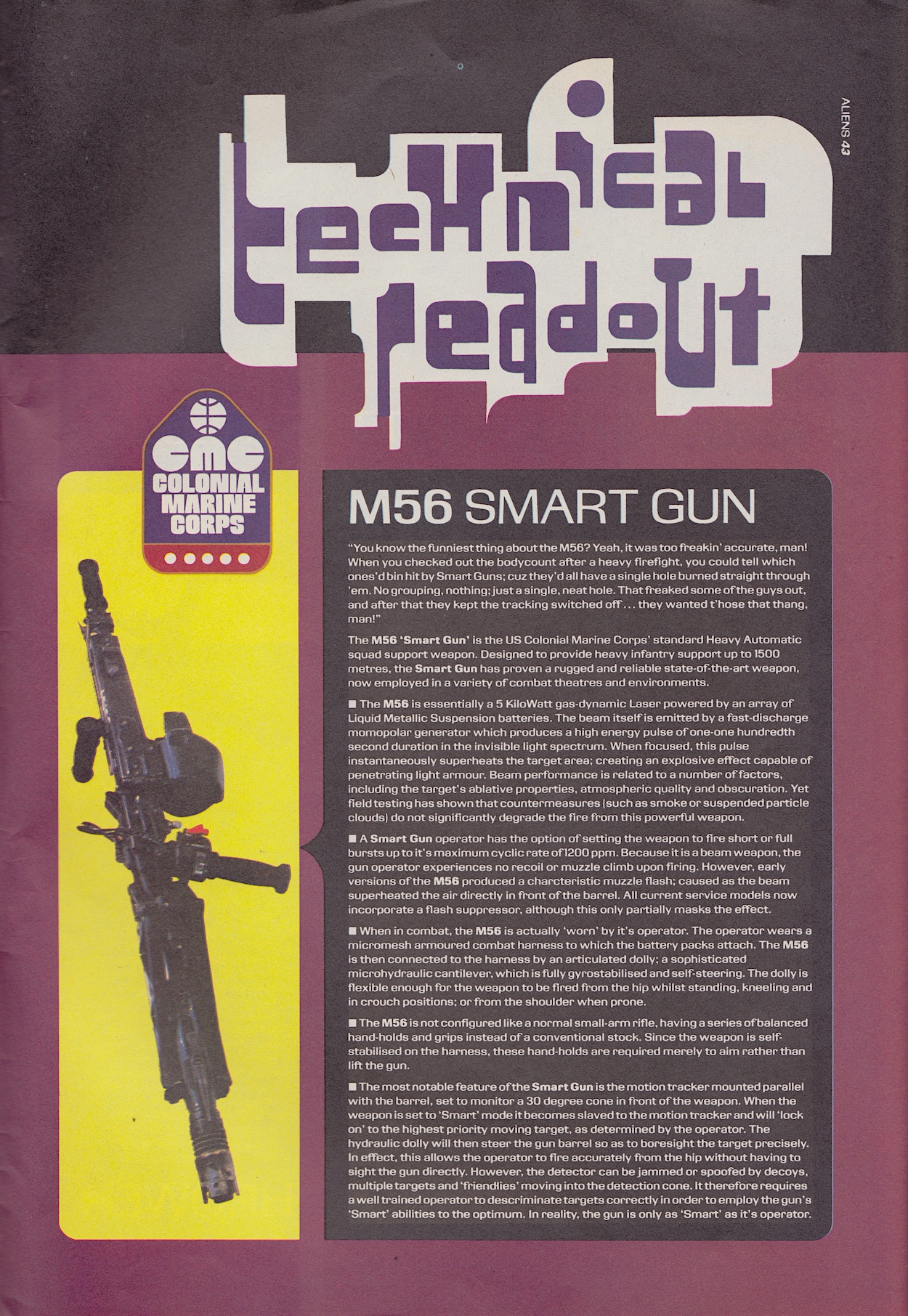
Towards the rear of the comic are three pages detailing some of the weaponry used by the Colonial Marines in the Aliens movie. For fictional weapons the Technical Readout really does go into a lot of detail. If this is the beginning of the comic adding some background depth to not only itself but also the universe of the films then it’s another great start. These pages bring back exciting memories of their onscreen use, especially the M56 Smart Gun as used by Jenette Goldstein’s Vasquez character, decades before “smart” devices became the things to own.
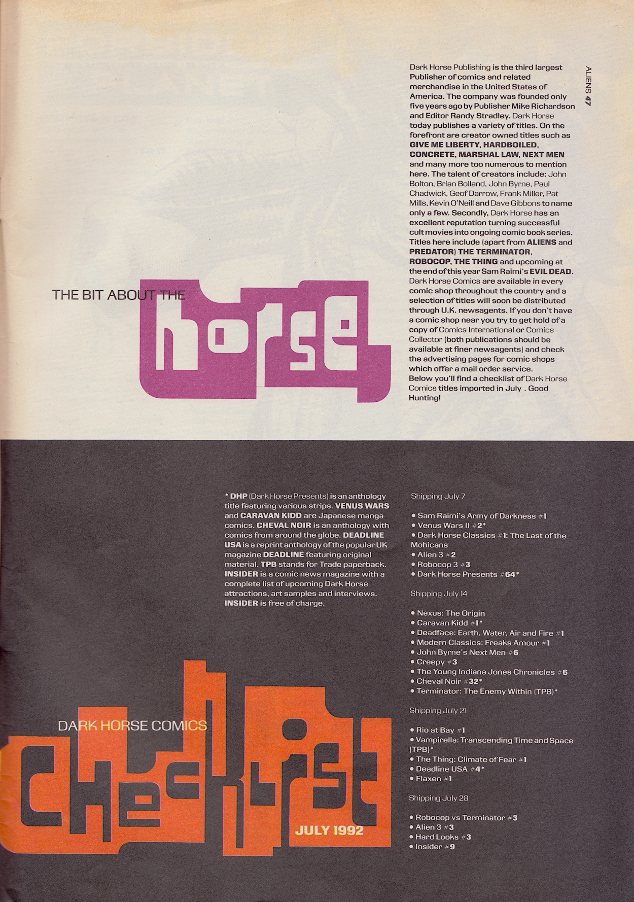
Finally, just as in Jurassic Park (and many Marvel UK comics) we get a comics checklist, although at this stage Aliens was Dark Horse International’s only UK title so it focusses solely on the imported comics available in specialist comics shops. These weren’t as easily found at the time (Northern Ireland only had two such shops back then) so for most of us these were beyond our reach. It’ll be interesting to see this develop as the company settled (at least temporarily) into this part of the world.
With that we come to the end of the first issue and it’s off to a cracking start. The Aliens strip itself is fantastic and it hasn’t really got going yet, but the set up has plenty of potential for things to go horribly wrong for the cocky humans. Predator is also enjoyable and might be more so once I actually watch the films (which I now want to do, so that’s another good point) and the extras are interesting. Lots of potential here. This is a lengthy read through that’ll take us all the way to March 2026, so settle in and come back on Tuesday 23rd July 2024 for the next instalment.
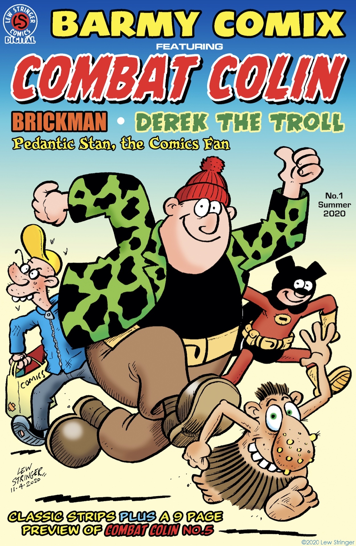
Created by master of mirth Lew Stringer, Barmy Comix was released for free online in 2020 in response to a delay in the publication of his next Combat Colin comic due to Covid. Bringing some much needed cheer to a locked down world when access to new comics was impossible, it has 32 pages (or screens) of strips taken from various publications in the Lewniverse, including a nine-page preview of the next issue of Combat Colin.
That’s not all from the moronic militia man though. There’s a classic from the Transformers days, when Lew’s strips were at their height later in the run with Day of the Gunge, a strip I fondly remember reading first time around when I was a much smaller human. There’s also a full-colour adventure with Colin and Semi-Automatic Steve I hadn’t read before from the pages of Aces Weekly. This on its own is worth the price of entry. Not that there is any price, but you get my drift.
Loose Brayne, aka Brickman is in here too. It’s quite possibly the barmiest strip of the whole comic and that’s certainly saying something. The Brickman Meets The Mad Cobbler is classic Lew turned up to ten. I love the character of Albert and on the next page we see that it’s actually the big fancy house, Brayne Manor, that sits in a cave while Brickman’s supposedly secret lair is above ground for all to see.
This should give you some idea of the chaos to expect if you’ve never read a Brickman strip before. Set in “Pre-Holocaust Thatcherite Britain” it’s an ingenious mix of slapstick, social commentary and daft gags. It’s probably my favourite out of the whole issue. Saying that, there’s also a second story of his, Brickman and Trowel Meet Professor Deranged! Nothing subtle about the villain names in this comic.
Derek the Troll’s strip takes the form of one of those Make-Your-Own-Adventure books we had as kids (OiNK had its own version back in #5). Derek was originally created for role-playing magazine Warlock and that’s where this strip comes from. Lew has also released a comic reprinting all of Derek’s misadventures which I’ve already reviewed on the blog and (spoiler) enjoyed immensely.
Derek the Troll’s ‘orrible Troll-Playing Game is almost impossible to win, throwing a spanner in the works every time you think you’ve made the right decision, its curveballs and surprises keeping you laughing all the way to the end. There are also two full-colour strips of Derek’s from the short-lived digital comic Goof and he’s the star of one of the mini-posters scattered throughout Barmy Comix, ready to be printed out and Blu-Tac’ed to your wall if you’re feeling particularly nostalgic.
One creation of Lew’s I’d never heard of before reading this comic during the pandemic was Pedantic Stan the Comics Fan. Co-created with former Marvel UK editor and the utter gentleman behind comics news site Down the TubesJohn Freeman, he was created for comic newspaper Speakeasy in the 1990s (an earlier edition of which has already appeared on the blog). Lew has also released the complete collection of Stan’s strips in a small, landscape format comic which was a hoot to read. It’s been a while since I’ve read it so it was fun to see his Full-Page Christmas Special again.
Also in here is a touching strip from the Undefeated Spirit of Hope book released in 2011 in the wake of the natural disasters in New Zealand and Japan of that year, finishing off the comic on the back page. Altogether this has reminded me of The Marvel Bumper Comic, which introduced me to comics and characters I hadn’t previously read among a mix of hugely enjoyable, hand-picked reprints of some of my favourites.
Barmy Comix was (and still is) free although Lew does ask fans if they could donate a small sum of £2.00 towards the creation of future comics in his range. This was particularly relevant during the pandemic but it’s such a small ask in return for the many laughs we get from each and every one of his publications. To download it just click on the link below to Lew’s own blog and please do remember to donate.
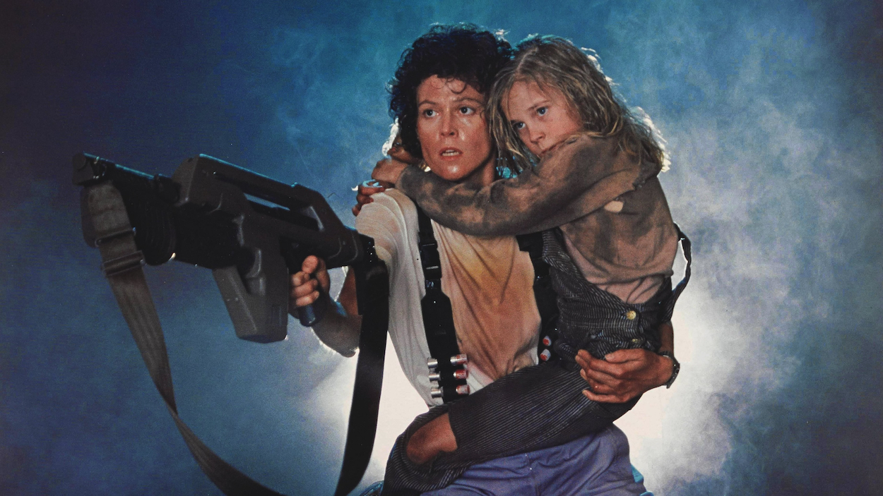
On my 15th birthday (21st December 1992) my mum and I sat down to watch the evening movie on UTV. I knew of the Alien films (there were only two at the time) but knew nothing about them, however Sigourney Weaver from Ghostbusters was in it so I was sold. It was on for an hour before breaking for 30 minutes to make way for the Ten O’Clock News, the cut off point being perfectly timed as they drove inside Hadley’s Hope.
It had built up for an hour and we were primed when the film returned to the air for what felt like an hour-long climax. I’d never seen anything like it and even my mum loved it, going along for the ride with Ripley, Newt and the rest. In school I raved about it and discovered some of my friends were huge fans, who then arranged a night for us to watch the Special Edition together with all of its cut scenes restored. Over the years I’d go on to watch the original and the sequels, but this one always remained my favourite and one of my favourite films of all time. (Ever since I’ve always checked the TV listings for a good movie on my birthday night. Nothing’s ever come close.)
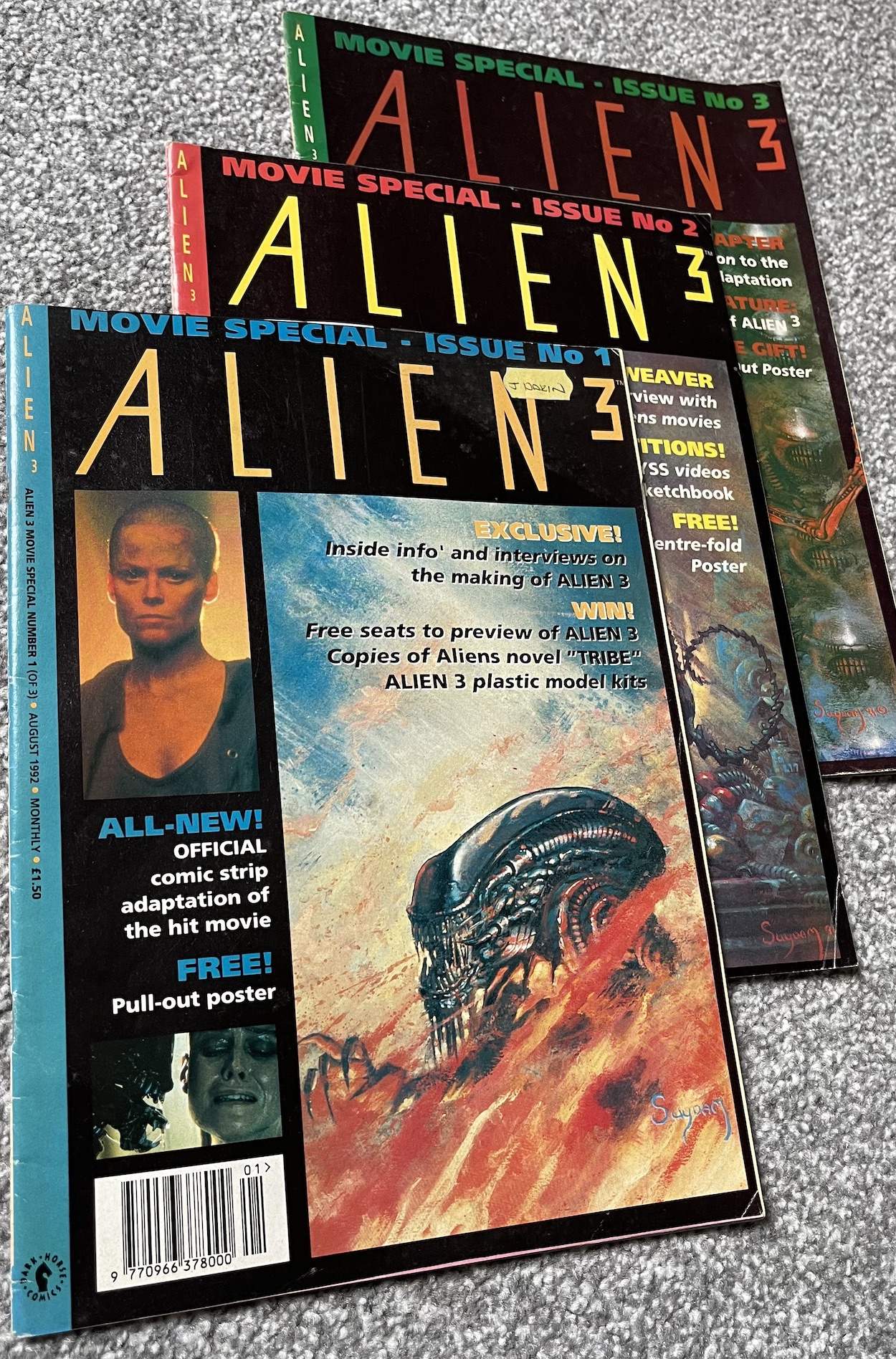
I knew there was a UK comic at the time thanks to one of those friends. I flicked through some of their issues (which did look amazing) and saw adverts in my Jurassic Park comic but I never collected it myself, only buying one issue for a long train ride on a holiday in 1994. I remember being engrossed by it but then never seeing it anywhere after that. At that age my attention span soon drifted and that one issue was the only one I ever read. Until now.
While reading Jurassic Park for the blog I couldn’t help but notice the promotions for Dark Horse International’s Aliens and it got me thinking about covering it. However, upon researching to see how much there was to collect I noticed Dark Horse only produced volume two, the first was published by Trident who I’d never heard of before. I picked up an issue of Trident’s but it was a very different beast and not what I remembered at all.
I may eventually go back and collect those issues but for now I’m concentrating solely on Dark Horse’s volume, which began in the summer of 1992. There are more issues than volume one, on the surface it seems to be a lot more professionally put together and it contains features beyond the comic strips. But most of all it includes the issue I bought as a teen and so it’s this version I want to relive and rediscover as an adult. That’s the whole point of the blog after all.
Apart from flicking through each issue just to check page numbers and ensure everything is there (I haven’t read anything) I did notice the cover art is simply wonderful on each and every one of them. I mean properly stunning. If this is an indicator of what I can expect from this comic then I can’t wait to get stuck in. Speaking of the covers, I had a vague recollection of the one I’d bought many years ago, and when I was eventually able to collect them all I instantly recognised it. As it turns out it had been the last issue before Dark Horse International went out of business. No wonder I never saw any more on the shelves.
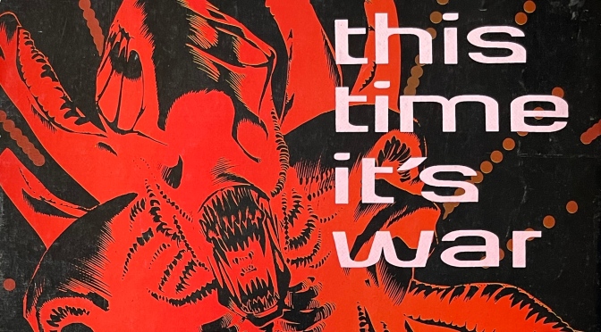
Firstly though, Dark Horse produced one final issue to volume one, which included a specially commissioned cover from sculptor Chris Halls, who had worked on the then-yet-to-be-released Alien³, and inside are a selection of short stories to round everything off for a new start the following month. I haven’t included it in this read through so it’ll be a fun way of ending volume one if I get around to it. It explained to readers what was happening with the change of publisher and included an atmospheric back page with the new tagline for Volume Two: “This Time It’s War!”
As for what you’ll see in this real time read through, there are 22 monthly issues plus a special three-part Alien³ series, published every three weeks. These will make for a meaty read through of 25 issues for you and I both to enjoy. Some of them have their free gifts intact and there are even two Christmas issues! Well, there are two Christmas covers anyway, I doubt there are festive tales inside but I’m still thrilled with the fact an Aliens comic marks the festive season at all. (If you’re new to the blog, I’m a bit of a Christmas nut.)
What else do I know before I go in blind to this series? Well, the accompanying mini-series is a bit of a giveaway but there’ll be plenty of coverage of the third film as I see it mentioned on a lot of the covers. It wasn’t brilliantly received at the time by fans but I always enjoyed it. However, in recent years a Special Edition has been released and it’s a completely different film. It’s superb! In fact, this version is very much the one that should’ve been released at the time but for studio interference. I’d place it right up next to Aliens, that’s how good I think it is nowadays. So it’ll be interesting to see how the comic and its readers (there’s a letters page) spoke of it at the time, unaware of all of this.
The Predator seems to feature quite heavily too. The two franchises hadn’t met at this stage but they were always destined to and the editorial in Volume 1 #17 hyped up the return of the alien hunters in issues to come. I’ve only ever seen the second movie in that particular franchise so I wonder if the comic strips will make me want to go back and get caught up with those too.
I’m always excited to get stuck into a new real time read through and I feel extra excited this time. That one issue decades ago left such an impression on me, and it’s just so different to anything else covered thus far. I’m also collecting the new Marvel Aliens comics and they’re fantastic so that’s adding to my hype. Jurassic Park finally has some company in the Dark Horse International menu too.
The first issue of Aliens will face hug the blog on Tuesday 18th June 2024.
As I collected Death’s Head’s comic for the blog I couldn’t help but notice the covers for the final three issues all prominently displayed characters from other publications. Crossovers were usually an event and used sparingly in my comics as a kid so my initial reaction to seeing these was that they were really, really trying to get a bigger audience for the comic, which made me think sales weren’t great. A bit of a leap perhaps, but three crossovers in a row?
This issue we see the Seventh Doctor (as played by Sylvester McCoy on TV) guest star after our Freelance Peace-Keeping Agent first appeared in Doctor Who Magazine and ended up reduced to human size by the time-traveling alien. It’s clear from the cover and the editorial inside that the opportunity for revenge has presented itself and Death’s Head intends to follow it through. But first, a surprise in the credits!
Unlike all previous issues, which were written by the character’s co-creator Simon Furman, this chapter is written by Steve Parkhouse (Nick Fury Agent of S.H.I.E.L.D., The Bojeffries Saga, Doctor Who – unsurprisingly) who also inks Art Wetherell’s (Transformers, The Incredible Hulk Presents, Sheena Queen of the Jungle) pencils. Annie Halfacree letters and Louise Cassell colours a strip that feels very different than usual. Plus, Steve White (editor of Visionaries, colourist on Jurassic Park) takes over as editor after Richard Starkings had resigned.
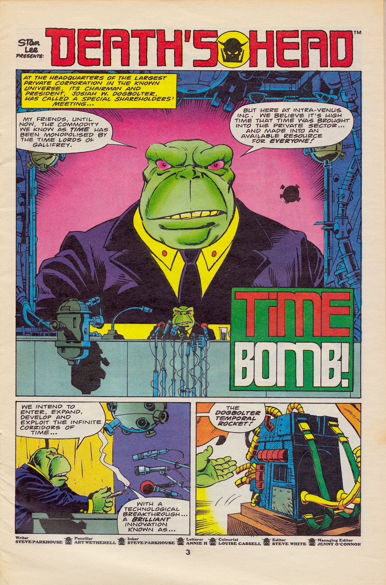
The plot involves Josiah W. Dogbolter, a character of Steve Parkhouse’s and Steve Dillon‘s from DWM in the Fifth Doctor days, whose company wants to make money out of time travel by privatising it. How could time travel be privatised? In the 80s we thought the same thing about water and the railways. This is clearly taking a dig at Margaret Thatcher’s government of the time, something Simon’s Dragon’s Claws was very good at. It’s nice to see this kind of satire make its way into the more comedy-focussed title.
Dogbolter finishes his speech to his shareholders and the press with the phrase, “Time IS money!!” and I have to hand it to him for that one. It doesn’t take a genius to work out that the businessman has had previous run-ins with The Doctor and that’s why he’s wanting to control the very essence of time travel. The first panel above sums up the entirety of the plot for this issue, found on the second page.
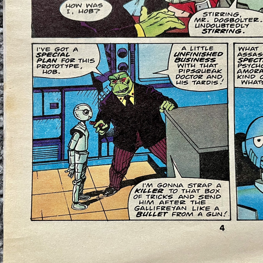
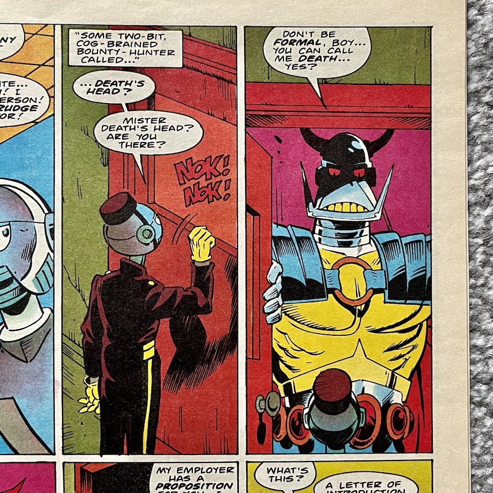
This comic could never be accused of having intricate plot lines, usually they’re just a means to an end. But when those ends are so full of character, action and laughs, when they’re so enjoyable, they do the job. This issue is no exception. Hob is Dogbolter’s robotic assistant and is sent out (in delivery boy uniform no less) to hire Death’s Head for an assassination attempt on The Doctor. Needless to say, he accepts the job.
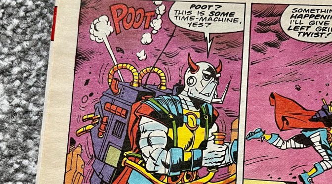
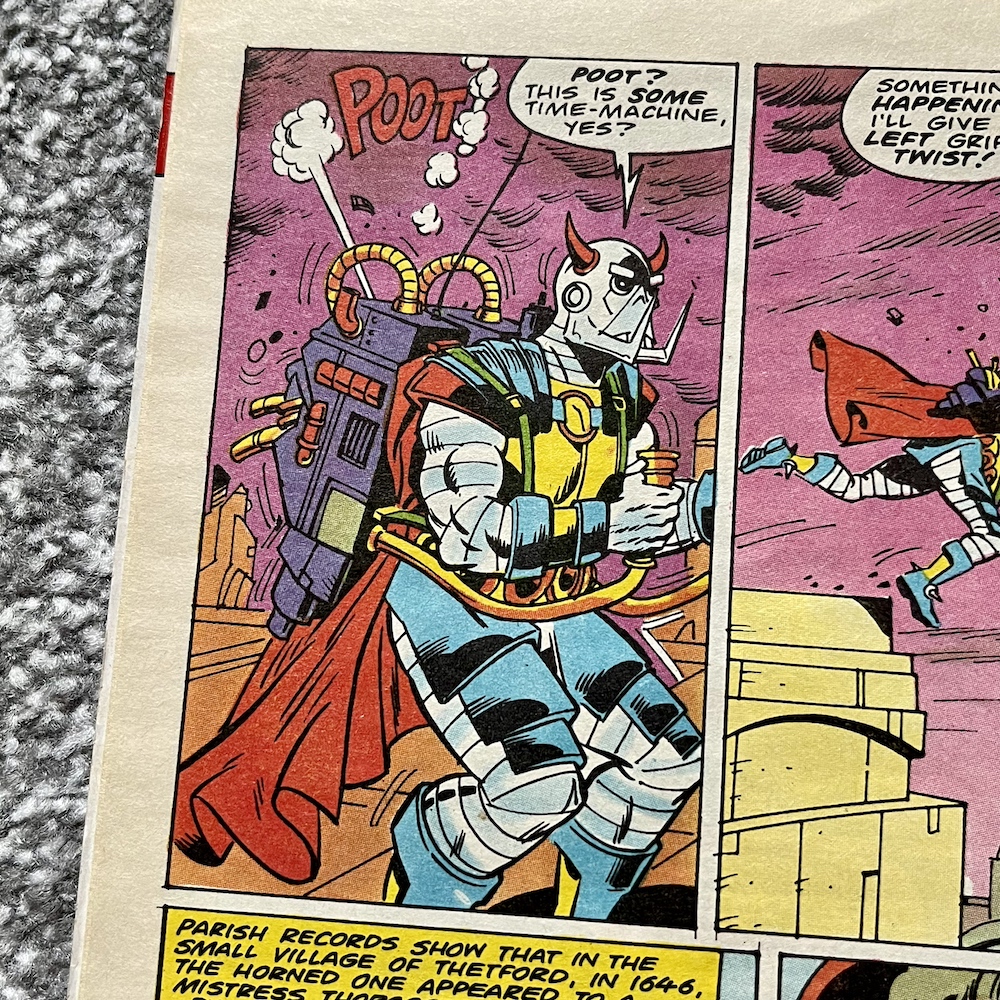
“Poot? This is some Time Machine, yes?”
Death’s Head
What he doesn’t know is that Dogbolter was looking for “a skilled assassin who’s not only spectacularly stupid, but psychotically aggressive, amoral, and lacking any kind of imagination whatsoever” and Hob’s conclusion was to approach our lead character. It becomes apparent later in the strip why his boss was looking for someone with these particular traits. But first, on a dark and stormy post-apocalyptic night in a future Los Angeles, the powerful time travelling device gets strapped to Death’s Head and he dramatically sets off. Well, sort of.
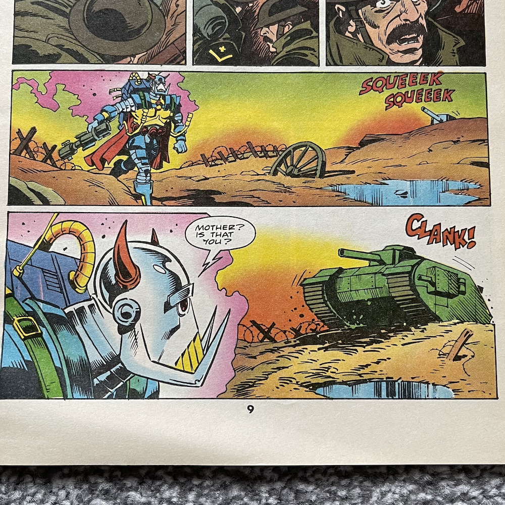
It’s not exactly the TARDIS. A fun segment takes Death’s Head through various points in time before he’s able to find The Doctor. First of all he lands in an English parish in 1646. Leaving just moments later it was enough for the poor woman whose garden he appeared in to be sentenced to death for summoning a demon. Two huge shoed footprints are uncovered by archaeologists digging for Triassic period fossils and then he appears in front of a German tank during World War II!
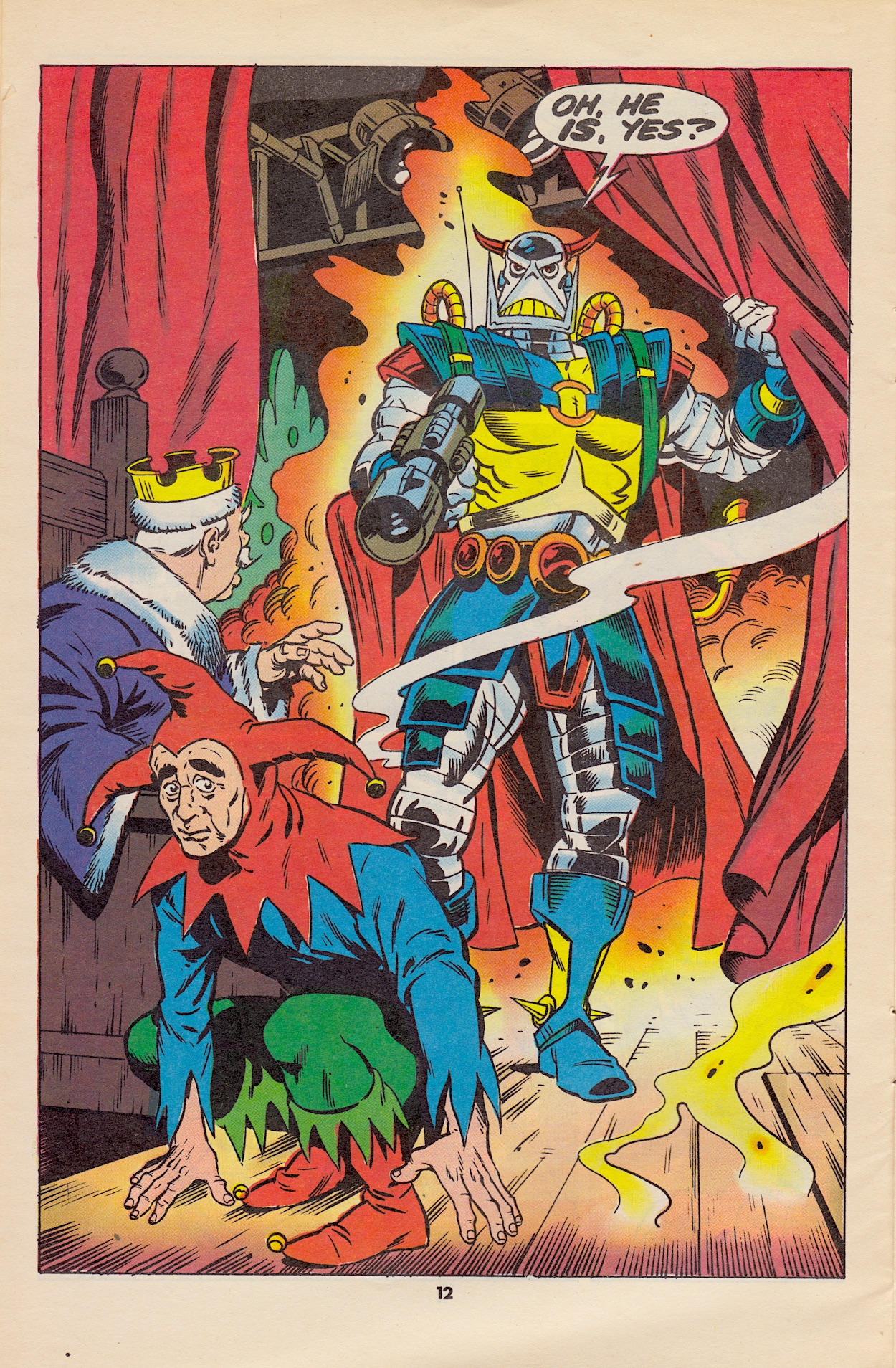
Lots of laughs later we see The Doctor is also attempting to make an audience smile as he plays a court jester in a panto taking place in front of tourists on an English seaside pier. I have no idea why this is, perhaps it ties into a story in Doctor Who Magazine at the time. A loud noise from behind him sends the audience into the usual pantomime chant of “He’s behind you”, to which The Doctor naturally replies, “Oh not he isn’t”, leading to this next page.
That’s an entrance. Using some panto clichés, namely pulling a lever to open a trap door under Death’s Head and then escaping as one half of a pantomime horse (no, really), The Doctor makes his way back to the TARDIS and scarpers to another time and place. This really is all rather ridiculous, even for the far-fetched nature of this comic but then again we have to remember this was published during 80s Doctor Who.
I have a real fondness for Sylvester’s Doctor. He was my first but I didn’t start watching until the beginning of his second season (with the phenomenal Remembrance of the Daleks) when he became a darker and more mysterious character, often instigating the plot rather than reacting to an injustice. But when this comic was written only his first season had been broadcast in which he was much more of a clown, fumbling his way through time while playing the spoons!
This explains a lot about his actions in Time Bomb, and especially the ludicrous escape he’s just made.
So he may not feel like my Doctor but it’s still an entertaining strip. Death’s Head is able to somehow materialise inside the TARDIS (this is never explained) direct from the sea he’d plunged into under the pier. An alarm sounds and soon he finds out he’s been double-crossed. Dogbolter not only ensured The Doctor would be killed but that there wouldn’t be any witnesses to tie things back to him.
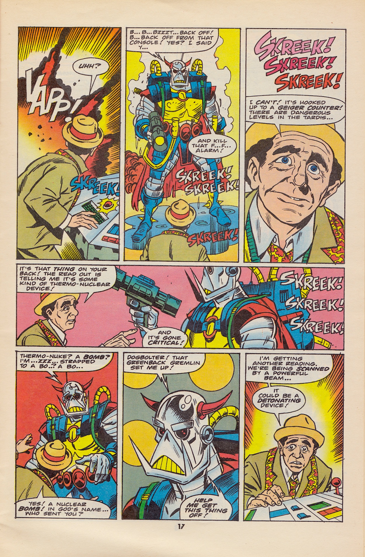
Over the next couple of pages we see Death’s Head and The Doctor work together as much as they ever will, not exactly with each other but they have a mutual wish to survive and that’s enough for now. They lock on to the source of the signal and materialise on top of Intra-Venus Inc.’s (brilliant name) roof, much to Dogbolter’s chagrin. As he heads to the sub-basement shelter, inside the TARDIS Death’s Head tries to convince The Doctor to blast the straps of the machine off his back.
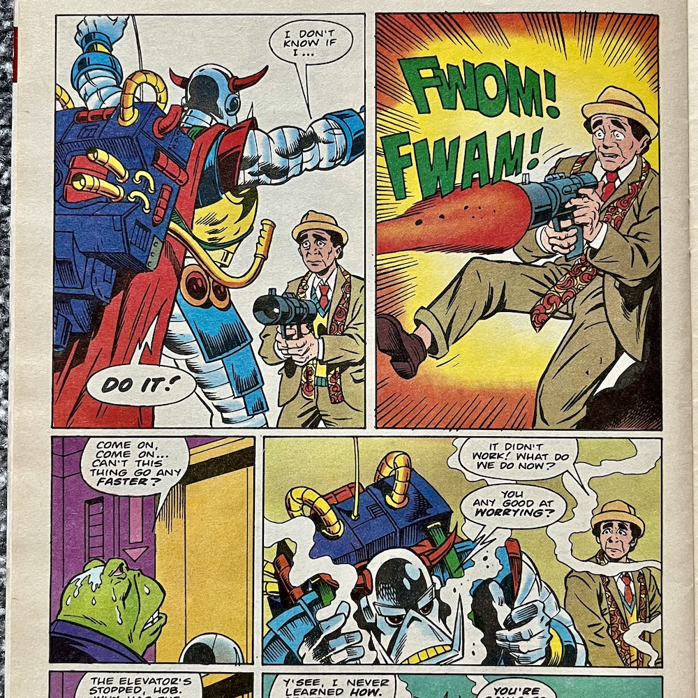
The patter between these two is very good. Death’s Head explains he never learned how to worry but that The Doctor is about to be blown up and end up in hell, so he tells him he’d better get to work. Using something called a Piklok (a new invention, but why not the Sonic Screwdriver?) he manages to unstrap the time machine while elsewhere Dogbolter has lost his ID card and can’t get off the elevator in time to escape before this next page.
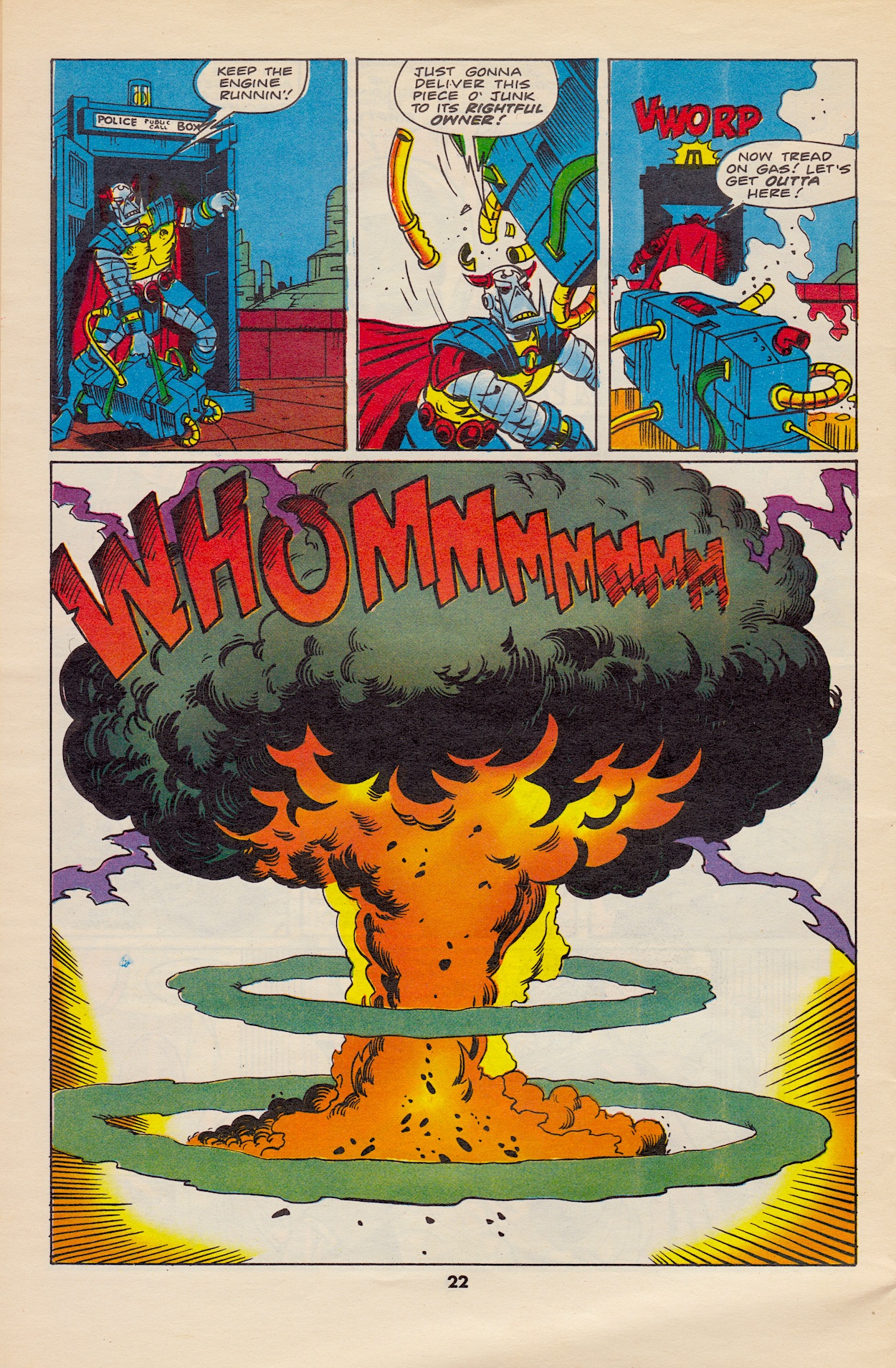
I have an issue with this. A big one. It’s been established the time machine is nuclear-powered, so why did The Doctor not dispose of it in deep, dark space? Why bring it back to Earth? The size of the explosion is meant to indicate the end of Dogbolter and his company, but that would also include everyone else in that building and at the very least the surrounding buildings too! The Doctor would never put innocent human lives at risk, never mind actually blowing them to bits!
Back in Doctor Who Magazine #135 he also put Earth at risk by dropping Death’s Head off here, even though he acknowledged how dangerous that would be for his favourite planet. It’s not like the Seventh Doctor had it in for us humans, he held the same morals as all the rest, including the modern day incarnations (if you’re unfamiliar with the classic series). It’s a huge sticking point for me and kind of ruins the end of a fun story.
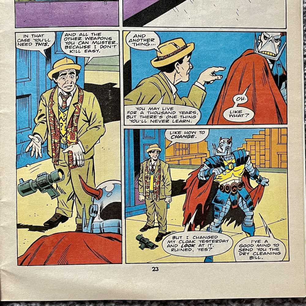
With this in mind it’s quite galling of The Doctor to then try to lecture our mechanoid anti-hero on his behaviour. Death’s Head’s response is funny though, I’ll give the strip that. The Doctor tells him that humans can evolve and change their evil ways, which Death’s Head simply describes as falling apart. After all, he’s programmed, and metal; if he changes from that then he’s literally falling apart. It’s black and white to him.
“A thousand years from now I’ll be rich… but you’ll be dead.”
Death’s Head
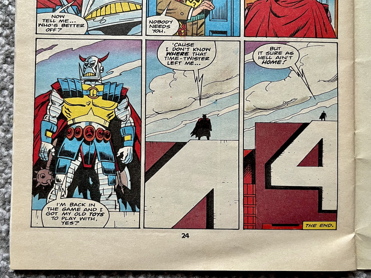
As The Doctor leaves he tells Death’s Head that he’s doomed, that in a thousand years people will be different be he’ll still be the same. “A thousand years from now I’ll be rich… but you’ll be dead”, he retorts. There’s no use in trying to push it, so as the TARDIS doors close he’s told he’s just a machine, a tool, one that nobody truly needs. Death’s Head muses that The Doctor is probably right, but then realises he doesn’t care; he’s home and ready to earn money again.
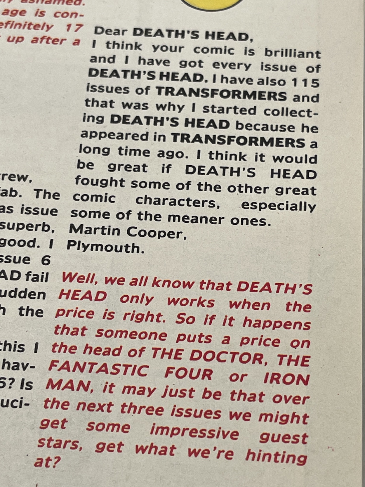
The final few panels pull back to reveal a not-so-subtle hint of who will be guest starring in #9. Anyone unsure (as I would’ve been at the time if I’d been reading this as a kid, I wasn’t a superhero comic reader), the answer to the final letter on the Head To Head page gives the game away not only for the next issue but the final one beyond that.
Then again, what’s the point in crossovers if you can’t market the hell out of them in advance to try to increase sales, yes?
I really enjoyed this story but that explosive ending bugs me. I don’t mean to dwell but as a fan of Doctor Who it’s just so out of character, so out of sync with what the series stands for, that I can’t let it go. I know nothing about The Fantastic Four so if they suffer the same fate I’ll be none the wiser. We’ll see how Death’s Head fares with four super-powered humans in #9, so watch out for the review on Monday 1st July 2024.
Below is the original post I wrote when this Kickstarter project launched. It was successful and then some! To find out just how record-breaking it’s turned out to be keep reading to the very end for an update.
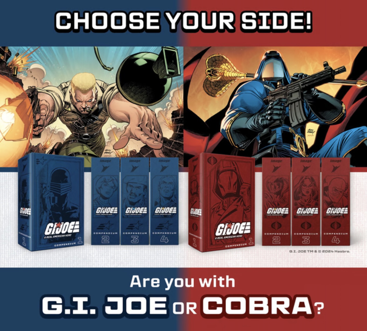
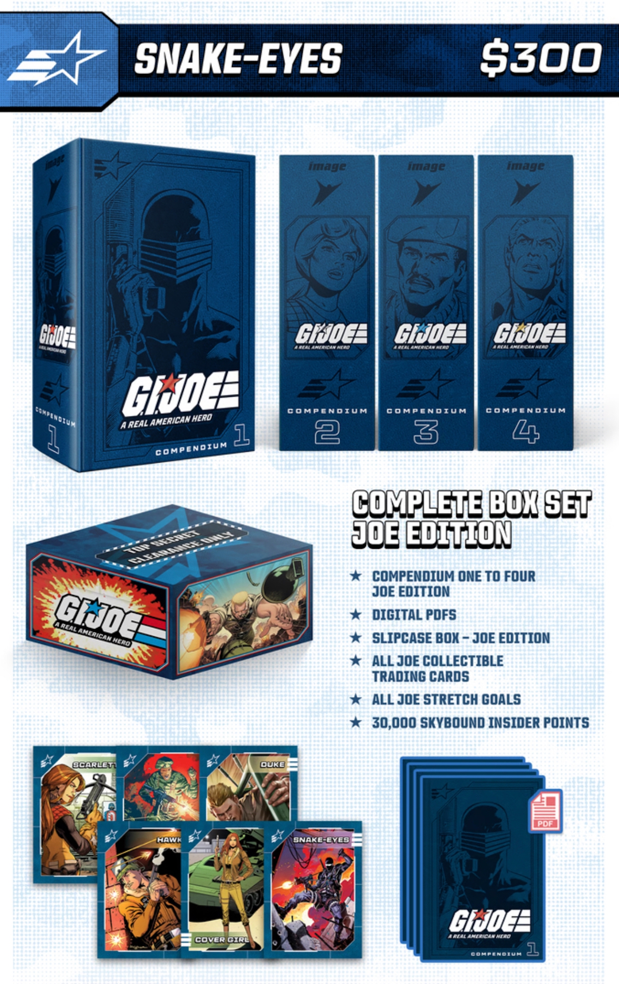
Readers of the blog, and in particular the blog’s Instagram account, will know how much I love Larry Hama’s G.I. Joe comic. Skybound Entertainment and Image have the current rights to produce comics based on the Hasbro toy line and alongside their own monthlies they’ve decided to release all of the original, epic Marvel run in a huge, gorgeous box set, including the American Transformers crossover mini-series and of course the later story that kicked offTransformers: Generation 2.
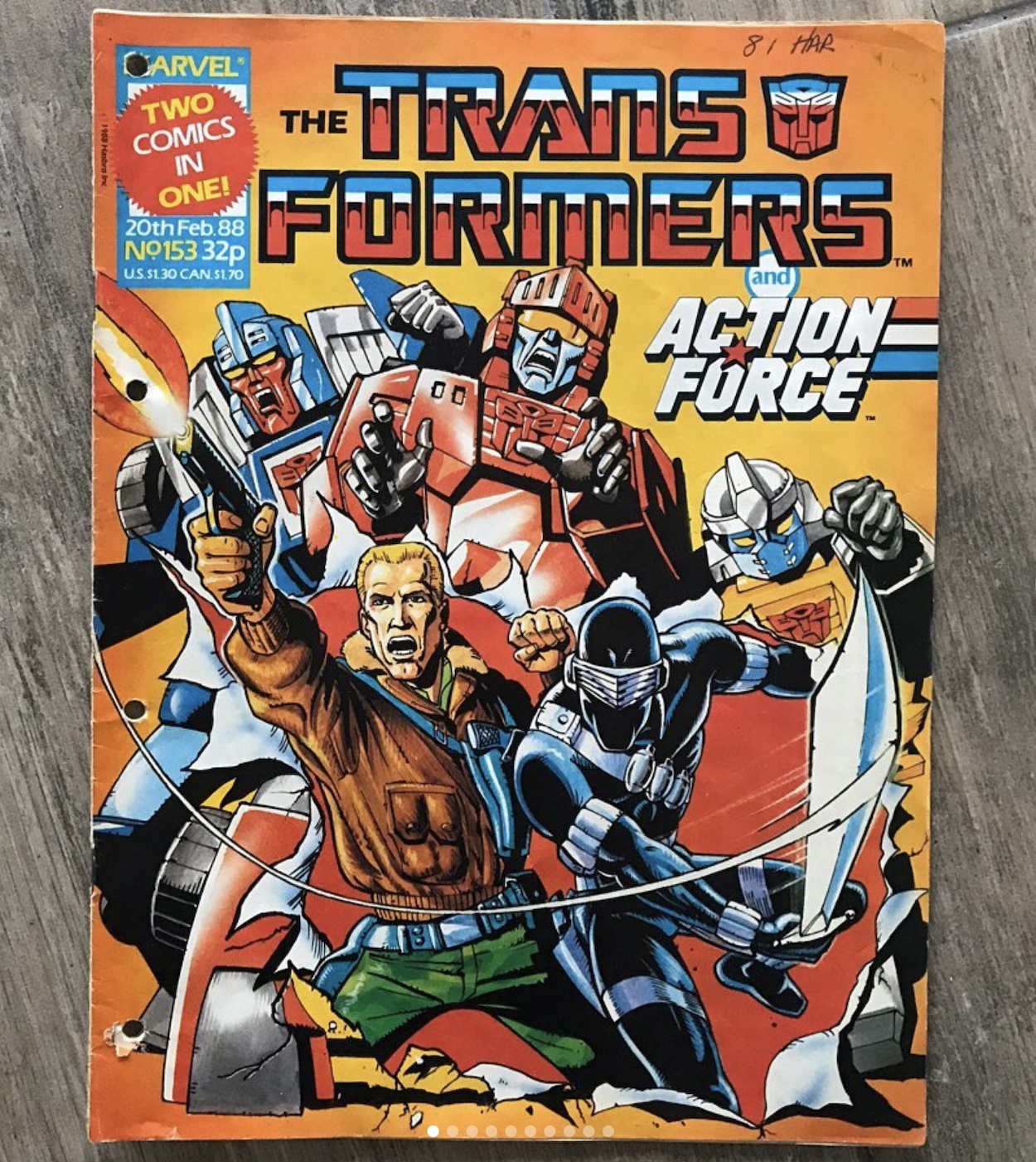
I became acquainted with Snake Eyes, Scarlett, Stalker, Baroness and the rest when they appeared as back up strips in Marvel UK’s Transformers weekly in the 80s and 90s (initially known as Action Force here) and I instantly loved every single one of the characters. Many years later IDW decided to continue Marvel US’s story and produced #156 to #300 before the licence transferred to Skybound/Image. Now, G.I. Joe – A Real American Hero continues anew from #301 onwards, and still with Larry at the helm!
Recently Skybound announced a box set of the original comics would be coming to Kickstarter. It launched on Tuesday 28th May 2024 with a goal of $50,000 (£39,213). It was fully funded in a staggering six minutes and in a little over 24 hours it rocketed past (I’ll put on my best Dr. Evil voice here) one million dollars, making it the most successful first day ever for comics Kickstarter. At the time of publishing this post about half a day later it’s now sitting at $1,214,849/£956,938, pledged by 3,332 people. That’s just phenomenal! (Final amount now updated at the bottom of this post – Phil) As a fan I feel really rather proud of the fanbase, and it’s reassuring that this most likely means the monthly is also selling well enough to last for many years to come.
I not only wanted to let you know about the Kickstarter in case you’re a fan too and wish to pledge, I also intend to show it off to you when I receive it and give you updates as we go. Yes that’s right, I’ve pledged and bought the set! I’ll admit it’s an expensive piece of kit but when broken down into the cost per issue it’s not really. Plus, given the trouble I’ve had trying to get a hold of these classic tales it’s great to buy them all in one go and just be able to look forward to them at last.
By the time I found out IDW were continuing the original Marvel stories their run was already at #250. I collected it for a few years before I stopped buying new comics for a while, but in that time my local comic shop tried everything they could to order in the graphic novel collection of the older stories. Unfortunately Diamond, the international distributors, would often send the wrong volume or a book from the wrong series! I ended up with volumes 1, 2, 3, 5, 6 and 13!
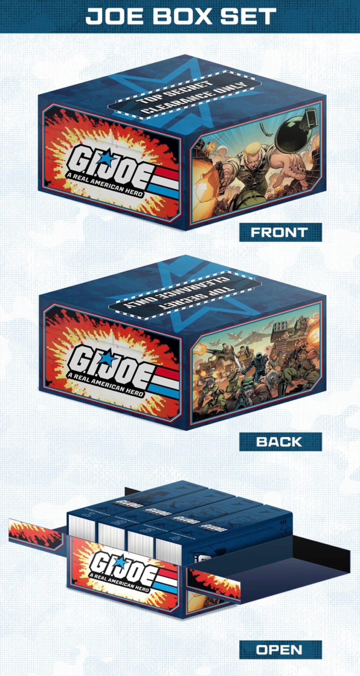
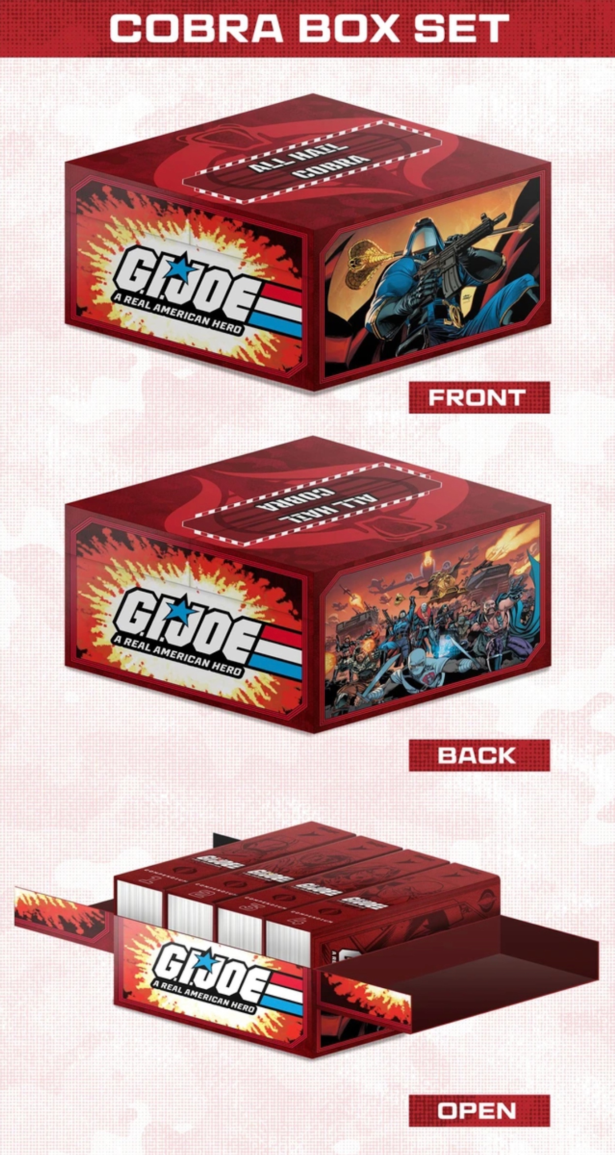
So I couldn’t read past volume three and no more books ever arrived. When Skybound/Image took over I crossed my fingers they’d have their own graphic novel series but this is so much better! The individual compendiums will eventually be available in soft back formats in comic shops but for now this is the only way to get your hands on them, and they’re all hardback and inside lovely glossy display boxes.
On the Kickstarter you can order either a Joes or Cobra version of the whole set ($300/£235) or the first compendium on its own ($75/£59) to which you can add the softcovers when they’re available. There are also the obligatory digital versions and a wealth of extras such as trading cards and comics signed by Larry (well, there were when I wrote the first draft of this post but they’ve now sold out). There are also stretch goals quickly being unlocked such as a gloss finish to the box fronts (illustrations on both by Andy Hubert and Brad Anderson), bookmarks, posters and more.
Personally I’ve splashed out on the Joes version of the complete set which works out at about £1.19 per issue, plus of course I’ll be getting them in these gorgeous hardback books with all the presentation and extras. It may be a lot to fork out in one go, but even when they were available the IDW graphic novels would’ve cost a good bit more in total, and the original comics go for ludicrous amounts on eBay so this is an absolute bargain in my eyes.
If you’re interested in pledging yourself or simply wish to find out more about what is very likely to be an incredible purchase, you can check out the official Kickstarter page for G.I. Joe: A Real American Hero Compendium Set (link below). I’ll update you all further after the project finishes raising funds. It’s scheduled to end on Wednesday 26th June 2024 so a day or two after that I’ll get something posted up.
Yo Joe!
UPDATE: Not only did Skybound’s G.I. Joe Kickstarter pass its goal in six minutes, it also became THE MOST SUCCESSFUL COMICS KICKSTARTER EVER! That’s right, it broke all previous records and raised a staggering $3,734,499 (£2,956,812) from 10,335 backers! That’s 7,468% of the original goal! This is insane. I couldn’t be happier that something I backed was so successful, and as a result of crushing over 20 stretch goals a wealth of free extras will be accompanying my box set when it eventually arrives. On a related note, this bodes very well for both Skybound/Image’s hugely entertaining G.I. Joe/Transformers reboot series of comics, the Energon Universe, and also their continuation of G.I. Joe A Real American Hero. With this level of support I’m sure they’ll continue for many years to come!
I’ll keep you updated as I receive news of the box set and of course I’ll be showing it off to you when it arrives, scheduled at the minute for the end of this year in America and early 2025 for the rest of us.