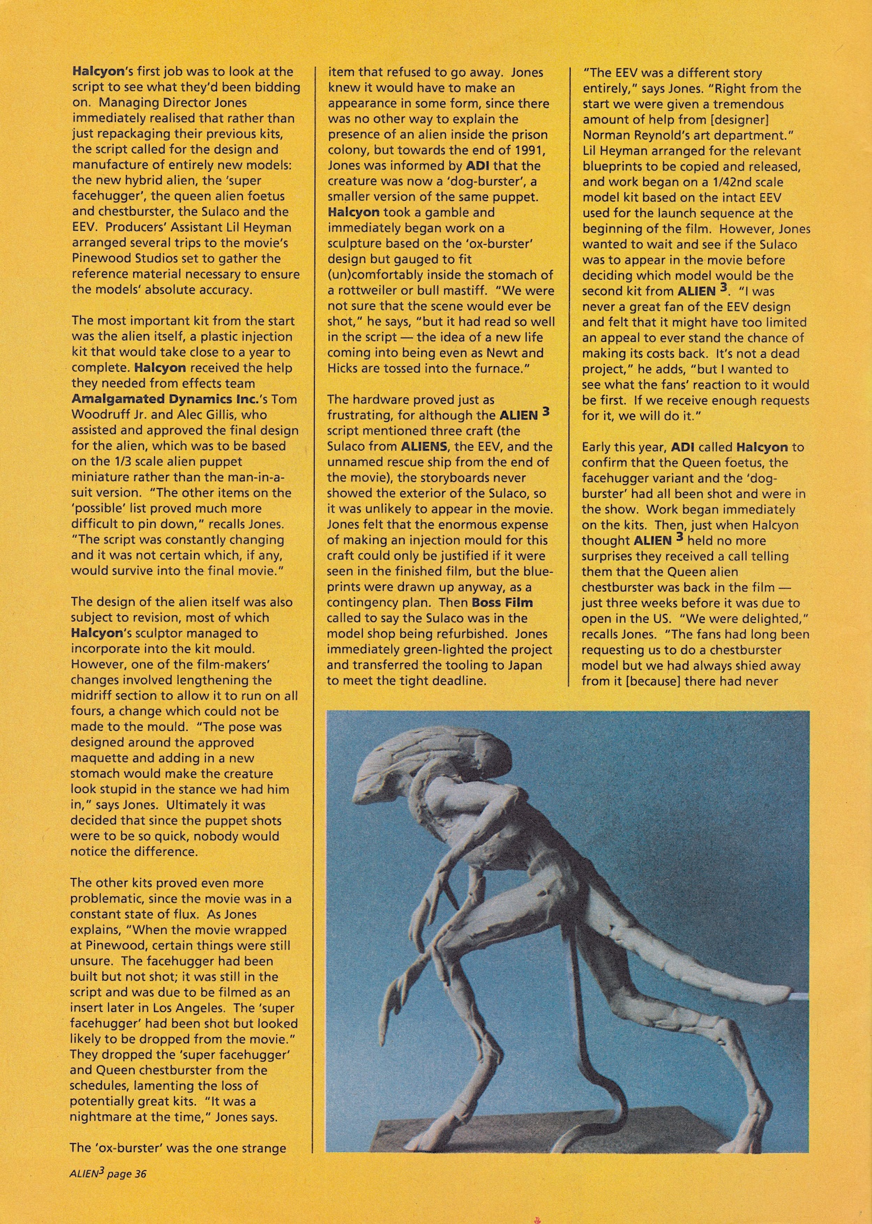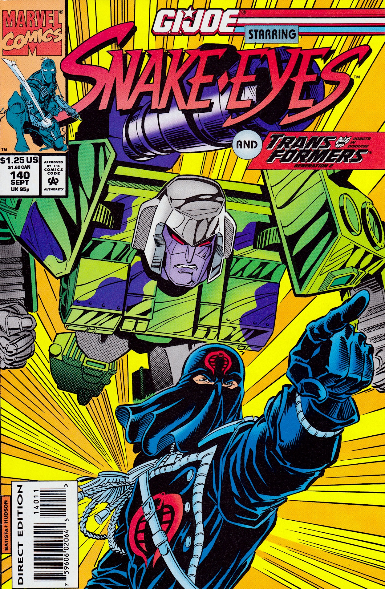
G.I. JOE #138: MORE THAN MEETS THE EYE

I do love it when I get to start a brand new real time read through and this is one I’ve been particularly looking forward to. Not only have I never read Transformers: Generation 2 before (and as usual I’ll be discovering it one month at a time and telling you about it as I do) but the story actually kicked off in a special crossover event in the pages of another favourite comic, G.I. Joe.

I discovered the Joes and Cobra when they were known as Action Force in the UK in their position as back up strip in Transformers, after their own weekly was cancelled. When reading their adventures as part of that read through on the blog’s Instagram I became a huge fan all over again, collected some of IDW’s continuation and am now a dedicated reader of the same comic under the stewardship of Image Comics.

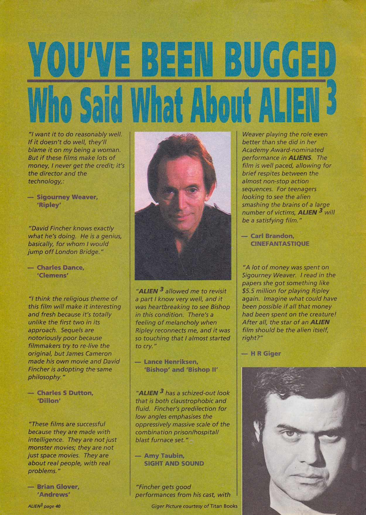
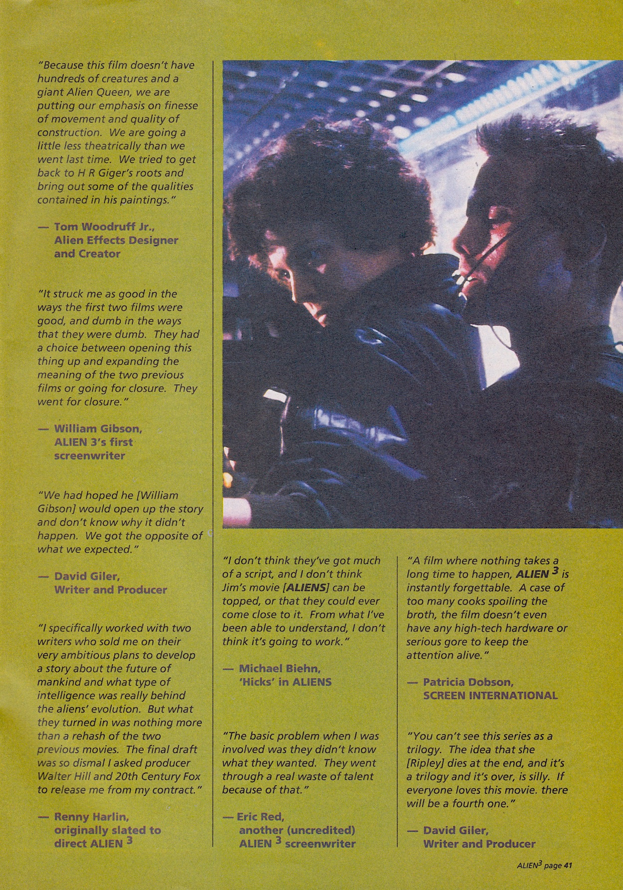
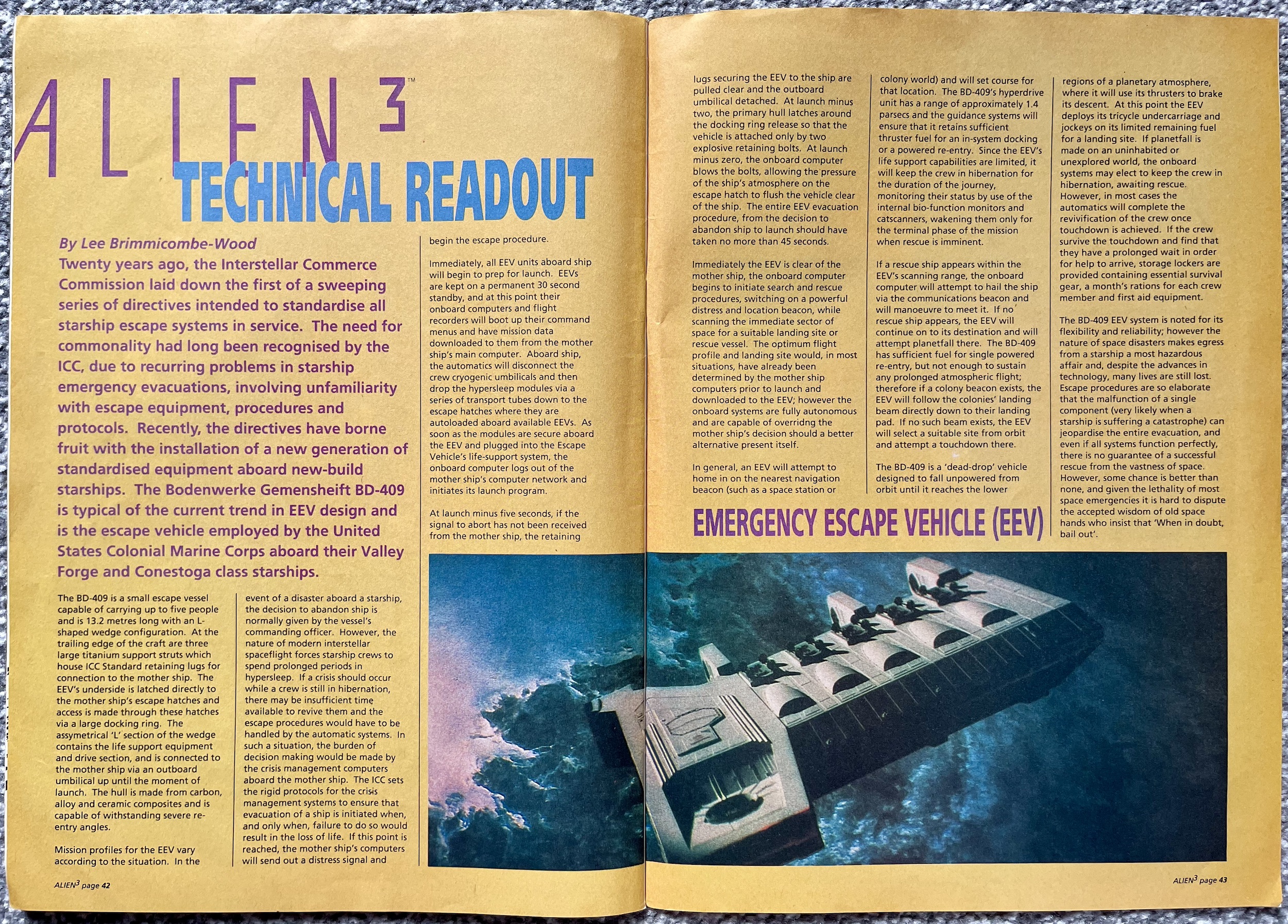
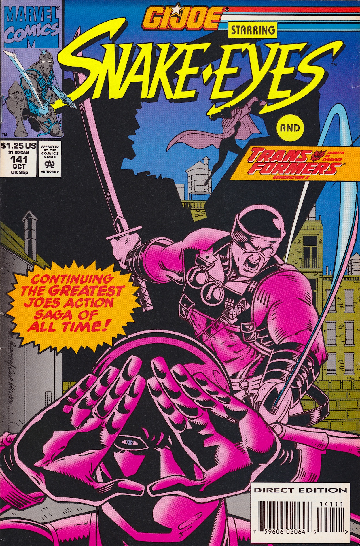
In case you didn’t know, this actual comic continues to this day and it’s still being written by Larry Hama! So going back to read these issues is extra exciting for me because they’re earlier stories of the new comic I’m reading today. Regarding that title on the cover, the Ninja Force were a sub-section of both sides of the conflict and a new range of Hasbro toys at the time. With Snake Eyes and Storm Shadow as the main characters the comic’s name was temporarily changed to promote the range.

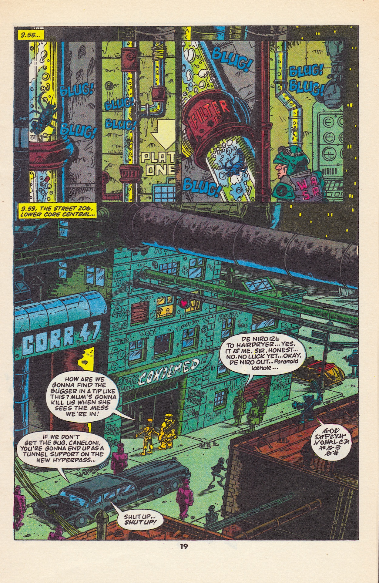
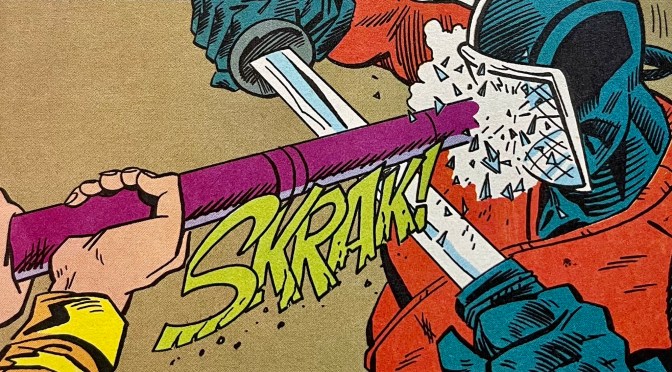
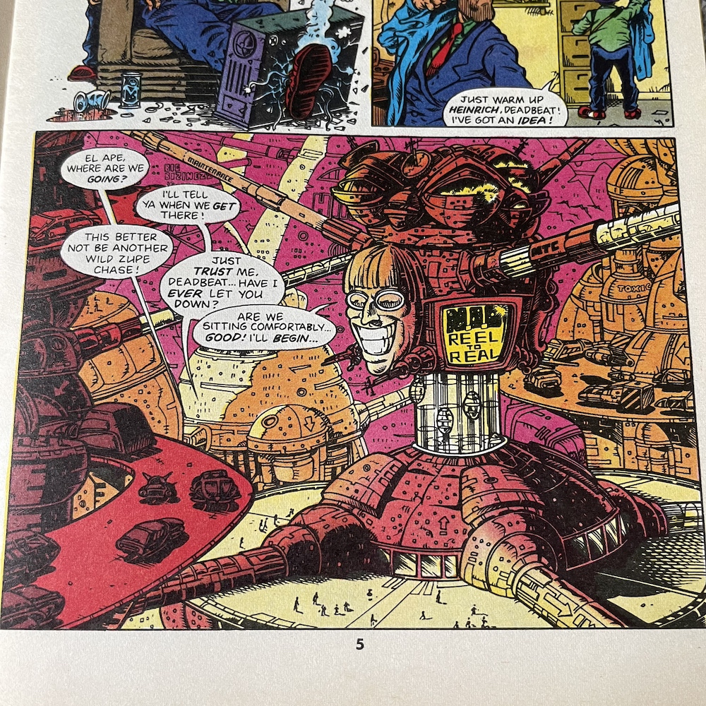
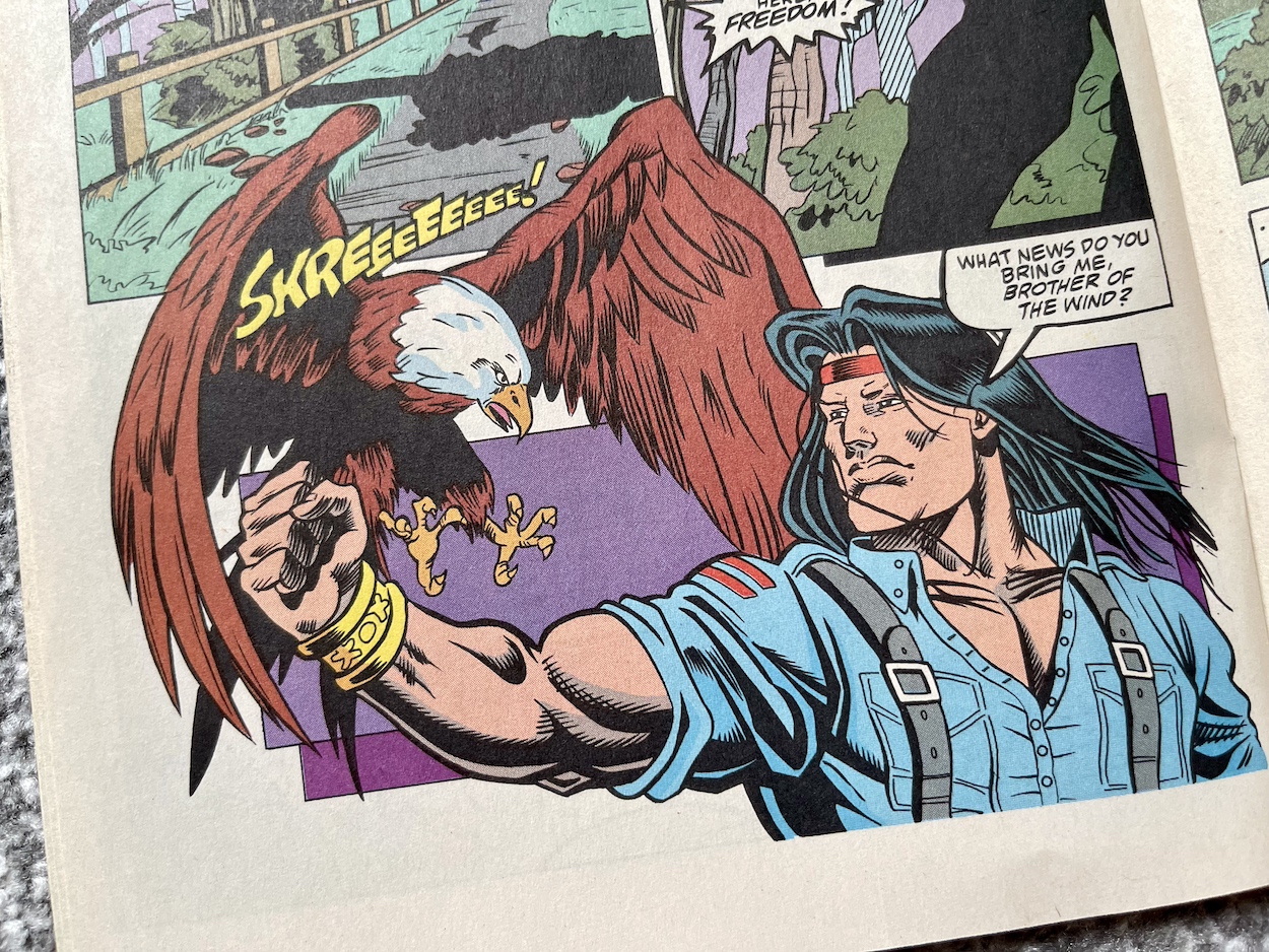
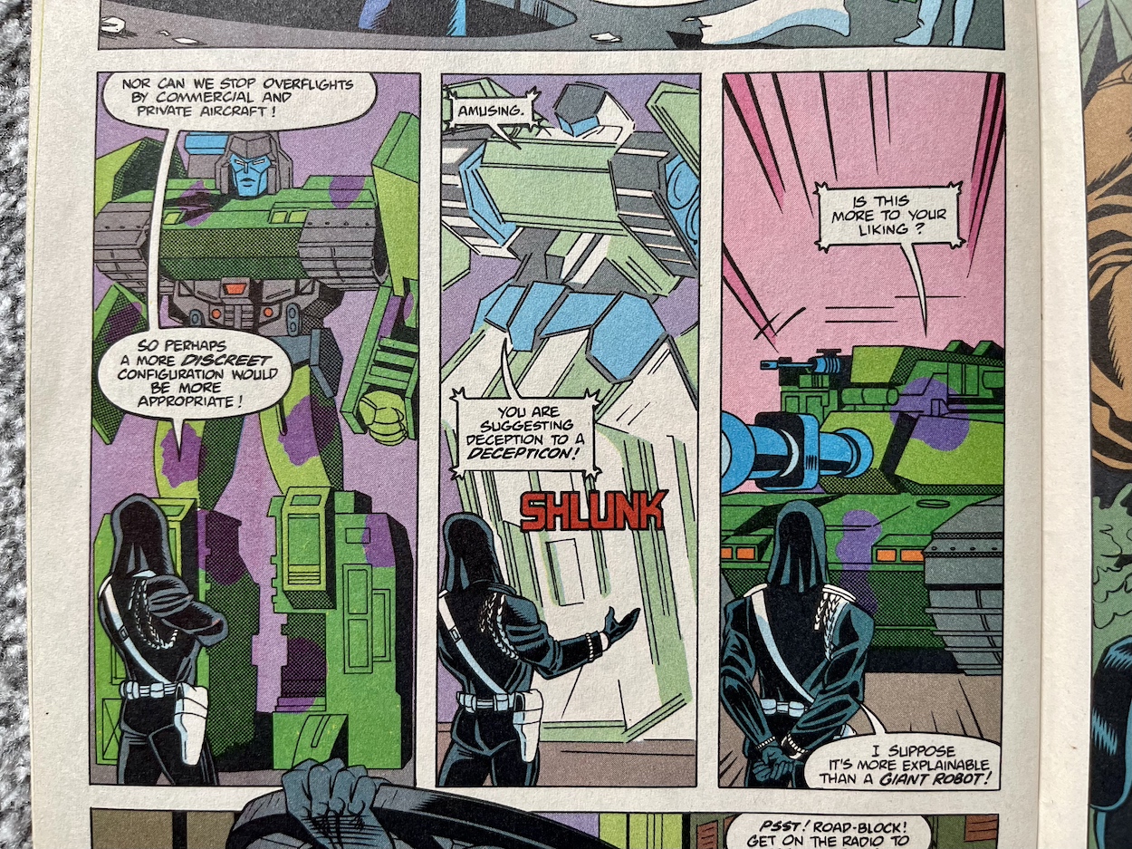
Instantly I recognise the art style, that unique Marvel UK look produced by Andrew Wildman and Stephen Baskerville

That secondary title would be replaced with ‘and Transformers: Generation 2’ from the next issue and initially I thought that was where I’d begin with the four-part story between #139 and #142. But this issue was also in the bundle of comics I purchased from eBay and a quick flick through it showed me why. You’ll see why, so let’s begin.

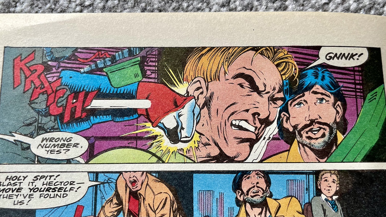
Instantly I recognise the art style, that unique Marvel UK look produced by Andrew Wildman (also on cover duties) on pencils and Stephen Baskerville on inks, now in this American comic. Together they produced some incredible art for the original Transformers towards the end of its run. Andrew is best know for his Transformers, The Real Ghostbusters and G.I. Joe work, while it’s the former two and 2000AD for Stephen. The art is completed with letters by Rick Parker (Spider-Man, Time magazine, Tales From the Crypt) and colours by Bob Sharen (Alpha Flight, Ghost Rider, Invincible Iron Man), both of whose work I recognise from those earlier back up strips.


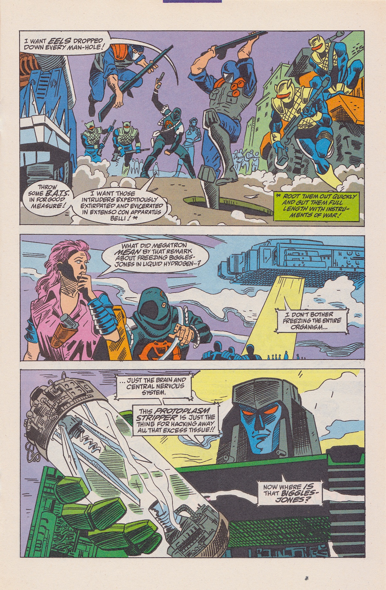
“I want that uxorious chrome-visaged twit and his xanthippic consort winkled out like the limeceous bivalves they are!”

Cobra Commander

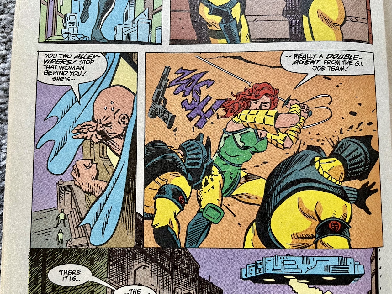
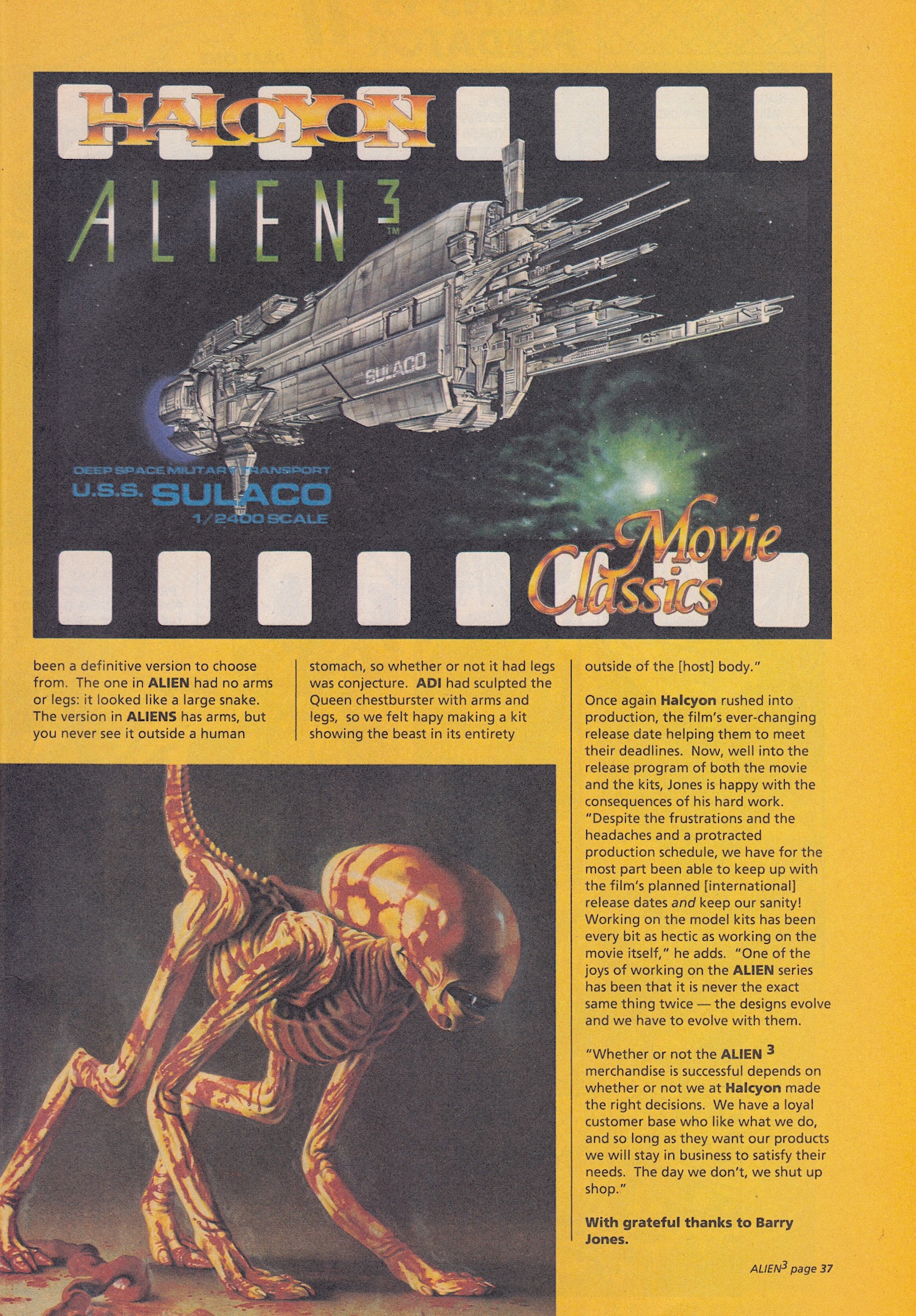
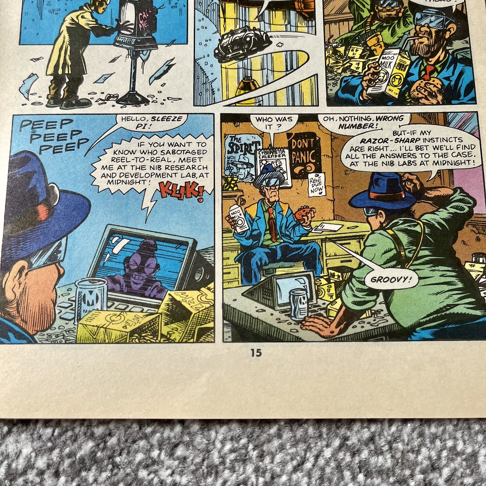
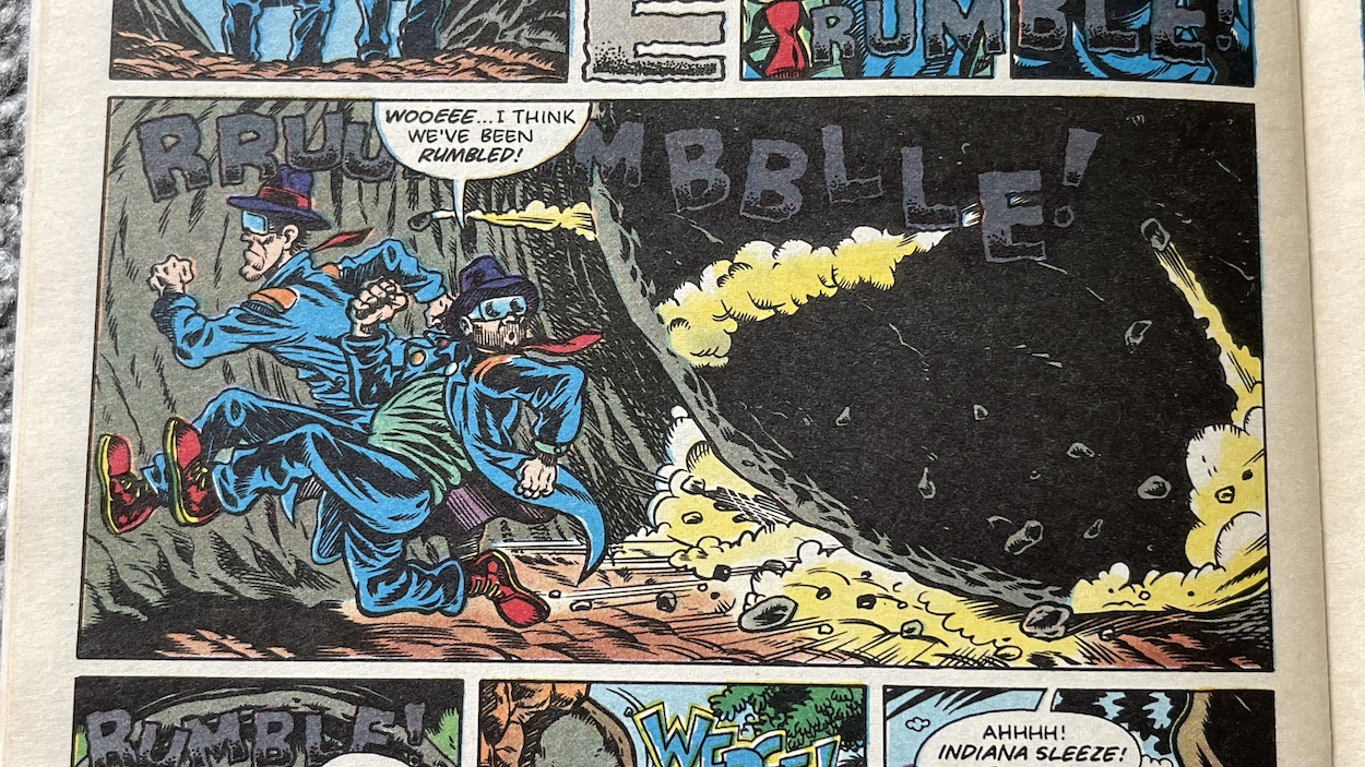
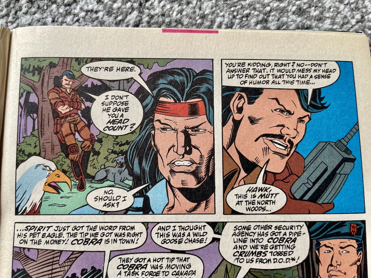
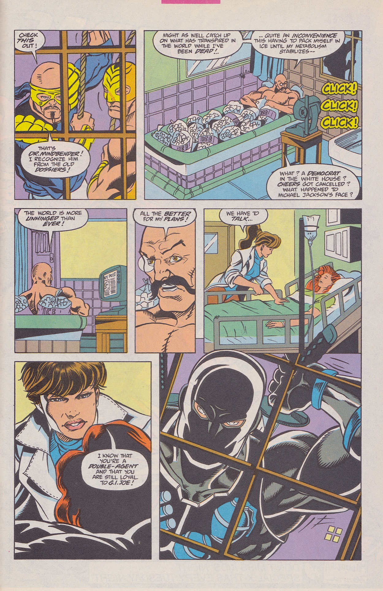
So I immediately felt right at home. Things begin with one of my favourite characters, Scarlett going through a mental crisis. She’s apparently defected to Cobra although in reality this is just an undercover mission. However, she believes her actions led to the death of Hawk and Stalker, however they survived whatever transpired in previous issues. She just doesn’t know this yet.

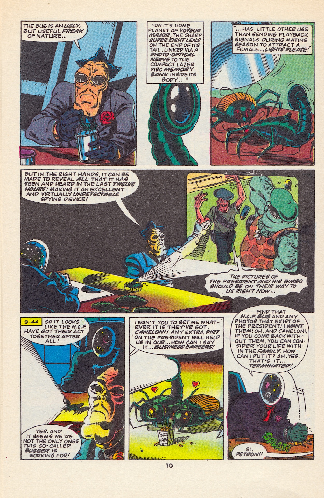
Obviously I haven’t read the chapters leading up to this so I can only tell you what happens here. In a nutshell Destro and Baroness are trying to escape from Cobra with the aid of G.I. Joe (a separate story from Scarlett’s). The action takes place inside a tall fortress of Destro’s design that can shift its shape into different defensive and offensive configurations. Destro also included secret crawlspaces behind the walls, where they are currently hiding. However, these have now been discovered, a hole has been blown in a wall and Cobra Commander has sent his troops in to capture them.

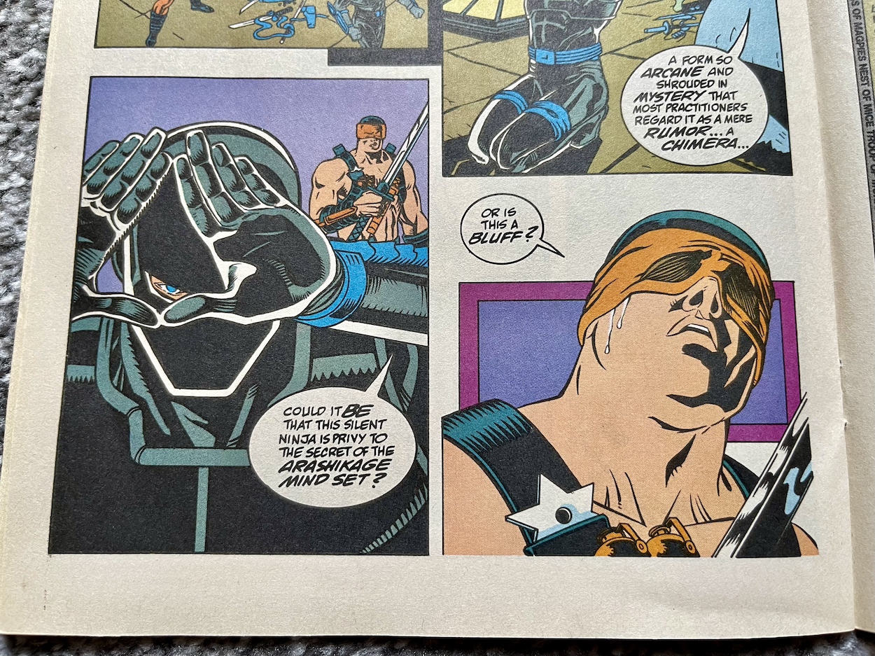
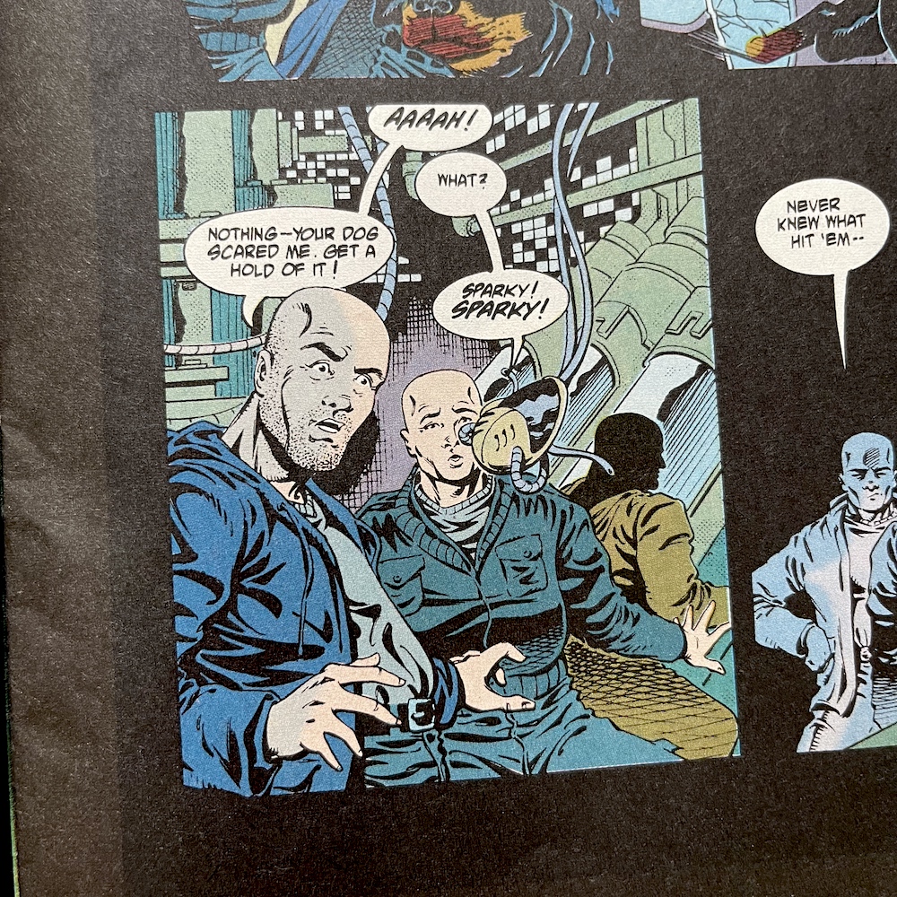
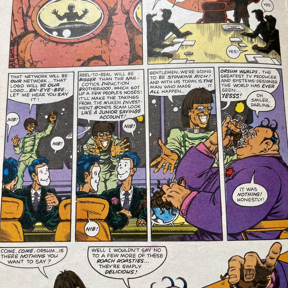
At this point in the story it seems Cobra Commander has a… unique use of language. Throughout this issue he seems to use half a dozen words when one would suffice. It adds to his superiority complex and I enjoy it. Only Larry could carry these lengthy speech balloons off in the heat of the action. We also see Destro’s use of cool 80s tech from within his metallic face mask that I hadn’t seen before and we find out just how dedicated the Joes need to be to Scarlett’s mission.

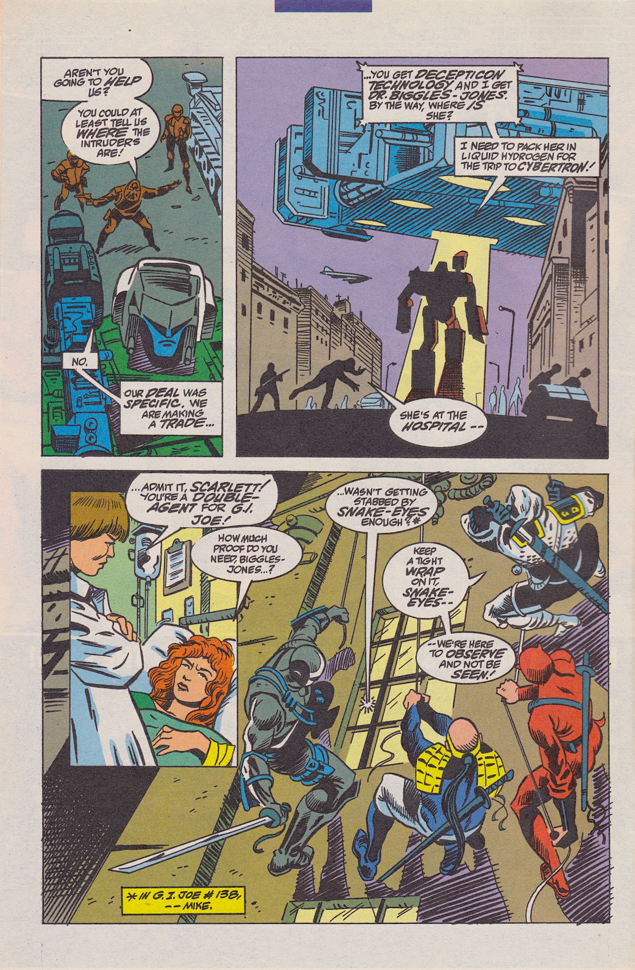
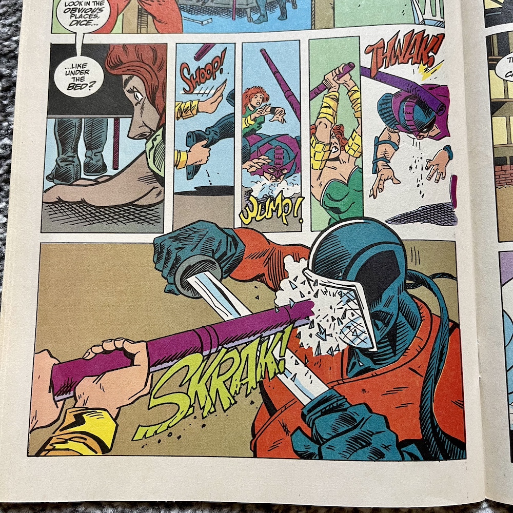
Despite Scarlett and Snake Eyes being very much in love, he and Storm Shadow must treat her like any other Cobra enemy if she’s to remain alive. It’s a fine balancing act that leads to a shocking moment later in the issue. (If you’re wondering, “Xin-loi” is a phrase used during the Vietnam war and roughly translates as “tough luck”, albeit a more vulgar version.) Once inside the crawlspaces, laden with boobie traps, Larry shows he’s still not afraid to kill people in glorious fashion in this children’s comic, something the cartoon couldn’t do.

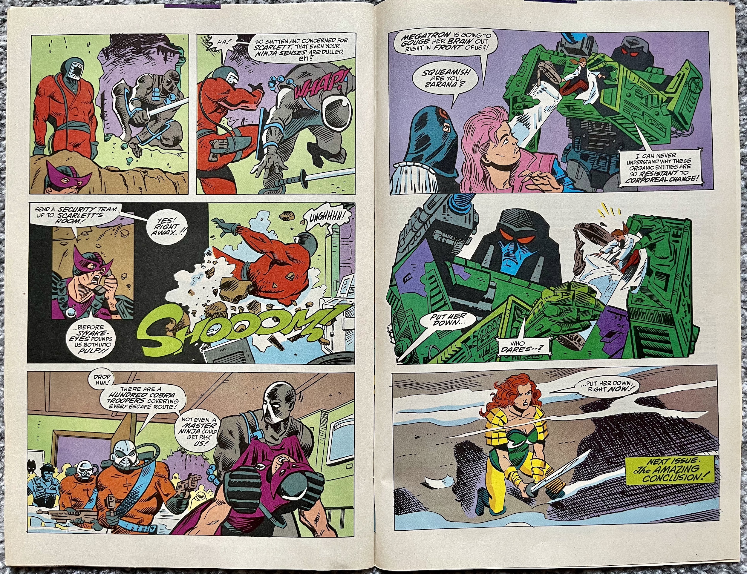
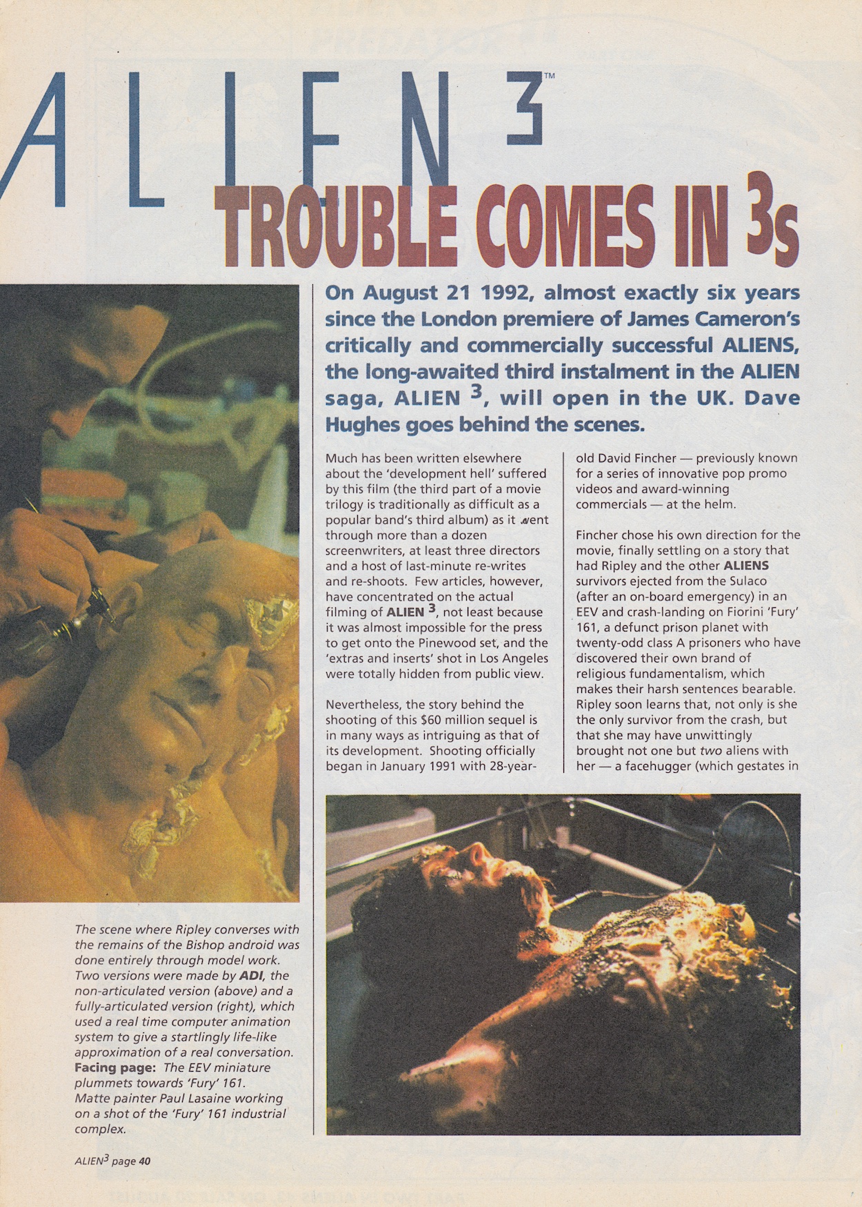
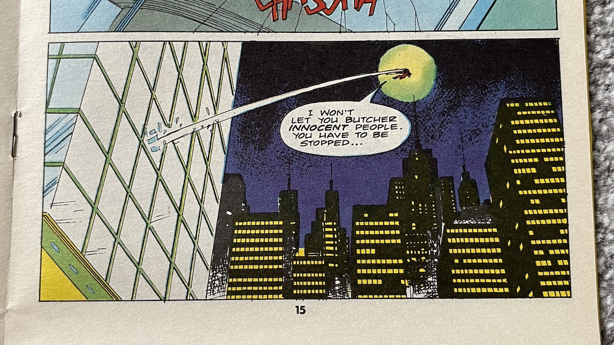
Storm Shadow and the ever-silent Snake Eyes skilfully parachute in on top of the transforming building and we can see how it’s whole form is shifting about, taking care of many of the Cobra grunts as it does so. I’ve searched online and I can’t find evidence of this strange castle being a toy in the original range but I’m happy to be proven wrong if any readers can point me in the right direction.

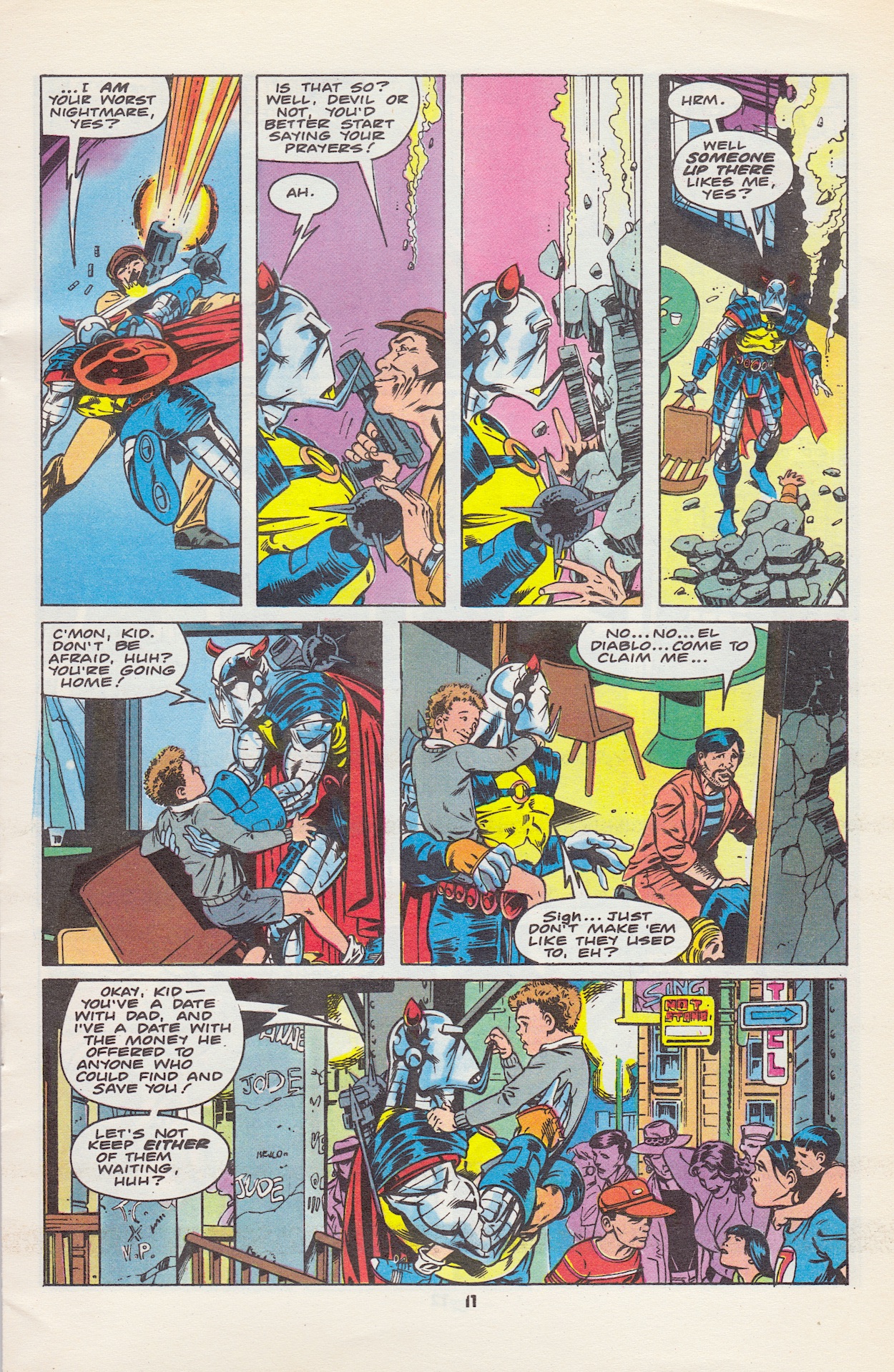
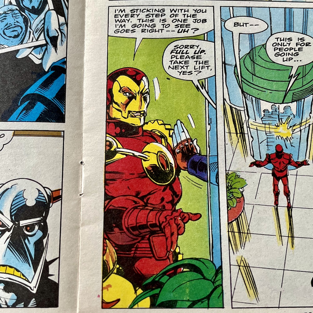
I’ve seen some wonderful fan-made models of it though, complete right down to the colour of the stone and the ability to alter its shape. It’s this shape altering that brings us to the first shock of the issue, at least for anyone who had been reading this in 1993 and especially those who had been fans of Marvel’s other popular licenced monthly from a few years previous. As the building continues to change it’s caught the attention of an outside force.

Many fans of Transformers were also fans of G.I. Joe (and this continues to be the case today, like me for example) so imagine the impact that page would’ve had as they’d been reading what is already an exciting climax to a story. That’s just a tiny glimpse, one that perhaps those not au fait with the Transformers wouldn’t have fully grasped, but I’m sure the majority were thrilled. I wish I hadn’t flicked through the issue when I first got it as part of my eBay bundle, I’d loved to have been surprised by this.

Back to that story though and the plan will be familiar to those who have seen The Dark Knight (as one example). To extract Destro and Baroness they’re fastened to Snake Eyes and Storm Shadow, and long wires with balloons on the end are attached to the ninjas. The balloons are inflated and travel far up into the night sky where planes grab the wires and haul all four of them off the ground at high speed.

Imagine being a fan of both franchises and reading this for the first time without knowing it was coming

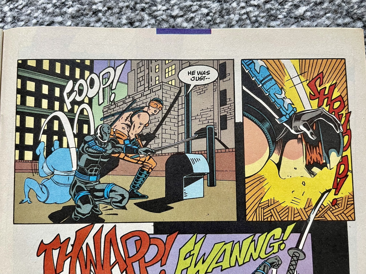
But what Snake Eyes didn’t reckon on was Scarlett being part of the Cobra team sent to return Destro to Cobra Commander. They come into contact with each other on the roof of the castle. Quite literally! Now remember, Snake was ordered by Hawk to treat Scarlett as if she were any other enemy so as not to blow her cover. What happens as a result is truly the most shocking moment of the issue.

This shocked me even though I know Scarlett is in the modern comic! I can only imagine what impact this page would’ve had decades ago. A few pages later though, this moment proves to be cathartic for Scarlett. Slice, a member of Cobra who is suspicious of her still isn’t convinced despite seeing it happen, even though Dr. Biggles-Jones declares Snake trying to kill her is clear proof of her loyalty.

However, back on board the Joes’ plane Storm Shadow explains Snake had to do the near-impossible; he had a split second to make it convincing and at the same moment make sure his aim was “pure”. It had to be so, so close. Hawk tries to sooth Snake’s obvious anxiety by telling him Scarlett of all people knows how good he is, she knows he never misses “except on purpose”, that even if she still believes she was responsible for Hawk’s and Stalker’s supposed deaths she “now knows that you couldn’t hold it against her!”

Back at the now-stationery castle Scarlet is in incredible agony, yet has a smile beneath all the tears and is just about able to utter the words “I know” before passing out. Amongst all of the action, whether that be the ninja-based, sci-fi or war storylines the comic flipped between, Larry’s characters have always been fully formed, grounded and believable, even when their very existence is far fetched. Decades of writing them hasn’t blunted any of that expertise either.

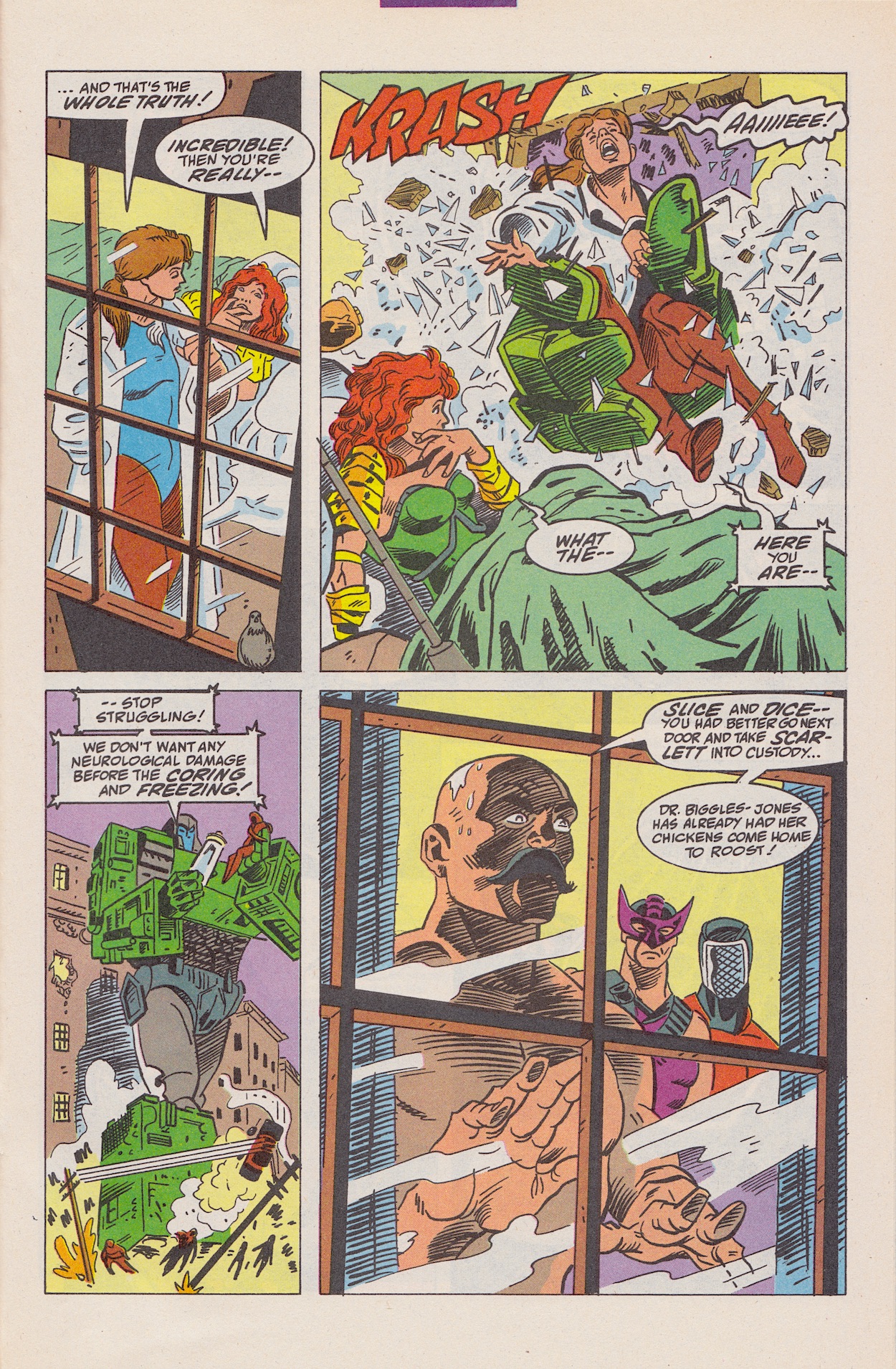
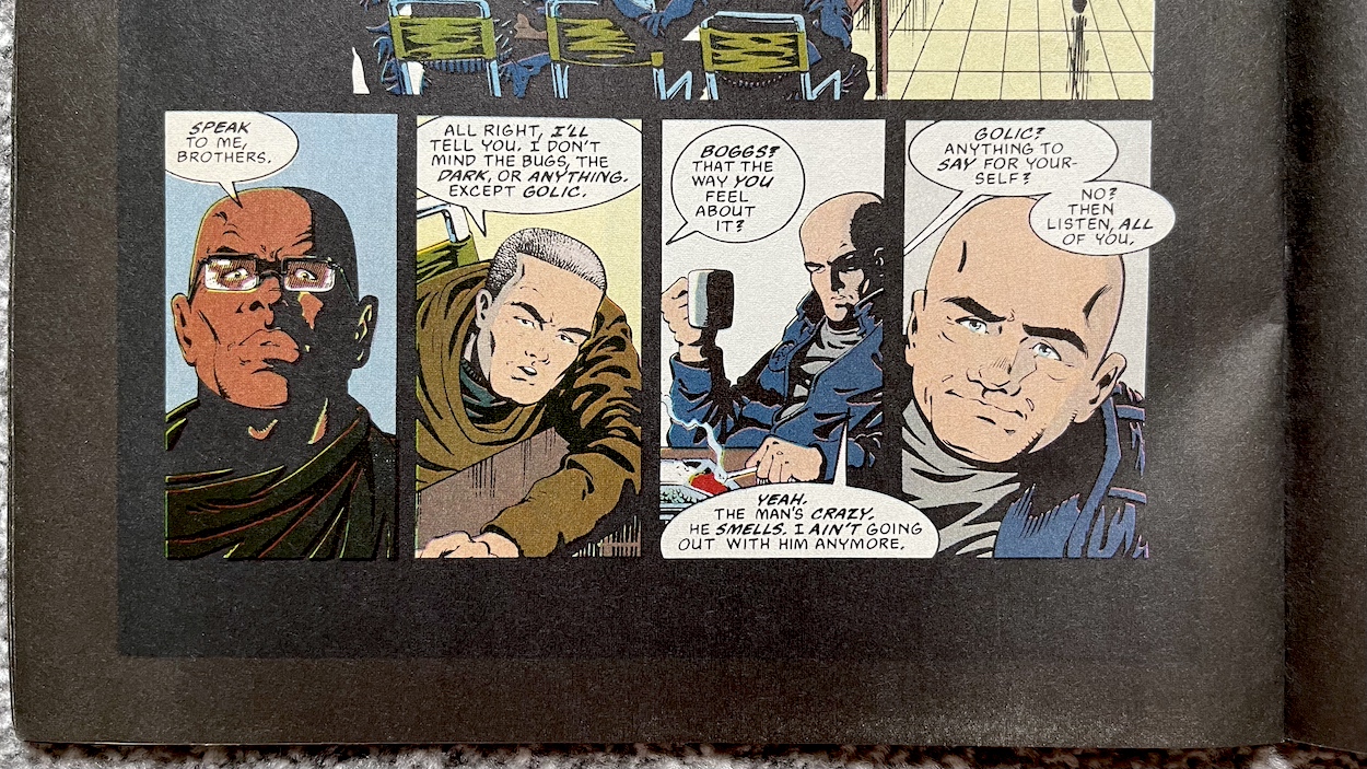
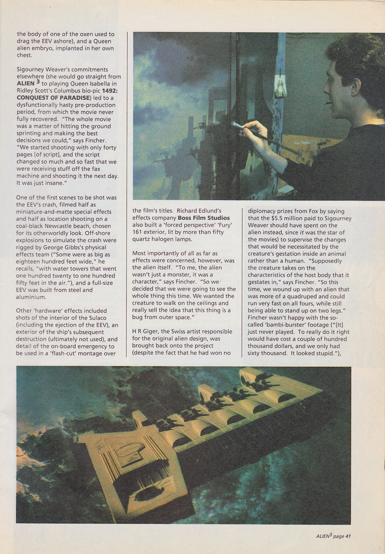
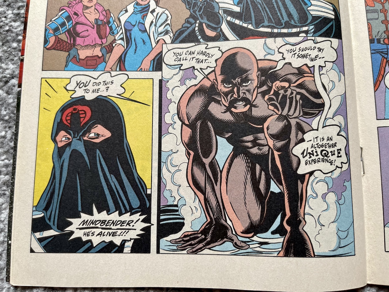
The panels above form the bottom half of the penultimate page of the strip, with Cobra Commander’s cold reaction to Slice’s request to gut Scarlett, to see how the Joes react as a final test of her loyalty. Then a huge shadow falls over the group. The terrorists looks up in horror. And we turn the page.

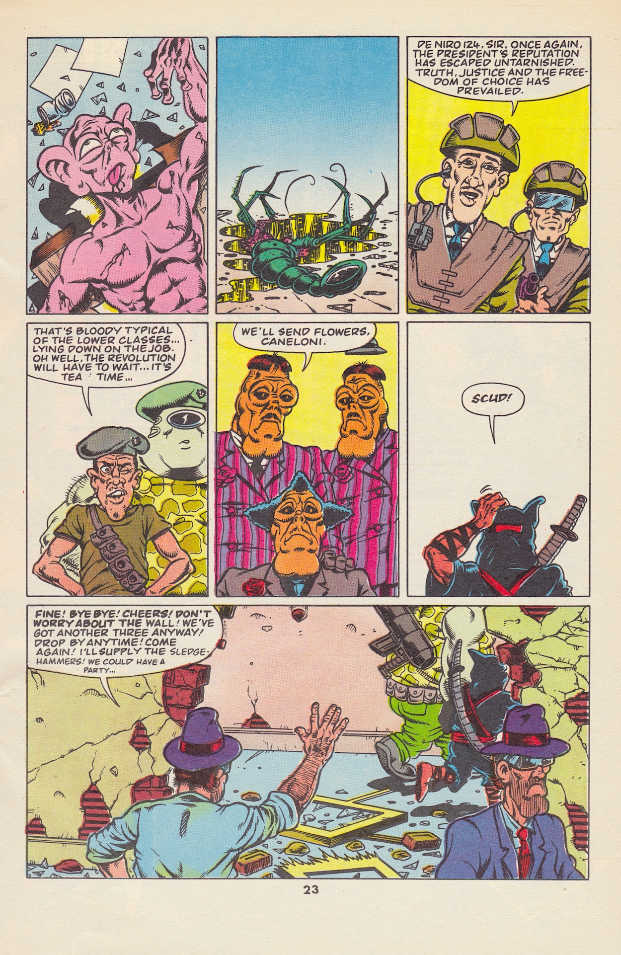
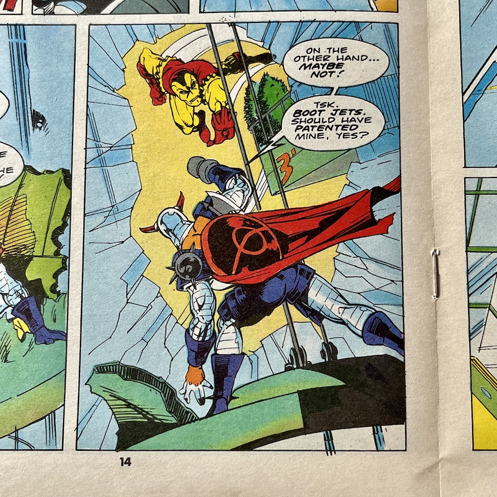
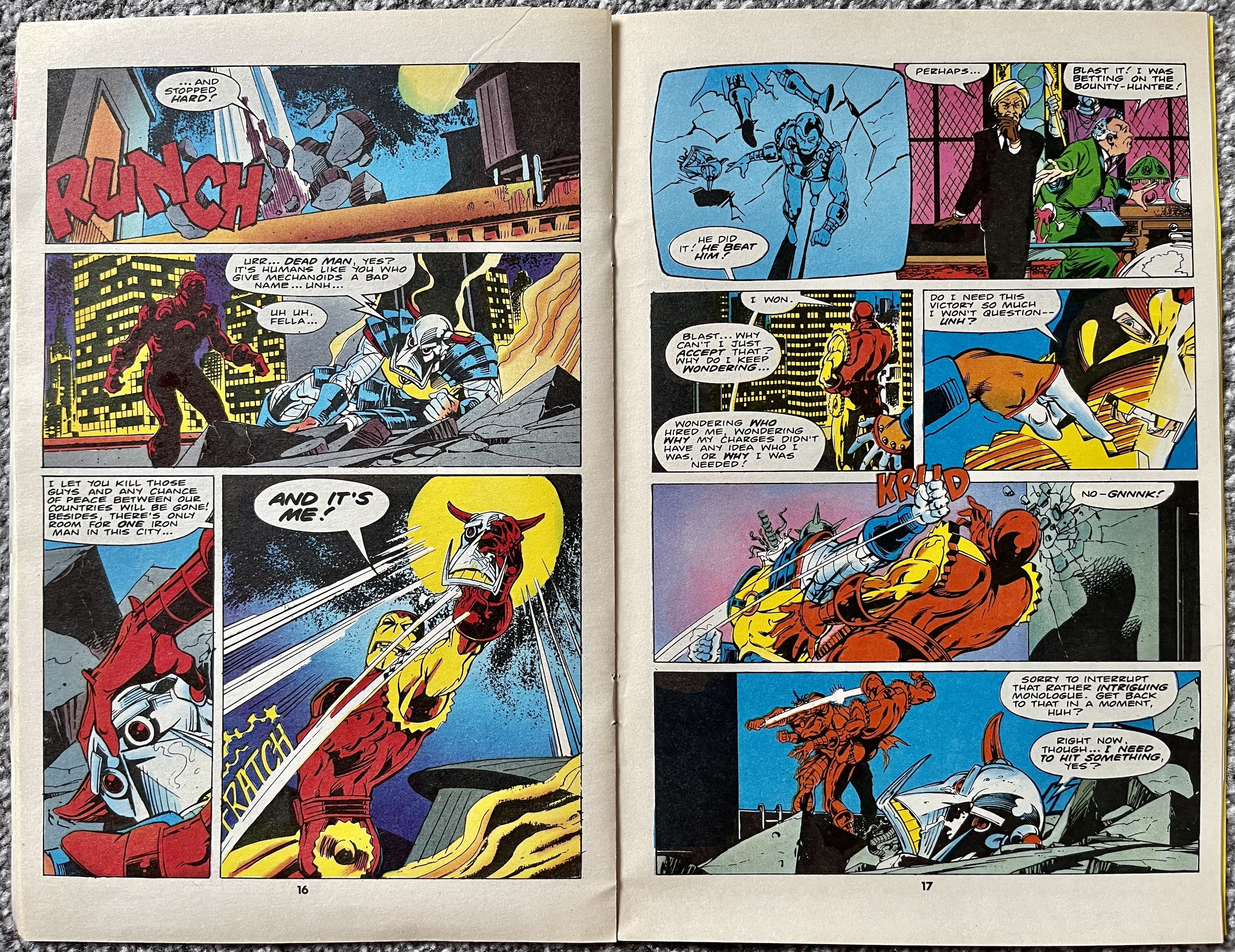
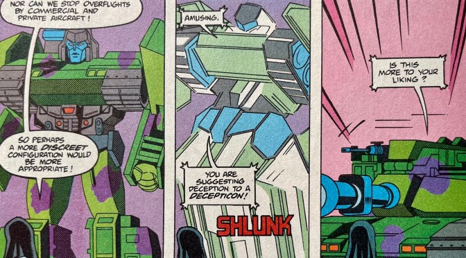
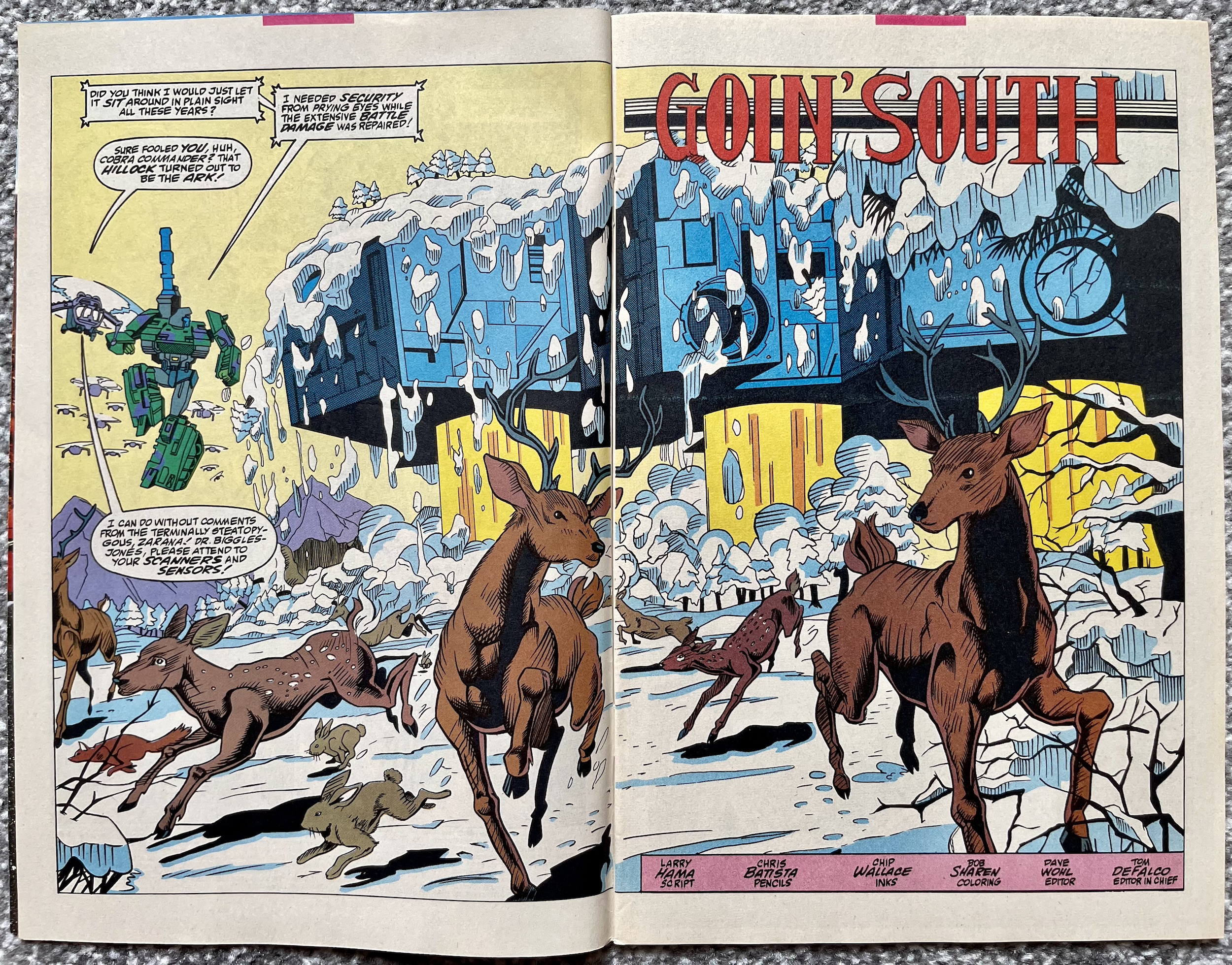
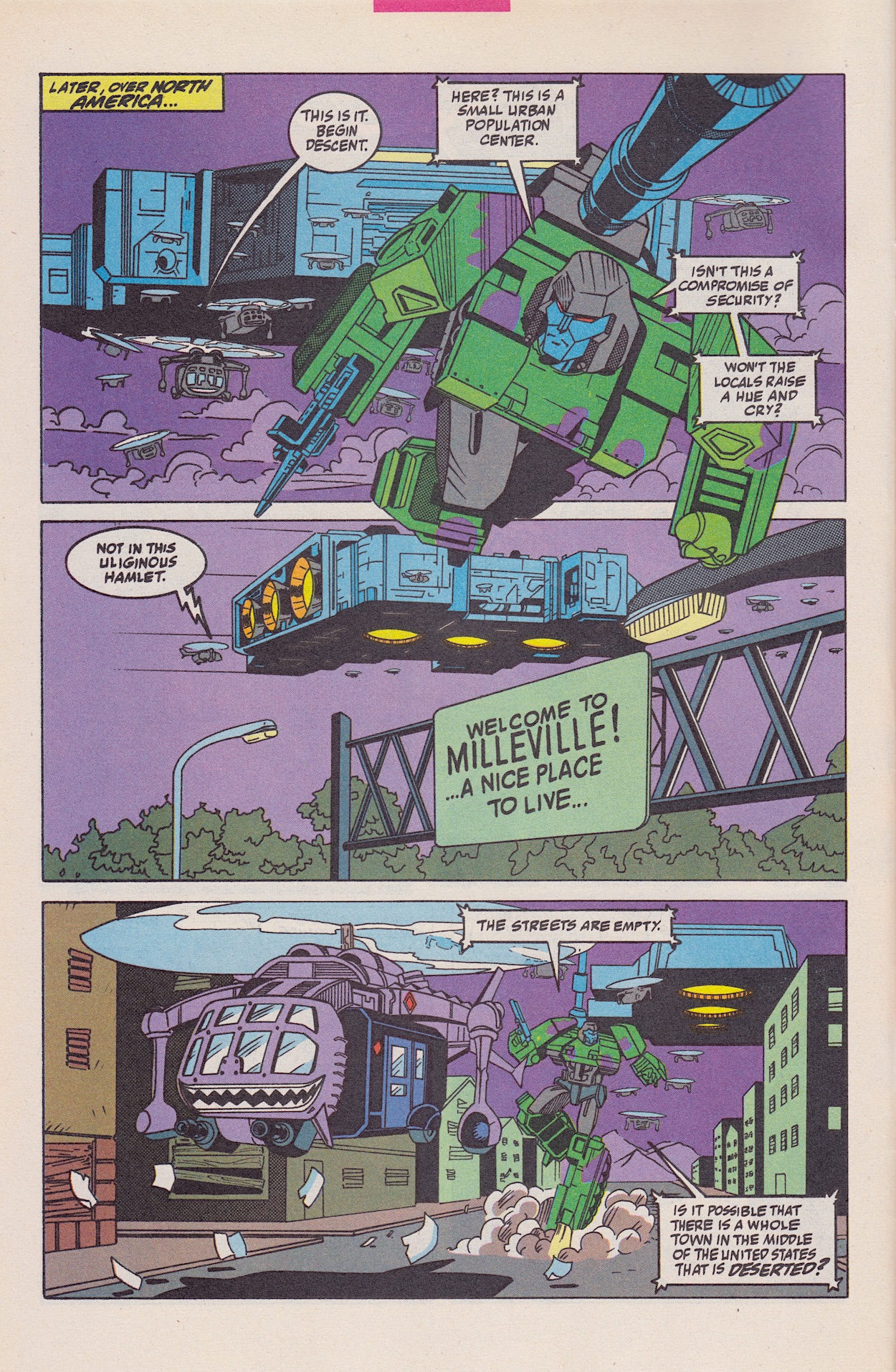
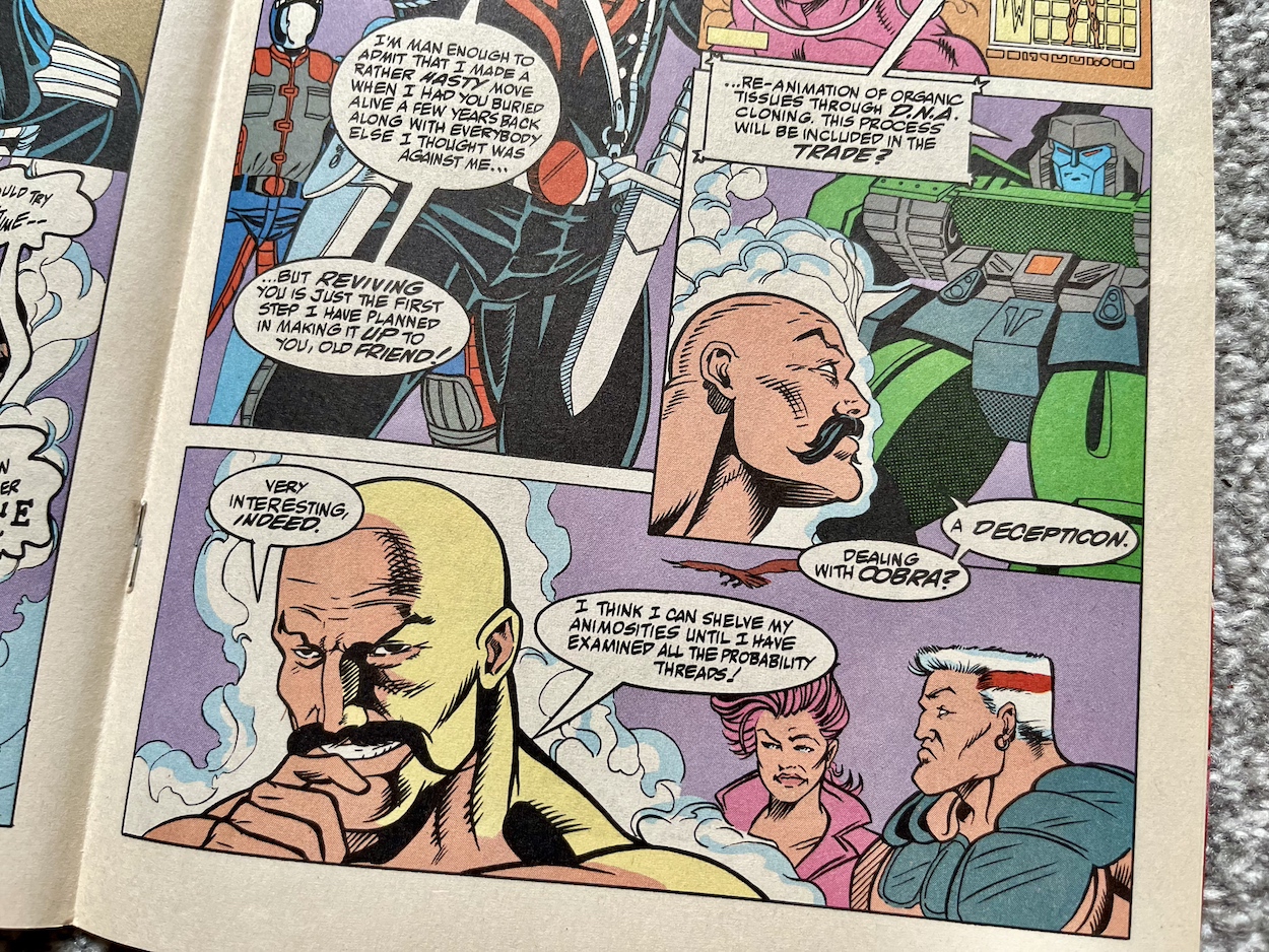
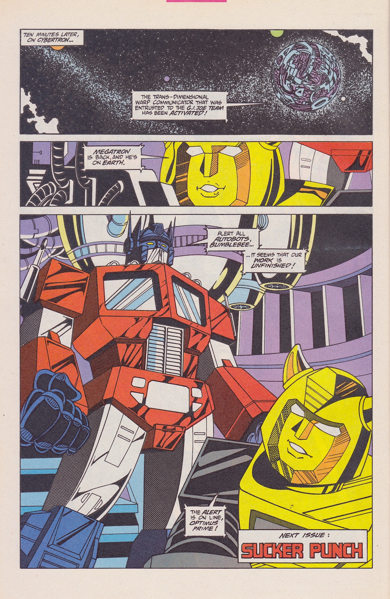
What an ending! Again, imagine being a fan of both franchises and reading this for the first time without knowing it was coming. Especially with Andrew and Stephen’s familiar superb work on Megatron! The last time we saw ol’ Megs was in the final UK annual released for Christmas 1991. The Decepticons were trying to use the unstable nucleon (which had had unexpected side effects on some Transformers) to resurrect their fallen leader, recently separated from the body he shared with Autobot Ratchet before The Ark was blown up and crash landed on Earth.

Here he looks suitably patchy, with wires hanging out of battered parts of his body. I knew this was coming but it was still a thrill to read this page as the end of this story. I’m super hyped to get stuck into the next four issues of G.I. Joe and even more so for the 12 issues of Transformers: Generation 2 to come after that! Simon Furman writing that forthcoming series and having these robotic characters resurrected by Larry Hama is going to be something special if this small preview story (as it is for me) is anything to go by.

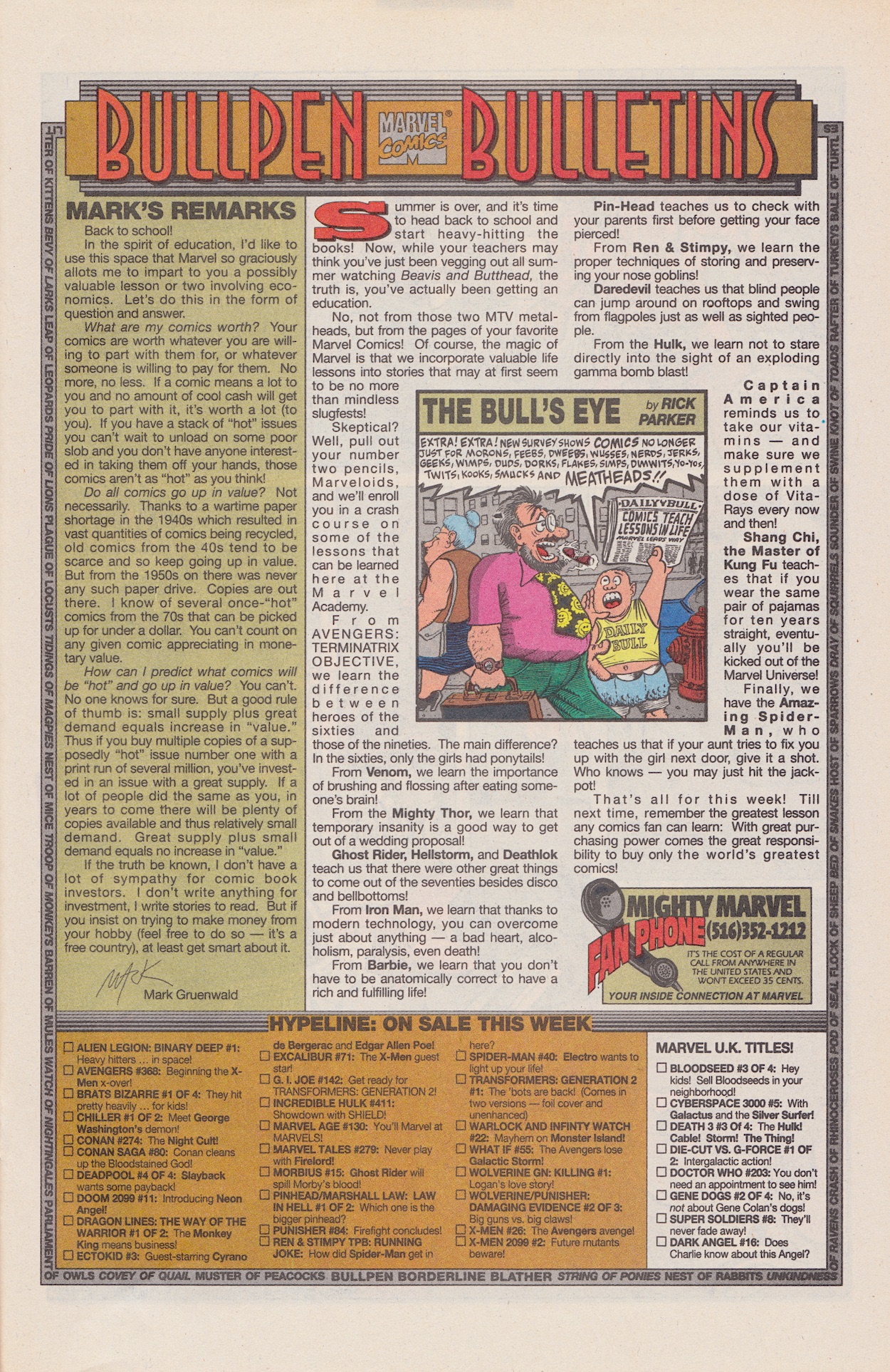
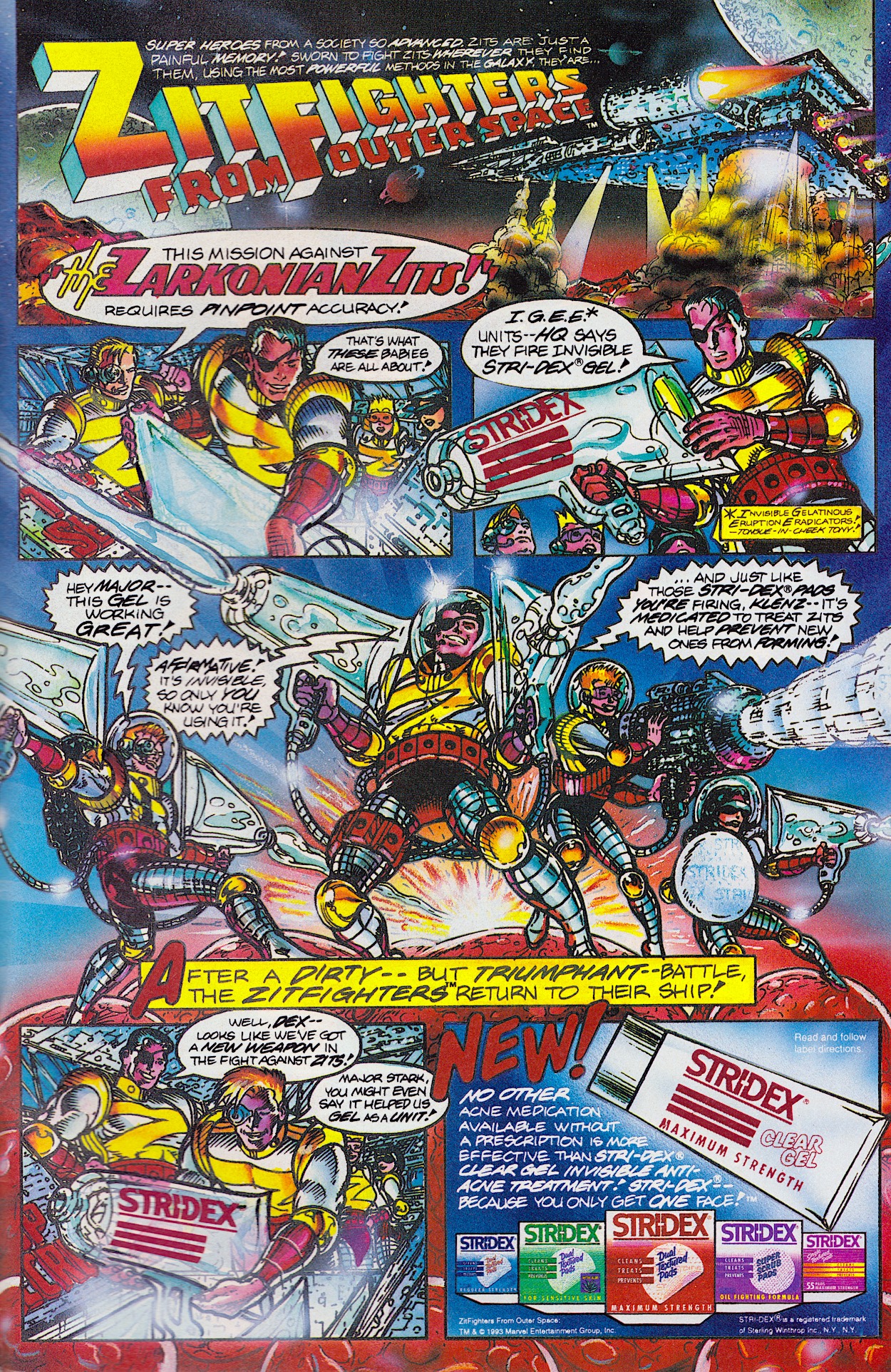
Before we wrap up, a quick look at a couple of contemporary adverts from the issue. First up, a movie that has been derided in the years since but which I still enjoy. Super Mario Bros was a flop (and the recent animation knocks it out of the park) but it’s a zany, ridiculous and oh-so-90s film that’s completely unique. I have the BluRay and the documentary tells a fascinating tale about its creation. Apparently the original script was great, aimed at a teenage-and-up audience and the cast were very happy with it (as were Nintendo). But just a few days before shooting was to commence the studio produced a new, more child-friendly script that threw everything out that had been created before, so its directors had to shoot something they didn’t like while using all of the sets and effects created for the previous script!

In the documentary John Leguizamo explains how they made the most of such a horrid situation and to me it’s a miracle any movie got made. As much as I enjoy the silliness of the end result, I can’t help but wonder what this talented cast could’ve done without the interference of studio executives who didn’t understand the original source material. Oh well.

Another ad that stood out (among the many, many adverts in the comic that often interrupted the strip on every other page) was for classic video game Flashback. I remember seeing friends play it on their Commodore Amigas and it looked stunning in a demo for my own 3DO but I never played it myself. Well, as it turns out it’s been rereleased for the Nintendo Switch so after seeing this ad I just had to break out the wallet.

It’s a great start to this latest real time read through and for all intents and purposes it’s not even the beginning yet, that’ll come next month with the actual first part of the G.I. Joe and Transformers: Generation 2 storyline by Larry Hama. It seems suitably timely with a crossover movie coming to our screens in the not-too-distant future. Be sure to check back on Sunday 30th June 2024 for the next/first chapter.

GO TO iSSUE 139

TRANSFORMERS: GENERATiON 2 MENU

MAiN TRANSFORMERS MENU

PiTCHiNG TO PiGLETS PART TWO: FOOD & DRiNK

I’ve really been looking forward to diving back into this occasional series of posts in which we take a look at all of the real advertisements published in OiNK between April 1986 and April 1990. Still to come are adverts for comics and toys amongst other things, however in a surprise turn it was seeing the adverts for all of the food and drink of the 80s that really transported me back in time.

There were plenty of them in OiNK too, far too many to include in one post, so I’ve whittled them down to 11 of my favourites, all for things I’d have happily chomped down on or guzzled back when I was a kid. Well, there’s one exception to that and as you scroll I’m sure you’ll be able to guess which one. Some of these are no longer available, but even for those that are their adverts are so quintessentially 80s they just had to be included. So let’s get things started with some breakfast, shall we?

I remember those adverts on TV with kids walking down the street with a superimposed red glow around them after eating their bowls of hot, filling Ready Brek, advertised here in #52 from February 1988. I did like that cereal, although I preferred my mum’s huge pots of porridge she’d rustle up. I don’t know about you, but I think a list of ’50 Brill Things To Do Before Breakfast’ would’ve been wasted on me. Getting out of bed and washed and fed was enough to do before school!


“Get yours before the special multipacks dematerialise!”

Golden Wonder crisps

The Bean St. Kids (#39, October 1987) had animated cartoon adverts on TV I seem to recall, complete with cackling villain, but the tins sold themselves. I know we’re told our tastebuds change as we age, so either mine really have or those tins of mini sausages have changed, because as an adult I think they’re completely vile! I tried one of those ‘All-Day Breakfasts’ in a tin of beans and my word, never again. But as a child I loved them, especially with crispy bacon and eggs for breakfast at the weekend.

As our day in the 80s continues it’s time for a mid-morning snack and our house always had multipacks of crisps for us to rummage through, although more often than not they were Crazy PricesYellow Pack crisps (ask your parents, kids). Sometimes we got treated to others though and apart from Wotsits (I remember devouring all of the barbecue flavours before my siblings could) the other household favourites were all advertised in OiNK.

My dad still eats the Salt-n-Shake crisps to this day, although you can only get the salted ones now. This is just as well really because I remember the other flavours didn’t really work. No matter how much we shook the bag like the fella in this advert from #6 (July 1986) we’d always get a mixture of bland crisps and others with so much flavouring on them they’d burn our tongues. Needless to say that “mixing different sachets” to “invent your own flavours” was an atrocious idea too.

I’ll admit I still have a fondness for Monster Munch (#33, July 1987) to this day; the pickled onion ones are a favourite but I just can’t walk past a shelf of roast beef packets without filling the trolley! I was sure the regular Golden Wonder crisps disappeared for a while many years ago but that doesn’t seem to be the case. While they did go into administration in 2006 they were bought by my local Northern Irish crisp company, Tayto and continue to be made here, which surprised me!


“You can meet Jo-Jo, Bruno and our own super hero, ‘Mar-Might’…””

Marmite spread

I remember the Golden Wonder bags of my youth had a little window on the front through which you could see the crisps. The packets were horrible though, becoming very jagged when crumpled and they felt horribly greasy on the inside, things people seem to forget on those talking heads documentaries on Channel 5 where celebrities go all misty-eyed for such things. Here in #15 (November 1986) the promotion to lure us kiddies in was a range of exclusive Sixth Doctor comics, although the lure was lost on me as I didn’t start watching the show until 1988.

On to lunchtime sandwiches and no prizes if you guessed the first of these two adverts (#22, February 1987) is the thing I mentioned above that I didn’t like. I still don’t. I’ve only ever tasted Marmite once but I didn’t eat it. I’m probably sharing too much information when I say I was in my early 20s, I’d been out for a night for a few drinks and at the end I kissed a lady who had just eaten some. Gagging and recoiling from a kiss isn’t a great impression to make.

In #25 (April 1987) bread was advertised in a children’s comic. How exciting. To be fair, it was promoting a free sports bag emblazoned with the loaf’s logo and Champion was heavily advertised during children’s programming as the bread of choice for fit and athletic kids. I hated it back then with all of the little ‘bits’ in it but these days I do love a good granary loaf. Showing my age probably. Mother’s Pride make a vast amount of different breads these days in their Hovis range. I wonder if one of them is the modern day equivalent of this?

Imagine that was your foot!

On the way home we’d visit the sweet shop and long before Jamie Oliver’s sugar tax came in (something I cursed him for at the time but which I now think was for the best) any can of soft drink was so loaded with sugar they were main staples of kids’ diets in the 80s! Cherry Coca-Cola was the latest craze and was advertised with very surreal images on both the telly and in publications. They made little sense but were certainly eye-catching and worked a (sugary) treat, the first two here taken from #28 (May 1987) and #34 (August 1987) respectively.

It doesn’t taste the same anymore. For some reason when the sugar tax came in Coke changed the recipe for Coke Zero (the brand under which the different flavourings now reside) and suddenly it tasted like that horrible Diet Coke stuff (I’ve never been a fan). I moved over to Pepsi Max and actually much prefer it and its range of flavours, so thanks Jamie! I still buy my sugar-full Coke to slow cook my Christmas ham though. (Damn, that’s still too many months away.)


“2p off Milky Way!”

Milky Way chocolate bar

In hindsight ring pulls were so bloody dangerous on a product kids loved, never mind asking us to actually collect the sharp little things, and that advert (#30, June 1987) makes me wince nowadays. Imagine that was your foot! Anyway, collecting them is exactly what we did. I didn’t send any off for this particular product but I’m going to guess many blog readers of a certain vintage will have done so for their Coke or Fanta yo-yos, am I right?

With most of our pocket money spent on crisps and soda what were we going to do about our chocolate cravings? We couldn’t have a can of Coke without a chocolate accompaniment! But we also couldn’t spoil dinner, so we needed something we could eat “without ruining our appetite”. Luckily, Mars gave us a handy coupon for a whopping 2p off our next Milky Way. Hey, don’t knock it, that was a good chunk off back then. The advert was also split in two and spread over the issue (this one appeared in #12, October 1986).

The competition for a Commodore 64 also catches my eye today, it being my first proper home computer, although I didn’t get mine until Christmas 1991. The inside of a Milky Way was chocolate flavoured back then but was changed to vanilla in 1993 and I hated it. Although, Mars’ Flyte came along in 1996 and used the original recipe in a bar aimed at adults. Once I discovered this they were a very frequent purchase. Such a shame they’ve been discontinued since.

This really has been a whirlwind trip down memory lane for both my mind and my taste buds. I feel suitably qualified to appear on Channel 5 now. You can see companies knew how to appeal to us 80s kids. As well as adverts taking the form of comic strips, many offered their own magazines and comics to send off for, and there was always something magical about collecting silly little tokens (or ring pulls) that had the desired affect on us and on their bottom line.

In the next part of this series I’ll be taking a look at the toys advertised during OiNK’s run and you can expect that at Christmas (naturally).

PART ONE < > PART THREE

OiNK’S REAL ADVERTS

‘MORE OiNK’ MENU

MAiN OiNK MENU

TRANSFORMERS GENERATiON 2: iN REAL TiME

Even back in the 1990s, when the computer-generated intro sequence to Transformers: Generation 2 first aired I remember thinking it looked very primitive, especially when compared to the graphics being produced by the new wave of CD-based videogame machines. Having collected Transformers toys for a few years until the original comic’s cancellation in the UK in January 1992, this did not inspire me to restart that obsession.

Transformers: Generation 2 was Hasbro’s attempt to relaunch the successful toy line for a new generation of children but it always felt half-assed to me. (So why am I covering the comic on the blog? I’ll get to that.) The cartoon wasn’t even a new series. Instead, it was a rerun of 52 of the original series’ episodes with that CGI introduction (taken from advertising) and some incredibly intrusive computer graphics overlayed on top of the episodes themselves.

The word ‘lazy’ springs to mind. The toys themselves didn’t fare much better to young teenager eyes. The G2 line ran from 1992 to 1994 and, apart from a few impressive new models such as Megatron who now transformed into a tank, most of the initial releases were reruns of previous toys with garish new colour schemes. Oh, and I mean garish! It was very 90s.

Optimus Prime’s ‘new’ toy played a bit fast and loose with the term ‘Robots in Disguise’

Some received new spring-loaded weapons and missile launchers etc., but for the most part even this eager Transformers fan, who would’ve happily continued collecting the original toys, thought some of them looked like cheap knock-offs rather than the official range. The original toys had declined in popularity but they’d had a great run which should be celebrated, and of course the franchise continues very successfully to this day.

With the vast array of different types of Transformers (even ones that couldn’t transform) towards the end I can commend Hasbro for wanting to go back to basics but for me this was the wrong way to go about it. The franchise recovered of course but Generation 2 didn’t excite me as a child and apparently I wasn’t alone. Also, just as a side note, Optimus Prime’s ‘new’ toy in particular played a bit fast and loose with the term “Robots in Disguise”, which was still on the box despite his trailer’s design. Less of a disguise and more of an announcement I’d say.

The colour schemes no longer matched the cartoon they’d repackaged with that CGI, and some of the characters in it weren’t available in any G2 toy form, making it all seem like it wasn’t very well thought out. In the end the toy line was discontinued when the first Transformers: Beast Wars toys began hitting shelves, which went off in a completely different and much more successful direction. 

[The Transformers: Generation 2 comic’s] reputation proceeds it and I’ve seen some of the hard-edged artwork which looks just incredible

So if I’m so unimpressed, why on Earth am I dedicating room to this strange little spin-off on the blog? Well, in September 1994 a new comic arrived on the shelves from OiNK‘s second publisher, Fleetway Publications. I was initially thrilled to see a brand new Transformers comic, even if it was monthly instead of weekly and didn’t seem to have a lot of content by comparison. Still, the first issue drew me in with its cover and the foldout poster inside which the editorial used to describe the comic as a ‘Transformer’ too, which I still think was fun.

I didn’t buy any more issues at the time and it only lasted for five months in the end, but what I didn’t know about at the time was the Marvel US monthly (which Fleetway started serialising in #3), written as ever by the original comic’s Simon Furman. I’ve never read the series but its reputation proceeds it and I’ve seen some of the hard-edged artwork which looks just incredible, reminding me of some of Kevin O’Neill’s early 2000AD work. That alone made me want to collect it in recent years.

It was marketed at the time as a more mature comic, less for the kids buying the new (well, new-ish) toys and more for those that had been reading the previous Transformers a few years before. No longer restricted by Hasbro in how he could portray characters, nor having to write in certain toys as a way of marketing new releases, Simon was given free rein to tell the story he wanted.

Because the UK title is so hard to come by for a decent price I’m going to cover the original American one first (a first for the blog), then at a future date we’ll see what Fleetway did with the license. Unfortunately, even the US comic only lasted for 12 months but that’s not an indictment of its quality. After all, just a few years before it the original G1 (as it was called from this point on) comic was cancelled when it was still selling about 100,000 copies per month!

That would be a massive hit today or for a new, original comic at the time, but at its peak Transformers had sold 250,000 a month so all Marvel saw was the decrease, sadly. Even with Transformers: Generation 2 technically being a new title it wasn’t going to reach those previous lofty heights for a licensed comic and, despite sales figures of around 100,000 per issue again, the rug was pulled. However, I’m really looking forward to seeing what all the positive fuss over that year is all about. Technically, there are more than 12 issues too because there were another four monthly chapters to the story before #1!

That’s right, it all kicked off as a crossover event in the pages of G.I. Joe in #139-#142, so I’m going to be including those issues on a month-by-month basis too in real time. As a fan of those characters (thanks to them being a back up strip in Marvel UK’s Transformers G1) I’m even more excited about the prospect of this read through than I already was. In fact, the issue before that again leads into the crossover, so altogether there are going to be 17 monthly comic reviews covering the entirety of Transformers: Generation 2.

It all begins with G.I. Joe #138 on the 31st anniversary of its release State-side on Sunday 26th May 2024. The Transformers have a bright future ahead on the blog and this is only the beginning of it!

GO TO G.i. JOE 138

TRANSFORMERS: GENERATiON 2 MENU

MAiN TRANSFORMERS MENU

RiNG RAiDERS LiCENSEE STYLE GUiDE: PART FiVE

Here we are at the end of this monthly series already. It’s been really interesting looking at this Ring Raiders Style Guide sent out to all potential licensees by the copyright holders Those Characters From Cleveland (TCFC) back in 1989. Judging from the feedback I’ve been getting on socials it seems like you lot agree. The final 12 pages are all here and as you can see from the photo above they make for a meatier read this time around.

There are three sections to round off the folder and we start with ‘Copy and Type Application’, which amounts to two whole pages about fonts. Yes, really. It’s something I never really considered but now that I see all of these examples I can remember each and every one of them on the packaging (which you’ll see further below) and on the toy advertisements in the comic produced by the editorial team.

The page of suggested taglines sound like they’ve been written by committee. A committee who has no idea about aircraft. They’re cringe-worthy and thankfully weren’t used on the toys themselves or in the comic. You can also see all potential designs were subject to TCFC’s approval, however the comic’s editor Barrie Tomlinson said the people behind Ring Raiders were more open than most to what licensees could bring to the franchise, and they were very happy with what Barrie and his team were producing.

Logos and Legal’ is the next part of the binder and they’re a weird combination, like they’ve only been shoved into the same section because they start with the same letter. It kicks off with a lot of detail about how to use trademarked names and exactly how every piece of merchandise should be labelled appropriately. If you’ve ever wondered what the difference is between the ™ and the ® symbols you’ll find that answer here too.

Even textile manufacturers get their own paragraph detailing how their products should be labelled. This was most likely the same information found in similar style guides for all of TCFC’s (and other’s) ranges but it’s still an interesting read. You’d see these little footnotes in all of our licenced comics too and I always thought it was up to the publisher how they were worded, especially for their own trademarks, but it looks like that wasn’t the case and it was the licence-holder’s wording. Although, to be fair, it’s a pretty standard format.

I simply loved the full colour Ring Raiders logo

Want to know the difference between a trademark and a copyright? Or why the year mentioned can sometimes change and sometimes remain the same? It’s all there for you. As most of my comics reading post-OiNK as a kid was based around licenced titles the nerd in me found this of particular interest. Then we move on to the second part of this alliterative section and the variations on the franchise’s logo that were permissible to use.

I thought the ‘Ring Raiders’ main title was a brilliant design and the accompanying logo the perfect embodiment of the toys. I simply loved the full colour Ring Raiders logo. I still feel the same, they’re just great designs! Below you’ll see the one-colour (that is, black and white) version of the logo, the same one in various sizes taking up a full page for some reason. You’ll see a handwritten note by Barrie too, highlighting how they’d use this particular version.

On the next page is a selection of variants for both the Ring Raiders and the Skull Squadron (quaintly described as “Good Guy / Bad Guy Logos”). The top two were used as the individual logos for each side on toy packaging and across any and all merchandise. The next row down are the in-universe logos used by the characters themselves on their planes, bases and uniforms.

The smaller, circular logos had specific uses in the toy range. The first two on each row were used on the tiny plastic rings we’d slip on our fingers, the planes attached via a thin, posable plastic rod. The star and skull circles were on the front of the rings while the ones with the lettering encircled the ball-shaped attachment on the top. The final one is exactly what it says, a miscellaneous combination of both to be used as they saw fit.

Anyone who collected these very collectible toys at the time should prepare to have their memory cells jolted as we move on to ‘Hang Tag and Packaging‘, namely the packaging used for the Matchbox toys themselves. First there’s more criteria, although these are more like suggestions and designers are encouraged to explore what might suit their product the best. These apply to all packaging, whether that’s by Matchbox or anyone else, right down to the sky background. There’s also mention of bold visuals such as colour bands trailing after the planes and you can see examples in the previous section’s merchandise concept drawings.

These card displays with the planes tucked away inside moulded clear plastic take me right back. From discovering my first two-plane starter set to excitedly collecting all the packs I could in every toy shop I visited, as well as receiving gifts during the festive season or from visiting family members from Scotland. I have a particularly fond memory of coming home from school to find my sister was visiting and I hadn’t been told, so it was a surprise. After a while she told me she’d brought me something and it was a huge eight-plane set featuring all the Wing Commanders.

I think back and my parents must’ve had to coordinate with my siblings and family friends because I never received any sets I already had (although there was some overlap in the range like those Wing Commanders planes, each of which would also be in their Wing sets). I’ve no idea how they managed that without me knowing. Anyway, yes, these photos are bringing all the smiles right now.

The rear of the packaging reveals more sets and a huge array of extras. As you know the franchise never took off, but over the course of a year (actually, mainly over the course of one summer and Christmas) I was able to collect everything here (plus most of the additional plane sets not shown here) except the gigantic Air Carrier Justice and the black version of the Battle Blaster. Ah, good times.

In case you’re wondering what we could redeem those barcode points for the answer is simple: nothing. It was possibly something for consideration at some future point but nothing ever came of them within the time the line lasted. According to online sources there were second and third series of planes, although I only ever remember seeing a second series the next summer which just made me more frustrated that the comic hadn’t lasted, because I thought the release of more toys meant they’d been a success.

Of course, with hindsight I know the second series would’ve already been in production before things fell apart. But I never did buy any more after that initial year and then in my later teens mine were handed down to a young nephew and subsequently destroyed through his playing. I kept the yellow and red X-29 as it was my first, and my favourite, but even this was given away to a girl in my late teens. (Hey, I was young and she’d taken a shine to it.)

Ring Raiders had that “gotta collect ‘em all” quality

After the hangtag (an example of what a product could hang from in a store) things are rounded off with a large scale image of that beautiful, full-colour logo. It’s the same page that’s been slipped inside the front of the folder which I’ve shown in a few photographs, but I’m including a proper scan of it to end on as requested by blog reader Terry in their comment under part three of this series. You’re right Terry, it is sweet!

With that the folder is finally closed and placed back on the shelf alongside what was, and still is, my favourite non-OiNK childhood comic. The toy line may have only lasted about a year and I was quick to move on to my next obsession, I’m sure, but what an obsession these were. I come away from this series of posts with one key takeaway; the Ring Raiders were robbed of being a hit franchise.

Before Pokémon, the Ring Raiders had that “gotta collect ‘em all” quality. They were great toys, the comic had great characters and action, there was variety and adventure and a ton of fun in all aspects of the franchise and it had more potential than most others in my opinion. They have a special place in my heart all these years later and, dare I say it, I don’t think I’m finished with them yet.

Once again, thanks to former IPC/Fleetway editor/writer Barrie Tomlinson and his writer son James for kindly sending me this folder in the first place.

BACK TO PART FOUR
LiCENSEE FOLDER MENU

RiNG RAiDERS MENU

DEATH’S HEAD #7: EXPLOSiVE SLAPSTiCK

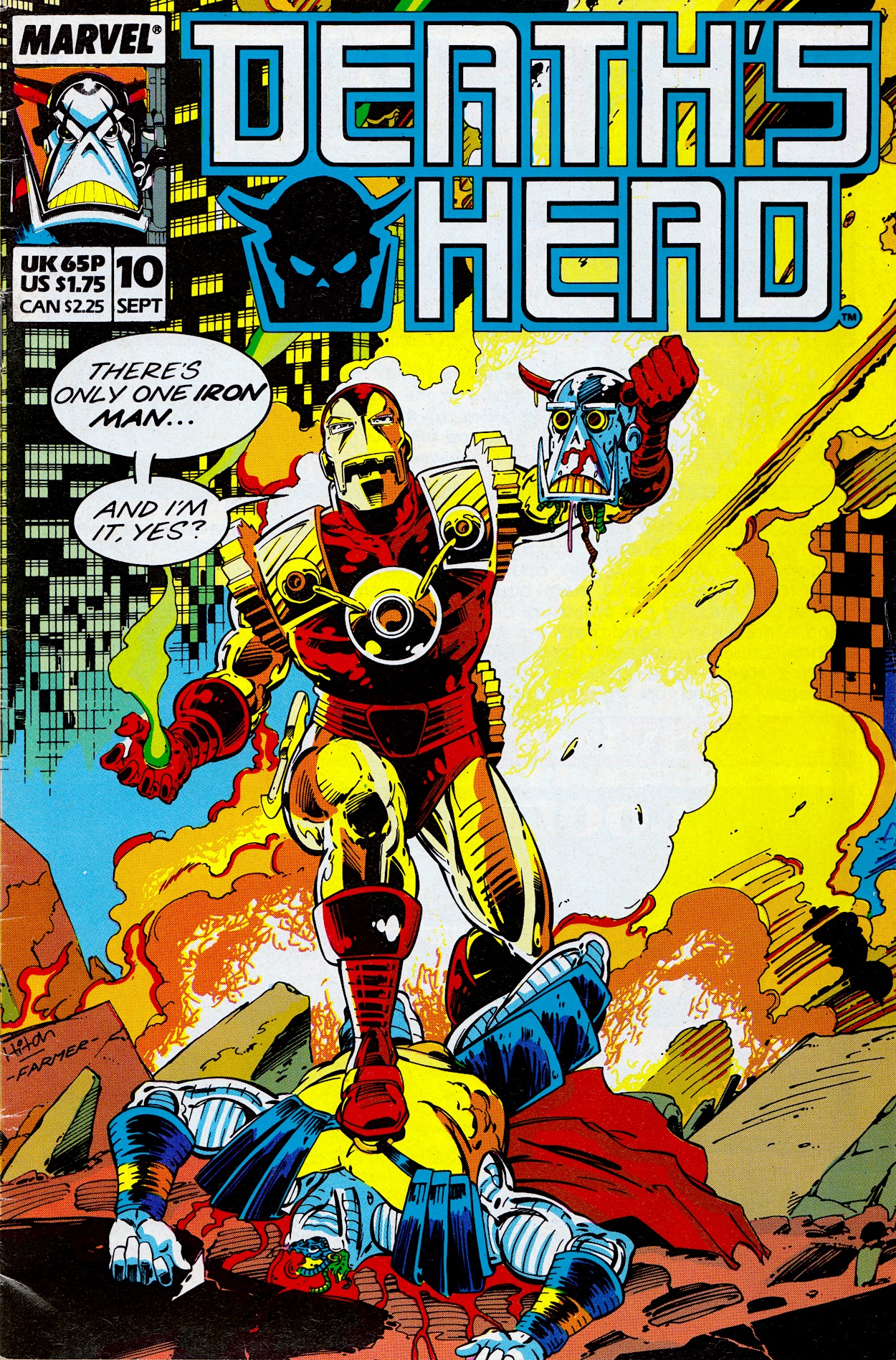
With an increase of 5p on the cover price, Death’s Head #7 hit stores today back in 1989 with this Bryan Hitch and Mark Farmer cover, while inside I’m excited to see inking duties on Bryan’s pencils are actually by Jeff Anderson, whose work I loved so much in Marvel UK’s top-selling Transformers and this combination is just superb throughout. The comic is also still offering subscriptions for 12 months so clearly there was no sign yet that even those earliest of subscribers wouldn’t be getting all of their issues delivered. (Only three more to go after this one.)

A new colourist has joined the fray, namely Stuart Place who also coloured for the company’s The Real Ghostbusters, Action Force (G.I. Joe) and Transformers, most notably the fan-favourite Dinobot Hunt story in the early days of the comic. Steve White has also taken over as editor after Richard Starkings resigned. Poor Steve, we’ve already seen his name on the blog when he edited Visionaries but it didn’t last long because the subject matter flopped, he took over Havoc just before it got unceremoniously canned and the same is about to happen here. None were his fault obviously, and he is a simply incredible artist! Check out his Instagram and make sure you see his gorgeous colouring on Xenozoic Tales in Dark Horse’s Jurassic Park!

Shot by Both Sides (as ever written by Simon Furman with Annie Halfacree lettering) is a brilliant strip, one of my favourites of the run so far. The comedy comes thick and fast in the early pages. A robotic tour guide is telling passengers on a bus what they can see to their right and left when a crashing ship narrowly averts disaster but rips off the roof of the vehicle in the process. In response, the robot simply moves on with, “Um, well… above you, you can see…”.

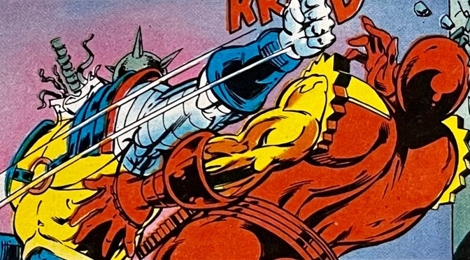
It’s at this point we see the panel above and the ship in question is Death’s Head‘s, who seems to be having problems with the autopilot. I remember a friend of mine in school who was a particularly big fan and he’d often quote the “No, yes?” line when asked a question. The plot this time combines two previous cliffhangers from #4 and #6 and sees bounty hunter Big Shot and explosives expert Short Fuse both attempting to take out the Freelance Peace-Keeping Agent for their bosses.

These bosses are the previously featured Undertaker and new gangster Dead Cert, a cigar-chomping man with a horse’s head who unironically runs the city’s illegal sports gambling rings, including horse racing. In the first scene (the crashing ship one) we find out Big Shot had fired a high-powered missile at Death’s Head ship which had initiated the crash. But Short Fuse had also planted an explosion in the cargo hold. When it went off it lightened the craft enough for it to be successfully pulled up before it crashed into that bus.

Death’s Head puts both down to “cowboy builders” and doesn’t realise he was actually under attack. This forms the backbone of this month’s tale. Big Shot’s aim is to kill our anti-hero and double-cross Undertaker by taking over Death’s Head’s business, while Short Fuse just wants to do a good job for the person/horse who hired him. However, they keep attempting to take out their target at the same time. While completely unaware of each other, each attempt is undone by the other’s, cancelling each other out in an increasingly funny series of events.

There’s a main bad guy mixed in here that acts as Death’s Head’s target for a job he and Spratt (good to see him back in the strip) have been hired to carry out. Called Photofit, he has a hi-tech suit which enables him to mimic anyone he comes in contact with. Think the T-1000 from Terminator 2, albeit a few years before that film was released. While the chase makes for an entertaining plot it’s really just a vehicle for the assassination attempts.

Eventually our lead clicks that something is going on as you can see below. I love the panel when he realises, his expression and the rain bouncing off his metallic face is all just perfectly realised. In the middle panel you can see how Short Fuse’s mistimed bomb blows Death’s Head backwards and away from Big Shot firing his bazooka-like weapon. He’d been in his sights but the explosion pushed the target out of the way and you can see the bazooka shell zooming harmlessly past.

Somehow this doesn’t get stale either, mainly thanks to the imagination on show in how these attempts fail and Death’s Head’s reactions. All the while the Photofit story continues and he disguises himself as a contestant on a game show where the prize is a trip out of the country, all paid for and through legitimate channels, the ultimate getaway right in plain sight.

Spratt accidentally ends up on the show itself and faces off against the disguised Photofit while Death’s Head tries to search the rest of the building for someone who could be anyone. All the while he’s getting attacked by unknown enemies. Unknown until Big Shot finally decides to change that. Sick of having his chances squandered he blasts Death’s Head through a wall, then stands over him, gun pointed at his head, ready to take the final shot… when another explosion knocks him off his feet and into waiting fists.

I had to laugh at that first panel! Well, our main character isn’t a bounty hunter after all, yes? Short Fuse is getting frustrated too. For once it was Big Shot who got in his way, so he resorts to desperate measures but his own incompetence results in nothing more than an explosion in mid-air that shoves the fighting duo through a wall and into the television studio. 

Just before this, Photofit makes himself known to Spratt because our unwitting contestant is actually winning the game. A gun held in the small of his back, he’s saved by the sudden arrival of our fighting duo and Photofit realises he’s defeated and must escape. He sees the perfect disguise right in front of him. Or it would be, if that disguise didn’t immediately place him in the sights of an assassin.

So the magnetic bomb obviously doesn’t stick to the very human imposter and in a shocking move it not only blows him up but Short Fuse as well! Okay, yes, he’s been trying to blow up Death’s Head but the very violent slapstick comedy he’s brought to the issue has been hilarious and I’m genuinely sorry to see him killed off. Despite being a hired killer there was something loveable about the little man. However, even in death he manages to thwart Big Shot one final time and save the mechanoid they’d both been hired to kill. 

As the story ends Spratt and Death’s Head converse over how it was strange that things kept exploding around them, reminding the readers that the duo never even knew of Short Fuse’s existence, never mind his influence on events (and their lives). They don’t seem to care why those explosions kept happening and instead only hope there’s enough left of their target so that they can prove they’ve earned their money!

It’s a suitably funny conclusion for these two, playing down the events and simply moving on. In their position it’s probably the healthiest way to be but that’s not the point. The point is that they’re very funny together and obviously the perfect match, something even Death’s Head seems to have finally acknowledged. These two are so well written, their actions and dialogue so natural that you have to step back to remember how far-fetched the whole scenario of the comic is.

I’ve really enjoyed Simon’s writing in Transformers and Dragon’s Claws but there’s something about this particular comic that stands out. It feels like it’s more of a personal project for Simon, it’s so one-of-a-kind and has such a unique sense of humour I get the feeling the writing is closer to Simon’s own personality than anything else I’ve read. We’ll see that insight hopefully develop even more over the remaining months, the next instalment in five weeks on Monday 3rd June 2024. But before then…

iSSUE SiX < > DEATH’S HEAD 2

DEATH’S HEAD MENU

YOU CAN QUOTE ME… WELL, THEM!

A few years back I wrote an article about OiNK for a fan-produced magazine called Comic Scene. It’s a magazine that has been cancelled, returned in a different format and cancelled again more times than Uncle Pigg has had hot swill. The article was for their ambitious but ultimately factual-error-filled (and also cancelled) partwork series History of Comics. To accompany it I also wrote about my top six issues of OiNK and was able to get some fantastic quotes from some of the comic’s team to use as a box out.

For whatever reason neither of these were used. I thought not including the quotes from these incredibly talented cartoonists (who had all happily got back to me with their thoughts) was particularly surprising. Well, to mark the 1986 release date of OiNK’s preview issue (and the first OiNK review on the blog) here are the quotes I was able to muster in time for the article’s original deadline but which never saw print for whatever reason. They’re a nice little insight into the making of OiNK and I’d like to thank everyone for contributing at the time.


STEVE McGARRY

“It was more than an honour to be asked to contribute to those first few issues of OiNK, it was a damned inconvenience.”

DAVID LEACH

“Working on OiNK was a fantastic experience, it featured my first professional cartoon character and it marked the start of my professional career as a freelance cartoonist.

“I got to meet life-long friends and it got my foot in the door. As such it holds a soft spot in my dangerously enlarged, erratically beating heart. OiNK was the start of my professional career as a cartoonist. I had seen a preview copy of the comic and just knew I had to be in it. I contacted Bob Paynter, Group Editor of Humour Comics at IPC at the time and he offered to send my work sample to OiNK if I did a job for Whizzer and Chips. I ended up drawing a four issue pull-out strip called Phil Fitt and Brad Habit, which got published and in return my sample strip for Psycho Gran got sent off to OiNK and that was that!”

JEREMY BANX

Working on OiNK was hard work and great fun. I’d never expected to work in comics so it was a strange adventure for me. I learnt a huge amount and it certainly changed the general direction of my travel.”

LEW STRINGER

“OiNK came along at just the right time for those of us who were still new to the comics business. We were full of ideas and still young enough to be able to relate with what the readership wanted. It gave us the perfect opportunities to develop our craft and come up with strips that wouldn’t fit in with the more pedestrian formularised comics. It was such a fun time to work in comics. We all had a great time and I think that shows in how fondly OiNK is still remembered all these years later.”

DAVEY JONES

“Thinking of OiNK, I reckon the main thing I remember is how open they were to stuff which wasn’t necessarily in the traditional British comic format. They liked the more familiar style of Buster/Whizzer and Chips style strips as well of course, but were also happy to look at stuff that was a bit different. I really liked the things that Jeremy Banx was doing with Burp the alien, which were sometimes these short, funny science fiction stories, and I hadn’t really seen anything quite like it in comics. So you felt like you didn’t need to follow any particular formula when submitting scripts, just think of daft stuff that they might find funny.

“The other thing that occurs to me is how encouraging [co-editor] Mark Rodgers was. I’d send him the scripts first, and quite often he’d turn them down, but he went to some trouble to explain where I was going wrong (the stories were too complicated, or I was trying to fit too much in etc.) which I appreciated a lot, because he could have just stamped the word REJECTED on them.”

KEV F SUTHERLAND

“In 1986 I was desperately trying to break into comics so I was sending something, at least every week, to both 2000AD and OiNK. OiNK would reply saying my stuff was too superheroey or dramatic and that I ought to send it to 2000AD, and 2000AD would reply saying my stuff was too funny or cartoony and I should send it to OiNK. It took a year until, finally, it was OiNK that broke under the pressure and let me in with, I think, a Rotten Rhymes script which they let me draw.

“I then got increasing amounts into the comic, especially my Meanwhile… strips which ran to a page each, reaching a climax with #68, a third of which was written and drawn by me (including The Plop Factory, a parody of Stock Aitken & Waterman in the style of an EC Comics horror story). That was the final issue of OiNK, and I was back where I started, desperate to break into comics.”

GRAHAM EXTON

“By an eerie coincidence, all of us who contributed material for Rrrassp! comic (as OiNK was first called) wrote strips featuring pigs. So Bob Paynter suggested making pigs the main theme. I’m not sure if it was my idea, but Mark and I both liked the Tharg and Stan Lee characters who communicated on the 2000AD and Marvel letters pages, hence Uncle Pigg. I think the Plops were my idea, but given the theme of pigs they were pretty well inevitable. They were based on Leo Baxendale‘s squelchies who were Grimly Fiendish‘s minions years before Despicable Me.

“Mark and I met with Tony [Husband, co-editor] in his home and I was struck by his lovely paintings and impressive collection of Peter Hammill LPs. I have not met Patrick [Gallagher, co-editor] in person though we are Facebook buddies. I was impressed with his ability to mimic other artists’ styles. Mark and I did a few fumetti [photo stories] when he and wife Helen came to visit me in South Andros, Bahamas. We roped in our neighbours too.

“The funniest strips I was involved with were the two Herbert Bowes ones. He had a lot of things up his nose. Jeremy Banks’ art made them super funny. The third one involved the Starship Enterprise (up his nose), but I couldn’t make it work, so never finished it. My all-vegetable theatre strip (with fab Ian Knox art) festered in my brain for many years before emerging, butterfly-like, as Tatertown, a strip I give away on Facebook. I did it mostly to learn how to use Photoshop, but it now has a life of its own.”

DAVY FRANCIS

“I loved working for OiNK. As well as scripted stories, I was allowed to use my own jokes, so I would send off scripts – thumbnails, really – and if I got a yea, then I’d draw it and send it off. I was doing Ciderman at the same time, and working in the Housing Executive full time, so it was a very busy time. However, I loved it. One mystery remains: what happened to the German version of OiNK? It ran for 3 issues, but I’ve never seen a copy.”

PATRICK GALLAGHER

“From my earliest recollections of OiNK, going way back to its development stage when Tony, Mark and I had never produced a comic before, or suffered the logistical nightmare such a dream job brings, it all felt excitingly experimental and risqué. Those feelings became the form and the norm that remained right up until the final issue, which I think gave OiNK a certain sense of unpredictability and edge throughout its life, with room for error and genius in varying measures.

“Yes, some things worked better than others; OiNK was never perfect but what carried it through was its ‘voice’, which never faltered. That was the combined comedic soul of Tony, Mark and me. That is what I am most proud of and what our brilliant contributors latched onto to make OiNK something special.”


These were from a few years ago, before this version of the blog was even launched and since then more of OiNK’s creative team have reached out to me for the blog and other reasons, hence the non-appearance of some key names above. It actually gives me an idea for the future but I won’t say anything yet in case I jinx anything. Thanks again to everyone above and to everyone who has been such a great source of information, OiNK and otherwise!

CREATiNG OiNK MENU

MAiN OiNK MENU

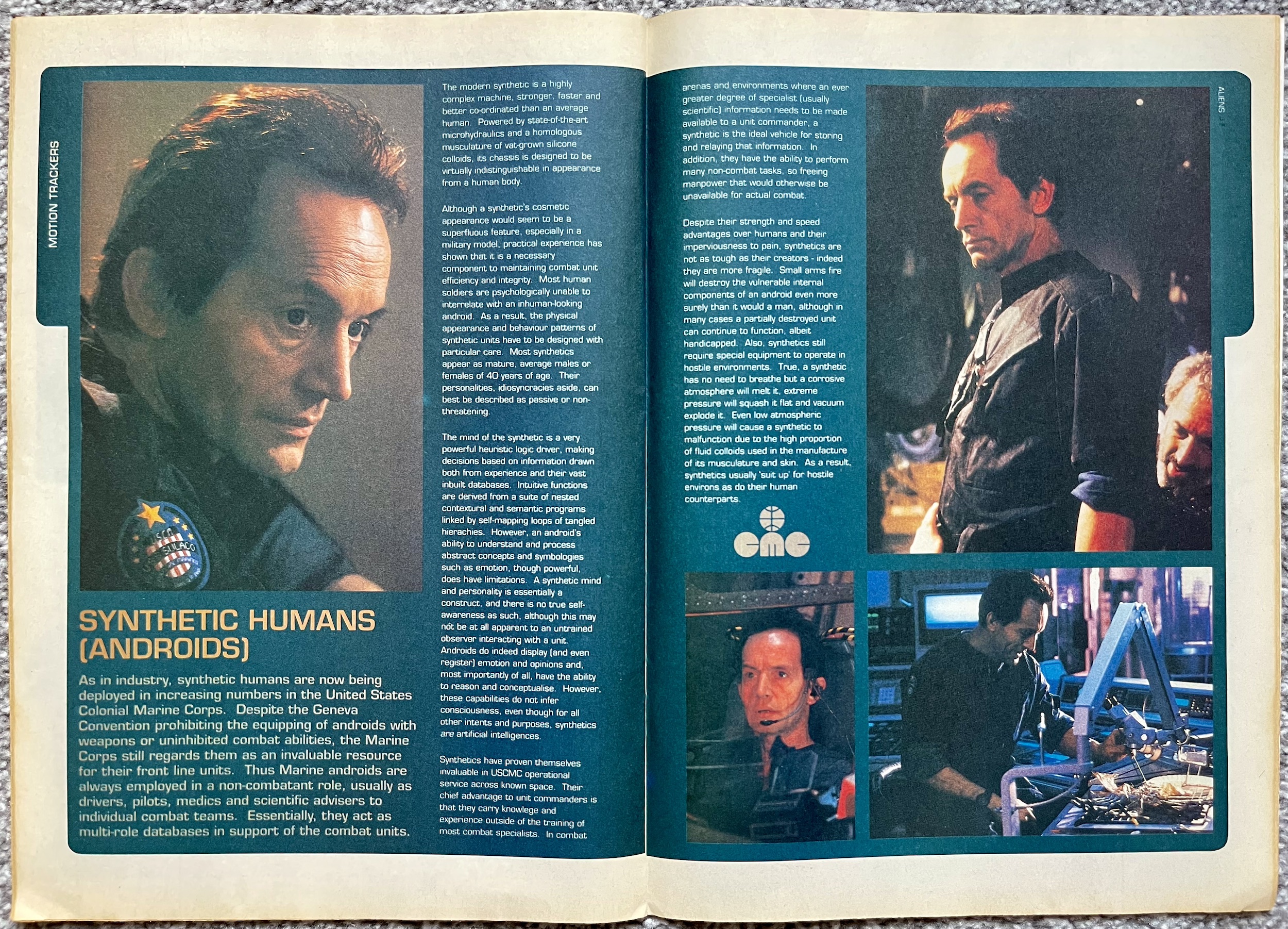
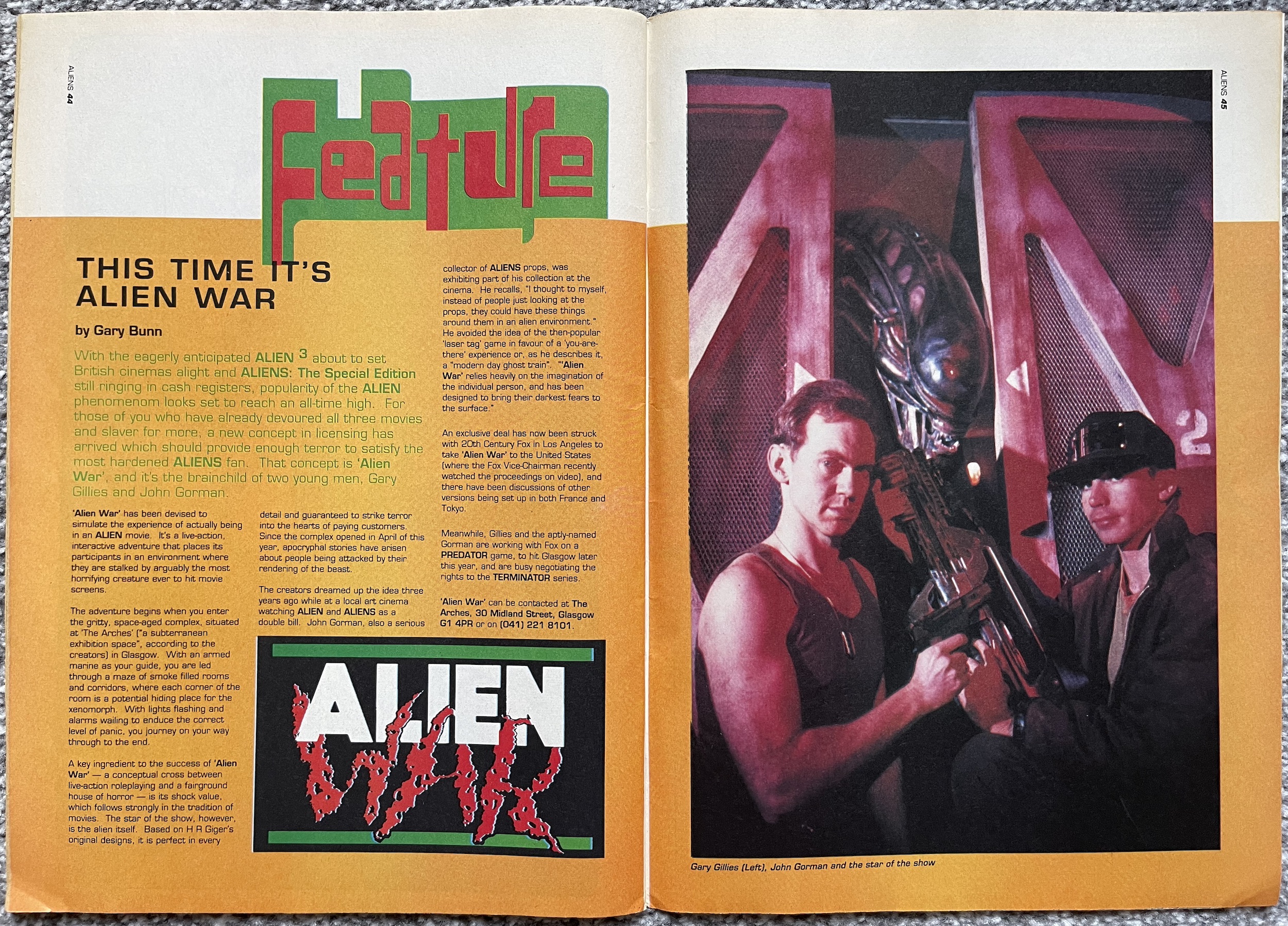
PALEONTOLOGiCAL PROMO: JURASSiC PARK ADVERT

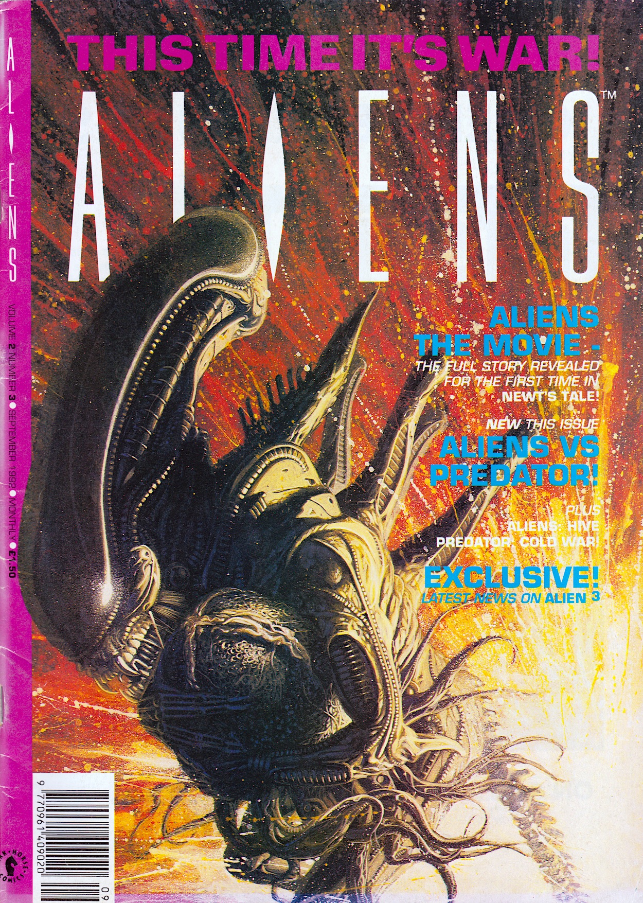
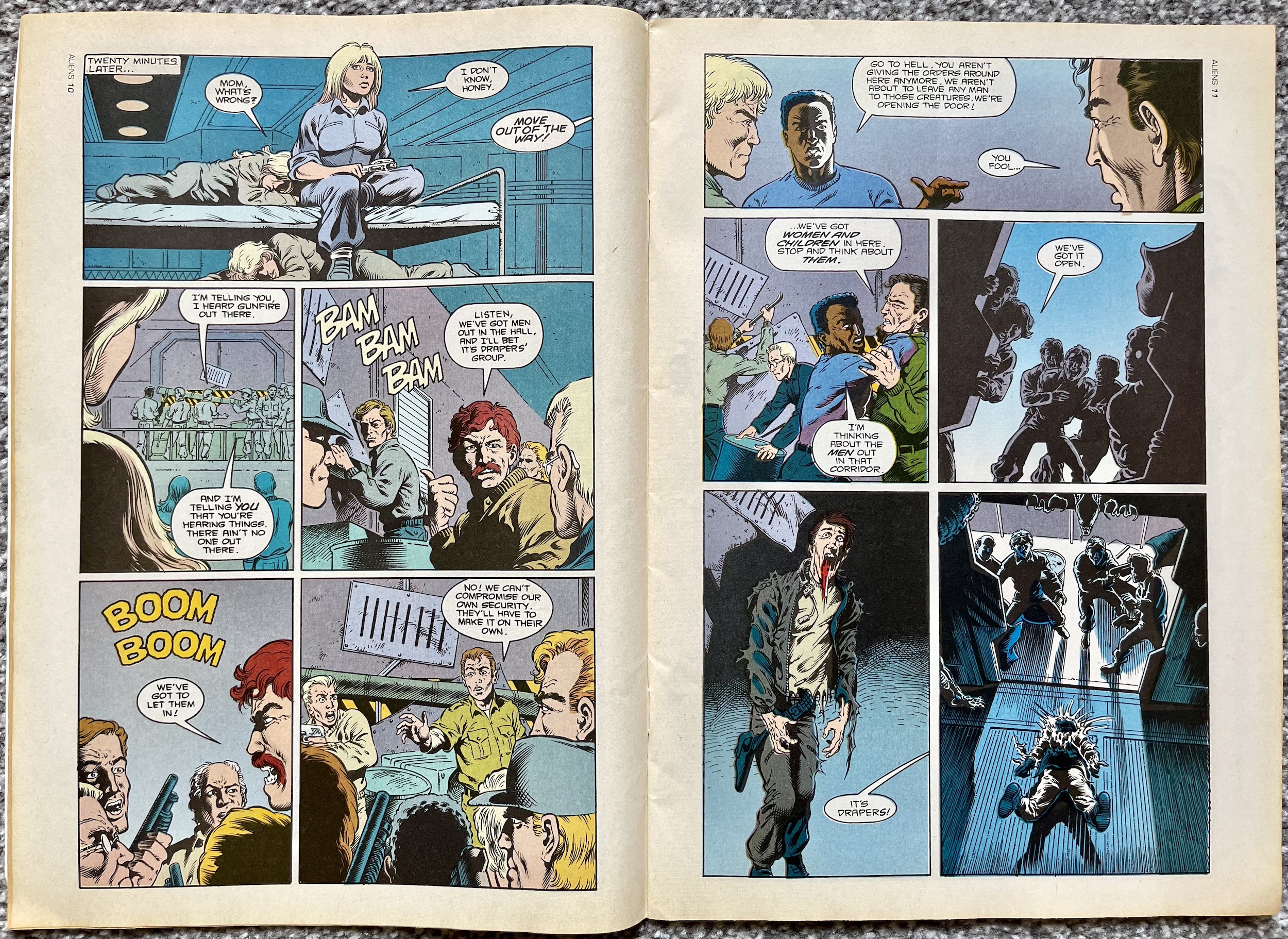
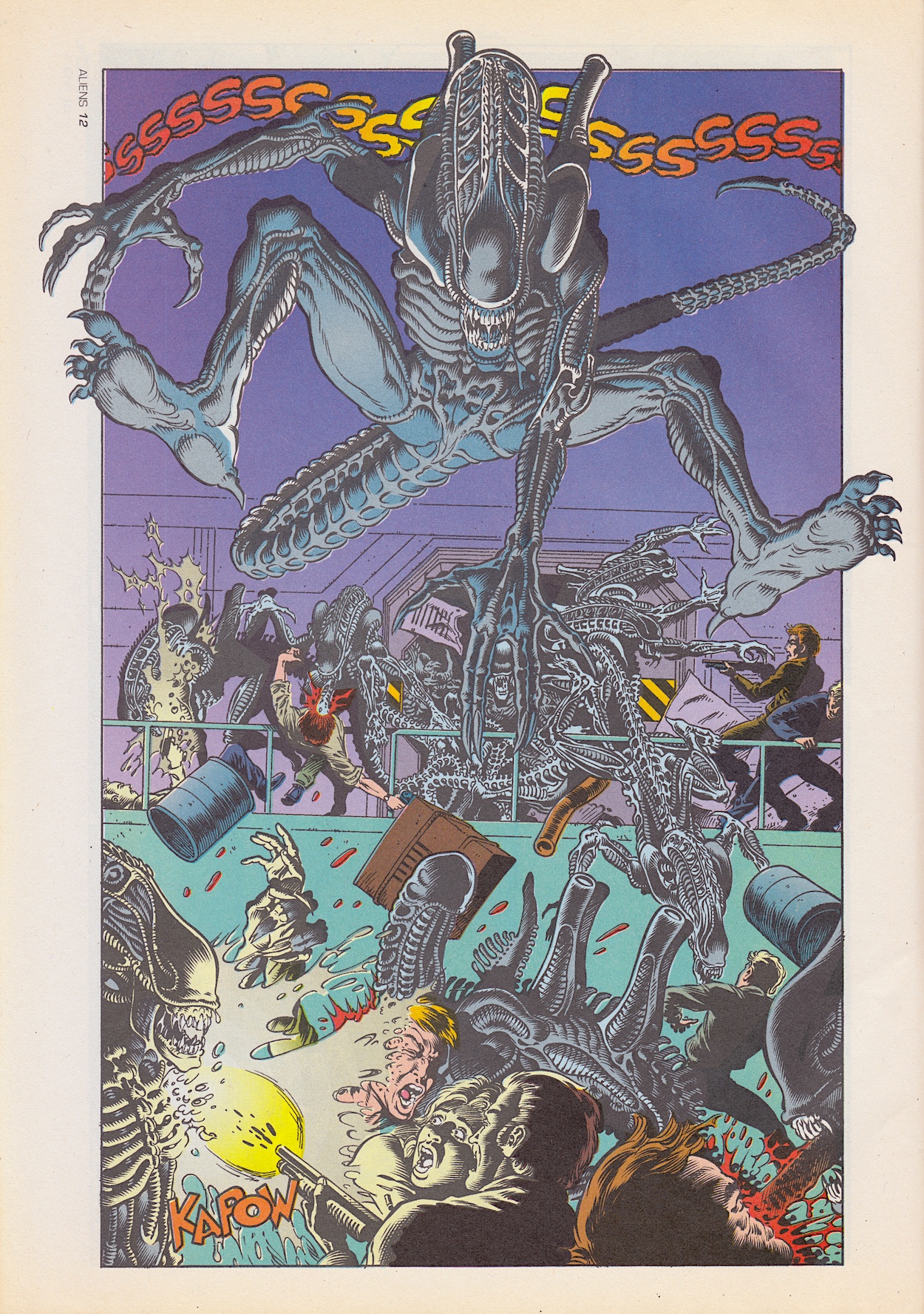
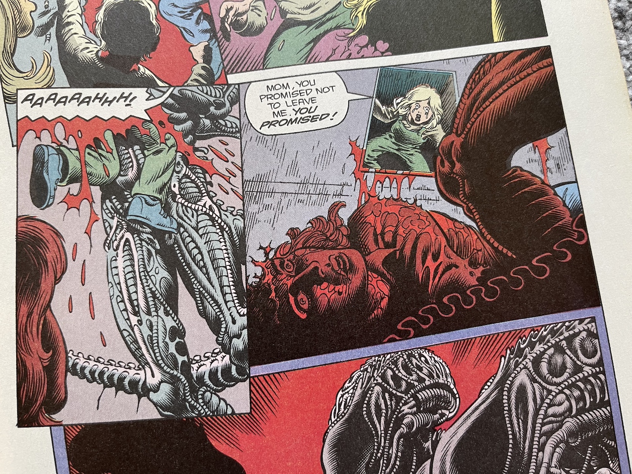
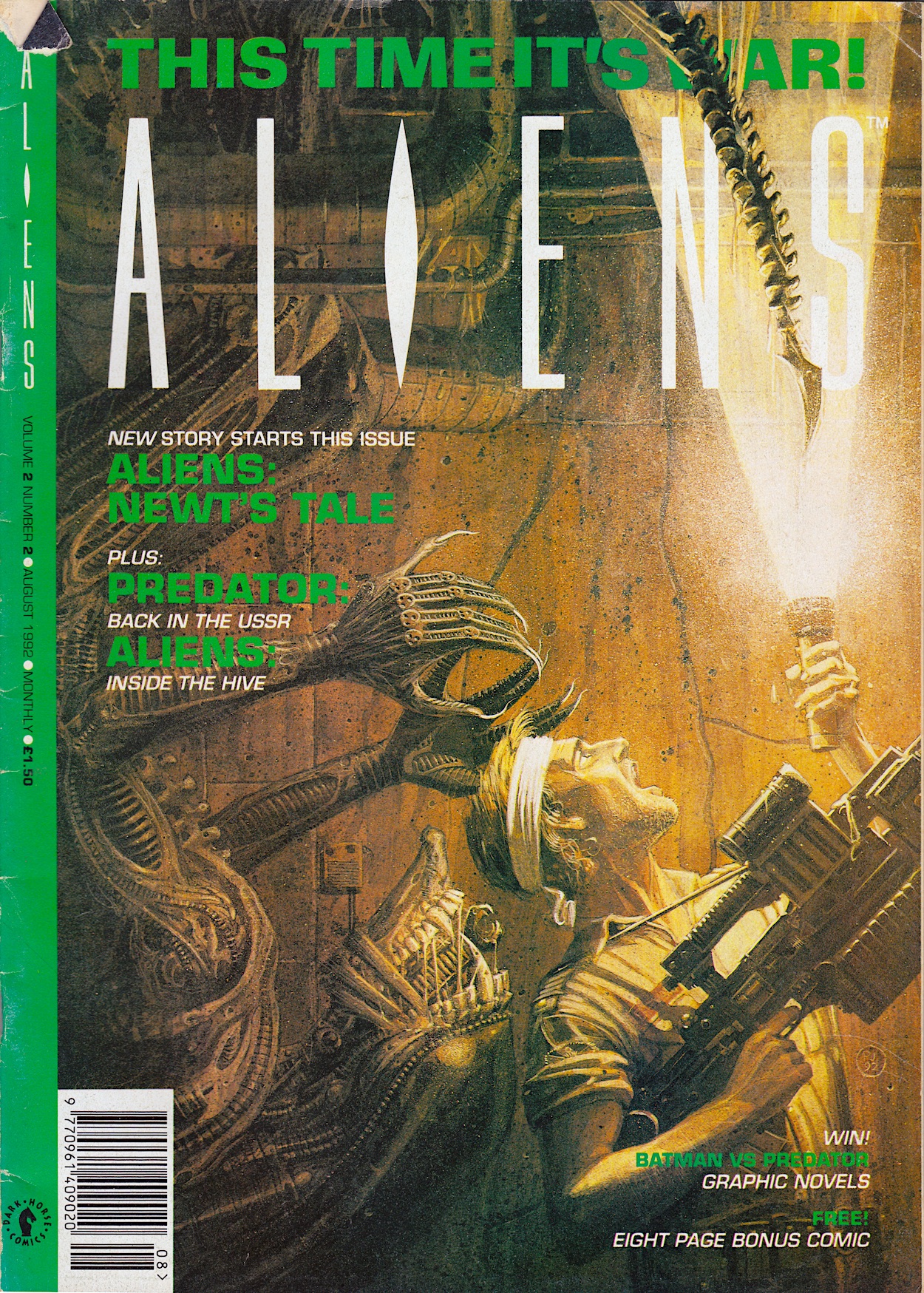
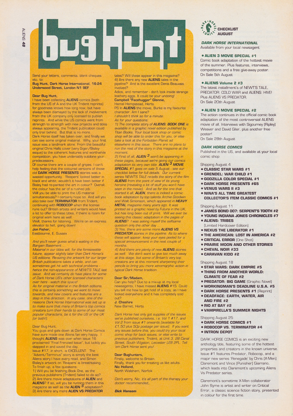
When I read Dark Horse International’s UK Jurassic Park comic I wondered what marketing it may have received in their other titles. Throughout the reviews you’ll see adverts for the likes of Total Carnage, Manga Mania and what could probably be described as their flagship comic, Aliens. It’s on the back page of an issue of that film spin-off that I spotted a full-page advertisement for the new movie tie-in comic.

As I announced last Christmas, Aliens will be coming to the blog this year in a real-time read through of Dark Horse’s time with the licence (UPDATE: Now live). Whenever I buy classic comics from eBay I don’t read them until I’m scheduled to do so for the blog, but I do flick through them, solely checking the page numbers to ensure there’s nothing missing. As I picked up #13 (on sale 24th June 1993) to begin flicking from the back cover to the front, counting down the page numbers as I went, this jumped out at me.

As you can see, I wasn’t the only person something was jumping out on. Using the cover from #1 (by Gil Kane and George Perez), this is promoting the initial run of the adaptation of the film, before the American comic began publishing the first official continuation of the story. At this point in the US bets were hedged before telling readers it was an ongoing comic, so naturally over here they’d do the same. Released every three weeks to start with, it all began on 8th July before the movie had even been released here.

The advert mentions how the art of the strip was based on stills from the movie, which is a strange boast to make. It makes it sound like it could be nothing more than traced-like images, but of course in the end it was a genuinely good comics adaptation which successfully tinkered with the script and the running order of the scenes so it’d work better on the page. Well, for the most part anyway, until they got to the final chapter. You can read the reviews to see what happened there.

The Jurassic Park comic would prove popular enough to survive many cancellations at Dark Horse

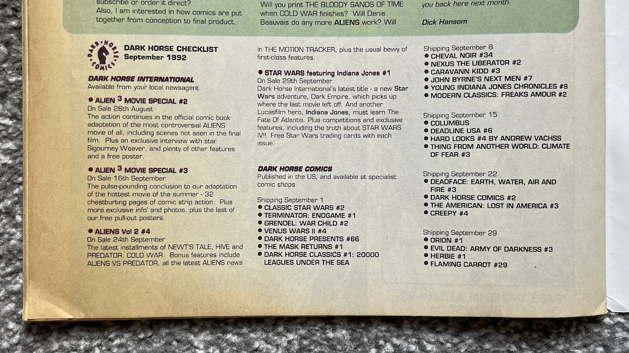
Strangely, it’s advertised as a 32-page comic when it actually had 36, but then again Dark Horse didn’t seem to count their covers in the total. Then in a later issue of Aliens (#17) I discovered the exact same advert again minus the green text along the bottom. However, the promotion of a competition with “50 (count them) 50 fantastic prizes” only applied to #1 and not the competitions in the issues on sale at that later time. What does correlate properly are the Dark Horse Checklists.

In each of the early editions of Jurassic Park the checklist showed the upcoming comics that would be on sale over the next month, so they contained details of the next issue. This means we never got to see the checklist released for the premiere issue to see what it had to say, but #13 of Aliens does, just a couple of pages before that advert.

By the time Jurassic Park moved to a monthly ongoing format with brand new stories set after the movie the checklists were dropped from it. There just wasn’t room anymore, however they still appeared in the larger Aliens. Below is the one which promoted the beginning of the first official sequel to the movie, although it unfortunately doesn’t mention the completely awesome Age of Reptiles back up strip.

The question marks might look like they’re keeping the free gift a mystery for some reason, but it’s actually just placeholder text that they’ve forgotten to delete before going to press because #6 didn’t come with a free gift. A few sloppy errors aside it’s interesting to see how one of my favourite childhood comics was marketed to potential readers.

After the movie proved to be such a phenomenal success I thought they’d have advertised the comic more, that they’d have at least produced a new advert to promote the new stories instead of recycling the one they’d already used before the film’s release. Oh well, hindsight is a wonderful gift. The Jurassic Park comic would prove popular enough to survive many cancellations at Dark Horse, only succumbing to the folding of the company itself towards the end of 1994. You can read reviews of them all on the blog right now.

JURASSiC PARK MENU

SPEAKEASY #76: ‘PAPER PRESS PiGS

This is #76 of Speakeasy, a sort of newspaper about the UK comics industry which began life as a fanzine in 1979 and would go on to become a monthly resource for comics fans and the industry for over 120 issues, all the way through to 1991. Above is the front cover as it would’ve been seen on the shelves, fitting in perfectly with all of the other similarly-sized UK comics. However, that wasn’t its true front page.

I think this was rather neat! It opens out to tabloid size and is printed on similar newspaper stock. With 20 of these huge pages there was certainly plenty to read in the days when we relied on print publications to deliver us our comics news. Bambos Georgiou, who drew Blimey! It’s Slimer in The Real Ghostbusters (after Lew Stringer’s early issues) was editor at one stage, although by now that job was Richard Ashford‘s.

Bambos is credited as the ‘UK Correspondent’ but in reality publishers Acme Press Ltd was the creation of his, Richard, Cefn Ridout and Dick Hansom, who readers of the blog may know better as the editor of Dark Horse International’s Jurassic Park and Aliens comics. The connections with other blog comics continues as Death’s Head/Dragon’s Claws/The Sleeze Brothers editor (and friend of the blog) Richard Starkings designed the logo.

It’s a meaty read and there’s a lot packed onto each page but I did spot this blink-and-you’ll-miss-it reference to Visionaries, although it’s short on details. This issue of Speakeasy went on sale on this date back in 1987 and the American Visionaries comic would launch as a bi-monthly in November, not coming over to this side of The Pond until Spring 1988. Also, the less said about that He-Man movie the better, yes? I still shudder with the memory of the one night I watched it back then!

So anyway, why am I showing you this issue of Speakeasy? Simple, it’s because OiNK gets a mention. This shouldn’t really be surprising news when you spot a page summing up a lot of that month’s releases, however there’s more to it than that as far as OiNK is concerned. It mentions the banning of the comic from the kids’ shelves in W.H. Smith (boo!) and the surprising revelation to me that John Menzies didn’t stock it at all!

I remember visiting a John Menzies in Oban in Scotland as a teen, when we spent summers in a small village in the highlands of Scotland, and I’d spend my hard-earned waiting staff wages on games for my Commodore 64 that was waiting for me back home in Northern Ireland. If I’d known, I’d have went elsewhere. However, as you can see the column here says they were only losing OiNK about 10,000 sales per issue. Yes, it’s not to be sniffed at when you’re the publisher, but when OiNK was selling 100,000 and more per issue I honestly thought the figure would’ve been higher.

I do like the fact Speakeasy calls for its readers to do the complaining now and gives us the address to write to one of the newsagents in question. “Bring Back the Bacon to Where It Belongs!!” Love it! You can check out the reviews for the two issues mentioned here, #34 and #35 on the blog. No mention though of how these two issues saw the transition between original publisher IPC Magazines and Fleetway Publications.

This full-page advertisement for that year’s UK Comic Art Convention stood out to me as well thanks to a couple of photographs I’d already seen that were taken at this very event. You’ll see Tom Thug and Pete and his Pimple cartoonist Lew Stringer’s name on the page as a confirmed guest, alongside OiNK contributors Kevin O’Neill and Dave Gibbons and several of the talented creative team from Marvel UK’s Transformers.

Not mentioned are more of Uncle Pigg’s finest workers who all appeared at an OiNK panel during the weekend. Below are two photographs kindly supplied by Lew showing the team taking questions from the audience with their 80s hair dos in all their glory (and Lew rocking the OiNK t-shirt).

In the first photo (from left to right) we have the panel’s moderator Theo Clark, then Lew himself, Ed McHenry (“swigging pop” according to Lew), David Leach, Davy Francis hidden behind him and Jeremy Banx! In the second photo you can see Ed more clearly and on the far left is Viz co-creator Chris Donald. OiNK was at the height of its popularity at this point, (despite the best efforts of the aforementioned newsagents) having just enjoyed its first anniversary, the release of its first Holiday Special, the first annual was in the can and some of the comic’s best issues were about to hit the shelves.

Also of note to blog readers (and readers of its social media) is a little bit about Transformers and Action Force (G.I. Joe), namely Dave Gibbons drawing the cover to #133 of the former which is worthy of a mention in the news and there’s also a preview of his art. Action Force gets more space here with the announcement of a monthly comic to compliment the weekly, for sale both in the UK and as a way of repackaging British stories into a smaller comic to sell in the States.

The thing is, while it states here that this new comic would be released in a few months, Action Force Monthly wouldn’t appear until the following summer after the weekly had already been cancelled and merged with Transformers. It’s interesting to see it wasn’t originally planned as a replacement for the cancelled weekly but instead fans of Duke, Snake Eyes and Scarlett were meant to have both a weekly and a monthly to enjoy every month.

OiNK may have only got a small mention here but I’m always on the look out for my favourite comic of all time popping up in media of the day. It was nice to see it being taken seriously in the pages of Speakeasy and the call for support to get it back among the children’s comics. Speakeasy itself is a fascinating snapshot of the medium in the 80s and if you’re a fan of the decade’s comics you could do worse than picking up a few issues to see how your favourites were reported on.

GO TO SPEAKEASY 81

OiNK MEDiA COVERAGE

MAiN OiNK MENU

RiNG RAiDERS LiCENSEE STYLE GUiDE: PART FOUR
Have you ever found out something about your childhood many years later and wondered how you never noticed even though it was so glaringly obvious? In the case of this blog it could be how I never clicked that the TV show Round the Bend was created by OiNK’s editors! As for the Ring Raiders it’s something small but even more obvious, the colour of the canopies on all of those planes I collected.

Welcome to the fourth part of my look at every single page of the Ring Raiders Style Guide sent out to licensees in 1989. We’ve covered the introductions and details of the range, the characters and their all-important aircraft and now we move on to the Product Art Reference section. Here, Those Characters From Cleveland (TCFC) described how they expected their creations to be shown and a concept artist drew up some fun merchandise ideas, making this my favourite part of the whole folder.

The introduction reminds licensees the planes are the focus, which is an obvious point since it’s all based around those superb Matchbox toys. Of course, Barrie Tomlinson’s comic understood the significance of focusing on and developing the characters in order to tell good stories with those planes. Coming to this as a fan of the comic I initially found it strange how they were trying to tell artists specific ways to draw their creations, but of course this wasn’t aimed at dynamic comic strips. Instead, this was for those making other merchandise based solely on static representations of the aircraft.

In fact, when I spoke to Barrie about the Ring Raiders comic he told me how some licence holders didn’t understand the medium and would analyse every single frame as if it were an individual image instead of a sequential piece of art. Thankfully TCFC were apparently much more knowledgeable about comics. This page mentions my point about the canopies, how the Ring Raiders all had blue canopies and the Skull Squadron‘s were all red. A quick glance on eBay proves this point and I’ve no idea how I didn’t notice that pattern as a kid!

This full-page piece shows how some of the aerial action could be portrayed and I think it’s a great scene! It’d certainly make for an awesome poster if it was blown up a lot larger. I particularly like the lighting on Scorch’s Torch and seeing inside Vector’s cockpit. In fact, it’s only upon seeing this that I realised the airplane controls weren’t something we really saw in the comic, apart from the sci-fi element of the rings. Yes, I just love this and it’s a shame we don’t know who drew it.

The next five pages are my favourites because they give me an insight into all of the cool (and not so cool) things I no doubt would’ve wanted to adorn my bedroom (and my body) with if the franchise had taken off. These weren’t officially released, TCFC used these to promote possible ideas to companies as a way of convincing them to work on the franchise. Unfortunately I don’t know the artist whose signature is on these pages. Hopefully I’ll be able to find out in the future.

In the introduction to this section colourful checkerboards were mentioned as a way to add borders and banners where needed and the artist shows how these could work on some particularly gaudy clothing. Hey, it was the late 80s and in their own way Ring Raiders may have been ahead of their time as we slid into the 1990s. I mean, have you seen the fashions of that latter decade? We even wore shell suits for goodness sake!

I started secondary school in the autumn of 1989, the year of the range’s launch, so I doubt any of these clothes would’ve been aimed at my age range. I also doubt any of my friends would’ve let me forget if I’d turned up wearing any of them. However, given how retro inspired clothes are all the rage today, and it seems the more colourful trainers are the better, I think one of the items below might still sell to a select audience.

Okay, so those who are still fans of the Ring Raiders may make for a rather niche market but when you look at some of the celebrity ranges or those based on other retro franchises they don’t look too out of place. The slippers and their tiger design (to match that of “Cub” JonesF-5) might also work without that green and blue strap; I certainly know a friend who loves animal print, although the plane might put her off!

On the final page of wearables, is there anything more 80s than roller-skates and sweat bands? Initially I thought the top-down view of the Victory 1 F-19 Stealth Fighter was a more custom skate, but when I couldn’t figure out where you’d put your foot in I clicked it’s actually one of those novelty skateboards that were so popular back then. As a kid I wasn’t really into sports so these wouldn’t have been on my Christmas list, but that’s certainly not the case with the items on the next page.

How much do I want that lamp even now as an adult? I remember cutting out the main title logos from my toy packaging and sticking them all over my room alongside the posters from the comic, I even had a large one on the door to my room instead of the usual name plate. I was crying out for more official merchandise to be released. As such, that clock would have looked good on my wall and I think modelling a laundry basket on an airfield’s windsock is ingenious. It may even have helped keep my room tidy!

While these are just a way of throwing out ideas for licensees to work from, I think they’re great fun. In the Ring Raiders: In Real Time introductory post you can see some of the official merchandise that was released at the time and you’ll see that checkerboard pattern plenty too. Also in that post is a photo of a mocked up child’s bedroom where everything seems to have the branding of the range. It’s a somewhat ambitious photo on the part of TCFC but you have to aim high, right? Plus (again) it was the 80s! This was the way of things.

These two pages round off this section of the folder and show the great idea of having different emblems for each of the leader craft. I never saw these on any of the toy packaging or in the comic so I’m assuming they never ended up as an official part of the branding. While each Commander’s aircraft was accompanied by three other planes in a pack, I like the idea of the lead planes being promoted this way.

I can imagine some of these being turned into badges or, to be really 80s/90s they could’ve been material patches to be sown on to denim jeans and jackets. I particularly like the ones for the Galloping Ghoul P-51 Mustang (a favourite from the toy range), Kirkov’s Comet F4 Phantom II and the Sky Tiger. This whole section sums up the fun manufacturers and us kids could’ve had with the Ring Raiders as the next big craze of childhood.

Where has the time gone? We’ve only got one more part of this monthly series to go. The final few pages deal with more serious stuff like trademarks and the legal side of things, as well as approved logo variations, typography and some samples of the packaging that would be adorning toy stores around the country and the wider world. So make sure you fly back here on Monday 13th May 2024 for the final landing.

PART THREE < > PART FiVE

LiCENSEE FOLDER MENU
RiNG RAiDERS MENU

MY MUM: iN MEMORY

A few weeks ago I lost my mum. It was cancer, as it always seems to be these days. I was with her on Christmas Eve 2019 when she was given her diagnosis, when the doctor told her he couldn’t give her any timeframe other than to say it could be six-to-twelve months or it could be years. She passed away over four years later and lived her best life in that time, surrounded by friends and family, always so giving to everyone she loved.

I can still remember my mum rolling her eyes at some of the things she’d see in my OiNK comics and laughing over Christmas 1987 as I showed the cheeky front and back covers of the OiNK Book to every one of her friends that visited over the holidays. She always encouraged my reading. While she may have complained when another comic came along that I wanted to collect, later in life she said she’d always been so happy I was asking for comics instead of sweets every time we went to the shops.

My comics really helped my reading comprehension as a kid and mum encouraged me to read more and more, always filling my stocking every Christmas with books from The Railway Series and always happy (though she’d quibble to me at the time) to give me money to buy comics and computer magazines throughout my younger and teen years.

In 1999, when I decided to forego a full-time job and go back to college to study media and writing she didn’t hesitate to back me, knowing that I was still trying to work out what I wanted to do with my life. Even if she didn’t always agree with decisions I made in that regard, the most important thing for my mum was that I was happy and following my heart. Every new job I tried she was right behind me. I was in my 40s before I realised what I wanted to do and my mum was still encouraging me.

I could wax lyrical with memory upon memory of growing up with my mum but where do you even begin choosing which ones to write about? Instead, I wanted to focus on those associated with my writing and thus this very website; how she was always there to help when times got hard, always there to check that I was still happy, always there to make sure I wasn’t giving up on my dreams, always there to spur me on and let me know she wanted me to succeed.

It breaks my heart that it’s only now that things are developing the way I wanted them to, that she’ll never see what happens next. After talking to her so much about it over the years, the fact I won’t be able to share any of these things with my mum seems so unfair. Without her I’d have given up by now; I simply wouldn’t have been able to get to this stage without her help and support. I wish she was still here to share this with me.

While I’m sure my friends are right when they reassuringly tell me my mum was always proud of me, I feel her spirit is pushing me on and I’m working hard to make her proud of what I’ll achieve. I look at her photo in my living room from my cousin’s wedding in 2015 and I tell her what I’m finally working on and I know she’d be so happy. (This is the last photo taken of us together in fact. I always take photos of others but so rarely do I put myself in them! This has made me realise I have to correct that.)

Just you watch, mum!

If you’re lucky enough to still have your parents in this world with you make sure you phone them, visit them, and tell them you love them. You just never know when the last time will be the last time.

Love you mum. ❤️

PERSONAL POSTS

Classic Comics in Real Time