Category Archives: Comic Reviews

BRAM STOKER’S DRACULA #2: HUNGRY LiKE THE WOLF

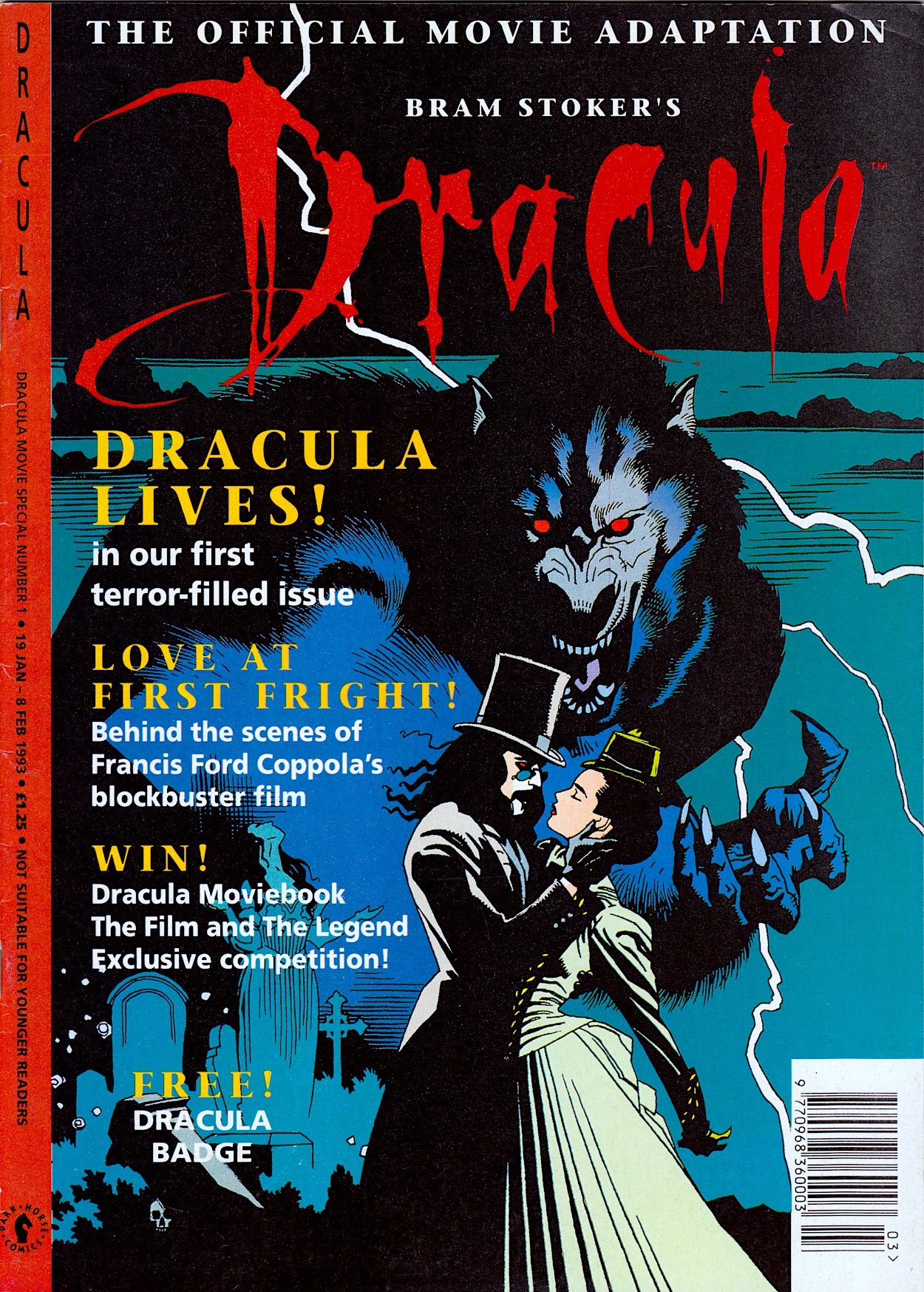
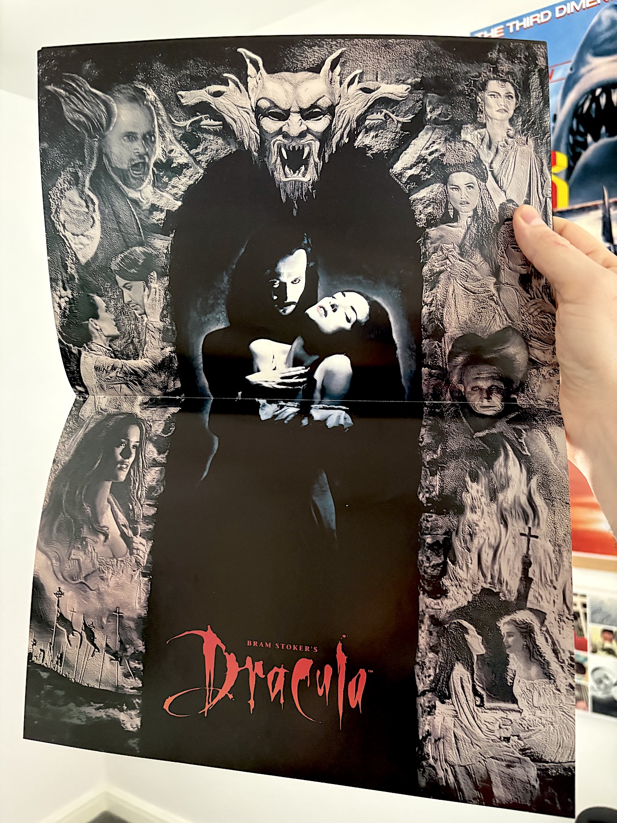
This evocative cover by John Bolton (Jurassic Park, Aliens, Black Dragon) shows us Count Dracula descending on poor Lucy Westerna (played by Sadie Frost in her first film role) and it has me wondering exactly what the comic will show from certain scenes in the film. We’ll find out as we creak open the coffin lid and gaze upon #2 of Dark Horse International’s Bram Stoker’s Dracula. But first, I assumed my copy would be missing its free gift and was very happy to be proven wrong with this glossy movie poster still attached to the staples!

Returning to the opening pages and again Anthony Hopkins’ voice welcomes readers to the second chapter of the movie adaptation, which three weeks ago I praised for its art direction, style and atmosphere. Although, at times it could be confusing to anyone who hadn’t seen the film in a while. This was because some scenes didn’t translate that well to the page. Fortunately, this time around there’s less of this criticism to be found.

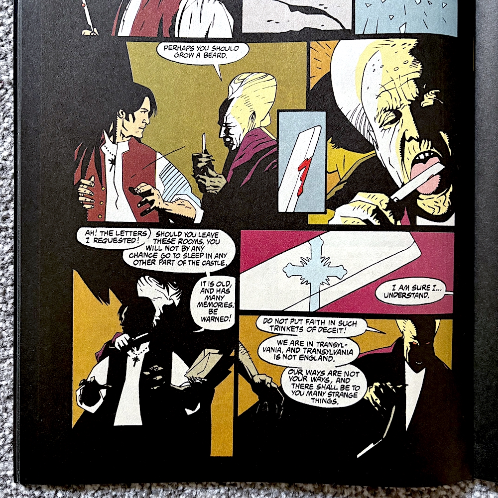
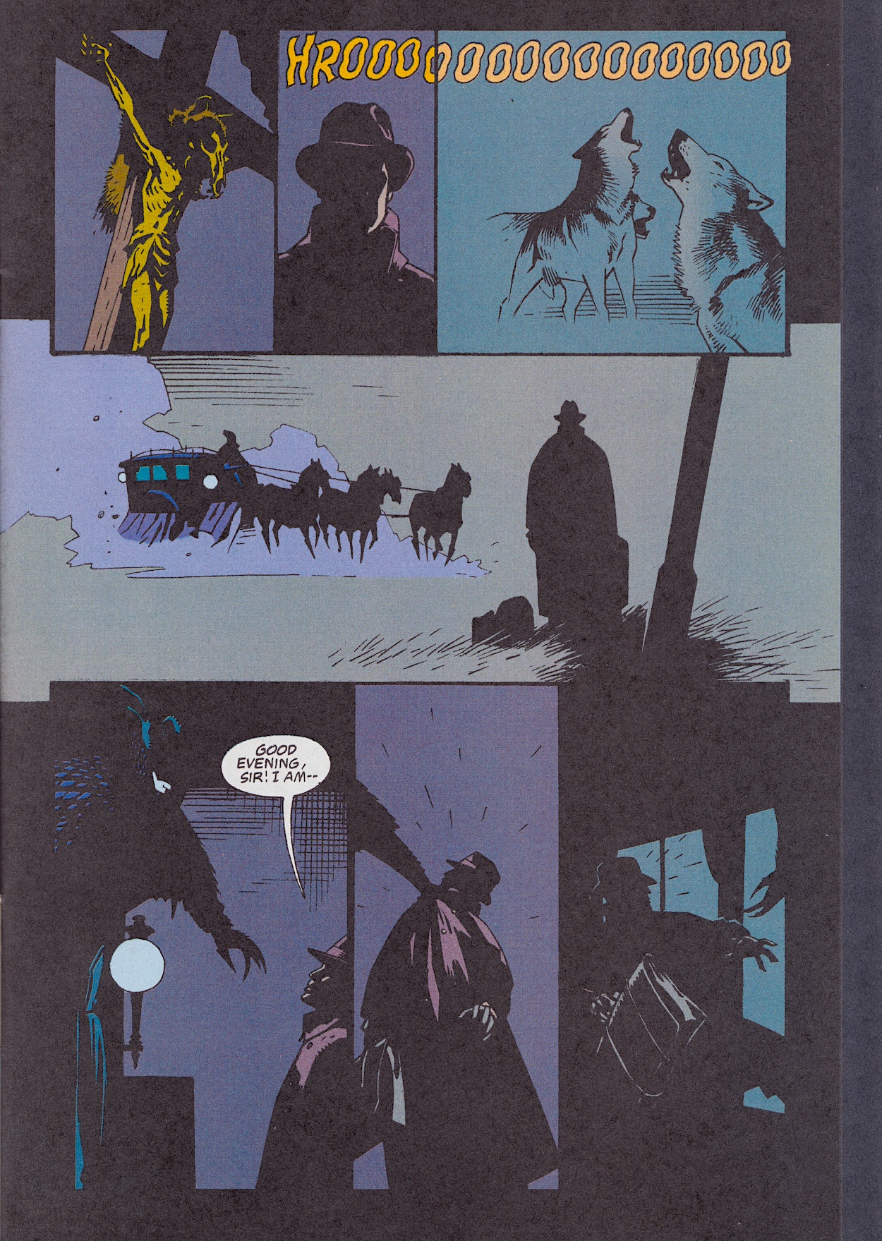
We kick things off with Jonathan Harker (Keanu Reeves) trying to find his way out of the castle and instead traipsing through a living nightmare, before trying and spectacularly failing to kill the Count while he sleeps. (This moment in the film belongs to Gary Oldman!) Over in England a vast storm unlike anything ever recorded has hit the country and we may be missing the powerful music from this moment but it plays in my head as I read the following few pages.

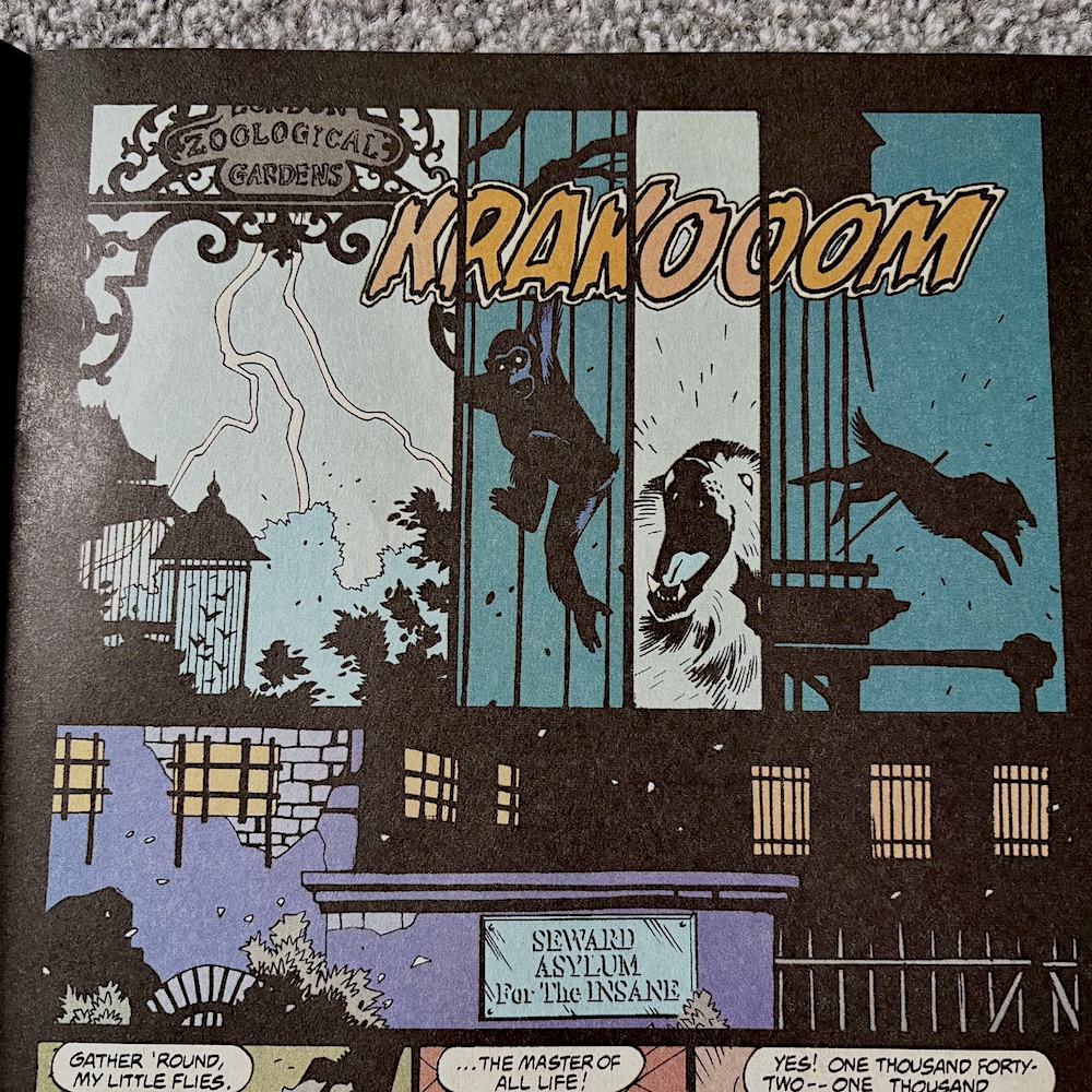
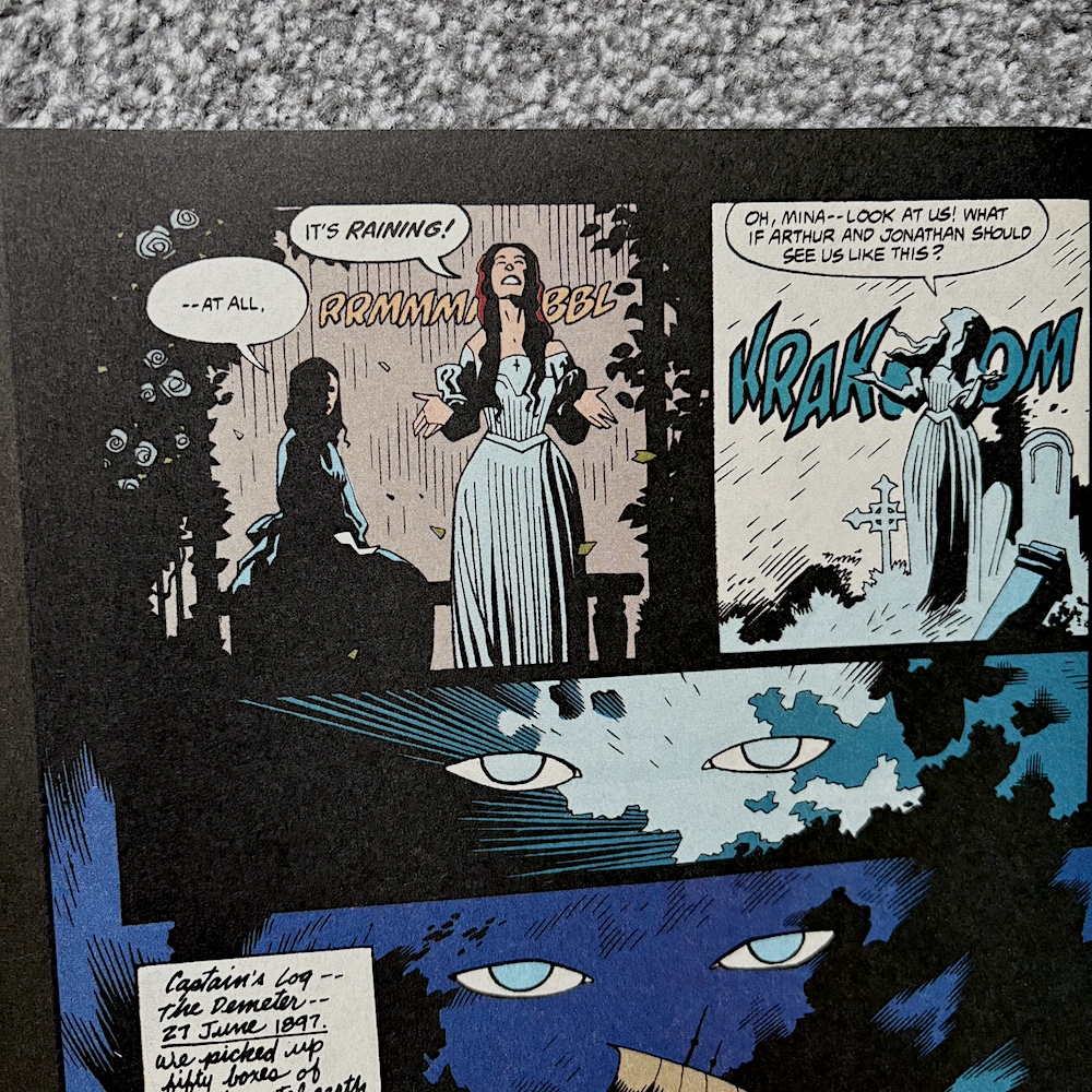
As we see the animals going wild and a wolf escaping the zoo, the rain soaking Lucy and the storm getting worse, we know it’s all because the ship with Dracula on board is getting ever closer, hence his eyes in the sky watching over everything. While the film offered no narration for this moment it was clear what was happening. It’s a very stylised moment, very Coppola, and can’t have been easy to bring to the page.

Any fan of the film will know what’s coming next

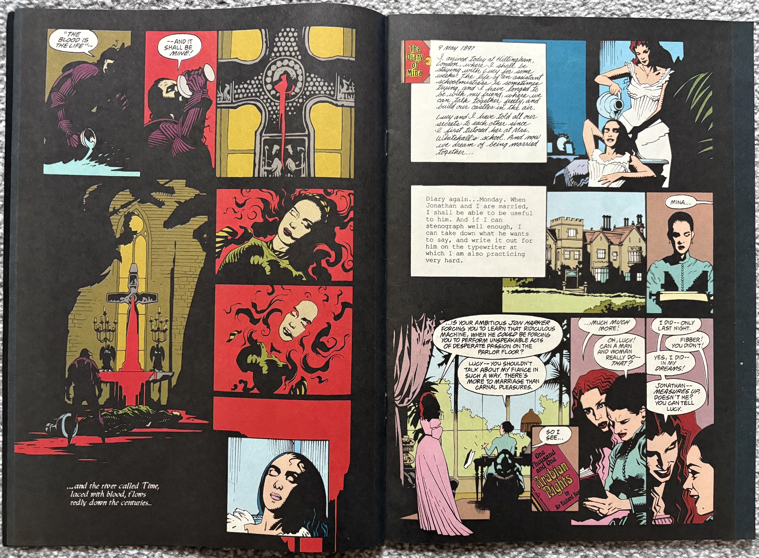
It works better than last issue, but of course I’ve seen the film recently so I don’t know how easily it could be followed without narrative captions for new readers or lapsed viewers. I personally like the fact there aren’t captions, just the diary entries now and again. It matches the film in this regard, but in a different medium should it have contained more text? The jury is out, but if you know the film (or even the original story) you’ll enjoy this sequence and the lovely, shadowy art once more by penciller Mike Mignola, inker John Nyberg and colourist Mark Chiarello.

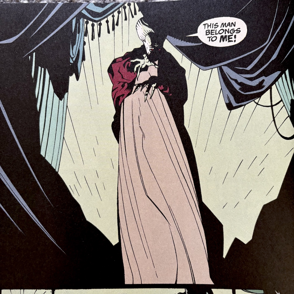
Any fan of the film will know what’s coming next and it relates to what I said about the cover. While there’s no obvious nudity it’s still surprising to see the scene play out in a comic if I’m honest. Although, without all of the dramatic build up and the actual horror and suspense leading up to this moment it feels a bit random and gratuitous.

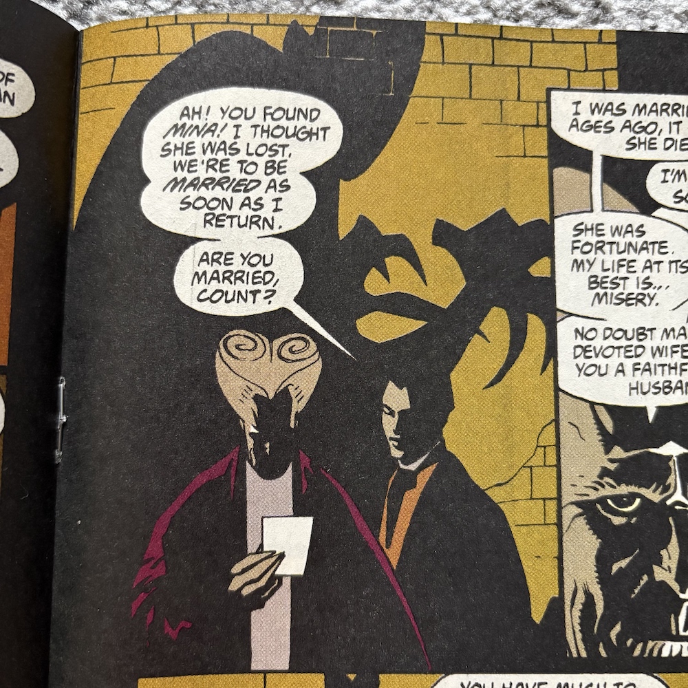
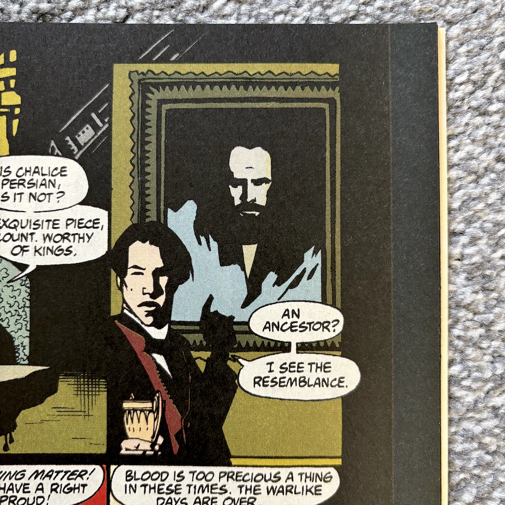
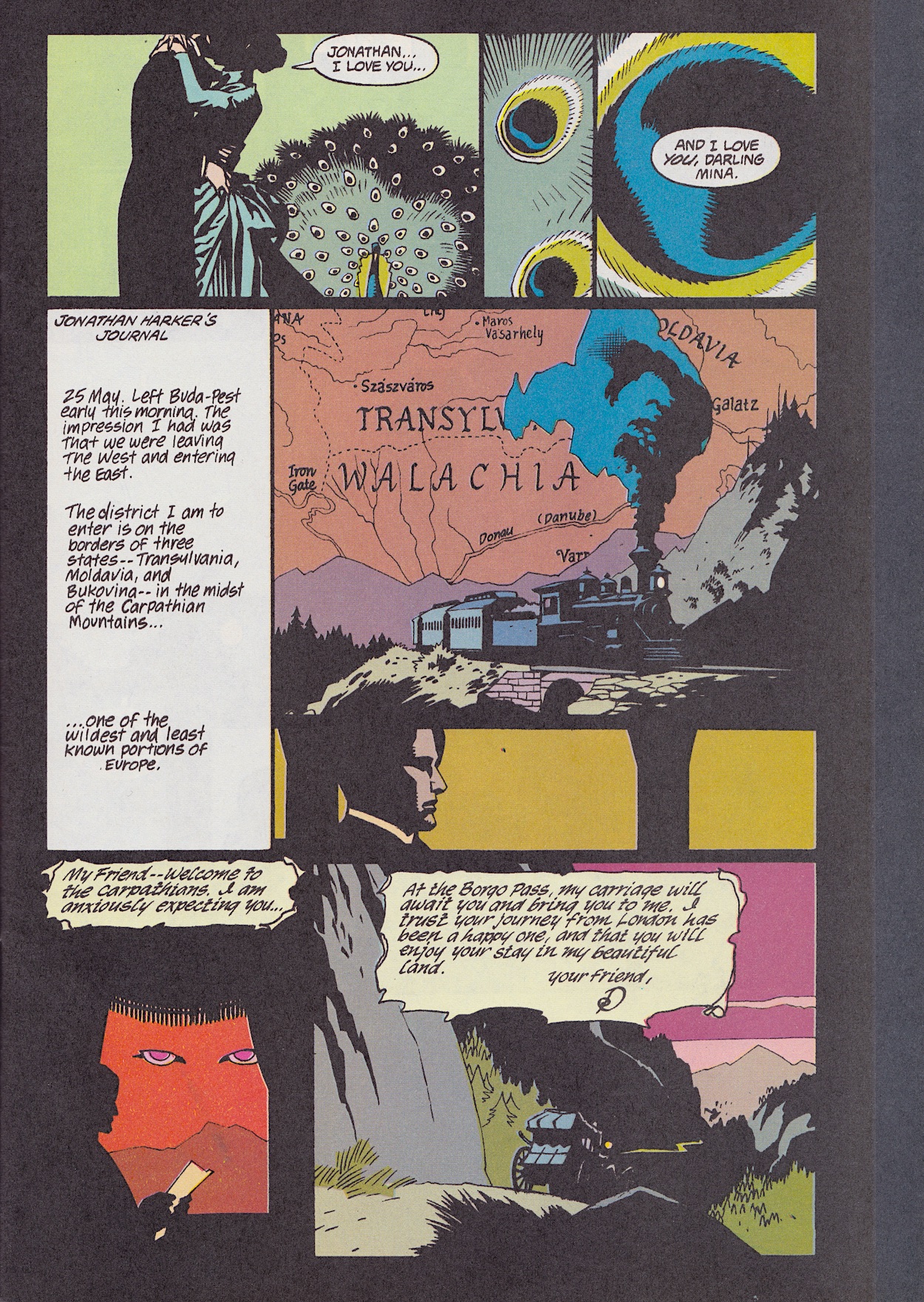
After this terrifying sexual encounter comes one of my very favourite scenes in the whole film, when Dracula and Mina meet properly for the first time on the streets of London and simply chat. Gary and Winona Ryder were perfect in this scene and it pretty much all plays out in the comic, taking up eight pages in total of Roy Thomas’ adaptation (his script lettered by John Costanza). Of course the medium doesn’t lend itself to translating the slow, deliberate acting in what is a touching, yet mysterious scene (unless you read it that way of course), but the art remains fascinating.

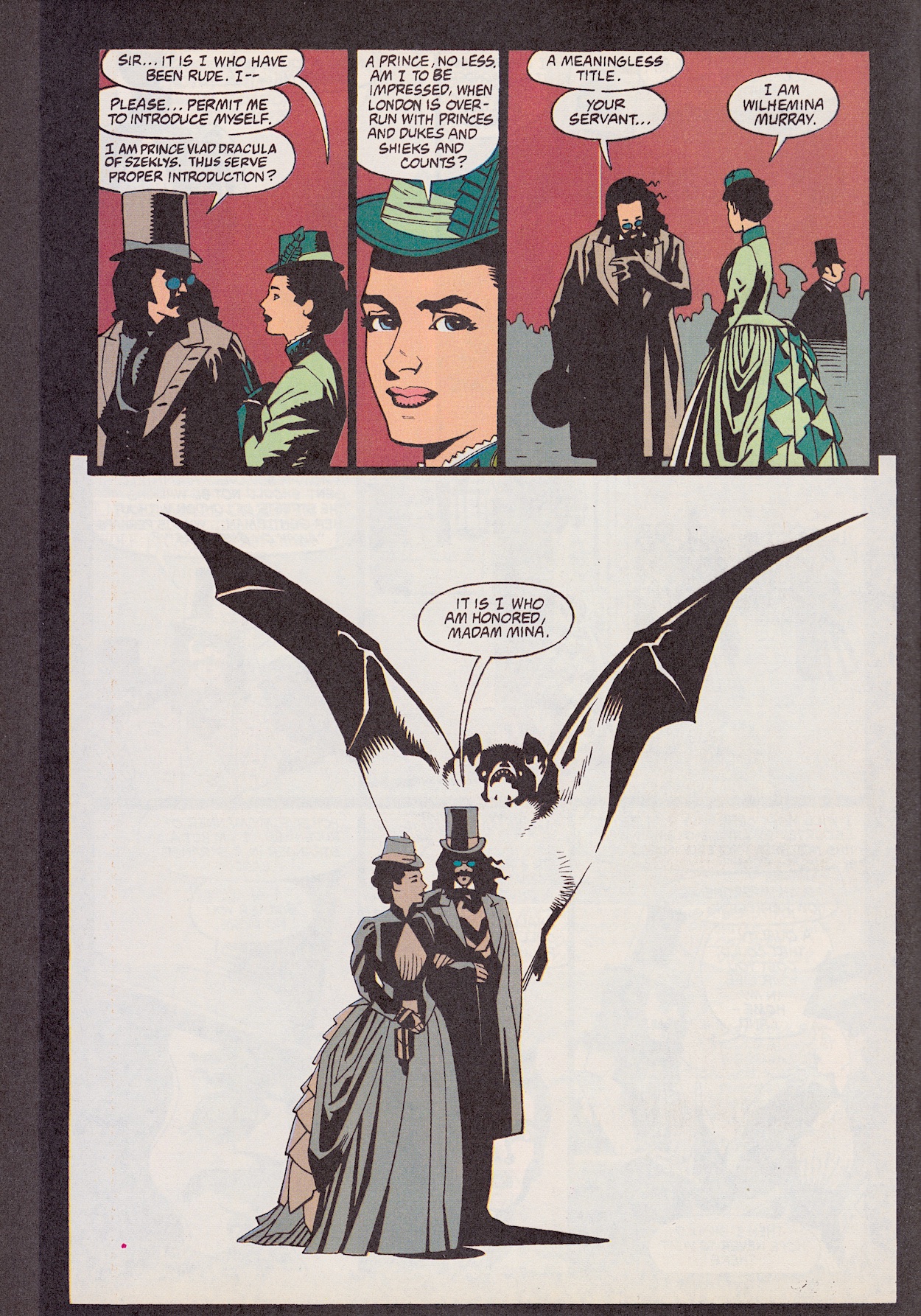
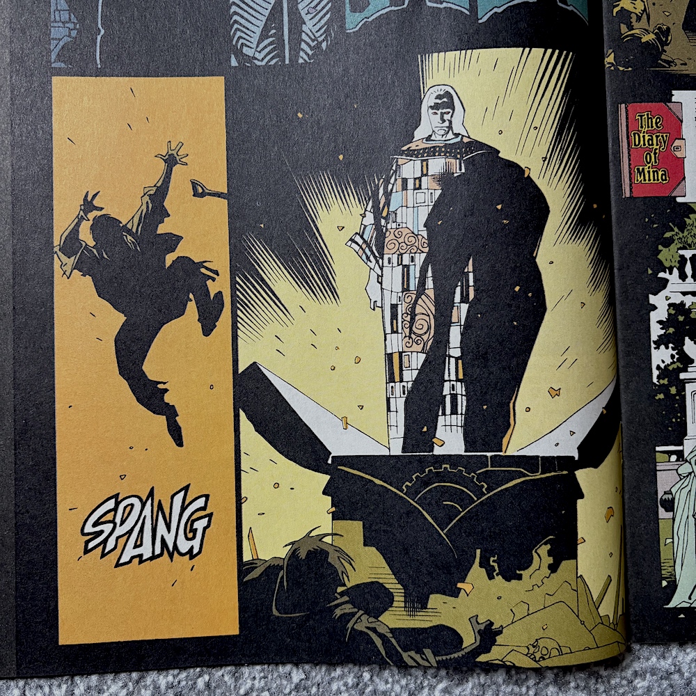
Their initial introduction ends on this image of a bat rising out of the scene against a pure white background. This is an example of the comic taking inspiration from the visuals of the film and producing its own to get across narrative elements of the story it may have otherwise struggled with. Opposite from this is the rear of the poster so coincidentally this feels like a natural chapter end in itself.

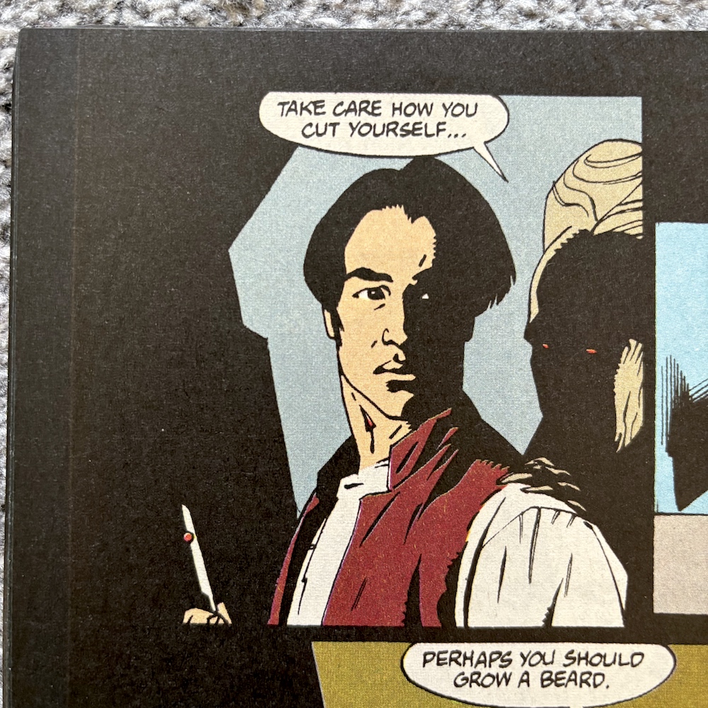
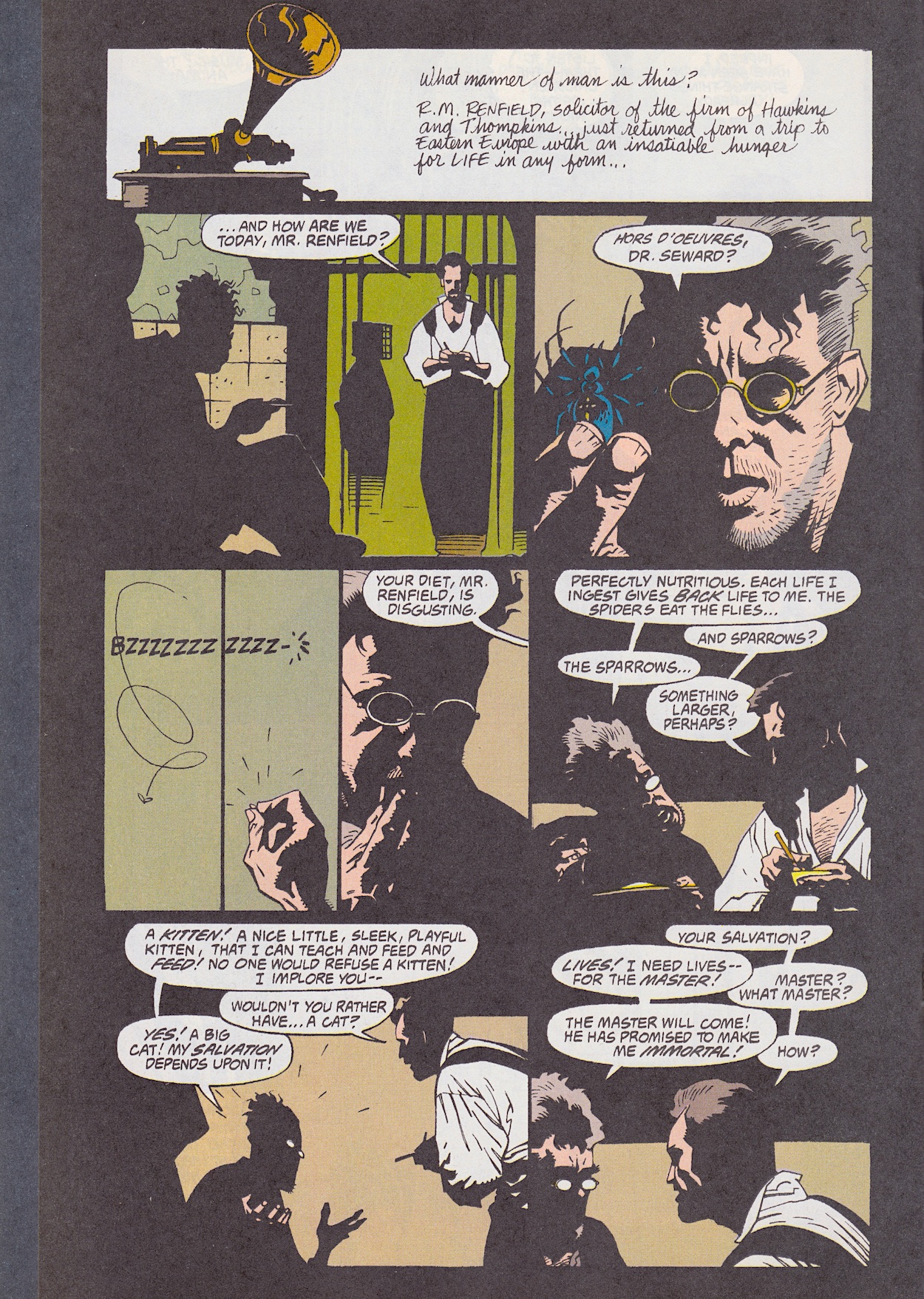
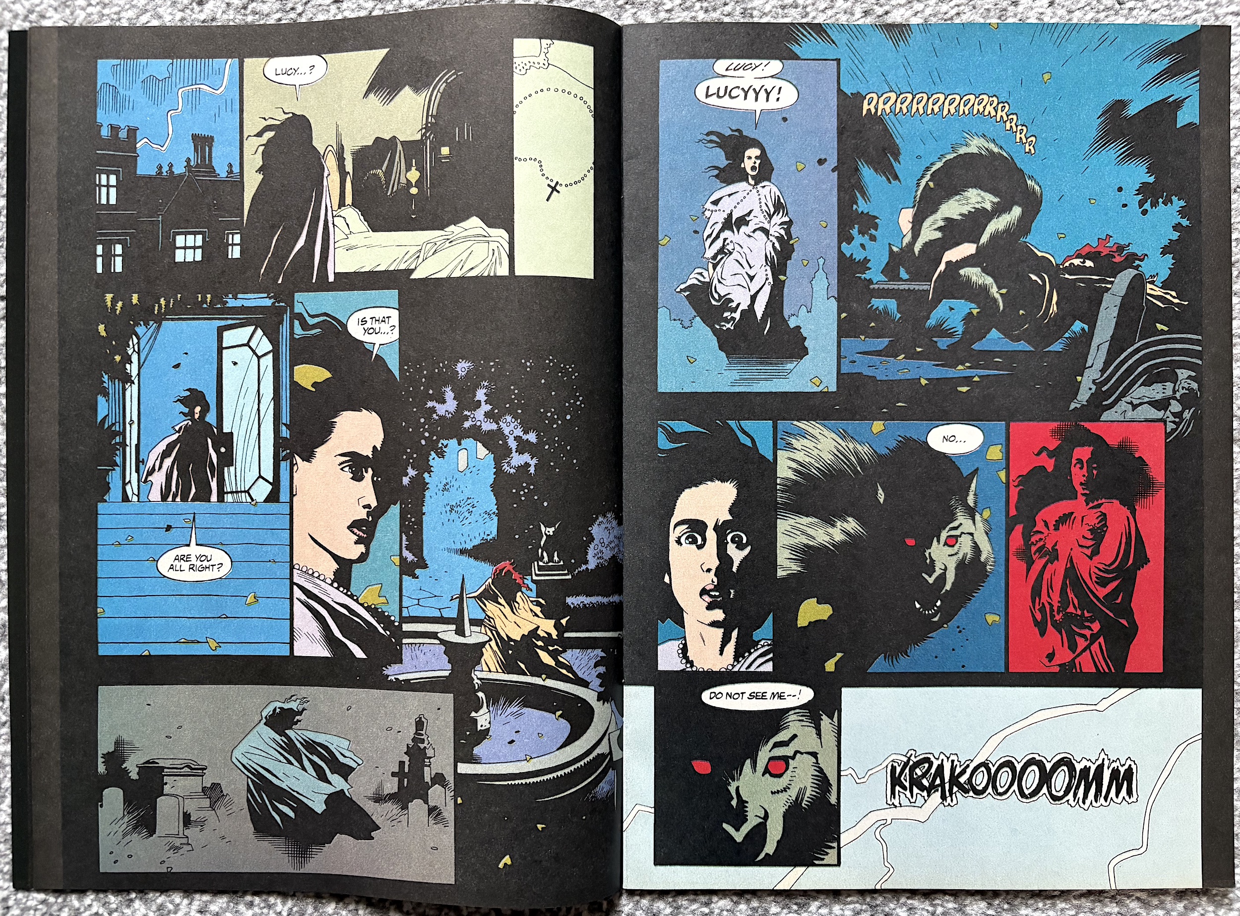
The comic has also improved its translation of such moments to the page. Take when Arthur Holmwood (Carey Elwes) comes to check on his fiancée Lucy, who has been in the care of Dr. Jack Seward (Richard E. Grant). The visual moment in question is actually a scene transition after Arthur agrees to bring in Van Helsing, finally admitting to himself there’s something ‘else’ wrong with his love.

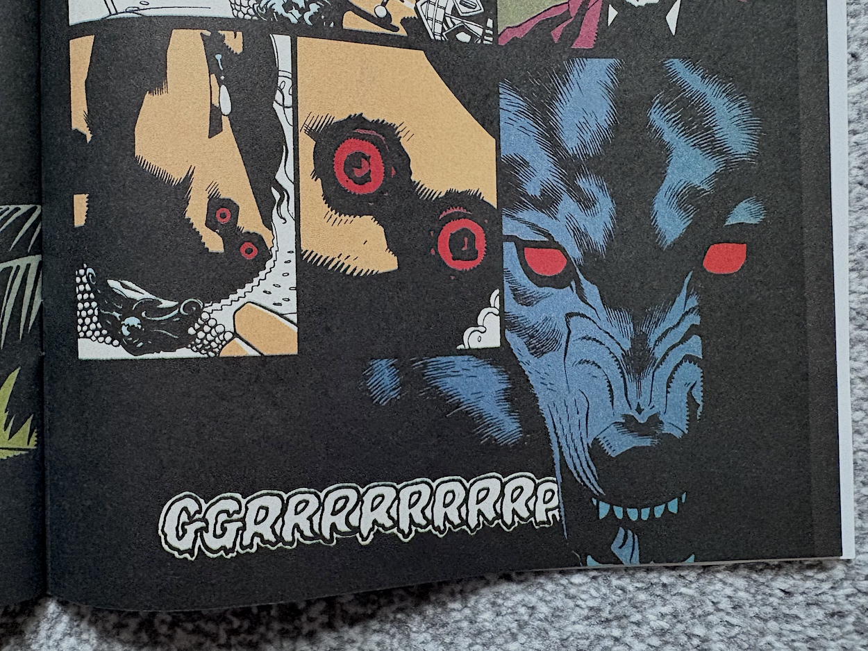
Lucy is holding onto her dress collar and we zoom in past it to see the two red holes in her neck where she was bitten by Dracula in his monstrous wolf man form. Just like in the film, as we get closer to the bite marks they turn into his eyes and then into the eyes of the wolf that had escaped from the zoo. This transition takes us back to the London scene, ending with ol’ Drac easily taming the wolf, and the wolf then letting Mina pet it; a key moment in the development of our lead characters’ relationship.

While earlier in this review I did lament how some scenes could’ve done with more explanation and room inside the comic, I’m glad to say the London scene isn’t the only one that gets space to breathe. Some of the smaller moments are actually given prominence, such as when Dracula arrives at the window of Lucy’s bedroom. 

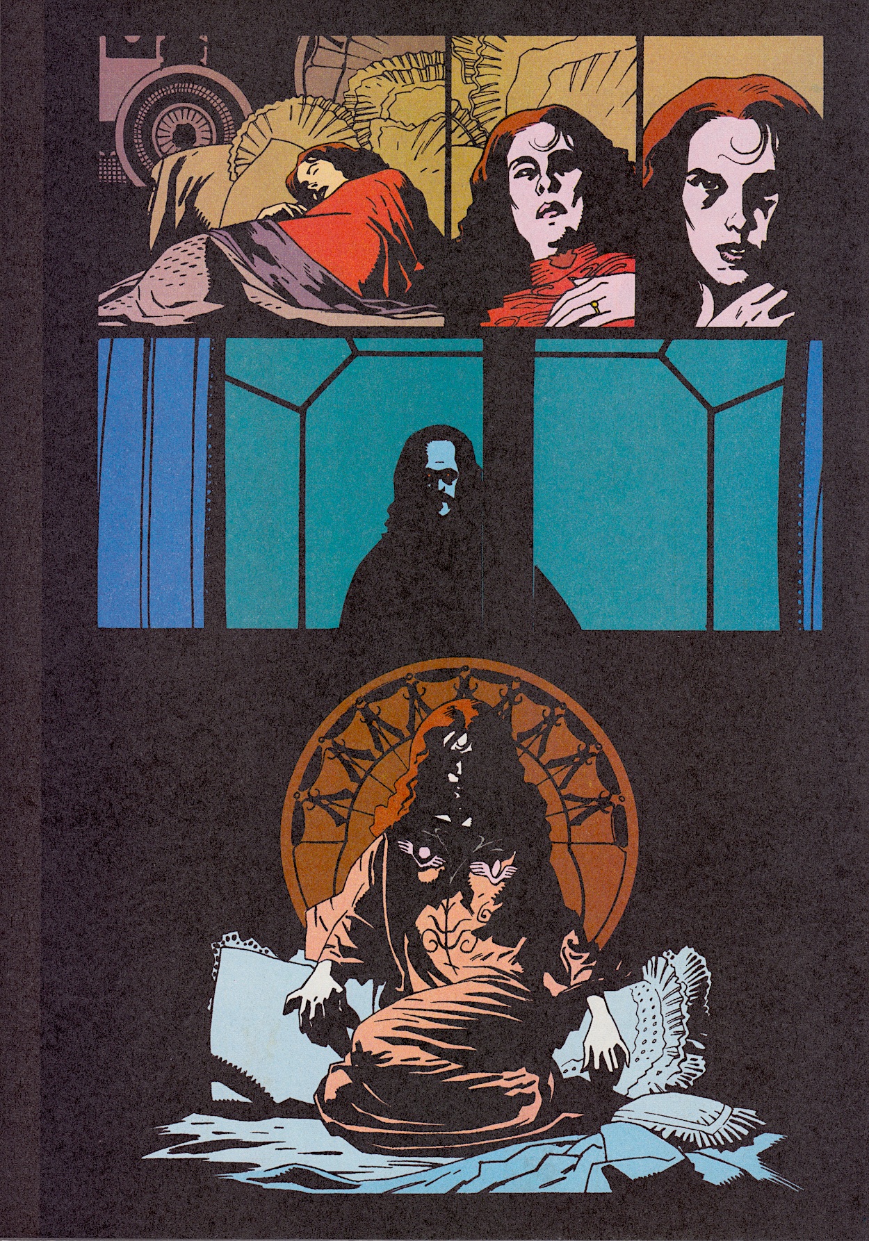
This could’ve been summed up in a couple of panels but instead it’s presented in a way that adds such atmosphere to the comic. In that regard I think it’s the best example to sum up the title as a whole and a page that could be framed for the wall by anyone who’s a fan of the film. Perhaps alongside that poster.

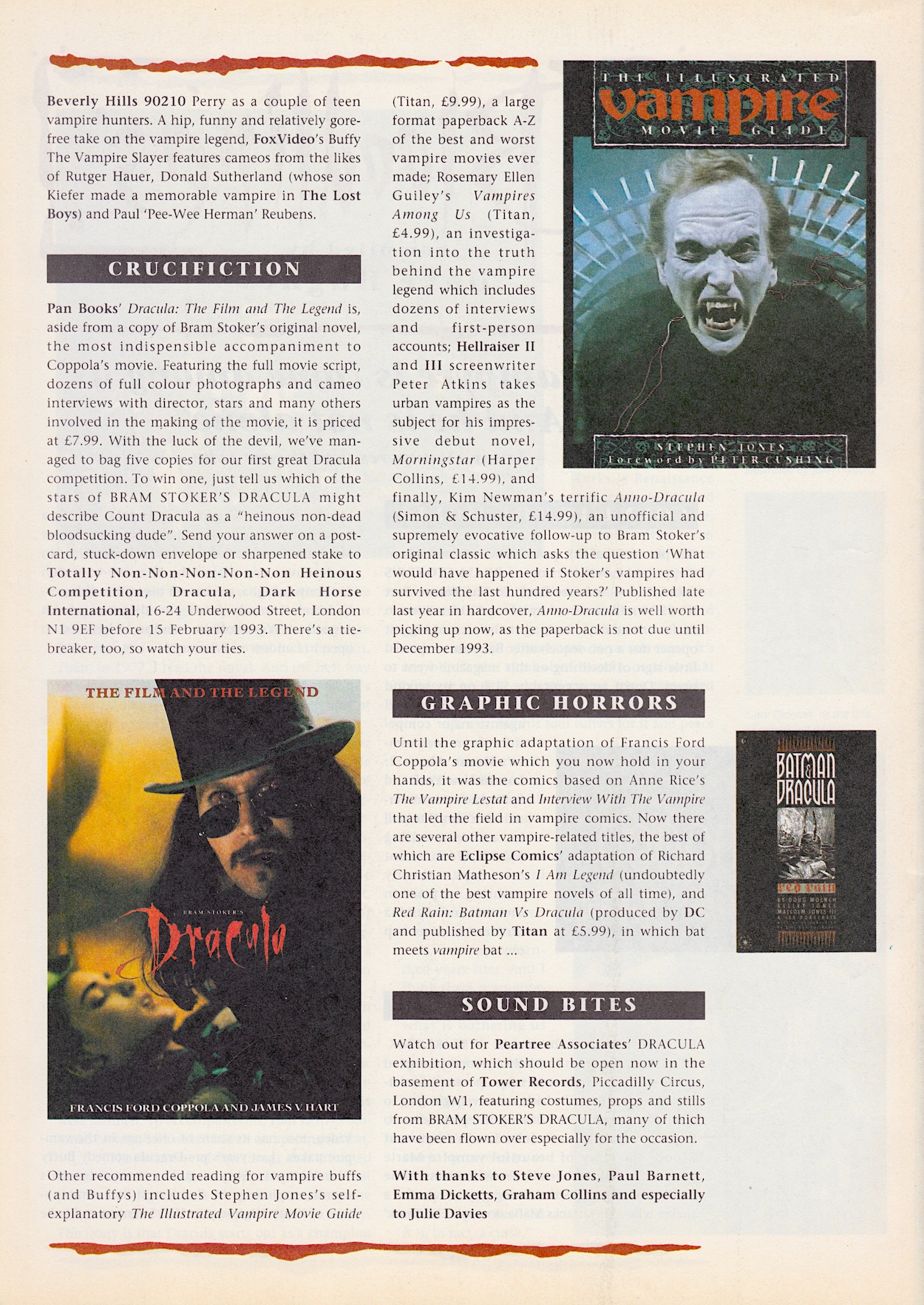
Moving on to the extra features and again it’s made up of Inside Dracula and Bloodlines, the making-of and news pages respectively. It’s here I take issue with one of the headlines on the cover. “Interviews (plural) with the cast of the smash-hit movie”, editor Dick Hansom boasted. What we actually get are two pages with small profiles of six of the cast members. For three of them we get some quotes taken from actual interviews elsewhere and a fourth where the quote is from Francis Ford Coppola instead.

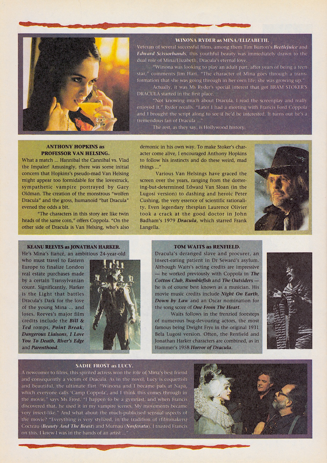
There are some interesting nuggets here, such as Francis’ insistence on a young cast in keeping with the novel (which went against the grain of previous adaptations) and Winona’s role in getting the whole thing started in the first place, which was touched upon last issue. I can sympathise with how reading the novel is described as a “formidable task” and in Sadie’s profile the comic mentions “the much-publicised sensual aspects”, which you just know referred to what British tabloid rags thought were the most important scenes in the film.

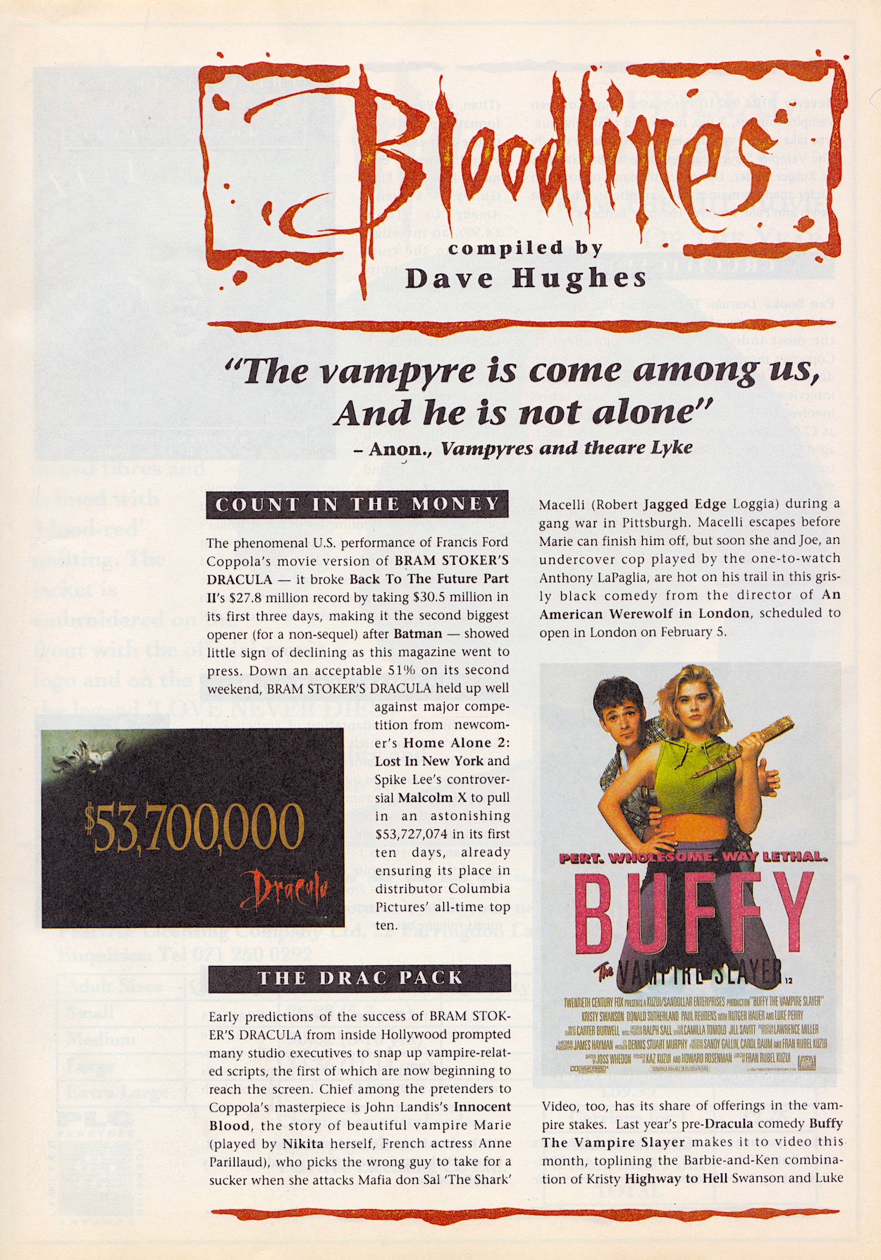
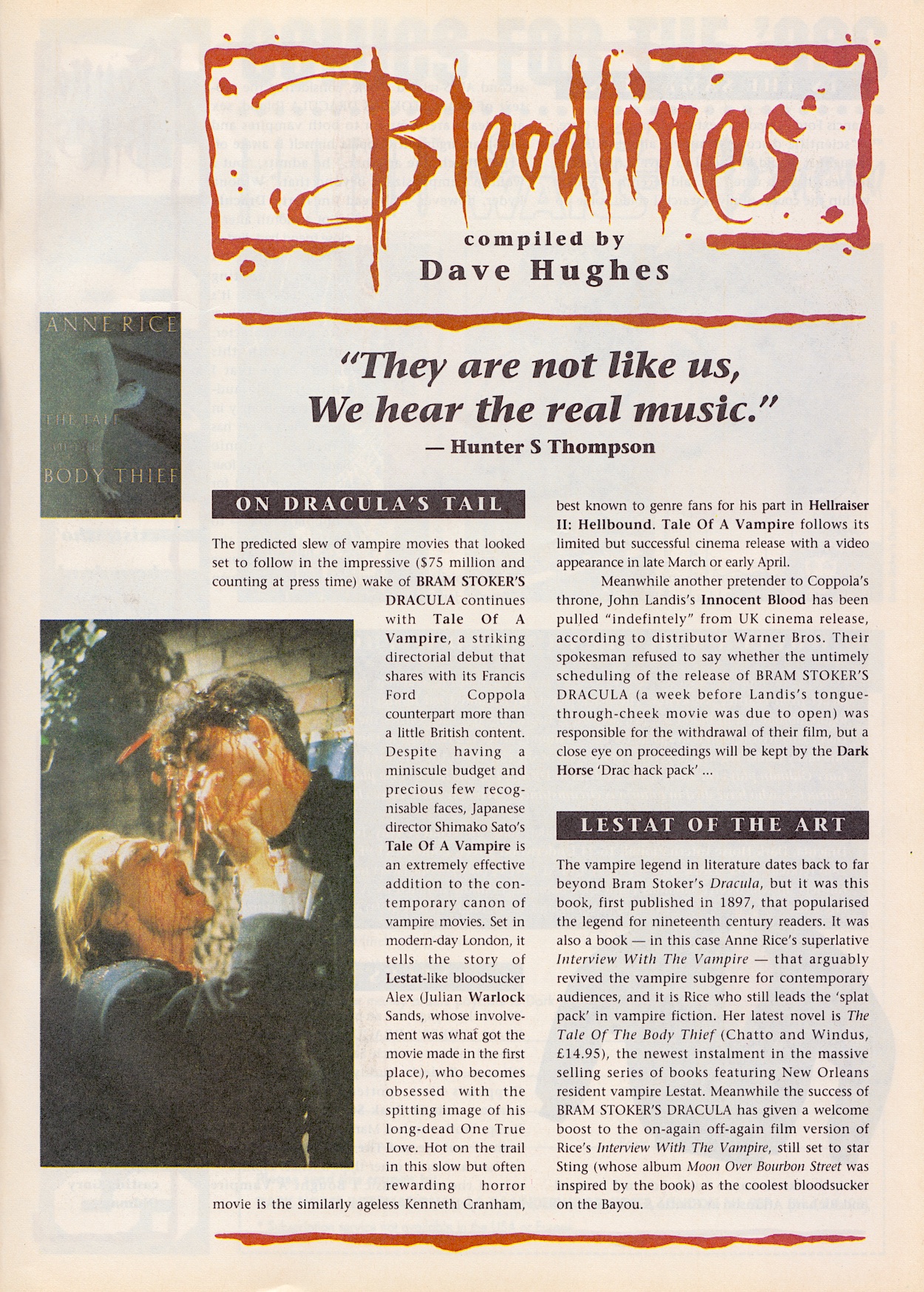
Bloodlines rounds up the movie’s takings so far and the glut of vampire flicks which went into production off the back of the news Francis Ford Coppola was making Dracula. News of Tale of a Vampire has a different feel to it now, after we tragically lost the great Julians Sands in 2023. I’d never heard of this film but the role seems just perfect for him so I’ll probably track it down on a streaming service and check it out.

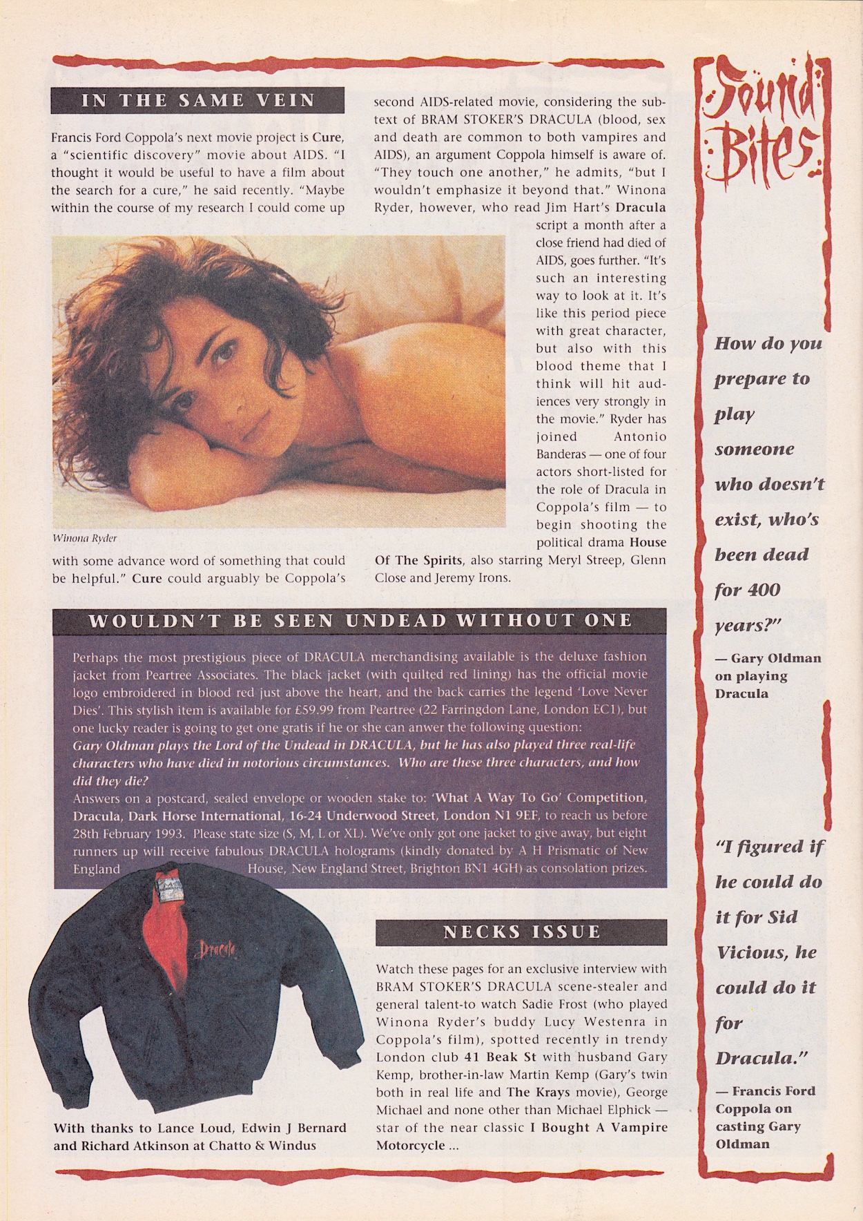
The mystery behind Innocent Blood’s release was probably more to do with its complete flop in the States than with our movie. Described on Wikipedia as a “mixture of the vampire, gangster and buddy cop genres” but with a ton of nudity and gore, it doesn’t scream ‘John Landis’ to me. As for Interview With the Vampire, I can’t find proof of Sting being approached but coincidentally Julian Sands was considered!

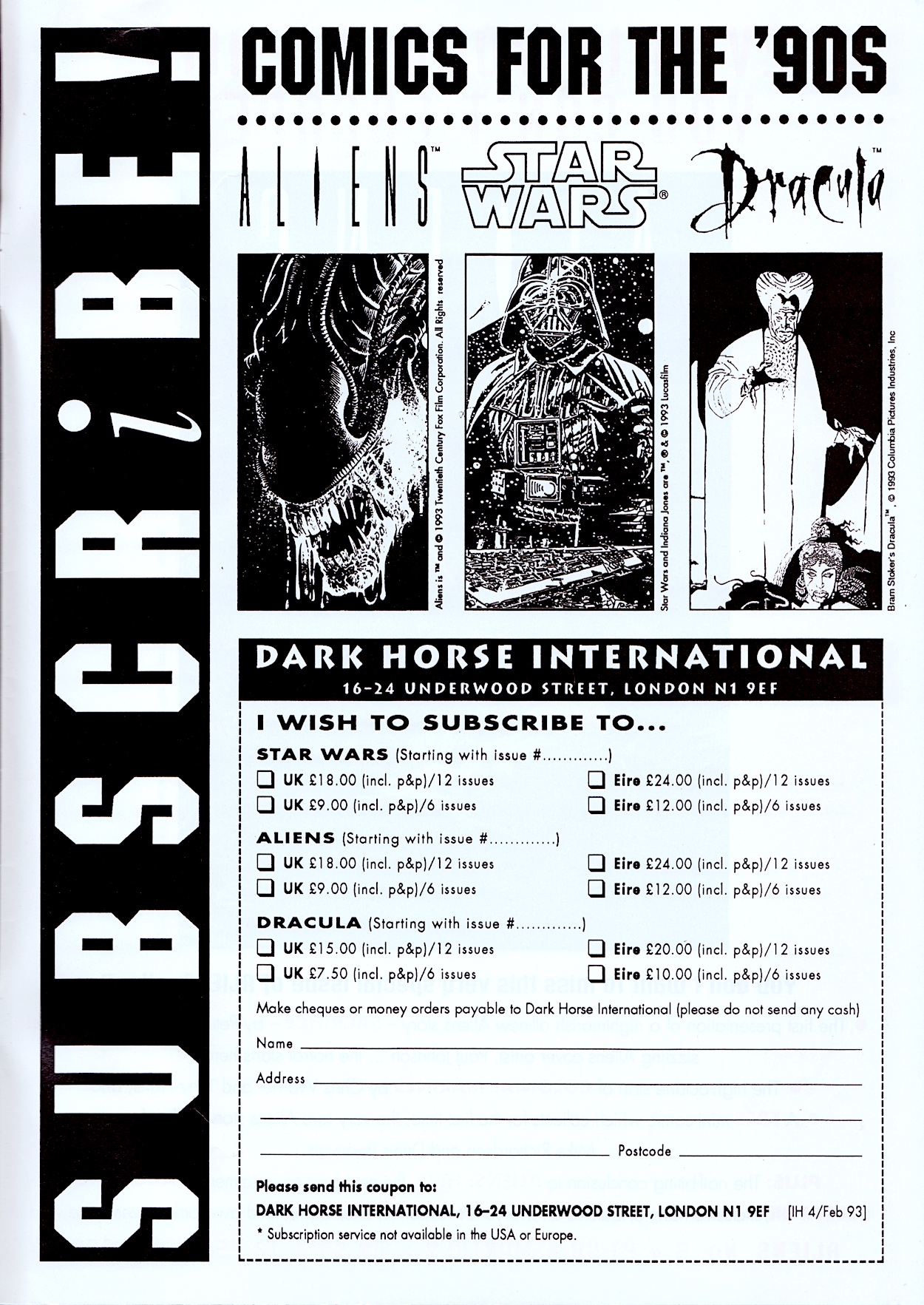
Then, on the glossy inside back cover is the first of Dark Horse International’s subscriptions pages for their range, something I would become very familiar with towards the end of the same year when I discovered their Jurassic Park. I started reading that comic from #6 and by then two of the three titles below had already been cancelled and replaced by others, which probably shocked the publisher as much as the readers, given what they were based on.

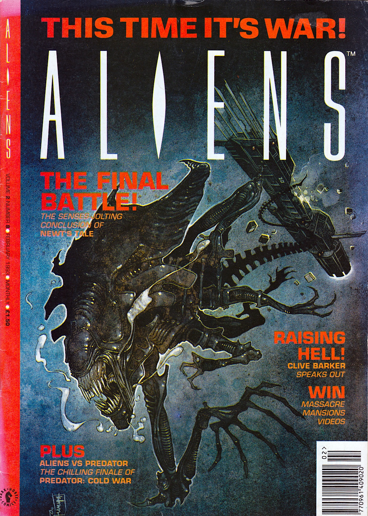
On the back page is the same Aliens advert from last time promoting #9 of that comic and its brand new UK strip, the review of which will be up on 18th February 2025. For now Dracula slinks back into his coffin to await the next review of his own comic. This is the most promising movie adaptation yet on the blog, so let’s hope #3 continues the trend on Sunday 2nd March 2025.

iSSUE ONE < > iSSUE THREE

DRACULA MENU

LEW STRiNGER’S COMiC SAMPLER: S-AMPLE LAUGHS

Originally created for the 2024 London Comic Con, Lew Stringer’s Comic Sampler does exactly as you’d expect with a title like that. Inside its card sleeve is an abundance of Lew’s characters in a seemingly random selection of reprints that shows off the wide variety of funny strips he’s produced over his career. Beginning with a small introduction and a sample of his earliest work from Marvel UK’s The Daredevils, it’s a smorgasbord of delights for fans.

Transformers fans are well catered for with Robo-Capers and a couple of Combat Colin strips, the first of which features not only the debut appearance of his archenemy The Brain, but also a blink-and-you’ll-miss-him cameo from none other than OiNK’s brainless bully, Tom Thug. Tom also appears in a small cover strip from his time in Buster comic and Lew’s perennial superhero Brickman is also here.

Above is a sample of the second Combat Colin strip printed in digital anthology comic, Aces Weekly. So for any Transformers UK readers out there it’s a new adventure for you to enjoy. Alongside this new (for me) Colin strip there was another duo I’d never read anything of before, namely Tough Guy and Scruffy from the pages of Triffik! comic, a two-page story from the front and back cover of that publication. Here’s the first page.

Triffik! was a very short-lived comic, lasting only 12 weeks in the early 90s, a time when I’d moved on from humour comics as a child (hey, we all make mistakes). Lew’s Tough Guy strip is fun and at the end there’s a small advert for a free digital comic collecting together his misadventures over those 12 issues, so watch out for a review of it soon on the blog. (Or, you know, go and download it now from Lew’s site, what’s stopping you?)

The whole comic is printed in monochrome which adds a lovely retro, homemade fanzine kind of feel to it. On Lew’s blog he elaborates on why even the cover itself is in black-and-white when his reprint collections usually have a colour front page. “Why is the cover monochrome?,” says Lew. “Mostly to keep the costs down for this one-off special, but also I wanted to go ‘back to basics’ and do an entirely black and white comic like I used to many years ago.” And now, Daleks!

Haha, I have to admit I did chuckle at the “Oops, too late” bit of that Christmas with the Daleks strip. Lew’s comical killers pop up every month in Doctor Who Magazine, a publication I personally only buy irregularly so it was nice to get a glimpse of Lew’s work I usually miss out on. Similarly, the back page has another I hadn’t read before, namely a Sgt. Shouty strip from The 77.

Robo-Capers, two Brickman strips, two Combat Colin strips, Tom Thug, Tough Guy and Scruffy, Derek the Troll’s hilarious spoof role-playing game, the Daleks and Sgt. Shouty, packaged together on high quality A5 paper (with card cover) and all for only £3.50. If you’re a fan of any one of the aforementioned characters then you really can’t miss out on Lew Stringer’s Sampler Comic.

When I decided to include this in a future OiNK Contributor Releases review it was available on Lew’s eBay page. However, as is the way with small press comics, at the time of writing the comic has currently sold out but that doesn’t mean it won’t make a return at some point as other titles of Lew’s have, so go to his shop and see what you fancy. *

In the meantime, make sure you also check out the Contributor Releases page of the OiNK Blog for more of Lew’s comics (link at the bottom of this post) and Lew’s own blog to keep up to date on his latest published work as well as news of future comic releases, such as the fact there’s brand new Brickman coming this year as mentioned in this comic! So bookmark his site now, pig pals!

OiNK CONTRiBUTORS’ RELEASES MENU

OiNK CONTRiBUTORS MENU

MAiN OiNK MENU

(* Due to some ridiculous changes eBay are introducing, Lew will no longer be selling his comics on it. His original artwork will remain, but he’s currently considering options for where to sell his comics. As soon as he decides I’ll update all blog links.)

TRANSFORMERS GENERATiON 2 #5: HEAD MASTER

My heart sank a little with this Derek Yaniger cover. Don’t get me wrong, it’s another superb piece by him, we’ve come to expect nothing less these past few months (unfortunately his only contribution to this issue). The problem for me is that Bludgeon is my favourite leader of the Decepticons! He may only have come to the fore over the last year or two of the original Marvel UK run but he made a huge impact on me.

That’s for our backup strip though and first we’ve got the next chapter in our main story, which begins by setting the tone in a familiar way to long term readers, describing Cybertron in a way we’ve seen a few times before, and drawn by Manny Galan, inked by Jim Amash, lettered by Richard Starkings and John Gaushell, and we welcome Chia-Chi Wang (The Punisher, Venom, G.I. Joe) on colours. This familiarity isn’t a complaint, it’s evocative and usually comes before some epic moment or storyline so the levels of anticipation are high. Plus I love the word “bio-chanic”!

But there’s a twist. Optimus Prime is beginning to doubt all of this. Hooked up to a new machine in a vast resonating cavern to allow connection between him and the small part of the Matrix in his mind. No, it doesn’t make sense but it’s a comic about giant alien robots that transform into cars, it only has to sound like it does. The story plays on the psychic nature of the Matrix, which the UK comic did quite a bit. So did the live-action films, again proving some “fans” who complained about such things need to go back and read the original comics.

Meanwhile, on a beautiful, natural, green world somewhere writer Simon Furman doesn’t hold back with his eco message for young readers. This isn’t new to Transformers, their own world was dying and the Decepticons wanted to strip Earth of its natural resources way back at the very beginning of the original comic. Simon also wrote more environmental messages into the UK comic like the wonderful Christmas tale, The Greatest Gift of All.

However, Jhiaxus is more concerned about an attack from the Autobots. Interestingly, it’s the fact they haven’t attacked that concerns him. It must mean Prime is up to something much bigger if this wanton destruction is being ignored. Back with Prime and what’s consuming his thoughts, and we actually get to see Primus create the first ever Transformer life. This is cool, even if the comic always struggled to produce original designs anywhere near as good as the toys.

So what are these disturbing visions trying to tell him? For us, it’s a rewriting of Transformers history as we know it, when Prime realises that they weren’t just created and left to use the Matrix to create new Transformers like all who had come before. For a long, long period of their history they too evolved just like organic life on other planets.

Primus couldn’t just create the life needed to destroy Unicron, his creations had to learn and grow and evolve until they were ready. But they were programmed to stop doing so. Somehow, Jhiaxus unlocked this genetic code, he and his fellow Transformers continuing to evolve into something… else. I have to say, this is a neat way of getting ‘Generation 2’ into the actual story of the comic rather than just being the name of the toy line. It’s quite wonderful, in fact.

Angry, Prime rips himself out of the machine. His race was already at the edge of what it was created to be: a force for good. Megatron and the Decpeticons crossed that line, but what have the Transformers become under Jhiaxus, without a conscience? But as Prime leaves, we readers get to see what the machine would’ve shown him next.

It’s Jhiaxus’ evolutionary process, repeating and repeating until the darkness within transforms into something else and makes its way out into the cosmos. Is this what Prime’s visions in previous months were all about? Is it linked to the vast powers from the time of Primus and Unicron, the reason their evolution was programmed to stop? The story is going very big, very quickly and I like the messages and questions it’s bringing to what would’ve been younger readers at the time. My anticipation for the rest of the run is sky high!

The six-page Tales of Earth: Part Two is also written by Simon and is drawn by the same team, however I’m glad to see Sarra Mossoff back on colours. According to Bludgeon modern day Earth has been completely subjugated by the Decepticons. This is a strange route to take, seeing as how kids could look outside and go, “No it hasn’t.” Personally, setting it just a year or two later as a possible future would’ve made it more dramatic.

Why has Starscream got what looks like a snake’s tongue all-of-a-sudden? Anyway, the story is basically a fight between the two leaders, the outcome of which we already know thanks to the cover and Megatron easily rips off Bludgeon’s head. He’s a Pretender though, so while we know any pain felt by a Pretender shell is also felt by the occupier, Bludgeon battles through, throwing himself out of his shell and straight into his tank mode. Behind all of this we get a funny moment showing the newly restored Starscream is still the same Starscream he’s always been.

At one point Megatron blows up one of Bludgeon’s Decepticons and calls the now-deceased jet ‘Darkwing’, but the colour scheme is that of Dreadwind, a fan favourite among Marvel UK readers as he was one of our letter answerers. I hope it was just a colouring error! In the end things are finished quite easily, with Megatron simply turning into his new tank mode and destroying Bludgeon. A shame, because I always preferred him over Megatron or Galavatron.

On the letters page, Vincent Grisanti may have (unbelievably) preferred Nel Yomtov’s colouring over Sarra’s and he may not like Richard’s word balloons, but he does bring up one good point. Namely, he questions the continuity between the end of the old series and the sequel, in particular the Nucleon storylines which resulted in some Transformers gaining great strength but losing their ability to transform, something they can all do again in Generation 2.

I hate the answer given here. The Action Masters toys may have been criticised at the time (these days non-transforming Transformers seem to sell well) but Simon crafted a wonderful storyline to explain them. This is thrown out with a pithy one-sentence response that I feel mocks all of those dramatic stories (particularly for Grimlock), stopping just short of ignoring them completely.

Of course, here in the UK the final Transformers Annual had a wonderful, character-driven prose story which opened up the doors to those Autobots transforming again. But who cares, right? Just chuck all of that wonderful work away! If the comic carried on beyond its first year I’d loved to have seen this addressed but clearly it wasn’t going to be. I feel cheated. Anyway, before we finish off two adverts from this issue caught my eye from the perspective of cost!

$70 for Sonic the Hedgehog 3?! A game even I could finish in an afternoon? I remember the prices of Sega’s and Nintendo’s cartridges being on the news at the time. No wonder! The Screen Posters are desktop wallpapers. When we now can take any image from the internet or any of our own personal photos and make them our wallpapers with a few clicks, it’s so quaint to remember a time when companies could sell them to us. But without that offer they’re $30! The fact the prices from these adverts are from the early 90s makes them even more shocking!

The best issue so far in this series comes to an end. As the two strips appear to be coming closer together, and as the main one becomes more complex, I can see why this run has been held in such high regard. I can’t believe this is a comic series that would ultimately be cut short. Next month we’re only half way through though, so there’s still plenty to get stuck into yet. The sixth issue of Transformers Generation 2 will be here on Sunday 23rd February 2025. It can’t come bloody soon enough!

iSSUE FOUR < > iSSUE SiX

TRANSFORMERS: GENERATiON 2 MENU

MAiN TRANSFORMERS MENU

ALiENS #8: ADiÓS, MUCHACHOS

Any Aliens fan will recognise this scene depicted by superb Irish artist Kilian Plunkett (The Unknown Soldier, The Mask, Star Wars – The Clone Wars TV series) so we know the final part to the movie adaptation is inside #8 of Dark Horse International‘s monthly from 1993. Two of the strips come to an end this issue, while Hive will conclude next month so it’s all change for the first time since it began, as the editorial explains. The most exciting news is that one of next month’s new strips will be an exclusive created for the UK comic.

Given this news and the change in lineup the comic appears to be in rude health! As it was. It was a success for the publisher (as was Jurassic Park) but unfortunately the UK arm of Dark Horse wouldn’t survive for more than another year or so and their collapse would take these superb titles with them. But 1993 was quite the year for DHI and the same is true of the blog.

The conclusion to Newt’s Tale is the shortest strip this month, coming in at seven pages. I know it’s not officially an adaptation of the film but it’s long given up retelling the story from Newt’s point of view, which still disappoints me. It had done so, and brilliantly, in those first few chapters. But I can’t quibble about the art by Jim Somerville, Brian Garvey and Gregory Wright (full credits for all strips on the page above).

The alien Queen in particular is brilliantly portrayed and, while the human characters don’t look like their actor counterparts, they’re at least distinct enough from each other this month to follow along. Then again, there are only three left, including Bishop the synthetic. A rare piece of swearing makes it into the comic but it’s not like they could leave that line out! There was a great opportunity to see the terrifying chase between the alien and Newt from her perspective; her crawling under the floor panels, the alien ripping them off and just missing her each time. Instead, it takes up a mere three panels before concentrating on the climactic battle with Ripley.

Ironically, it’s in the final moment of this scene that they decide to show us something from Newt’s point-of-view. I know people will have seen the film before reading this, but when the past several months have been a beat-for-beat adaptation, to suddenly eschew that feels like a rushed cop out. If the whole strip had done this then these final moments would’ve fitted in fine, but those early compelling chapters and these final two pages aren’t enough to make this any different than any other movie adaptation. It’s a shame, but thankfully the art has sustained it for the most part and there’s that added surprise at the end to fit in with the newly released Alien³.

I didn’t rent Alien³ from a local video store at home originally, instead it was a year later while holidaying in the highlands of Scotland when I did so for the first time, from a mobile van library! Anyway, I never got to see the special extra video. Looking back now after watching the third film’s Special Edition it’s frustrating how director David Fincher’s vision was originally cut down so much. Oh, and it appears I was by no means alone with my thoughts about the comic’s review of the Aliens Special Edition.

In the middle of the comic the back up Predator: Cold War strip takes up ten pages for a brilliant ending to what has been the stand out strip so far. The solution to last month’s cliffhanger sees Lt. Ligachev rescue Detective Schaefer by gunning down the Predators and blasting out the wall behind him to loosen the wire traps. Then a very interest dynamic plays out.

As another Predator drops in, General Philips and his men arrive, firing off a warning shot for both the alien and the humans! The Americans want to get their man out of there so as not to interfere, instead letting the Predators leave before the Russians arrive and claim any weaponry. One of Philips’ men even threatens Schaefer and the whole situation is surprisingly tense for a comic.

The fact the alien is right there, observing, trying to work out what’s going on is a suspenseful moment. When Schaefer throws an explosive towards the ship an American soldiers opens fire and takes him down! I was genuinely shocked by this. Schaefer lies at the feet of the Predator, who replicates a human laugh and runs back inside, seemingly having worked out what’s going on. The soldier who shot Schaefer takes aim again and we see the targeting reticle dead centre on his head! General Philips, the character Dutch (Arnold Schwarzenegger) was last seen with in the film just stands by and watches.

Rasche may not have appeared much previously but he made a big impact, and that’s coming from someone who never read the previous story he and Schaefer starred in. It’s left to Lt. Ligachev to bring the story to a suitably explosive end. She knows neither the Americans nor the Russians can win. Seeing Schaefer helped to his feet by Rasche, by a friend, she realises he’s found peace at last so she has to find her’s. He watches her set the timer on the explosive and grins. Despite being on opposite sides of the Cold War, they are simpatico.

“As the American says, screw it!”, Ligachev screams as she kicks the charge into the escaping ship, recalling her football skills from an earlier issue. The ship explodes above their heads and Arnie-replacement Schaefer just has to get in the final punchline and shouts, “Yeah! That’s what you get for driving an import!” Hey, it’s based on an 80s action flick, what did you expect? Then on the final page Ligachev turns the tables on her superiors with one simple question.

After reading this strip for over half a year I’m really going to miss these characters and I think a story set in New York with these three would be a great read. It doesn’t even have to involve extraterrestrials! For now though, the Predator back up strip leaves Aliens on a high. As you’ll see below it won’t be here next month, although from checklists and adverts in Jurassic Park I know the series pops up elsewhere. The legacy of Predator: Cold War for me though? It got me watching the films for the first time!

Tucked away in the middle of the comic is Aliens: A Dire Tribe by Dave Hughes, a quick one-page feature about writer-director Clive Barker’s (Hellraiser, Nightbreed, Books of Blood) views on the Alien franchise after being approached to write Alien³. I was excited to read this but came away with a negative impression, not of the comic or of the article, but of Barker himself.

Such a famous and talented writer couldn’t find anything interesting about the aliens? The many various sequels since suggest that he just couldn’t personally come up with anything interesting. That’s fine, but instead of admitting this he blamed the franchise and the alien creations themselves, as if they were beneath him. Of course I can only give my own impression, my own takeaway, but that’s my conclusion from reading this, which is a shame.

Now we move on to the penultimate chapter of Aliens: Hive and unfortunately it’s the longest strip this time around. After barely making a whisper last month it takes up a whopping 18 pages here, more than the other two combined! I don’t want to sound like a stuck record as far as Hive is concerned, but the only reason I’m so disappointed with these last few months of the strip is because the first few chapters were so good and had so much potential.

Instead, that potential was swapped out for a run-of-the-mill thriller with unlikeable, stupid human characters who keep putting themselves into ludicrous situations. It’s like a bad teen horror, but with aliens. Captions are really needed here too because there’s a lot of very confusing art. I have no idea what’s going on in any of these panels.

We also get a sudden sub-plot involving synthetic Gill crushing on Julian Lish and it’s the creepiest thing I’ve yet seen. As well as poking her in the face and grinning maniacally while she’s unconscious, later he starts examining her hair and then kisses her, again while she’s unconscious and unable to consent. There’s no meaning to this in the plot from what I can tell, apart from giving the android some kind of thrill!

Hive is also frustrating because in scenes involving the aliens it’s clear artist Kelley Jones could produce some excellent Aliens comics if given a decent script. I pray he’s given something better at a later point in the run because as these two separate pages below show, the potential is there. Story-wise though, by this point I’m rooting for the aliens, which I shouldn’t be doing.

On to the Technical Readout and I have to hand it to Lee Brimmicombe-Wood, he has an incredible ability to take models from the movie that were created simply to look cool and fit in with an aesthetic and make it seem like every nut and bolt was very purposely created for a specific real-world reason. The ‘Jordan Tractor’ can be seen at the beginning of Aliens when Newt’s prospector parents drive out to investigate the crashed spacecraft from the first film.

I can understand having all of the Colonial Marines’ weaponry and vehicles broken down into very intricate details, but to do so with something like this is testament to Lee’s dedication to a movie he’s clearly a huge fan of. There’s simply no way someone could produce these to this quality if they were just a writer assigned a job. Plus, I want to see those races played out in a future film or TV series!

Not much happens in the latest two-page chapter of Aliens Vs Predator and on the letters page Terry Jones (not him) has a thing or two to say about “fans” who demand things of their franchises and attack those who think differently or who don’t create the exact sequel they wanted. Sounds familiar, doesn’t it? No one tell Terry it’d only get worse with the advent of social media. Then there’s a special full-page Next Issue promo on the back cover.

This was also on the back page of Dracula #1 (even though it was released two days before this issue of Aliens) and I am super hyped for the next issue. There may be no Predator strip but the two new Aliens stories (and finally being able to say goodbye to Hive) will more than suffice, I’m sure. Plus, I’ve just checked and the free mini-comic is in my copy! You can check out Aliens #9 in its real time review on Tuesday 18th February 2025.

iSSUE SEVEN < > iSSUE NiNE

ALiENS MENU

BRAM STOKER’S DRACULA #1: DARK ARTS

The first new real time read through for 2025 adds a third title to the Dark Horse International menu on the blog with Bram Stoker’s Dracula from 1993. This was released in the same year as their Jurassic Park comic and follows a similar formula, the movie adaptation taking up all of the comic strip space inside and followed by some extra features. This is similar to the Alien³ Movie Special mini-series from the previous year and has the same description down the left-hand border.

However, much like Jurassic Park, this comic would continue beyond the end of the movie and become an ongoing monthly, albeit with a rather big caveat (which we’ll get to when the time comes). The atmospheric cover by Mike Mignola (Hellboy, Rocket Raccoon, Baltimore) cements the dark, gothic feel of the strip  and upon opening we’re met with a suitably black interior design.

I defy anyone who has seen the film not to read the introduction in Anthony Hopkins’ voice. I note that subscriptions are offered so clearly DHI were hoping the adaptation issues would be enough of a success for them to carry on. However, while it was advertised as a fortnightly in other comics it’s actually triweekly like the aforementioned adaptations.

Edited by Dick Hansom (Jurassic Park, Aliens, Speakeasy), the 36-page comic has a lovely glossy cover with matte interior pages, a 28-page first chapter and two two-page features at the rear. So far, so DHI. The real stand out here is the strip’s art. Regular readers will know how I feel about movie adaptations but to see an original art style filled me with confidence for this one.

The art goes the opposite way of the elaborate, ornate movie. It may have quite simply drawn scenes and characters, but it’s the use of shadow that ties it in so neatly to the film. There’s simply no way of capturing the intricacy of the design and the style of Francis Ford Coppola’s direction so instead it feels like penciller Mike, inker John Nyberg (Action Comics, Doom Patrol, Nexus) and colourist Mark Chiarello (Batman/Houdini, Hellboy, Hush) have gone for atmosphere over detail.

It works. It looks old-fashioned but I don’t mean in an ‘out-of-date comic’ kind of way. I mean the individual panels feel like they could’ve been drawn around the time the story is set and cleaned up for the 90s. Simple, sometimes scratchy line work with a mixture of bold colours for the more horrific scenes and subdued, almost washed out colours for the spookier moments, with the swathes of black in all the panels capturing that claustrophobic, haunted feel of the film, it’s just perfect.

John Costanza (Jurassic Park, The Tomb of Dracula, Red) does an incredible job on lettering Roy Thomas‘ (Conan, Secret Origins, Stoker’s Dracula) script too. Whether it’s historical prose, different handwriting (or typed text) for each character’s diary or his regular style, it’s all very clever and captures the narrative aspects of the film, as you can see above. The original US comic edited by story by Jim Salicrup (writer on Transformers, Sledge Hammer and The A-Team), credited here as story editor.

Sometimes, however, the use of shadow can make it difficult to work out sequences of events and once or twice I found myself perusing panels a few times to work out what was happening, and that’s with me having seen the film recently. Like most comics adaptations the main audience would’ve been those who’d seen the movie already rather than new readers. Even more so with this one, I feel.

I’ve criticised previous movie adaptations for rushing through their screenplays or for being poor copies of their big screen originals, but I’ve also praised those that took the time to properly adapt the story to a different medium. Bram Stoker’s Dracula falls into the latter category. While what’s written on the page is basically verbatim from the script, the art does a perfect job of taking the movie fan back into that world to enjoy it in a different way.

A perfect example of this is the moment when the carriage comes to pick up Jonathan Harker. In the film a massive set was built for this scene and it was full of highly detailed, creepy imagery. Here, all of that is stripped back. Instead, the sparse nature of the art and the use of shadow captures how that moment felt for the viewer. This brings the chill of the scene to the reader much better than any attempt to just copy it ever could have.

The shadow work brings another benefit too. Previous attempts at adapting a movie have had mixed results in portraying the actors. Most times there’s no attempt at all (and that may have been due to rights), other times they’ve tried so hard to capture their likeness they become stilted and expressionless. This team does something different. Through clever use of dark shadows the characters look enough like the actors without having too much detail, meaning they retain their expressiveness and, most importantly (and something Alien³ failed to do) their faces remain distinct from each other’s.

Not all of the film’s iconic visuals translate well to the page though, the best/worst example being Jonathan’s train journey. While that marvellous model shot couldn’t hope to be replicated on the page, the zooming in on the peacock’s feathers makes no sense here and Dracula’s eyes in the sky just look weird. These moments were great examples of the film’s iconic style but I can’t help thinking they’d have been best left out here, or at least have the Count’s eyes elaborated on to make more sense in this medium than the seemingly random panel below.

The first chapter of the story ends on that horrible/terrifying scene with the baby. Anyone who has seen the film will know exactly which moment I’m talking about! Then it’s quite jarring to come to white pages. I kind of wish they’d kept them black, but that may have made them hard on the eyes. As with the first five issues of Jurassic Park, Gary Gerani’s behind-the-scenes feature is in parts and begins with the original source material. I remember at the time some people complaining about what they thought were “changes” to the character (e.g. Dracula walking about outside), so thankfully that’s all put to rest here, confirming this film is the one that follows the book and portrays the character most accurately.

I’m usually one who likes to read opening credits and link the names listed to other films I’ve watched, but I was surprised to find out which family-friendly Steven Spielberg movie James V. Hart had written! Although, I do disagree with him on the best way to read Bram Stoker’s novel. If it’s your first time reading any novel it shouldn’t be the annotated version, or at the very least ignore the annotations until your second reading. They can be fascinating on second reads, but they interrupt the flow of the work and can also contain spoilers for later in the book.

Dave HughesBloodlines is the news feature of the comic, similar to his Motion Tracker pages in Aliens. With Bram Stoker’s Dracula still in the cinemas at the time of publication the comic was keeping us up to date with its takings so far. It would go on to rake in over four times that amount. Also truly placing the comic in the past is the description of Anthony LaPaglia (Without a Trace) as a new actor on the scene! But it’s surely another film release that will catch blog readers’ attentions.

Who knew that silly film would go on to be reincarnated as a hit TV show? A show I really enjoyed until (coincidentally) Dracula turned up. Treating him like an easily-slayed villain-of-the-week was annoying and I remember that season becoming too sombre and lacked the humour of previous years, so I stopped watching. But anyway, it’s another example of placing this comic in our own timelines.

The news pages also mention Malcolm X, another film of the same era that I must revisit sometime, and Anno Dracula, an alternate history novel by Kim Newman which sounds fascinating, although I admit even all these years later I’ve never heard of it. Upon doing a bit of research I found out that in Anno Dracula, the Count’s first wife is called ‘Elisabeta’, a name taken from this film. Also above, you’ll see the usual fun competition and address our comics and magazines like to do at the time.

Rounding off the issue on the inside back cover is this advert for a very 90s jacket tie-in The Master from Doctor Who would’ve liked, and on the back page is an advert for #9 of Aliens. Even though #8 was still to be released two days later, the next one had some exciting new additions and this was also used as a Next Issue page in the Aliens comic itself.

It’s never going to tell the story as well as the film for newbies but this comic was clearly aimed at those who had just enjoyed Bram Stoker’s Dracula at the cinema. In that regard this is the best movie adaptation I’ve come across so far on the blog. That art, that brave decision to create its own unusual style that somehow feels just right, is wonderful. There’ll hopefully be for wonderfulness in just three weeks with #2 on Sunday 9th February 2025.

GO TO iSSUE TWO

DRACULA MENU