Even back in the 1990s, when the computer-generated intro sequence to Transformers: Generation 2 first aired I remember thinking it looked very primitive, especially when compared to the graphics being produced by the new wave of CD-based videogame machines. Having collected Transformers toys for a few years until the original comic’s cancellation in the UK in January 1992, this did not inspire me to restart that obsession.
Transformers: Generation 2 was Hasbro’s attempt to relaunch the successful toy line for a new generation of children but it always felt half-assed to me. (So why am I covering the comic on the blog? I’ll get to that.) The cartoon wasn’t even a new series. Instead, it was a rerun of 52 of the original series’ episodes with that CGI introduction (taken from advertising) and some incredibly intrusive computer graphics overlayed on top of the episodes themselves.
The word ‘lazy’ springs to mind. The toys themselves didn’t fare much better to young teenager eyes. The G2 line ran from 1992 to 1994 and, apart from a few impressive new models such as Megatron who now transformed into a tank, most of the initial releases were reruns of previous toys with garish new colour schemes. Oh, and I mean garish! It was very 90s.
Optimus Prime’s ‘new’ toy played a bit fast and loose with the term ‘Robots in Disguise’
Some received new spring-loaded weapons and missile launchers etc., but for the most part even this eager Transformers fan, who would’ve happily continued collecting the original toys, thought some of them looked like cheap knock-offs rather than the official range. The original toys had declined in popularity but they’d had a great run which should be celebrated, and of course the franchise continues very successfully to this day.
With the vast array of different types of Transformers (even ones that couldn’t transform) towards the end I can commend Hasbro for wanting to go back to basics but for me this was the wrong way to go about it. The franchise recovered of course but Generation 2 didn’t excite me as a child and apparently I wasn’t alone. Also, just as a side note, Optimus Prime’s ‘new’ toy in particular played a bit fast and loose with the term “Robots in Disguise”, which was still on the box despite his trailer’s design. Less of a disguise and more of an announcement I’d say.
The colour schemes no longer matched the cartoon they’d repackaged with that CGI, and some of the characters in it weren’t available in any G2 toy form, making it all seem like it wasn’t very well thought out. In the end the toy line was discontinued when the first Transformers: Beast Wars toys began hitting shelves, which went off in a completely different and much more successful direction.
[The Transformers: Generation 2 comic’s] reputation proceeds it and I’ve seen some of the hard-edged artwork which looks just incredible
So if I’m so unimpressed, why on Earth am I dedicating room to this strange little spin-off on the blog? Well, in September 1994 a new comic arrived on the shelves from OiNK‘s second publisher, Fleetway Publications. I was initially thrilled to see a brand new Transformers comic, even if it was monthly instead of weekly and didn’t seem to have a lot of content by comparison. Still, the first issue drew me in with its cover and the foldout poster inside which the editorial used to describe the comic as a ‘Transformer’ too, which I still think was fun.
I didn’t buy any more issues at the time and it only lasted for five months in the end, but what I didn’t know about at the time was the Marvel US monthly (which Fleetway started serialising in #3), written as ever by the original comic’s Simon Furman. I’ve never read the series but its reputation proceeds it and I’ve seen some of the hard-edged artwork which looks just incredible, reminding me of some of Kevin O’Neill’s early 2000AD work. That alone made me want to collect it in recent years.
It was marketed at the time as a more mature comic, less for the kids buying the new (well, new-ish) toys and more for those that had been reading the previous Transformers a few years before. No longer restricted by Hasbro in how he could portray characters, nor having to write in certain toys as a way of marketing new releases, Simon was given free rein to tell the story he wanted.
Because the UK title is so hard to come by for a decent price I’m going to cover the original American one first (a first for the blog), then at a future date we’ll see what Fleetway did with the license. Unfortunately, even the US comic only lasted for 12 months but that’s not an indictment of its quality. After all, just a few years before it the original G1 (as it was called from this point on) comic was cancelled when it was still selling about 100,000 copies per month!
That would be a massive hit today or for a new, original comic at the time, but at its peak Transformers had sold 250,000 a month so all Marvel saw was the decrease, sadly. Even with Transformers: Generation 2 technically being a new title it wasn’t going to reach those previous lofty heights for a licensed comic and, despite sales figures of around 100,000 per issue again, the rug was pulled. However, I’m really looking forward to seeing what all the positive fuss over that year is all about. Technically, there are more than 12 issues too because there were another four monthly chapters to the story before #1!
That’s right, it all kicked off as a crossover event in the pages of G.I. Joe in #139-#142, so I’m going to be including those issues on a month-by-month basis too in real time. As a fan of those characters (thanks to them being a back up strip in Marvel UK’s Transformers G1) I’m even more excited about the prospect of this read through than I already was. In fact, the issue before that again leads into the crossover, so altogether there are going to be 17 monthly comic reviews covering the entirety of Transformers: Generation 2.
It all begins with G.I. Joe #138 on the 31st anniversary of its release State-side on Sunday 26th May 2024. The Transformers have a bright future ahead on the blog and this is only the beginning of it!
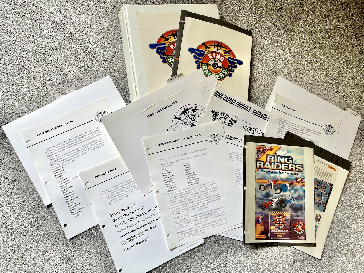
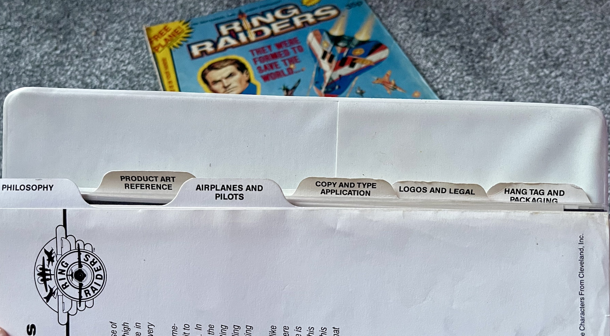
Here we are at the end of this monthly series already. It’s been really interesting looking at this Ring Raiders Style Guide sent out to all potential licensees by the copyright holders Those Characters From Cleveland (TCFC) back in 1989. Judging from the feedback I’ve been getting on socials it seems like you lot agree. The final 12 pages are all here and as you can see from the photo above they make for a meatier read this time around.
There are three sections to round off the folder and we start with ‘Copy and Type Application’, which amounts to two whole pages about fonts. Yes, really. It’s something I never really considered but now that I see all of these examples I can remember each and every one of them on the packaging (which you’ll see further below) and on the toy advertisements in the comic produced by the editorial team.
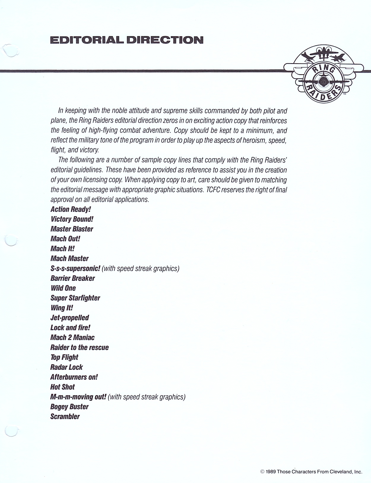
The page of suggested taglines sound like they’ve been written by committee. A committee who has no idea about aircraft. They’re cringe-worthy and thankfully weren’t used on the toys themselves or in the comic. You can also see all potential designs were subject to TCFC’s approval, however the comic’s editor Barrie Tomlinson said the people behind Ring Raiders were more open than most to what licensees could bring to the franchise, and they were very happy with what Barrie and his team were producing.
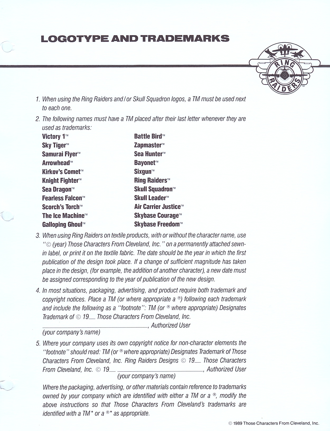
‘Logos and Legal’ is the next part of the binder and they’re a weird combination, like they’ve only been shoved into the same section because they start with the same letter. It kicks off with a lot of detail about how to use trademarked names and exactly how every piece of merchandise should be labelled appropriately. If you’ve ever wondered what the difference is between the ™ and the ® symbols you’ll find that answer here too.
Even textile manufacturers get their own paragraph detailing how their products should be labelled. This was most likely the same information found in similar style guides for all of TCFC’s (and other’s) ranges but it’s still an interesting read. You’d see these little footnotes in all of our licenced comics too and I always thought it was up to the publisher how they were worded, especially for their own trademarks, but it looks like that wasn’t the case and it was the licence-holder’s wording. Although, to be fair, it’s a pretty standard format.
I simply loved the full colour Ring Raiders logo
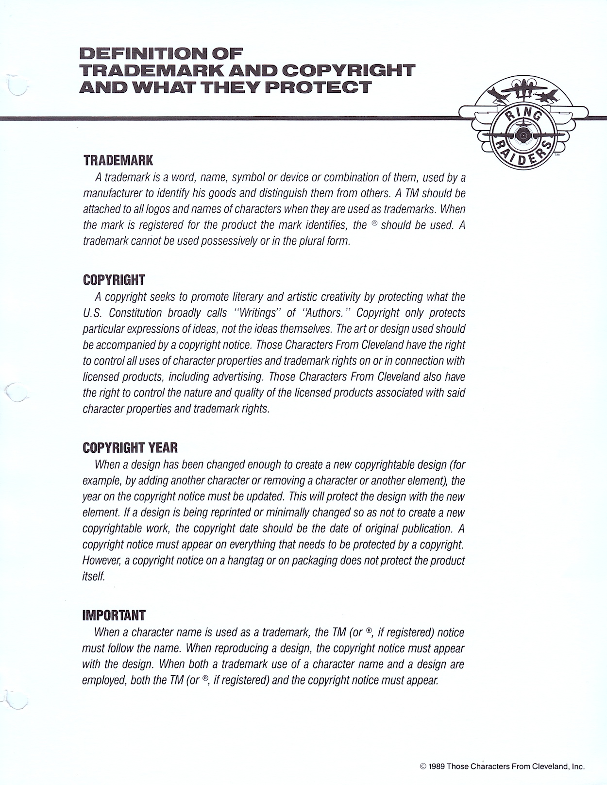
Want to know the difference between a trademark and a copyright? Or why the year mentioned can sometimes change and sometimes remain the same? It’s all there for you. As most of my comics reading post-OiNK as a kid was based around licenced titles the nerd in me found this of particular interest. Then we move on to the second part of this alliterative section and the variations on the franchise’s logo that were permissible to use.
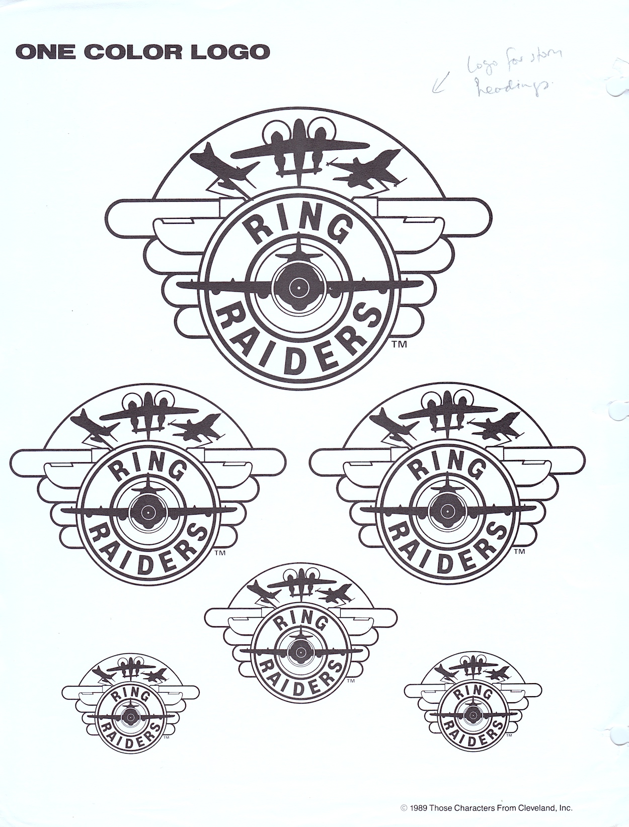
I thought the ‘Ring Raiders’ main title was a brilliant design and the accompanying logo the perfect embodiment of the toys. I simply loved the full colour Ring Raiders logo. I still feel the same, they’re just great designs! Below you’ll see the one-colour (that is, black and white) version of the logo, the same one in various sizes taking up a full page for some reason. You’ll see a handwritten note by Barrie too, highlighting how they’d use this particular version.
On the next page is a selection of variants for both the Ring Raiders and the Skull Squadron (quaintly described as “Good Guy / Bad Guy Logos”). The top two were used as the individual logos for each side on toy packaging and across any and all merchandise. The next row down are the in-universe logos used by the characters themselves on their planes, bases and uniforms.
The smaller, circular logos had specific uses in the toy range. The first two on each row were used on the tiny plastic rings we’d slip on our fingers, the planes attached via a thin, posable plastic rod. The star and skull circles were on the front of the rings while the ones with the lettering encircled the ball-shaped attachment on the top. The final one is exactly what it says, a miscellaneous combination of both to be used as they saw fit.
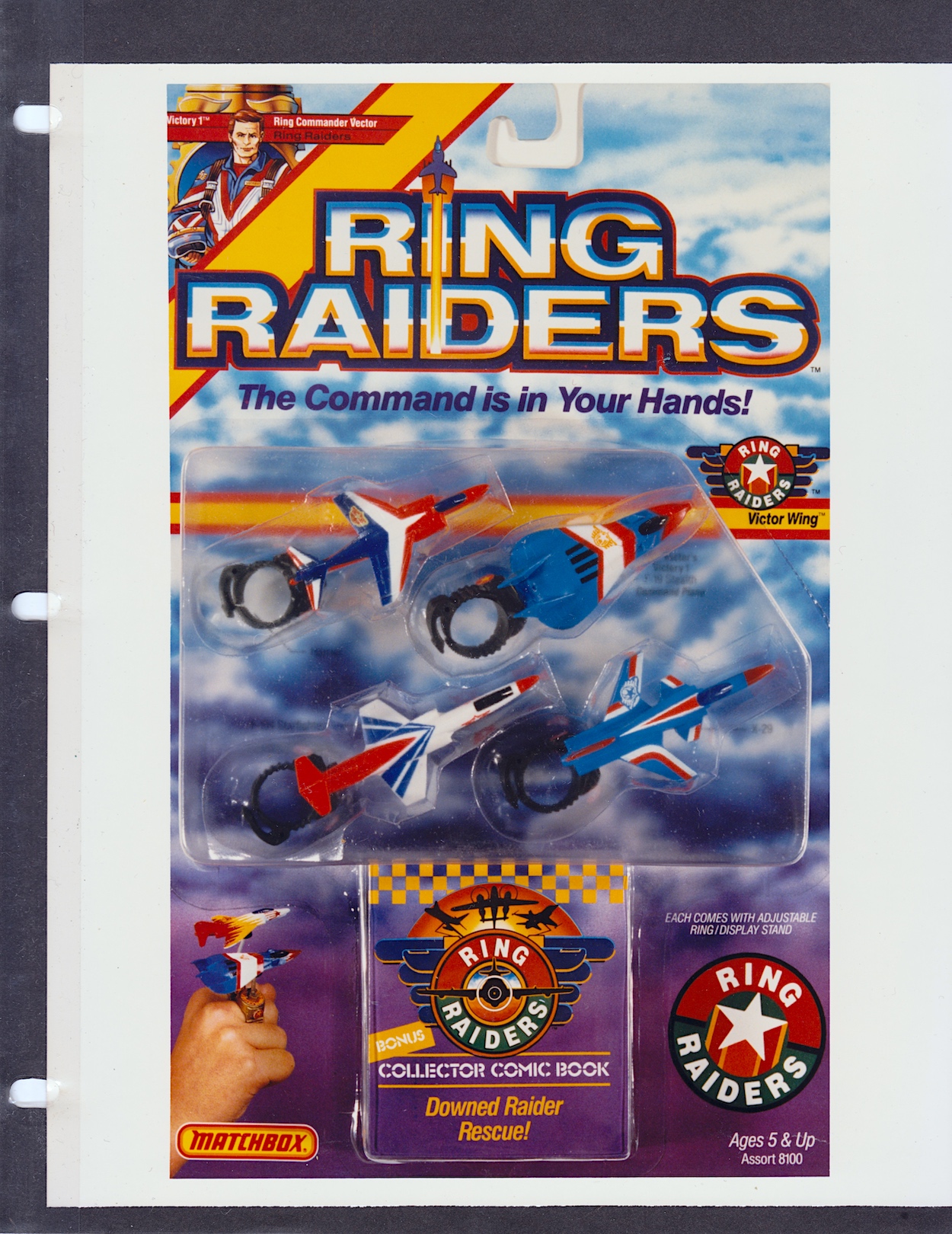
Anyone who collected these very collectible toys at the time should prepare to have their memory cells jolted as we move on to ‘Hang Tag and Packaging‘, namely the packaging used for the Matchbox toys themselves. First there’s more criteria, although these are more like suggestions and designers are encouraged to explore what might suit their product the best. These apply to all packaging, whether that’s by Matchbox or anyone else, right down to the sky background. There’s also mention of bold visuals such as colour bands trailing after the planes and you can see examples in the previous section’s merchandise concept drawings.
These card displays with the planes tucked away inside moulded clear plastic take me right back. From discovering my first two-plane starter set to excitedly collecting all the packs I could in every toy shop I visited, as well as receiving gifts during the festive season or from visiting family members from Scotland. I have a particularly fond memory of coming home from school to find my sister was visiting and I hadn’t been told, so it was a surprise. After a while she told me she’d brought me something and it was a huge eight-plane set featuring all the Wing Commanders.
I think back and my parents must’ve had to coordinate with my siblings and family friends because I never received any sets I already had (although there was some overlap in the range like those Wing Commanders planes, each of which would also be in their Wing sets). I’ve no idea how they managed that without me knowing. Anyway, yes, these photos are bringing all the smiles right now.
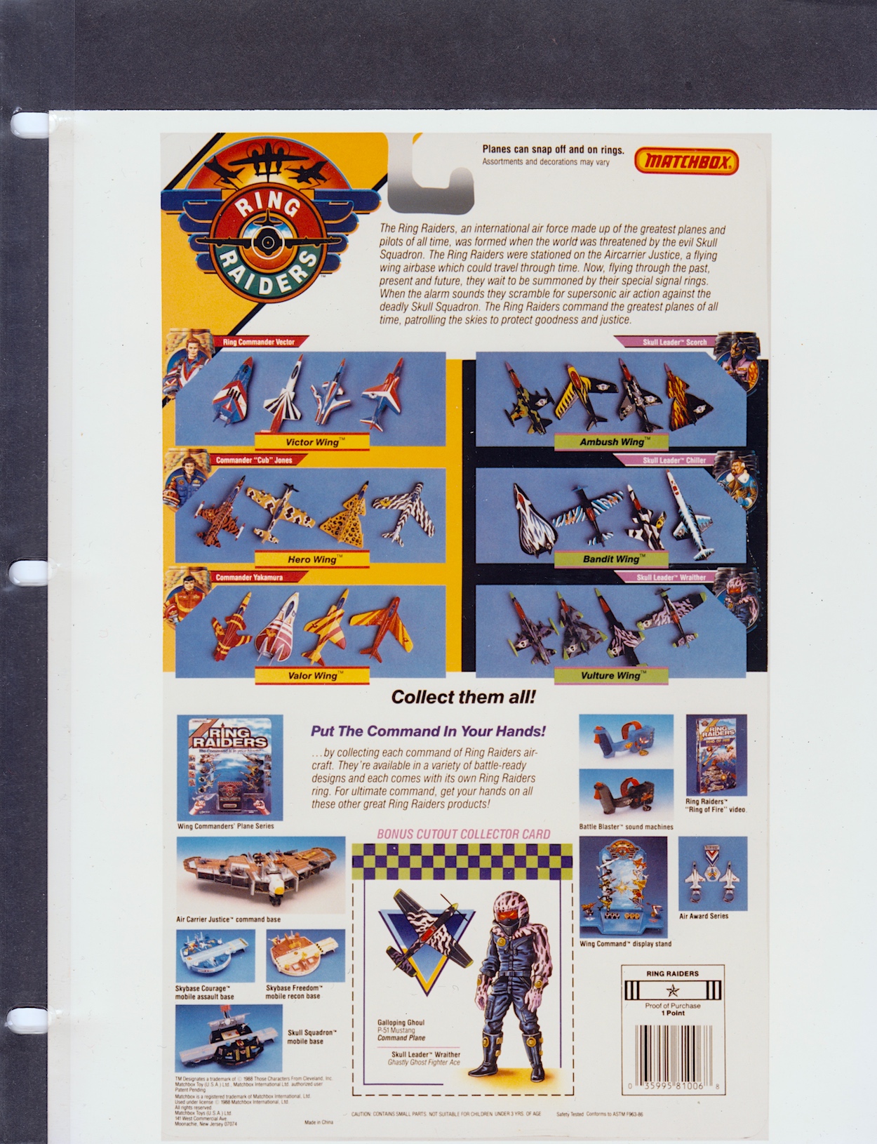
The rear of the packaging reveals more sets and a huge array of extras. As you know the franchise never took off, but over the course of a year (actually, mainly over the course of one summer and Christmas) I was able to collect everything here (plus most of the additional plane sets not shown here) except the gigantic Air Carrier Justice and the black version of the Battle Blaster. Ah, good times.
In case you’re wondering what we could redeem those barcode points for the answer is simple: nothing. It was possibly something for consideration at some future point but nothing ever came of them within the time the line lasted. According to online sources there were second and third series of planes, although I only ever remember seeing a second series the next summer which just made me more frustrated that the comic hadn’t lasted, because I thought the release of more toys meant they’d been a success.
Of course, with hindsight I know the second series would’ve already been in production before things fell apart. But I never did buy any more after that initial year and then in my later teens mine were handed down to a young nephew and subsequently destroyed through his playing. I kept the yellow and red X-29 as it was my first, and my favourite, but even this was given away to a girl in my late teens. (Hey, I was young and she’d taken a shine to it.)
Ring Raiders had that “gotta collect ‘em all” quality
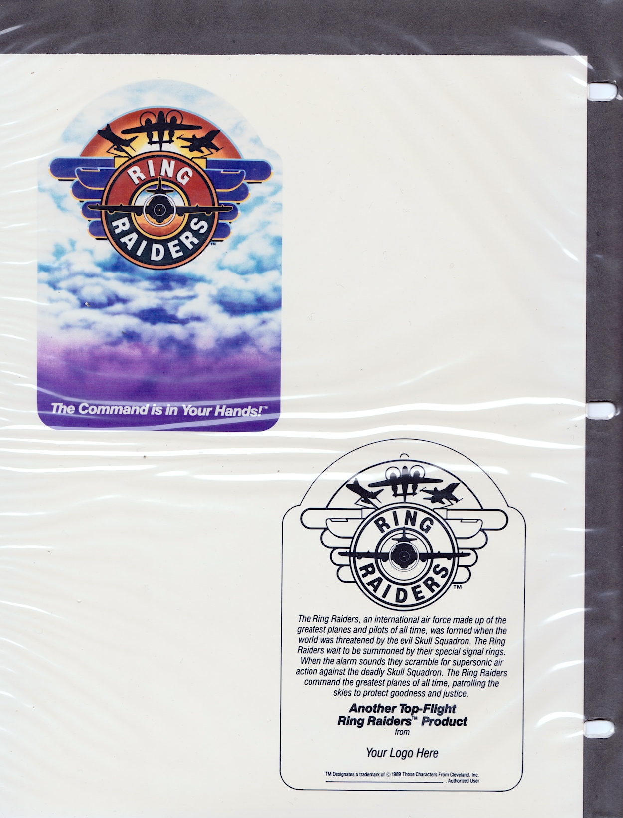
After the hangtag (an example of what a product could hang from in a store) things are rounded off with a large scale image of that beautiful, full-colour logo. It’s the same page that’s been slipped inside the front of the folder which I’ve shown in a few photographs, but I’m including a proper scan of it to end on as requested by blog reader Terry in their comment under part three of this series. You’re right Terry, it is sweet!
With that the folder is finally closed and placed back on the shelf alongside what was, and still is, my favourite non-OiNK childhood comic. The toy line may have only lasted about a year and I was quick to move on to my next obsession, I’m sure, but what an obsession these were. I come away from this series of posts with one key takeaway; the Ring Raiders were robbed of being a hit franchise.
Before Pokémon, the Ring Raiders had that “gotta collect ‘em all” quality. They were great toys, the comic had great characters and action, there was variety and adventure and a ton of fun in all aspects of the franchise and it had more potential than most others in my opinion. They have a special place in my heart all these years later and, dare I say it, I don’t think I’m finished with them yet.
Once again, thanks to former IPC/Fleetway editor/writer Barrie Tomlinson and his writer son James for kindly sending me this folder in the first place.
With an increase of 5p on the cover price, Death’s Head #7 hit stores today back in 1989 with this Bryan Hitch and Mark Farmer cover, while inside I’m excited to see inking duties on Bryan’s pencils are actually by Jeff Anderson, whose work I loved so much in Marvel UK’s top-selling Transformers and this combination is just superb throughout. The comic is also still offering subscriptions for 12 months so clearly there was no sign yet that even those earliest of subscribers wouldn’t be getting all of their issues delivered. (Only three more to go after this one.)
A new colourist has joined the fray, namely Stuart Place who also coloured for the company’s The Real Ghostbusters, Action Force (G.I. Joe) and Transformers, most notably the fan-favourite Dinobot Hunt story in the early days of the comic. Steve White has also taken over as editor after Richard Starkings resigned. Poor Steve, we’ve already seen his name on the blog when he edited Visionaries but it didn’t last long because the subject matter flopped, he took over Havoc just before it got unceremoniously canned and the same is about to happen here. None were his fault obviously, and he is a simply incredible artist! Check out his Instagram and make sure you see his gorgeous colouring on Xenozoic Tales in Dark Horse’s Jurassic Park!
Shot by Both Sides (as ever written by Simon Furman with Annie Halfacree lettering) is a brilliant strip, one of my favourites of the run so far. The comedy comes thick and fast in the early pages. A robotic tour guide is telling passengers on a bus what they can see to their right and left when a crashing ship narrowly averts disaster but rips off the roof of the vehicle in the process. In response, the robot simply moves on with, “Um, well… above you, you can see…”.
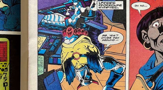
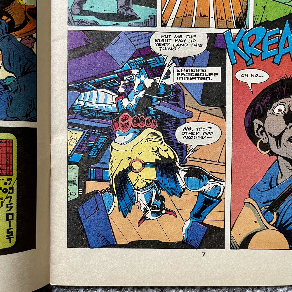
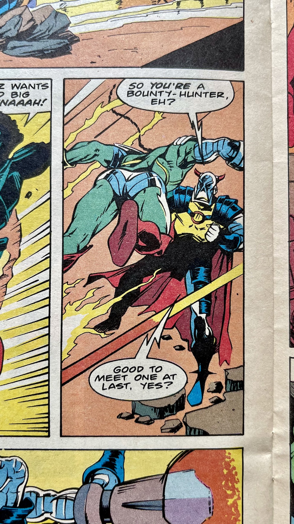
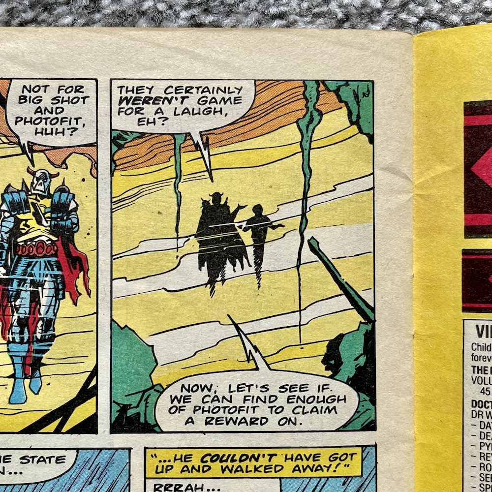
It’s at this point we see the panel above and the ship in question is Death’s Head‘s, who seems to be having problems with the autopilot. I remember a friend of mine in school who was a particularly big fan and he’d often quote the “No, yes?” line when asked a question. The plot this time combines two previous cliffhangers from #4 and #6 and sees bounty hunter Big Shot and explosives expert Short Fuse both attempting to take out the Freelance Peace-Keeping Agent for their bosses.
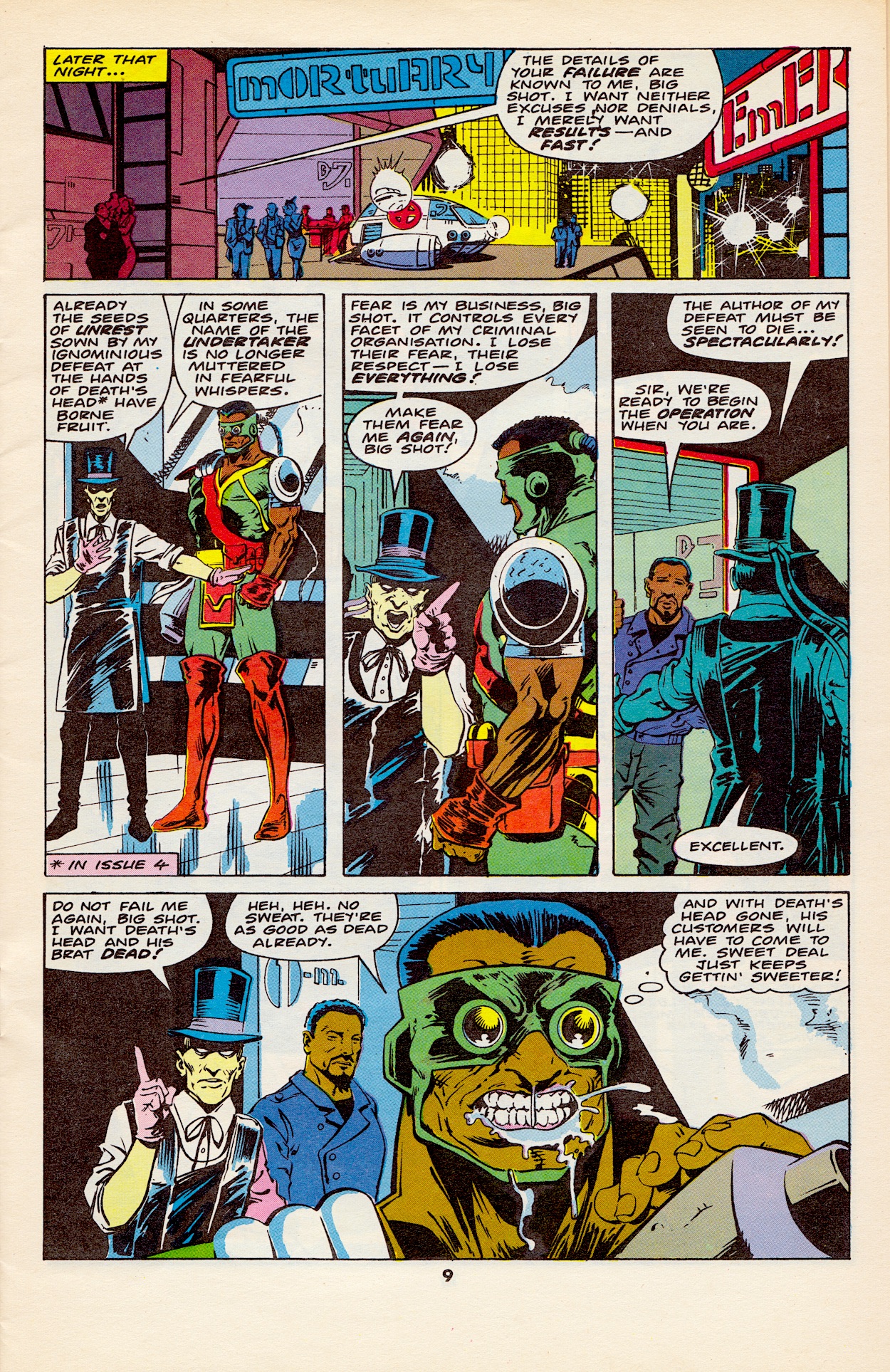
These bosses are the previously featured Undertaker and new gangster Dead Cert, a cigar-chomping man with a horse’s head who unironically runs the city’s illegal sports gambling rings, including horse racing. In the first scene (the crashing ship one) we find out Big Shot had fired a high-powered missile at Death’s Head ship which had initiated the crash. But Short Fuse had also planted an explosion in the cargo hold. When it went off it lightened the craft enough for it to be successfully pulled up before it crashed into that bus.
Death’s Head puts both down to “cowboy builders” and doesn’t realise he was actually under attack. This forms the backbone of this month’s tale. Big Shot’s aim is to kill our anti-hero and double-cross Undertaker by taking over Death’s Head’s business, while Short Fuse just wants to do a good job for the person/horse who hired him. However, they keep attempting to take out their target at the same time. While completely unaware of each other, each attempt is undone by the other’s, cancelling each other out in an increasingly funny series of events.
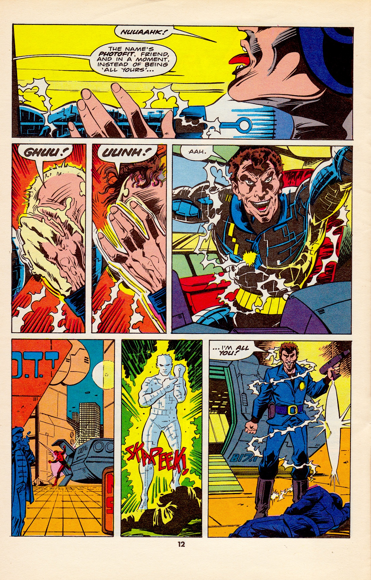
There’s a main bad guy mixed in here that acts as Death’s Head’s target for a job he and Spratt (good to see him back in the strip) have been hired to carry out. Called Photofit, he has a hi-tech suit which enables him to mimic anyone he comes in contact with. Think the T-1000 from Terminator 2, albeit a few years before that film was released. While the chase makes for an entertaining plot it’s really just a vehicle for the assassination attempts.
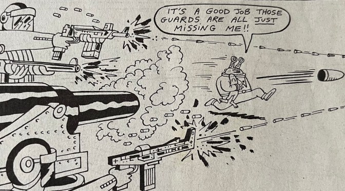
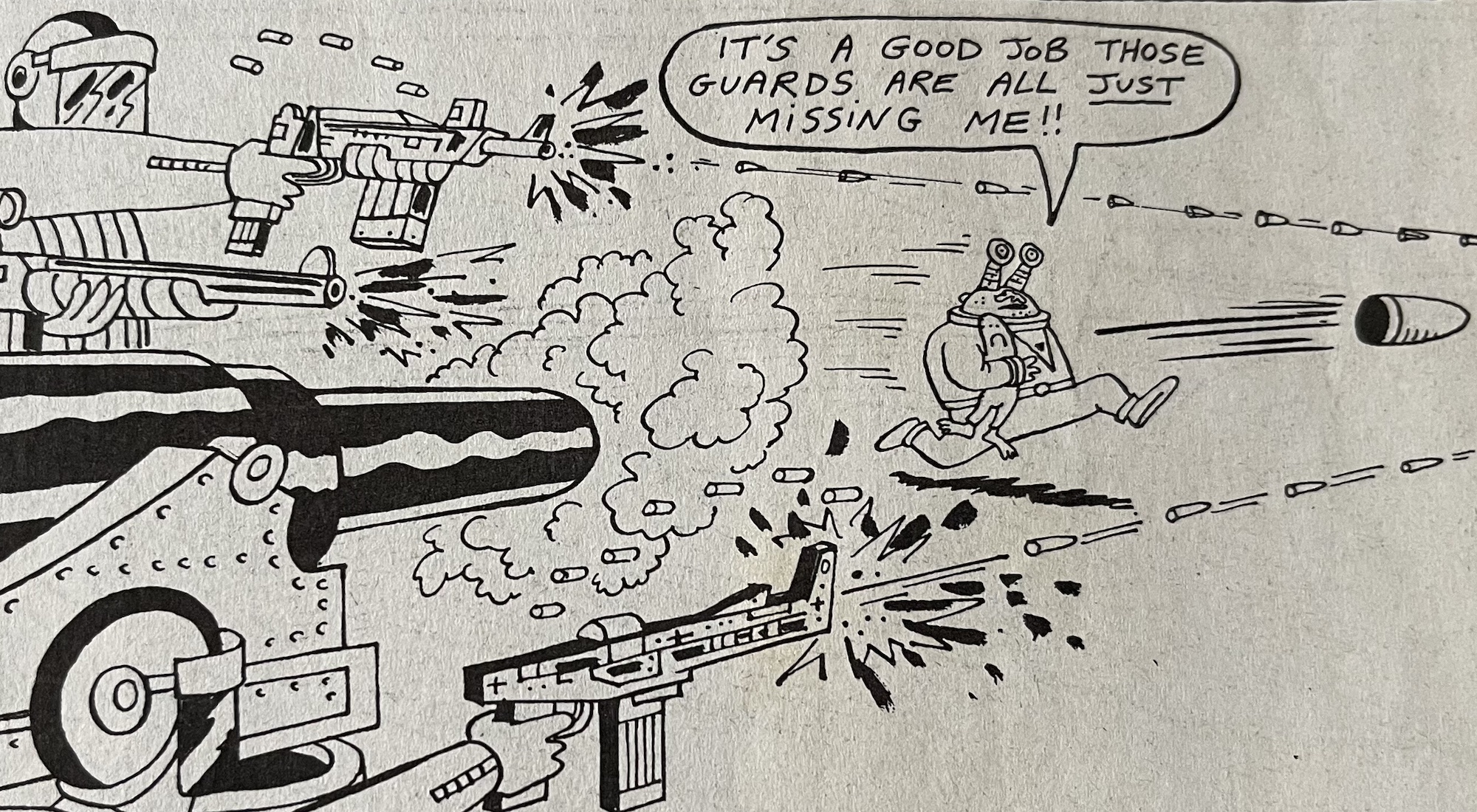
Eventually our lead clicks that something is going on as you can see below. I love the panel when he realises, his expression and the rain bouncing off his metallic face is all just perfectly realised. In the middle panel you can see how Short Fuse’s mistimed bomb blows Death’s Head backwards and away from Big Shot firing his bazooka-like weapon. He’d been in his sights but the explosion pushed the target out of the way and you can see the bazooka shell zooming harmlessly past.
Somehow this doesn’t get stale either, mainly thanks to the imagination on show in how these attempts fail and Death’s Head’s reactions. All the while the Photofit story continues and he disguises himself as a contestant on a game show where the prize is a trip out of the country, all paid for and through legitimate channels, the ultimate getaway right in plain sight.
Spratt accidentally ends up on the show itself and faces off against the disguised Photofit while Death’s Head tries to search the rest of the building for someone who could be anyone. All the while he’s getting attacked by unknown enemies. Unknown until Big Shot finally decides to change that. Sick of having his chances squandered he blasts Death’s Head through a wall, then stands over him, gun pointed at his head, ready to take the final shot… when another explosion knocks him off his feet and into waiting fists.
I had to laugh at that first panel! Well, our main character isn’t a bounty hunter after all, yes? Short Fuse is getting frustrated too. For once it was Big Shot who got in his way, so he resorts to desperate measures but his own incompetence results in nothing more than an explosion in mid-air that shoves the fighting duo through a wall and into the television studio.
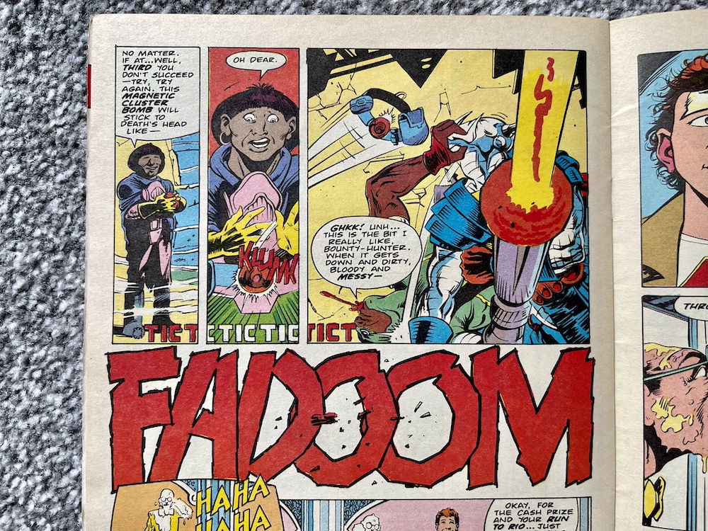
Just before this, Photofit makes himself known to Spratt because our unwitting contestant is actually winning the game. A gun held in the small of his back, he’s saved by the sudden arrival of our fighting duo and Photofit realises he’s defeated and must escape. He sees the perfect disguise right in front of him. Or it would be, if that disguise didn’t immediately place him in the sights of an assassin.
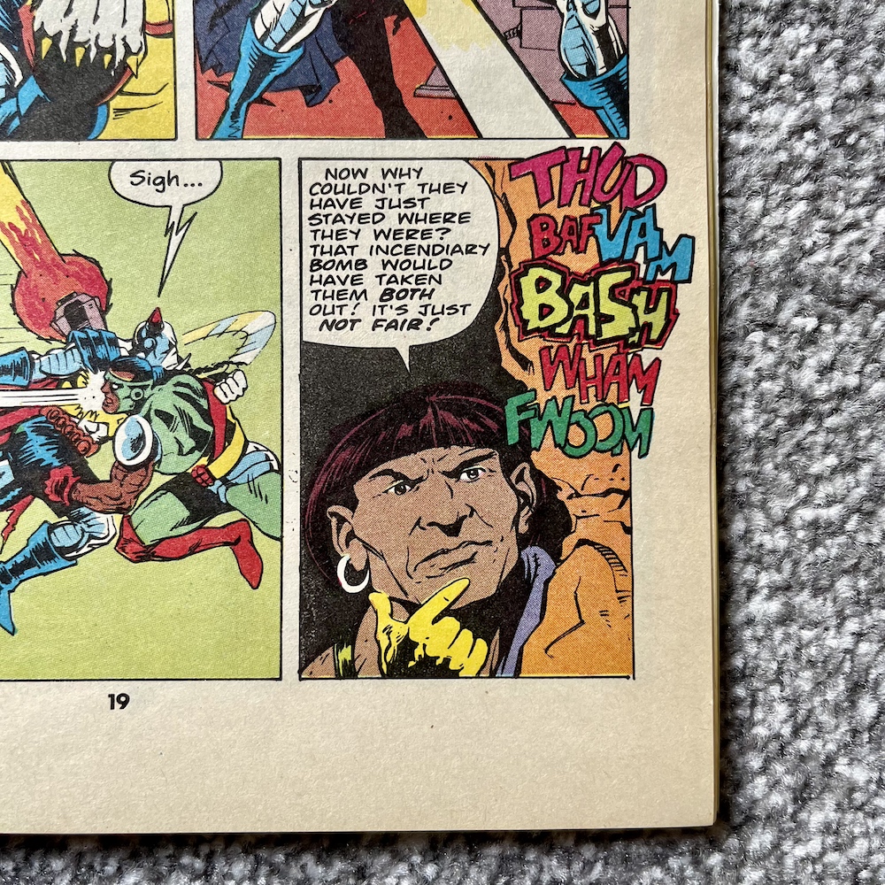
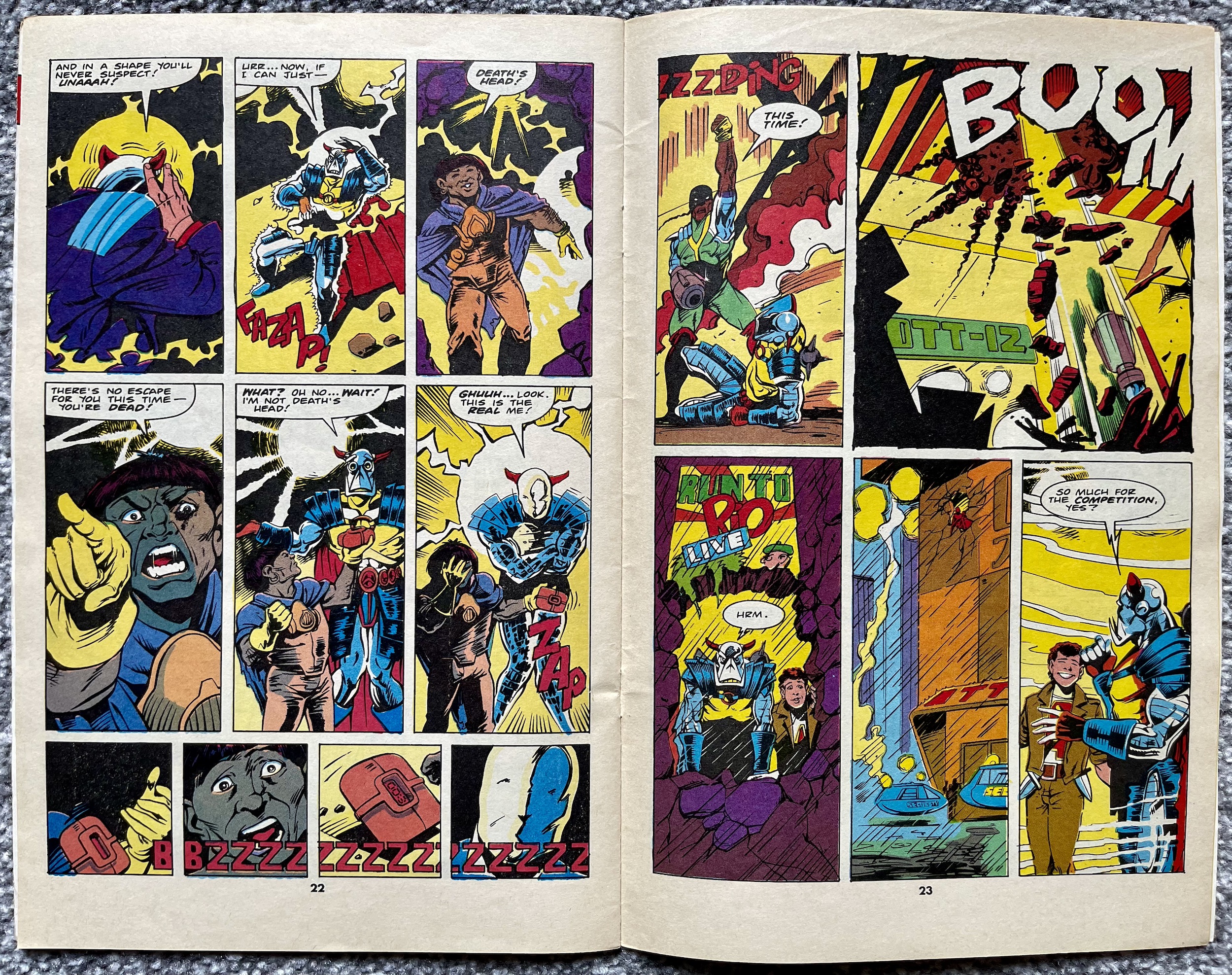
So the magnetic bomb obviously doesn’t stick to the very human imposter and in a shocking move it not only blows him up but Short Fuse as well! Okay, yes, he’s been trying to blow up Death’s Head but the very violent slapstick comedy he’s brought to the issue has been hilarious and I’m genuinely sorry to see him killed off. Despite being a hired killer there was something loveable about the little man. However, even in death he manages to thwart Big Shot one final time and save the mechanoid they’d both been hired to kill.
As the story ends Spratt and Death’s Head converse over how it was strange that things kept exploding around them, reminding the readers that the duo never even knew of Short Fuse’s existence, never mind his influence on events (and their lives). They don’t seem to care why those explosions kept happening and instead only hope there’s enough left of their target so that they can prove they’ve earned their money!
It’s a suitably funny conclusion for these two, playing down the events and simply moving on. In their position it’s probably the healthiest way to be but that’s not the point. The point is that they’re very funny together and obviously the perfect match, something even Death’s Head seems to have finally acknowledged. These two are so well written, their actions and dialogue so natural that you have to step back to remember how far-fetched the whole scenario of the comic is.
I’ve really enjoyed Simon’s writing in Transformers and Dragon’s Claws but there’s something about this particular comic that stands out. It feels like it’s more of a personal project for Simon, it’s so one-of-a-kind and has such a unique sense of humour I get the feeling the writing is closer to Simon’s own personality than anything else I’ve read. We’ll see that insight hopefully develop even more over the remaining months, the next instalment in five weeks on Monday 3rd June 2024. But before then…
A few years back I wrote an article about OiNK for a fan-produced magazine called Comic Scene. It’s a magazine that has been cancelled, returned in a different format and cancelled again more times than Uncle Pigg has had hot swill. The article was for their ambitious but ultimately factual-error-filled (and also cancelled) partwork series History of Comics. To accompany it I also wrote about my top six issues of OiNK and was able to get some fantastic quotes from some of the comic’s team to use as a box out.
For whatever reason neither of these were used. I thought not including the quotes from these incredibly talented cartoonists (who had all happily got back to me with their thoughts) was particularly surprising. Well, to mark the 1986 release date of OiNK’s preview issue (and the first OiNK review on the blog) here are the quotes I was able to muster in time for the article’s original deadline but which never saw print for whatever reason. They’re a nice little insight into the making of OiNK and I’d like to thank everyone for contributing at the time.
STEVE McGARRY
“It was more than an honour to be asked to contribute to those first few issues of OiNK, it was a damned inconvenience.”
DAVID LEACH
“Working on OiNK was a fantastic experience, it featured my first professional cartoon character and it marked the start of my professional career as a freelance cartoonist.
“I got to meet life-long friends and it got my foot in the door. As such it holds a soft spot in my dangerously enlarged, erratically beating heart. OiNK was the start of my professional career as a cartoonist. I had seen a preview copy of the comic and just knew I had to be in it. I contacted Bob Paynter, Group Editor of Humour Comics at IPC at the time and he offered to send my work sample to OiNK if I did a job for Whizzer and Chips. I ended up drawing a four issue pull-out strip called Phil Fitt and Brad Habit, which got published and in return my sample strip for Psycho Gran got sent off to OiNK and that was that!”
JEREMY BANX
“Working on OiNK was hard work and great fun. I’d never expected to work in comics so it was a strange adventure for me. I learnt a huge amount and it certainly changed the general direction of my travel.”
LEW STRINGER
“OiNK came along at just the right time for those of us who were still new to the comics business. We were full of ideas and still young enough to be able to relate with what the readership wanted. It gave us the perfect opportunities to develop our craft and come up with strips that wouldn’t fit in with the more pedestrian formularised comics. It was such a fun time to work in comics. We all had a great time and I think that shows in how fondly OiNK is still remembered all these years later.”
DAVEY JONES
“Thinking of OiNK, I reckon the main thing I remember is how open they were to stuff which wasn’t necessarily in the traditional British comic format. They liked the more familiar style of Buster/Whizzer and Chips style strips as well of course, but were also happy to look at stuff that was a bit different. I really liked the things that Jeremy Banx was doing with Burp the alien, which were sometimes these short, funny science fiction stories, and I hadn’t really seen anything quite like it in comics. So you felt like you didn’t need to follow any particular formula when submitting scripts, just think of daft stuff that they might find funny.
“The other thing that occurs to me is how encouraging [co-editor] Mark Rodgers was. I’d send him the scripts first, and quite often he’d turn them down, but he went to some trouble to explain where I was going wrong (the stories were too complicated, or I was trying to fit too much in etc.) which I appreciated a lot, because he could have just stamped the word REJECTED on them.”
KEV F SUTHERLAND
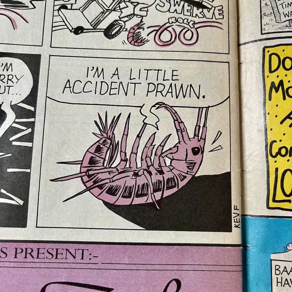
“In 1986 I was desperately trying to break into comics so I was sending something, at least every week, to both 2000AD and OiNK. OiNK would reply saying my stuff was too superheroey or dramatic and that I ought to send it to 2000AD, and 2000AD would reply saying my stuff was too funny or cartoony and I should send it to OiNK. It took a year until, finally, it was OiNK that broke under the pressure and let me in with, I think, a Rotten Rhymes script which they let me draw.
“I then got increasing amounts into the comic, especially my Meanwhile… strips which ran to a page each, reaching a climax with #68, a third of which was written and drawn by me (including The Plop Factory, a parody of Stock Aitken & Waterman in the style of an EC Comics horror story). That was the final issue of OiNK, and I was back where I started, desperate to break into comics.”
GRAHAM EXTON
“By an eerie coincidence, all of us who contributed material for Rrrassp! comic (as OiNK was first called) wrote strips featuring pigs. So Bob Paynter suggested making pigs the main theme. I’m not sure if it was my idea, but Mark and I both liked the Tharg and Stan Lee characters who communicated on the 2000AD and Marvel letters pages, hence Uncle Pigg. I think the Plops were my idea, but given the theme of pigs they were pretty well inevitable. They were based on Leo Baxendale‘s squelchies who were Grimly Fiendish‘s minions years before Despicable Me.
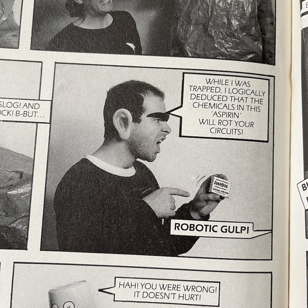
“Mark and I met with Tony [Husband, co-editor] in his home and I was struck by his lovely paintings and impressive collection of Peter Hammill LPs. I have not met Patrick [Gallagher, co-editor] in person though we are Facebook buddies. I was impressed with his ability to mimic other artists’ styles. Mark and I did a few fumetti [photo stories] when he and wife Helen came to visit me in South Andros, Bahamas. We roped in our neighbours too.
“The funniest strips I was involved with were the two Herbert Bowes ones. He had a lot of things up his nose. Jeremy Banks’ art made them super funny. The third one involved the Starship Enterprise (up his nose), but I couldn’t make it work, so never finished it. My all-vegetable theatre strip (with fab Ian Knox art) festered in my brain for many years before emerging, butterfly-like, as Tatertown, a strip I give away on Facebook. I did it mostly to learn how to use Photoshop, but it now has a life of its own.”
DAVY FRANCIS
“I loved working for OiNK. As well as scripted stories, I was allowed to use my own jokes, so I would send off scripts – thumbnails, really – and if I got a yea, then I’d draw it and send it off. I was doing Ciderman at the same time, and working in the Housing Executive full time, so it was a very busy time. However, I loved it. One mystery remains: what happened to the German version of OiNK? It ran for 3 issues, but I’ve never seen a copy.”
PATRICK GALLAGHER
“From my earliest recollections of OiNK, going way back to its development stage when Tony, Mark and I had never produced a comic before, or suffered the logistical nightmare such a dream job brings, it all felt excitingly experimental and risqué. Those feelings became the form and the norm that remained right up until the final issue, which I think gave OiNK a certain sense of unpredictability and edge throughout its life, with room for error and genius in varying measures.
“Yes, some things worked better than others; OiNK was never perfect but what carried it through was its ‘voice’, which never faltered. That was the combined comedic soul of Tony, Mark and me. That is what I am most proud of and what our brilliant contributors latched onto to make OiNK something special.”
These were from a few years ago, before this version of the blog was even launched and since then more of OiNK’s creative team have reached out to me for the blog and other reasons, hence the non-appearance of some key names above. It actually gives me an idea for the future but I won’t say anything yet in case I jinx anything. Thanks again to everyone above and to everyone who has been such a great source of information, OiNK and otherwise!
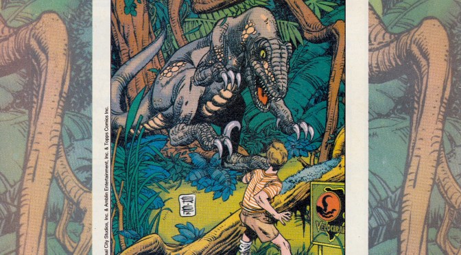
When I read Dark Horse International’s UK Jurassic Park comic I wondered what marketing it may have received in their other titles. Throughout the reviews you’ll see adverts for the likes of Total Carnage, Manga Mania and what could probably be described as their flagship comic, Aliens. It’s on the back page of an issue of that film spin-off that I spotted a full-page advertisement for the new movie tie-in comic.
As I announced last Christmas, Aliens will be coming to the blog this year in a real-time read through of Dark Horse’s time with the licence (UPDATE: Now live). Whenever I buy classic comics from eBay I don’t read them until I’m scheduled to do so for the blog, but I do flick through them, solely checking the page numbers to ensure there’s nothing missing. As I picked up #13 (on sale 24th June 1993) to begin flicking from the back cover to the front, counting down the page numbers as I went, this jumped out at me.
As you can see, I wasn’t the only person something was jumping out on. Using the cover from #1 (by Gil Kane and George Perez), this is promoting the initial run of the adaptation of the film, before the American comic began publishing the first official continuation of the story. At this point in the US bets were hedged before telling readers it was an ongoing comic, so naturally over here they’d do the same. Released every three weeks to start with, it all began on 8th July before the movie had even been released here.
The advert mentions how the art of the strip was based on stills from the movie, which is a strange boast to make. It makes it sound like it could be nothing more than traced-like images, but of course in the end it was a genuinely good comics adaptation which successfully tinkered with the script and the running order of the scenes so it’d work better on the page. Well, for the most part anyway, until they got to the final chapter. You can read the reviews to see what happened there.
The Jurassic Park comic would prove popular enough to survive many cancellations at Dark Horse
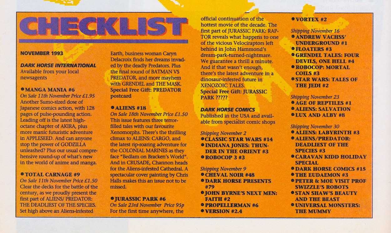
Strangely, it’s advertised as a 32-page comic when it actually had 36, but then again Dark Horse didn’t seem to count their covers in the total. Then in a later issue of Aliens (#17) I discovered the exact same advert again minus the green text along the bottom. However, the promotion of a competition with “50 (count them) 50 fantastic prizes” only applied to #1 and not the competitions in the issues on sale at that later time. What does correlate properly are the Dark Horse Checklists.
In each of the early editions of Jurassic Park the checklist showed the upcoming comics that would be on sale over the next month, so they contained details of the next issue. This means we never got to see the checklist released for the premiere issue to see what it had to say, but #13 of Aliens does, just a couple of pages before that advert.
By the time Jurassic Park moved to a monthly ongoing format with brand new stories set after the movie the checklists were dropped from it. There just wasn’t room anymore, however they still appeared in the larger Aliens. Below is the one which promoted the beginning of the first official sequel to the movie, although it unfortunately doesn’t mention the completely awesome Age of Reptiles back up strip.
The question marks might look like they’re keeping the free gift a mystery for some reason, but it’s actually just placeholder text that they’ve forgotten to delete before going to press because #6 didn’t come with a free gift. A few sloppy errors aside it’s interesting to see how one of my favourite childhood comics was marketed to potential readers.
After the movie proved to be such a phenomenal success I thought they’d have advertised the comic more, that they’d have at least produced a new advert to promote the new stories instead of recycling the one they’d already used before the film’s release. Oh well, hindsight is a wonderful gift. The Jurassic Park comic would prove popular enough to survive many cancellations at Dark Horse, only succumbing to the folding of the company itself towards the end of 1994. You can read reviews of them all on the blog right now.
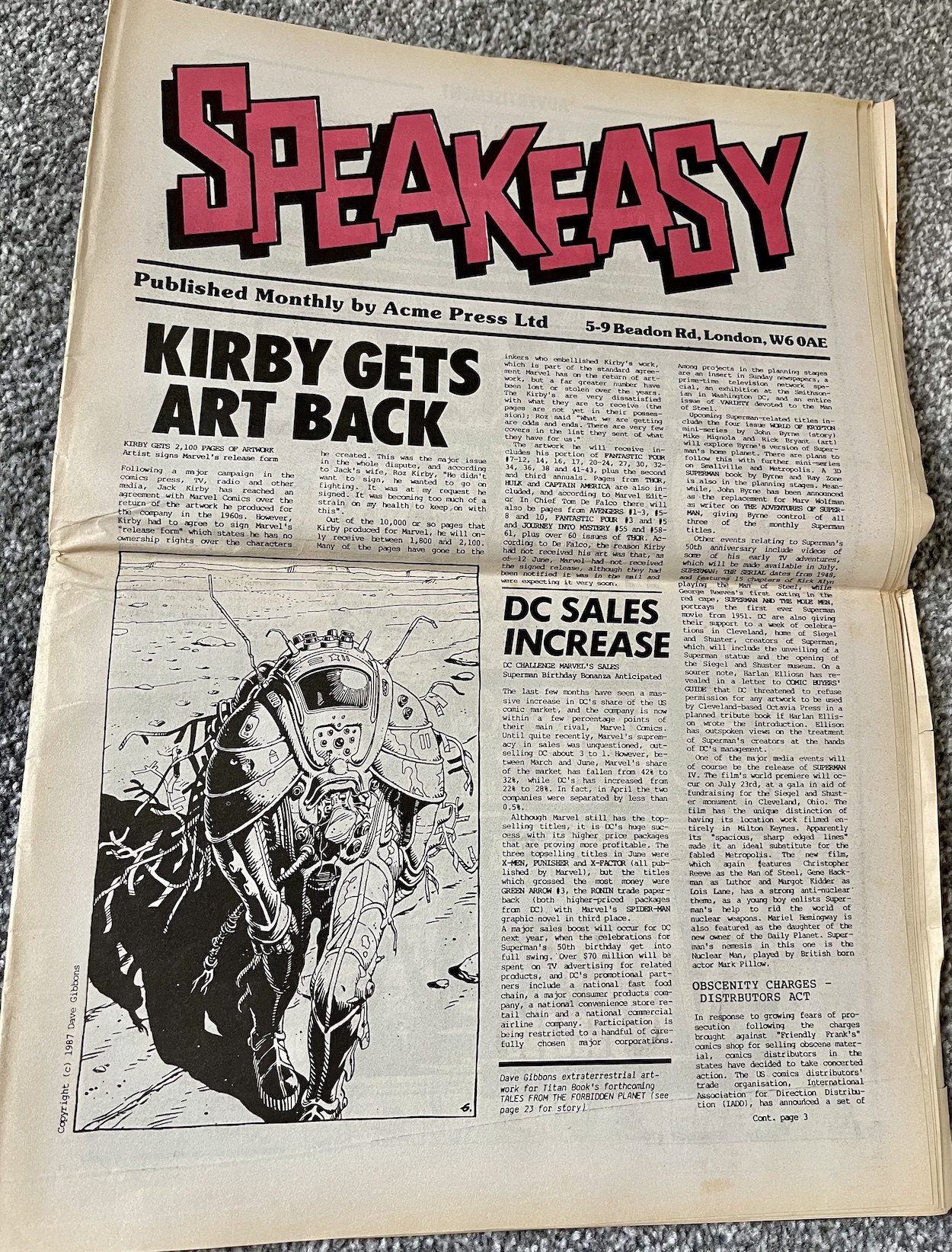
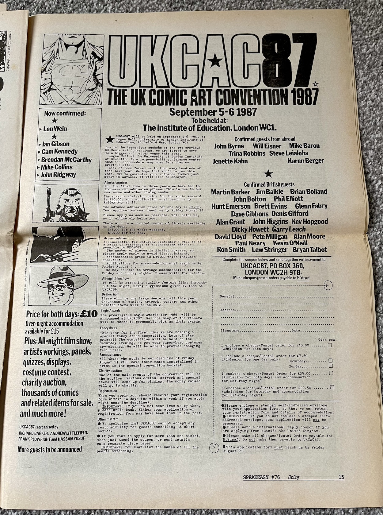
This is #76 of Speakeasy, a sort of newspaper about the UK comics industry which began life as a fanzine in 1979 and would go on to become a monthly resource for comics fans and the industry for over 120 issues, all the way through to 1991. Above is the front cover as it would’ve been seen on the shelves, fitting in perfectly with all of the other similarly-sized UK comics. However, that wasn’t its true front page.
I think this was rather neat! It opens out to tabloid size and is printed on similar newspaper stock. With 20 of these huge pages there was certainly plenty to read in the days when we relied on print publications to deliver us our comics news. Bambos Georgiou, who drew Blimey! It’s Slimer in The Real Ghostbusters (after Lew Stringer’s early issues) was editor at one stage, although by now that job was Richard Ashford‘s.
Bambos is credited as the ‘UK Correspondent’ but in reality publishers Acme Press Ltd was the creation of his, Richard, Cefn Ridout and Dick Hansom, who readers of the blog may know better as the editor of Dark Horse International’s Jurassic Park and Aliens comics. The connections with other blog comics continues as Death’s Head/Dragon’s Claws/The Sleeze Brothers editor (and friend of the blog) Richard Starkings designed the logo.
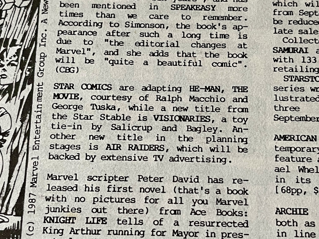
It’s a meaty read and there’s a lot packed onto each page but I did spot this blink-and-you’ll-miss-it reference to Visionaries, although it’s short on details. This issue of Speakeasy went on sale on this date back in 1987 and the American Visionaries comic would launch as a bi-monthly in November, not coming over to this side of The Pond until Spring 1988. Also, the less said about that He-Man movie the better, yes? I still shudder with the memory of the one night I watched it back then!
So anyway, why am I showing you this issue of Speakeasy? Simple, it’s because OiNK gets a mention. This shouldn’t really be surprising news when you spot a page summing up a lot of that month’s releases, however there’s more to it than that as far as OiNK is concerned. It mentions the banning of the comic from the kids’ shelves in W.H. Smith (boo!) and the surprising revelation to me that John Menzies didn’t stock it at all!
I remember visiting a John Menzies in Oban in Scotland as a teen, when we spent summers in a small village in the highlands of Scotland, and I’d spend my hard-earned waiting staff wages on games for my Commodore 64 that was waiting for me back home in Northern Ireland. If I’d known, I’d have went elsewhere. However, as you can see the column here says they were only losing OiNK about 10,000 sales per issue. Yes, it’s not to be sniffed at when you’re the publisher, but when OiNK was selling 100,000 and more per issue I honestly thought the figure would’ve been higher.
I do like the fact Speakeasy calls for its readers to do the complaining now and gives us the address to write to one of the newsagents in question. “Bring Back the Bacon to Where It Belongs!!” Love it! You can check out the reviews for the two issues mentioned here, #34 and #35 on the blog. No mention though of how these two issues saw the transition between original publisher IPC Magazines and Fleetway Publications.
This full-page advertisement for that year’s UK Comic Art Convention stood out to me as well thanks to a couple of photographs I’d already seen that were taken at this very event. You’ll see Tom Thug and Pete and his Pimple cartoonist Lew Stringer’s name on the page as a confirmed guest, alongside OiNK contributors Kevin O’Neill and Dave Gibbons and several of the talented creative team from Marvel UK’s Transformers.
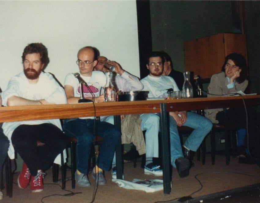
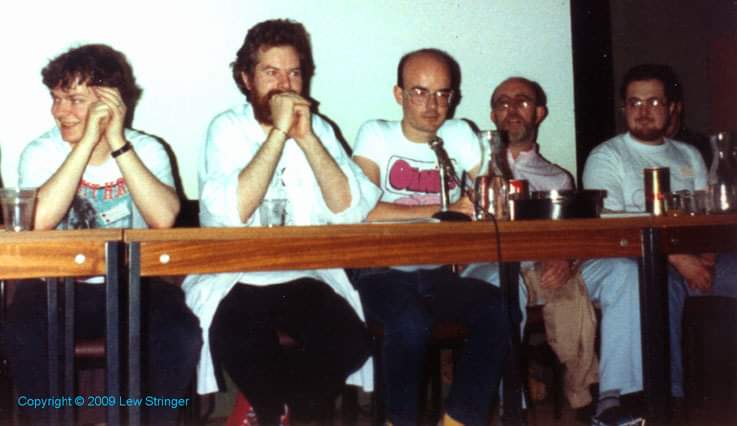
Not mentioned are more of Uncle Pigg’s finest workers who all appeared at an OiNK panel during the weekend. Below are two photographs kindly supplied by Lew showing the team taking questions from the audience with their 80s hair dos in all their glory (and Lew rocking the OiNK t-shirt).
In the first photo (from left to right) we have the panel’s moderator Theo Clark, then Lew himself, Ed McHenry (“swigging pop” according to Lew), David Leach, Davy Francis hidden behind him and Jeremy Banx! In the second photo you can see Ed more clearly and on the far left is Viz co-creator Chris Donald. OiNK was at the height of its popularity at this point, (despite the best efforts of the aforementioned newsagents) having just enjoyed its first anniversary, the release of its first Holiday Special, the first annual was in the can and some of the comic’s best issues were about to hit the shelves.
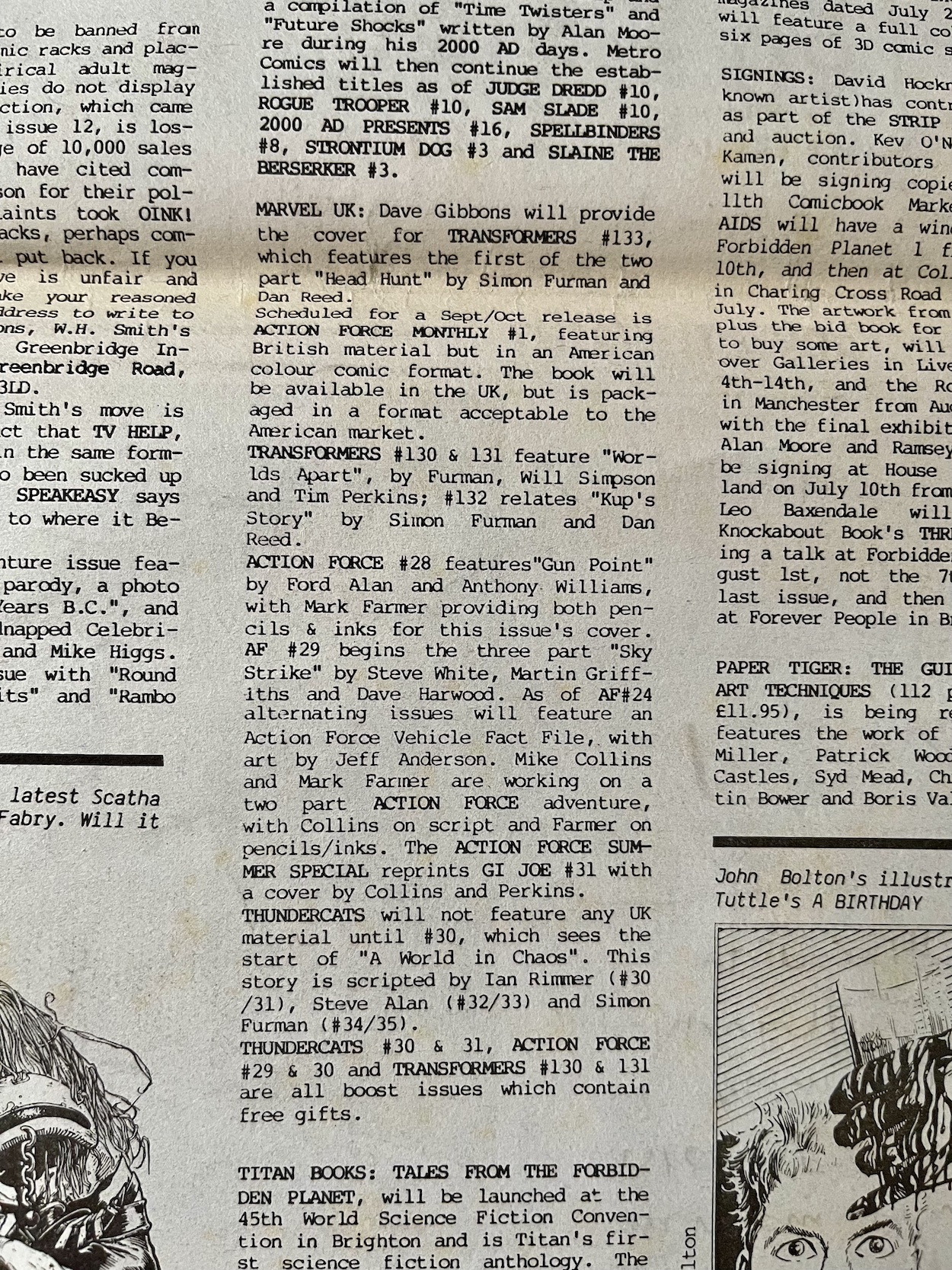
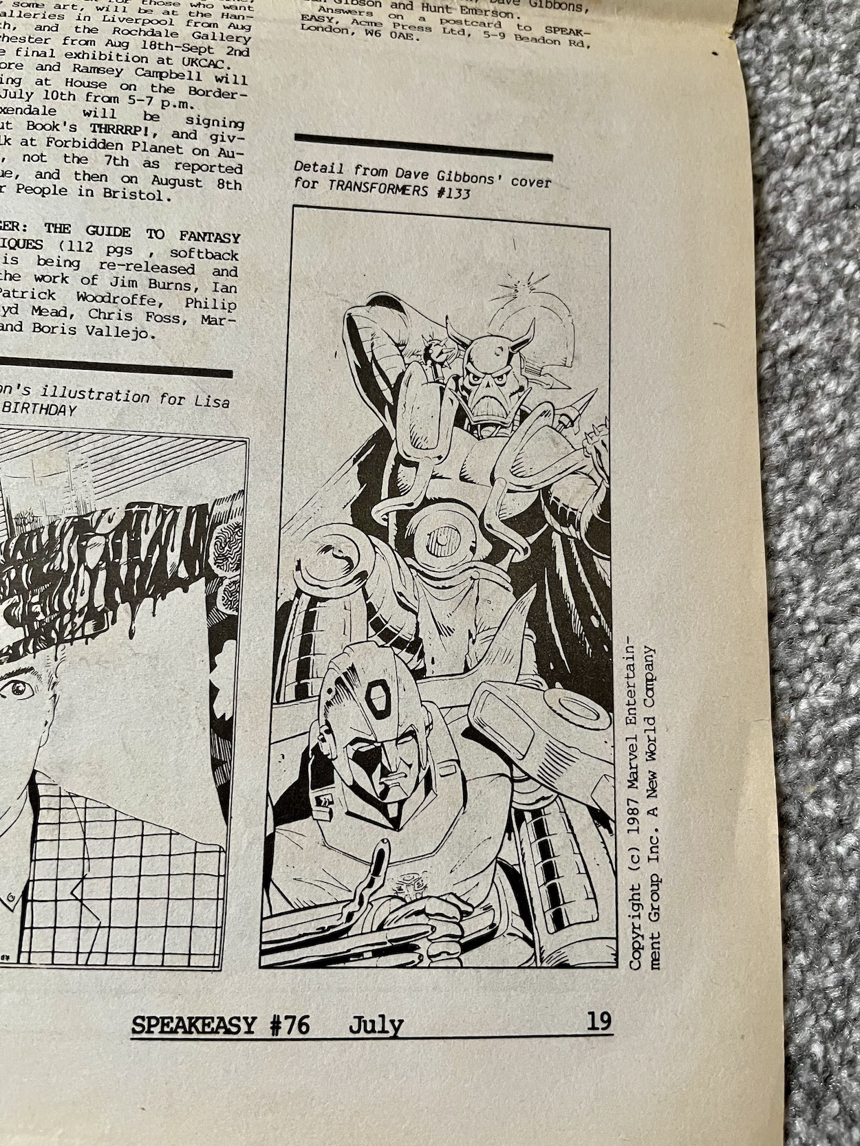
Also of note to blog readers (and readers of its social media) is a little bit about Transformers and Action Force (G.I. Joe), namely Dave Gibbons drawing the cover to #133 of the former which is worthy of a mention in the news and there’s also a preview of his art. Action Force gets more space here with the announcement of a monthly comic to compliment the weekly, for sale both in the UK and as a way of repackaging British stories into a smaller comic to sell in the States.
The thing is, while it states here that this new comic would be released in a few months, Action Force Monthly wouldn’t appear until the following summer after the weekly had already been cancelled and merged with Transformers. It’s interesting to see it wasn’t originally planned as a replacement for the cancelled weekly but instead fans of Duke, Snake Eyes and Scarlett were meant to have both a weekly and a monthly to enjoy every month.
OiNK may have only got a small mention here but I’m always on the look out for my favourite comic of all time popping up in media of the day. It was nice to see it being taken seriously in the pages of Speakeasy and the call for support to get it back among the children’s comics. Speakeasy itself is a fascinating snapshot of the medium in the 80s and if you’re a fan of the decade’s comics you could do worse than picking up a few issues to see how your favourites were reported on.
Have you ever found out something about your childhood many years later and wondered how you never noticed even though it was so glaringly obvious? In the case of this blog it could be how I never clicked that the TV show Round the Bend was created by OiNK’s editors! As for the Ring Raiders it’s something small but even more obvious, the colour of the canopies on all of those planes I collected.
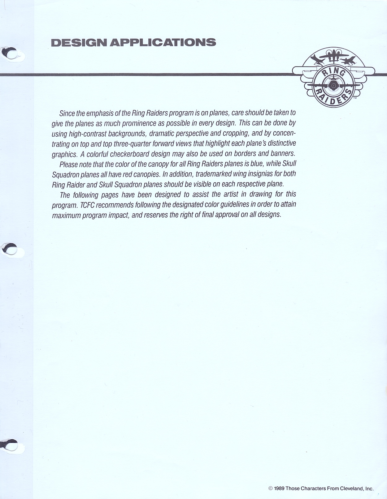
Welcome to the fourth part of my look at every single page of the Ring Raiders Style Guide sent out to licensees in 1989. We’ve covered the introductions and details of the range, the characters and their all-important aircraft and now we move on to the Product Art Reference section. Here, Those Characters From Cleveland (TCFC) described how they expected their creations to be shown and a concept artist drew up some fun merchandise ideas, making this my favourite part of the whole folder.
The introduction reminds licensees the planes are the focus, which is an obvious point since it’s all based around those superb Matchbox toys. Of course, Barrie Tomlinson’s comic understood the significance of focusing on and developing the characters in order to tell good stories with those planes. Coming to this as a fan of the comic I initially found it strange how they were trying to tell artists specific ways to draw their creations, but of course this wasn’t aimed at dynamic comic strips. Instead, this was for those making other merchandise based solely on static representations of the aircraft.
In fact, when I spoke to Barrie about the Ring Raiders comic he told me how some licence holders didn’t understand the medium and would analyse every single frame as if it were an individual image instead of a sequential piece of art. Thankfully TCFC were apparently much more knowledgeable about comics. This page mentions my point about the canopies, how the Ring Raiders all had blue canopies and the Skull Squadron‘s were all red. A quick glance on eBay proves this point and I’ve no idea how I didn’t notice that pattern as a kid!
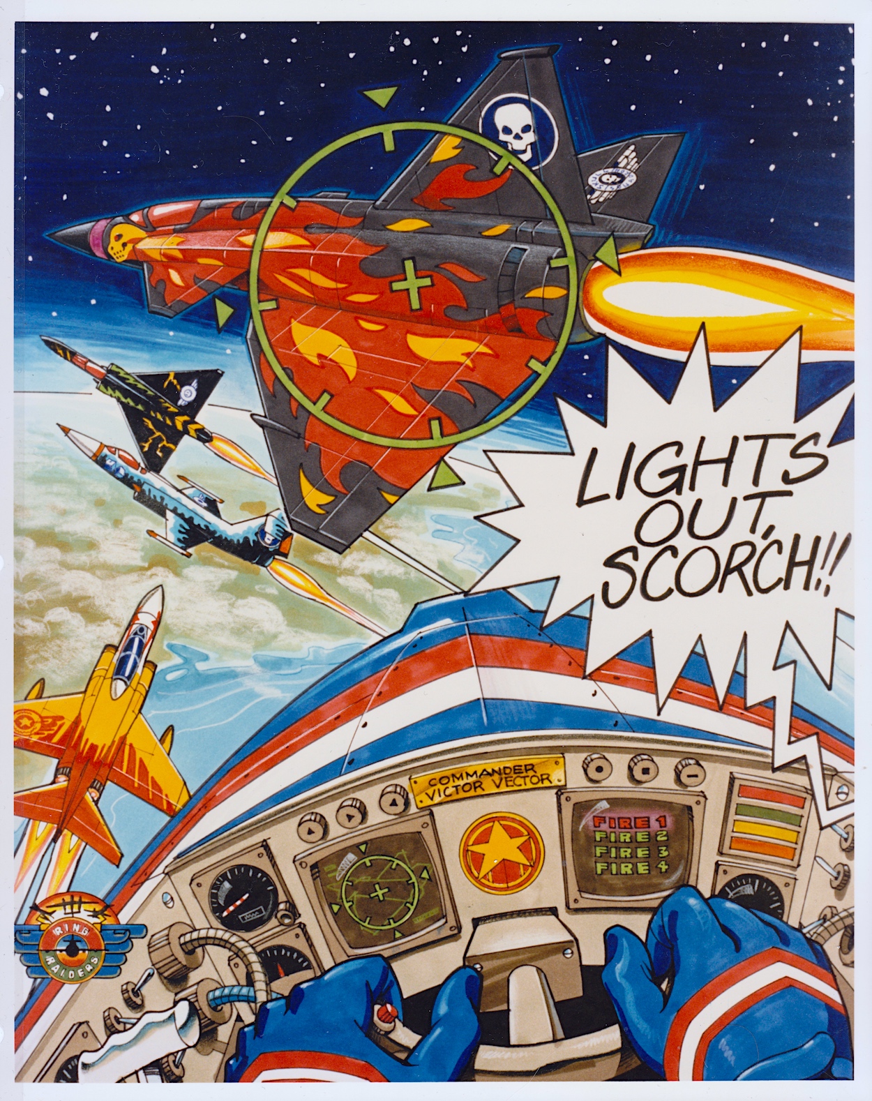
This full-page piece shows how some of the aerial action could be portrayed and I think it’s a great scene! It’d certainly make for an awesome poster if it was blown up a lot larger. I particularly like the lighting on Scorch’s Torch and seeing inside Vector’s cockpit. In fact, it’s only upon seeing this that I realised the airplane controls weren’t something we really saw in the comic, apart from the sci-fi element of the rings. Yes, I just love this and it’s a shame we don’t know who drew it.
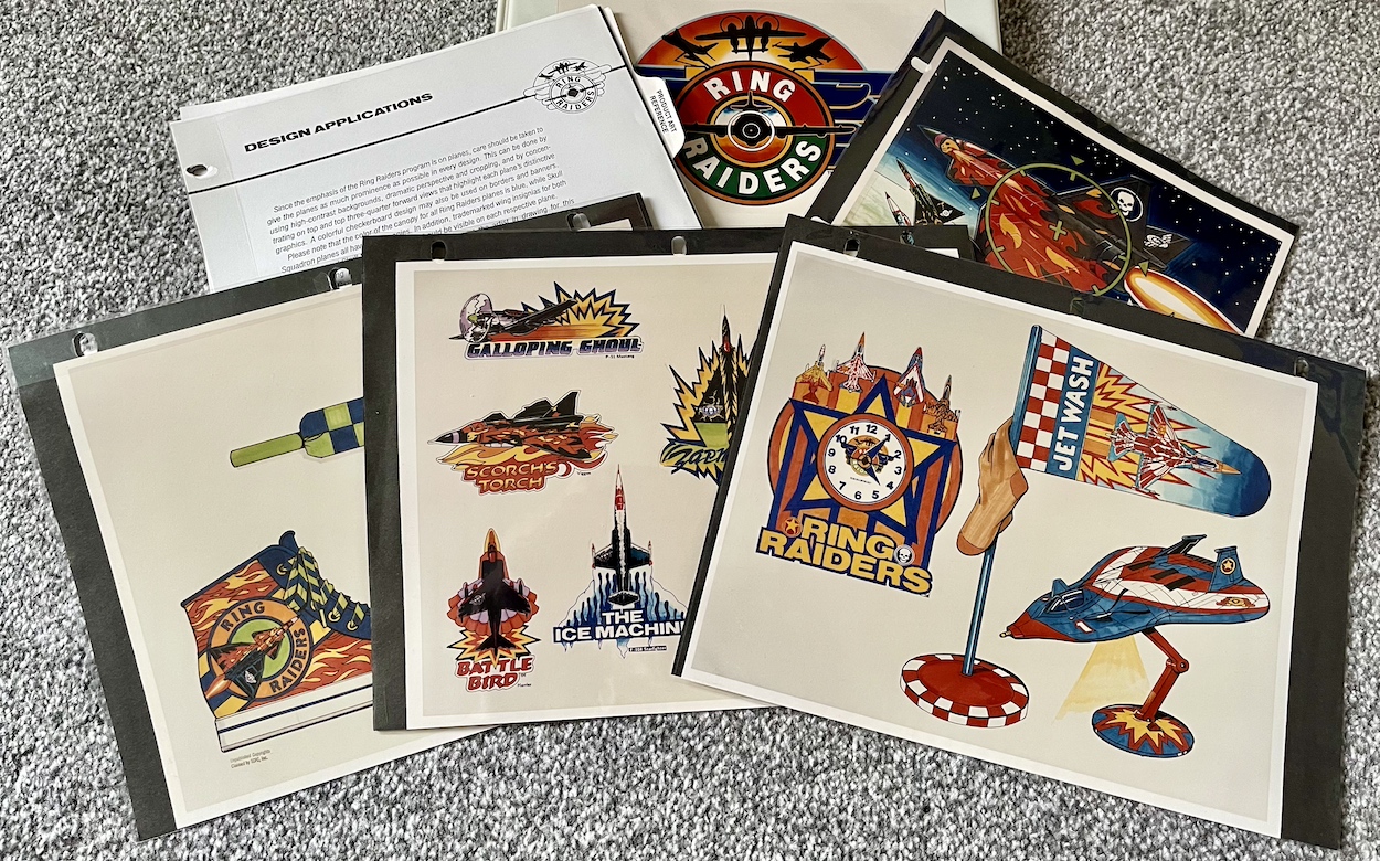
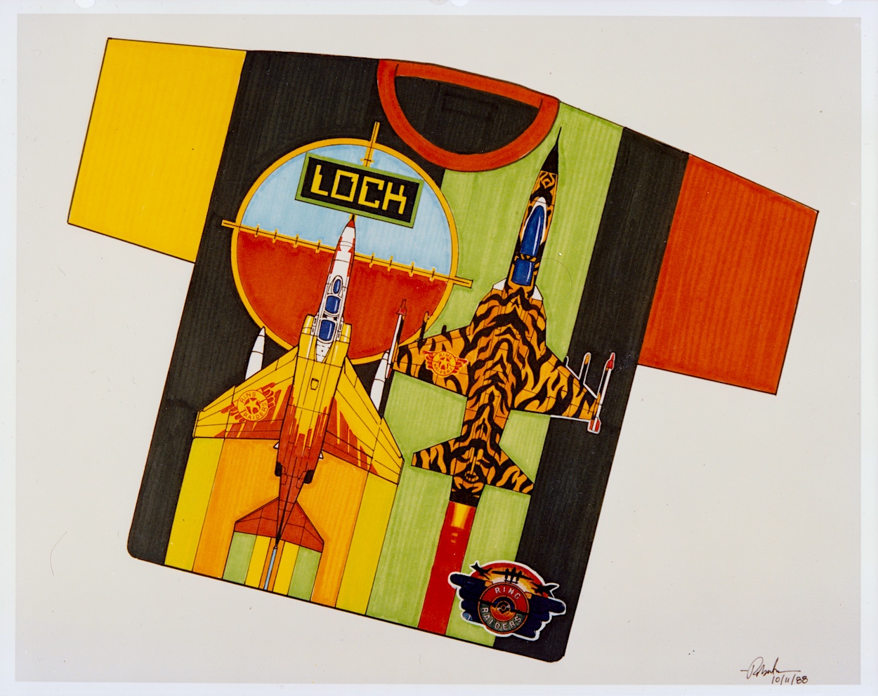
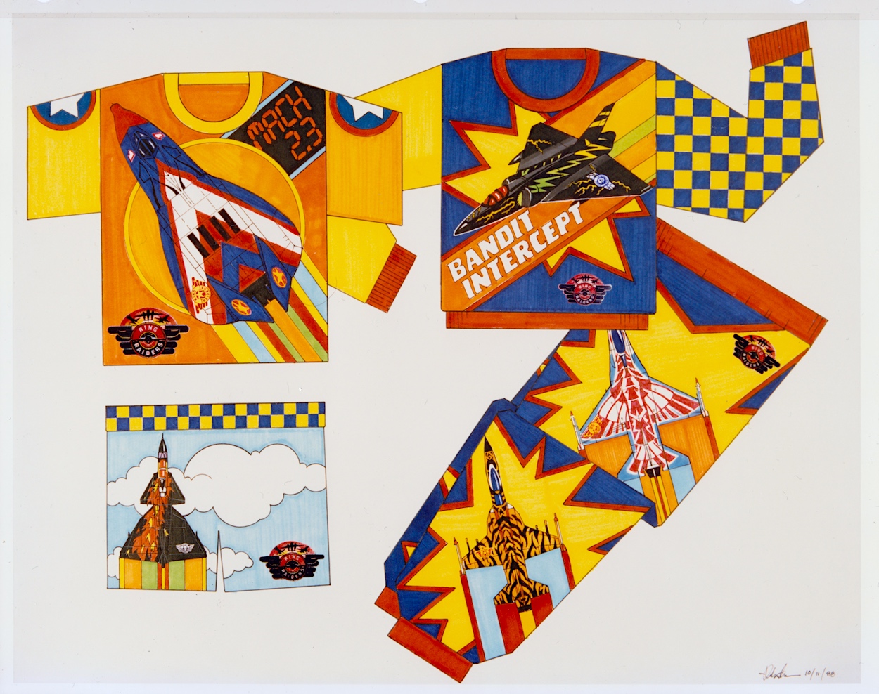
The next five pages are my favourites because they give me an insight into all of the cool (and not so cool) things I no doubt would’ve wanted to adorn my bedroom (and my body) with if the franchise had taken off. These weren’t officially released, TCFC used these to promote possible ideas to companies as a way of convincing them to work on the franchise. Unfortunately I don’t know the artist whose signature is on these pages. Hopefully I’ll be able to find out in the future.
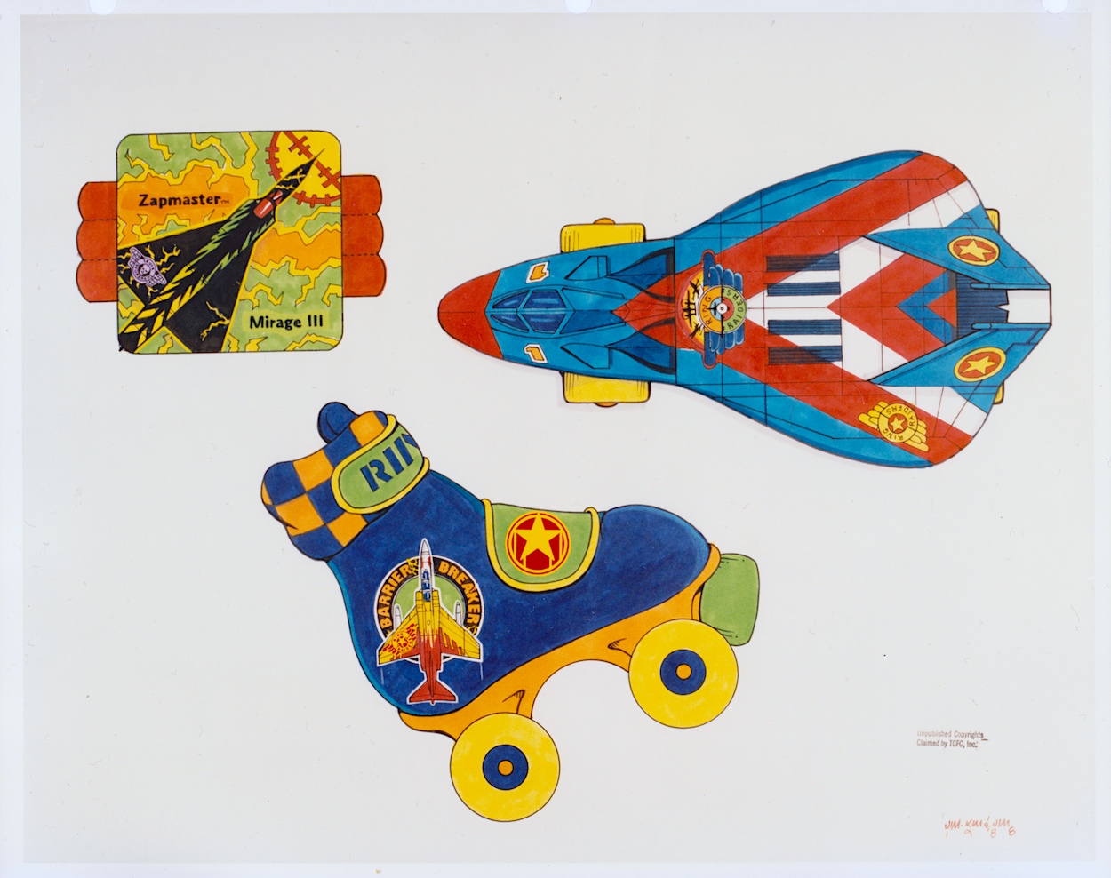
In the introduction to this section colourful checkerboards were mentioned as a way to add borders and banners where needed and the artist shows how these could work on some particularly gaudy clothing. Hey, it was the late 80s and in their own way Ring Raiders may have been ahead of their time as we slid into the 1990s. I mean, have you seen the fashions of that latter decade? We even wore shell suits for goodness sake!
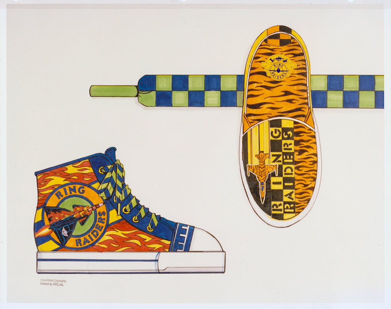
I started secondary school in the autumn of 1989, the year of the range’s launch, so I doubt any of these clothes would’ve been aimed at my age range. I also doubt any of my friends would’ve let me forget if I’d turned up wearing any of them. However, given how retro inspired clothes are all the rage today, and it seems the more colourful trainers are the better, I think one of the items below might still sell to a select audience.
Okay, so those who are still fans of the Ring Raiders may make for a rather niche market but when you look at some of the celebrity ranges or those based on other retro franchises they don’t look too out of place. The slippers and their tiger design (to match that of “Cub” Jones’ F-5) might also work without that green and blue strap; I certainly know a friend who loves animal print, although the plane might put her off!
On the final page of wearables, is there anything more 80s than roller-skates and sweat bands? Initially I thought the top-down view of the Victory 1 F-19Stealth Fighter was a more custom skate, but when I couldn’t figure out where you’d put your foot in I clicked it’s actually one of those novelty skateboards that were so popular back then. As a kid I wasn’t really into sports so these wouldn’t have been on my Christmas list, but that’s certainly not the case with the items on the next page.
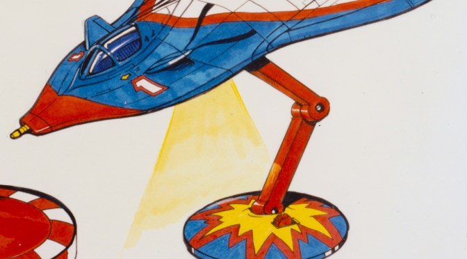
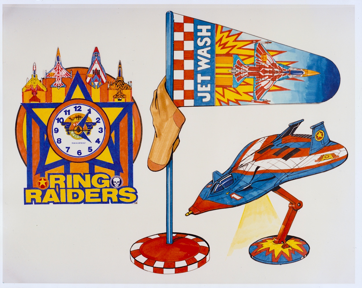
How much do I want that lamp even now as an adult? I remember cutting out the main title logos from my toy packaging and sticking them all over my room alongside the posters from the comic, I even had a large one on the door to my room instead of the usual name plate. I was crying out for more official merchandise to be released. As such, that clock would have looked good on my wall and I think modelling a laundry basket on an airfield’s windsock is ingenious. It may even have helped keep my room tidy!
While these are just a way of throwing out ideas for licensees to work from, I think they’re great fun. In the Ring Raiders: In Real Time introductory post you can see some of the official merchandise that was released at the time and you’ll see that checkerboard pattern plenty too. Also in that post is a photo of a mocked up child’s bedroom where everything seems to have the branding of the range. It’s a somewhat ambitious photo on the part of TCFC but you have to aim high, right? Plus (again) it was the 80s! This was the way of things.
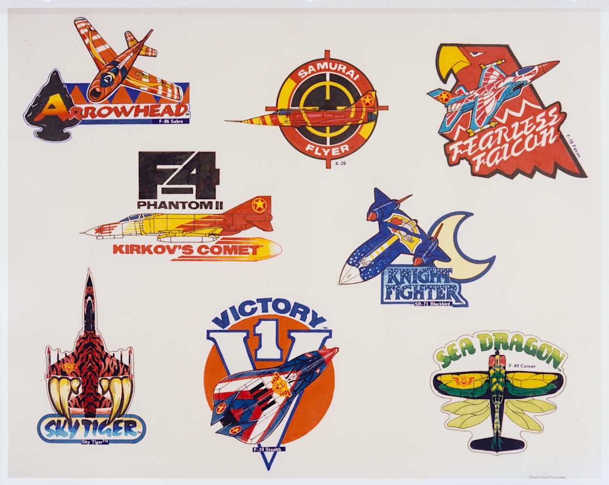
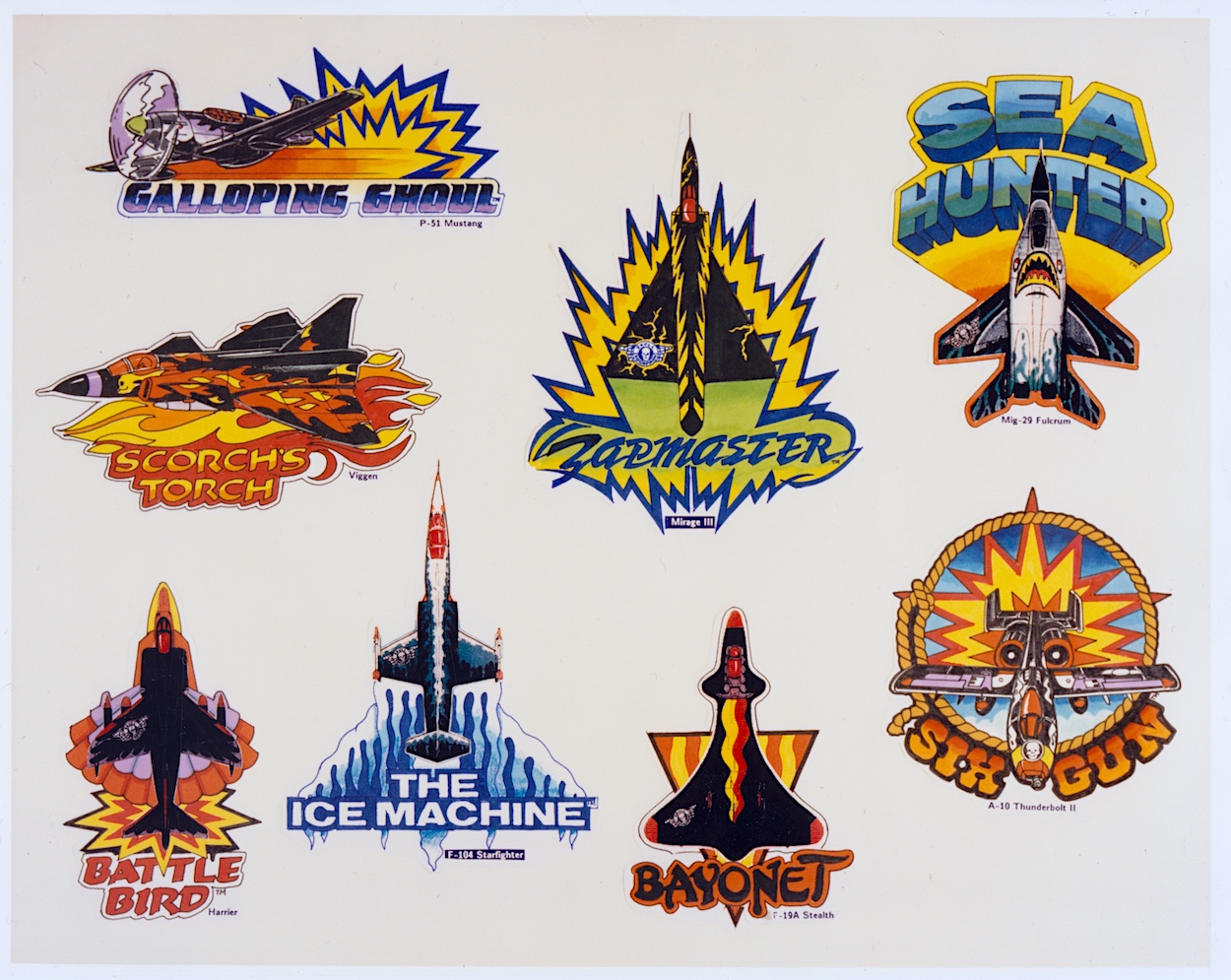
These two pages round off this section of the folder and show the great idea of having different emblems for each of the leader craft. I never saw these on any of the toy packaging or in the comic so I’m assuming they never ended up as an official part of the branding. While each Commander’s aircraft was accompanied by three other planes in a pack, I like the idea of the lead planes being promoted this way.
I can imagine some of these being turned into badges or, to be really 80s/90s they could’ve been material patches to be sown on to denim jeans and jackets. I particularly like the ones for the Galloping Ghoul P-51 Mustang (a favourite from the toy range), Kirkov’s Comet F4 Phantom II and the Sky Tiger. This whole section sums up the fun manufacturers and us kids could’ve had with the Ring Raiders as the next big craze of childhood.
Where has the time gone? We’ve only got one more part of this monthly series to go. The final few pages deal with more serious stuff like trademarks and the legal side of things, as well as approved logo variations, typography and some samples of the packaging that would be adorning toy stores around the country and the wider world. So make sure you fly back here on Monday 13th May 2024 for the final landing.
A few weeks ago I lost my mum. It was cancer, as it always seems to be these days. I was with her on Christmas Eve 2019 when she was given her diagnosis, when the doctor told her he couldn’t give her any timeframe other than to say it could be six-to-twelve months or it could be years. She passed away over four years later and lived her best life in that time, surrounded by friends and family, always so giving to everyone she loved.
Christmas 1980 and Summer 1984
I can still remember my mum rolling her eyes at some of the things she’d see in my OiNK comics and laughing over Christmas 1987 as I showed the cheeky front and back covers of the OiNK Book to every one of her friends that visited over the holidays. She always encouraged my reading. While she may have complained when another comic came along that I wanted to collect, later in life she said she’d always been so happy I was asking for comics instead of sweets every time we went to the shops.
My comics really helped my reading comprehension as a kid and mum encouraged me to read more and more, always filling my stocking every Christmas with books from The Railway Series and always happy (though she’d quibble to me at the time) to give me money to buy comics and computer magazines throughout my younger and teen years.
1990: I definitely got my love of Christmas from mum, and her Christmas dinners were the best!
In 1999, when I decided to forego a full-time job and go back to college to study media and writing she didn’t hesitate to back me, knowing that I was still trying to work out what I wanted to do with my life. Even if she didn’t always agree with decisions I made in that regard, the most important thing for my mum was that I was happy and following my heart. Every new job I tried she was right behind me. I was in my 40s before I realised what I wanted to do and my mum was still encouraging me.
I could wax lyrical with memory upon memory of growing up with my mum but where do you even begin choosing which ones to write about? Instead, I wanted to focus on those associated with my writing and thus this very website; how she was always there to help when times got hard, always there to check that I was still happy, always there to make sure I wasn’t giving up on my dreams, always there to spur me on and let me know she wanted me to succeed.
Enjoying Paris with mum in 2008 Mum with her family at my nephew’s birthday in 2015
It breaks my heart that it’s only now that things are developing the way I wanted them to, that she’ll never see what happens next. After talking to her so much about it over the years, the fact I won’t be able to share any of these things with my mum seems so unfair. Without her I’d have given up by now; I simply wouldn’t have been able to get to this stage without her help and support. I wish she was still here to share this with me.
While I’m sure my friends are right when they reassuringly tell me my mum was always proud of me, I feel her spirit is pushing me on and I’m working hard to make her proud of what I’ll achieve. I look at her photo in my living room from my cousin’s wedding in 2015 and I tell her what I’m finally working on and I know she’d be so happy. (This is the last photo taken of us together in fact. I always take photos of others but so rarely do I put myself in them! This has made me realise I have to correct that.)
Just you watch, mum!
My cousin Elaine’s wedding with mum and dad in 2015
If you’re lucky enough to still have your parents in this world with you make sure you phone them, visit them, and tell them you love them. You just never know when the last time will be the last time.
The first time K.I.T.T. (programmed for human preservation) faced off against the evil prototype K.A.R.R. (programmed for self-preservation) in season one of Knight Rider the paradox of “What happens when an irresistible force meets an immovable object?” was brought up. As a huge fan of the show, when I opened this sixth issue of Marvel UK’s Death’s Head its inclusion as the opening of the editorial made me smile. The militia group Sudden Impact are promoted as equals to the Peacekeeping Agent, so while their cliffhanger last time felt lacking it’s made up for here.
They’re a clichéd lot though, with an overly shouty commander and a ragtag collection of men and women that look like they’ve walked straight out of an 80s action figures catalogue. You might also notice the art style is somewhat different to what we’re used to. That’s because this issue is pencilled by Liam Sharp (Judge Dredd, Batman, Spider-Man), inked by Paul Marshall (Mean Machine, Firekind, Sinister Dexter) and coloured by Louise Cassell (Doctor Who Classic Comics, Transformers, Captain Britain) alongside regular letterer Annie Halfacree and all under the auspices of editor Richard Starkings. The cover above is by the usual pairing of Bryan Hitch and Mark Farmer.
An army general arrives with some troops and confirms he’s there to hire Sudden Impact to tie up some unnamed loose end, which I initially thought would be Death’s Head. His men start to bad-mouth the mercenaries’ looks but Mayhem (their very original-named leader) gives them the go ahead to fight back. Physically. Soon the troops, who vastly outnumbered them, are all beaten but the general doesn’t care. He just agrees Mayhem’s team are the right people for the job.
We catch up with our anti-hero in a luxurious compound in the middle of nowhere, where he’s been hired to ensure a nervous government witness gets to trial. It’s a cushty job for once, so far involving nothing more than relaxing and watching TV. But we know a large team of maniacal, murderous mercenaries are on their way and it would appear he’s the last line of defence. Surely an impossible mission? It’s just as well he has Tom Cruise there too!
As writer Simon Furman describes it in the following panels, the attack is less a battle and more of a slaughter. Tom… I mean, Marshal Lek and his politicised police force are no match for Sudden Impact and the star witness begs Death’s Head to do something. So naturally he responds by telling him they’ll go and find the chess set! We’ll get back to that.
First we get the plot laid out for us as we meet Minister Carson, a corrupt official who has been selling parts of the US armed forces to foreign adversaries for substantial payments. The General we met earlier actually thinks this wouldn’t stop a lot of Americans from still voting for him. Given today’s climate and the blind followers of certain presidential candidates in that country this isn’t as far fetched as it once may have been.
Before we return to the action we catch a quick glimpse of Spratt back at their office. After not appearing at all last month and on one solitary page this time around it feels a bit like he’s taking a back seat after being promoted as Death’s Head’s partner in earlier issues. Such a shame. Here he’s reduced to trying to answer the phone while being attacked by their rescued vulture (see #5), only to discover someone on the line addressing Death’s Head as “my darling”.
That’s all we get of that particular storyline for this issue before we return to that chess set. Yep, he wasn’t kidding and he’s set it up in a secured safe room and ignores the fighting outside. Of course Lek isn’t too happy but you can’t fault Death’s Head’s logic below, and it’s nice to see him back to working to the letter of his contracts which was such an important rule in #1 and yet seemed to be broken or forgotten about last time.
With Lek’s small army taken out already and the mercenaries breaking through into the safe room, it all rests on the star of the comic to take down Sudden Impact one member at a time. What we’re treated to next are several pages of perfect 80s action, similar to how certain issues of Dragon’s Claws (also written by Simon) felt like 80s action movies translated directly to the page. What this means for this character is one exciting take down after another, each accompanied by a Schwarzenegger-like punchline.
With six now taken out already a disappointed Death’s Head laments about how they were meant to be unstoppable but yet it’s all a bit easy for him. Missile launchers, flame throwers, aerial attacks, stealth moves… nothing works and we see the team reduced to its final members over these pages. While it’s all great fun I can’t help but wonder would it have been more exciting if this had been one seemingly unstoppable mercenary rather than a group?
As it stands, Sudden Impact seem little more than cannon fodder, but if it had been Mayhem himself taking up all these pages with attempts to kill Death’s Head, relentlessly coming back for more, it may have felt more dramatic. However, it’s great fun and if there’s anything we’ve learned about the comic by this sixth issue it’s that fun is the main aim here, not drama.
So who cares if they’re cannon fodder? Who cares if it could’ve been more dramatic with one merc? With killer lines like “Buck stops here, yes?” this is so enjoyable and so reminiscent of the aforementioned Arnie and his over-the-top action flicks of the time that the only thing I’m unhappy with is the fact there are only four more issues to go. It’s a title that really stands out as something different, something only Marvel UK could’ve produced.
This is one of the best issues of Death’s Head yet for sheer fun value
We then get to briefly meet the senator whose witness is at the centre of all this violence and it appears our star isn’t exactly working for the good guys. Senator Letterman knows the only difference between Marshal Lek and terrorists are their uniforms and when he realises the extra law enforcement he ordered to escort him are handling a massive riot elsewhere in the city he demands they be called away.
The citizens can kill each other for all he cares, they’re all expendable as long as they’ve already voted for him, and the police aren’t the public’s, they’re his. Whether we see this horrible little squirt again or whether he’s just an example of the larger government I don’t know, but it does show that Death’s Head really is an anti-hero rather than an out-and-out goodie. He might do what’s morally right when the situation calls for it, but he’ll take a contract worth good money from anyone who can afford him. It makes for a more interesting character.
At the top of this review I mentioned a classic episode of Knight Rider and how excited I got with the editorial of this issue. Well, I can only imagine how excited I’d have been reading the page above (which ends the fight) without the foreknowledge of that introductory page. Also, on the penultimate page of the story the “conscientious objector” line from the cover is meant to be the final gag of the story. A shame both of these moments were somewhat spoiled already then.
But in a rare case for our main character, in this story he fails to do what he was hired to do. Beaten, Mayhem asks Death’s Head how many of his team has he killed. The tally stands at eight, to which Mayhem simply replies “Nine” before the building holding the witness explodes. Death’s Head had missed one. Lek laments, he believes Letterman will be taking a contract out on him next. As for Death’s Head’s response, it’s as typical as you’d expect from him.
As he simply packs up and leaves Lek with Mayhem I’ll admit I smiled. How very in-character. As per previous issues the final page is unrelated to the story and sets up a cliffhanger instead, this time involving a cigar-smoking horse(!) planning to kill Death’s Head. I’ll leave that for next month because we’ll need to read the next issue to make sense of that one, but for now we wrap up the first issue in the second half of the comic’s run (not that anyone knew this at the time).
It may not have had the most involving plot this month but that needn’t matter. I’m here for this character and this was a brilliant story for him. It gave him the perfect set up to unleash everything that made him so beloved by readers at the time (and still to this day). Full of action and comedy, this is one of the best issues of Death’s Head yet for sheer fun value. With four issues left I hope the momentum keeps up alongside some great stories. We’ll find out with #7’s review later this month on Monday 29th April 2024.
Ham Dare, Pig of the Future makes the cover of OiNK for the first time and it’s only taken for the comic’s cancellation for it to happen! I’d always assumed he’d made the cover each time he returned to the pages of OiNK since his stories were such big events, so it was a surprise to find out this was the only time. The OiNK Holiday Special 1989 is the third spring/summer edition and was promised to us way back in October the previous year when Uncle Pigg made that fateful announcement in the final issue.
It’s been a long time coming but it’s finally here (in fact work began on it so far in advance of its publication, as per usual for special and annuals, we’re treated to the lovely original logo), although it’s a bit of a strange one and feels much more like the next monthly issue than a holiday special. Not only did the monthlies have the same amount of pages as the specials, this one is clearly made up of content that went unused after the comic was cancelled rather than brand new material. So there are no themed summer holiday stories and one Rotten Rhyme even mentions Christmas approaching. As an adult some other things stand out by their very absence.
“Slap my snout and call me Porky – there’s something dashed odd going on around here…”
Ham Dare (Lew Stringer)
With Tom Thug and Pete and his Pimple having made the leap over to Buster they’re nowhere to be seen here, although thankfully their creator Lew Stringer is still on hand to write the wonderful Ham Dare story. Although, OiNK favourites not contributiung this time out include Ian Jackson, Jeremy Banx and David Leach among others, so there’s no Burp, Hadrian Vile or Psycho Gran. But let’s not dwell, let’s concentrate on what is here and start off with that headline act.
Dynasty of the Dinosaurs was originally written by Lew and drawn by the incredibly talented J.T. Dogg for OiNK way back when it was a weekly, believe it or not. The monthlies may have been twice the size but there were three less issues in an average month so there must have been a lot of leftover material from the weekly comic. As such, Ham Dare is presented in its original five individual chapters, each with their own very unique cliffhanger.
The story follows on from the one in The OiNK! Book 1988 over a year ago and sees our hero and his (and I quote) “chubby sidekick” Pigby go through some sort of space disruption and apparently land on another planet, a planet inhabited by English-speaking dinosaurs in tight flight suits. It’s already way out there and has all those knowing nods this wonderful Dan Dare spoof revels in, but then we get to that final panel above and the plot of this serial reveals itself.
Ham sums up the mystery in one handy speech bubble, complete with a typical Pigby response and then hilariously gets away with one of his trademark silly ideas. Although, this time it actually makes some kind of sense. Or maybe I’ve just been reading OiNK for too long. The main dino dude is called Bad Rep and he explains that Earth is known throughout the universe as the most evil planet in existence.
Then this very funny spoof suddenly poses an ethical question
Of course the Meekon has to be behind everything and as he hovers in his frying pan he does what all good baddies (if that’s not a contradiction in terms) do in classic action strips and explains the whole plot to our heroes. I remember being absorbed by all of this as an 11-year-old, having learned about the extinction of the dinosaurs at school and seeing it all turned on its head in typical OiNK fashion. As an adult it’s just as entertaining.
In the penultimate chapter Pigby’s umbrella makes for a quick escape as well as a couple of puns and we get to see how Earthlings are seen across the galaxy. But it’s not just the T-rex causing problems, Ham and Rigby come up against Triceratops and others, who Ham thinks aren’t a threat because they were vegetarian dinosaurs… before he gets a clobberin’. Then this very funny spoof suddenly poses an ethical question.
This reminds me of the Fourth Doctor posing a similar one when he was given the chance to wipe out the Daleks before they were even created. It leads nicely on to the final double-page spread and a moment that struck me as a kid and which, as with the best moments of OiNK, has stayed with me in my head ever since. These are usually comedic moments but in this case it’s something more profound.
Beginning with a nice reference to Dan Dare’s creator and original artist in the title caption, we get more silliness and an overly-easy resolution by Ham as always (who remains cool as a cucumber throughout) before we see something he doesn’t; we see the results of him putting everything back the way it was. It’s this moment involving a dinosaur mother and her child that provided a surprisingly tender moment and pulled on the heartstrings of readers. Knowing it was coming this time around doesn’t make it any less so either.
In an interview with Dan Dare fan magazine Spaceship Away, Lew said about this scene, “Having mainly written and drawn basic slapstick comedy before I welcomed the opportunity to write something with a bit more depth. People have said to me they found the dinosaur extinction scene to be quite harrowing when they were kids. I remember the emotions I felt writing that part so I’m glad it came across in the story. Apologies for causing any kids distress when they read it though!”
I asked Lew myself about this moment and he explained it was actually very OiNK-like. “One of the qualities of OiNK was that it allowed us to do something like that at times,” he says. “I think it’s more effective for a humour comic to include an unexpected emotional moment (as Tony did sometimes with his Horace strip). We knew the readers were intelligent enough to appreciate it.” We certainly did, Lew. An example of Tony doing just that is coming up too.
“Wondering what your favourite OiNK chums have been doing since OiNK stopped appearing last November?”
Uncle Pigg
In the middle of the issue is a seven-page piece I assumed would’ve been created by co-editor Patrick Gallagher but he assures me it wasn’t. Unfortunately, he doesn’t recall who it was. Whoever it was takes the opportunity to bring us up-to-date on some of our favourite characters’ lives since OiNK was cancelled. Alongside the examples below the Torture Twins have also been employed in schools as a replacement for the cane, Mary Lighthouse is happy editing all of our kids’ TV shows until they’re unrecognisable and Cowpat County has been concreted over and turned into the ‘Patworld’ theme park!
As a child I loved seeing some old faves all together again but now it’s clear these are recycled panels from previous strips, even the picture of Uncle Pigg is from a newsagent reservation coupon. A strip by Patrick follows this in which our porcine editor makes an appeal to his readers for financial aid, telling us of all the woes that’s befallen him and his staff since OiNK ended, most horrifying of all being those that now had to work for Buster comic!
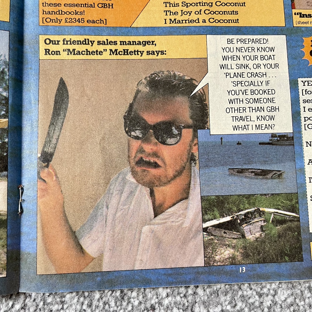
In the end it’s all a con and as the readers throw their money to help Uncle Pigg he summons his private helicopter to whisk him back off to those tropical islands he told us about when he signed off in #68. I have to say that while it’s funny (and as a kid I hoped the bit about having “an appeal every year” meant there’d be yearly specials forever) for young me it seemed out of character. While he loved his money Uncle Pigg always put his readers first and here he was grifting them instead. Nowadays though, it’s just silly fun and I suppose it’s in keeping with the likes of GBH. Speaking of which…
They may not have been a one-hit wonder but Bros did seem to be here one second and then gone the next. I remember some friends being obsessed and I even bought the (terrible) Marvel UK special! Here, GBH took advantage of the teen crazes of the time and then the comic tested fans to see if they were as obsessed as they’d made themselves out to be (with a brill Wilkie mini-strip underneath). I love the ‘Gros’ logo spoof of the real one and I wonder if, had OiNK continued, would the band have been a regular target. Looks that way.
Rick Astley is still going strong though, which I was pleasantly surprised to find out a couple of years back when he popped up on Jools Holland’s Hootenanny. Can’t keep a good 80s icon down.
The next page is by an artist who makes his sole contribution in this issue and that’s a shame because if this is anything to go by I’d loved to have seen more from him. José Luis Prats Cruz is a cartoonist from Southern Spain and has continued to work in the industry ever since, although his work has eluded me until now. Signing as’Ozeluí‘, if you search online you’ll find most of his cartoons have no speech just like this instant OiNK classic. You can check out his most recent work on his Instagram account. What a shame he never got to create anything else for us pig pals.
In the final issue a strip called The Pigpen of Fear presents The Spine-Tingling Tale of The House at No.13 Veryscary Avenue was billed as the first in a new series by Davey Jones. It didn’t feel odd to have it billed as such, even when no more would be coming, because OiNK was always doing things like that. Well, as it turns out it was intended to be a series after all. Not only that, but the second strip is one of my very favourite OiNK strips of all time.
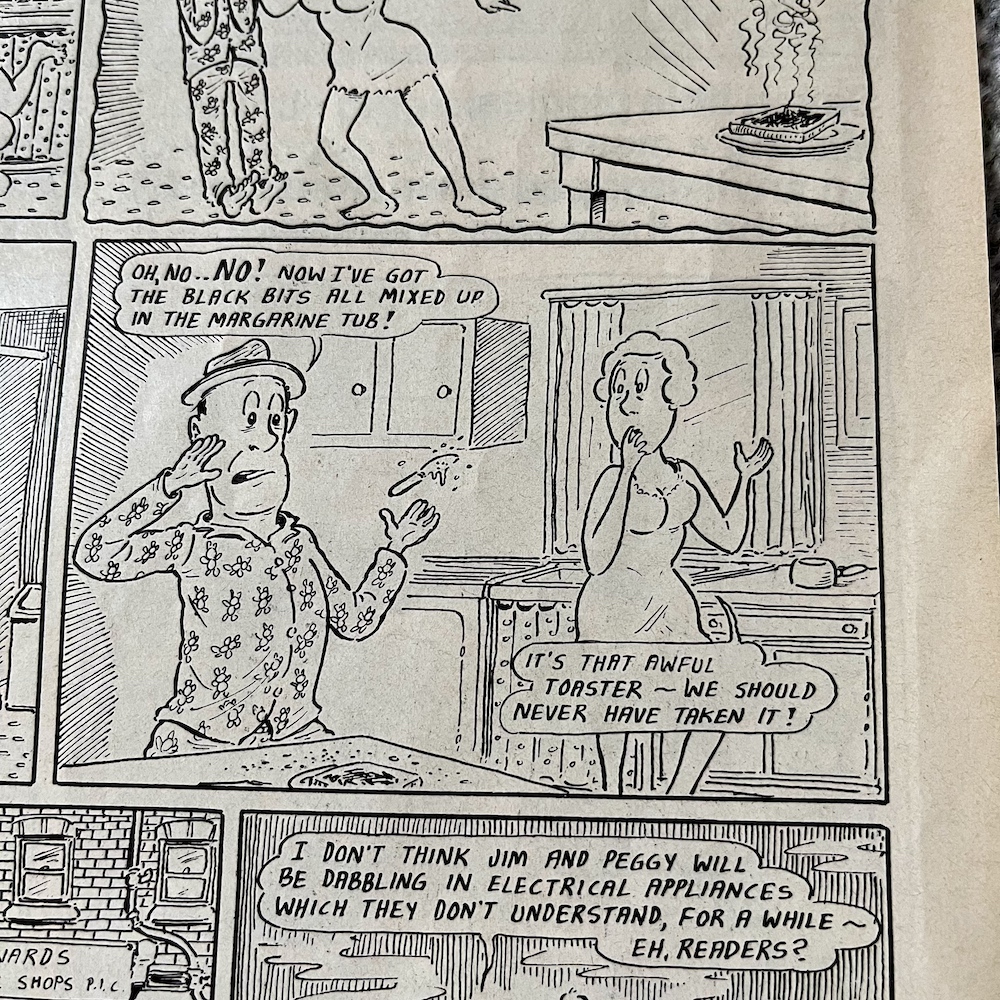
The Pop-Up Toaster of Doom sees Jim and Peggy Watkins meet their comeuppance when they cross the wrong shop keeper. Complete with the scary pig character as the narrator, it’s a perfect spoof of TV shows such as Tales From the Crypt. Right from the off it pokes fun at the conventions of such shows, like the name of the shopkeeper being so obvious, and of course since this is by Davey there are a ton of background jokes to spot too.
The main gag here is that there’s nothing sinister or evil happening at all but it’s still dressed up as a horror story. Everything is completely ordinary. Even the shop itself is a red herring and in the end the horrible outcome for the couple is that they’ll just take the toaster back to the shop. It’s ingenious ludicrousness by Davey as per usual and one that had me roaring as a kid. It’s one of those occasions when it makes me laugh even more so as an adult too.
It’s the funniest strip in the issue and one of the funniest OiNK produced. Unfortunately, just like the monthlies there are reprints here too, five pages in total. In fact, the final three pages of the comic are ones we’ve seen before, which ends things on a bit of a downer for regular readers. But just before those is a new four-page Horace (Ugly Face) Watkins strip which finally concludes his long-running story with the happy ending he always deserved. It’s his and Mandy‘s wedding day!
Horace may have evolved completely from those early joke strips to an ongoing serial about the difficulties he faced thanks to his looks, but co-editor Tony Husband never forgot it was meant to be daft too. Horace’s ongoing football soap opera was wonderfully random and he faced everything from a stalker to a radioactive monster (in fact, they were both the same person). However, his strips taught us much along the way about never judging others based on their looks and that we shouldn’t let others who judge us unfairly hold us back. Yes, OiNK was a daft comic but Horace’s strip sat comfortably alongside the non-smoking, anti-bullying and anti-bigotry messages to teach its young readers the right lessons in life, without us ever being aware that’s what they were doing.
Three months was a long time to wait for new OiNK material, however the next issue wouldn’t be released for another six! The Holiday Special 1989 may have been an additional monthly issue of OiNK rather than a summery feast, but it was no less fun to take another bite of that pork pie. I never saw any adverts for the OiNK Winter Special because I wasn’t collecting any of the comics it would’ve appeared in so it was a wonderful surprise when it popped up in November 1989. I can’t wait to read it for the first time since! That next crackling issue will be here on Saturday 2nd November 2024.