PiTCHiNG TO PiGLETS PART ONE: MOViES

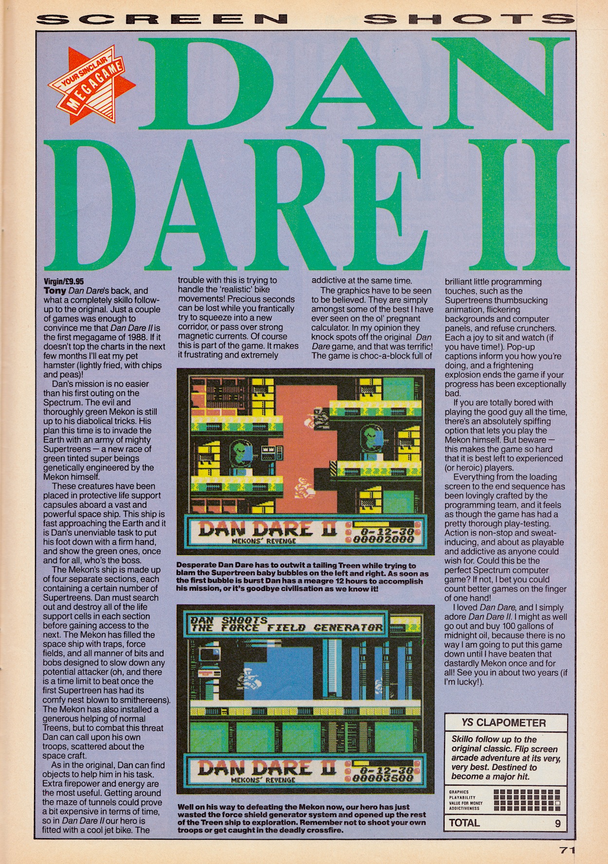
Welcome to the first in a new occasional series of posts taking a retrospective look at the contemporary advertisements found within the pages of OiNK between its launch in 1986 and its final special in 1990. The real adverts that is, not the spoof Madvertisements. During the comic’s real time read through I found it wasn’t just the antics of the comic’s gangster-led mail order company GBH that transported me back in time, these real ads often brought back many happy memories too.

I’ve separated the adverts into six categories. Coming up you’ll see marketing for 80s food and drink, toys, electronics, comics and books, then finishing with a miscellaneous collection to round things off, but we begin with movies. This was an easy selection to make because there were only five of them featured throughout the comic’s entire run. I present them here in the order of their release, and first up is one I’d never heard of before.

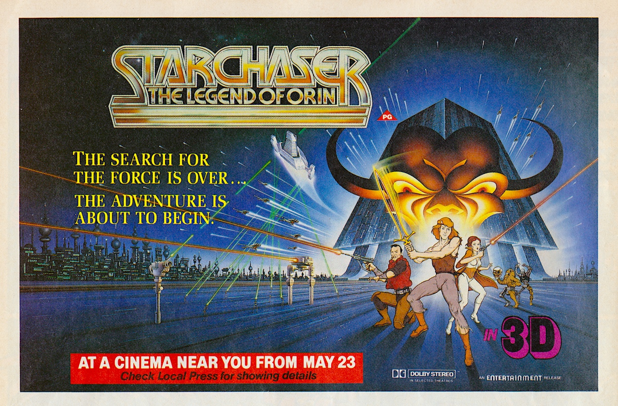
The 80s saw a resurgence in 3D movies for a few years, my favourite being Jaws 3D, a fun sequel to my favourite film of all time which has proper, American theme park style in-your-face 3D. Star Chaser: The Legend of Orin was a cartoon but used a combination of traditional art and computer generated animation to produce its effects. Advertised as the first 3D animated film (it was actually the second after a small Australian movie) the story revolved around human slaves being ruled by a ‘God’ who turns out to be a human masquerading as one.

It sounds quite Stargate-like and starred Stargate SG-1’s Carmen Argenziano (Jacob Carter). However, it was it’s very close resemblance to Star Wars’ story which saw it panned in reviews at the time and it flopped at the cinema, which wasn’t great when it was more expensive to produce than other cartoon films. The advert appeared in OiNK #3 in May 1986 and that summer a much more successful movie sequel popped up in the pages of #7.

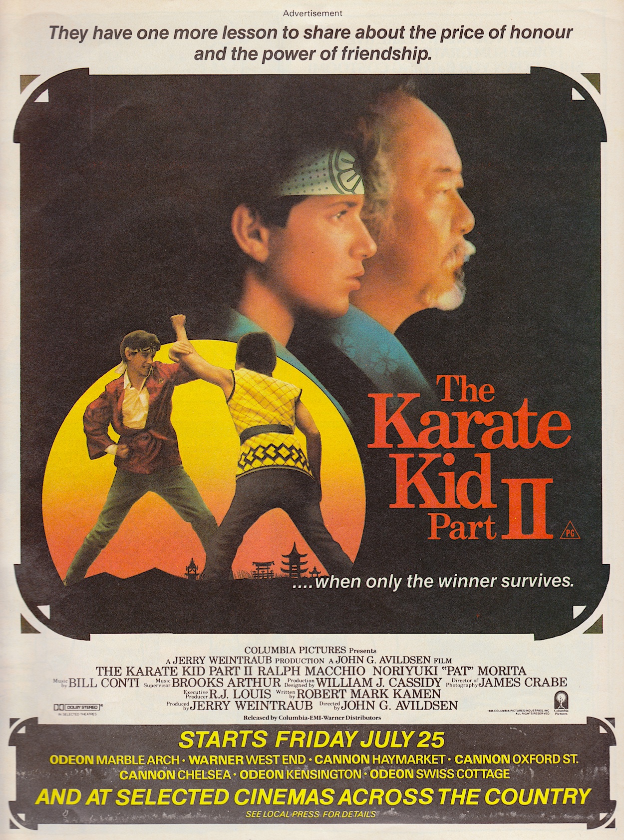
Once again starring Ralph Macchio and Pat Morita, The Karate Kid: Part II’s box office not only eclipsed Star Chaser’s, it equalled the original movie’s and spawned a couple more sequels in the original series. While researching for this post I discovered it never actually filmed in Okinawa, the location that was a major selling point for the film. In reality, the heavy military presence there led the filmmakers to choose Hawaii instead.

The first scene in Part II was originally written to be included at the end of the original so, like James Bond’s Quantum of Solace did many years later, this literally picked up straight after the previous film. I recall my brother renting these from our local video store and I can remember the action, the famous training scenes from the first film and some bits and pieces here and there, but mainly it’s the memory of enjoying them with the family that remains.

I finally succumbed to the years of friends talking about how great David Bowie was as the King of the Goblins

The next film (advertised in #15) completely passed me by as a kid, although as the youngest of five siblings I’m sure they rented it at some stage for themselves or at least watched it on TV during more than one Christmas. It was only during this last festive period (2023) that I finally succumbed to the years of friends talking about how great David Bowie was as the King of the Goblins and sat down to watch it on the BBC one afternoon.

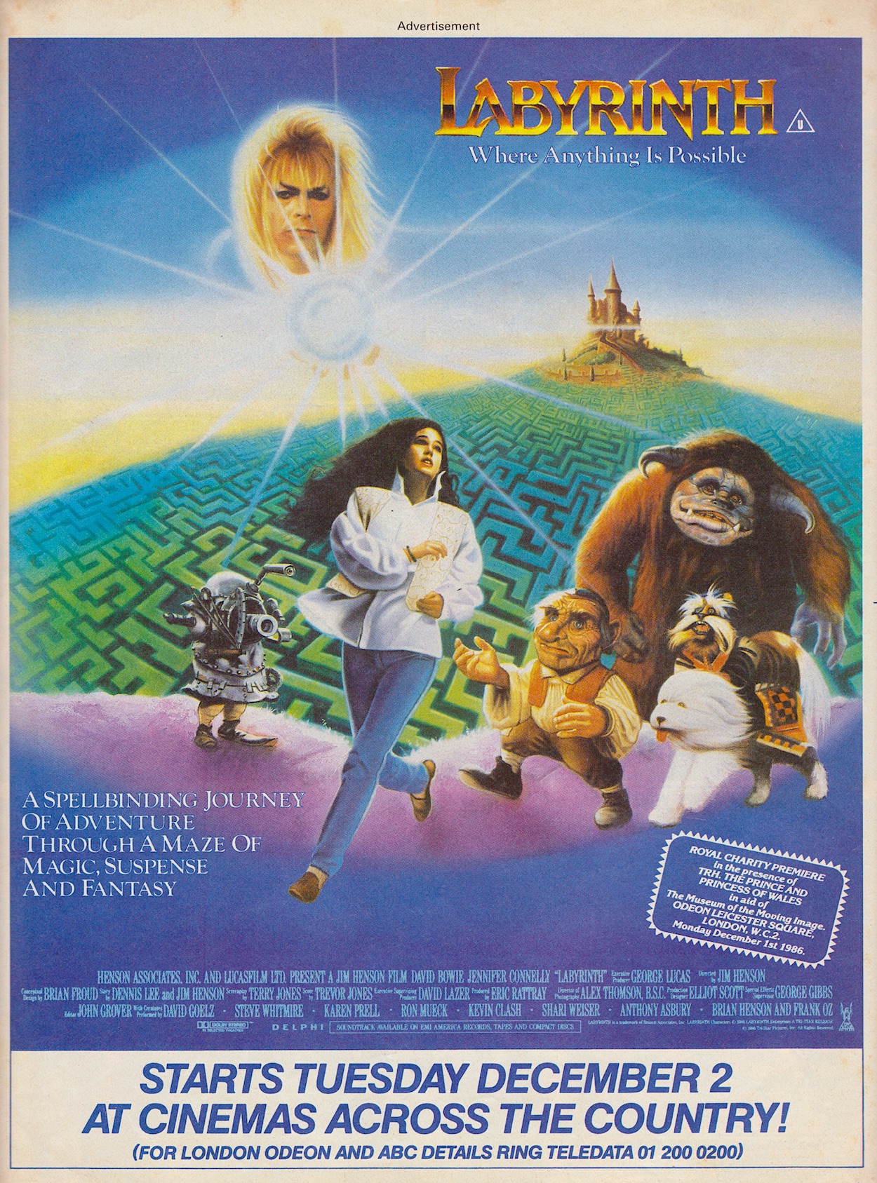
Not only did I love David Bowie (his interactions with the goblin puppets producing some wonderfully funny moments), Jennifer Connelly was also superb. I’ve become a fan of hers through the Snowpiercer TV series in recent years and it’s just incredible to see such a great performance at only 14-years-of-age, especially considering the characters she was interacting with. As for the film, directed of course by Jim Henson (and written by Terry Jones, although rewritten by uncredited others) it still flopped but that hasn’t stopped it from gaining in popularity ever since.

For me personally, it was a fun movie although I do think I’d have loved it more as a kid; the imagination on show is brilliant and very 80s. I really loved the fantastic M.C. Escher-inspired staircase scene too. There’s one movie out of these five I adored from the moment I saw it on VHS at a friend’s 11th birthday party in October 1988, almost a year after this advert for its cinema release in OiNK #16. I’m really not sure why we didn’t go to the cinema as a group when it was out!

I didn’t really get into The Transformers until the following year, but once I did this movie was rented a lot! It was basically a way for Hasbro to refresh the toy line, hence killing off most of the TV series’ original cast, Optimus Prime’s death famously upsetting children in American and resulting in an added narration at the end when it reached these shores, promising his return. It also flopped (there’s a theme here) at the time and has been derided by critics ever since as a glorified toy advert.

The Transformers: The Movie is also notable for being Orson Welles’ final film, believe it or not

If you’re already a fan of Transformers you’ll love this, if not then it’s not really going to win you over. As an adult I can appreciate its retro goodness, especially its 80s soundtrack, although I find it does work much better as part of the animated series than a standalone film. I just wish they’d stop cutting the top and bottom off it every time they remaster it. It was created in a 4:3 ratio but every time it gets rereleased they seem to think people will only want to watch it in widescreen, the full-screen version usually left to languish, non-remastered, in the extra features. Such a shame.

It’s also notable for being Orson Welles’ final film, believe it or not. Over the years it’s been said he hated it but in reality he really liked the script; he accepted the role after reading it and was happy to be working on a children’s movie. He may not have fully understood all the characters and their relationships with each other but which adult of a young Transformers fan ever did? As a fan of the modern films (Transformers, Dark of the Moon and Bumblebee being my favourites) this can feel quaint today but during my recent read through of the original Marvel UK comic the 1987 film was an epic, dramatic and really fun part of the experience.

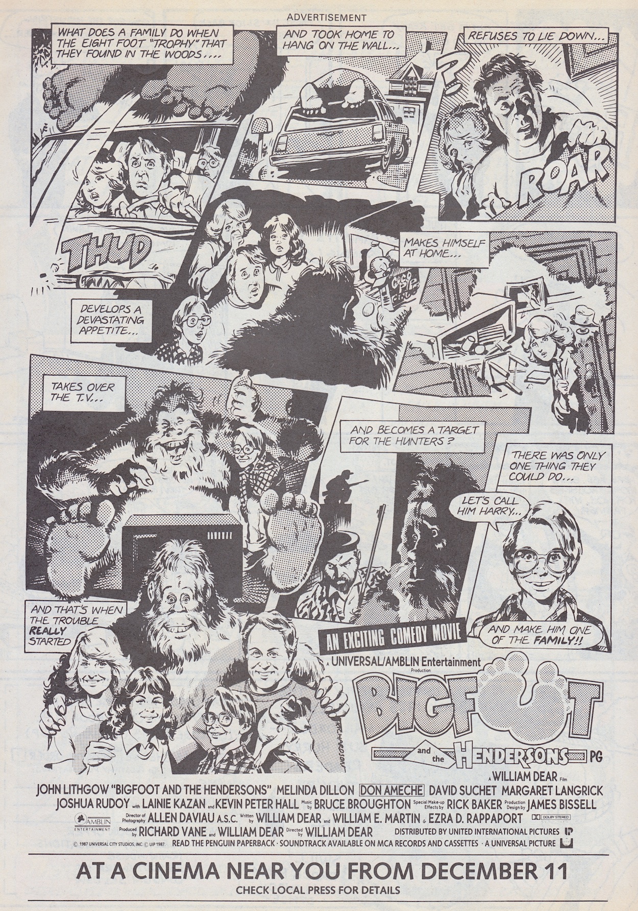
To any readers living outside of this part of the world this poster might be a bit confusing, but this is indeed Harry and the Hendersons, advertised in #42. It was renamed for the UK market, perhaps to better describe what Harry actually was to potential cinema goers not familiar with the legend in the States. John Lithgow seemed to pop up in every American film when I was a child but I never complained, he was always funny in every role he took on. The film was essentially E.T. with a big hairy fella instead of a short, wrinkly alien but I do remember finding it very funny as a child, although I’ve never seen it again since.

There we go. There may only have been five movie adverts throughout OiNK’s run but they’re a nice snapshot of the films that would’ve appealed to young readers at the time and their retro artwork is a joy to look at. There are a ton of adverts for the next category of food and drink though, including everything from crisps and fizzy drinks to Marmite and bread! Look out for that during the summer later on this year.

GO TO PART TWO

OiNK’S REAL ADVERTS

‘MORE OiNK’ MENU

MAiN OiNK MENU

RiNG RAiDERS LiCENSEE STYLE GUiDE: PART TWO

I’m back with the second part of the Ring Raiders Style Guide folder sent to licensees of the potential hit franchise in 1988, this particular copy very graciously given to me by Barrie and James Tomlinson, father and son editing and writing team behind Fleetway’s short-lived but awesome Ring Raiders comic. I previously covered the introduction to the toy range, the background story and a couple of examples of the mini-comics packaged in with the Matchbox planes. Now we move on to the meat of the folder.

The next section is all about the planes and their pilots and there’s so much here I’ve decided to divide it into two parts, this month focussing on the heroic Raiders themselves. Included are eight of the Wing Commanders and their aircraft over sixteen pages, including top and side views of the planes and a full view of the pilot with a little bit of written information about each of them. We begin with their leader, Ring Commander Victor Vector and his F-19 Stealth fighter codenamed Victory 1, and “Salty” Salton with his Corsair Sea Dragon.

The basic details about the human element of each pairing would be elaborated on by the comic although the basics remained. It’s fun for me to remember all of those little details about the planes, such as weapons panels that were meant to slide open, wings that could split in two or underbellies that had inflatables built in. Of course the Matchbox toys were so dinky none of these were actually included but in our imaginations they were there and deployed often, not that it mattered with Salty because he was never a toy! More on that below.

For such small toys they had intricately moulded details. The panels may not have opened, but they were all there; the bodywork of the planes looked and felt authentic in our tiny hands. What else would you expect from Matchbox? The next couple includes my absolute favourite, the X-29 Samurai Flyer flown by Yasuo Yakamura, the first plane I owned (alongside a Skull Squadron plane I’ll show you next time). It was just the coolest toy ever!

I had most of the wings from the first series, although at the time I never thought about the coincidence that the Knight Fighter was flown by a pilot called Max Miles. The coincidence I’m thinking of? Knight Rider and one of its characters, Devon Miles. Maybe one day I’ll find out if there’s more to that than just coincidence. For now, what about those colour codes?

Even if these pages were sent in black and white it wouldn’t matter because the artist could use the Pantone code

The Pantone company’s Pantone Matching System is a standard colour chart used across various industries. It ensures correct use of exacting colours and licence holders Those Characters From Cleveland have used it here. They understood how important it was that all those little Matchbox toys were exactly as designed and that every bit of merchandise, like our comic, didn’t deviate.

I’d never given a thought to how precise things like this would have to be but it makes perfect sense of course. It’s a level of detail in this folder I didn’t expect to see. By using this system and its naming of the tones it also stops any accidental colour changes, for example if these pages were photocopied or faxed to the artists. Even if they ended up being sent in black and white it wouldn’t matter because the artist could use the Pantone code.

When you consider how small the planes were it’s pretty incredible to see precise colour codes for such teeny tiny details as the darker blue outlines of Joe Thundercloud’s F-86. “Cub” JonesF-5 Sky Tiger with its animal markings was a really cool plane to own at the time. Note that the page also mentions the mini missile system, something else our imaginations ran with. James actually wrote it into a script, brought to life by artist Don Wazejewski.

Cub’s background was also one I enjoyed and it brought a personal touch to the World War II story featured in the early issues of the comic. However, for whatever reason the cartoon did away with this completely and made him a modern day rookie Ring Raider pilot. I’m surprised they were allowed to change a key element of a character so drastically. The comic proved this original version could be so much more interesting.

Finally for this month are Yuri Kirkov’s F-4 Comet, a favourite toy of mine. In fact, his entire wing was a favourite, the colour scheme of the lead plane used across the three accompanying aircraft (like most of the wings), they really did look quite incredible to my young eyes. I was thrilled to see his Wing getting a starring role in a gorgeous Sandy James strip.

Go check that out to see just how brilliant Sandy was at bringing this toy to life. It’s the perfect example of what the comic could do. Before writing this post I thought Commander “Never” Evers and his F-16 Fearless Falcon was that rare thing, a Ring Raiders set I didn’t actually own. I thought, looking at its design, that I’d really missed out. But a fellow fan informed me that Evers and Salty were never actually released as toys, despite being official characters and planes, both featuring in the comic and the cartoon. How strange.

That’s the first half of the Airplanes and Pilots section covered, all the leader craft and characters in the toy range for the good guys done and dusted. I’m excited about doing the same for the Skull Squadron next month, even more excited to show fans what’s to follow after that. Whether you were as obsessed as I was with Ring Raiders or you’re interested in the production of licensed comics, I hope you’re enjoying this series so far.

The Skull Squadron takeover happens on Wednesday 13th March 2024.

PART ONE < > PART THREE

LiCENSEE FOLDER MENU

RiNG RAiDERS MENU

YOUR SINCLAiR #27: SLOW PORK

There I was, thinking I’d pretty much covered the OiNK computer game as much as I could have when I spotted the name of our favourite comic on the cover of this issue of Your Sinclair from 1988. One quick eBay purchase later and here we are, exactly 36 years to the day of its release and ready to check out another contemporary review of the game.

Previously we’ve seen how Commodore 64 magazine Zzap!64 and multiformat magazine Computer + Video Games thought it was a fun game and represented good value for money, with three very playable mini-games for the price of one full game. The problem was that it basically had nothing to do with OiNK. However, reviews were still generally very positive and so was I when I eventually played it decades after its release. So how did the Sinclair Spectrum conversion released six months later stack up?

As you can see, YS’s design was a bit basic to say the least and it’s rather sparse in the screenshot department (even for games it rewards big scores to like Gryzor), but from this one uninspiring picture of Tom Thug’s game we can see it’s a million miles away from the original C64 version. It’s not just the graphics that suffer either, it runs very slowly by comparison and while the C64 version loaded everything in at once, here each of the mini-games needs a few minutes to load individually.

This continues the general feeling that it had very little to do with the comic but as a game in its own right it was fun to play

Duncan McDonald’s review was written when the game was first released at full price (usually a tenner on cassette, around five pounds more for disk). Like most games of the time on these machines it would be rereleased in a smaller cassette box as a budget game for a few quid about a year later. The main complaint here is that each of the games already feels like a budget game rather than part of a full price release, but bundled together it’s not bad and is quite fun, hence the decent score overall.

This continues the general feeling about the game, that it really had very little to do with the comic but as a game in its own right it was fun to play and good value for money. You’ll also see here that Andy Capp’s game was reviewed on the same page, which is quite fitting since he’s very loosely linked to OiNK. When Buster comic was first released the character of Buster was billed as Andy Capp’s son, and as we know OiNK merged with Buster when it was cancelled. Nice little coincidence there.

As normal when checking out these magazines I decided to take a look at the rest of the contents and this Street Life double-page was right up my alley. As well as the obligatory sales charts it also takes a look at the 80s culture readers may have been interested in. Yes, there are a lot of daft space filler things here too but there’s some interesting contemporary snippets.

There’s a comics chart, although it’s focussed on specialist stores importing American titles rather than UK comics. Alongside this is a chart of the most popular arcade games back when such venues were everywhere and a review of two new movie releases, one of which would go on to spawn two awful sequels, a television series I loved and a comic series which was printed in Havoc in the UK and reviewed right here on the blog.


“[The graphics] are simply amongst some of the best I have ever seen on the ol’ pregnant calculator.”

Tony Worrall

Two other pages which may interest comics fans are an advert and review for a Dan Dare computer game, Dan Dare II: Mekon’s Revenge. To say the screenshots on the advert are small is an understatement. Maybe they’d have been fine for me at the time but to these 46-year-old eyeballs they’re so tiny they tell me nothing about the game whatsoever, the details lost to me. I do like how the advert has a 1955 date and price as if it’s a Dan Dare comic cover.

It appears Tony Worrall is a bit of a fan of the game. It may not look like much compared to today’s graphics, or even those found on my beloved C64, but for the Spectrum (which a friend of mine owned at the time) it does look ace and sounds like it would’ve been quite fun to play. If you read the review and find the sight of thumb-sucking mini-Mekons a funny idea check out the first screen shot closely and look at the two cryogenic chambers, you should be able to make out the animation. Fun stuff.

When I looked back at my first ever magazine, namely Commodore Format #14, I showed you a large double-page advertisement from Datel Electronics, a company renowned for quality hardware accessories for the home computers of the 80s and 90s. The CF adverts were slick, the accessories wowed teenage me and I ended up collecting much of what they offered in just the first couple of years of my Commodore ownership. But a few years previous, the same couldn’t be said of their Spectrum ads.

That’s not really fair of me to compare the two, over the next four years new developments in Desktop Publishing saw leaps forward in magazine design and the advertisements changed with the times. For this fan of retro gaming and computing it’s interesting to see what the Spectrum range offered in terms of add-ons, although it does appear to be somewhat limited to devices which would give these British computers access to things their competitors already had built-in.

As the end of the 80s approached a new breed of 16-bit machines was beginning to make its mark, the Atari ST being the first. The Commodore Amiga would soon be advertised all over the magazines aimed at the 8-bit owners and many would be enticed away, so it was quite the feat that Future Publishing’s Your Sinclair (they bought the title in 1990 from Dennis) continued until 1993, Amstrad Action until June 1995 and Commodore Format until October 1995, just six months before the release of the 32-bit Sony Playstation!

I simply adored my Commodore 64. I also had great fun playing a friend’s Amiga, but it was always Atari’s machine which fascinated me the most out of the 16-bits. I think it’s a lovely machine and nicer aesthetically than the Amiga, but I think it was mainly due to a friend’s music set up that I rightly or wrongly thought the ST was the better computer.

He had a guitar, a keyboard and some massive speakers all hooked up to his ST and what he could do with it was phenomenal. This friend was a particularly adept musical genius as far as I was concerned, but the ST was known for its music creating abilities and what he produced in the 90s in front of us in no time at all thanks to that computer wowed us. Plus we played Worms and Lemmings afterwards. Some great memories thanks to the Atari ST.

John is being sarcastic, using the language of what we’d call ‘incels’ and ‘trolls’ today to take very deliberate aim at toxic male views of the world

Page 98 is the last before the back cover and it’s an article called Backstabbin’ by freelance writer John Minson about the subject of girl gamers. Firstly, remember this is in a magazine from 1988, a time when everything for children was very explicitly split between what was for boys and what was for girls, with no overlap. Thankfully that’s changed a lot but at the time computer games were seen (incorrectly) as the exclusive domain of boys.

When you start reading this article you’d be forgiven for thinking it’s a patronising piece aimed at placating any female readers. However, keep reading and you’ll see John is being sarcastic, using the language of what we’d call ‘incels’ and ‘trolls’ today to take very deliberate aim at toxic male views of the world (in this case the world of home computing). The fact Your Sinclair was edited by a woman (Teresa Maughan) should tell you there’s more to this than you initially think.

It’s disappointing that something like this would ever have needed written in the first place, but at the same time it’s quite a delightful surprise to see it in Your Sinclair of all places, and way back in 1988. It rounds off a fun look at another retro computing magazine, a genre I never thought I’d be covering when I started this blog, but one I’m enjoying immensely. Don’t forget there’s a lot more coverage of the OiNK computer game on the blog already, just click on the link below to go to the full menu.

OiNK COMPUTER GAME MENU

OiNK MERCHANDiSE MENU

MAiN OiNK MENU

DEATH’S HEAD #4: DOG-GEDLY BRiLLiANT

The front cover to this fourth issue of Death’s Head may be drawn by the familiar team of Bryan Hitch and Mark Farmer but inside Plague Dog is drawn by renowned Transformers artist Lee Sullivan (also Havoc (RoboCop), Doctor Who), with Annie Halfacree on letters, Nick Abadzis colouring and Simon Furman writing of course, with Richard Starkings editing. While I love Geoff Senior’s art being in every issue of Dragon’s Claws, I like the mixing of styles here.

Last month we saw Death’s Head’s new office wasn’t the perfect purchase Spratt seemed to think it was, having spent his new partner’s hard earned cash before he’d earned it. This issue sees that picked up and developed into two separate stories, one for each of our main characters. While our mechanoid anti-hero is hired by one gangster to hunt down and kill his rival’s pet mutt, Spratt comes face-to-face with it in their new property.

We kick things off with Death’s Head arriving at Jules ‘Kneecap’ Venici’s birthday party in his usual understated style. A huge birthday cake arrives but Venici has seen this movie before and fills it full of lead. Surprised at finding no one inside he still insists on killing whoever sent it because his own actions have made him look stupid. He then sits down to eat a slice, not noticing the highly conspicuous waiter in his latest in a long line of ridiculous wigs.

Predictably a huge shoot-out occurs between all of the gangsters and our lone hero, although even in this dire situation there’s time for some comedy. Elsewhere, Spratt is checking out their new digs and the lights are out. After we see a clawed hand swiping down in the darkness he lets out a blood-curdling scream and we’re led to believe the hand has made contact, until you read the following caption. Simon once again playing with our expectations.

I particularly like Spratt’s reaction to the sound effect of the plague dog, the alien monster used by Venici to take revenge out on those who wrong him. Last month we saw someone who looked like an undertaker sell the office to Spratt and in this issue we find out he is in fact called The Undertaker, a killer-for-hire whose method of assassination is somewhat gruesome.

But yes, that sound effect. We get all sorts of wording to describe sounds in our comics. Sometimes they’re downright bizarre to say the least. The fact Spratt correctly names this rather random sound effect is very funny and just shy of the character breaking the fourth wall and identifying he’s in a comic. It genuinely made me laugh. Back in the other half of the story, as the issue constantly flicks back and forth between the two scenes, Death’s Head is still at it even when cornered and out of ammunition.

Death by cocktail sausages! As a form of getting back at the bad guys it seems appropriate for this blog. Death’s Head isn’t the only one up against the odds, nothing to shoot with and having to use his ingenuity to get out of a tough scrape. As the rotten internals of the office building collapse around him, Spratt is trying desperately to escape but is hopelessly out of his depth.

In fact, the crumbling of the building saves him on more than one occasion, luck playing a huge part in keeping him alive. He could be learning a thing or two from his new boss though, or perhaps they’re just more suited than the mechanoid realises, because despite his fear (or perhaps because of it) he can’t help making quips.

Slipping out of his boot and shoving it into the monster’s mouth (complete with another joke) he makes a run outside and finds a car parked (well, hovering, it’s in the future after all). This is Spratt’s speciality. Quietly boosting cars is a particularly useful skill that Death’s Head needs him for. There’s a little bit of tension here as Spratt struggles to get inside, panicking as the plague dog bears down on him.

The engine doesn’t immediately kick in either and the tension rises further as the thing makes a leap for him and crashes through the rear window, clawing at the interior, getting closer and closer to Spratt until it finally places a claw on his shoulder. The escape vehicle now seems to have become a death trap. We know Spratt can’t die, but even if he takes off surely the thing’s head and arm are already inside so what can he do? Well…

Just like last month when an accidental slip of the hand by Spratt turned the tide of battle, here his mistake with the gears sends him rocketing backwards, squashing the monster against the building. Fuel tank ruptured, the dog roaring out to his “Foood!” as it starts to push the car off itself, Spratt characteristically can’t help but bask in his glorious victory, no matter how accidental.

The final spread of the issue sees The Undertaker making a phone call, apparently to activate the plague dog at its lair. So are we to assume he actually sold the lair to Spratt? His job also done, Death’s Head makes his way to the office and finds chaos has ensued, although Spratt seems somewhat subdued and not showing off for once. Of course, our mechanoid friend can always turn a situation around when money is concerned and our story ends.

On the next page a somewhat tacked on cliffhanger has The Undertaker hiring someone called Big Shot, a muscly man with a big gun. I can’t help but be a little underwhelmed with this after last month’s ending. Surely having a plague dog lying in wait was the more dramatic cliffhanger. I’m aware I haven’t read the next issue to see how good this guy is with his gun, but I feel this is a bit of a muted ending by comparison and the two should’ve been the other way around.

Head to Head is the comic’s new letters page and there’s an anonymous letter from my home city of Belfast. Although, if this person had actually read Death’s Head’s adventures in Transformers and properly understood them I don’t see how they could think he’s commonly seen as a full-blown villain. Not too sure who “Bob” is that the first letter is addressed to (Richard Starkings is the editor and Jenny O’Connor the Managing Editor) but there’s definitely a lot of high praise here and I agree with it all.

I just wish Lierne Elliot had been right when he said “seems we have a hit here”. Of course, it may have seemed that way at the time, especially since this was a comic based on a very popular character from another Marvel UK title, but alas the sales figures wouldn’t be good enough to make up for the cost of producing the comic, as Richard explained to me in the introductory post to this series.

But let’s not dwell on that, we’ve another six months of this to go!

On the back page is an advertisement for a new fortnightly Marvel comic that would never actually appear. The William Tell TV series was apparently shown on ITV, although I don’t ever remember seeing it advertised. There’s a chance it either wasn’t broadcast on Northern Ireland’s UTV or it didn’t last long before ITV pulled the plug, despite it running for three seasons of 72 30-minute episodes in France and elsewhere, where it was known as Crossbow.

I remember this comic advert alerting me to the TV series and yet I still never caught it in any TV listings magazines. Marvel’s confidence must’ve been knocked as the plan for a fortnightly changed to a Summer Special, an annual and a run of strips in the Marvel Bumper Comic, plus a collected graphic novel, the strips for all of these already created for the defunct fortnightly. This is why I think the show must’ve failed to pick up viewers here in the UK, as Marvel suddenly realised the audience wasn’t there for what they’d assumed was going to be a hit.

You just might see some of it on the blog at some point though, as the Bumper Comic is on the cards for the future, I just don’t know when yet, but you heard it hear first! (As if you’d hear it anywhere else.) For now, that’s us finished with another outing for Death’s Head… well, really more of an outing for Spratt this month. We return to Earth of the far future on Monday 4th March 2024.

iSSUE THREE < > iSSUE FiVE

DEATH’S HEAD MENU

DRAGON’S CLAWS #9: OOH, MATRON!

Last month there was a feeling this fantastic comic was shifting gears towards a suddenly imposed ending, which with hindsight we know is coming in #10. At the very end of this penultimate issue of Dragon’s Claws it feels like there’s a rush to finish it all off before the unfortunate cancellation. For the majority of the strip however this isn’t obvious and it’s another belter of a chapter with these sadly short-lived characters.

The issue’s FastFax, normally a way of adding depth to the world in which the comic resides or hinting about future storylines or guest characters, is a more straightforward ‘Story So Far’ page like we’d get in other comics. While the fictional news service would obviously focus on the events in N.U.R.S.E.’s headquarters, it adds to the feeling of the title wrapping things up, when I was so used to this page being used as a way of looking forward. A sad reminder the end is nearly here.

The strip itself is called Treatment and the main focus is Matron’s capture of both Dragon and The Evil Dead’s leader Slaughterhouse. All three of them are linked up to a mind control machine Matron uses as a way of accessing their memories, then torturing them with those same memories. Yes, it’d be much easier to just kill them both and she mentions this at one point, but like all the best James Bond villains she wants to have her fun first.

She’s completely confident in her success and feels the destruction of both teams and the deaths of Deller and Golding are inevitable, so she wants to drag it out and savour it as much as possible. Despite an underwhelming cliffhanger involving Matron last month, the character is superbly written by Simon Furman here, her psychotic nature making me wish we’d seen more of her all along.

We get to see inside the minds of both team leaders, with Dragon being made to watch as his wife Tanya and son Michael confront him before being killed by Deller, which as we know didn’t happen despite Matron’s orders. In fact, I’m assuming their arc will be the final part of the story to get wrapped up next time. In a particularly dark and shocking scene Deller shoots and kills the young boy! We see the shot and then his dead body on the ground in the next panel!

It’s all rather harrowing for a Marvel UK title young Transformers fans may have been collecting after it was heavily promoted in that comic. Outside of his mind we see Dragon curled up and crying desperately, his own insecurities around the ones he loves leading to that scene playing out in his mind, Matron merely triggering them rather than forcing the scenario. At this point I was intrigued as to what resided in Slaughterhouse’s mind!

But first we head back down the building to catch up with the rest of the characters. Matron has seen on her screens that Stenson is dead, The Evil Dead and Dragon’s Claws are about to decimate each other’s ranks and World Development Council ambassador Golding and Deller are trapped in a burning room dozens of floors up from the ground. No wonder she’s confident.

For the unlikely pairing of Golding and Deller there’s only one option for escape, and that’s out the window and back in again to a different room. There’s a pole sticking out from the building which Deller can use to swing out and back in again through another window, then break down the locked door to get Golding out. But first he must overcome his fear of heights!

This is something that hasn’t cropped up before simply because the story has never put him in such a position. It adds drama to a sequence that plays out over a few pages scattered throughout the rest of the issue. In fact, we come back a few pages later to see he’s frozen to the spot and it’s Golding who encourages him to take the leap, to believe in himself after all the humiliation he’s faced in previous issues (albeit by screaming at him).

There’s a definite theme this issue of people from all sorts of backgrounds and from completely different sides coming together to fight a greater enemy. An enemy that’s using them all, that’s creating division and fomenting hatred to turn the populace against each other for their own selfish needs. I’ve said it before and I’ll say it again, Dragon’s Claws could easily be released today and be just as relevant, if not more so than it was in the 80s.

Death Nell and Steel’s romantic history gives the story an opening to bring the two teams together to launch a united frontal assault on the upper floors of the building where the majority of security has amassed to protect Matron. As a reader you know it’s coming, even as the opposing sides continue to fight, Mercy in particular sticking the boot in. (Boom, boom!)

On a side note, I was surprised to read Nell saying, “Wise Up!” because as far as my friends and I were concerned this was always a Northern Ireland phrase. Indeed, when I used it myself in Scotland with some friends there in my teenage years it completely confused them. Perhaps we were wrong, but most likely it’s just a coincidence and wasn’t known to be a popular phrase in this part of the UK.

It’s at this point we finally get a look into the mind of Slaughterhouse. I was really looking forward to this and Simon doesn’t disappoint. His memories start off hard with an abusive father hitting him with a baseball bat because Slaughterhouse’s own mum died during child birth. Damn, this goes dark. This was enough to lead him to a life of crime, then once captured the corrupt government experimented on him in return for reducing his sentence.

The side effects included his pointed teeth, his skin colour and blood red eyes and Slaughterhouse, who was very much the victim of his life’s circumstances, couldn’t handle it and he turned on the whole world, the world that had beaten him down so cruelly time and again. But his mind was lost by this stage and he began killing people, seeing everyone as an imaginary enemy, and within just a couple of pages Slaughterhouse’s entire origin story is told.


“We do this my way!”
“The weak way… the stupid way!”
“Let’s just kill ’em!”
“Try it, curly!”

Dragon’s Claws and The Evil Dead

We can only guess if it would’ve been told at this stage (or so quickly) had the comic not been cancelled but somehow it doesn’t feel rushed. In fact, it just makes me lament the fact we can’t see more character development for him now that we (and Dragon) know the truth. The whole chapter is a great piece for both leads. Dragon’s own insecurities while leading his team and in his position in the world could’ve made for a wonderfully deep character too.

As the Claws and The Evil Dead make an uneasy alliance to take down N.U.R.S.E. and rescue their respective leaders, the two men’s minds are thrown into a climactic final battle, one which Matron fully expects will mentally tear them apart, leaving them gibbering wrecks and essentially dead. But she hasn’t reckoned on the power of said minds. Dragon slowly realises he’s in his old Game uniform and tries to convince Slaughterhouse it’s all fake.

He does so through reasoning. Yes, they’re physically fighting of course, we have to have our action in an action comic, but they come to realise they’re flip sides of the same coin, that they both do what they do because they believe in it, they’ve both been manipulated into becoming what they are and they agree giving in now would be the easy way out. But they don’t do easy. For once the hardest thing to do isn’t to fight each other, it’s to work together and they turn their minds on Matron’s.

They start to take her mind down in another physical battle but we’re inside her thoughts now so she’s all-powerful and the two men have to fight side-by-side if they’re to survive. Dragon only wants her beaten, so she can face justice for her crimes in the real world, but Slaughterhouse can’t stop himself. His thirst for revenge is too much and inside the mind machine he slits her throat just as Nell does so to her physical body.

It’s a shock ending but then it all kind of deflates on the next page, the final one of the strip. In just five panels we get a lot of exposition and explanations about what takes place next instead of actually seeing anything. The Evil Dead are let go, Dragon knowing they could never work together, Deller is somewhat redeemed in his own eyes, the team decide what they’re going to do now their employer is no more… a lot happens ‘off-screen’, dealt with through a very quick conversation between the team.

I understand the next issue is the last and it’ll most likely wrap things up for the Dragon family’s arc, but so many other important story arcs just seem discarded far too easily, like one of those final scenes you’d see at the end of an old 80s cartoon. To be clear, it’s only disappointing because of the quality of what came before, not just in this exciting chapter but in the whole run up to now.

The team should be incredibly proud of this chapter though. Writer Simon Furman, artist Geoff Senior, colourist Steve White and editor Richard Starkings are to be congratulated. What the final page lacks is what the other 21 pages do superbly, quickly wrapping up as much of the main story as possible without feeling rushed. Which is why page 24 feels so unlike what we’ve come to expect.

To round off this penultimate review is Digit’s fact-file and more interesting tidbits of information on Dragon’s teammate that would’ve been elaborated on in future issues. These include the fact he’s Scottish, a missing amount of time in his life and just how stable/unstable he actually is. I bet his lost memories would’ve made for some great stories. Instead, we must say goodbye. That’ll happen a little over a month from now. The final issue didn’t go on sale the same day as Death’s Head for the first time, instead it appeared a week later. So watch out for the review of #10 of Dragon’s Claws on Monday 11th March 2024.

iSSUE EiGHT < > iSSUE TEN

DRAGON’S CLAWS MENU