DEATH’S HEAD #7: EXPLOSiVE SLAPSTiCK

With an increase of 5p on the cover price, Death’s Head #7 hit stores today back in 1989 with this Bryan Hitch and Mark Farmer cover, while inside I’m excited to see inking duties on Bryan’s pencils are actually by Jeff Anderson, whose work I loved so much in Marvel UK’s top-selling Transformers and this combination is just superb throughout. The comic is also still offering subscriptions for 12 months so clearly there was no sign yet that even those earliest of subscribers wouldn’t be getting all of their issues delivered. (Only three more to go after this one.)

A new colourist has joined the fray, namely Stuart Place who also coloured for the company’s The Real Ghostbusters, Action Force (G.I. Joe) and Transformers, most notably the fan-favourite Dinobot Hunt story in the early days of the comic. Steve White has also taken over as editor after Richard Starkings resigned. Poor Steve, we’ve already seen his name on the blog when he edited Visionaries but it didn’t last long because the subject matter flopped, he took over Havoc just before it got unceremoniously canned and the same is about to happen here. None were his fault obviously, and he is a simply incredible artist! Check out his Instagram and make sure you see his gorgeous colouring on Xenozoic Tales in Dark Horse’s Jurassic Park!

Shot by Both Sides (as ever written by Simon Furman with Annie Halfacree lettering) is a brilliant strip, one of my favourites of the run so far. The comedy comes thick and fast in the early pages. A robotic tour guide is telling passengers on a bus what they can see to their right and left when a crashing ship narrowly averts disaster but rips off the roof of the vehicle in the process. In response, the robot simply moves on with, “Um, well… above you, you can see…”.

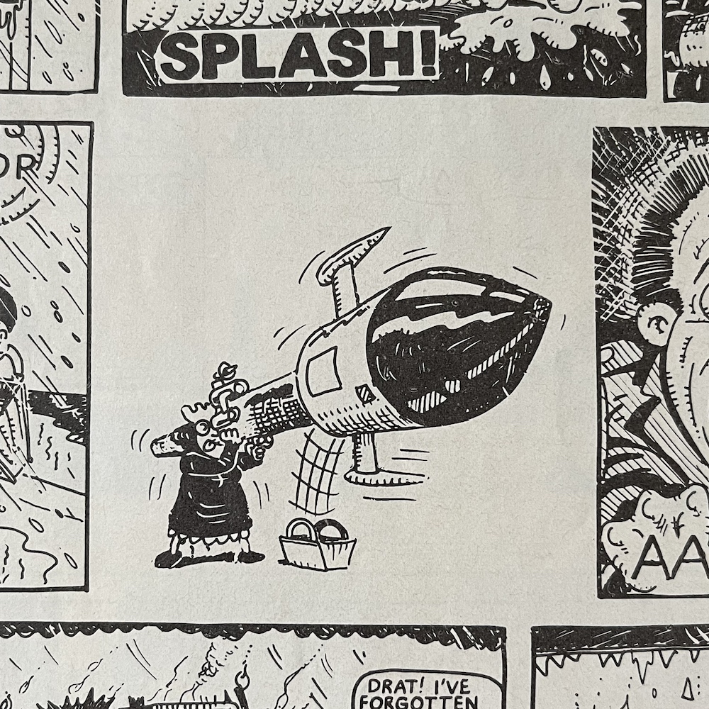
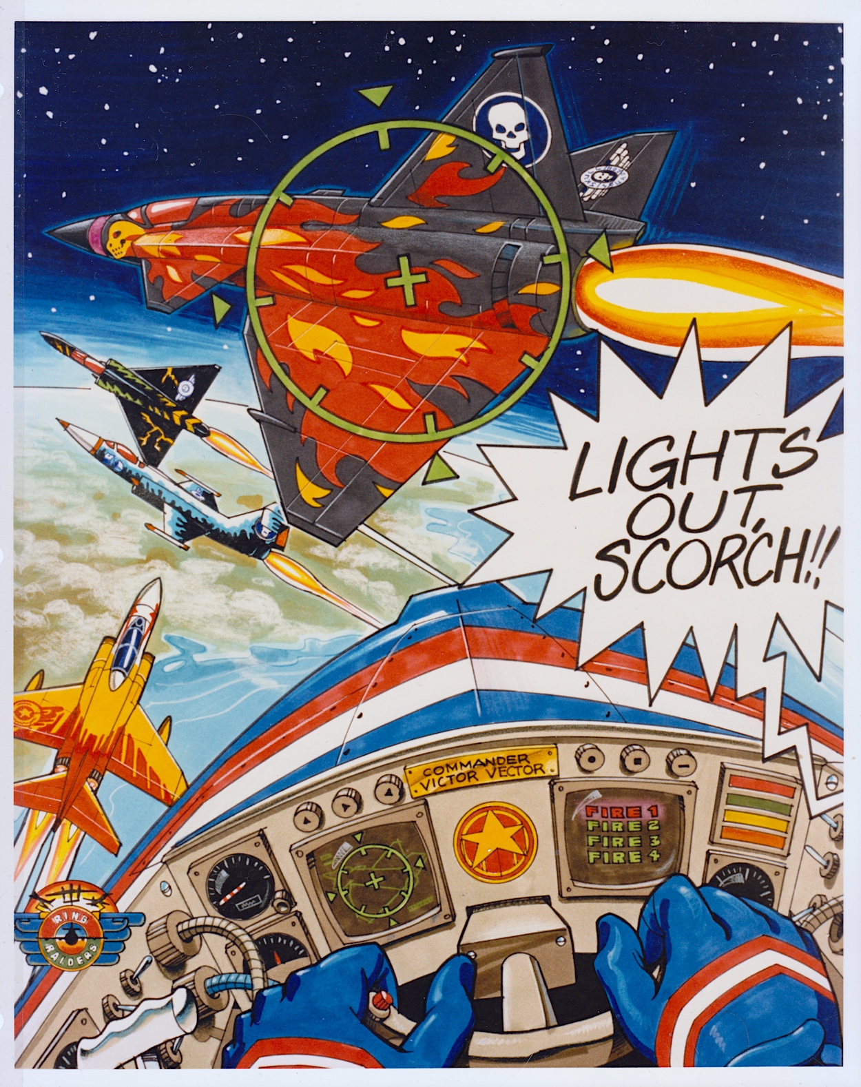
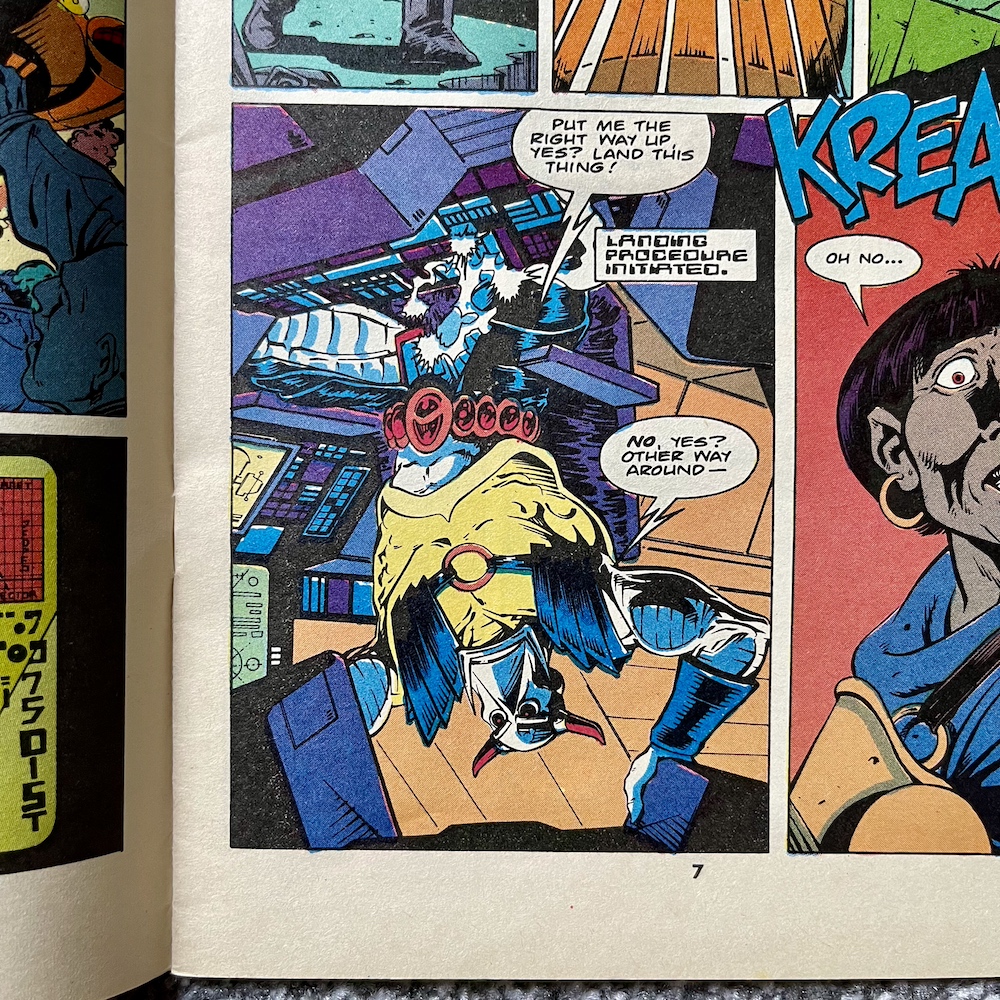
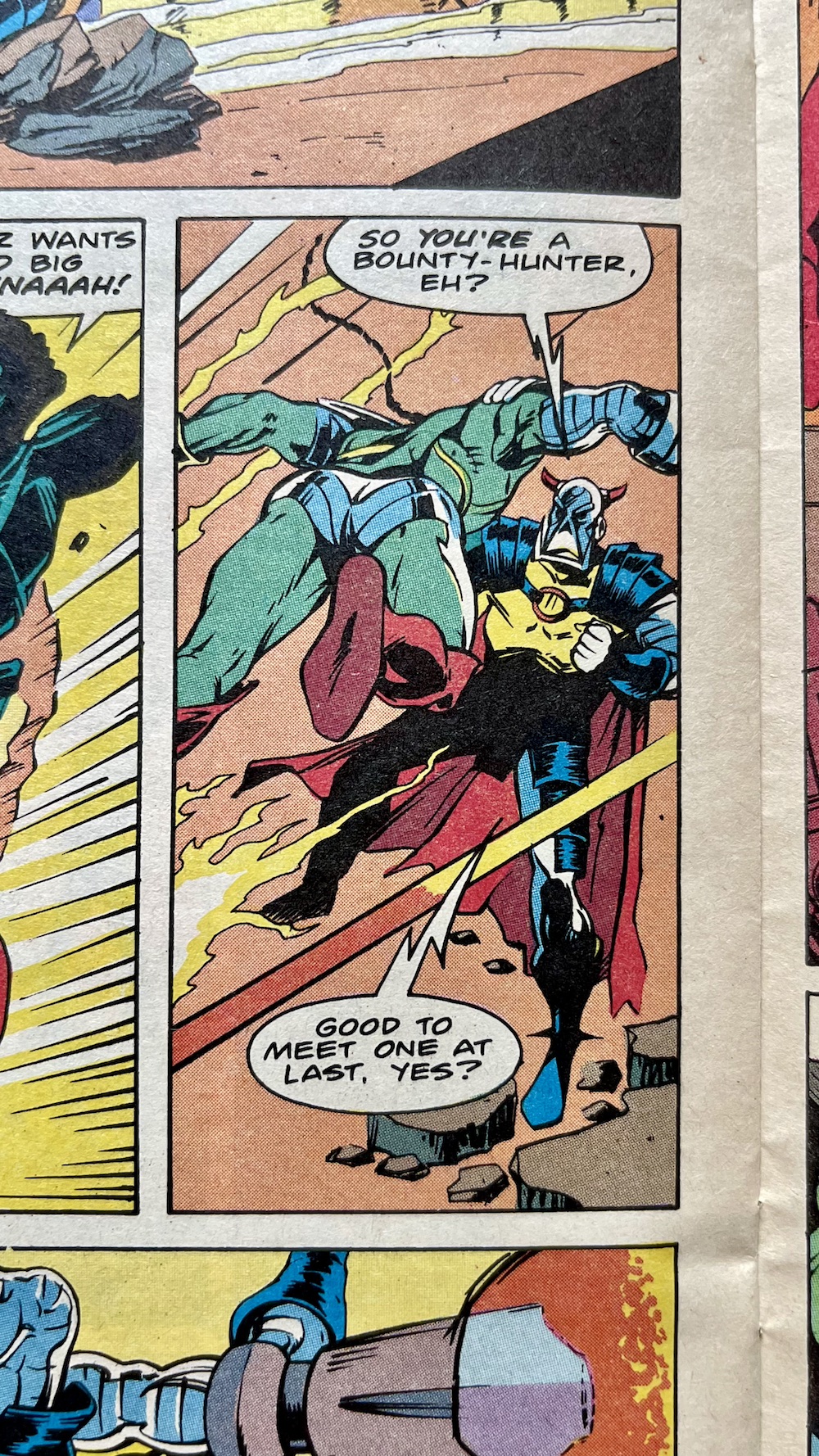
It’s at this point we see the panel above and the ship in question is Death’s Head‘s, who seems to be having problems with the autopilot. I remember a friend of mine in school who was a particularly big fan and he’d often quote the “No, yes?” line when asked a question. The plot this time combines two previous cliffhangers from #4 and #6 and sees bounty hunter Big Shot and explosives expert Short Fuse both attempting to take out the Freelance Peace-Keeping Agent for their bosses.

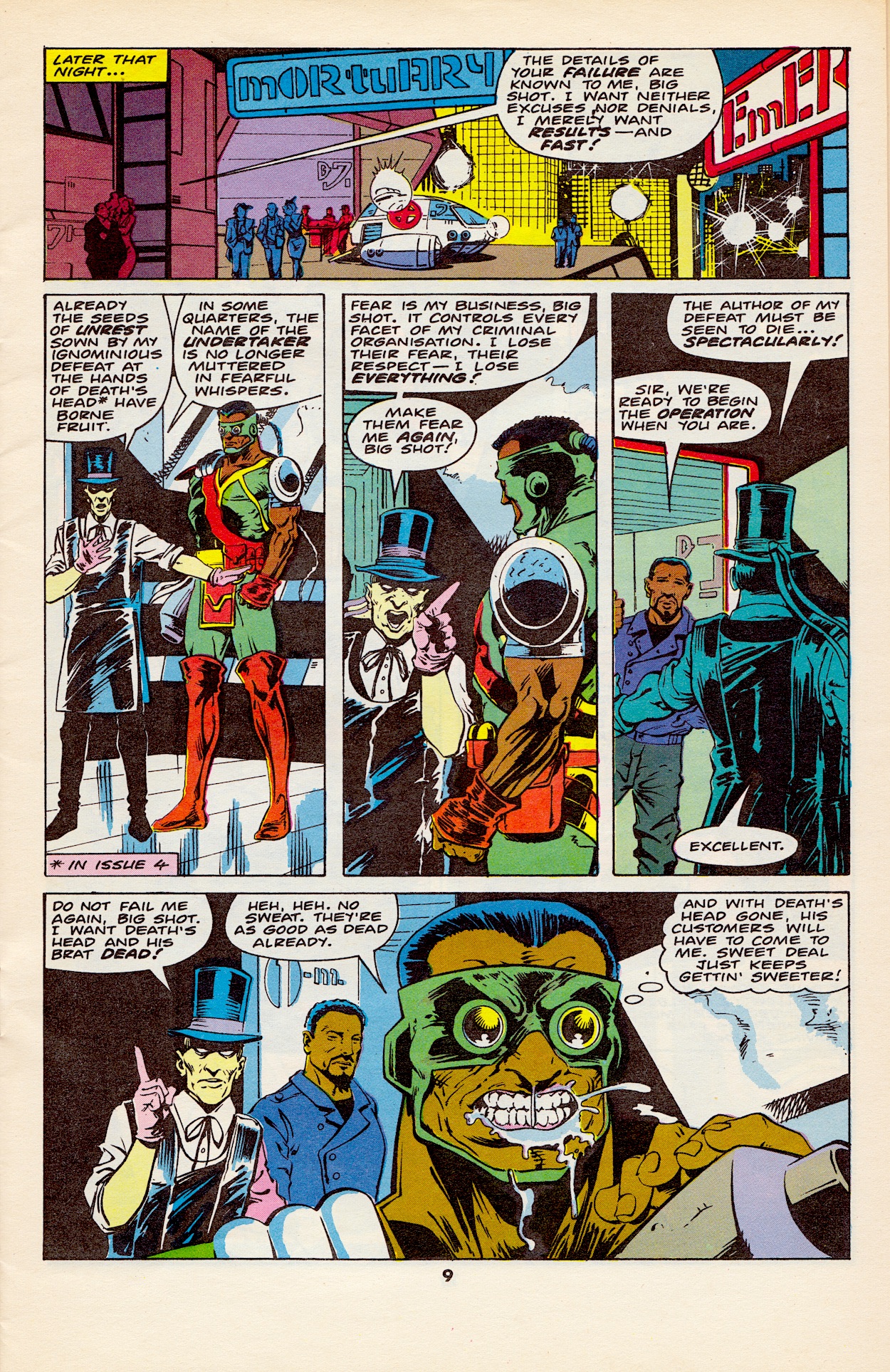
These bosses are the previously featured Undertaker and new gangster Dead Cert, a cigar-chomping man with a horse’s head who unironically runs the city’s illegal sports gambling rings, including horse racing. In the first scene (the crashing ship one) we find out Big Shot had fired a high-powered missile at Death’s Head ship which had initiated the crash. But Short Fuse had also planted an explosion in the cargo hold. When it went off it lightened the craft enough for it to be successfully pulled up before it crashed into that bus.

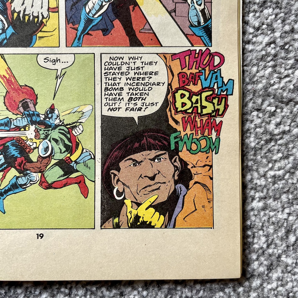
Death’s Head puts both down to “cowboy builders” and doesn’t realise he was actually under attack. This forms the backbone of this month’s tale. Big Shot’s aim is to kill our anti-hero and double-cross Undertaker by taking over Death’s Head’s business, while Short Fuse just wants to do a good job for the person/horse who hired him. However, they keep attempting to take out their target at the same time. While completely unaware of each other, each attempt is undone by the other’s, cancelling each other out in an increasingly funny series of events.

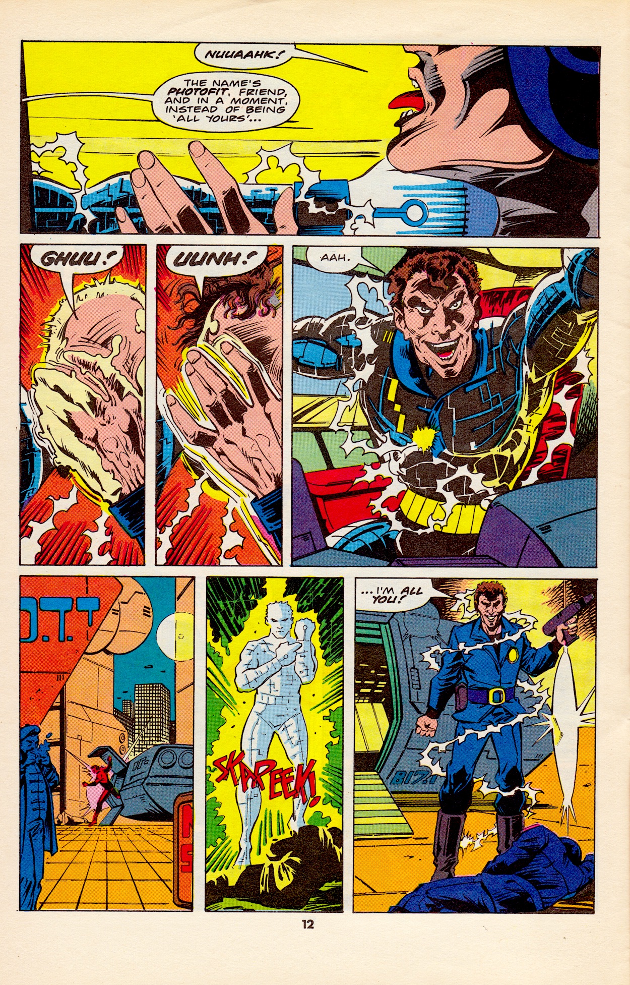
There’s a main bad guy mixed in here that acts as Death’s Head’s target for a job he and Spratt (good to see him back in the strip) have been hired to carry out. Called Photofit, he has a hi-tech suit which enables him to mimic anyone he comes in contact with. Think the T-1000 from Terminator 2, albeit a few years before that film was released. While the chase makes for an entertaining plot it’s really just a vehicle for the assassination attempts.

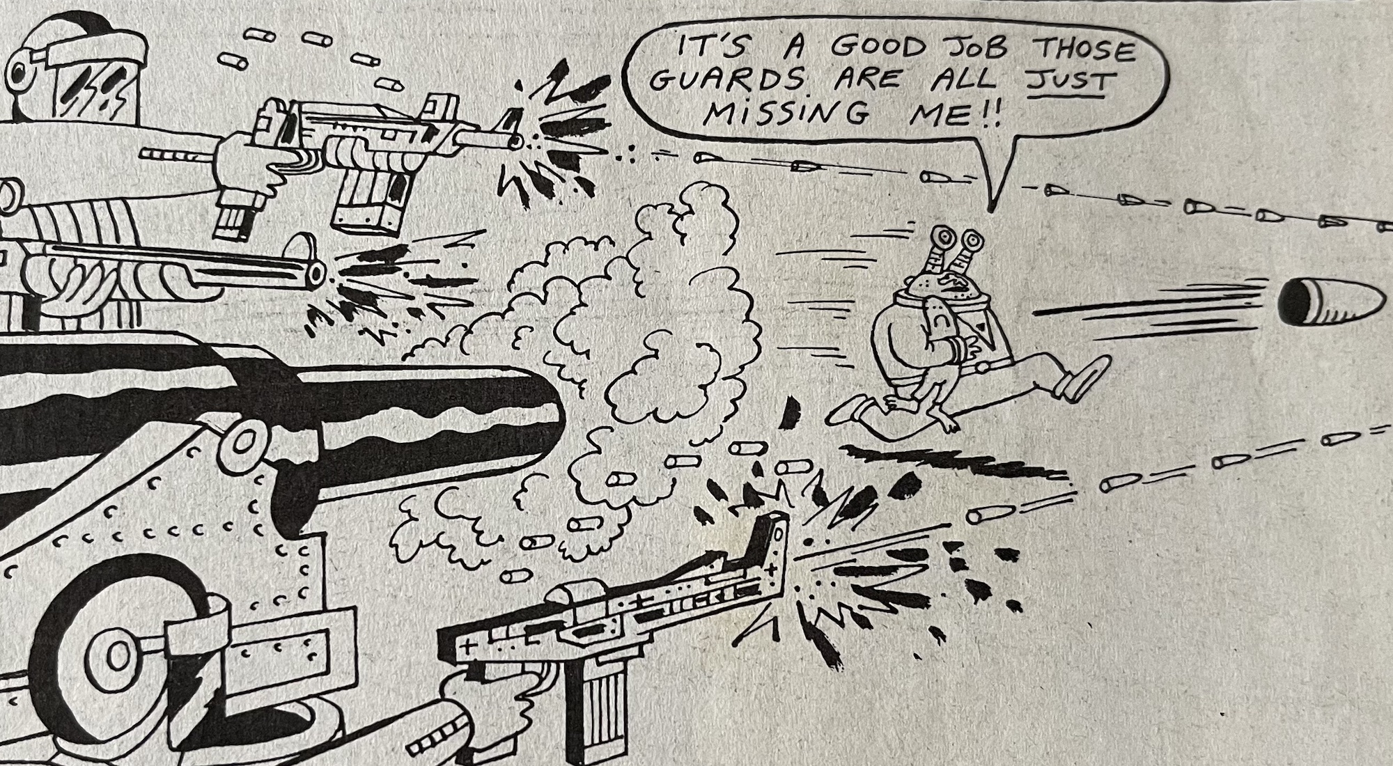
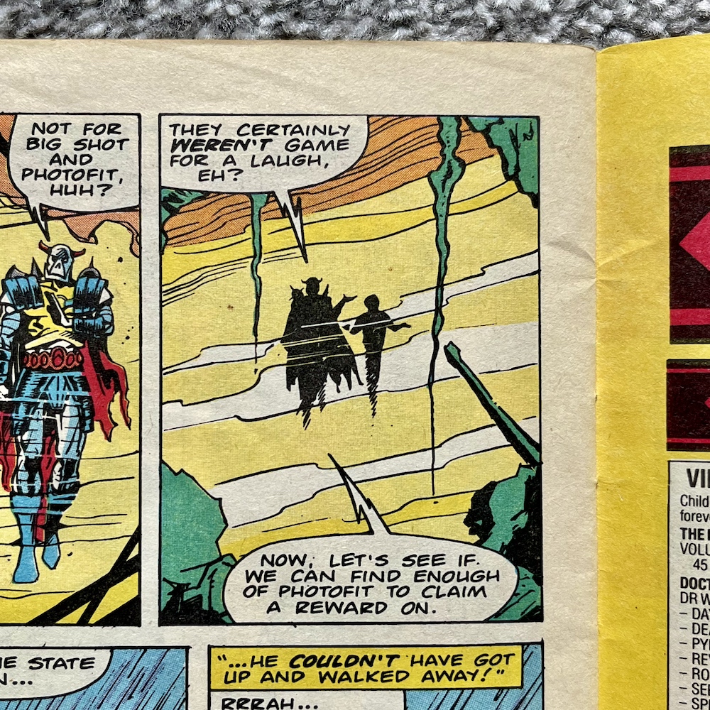
Eventually our lead clicks that something is going on as you can see below. I love the panel when he realises, his expression and the rain bouncing off his metallic face is all just perfectly realised. In the middle panel you can see how Short Fuse’s mistimed bomb blows Death’s Head backwards and away from Big Shot firing his bazooka-like weapon. He’d been in his sights but the explosion pushed the target out of the way and you can see the bazooka shell zooming harmlessly past.

Somehow this doesn’t get stale either, mainly thanks to the imagination on show in how these attempts fail and Death’s Head’s reactions. All the while the Photofit story continues and he disguises himself as a contestant on a game show where the prize is a trip out of the country, all paid for and through legitimate channels, the ultimate getaway right in plain sight.

Spratt accidentally ends up on the show itself and faces off against the disguised Photofit while Death’s Head tries to search the rest of the building for someone who could be anyone. All the while he’s getting attacked by unknown enemies. Unknown until Big Shot finally decides to change that. Sick of having his chances squandered he blasts Death’s Head through a wall, then stands over him, gun pointed at his head, ready to take the final shot… when another explosion knocks him off his feet and into waiting fists.

I had to laugh at that first panel! Well, our main character isn’t a bounty hunter after all, yes? Short Fuse is getting frustrated too. For once it was Big Shot who got in his way, so he resorts to desperate measures but his own incompetence results in nothing more than an explosion in mid-air that shoves the fighting duo through a wall and into the television studio. 

Just before this, Photofit makes himself known to Spratt because our unwitting contestant is actually winning the game. A gun held in the small of his back, he’s saved by the sudden arrival of our fighting duo and Photofit realises he’s defeated and must escape. He sees the perfect disguise right in front of him. Or it would be, if that disguise didn’t immediately place him in the sights of an assassin.

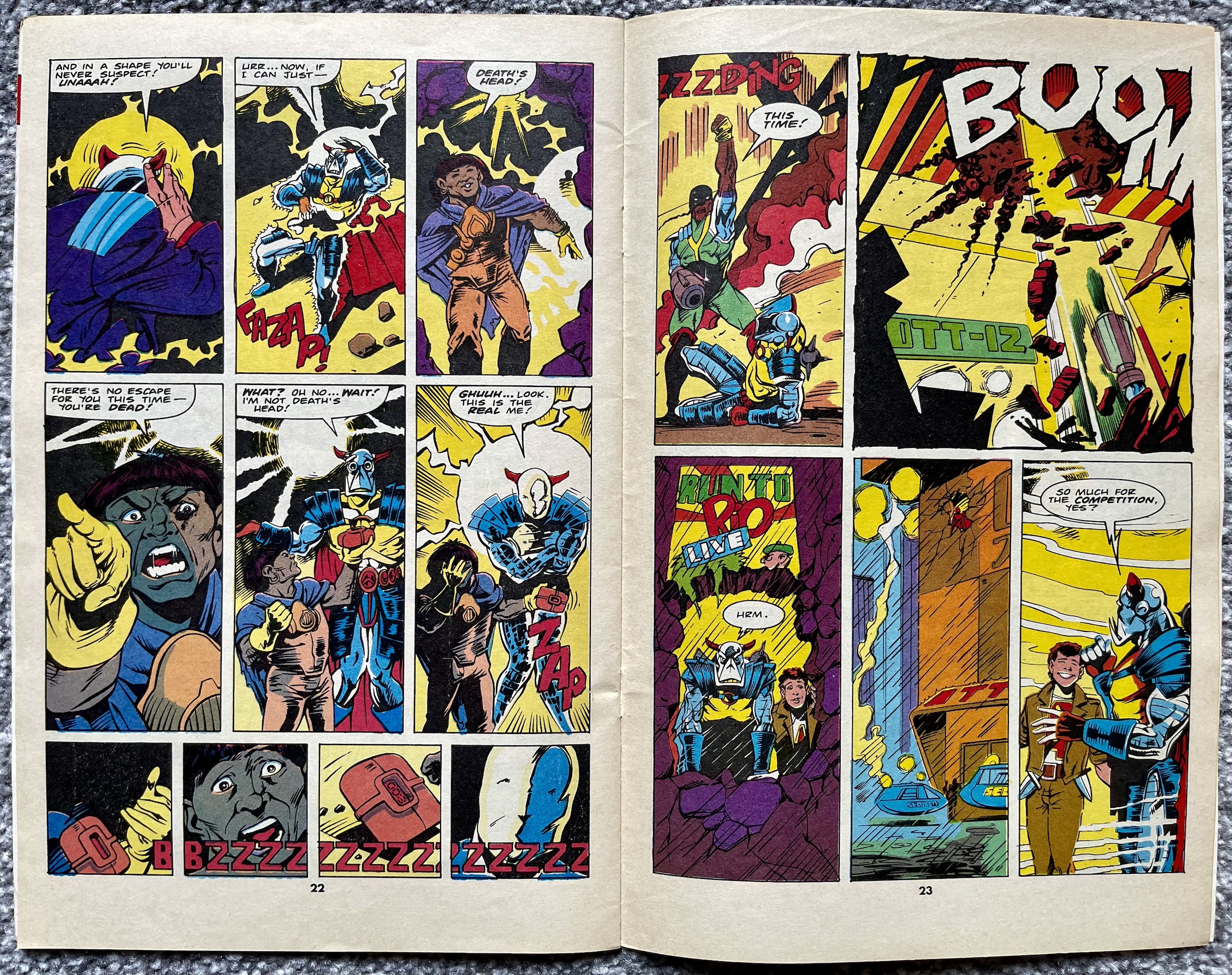
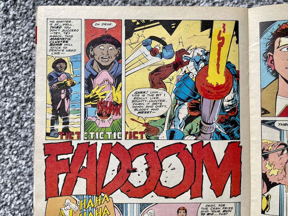
So the magnetic bomb obviously doesn’t stick to the very human imposter and in a shocking move it not only blows him up but Short Fuse as well! Okay, yes, he’s been trying to blow up Death’s Head but the very violent slapstick comedy he’s brought to the issue has been hilarious and I’m genuinely sorry to see him killed off. Despite being a hired killer there was something loveable about the little man. However, even in death he manages to thwart Big Shot one final time and save the mechanoid they’d both been hired to kill. 

As the story ends Spratt and Death’s Head converse over how it was strange that things kept exploding around them, reminding the readers that the duo never even knew of Short Fuse’s existence, never mind his influence on events (and their lives). They don’t seem to care why those explosions kept happening and instead only hope there’s enough left of their target so that they can prove they’ve earned their money!

It’s a suitably funny conclusion for these two, playing down the events and simply moving on. In their position it’s probably the healthiest way to be but that’s not the point. The point is that they’re very funny together and obviously the perfect match, something even Death’s Head seems to have finally acknowledged. These two are so well written, their actions and dialogue so natural that you have to step back to remember how far-fetched the whole scenario of the comic is.

I’ve really enjoyed Simon’s writing in Transformers and Dragon’s Claws but there’s something about this particular comic that stands out. It feels like it’s more of a personal project for Simon, it’s so one-of-a-kind and has such a unique sense of humour I get the feeling the writing is closer to Simon’s own personality than anything else I’ve read. We’ll see that insight hopefully develop even more over the remaining months, the next instalment in five weeks on Monday 3rd June 2024.

iSSUE SiX < > iSSUE EiGHT

DEATH’S HEAD MENU

YOU CAN QUOTE ME… WELL, THEM!

A few years back I wrote an article about OiNK for a fan-produced magazine called Comic Scene. It’s a magazine that has been cancelled, returned in a different format and cancelled again more times than Uncle Pigg has had hot swill. The article was for their ambitious but ultimately factual-error-filled (and also cancelled) partwork series History of Comics. To accompany it I also wrote about my top six issues of OiNK and was able to get some fantastic quotes from some of the comic’s team to use as a box out.

For whatever reason neither of these were used. I thought not including the quotes from these incredibly talented cartoonists (who had all happily got back to me with their thoughts) was particularly surprising. Well, to mark the 1986 release date of OiNK’s preview issue (and the first OiNK review on the blog) here are the quotes I was able to muster in time for the article’s original deadline but which never saw print for whatever reason. They’re a nice little insight into the making of OiNK and I’d like to thank everyone for contributing at the time.


STEVE McGARRY

“It was more than an honour to be asked to contribute to those first few issues of OiNK, it was a damned inconvenience.”

DAVID LEACH

“Working on OiNK was a fantastic experience, it featured my first professional cartoon character and it marked the start of my professional career as a freelance cartoonist.

“I got to meet life-long friends and it got my foot in the door. As such it holds a soft spot in my dangerously enlarged, erratically beating heart. OiNK was the start of my professional career as a cartoonist. I had seen a preview copy of the comic and just knew I had to be in it. I contacted Bob Paynter, Group Editor of Humour Comics at IPC at the time and he offered to send my work sample to OiNK if I did a job for Whizzer and Chips. I ended up drawing a four issue pull-out strip called Phil Fitt and Brad Habit, which got published and in return my sample strip for Psycho Gran got sent off to OiNK and that was that!”

JEREMY BANX

Working on OiNK was hard work and great fun. I’d never expected to work in comics so it was a strange adventure for me. I learnt a huge amount and it certainly changed the general direction of my travel.”

LEW STRINGER

“OiNK came along at just the right time for those of us who were still new to the comics business. We were full of ideas and still young enough to be able to relate with what the readership wanted. It gave us the perfect opportunities to develop our craft and come up with strips that wouldn’t fit in with the more pedestrian formularised comics. It was such a fun time to work in comics. We all had a great time and I think that shows in how fondly OiNK is still remembered all these years later.”

DAVEY JONES

“Thinking of OiNK, I reckon the main thing I remember is how open they were to stuff which wasn’t necessarily in the traditional British comic format. They liked the more familiar style of Buster/Whizzer and Chips style strips as well of course, but were also happy to look at stuff that was a bit different. I really liked the things that Jeremy Banx was doing with Burp the alien, which were sometimes these short, funny science fiction stories, and I hadn’t really seen anything quite like it in comics. So you felt like you didn’t need to follow any particular formula when submitting scripts, just think of daft stuff that they might find funny.

“The other thing that occurs to me is how encouraging [co-editor] Mark Rodgers was. I’d send him the scripts first, and quite often he’d turn them down, but he went to some trouble to explain where I was going wrong (the stories were too complicated, or I was trying to fit too much in etc.) which I appreciated a lot, because he could have just stamped the word REJECTED on them.”

KEV F SUTHERLAND

“In 1986 I was desperately trying to break into comics so I was sending something, at least every week, to both 2000AD and OiNK. OiNK would reply saying my stuff was too superheroey or dramatic and that I ought to send it to 2000AD, and 2000AD would reply saying my stuff was too funny or cartoony and I should send it to OiNK. It took a year until, finally, it was OiNK that broke under the pressure and let me in with, I think, a Rotten Rhymes script which they let me draw.

“I then got increasing amounts into the comic, especially my Meanwhile… strips which ran to a page each, reaching a climax with #68, a third of which was written and drawn by me (including The Plop Factory, a parody of Stock Aitken & Waterman in the style of an EC Comics horror story). That was the final issue of OiNK, and I was back where I started, desperate to break into comics.”

GRAHAM EXTON

“By an eerie coincidence, all of us who contributed material for Rrrassp! comic (as OiNK was first called) wrote strips featuring pigs. So Bob Paynter suggested making pigs the main theme. I’m not sure if it was my idea, but Mark and I both liked the Tharg and Stan Lee characters who communicated on the 2000AD and Marvel letters pages, hence Uncle Pigg. I think the Plops were my idea, but given the theme of pigs they were pretty well inevitable. They were based on Leo Baxendale‘s squelchies who were Grimly Fiendish‘s minions years before Despicable Me.

“Mark and I met with Tony [Husband, co-editor] in his home and I was struck by his lovely paintings and impressive collection of Peter Hammill LPs. I have not met Patrick [Gallagher, co-editor] in person though we are Facebook buddies. I was impressed with his ability to mimic other artists’ styles. Mark and I did a few fumetti [photo stories] when he and wife Helen came to visit me in South Andros, Bahamas. We roped in our neighbours too.

“The funniest strips I was involved with were the two Herbert Bowes ones. He had a lot of things up his nose. Jeremy Banks’ art made them super funny. The third one involved the Starship Enterprise (up his nose), but I couldn’t make it work, so never finished it. My all-vegetable theatre strip (with fab Ian Knox art) festered in my brain for many years before emerging, butterfly-like, as Tatertown, a strip I give away on Facebook. I did it mostly to learn how to use Photoshop, but it now has a life of its own.”

DAVY FRANCIS

“I loved working for OiNK. As well as scripted stories, I was allowed to use my own jokes, so I would send off scripts – thumbnails, really – and if I got a yea, then I’d draw it and send it off. I was doing Ciderman at the same time, and working in the Housing Executive full time, so it was a very busy time. However, I loved it. One mystery remains: what happened to the German version of OiNK? It ran for 3 issues, but I’ve never seen a copy.”

PATRICK GALLAGHER

“From my earliest recollections of OiNK, going way back to its development stage when Tony, Mark and I had never produced a comic before, or suffered the logistical nightmare such a dream job brings, it all felt excitingly experimental and risqué. Those feelings became the form and the norm that remained right up until the final issue, which I think gave OiNK a certain sense of unpredictability and edge throughout its life, with room for error and genius in varying measures.

“Yes, some things worked better than others; OiNK was never perfect but what carried it through was its ‘voice’, which never faltered. That was the combined comedic soul of Tony, Mark and me. That is what I am most proud of and what our brilliant contributors latched onto to make OiNK something special.”


These were from a few years ago, before this version of the blog was even launched and since then more of OiNK’s creative team have reached out to me for the blog and other reasons, hence the non-appearance of some key names above. It actually gives me an idea for the future but I won’t say anything yet in case I jinx anything. Thanks again to everyone above and to everyone who has been such a great source of information, OiNK and otherwise!

CREATiNG OiNK MENU

MAiN OiNK MENU

PALEONTOLOGiCAL PROMO: JURASSiC PARK ADVERT

When I read Dark Horse International’s UK Jurassic Park comic I wondered what marketing it may have received in their other titles. Throughout the reviews you’ll see adverts for the likes of Total Carnage, Manga Mania and what could probably be described as their flagship comic, Aliens. It’s on the back page of an issue of that film spin-off that I spotted a full-page advertisement for the new movie tie-in comic.

As I announced last Christmas, Aliens will be coming to the blog this year in a real-time read through of Dark Horse’s time with the licence (UPDATE: Now live). Whenever I buy classic comics from eBay I don’t read them until I’m scheduled to do so for the blog, but I do flick through them, solely checking the page numbers to ensure there’s nothing missing. As I picked up #13 (on sale 24th June 1993) to begin flicking from the back cover to the front, counting down the page numbers as I went, this jumped out at me.

As you can see, I wasn’t the only person something was jumping out on. Using the cover from #1 (by Gil Kane and George Perez), this is promoting the initial run of the adaptation of the film, before the American comic began publishing the first official continuation of the story. At this point in the US bets were hedged before telling readers it was an ongoing comic, so naturally over here they’d do the same. Released every three weeks to start with, it all began on 8th July before the movie had even been released here.

The advert mentions how the art of the strip was based on stills from the movie, which is a strange boast to make. It makes it sound like it could be nothing more than traced-like images, but of course in the end it was a genuinely good comics adaptation which successfully tinkered with the script and the running order of the scenes so it’d work better on the page. Well, for the most part anyway, until they got to the final chapter. You can read the reviews to see what happened there.

The Jurassic Park comic would prove popular enough to survive many cancellations at Dark Horse

Strangely, it’s advertised as a 32-page comic when it actually had 36, but then again Dark Horse didn’t seem to count their covers in the total. Then in a later issue of Aliens (#17) I discovered the exact same advert again minus the green text along the bottom. However, the promotion of a competition with “50 (count them) 50 fantastic prizes” only applied to #1 and not the competitions in the issues on sale at that later time. What does correlate properly are the Dark Horse Checklists.

In each of the early editions of Jurassic Park the checklist showed the upcoming comics that would be on sale over the next month, so they contained details of the next issue. This means we never got to see the checklist released for the premiere issue to see what it had to say, but #13 of Aliens does, just a couple of pages before that advert.

By the time Jurassic Park moved to a monthly ongoing format with brand new stories set after the movie the checklists were dropped from it. There just wasn’t room anymore, however they still appeared in the larger Aliens. Below is the one which promoted the beginning of the first official sequel to the movie, although it unfortunately doesn’t mention the completely awesome Age of Reptiles back up strip.

The question marks might look like they’re keeping the free gift a mystery for some reason, but it’s actually just placeholder text that they’ve forgotten to delete before going to press because #6 didn’t come with a free gift. A few sloppy errors aside it’s interesting to see how one of my favourite childhood comics was marketed to potential readers.

After the movie proved to be such a phenomenal success I thought they’d have advertised the comic more, that they’d have at least produced a new advert to promote the new stories instead of recycling the one they’d already used before the film’s release. Oh well, hindsight is a wonderful gift. The Jurassic Park comic would prove popular enough to survive many cancellations at Dark Horse, only succumbing to the folding of the company itself towards the end of 1994. You can read reviews of them all on the blog right now.

JURASSiC PARK MENU

SPEAKEASY #76: ‘PAPER PRESS PiGS

This is #76 of Speakeasy, a sort of newspaper about the UK comics industry which began life as a fanzine in 1979 and would go on to become a monthly resource for comics fans and the industry for over 120 issues, all the way through to 1991. Above is the front cover as it would’ve been seen on the shelves, fitting in perfectly with all of the other similarly-sized UK comics. However, that wasn’t its true front page.

I think this was rather neat! It opens out to tabloid size and is printed on similar newspaper stock. With 20 of these huge pages there was certainly plenty to read in the days when we relied on print publications to deliver us our comics news. Bambos Georgiou, who drew Blimey! It’s Slimer in The Real Ghostbusters (after Lew Stringer’s early issues) was editor at one stage, although by now that job was Richard Ashford‘s.

Bambos is credited as the ‘UK Correspondent’ but in reality publishers Acme Press Ltd was the creation of his, Richard, Cefn Ridout and Dick Hansom, who readers of the blog may know better as the editor of Dark Horse International’s Jurassic Park and Aliens comics. The connections with other blog comics continues as Death’s Head/Dragon’s Claws/The Sleeze Brothers editor (and friend of the blog) Richard Starkings designed the logo.

It’s a meaty read and there’s a lot packed onto each page but I did spot this blink-and-you’ll-miss-it reference to Visionaries, although it’s short on details. This issue of Speakeasy went on sale on this date back in 1987 and the American Visionaries comic would launch as a bi-monthly in November, not coming over to this side of The Pond until Spring 1988. Also, the less said about that He-Man movie the better, yes? I still shudder with the memory of the one night I watched it back then!

So anyway, why am I showing you this issue of Speakeasy? Simple, it’s because OiNK gets a mention. This shouldn’t really be surprising news when you spot a page summing up a lot of that month’s releases, however there’s more to it than that as far as OiNK is concerned. It mentions the banning of the comic from the kids’ shelves in W.H. Smith (boo!) and the surprising revelation to me that John Menzies didn’t stock it at all!

I remember visiting a John Menzies in Oban in Scotland as a teen, when we spent summers in a small village in the highlands of Scotland, and I’d spend my hard-earned waiting staff wages on games for my Commodore 64 that was waiting for me back home in Northern Ireland. If I’d known, I’d have went elsewhere. However, as you can see the column here says they were only losing OiNK about 10,000 sales per issue. Yes, it’s not to be sniffed at when you’re the publisher, but when OiNK was selling 100,000 and more per issue I honestly thought the figure would’ve been higher.

I do like the fact Speakeasy calls for its readers to do the complaining now and gives us the address to write to one of the newsagents in question. “Bring Back the Bacon to Where It Belongs!!” Love it! You can check out the reviews for the two issues mentioned here, #34 and #35 on the blog. No mention though of how these two issues saw the transition between original publisher IPC Magazines and Fleetway Publications.

This full-page advertisement for that year’s UK Comic Art Convention stood out to me as well thanks to a couple of photographs I’d already seen that were taken at this very event. You’ll see Tom Thug and Pete and his Pimple cartoonist Lew Stringer’s name on the page as a confirmed guest, alongside OiNK contributors Kevin O’Neill and Dave Gibbons and several of the talented creative team from Marvel UK’s Transformers.

Not mentioned are more of Uncle Pigg’s finest workers who all appeared at an OiNK panel during the weekend. Below are two photographs kindly supplied by Lew showing the team taking questions from the audience with their 80s hair dos in all their glory (and Lew rocking the OiNK t-shirt).

In the first photo (from left to right) we have the panel’s moderator Theo Clark, then Lew himself, Ed McHenry (“swigging pop” according to Lew), David Leach, Davy Francis hidden behind him and Jeremy Banx! In the second photo you can see Ed more clearly and on the far left is Viz co-creator Chris Donald. OiNK was at the height of its popularity at this point, (despite the best efforts of the aforementioned newsagents) having just enjoyed its first anniversary, the release of its first Holiday Special, the first annual was in the can and some of the comic’s best issues were about to hit the shelves.

Also of note to blog readers (and readers of its social media) is a little bit about Transformers and Action Force (G.I. Joe), namely Dave Gibbons drawing the cover to #133 of the former which is worthy of a mention in the news and there’s also a preview of his art. Action Force gets more space here with the announcement of a monthly comic to compliment the weekly, for sale both in the UK and as a way of repackaging British stories into a smaller comic to sell in the States.

The thing is, while it states here that this new comic would be released in a few months, Action Force Monthly wouldn’t appear until the following summer after the weekly had already been cancelled and merged with Transformers. It’s interesting to see it wasn’t originally planned as a replacement for the cancelled weekly but instead fans of Duke, Snake Eyes and Scarlett were meant to have both a weekly and a monthly to enjoy every month.

OiNK may have only got a small mention here but I’m always on the look out for my favourite comic of all time popping up in media of the day. It was nice to see it being taken seriously in the pages of Speakeasy and the call for support to get it back among the children’s comics. Speakeasy itself is a fascinating snapshot of the medium in the 80s and if you’re a fan of the decade’s comics you could do worse than picking up a few issues to see how your favourites were reported on.

GO TO SPEAKEASY 81

OiNK MEDiA COVERAGE

MAiN OiNK MENU

RiNG RAiDERS LiCENSEE STYLE GUiDE: PART FOUR

Have you ever found out something about your childhood many years later and wondered how you never noticed even though it was so glaringly obvious? In the case of this blog it could be how I never clicked that the TV show Round the Bend was created by OiNK’s editors! As for the Ring Raiders it’s something small but even more obvious, the colour of the canopies on all of those planes I collected.

Welcome to the fourth part of my look at every single page of the Ring Raiders Style Guide sent out to licensees in 1989. We’ve covered the introductions and details of the range, the characters and their all-important aircraft and now we move on to the Product Art Reference section. Here, Those Characters From Cleveland (TCFC) described how they expected their creations to be shown and a concept artist drew up some fun merchandise ideas, making this my favourite part of the whole folder.

The introduction reminds licensees the planes are the focus, which is an obvious point since it’s all based around those superb Matchbox toys. Of course, Barrie Tomlinson’s comic understood the significance of focusing on and developing the characters in order to tell good stories with those planes. Coming to this as a fan of the comic I initially found it strange how they were trying to tell artists specific ways to draw their creations, but of course this wasn’t aimed at dynamic comic strips. Instead, this was for those making other merchandise based solely on static representations of the aircraft.

In fact, when I spoke to Barrie about the Ring Raiders comic he told me how some licence holders didn’t understand the medium and would analyse every single frame as if it were an individual image instead of a sequential piece of art. Thankfully TCFC were apparently much more knowledgeable about comics. This page mentions my point about the canopies, how the Ring Raiders all had blue canopies and the Skull Squadron‘s were all red. A quick glance on eBay proves this point and I’ve no idea how I didn’t notice that pattern as a kid!

This full-page piece shows how some of the aerial action could be portrayed and I think it’s a great scene! It’d certainly make for an awesome poster if it was blown up a lot larger. I particularly like the lighting on Scorch’s Torch and seeing inside Vector’s cockpit. In fact, it’s only upon seeing this that I realised the airplane controls weren’t something we really saw in the comic, apart from the sci-fi element of the rings. Yes, I just love this and it’s a shame we don’t know who drew it.

The next five pages are my favourites because they give me an insight into all of the cool (and not so cool) things I no doubt would’ve wanted to adorn my bedroom (and my body) with if the franchise had taken off. These weren’t officially released, TCFC used these to promote possible ideas to companies as a way of convincing them to work on the franchise. Unfortunately I don’t know the artist whose signature is on these pages. Hopefully I’ll be able to find out in the future.

In the introduction to this section colourful checkerboards were mentioned as a way to add borders and banners where needed and the artist shows how these could work on some particularly gaudy clothing. Hey, it was the late 80s and in their own way Ring Raiders may have been ahead of their time as we slid into the 1990s. I mean, have you seen the fashions of that latter decade? We even wore shell suits for goodness sake!

I started secondary school in the autumn of 1989, the year of the range’s launch, so I doubt any of these clothes would’ve been aimed at my age range. I also doubt any of my friends would’ve let me forget if I’d turned up wearing any of them. However, given how retro inspired clothes are all the rage today, and it seems the more colourful trainers are the better, I think one of the items below might still sell to a select audience.

Okay, so those who are still fans of the Ring Raiders may make for a rather niche market but when you look at some of the celebrity ranges or those based on other retro franchises they don’t look too out of place. The slippers and their tiger design (to match that of “Cub” JonesF-5) might also work without that green and blue strap; I certainly know a friend who loves animal print, although the plane might put her off!

On the final page of wearables, is there anything more 80s than roller-skates and sweat bands? Initially I thought the top-down view of the Victory 1 F-19 Stealth Fighter was a more custom skate, but when I couldn’t figure out where you’d put your foot in I clicked it’s actually one of those novelty skateboards that were so popular back then. As a kid I wasn’t really into sports so these wouldn’t have been on my Christmas list, but that’s certainly not the case with the items on the next page.

How much do I want that lamp even now as an adult? I remember cutting out the main title logos from my toy packaging and sticking them all over my room alongside the posters from the comic, I even had a large one on the door to my room instead of the usual name plate. I was crying out for more official merchandise to be released. As such, that clock would have looked good on my wall and I think modelling a laundry basket on an airfield’s windsock is ingenious. It may even have helped keep my room tidy!

While these are just a way of throwing out ideas for licensees to work from, I think they’re great fun. In the Ring Raiders: In Real Time introductory post you can see some of the official merchandise that was released at the time and you’ll see that checkerboard pattern plenty too. Also in that post is a photo of a mocked up child’s bedroom where everything seems to have the branding of the range. It’s a somewhat ambitious photo on the part of TCFC but you have to aim high, right? Plus (again) it was the 80s! This was the way of things.

These two pages round off this section of the folder and show the great idea of having different emblems for each of the leader craft. I never saw these on any of the toy packaging or in the comic so I’m assuming they never ended up as an official part of the branding. While each Commander’s aircraft was accompanied by three other planes in a pack, I like the idea of the lead planes being promoted this way.

I can imagine some of these being turned into badges or, to be really 80s/90s they could’ve been material patches to be sown on to denim jeans and jackets. I particularly like the ones for the Galloping Ghoul P-51 Mustang (a favourite from the toy range), Kirkov’s Comet F4 Phantom II and the Sky Tiger. This whole section sums up the fun manufacturers and us kids could’ve had with the Ring Raiders as the next big craze of childhood.

Where has the time gone? We’ve only got one more part of this monthly series to go. The final few pages deal with more serious stuff like trademarks and the legal side of things, as well as approved logo variations, typography and some samples of the packaging that would be adorning toy stores around the country and the wider world. So make sure you fly back here on Monday 13th May 2024 for the final landing.

PART THREE < > PART FiVE

LiCENSEE FOLDER MENU

RiNG RAiDERS MENU