Tag Archives: Dan Abnett

THE SLEEZE BROTHERS #1: A BREATH OF (BOTTLED) FRESH AiR

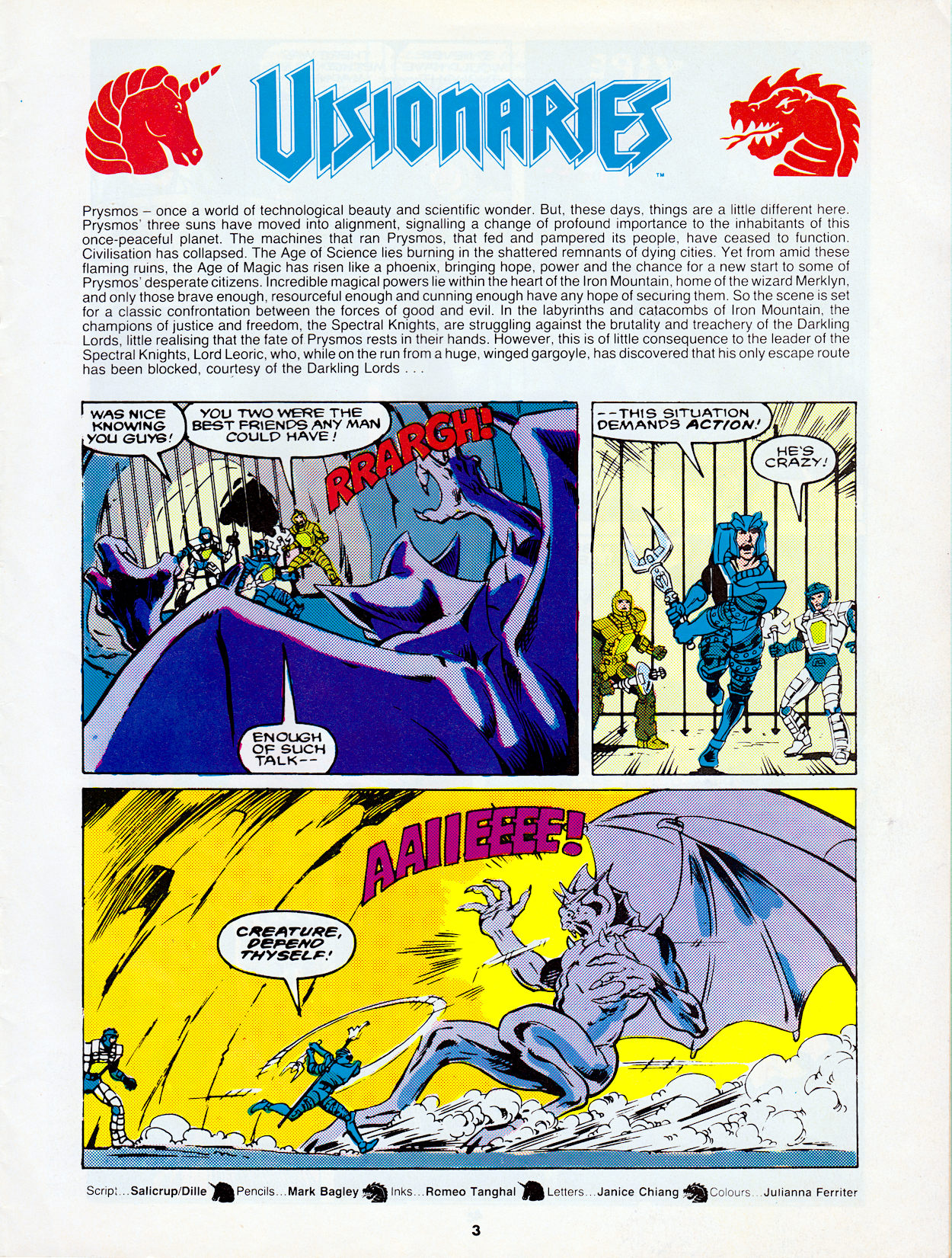
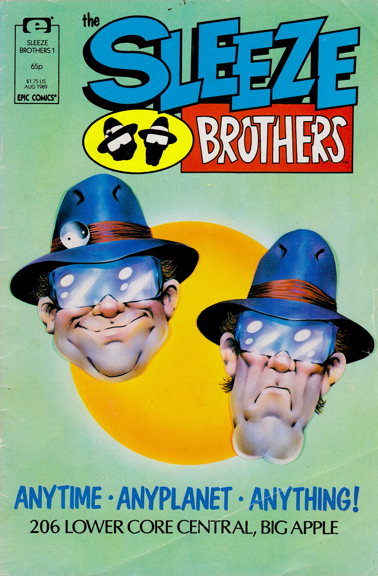
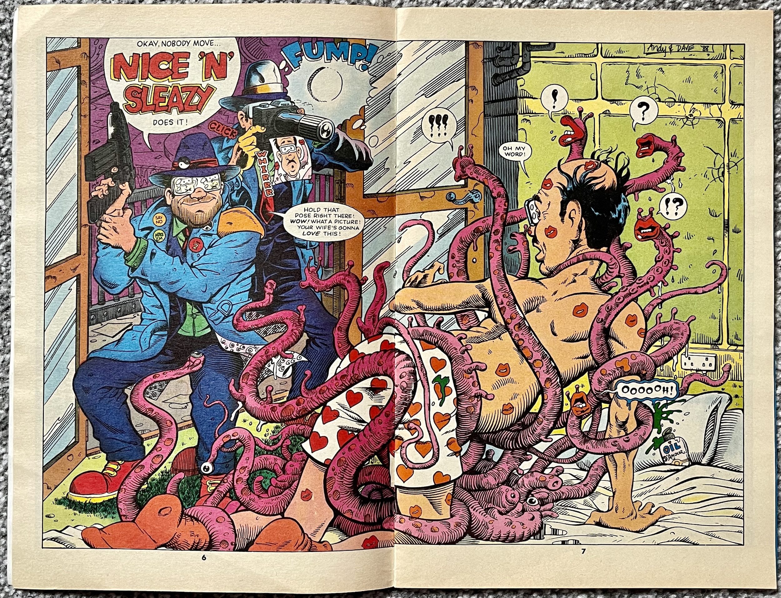
I can remember the day I bought this issue of Marvel UK’s (under the Epic Comics imprint) new monthly, The Sleeze Brothers. Sitting in my Aunt May’s house with my mum certain images were seared onto my retinas, in particular the strip’s title spread you’ll see further below. It’s been months since the brothers popped up in Doctor Who Magazine, so just how will they translate to full 22-page stories? Incredibly well is the answer to that.

The editorial is ‘written’ by a stereotypical Huggy Bear-type called Papa Beatbox, some form of MC who gives us a sort of origin story for El’ Ape and Deadbeat. Discarded test tube babies, Beatbox raised them as if they were his own and, despite their gruff, selfish, greedy exteriors they apparently have insides of pure gold. We’ll see about that. 

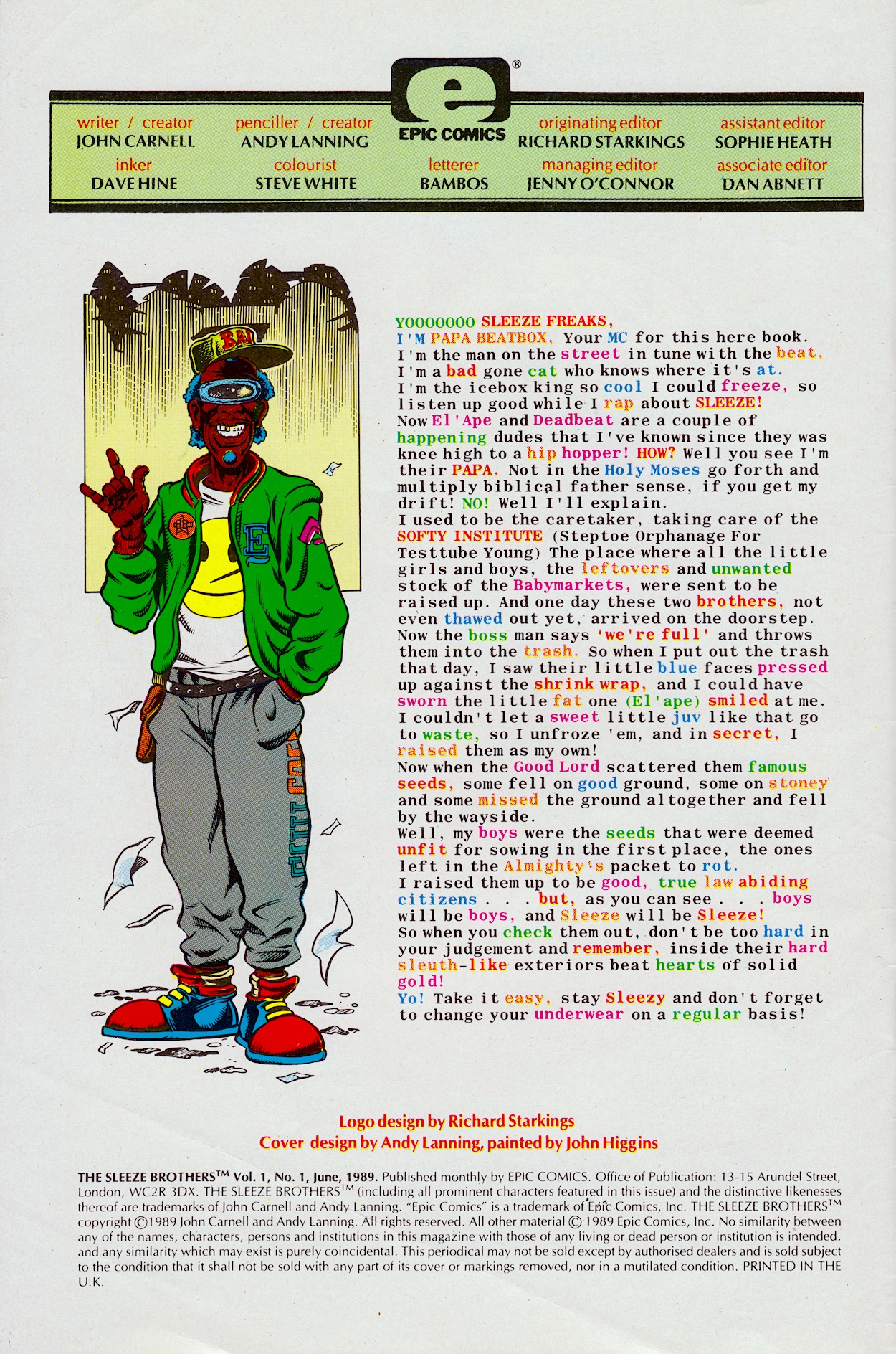
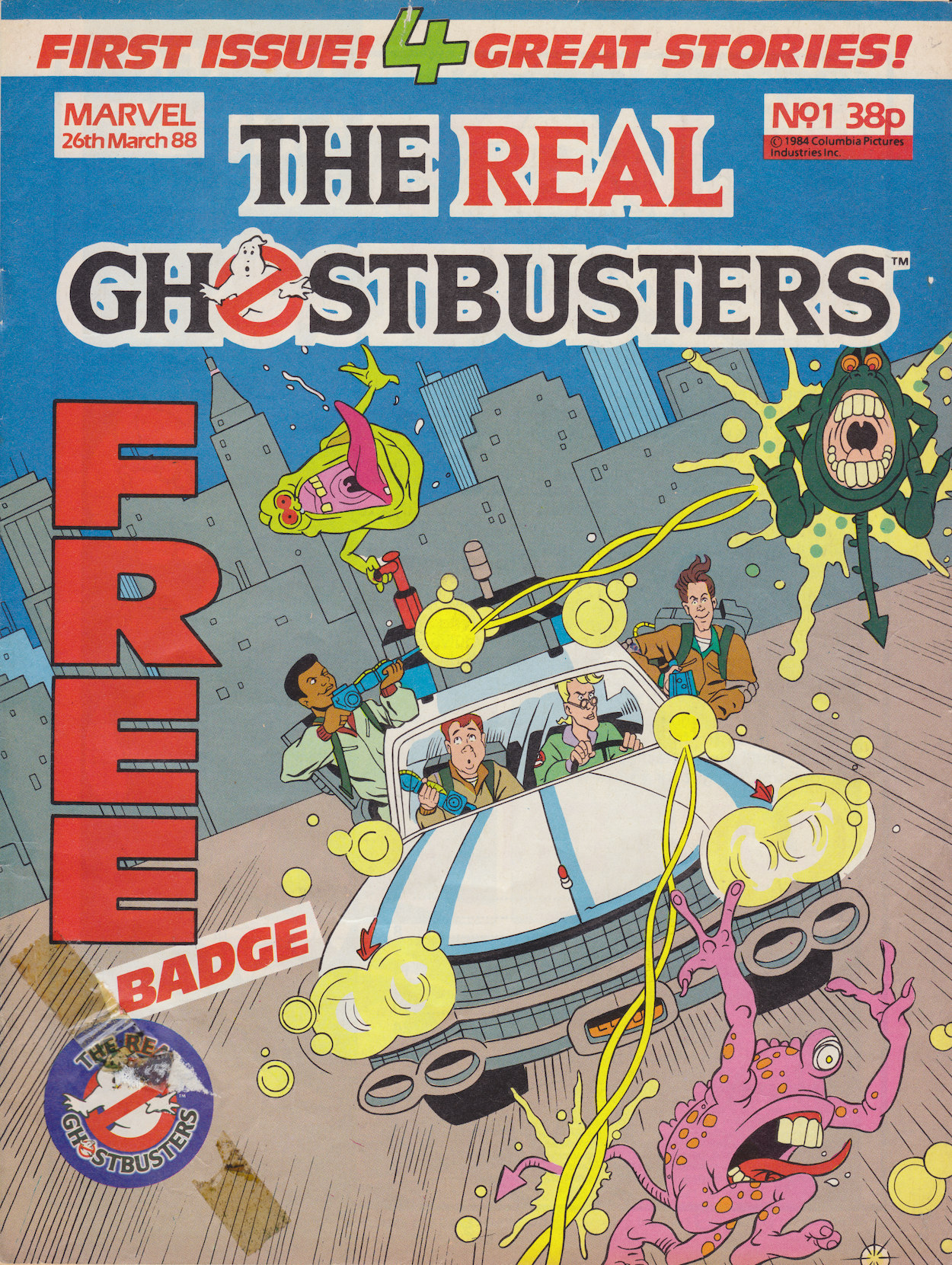
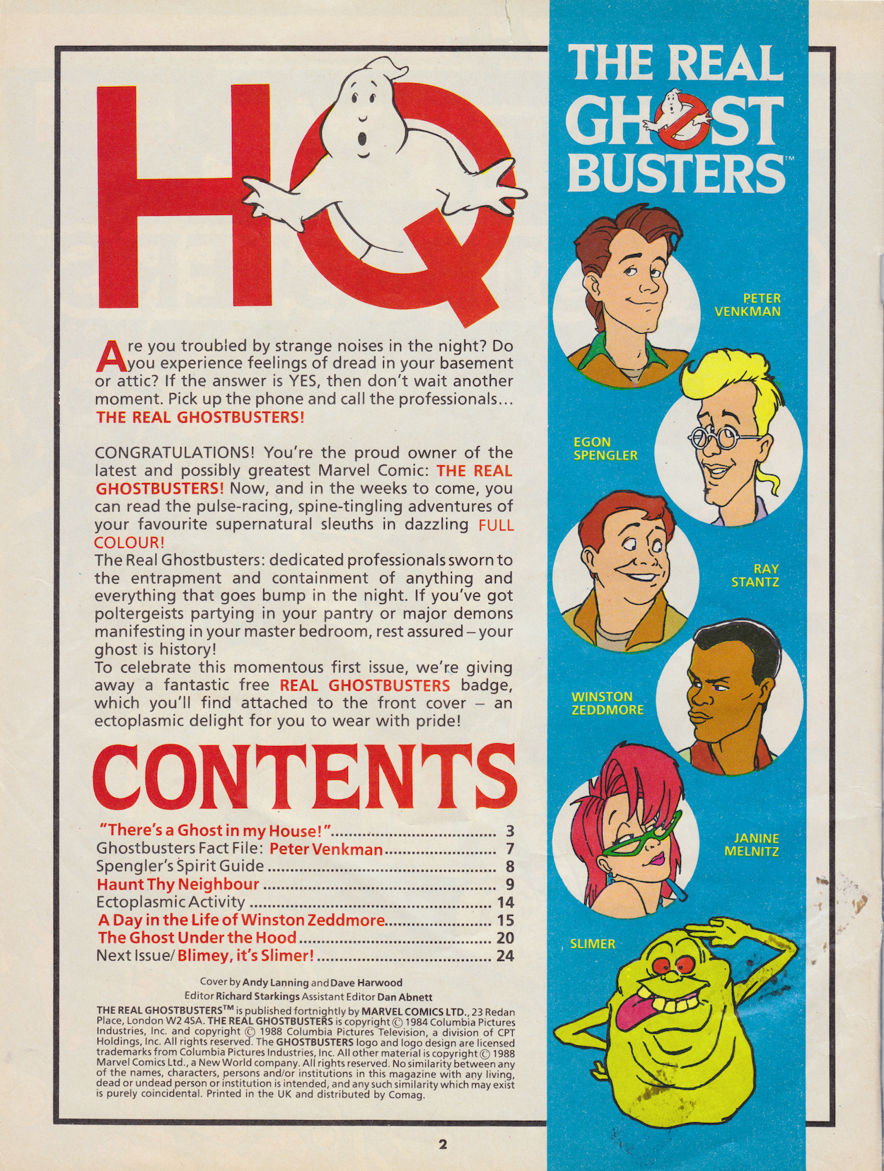
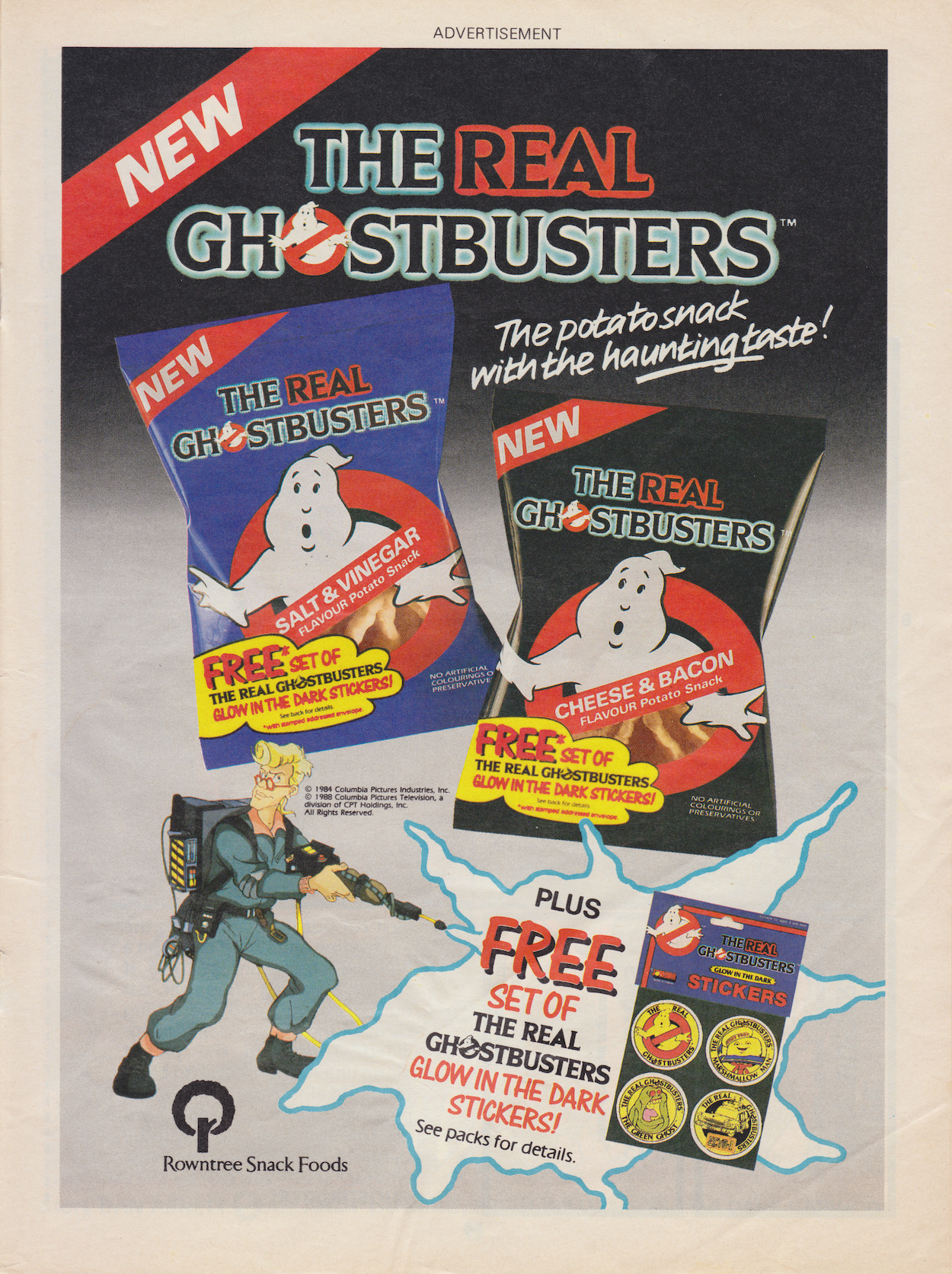
I didn’t realise Dan Abnett (Knights of Pendragon, Nova, Sinister Dexter) was associate editor until now. As I list those credited with working on The Sleeze Brothers I won’t be mentioning The Real Ghostbusters after their individual names. Just take it for granted that whoever I mention also worked on that comic unless I say otherwise! This was the main reason I loved this issue so much as a kid and why I’ve been really looking forward to it on the blog, because that aforementioned comic was such a childhood favourite.

Only a few pages in and the art team have definitely nailed it

So anyway, on to our strip which is called Nice ’n’ Sleazy. Written by John Carnell (Doctor Who, DC’s Hitchhiker’s Guide to the Galaxy comic) and pencilled by Andy Lanning (Digitek, Nova, Death’s Head II), they also created these characters. Inks are by Dave Hine (Zoids, Mambo, X-Men), colours are by Steve White (Xenozoic Tales, Transformers, editor on Visionaries, Havoc and Death’s Head), letters are by Bambos Georgiou (Slimer, co-creator of Speakeasy and Aces Weekly) and it’s all edited by Richard Starkings (Death’s Head, Dragon’s Claws, Elephantmen) who designed the comic’s logo and chatted with me in the introductory post about the comic’s creation and the Epic label.

After the plethora of artists behind the Doctor Who strip, the comic settles into its art style and I’m loving it from the very first page. This future world is so intricately designed by Andy, and he and Dave are an excellent partnership in bringing out all of the fun details, with Steve’s bright and often gaudy colours really making the pages pop more than anything I’ve read on the blog so far. Only a few pages in and the art team have definitely nailed it. What about the plot?

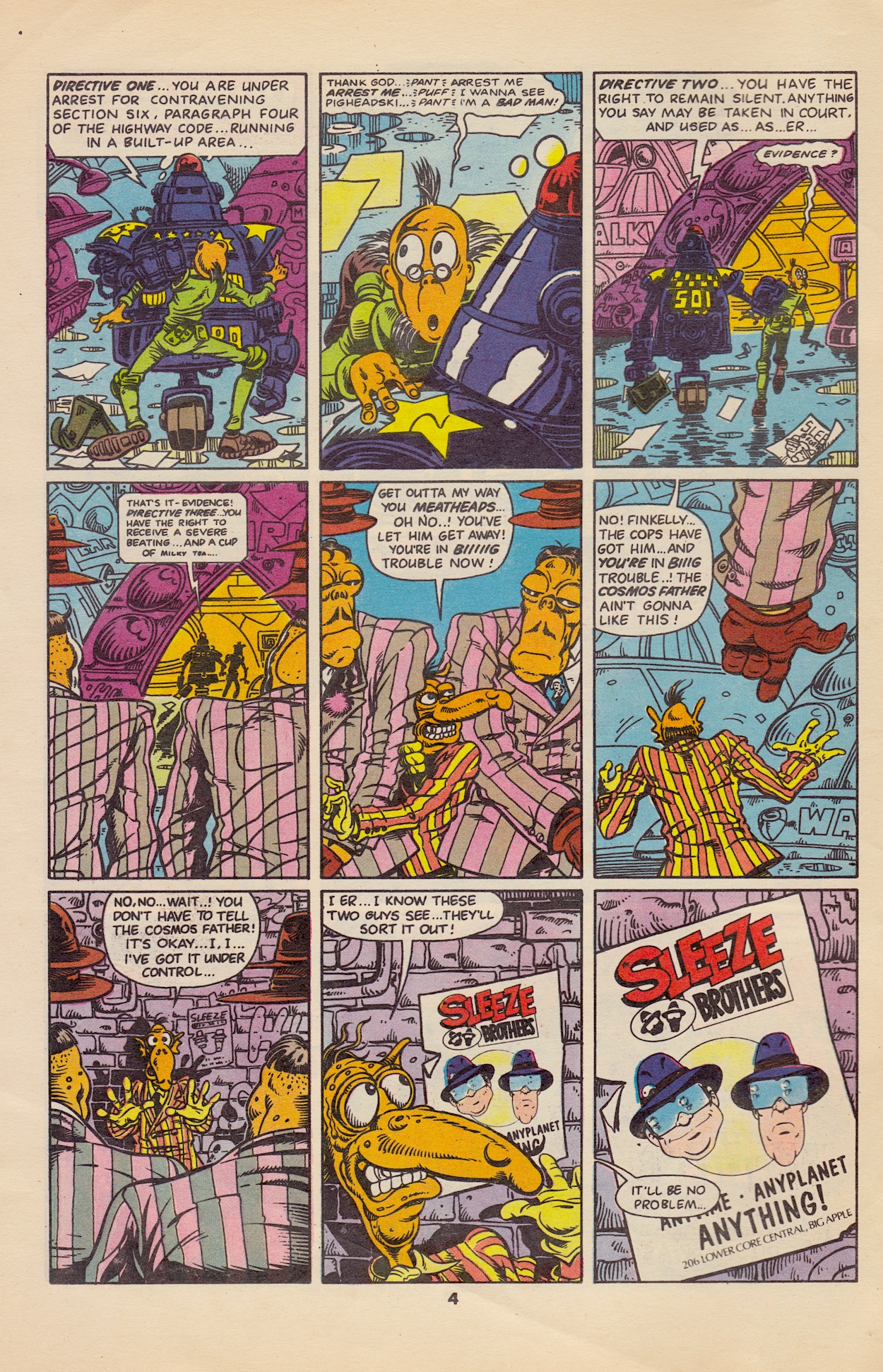
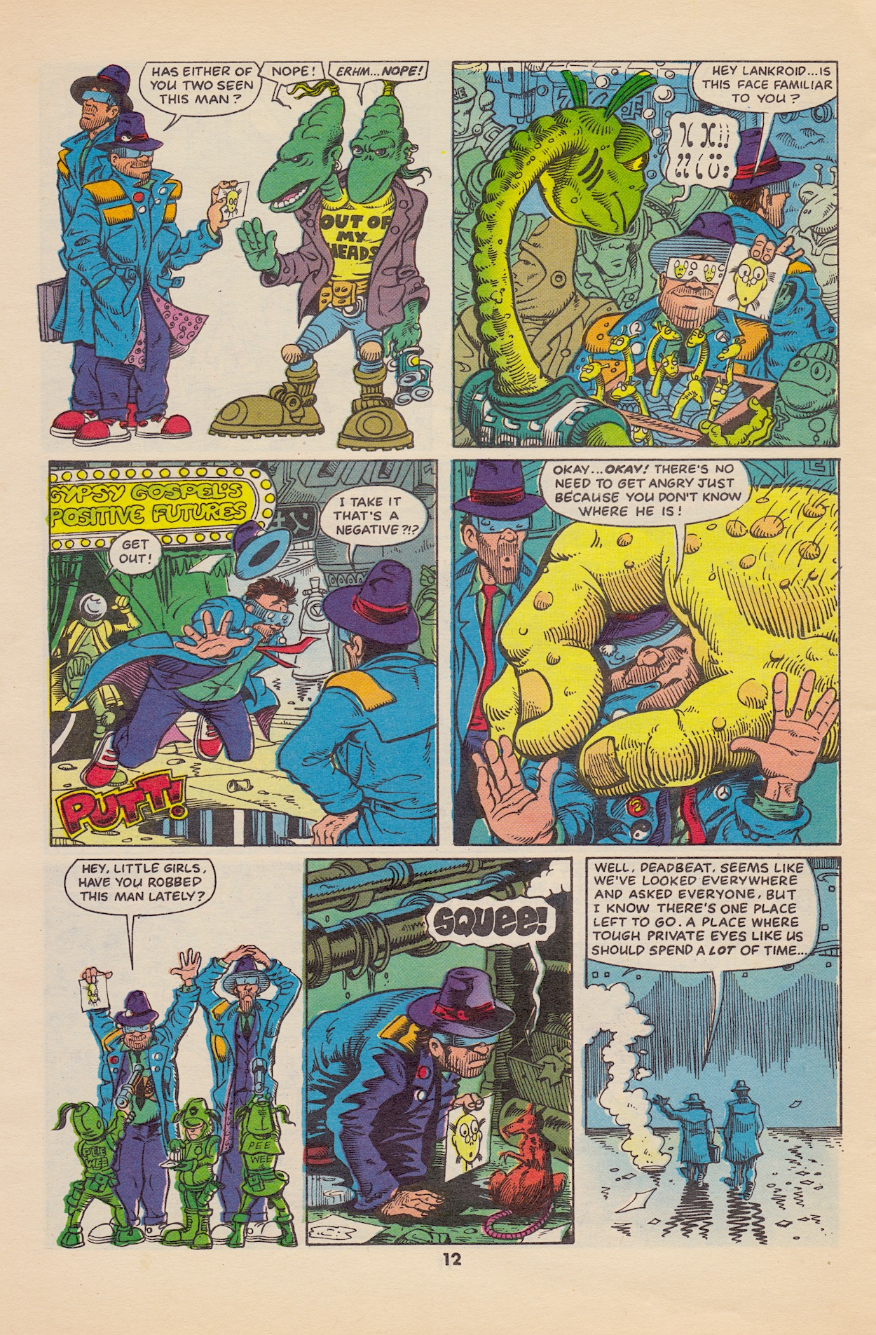
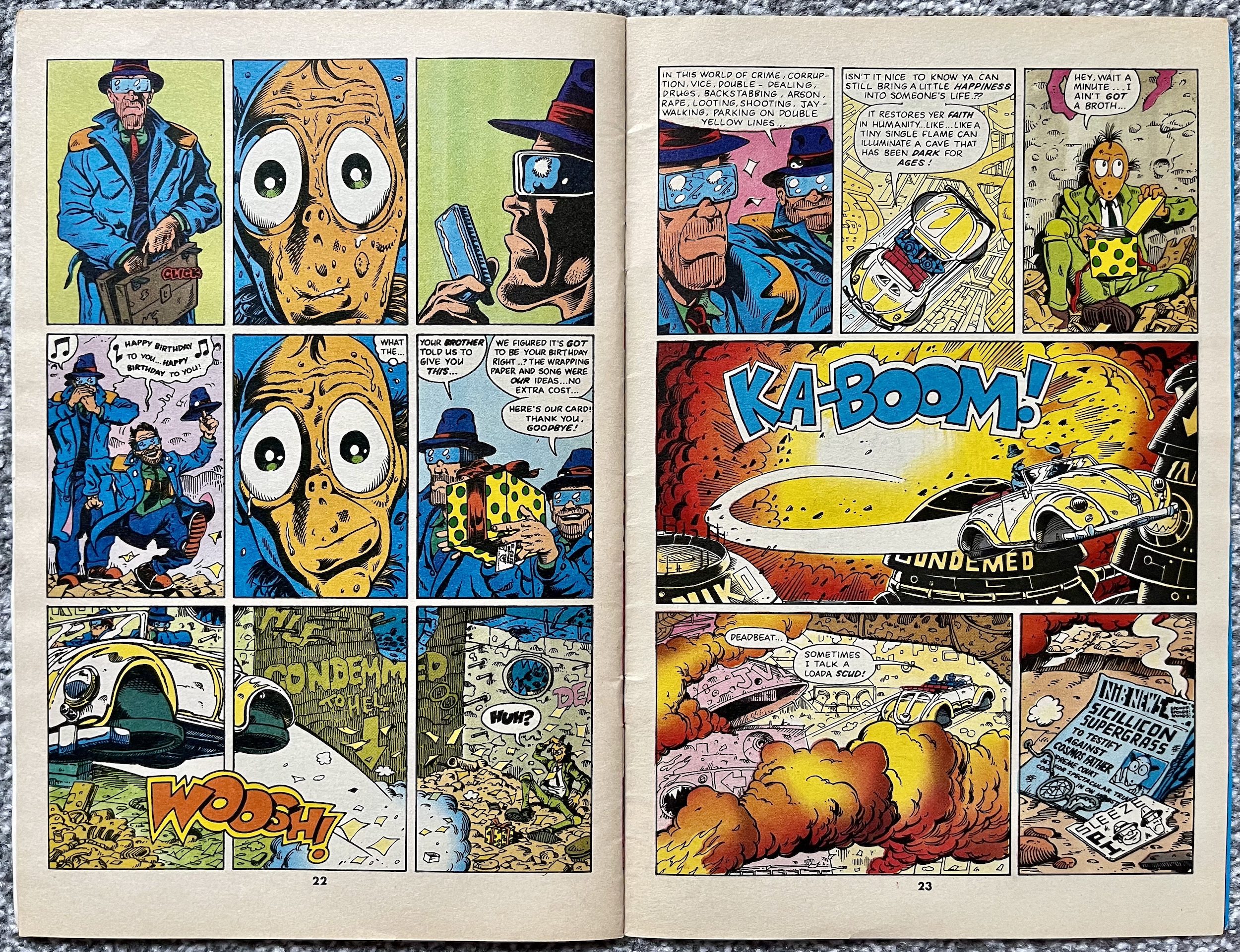
It’s a simple story but it’s the first issue so it’s main purpose is to introduce the main characters and the world in which they inhabit, with all of its grime, corruption, many and varied alien life forms and the comedic ineptitude of everyone (and everything – we see a police robot forget its directives mid-arrest) that make up the Earth of the future. The Sleeze Brothers actually get involved by accident here, when Finkelly lets a key witness against the Cosmos Father escape and, backed into a corner by his goons, he spots a flyer for the brothers’ detective agency (which doubles as the front cover) and pretends like he knows them.

We then get to meet up with El’ Ape and Deadbeat as they bust in on a husband partaking in some very extracurricular activity. This is the spread I mentioned above and I think you’ll be able to see why it was so memorable to my young eyes! I love the little details here too, such as El’ Ape’s pin badges, the fact we see the photo Deadbeat takes sliding out of the camera and even the husband’s surprised look reflected in El’ Ape’s sunglasses.

Thinking this proves that being private detectives is paying off, El’ Ape’s excitement is cooled when Deadbeat reminds him how much the camera, film and skeleton keys cost, then their last few remaining notes are ripped from his hands by their landlord. Deadbeat is sure they’re not going to earn enough in this line of work but El’ Ape is optimistic and says something always turns up “in these types of stories”. Is this a hint that they’re acknowledging being inside a comic? Even if it’s not, it’s funny.

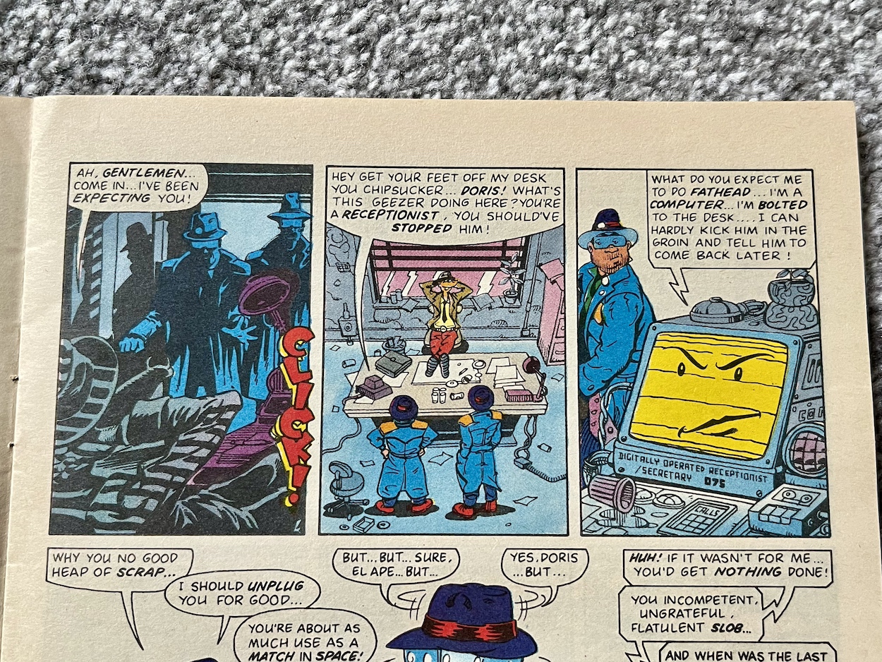
Back in their office we meet Doris, their receptionist. Well, sort of. You see, she’s a computer and, despite this being set in the far future, Doris is an antiquated desktop complete with cassette deck, so completely unable to move about and do much of a receptionist’s job. She’s just one example of the insane characters John and Andy come up with throughout the issue.

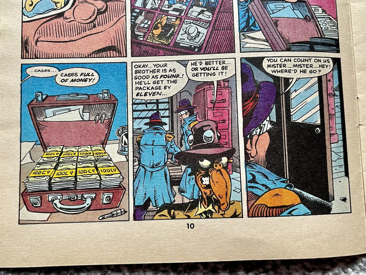
Finkelly hires them to find his twin brother, showing them a picture of the runaway witness and obviously they look nothing like each other. “He parts his hair on a different side to me”, explains Finkelly. This and a suitcase full of cash is enough to convince the Sleezes the case is legit, despite Doris calling them out on it. Yes, these two aren’t exactly the sharpest, just in case you missed their misadventure with the Doctor.

In a scene that reminds me of a funny page in #5 of Death’s Head they start asking around and run into a whole bunch of weird and wacky folk, giving Andy a chance to draw up a variety of inhabitants of the city. This page should give you some indication of the imagination on show throughout the comic and this is only the beginning. Unsurprisingly, asking random strangers doesn’t work out. Without any other ideas they head off to Wong’s Air Bar.

The Air Bar plays up to our legitimate worries of climate change, hypothesising that in the future fresh air is such a luxury it’s bottled up inside pressurised bottles and sold like beer. Not that alcohol is in short supply either, El’ Ape throwing about the cash from their suitcase as if they’ve already solved the case. When the photo accidentally falls out the bar’s proprietor is able to point them in the right direction at last (after some eyes-down-the-barrel-of-a-gun persuasion).

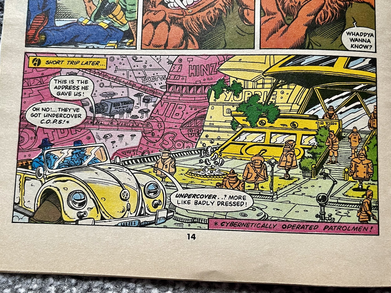
I have to say I laughed at this panel above. The city is very much a spoof of Judge Dredd’s MegaCity One. As well as the so-called “undercover C.O.P.S.” (neither undercover nor decent cops) the brothers’ car is just a Volkswagon Beetle with hovercraft piping instead of wheels, delivery trucks use the same configuration and on other pages we see regular electrical sockets and other contemporary technology, giving it a lovely feel of a future world poking fun at the depictions of the future seen in 80s movies of the day.

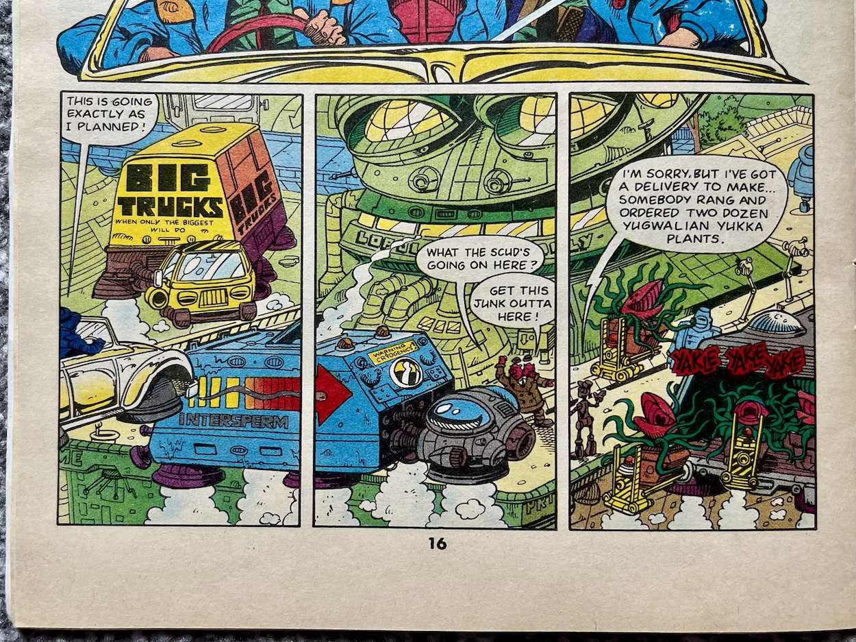
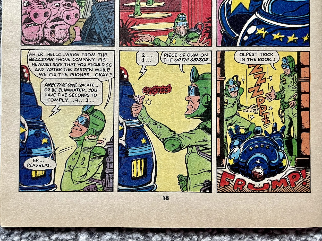
The biggest thing that’s purposely out of place for me are public phone boxes (and not a mobile in sight). Here, Deadbeat explains all the technological security these have in order to stop tampering, theft, fee dodging etc., all of which he bypasses by simply sticking a bit of chewing gum on one of its parts. “Oldest trick in the book”, he says. Placing a call to several delivery companies for the building housing their target (that uncanny resemblance to a frog above), it’s bombarded with trucks which keeps the police occupied. The two-headed chief calls for phone line repairmen, who of course end up being the brothers in disguise. It’s a ridiculously convoluted plan and I love it. Although, they’re quickly caught by one of those inept RoboCops.

So that’s two oldest tricks in the book. The ludicrousness of this future world is what has delighted me the most. I had it in my head that the world itself would be more like that in Death’s Head, with some background gags and funny social commentary but for the most part it would play the straight guy to the main characters’ comedy. But in fact the inept duo, one being a loud mouth reactionary and one quiet and thoughtful, are actually the closest we get to normality. And that’s saying something!

Through a chase involving a comedy of errors our detectives catch up with the witness. Not that they know he’s a witness. Cornered and terrified, he whimpers at the end of a back alley while El’ Ape and Deadwood approach. El’ Ape grins. Deadwood is stoney faced as per usual. He clicks open his briefcase and it looks like a professional hit to the defenceless victim, until we see what Deadbeat was reaching for. What happens next over a double-page spread at the end of our story perfectly sums up the humour of the comic.

It’s been a wild and crazy ride and this is only the first issue. You’d be hard pushed to find a comic with a premiere issue that works as perfectly as this one. It feels like a fully developed comic, as if this were the sixth or so issue in its run. Of course, with a predetermined length of only six issues John and Andy had to hit the ground running. They’ve sprinted! Every page is packed full of fun, every gag lands, the leads feel fully formed and the world in which they inhabit is just as big a character as they are.

Let’s hope the remaining issues over the course of the rest of this year live up to the exceptionally high standard this premiere has laid out. It’s also got me thinking about finally finishing off my collection of The Real Ghostbusters to enjoy more of John’s and Andy’s work after this read through is finished. For now I’ll look forward to whatever they have in store for The Sleeze Brothers #2, which will be reviewed right here on the blog on Monday 29th July 2024.

DOCTOR WHO MAGAZiNE 147 < > iSSUE TWO

THE SLEEZE BROTHERS MENU

ViSiONARiES ANNUAL 1988: REPEAT PERFORMANCE

When I reviewed Marvel UK‘s monthly Visionaries comic earlier this year the general reaction on social media fell into two camps. There were those who’d forgotten all about the comic and those who never knew it existed. Even fewer knew about this annual. Exactly 33 years ago to the day, back in 1988 I received it on Christmas Day, not knowing about the existence of a regular comic until it was mentioned inside. I was gutted I’d missed out, being such a fan of the cartoon, so finally reading their origin story (which I’d missed on TV) was a thrill.

Of course, today that thrill is diminished somewhat after reading that story several months ago in the comic. I can imagine fans weren’t too pleased that over half the book was reprint material either. But let’s start at the beginning with that eye-catching cover by Martin Griffiths (Thundercats, The Real Ghostbusters, 2000AD) and John Burns (Transformers, Sable and Fortune, G.I. Joe). Only upon reading these for the blog did I realise this was the image produced for the premiere issue marketing. But still, original Marvel UK pieces like this are the envy of American Visionaries fans, just like this opening spread by Dougie Braithwaite (The Punisher, The Real Ghostbusters, Batman) and John.

There’s an editorial matching the comic’s design, although at least here it’s all hype for the annual in the reader’s hands rather than advertising for other titles. Surprisingly it explains the strip is a reprint but it does make a big deal of the fact there are two brand new prose stories and a handful of fact-files. There’s also the obligatory space to fill in your name in case your friends decided to steal it away from you.

Monthly Visionaries editor Steve White is credited as designer here, most likely because most of the design is lifted straight from the comic with minimal changes. The editor is Marvel UK stalwart Richard Starkings (Transformers letterer, The Real Ghostbusters launch editor, Elephantmen writer and Comicraft founder) and with limited resources to produce an annual for a comic which had proven unsuccessful, meaning no UK originated strips, he’s done a fine job in pulling together a book I have very happy memories of.

So yes, the most exciting thing in this annual for me originally was finally reading how it all began and it’s always a good read, no matter how many times I do so. The End… The Beginning takes up a whopping 38 of the 64 pages available here and is the original version of the strip, minus the great big lump of text that removed some important panels from the start of the second half when published in #2 (see below).

Based on the teleplay by Flint Dille, adapted by Jim Salicrup, pencilled by Mark Bagley, inked by Romeo Tanghai, lettered by Janice Chiang and coloured by Julianna Ferriter it’s still a masterpiece in origin storytelling today, however I’m not going to read it again for this review. It may have been brand new and exciting 33 years ago but I read it for the comic’s reviews last spring and again in the pages of Transformers this year on the blog’s Instagram! (I’ll explain that at the end of the review.) So for the full details of this story check out the reviews of #1 and #2 of the comic.

So I’m just reading the parts that are new and as such it’s a much different, much shorter experience this time around. We begin with the fact-files, of which there are six featuring Spectral Knights Leoric, Witterquick and Arzon, and Darkling Lords Darkstorm, Cindarr and Cravex. I’m not sure who drew the images for them but they are rather basic. Four of them were used for the editorial page, although just their faces. Given how far in advance annuals are created I think we can conclude these were drawn for these fact-files and then used in the monthly.

The descriptions have basically been lifted from the toy packets, reworded slightly to include the occasional reference to the origin strip. While the cartoon and comic had our heroes turn into the animals on their chest plates, the toys simply said these totems “represented” the characters’ personalities and you can see that’s used here too, which is a bit strange. Also, by this stage Darkstorm‘s goal had been established as more than simply wanting to conquer his foes (I’ve gone into that in depth in the monthly reviews) so it’s a shame to see that included.

I loved getting my Marvel annuals every year with their mix of strips and text stories. Unbelievably, some of my friends didn’t read the prose tales and wished their books were strips from cover to cover. They really missed out, these were some of the very best stories told by Marvel UK; it was one of the annual text stories that created Megatron‘s background of being a gladiator before the war, something that’s canon in basically every interpretation of Transformers today.

The writers would often concentrate on a couple of characters for the whole story, using the format to have some fun with them. While Transformers used it to develop them, for most of the other annuals it was a chance to take one small battle or incident and create a story full of personality and humour. That’s definitely the route the two new stories take here. First up is The Edge written by Ian Rimmer (Zoids, Action Force, Transformers) with art by Will Simpson (Transformers, Hellblazer, Rogue Trooper) and colour by Stuart Place (Captain Britain, Transformers (yes, again!)).

The story is bookended with Merklynn playing a game of chess, or whatever the Prysmos equivalent is, and equating his game to the ongoing battles between the two factions of warriors he’s created. The theme here is luck; no matter the strategy in the game chance will always play a part. The story itself is simple but fun and these bookends are an attempt to make it all feel more substantial than it actually is. It’s an interesting way of doing it and a good example of the more experimental writing techniques used in the text stories.

Reekon and Virulina are stalking about the lake near Leoric‘s compound when they happen upon Cryotek gathering drinking water and immediately hatch a plan to take him out involving both of their totems, a plan which is actually quite smart and very entertaining. In the midst of the fight the wooden shaft of the Spectral Knight’s staff gets snapped in two and the magic power itself disappears from within. This is a moment of revelation for the Darkling Lords but surely they’d have known this already? Has no damage come to their own wooden staffs in all this time?

The Lords launch a mass attack in which their targets aren’t the Knights themselves but their staffs, and they begin destroying them one by one. Surely a risky manoeuvre since their own staffs would be just as vulnerable, surely? Cryotek is holding the two pieces of his and needs a free hand to fight, so he holds them together in one hand at the point where they snapped apart. The magical energy returns, all it needed was to be held together and connected via the inner energy of the person whose persona is embodied within it. The battle ends in a draw and we read about Merkylnn resetting his chess game ready for the next battle and laughing.

It’s a strange little tale that doesn’t make an awful lot of sense if you think about it too much but there are some nice character moments, particularly for Reekon and Virulina. The dialogue between the two is snappy and funny as they whisper and bicker about their plan, and Reekon shows a masterful mathematical mind in working out the odds of success (and survival), an aspect of his character we never got to see in the comic before its premature cancellation. Definitely worth it for these moments alone.

The second prose story is the final new Visionaries story of the whole run, so in hindsight it has an awful lot to live up to. I’m very happy to say it does so with aplomb. False Light at Fulch Rock stars Arzon, Darkstorm and Cravex and is written by Dan Abnett (Doctor Who, Knights of Pendragon and a legend on The Real Ghostbusters), with accompanying art by Dougie Braithwaite and Cam Smith (Supergirl, Sinister Dexter, New Mutants), and colours by Chris Mattews (Thundercats, Mighty Max).

I was won over from the very first sentence, which paints the picture of a monastery on a cliff edge in the middle of a “dark storm”. With an image of the similarly named leader of the Darkling Lords on a purple horse across the page it immediately draws you in; we’re in for a treat with this one in atmosphere alone. However, everything else about the story is a winner too.


Darkstorm: “The Crystal of Light. With it, I will be supreme.”

Cravex: “You?”

Darkstorm: “The Darkling Lords. Whatever. Now come on!”


It tells the story of the Knights and Lords travelling to townships offering protection in this new dangerous age and Arzon’s next stop is Fulch Rock where the Order of the Lightfinders have taken refuge, led by Murnoc. Before he can get inside he’s set upon by Darkstorm and Cravex, barely escaping thanks to his Power of Knowledge spell poem, with which he’s able to predict the most likely next attack from his foes. However, he eventually falls over the cliff, transforming into his eagle form at the last second, slowing his decent enough to survive although he’s badly injured. He’s found by the Lightfinders and brought inside, where Darkstorm is ordered not to harm Murnoc’s guest while he works out which side to accept protection from.

It’s a great start. The rest of the story explains how the Lords are only offering protection because of the rumour of a Crystal of Light much like Merklynn’s hidden inside. There’s some cracking dialogue here which we’ve come to expect from Marvel UK text stories and in the end we find out it’s all been a ruse to lure the Lords there to steal their armour, what these religious nuts call “Aftertech” and view as their salvation, to power themselves and take over the land. The crystal is a fake and the three Visionaries must work together to escape due to the vast numbers of followers Murnoc has amassed.

Dan’s writing paints a picture in the mind and I think the story works so much better as prose than I think a strip would have. The Visionaries comic was always very good at building atmosphere with its descriptive panels, but having what is essentially seven pages of that kind of writing is something else. After the final battle Arzon tells Darkstorm the lesson to be learned is not judging others by appearance alone and that it’s a shame the two sides, so formidable together for the greater good, couldn’t work together to rebuild the planet. Darkstorm actually hesitates here. But in the end they leave as enemies. It’s a nicely written reference back to the monthly and the fact Darkstorm truly believed he was just doing what was best for his world.

See if you can track the whole series down, you’ll enjoy some of the very best 80s comics you’re ever likely to read

So if you’ve read the strip already is it worth your while picking this book up? Most definitely. The exclusive art and text stories are worth the entry fee and it’s essential for the completist. It’s also a bittersweet moment because as I finished Fulch Rock I realised that was the last story these wonderful characters had. There’d be a Spring Special a few months into 1989 which was a page-for-page reprint of #5 of the comic, released to plug the fact Visionaries were returning to the Transformers comic, which I’m reading in real time on the blog’s Instagram. But when they did reappear it was yet another reprint of The End… The Beginning, making it three times it was published in the UK in one year!

It’s been a blast reliving the feeling of receiving this annual all those years ago. It’s sad to know there are no more stories to come when the comic had some of the greatest potential of any licenced title. It started off in such strong shape and was developing so fast. I truly believe it’s a great loss we didn’t get to see what could’ve happened if the lifespan fellow Hasbro franchises like Transformers and G.I. Joe had, had been granted to the Visionaries.

After Christmas get yourself on to eBay and see if you can track the whole series down (it won’t take too long to complete), you’ll enjoy some of the very best 80s comics you’re ever likely to read.

TRANSFORMERS Pt.2 < > SPRiNG SPECiAL

ViSiONARiES MENU

ANNUALS MENU

CHRiSTMAS 2021

THE REAL GHOSTBUSTERS: PREMiERE iSSUE ANNiVERSARY

I admit that back in 1988 when I finally got to open my copy of The Real Ghostbusters‘ premiere issue I was a little confused. I’d been looking forward to something more along the lines of Marvel UK‘s Transformers comic, with a lengthy multi-part story and certainly no text stories which I associated with comics aimed at much younger kids. However, any confusion, or indeed initial disappointment, evaporated as soon as I started to read.

By the end of its 24 pages I was hooked and didn’t regret placing the order with my newsagent before even reading it. In fact, I stayed with the comic for the majority of its run. Now, 33 years later I’ve just finished reading issue one for the first time in decades. So how does it hold up to reading today?

That front cover is nothing short of iconic, often copied by my young self back in the day on several school exercise books. Andy Lanning (The Sleeze Brothers, Superman, Majestic) and Dave Harwood‘s (Action Force, Swift Sure, Conqueror) introduction to this new title perfectly captures the light-hearted tone of the comic. Unlike the aforementioned Transformers I’d enjoyed reading at my friend’s house, The Real Ghostbusters would focus on smaller, complete tales aimed at getting a chuckle out of its readers. A unique approach, brave even, but they pulled it off and created a comic like no other.

The first issue has no less than three strips and a text story, fact-file, activity page, ghost guide, request for readers’ letters and of course a Lew Stringer strip. (What Marvel comic was complete without Lew?) It’s all introduced on the HQ page which starts off the whole shebang by reciting the movie, setting the tone perfectly for this comedy comic (a term I’ll clarify later). The overall design wouldn’t change, there’d be no ‘new look’ every 50 or so issues, instead the cover and feature pages remained the same almost until the very end.

There’s certainly a confidence about it from the very start.

All of the strips here are written by John Freeman (of Down the Tubes). Editor of Doctor Who Magazine at the time, he was asked by the comic’s launch editor Richard Starkings to supply stories for the first issue. John told me this was literally his first regular writing gig, which is incredible since this was the launch of a brand new comic based on such a hot property. Needless to say, John knocks it out of the park.

As with the other stories, “There’s a Ghost in my House!” takes place with the team already on the job and gives us an idea of the pacing we can expect, as well as acting as an introduction to the Ghostbusters’ equipment, interactions and most importantly their humour. That’s all it really needs to do, but there’s still a twist. The ghost itself is a buggane, a house ghost and harmless if treated right. The homeowner ends up feeling sorry for it and in the end keeps it as a pet!

Dave’s inking added ample shadow work to gloomy, haunted scenes in the annuals

The strip is drawn by Anthony Williams (Judge Dredd, Fate, Sinister Dexter) with Dave Harwood on inking, lettering by future Slimer! artist Bambos Georgiou (Knights of Pendragon, Spectacular Spider-Man, James Bond Jr.) and coloured by Steve White (Transformers, Xenozoic Tales in Jurassic Park, editor of Visionaries). One of the other stories, The Ghost Under the Hood is also drawn by Williams but with Dave Hine (Detective Comics, X-Men, Night of the Living Dead) inking and there’s quite the difference. For the previous blog site I’d read a couple of the annuals and Dave’s inking added ample shadow work to gloomy, haunted scenes and made for some atmospheric illustrations. Finally, this strip is coloured by Paul Jacques (Adventures of the Galaxy Rangers).

Again, it’s full of action and humour and plays out like one scene has been plucked from an episode of the cartoon. This was Richard’s intention, he wanted each story to take place right in the midst of the action whenever possible. Here, Ecto-1 is out of control, Egon unable to steer or brake. You can see from the page above the plan isn’t to Peter‘s liking and in the end the car suddenly stops, sending him flying. Now parked outside a Chinese takeaway, their perpetually hungry pet ghost Slimer appears from under the hood.

To establish a scene and scenario, pack in some action, wit, character and a funny conclusion in just three pages is quite the achievement. Indeed, by the time I finished reading the comic I was a little breathless (metaphorically speaking) with the fast-paced nature of the stories and gags.

The humour in their interactions was always well developed and genuinely very funny

The covers were mainly used to illustrate the text stories, doubling up as their title pages. So yes, basically we’d be getting two identical pages in our comic but we didn’t care, some of the front covers would have us frantically flicking straight to that story. This was especially true later in the run with some simply stunning artwork on the covers.

I’ll admit it took me a handful of issues before I read one of the prose stories as a kid because of a false perception they were aimed at younger children than me. But I remember discovering just how good they were and reading all the ones I’d glossed over one very enjoyable afternoon. From then on they often became the first thing I would read.

Space constraints might have been a factor here, but they would often focus on just a couple of members of the team per story. This would give each individual character time to shine, and in doing so the humour in their interactions was always well developed and genuinely very funny.

None were funnier than the Winston’s Diary series which ran in alternate issues, with Brian Williamson‘s (Doctor Who, Totally Primeval, Batman) panels repeated each time. In this issue, my favourite character takes us through a typical day in the life of the team. In this issue’s story, over the course of a few busts Winston’s cool head provides a hilarious contrast to the others. Here’s just one example, where a rock star is hearing strange noises in his apartment:


“The apartment was newly decorated and equipped. Egon took PKE readings in all the rooms. Ray spectra-scoped the walls and balcony. Peter explained that he must carefully examine the rock star’s expensive Hi-Fi and video in case the ghost was lurking there. We all heard weird noises, groans and whines. I bled the air bubbles from the newly-installed radiators and the noises stopped.”

Winston Zeddmore (Dan Abnett)

This repeats throughout the day, Egon and Ray going to ever more extreme methods of ghost hunting, Peter finding something to distract himself and Winston solving the problem with common sense. It’s deadpan humour at its best.

Another text feature would also be a highlight every issue.

Spengler’s Spirit Guide appeared in every issue until just before the end. In the film and cartoon Egon would make reference to ‘Tobin’s Spirit Guide’ and this ongoing series was his own version of said tome. These were all written by Dan Abnett (Knights of Pendragon, Death’s Head II, Sinister Dexter), which is no small feat when you think about how the comic went weekly from issue 14 onwards and he created well over 150+ altogether! In an issue which featured The Four Horsemen of the Apocalypse the Guide detailed the other half dozen or so Horsemen that don’t get talked about. I can remember laughing hard at that one in particular.

I’ve found out recently that little illustration of Egon was drawn by none other than future Marvel US, DC Comics and 2000AD artist Cam Smith (Supergirl, The Incredible Hulk, Gen13). This means Cam’s work appeared in more issues than anyone else’s of course, technically speaking.

With Lew Stringer at the helm Slimer made his way to Britain for a slap up feed

This issue also contains the first fact-file. As a child I drew a combined figure of the Ghostbusters based on that final sentence. From what I remember Egon was the brain, Winston the heart, Slimer the stomach (obviously) etc. It was a real Frankenstein’s monster which I decided not to send in to the letters page because, well, some things just aren’t meant to be seen.

Once in a while the comic would include what it called Ectoplasmic Activity, such as this membership card and masks in a couple of future issues but it didn’t appear much, unlike Blimey! It’s Slimer. While it wouldn’t be too long until Bambos (letterer on our first strip) took over, at the beginning the little green blob was in the hands of OiNK‘s very own Lew Stringer. Of course, with Lew at the helm Slimer is going to make his way to Britain for a slap up feed.

Lew has written a blog post about his time on the comic, which you can read here.

A look at a classic comic wouldn’t be complete without a look at the advertisements within, especially when they’re connected to the subject matter. I welcomed these action figures into my toy collection during Christmas 1988, along with Ecto-1, Slimer, the Stay Puft Marshmallow Man and a few other ghoulish monstrosities, and I recall I ate far too many packets of these crisps that summer too. They were surprisingly nice for a tie-in.

So how did this 33-year-old comic hold up for this 43-year-old? One word: brilliantly. I was surprised at how many times I chuckled while reading it, even though I’m not exactly the original target audience anymore.

I called it a “comedy comic” earlier, a term I’ve never used before. The definition of “funny comics” conjures up images of OiNK, Beano, Buster etc. But while this is indeed a comic which sets out to be as funny as it can be (something it succeeds at very well) it’s more the sitcom to OiNK’s sketch show. I also think calling it some combination action/adventure/funny comic would sell it short. The Real Ghostbusters was a unique comic and remains so to this day.

WHEN YOU GONNA CALL?

Just as it happened 33 years ago today I have an urge to collect this comic all over again. This issue has been immense fun and it just kept getting better and better. In fact, as brilliantly as it began my favourite time with the comic wouldn’t be until around issue 80 onwards.

It’s just such a fun comic there’s only one thing for it.

Now of course this will take a while, it was Marvel UK’s most popular comic at one stage and lasted a whopping 193 issues, alongside four annuals, specials, poster magazines and more, even a puzzle spin-off. It’s going to be quite the task so don’t expect any more real time reviews for quite some time. The daunting thought of covering a series of its size on a weekly basis has put me off in the past, but after reading this issue again perhaps I could use my own model of how I covered the publisher’s Transformers.

Finally, just look at this little Easter egg I found while doing some research, from the pages of IDW‘s Ghostbusters Crossing Over comic from 2006!

THE REAL GHOSTBUSTERS RETROSPECTiVE

THE REAL GHOSTBUSTERS ANNUAL 1

RETROSPECTiVES MENU