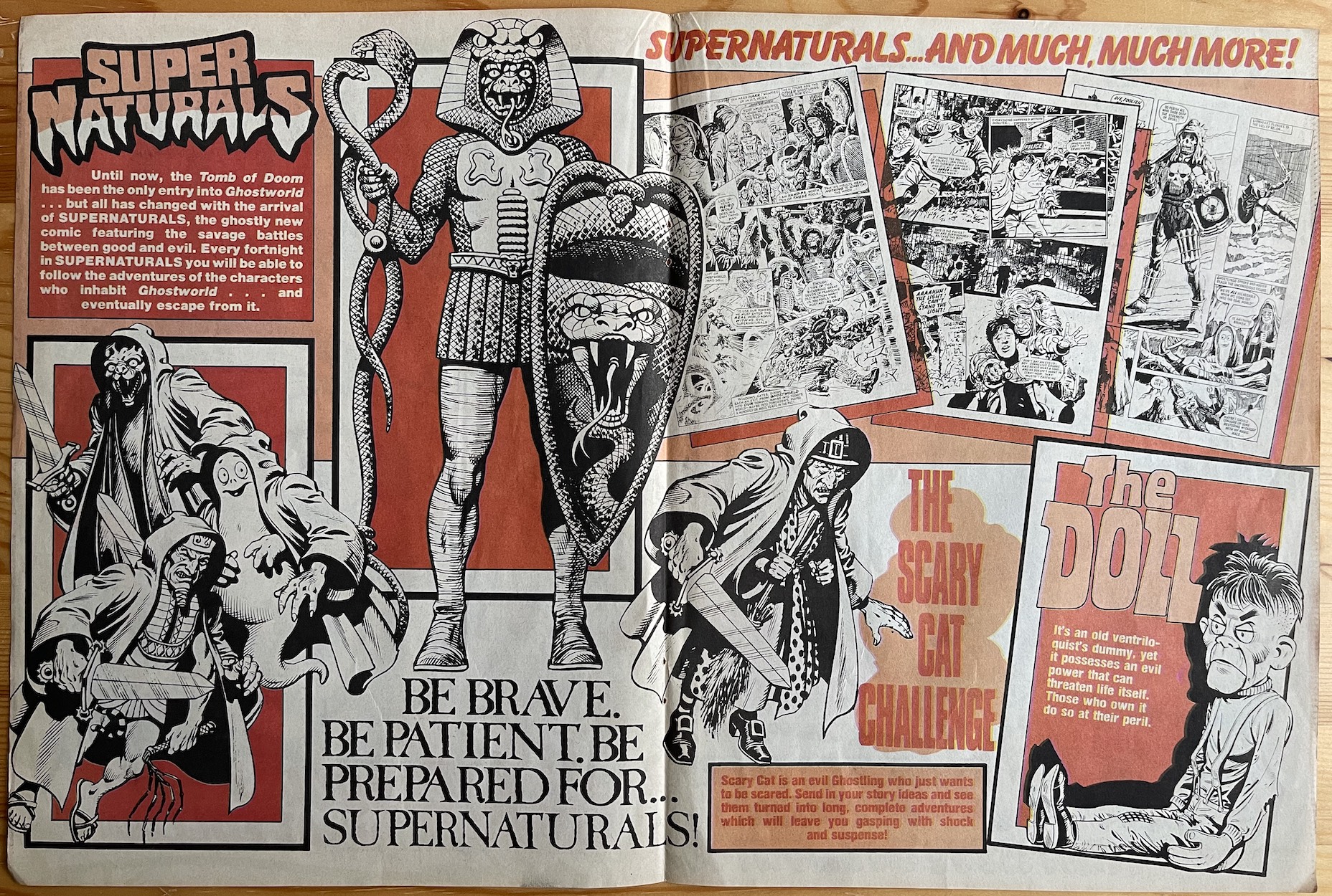
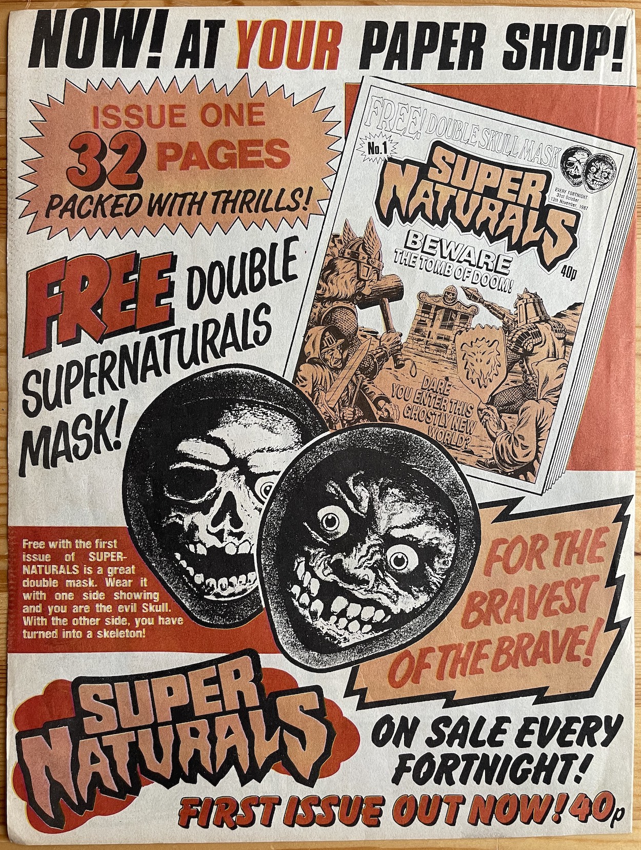
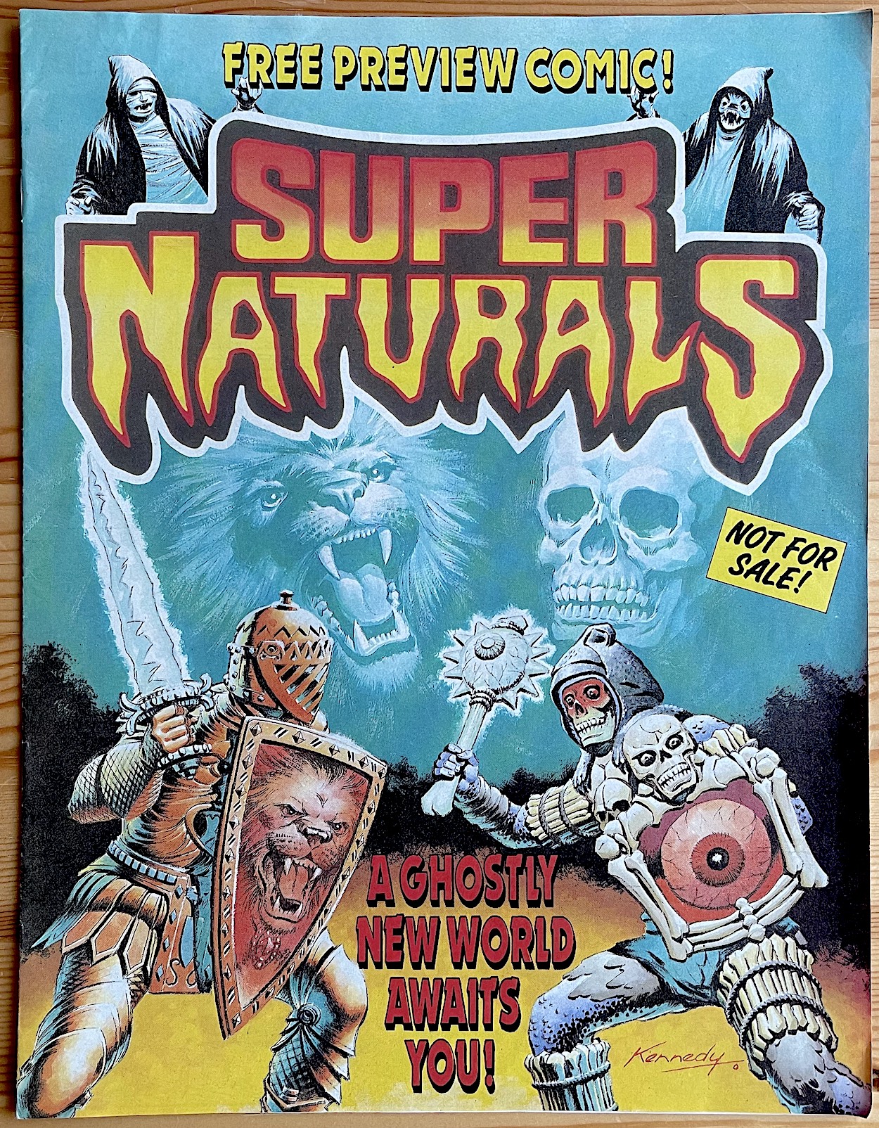
When I was building up to OiNK‘s own read through I wrote about how IPC Magazines promoted its release in new ways compared to previous comics. These included a four-page ‘Blockbuster Advert’. Rather than a regular advertisement these actually added four pages to those comics that contained it and acted as a large pull-out promo which could be enjoyed separately, just one week after the preview issue had also been given away. By 1987 Fleetway had taken over IPC’s comics and decided to employ this tactic for Barrie Tomlinson‘s Super Naturals tie-in.
So, one week after the free preview comic and on the same day as the premiere issue went on sale (Hallowe’en 1987) came the Super Naturals’ own Blockbuster Ad. At the same bigger-than-A4 paper size it surely must’ve made an impact when Sandy James‘ Skull fell out of readers’ regular comics. Unfortunately just like the preview issue this wasn’t given away with OiNK so I didn’t discover it until decades later. The exact comics that included this is unknown but I think it’s a given the likes of Eagle and the licenced Mask would have.
The Blockbuster Advert, as seen below, included samples of Super Naturals art by Sandy James, Francesc Masi, John Gillatt, Jim Watson and Alan Langford.
So it was included in the issues released on 31st October, the perfect day for some added spookiness to tempt new readers over. Inside, the layout shows off all the main highlights of the issue in stores that very day, including that bloody doll as drawn by Francesc Masi. (I mean this endearingly because I loved being scared by that thing.) A few of the toy characters are shown in their new comic form and there’s a preview of three of the strips, perfectly highlighting the creepy artwork to be found in this very different publication. I must admit though, I’m not entirely sure what the “Be Patient” is all about.
The back page highlights the free gift and the physical details of the comic. I always did love the way Fleetway would draw pages behind the cover, something they did with adverts for their annuals. It gives the impression of a thick, meaty read and that was no word of a lie with this one.
Back on Hallowe’en 1987 I discovered the comic by accident in the shop, but if this had fallen out of one of my OiNK’s I’d have been right back down to the newsagent straight away anyway!
There was definitely a big promotional push behind Super Naturals both in terms of the toys and the comic. It was all set to be a hit for Tonka and Fleetway, but alas it was not to be. Let’s not get hung up on that though, instead let’s enjoy the journey through all the regular issues and specials to come.
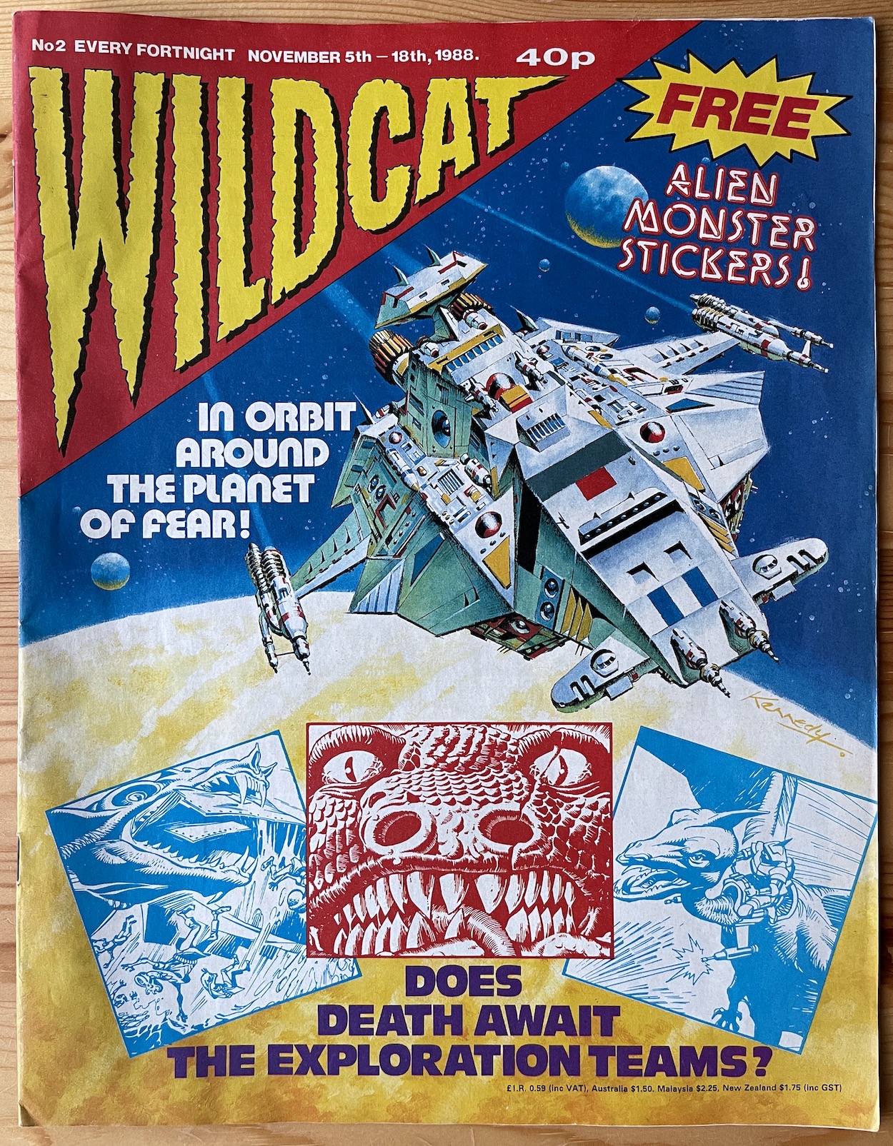
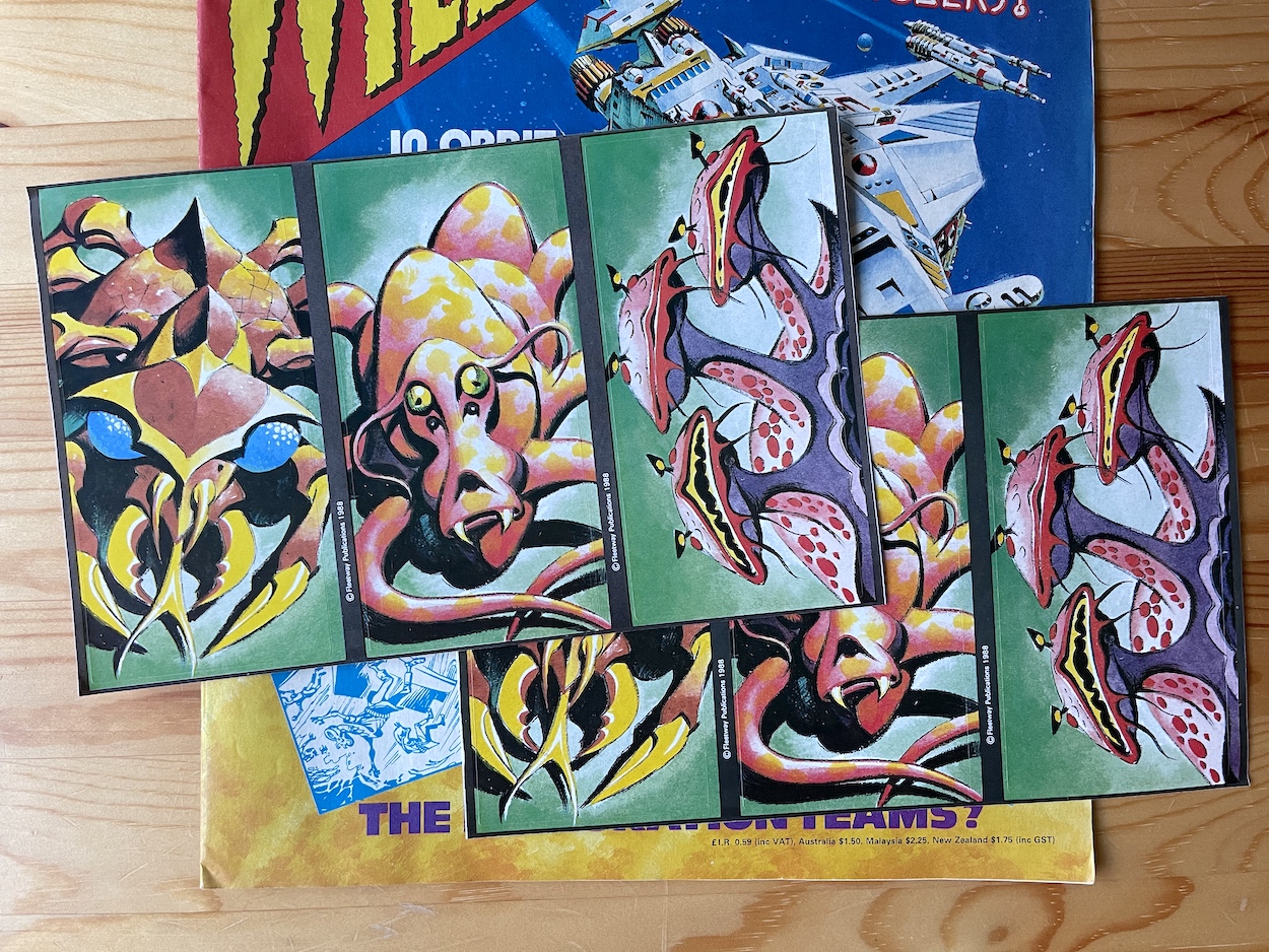
We all know the risks of buying classic comics on eBay and that’s why I always check either in the description or with a message to the seller that all the pages are included and intact. This was listed as being in mint condition and it really is, but what the seller failed to mention was that it also came complete with its free gift. In fact two copies of the gift. To go along with that lovely depiction of the Wildcat spaceship by Ian Kennedy are stickers also drawn by the man himself.
These were to be attached to the free poster that came with the previous issue, which I haven’t been able to acquire yet, but even on their own they’re a cool gift. None of the aliens (at least in these stickers, there were more given away with the first few issues) relate to any of the stories inside, so this was simply a case of Ian’s imagination running wild. I think you’ll agree they’re great and very typical of his work. Brilliant stuff.
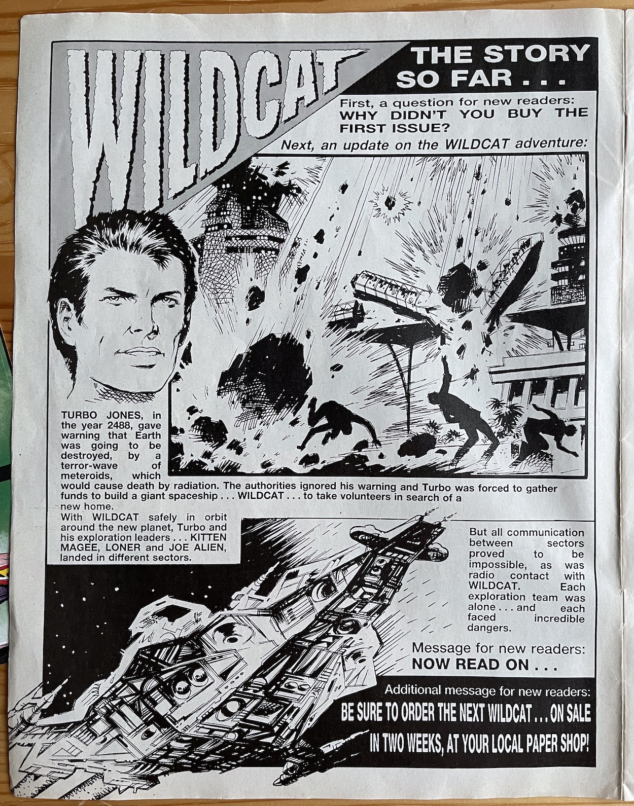
With this being only the second issue there’s another recap page to kick things off for new readers who missed out on the preview and issue one, although the comic does ask them why they missed it! The page itself feels a bit like an 80s tabloid layout which is a nice touch, giving the headline news of the story an immediacy I’m sure was appreciated at the time.
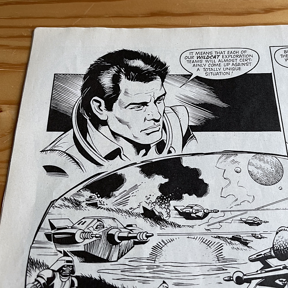
After this it’s on to the second part of Turbo Jones‘ story and unfortunately it looks like Ian is no longer the artist for the leader of the daring planetary expedition.
But you needn’t fear because in his place is Vanyo (Death Wish, Storm Force, Ghost Squad), which was actually the pseudonym used by two Spanish brothers, Vicente Vano Ibarra and Eduardo Vano Ibarra. I asked Barrie if he remembers which brother drew Turbo but because they worked through an agency he was never sure which one was contributing which art to his comics. However, on their work he did say, “I do know they kept up a very high standard of artwork and I am a great fan of their work.” I think we can all agree on that.
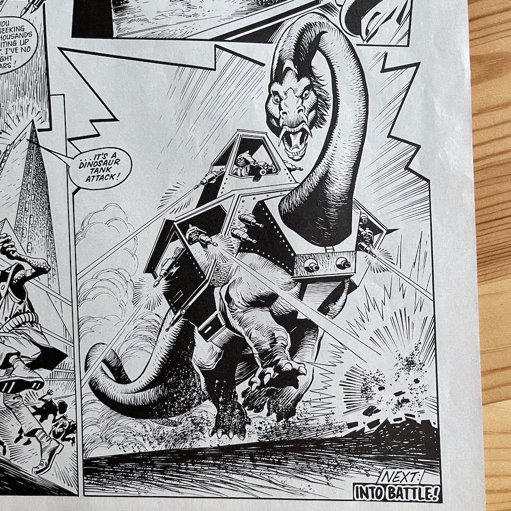
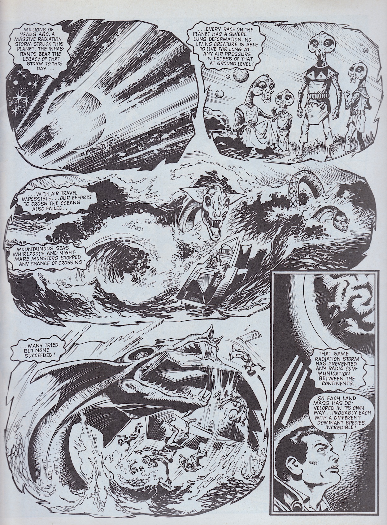
Their line work brings dramatic facial expressions to Turbo that really humanise him, and adds a real solid feel to the ground-shaking action throughout. In this part of the story we find out the aliens who captured Turbo last issue are called the Burroids and they aspire to be a peaceful race. However, their war with the savage Arglons has been raging for so long now they were instantly suspicious of these new human aliens. Their leader is a giant brain suspended in a large glass dome, who tells Turbo of the history of their races, the war and of the planet itself.
A radiation storm, not unlike that which Turbo predicted for Earth (coincidence?) struck the planet a millennia ago. The resultant conditions upon the world resulted in all species developing a lung deformation and the inability to survive for any length of time above ground level. This rules out air travel and with giant monsters and raging seas stopping travel across the oceans each continent was thus cut off from their neighbours. This also explains the interference in communications prevalent in all of the strips.
This is the perfect set up for the comic. Each continent evolved across a million years separate from all others, meaning each of our landing parties (and our strips) can discover completely different environments and inhabitants, and are all cut off from calling for help, meaning they must explore. It’s quite an ingenious idea by Wildcat‘s creator and editor Barrie Tomlinson. It’s like having lots of different planets to explore all at once.
The Brain explains the two races signed an anti-nuclear treaty to ensure their war wouldn’t destroy the planet or negatively impact those on other continents. But the Burroids are still losing and need a new military leader. Guess who they want? That’s the set up to Turbo’s initial story arc complete and it’s an original one. Let’s see how it develops.
The scenes of murder and mayhem feel like they’re drawn with real relish
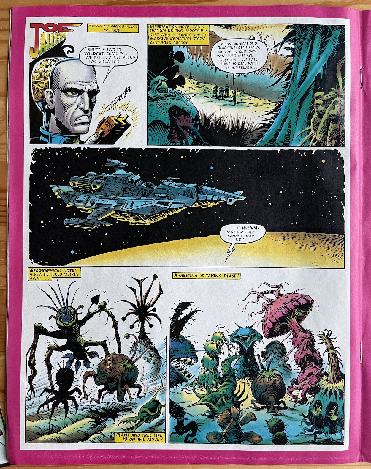
David Robinson‘sJoe Alien is up next and his team aren’t really having the best of days. Confirming contact with the Wildcat is being disrupted, I like the fact this only happens after Turbo’s strip has given us readers the explanation why (Loner was cut off last time but we figured it was just the area he was in). It’s just one way in which each strip feels connected to the larger story, which was the whole point of the comic in the first place.
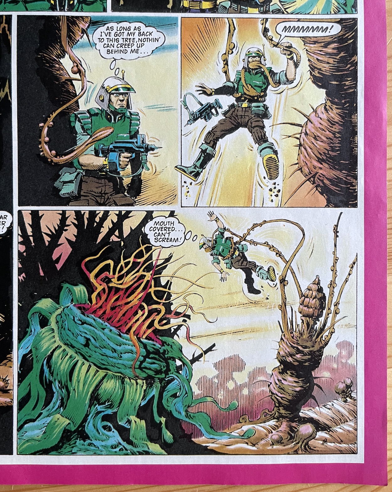
The bad luck continues as he loses another team member, all the while taking shelter from their stalker among the thick vegetation, unable to work out that this is actually the source of their woes. Joe himself keeps sensing danger all around them but continues to be just as confused as his men. When they see something move in the shadows they open fire and hear a scream but find no body. It was the tree that screamed, unbeknownst to them.
I know I’m making a bit of an assumption here but the scenes of murder and mayhem feel like they’re drawn with real relish, like artist Massimo Belardinelli is really enjoying drawing this strip with its weird and wacky antagonists. I do hope that was the case, as it’s such gruesome fun so far. A real classic gem.
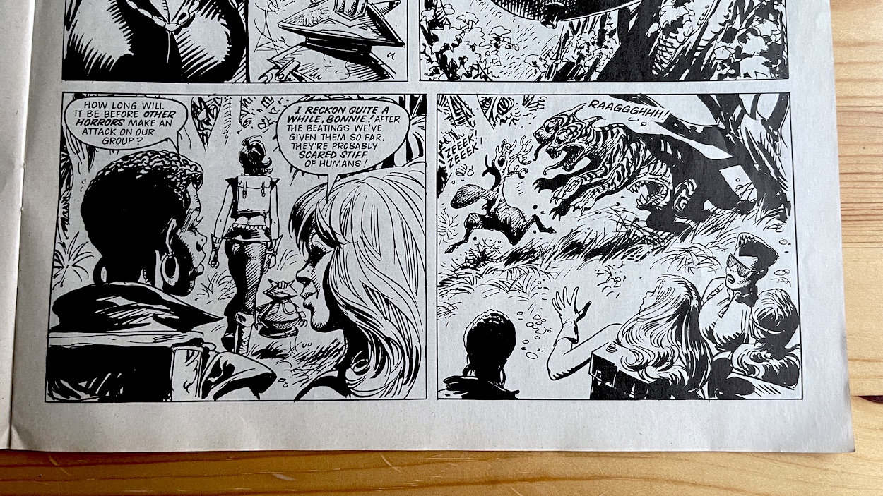
We return to Kitten Magee next, written by James Tomlinson and drawn by José Ortiz, and she finally meets some of the locals. First they befriend a cute littlefurry eight-legged creature, only for it to be eaten on the very next page by flying blobs with big teeth. Her team fire back to scare them off, Kitten stopping her team from killing them, pointing out this is just nature’s way and their lives aren’t in danger. This is a nice moment because after the action of last issue it could’ve been easy to make these characters trigger-happy. Instead, the readers were given all-out action in issue one to draw them in but now things are settling a little more and proper exploration and research is beginning.
There’s quite a funny moment here when two of the team members are talking about when the next attack will come. They draw the conclusion it’ll be a while because their initial actions probably scared off the animals, when this happens.
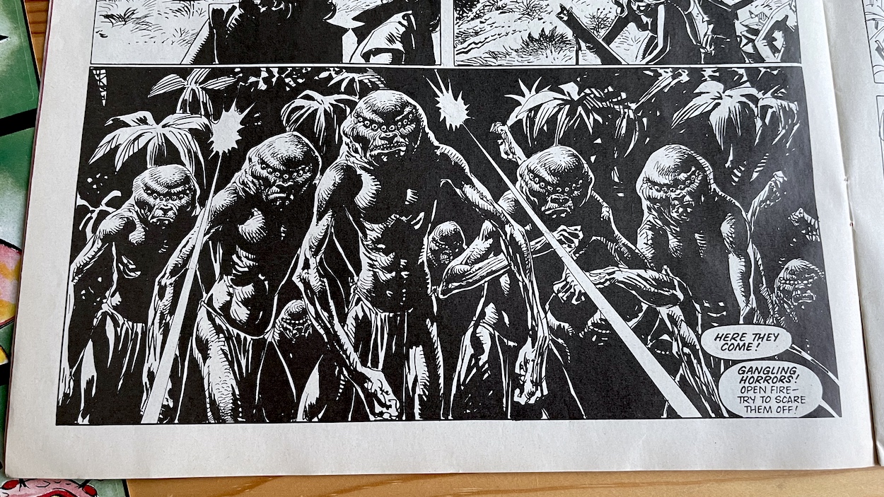
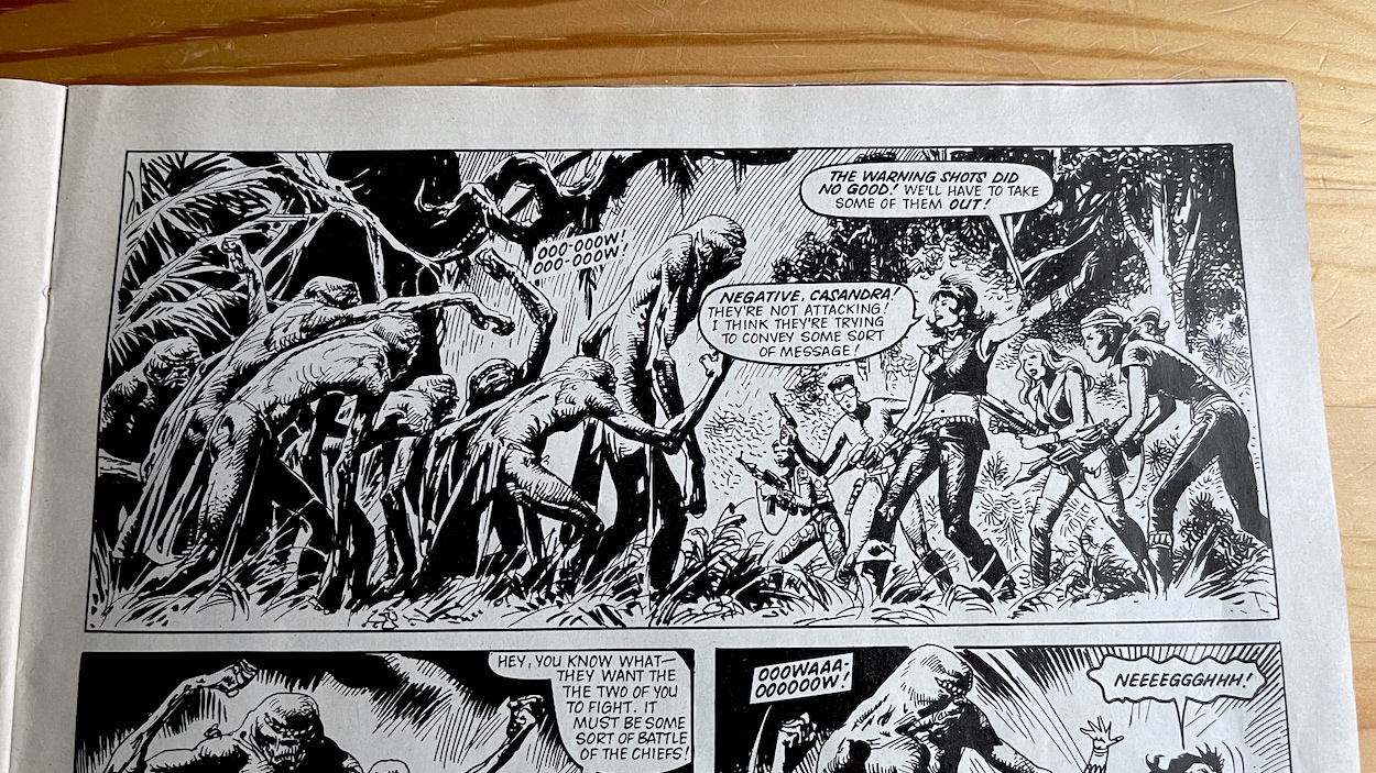
The two-headed, three-mouthed tiger and its dinner disappear as quickly as they appeared, not even noticing the humans, making for nothing more than a fun piece of comic timing. The laughs soon stop when a tribe of multi-eyed men walk out of the shadows, not flinching when warning shots are fired in an attempt to halt their advance. Cassandra wants to fire directly upon them, based solely on how scary they look, but she’s told by Kitten she’s assumed incorrectly. The tribe are instead conveying a message through a form of sign language.
They wish for their leader to fight Kitten, who they’ve observed as the leader of this strange new tribe. Accepting the challenge, it doesn’t go her way but despite the cliffhanger of a giant rock held over her head, ready to crush her, she tells her team they can’t interfere if this is the custom of the local people. With what seems like an endless array of weaponised jewellery, we’ll have to wait 14 days to see which one she pulls out of the bag (figuratively speaking) to get herself out of this one.
The art here is suitably creepy or suitably action packed when it’s called for. José’s use of dark shadows and scratchy lines is a great contrast to the glorious full-colour assault on the eyes that is Joe’s strip. In fact, I think Kitten’s really benefits from being in this place in the line-up right after Massimo’s work. The sudden change almost forces us to read this differently. The contrast is striking and helps the story convey the darker tone it wants to get across.
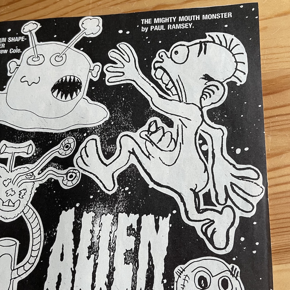
There are then two pages of reader’s letters and drawings, although most likely not by actual readers of the comic yet (I explained where #1’s came from last time). One of the alien designs stands out, although not for the reason you might think. Take a look at ‘The Mighty Mouth Monster’ by Paul Ramsey. The second I saw it I recognised it from the myriad of marketing images for The Real Ghostbusters, a franchise which had only just launched in the UK (complete with its own comic) at the beginning of the same year. Here’s the image in Wildcat alongside one of the TV tie-in novels. Notice anything similar? (Novel photo taken from eBay.)
The question about the destruction of our home planet being different to that predicted by Turbo is raised on these pages too, answered with the hope that six pages will be devoted to explaining it in a future issue. Intriguing, although I do know from speaking with Barrie that this story was never developed. What a shame.
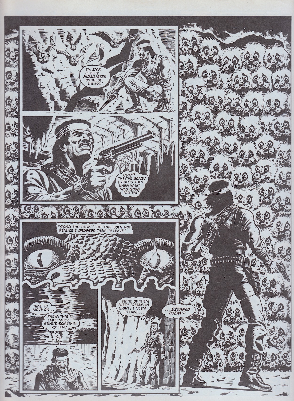
On to my favourite strip now and former mercenary Loner uses his modified six-shooter Babe to fire flares into the air, scaring off the cute-but-deadly little furballs from last issue’s cliffhanger. Loner was created by editor Barrie Tomlinson and written by both him and his son, James Tomlinson (Johnny Red, Storm Force, Ring Raiders) and I think you can tell they were having a blast with the scripts here. As he tries to run for his life, Loner jumps into the water but there are floating versions of the little balls of fluff. Then on higher ground he gets attacked by cuddly bat versions!
It doesn’t descend into farce but it’s still quite comical without ever losing its edge or drama. Quite the feat considering how they look. What I particularly like is how he recognises himself as the intruder. He laments having to use his gun to scare them and he refuses to open fire. Again, Wildcat lured its younger readers in with the action but is now showing them there’s more to being a hero than fighting. Constantly getting stung, becoming weaker and weaker he’s unaware of a pair of lizard eyes watching his every move and reading his every thought, or that this creature is controlling the furballs with his mind.
When Loner comes up against a wall of the little creatures the image makes the reader stop and take notice! It’s a great looking page; the wall of electrified death is the background, the panels leading up to that moment on top. I especially like the perfectly aligned little row of eyes between the two groups of panels. But nothing could’ve prepared the young version of me for what was on the next page.
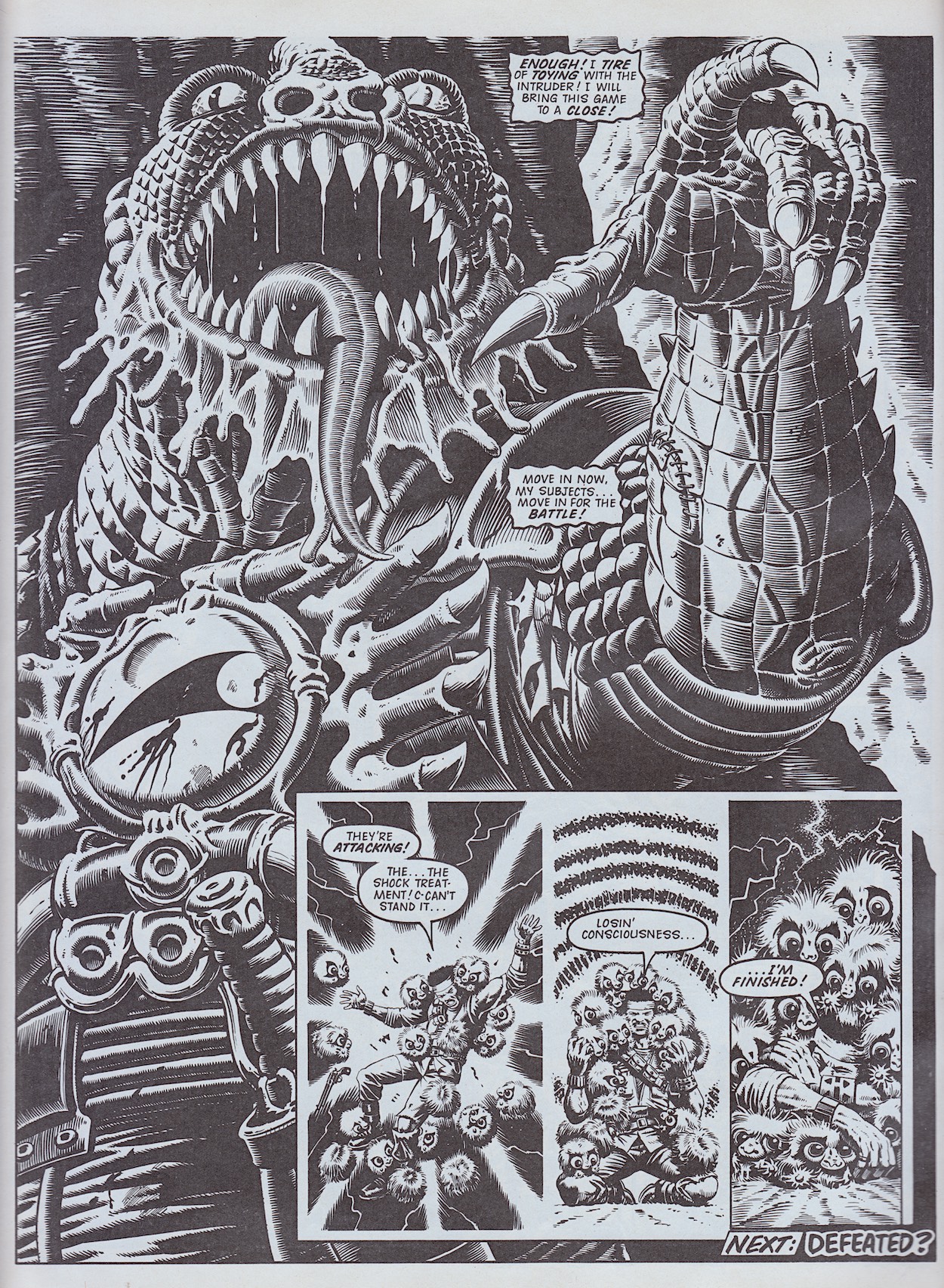
Wow. This is the creature that’s been in control this whole time and would you just look at this image! The detail here is quite remarkable. I love the little details such as the scars, the veins, the shading giving real weight to the figure and that hand in particular. When you have an artist of the calibre of David Pugh drawing something like this it’s almost criminal to know the likes of 2000AD told its readers Wildcat was for their little brothers or sisters. Well, it was their loss and those of us who bought Wildcat were treated to the very best.
Across the page, under those adverts for stamp collecting that seemed to appear in every comic throughout the 80s is the Next Issue panel. At the end of Joe’s strip he used his telescopic limbs to grab hold of a small plant high up on a cliff, trying to look down and see who was attacking them. But the plant started to unravel its roots from the rocks and Joe realised they’re more alive than he bargained for. His realisation came too late though as it ended with him plummeting to the ground. Below you can see what happens next.
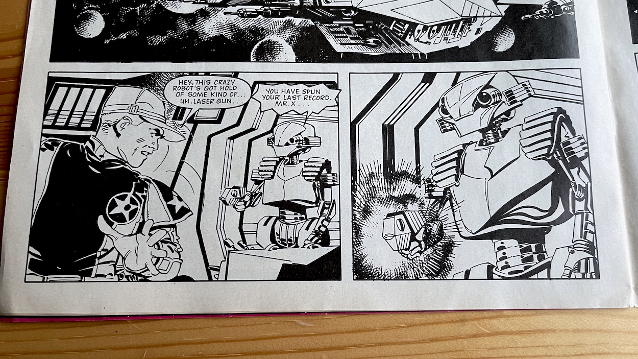
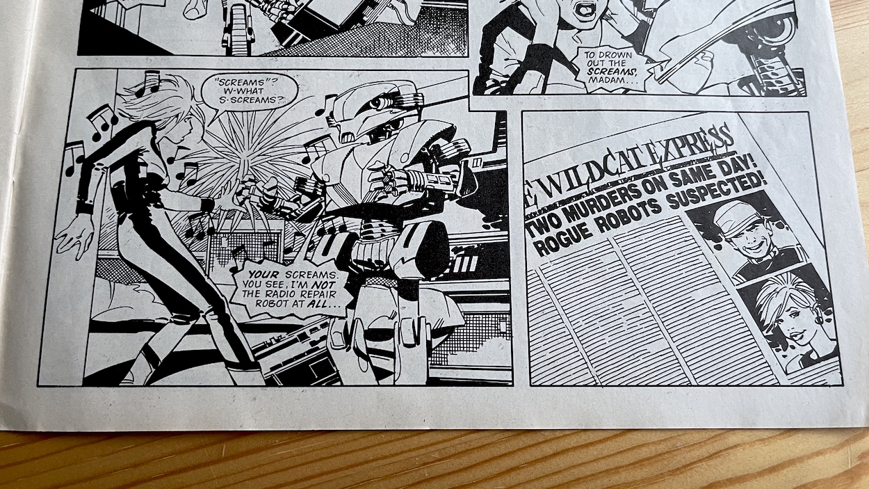
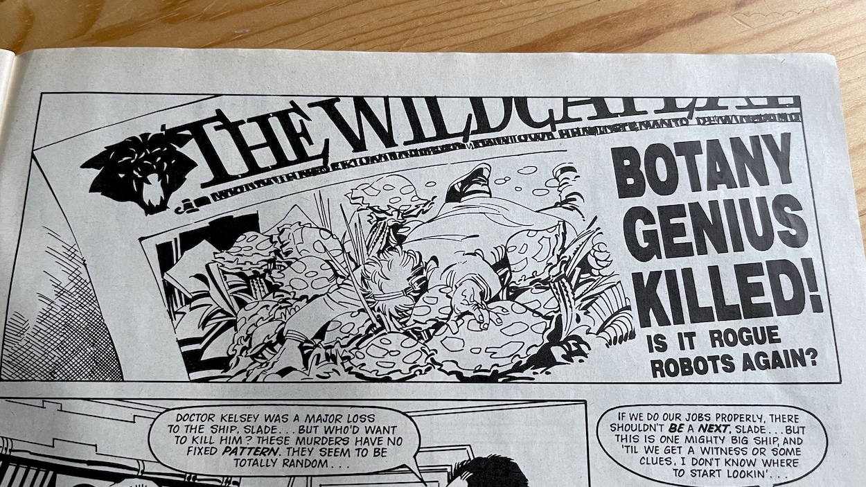
The second Wildcat Complete is called Space Madness and readers of classic 2000AD might feel right at home with this one. Although not 100% confirmed, my usual sources of help in identifying artists believe this issue’s story was drawn by Jesús Redondo (Dan Dare, M.A.C.H. 1, Nemesis the Warlock). It all kicks off with a DJ at the ship’s radio station being murdered by a robot while he’s still broadcasting to the last several hundred human beings in existence. As his death is played out live one of his listeners suffers the exact same fate in her room somewhere else on board.
Their untimely deaths make the front page of The Wildcat Express newspaper, which now feels somewhat quaint for being set in the far future (there are even horoscopes despite them being in deep space), but I always enjoy seeing how the future was predicted in stories from our youth. Anyway, I digress. Panic hits the Wildcat, which is understandable given the fact there appears to be a serial killer among them when there really aren’t that many people left, and they’re all trapped inside an orbiting tin can.
As the killings continue you begin to realise each one could be a major blow to the mission. For example a professor is carrying out experiments into the thoughts and feelings of plants in an attempt to understand them. I could see that being of particular use to Joe! Remember, as stated in the preview issue everybody was handpicked by Turbo and his team to be the best of the human race and here the story is just picking them off one by one.
“Mad Newspaper Boss Responsible For Wildcat Murders”
Newspaper headline
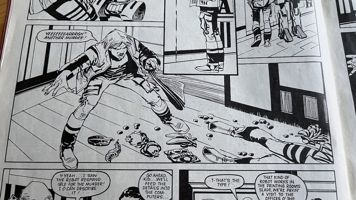
In the end, a witness to a fourth murder identifies the culprits as printing robots, leading security to the editor of the paper whose sales were failing because everything was so peaceful on board. It wasn’t exactly a hard case to solve but that’s not the point. The editor is diagnosed with Space Madness, “a kind of insanity triggered off by dwelling too long on the fact that Earth is destroyed and we’re in an unknown galaxy”. Apparently it’s happening across the ship.
It sounds similar to ‘Future Shock’ from the earliest 2000ADs, although here it makes a lot more sense. (It always confused me why people inthe future would diagnose others as being unable to cope with living in the future; it’s not the future to them!) I instantly think this would’ve been interesting to expand upon, perhaps it spreading across the Wildcat could’ve been the basis for future stories. I’m not alone in this thinking, because that’s exactly what happens in #10. The fact the doc’s experiments could’ve related to Joe’s story is also interesting. Perhaps if the comic had lasted longer we’d have seen plot points from the strips develop, crossing over into others since they’re all part of one bigger story after all. We’ll never know.
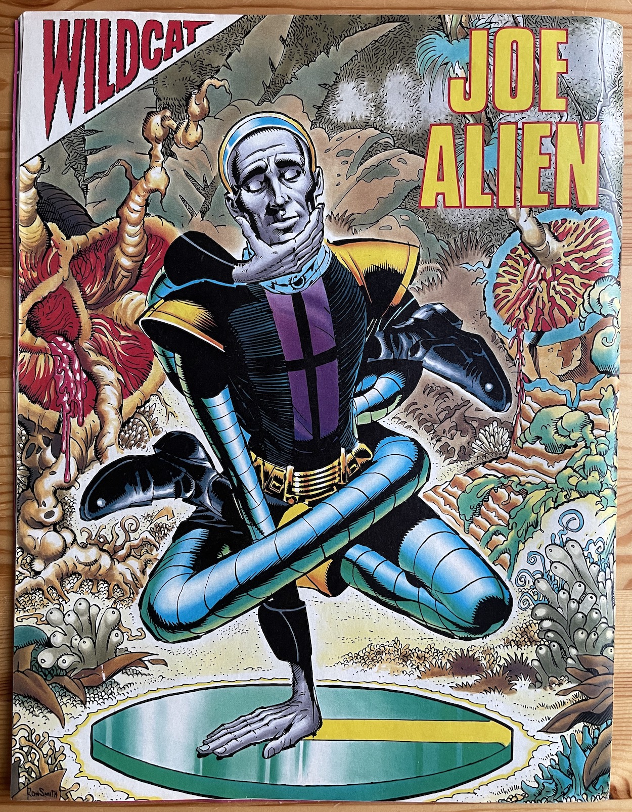
The back page pin up is Joe Alien this time and it’s drawn by the hugely talented Ron Smith (Transformers, The Dandy, Harlem Heroes) and I’m happy to say there’ll be more of Ron in future issues. With all the danger inside, it’s nice to see Joe taking a moment to do some alien meditation surrounded by his new, erm, friends.
Just one thing I’d like to add before I sign off. During The Wildcat Complete I reiterated the point about how so few people were actually saved from the cataclysm. This hasn’t stopped Barrie and his writers from killing off plenty of them so far though! Between Joe Alien and the Wildcat Complete stories so far we’ve lost seven of our survivors already and we’re only two issues in. I think I’ll have to keep tabs on this, just for fun.
Already showing confidence in its scenario and where it wants to take us, this second issue has been a joy to read from beginning to end. If it were in the hands of anyone other than Barrie this is the kind of solid quality we wouldn’t expect until much later in the run, so we really are off to a flying start. Come on back on Friday 19th November 2021 to see where he takes us next.
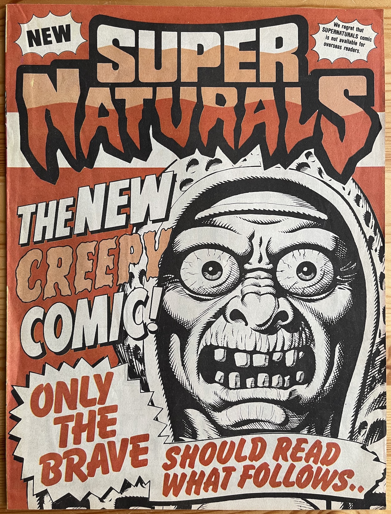
I’ve never really been into Hallowe’en and could count on one hand the amount of times I’ve really celebrated it. The first time I did anything remotely tied to the season was in 1987 when I sat down on the evening of Saturday 31st October with this Sandy James cover, wearing a mask of a rotting face and read the comic it had come with. That comic was the first issue of Super Naturals from Fleetway and surely its release date was the perfect bit of marketing in itself!
I ended up only buying the second issue before being distracted by something else (easily and often done back then) and I’ve gone into more depth on how my fascination with these returned too late in the introductory post. Right here, right now, I’m ready to read this complete series in real time and enjoy every page along the way I’m sure. As mentioned last time the first story is a reprint of the preview comic’s origin story. Of course, I didn’t originally know this and I’ve a vivid memory of pouring over this particular page from editor Barrie Tomlinson‘s The Legend of the Super Naturals for a long time.
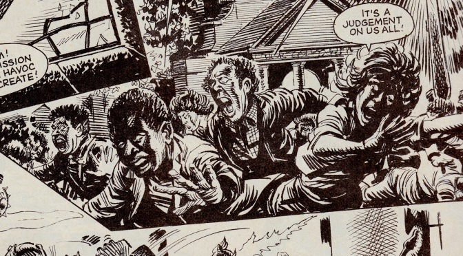
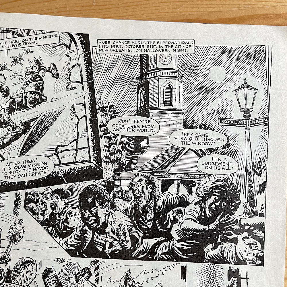
I think it was because of the panel on the top-right. John Gillatt‘s depiction of terrified church goers, fleeing their place of sanctity on the same night I was reading the comic was a powerful image to someone who was only approaching their tenth birthday in a couple of months. The way their faces are cloaked in shadows makes their eyes almost blank with fear, the fact the comic chose a church of all places to have these supernatural entities explode into our world, the date giving it an immediacy when read; these all combined into something that seared itself into my memory.
This is coming from someone whose Reminders app on his iPhone is always full nowadays because he has a head like a sieve, so the fact this memory has stuck with me should say a lot. I won’t go into detail on the story here because I’ve covered it already in the preview issue’s review, but I felt I had to hold back on describing reading this page until now. This was how I first read it so it seemed more fitting for this review. After that heart-pounding beginning it was on to something a lot lighter.
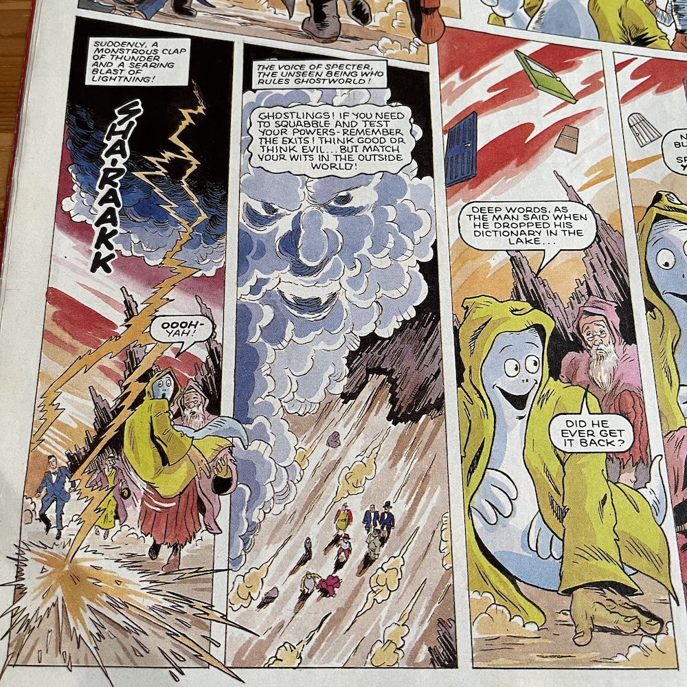
Moving into more comedic territory, Ghostlings was very appropriately illustrated by Anthony Williams (Sinister Dexter, The VCs, Batman) who I knew from the ghostly goings on of an equally comedic variety in The Real Ghostbusters. So who were the Ghostlings? These little helper spirits were Spooks, who in a previous life had been a court jester and can now switch between that form and a traditional ghost, Mr. Lucky the magician who could transform into a giant rabbit, Hooter the wise old wizard whose spells were hit and miss had an owl form and See-Thru, who was a take on The Invisible Man and whose holographic toy could lose its bandages.
There’s such potential within this comic
The evil Super Naturals had their own Ghostlings. Scary Cat the witch could change into a hissing cat (although I assume in the comic she wouldn’t be constantly hissing), Rags was an Egyptian Pharaoh and mummy, Weird-Wolf was a very 80s villain in his punk teen and teen wolf variations and finally Vamp-Pa wasn’t a fatherly old gentleman bloodsucker, he was a vicious vampire and a bat, obviously. In their own story they want to be seen as more than assistants assigned by Specter, who we actually see take form which I don’t remember happening.
Weird-Wolf decides to crash into our world at a rock concert to cause a bit of havoc. It’s not exactly a grand evil scheme, but that’s the whole point of these characters, they wish to play with the bigger kids and impress them by causing a little chaos and showing their potential. It’s a fun set up but as Spooks and his pals give chase the doorway inside Ghostworld changes randomly and they end up in a setting more befitting his previous life, in the court of Henry VIII! Well, I didn’t see that coming. A fun, light-hearted strip to ease the tension for the young readers, giving them a false sense of security before the next story.
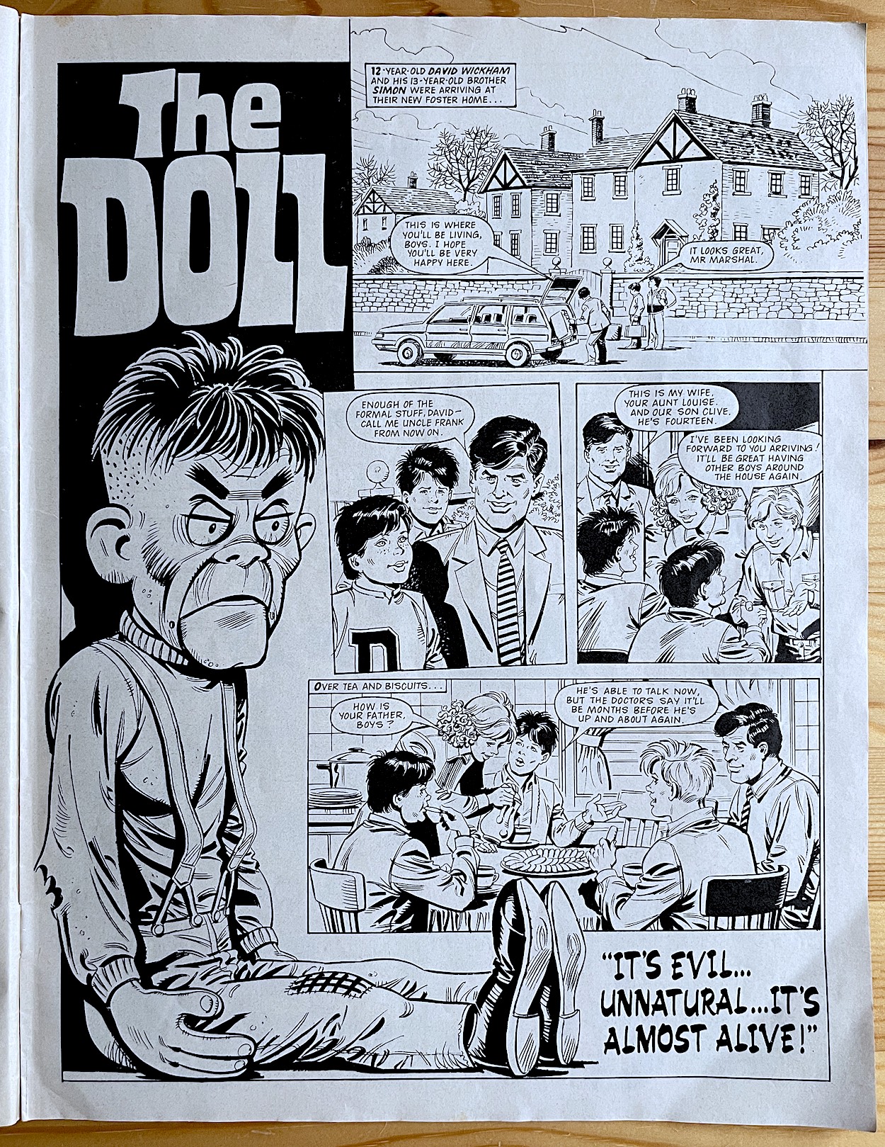
The Doll appears to be the most memorable of all the strips in the comic if social media responses are anything to go by, and it’ll soon become clear why. David Wickham and his older brother Simon move in with a temporary foster family after their dad’s accident, their mum having died when they were very young. They’re soon settling in and making friends and it’s all so idyllic to begin with. Illustrated by Francesc Masi (Jackie, Warlord, Bonanza) like a traditional, wholesome comic story it puts the reader at ease. A classic bit of misdirection.
I think it’s worth mentioning this was a year before Child’s Play hit cinemas
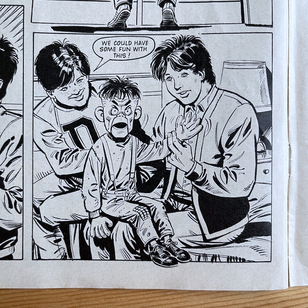
David soon finds an old ventriloquist’s dummy hidden away in the back of a closet and immediately takes a shine to it. Simon just thinks it’s ugly. He’s more concerned with his baby brother playing with what he considers a girl’s doll. David wants to show off his discovery of what he thinks is just a forgotten toy and goes to ask Frank and Louise if he can play with it. Frank’s reaction is one of outright anger and he snaps the doll out of David’s hands. Louise tries to explain that it belonged to a previous foster child who had an accident while under their care, and the doll just brought back painful memories. When the kids are in bed though, Frank tells Louise he doesn’t understand how it was still in the house, he thought he’d gotten rid of it years ago, and he throws it in the bin outside.
David isn’t happy one bit. He gets angry when talking about it in bed with his brother, a side to him that Simon has never seen before. He doesn’t understand why his brother is acting this way just because of a doll he found only moments before. Of course, we know by now it’s not just a doll. Aside from the title page, when you look closely at some panels of the strip you can see the doll giving a little side-eye here and there. It’s subtle but it’s clear it’s not being done by the person holding it.
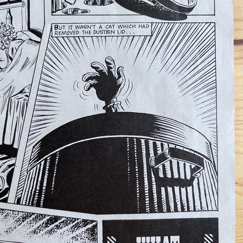
The strip ends with a noise outside as the bin lid clatters onto the ground. Thinking it’s just cats digging about the trash again, Frank goes to have a look. While he’s on his way we get that lovely creepy image above of a hand slowly rising up under its own power. Two staring eyes lear over the rim and this is where the story ends for now. I think it’s worth mentioning this was a year before Child’s Play hit cinemas.
Kids love being scared by their chosen entertainment. Whether it’s Doctor Who, Hallowe’en games or storybooks etc. Tabloids try to rile parents up with fake outrage about such things but kids love this sort of thing. It’s a safe scare. The Doctor will arrive and she’ll save the day for example. Or we’d know it was just our friends jumping out at us from the dark. Or we could always put down the book, but we never did. The Doll did frighten me back then but I lapped it up. I’d never known a comic could do that and the strip was a hot topic amongst friends at school, copies being passed back and forth with those children whose parents didn’t allow them to read it.
Just to clear up some online misinformation, some people think The Doll was written for another comic aimed at older kids and was simply printed here to fill space. This is rather insulting to the team behind the comic. Just because it’s a toy licence it can’t possibly be scary? The fact The Doll did scare us shows these people are wrong. Francesc Masi even drew the cover to the final issue and inside that edition the story was given a proper conclusion. This was written for Super Naturals and is another reason why this comic deserves more attention and recognition.
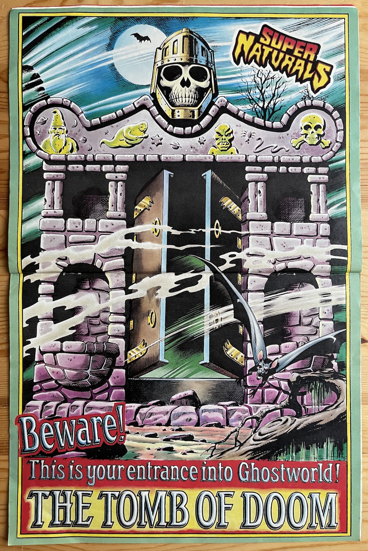
Sandy James returns for the double-page poster above, showcasing The Tomb of Doom, the gateway to Ghostworld and he does a superb job of turning the plastic toy into a creepy monstrosity. We then move on to The Scary Cat Challenge. Hosted by the Ghostling, she’d ask readers to send in their ideas for a scary story and, if chosen, the team would turn that idea into a fully fledged comic strip. There was even a tenner for each one used! That was big bucks to us back then. But the real thrill must surely have been seeing your idea brought to life on the page.
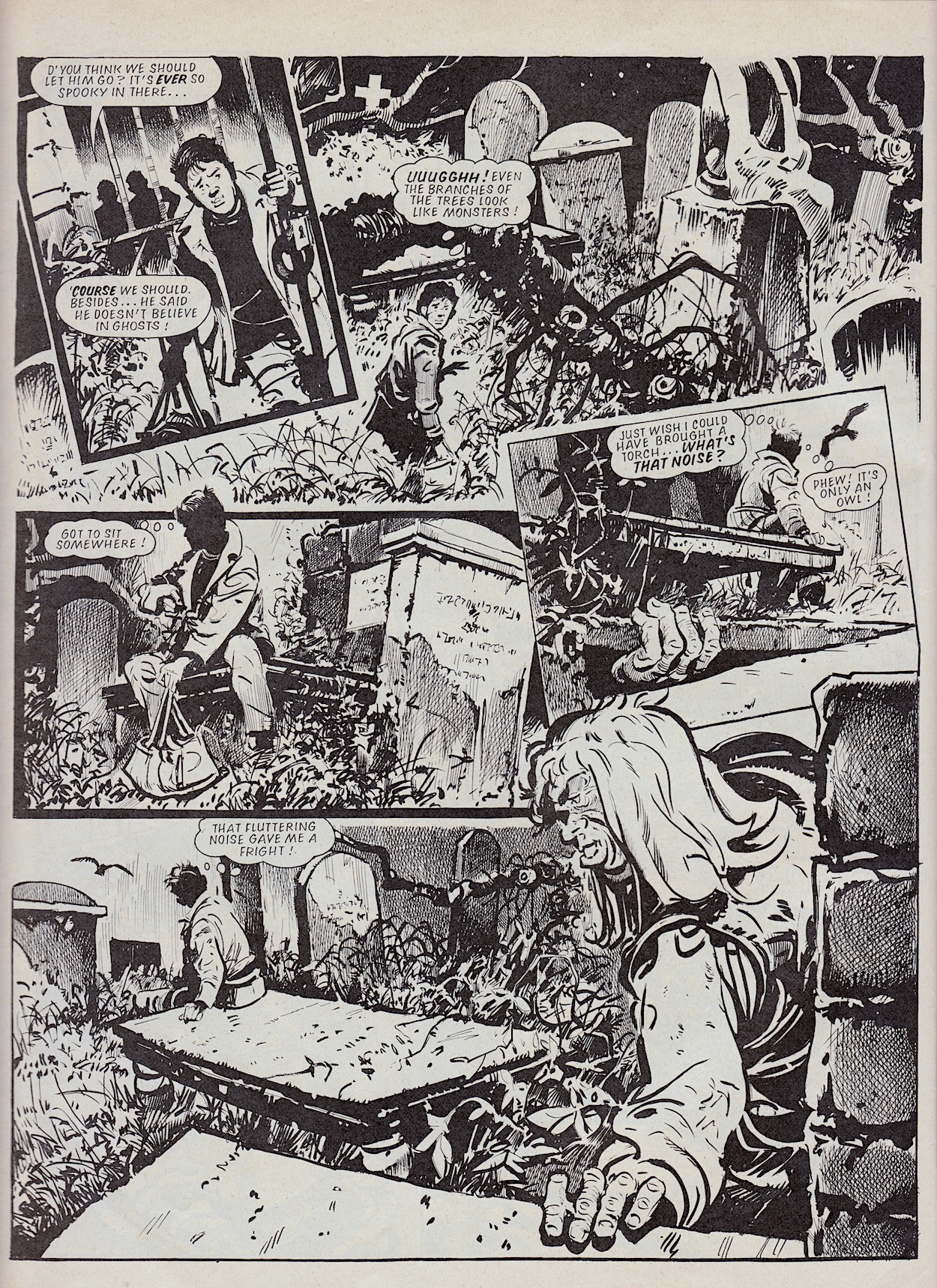
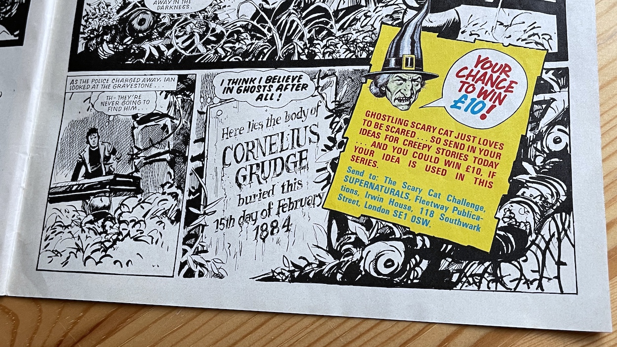
Of course the first few stories couldn’t be based on these yet so instead the comic’s writers (as yet unknown to me) came up with some of their own. In The Hunchback of Hinkley Rest a typical teenage game of Dare goes horribly wrong when Ian agrees to spend a night in the local cemetery and accidentally wakes someone up. That someone is the late Cornelius Grudge, a gentle, lonely hunchback who just wants to make friends, but who was bullied by children when he was alive because of his looks. He never gave up on people though and here he comes out to keep Ian company.
Despite opening up to the boy, Ian and his friends do exactly the same thing as people had done throughout Cornelius’ life. They fear him because of his looks, they think he’s a monster and call the police in, who in turn instantly think he’s a criminal or monster of some kind, all based on how they perceive him with their eyes. In the end he’s forced to return to his grave, the police thinking he’s run off, leaving only Ian to know the truth. It’s actually a sad tale in the end, if rather simplistic. But the downbeat ending adds another layer to the comic and the atmosphere is thick, thanks to artist Jim Watson (Scream, Commando, Battle Action Force).
We’re back into Super Naturals territory with a two-page introduction to all the characters which builds upon the card given away with the preview issue. Sandy James is once again on hand and his character models add so much personality to the toys, really bringing those little green holograms to life. In fact it was Sandy who designed the comic’s take on the toys, a process we’d be let in on in a future special feature.
It’s these characters we return to for the final strip of the issue in part one of Mount of Athos. While at this stage readers would be unaware of how long each of the individual stories were to last, the opening page of this gives the impression of a real epic. I just love the grand scale of Lionheart and Skull in battle. The scenario for these characters is such a huge idea, it really is capable of having scope and this page sums it up perfectly for me. There’s such potential within this comic.
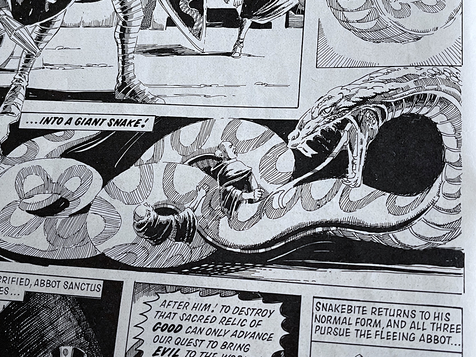
In reality, Athos would last a handful of issues before another Super Naturals tale would begin in its place, but that epic feel remains. This is testament to the art of Alan Langford (Eagle, Judge Dredd Megazine, 2000AD), who brings a mature feel to this toy licence tale. The story involves the Monastery of Athos and the Sacred Coffer relic which contains the remains of Saint Servius, known as The Essence of Perfection. As a symbol of all that is good it’s the perfect target for Skull and his group.
All the players are here and more of their abilities are shown off in the heat of battle. Best of all we see Snakebite transform himself into his giant snake form. Snakebite does this to terrify the monks into revealing the location of the coffer in order to save their own lives. I think this image is incredible. This is the kind of horror-action our imaginations would’ve been full of when playing with the toys, but we’d never have been able to imagine it brought to life as such.
For fans of the toys everything they could possibly wish for is here in #1 of Super Naturals. All the characters are introduced, their abilities have been established, toy likenesses elaborated on and more importantly they’re well developed for a first issue. For young fans of children’s horror comics the licenced strips offer spooky adventures (alongside some comedy) and the extra content brings an anthology feel and the promise of real chills to come. It really is the best of both worlds.
It’s a great start. I really hope this read through can bring some overdue attention to this forgotten comic, it’s a truly unique title and deserves a place in the history of UK comics alongside Scream! For now we close off issue one with another competition on the back page from Tonka. This time the two vehicles are up for grabs but strangely aren’t shown.
Next week on Sunday 7th November 2021 I’ll take a look at the four-page Blockbuster Advert found in some of Fleetway‘s other comics as part of the marketing for Super Naturals, followed closely on the 14th with #2’s review. With all three of editor Barrie Tomlinson‘s comics now being read side-by-side, this could be a great winter on the blog!
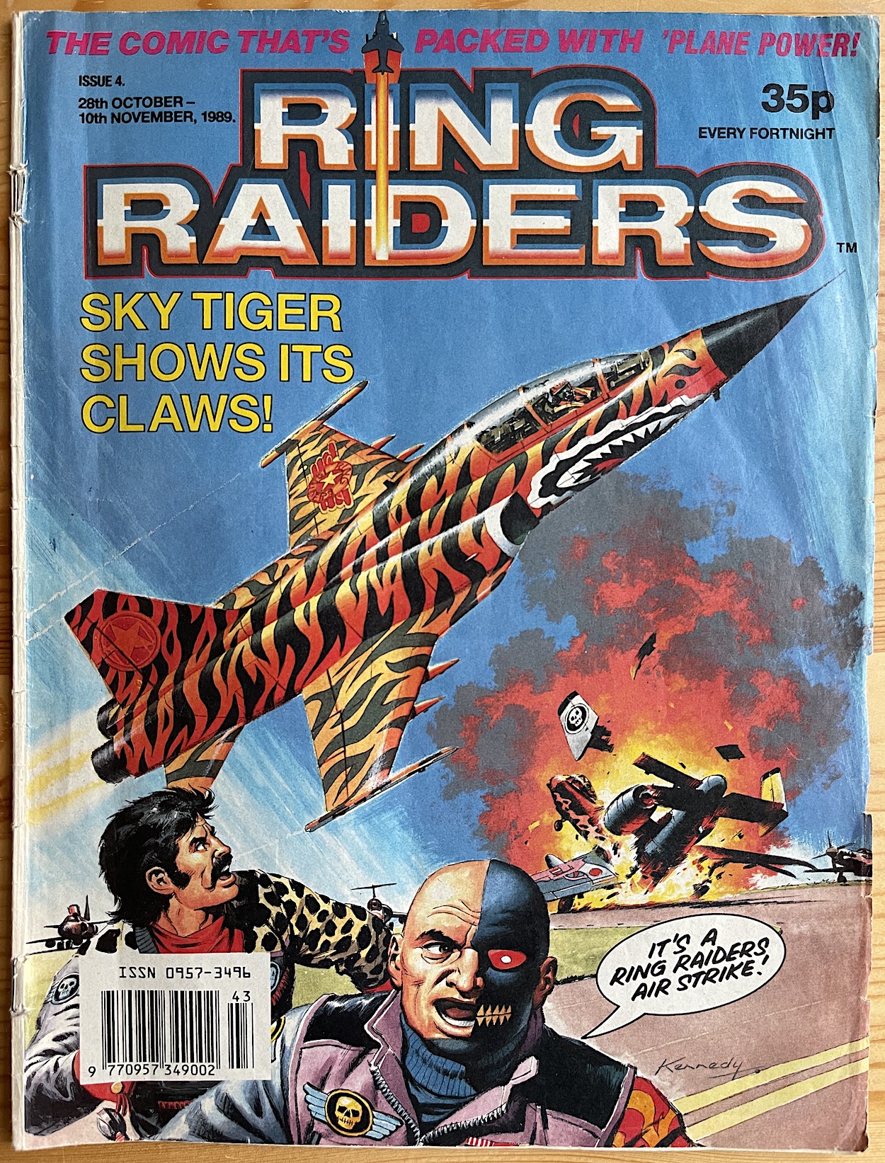
With a gorgeous hand-painted Ian Kennedy cover and a larger logo there’s an air of confidence about this issue, the fourth in Ring Raiders‘ short life. It really felt like it was settling in for the long run. But just look at that piece of art! The covers don’t actually relate to a particular strip inside, but this was never an issue for us readers. We just wanted glorious, attention grabbing art like this every issue and that’s exactly what we got, with every one by Ian from now on.
While the pin up inside would tell a short story explaining the cover image, the covers for the likes of Mask, Super Naturals and even Teenage Mutant Hero Turtles Adventures (all edited by Ring Raiders’ Barrie Tomlinson) would instead highlight some of the characters (or planes) featured inside that issue rather than a particular plot point. Known for his love of painting aircraft, Ian is the perfect cover artist for Ring Raiders and never fails to bring the little toys to spectacular life.
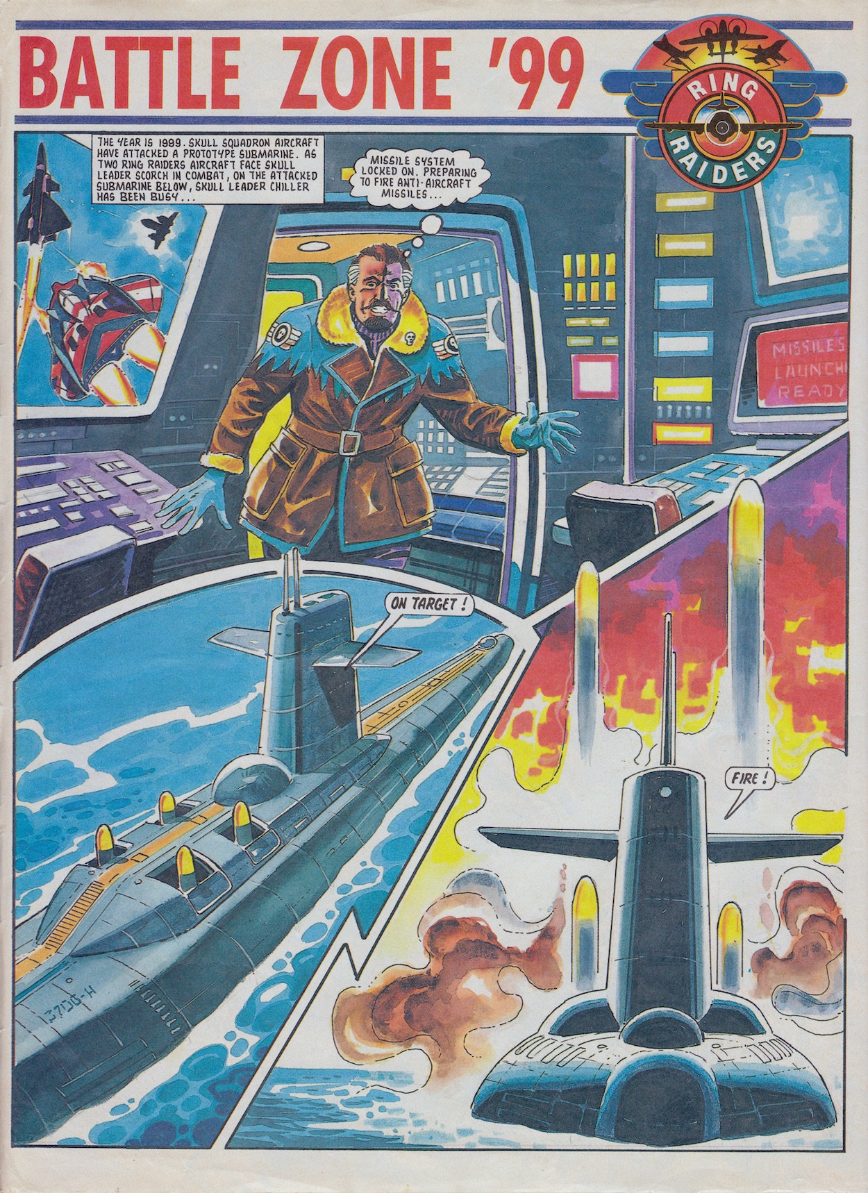
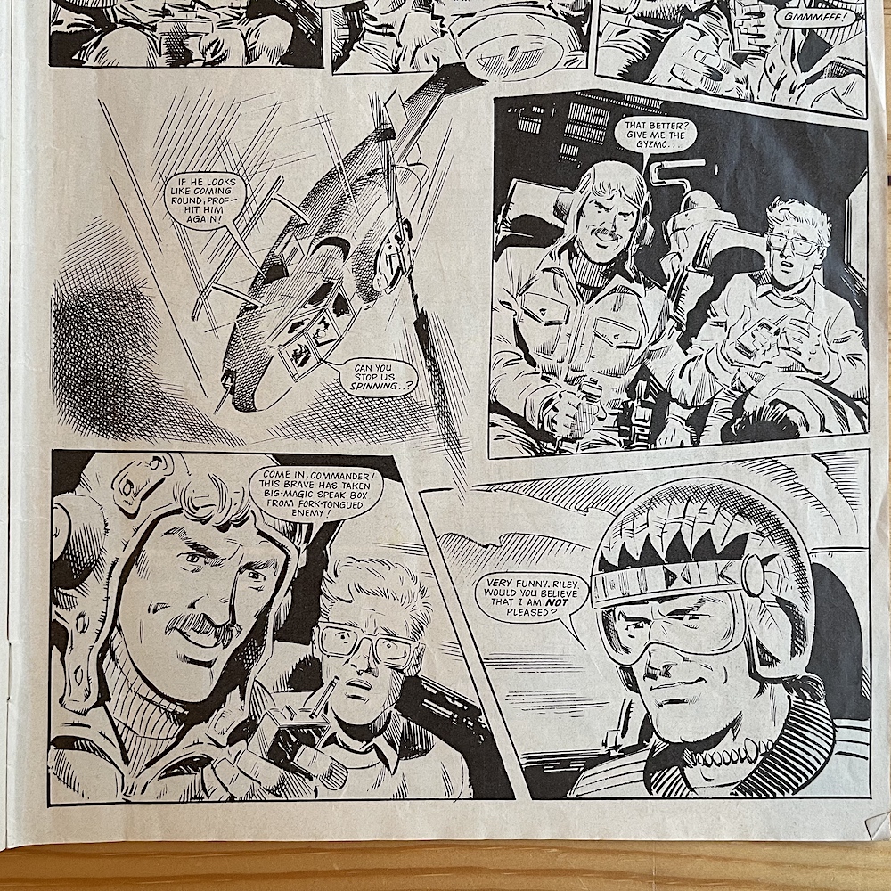
Inside, all of our stories continue apace beginning with part three of Barrie’s Battle Zone ’99, drawn by Carlos Pino. The comic has a great mix of scripts with some focussing more on the action, some on the plot and some on individual characters, with the best incorporating all three elements. The comic likes to kick off with pure action. Skull Leader Chiller has been able to get inside the gravity-powered sub after subduing the last of the crew and made his way to the weapons controls, firing off the anti-aircraft missiles. When the Ring Raiders fire their flares the missile is blinded and locks on to the first thing it detects, Skull Commander Scorch!
There’s some funny tit-for-tit between the two Skulls, their leader expertly evading the missile and setting it on a course for the sub, where it passes metres above Chiller’s head! Summoning his Bandit Wing through time the stage is set for a final confrontation, but is it going to be between the two sides of the conflict, or the two Skulls who, through one misunderstanding after another believe they’re firing upon each other? There were no lengthy plans for the comic’s overall story yet but throughout the run it does seem Chiller would like to assume control, and with some of his schemes he could be manoeuvring himself to make a play for Scorch’s position. An interesting dynamic, played for laughs in this story.
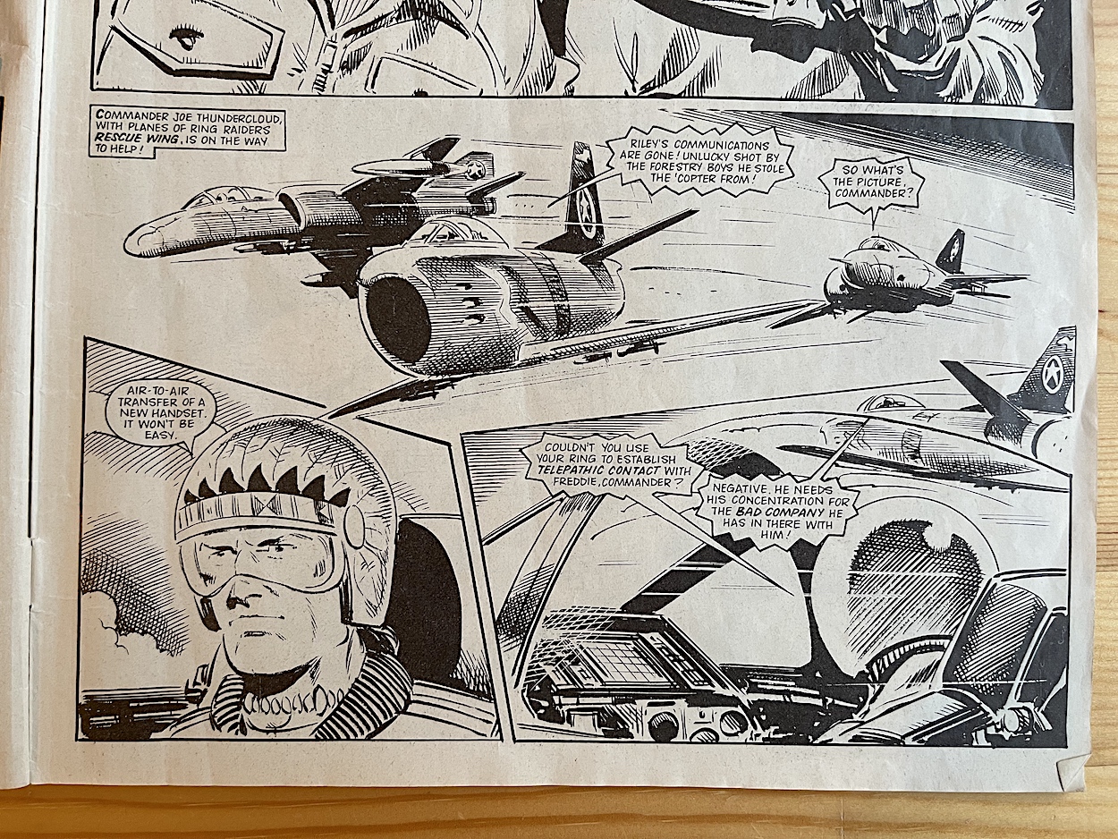
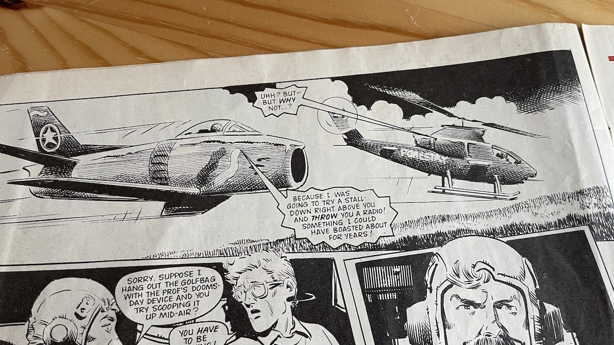
Eagerly I move on to part four of Trackdown from writer Angus Allan and artist John Cooper and the tension is building. Upon first reading we may have thought this was building to a climax but in reality it’s far from its conclusion. With Blackjack‘s Havoc Wing lying in wait to ambush the Ranger helicopter occupied by Riley, Runtz and the professor, Riley’s commanding officer Joe Thundercloud and his men swoop in to save the day. In the chaos Riley overpowers Runtz, knocking him unconscious and using his radio.
“Housed in Sky Tiger’s forward underbelly, Tigerclaw is a retractable pod of 25 miniature missilesthat can each be remote controlled by the plane’s on board computers.”
Those Characters From Cleveland/Matchbox
With no radio on board the original plan had been to pass one from one aircraft to the other so that the Air Carrier Justice could triangulate their position and beam them and the Doomsday Device safely to the landing bays. There’s also mention of using the telepathic circuits inside the rings, which is the first they’re officially mentioned. They’ve been hinted at, that somehow they can communicate with each other using them and how the rings can send warning signals through time, but this is the first we’ve discovered the pilots can speak to each other in a kind of Bluetooth fashion (before it existed) via the high-tech jewellery.
But, with communications back thanks to Runtz’s radio the Raiders no longer need to make such a dangerous play, much to the chagrin of their Wing Commander.
I really am enjoying the original character of Riley and the brilliant writing (only four issues in) has me believing these men really do have a solid friendship and history together, despite very obviously coming from completely different backgrounds. With the Ring Raiders assembled from various points throughout history and from all across the globe they were an extremely diverse bunch. It was one of the things I liked about the set up as a kid and, I have to say, still do.
The humour between them is very natural and I think it’s wonderful how the wing’s leader, such a noble warrior on the surface, just wanted to show off. Some comics could be painfully obvious in being licenced fare, their one purpose being to sell toys, the stories feeling little more than action figures moving about in long, elaborate adverts. But it’s a testament to Barrie as the driving force and his assembled creative team that Ring Raiders feels like it’s an action adventure comic first, a licenced title second.
When I see my second favourite comic ever paying homage to a favourite film of mine, it just brings a huge smile to my face
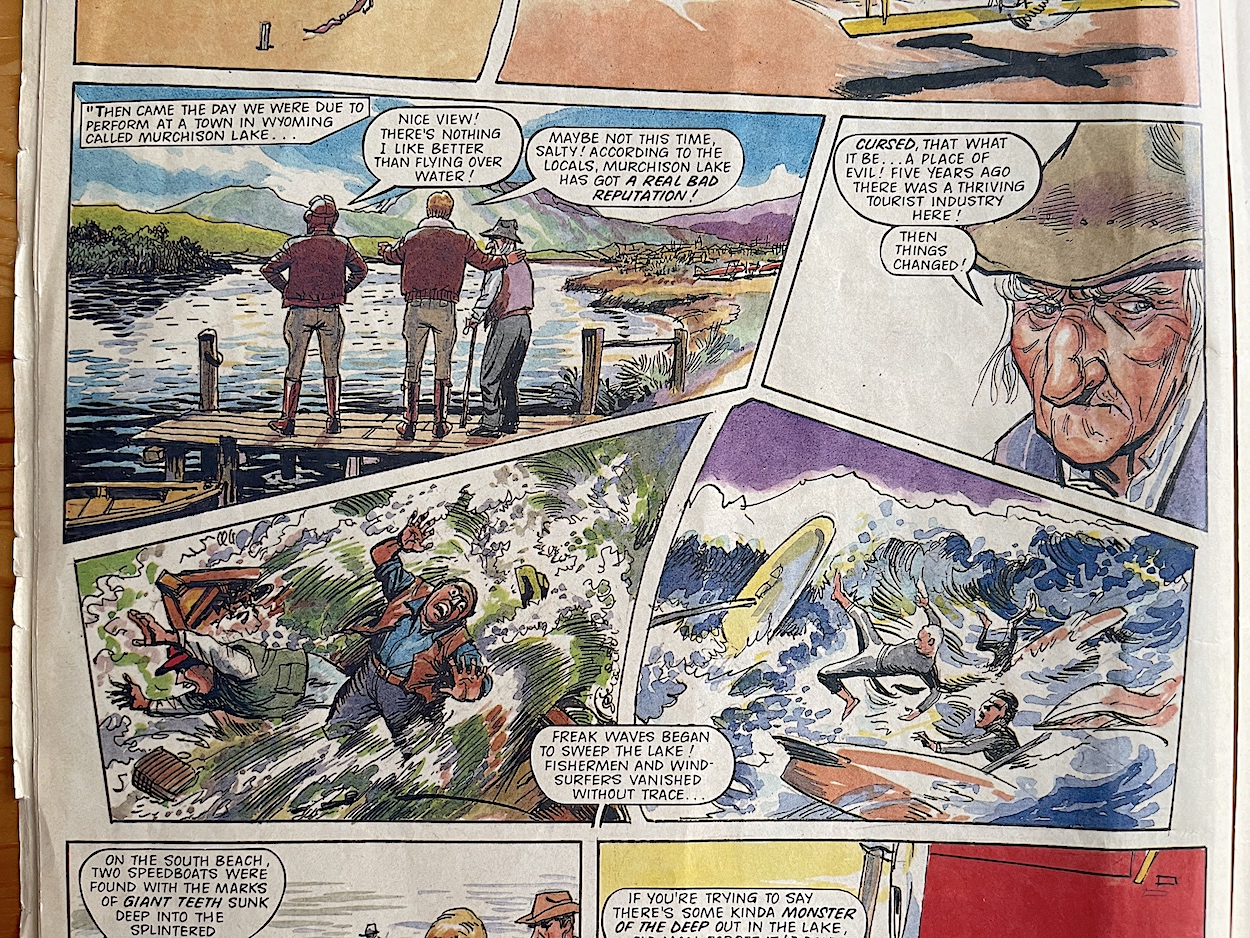
We have a change of artist for the complete character tale this issue. ‘Salty’ Salton: Super Stunt Pilot from 50 Years Ago gets brought to life by another member of Barrie’s regular team, Geoff Campion (TV Comic, Battle Picture Weekly, Action Force). Geoff brings a lovely classic comic feel to the strip (beyond the fact the comic is already 32 years old), which is just perfect for a tale about Salty as a young gung-ho stunt pilot in his prop plane, a mysterious cursed lake and hidden underground lairs.
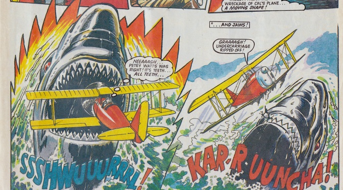
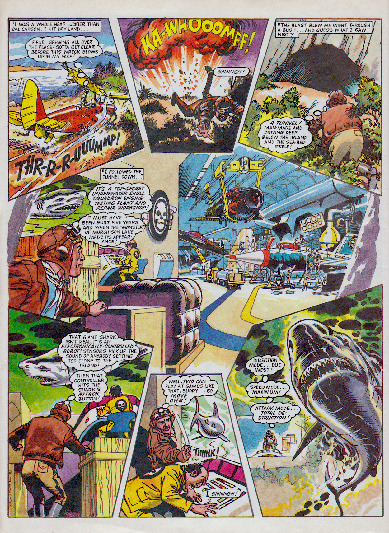
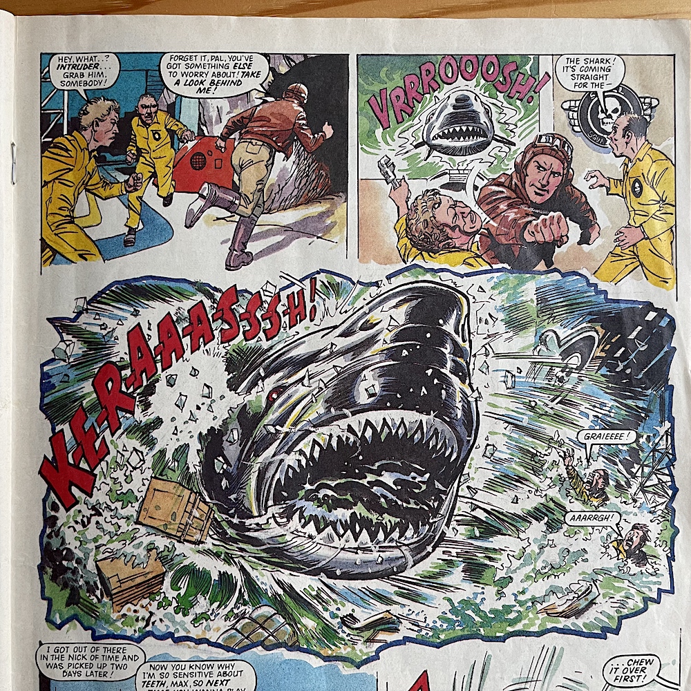
After being freaked out by a set of clockwork toy teeth in the dining hall of the Air Carrier Justice, Salty relates a story of the death of one of his stunt partners. Due to perform low-level aerobatics over the idyllic Murchison Lake in Wyoming, a local tells Salty of missing people, dead bodies on the shore and giant teeth marks on the sides of sunken boats. Not believing any of it, Salty watches in disbelief as one of his best friends flies behind an island in the lake and, instead of pulling up to do his stunt, his plane explodes while he’s out of sight.
One of the other stunt flyers had been in the air and lands safely but is terrified of going back out over the water again. Salty takes to the air to investigate and over the wreckage he gets the shock of his life as a giant shark, bigger than anything he could imagine, leaps out of the water and damages his plane, only his unique skills saving him from certain death. His inner thoughts echo those of his terrified friend. “It’s teeth… all teeth… and jaws!” That final word is important.
Crashing on the island and noticing a manmade cave entrance, Salty soon discovers a secret Skull Squadron base under the lake and a control centre for a huge robotic shark, used to terrify locals into staying away. This is all revealed through this wonderful panel arrangement above, the lair taking up the middle of the page while the story plays out around it. What a wonderful design and a fun way to tell the story as Salty programmes the shark to home in on the base and crash through the observation window, flooding everything. Below is part of the final page of the story and this is where that important word above comes in.
Firstly, I should explain my favourite film of all time is Jaws and I have a soft spot for its second sequel, Jaws 3D. I even upgraded my TV and BluRay player about five years back so I could finally see it the way it was intended. Hands down the best 3D I’ve seen in film. Anyway, at the end the giant shark in the film spots our heroes through an underwater observation window and swims straight through it, the gushing water scattering bodies everywhere. It’s also set in a fictional Sea World where underwater caverns are manmade and stunts are performed above on the water (and of course in reality the shark was mechanical).
The end of this strip feels very familiar, right down to the little details like the shark coming head on at the glass in the background. If intended (and I can’t see how it wasn’t) I personally think it’s a great homage. I can’t remember making this connection as a kid but now when I see my second favourite comic ever paying homage to a favourite film of mine, it just brings a huge smile to my face. It’s fun, silly (in a good way) and completely far-fetched. I think fans of the movie would appreciate it. Writer Scott Goodall is either one of those fans or is having a great time poking fun at the film.
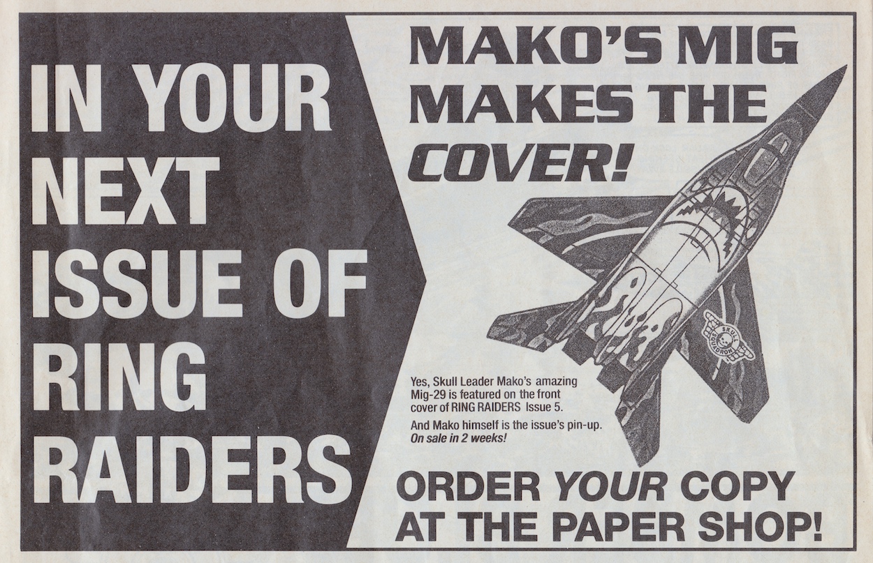
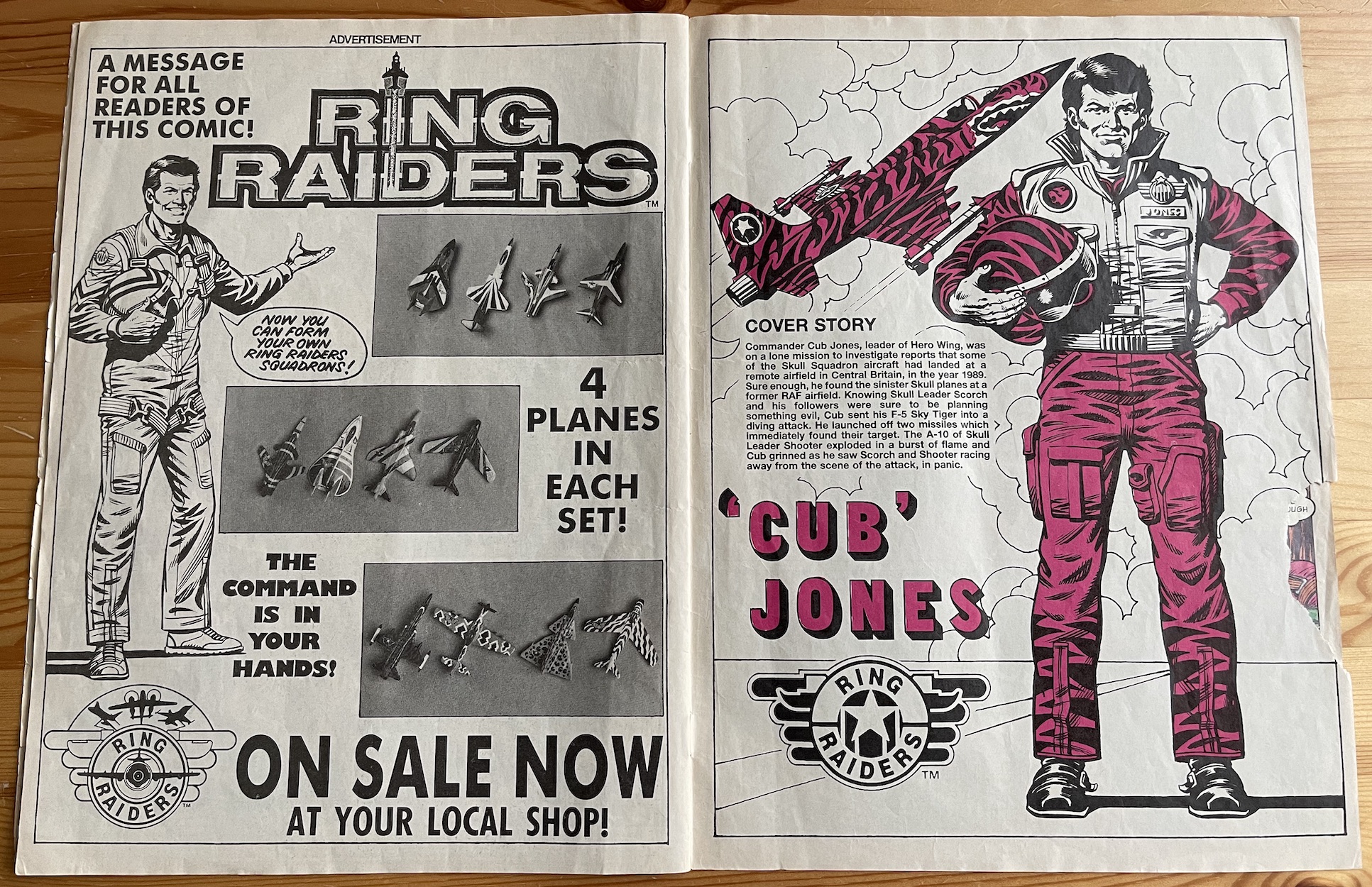
After a page of letters we have a brief look at the next issue. No story details, just the fact Skull Leader Mako‘s Mig-29 ‘Sea Hunter’ is on the cover and that he’s the pin up. Of course, we know Mako is one of the stars of the ongoing Freedom Flight strip so his being on the cover makes sense, as I mentioned above. I have to say I’m looking forward to seeing his shark motif aircraft (this image below) painted in full colour by Ian Jackson.
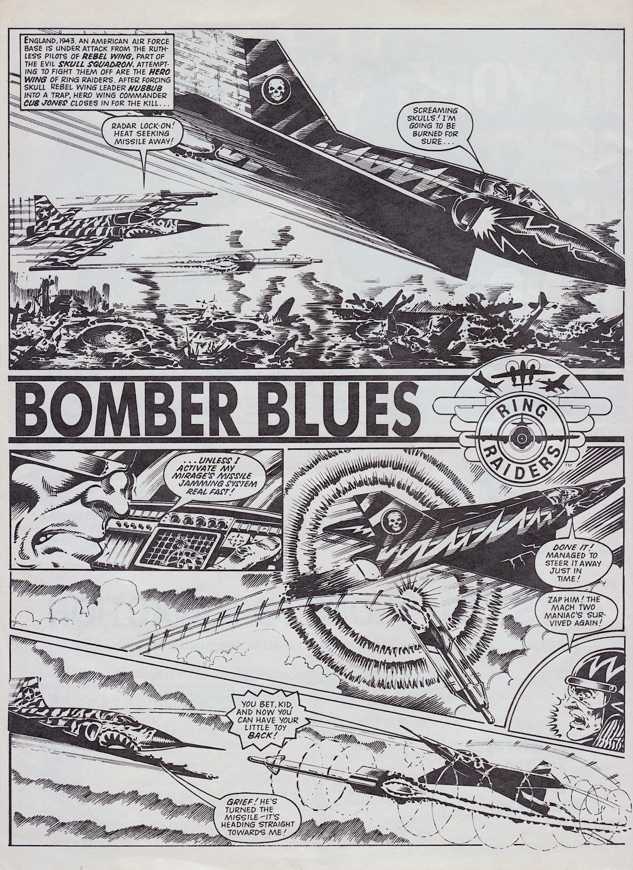
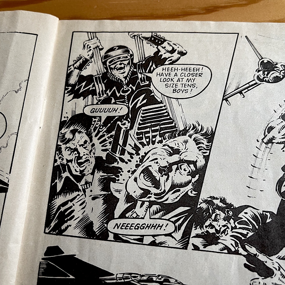
The fourth part of James Tomlinson‘s Bomber Blues once again takes place almost entirely in the air, as Skull Leader Hubbub narrowly avoids death at the hands of the youngest Raider, ‘Cub’ Jones during World War II. Using his jamming system at the last second he sets the missile on a return course back to its sender, the decor of Jones’ plane suddenly looking less fearsome and more terrified!
I joke, of course. The strip is packed full of action and plenty of twists and turns, the reader never quite sure who’s going to come out on top. If there’s one thing the comic had taught us already it was the good guys can get shot down just as often as the bad guys. Even last issue’s cliffhanger for this story was the missile homing in on Hubbub, for all those young Skull Squadron fans. So the outcomes of individual battles was never certain.
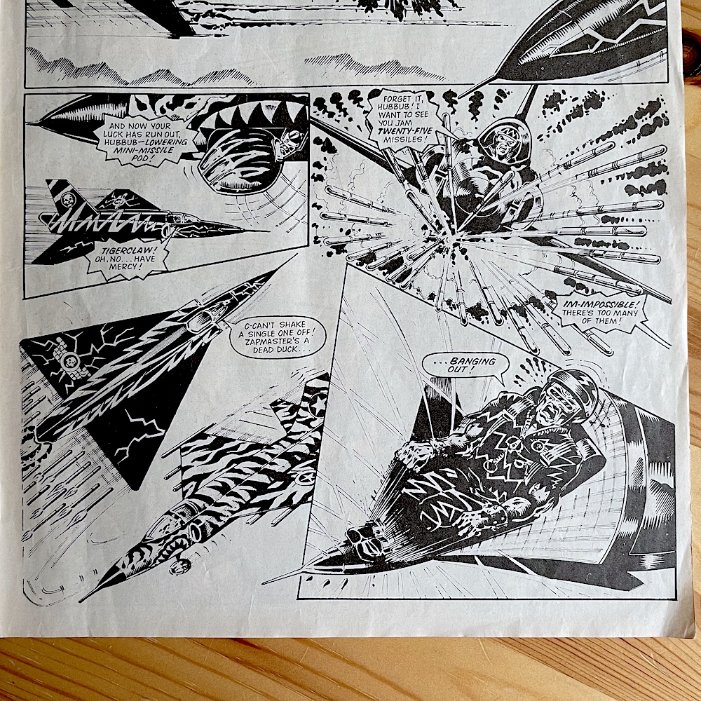
From here it turns into a battle of wits between the two air aces. The missile is bounced back and forth until it’s finally destroyed by Jones blasting it out of the sky with his 20mm cannons. It’s at this moment the personal nature of this mission takes a hold of him. Plucked out of the war to join the Ring Raiders it’s like he has unfinished business in this time period, so he’s taking the chance to save those the likes of whom he left behind first time around. It adds an air of determination to the character so when he unleashes his ultimate weapon you know he’s here to end this once and for all.
Well that missile pod is rather unique! I’ve looked up the licence information Barrie and James kindly sent me (which I’ll cover in-depth at a later date) and while the toys were obviously too dinky for detachable weapons and hidden compartments, in the information provided was the following:
“But of all the modifications done to his F-5, the most hazardous to Skull Squadron planes has been its Tigerclaw mini missile system. Housed in Sky Tiger’s forward underbelly, Tigerclaw is a retractable pod of 25 miniature missiles that can each be remote controlled by the plane’s on board computers and used against air, land and sea targets.”
The little mini-comics we received with our plane packs must’ve contained these details, to ignite our imaginations while playing. This particular weapons system certainly sparked James’ imagination and results in Hubbub ejecting as his craft explodes, although he does make quite the impact (figuratively and literally) as he lands, thanks to artist Don Wazejewski‘s expressive faces. Details like this and James’ obvious enthusiasm for the subject matter, both in airplanes and the actual licence, shines through in a real treat for die-hard fans of the toys.
It’s commercial break time and another advert created by the comic’s creative team with a Sandy James drawing of Ring Commander Victor Vector and some Wings photos. Recently Barrie told me he couldn’t remember if these photos were taken in-house or supplied, but he did say if it had been up to him they would’ve been more professional. I never thought anything of it at the time, but now I can see they could definitely have been better. I think they’re just black and white photocopies of the colour images on the packets, resulting in a rather muted end result.
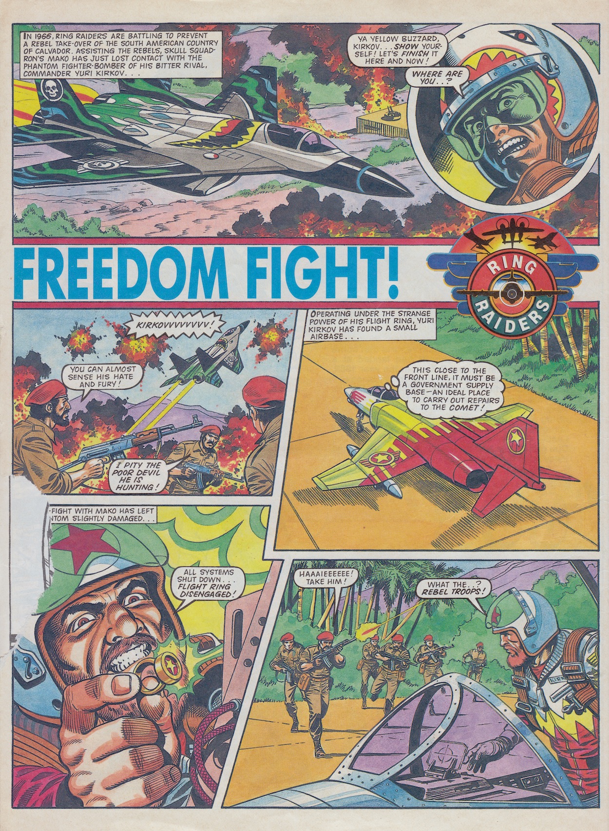
Next to this is the pin up I mentioned earlier. It’s also drawn by Sandy and then it’s on to the fourth chapter of Freedom Flight where he adds his particular style of colouring to the tale of a government on the verge of being toppled by a rebellious uprising, written by Tom Tully. Last time we saw Wing Commander Yuri Kirkov use his ring to energise his failing F-4 Phantom ‘Comet’ just enough so he could touch down on solid ground, much to the annoyance of Mako.
Kirkov has unknowingly landed in rebel territory and quickly finds himself surrounded. As explained before, when a ring is used this way it also floods the pilot with energy in order for them to be able to control the aircraft, but all of this drains the pilot’s nervous system, so Kirkov isn’t in any condition to make a run for it and finds himself captured. His wingmen are soon on the attack though, strafing the advancing troops and again it’s nice to see a strip namecheck the pilots who were left unnamed in the toy line.
From speaking with Barrie it seems Matchbox and Those Characters From Cleveland told him he was pretty much free to expand on what the toys had set out. Apparently they were very happy with what was being produced in the comic and when you have strips like this, who can blame them? I just adore Sandy’s colouring, with the bright, bold livery of Freedom Wing replicated throughout the rest of the art. I think this is really rather neat, his colour scheme for the whole strip centred around those of the toys (backgrounds, strafing gunfire, clothing etc.).
Thus ends another issue of a simply fantastic comic series. When you take a look at the comic as a whole it’s great to see so much strip content here for the licence. Marvel UK comics would have had one or two strips, maybe a non-related one as well and in some cases a small text story, the rest of the pages filled out with extra features. Some were great, some were fillers. Fleetway‘s own Super Naturals was more like an anthology comic, with two of its five strips not related to the licence. However, for Ring Raiders we got five superb strips, each taking us on completely different adventures with this huge ensemble cast.
The next issue was the only one from my original collection I lost over the years and I had to track it down online. It’s a corker and well worth the inflated eBay price. We’ll actually see some of our current stories come to their conclusions too. So check back on Thursday 11th November 2021 for #5.
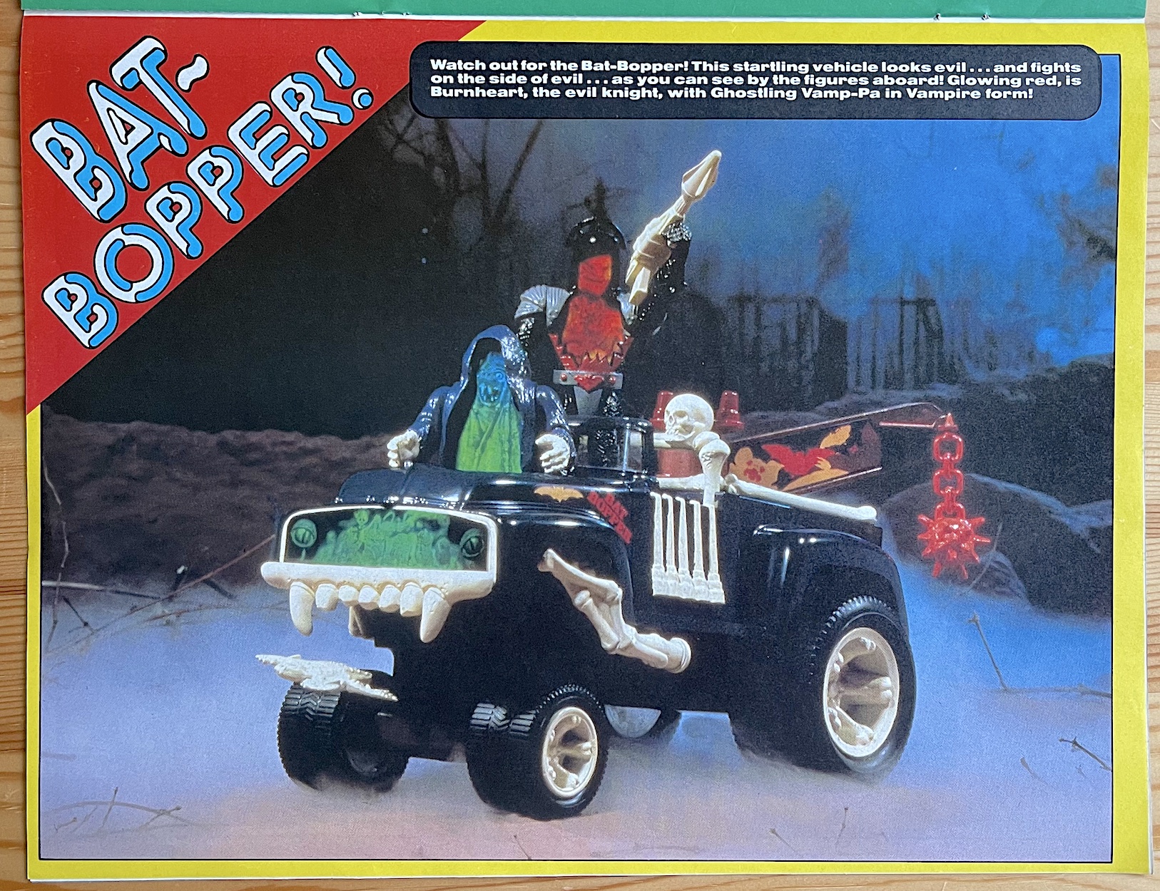
Given away free with a handful of other Fleetway comics a week before the launch of the new Super Naturals fortnightly was this full-sized 16-page preview edition. Inside it contained a five-page introductory strip, a shorter humorous back-up and a few full-page photographs of the Tonka toys in all of their holographic glory, as well as a competition and full details of the contents of #1. But it wasn’t the only thing falling out of comics that week.
Also included was this glossy comic-sized card with that great logo on one side and a fact-file about the characters on the other with images drawn by Sandy James. The toys were just launching in the UK around this time so the preview comic was also like a preview/advert for the toys. Well, it’s a licenced comic after all and that’s kind of the whole point. This card highlighted the good and evil characters we’d be following each issue and introduced their illustrated look for the comic.
At the time I wasn’t aware of either gift, only stumbling across both a few years ago on eBay. I came across the premiere issue on Hallowe’en itself, which I’ll whitter on about in the next review. But having this card bundled in with the preview, and the fact a Super Naturals Blockbuster Advert like the kind OiNK had was also produced (which you’ll see soon), gives the impression there was a big push for this comic. The toy adverts seemed to be on TV constantly and the comic launch was next with a few issues before Christmas to help build the hype.
Ian Kennedy‘s gorgeous painted cover kicked things off in a suitably creepy fashion with skulls, ghosts and powerful animal images. He was even able to perfectly encapsulate the feeling of three-dimensional holograms, particularly in evil leader Skull‘s shield. Surely intriguing to those who received it, inside the background story is equally atmospheric. Drawn by John Gillatt (Scorcher, Eagle, Ring Raiders) he does an incredible job invoking the themes of mystery, darkness and the supernatural in this opening spread.
Throughout history humans from various points in time have discovered the Tomb of Doom, an ancient doorway to another realm called Ghostworld, overseen by the unknown entity Specter. These people would be attracted to its power for good or evil purposes, becoming trapped inside. Killed by Specter and transformed into the Super Naturals, they would be imbued with special powers best reflecting their individual personalities.
Specter did not care whether these people wanted the power to protect or to rule, only that their heart was dedicated to their desires. Who or what was Specter? Why were they doing this? To what end? Was it all a game to them? We didn’t know. Enter two brothers who end up leaders of the opposing forces in our main story The Legend of the Super Naturals, part one of the main ongoing strip. While their backgrounds are a mystery, Lionheart and Skull are descended from royalty of some description and it’s interesting to find out after all these years they were so closely related when they were human.
“It’s a judgement on us all!”
Eyewitness to the arrival
The story rockets along. Yes, it has to in order to set up the comic’s premise, but it’s full of possible story points which could’ve been explored further down the line; the origin of Ghostworld, were there other Super Naturals in there, the living history of every character, the list goes on. Unfortunately none of this would be explored because the comic’s life was cut short, but it’s intriguing to think of the potential storylines because these characters and this setting are crying out for development and for depth of storytelling on an epic scale.
All of those swirling doors and windows within the Tomb are entryways to the real world, the only place they can use their powers to do battle because it is forbidden inside Ghostworld. The end result is truly terrifying if the faces of the church goers in the above panel are anything to go by.
Their first breach flings them into their far future but to the reader it was the present day, Hallowe’en 1987, the date the first issue of the comic would be released. At this point in the story they’re unaware of where they could end up, the places and timezones seemingly random. As the comic gets underway we’ll see Skull and his cronies plot and plan like all good evildoers, choosing where and when to crash through to spread as much fear as possible; their ultimate goal was to turn reality into a dark underworld with them ruling all. The usual stuff.
I love the fact they’ve smashed through a church window here, showing straight away there’s no safe place in our world. For me, it also shows the comic wasn’t afraid of exploring certain horror themes, because I can imagine some parents wouldn’t have been too happy about a child’s comic showing evil demons battling in such a religious setting. It’s great stuff and reads like a classic 80s horror movie, the atmosphere perfectly captured by John.
The comic was edited by Barrie Tomlinson (see also Ring Raiders and Wildcat on the blog) but unfortunately it seems very little is remembered about the creation of this particular comic. John had worked with Barrie before on titles such as Tiger and drew Billy’s Boots for a long time, as well as working on both of the comics mentioned above. This was released earlier than either of them and John really does seem to relish drawing the darker material here after all the sports strips he was known for at the time. Skull looks appropriately manic as he breaks through and the nighttime scene of their arrival wouldn’t look out of place in something like Scream. This won’t be the last time I mention that comic.
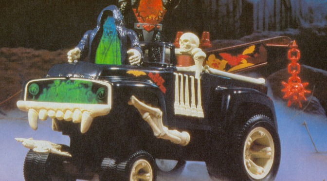
This preview also acted as advertising for the toy line and I don’t just mean because it had a licenced comic strip. There are also pin-ups of the various figures and vehicles produced by Tonka, who were always known for their high quality toy trucks so naturally the Super Naturals wouldn’t drive about in any old cars, they had to be large Tonka trucks!
The images were supplied for the comic by the toy manufacturer and are expertly lit to show off the intricate and highly detailed holograms. I only owned one of the toys but from seeing these images and others online they were in a class of their own and superior to Hasbro‘s Visionaries. (I went into more detail about the toys in the introductory post to Super Naturals.) I can just imagine how I would’ve poured over these images in anticipation of Christmas if I had owned this at the time, but unfortunately the preview comic wasn’t given away with OiNK for some reason.
To lighten the mood after the main strip is Ghostlings, a shorter story based on the smaller ghosts; long-time inhabitants of Ghostworld who acted as helpers to the main characters. Again, each has a background of their own, in fact we’re told exactly who they were before they were killed, albeit without their original names. Among them, a former stage magician, a court jester, a witch and even a teen wannabe rock star. They’re certainly a diverse group. Their stories would bring a bit of humour to the main fortnightly comic.
Little did we know the lasting effect that story would have on us!
Below is the line-up for that first issue. I do think it’s strange the preview printed the story already planned for issue one rather than its own introduction, but beyond that is another Super Naturals strip which really did look epic and really showsedoff the kind of stories the set up would be capable of telling. The Ghostlings would return, there was the promise of complete horror stories (which do live up to the hype) and innocently listed there is The Doll. Little did we know the lasting effect that story would have on us!
It’s interesting to see even before the first issue the two non-franchise stories taking second and third place in the line-up. You’ll see these in the review of #1, but already it’s clear this is going to be more than your standard licenced comic. In some ways it felt like a reimagining of the horror classic, Scream! I’m incredibly excited to get reading these. As per usual I’ll be doing so fortnightly in real time and it all begins on Hallowe’en itself, one week from now.
To finish off this whirlwind introduction to these very different characters the back page has a special competition to win a Tomb of Doom and action figures to place inside it. The slogan from the TV adverts adorns the top left of the page and should be read in a suitably creepy voice. The competition had been put together by Tonka themselves as an advertisement just for the comic and would become a regular back page addition with various prizes along the way.
There really is no other comic more suitable for review at this time of the year, so join me (if you dare) on Sunday 31st October 2021 for the first issue of a forgotten classic.