
Have you ever found out something about your childhood many years later and wondered how you never noticed even though it was so glaringly obvious? In the case of this blog it could be how I never clicked that the TV show Round the Bend was created by OiNK’s editors! As for the Ring Raiders it’s something small but even more obvious, the colour of the canopies on all of those planes I collected.
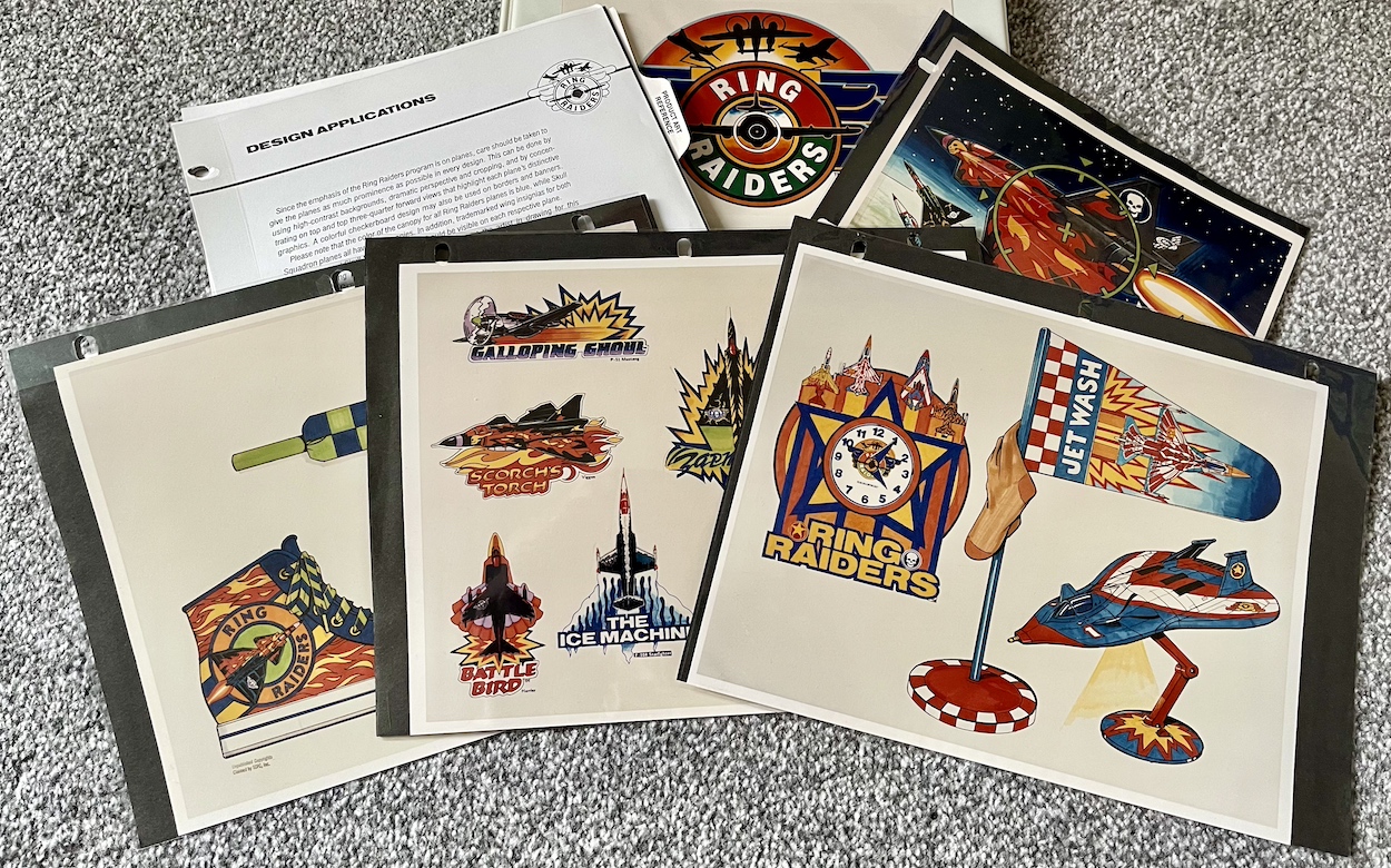
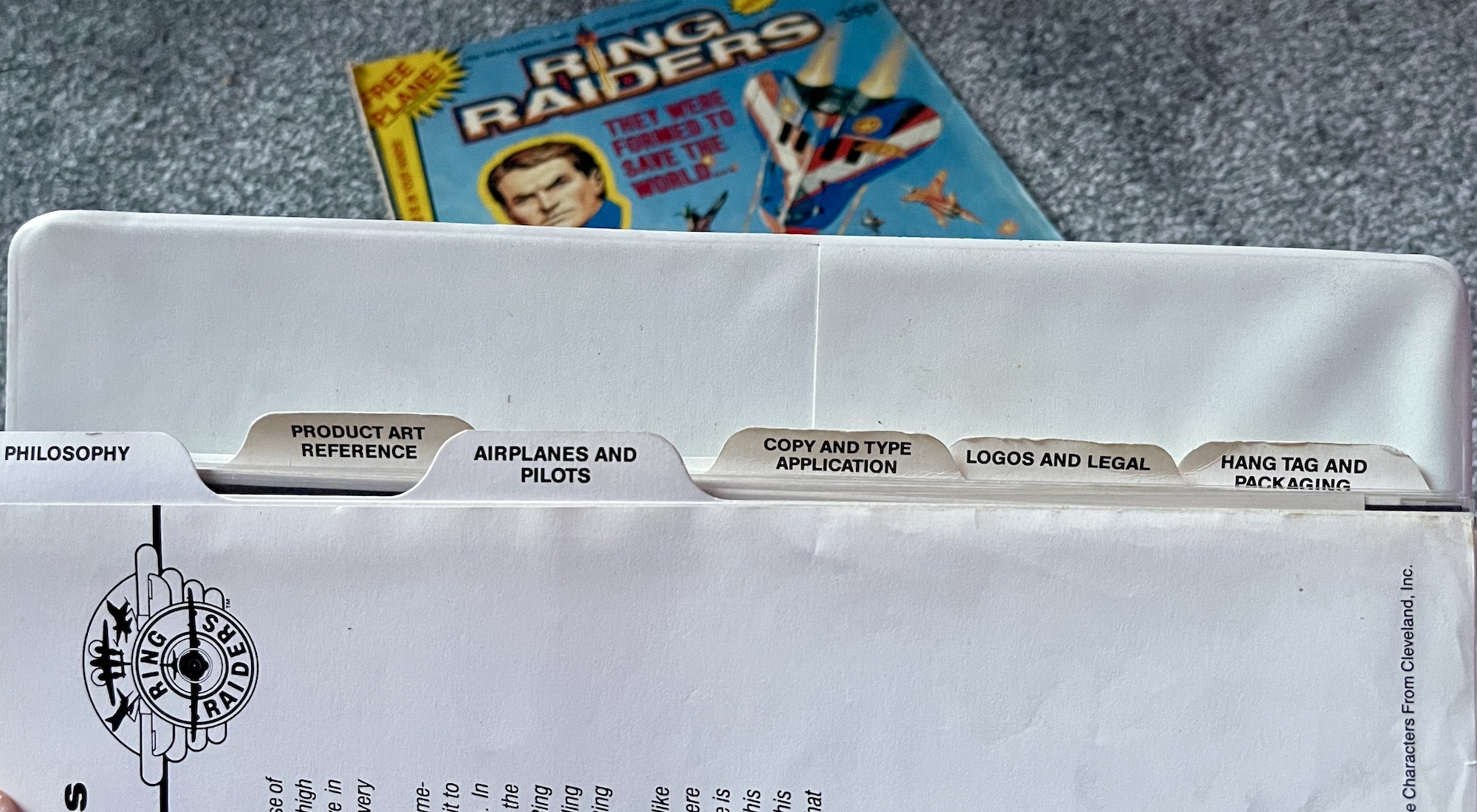
Welcome to the fourth part of my look at every single page of the Ring Raiders Style Guide sent out to licensees in 1989. We’ve covered the introductions and details of the range, the characters and their all-important aircraft and now we move on to the Product Art Reference section. Here, Those Characters From Cleveland (TCFC) described how they expected their creations to be shown and a concept artist drew up some fun merchandise ideas, making this my favourite part of the whole folder.
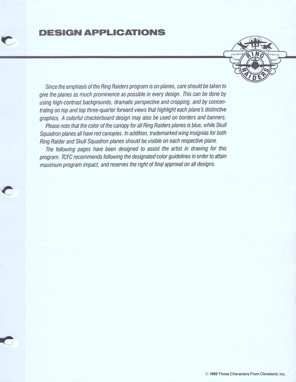
The introduction reminds licensees the planes are the focus, which is an obvious point since it’s all based around those superb Matchbox toys. Of course, Barrie Tomlinson’s comic understood the significance of focusing on and developing the characters in order to tell good stories with those planes. Coming to this as a fan of the comic I initially found it strange how they were trying to tell artists specific ways to draw their creations, but of course this wasn’t aimed at dynamic comic strips. Instead, this was for those making other merchandise based solely on static representations of the aircraft.
In fact, when I spoke to Barrie about the Ring Raiders comic he told me how some licence holders didn’t understand the medium and would analyse every single frame as if it were an individual image instead of a sequential piece of art. Thankfully TCFC were apparently much more knowledgeable about comics. This page mentions my point about the canopies, how the Ring Raiders all had blue canopies and the Skull Squadron‘s were all red. A quick glance on eBay proves this point and I’ve no idea how I didn’t notice that pattern as a kid!
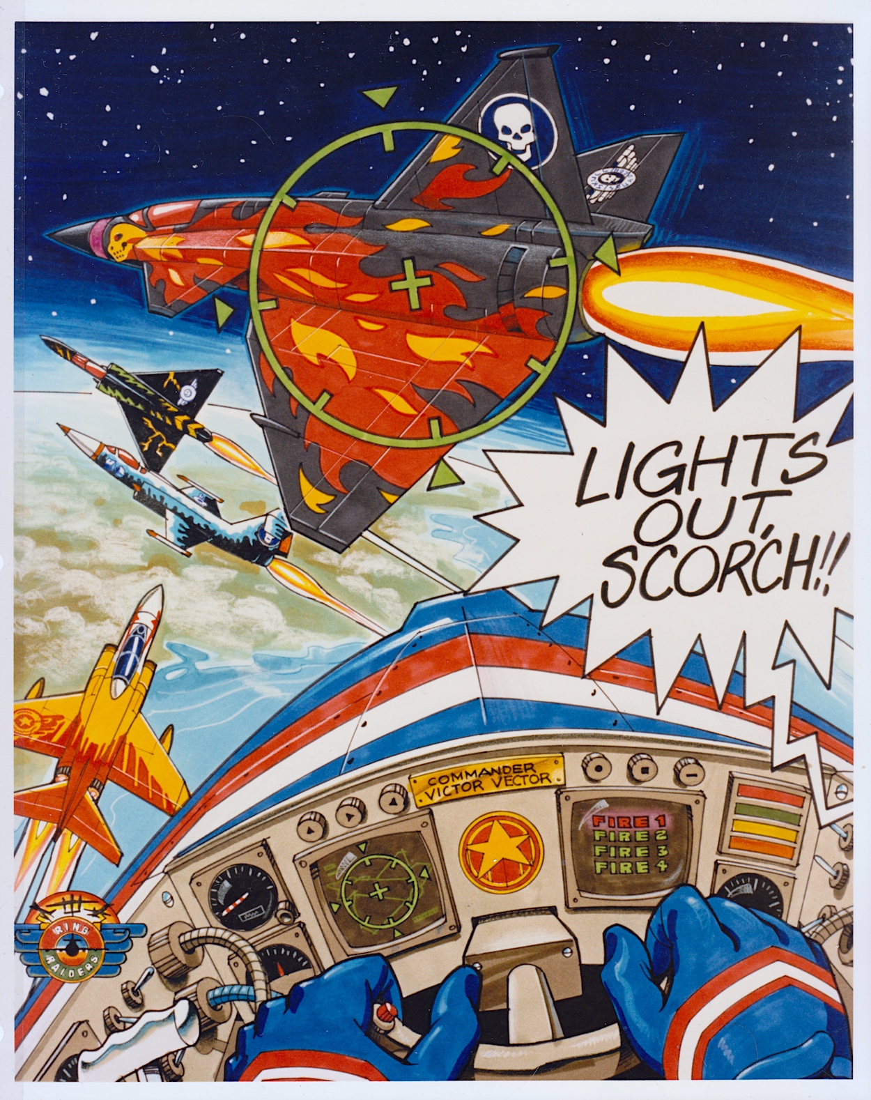
This full-page piece shows how some of the aerial action could be portrayed and I think it’s a great scene! It’d certainly make for an awesome poster if it was blown up a lot larger. I particularly like the lighting on Scorch’s Torch and seeing inside Vector’s cockpit. In fact, it’s only upon seeing this that I realised the airplane controls weren’t something we really saw in the comic, apart from the sci-fi element of the rings. Yes, I just love this and it’s a shame we don’t know who drew it.
The next five pages are my favourites because they give me an insight into all of the cool (and not so cool) things I no doubt would’ve wanted to adorn my bedroom (and my body) with if the franchise had taken off. These weren’t officially released, TCFC used these to promote possible ideas to companies as a way of convincing them to work on the franchise. Unfortunately I don’t know the artist whose signature is on these pages. Hopefully I’ll be able to find out in the future.
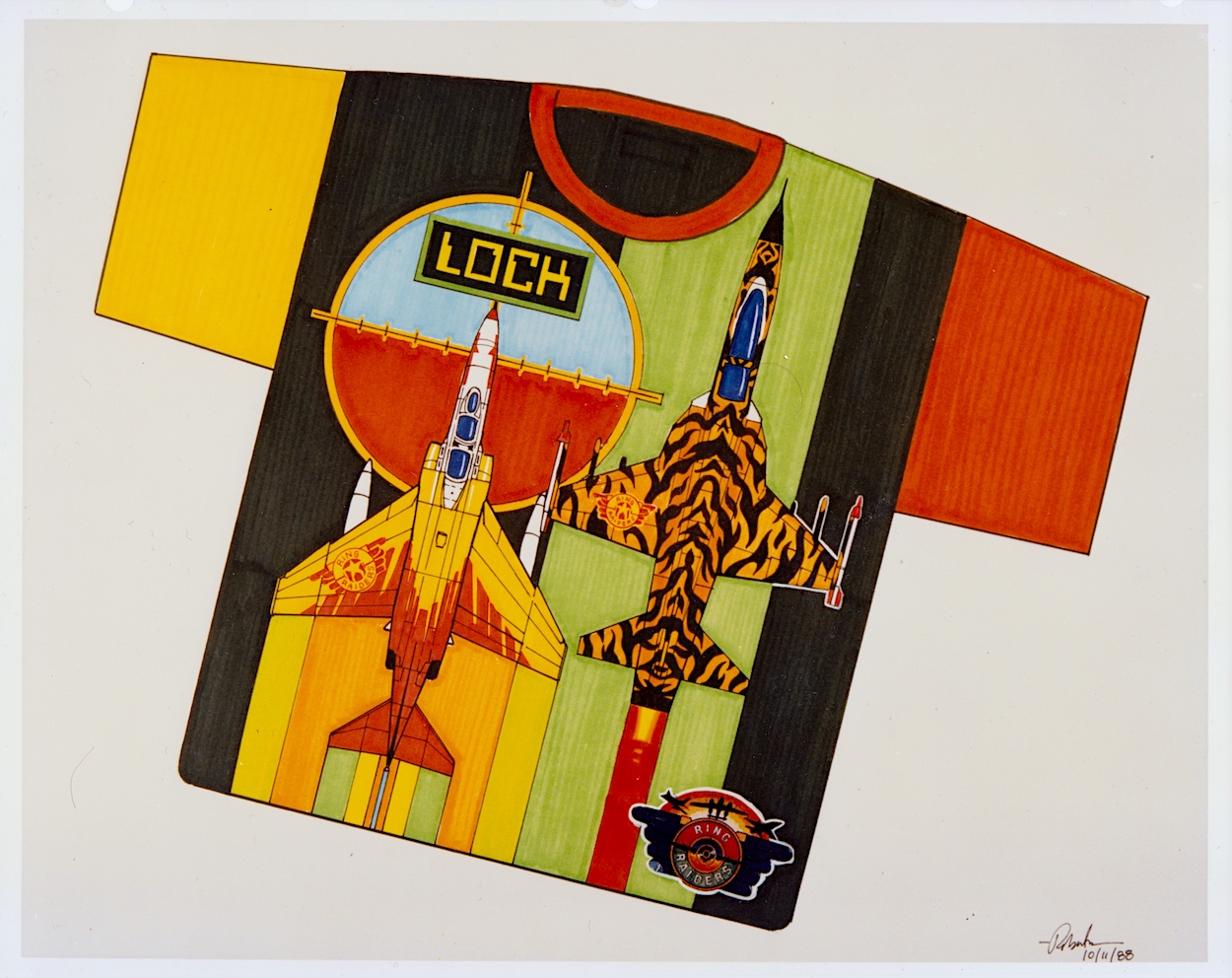
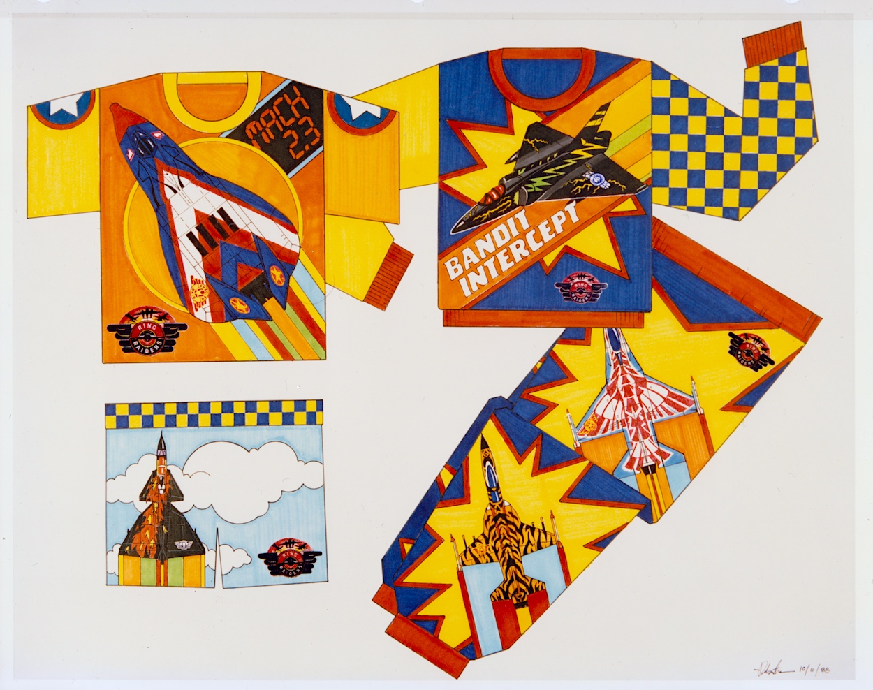
In the introduction to this section colourful checkerboards were mentioned as a way to add borders and banners where needed and the artist shows how these could work on some particularly gaudy clothing. Hey, it was the late 80s and in their own way Ring Raiders may have been ahead of their time as we slid into the 1990s. I mean, have you seen the fashions of that latter decade? We even wore shell suits for goodness sake!
I started secondary school in the autumn of 1989, the year of the range’s launch, so I doubt any of these clothes would’ve been aimed at my age range. I also doubt any of my friends would’ve let me forget if I’d turned up wearing any of them. However, given how retro inspired clothes are all the rage today, and it seems the more colourful trainers are the better, I think one of the items below might still sell to a select audience.
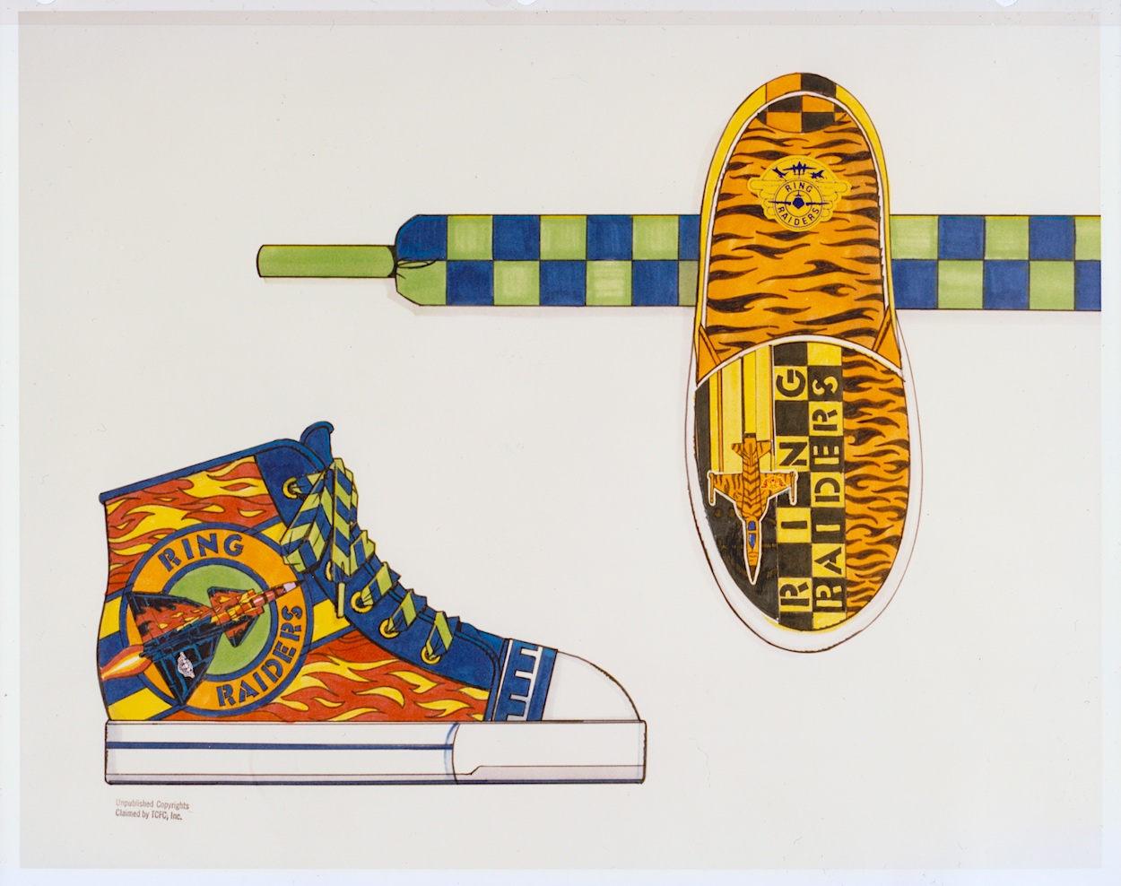
Okay, so those who are still fans of the Ring Raiders may make for a rather niche market but when you look at some of the celebrity ranges or those based on other retro franchises they don’t look too out of place. The slippers and their tiger design (to match that of “Cub” Jones’ F-5) might also work without that green and blue strap; I certainly know a friend who loves animal print, although the plane might put her off!
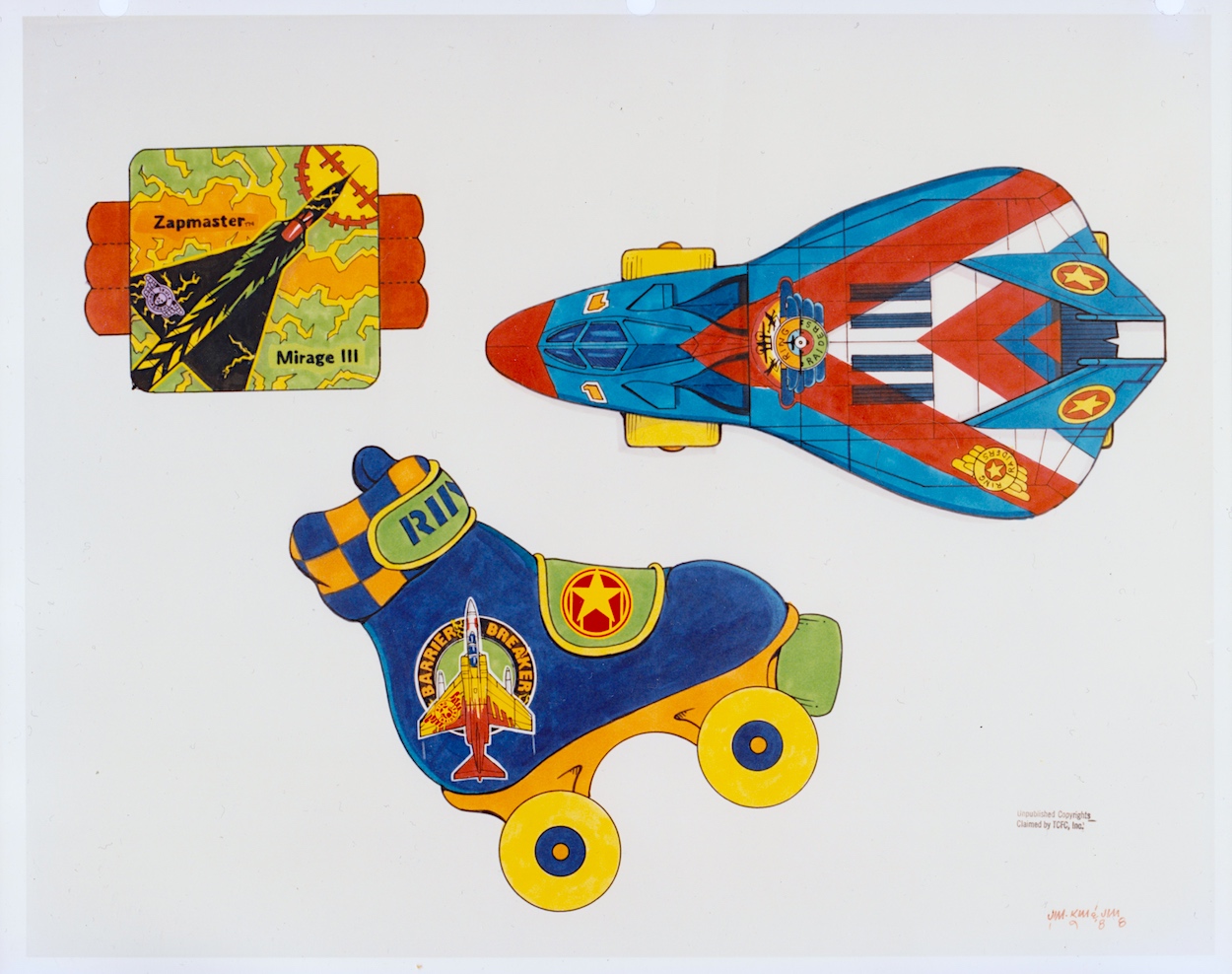
On the final page of wearables, is there anything more 80s than roller-skates and sweat bands? Initially I thought the top-down view of the Victory 1 F-19 Stealth Fighter was a more custom skate, but when I couldn’t figure out where you’d put your foot in I clicked it’s actually one of those novelty skateboards that were so popular back then. As a kid I wasn’t really into sports so these wouldn’t have been on my Christmas list, but that’s certainly not the case with the items on the next page.
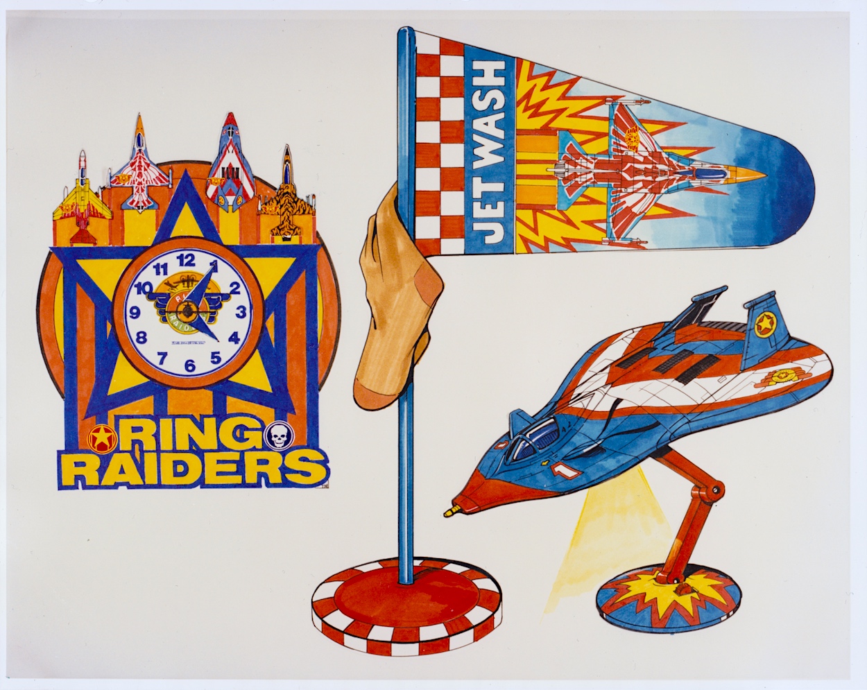
How much do I want that lamp even now as an adult? I remember cutting out the main title logos from my toy packaging and sticking them all over my room alongside the posters from the comic, I even had a large one on the door to my room instead of the usual name plate. I was crying out for more official merchandise to be released. As such, that clock would have looked good on my wall and I think modelling a laundry basket on an airfield’s windsock is ingenious. It may even have helped keep my room tidy!
While these are just a way of throwing out ideas for licensees to work from, I think they’re great fun. In the Ring Raiders: In Real Time introductory post you can see some of the official merchandise that was released at the time and you’ll see that checkerboard pattern plenty too. Also in that post is a photo of a mocked up child’s bedroom where everything seems to have the branding of the range. It’s a somewhat ambitious photo on the part of TCFC but you have to aim high, right? Plus (again) it was the 80s! This was the way of things.
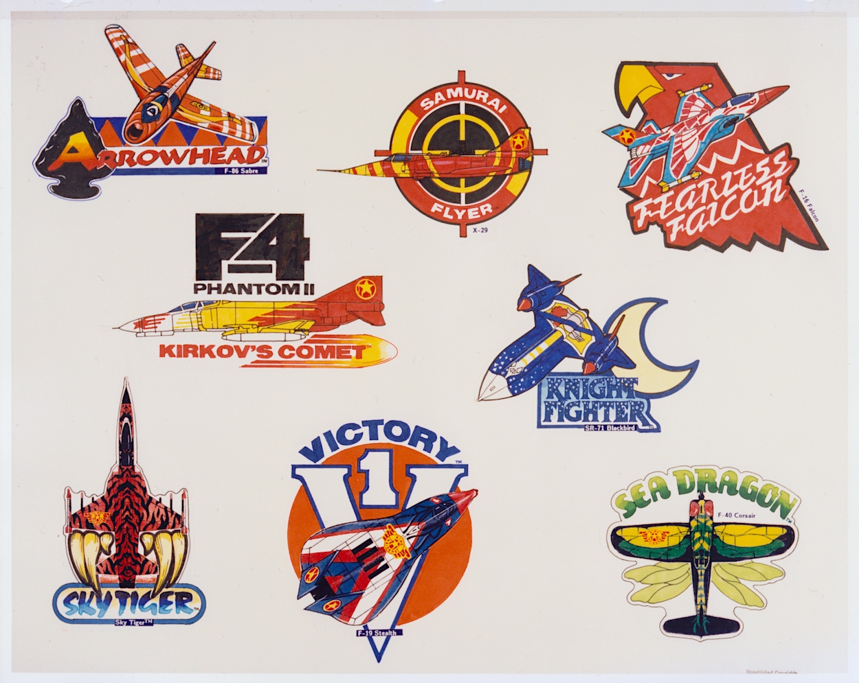
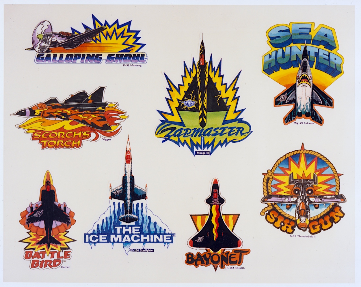
These two pages round off this section of the folder and show the great idea of having different emblems for each of the leader craft. I never saw these on any of the toy packaging or in the comic so I’m assuming they never ended up as an official part of the branding. While each Commander’s aircraft was accompanied by three other planes in a pack, I like the idea of the lead planes being promoted this way.
I can imagine some of these being turned into badges or, to be really 80s/90s they could’ve been material patches to be sown on to denim jeans and jackets. I particularly like the ones for the Galloping Ghoul P-51 Mustang (a favourite from the toy range), Kirkov’s Comet F4 Phantom II and the Sky Tiger. This whole section sums up the fun manufacturers and us kids could’ve had with the Ring Raiders as the next big craze of childhood.
Where has the time gone? We’ve only got one more part of this monthly series to go. The final few pages deal with more serious stuff like trademarks and the legal side of things, as well as approved logo variations, typography and some samples of the packaging that would be adorning toy stores around the country and the wider world. So make sure you fly back here on Monday 13th May 2024 for the final landing.
PART THREE < > PART FiVE

I’m continuing to love this. Wish I could get my hands on an adult version of that sweet tshirt!
LikeLiked by 1 person
Thanks Terry, just the one section to go. Oh dear, really? You’d wear that?! You’re a brave person lol! I still want that lamp and that laundry basket though!
LikeLike