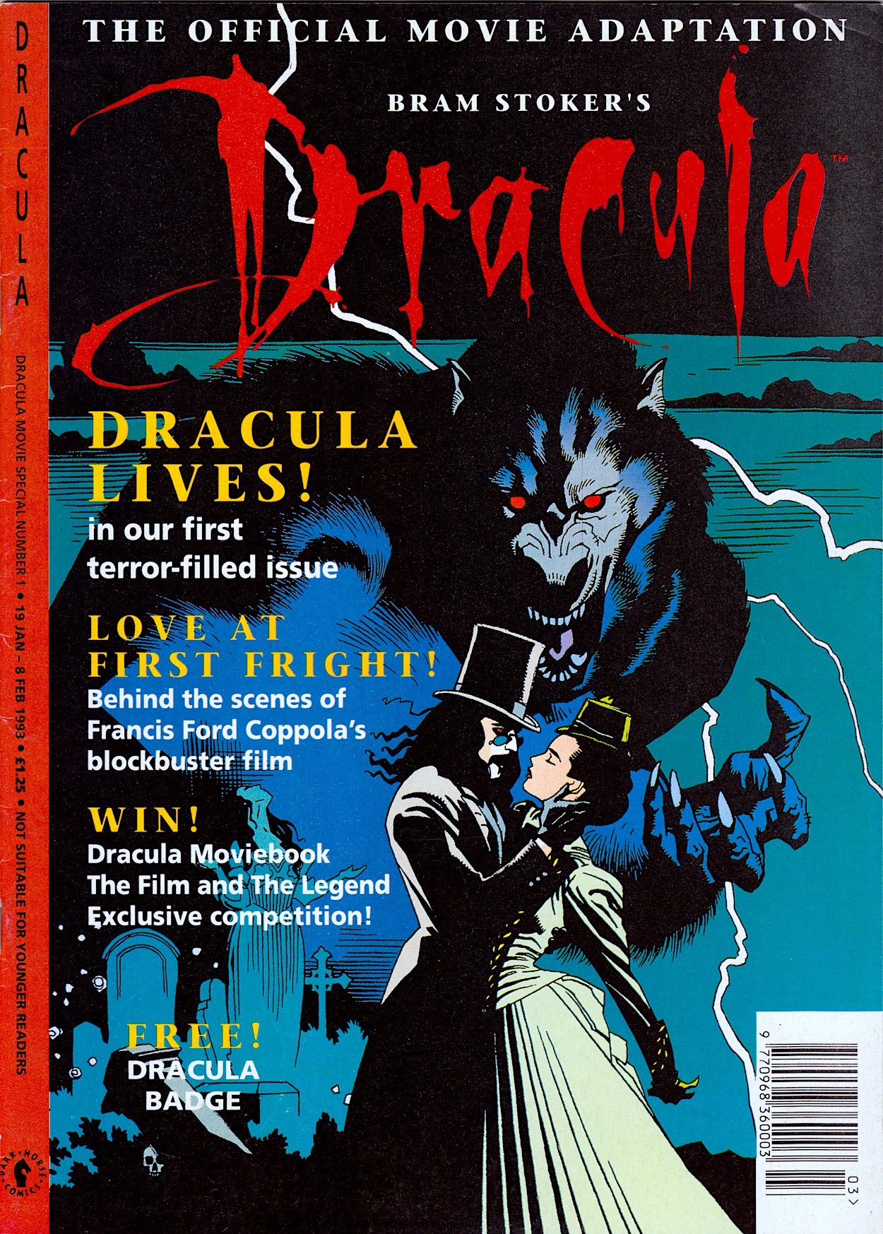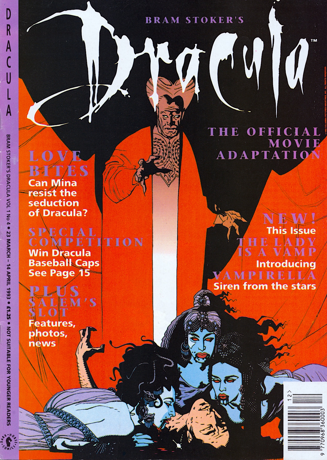
While it’s not the easiest to read (and so wouldn’t have stood out from the cover on newsagent shelves), look closely at Mika Mignola’s cover to this latest edition of Dark Horse International’s Bram Stoker’s Dracula and you’ll spot a new addition to this fourth issue. Vampirella has joined the comic as a back up strip, just as Xenozoic Tales would join the fourth issue of the publisher’s Jurassic Park later in the year.
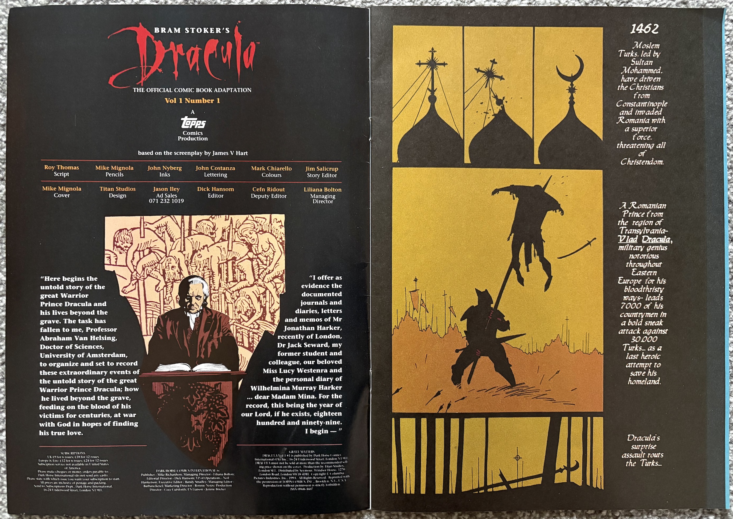
For both series, sales figures had proved themselves enough that the three-weekly movie adaptations were turned into monthly ongoings, the final chapter split in order to get ahead of the new schedule and introduce readers to new content. Inside this comic, both strips run to 14 pages, Dracula himself getting exactly half the amount as normal. However, Vampirella gets no introduction anywhere and the editorial is still in the hands of Van Helsing.
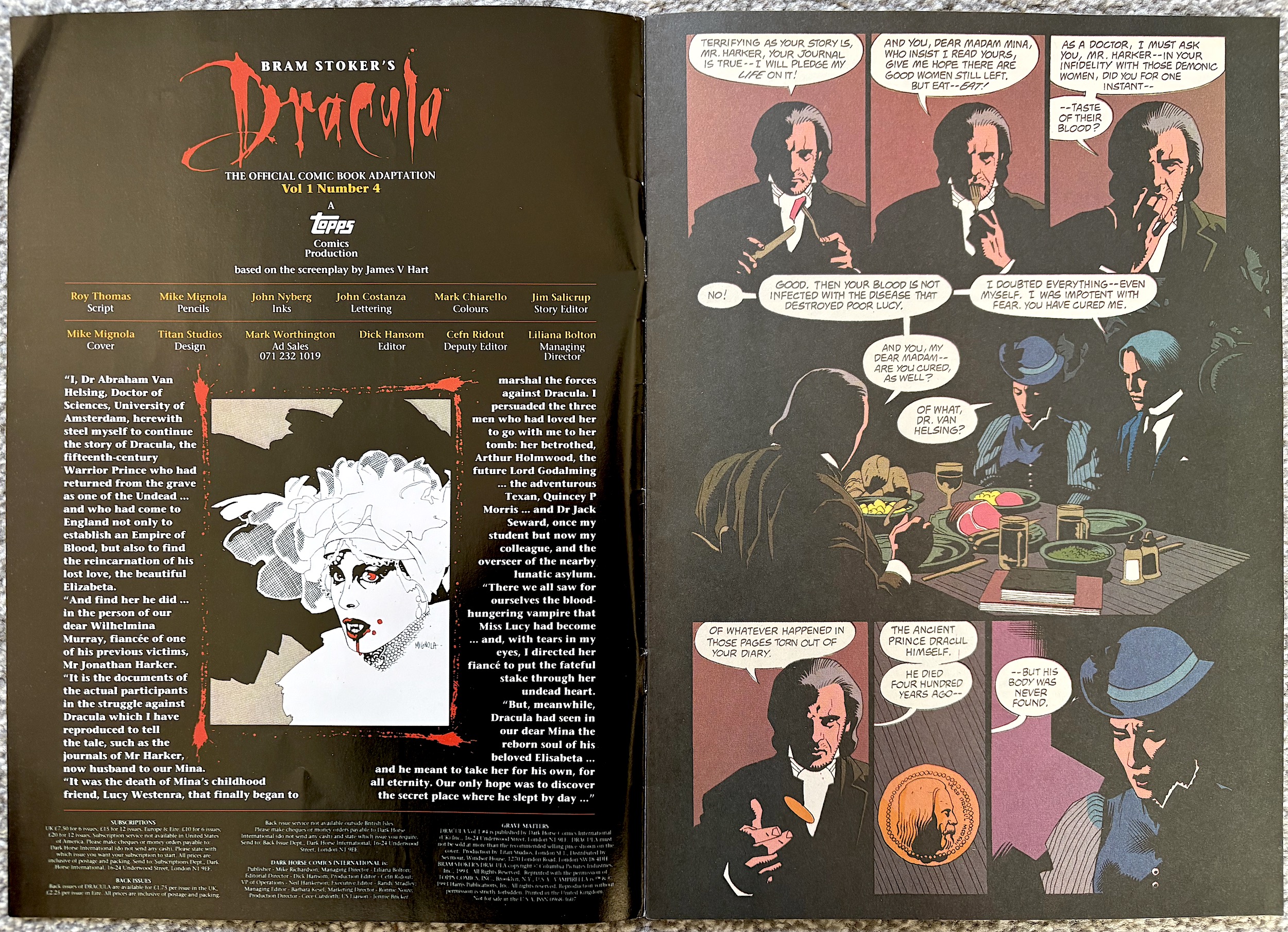
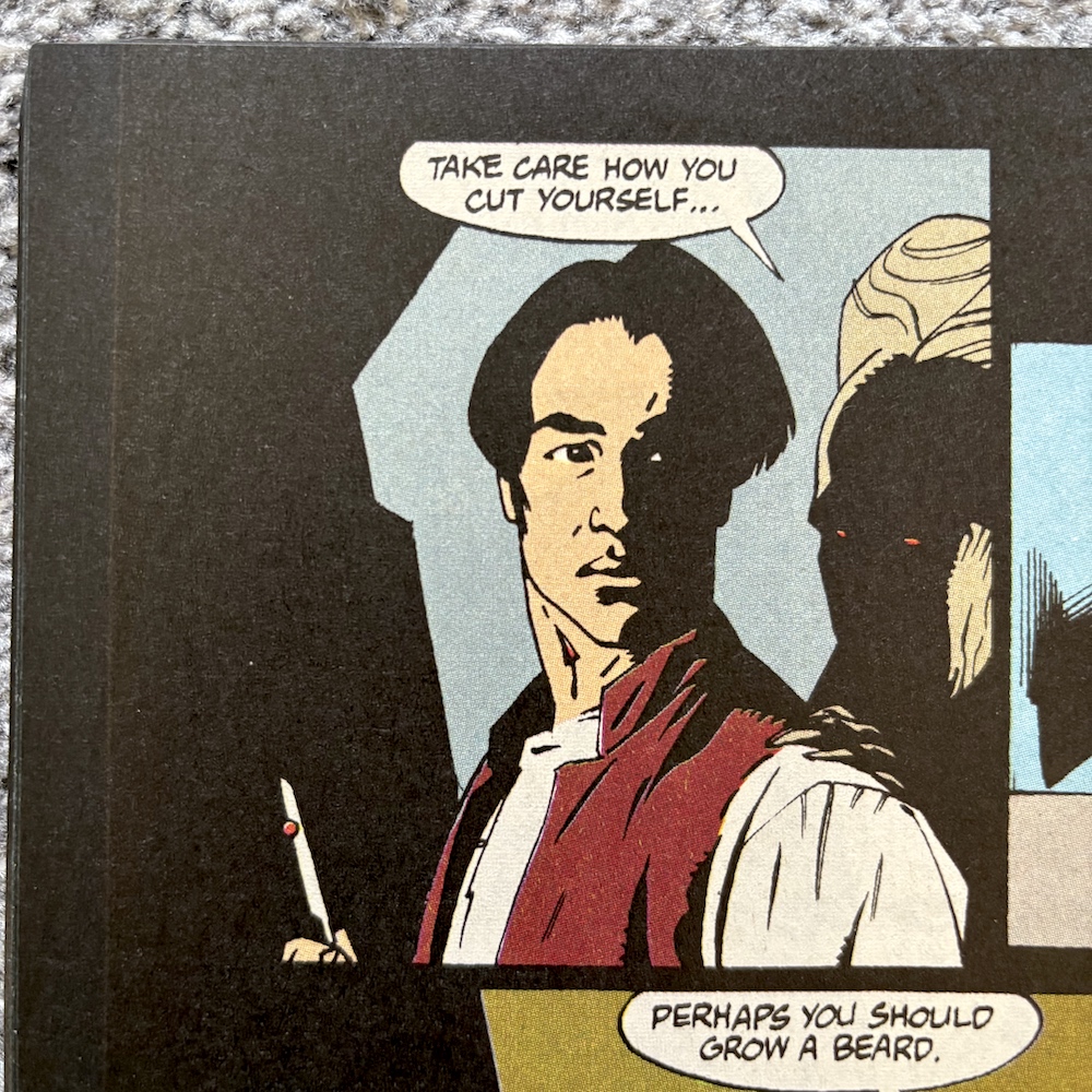
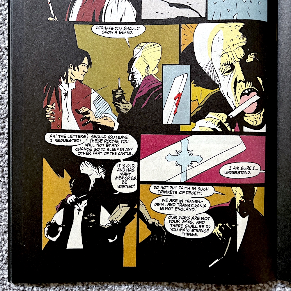
I’m going to assume once the main strip concludes we’ll no longer have these characterful introductions so I’m enjoying them while they last. The final chapter begins with a scene that simply can’t be conveyed properly through still images, that of Anthony Hopkins devouring his food in the English pub like a savage. The result is a much more restrained version of the character, which is unfortunate.
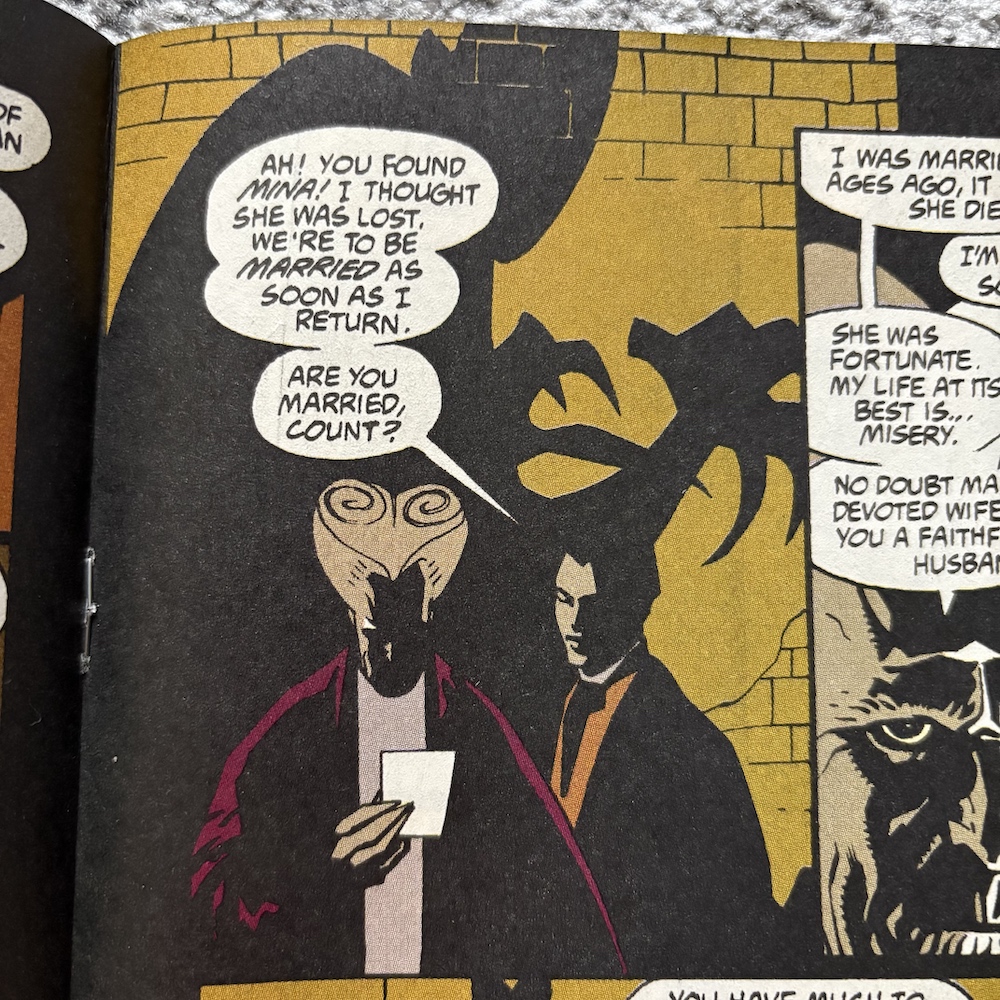
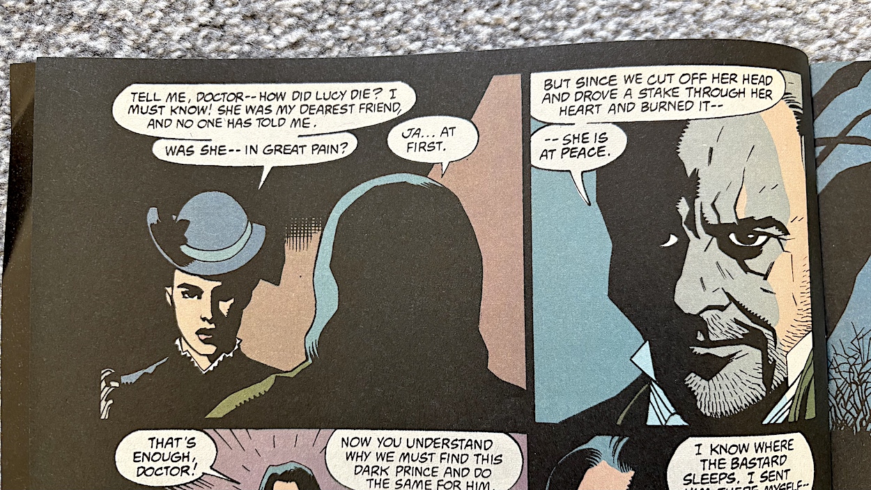
In fact, I realise this has been the main problem for writer Roy Thomas all this time. It’s just impossible to convey in a comic the wonderful acting choices the talented cast made throughout the movie. However, when we turn the page and Mina questions him on how her best friend Lucy died, we do get one of the film’s rare comedic moments still intact. Darkly comedic of course. Very darkly comedic.
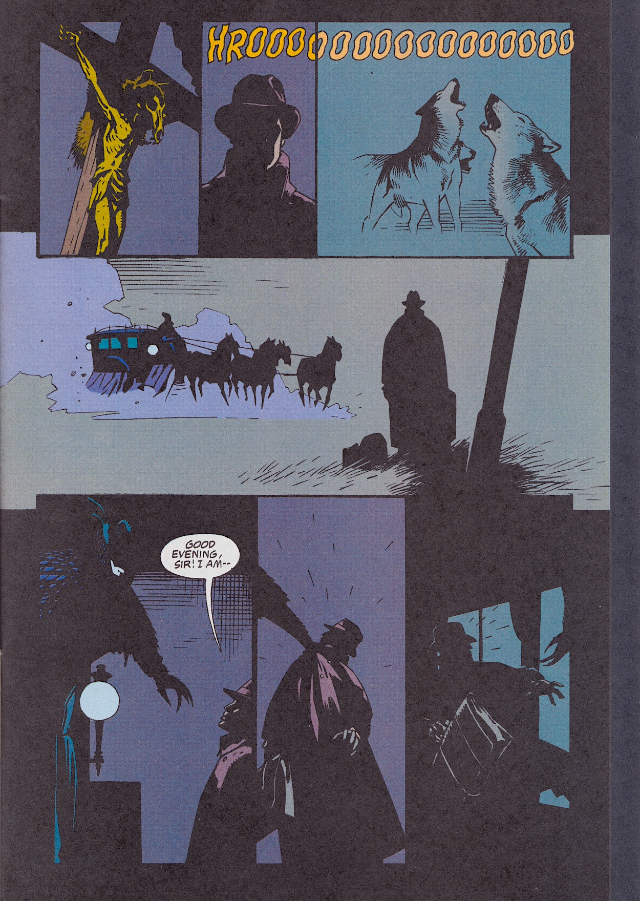
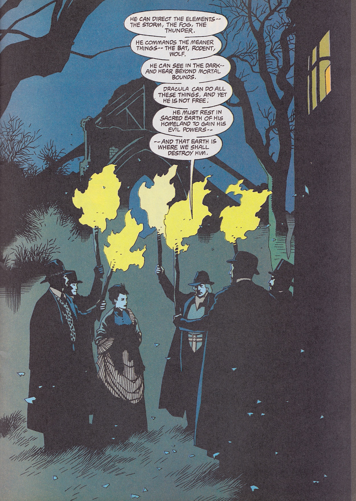
This chapter includes the burning of the boxes containing Transylvanian soil Dracula had moved to his newly purchased, abandoned Abbey. It includes all of the ancient text, the Latin words spoken by Van Helsing to cleanse the place of evil. But more interestingly for me is the beginning of this scene with the rules of the vampire set out. They were a world apart from the clichéd rules we’d become used to from decades of other movies and TV shows.
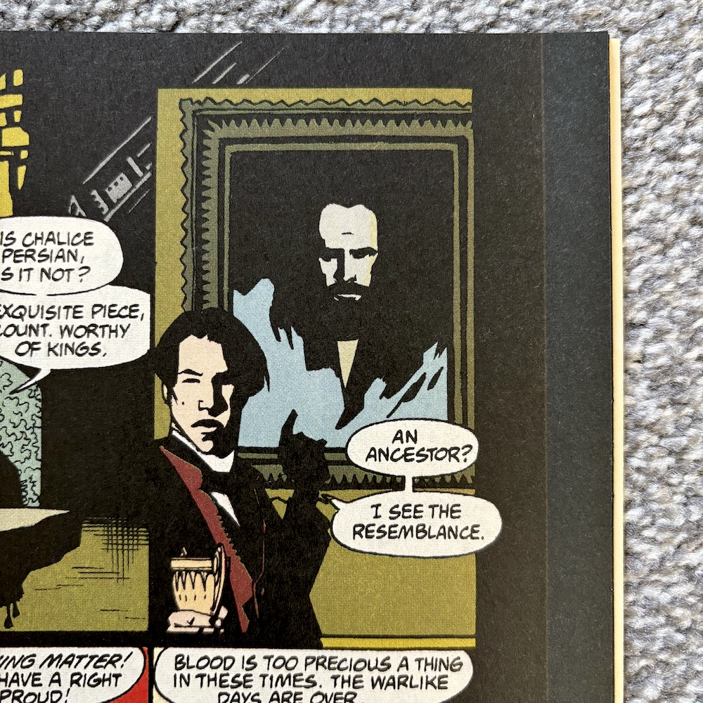
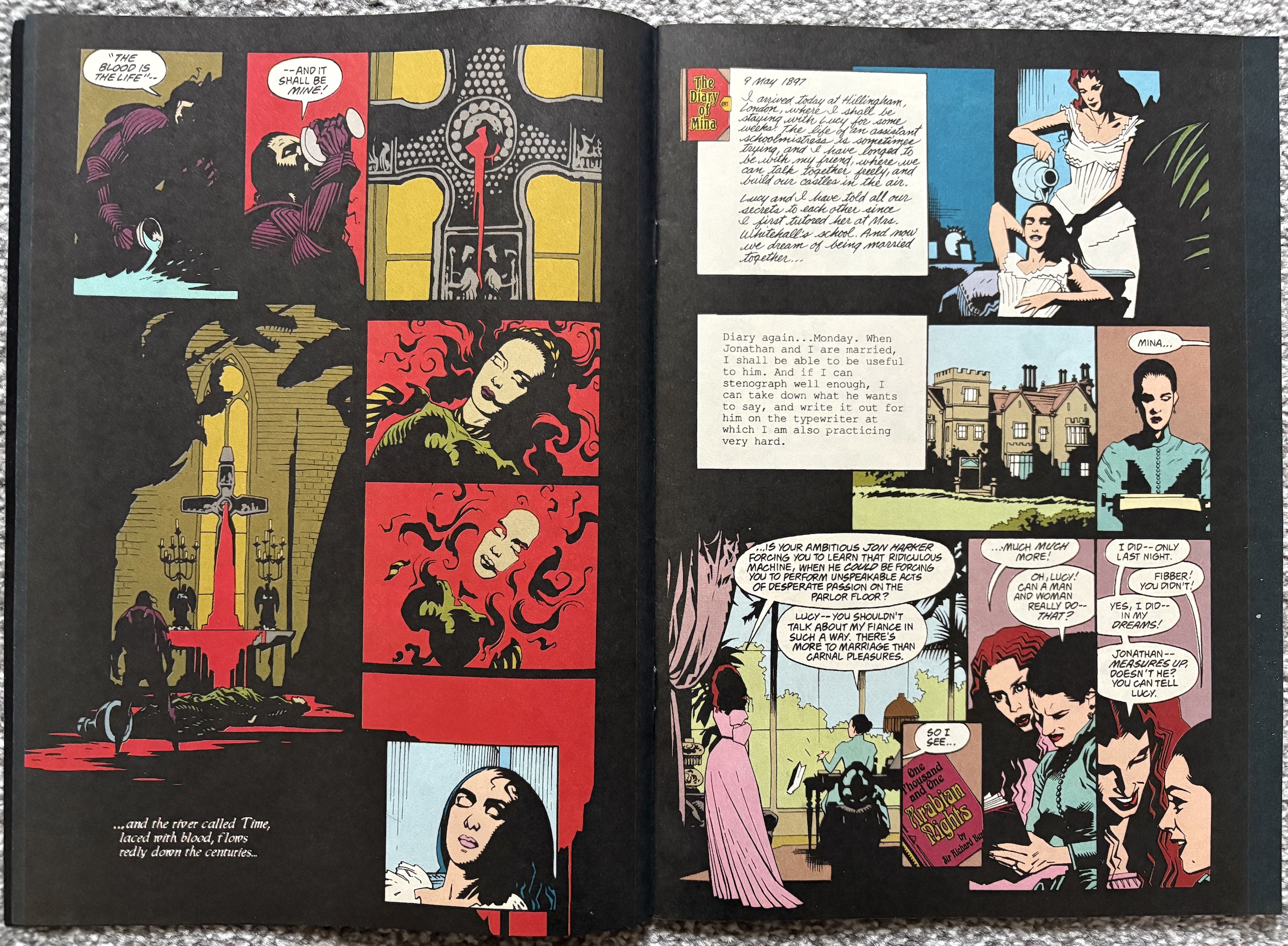
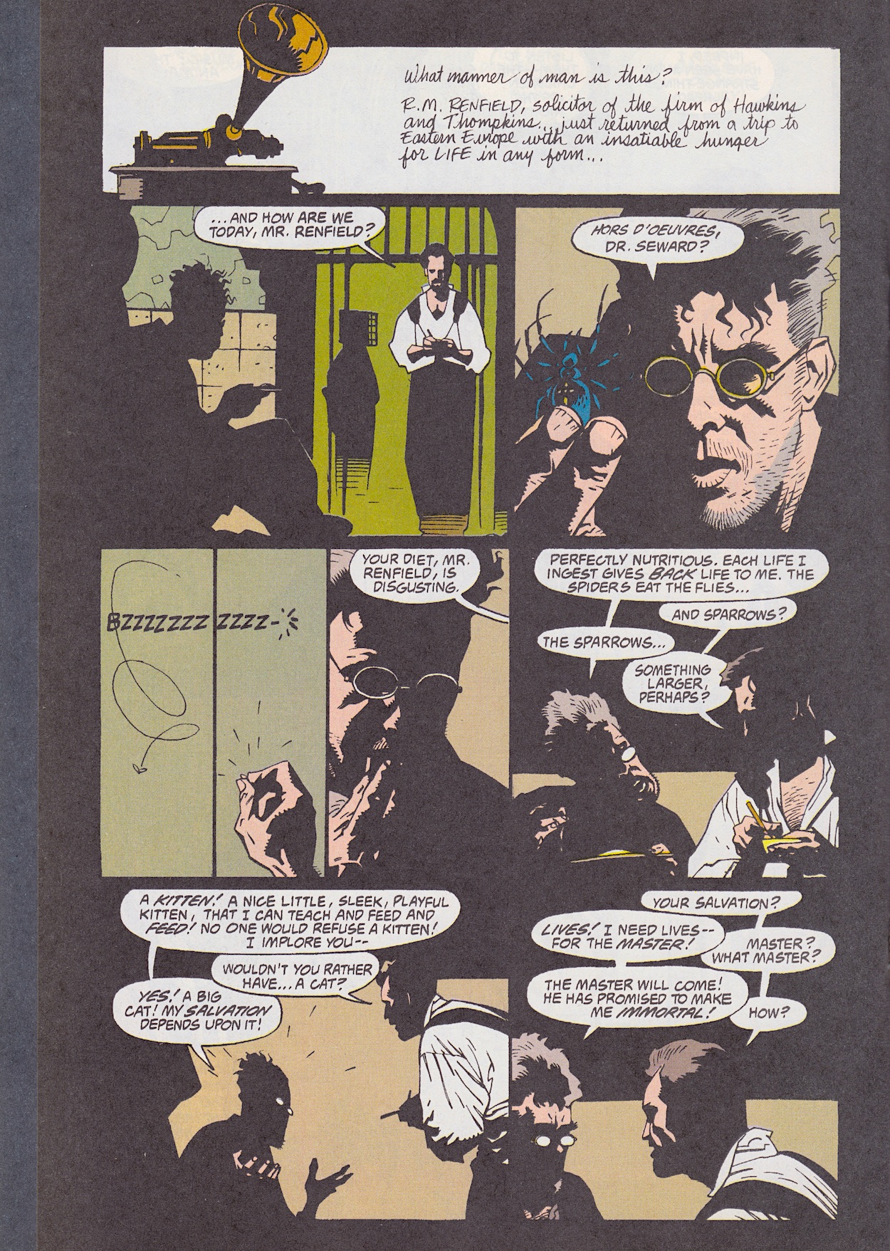
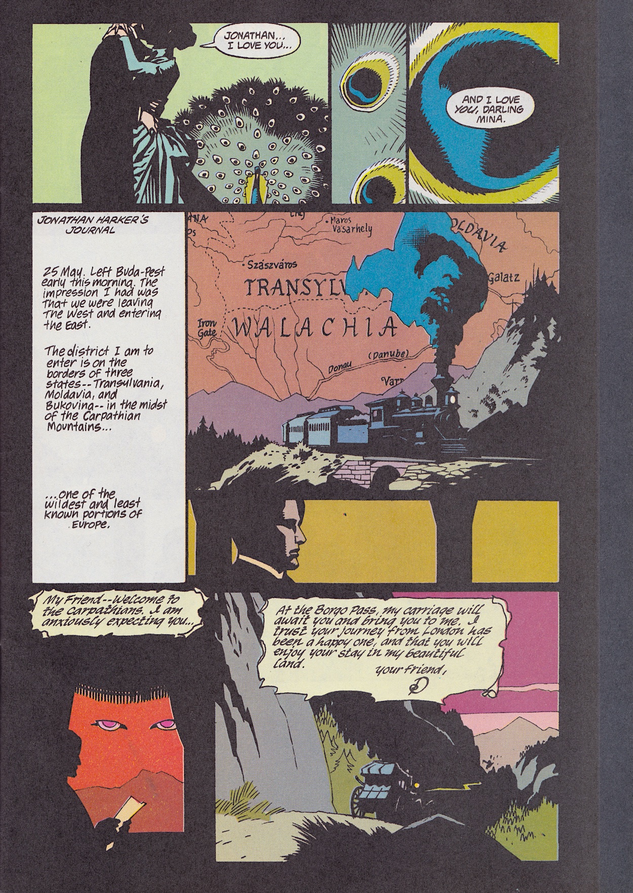
Alongside the death of Renfield the main bulk here is dedicated to Mina deciding to join her beloved Count in eternal life. While it’d be impossible to convey how surprisingly touching this scene was (especially given what it was about!) thanks to the excellent performances of Gary Oldman and Winona Ryder, penciller Mike, inker John Nyberg and colourist Mark Chiarello (alongside letterer John Costanza) do an excellent job of portraying their intimacy in what’s actually a shocking moment. For an adaptation of this movie it’s perfect.
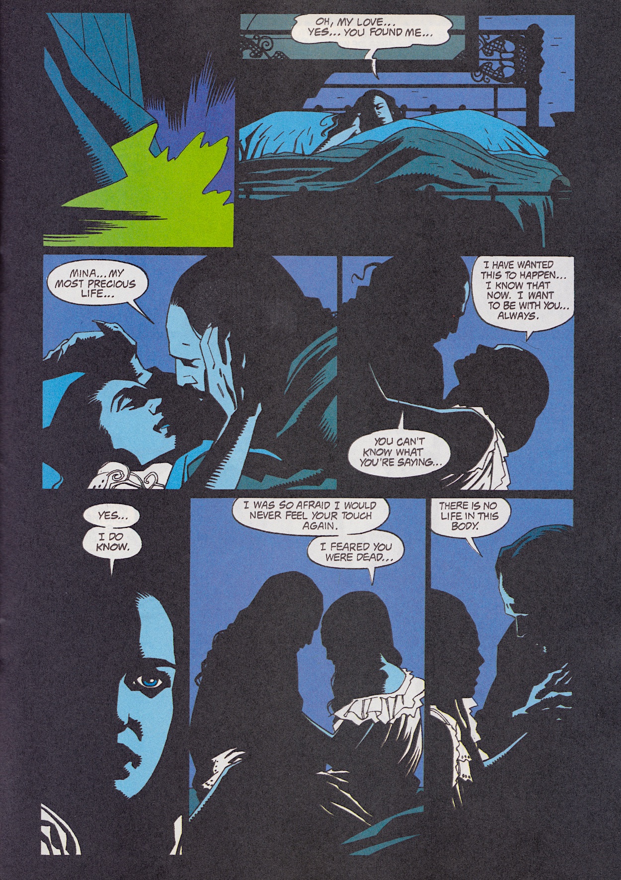
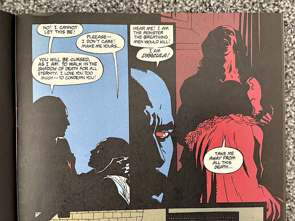
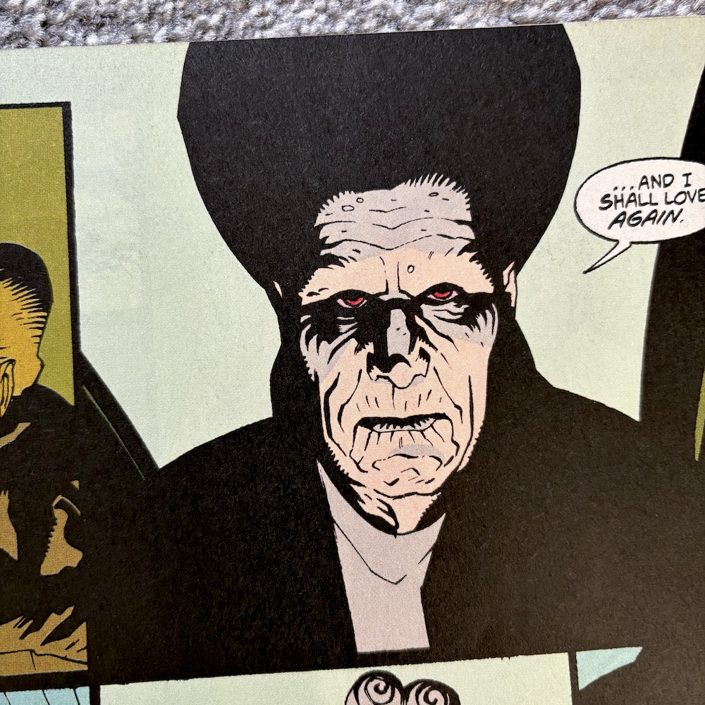
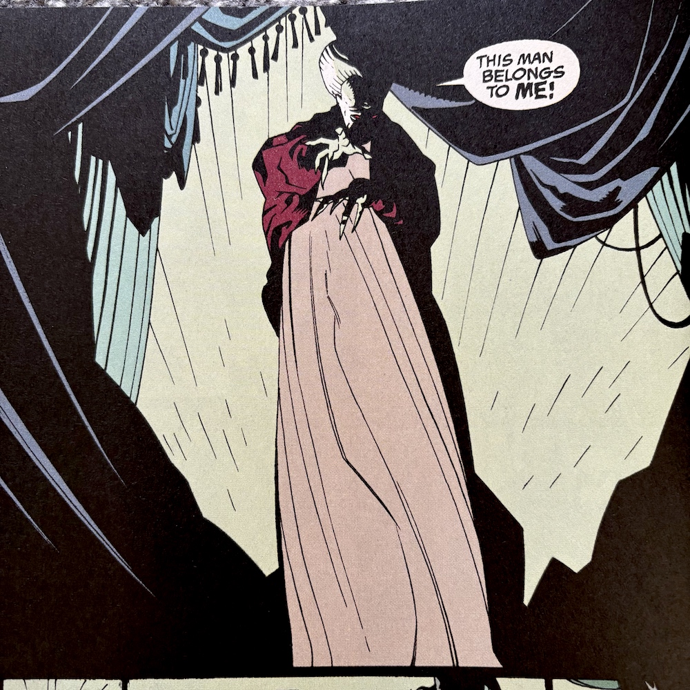
The iconic moment of Dracula using one of his nails to slice across his chest, drawing blood for Mina to drink, is presented in a similar fashion. Then the colours are shifted for one panel to highlight the key moment. After two pages of blue this really stands out. Then, interrupted by Jonathan and Van Helsing, Dracula changes into his man bat form and reiterates his anger from the beginning of the film. I always found this the most fascinating and surprising part of the character; a devoted Christian who had sacrificed so much in the name of their God, the religion’s archaic beliefs and the selfish nature of its men betraying him.
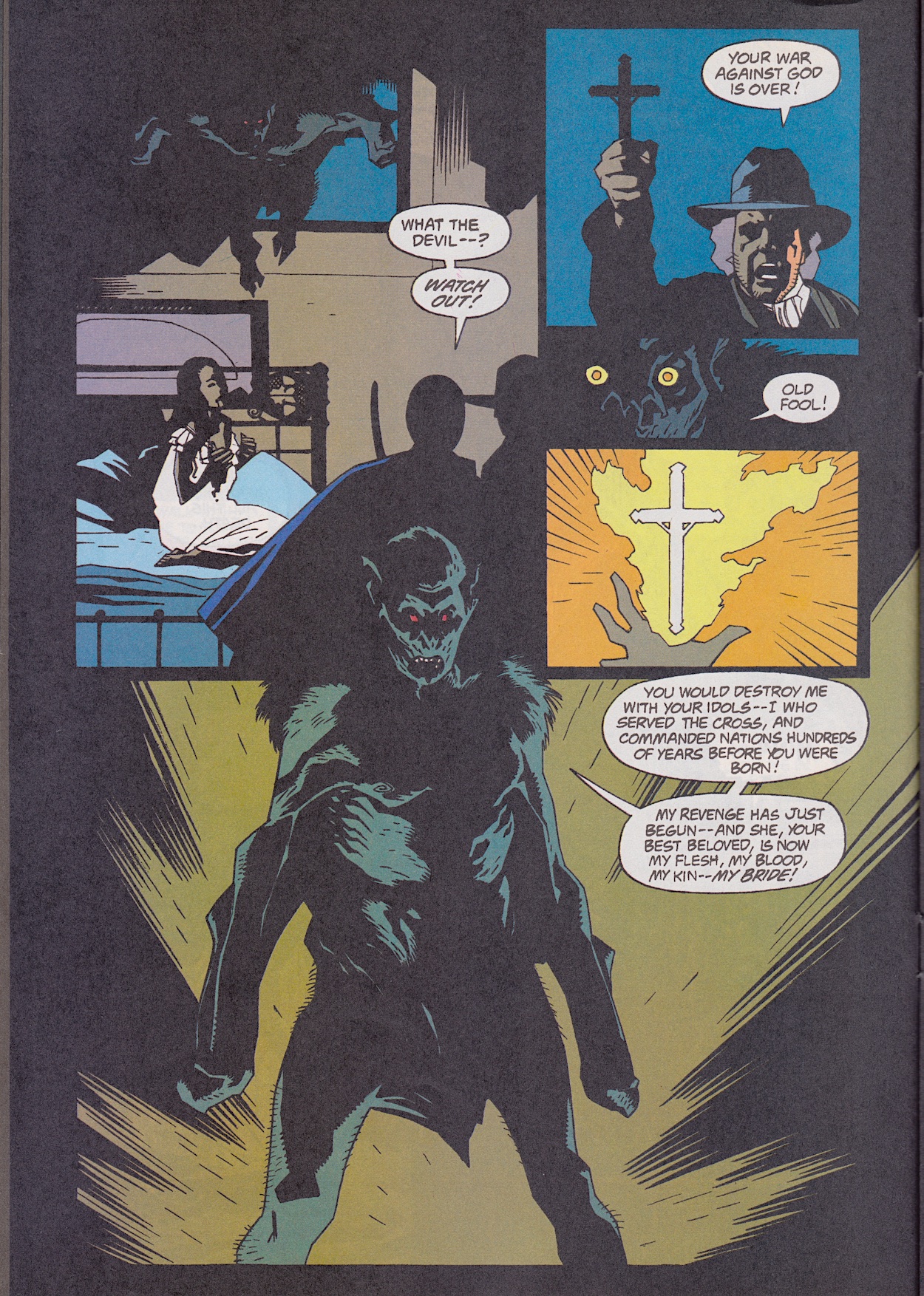
I never knew this side of the character from the Dracula films we saw growing up; he and Christianity are essentially two sides of the same coin. While the cross and Van Helsing’s devotion to the faith fight evil, Coppola’s film never let us forget whose fault this was in the first place, why Vlad became what he did. On the flip side, he’s obviously a monster and a mass murderer but we never forget why this happened to him. The film perfectly balances this to such a degree that we’re both horrified and emotionally moved by him.
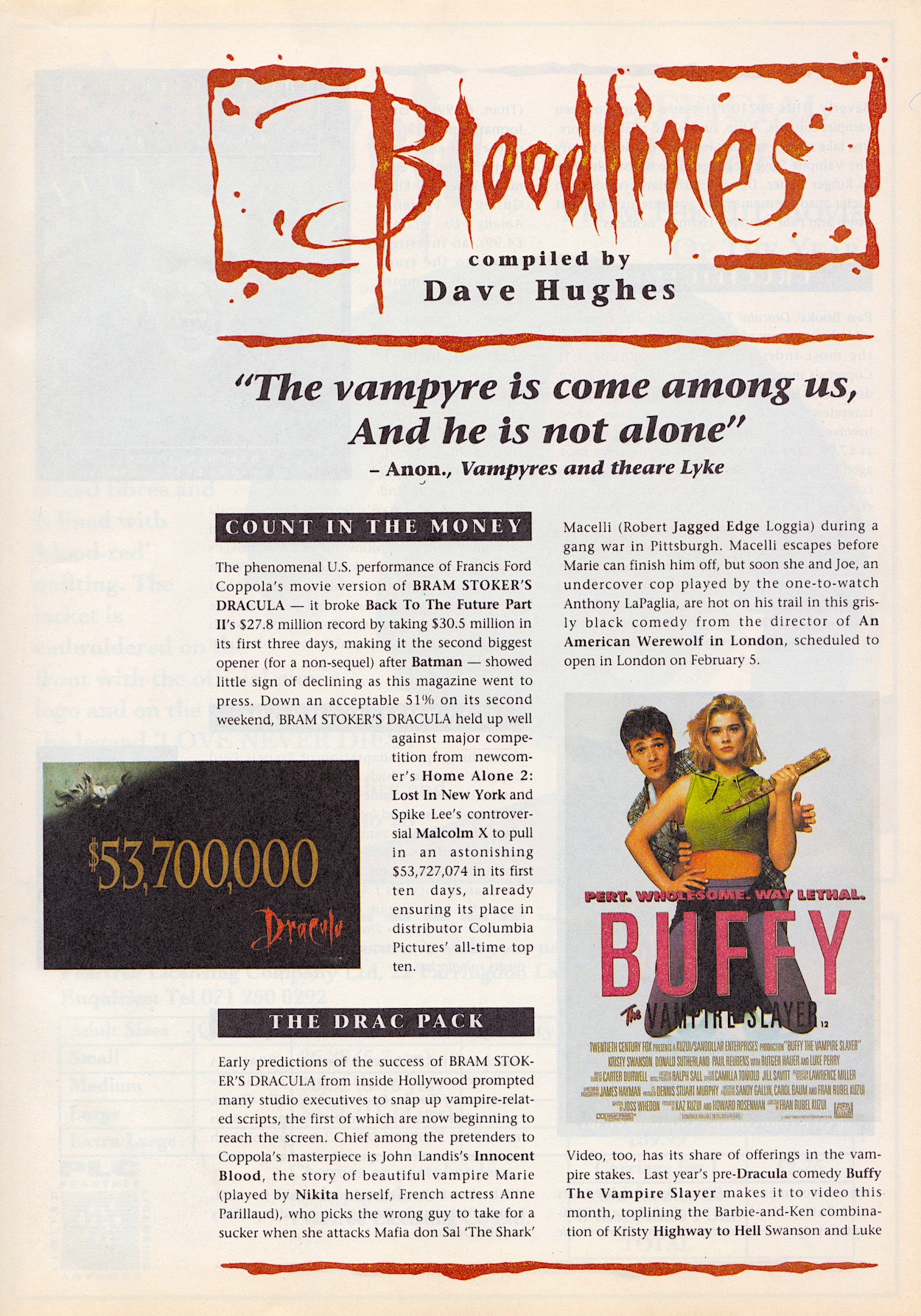
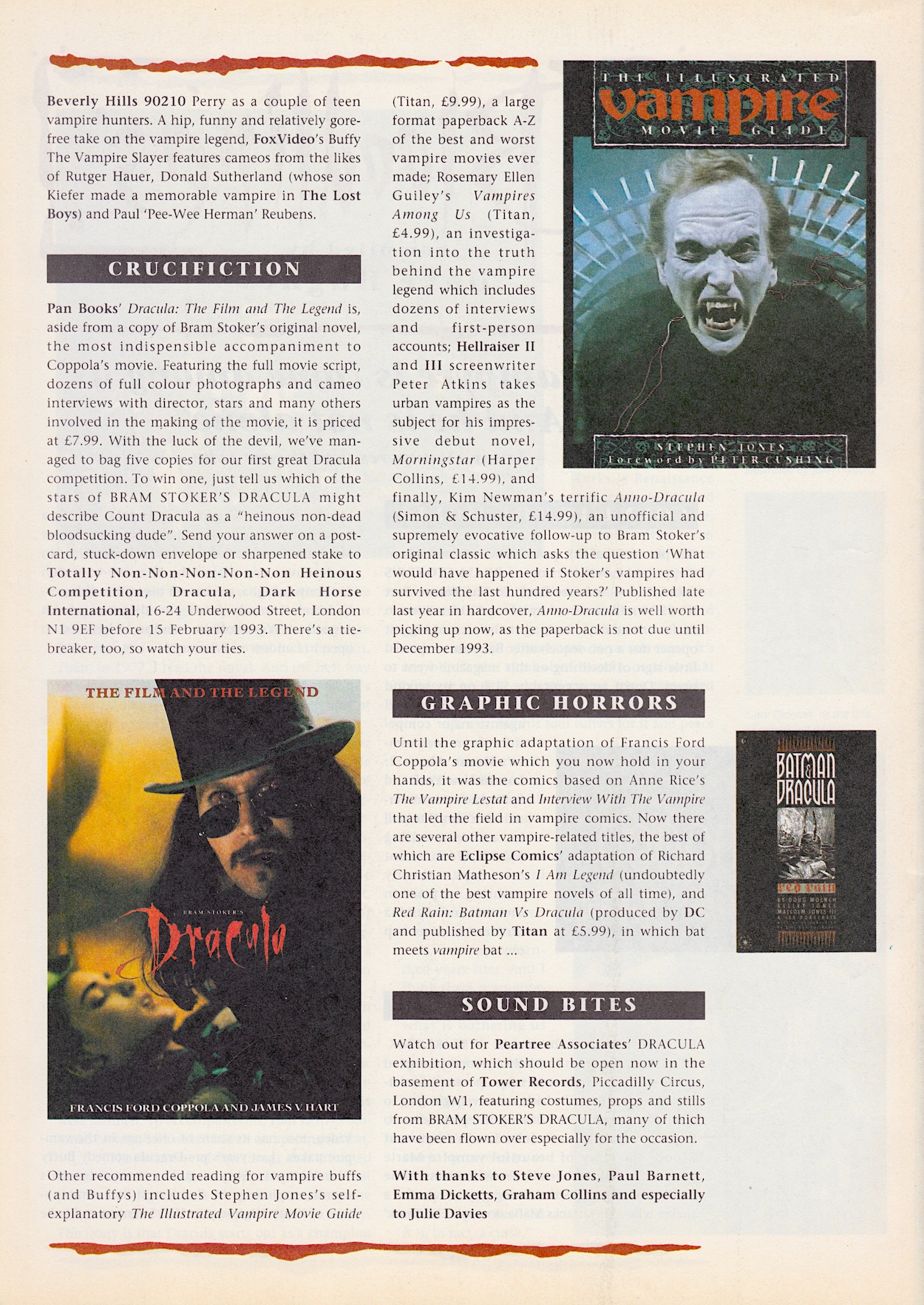
In the middle of the issue is Bloodlines by Dave Hughes, the usual two-page news section about all things vampiric in the world of 90s entertainment. Dracula’s Oscar nominations are mentioned and, while I could easily look up who did and did not win, I’m going to wait and let the comic tell me, just as readers at the time had to. I’m looking forward to finding out, though.
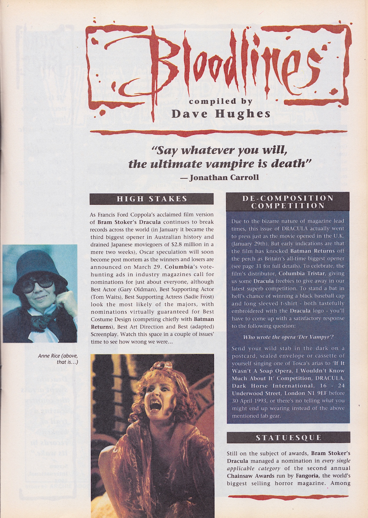
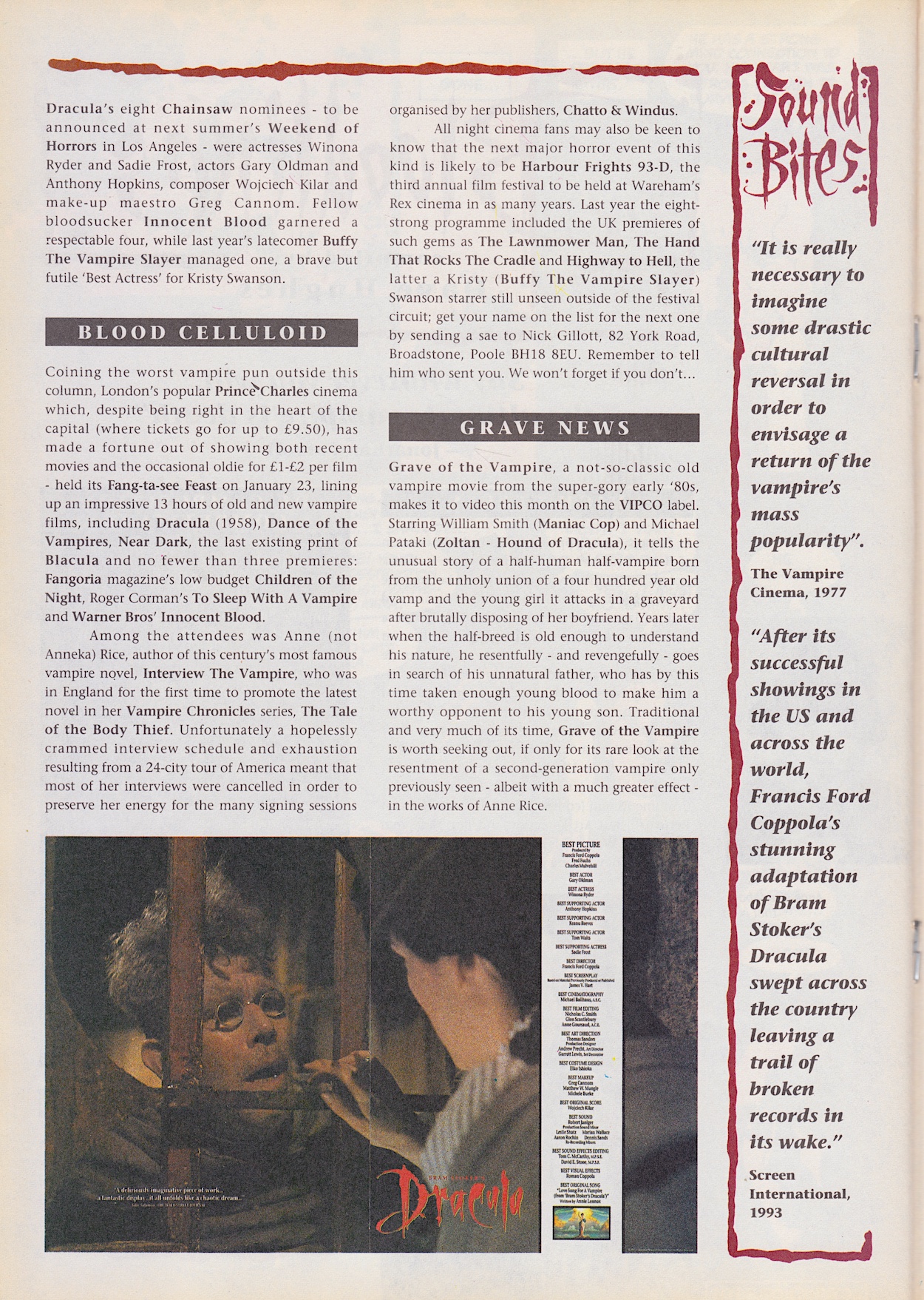
The competition informs us of the insane lead time needed when working on the comic, the Sound Bites are actually interesting this month with their comparison between 1977 (the year I was born, funnily enough) and 1993 in respect to thoughts about vampire films, and there’s mention of all-night events at the cinema. Personally, I found watching Terminator 1, 2 and Genisys back-to-back in a cinema long enough, never mind a whole night! (Especially given how that place smelled by the end.)
I have to say the choice of image for the award nominations as presented by Columbia Pictures is a strange one. To anyone not familiar with the film they could easy assume Tom Waits was playing the lead character. Then opposite this always-fun news feature is the first page of our black-and-white back up and I breathed a sigh when I saw it. Not of relief, but of disappointment and pessimism.
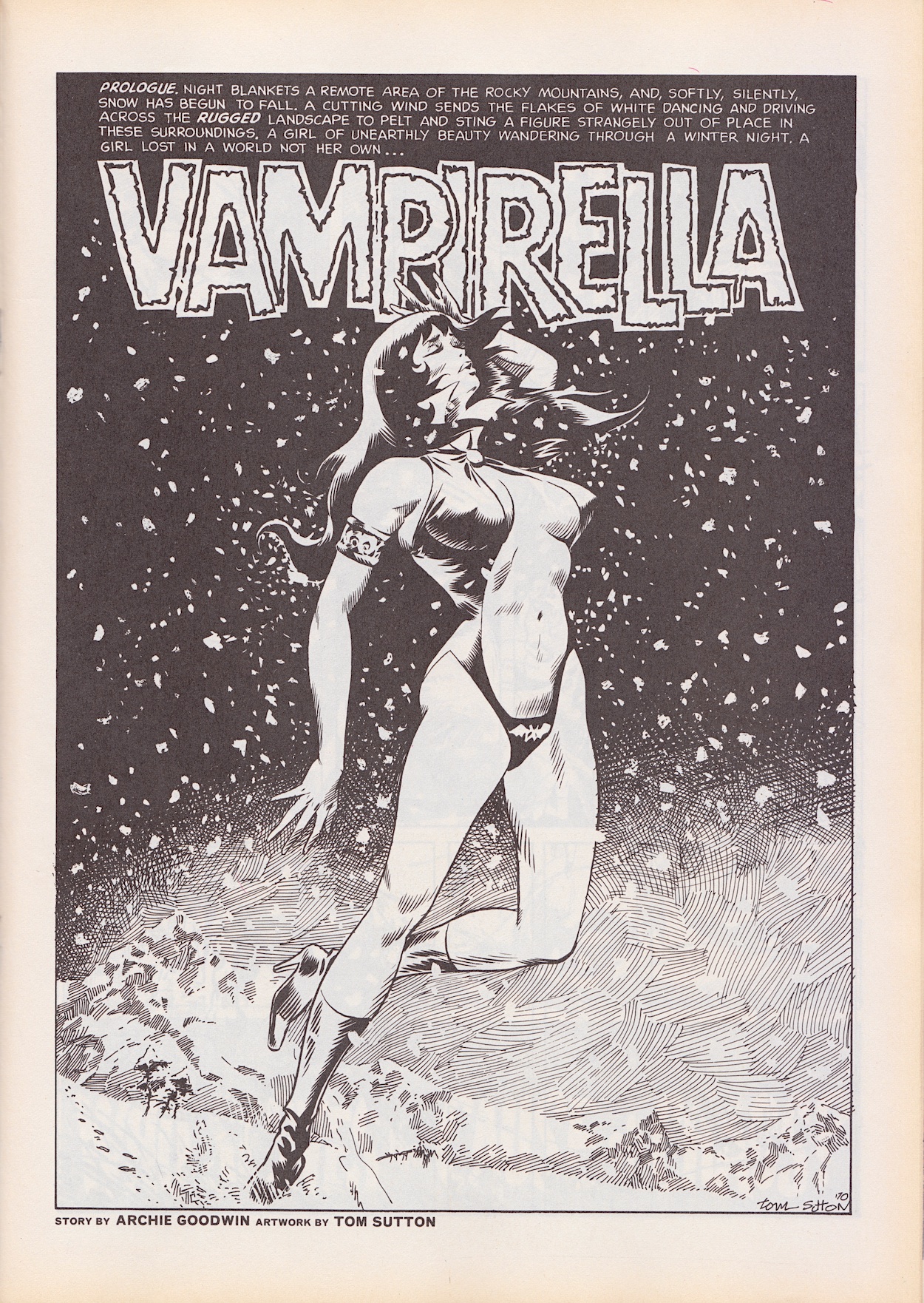
Over the years I’ve seen Vampirella comics advertised here and there and even as an impressionable teenage boy I always felt her clothing (or lack of) was shamelessly gratuitous. Not that I would’ve used those words as a teenager! As an adult I think she always looked like she was there to appeal to a certain type of male reader, of which I am not. So while researching for this review it was a shock to find out she was co-created by a woman.
Trina Robbins did so much fantastic work to raise the profile of women in comics that I’m rethinking my assumptions about this character
Vampirella was created by Forrest J. Ackerman (literary agent, actor, editor) and Trina Robbins (Wonder Woman, Strip AIDS, GoGirl!) in 1969. Trina did so much fantastic work to raise the profile of women in comics throughout her life I’m rethinking my assumptions about this character. In fact, it was Trina who designed her look. Editor Archie Goodwin then continued to write and develop her.
While the issue gives no official introduction other than the cover headline, there’s a brief history of the character in the strip. So, Earth’s vampires originate from Dracula, a forgotten member of the Vampiri race who left his homeworld (Drakulon) centuries ago only to be corrupted by the demonic entity known as Chaos. Vampirella is the last of her race who came to our planet after her own died out. With no other choice, she has to feed on human blood. However, underneath she’s good so I’m assuming she attacks and drinks but does not kill. Even Dracula was originally peaceful in his story. I also assume the ridiculously revealing costume is how her race dress.
It’d be polite to say this story is “of its time”. While Trina co-created her, this particular story (of which she was not involved in) feels very much like a strip written by men for men. Rescued from the cold by a doctor running a remote retreat for the rich, he’s amputated her apparently rotting wings and is clearly lusting after her, despite an angry nurse claiming he must keep his distance from Vampirella while dangling a satanic-looking necklace.
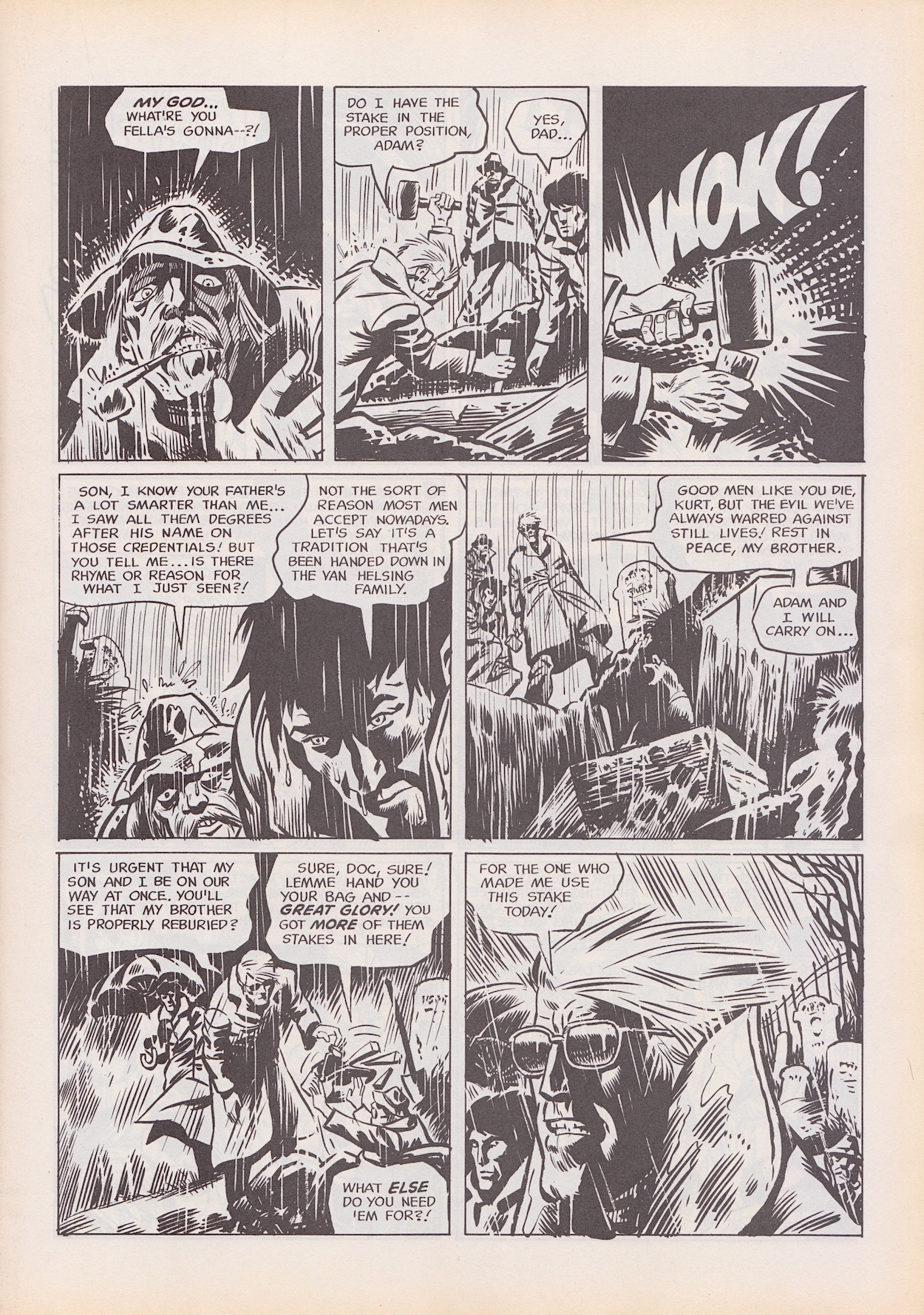
The best part is a graveyard scene depicting a descendent of Van Helsing‘s digging up bodies to ram stakes through their hearts. This might explain why this story has been chosen as a back up and it’s an interesting segue, but in the main I’m disappointed with our main character. She’s scared of the doctor, terrified even, and for most of the strip is portrayed as having a strong will to resist whatever drugs she’s on. She’s piecing together the mystery of what’s going on but then suddenly she’s snogging the man after a simple slug of his blood.
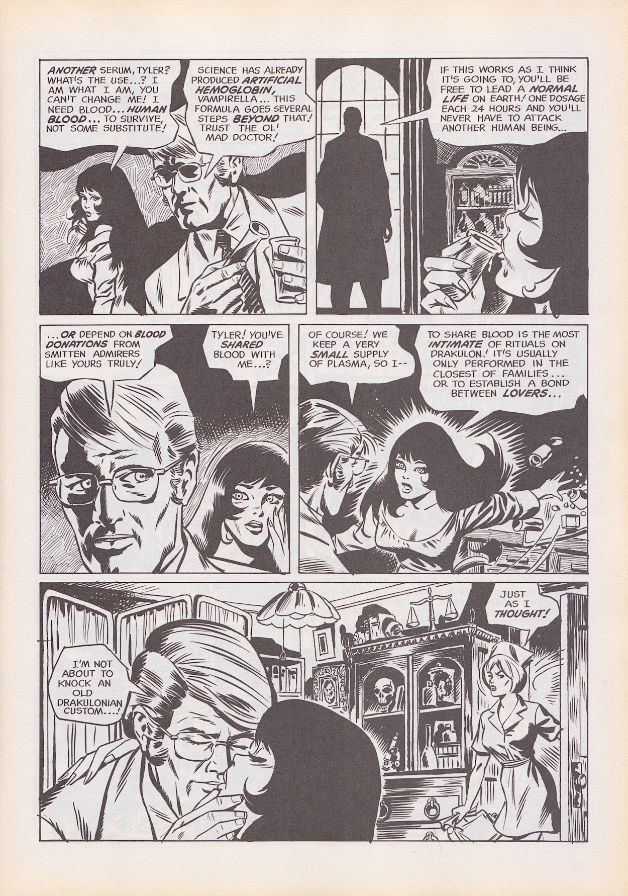
The strip is from 1970 so it’s very much from a time when a strong female lead character was rare. In fact, that was still a rare thing when Barrie Tomlinson created Kitten Magee in Wildcat comic in the late 1980s! But this was the 70s, so apparently a strong female character still had to be dressed to appeal to men’s baser instincts and fall for the man full of red flags at the drop of a hat. This doesn’t read well today.
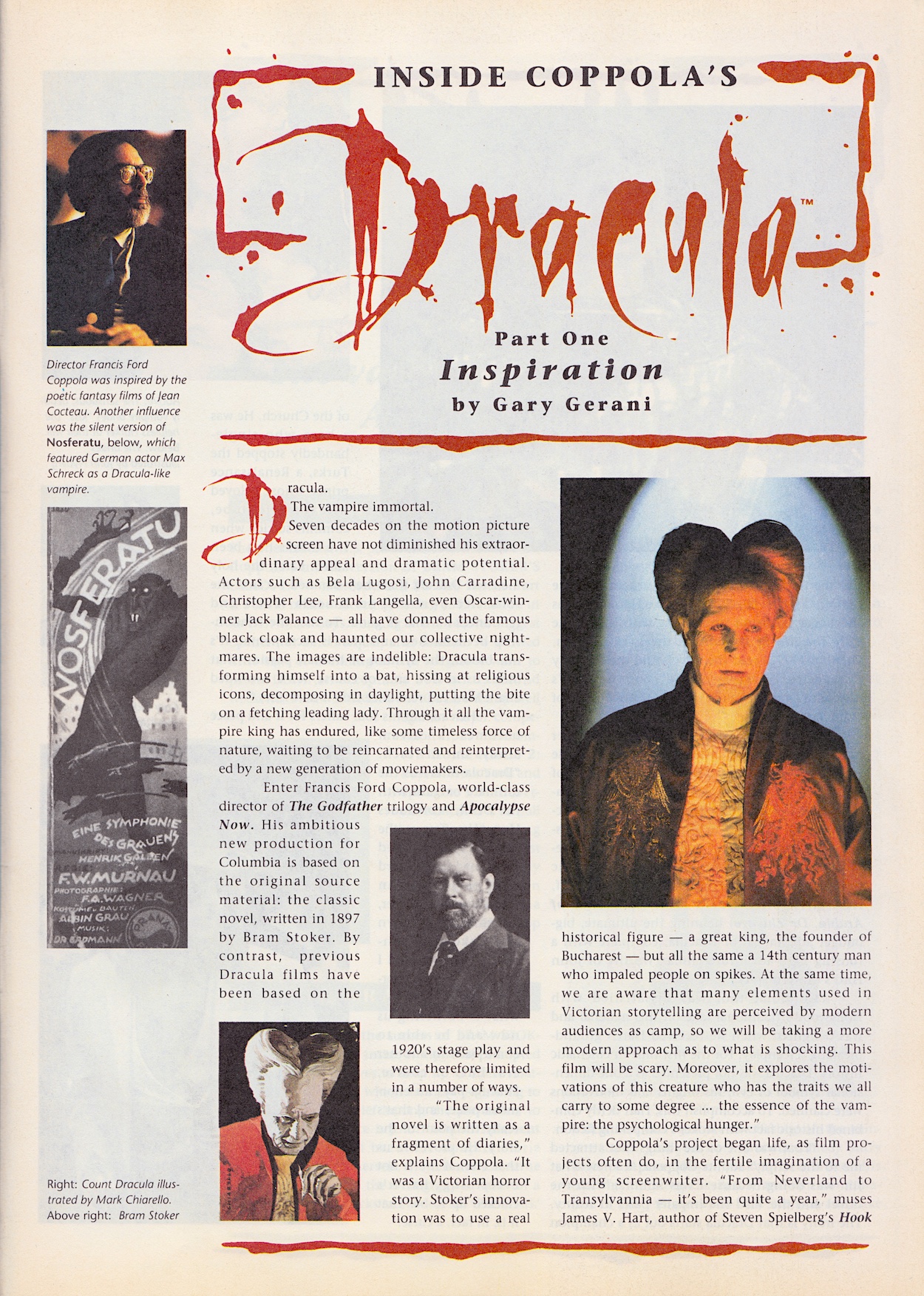
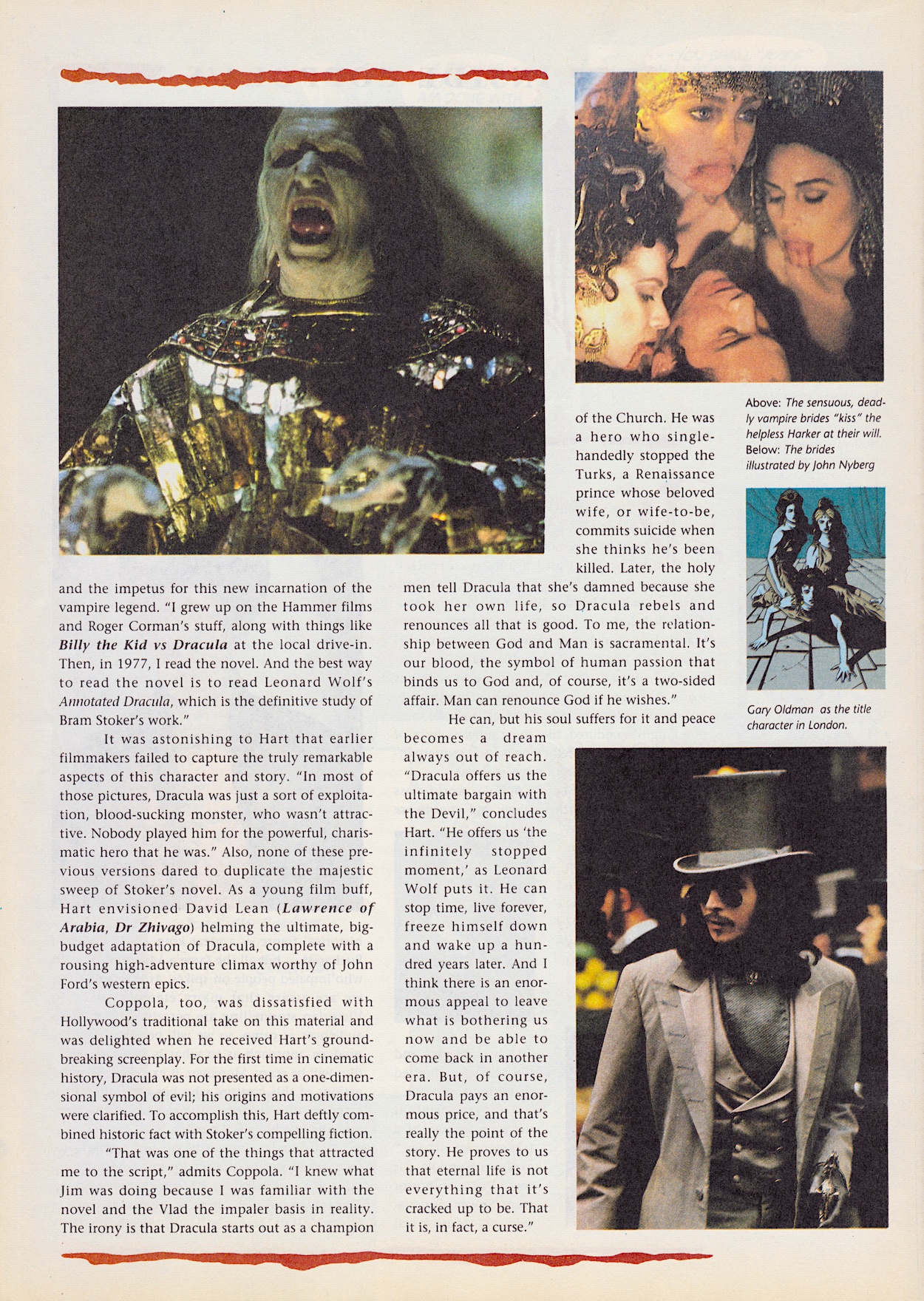
Back to the comic’s title character and the Inside Dracula making-of series by Gary Gerani and Dave Hughes is only one page this month, possibly to spread the final part over two issues just like the strip. A piece about Salem’s Lot by Seamus Ryan is the random substitute for one page, in which he discusses its vastly different cuts. Disappointingly, there’s still no sign of the promised Sadie Frost interview and by this point I’m just going to assume it’s not going to appear.
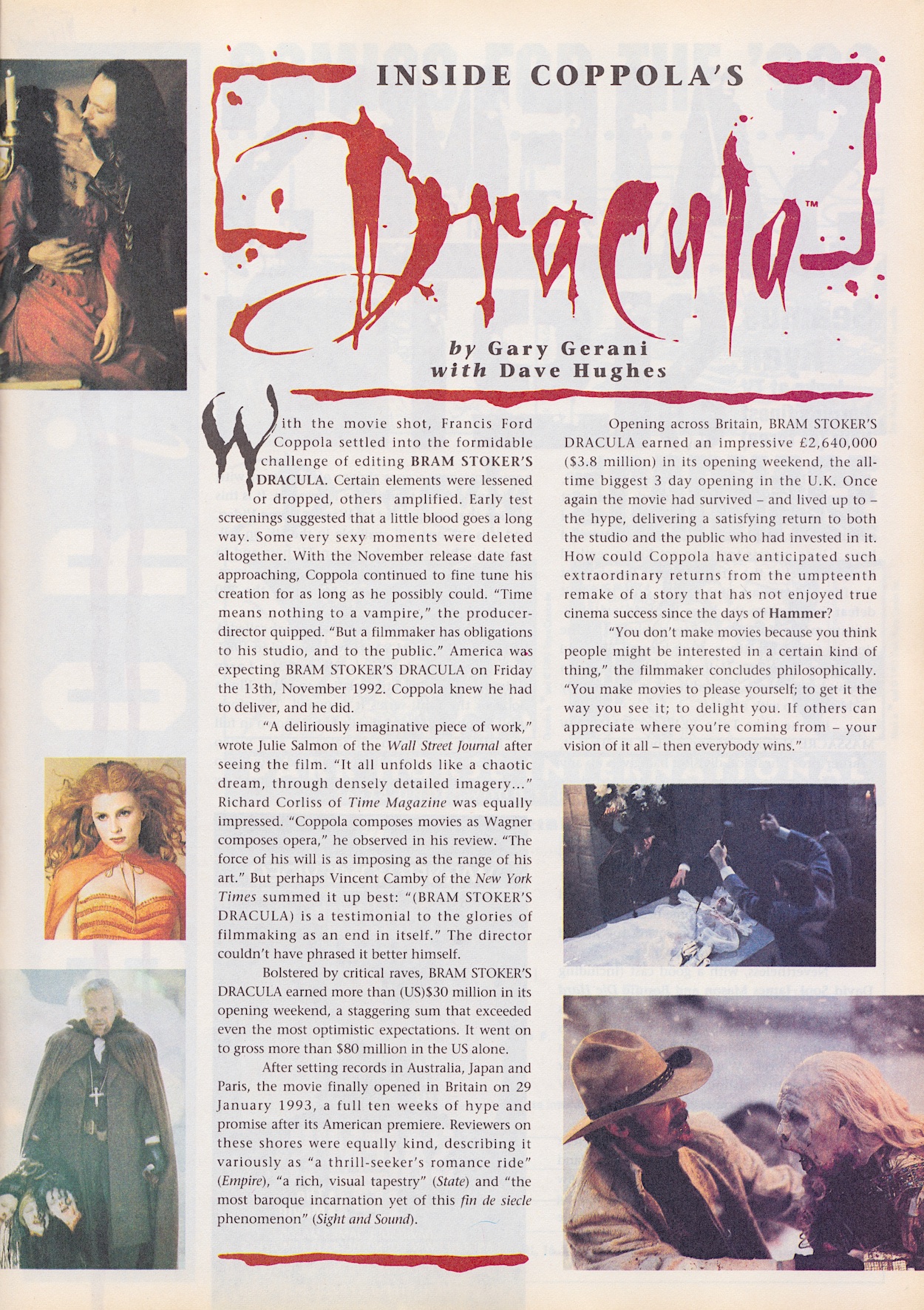
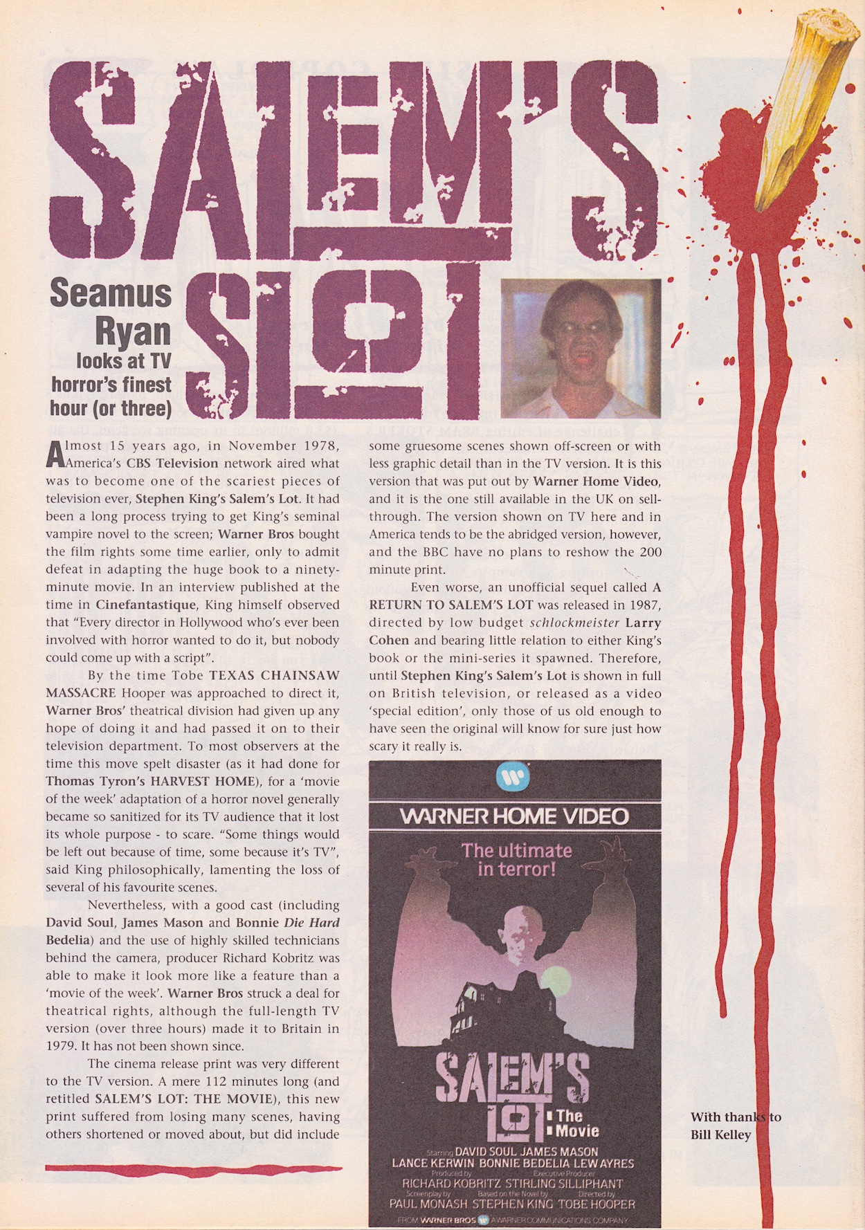
The mention of deleted scenes reminded me I still hadn’t checked them out so I got my Apple TV on and watched them today. I like making-of features but usually skip deleted scenes (they’ve been deleted for a reason). After watching them for Dracula I can still say the only exception are the ones from The Lost World: Jurassic Park, which I’d love to see added back in to that movie. Oh, and Dracula’s final box office? On a budget of $40,000,000 it raked in a superb $215,862,692 according to Box Office Mojo. Superb! And well deserved!
The final paragraph of director Francis Ford Coppola’s view on why he makes movies reminds me of why I write. So it feels like a fitting note to end the review on. I’m intrigued to find out what direction the comic is headed in and look forward to the art depicting the movie’s climax in just three weeks, on Sunday 13th April 2025.


