Category Archives: Merchandise

ALiENS VS PREDATOR ON GAMEBOY: A HANDHELD HORROR

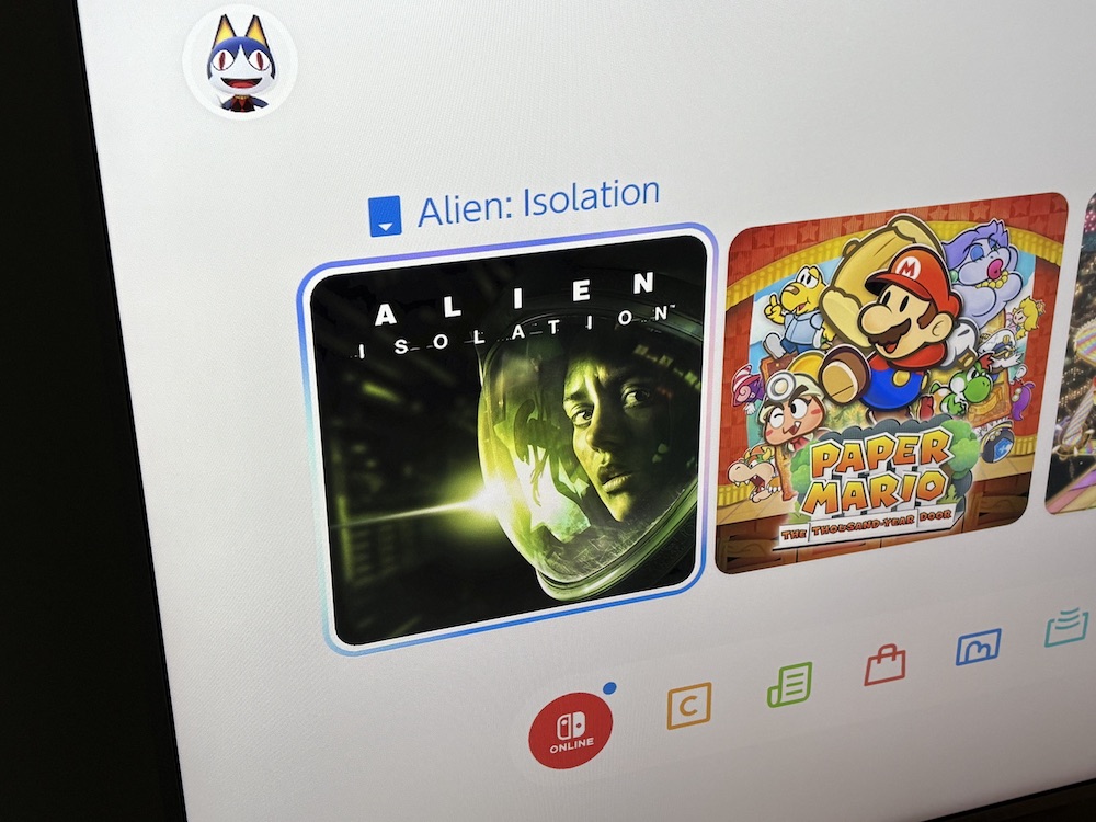
A couple of years ago I bought the Alien: Isolation game for my Nintendo Switch after some friends had described just how terrifying they’d found it. They weren’t wrong. I could only play it for about an hour at a time; my heart couldn’t take any more in one sitting. Then again, playing it late at night in the dark with surround headphones on probably didn’t help.

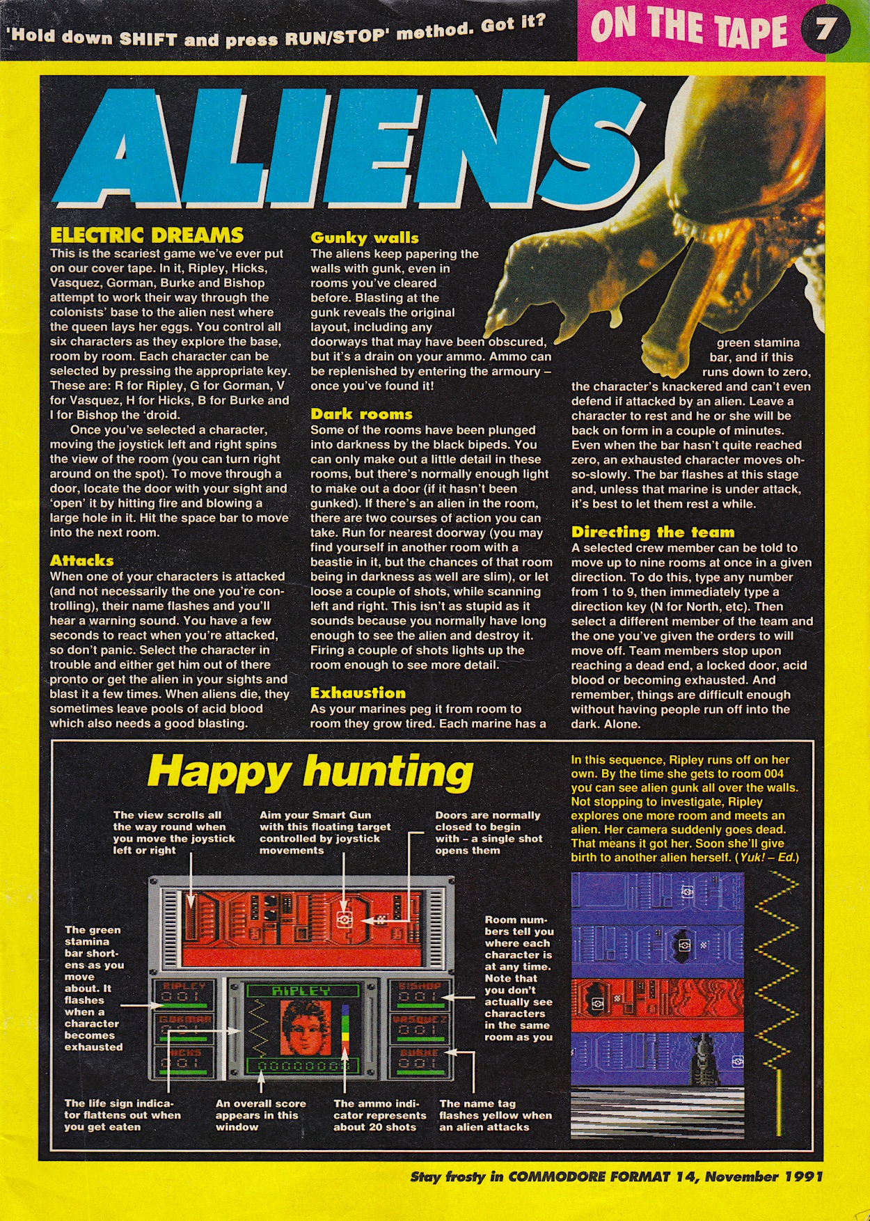
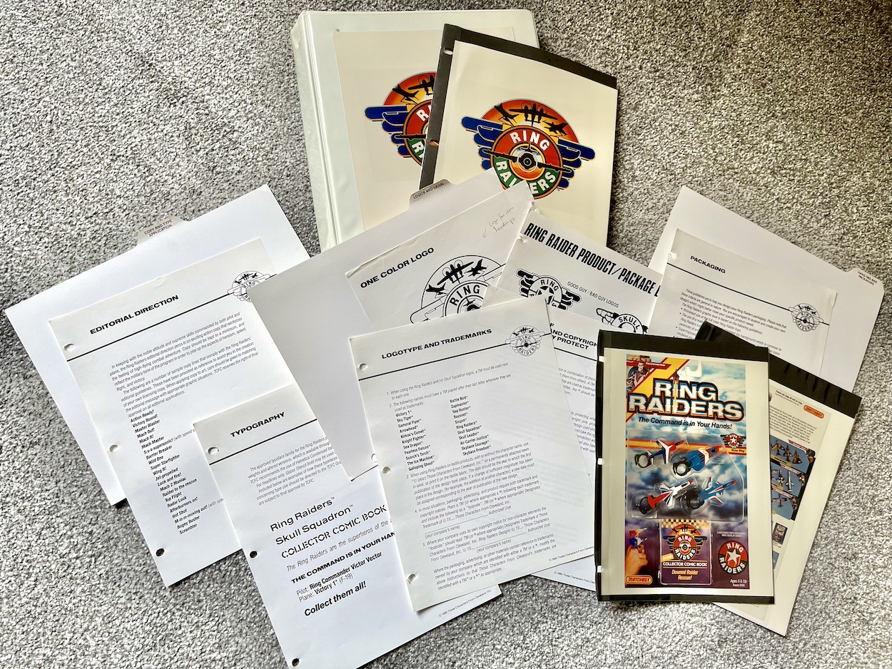
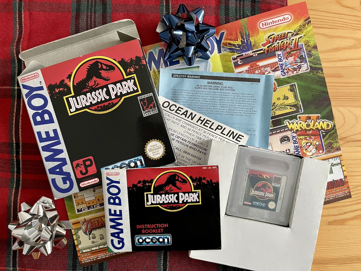
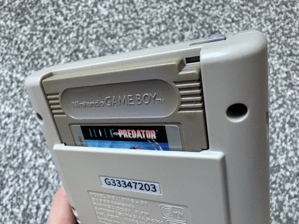
Back in 1991 my first edition of Commodore Format included the UK version of the C64’s Aliens game on the cover tape. It’s very basic today but at the time its eerie atmosphere and sudden sound effects gave us the willies and jump scares aplenty. Now, I’ve added a game that lands somewhere in between the two time-wise to my growing Nintendo GameBoy collection (which began because of the Jurassic Park comic on this blog), Alien Vs Predator: The Last of his Clan from the 90s.

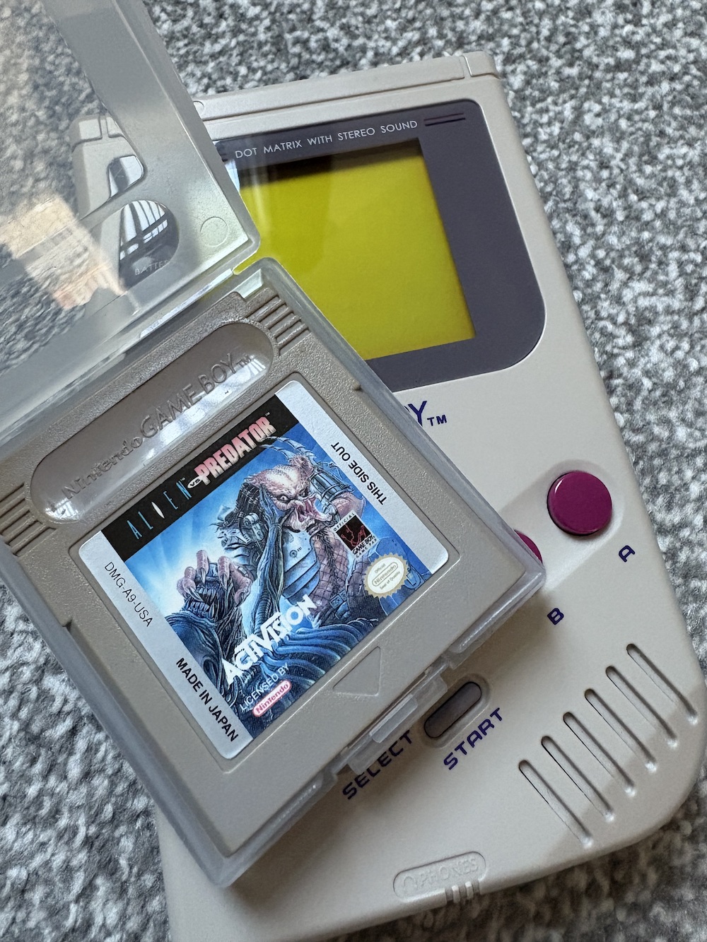
It’s the first game in my collection not to come with a box (because the cheapest complete set would’ve melted my debit card) so I had to download the manual from an online resource, but at least it’s still the original cartridge being played on an original machine, just like the rest. While I wasn’t expecting it to terrify me, the legacy of the 8-bit game I’d played decades before showed the potential of creating an atmosphere and using the player’s imagination against them.

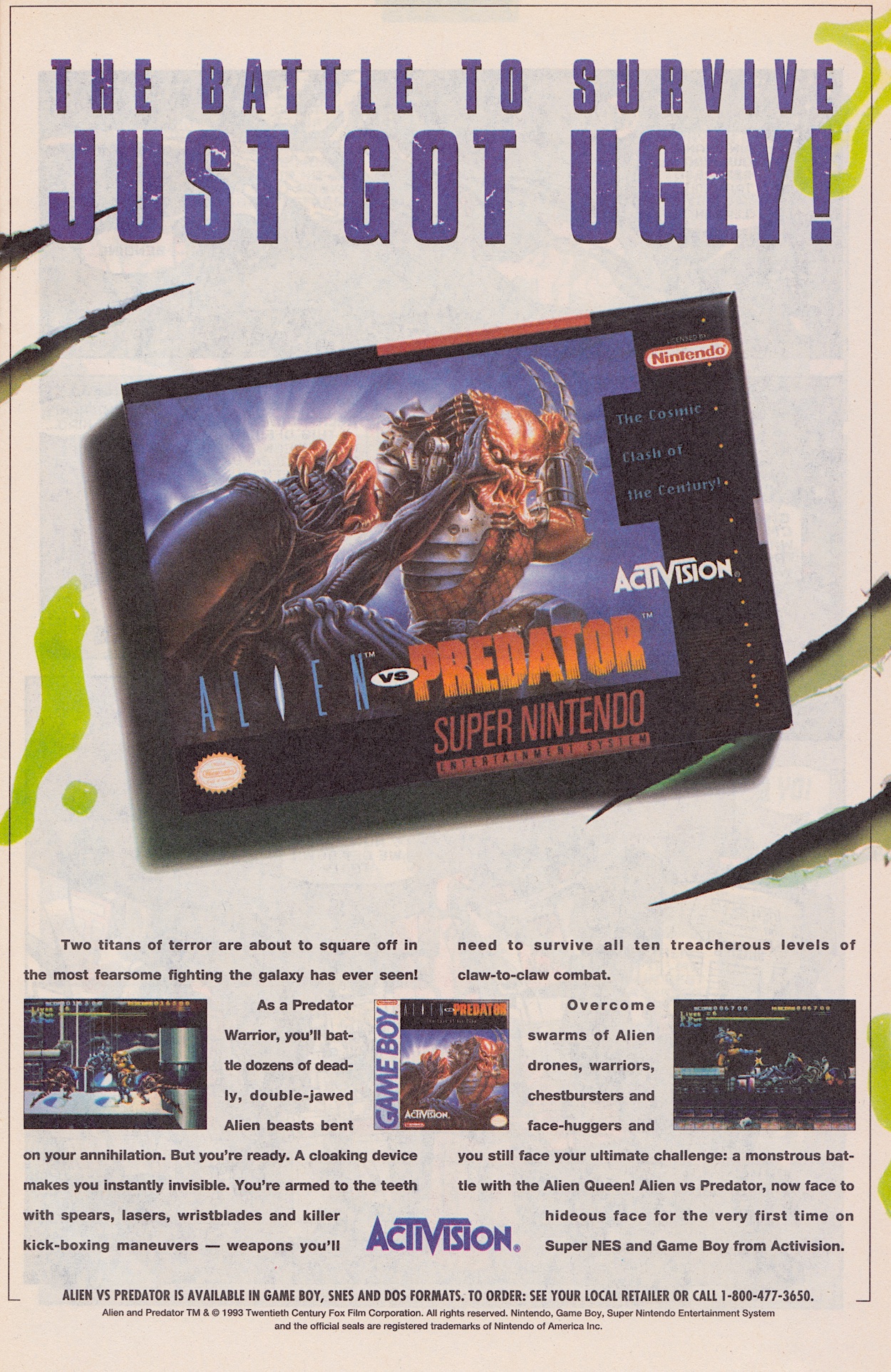
Unfortunately, what we have here is a by-the-numbers action platform game instead. The advert published in the pages of an issue of Transformers: Generation 2 alerted me to the game’s existence and I liked the sound of it from the description. What a shame then, despite the ad showing the GameBoy box, the description is for the Super Nintendo home console version which has received many positive reviews online. So what did I think of this version?

Let’s begin with the plot. While I say “plot”, it’s more like an excuse for the gameplay but I won’t hold that against it, that was something we were used to back then. Basically, in wanting the ultimate hunt the Predator race seeded a few alien eggs on a desolate world and completely underestimated the numbers they’d produce. Now, playing the lone surviving Predator you must infiltrate the alien hive and kill the Queen to avenge your tribe’s honour. You know, instead of just leaving.

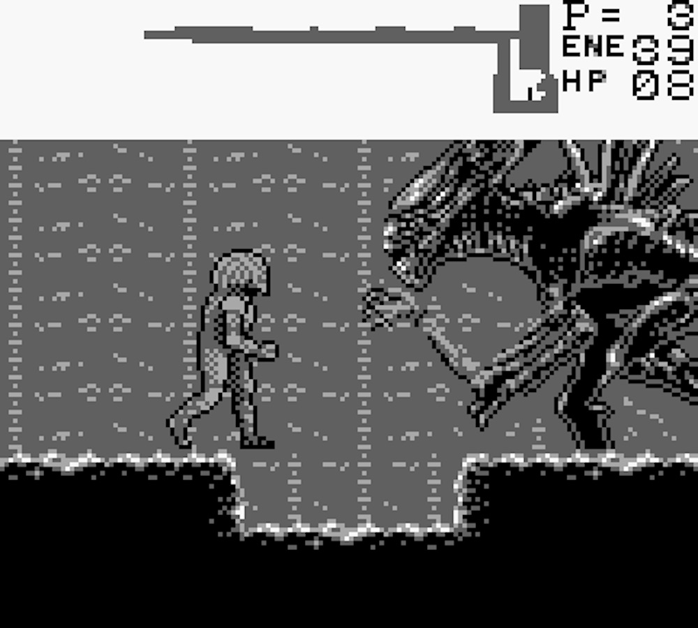
The first thing that struck me was the intricately detailed sprites of the Predator and the aliens. Or rather, alien in the singular sense as it’s the same sprite used for every xenomorph throughout. Not that it’s easy to make them out. While original GameBoy games did blur when scrolling, this one seems to do so way more than others, resulting in a right confusing mess on the screen.

What I did like straight away was the large map area, which draws as you explore and by playing close attention you’ll see differences between it and the main game screen, identifying fake walls to be walked through or blown up. However, the map is powered by energy cells, the same ones that run your invisibility cloak and the map constantly drains them. This adds a bit of strategy to proceedings as you have to use the map to find the weapon pick ups and the extra energy cells to keep it going. This and the bombs are really the only things you’ll need to think about, though.

The bombs can also be used to push your jumps further into the air to find more secrets. However, when you realise the amount of bombs you get per level is the exact amount you need to make it through to the end there’s no room for experimentation and strategy. One error and you’ll have to find an alien to kill you so you can restart the level all over again.

The shoulder cannon with its heat-seeking ammunition kills with one shot, but even having “only” 20 rounds doesn’t bring any thought to the gameplay because there won’t be that many enemies in any one zone, and you have to recollect fresh weapons at the start of every level anyway. So what does that leave us with? A game that pays lip service to having a bit of depth but which in practice is a simple shoot-first-and-ask-no-questions-because-the-aliens-won’t-understand-or-care kind of game.

Games like this are why
Jurassic Park stood out

I wouldn’t call it a “run and gun” either because as you can see our Predator friend lumbers along like he’s on his way to the office on a Monday morning. The fight button uses whatever weapon you happen to have selected, while the other makes him jump a preset height and distance. There are ladders which always seem to have annoying facehuggers or alien symbiotes at the bottom that you can’t avoid (until you get the heat seekers), cheekily damaging you without a way around them.

The aliens themselves come in from the same direction every play through so when you’ve finished a level you know exactly what’ll occur and when. Unlike their movie (and now TV) counterparts they’re not exactly smart. They just run at you blindly and you have a good enough reach that even with your wrist blades (the default weapon) you can just punch them a few times (more on later levels) to get rid of them.

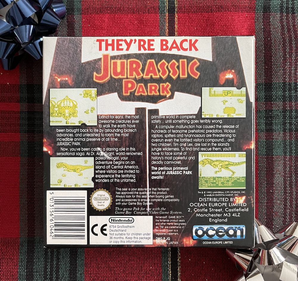
Look, I know it’s a GameBoy game but that doesn’t mean it has to be this basic. In my collection so far I have games which show this machine could handle more complex game styles, such as the frantic platforming of Super Mario Land, the utterly fantastic conversion of Lemmings (the fact it works so well on the small screen with so few buttons is a masterclass!) and of course Jurassic Park which offers more play styles, more fun and a much greater challenge.

There are some elements here I do enjoy, such as finding the little secret areas only through close study of the map, the inventory management needed with the energy cells and the bombs, and the main sprites are certainly entertaining for a while, even if you can only admire them when they don’t move. The variety of weapons livens things up too, especially on later levels when I was getting tired of the same gameplay over and over. However, with each new level you have to go off and find them all over again, adding to the repetitiveness.

There are seven levels altogether over four different locations. You’ll find yourself traversing a warehouse, a vent, a cave and the final alien nest. Not exactly a thrilling selection and to be honest they all play identically despite the slight change in backgrounds. The criticisms I’ve levelled (no pun intended) at this game are pretty clichéd I have to say, because they’re the same traps a lot of licenced games fell into back in the 80s and 90s. They’re the reason why games such as Jurassic Park stood out.

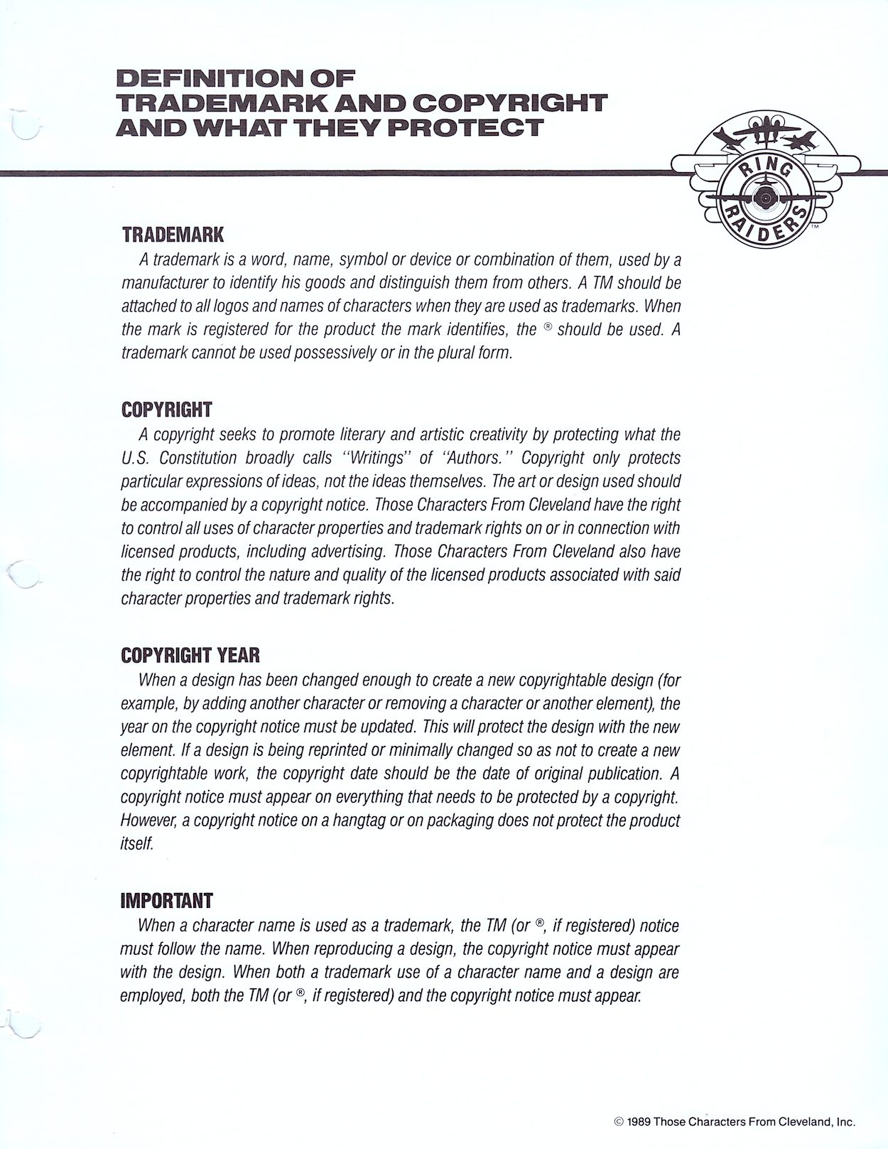
In fact, if you replaced the Predator and alien sprites with those related to any other licence this could easily have been marketed as a tie-in for any movie, TV series, cartoon etc. The only part of the game that stands out is the final confrontation with the Queen. She takes up most of the display and it’s an impressive sight after the rest of the game. Even so, she’s not the most difficult end-of-game boss to defeat, it just takes a long time and can become quite monotonous.

The end sequence amounts to no more than a written congratulatory message and with the game playing exactly the same each time there’s no replay value once you’re finished. The day before this review was due on the blog I decided to record these videos and unfortunately I didn’t make it all the way to the Queen, and the thought of going through everything all over again was just too much, so here’s a screen grab from VG Junk’s Retrovania blog instead.

What there is in Aliens Vs Predator: Last of his Clan isn’t necessarily bad, it’s just that there’s not much of it. The first level feels like it should be the introduction to the basic controls before more complex levels and gameplay later, but it never develops beyond this initial experience, instead copying and pasting everything from gameplay to the enemy attacks for half a dozen levels.

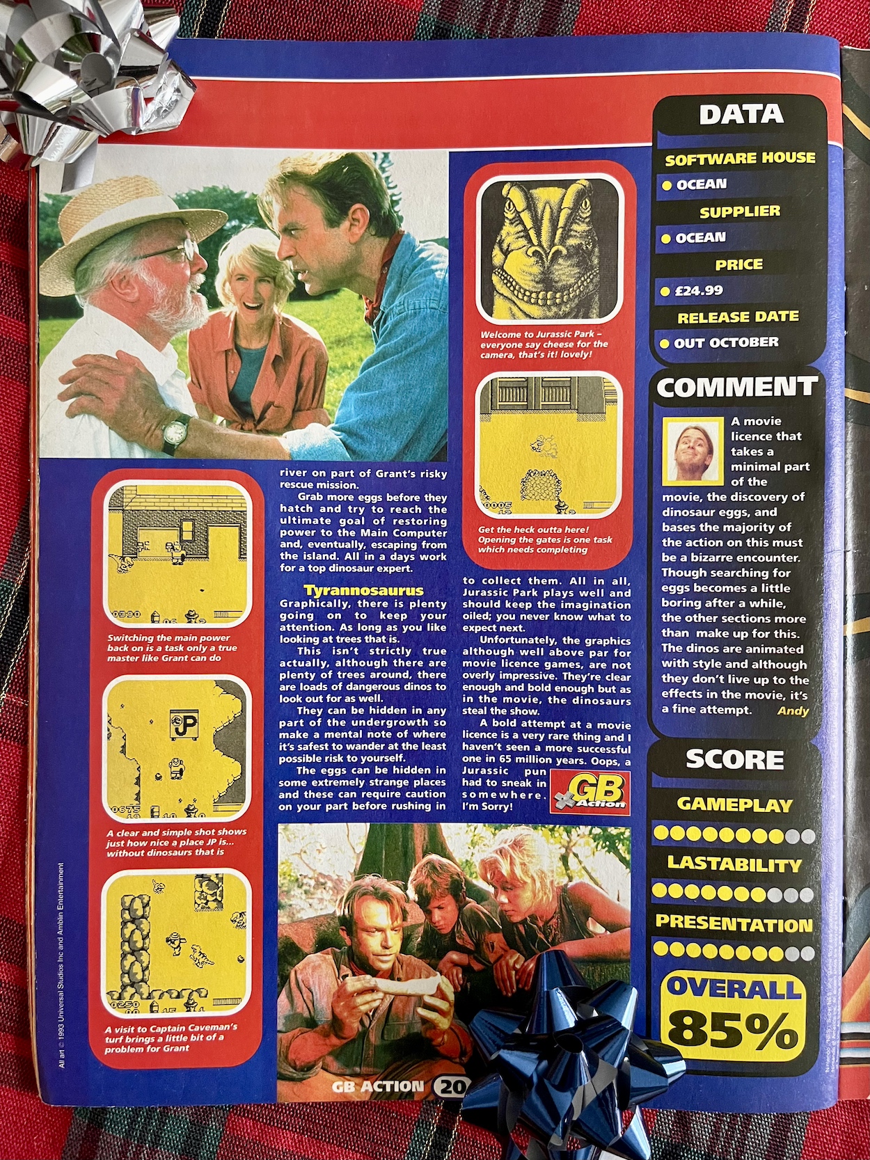
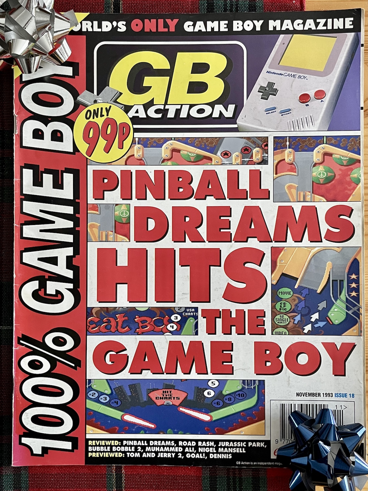
It’s a shame, especially after the C64 showed what was possible with a limited 8-bit system. However, there could be more positive news ahead. Another game on the horizon for the Dark Horse International section of the blog is the GameBoy’s version of Alien³. It got rave reviews at the time across all formats, including the diminutive handheld. In fact, I’ve been collecting GB Action magazines from the 90s to help me choose games for my own personal collection and its review is stellar. (Aliens Vs Predator wasn’t in any of the issues I have so far or I could’ve saved myself £30.)

So watch out for more handheld horrors of (hopefully) the good kind next Halloween!

ALiENS MENU

RiNG RAiDERS LiCENSEE STYLE GUiDE: PART FiVE

Here we are at the end of this monthly series already. It’s been really interesting looking at this Ring Raiders Style Guide sent out to all potential licensees by the copyright holders Those Characters From Cleveland (TCFC) back in 1989. Judging from the feedback I’ve been getting on socials it seems like you lot agree. The final 12 pages are all here and as you can see from the photo above they make for a meatier read this time around.

There are three sections to round off the folder and we start with ‘Copy and Type Application’, which amounts to two whole pages about fonts. Yes, really. It’s something I never really considered but now that I see all of these examples I can remember each and every one of them on the packaging (which you’ll see further below) and on the toy advertisements in the comic produced by the editorial team.

The page of suggested taglines sound like they’ve been written by committee. A committee who has no idea about aircraft. They’re cringe-worthy and thankfully weren’t used on the toys themselves or in the comic. You can also see all potential designs were subject to TCFC’s approval, however the comic’s editor Barrie Tomlinson said the people behind Ring Raiders were more open than most to what licensees could bring to the franchise, and they were very happy with what Barrie and his team were producing.

Logos and Legal’ is the next part of the binder and they’re a weird combination, like they’ve only been shoved into the same section because they start with the same letter. It kicks off with a lot of detail about how to use trademarked names and exactly how every piece of merchandise should be labelled appropriately. If you’ve ever wondered what the difference is between the ™ and the ® symbols you’ll find that answer here too.

Even textile manufacturers get their own paragraph detailing how their products should be labelled. This was most likely the same information found in similar style guides for all of TCFC’s (and other’s) ranges but it’s still an interesting read. You’d see these little footnotes in all of our licenced comics too and I always thought it was up to the publisher how they were worded, especially for their own trademarks, but it looks like that wasn’t the case and it was the licence-holder’s wording. Although, to be fair, it’s a pretty standard format.

I simply loved the full colour Ring Raiders logo

Want to know the difference between a trademark and a copyright? Or why the year mentioned can sometimes change and sometimes remain the same? It’s all there for you. As most of my comics reading post-OiNK as a kid was based around licenced titles the nerd in me found this of particular interest. Then we move on to the second part of this alliterative section and the variations on the franchise’s logo that were permissible to use.

I thought the ‘Ring Raiders’ main title was a brilliant design and the accompanying logo the perfect embodiment of the toys. I simply loved the full colour Ring Raiders logo. I still feel the same, they’re just great designs! Below you’ll see the one-colour (that is, black and white) version of the logo, the same one in various sizes taking up a full page for some reason. You’ll see a handwritten note by Barrie too, highlighting how they’d use this particular version.

On the next page is a selection of variants for both the Ring Raiders and the Skull Squadron (quaintly described as “Good Guy / Bad Guy Logos”). The top two were used as the individual logos for each side on toy packaging and across any and all merchandise. The next row down are the in-universe logos used by the characters themselves on their planes, bases and uniforms.

The smaller, circular logos had specific uses in the toy range. The first two on each row were used on the tiny plastic rings we’d slip on our fingers, the planes attached via a thin, posable plastic rod. The star and skull circles were on the front of the rings while the ones with the lettering encircled the ball-shaped attachment on the top. The final one is exactly what it says, a miscellaneous combination of both to be used as they saw fit.

Anyone who collected these very collectible toys at the time should prepare to have their memory cells jolted as we move on to ‘Hang Tag and Packaging‘, namely the packaging used for the Matchbox toys themselves. First there’s more criteria, although these are more like suggestions and designers are encouraged to explore what might suit their product the best. These apply to all packaging, whether that’s by Matchbox or anyone else, right down to the sky background. There’s also mention of bold visuals such as colour bands trailing after the planes and you can see examples in the previous section’s merchandise concept drawings.

These card displays with the planes tucked away inside moulded clear plastic take me right back. From discovering my first two-plane starter set to excitedly collecting all the packs I could in every toy shop I visited, as well as receiving gifts during the festive season or from visiting family members from Scotland. I have a particularly fond memory of coming home from school to find my sister was visiting and I hadn’t been told, so it was a surprise. After a while she told me she’d brought me something and it was a huge eight-plane set featuring all the Wing Commanders.

I think back and my parents must’ve had to coordinate with my siblings and family friends because I never received any sets I already had (although there was some overlap in the range like those Wing Commanders planes, each of which would also be in their Wing sets). I’ve no idea how they managed that without me knowing. Anyway, yes, these photos are bringing all the smiles right now.

The rear of the packaging reveals more sets and a huge array of extras. As you know the franchise never took off, but over the course of a year (actually, mainly over the course of one summer and Christmas) I was able to collect everything here (plus most of the additional plane sets not shown here) except the gigantic Air Carrier Justice and the black version of the Battle Blaster. Ah, good times.

In case you’re wondering what we could redeem those barcode points for the answer is simple: nothing. It was possibly something for consideration at some future point but nothing ever came of them within the time the line lasted. According to online sources there were second and third series of planes, although I only ever remember seeing a second series the next summer which just made me more frustrated that the comic hadn’t lasted, because I thought the release of more toys meant they’d been a success.

Of course, with hindsight I know the second series would’ve already been in production before things fell apart. But I never did buy any more after that initial year and then in my later teens mine were handed down to a young nephew and subsequently destroyed through his playing. I kept the yellow and red X-29 as it was my first, and my favourite, but even this was given away to a girl in my late teens. (Hey, I was young and she’d taken a shine to it.)

Ring Raiders had that “gotta collect ‘em all” quality

After the hangtag (an example of what a product could hang from in a store) things are rounded off with a large scale image of that beautiful, full-colour logo. It’s the same page that’s been slipped inside the front of the folder which I’ve shown in a few photographs, but I’m including a proper scan of it to end on as requested by blog reader Terry in their comment under part three of this series. You’re right Terry, it is sweet!

With that the folder is finally closed and placed back on the shelf alongside what was, and still is, my favourite non-OiNK childhood comic. The toy line may have only lasted about a year and I was quick to move on to my next obsession, I’m sure, but what an obsession these were. I come away from this series of posts with one key takeaway; the Ring Raiders were robbed of being a hit franchise.

Before Pokémon, the Ring Raiders had that “gotta collect ‘em all” quality. They were great toys, the comic had great characters and action, there was variety and adventure and a ton of fun in all aspects of the franchise and it had more potential than most others in my opinion. They have a special place in my heart all these years later and, dare I say it, I don’t think I’m finished with them yet.

Once again, thanks to former IPC/Fleetway editor/writer Barrie Tomlinson and his writer son James for kindly sending me this folder in the first place.

BACK TO PART FOUR

LiCENSEE FOLDER MENU

RiNG RAiDERS MENU

RiNG RAiDERS LiCENSEE STYLE GUiDE: PART FOUR

Have you ever found out something about your childhood many years later and wondered how you never noticed even though it was so glaringly obvious? In the case of this blog it could be how I never clicked that the TV show Round the Bend was created by OiNK’s editors! As for the Ring Raiders it’s something small but even more obvious, the colour of the canopies on all of those planes I collected.

Welcome to the fourth part of my look at every single page of the Ring Raiders Style Guide sent out to licensees in 1989. We’ve covered the introductions and details of the range, the characters and their all-important aircraft and now we move on to the Product Art Reference section. Here, Those Characters From Cleveland (TCFC) described how they expected their creations to be shown and a concept artist drew up some fun merchandise ideas, making this my favourite part of the whole folder.

The introduction reminds licensees the planes are the focus, which is an obvious point since it’s all based around those superb Matchbox toys. Of course, Barrie Tomlinson’s comic understood the significance of focusing on and developing the characters in order to tell good stories with those planes. Coming to this as a fan of the comic I initially found it strange how they were trying to tell artists specific ways to draw their creations, but of course this wasn’t aimed at dynamic comic strips. Instead, this was for those making other merchandise based solely on static representations of the aircraft.

In fact, when I spoke to Barrie about the Ring Raiders comic he told me how some licence holders didn’t understand the medium and would analyse every single frame as if it were an individual image instead of a sequential piece of art. Thankfully TCFC were apparently much more knowledgeable about comics. This page mentions my point about the canopies, how the Ring Raiders all had blue canopies and the Skull Squadron‘s were all red. A quick glance on eBay proves this point and I’ve no idea how I didn’t notice that pattern as a kid!

This full-page piece shows how some of the aerial action could be portrayed and I think it’s a great scene! It’d certainly make for an awesome poster if it was blown up a lot larger. I particularly like the lighting on Scorch’s Torch and seeing inside Vector’s cockpit. In fact, it’s only upon seeing this that I realised the airplane controls weren’t something we really saw in the comic, apart from the sci-fi element of the rings. Yes, I just love this and it’s a shame we don’t know who drew it.

The next five pages are my favourites because they give me an insight into all of the cool (and not so cool) things I no doubt would’ve wanted to adorn my bedroom (and my body) with if the franchise had taken off. These weren’t officially released, TCFC used these to promote possible ideas to companies as a way of convincing them to work on the franchise. Unfortunately I don’t know the artist whose signature is on these pages. Hopefully I’ll be able to find out in the future.

In the introduction to this section colourful checkerboards were mentioned as a way to add borders and banners where needed and the artist shows how these could work on some particularly gaudy clothing. Hey, it was the late 80s and in their own way Ring Raiders may have been ahead of their time as we slid into the 1990s. I mean, have you seen the fashions of that latter decade? We even wore shell suits for goodness sake!

I started secondary school in the autumn of 1989, the year of the range’s launch, so I doubt any of these clothes would’ve been aimed at my age range. I also doubt any of my friends would’ve let me forget if I’d turned up wearing any of them. However, given how retro inspired clothes are all the rage today, and it seems the more colourful trainers are the better, I think one of the items below might still sell to a select audience.

Okay, so those who are still fans of the Ring Raiders may make for a rather niche market but when you look at some of the celebrity ranges or those based on other retro franchises they don’t look too out of place. The slippers and their tiger design (to match that of “Cub” JonesF-5) might also work without that green and blue strap; I certainly know a friend who loves animal print, although the plane might put her off!

On the final page of wearables, is there anything more 80s than roller-skates and sweat bands? Initially I thought the top-down view of the Victory 1 F-19 Stealth Fighter was a more custom skate, but when I couldn’t figure out where you’d put your foot in I clicked it’s actually one of those novelty skateboards that were so popular back then. As a kid I wasn’t really into sports so these wouldn’t have been on my Christmas list, but that’s certainly not the case with the items on the next page.

How much do I want that lamp even now as an adult? I remember cutting out the main title logos from my toy packaging and sticking them all over my room alongside the posters from the comic, I even had a large one on the door to my room instead of the usual name plate. I was crying out for more official merchandise to be released. As such, that clock would have looked good on my wall and I think modelling a laundry basket on an airfield’s windsock is ingenious. It may even have helped keep my room tidy!

While these are just a way of throwing out ideas for licensees to work from, I think they’re great fun. In the Ring Raiders: In Real Time introductory post you can see some of the official merchandise that was released at the time and you’ll see that checkerboard pattern plenty too. Also in that post is a photo of a mocked up child’s bedroom where everything seems to have the branding of the range. It’s a somewhat ambitious photo on the part of TCFC but you have to aim high, right? Plus (again) it was the 80s! This was the way of things.

These two pages round off this section of the folder and show the great idea of having different emblems for each of the leader craft. I never saw these on any of the toy packaging or in the comic so I’m assuming they never ended up as an official part of the branding. While each Commander’s aircraft was accompanied by three other planes in a pack, I like the idea of the lead planes being promoted this way.

I can imagine some of these being turned into badges or, to be really 80s/90s they could’ve been material patches to be sown on to denim jeans and jackets. I particularly like the ones for the Galloping Ghoul P-51 Mustang (a favourite from the toy range), Kirkov’s Comet F4 Phantom II and the Sky Tiger. This whole section sums up the fun manufacturers and us kids could’ve had with the Ring Raiders as the next big craze of childhood.

Where has the time gone? We’ve only got one more part of this monthly series to go. The final few pages deal with more serious stuff like trademarks and the legal side of things, as well as approved logo variations, typography and some samples of the packaging that would be adorning toy stores around the country and the wider world. So make sure you fly back here on Monday 13th May 2024 for the final landing.

PART THREE < > PART FiVE

LiCENSEE FOLDER MENU

RiNG RAiDERS MENU

ROUND THE BEND GAME: COMMODORE FORMAT #17

This issue of the simply superb Commodore Format, on sale this day 32 years ago, was my fourth at the time and the first I bought after finally receiving my Commodore 64 computer for Christmas. (You can check out a more personal look at CF in my retrospective on #14.) This was a memorable issue for sure, with certain game reviews leading me to some lifelong favourites which I’d countless hours of fun with, as well as having a super addictive covertape game. However, I’m including it on the blog for none of these reasons.

Instead, CF makes its fourth appearance on the OiNK Blog because of a review inside for a game I didn’t purchase. It may have been based on a favourite TV show but there was only so much pocket money I could splash out on my C64 and it had very stiff competition this month. Now, decades later it’s time to take a closer look at that review because the game is based on a series dear to the hearts of pig pals everywhere, namely Round the Bend.

Originally intended to be an OiNK television show (much more on that at a later date) Round the Bend was an electronic comic show created by the same trio of Patrick Gallagher, Tony Husband and Mark Rodgers. With the huge Spitting Image Workshop puppet of Doc Croc as its editor and various animated comic strips with a certain sense of humour, it was OiNK in all but name. Running very successfully for three series, and winning awards as it did so, it was inevitable we’d see a computer game at some point.

Taking the tired old formula of turning a licence into a platform game, the general consensus appears to be that it plays well but was far too easy. So it was fun but not for long enough to justify the full price. As was customary at the time this would be rereleased a year or so later as a budget game for a few quid, but at a tenner or more it got knocked down for its value for money. It seems to concentrate completely on Doc Croc and his ratty writers too, which seems a waste as the show was chock full of zany characters who could’ve brought many different forms of gameplay. At least John Potato Peel makes a cameo!

Like the OiNK game before it there was nothing too original then, but what was there was fun. A quick glance at a “64%” score and it’d be easy to dismiss it, but reading Stuart Campbell’s review has me thinking it may have got a higher score upon rerelease. I can find no evidence of a further CF review, however Zzap!64 scored it 52% initially but this jumped to 74% after its price drop. Nothing to write home about then, but an interesting look into a curious OiNK-adjacent piece of merchandise nonetheless.

As is customary when looking at these old magazines I can’t help but reminisce and have pulled out some other highlights that had me fondly remembering reading this for the first time. First up is one of the games on the covertape. According to some sources online this was a copyrighted piece of software hacked and distributed illegally through the public domain, CF unknowingly giving away commercial software. But as you can see here in the first paragraph of the instructions page that’s incorrect; a piece of misinformation that gained traction in C64 circles despite the explanation of a hacker’s name on it being front and centre here.

The idea is a simple one but it is oh so addictive. You control that little silver circle and must destroy all the tiles on the screen and make your way to the exit. Thing is, the tiles explode one second after you touch them, so forward planning is essential. You must plot out your route over increasingly complex layouts because once you’re moving you can’t stop or else you’ll explode too. It’s just as addictive today as it ever was and is best played on a real machine with a joystick. One of my top C64 games of all time and it was a freebie!

Speaking of favourites.

In the Commodore Format retrospective I showed you the preview for First Samurai and the Making Of feature for Creatures II: Torture Trouble (and I also embellished on the magazine’s scoring system), both games impressing me from my first issue. Now at last both were available to buy! They blew away anything I was playing on friends’ consoles at the time and each had me glued to the screen for hours. For a computer created long before Nintendo even released their first console, these were pretty incredible.

The little egg character was a megastar in the 8-bit computer days

They both played like a dream too. As I’ve said before, Creatures II remains in my top five computer and video games of all time to this day. I remember buying it on cassette to begin with, but the mutliload (where each level has to load individually for a few minutes) was destroying the flow, so when my parent’s bought me my disk drive a few months later I used my pocket money again to buy it on 5.25” floppy disk (loading was so much faster) and never looked back! Two glorious games. No wonder Round the Bend never got a look in.

Also this month was the concluding part (obviously, the game was finished) of The Clyde Guide by the geniuses that were John and Steve Rowland, creators of Creatures, who provided a fascinating look into the creation of the game. I loved things like this and when they returned later in the magazine’s life it was for a game called Mayhem in Monsterland which they documented from the very earliest design stages.

Elsewhere in the budget games section was a game with a title that rather stood out. It was a difficult one I remember. You had to avoid all the buildings and enemy craft (even UFOs) until you got a chance to crash into and destroy the enemy HQ and rescue the hostages! Dizzy also makes an appearance this issue. The little egg character was a megastar in the 8-bit computer days and despite simplistic graphics and controls his adventures proved extremely popular thanks to great gameplay and puzzles.

That feature about the user-created, free-to-distribute software that made up the public domain showed what this little machine could really do graphically. A few years later I even put together my own Public Domain Library (amongst others who did the same) to help distribute said software. Parallel Logic Public Domain (thanks to lifelong friend Colin McMaster for the name), or PLPD as it went by, was even listed in CF as the third best PD library in the whole of the UK! I was dead chuffed.

I’ve also pointed out before how the game adverts of the day often didn’t even show us what the thing looked like in action, instead relying on exciting artwork and descriptions. Given how the games would look completely different across the many formats they’d be released on I can understand why. No one wants to buy a game thinking it’s going to look one way and then realise those images were from a much more powerful computer. One such advert in this issue was for the conversion of the arcade hit, Smash TV (think ‘The Running Man: The Game’).

Smash TV was a corker of a game. Copying the controls of the arcade cabinet you could use two joysticks to control your character, one for their feet (their movement) and one for their gun (which direction they’re firing). Hand one joystick to a friend and the shouting and hollering as you try to work together, clearing rooms of enemies in this violent gameshow while trying to pick up brand new toasters etc. was hilarious. Even seeing this advert brings back all the feels.

Finally, a look to the future. Not the future of the 21st century though, instead let’s take a look at the future according to Commodore in 1992 and their CDTV. The 90s would be a hotbed for CD-ROM machines promising us a multimedia future. I personally invested in one of Panasonic’s 3DO machines (3DO was to be a new standard like VHS) and to this day I think it’s criminal it was never the success it deserved to be.

They were expected to revolutionise our world

Of course these days we’re used to our electronic devices doing pretty much everything, but at the beginning of the final decade of the last century it was the norm to have a dedicated machine for each piece of entertainment, like games, music, movies etc. While 3DO at least tried something new and the various machines looked cool, Commodore went with a rather boring rectangle, possibly thinking it wouldn’t alienate people too much if it looked like their current VCR or HiFi (I assume).

Needless to say it never took off. It was basically a Commodore Amiga with a CD drive and no keyboard; the fact you could buy a keyboard, mouse and even a floppy disk drive for the CDTV didn’t help distinguish it from the computer range either. For me it’s always fascinating to read contemporary magazines from around that time and the hype for The Next Big Thing, and how they were expected to revolutionise our world. It took a little longer but in the end we got there.

I’ve had great fun reading this magazine again and reliving the hype I felt at the time for the games inside it. Commodore Format remains my top mag even to this day and you can check out other issues on the blog if you like. Namely, the one that gave away the OiNK game on the cassette, another which printed maps for said game, and as mentioned above my first issue as well, which just so happened to be my first ever magazine too. It also contained that advertisement for Round the Bend. Great memories. Still a great read.

THE OiNK COMPUTER GAME MENU

OiNK MERCHANDiSE MENU

MAiN OiNK MENU

HANDHELD JURASSiC PARK: RETRO ‘RAPTORS

Upon first spotting this post you may be wondering why I’m talking about a videogame on a classic comics blog. Well, regular readers may remember back when I was reading Dark Horse International’s Jurassic Park comic that the advertisement for this game and the subsequent competition to win a copy of the Nintendo GameBoy version brought back many happy memories of playing it at the time. Those memories have now ended up costing me money.

Then, earlier this year I bought a bookazine about the history of Nintendo and the chapters covering this little joyful plastic box had me grinning from ear-to-ear so much that I invested in a refurbished GameBoy and a few games. I’m delighted to say those rose-tinted glasses weren’t playing tricks on me and I’ve been having a blast with it. When I eventually teared myself away from Tetris (easier said than done) I replaced its cartridge with Jurassic Park’s and travelled even further down memory lane.

So, I’d decided to follow up on my wistful reminiscing about the game with actually getting my hands on it again all these years later. I thought you might like to take a closer look with me. Those adverts for the multi-format game were brilliant, playing off of the Street Fighter II craze at the time with a killer tagline. Despite no GameBoy screenshots (they’d always show the so-called ‘prettiest’ versions in the ads) I remember desperately wanting to get my hands on it for my handheld.

I think I got the game before the next issue, which actually contained images of the version I was playing as part of that month’s phone-in competition. I wouldn’t have been allowed to enter these anyway, they cost a fortune, so I was happy to have the game already. I remember it not having anything to do with the plot of the film, with Dr. Alan Grant instead walking about with a huge gun(!) but that never put me off because it was just so much fun.

I recall playing it late at night, long after I was meant to be asleep for school the next day, viewing it through one of those huge, cumbersome GameBoy magnifier accessories with a built-in light and having to take little breaks because it was so damn heavy! These restrictions obviously no longer apply and I’ve been playing this game (and others) quite a lot, getting plenty of jealous looks from people around my age on public transport, accompanied by looks of confusion from younger generations.

I decided to spend a little extra on the GameBoy and get a refurbished model and the same applies to the games, simply because I’d like to have them all in their original boxes and in great condition so my collection looks as good as possible on the shelf. The Jurassic Park game arrived in near mint condition and I couldn’t have been happier. It even included the manual and some advertising leaflets for other games. I’d forgotten all about these.

The manual also contains some basic details on the dinosaurs and from reading these it’s possible to glean how they could act in the game, although this hasn’t been particularly helpful with the T-rex. With my collection started I needed a way to figure out what other games (ones I didn’t own at the time) would be worth my money, especially if I was prepared to pay a little more for them. It’s not like I could easily shrug it off if a game was crap.

With writing a classic comics blog, one which has already included Commodore Format, it’s only natural I’d turn to some contemporary viewpoints. Instead of relying on people’s memories for recommendations or retro reviews which often unfavourably compare them to modern games, I wanted to read the opinions of those who were playing the GameBoy at the time, those who had been invested in it as a ‘modern’ gaming device.

As it turns out options were limited. The only magazine I found on eBay dedicated solely to this machine was GB Action from Europress Interactive. This same company had published a truly awful Commodore 64 magazine in the early 90s called Commodore Power, but beggars can’t be choosers as the saying goes and so I’ve started buying issues which contain previews and reviews of games I’m interested in. As it turns out, it’s not a half bad way of doing my research.

You can see the game in action in these three short videos

The reviews aren’t exactly in-depth and each 68-page magazine can be read in very little time but it does what I need it to do. I bought my first few games for my new GameBoy before buying any of these issues so their review of Jurassic Park ended up being a kind of test in a way. As it turns out their review pretty much sums up exactly how I feel about the game as I play it now, decades after its release.

Finally we get to the game itself and you can see it in action in these three short videos of the initial levels, after which I become completely and utterly stuck and I’m not going to show you that out of embarrassment.

The first thing that struck me is that John Williams’ music is nowhere to be heard throughout the game, despite this being a fully licenced title, but after a while I just started playing it with the soundtrack playing on my HomePod so it made little difference. The Velociraptors and Dilophosauruses keep the player on their toes and a keen memory is needed to remember the layouts of the security buildings in which pass keys are needed to unlock the main gate and escape into the rest of the park.

In most levels of the game there are dinosaur eggs lying about the place and these must all be either destroyed or collected. Of course, collecting them means more points and rewards but in the levels in which pass keys are needed they’re essential, the keys only made available to you after all the eggs have been taken care of. This means venturing into all the nooks and crannies of the maps, including the undergrowth where anything could leap out at you.

Playing that first level made me feel like a child again but I have no recollection at all of this Triceratops stampede which popped up next. I definitely got a lot further in the game as a teenager but my ageing memory initially thought the levels were all pretty similar. This stampede is really tough, mainly thanks to the fact you have to guide Tim to safety which isn’t easy when he constantly stays a few feet behind you, often putting herself in harms way when you try to turn left or right and he’s jumping out in front of a dinosaur just to remain at the right distance from you!

Reading OiNK led me to Jurassic Park, which in turn led me back to this game and now I’ve a new hobby

I’ll admit it took a few goes to get through this and of course because it’s a retro game there are only so many lives to play with until it’s game over and we have to start all over again from scratch. Thankfully there are a handful of continues on top of the lives handed out, which gave me 12 chances altogether before turning off the GameBoy and plugging Tetris or Super Mario Land back in.

Moving on and the sparks of memory surged a little as I remembered the next level in which Grant is on a rowing boat making his way to the next area of the park. Each press of the button pulls Grant’s arms in once and moves him a tiny bit up the screen in whatever direction you have his boat facing. This technique takes a long time to master. Timing is key. Being on the water it’s not easy to turn in a different direction, you have to wait until he’s stopped rowing, plus you can’t speed ahead because you don’t know what’s about to come down the screen. Also, if you stop Grant will start coasting back downwards again towards any danger you’ve already passed!

The game is definitely a challenge and I remember it being so back in 1993. I just had a lot more patience back then, even after playing it for ages and having to start over, which I did without a thought at that age. I don’t care that it’s not close to the premise of the film or its characters. Look at the system it’s on, it was never going to be too complex but it’s still Jurassic Park to me and a hugely enjoyable slice of it too.

Reading OiNK in real time led me to doing the same with Jurassic Park, which in turn led me back to this game and now I’ve a new hobby. Playing Nintendo GameBoy games on an original machine is always going to be the best way to play these, and with Lemmings and Pinball Dreams gratefully received for Christmas it looks like I’m back in this world for a long time to come. So thanks Jurassic Park! Now, one more go to sneak past that Tyrannosaurus rex in level four. Young me would be so ashamed of me right now…

JURASSiC PARK MENU

CHRiSTMAS 2023