Category Archives: Dracula

BRAM STOKER’S DRACULA #5: FiNAL(E) BITE

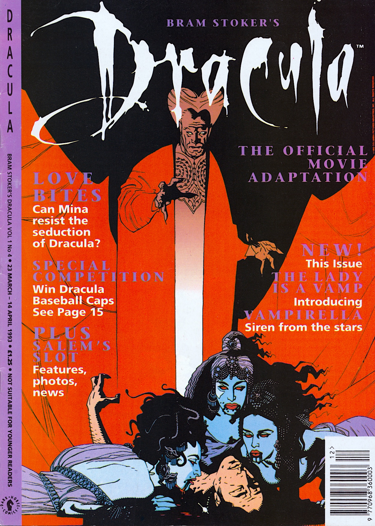
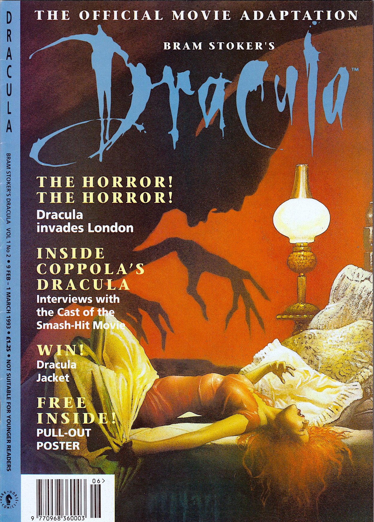
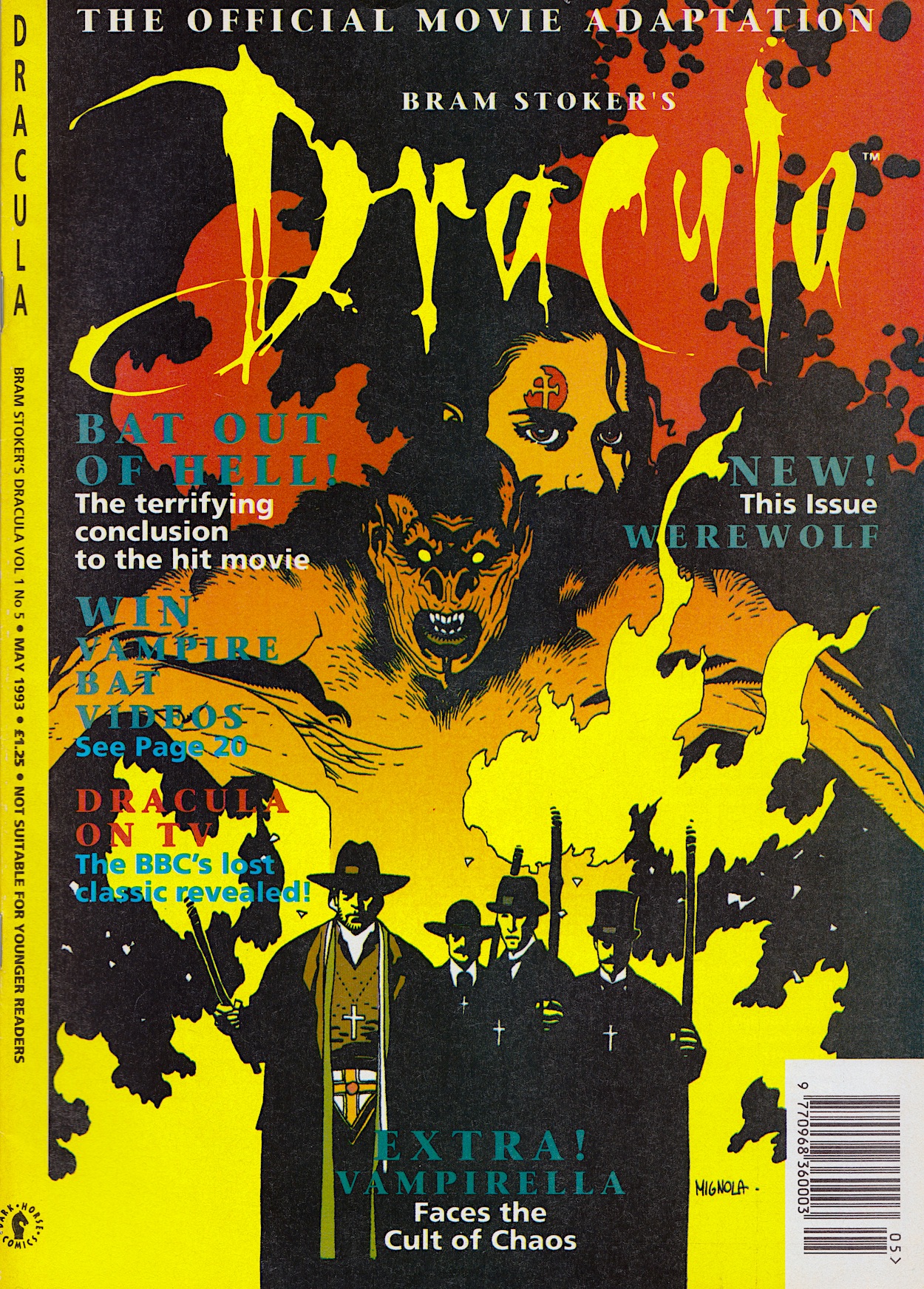
More and more headlines adorn the front cover of Dark Horse International‘s Bram Stoker’s Dracula as  strips and features are added, the comic morphing like the Prince himself on this great Mike Mignola image. Gone is the glossy cover, replaced with a good quality matte paper throughout that seems to suck up the ink magnificently, and you’ll notice a lack of specific dates on the spine. That’s right, the comic is now an ongoing monthly title instead of a limited series of three-weekly issues. Not that anything is made of this in the editorial. More on this below.
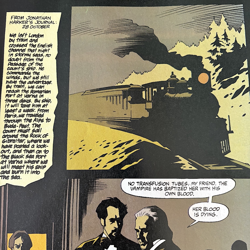
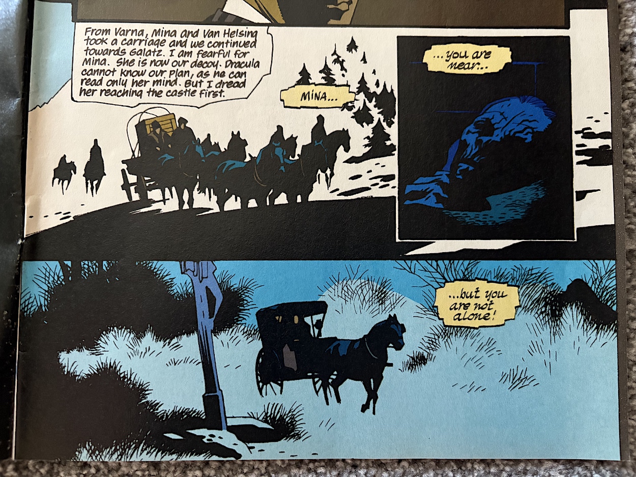
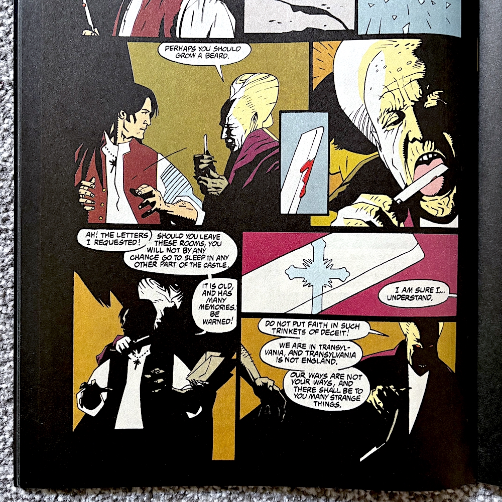
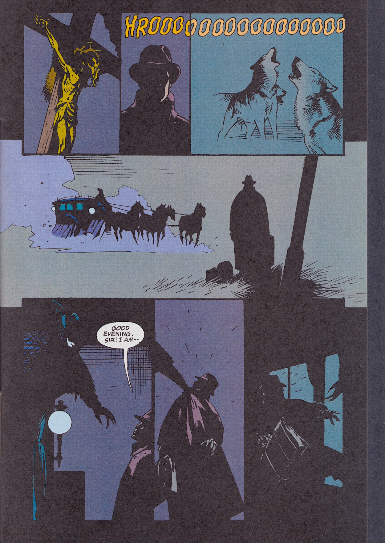
Our main strip runs to 17 pages, concluding the adaptation and again it’s the art that really stands out. The spectacular moments during the final 20 minutes of the film must’ve been daunting for penciller Mike, inker John Nyberg and colourist Mark Chiarello. The minimalist style flies in the face of the film’s production design but it works perfectly, such as with this opening scene above. The carriages aren’t even drawn but it works. (Accompanied by John Costanza‘s lettering of Jonathan’s diary.)

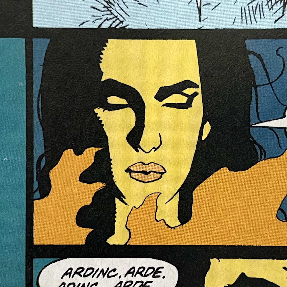
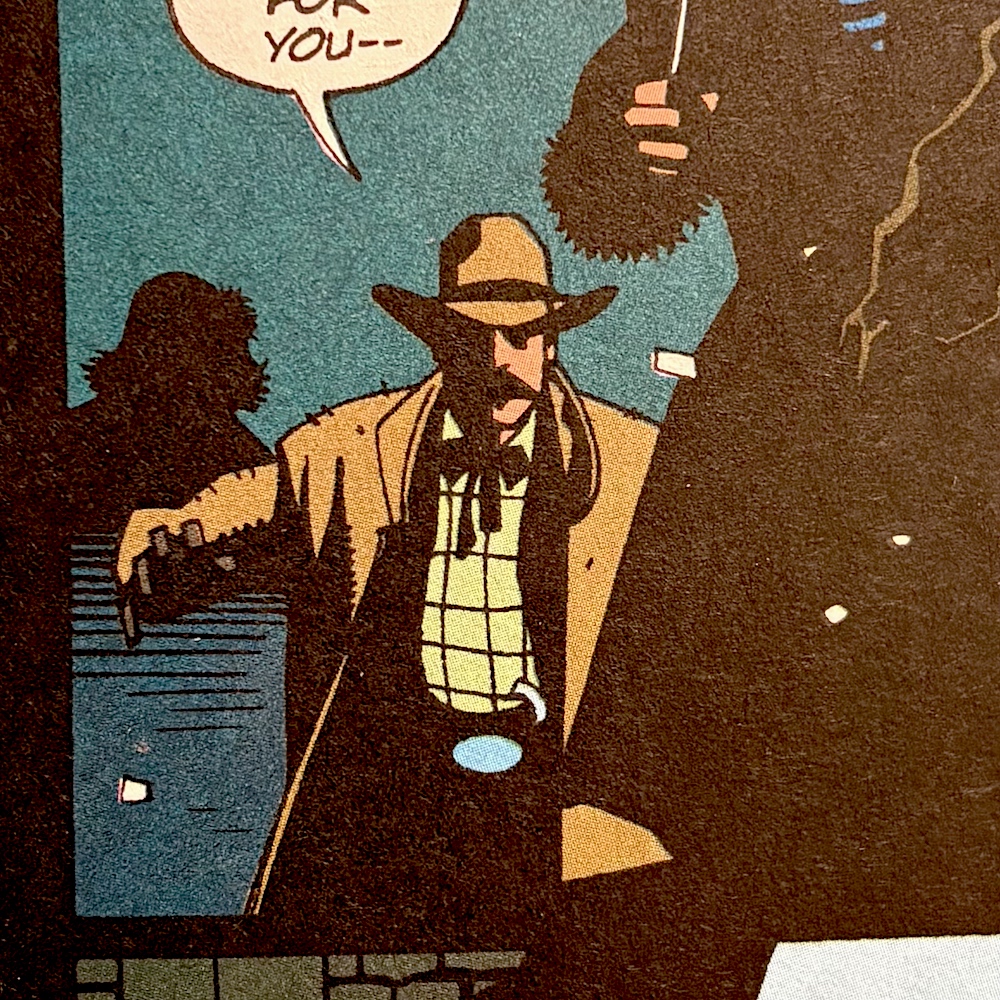
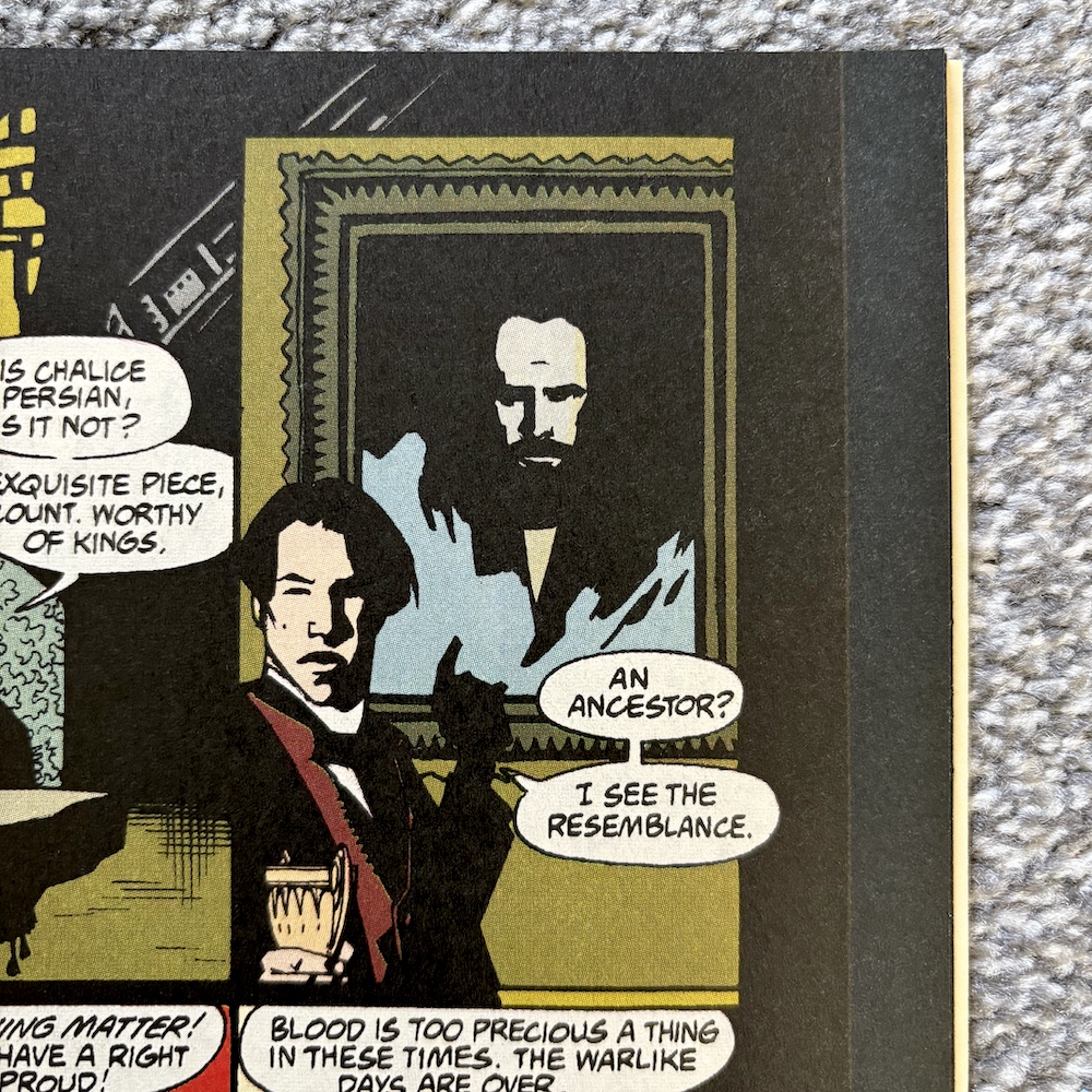
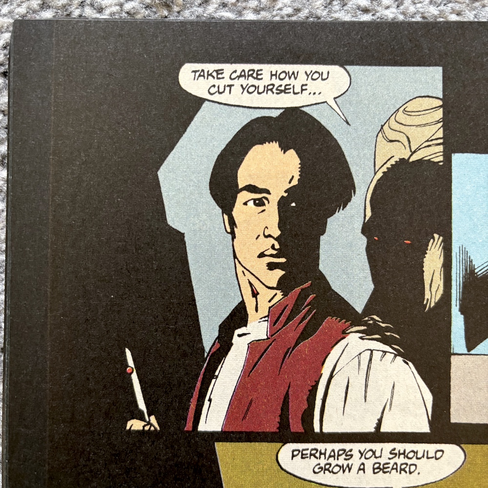
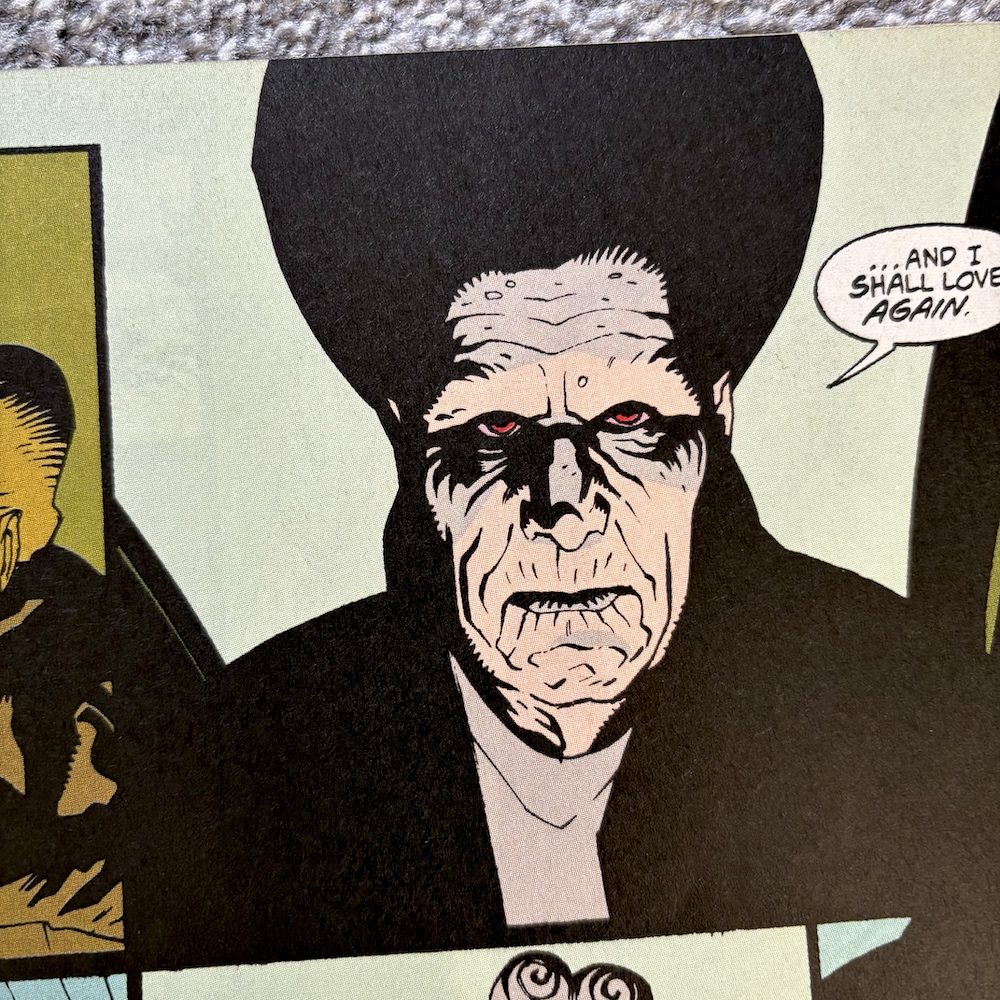
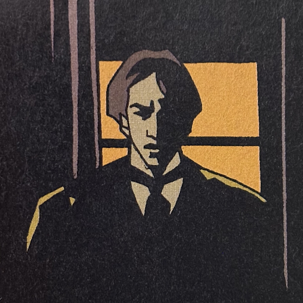
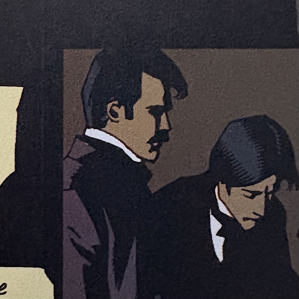
In fact there are some small, incidental panels of individual characters which, if combined in a grid, could make for a lovely minimalist poster for fans of the film. Look at these images below of Jonathan (Keanu Reeves), Arthur (Cary Elwes), Mina (Winona Ryder) and Quincy (Billy Campbell) and imagine that large poster made up of these and likewise panels for all of the others.
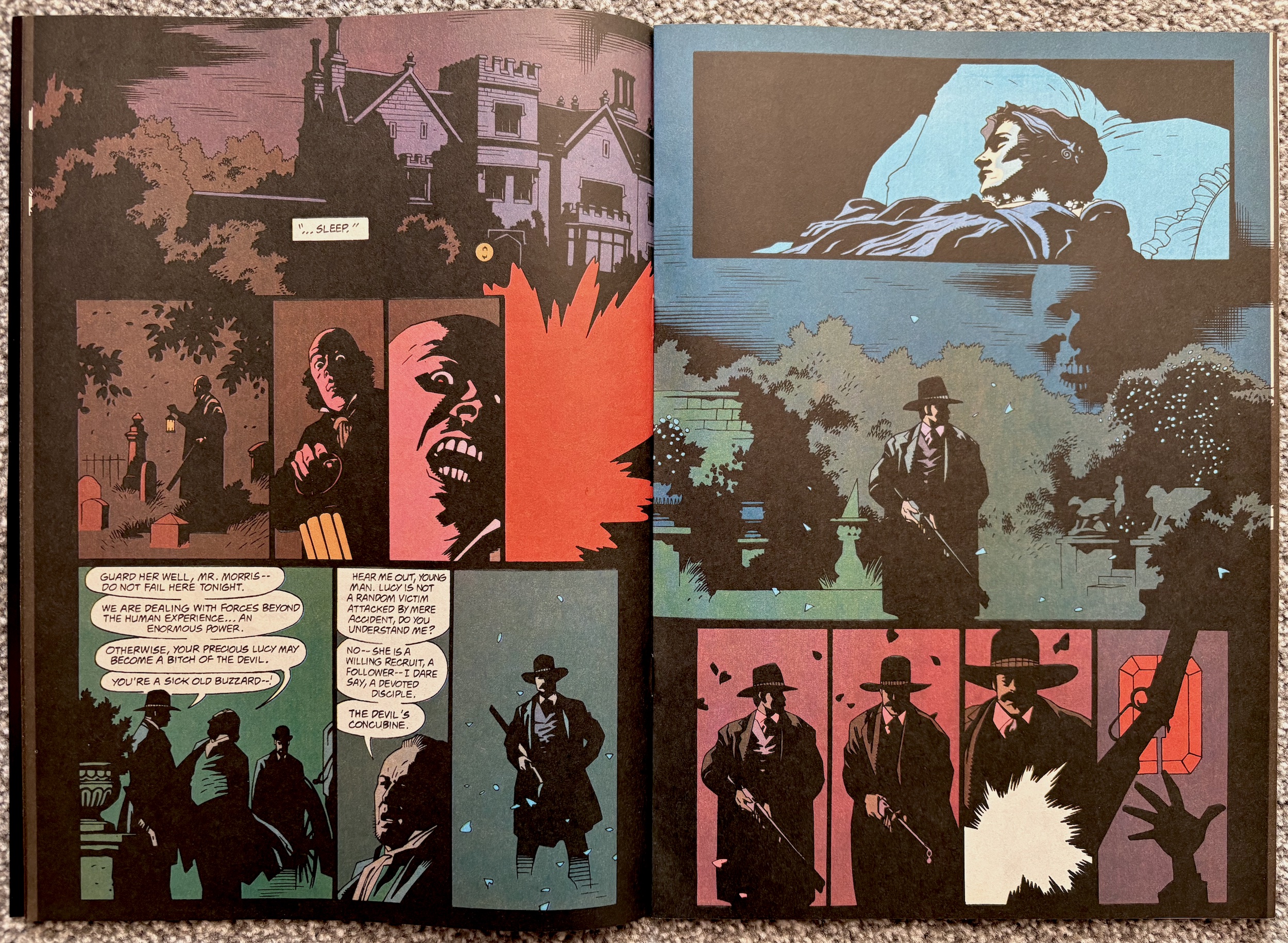
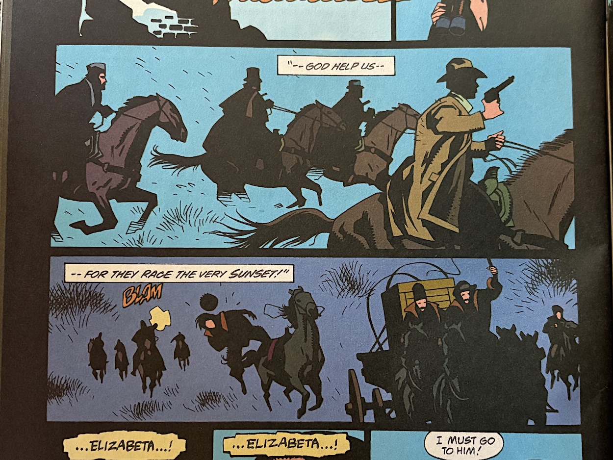
The first half of the strip concentrates on the journey to Dracula‘s castle and the inner fight of Mina’s as she struggles between her love for Jonathan, the enforced lust for the Prince and Helsing‘s attempts to save her. As with previous chapters the only negative here is the memory of these scenes from the film making for an unfair comparison. The horseback gunfight was an absolutely thrilling moment as our heroes fought the setting sun, accompanied by Wojciech Kilar‘s booming score. Reading it instead of watching it accentuates just how much their music brought to the scene! Also, the key factor of the setting sun is completely missing apart from one mention in text.
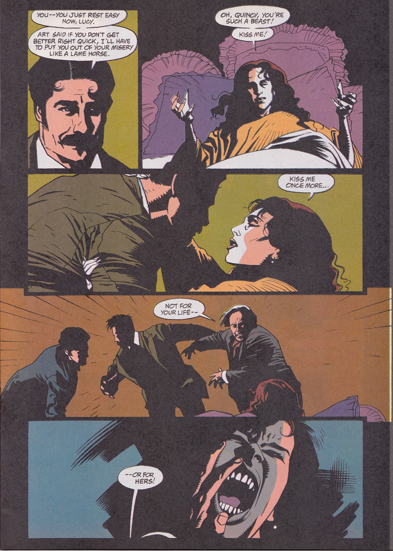
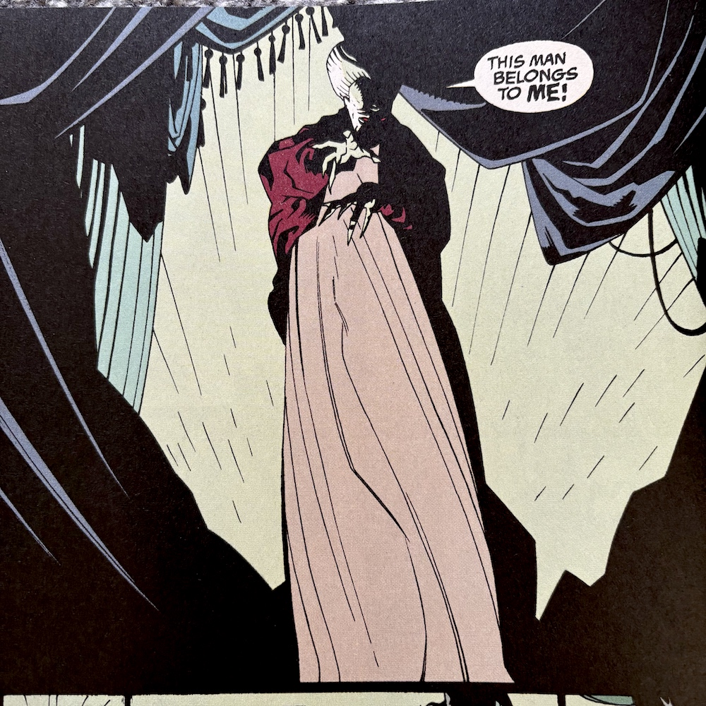
Meanwhile, further ahead at the castle Helsing battles with Mina’s soul. The powerhouse performances by the actors is replaced by some dramatic poses, which are highlighted wonderfully by the lack of detail, the silhouette of Mina over Helsing with the three vampire women scrawled in the background being my favoured panel here. A couple of pages later (after Helsing is seen entering a crypt post-sunrise) we see the ultimate fate of the three watching horrors. It’s surprisingly gore-free given what we’re actually looking at. In fact, gore is something that’s largely been missing throughout the adaptation.
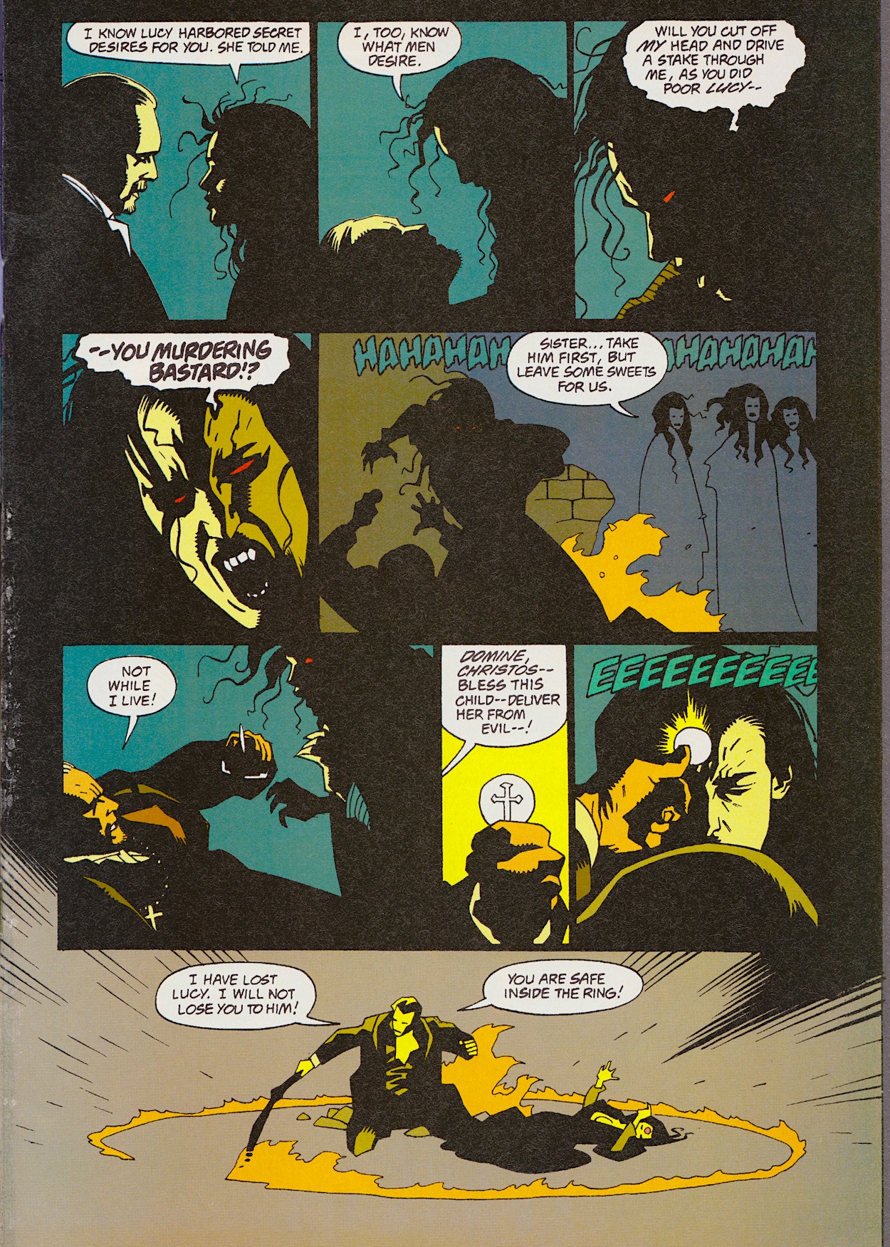
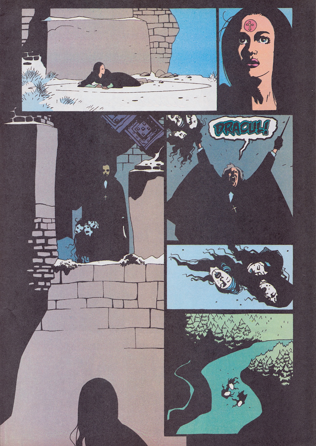
Not that the film relied on gore for its scares, but the comic really dials it down to little more than the odd splash of bold red, such as in Dracula’s final moments after Jonathan slits his throat. From here on it pretty much follows the film shot-for-shot, word-for-word. Well, why would you want to change such a perfect ending? Throughout these months there have been other changes made to the overall film, and there was no way it could match the atmosphere or looks, but what this series did differently to other adaptations was make bold artistic choices.
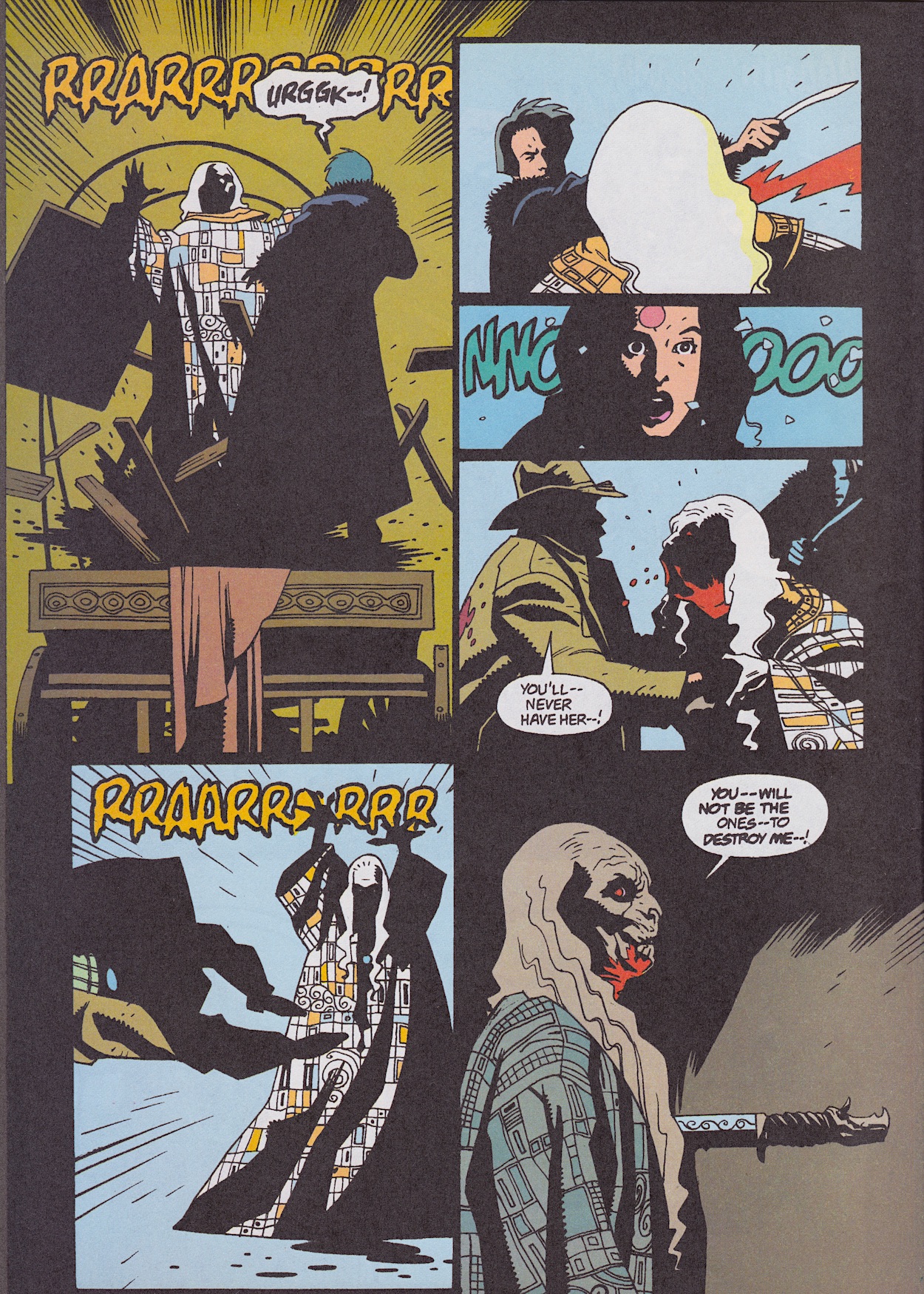
What we’ve been treated to over these first five issues is nothing short of a work of art. An adaptation of a work of art into another, in fact. For fans of the film it’s just such a unique take, a love letter to the movie. It feels like the team has created a tapestry of the film in comic art and as such it transcends a mere “comics adaptation of the current blockbuster movie”. It’s best enjoyed as a piece of art in this way and when it is it’s the best movie adaptation I’ve ever seen.

Dave HughesBloodlines news pages are chock full of goodies this month (although we’ll try to ignore the creepy description of actor Sadie Frost as “delectable”), beginning with the box office takings of the film so far. Until beginning this series I’d no idea it was this big at the time! Saying “set is the operative word” when describing where it was made is a reference to the fact the whole thing was filmed on huge soundstages. Even the outdoor scenes were elaborate sets, something I wish the comic had delved into in more depth.
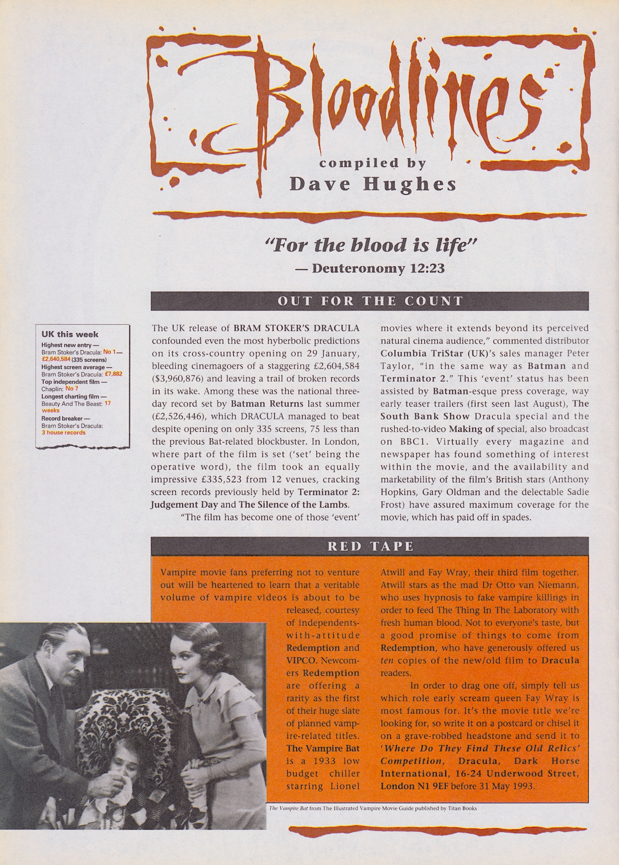
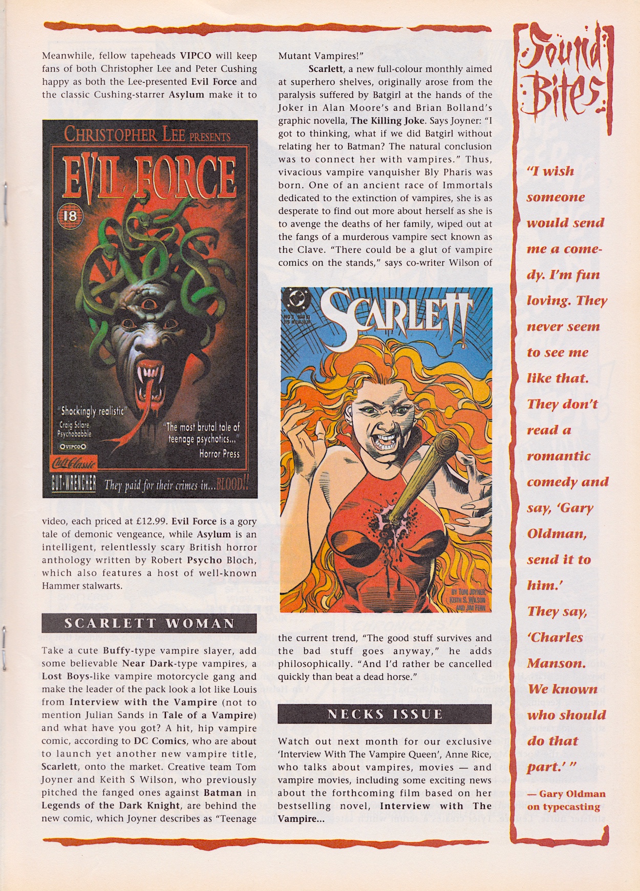
There isn’t exactly glowing praise for something they then immediately give away in a competition, I wonder if Coca-Cola had anything to say about the ‘Cult Classic’ logo used on the Evil Force video cover, and after reading the Sound Bites it’s no wonder Gary Oldman loves playing Jackson Lamb so much these days. One last thing of note, I have no idea how that “natural conclusion” was made in the ‘Scarlett Woman’ news item! (Oh, and I’ve given up on the promised Sadie interview ever appearing now.)
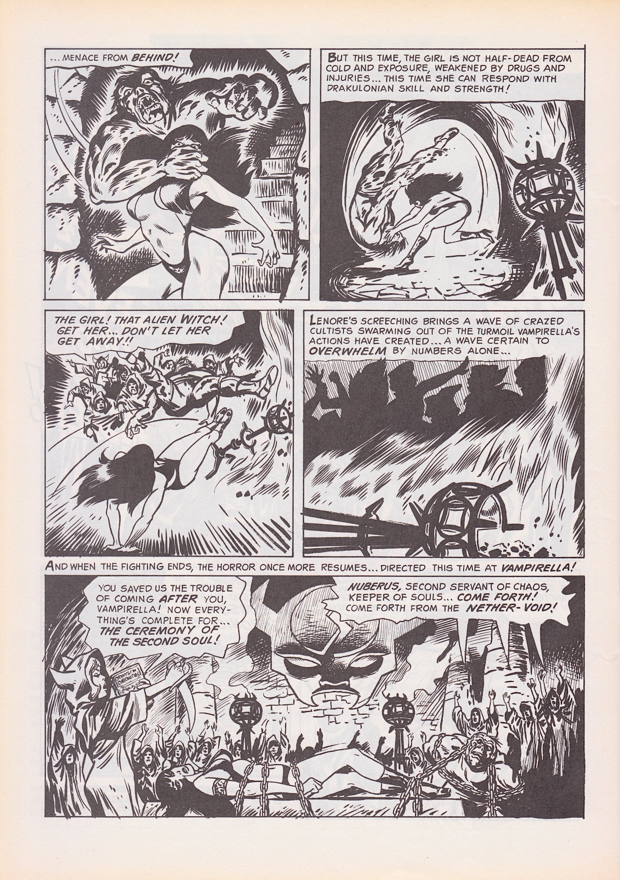
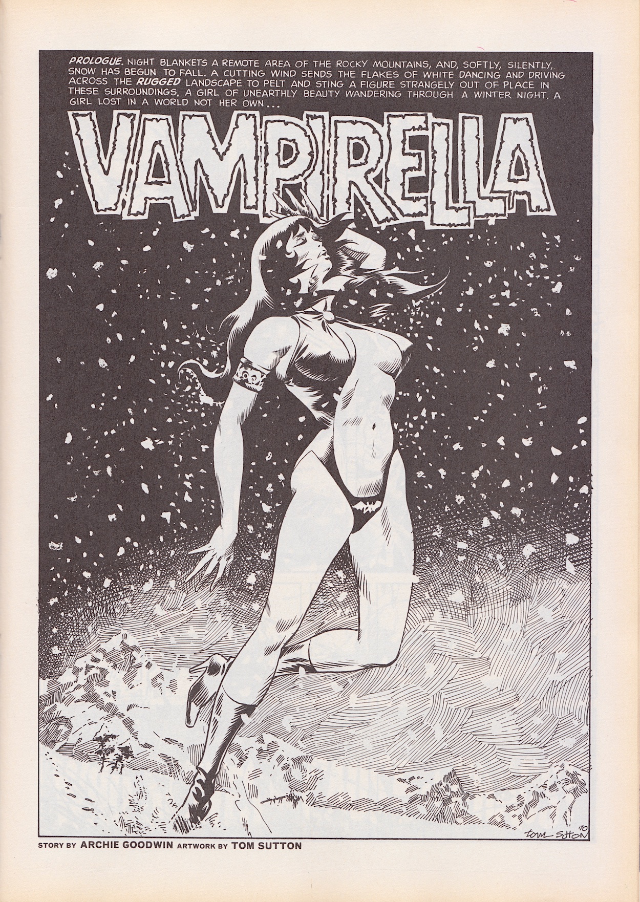
Vampirella‘s strip (written by Archie Goodwin, drawn by Tom Sutton) is reduced to seven pages to make way for a second back up, although personally I’m quite glad there’s less this time. The place she found herself in happens to be where a cult is trying to bring forth a demon of chaos and the scantily-clad alien vampire is to be sacrificed in order to do so. The man she fell in love with after five minutes turns out to be the soul of a warlock in a dead man’s body. He saves Vampirella and decides the evil nurse woman will be used as a vessel instead. How romantic. However, when she says no to him he turns on her (which sadly sounds rather familiar these days) and soon he’s trying to sacrifice her again.
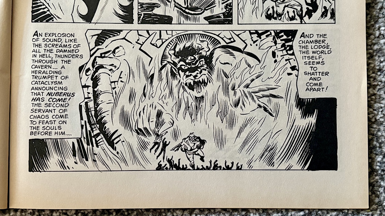
She’s saved by the monster from her visions, who is actually the soul of the deceased man inside the withered old body of the warlock. You keeping up? The summoned beast has come for their souls but instead devours all of the cult and the place crumbles under its power. It’s left up in the air whether it made its way through the portal and the strip ends with the revelation that Van Helsing is making his way around the graves of the crashed airplane’s passenger list, staking them all until he finds the vampire he knows was on board. (Such a shame the comic’s ‘Previously’ round up describes this despite it not being mentioned in the previous issue, ruining the twist.)
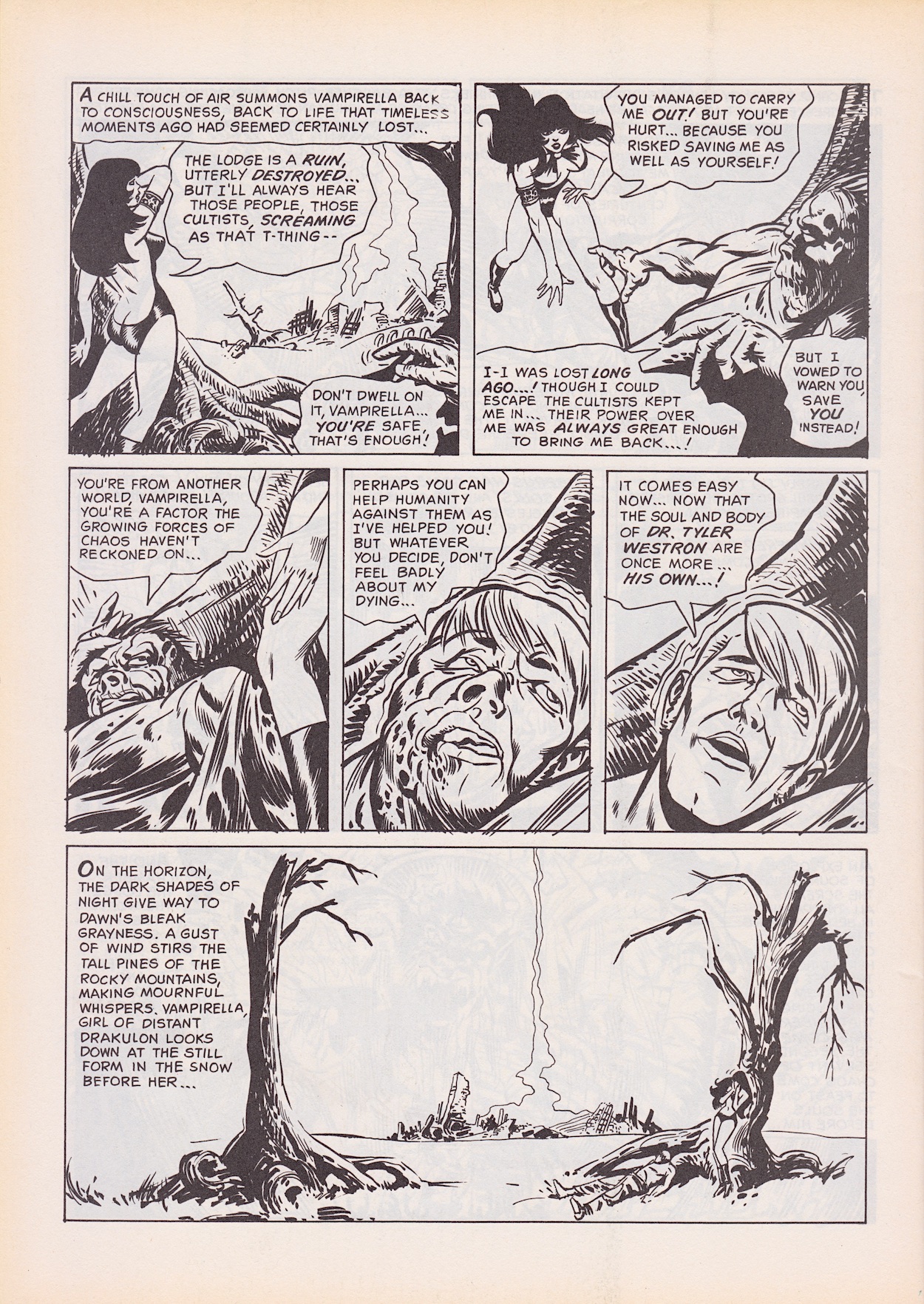
As my first delve into the world of Vampirella I’m not particularly underwhelmed because I had low expectations (see last issue’s review to find out why). I know it’s an old strip and it’s very much of its time, however I’ll admit there’s intrigue with Helsing’s mission and the chaos demons, so we’ll see if the characterisation of the lead develops more next time.

There’s a fascinating two-page article by Adrian Rigelsford about a forgotten BBC Count Dracula production from the year of my birth, 1977. (The article begins with a play on words based on the pop rock band Transvision Vamp so I was sold immediately!) I didn’t think I’d be interested in some older Dracula adaptation but as soon as I found out Octopussy‘s Kamal Khan himself, Louis Jourdan played the Count I was, ahem, sucked in.
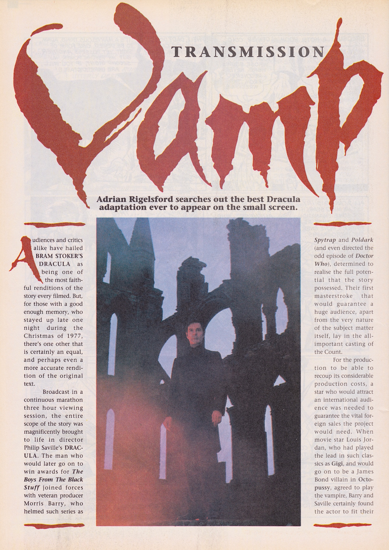
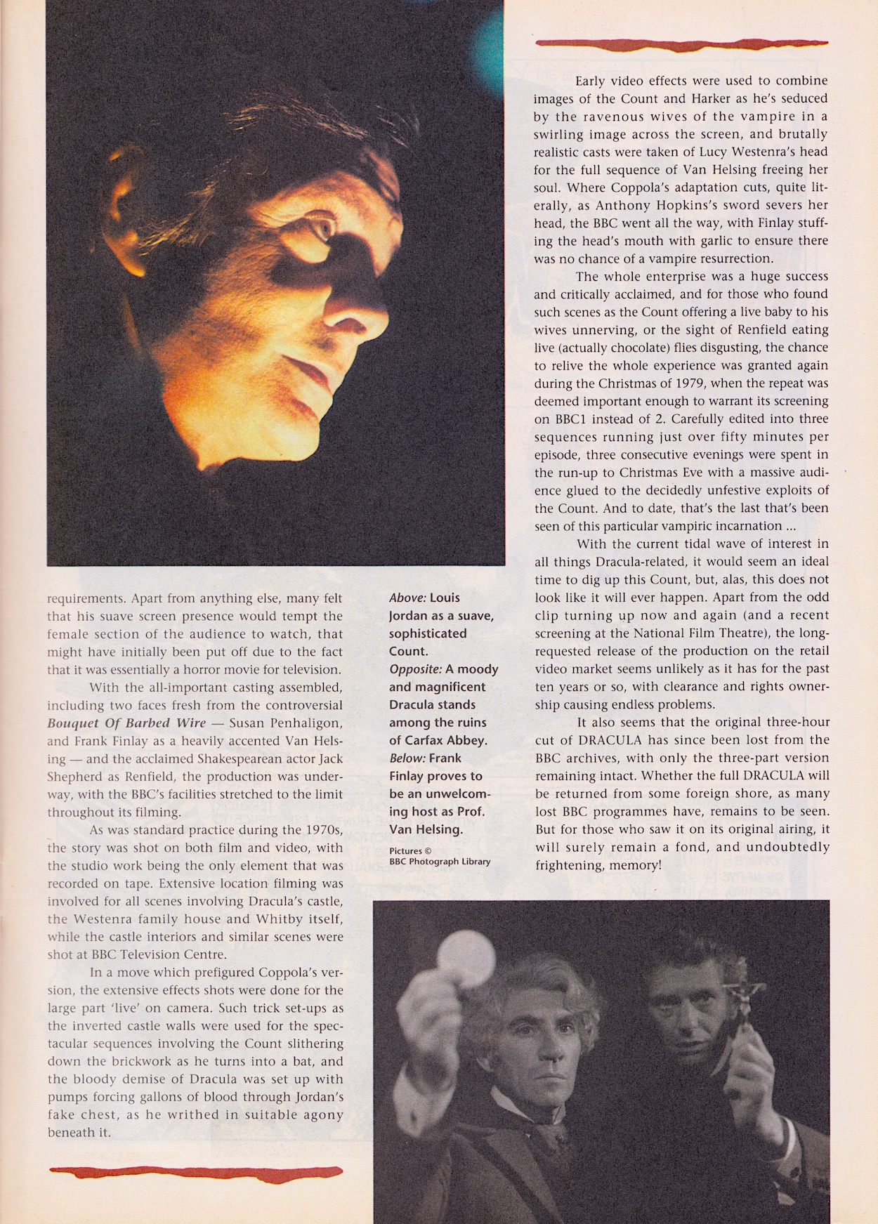
It all sounds fang-tastic (sorry). Originally shown as a three-hour movie and then split into episodes for repeats, at the time of this comic’s publication it was thought to be one of those “lost” BBC shows, which as a Doctor Fan I know all about. However, in a spooky coincidence, in the same month this issue was released the BBC repeated Count Dracula as a two-parter, possibly spurred on by the success of Francis Ford Coppola‘s movie. It hasn’t been broadcast since but was released on DVD in the early 2000s, so there may be a little second-hand purchase for Hallowe’en this year.

Finally, there’s a second six-page back up strip simply called Werewolf. I sighed when I saw a credit for Vampirella’s writer but this is an error, it was actually written by Larry Ivie (Eerie, T.H.U.N.D.E.R. Agents, artist on Castle of Frankenstein) for #1 of Creepy back in 1964 by Vampirella’s Warren Publishing. This story follows a complete asshole of a big game hunter (aren’t they all?) but he’s by no means the hero of the story. Treating local tribespeople like simpletons and beating his assistant, the ultimate outcome of the strip is satisfying as a result.
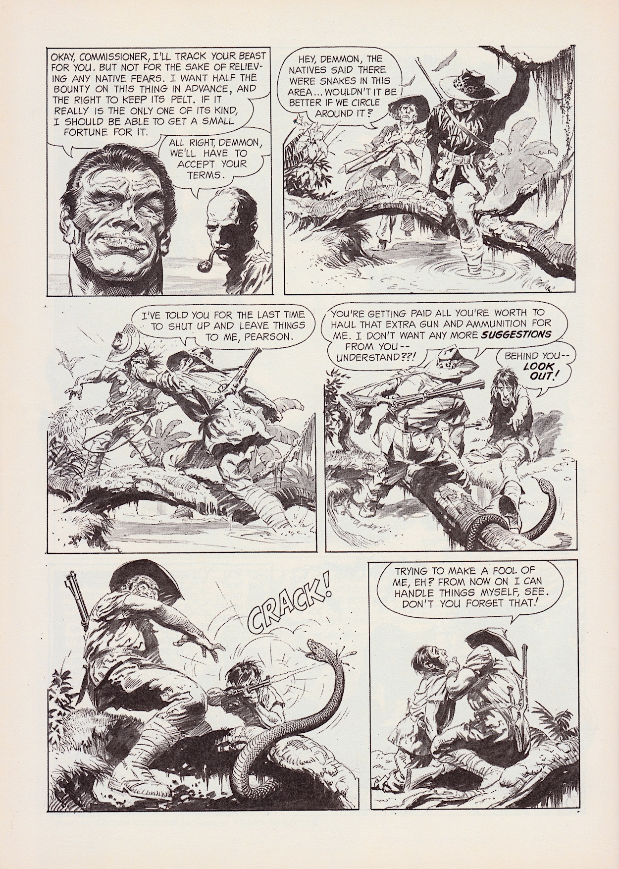
He’s been hired to track down a fabled immortal beast that’s said to transform into a human during the day. It has never killed but its evil apparently infects those around it. In the end he does indeed track it down and empties bullet after bullet into it to no avail. Not until he hits the one tiny white spot on its body does it fall to the ground. It then turns into a previous animal hunter, who had been cursed to live as the beast until someone else skilled in killing innocent animals could take it down.
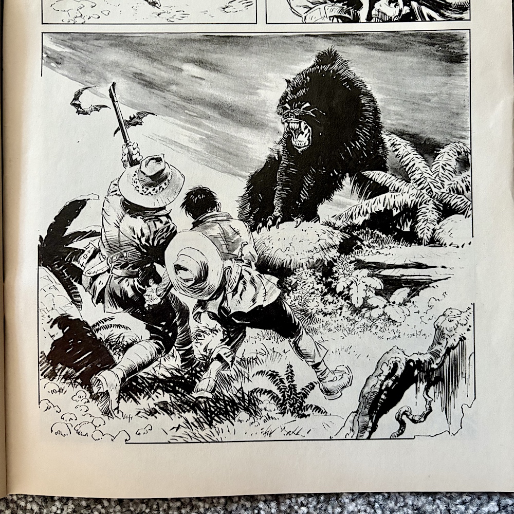
The hunter of the story then transforms into the werewolf, doomed to live this way for hundreds of years just like his predecessor. The moral of the story is clear and it’s always fun to see someone who hunts animals for fun get their commence in my book. Or in my comics, I should say. A simple, straight-to-the-point story with some gorgeous art by Frank Frazetta (Famous Funnies, Conan the Barbarian novel covers, album covers and movie posters), this bodes well for the comic’s choice of any additional back up strips from here on. Speaking of which, time to check out that back cover.
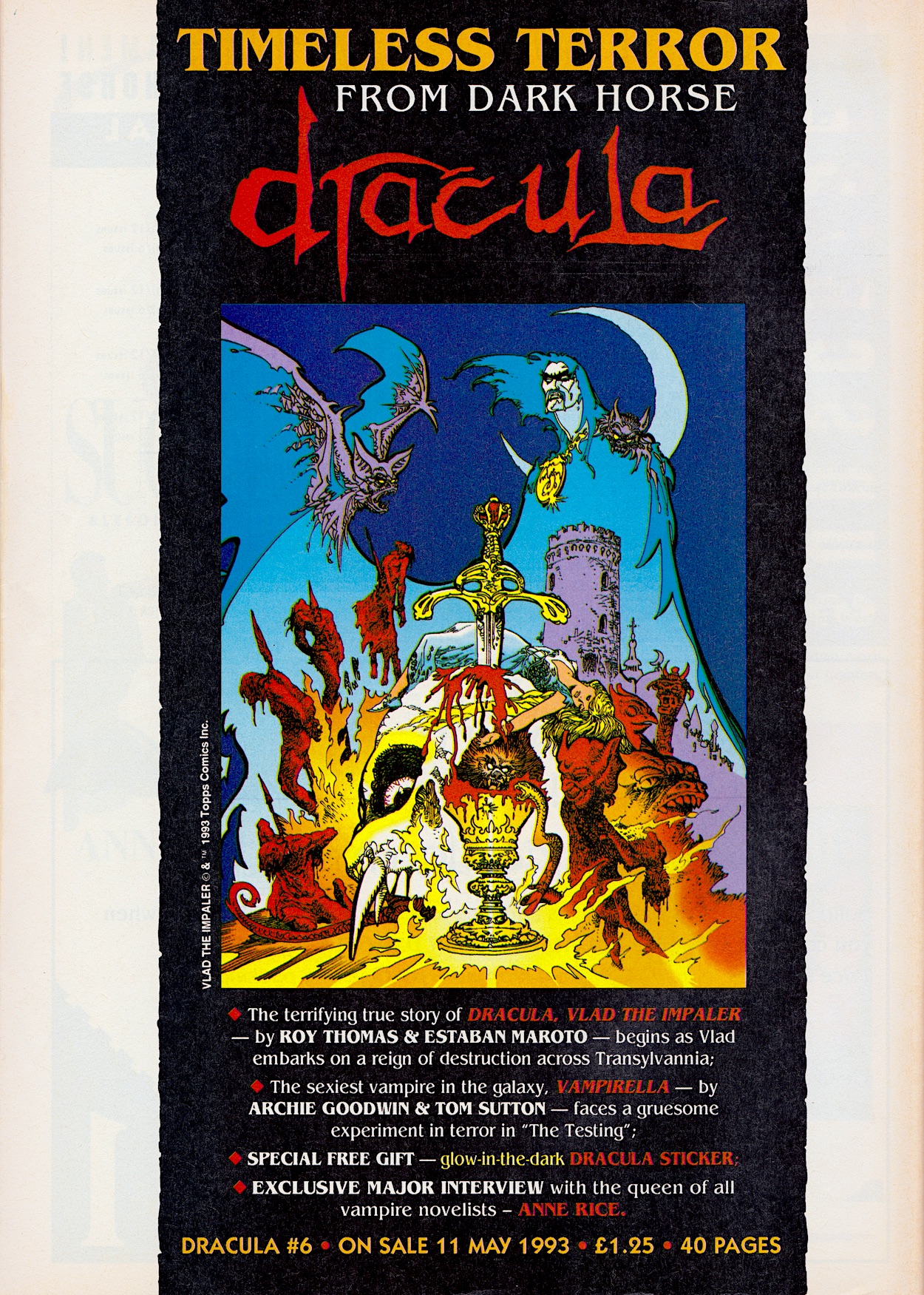
There’s a full-page Next Issue back cover just like Aliens had in its #8 and this too was used as advertising across the range. With four more pages (is this where Aliens’ four pages wandered off to?), the origin story of our main character, more Vampirella and an interview (fingers crossed) with Anne Rice, the comic is about to continue morphing into something quite different, heralded by the change in logo away from that of the movie’s. All for the same price though. Which of course is free for you lot, just tune into the OiNK Blog from Sunday 11th May (four weeks from now instead of three).

iSSUE FOUR < > iSSUE SiX

DRACULA MENU

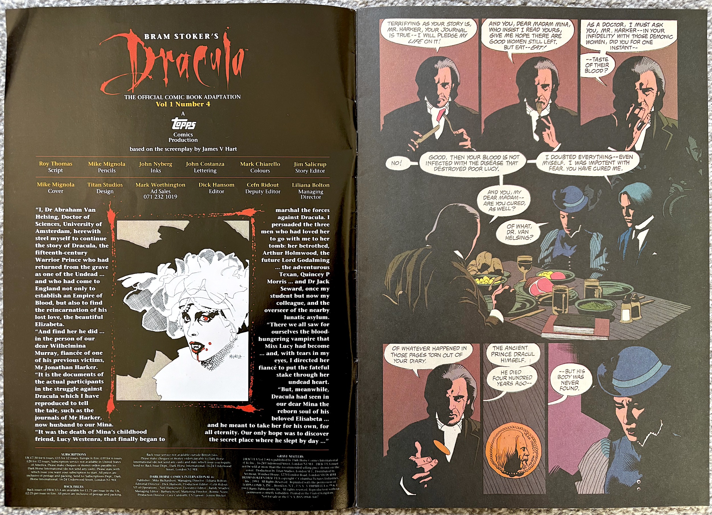
BRAM STOKER’S DRACULA #4: THE CHANGiNG FACE OF EViL

While it’s not the easiest to read (and so wouldn’t have stood out from the cover on newsagent shelves), look closely at Mika Mignola’s cover to this latest edition of Dark Horse International’s Bram Stoker’s Dracula and you’ll spot a new addition to this fourth issue. Vampirella has joined the comic as a back up strip, just as Xenozoic Tales would join the fourth issue of the publisher’s Jurassic Park later in the year.

For both series, sales figures had proved themselves enough that the three-weekly movie adaptations were turned into monthly ongoings, the final chapter split in order to get ahead of the new schedule and introduce readers to new content. Inside this comic, both strips run to 14 pages, Dracula himself getting exactly half the amount as normal. However, Vampirella gets no introduction anywhere and the editorial is still in the hands of Van Helsing.

I’m going to assume once the main strip concludes we’ll no longer have these characterful introductions so I’m enjoying them while they last. The final chapter begins with a scene that simply can’t be conveyed properly through still images, that of Anthony Hopkins devouring his food in the English pub like a savage. The result is a much more restrained version of the character, which is unfortunate.

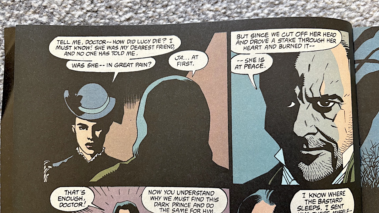
In fact, I realise this has been the main problem for writer Roy Thomas all this time. It’s just impossible to convey in a comic the wonderful acting choices the talented cast made throughout the movie. However, when we turn the page and Mina questions him on how her best friend Lucy died, we do get one of the film’s rare comedic moments still intact. Darkly comedic of course. Very darkly comedic. 

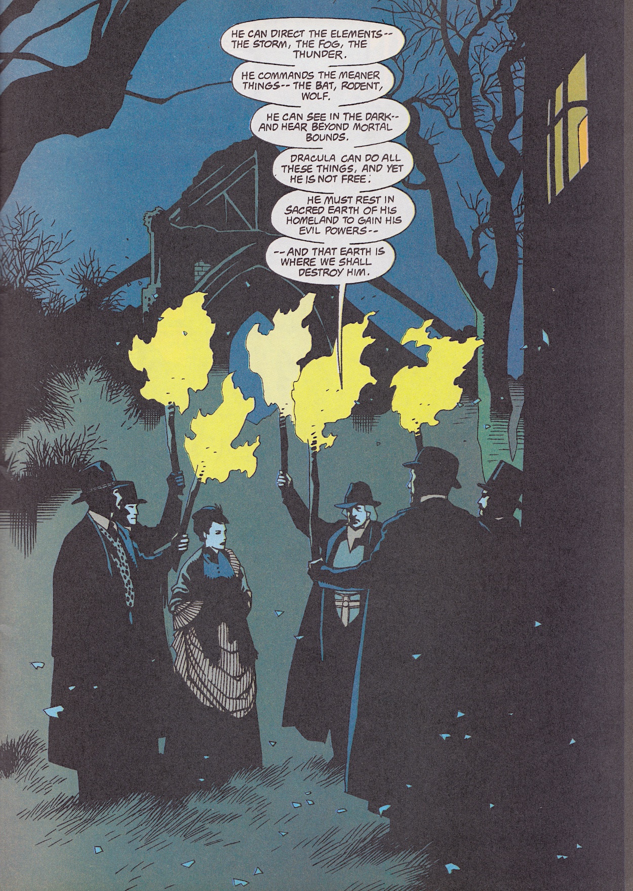
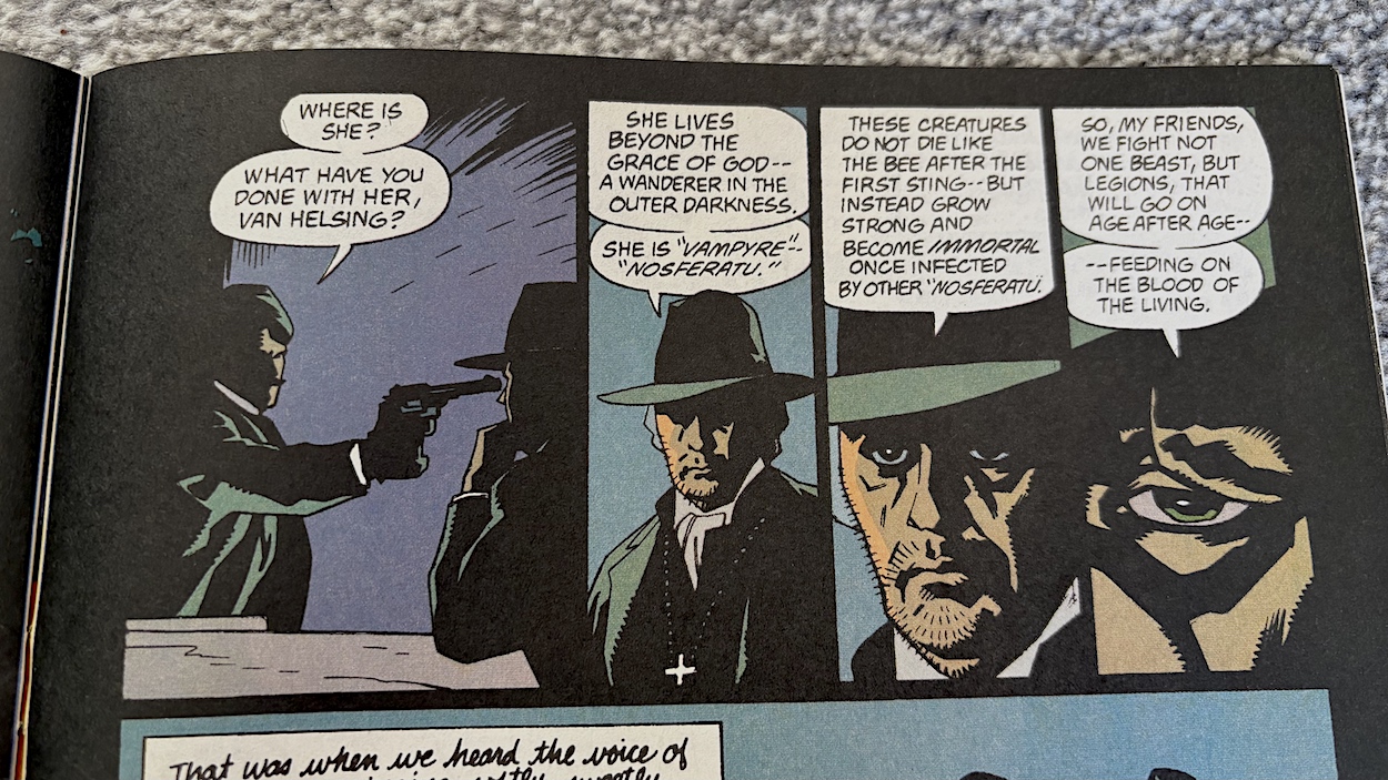
This chapter includes the burning of the boxes containing Transylvanian soil Dracula had moved to his newly purchased, abandoned Abbey. It includes all of the ancient text, the Latin words spoken by Van Helsing to cleanse the place of evil. But more interestingly for me is the beginning of this scene with the rules of the vampire set out. They were a world apart from the clichéd rules we’d become used to from decades of other movies and TV shows.

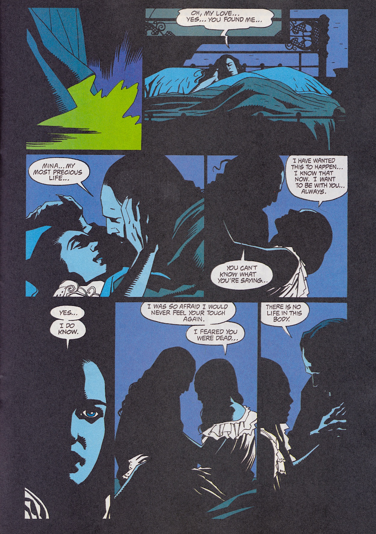
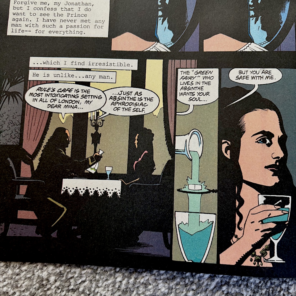
Alongside the death of Renfield the main bulk here is dedicated to Mina deciding to join her beloved Count in eternal life. While it’d be impossible to convey how surprisingly touching this scene was (especially given what it was about!) thanks to the excellent performances of Gary Oldman and Winona Ryder, penciller Mike, inker John Nyberg and colourist Mark Chiarello (alongside letterer John Costanza) do an excellent job of portraying their intimacy in what’s actually a shocking moment. For an adaptation of this movie it’s perfect.

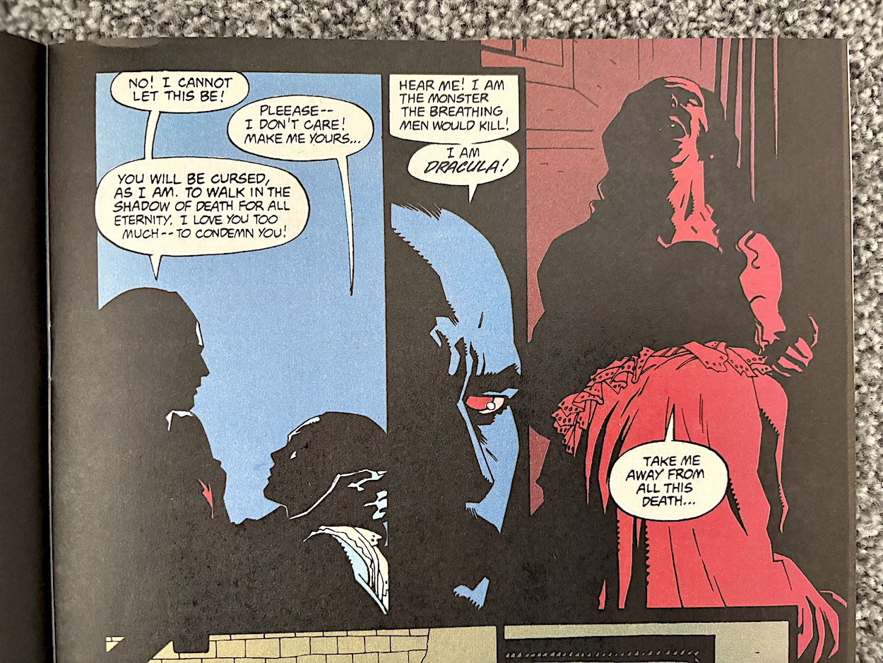
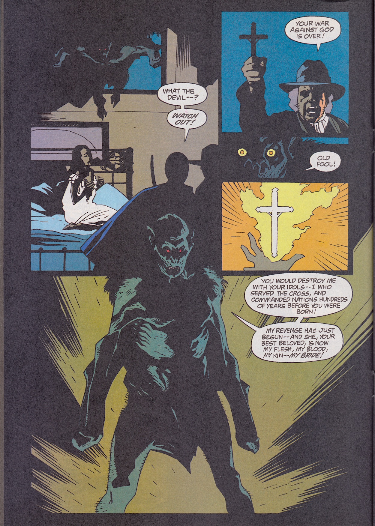
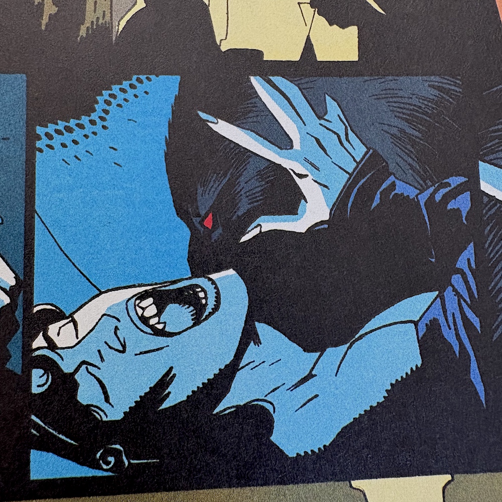
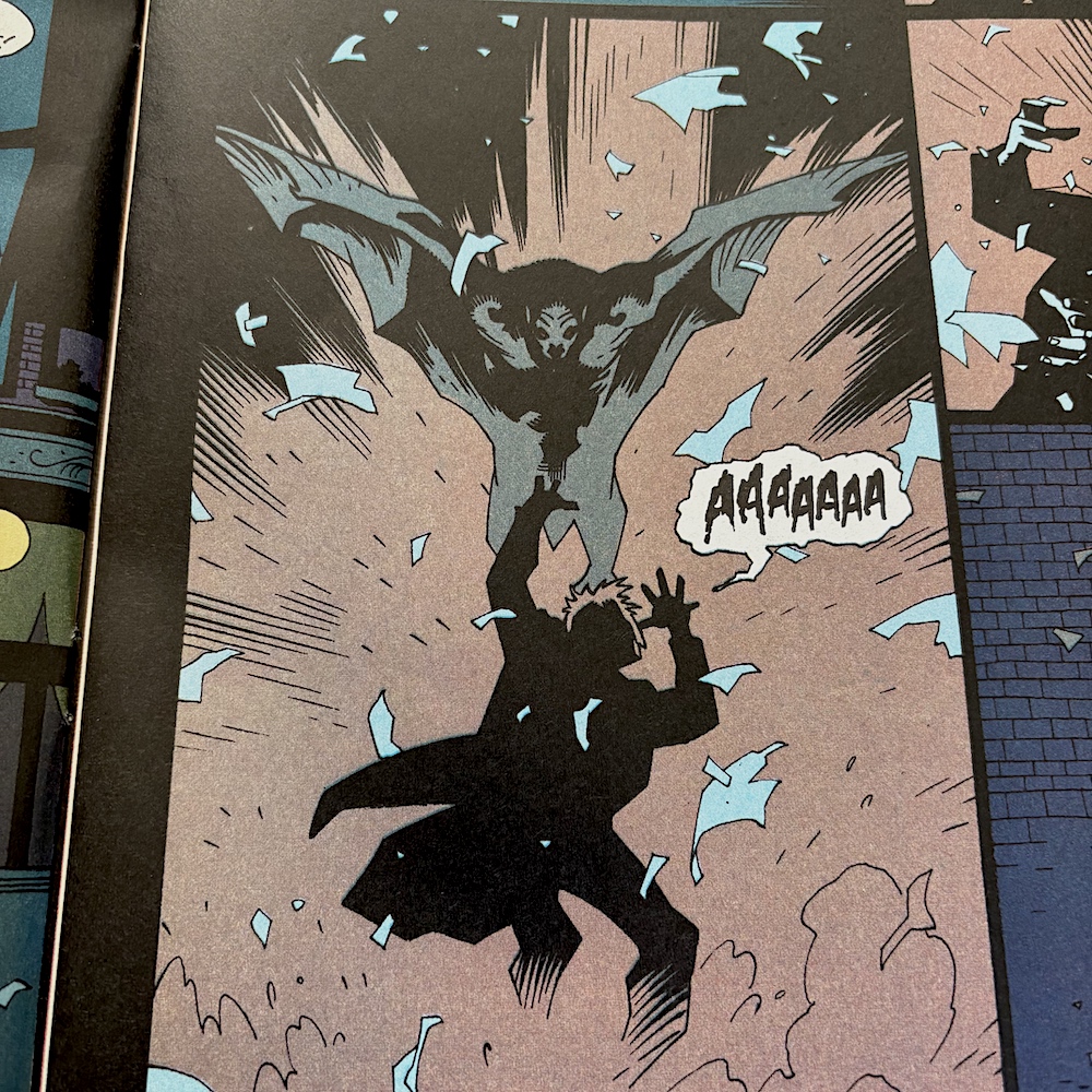
The iconic moment of Dracula using one of his nails to slice across his chest, drawing blood for Mina to drink, is presented in a similar fashion. Then the colours are shifted for one panel to highlight the key moment. After two pages of blue this really stands out. Then, interrupted by Jonathan and Van Helsing, Dracula changes into his man bat form and reiterates his anger from the beginning of the film. I always found this the most fascinating and surprising part of the character; a devoted Christian who had sacrificed so much in the name of their God, the religion’s archaic beliefs and the selfish nature of its men betraying him.

I never knew this side of the character from the Dracula films we saw growing up; he and Christianity are essentially two sides of the same coin. While the cross and Van Helsing’s devotion to the faith fight evil, Coppola’s film never let us forget whose fault this was in the first place, why Vlad became what he did. On the flip side, he’s obviously a monster and a mass murderer but we never forget why this happened to him. The film perfectly balances this to such a degree that we’re both horrified and emotionally moved by him.

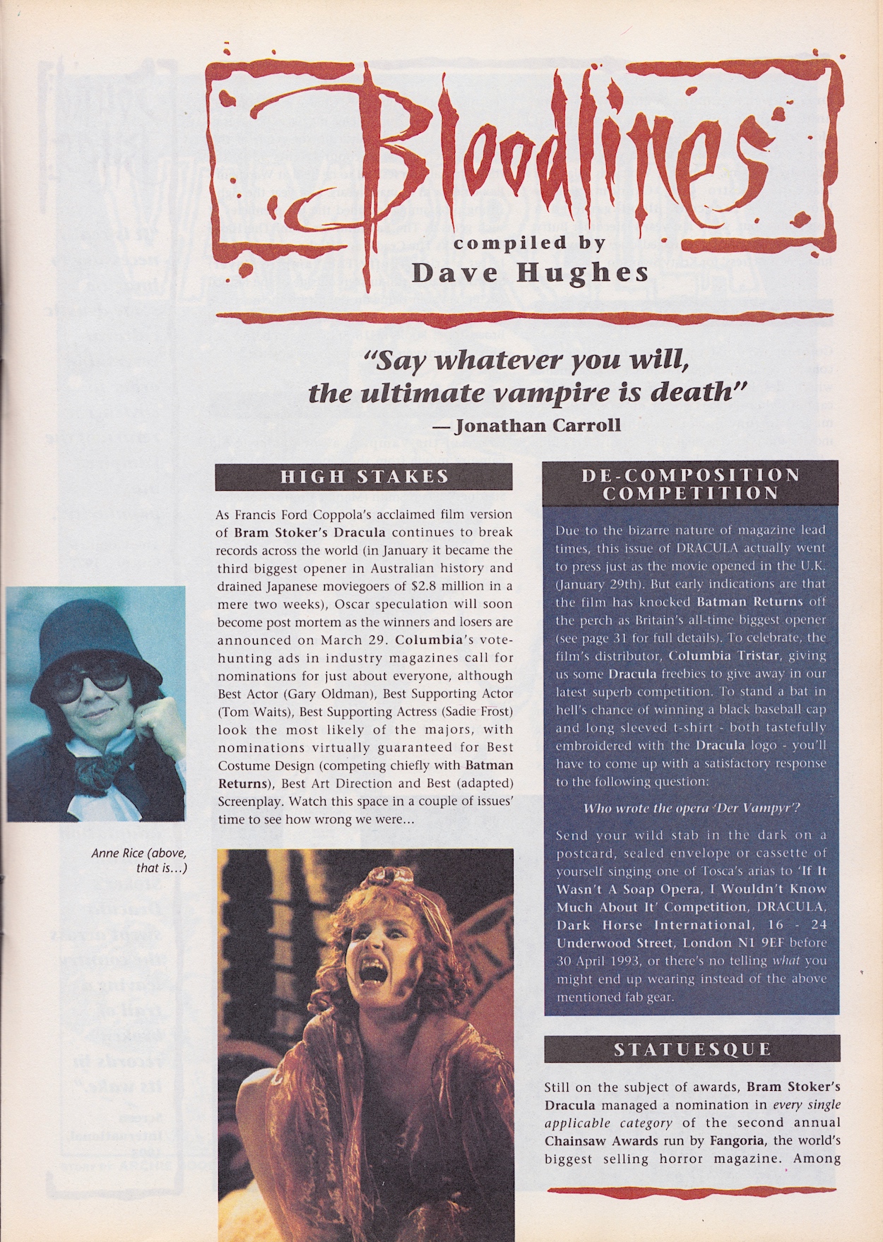
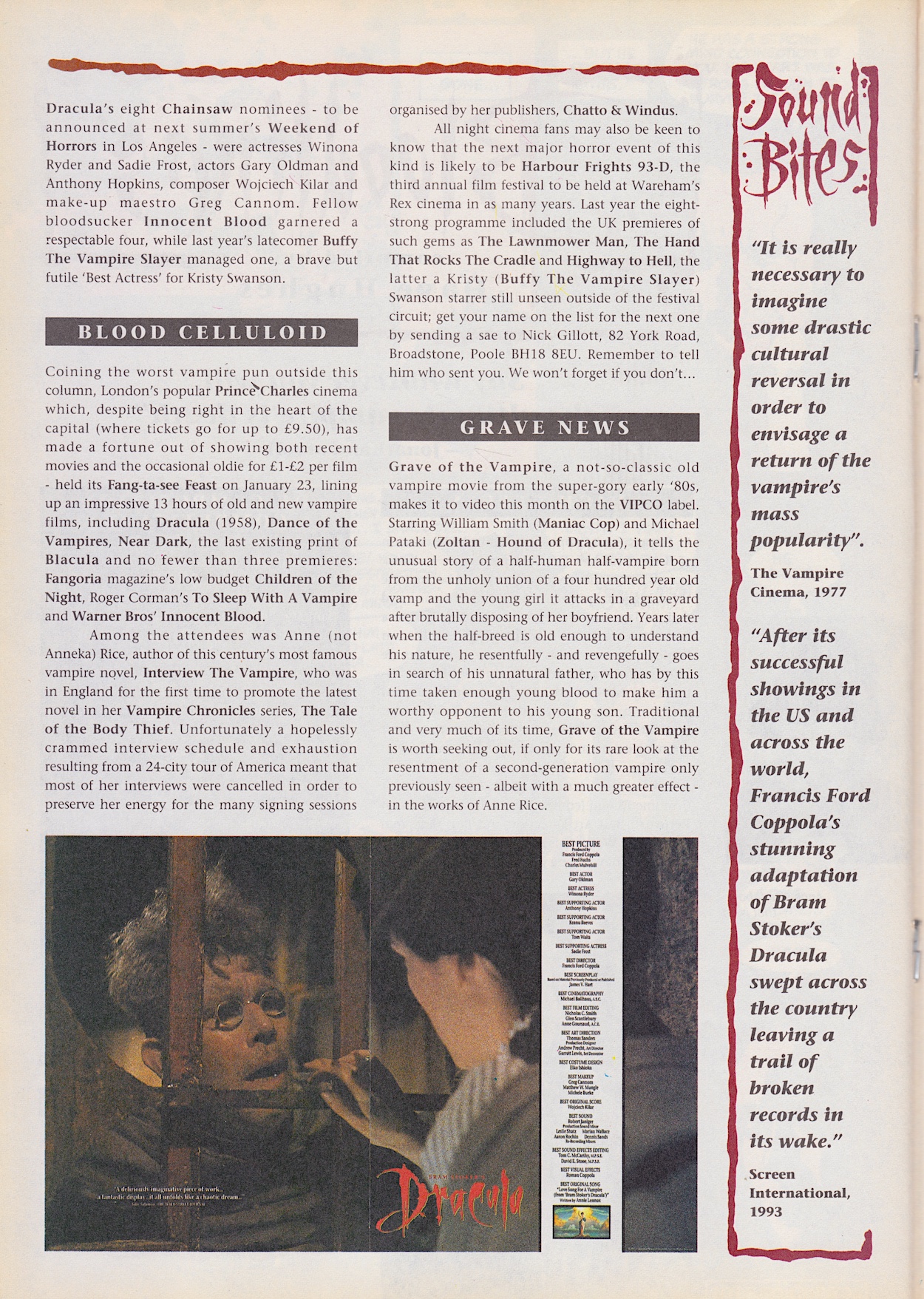
In the middle of the issue is Bloodlines by Dave Hughes, the usual two-page news section about all things vampiric in the world of 90s entertainment. Dracula’s Oscar nominations are mentioned and, while I could easily look up who did and did not win, I’m going to wait and let the comic tell me, just as readers at the time had to. I’m looking forward to finding out, though.

The competition informs us of the insane lead time needed when working on the comic, the Sound Bites are actually interesting this month with their comparison between 1977 (the year I was born, funnily enough) and 1993 in respect to thoughts about vampire films, and there’s mention of all-night events at the cinema. Personally, I found watching Terminator 1, 2 and Genisys back-to-back in a cinema long enough, never mind a whole night! (Especially given how that place smelled by the end.)

I have to say the choice of image for the award nominations as presented by Columbia Pictures is a strange one. To anyone not familiar with the film they could easy assume Tom Waits was playing the lead character. Then opposite this always-fun news feature is the first page of our black-and-white back up and I breathed a sigh when I saw it. Not of relief, but of disappointment and pessimism.

Over the years I’ve seen Vampirella comics advertised here and there and even as an impressionable teenage boy I always felt her clothing (or lack of) was shamelessly gratuitous. Not that I would’ve used those words as a teenager! As an adult I think she always looked like she was there to appeal to a certain type of male reader, of which I am not. So while researching for this review it was a shock to find out she was co-created by a woman.

Trina Robbins did so much fantastic work to raise the profile of women in comics that I’m rethinking my assumptions about this character

Vampirella was created by Forrest J. Ackerman (literary agent, actor, editor) and Trina Robbins (Wonder Woman, Strip AIDS, GoGirl!) in 1969. Trina did so much fantastic work to raise the profile of women in comics throughout her life I’m rethinking my assumptions about this character. In fact, it was Trina who designed her look. Editor Archie Goodwin then continued to write and develop her.

While the issue gives no official introduction other than the cover headline, there’s a brief history of the character in the strip. So, Earth’s vampires originate from Dracula, a forgotten member of the Vampiri race who left his homeworld (Drakulon) centuries ago only to be corrupted by the demonic entity known as Chaos. Vampirella is the last of her race who came to our planet after her own died out. With no other choice, she has to feed on human blood. However, underneath she’s good so I’m assuming she attacks and drinks but does not kill. Even Dracula was originally peaceful in his story. I also assume the ridiculously revealing costume is how her race dress.

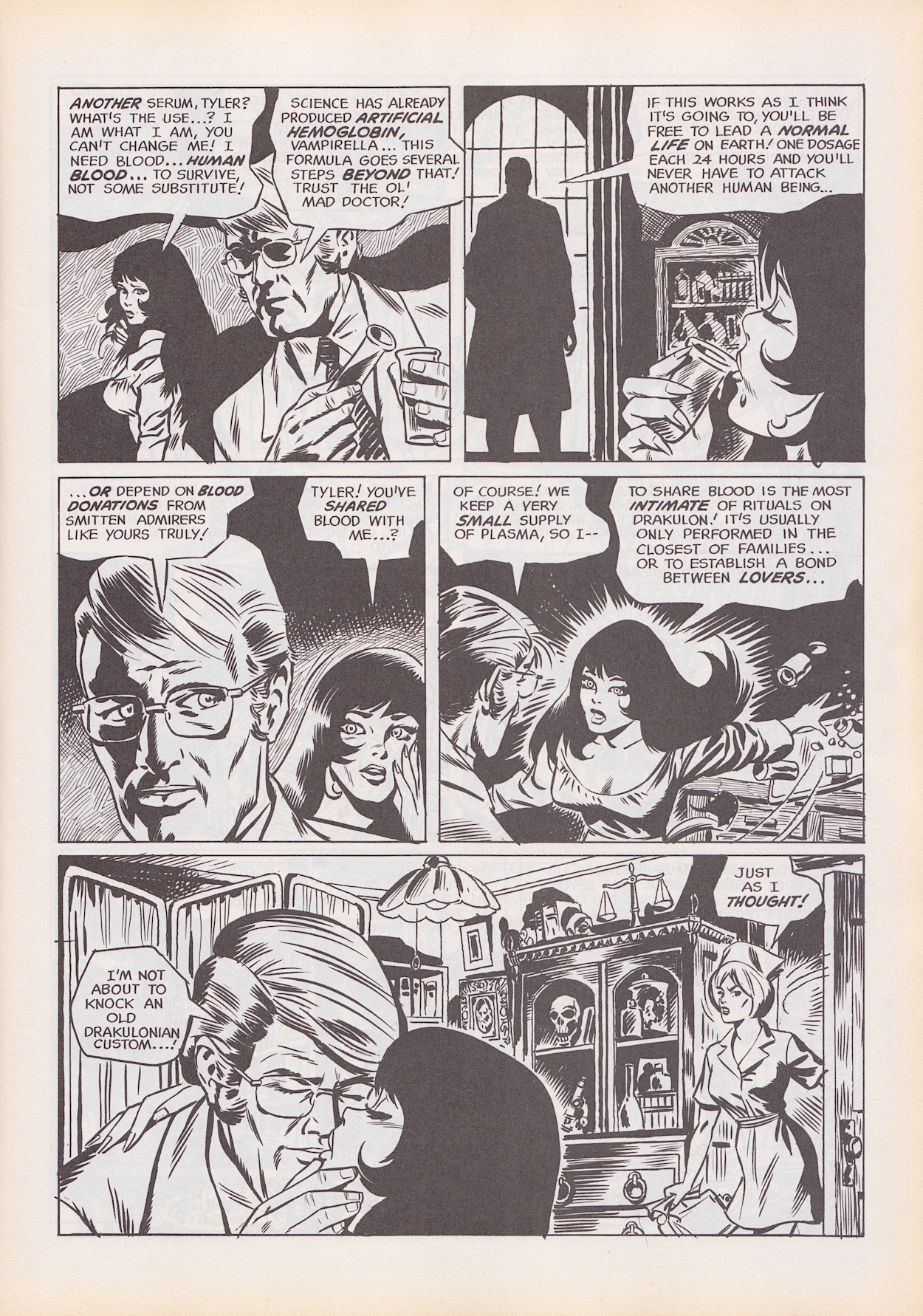
It’d be polite to say this story is “of its time”. While Trina co-created her, this particular story (of which she was not involved in) feels very much like a strip written by men for men. Rescued from the cold by a doctor running a remote retreat for the rich, he’s amputated her apparently rotting wings and is clearly lusting after her, despite an angry nurse claiming he must keep his distance from Vampirella while dangling a satanic-looking necklace.

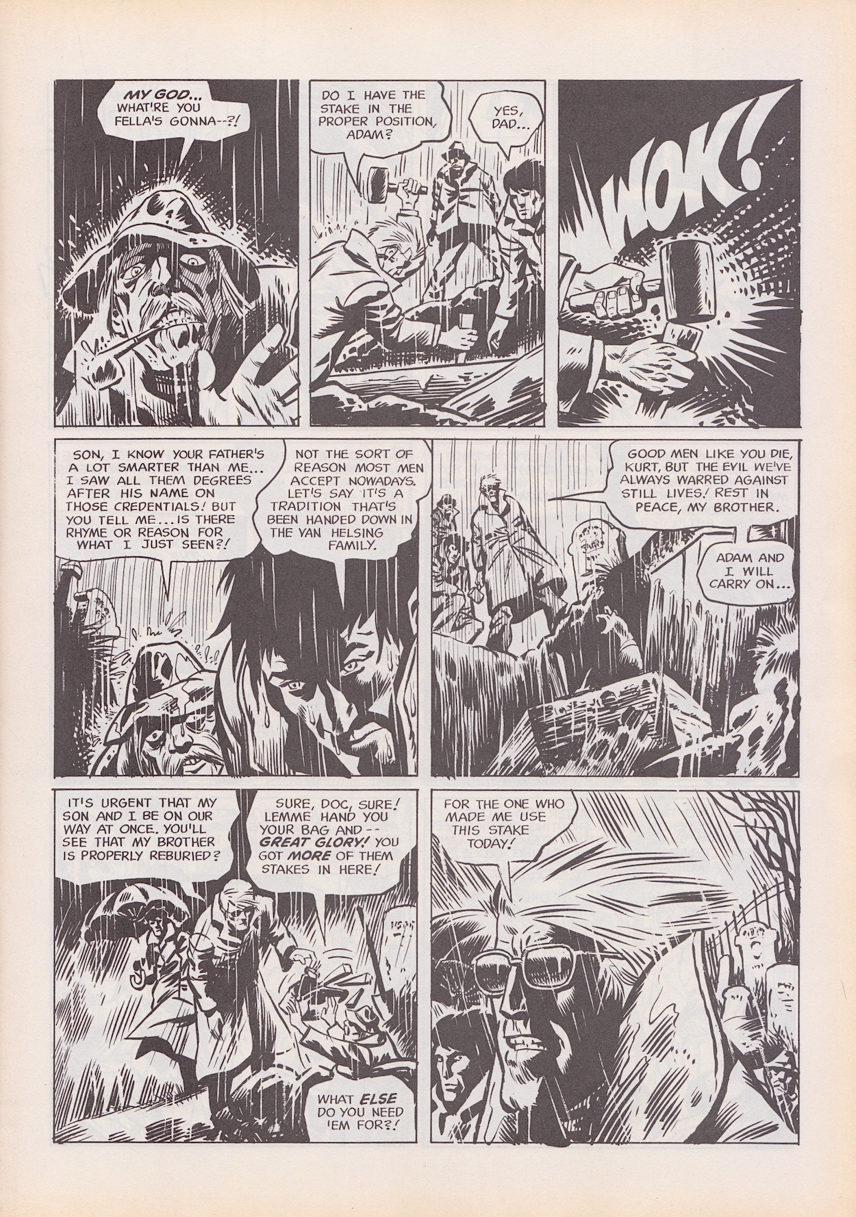
The best part is a graveyard scene depicting a descendent of Van Helsing‘s digging up bodies to ram stakes through their hearts. This might explain why this story has been chosen as a back up and it’s an interesting segue, but in the main I’m disappointed with our main character. She’s scared of the doctor, terrified even, and for most of the strip is portrayed as having a strong will to resist whatever drugs she’s on. She’s piecing together the mystery of what’s going on but then suddenly she’s snogging the man after a simple slug of his blood.

The strip is from 1970 so it’s very much from a time when a strong female lead character was rare. In fact, that was still a rare thing when Barrie Tomlinson created Kitten Magee in Wildcat comic in the late 1980s! But this was the 70s, so apparently a strong female character still had to be dressed to appeal to men’s baser instincts and fall for the man full of red flags at the drop of a hat. This doesn’t read well today.

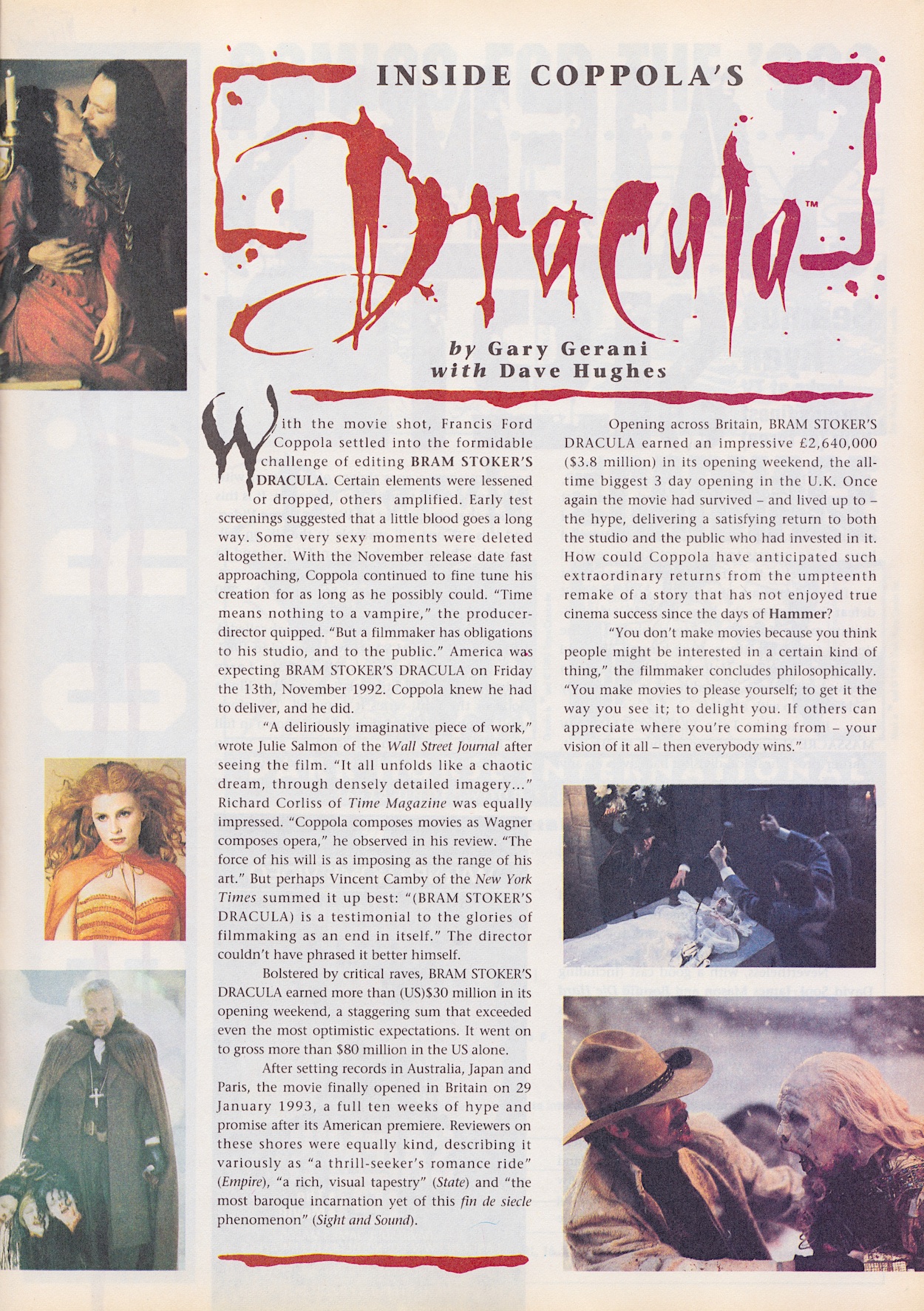
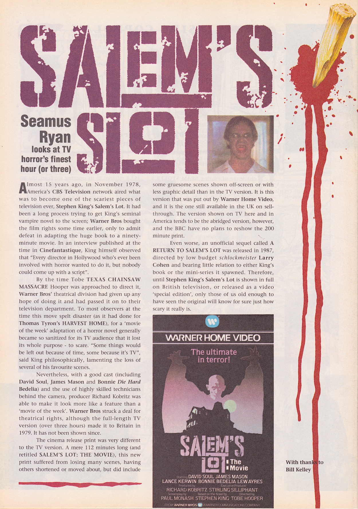
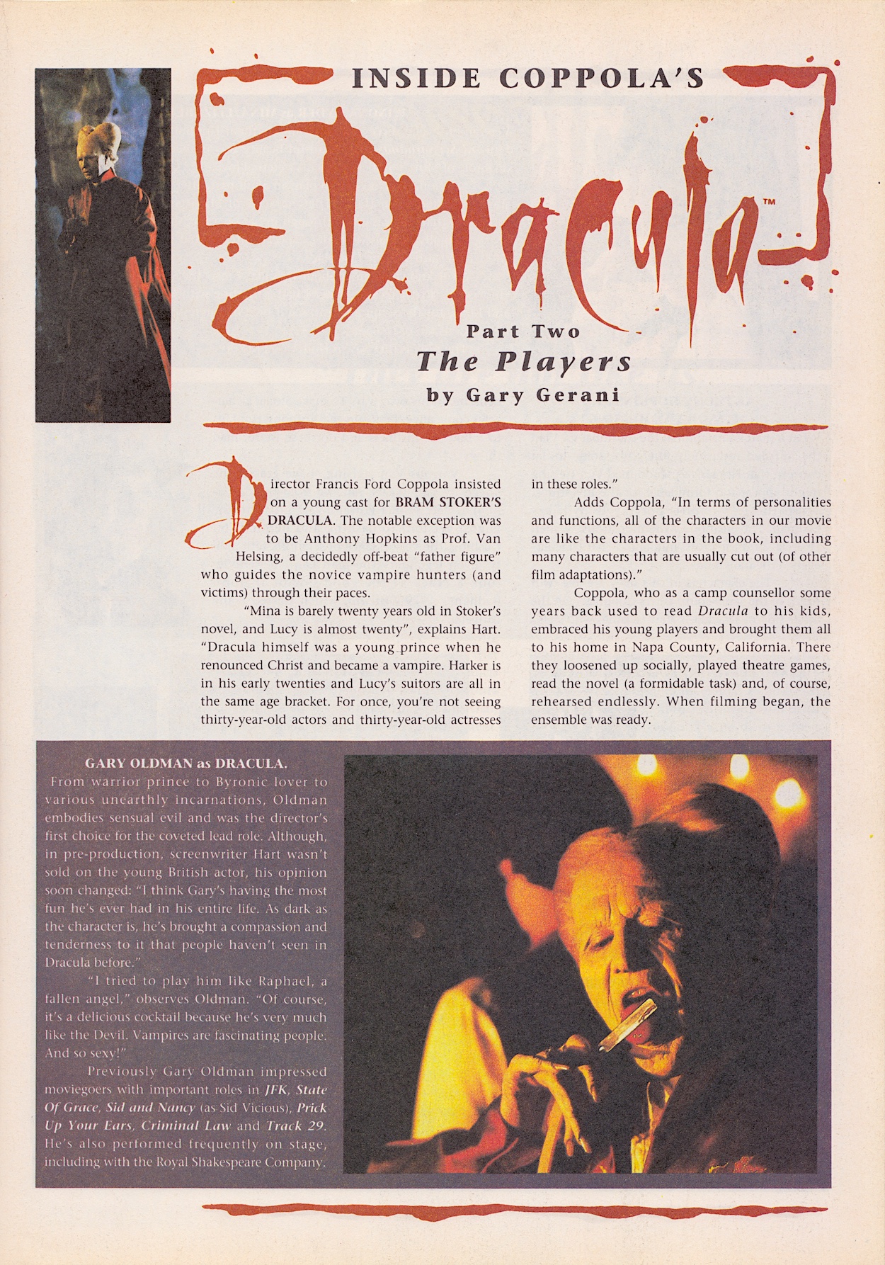
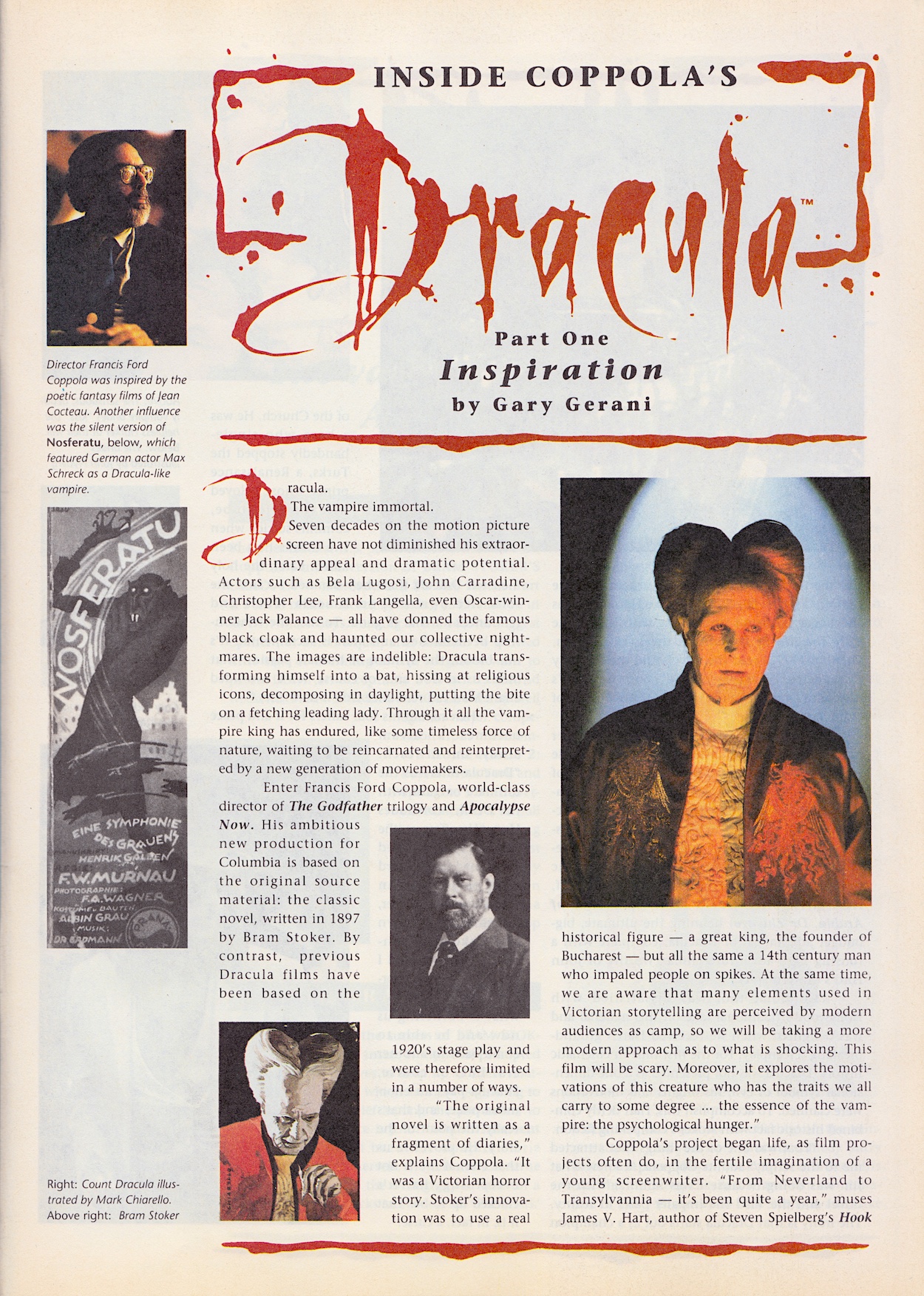
Back to the comic’s title character and the Inside Dracula making-of series by Gary Gerani and Dave Hughes is only one page this month, possibly to spread the final part over two issues just like the strip. A piece about Salem’s Lot by Seamus Ryan is the random substitute for one page, in which he discusses its vastly different cuts. Disappointingly, there’s still no sign of the promised Sadie Frost interview and by this point I’m just going to assume it’s not going to appear.

The mention of deleted scenes reminded me I still hadn’t checked them out so I got my Apple TV on and watched them today. I like making-of features but usually skip deleted scenes (they’ve been deleted for a reason). After watching them for Dracula I can still say the only exception are the ones from The Lost World: Jurassic Park, which I’d love to see added back in to that movie. Oh, and Dracula’s final box office? On a budget of $40,000,000 it raked in a superb $215,862,692 according to Box Office Mojo. Superb! And well deserved!

The final paragraph of director Francis Ford Coppola’s view on why he makes movies reminds me of why I write. So it feels like a fitting note to end the review on. I’m intrigued to find out what direction the comic is headed in and look forward to the art depicting the movie’s climax in just three weeks, on Sunday 13th April 2025.

iSSUE THREE < > iSSUE FiVE

DRACULA MENU

BRAM STOKER’S DRACULA #3: iCONiC EYE CANDY

Mike Mignola’s cover may not be as intricately painted as last month’s but through clever used of colour, and the changing of the logo to suit, we’ve another atmospheric introduction to the latest issue of Dark Horse International’s Bram Stoker’s Dracula. This third edition went on sale this day 32 years ago and continues with its regular format for now, with a 28-page chapter of the movie adaptation and four pages of extras bringing up the rear.

I have to say I still love the comic’s editorial page every issue. Written in the style of the Van Helsing character from the film it’s an inventive and fun way to kickstart things every three weeks. It certainly makes the plain contents pages of DHI’s Jurassic Park comic feel like a wasted opportunity. Here, Anthony Hopkins’ voice reminds us who some of the other characters are who’ll be featuring heavily in this issue, an issue with a surprising amount of iconic imagery, which I’ll get to later.

After such a great start in the first two editions, as we get into the meat of the second half of the film it feels like the strip is having to play catch up. It’s racing along, jumping back and forth between scenes after only paying lip service to them. Even as a fan of the film who watches it every Hallowe’en it felt confusing, like it’s been hastily chopped up and squeezed in rather than being properly adapted to another medium.

Don’t get me wrong, thanks to an interview with the writer of The Lost World: Jurassic Park’s adaptation we know how difficult it can be to adapt a movie to comic form and this film in particular couldn’t have been easy! I get that. So please do not see any critiques as being critical of writer Roy Thomas, this must have been a next-to-impossible task, it’s an incredibly visual film and delivers a lot of its thrills through original direction.

There are moments where I’d defy anyone who hasn’t seen the film in a long time to instantly recognise what’s happening. I last saw it only a few of months ago and I still had to reread some pages and look longer at some panels to remember what was meant to be going on. The problem is it’s suddenly trying too hard to follow the film moment-for-moment, instead of adapting it like we know the team is more than capable of from the previous issues .

As the film used its quick cuts, speeded up moments and dramatic music we easily followed what was going on while at the same time feeling bombarded and breathless, as intended by Coppola. But trying to do that with still images just isn’t going to work. However, the quieter moments between Dracula and Mina are again the highlight of the issue and highly enjoyable.

Special mention again to letterer John Costanza for the various forms of diary entries. A pattern emerges as I continue to read. The human moments are handled particularly well but the horror elements fall flat and end up confusing. Thankfully, there are some dramatic moments that come from the more chatty human scenes instead of the visual flair of Coppola, and in these instances the comic’s potential shines.

I mentioned iconic imagery, but what do I mean by that? Simply that there were certain images in the film that perfectly captured its intent as a whole. There are also fan favourite moments, as well as scenes which perfectly summed up Francis Ford Coppola’s vision with just a quick snippet.

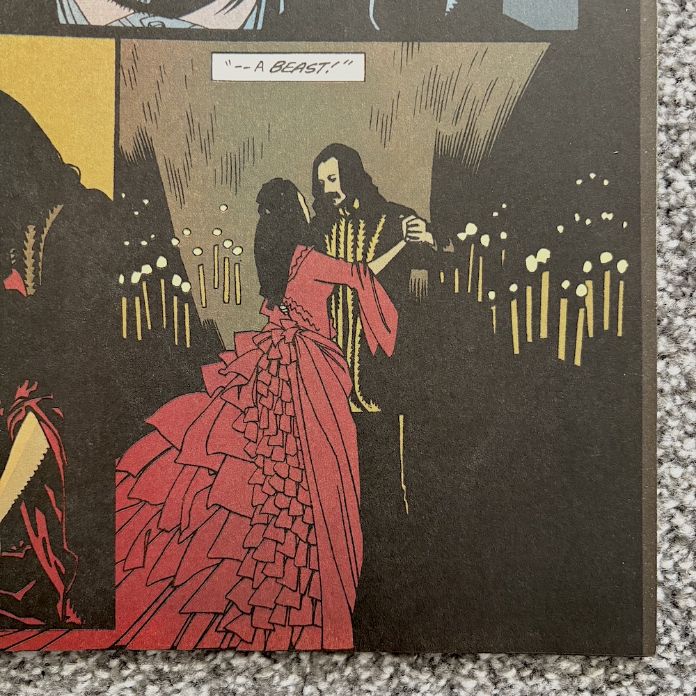
These are largely intact here and the first is that iconic moment when the Prince and Mina dance by candlelight, Winona’s character in that elegant and memorable red dress set against the darkness, perfectly capturing the colour palette of the film and thus encapsulating more than the moment itself. These were moments also used in the marketing at the time and ever since for good reason.

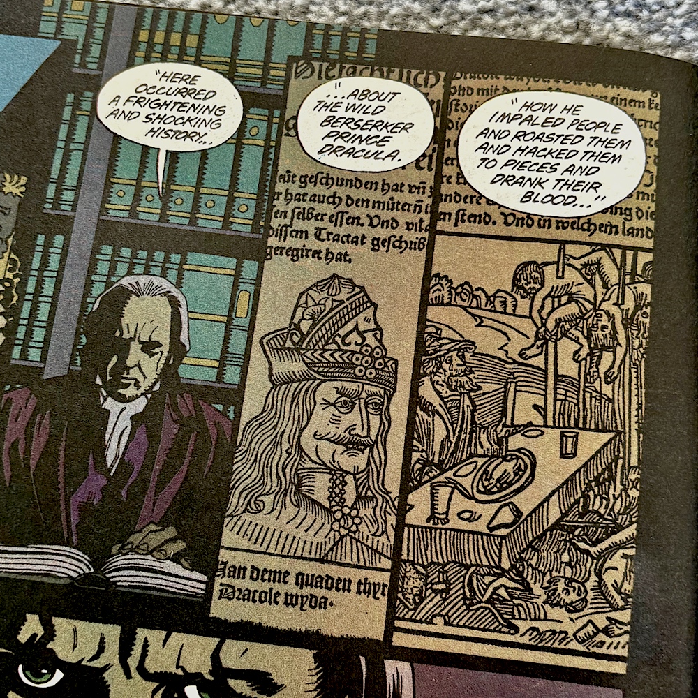
The ancient texts telling the story of Vlad, Sadie Frost’s Lucy character receiving her final bite to transform her and the giant man bat moment that the behind-the-scenes feature below actually talks about. All of these and more are present and correct, and all are brought to the page superbly by penciller Mike, inker John Nyberg and colourist Mark Chiarello.

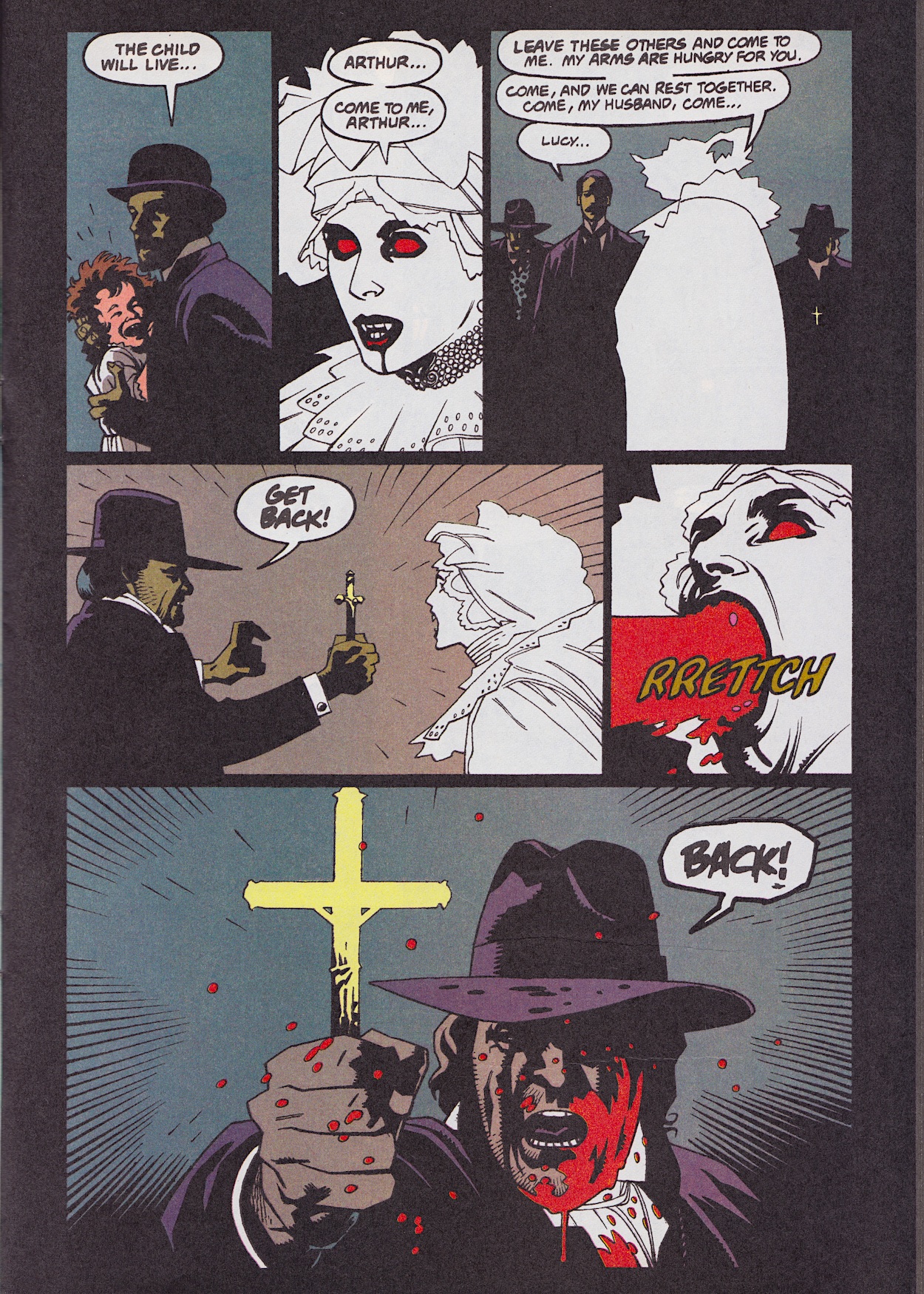
The creepy, terrifying crypt scene involving the now undead Lucy takes up a good chunk of the end of this issue’s chapter and I love Mark’s decision to not use any shading whatsoever when drawing her. As a result she stands out from the page as an ethereal entity, the contrast of the blood feeling all the more gruesome.

Don’t get me wrong, I’m still enjoying this but in a different way than it was intended. Instead of reading it like a normal comic and being drawn into its story it’s like a love letter from the artists to the film. I’ve spoken at length in the previous reviews about how the artists have been able to craft the same atmosphere through a brave, original stylistic choice and it continues here. But you might struggle if you’re hoping the comic can tell the story on its own.

Dracula was released in the UK right at the beginning of 1993 and 32 years later as I began this real time read through a certain other movie was released, coincidentally enough. This timing passed me by until I read these panels below, which are our final highlight of the issue’s strip.

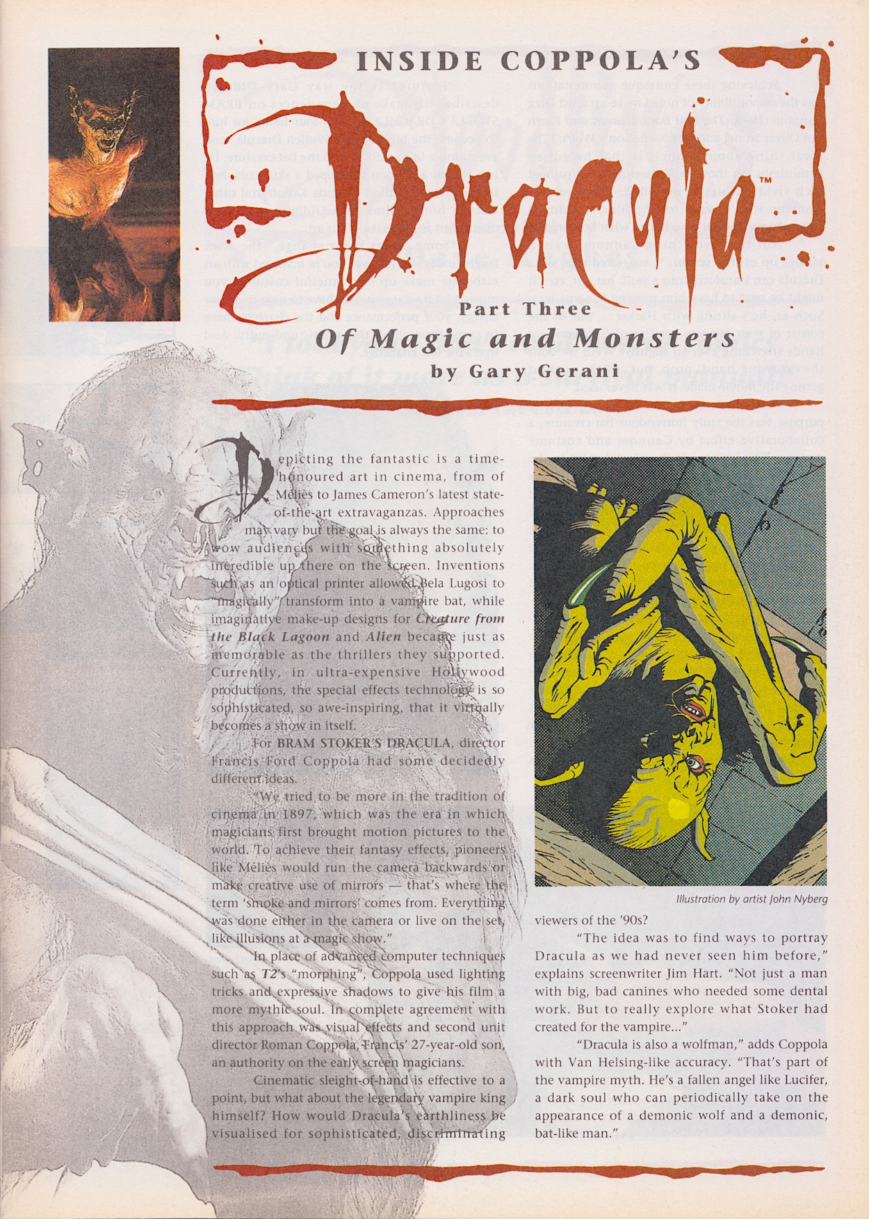
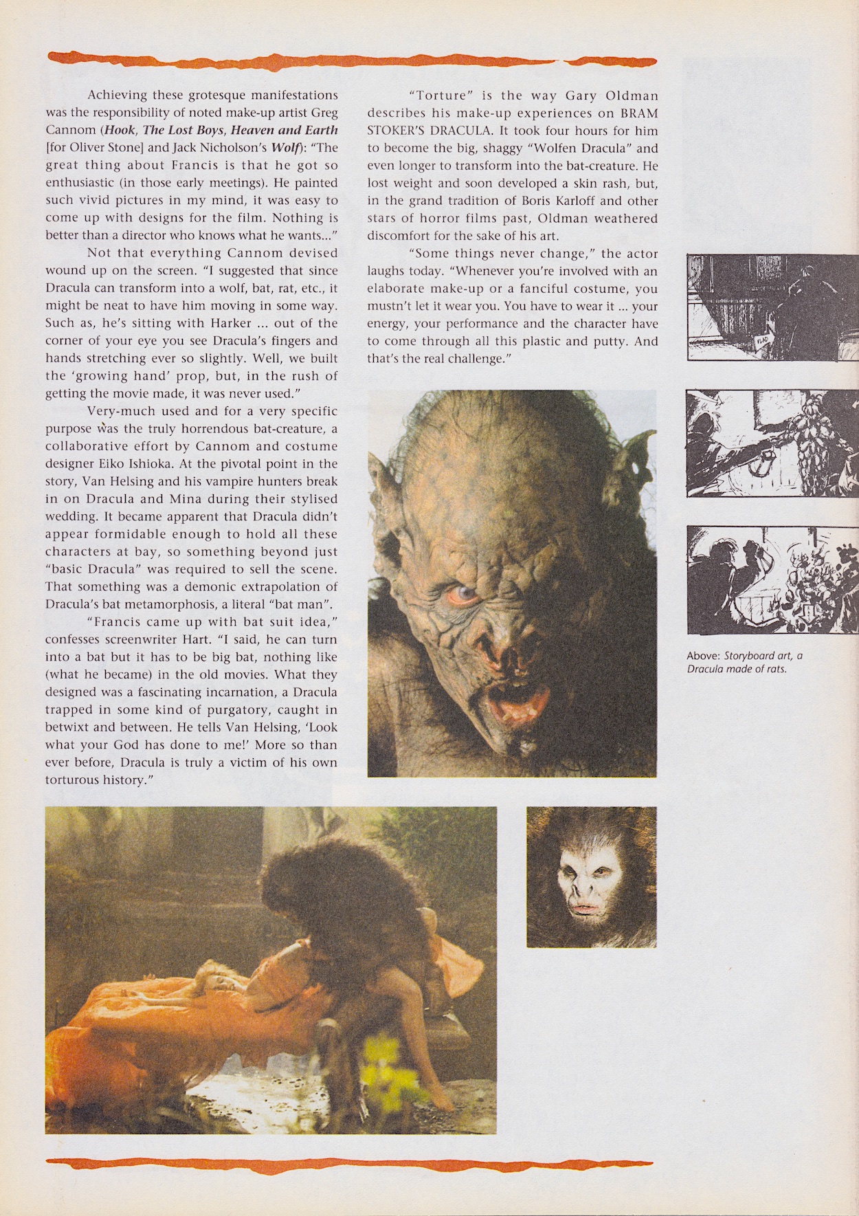
To the extras now and as usual things kick off with Inside Coppola’s Dracula and this time Gary Gerani is focussing on the special effects of the film. Famously, director Francis eschewed the new CGI trend and very deliberately used old fashioned movie-making techniques to give it the feeling of something made around the time in which it was set. Imaginative and genius use of classic “smoke and mirrors” techniques were used and interestingly we get the origin of that phrase here too.

The comparisons to Lucifer are interesting in explaining the use of a literal bat man rather than the usual, clichéd tiny bat in basically all other vampire films up to that point. The explanation here makes so much more sense. The transformation into a wolf was new to me when I first saw it as a teenager, werewolves were a completely separate entity from Dracula as far as I was concerned, so it was a surprise to be proven wrong. 

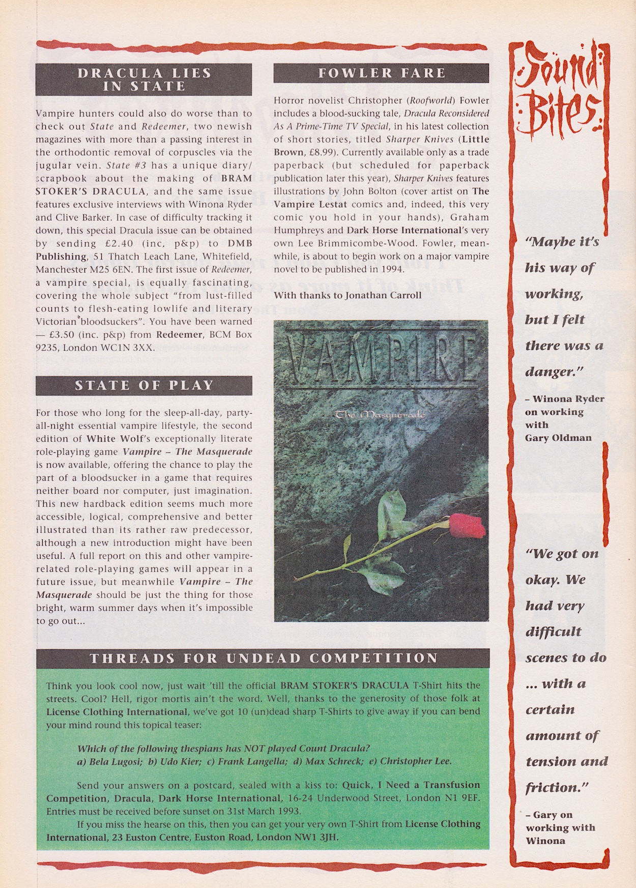
“Two newish magazines with more than a passing interest in the orthodontic removal of corpuscles via the jugular vein.”

Dave Hughes

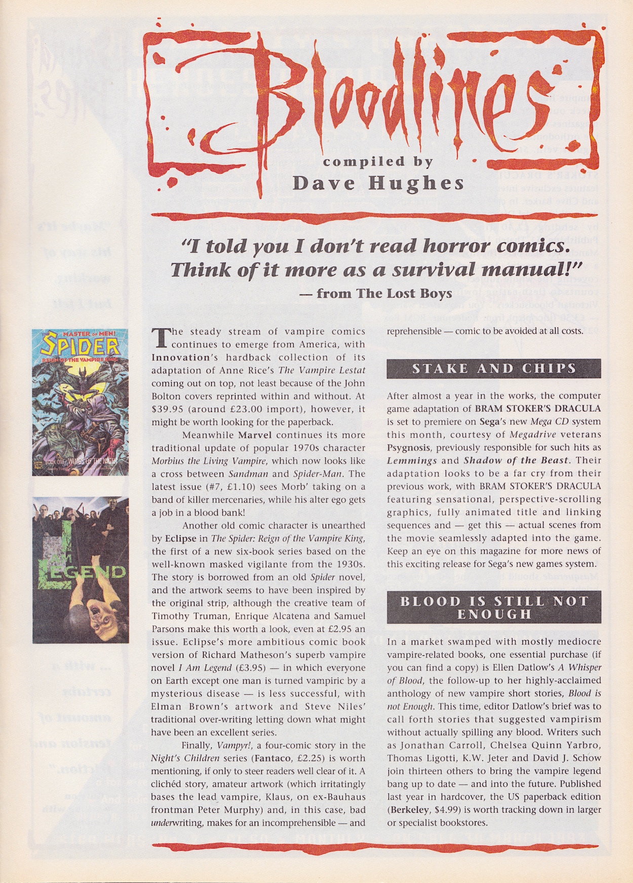
But what about that hand prop? I’ve never seen any photo or video of it but I can’t help but think of the hand effects from the short-lived 80s TV series Manimal. There’s a blast from the past! I think the prop for this film would’ve looked quite a bit better though, to say the least. Moving on to the Bloodlines news pages and Dave Hughes certainly doesn’t hold back with some of his reviews this time around.

Interesting to read that some comics prices really weren’t that much different to today (despite complaints about today’s prices), Ellen Datlow’s anthology books certainly sound interesting and on the second page some quotes from Winona Ryder and Gary Oldman are missing the context given to them last issue and so unfortuanately come across as tabloid-like here. That’s a shame because otherwise this is the most enjoyable Bloodlines yet. Written in a more relaxed and chatty style it’s really rather fun, even if it is missing the promised interview with Sadie Frost that I was particularly looking forward to.

We’re obviously approaching the end of the movie’s storyline and after such a promising and atmospheric start I find myself more excited about what’s to come after the main strip ends rather than it’s climax. The comic still offers up that art though and the extras are fun, then there’s that mysterious future for the remainder of the issues to find out about. That’s enough for me to eagerly anticipate #4 on Sunday 23rd March 2025.

iSSUE TWO < > iSSUE FOUR

DRACULA MENU

BRAM STOKER’S DRACULA #2: HUNGRY LiKE THE WOLF

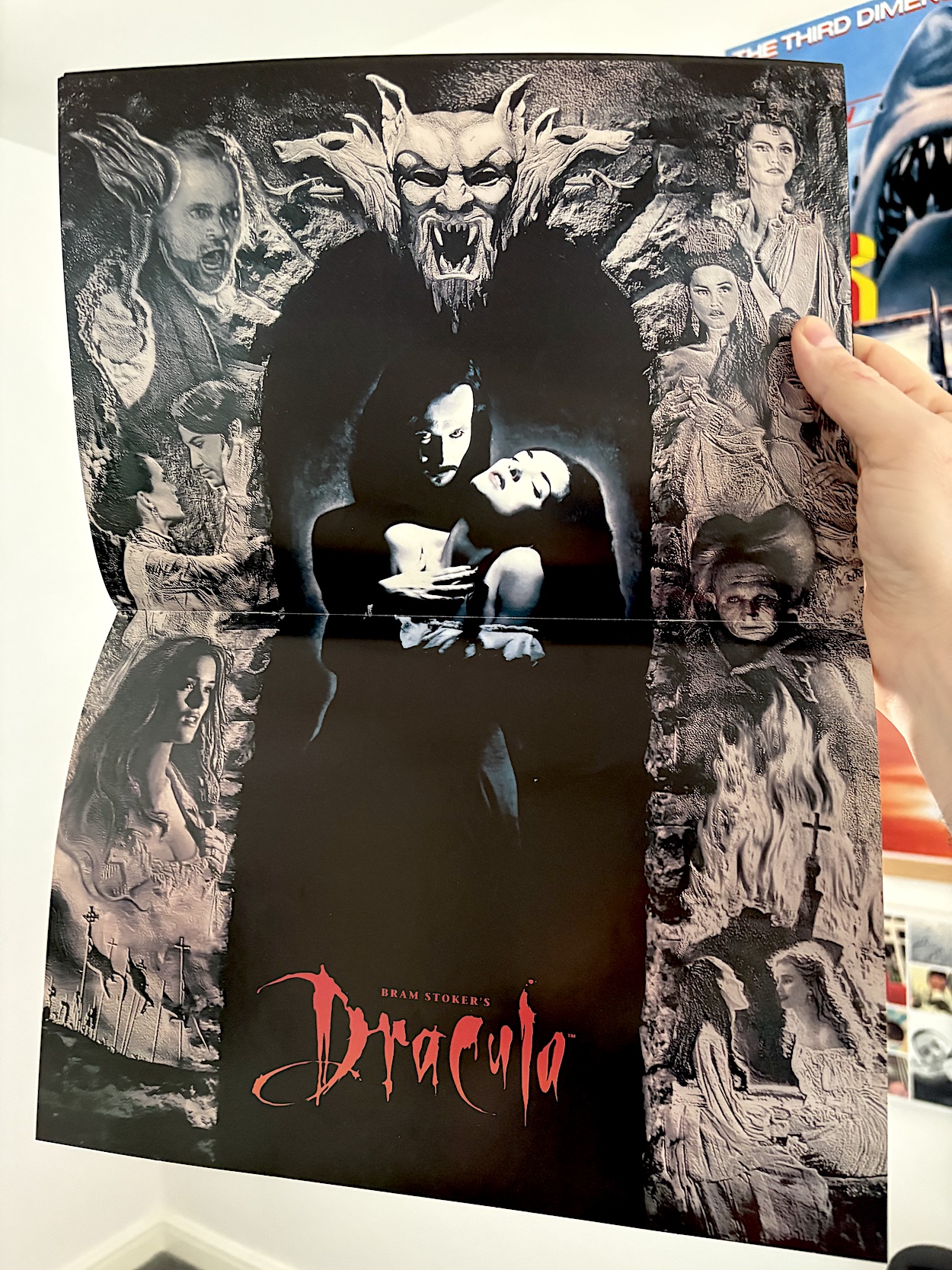
This evocative cover by John Bolton (Jurassic Park, Aliens, Black Dragon) shows us Count Dracula descending on poor Lucy Westerna (played by Sadie Frost in her first film role) and it has me wondering exactly what the comic will show from certain scenes in the film. We’ll find out as we creak open the coffin lid and gaze upon #2 of Dark Horse International’s Bram Stoker’s Dracula. But first, I assumed my copy would be missing its free gift and was very happy to be proven wrong with this glossy movie poster still attached to the staples!

Returning to the opening pages and again Anthony Hopkins’ voice welcomes readers to the second chapter of the movie adaptation, which three weeks ago I praised for its art direction, style and atmosphere. Although, at times it could be confusing to anyone who hadn’t seen the film in a while. This was because some scenes didn’t translate that well to the page. Fortunately, this time around there’s less of this criticism to be found.

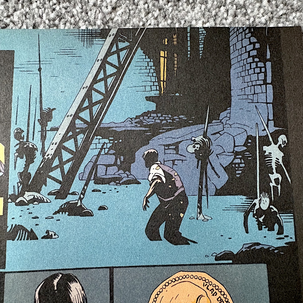
We kick things off with Jonathan Harker (Keanu Reeves) trying to find his way out of the castle and instead traipsing through a living nightmare, before trying and spectacularly failing to kill the Count while he sleeps. (This moment in the film belongs to Gary Oldman!) Over in England a vast storm unlike anything ever recorded has hit the country and we may be missing the powerful music from this moment but it plays in my head as I read the following few pages.

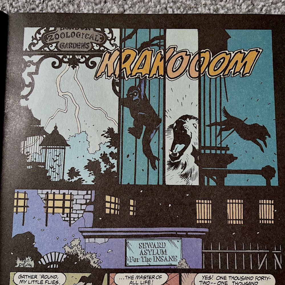
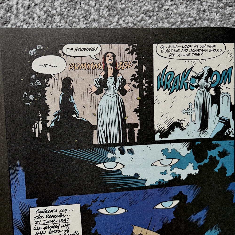
As we see the animals going wild and a wolf escaping the zoo, the rain soaking Lucy and the storm getting worse, we know it’s all because the ship with Dracula on board is getting ever closer, hence his eyes in the sky watching over everything. While the film offered no narration for this moment it was clear what was happening. It’s a very stylised moment, very Coppola, and can’t have been easy to bring to the page.

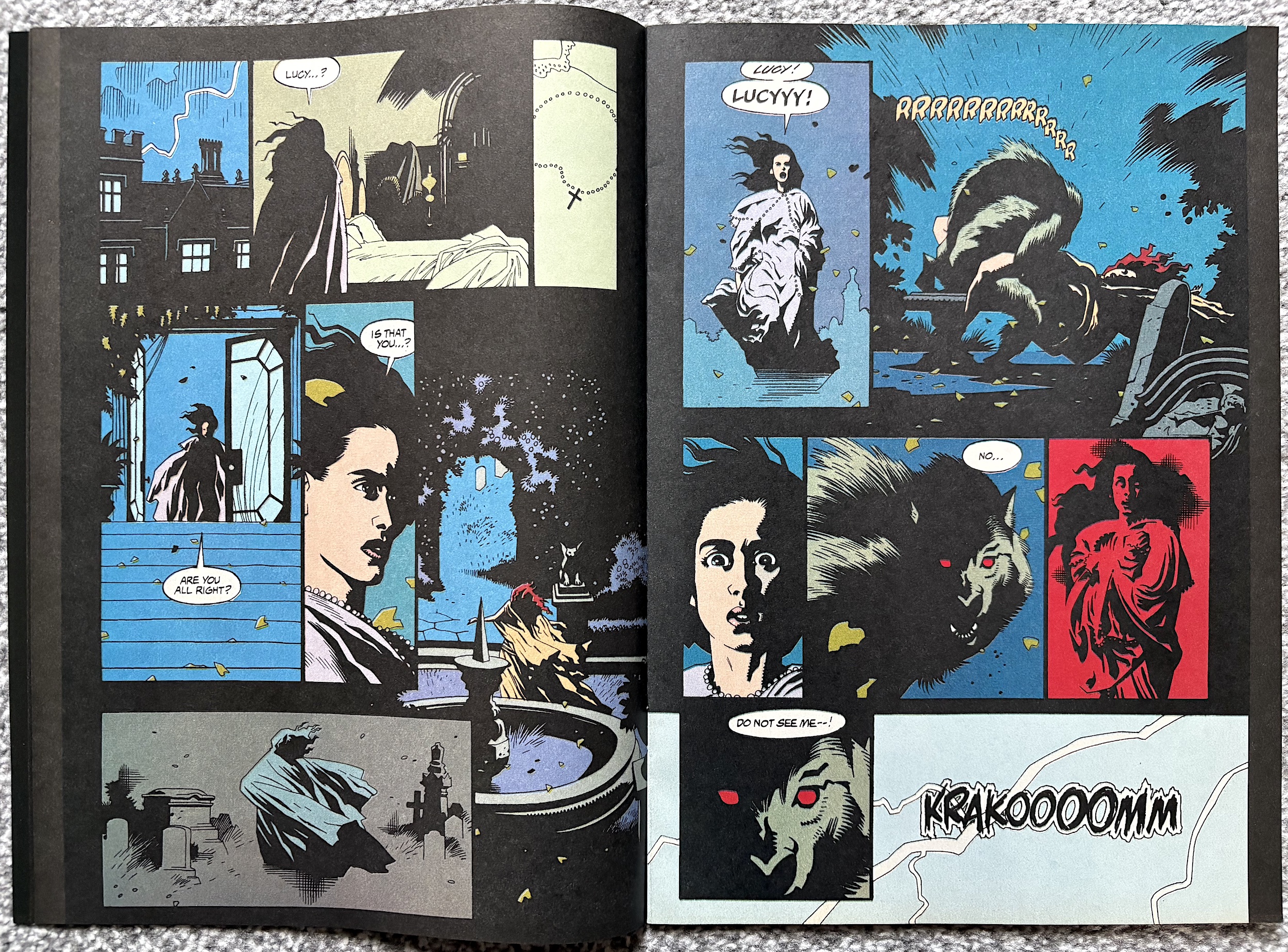
Any fan of the film will know what’s coming next

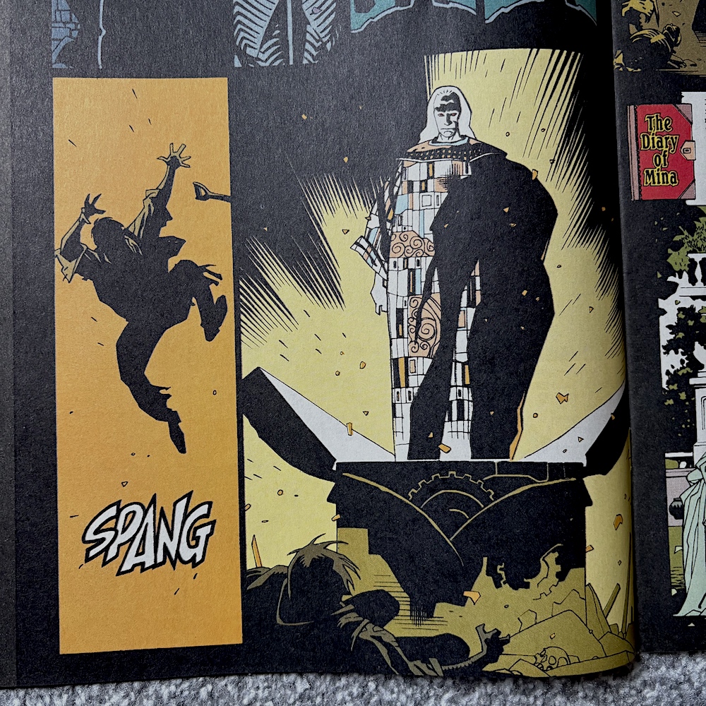
It works better than last issue, but of course I’ve seen the film recently so I don’t know how easily it could be followed without narrative captions for new readers or lapsed viewers. I personally like the fact there aren’t captions, just the diary entries now and again. It matches the film in this regard, but in a different medium should it have contained more text? The jury is out, but if you know the film (or even the original story) you’ll enjoy this sequence and the lovely, shadowy art once more by penciller Mike Mignola, inker John Nyberg and colourist Mark Chiarello.

Any fan of the film will know what’s coming next and it relates to what I said about the cover. While there’s no obvious nudity it’s still surprising to see the scene play out in a comic if I’m honest. Although, without all of the dramatic build up and the actual horror and suspense leading up to this moment it feels a bit random and gratuitous.

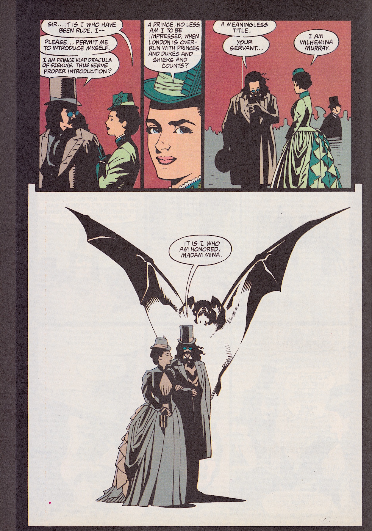
After this terrifying sexual encounter comes one of my very favourite scenes in the whole film, when Dracula and Mina meet properly for the first time on the streets of London and simply chat. Gary and Winona Ryder were perfect in this scene and it pretty much all plays out in the comic, taking up eight pages in total of Roy Thomas’ adaptation (his script lettered by John Costanza). Of course the medium doesn’t lend itself to translating the slow, deliberate acting in what is a touching, yet mysterious scene (unless you read it that way of course), but the art remains fascinating.

Their initial introduction ends on this image of a bat rising out of the scene against a pure white background. This is an example of the comic taking inspiration from the visuals of the film and producing its own to get across narrative elements of the story it may have otherwise struggled with. Opposite from this is the rear of the poster so coincidentally this feels like a natural chapter end in itself.

The comic has also improved its translation of such moments to the page. Take when Arthur Holmwood (Carey Elwes) comes to check on his fiancée Lucy, who has been in the care of Dr. Jack Seward (Richard E. Grant). The visual moment in question is actually a scene transition after Arthur agrees to bring in Van Helsing, finally admitting to himself there’s something ‘else’ wrong with his love.

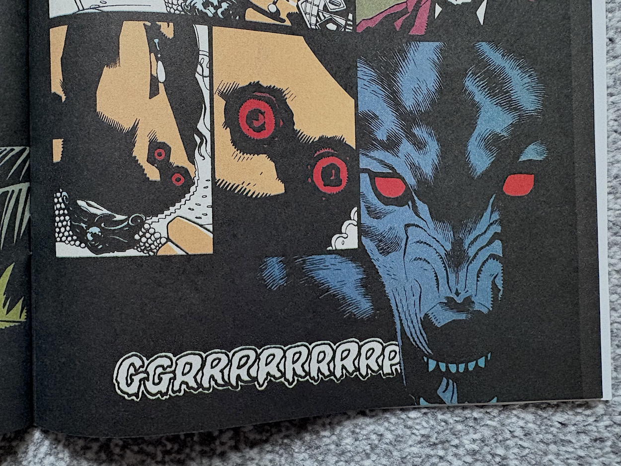
Lucy is holding onto her dress collar and we zoom in past it to see the two red holes in her neck where she was bitten by Dracula in his monstrous wolf man form. Just like in the film, as we get closer to the bite marks they turn into his eyes and then into the eyes of the wolf that had escaped from the zoo. This transition takes us back to the London scene, ending with ol’ Drac easily taming the wolf, and the wolf then letting Mina pet it; a key moment in the development of our lead characters’ relationship.

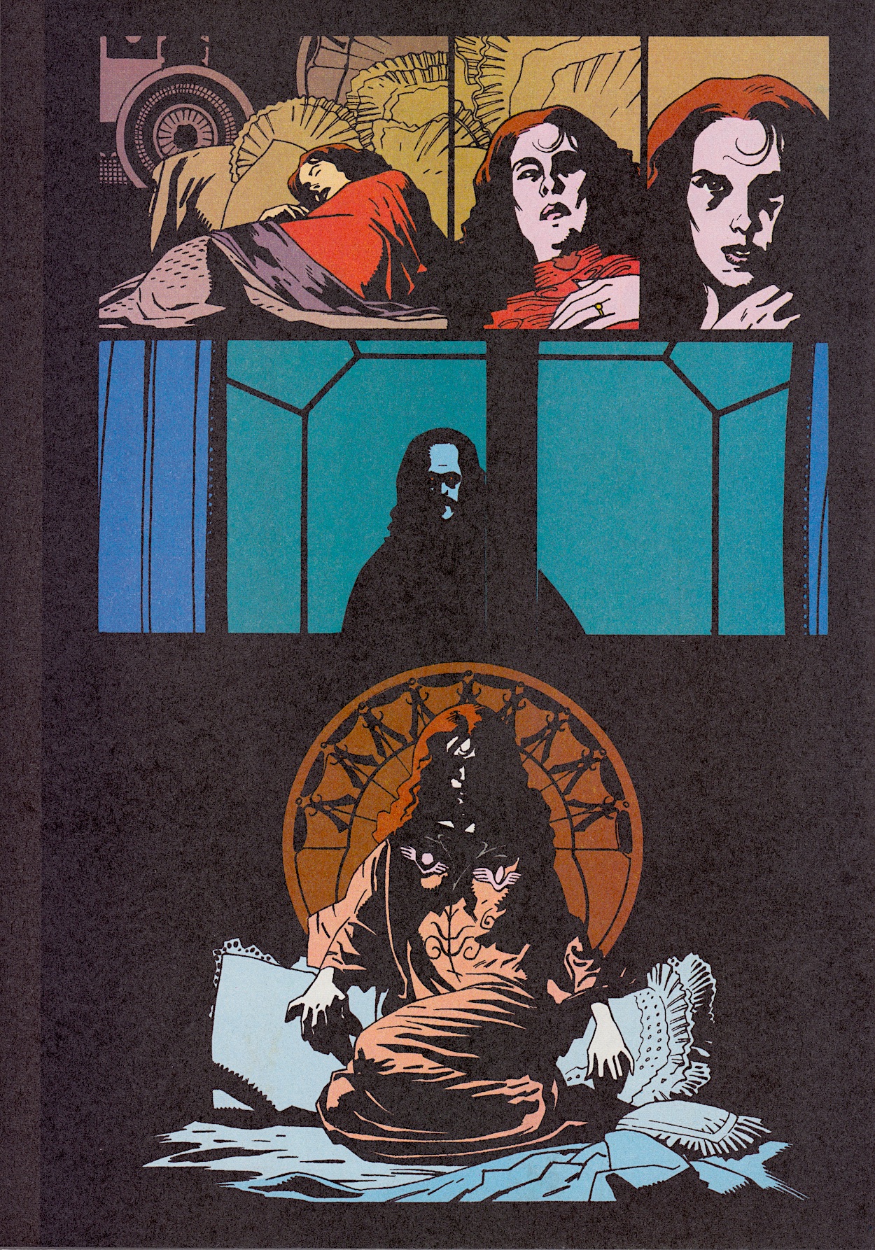
While earlier in this review I did lament how some scenes could’ve done with more explanation and room inside the comic, I’m glad to say the London scene isn’t the only one that gets space to breathe. Some of the smaller moments are actually given prominence, such as when Dracula arrives at the window of Lucy’s bedroom. 

This could’ve been summed up in a couple of panels but instead it’s presented in a way that adds such atmosphere to the comic. In that regard I think it’s the best example to sum up the title as a whole and a page that could be framed for the wall by anyone who’s a fan of the film. Perhaps alongside that poster.

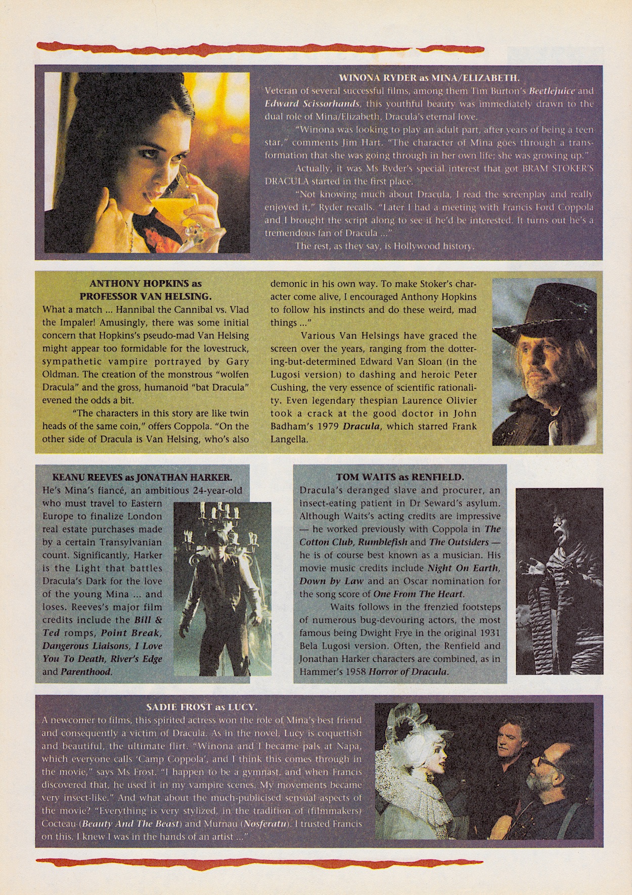
Moving on to the extra features and again it’s made up of Inside Dracula and Bloodlines, the making-of and news pages respectively. It’s here I take issue with one of the headlines on the cover. “Interviews (plural) with the cast of the smash-hit movie”, editor Dick Hansom boasted. What we actually get are two pages with small profiles of six of the cast members. For three of them we get some quotes taken from actual interviews elsewhere and a fourth where the quote is from Francis Ford Coppola instead.

There are some interesting nuggets here, such as Francis’ insistence on a young cast in keeping with the novel (which went against the grain of previous adaptations) and Winona’s role in getting the whole thing started in the first place, which was touched upon last issue. I can sympathise with how reading the novel is described as a “formidable task” and in Sadie’s profile the comic mentions “the much-publicised sensual aspects”, which you just know referred to what British tabloid rags thought were the most important scenes in the film.

Bloodlines rounds up the movie’s takings so far and the glut of vampire flicks which went into production off the back of the news Francis Ford Coppola was making Dracula. News of Tale of a Vampire has a different feel to it now, after we tragically lost the great Julians Sands in 2023. I’d never heard of this film but the role seems just perfect for him so I’ll probably track it down on a streaming service and check it out.

The mystery behind Innocent Blood’s release was probably more to do with its complete flop in the States than with our movie. Described on Wikipedia as a “mixture of the vampire, gangster and buddy cop genres” but with a ton of nudity and gore, it doesn’t scream ‘John Landis’ to me. As for Interview With the Vampire, I can’t find proof of Sting being approached but coincidentally Julian Sands was considered!

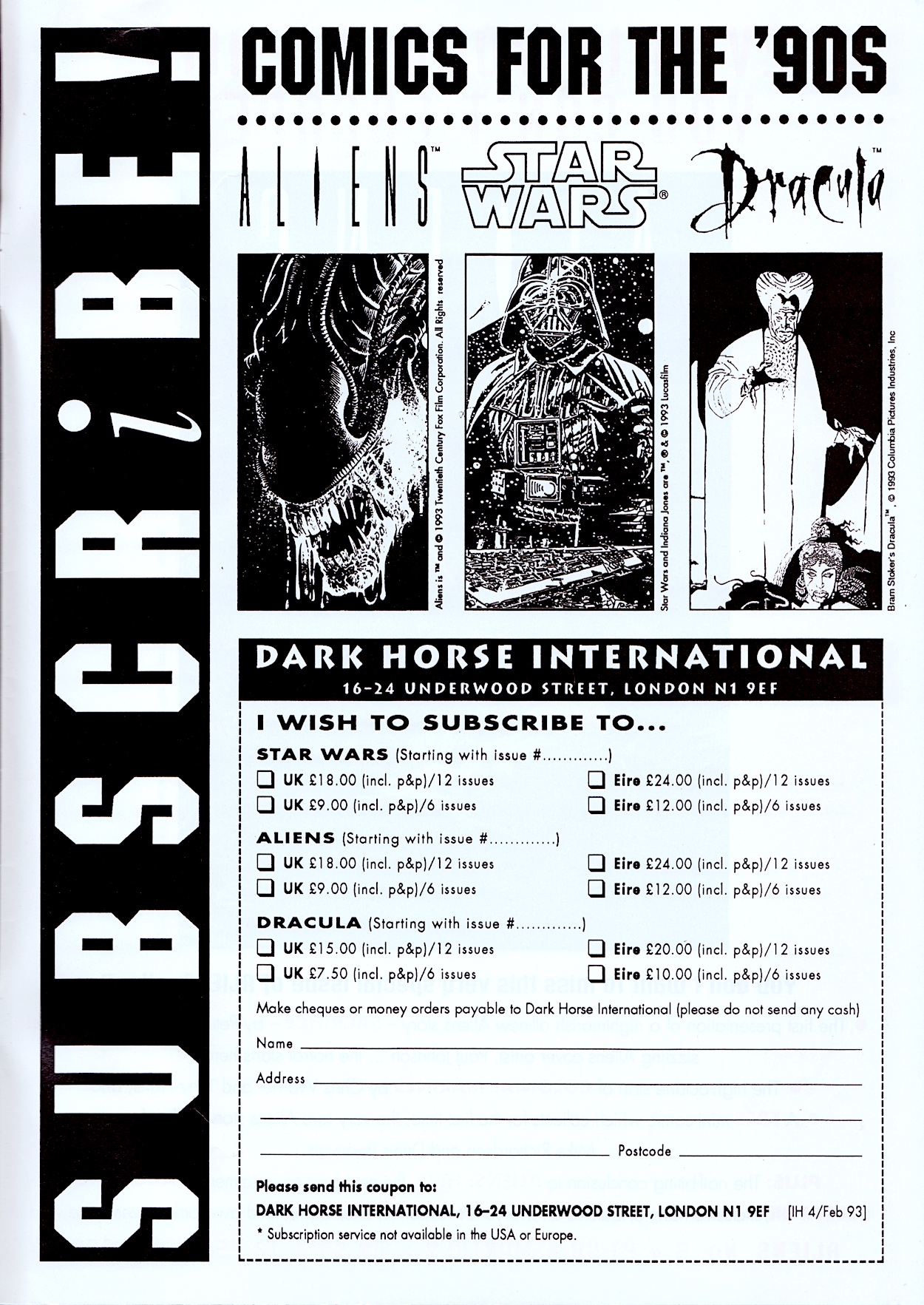
Then, on the glossy inside back cover is the first of Dark Horse International’s subscriptions pages for their range, something I would become very familiar with towards the end of the same year when I discovered their Jurassic Park. I started reading that comic from #6 and by then two of the three titles below had already been cancelled and replaced by others, which probably shocked the publisher as much as the readers, given what they were based on.

On the back page is the same Aliens advert from last time promoting #9 of that comic and its brand new UK strip, the review of which will be up on 18th February 2025. For now Dracula slinks back into his coffin to await the next review of his own comic. This is the most promising movie adaptation yet on the blog, so let’s hope #3 continues the trend on Sunday 2nd March 2025.

iSSUE ONE < > iSSUE THREE

DRACULA MENU

BRAM STOKER’S DRACULA #1: DARK ARTS

The first new real time read through for 2025 adds a third title to the Dark Horse International menu on the blog with Bram Stoker’s Dracula from 1993. This was released in the same year as their Jurassic Park comic and follows a similar formula, the movie adaptation taking up all of the comic strip space inside and followed by some extra features. This is similar to the Alien³ Movie Special mini-series from the previous year and has the same description down the left-hand border.

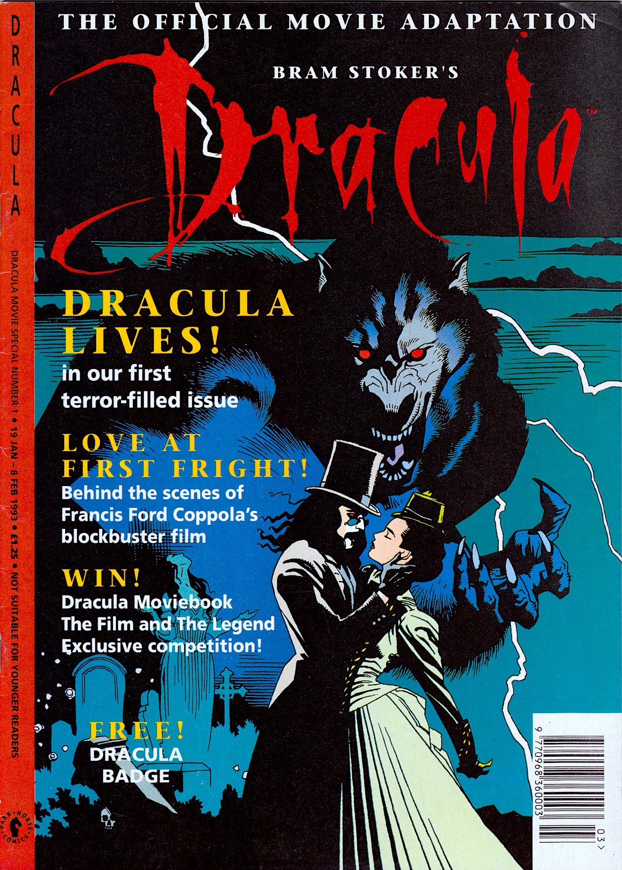
However, much like Jurassic Park, this comic would continue beyond the end of the movie and become an ongoing monthly, albeit with a rather big caveat (which we’ll get to when the time comes). The atmospheric cover by Mike Mignola (Hellboy, Rocket Raccoon, Baltimore) cements the dark, gothic feel of the strip  and upon opening we’re met with a suitably black interior design.

I defy anyone who has seen the film not to read the introduction in Anthony Hopkins’ voice. I note that subscriptions are offered so clearly DHI were hoping the adaptation issues would be enough of a success for them to carry on. However, while it was advertised as a fortnightly in other comics it’s actually triweekly like the aforementioned adaptations.

Edited by Dick Hansom (Jurassic Park, Aliens, Speakeasy), the 36-page comic has a lovely glossy cover with matte interior pages, a 28-page first chapter and two two-page features at the rear. So far, so DHI. The real stand out here is the strip’s art. Regular readers will know how I feel about movie adaptations but to see an original art style filled me with confidence for this one.

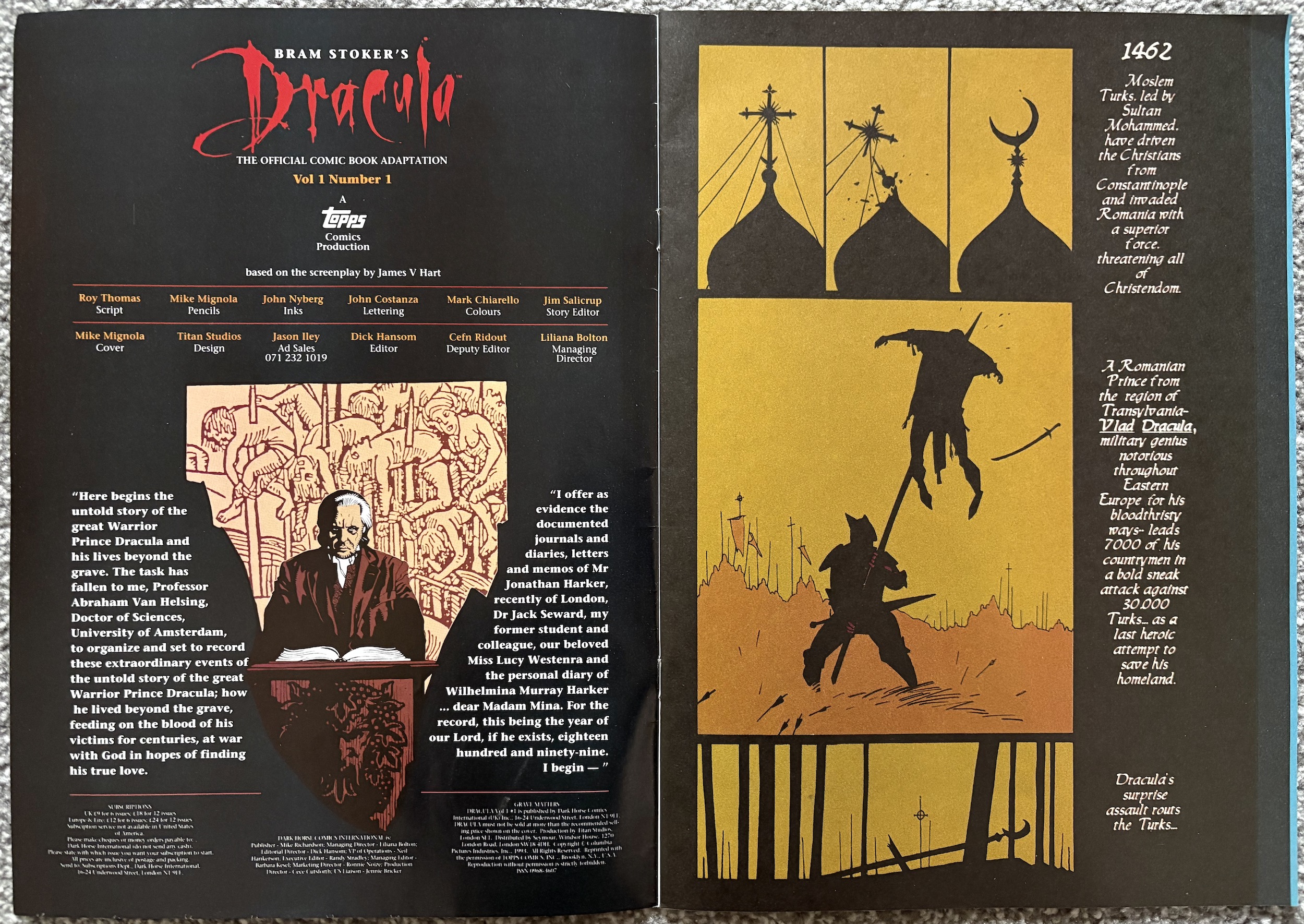
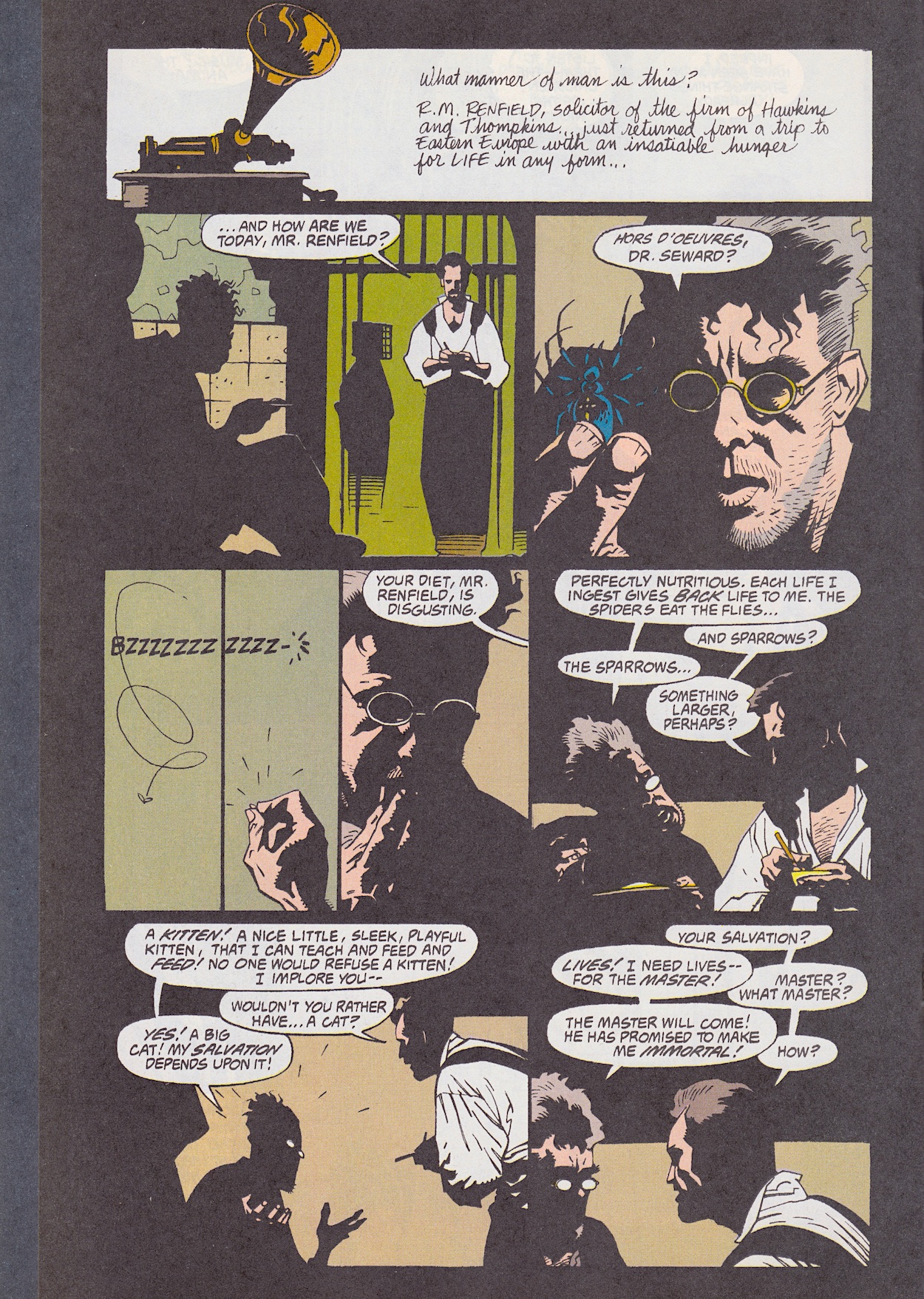
The art goes the opposite way of the elaborate, ornate movie. It may have quite simply drawn scenes and characters, but it’s the use of shadow that ties it in so neatly to the film. There’s simply no way of capturing the intricacy of the design and the style of Francis Ford Coppola’s direction so instead it feels like penciller Mike, inker John Nyberg (Action Comics, Doom Patrol, Nexus) and colourist Mark Chiarello (Batman/Houdini, Hellboy, Hush) have gone for atmosphere over detail.

It works. It looks old-fashioned but I don’t mean in an ‘out-of-date comic’ kind of way. I mean the individual panels feel like they could’ve been drawn around the time the story is set and cleaned up for the 90s. Simple, sometimes scratchy line work with a mixture of bold colours for the more horrific scenes and subdued, almost washed out colours for the spookier moments, with the swathes of black in all the panels capturing that claustrophobic, haunted feel of the film, it’s just perfect.

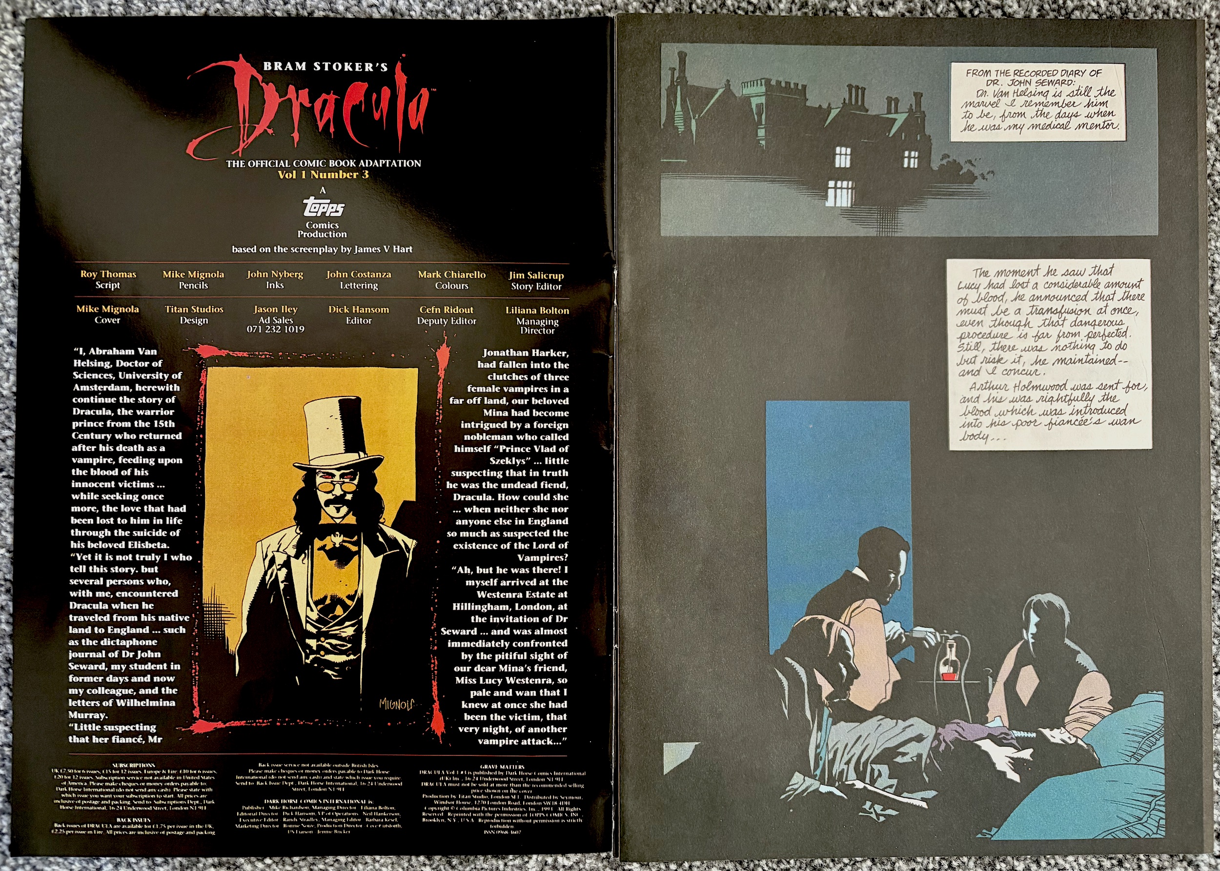
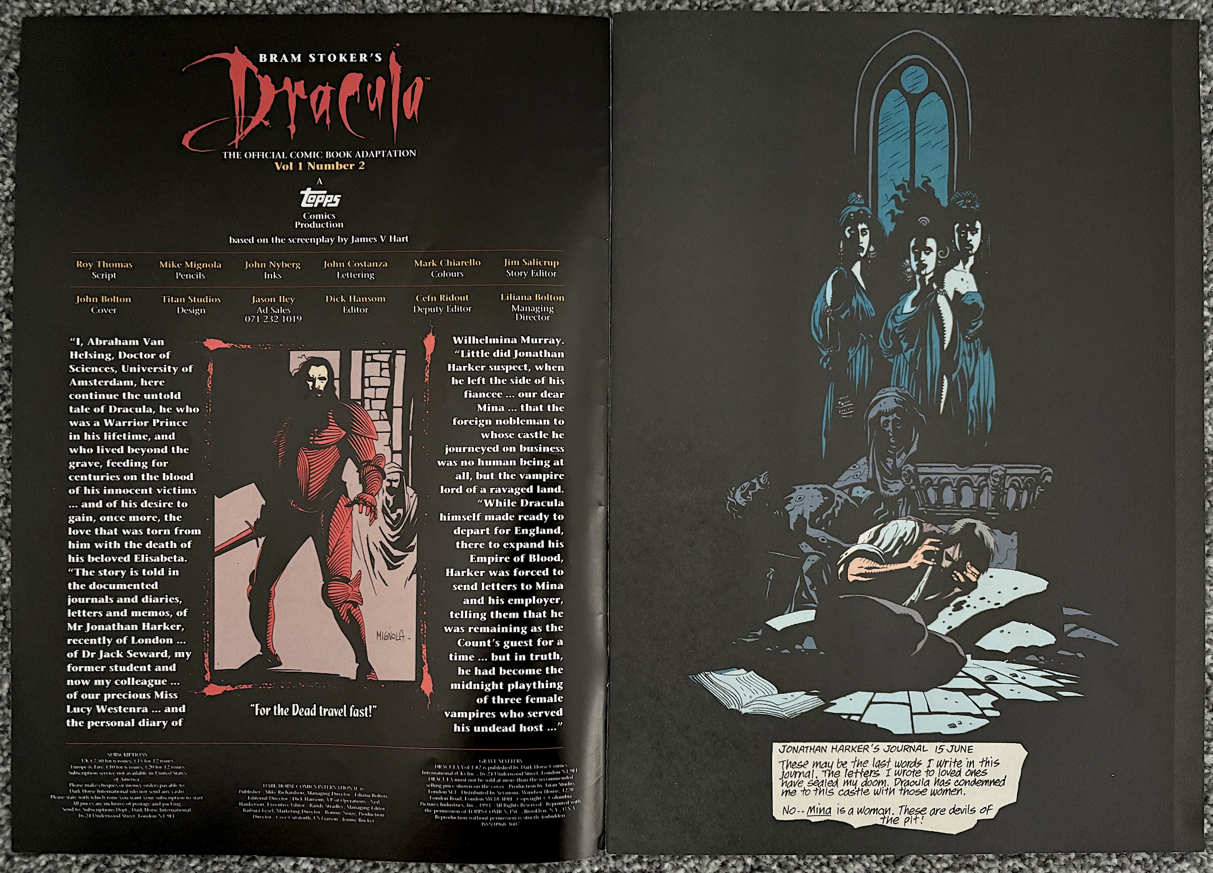
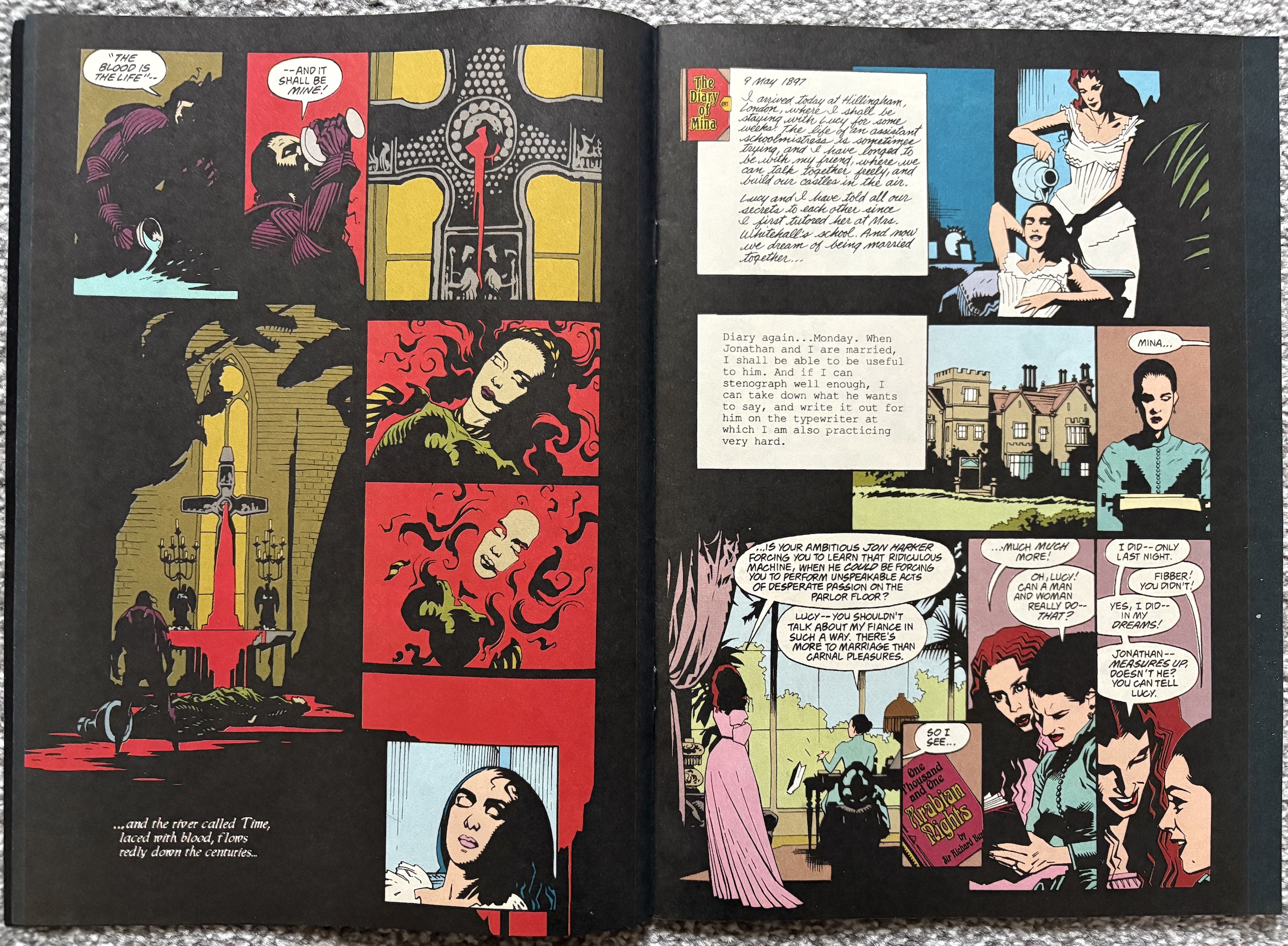
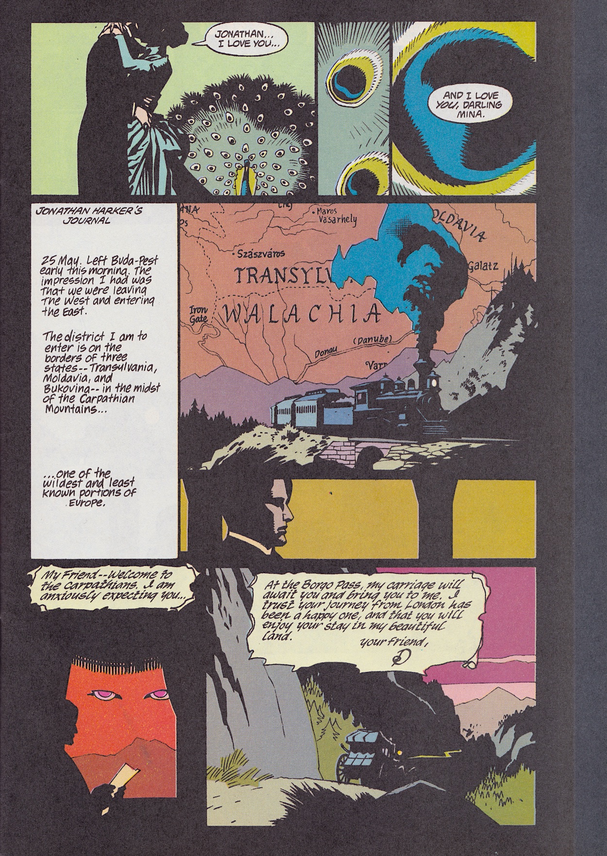
John Costanza (Jurassic Park, The Tomb of Dracula, Red) does an incredible job on lettering Roy Thomas‘ (Conan, Secret Origins, Stoker’s Dracula) script too. Whether it’s historical prose, different handwriting (or typed text) for each character’s diary or his regular style, it’s all very clever and captures the narrative aspects of the film, as you can see above. The original US comic edited by story by Jim Salicrup (writer on Transformers, Sledge Hammer and The A-Team), credited here as story editor.

Sometimes, however, the use of shadow can make it difficult to work out sequences of events and once or twice I found myself perusing panels a few times to work out what was happening, and that’s with me having seen the film recently. Like most comics adaptations the main audience would’ve been those who’d seen the movie already rather than new readers. Even more so with this one, I feel.

I’ve criticised previous movie adaptations for rushing through their screenplays or for being poor copies of their big screen originals, but I’ve also praised those that took the time to properly adapt the story to a different medium. Bram Stoker’s Dracula falls into the latter category. While what’s written on the page is basically verbatim from the script, the art does a perfect job of taking the movie fan back into that world to enjoy it in a different way.

A perfect example of this is the moment when the carriage comes to pick up Jonathan Harker. In the film a massive set was built for this scene and it was full of highly detailed, creepy imagery. Here, all of that is stripped back. Instead, the sparse nature of the art and the use of shadow captures how that moment felt for the viewer. This brings the chill of the scene to the reader much better than any attempt to just copy it ever could have.

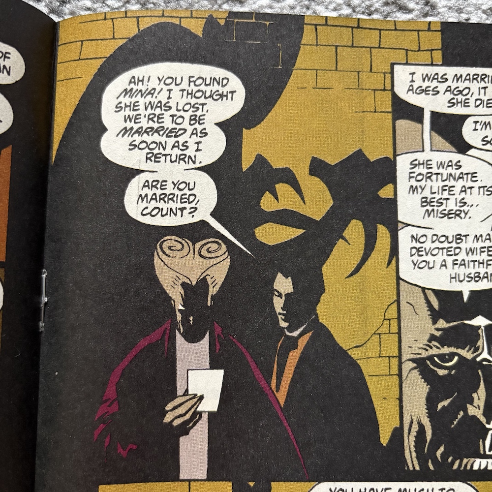
The shadow work brings another benefit too. Previous attempts at adapting a movie have had mixed results in portraying the actors. Most times there’s no attempt at all (and that may have been due to rights), other times they’ve tried so hard to capture their likeness they become stilted and expressionless. This team does something different. Through clever use of dark shadows the characters look enough like the actors without having too much detail, meaning they retain their expressiveness and, most importantly (and something Alien³ failed to do) their faces remain distinct from each other’s.

Not all of the film’s iconic visuals translate well to the page though, the best/worst example being Jonathan’s train journey. While that marvellous model shot couldn’t hope to be replicated on the page, the zooming in on the peacock’s feathers makes no sense here and Dracula’s eyes in the sky just look weird. These moments were great examples of the film’s iconic style but I can’t help thinking they’d have been best left out here, or at least have the Count’s eyes elaborated on to make more sense in this medium than the seemingly random panel below.

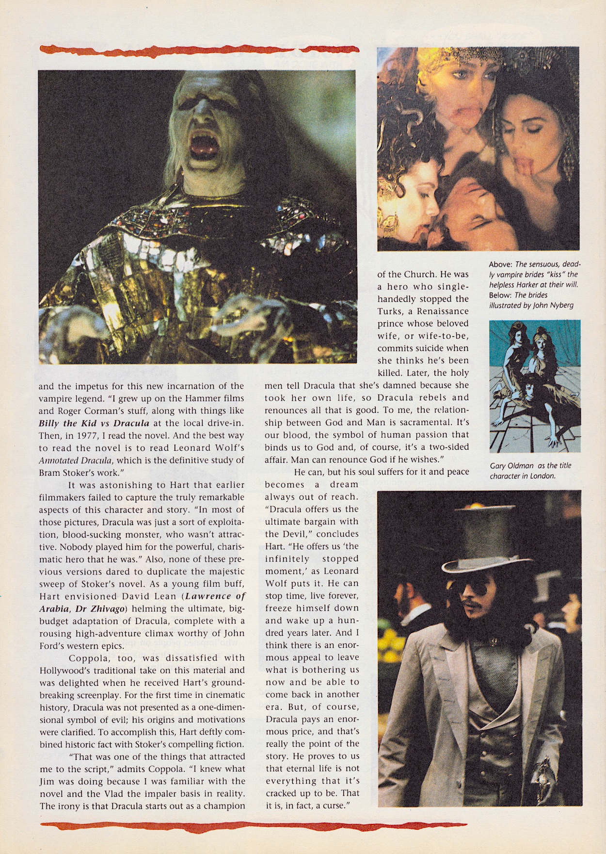
The first chapter of the story ends on that horrible/terrifying scene with the baby. Anyone who has seen the film will know exactly which moment I’m talking about! Then it’s quite jarring to come to white pages. I kind of wish they’d kept them black, but that may have made them hard on the eyes. As with the first five issues of Jurassic Park, Gary Gerani’s behind-the-scenes feature is in parts and begins with the original source material. I remember at the time some people complaining about what they thought were “changes” to the character (e.g. Dracula walking about outside), so thankfully that’s all put to rest here, confirming this film is the one that follows the book and portrays the character most accurately.

I’m usually one who likes to read opening credits and link the names listed to other films I’ve watched, but I was surprised to find out which family-friendly Steven Spielberg movie James V. Hart had written! Although, I do disagree with him on the best way to read Bram Stoker’s novel. If it’s your first time reading any novel it shouldn’t be the annotated version, or at the very least ignore the annotations until your second reading. They can be fascinating on second reads, but they interrupt the flow of the work and can also contain spoilers for later in the book.

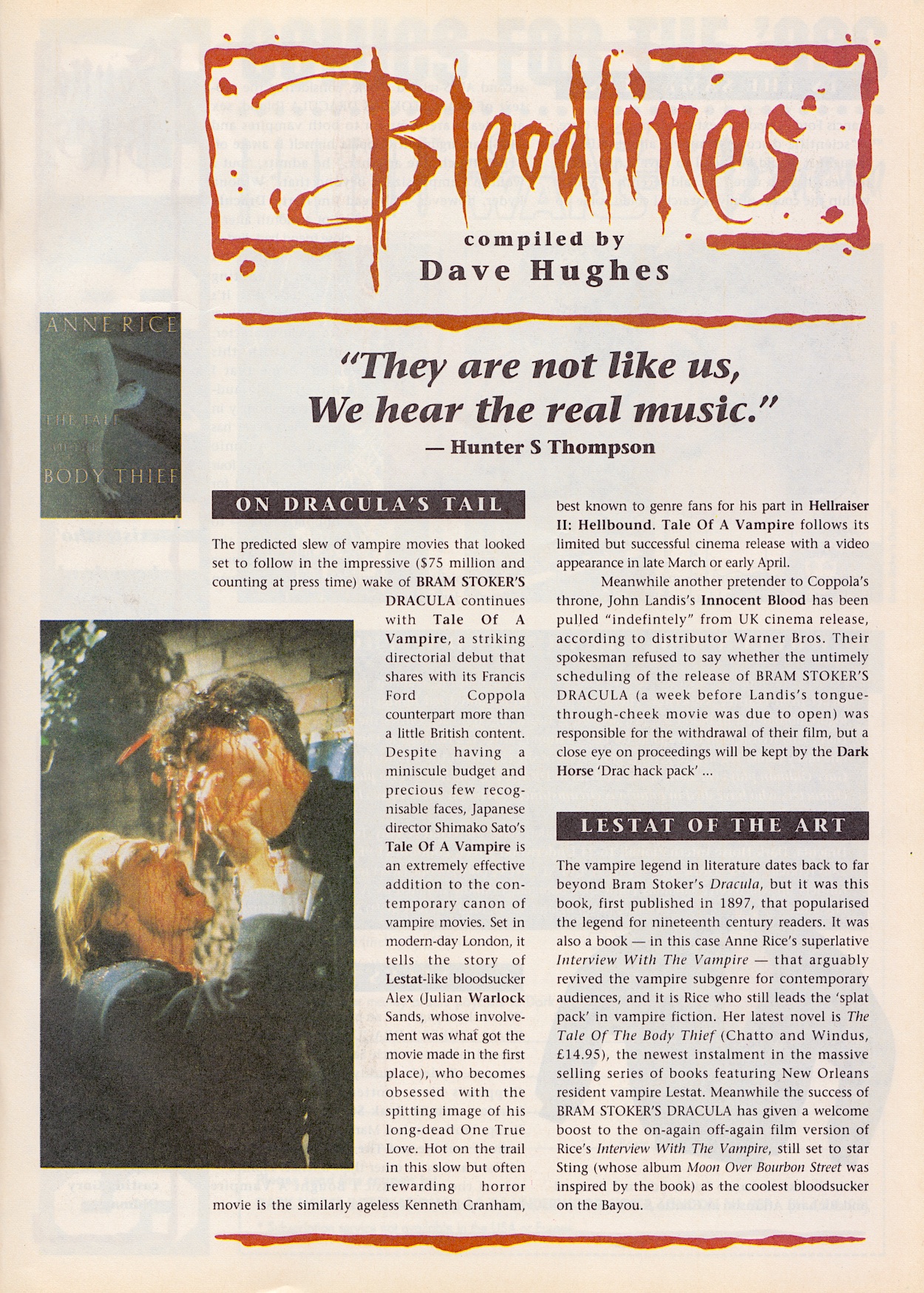
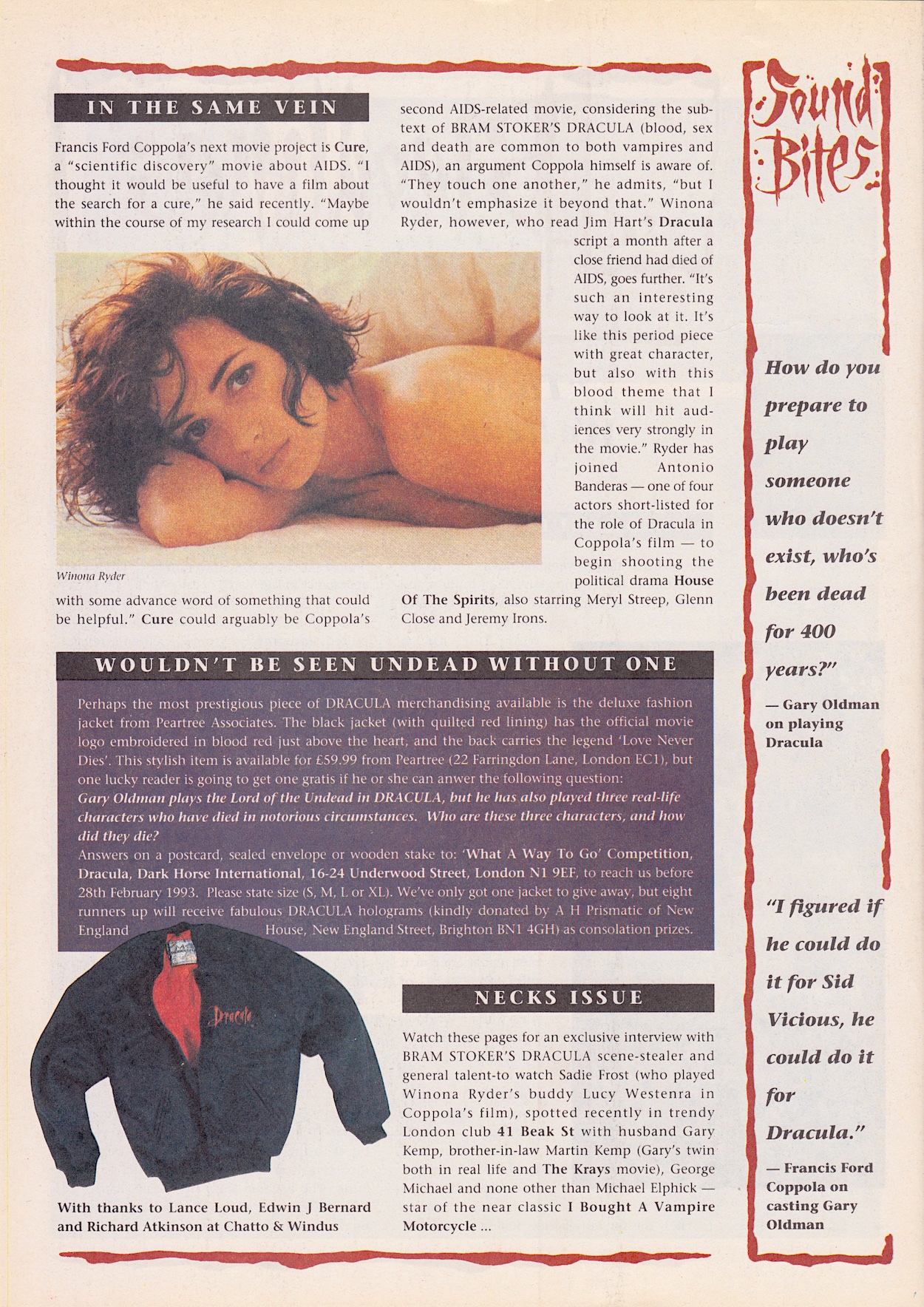
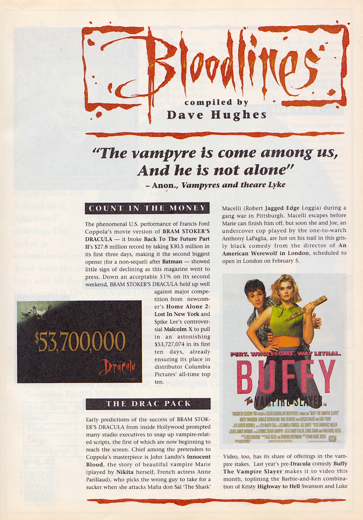
Dave HughesBloodlines is the news feature of the comic, similar to his Motion Tracker pages in Aliens. With Bram Stoker’s Dracula still in the cinemas at the time of publication the comic was keeping us up to date with its takings so far. It would go on to rake in over four times that amount. Also truly placing the comic in the past is the description of Anthony LaPaglia (Without a Trace) as a new actor on the scene! But it’s surely another film release that will catch blog readers’ attentions.

Who knew that silly film would go on to be reincarnated as a hit TV show? A show I really enjoyed until (coincidentally) Dracula turned up. Treating him like an easily-slayed villain-of-the-week was annoying and I remember that season becoming too sombre and lacked the humour of previous years, so I stopped watching. But anyway, it’s another example of placing this comic in our own timelines.

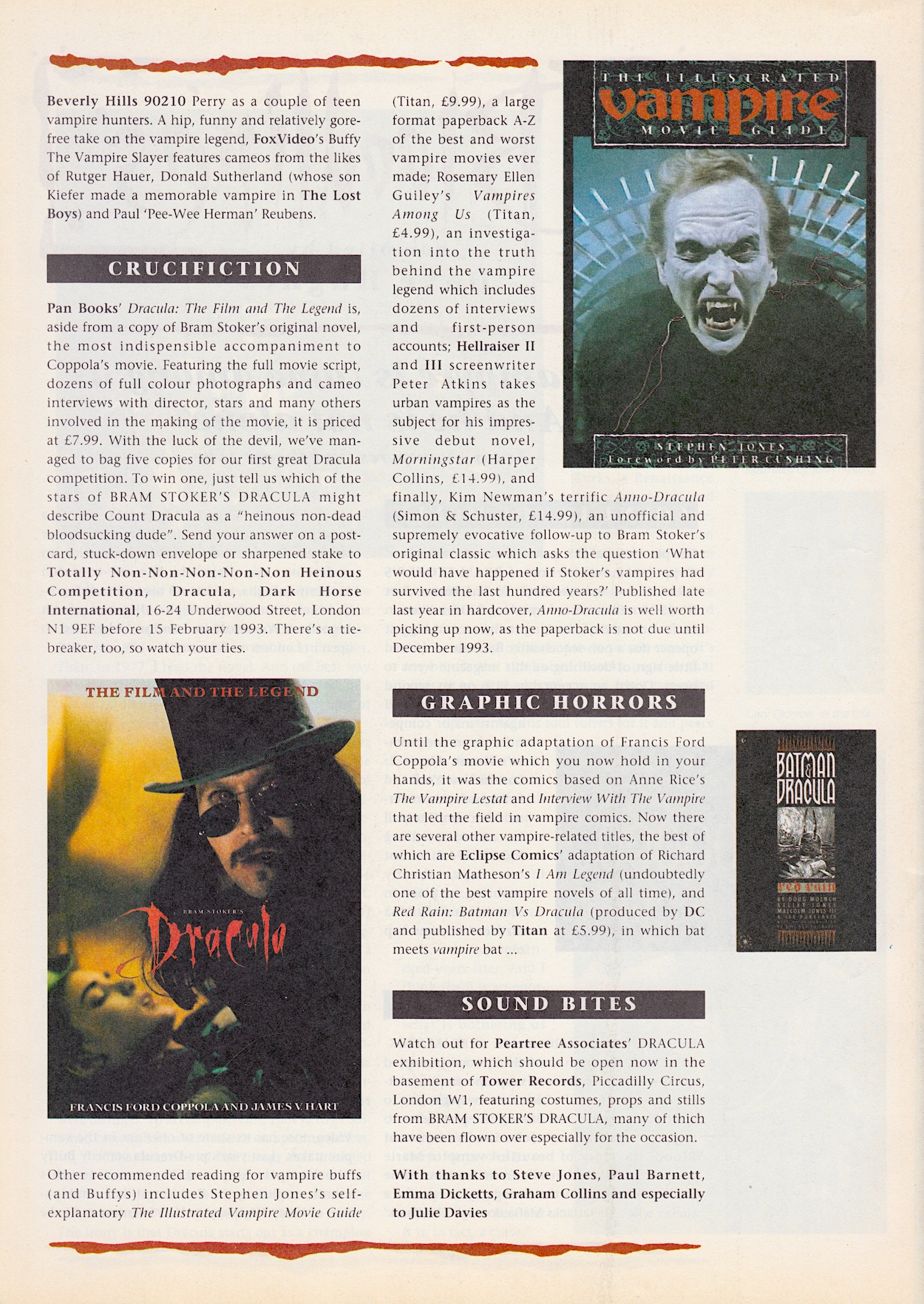
The news pages also mention Malcolm X, another film of the same era that I must revisit sometime, and Anno Dracula, an alternate history novel by Kim Newman which sounds fascinating, although I admit even all these years later I’ve never heard of it. Upon doing a bit of research I found out that in Anno Dracula, the Count’s first wife is called ‘Elisabeta’, a name taken from this film. Also above, you’ll see the usual fun competition and address our comics and magazines like to do at the time.

Rounding off the issue on the inside back cover is this advert for a very 90s jacket tie-in The Master from Doctor Who would’ve liked, and on the back page is an advert for #9 of Aliens. Even though #8 was still to be released two days later, the next one had some exciting new additions and this was also used as a Next Issue page in the Aliens comic itself.

It’s never going to tell the story as well as the film for newbies but this comic was clearly aimed at those who had just enjoyed Bram Stoker’s Dracula at the cinema. In that regard this is the best movie adaptation I’ve come across so far on the blog. That art, that brave decision to create its own unusual style that somehow feels just right, is wonderful. There’ll hopefully be for wonderfulness in just three weeks with #2 on Sunday 9th February 2025.

GO TO iSSUE TWO

DRACULA MENU