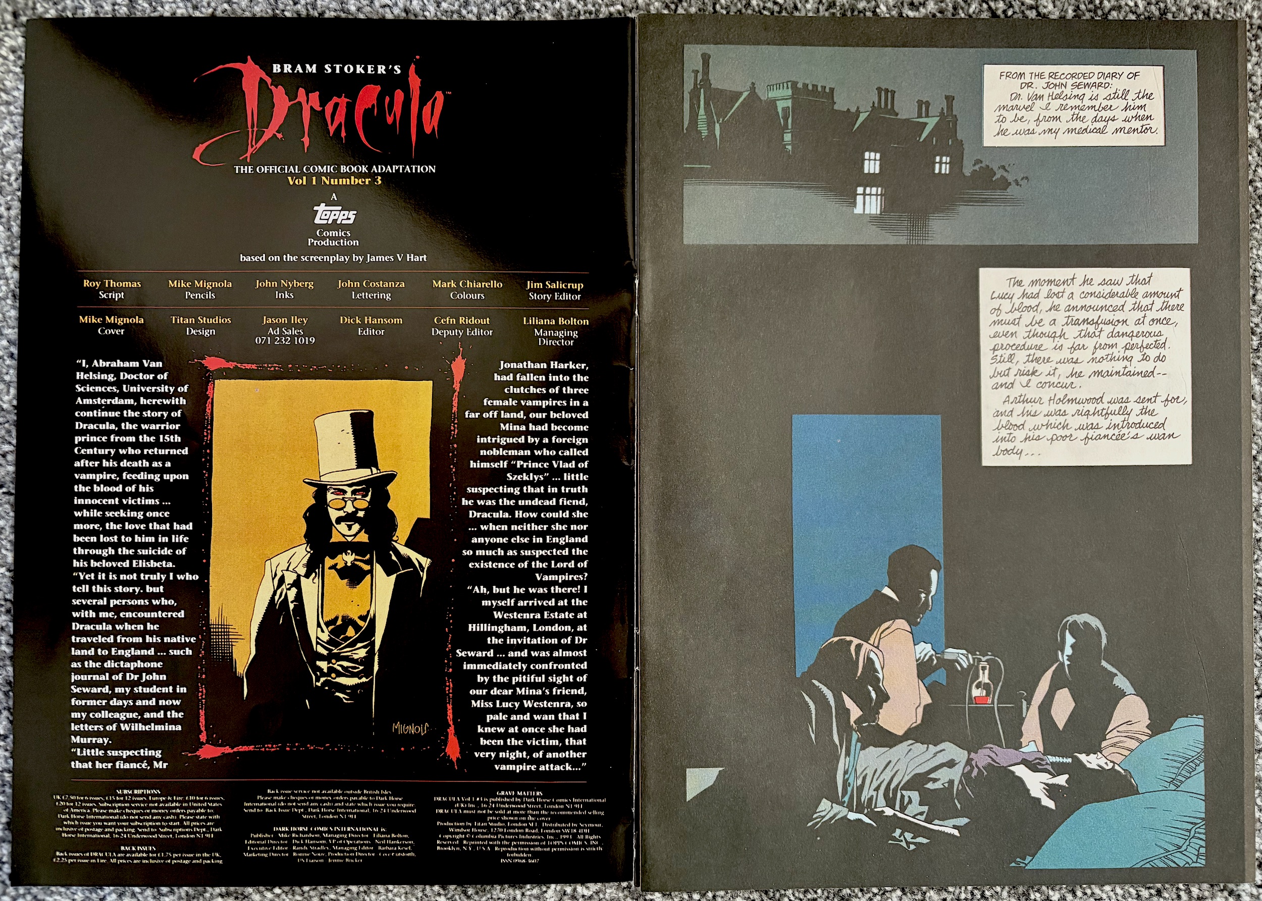
Mike Mignola’s cover may not be as intricately painted as last month’s but through clever used of colour, and the changing of the logo to suit, we’ve another atmospheric introduction to the latest issue of Dark Horse International’s Bram Stoker’s Dracula. This third edition went on sale this day 32 years ago and continues with its regular format for now, with a 28-page chapter of the movie adaptation and four pages of extras bringing up the rear.
I have to say I still love the comic’s editorial page every issue. Written in the style of the Van Helsing character from the film it’s an inventive and fun way to kickstart things every three weeks. It certainly makes the plain contents pages of DHI’s Jurassic Park comic feel like a wasted opportunity. Here, Anthony Hopkins’ voice reminds us who some of the other characters are who’ll be featuring heavily in this issue, an issue with a surprising amount of iconic imagery, which I’ll get to later.
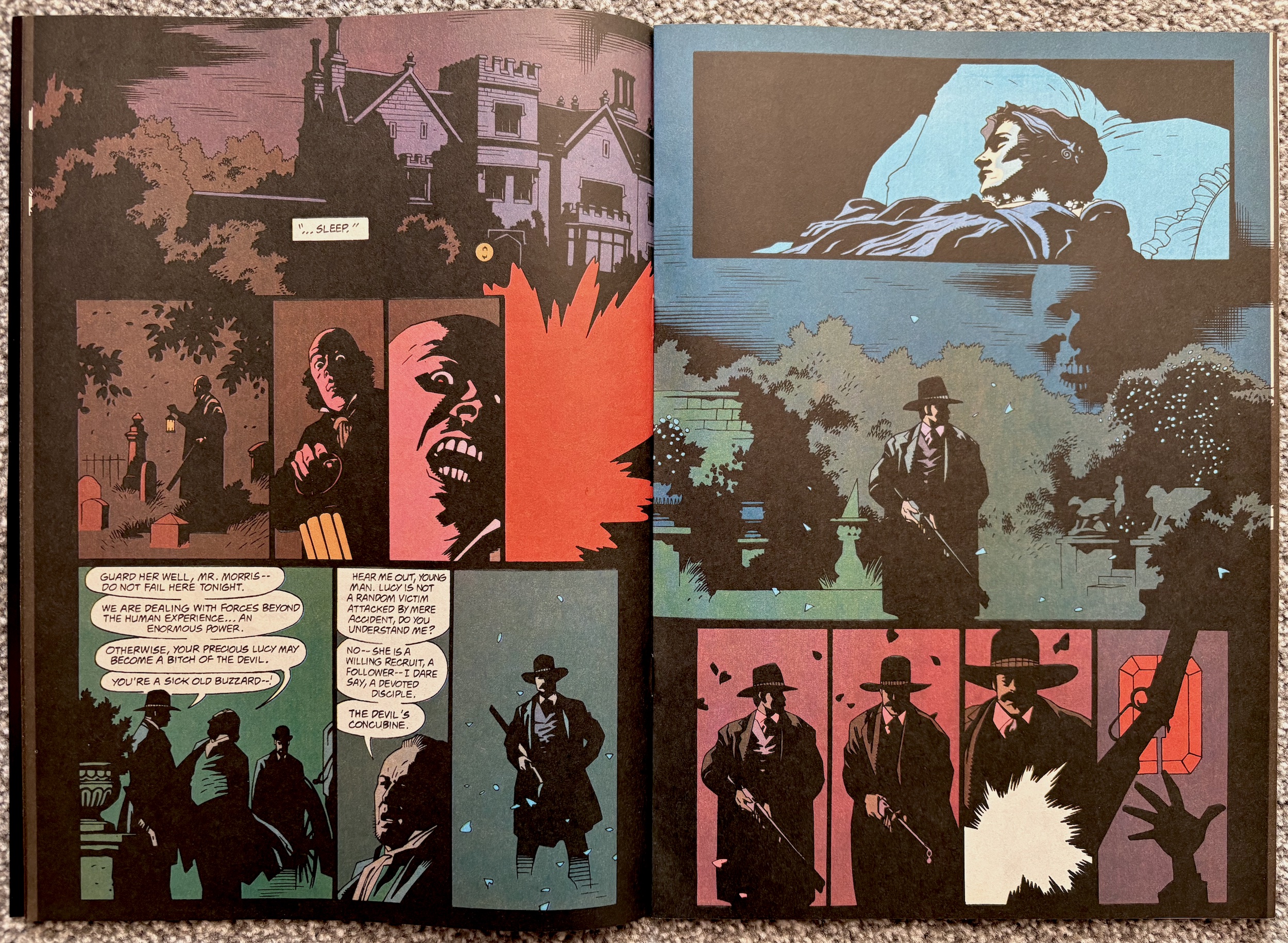
After such a great start in the first two editions, as we get into the meat of the second half of the film it feels like the strip is having to play catch up. It’s racing along, jumping back and forth between scenes after only paying lip service to them. Even as a fan of the film who watches it every Hallowe’en it felt confusing, like it’s been hastily chopped up and squeezed in rather than being properly adapted to another medium.
Don’t get me wrong, thanks to an interview with the writer of The Lost World: Jurassic Park’s adaptation we know how difficult it can be to adapt a movie to comic form and this film in particular couldn’t have been easy! I get that. So please do not see any critiques as being critical of writer Roy Thomas, this must have been a next-to-impossible task, it’s an incredibly visual film and delivers a lot of its thrills through original direction.
There are moments where I’d defy anyone who hasn’t seen the film in a long time to instantly recognise what’s happening. I last saw it only a few of months ago and I still had to reread some pages and look longer at some panels to remember what was meant to be going on. The problem is it’s suddenly trying too hard to follow the film moment-for-moment, instead of adapting it like we know the team is more than capable of from the previous issues .
As the film used its quick cuts, speeded up moments and dramatic music we easily followed what was going on while at the same time feeling bombarded and breathless, as intended by Coppola. But trying to do that with still images just isn’t going to work. However, the quieter moments between Dracula and Mina are again the highlight of the issue and highly enjoyable.
Special mention again to letterer John Costanza for the various forms of diary entries. A pattern emerges as I continue to read. The human moments are handled particularly well but the horror elements fall flat and end up confusing. Thankfully, there are some dramatic moments that come from the more chatty human scenes instead of the visual flair of Coppola, and in these instances the comic’s potential shines.
I mentioned iconic imagery, but what do I mean by that? Simply that there were certain images in the film that perfectly captured its intent as a whole. There are also fan favourite moments, as well as scenes which perfectly summed up Francis Ford Coppola’s vision with just a quick snippet.
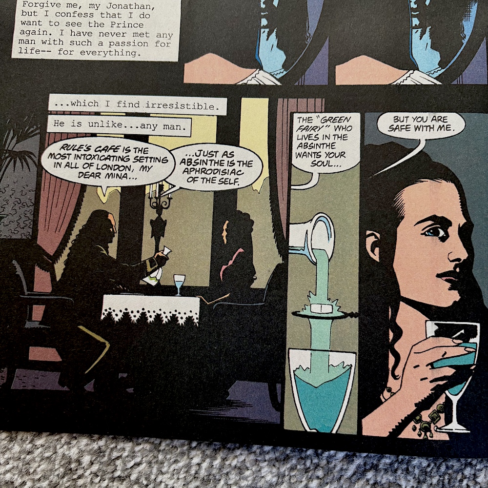
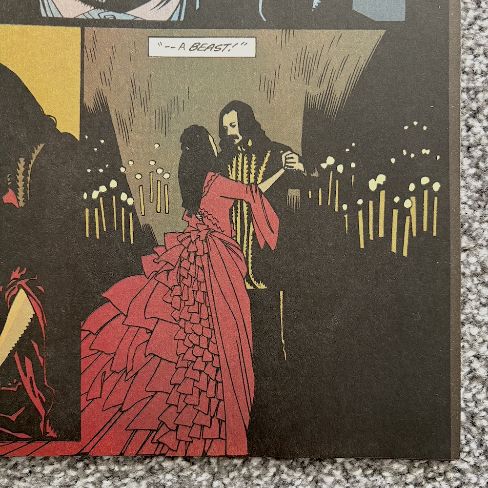
These are largely intact here and the first is that iconic moment when the Prince and Mina dance by candlelight, Winona’s character in that elegant and memorable red dress set against the darkness, perfectly capturing the colour palette of the film and thus encapsulating more than the moment itself. These were moments also used in the marketing at the time and ever since for good reason.
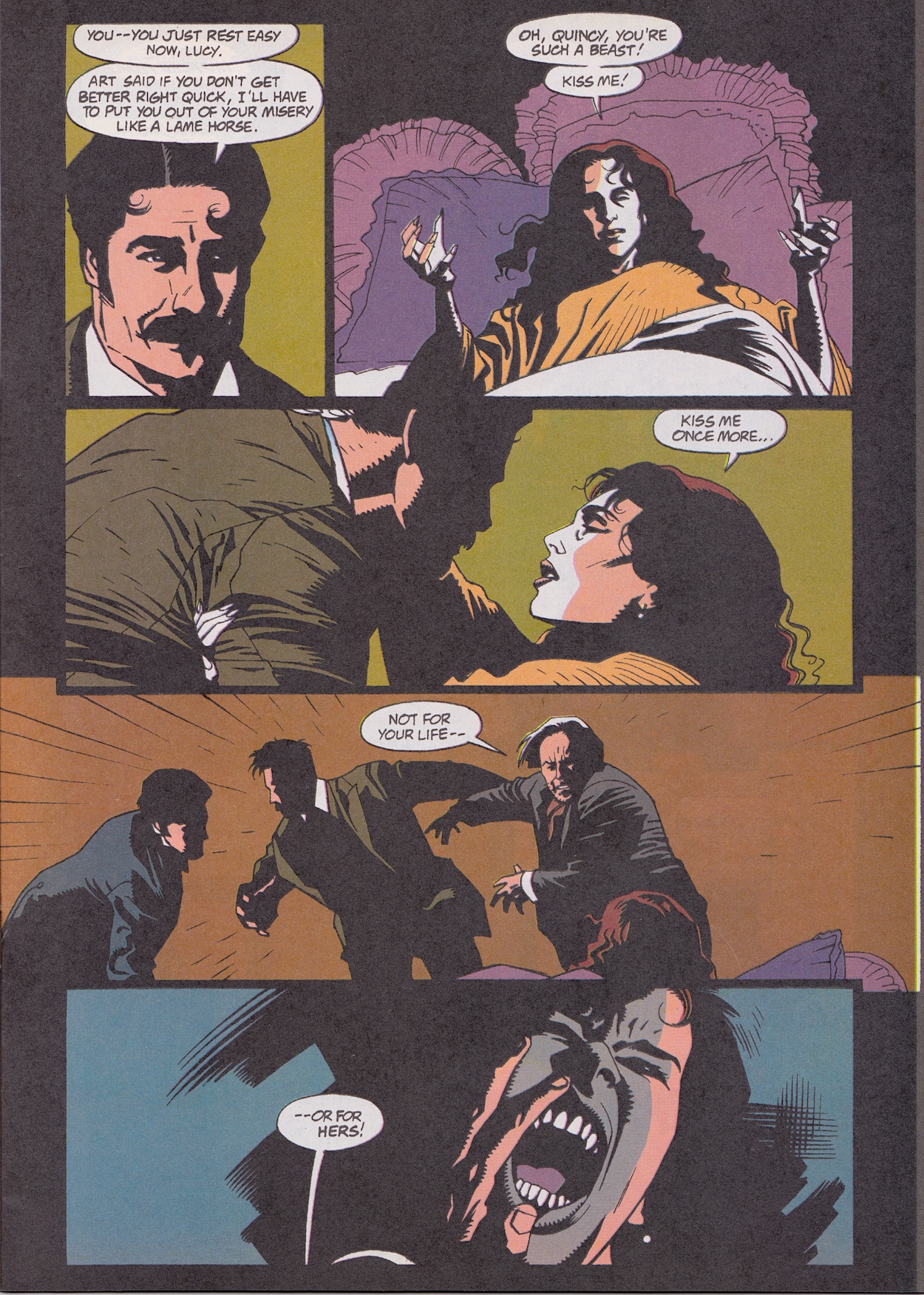
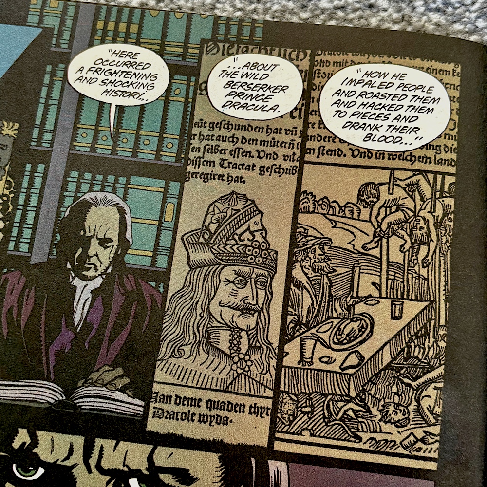
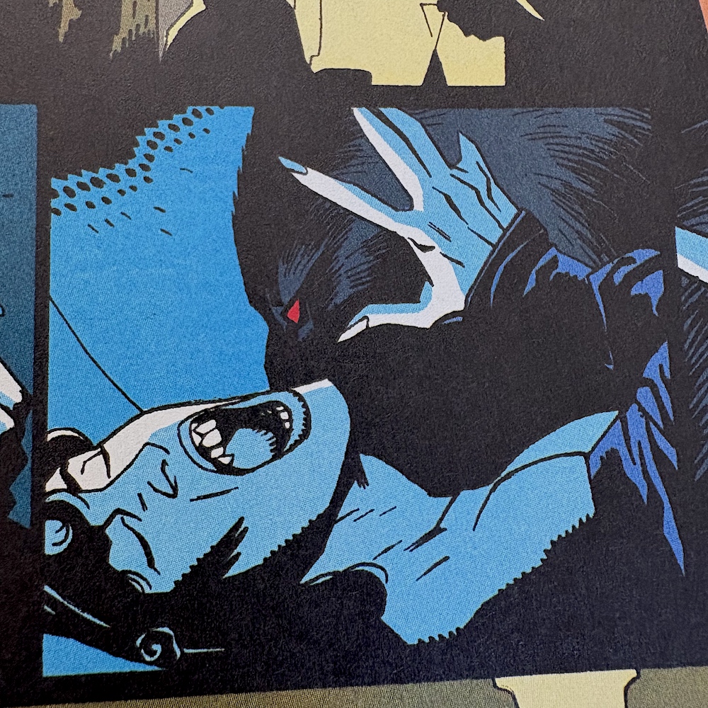
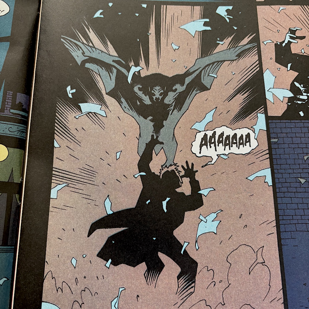
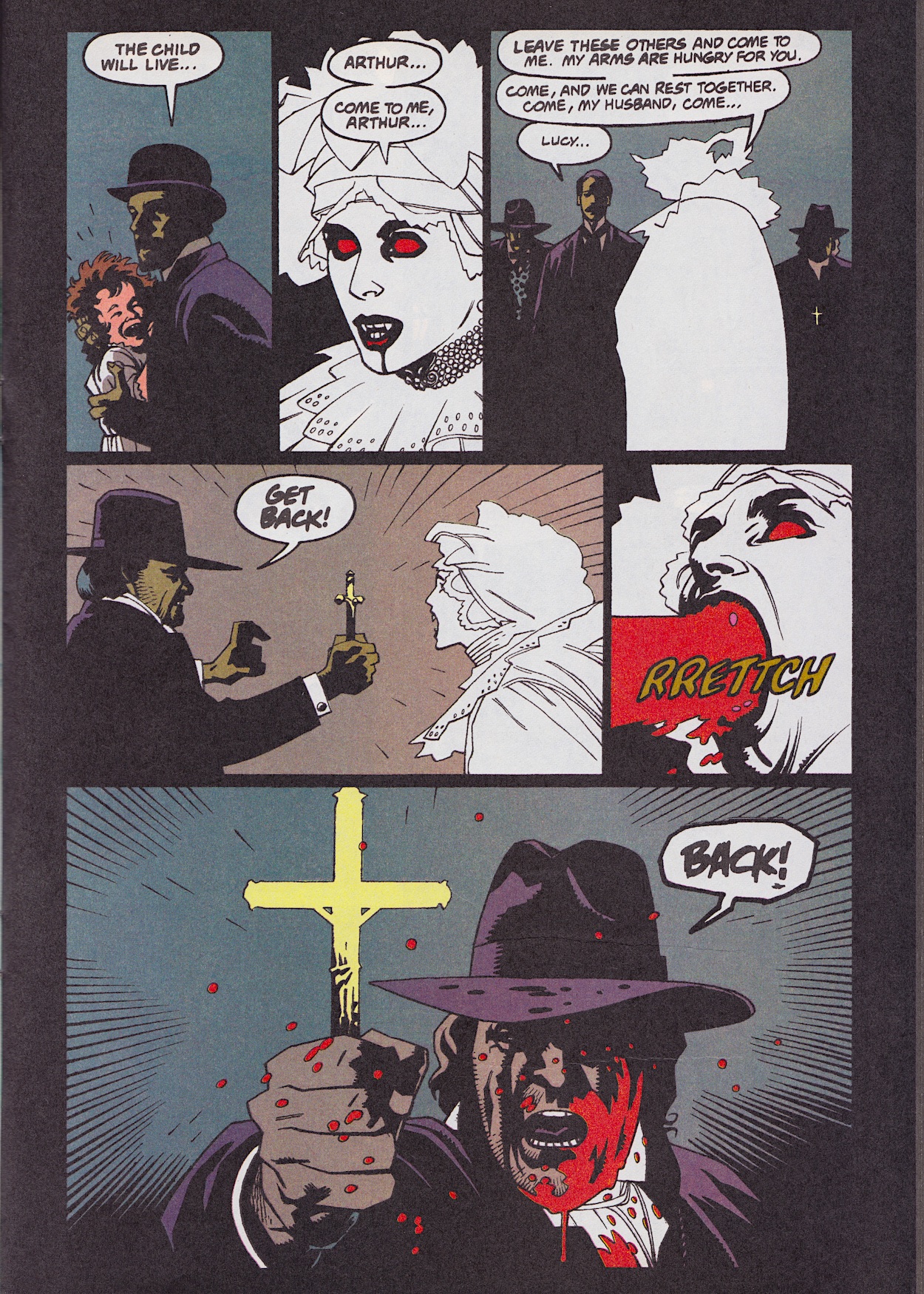
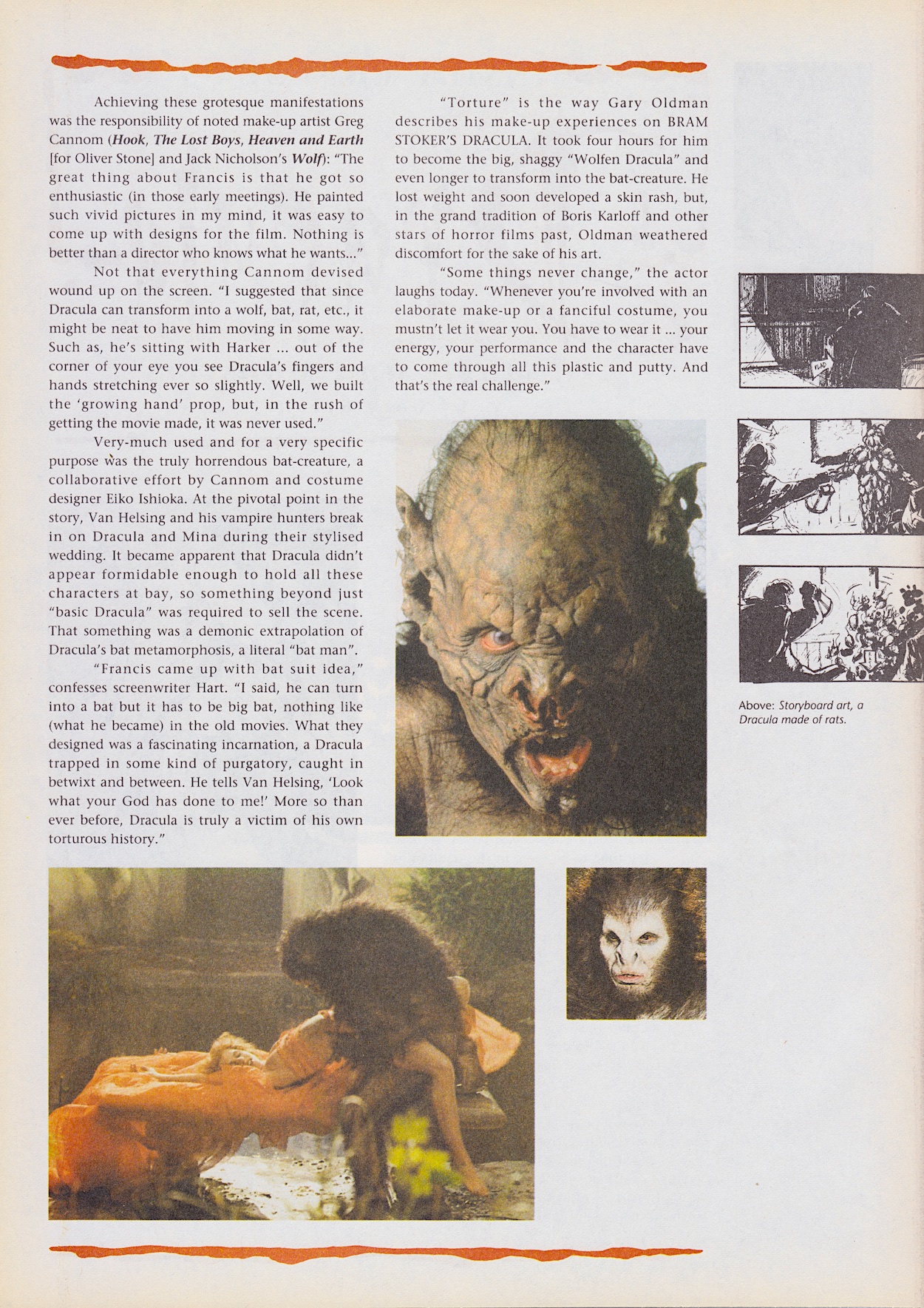
The ancient texts telling the story of Vlad, Sadie Frost’s Lucy character receiving her final bite to transform her and the giant man bat moment that the behind-the-scenes feature below actually talks about. All of these and more are present and correct, and all are brought to the page superbly by penciller Mike, inker John Nyberg and colourist Mark Chiarello.
The creepy, terrifying crypt scene involving the now undead Lucy takes up a good chunk of the end of this issue’s chapter and I love Mark’s decision to not use any shading whatsoever when drawing her. As a result she stands out from the page as an ethereal entity, the contrast of the blood feeling all the more gruesome.
Don’t get me wrong, I’m still enjoying this but in a different way than it was intended. Instead of reading it like a normal comic and being drawn into its story it’s like a love letter from the artists to the film. I’ve spoken at length in the previous reviews about how the artists have been able to craft the same atmosphere through a brave, original stylistic choice and it continues here. But you might struggle if you’re hoping the comic can tell the story on its own.
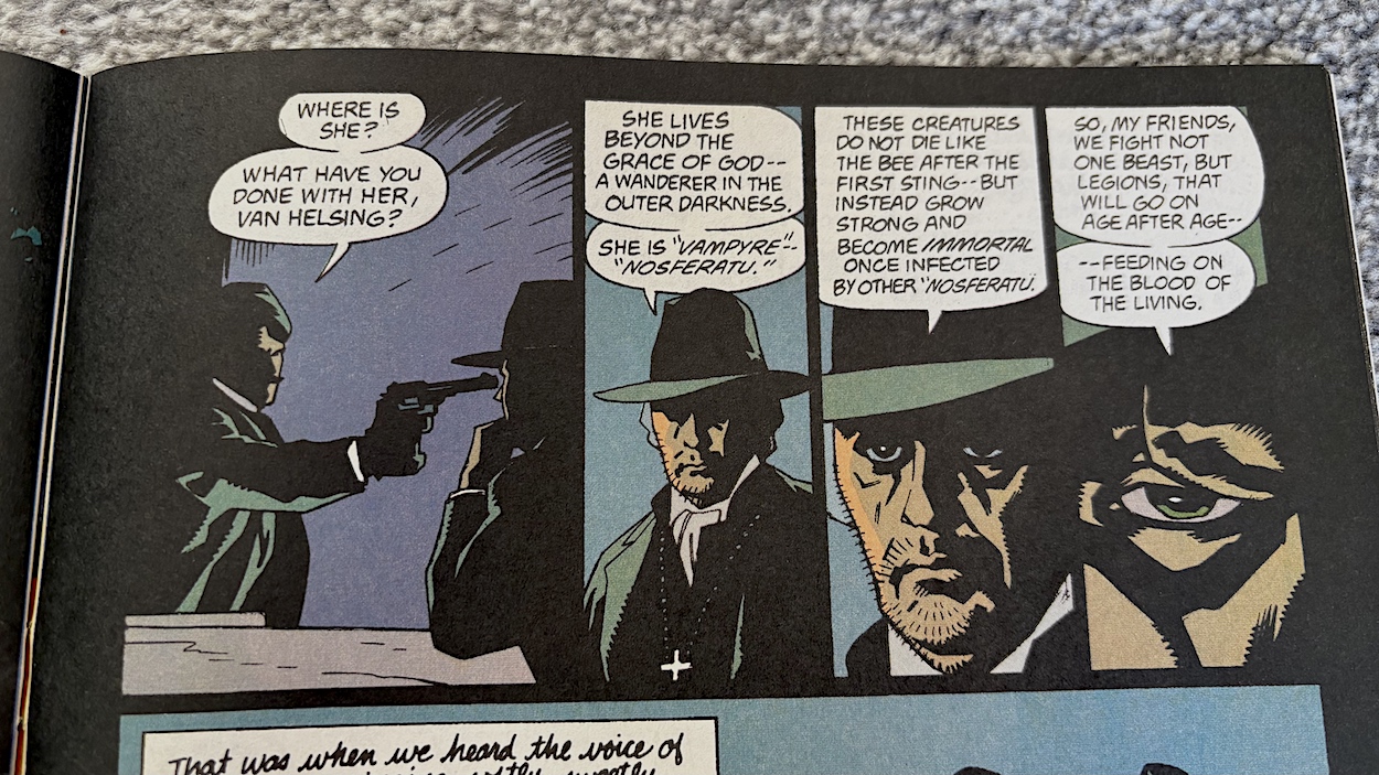
Dracula was released in the UK right at the beginning of 1993 and 32 years later as I began this real time read through a certain other movie was released, coincidentally enough. This timing passed me by until I read these panels below, which are our final highlight of the issue’s strip.
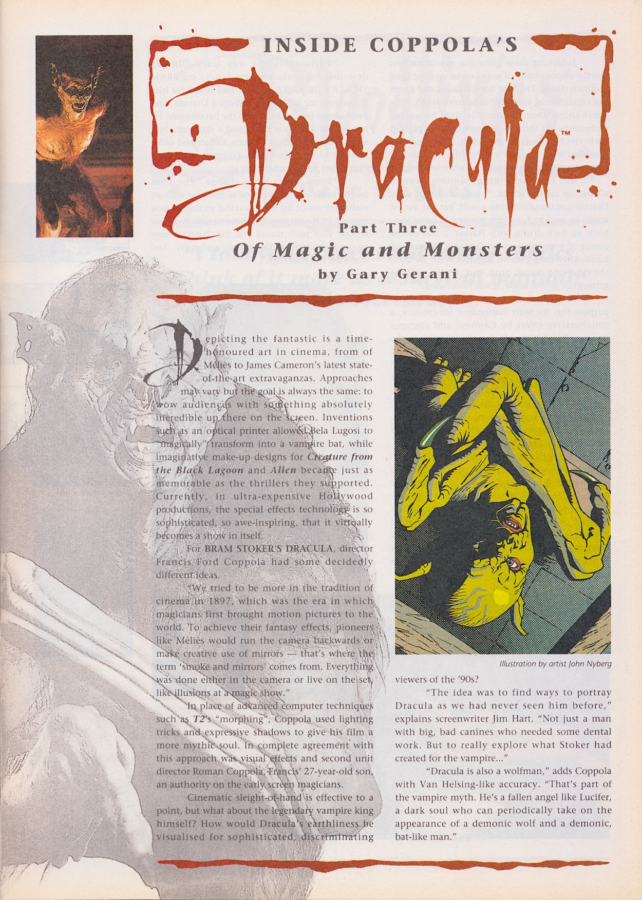
To the extras now and as usual things kick off with Inside Coppola’s Dracula and this time Gary Gerani is focussing on the special effects of the film. Famously, director Francis eschewed the new CGI trend and very deliberately used old fashioned movie-making techniques to give it the feeling of something made around the time in which it was set. Imaginative and genius use of classic “smoke and mirrors” techniques were used and interestingly we get the origin of that phrase here too.
The comparisons to Lucifer are interesting in explaining the use of a literal bat man rather than the usual, clichéd tiny bat in basically all other vampire films up to that point. The explanation here makes so much more sense. The transformation into a wolf was new to me when I first saw it as a teenager, werewolves were a completely separate entity from Dracula as far as I was concerned, so it was a surprise to be proven wrong.
“Two newish magazines with more than a passing interest in the orthodontic removal of corpuscles via the jugular vein.”
Dave Hughes
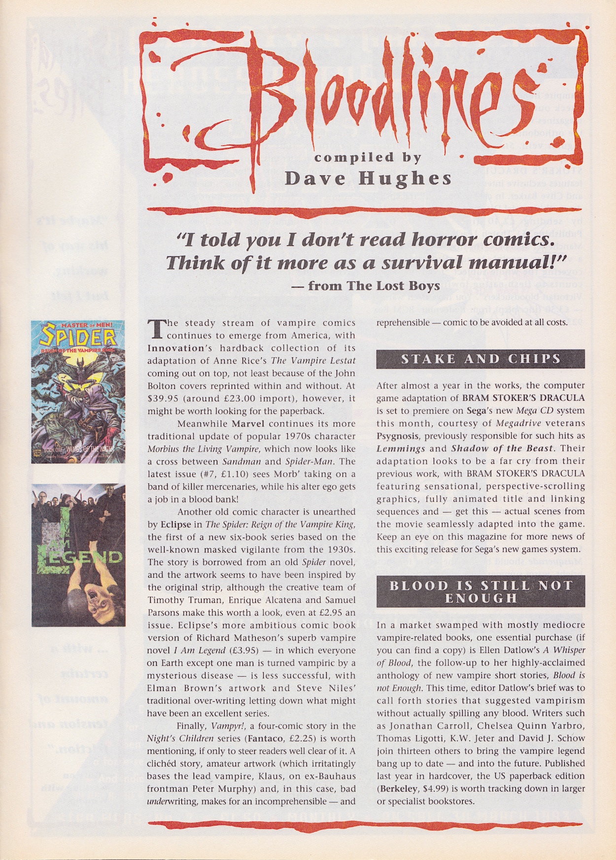
But what about that hand prop? I’ve never seen any photo or video of it but I can’t help but think of the hand effects from the short-lived 80s TV series Manimal. There’s a blast from the past! I think the prop for this film would’ve looked quite a bit better though, to say the least. Moving on to the Bloodlines news pages and Dave Hughes certainly doesn’t hold back with some of his reviews this time around.
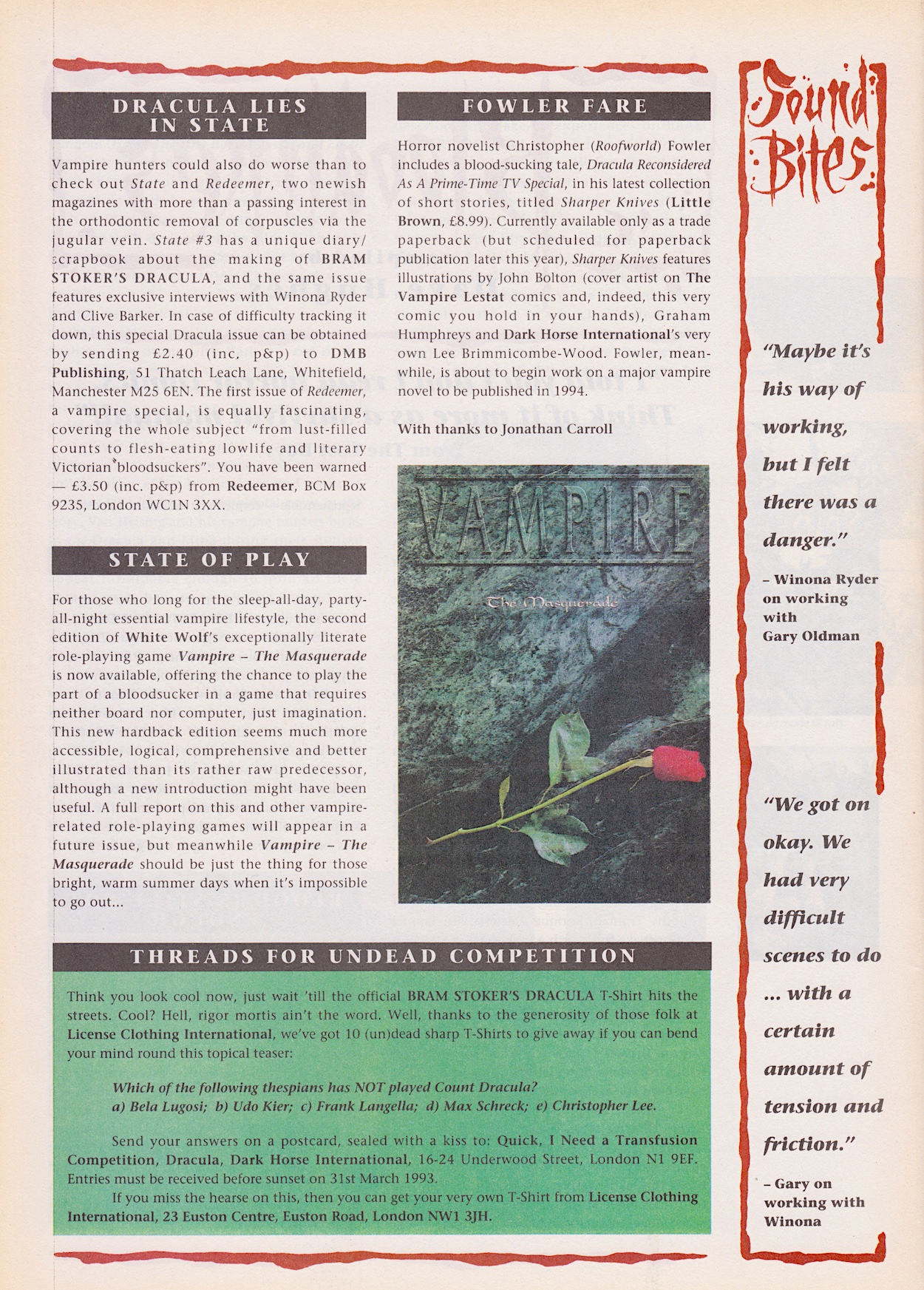
Interesting to read that some comics prices really weren’t that much different to today (despite complaints about today’s prices), Ellen Datlow’s anthology books certainly sound interesting and on the second page some quotes from Winona Ryder and Gary Oldman are missing the context given to them last issue and so unfortuanately come across as tabloid-like here. That’s a shame because otherwise this is the most enjoyable Bloodlines yet. Written in a more relaxed and chatty style it’s really rather fun, even if it is missing the promised interview with Sadie Frost that I was particularly looking forward to.
We’re obviously approaching the end of the movie’s storyline and after such a promising and atmospheric start I find myself more excited about what’s to come after the main strip ends rather than it’s climax. The comic still offers up that art though and the extras are fun, then there’s that mysterious future for the remainder of the issues to find out about. That’s enough for me to eagerly anticipate #4 on Sunday 23rd March 2025.