TRANSFORMERS GENERATiON 2 #7: MEGA(TRON) MEMORiES

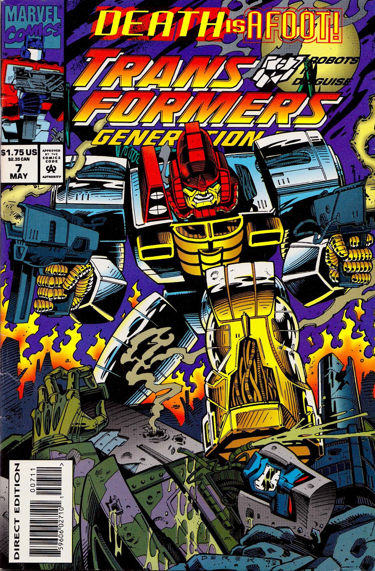
Once more Derek Yaniger‘s art is a storming start to the latest issue of Marvel USTransformers: Generation 2 comic from 1994 and inside it’s all-action. Written by Simon Furman, New Dawn begins with Megatron‘s Decepticons purging a planet of its robotic life in order to steal its natural resources, giving penciller Manny Galan, inker Jim Amash and colourist Sarra Mossoff a chance to introduce some of the new G2 toys as dramatically as possible!

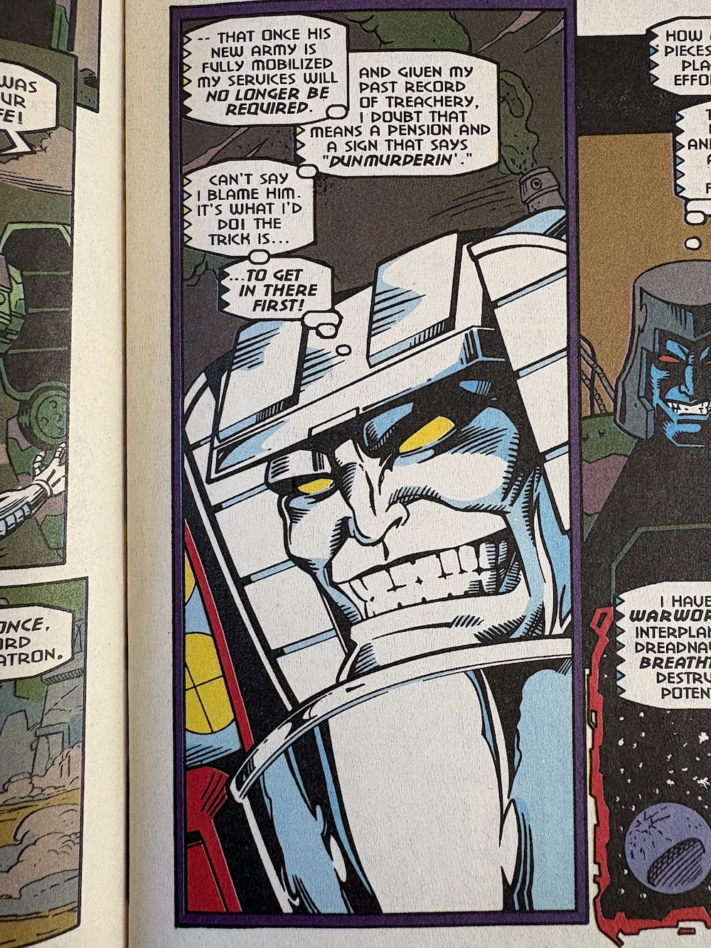
There are a handful of brand new robots I’d never heard of before but it was the reintroduction of an old character that really caught my eye. With the Matrix captured (far too easily) last time, Megatron has been busy creating (and recreating) an army and to see an old favourite return in this way was a thrill. It’s just a shame Simon got their name wrong. But when I read this initially (before researching for the review) I wasn’t aware and just enjoyed the shock and awe.

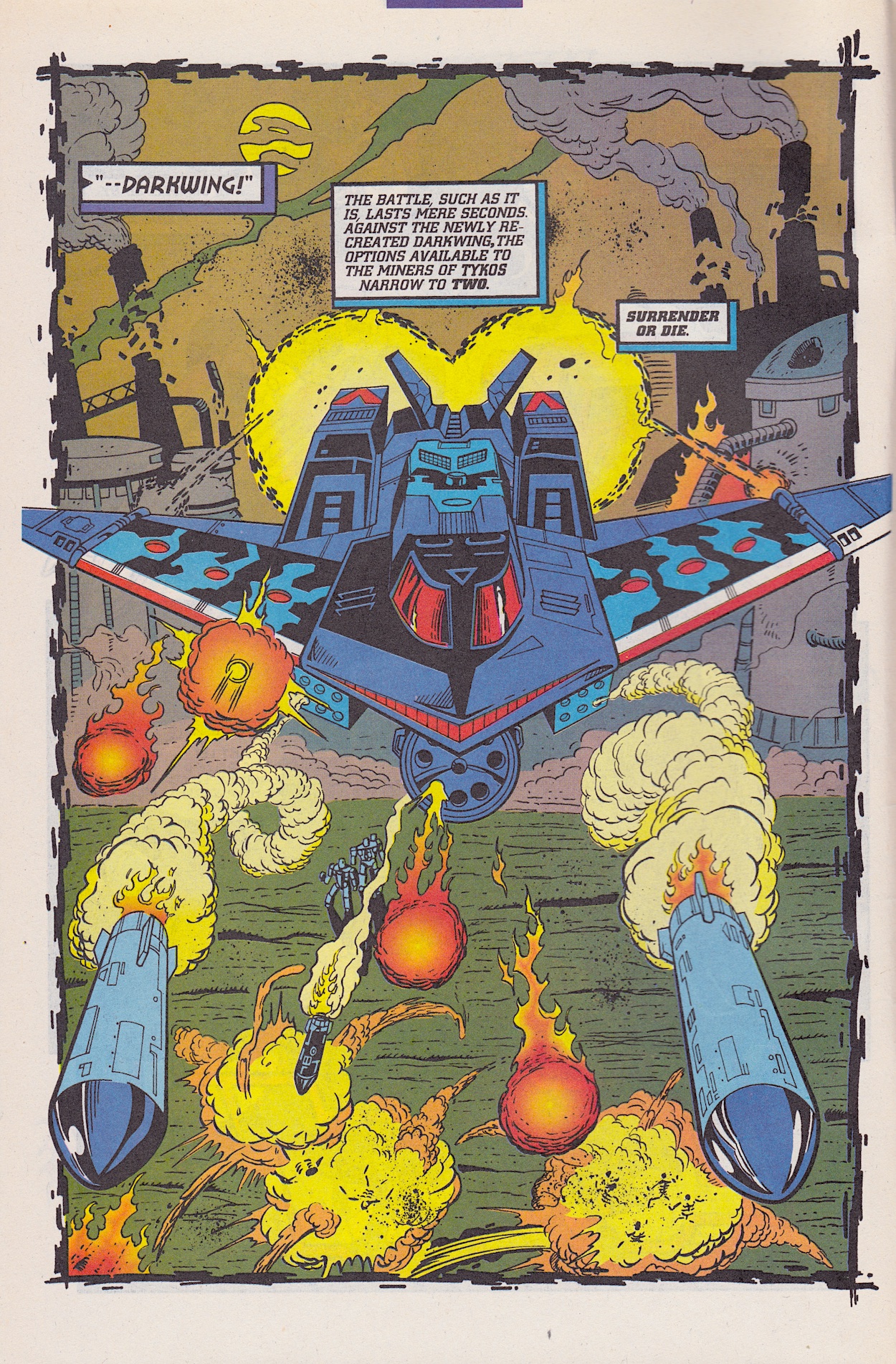
In G1 Darkwing and the UK letter answerer Dreadwind combined into the giant jet toy called Dreadwing. It’s this name Hasbro went with for this stealth bomber Decepticon in the G2 range but Simon has named it Darkwing. Just to add more confusion, back in #5 Darkwing was named as a downed Decepticon jet (hence he needed rebuilt by the power of the Matrix) but his colour scheme was that of Dreadwind. So that’s that cleared up!

The attack goes flawlessly for the Decepticons but in the background one of their ilk isn’t happy with how he’s being used; he’s been resurrected for a single-minded purpose just to be disposed of when the job is done. No prizes for guessing it’s Starscream, once more raising the questions of why Megatron chose him in the first place and why has he a head full of human teeth.

He seems to have picked up on some classic Earth sayings in his time on our planet during G1, which I admit I did chuckle at. With his army back at full strength Megatron addresses his troops, rallying them for the fight ahead against Jhiaxus‘ new generation of Cybertronians. It gives the comic a reason to include one of those great crowd scenes it was always so good at, and Manny et all don’t disappoint.

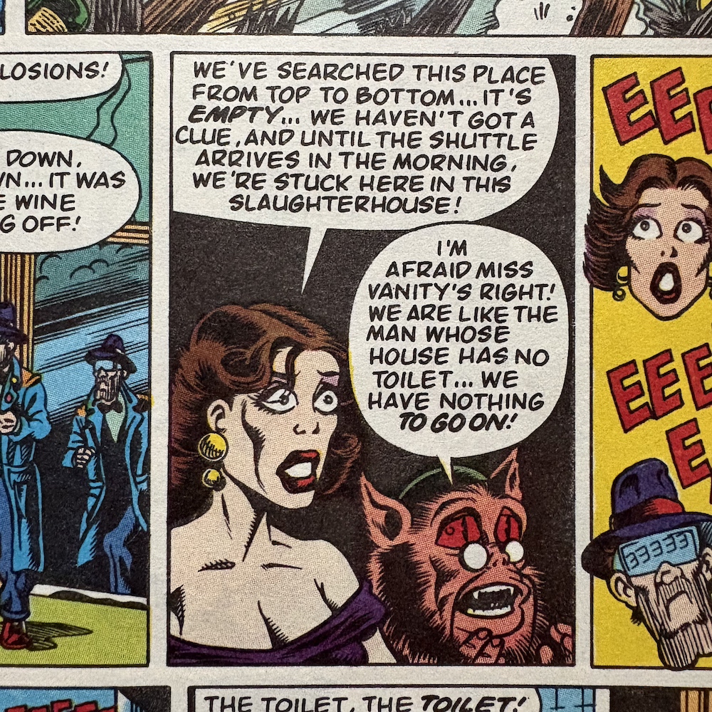
That’s a bit harsh of Megatron shouting “Death to the Pretenders!” so close to Fangry and Stranglehold, though. Not really, it’s a funny little in-joke and at least Octopunch in the bottom-right corner stops himself from inadvertently referring to his former boss! This sort of build up is something we saw a few times over the course of the epic first generation comic, which makes what happens next all the more shocking.

First we get a moment of reflection with Jhiaxus bemoaning the fact that “tact and diplomacy” haven’t worked. If what he’s done was tactful and diplomatic then the comic successfully predicted some of our idiotic world leaders today. While the Deceptions are the ones to initiate the fighting, it’s actually their ship that’s boarded by Jhiaxus’ troops. What follows is nothing short of a massacre!

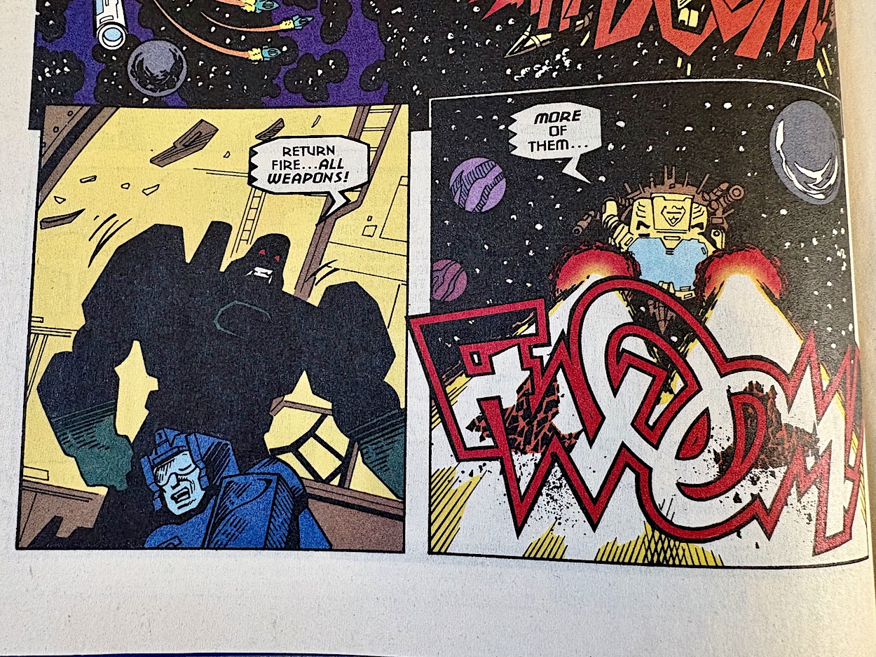
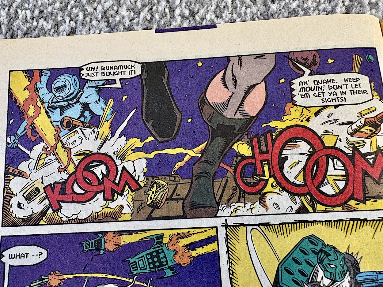
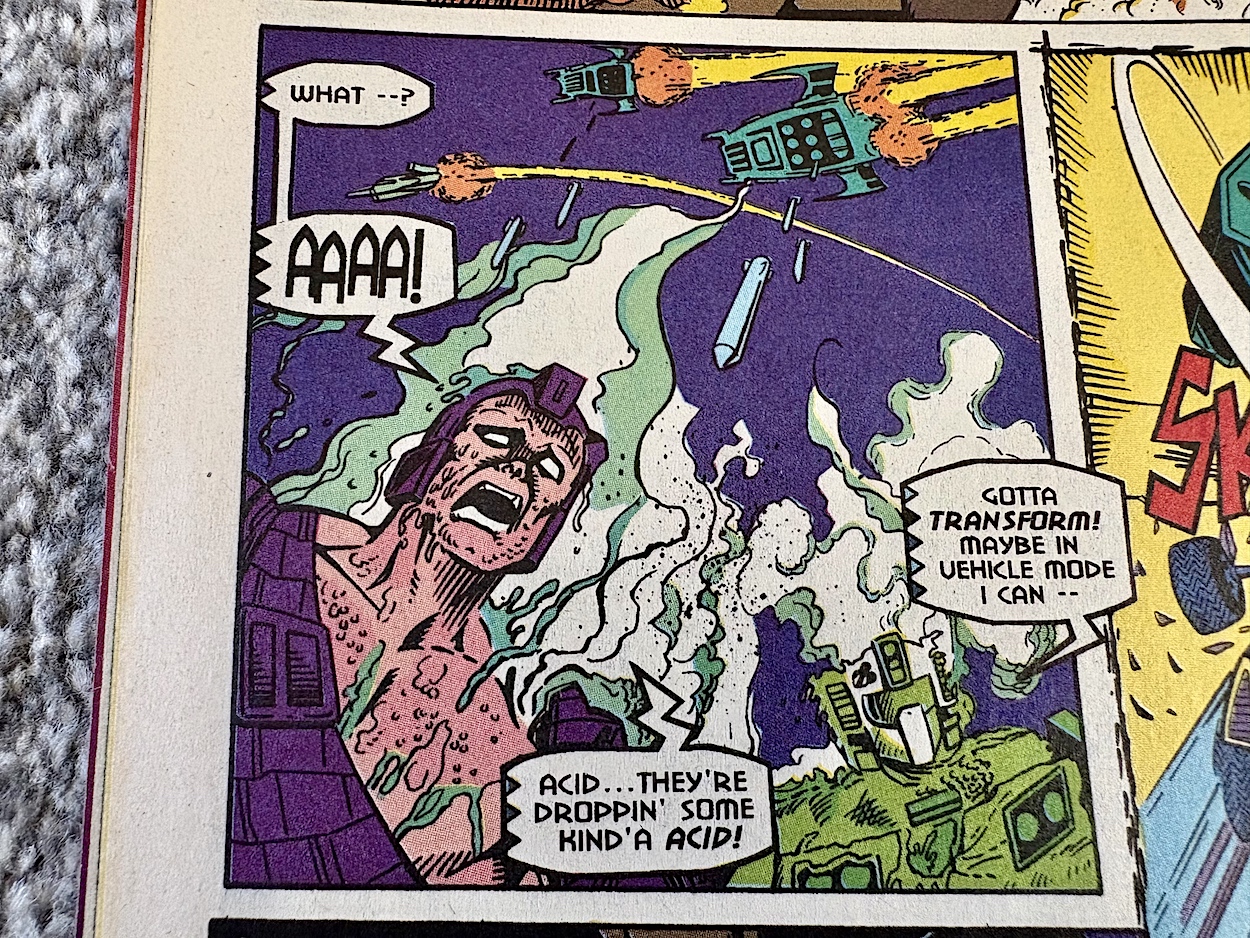
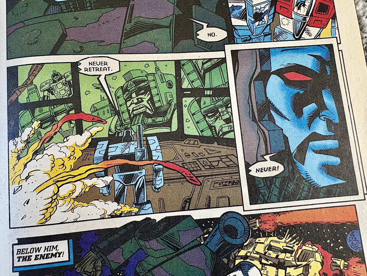
This has echoes of the Autobot Ark being boarded by Megatron and his army right back at the very beginning of the G1 comic, which adds to the dramatic outcome and the shock felt with the deaths of so many long-standing characters. Manny’s art is superb, even if an acid “drop” in zero gravity makes no sense. In the end, Megatron takes the fight to Jhiaxus… and subsequently gets seven shades of grey and green smacked out of him, as per the cover.

We see Megatron burning up upon entry to the planet below and have to take a breath to fully appreciate how everything has changed in the course of one issue. There’s a point where the story feels rushed, when Megatron sees Skullgrin‘s ship crash after an attack and suddenly he believes everything Prime told him last issue. Much in the same way as he claimed the Matrix, there are elements that feel they’ve been sped up from what Simon may have originally intended, in order to get the story to a finishing point for the final issue.

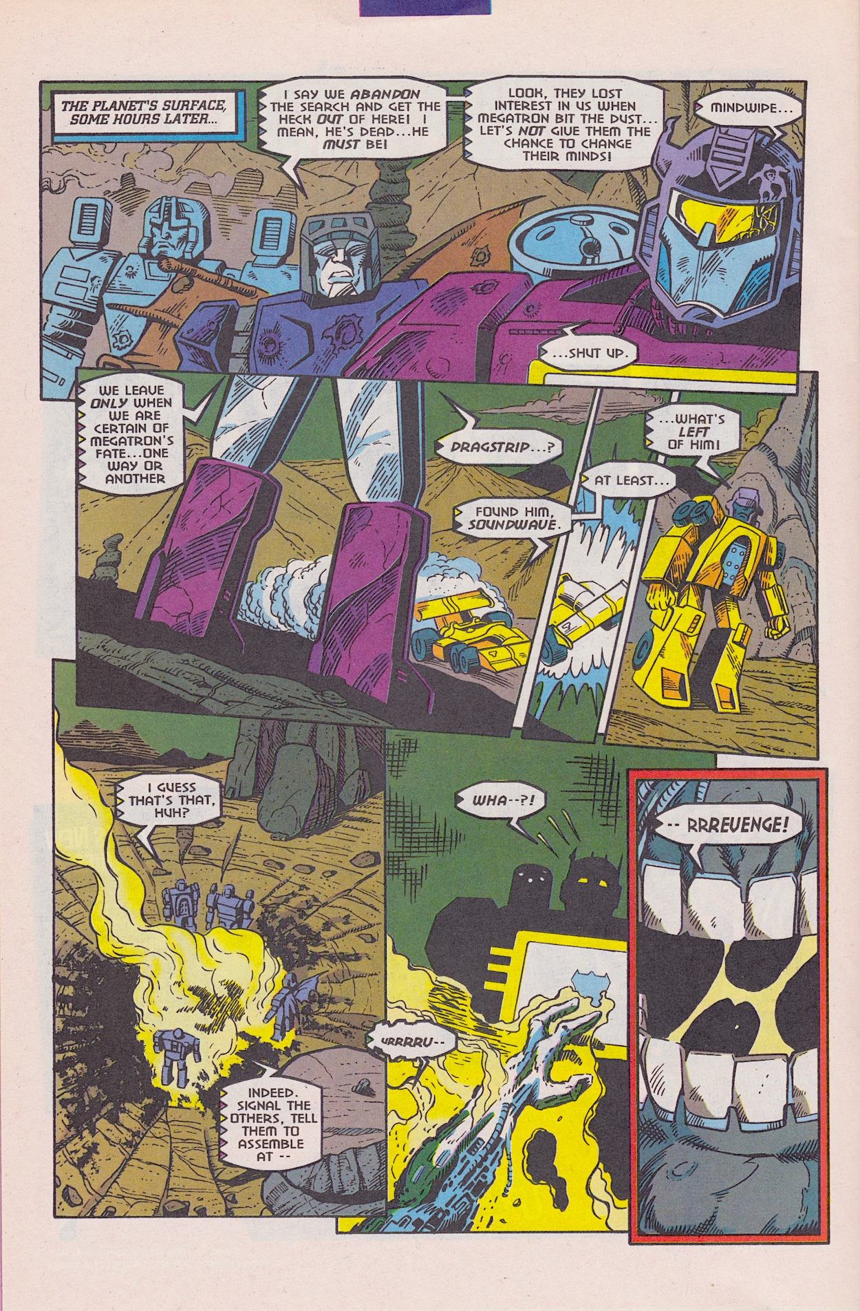
But it’s a testament to the quality of the comic that despite this it’s still so damned enjoyable. Soundwave takes some troops (including one of my favourite childhood Transformers toys, Dragstrip) down to the planet and discovers what they initially think are Megatron’s remains. However, as you can see it takes more than a savage beating in the depths of space, unprotected planetfall and a full speed descent over many miles into the solid ground to keep a good Decepticon down.

Tales of Earth continues as the backup strip and, while not an awful lot happens in part four, what it does contain are a few pages that are my absolute favourite of the whole issue, perhaps of the whole Generation 2 series so far. As Optimus Prime lies on an operating table getting slowly mended by medical drones, his thoughts wonder.

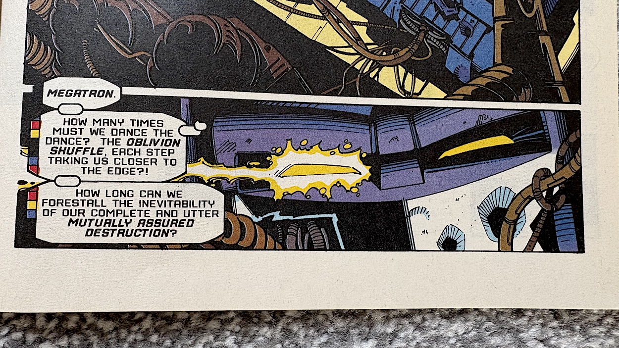
Having been close to death so many times must play on your mind, right? Reading that panel above, we know Prime is thinking back over the millennia and the endless war between the Autobots and Decepticons and the futility of it all. The back and forth between wins and loses, the only winner will surely be death, for them and their race. They’ve even saved one another upon occasion. Do they somehow know they actually need each other?

All of these thoughts are interesting enough but it’s how they’re presented that really grabbed me. I’m positive readers at the time loved these next few pages just as much and I know fans reading them here for the first time will feel exactly the same. Beginning with a double-page spread presented in landscape format, Prime’s thoughts trace back over specific key moments from the seven-plus years of the original comic.

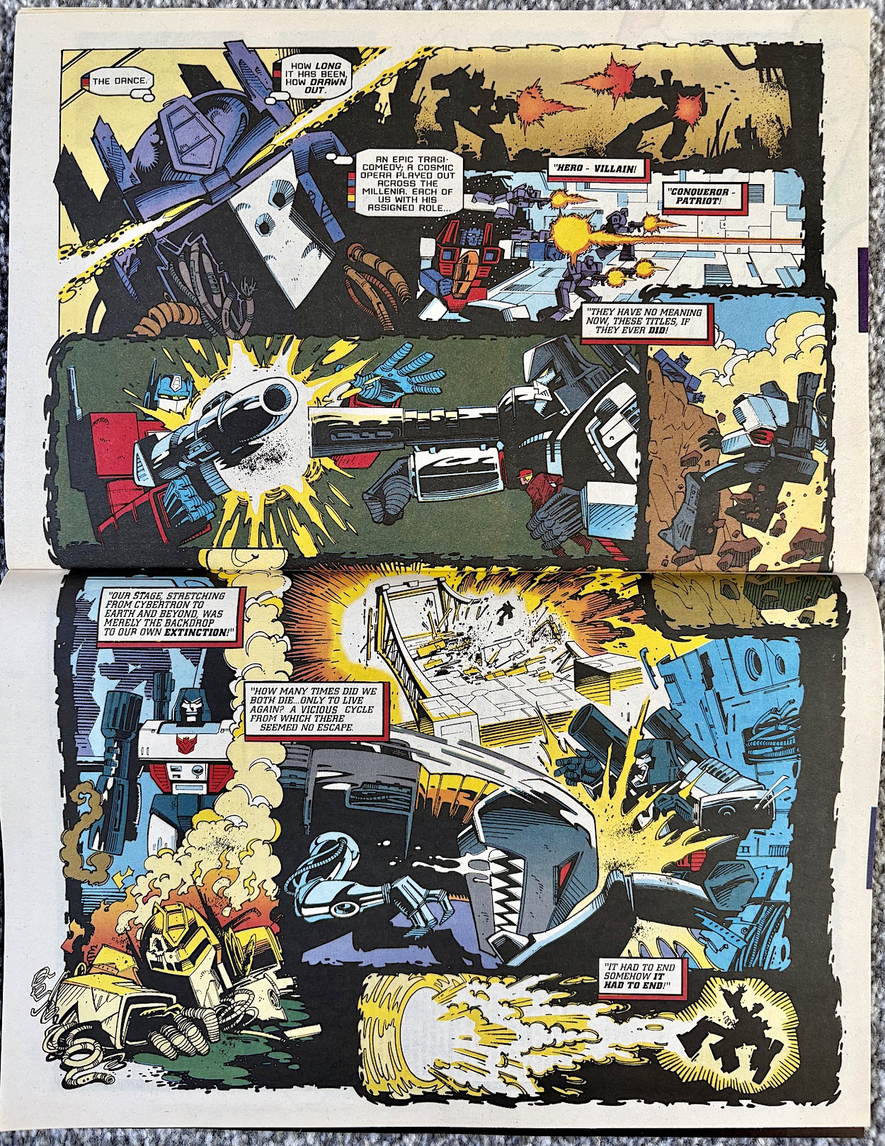
His inner monologue is brought to the page wonderfully by Richard Starkings alongside new partner Bill O’Neil (Gen13, writer on Fathom and John Carpenter’s Snake Plissken Chronicles) and their unique lettering, punctuating a glorious spread by Derek, Jim and Sarra that includes the aforementioned Ark assault and even the moment between Ratchet and Megatron atop a clifftop on Earth from the early days. Speaking of Ratchet, look at that final memory carefully and you’ll see extra limbs and a familiar head shape in that Megatron-like silhouette.

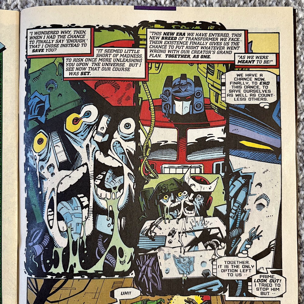
Seeing this on the next page again was thrilling! What a surprise! It was a huge moment in the final year of the original comic and wonderful to see it play a key role in the Generation 2 story, as Prime remembers how he saved Megatron and Ratchet, despite the latter’s wish to be killed so that their enemy wouldn’t survive. What a moment. What an issue this has been. At the end the cliffhanger is a half-destroyed Megatron bursting in and standing over the helpless Optimus. You’ll see him in all his battered glory in next month’s review. Things just stepped up a gear. No pun intended.

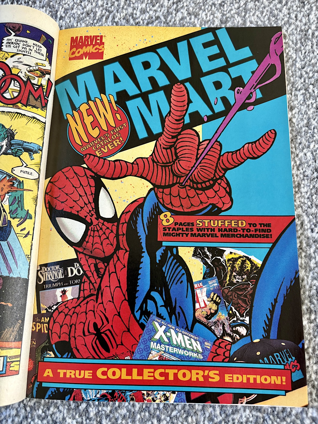
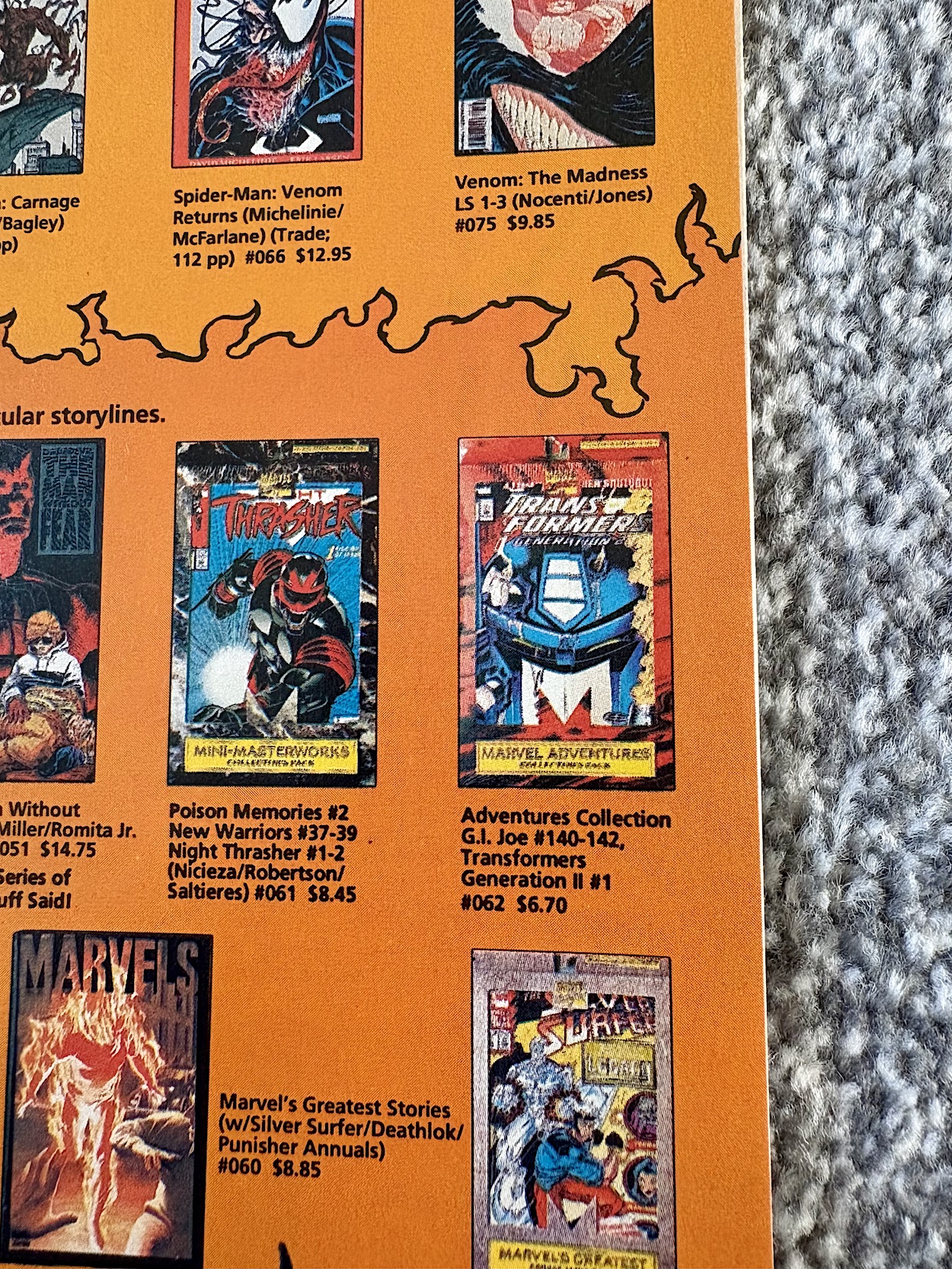
In the middle of the comic is an eight-page pullout and a removable cardboard order form for the Marvel Mart, which according to its own cover is “Marvel’s First Catalogue Ever”. It says it’s full of rare merchandise yet the majority of it is comics and box sets, with merchandise relegated to the usual t-shirts, posters and the like on one page. I did spot the Transformers Generation 2 box set that I owned, which confusingly didn’t contain part one of the G.I. Joe crossover. (Possibly because only four issues would fit inside the boxes used.) It’s basically an eight-page advert.

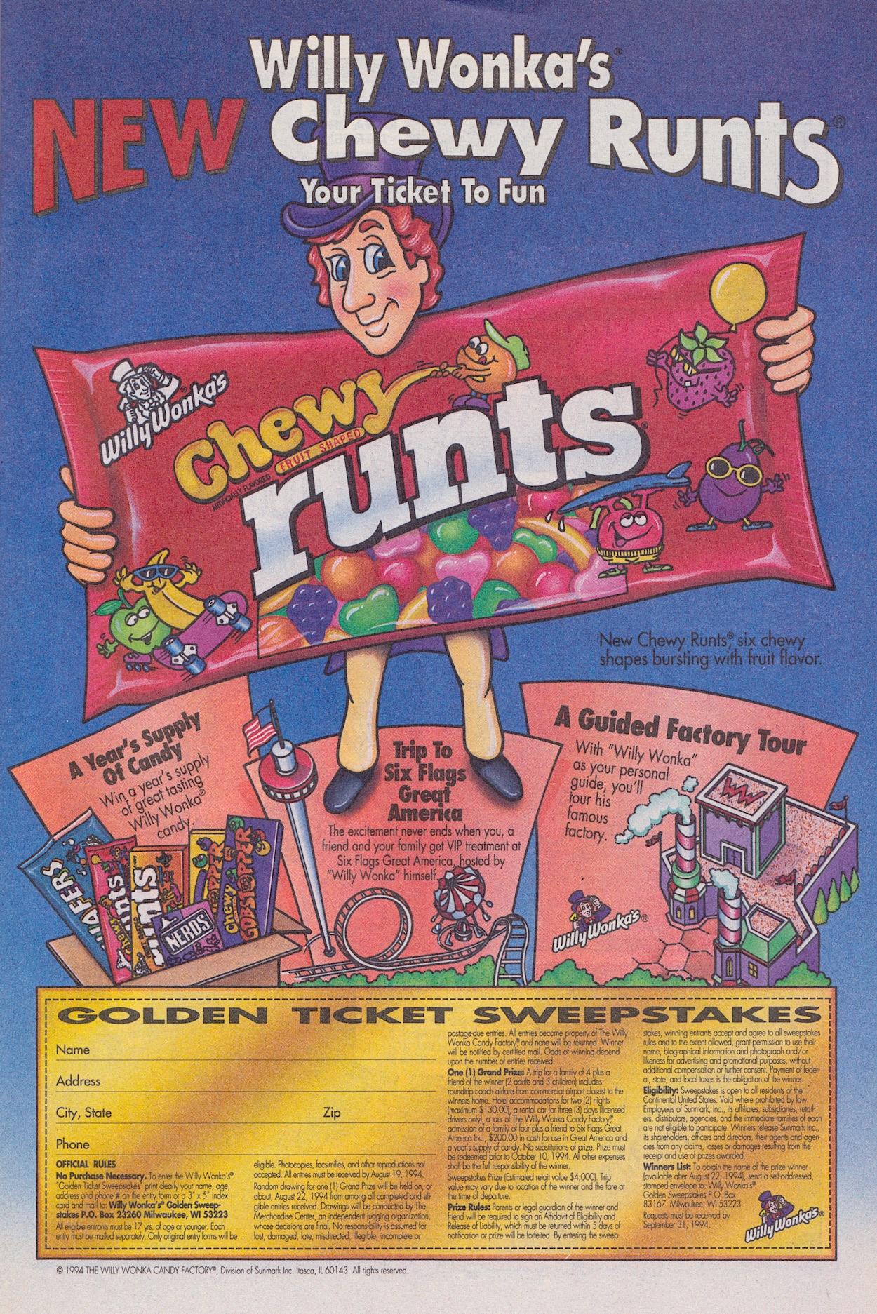
At the beginning of the comic, right opposite the dramatic Darkwing/Dreadwing page is an advertisement for some chewy sweets with an incredibly unfortunate name. I mean, how on Earth did this get past the initial idea stage, never mind into the shops? It’s funny to look back on, but can you imagine if these were advertised today in a kid’s comic? You’d be able to hear the keyboards of Daily Mail readers across the land.

With that rather strange look at 90s American candy we come to the end of this month’s real time review. If this is the quality this comic achieved by only its seventh issue, I can’t help but wonder where it could’ve gone and the heights it could’ve reached over another seven year run! Now more than ever the month between this and the next issue is going to be a long one. Transformers: Generation 2 returns on Sunday 27th April 2025 with #8.

iSSUE SiX < > iSSUE EiGHT

TRANSFORMERS: GENERATiON 2 MENU

MAiN TRANSFORMERS MENU

ALiENS #10: i HAVE SCARY DREAMS

Last month I lamented about how my copy of this next issue of Dark Horse International’s Aliens didn’t have the free comic packaged in with it after last month’s ended on a cliffhanger. So when I picked up #10 I ignored the banner along the top. However the 12 middle pages here, while not separate from the main comic this time, are presented like an additional comic and contain the concluding chapter to Aliens: Countdown.

A closer look at the cover reveals no less than six stories inside and Countdown is included. Boasting about a free comic but also including the name of it in the list of the main comic’s strips is a bit cheeky, but you can’t deny it felt like value for money! There’s a catch with the so-called “free” bit of Countdown though, which we’ll get to in a bit.

We no longer have a lovely glossy cover. Instead, the outer 32 pages are of a thicker paper stock that’s somewhere between matte and gloss, akin to the 90s’ Thunderbirds The Comic or the last year or two of The Dandy, while the inner pages are the usual matte grade. The editorial (shown above with full credits for this issue) has a lot to promote Aliens-wise but instead dedicates most of itself to new comic Total Carnage and the change of editor, what with Dick Hansom off to launch Jurassic Park.

Cefn Ridout (Doctor Who Magazine, Black Widow, Speakeasy) will be in charge and is left a comic at the top of its game with so much content. It all kicks off with the 12-page second part of the exclusive UK strip, Sacrifice. It turns out our lone survivor of the spaceship crash, Ann McKay is a priest. This seems to shock the male members of the village, which is a bit weird considering how far in the future these stories are set.

Ann thinks giving a service will help ingratiate her with the strange and inward-looking villagers although, given the flashbacks to her mother in a scene which I’m going to assume involved one of our aliens, she’s clearly looking for forgiveness for herself. It doesn’t help. The villagers still disdain her and she barely escapes an accident with a combine harvester (no, really) that was clearly an attempt to kill her.

The one person who likes her is Masters, who propositioned her last month. Here, in a part of the story that I literally cringed at, Masters tells her he won’t respect her wishes, he won’t wait for her consent, he’ll keep pushing until she loses her faith and they can be together. Then she kisses him! Okay, so she then runs off because her vows tell her she shouldn’t have done that, but really? He said all that and she fell for him?! If this was written today it could be accurately described as “tone deaf”.

Anyway, the rest of the story sees Ann track the men carrying a small bundle to the altar and as predicted they’ve got a baby they’re sacrificing to the alien. Yes, it’s horrible and this is meant to be a horror story, but it’s a cheap trick to pull at the heart strings and it makes no sense. (Where are they getting so many babies from?) Unfortunately the promising start last month is becoming uninspired and in the case of the scene with Ann and Masters, just ridiculous.

It ends with Ann grabbing the baby and running from the alien, tripping and falling off a cliff and down to a river while the alien breaks into the village. The art is lovely and in particular the alien itself looks suitably scary. If partnered with a good story Paul Johnson’s work could elevate the comic even higher. Let’s hope for better things from the next British strip soon.

Due to the sheer amount of content, Motion Tracker’s news has been shortened to one page and it all feels rather rushed, like they had two pages of material ready to go and decided to include it all in half the space. But at least it’s answered a niggling question I had about 15 years ago, when I wondered where I’d seen the font used in the Knight Rider sequel series (2008/9). Having that particular word spelled out in the title of the movie above certainly helped.

Colonial Marines continues across ten pages in the middle of the comic (with Countdown sandwich in the middle of it) and we’re introduced to some of the crew Lt. Joseph Henry is taking to the Sun Gun. This was a chance to embellish the roster of characters with personalities so we’d care about them and it does this very well, but they just had to go and introduce a relation to a movie character, didn’t they? In this case it’s Vasquez’ sister!

Writer Chris Warner really didn’t need to do this. The other characters are realistic, three-dimensional people already, there was no need to basically bring back a fan-favourite movie character. Much like Predator: Cold War there’s no need, the original characters are well written enough. For example, Joseph himself is brilliant. After sympathising with him last month he’s now more in his element and comes across as relatable and quippy. The fact this façade is hiding personal pain just makes him all the more believable.

Sergeant Nyland is no-nonsense military and she feels Joseph’s reputation makes him unsuitable for restraining a bunch of marines, all of whom are on this mission to serve time, eg. for insubordination. Mr Beliveau is in charge of the Sun Gun’s crew and also all-business. The story is clearly setting everyone up as hard-edged, get-the-work-done types who are going to crumble when up against the aliens, while Joseph’s more human approach will save the day. I’m here for it, I like the guy so much already that I’m looking forward to seeing his influence on the crew and marines.

Then there’s a somewhat larger synthetic character than we’re used to. 

Having the free Countdown comic stapled right into the middle of the Colonial Marines strip highlights something else about this story. Countdown tries so hard to translate the magic of the Aliens movie to the page that it’s ended up reading like a cut-and-paste job. Whereas, Vasquez’ sister aside, Colonial Marines takes the essence of the film and crafts something new yet familiar from it. It’s much more successful at paying homage to the film as a result.

Back at the Sun Gun the crew has been decimated by the aliens and just before the xenomorphs finish them off a new race of aliens arrive! I’m not sure how I feel with these pulp sc-fi people suddenly appearing from a 1970s episode of Doctor Who, but this is all we get of them so we’ll have to wait until next time to see how this developments. Are the xenomorphs going to be relegated to third place in the story, as some form of basic movie monster playing second fiddle to these new aliens? Let’s hope not.

Now, speaking of the strip I was comparing this to.

In the middle of the issue is the 12-page “free comic”, the concluding chapter of Countdown. To make it removable they’ve given it a cover, a page summarising the last issue and a couple of adverts. The thing is, when these 12 pages are removed the rest of the comic only has 44 pages remaining when it’s had 52 from the beginning. Looking back on #9 I see it was actually 48 pages. So pages were taken away in order for the publisher to make room for the supposedly free gift. You see what I mean when I said I questioned the word “free”?

It’ll be interesting to see if the main comic returns to 52 pages next month. One thing I know for sure is that the Countdown art by Denis Beauvais remains superb. Unfortunately there are some panels where the speech balloons point to the wrong person, making things confusing until you realise the error. This is compounded by the fact it was already difficult to keep up with who’s who because the characters are two-dimensional copies of the movie’s. In the end I just went along for the ride and enjoyed Denis’ work. Highly recommended for that alone.

No mention is made of the error with last month’s Aliens Vs Predator II reprint and it appears the mistake wasn’t noticed, because this issue’s instalment clearly follows on from incidents we should’ve seen last month but didn’t. After that, taking up only three pages but with a lot more content is part one of what is described as an “ongoing Aliens novel”, Tribes by Steve Bissette (artist on Swamp Thing, Sgt. Rock, Heavy Metal)

Tribes was actually a previously released (in the States) small novella with full-page images drawn by Dave Dorman (Star Wars, G.I. Joe comic and toy packaging artwork, Magic: The Gathering cards) that have been shrunk down so much it’s hard to make out the details, which is a crying shame. Although you can enjoy his full-page cover this month. The story involves a specialist infiltration unit and there are a lot of hints about their mission and people we’ve not met yet, meaning the cliffhanger about one of them doesn’t hit. Would it have been better to have a prose story written for the monthly comic format instead? Time will tell. There are great descriptions of a hive and of a character’s POV while being rescued from a face hugger but it sometimes tries too hard in its word use, like the author had a thesaurus on standby.

Finally, Predator: Rite of Passage is part one of a two-part story, so the species’ return to the comic is temporary but still very welcome. Just the eight pages this month but it’s a goodie! Written by Ian Edginton (Dark Horse’s The War of the Worlds, Star Trek: Early Voyages, Batman: No Man’s Land), pencilled by Rick Leonardi (Vigilante, Batman Beyond, The Amazing Spider-Man), inked by Dan Panosian (X-Men, Operation Nemesis, Alpha Flight) and coloured by Greg Wright (who we’ve seen in Aliens already with Newt’s Tale), there’s no letterer needed because there’s no speech.

What it does have is atmosphere and an interesting set up. An elder tribesman sees something fall to Earth and remembers seeing the same thing happen years ago. Staying in this earlier point in his life, he goes on a hunt and his fight against a lion mirrors that of a Predator hunt, with the human in the Predator role. He returns victorious only to see a familiar scene for fans of the franchise.

After breaking down upon seeing the horrors in front of him, he spots large footprints and begins tracking whoever is responsible. After a long time he walks past a cave, completely unaware that a Predator is inside and has been leading him there all along, tracking his every move. It’s a simple story but it’s presented so well that I’m all-in. It’s a shame it’s only two parts long but it just means I’m super excited to see the climax next month.

The comic is in fine form and a perfect example of Dark Horse understanding the difference with the UK market. I’m just hoping for a few more pages next month to help balance out the main stories and features more. It did feel a bit cramped this time around. Aliens #11 will be reviewed on Tuesday 22nd April 2025.

iSSUE NiNE < > iSSUE ELEVEN

ALiENS MENU

BRAM STOKER’S DRACULA #4: THE CHANGiNG FACE OF EViL

While it’s not the easiest to read (and so wouldn’t have stood out from the cover on newsagent shelves), look closely at Mika Mignola’s cover to this latest edition of Dark Horse International’s Bram Stoker’s Dracula and you’ll spot a new addition to this fourth issue. Vampirella has joined the comic as a back up strip, just as Xenozoic Tales would join the fourth issue of the publisher’s Jurassic Park later in the year.

For both series, sales figures had proved themselves enough that the three-weekly movie adaptations were turned into monthly ongoings, the final chapter split in order to get ahead of the new schedule and introduce readers to new content. Inside this comic, both strips run to 14 pages, Dracula himself getting exactly half the amount as normal. However, Vampirella gets no introduction anywhere and the editorial is still in the hands of Van Helsing.

I’m going to assume once the main strip concludes we’ll no longer have these characterful introductions so I’m enjoying them while they last. The final chapter begins with a scene that simply can’t be conveyed properly through still images, that of Anthony Hopkins devouring his food in the English pub like a savage. The result is a much more restrained version of the character, which is unfortunate.

In fact, I realise this has been the main problem for writer Roy Thomas all this time. It’s just impossible to convey in a comic the wonderful acting choices the talented cast made throughout the movie. However, when we turn the page and Mina questions him on how her best friend Lucy died, we do get one of the film’s rare comedic moments still intact. Darkly comedic of course. Very darkly comedic. 

This chapter includes the burning of the boxes containing Transylvanian soil Dracula had moved to his newly purchased, abandoned Abbey. It includes all of the ancient text, the Latin words spoken by Van Helsing to cleanse the place of evil. But more interestingly for me is the beginning of this scene with the rules of the vampire set out. They were a world apart from the clichéd rules we’d become used to from decades of other movies and TV shows.

Alongside the death of Renfield the main bulk here is dedicated to Mina deciding to join her beloved Count in eternal life. While it’d be impossible to convey how surprisingly touching this scene was (especially given what it was about!) thanks to the excellent performances of Gary Oldman and Winona Ryder, penciller Mike, inker John Nyberg and colourist Mark Chiarello (alongside letterer John Costanza) do an excellent job of portraying their intimacy in what’s actually a shocking moment. For an adaptation of this movie it’s perfect.

The iconic moment of Dracula using one of his nails to slice across his chest, drawing blood for Mina to drink, is presented in a similar fashion. Then the colours are shifted for one panel to highlight the key moment. After two pages of blue this really stands out. Then, interrupted by Jonathan and Van Helsing, Dracula changes into his man bat form and reiterates his anger from the beginning of the film. I always found this the most fascinating and surprising part of the character; a devoted Christian who had sacrificed so much in the name of their God, the religion’s archaic beliefs and the selfish nature of its men betraying him.

I never knew this side of the character from the Dracula films we saw growing up; he and Christianity are essentially two sides of the same coin. While the cross and Van Helsing’s devotion to the faith fight evil, Coppola’s film never let us forget whose fault this was in the first place, why Vlad became what he did. On the flip side, he’s obviously a monster and a mass murderer but we never forget why this happened to him. The film perfectly balances this to such a degree that we’re both horrified and emotionally moved by him.

In the middle of the issue is Bloodlines by Dave Hughes, the usual two-page news section about all things vampiric in the world of 90s entertainment. Dracula’s Oscar nominations are mentioned and, while I could easily look up who did and did not win, I’m going to wait and let the comic tell me, just as readers at the time had to. I’m looking forward to finding out, though.

The competition informs us of the insane lead time needed when working on the comic, the Sound Bites are actually interesting this month with their comparison between 1977 (the year I was born, funnily enough) and 1993 in respect to thoughts about vampire films, and there’s mention of all-night events at the cinema. Personally, I found watching Terminator 1, 2 and Genisys back-to-back in a cinema long enough, never mind a whole night! (Especially given how that place smelled by the end.)

I have to say the choice of image for the award nominations as presented by Columbia Pictures is a strange one. To anyone not familiar with the film they could easy assume Tom Waits was playing the lead character. Then opposite this always-fun news feature is the first page of our black-and-white back up and I breathed a sigh when I saw it. Not of relief, but of disappointment and pessimism.

Over the years I’ve seen Vampirella comics advertised here and there and even as an impressionable teenage boy I always felt her clothing (or lack of) was shamelessly gratuitous. Not that I would’ve used those words as a teenager! As an adult I think she always looked like she was there to appeal to a certain type of male reader, of which I am not. So while researching for this review it was a shock to find out she was co-created by a woman.

Trina Robbins did so much fantastic work to raise the profile of women in comics that I’m rethinking my assumptions about this character

Vampirella was created by Forrest J. Ackerman (literary agent, actor, editor) and Trina Robbins (Wonder Woman, Strip AIDS, GoGirl!) in 1969. Trina did so much fantastic work to raise the profile of women in comics throughout her life I’m rethinking my assumptions about this character. In fact, it was Trina who designed her look. Editor Archie Goodwin then continued to write and develop her.

While the issue gives no official introduction other than the cover headline, there’s a brief history of the character in the strip. So, Earth’s vampires originate from Dracula, a forgotten member of the Vampiri race who left his homeworld (Drakulon) centuries ago only to be corrupted by the demonic entity known as Chaos. Vampirella is the last of her race who came to our planet after her own died out. With no other choice, she has to feed on human blood. However, underneath she’s good so I’m assuming she attacks and drinks but does not kill. Even Dracula was originally peaceful in his story. I also assume the ridiculously revealing costume is how her race dress.

It’d be polite to say this story is “of its time”. While Trina co-created her, this particular story (of which she was not involved in) feels very much like a strip written by men for men. Rescued from the cold by a doctor running a remote retreat for the rich, he’s amputated her apparently rotting wings and is clearly lusting after her, despite an angry nurse claiming he must keep his distance from Vampirella while dangling a satanic-looking necklace.

The best part is a graveyard scene depicting a descendent of Van Helsing‘s digging up bodies to ram stakes through their hearts. This might explain why this story has been chosen as a back up and it’s an interesting segue, but in the main I’m disappointed with our main character. She’s scared of the doctor, terrified even, and for most of the strip is portrayed as having a strong will to resist whatever drugs she’s on. She’s piecing together the mystery of what’s going on but then suddenly she’s snogging the man after a simple slug of his blood.

The strip is from 1970 so it’s very much from a time when a strong female lead character was rare. In fact, that was still a rare thing when Barrie Tomlinson created Kitten Magee in Wildcat comic in the late 1980s! But this was the 70s, so apparently a strong female character still had to be dressed to appeal to men’s baser instincts and fall for the man full of red flags at the drop of a hat. This doesn’t read well today.

Back to the comic’s title character and the Inside Dracula making-of series by Gary Gerani and Dave Hughes is only one page this month, possibly to spread the final part over two issues just like the strip. A piece about Salem’s Lot by Seamus Ryan is the random substitute for one page, in which he discusses its vastly different cuts. Disappointingly, there’s still no sign of the promised Sadie Frost interview and by this point I’m just going to assume it’s not going to appear.

The mention of deleted scenes reminded me I still hadn’t checked them out so I got my Apple TV on and watched them today. I like making-of features but usually skip deleted scenes (they’ve been deleted for a reason). After watching them for Dracula I can still say the only exception are the ones from The Lost World: Jurassic Park, which I’d love to see added back in to that movie. Oh, and Dracula’s final box office? On a budget of $40,000,000 it raked in a superb $215,862,692 according to Box Office Mojo. Superb! And well deserved!

The final paragraph of director Francis Ford Coppola’s view on why he makes movies reminds me of why I write. So it feels like a fitting note to end the review on. I’m intrigued to find out what direction the comic is headed in and look forward to the art depicting the movie’s climax in just three weeks, on Sunday 13th April 2025.

iSSUE THREE < > iSSUE FiVE

DRACULA MENU

BRAM STOKER’S DRACULA #3: iCONiC EYE CANDY

Mike Mignola’s cover may not be as intricately painted as last month’s but through clever used of colour, and the changing of the logo to suit, we’ve another atmospheric introduction to the latest issue of Dark Horse International’s Bram Stoker’s Dracula. This third edition went on sale this day 32 years ago and continues with its regular format for now, with a 28-page chapter of the movie adaptation and four pages of extras bringing up the rear.

I have to say I still love the comic’s editorial page every issue. Written in the style of the Van Helsing character from the film it’s an inventive and fun way to kickstart things every three weeks. It certainly makes the plain contents pages of DHI’s Jurassic Park comic feel like a wasted opportunity. Here, Anthony Hopkins’ voice reminds us who some of the other characters are who’ll be featuring heavily in this issue, an issue with a surprising amount of iconic imagery, which I’ll get to later.

After such a great start in the first two editions, as we get into the meat of the second half of the film it feels like the strip is having to play catch up. It’s racing along, jumping back and forth between scenes after only paying lip service to them. Even as a fan of the film who watches it every Hallowe’en it felt confusing, like it’s been hastily chopped up and squeezed in rather than being properly adapted to another medium.

Don’t get me wrong, thanks to an interview with the writer of The Lost World: Jurassic Park’s adaptation we know how difficult it can be to adapt a movie to comic form and this film in particular couldn’t have been easy! I get that. So please do not see any critiques as being critical of writer Roy Thomas, this must have been a next-to-impossible task, it’s an incredibly visual film and delivers a lot of its thrills through original direction.

There are moments where I’d defy anyone who hasn’t seen the film in a long time to instantly recognise what’s happening. I last saw it only a few of months ago and I still had to reread some pages and look longer at some panels to remember what was meant to be going on. The problem is it’s suddenly trying too hard to follow the film moment-for-moment, instead of adapting it like we know the team is more than capable of from the previous issues .

As the film used its quick cuts, speeded up moments and dramatic music we easily followed what was going on while at the same time feeling bombarded and breathless, as intended by Coppola. But trying to do that with still images just isn’t going to work. However, the quieter moments between Dracula and Mina are again the highlight of the issue and highly enjoyable.

Special mention again to letterer John Costanza for the various forms of diary entries. A pattern emerges as I continue to read. The human moments are handled particularly well but the horror elements fall flat and end up confusing. Thankfully, there are some dramatic moments that come from the more chatty human scenes instead of the visual flair of Coppola, and in these instances the comic’s potential shines.

I mentioned iconic imagery, but what do I mean by that? Simply that there were certain images in the film that perfectly captured its intent as a whole. There are also fan favourite moments, as well as scenes which perfectly summed up Francis Ford Coppola’s vision with just a quick snippet.

These are largely intact here and the first is that iconic moment when the Prince and Mina dance by candlelight, Winona’s character in that elegant and memorable red dress set against the darkness, perfectly capturing the colour palette of the film and thus encapsulating more than the moment itself. These were moments also used in the marketing at the time and ever since for good reason.

The ancient texts telling the story of Vlad, Sadie Frost’s Lucy character receiving her final bite to transform her and the giant man bat moment that the behind-the-scenes feature below actually talks about. All of these and more are present and correct, and all are brought to the page superbly by penciller Mike, inker John Nyberg and colourist Mark Chiarello.

The creepy, terrifying crypt scene involving the now undead Lucy takes up a good chunk of the end of this issue’s chapter and I love Mark’s decision to not use any shading whatsoever when drawing her. As a result she stands out from the page as an ethereal entity, the contrast of the blood feeling all the more gruesome.

Don’t get me wrong, I’m still enjoying this but in a different way than it was intended. Instead of reading it like a normal comic and being drawn into its story it’s like a love letter from the artists to the film. I’ve spoken at length in the previous reviews about how the artists have been able to craft the same atmosphere through a brave, original stylistic choice and it continues here. But you might struggle if you’re hoping the comic can tell the story on its own.

Dracula was released in the UK right at the beginning of 1993 and 32 years later as I began this real time read through a certain other movie was released, coincidentally enough. This timing passed me by until I read these panels below, which are our final highlight of the issue’s strip.

To the extras now and as usual things kick off with Inside Coppola’s Dracula and this time Gary Gerani is focussing on the special effects of the film. Famously, director Francis eschewed the new CGI trend and very deliberately used old fashioned movie-making techniques to give it the feeling of something made around the time in which it was set. Imaginative and genius use of classic “smoke and mirrors” techniques were used and interestingly we get the origin of that phrase here too.

The comparisons to Lucifer are interesting in explaining the use of a literal bat man rather than the usual, clichéd tiny bat in basically all other vampire films up to that point. The explanation here makes so much more sense. The transformation into a wolf was new to me when I first saw it as a teenager, werewolves were a completely separate entity from Dracula as far as I was concerned, so it was a surprise to be proven wrong. 

“Two newish magazines with more than a passing interest in the orthodontic removal of corpuscles via the jugular vein.”

Dave Hughes

But what about that hand prop? I’ve never seen any photo or video of it but I can’t help but think of the hand effects from the short-lived 80s TV series Manimal. There’s a blast from the past! I think the prop for this film would’ve looked quite a bit better though, to say the least. Moving on to the Bloodlines news pages and Dave Hughes certainly doesn’t hold back with some of his reviews this time around.

Interesting to read that some comics prices really weren’t that much different to today (despite complaints about today’s prices), Ellen Datlow’s anthology books certainly sound interesting and on the second page some quotes from Winona Ryder and Gary Oldman are missing the context given to them last issue and so unfortuanately come across as tabloid-like here. That’s a shame because otherwise this is the most enjoyable Bloodlines yet. Written in a more relaxed and chatty style it’s really rather fun, even if it is missing the promised interview with Sadie Frost that I was particularly looking forward to.

We’re obviously approaching the end of the movie’s storyline and after such a promising and atmospheric start I find myself more excited about what’s to come after the main strip ends rather than it’s climax. The comic still offers up that art though and the extras are fun, then there’s that mysterious future for the remainder of the issues to find out about. That’s enough for me to eagerly anticipate #4 on Sunday 23rd March 2025.

iSSUE TWO < > iSSUE FOUR

DRACULA MENU

OiNK BLOG DOUBLES COMPETiTiON: MARCH 2025

Thanks to everyone who entered last month’s inaugural OiNK Blog Doubles Competition! Most (but not all of you!) got the answer right, there were 375 posts on the blog’s Instagram covering the real time read through of Marvel UK’s epic Transformers comic. The answer was in its introductory post in the Transformers section of the blog. The winner plucked from the trough was Ian Snow from Berkshire who won a copy of the special gatefold edition of Transformers: Generation 2 and a few other issues from the run. Congrats Ian!

So what’s next?

For March, how’d you like to get your hands on a couple of hilarious tales of The Sleeze Brothers? In order to complete my own collection I ended up with two issues as doubles from its limited six-issue run. Now one OiNK Blog reader can get their trotters on their own copies of #3 and #4, plus there’s an additional copy of #3 for one lucky runner-up! Each month the story was self-contained so you’ll not be missing out on anything and can simply kick back with a bottle of fresh air and laugh until your sides are sore with John Carnell and Andy Lanning’s inept detectives’ adventures, set in the funniest post-apocalyptic world you’re ever likely to see.

Just like last month you have 14 days to scour the blog for the answer to the following question:

Q – What licenced comic did The Sleeze Brothers’ creative team work on that’s also appeared on the blog?

When (you think) you’ve got the answer you can either email it to me at oink.blog@icloud.com (all emails will be deleted after the winner has been selected, I’m not fancy enough to have a newsletter or anything), or use the contact form you can find on the right-hand side of your desktop screen or under this post on mobile. Your entry must be with me by midnight on Friday 14th March 2025.

After this date I’ll contact the winners to ask for their postal addresses, so don’t be sending that yet. Unfortunately, due to rising postage costs the competitions are only open to UK and Ireland readers. If you win I’ll ask if you could take a photo of you with your prize for inclusion in next month’s competition post. You don’t have to, but you do get to show off if you do.

Please note, as per the photo above, the covers to these issues do have some wear and a bit of discolouration. This is how they originally arrived from eBay.

There’s now a menu page available for you to see the previous competitions and winners if you’re interested in seeing what you’ve missed out on and who the lucky people were. As you’ll be able to tell from the image at the top of the menu page I’ve a pile of doubles from various comics titles covered on the blog, so make sure you check back on the 1st of each month to see what’s next and good luck if you’re entering this month.

COMPETiTiONS MENU