
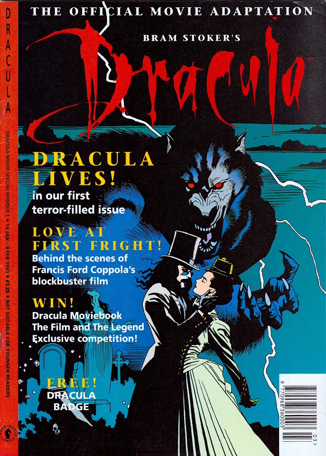
The first new real time read through for 2025 adds a third title to the Dark Horse International menu on the blog with Bram Stoker’s Dracula from 1993. This was released in the same year as their Jurassic Park comic and follows a similar formula, the movie adaptation taking up all of the comic strip space inside and followed by some extra features. This is similar to the Alien³ Movie Special mini-series from the previous year and has the same description down the left-hand border.
However, much like Jurassic Park, this comic would continue beyond the end of the movie and become an ongoing monthly, albeit with a rather big caveat (which we’ll get to when the time comes). The atmospheric cover by Mike Mignola (Hellboy, Rocket Raccoon, Baltimore) cements the dark, gothic feel of the strip and upon opening we’re met with a suitably black interior design.
I defy anyone who has seen the film not to read the introduction in Anthony Hopkins’ voice. I note that subscriptions are offered so clearly DHI were hoping the adaptation issues would be enough of a success for them to carry on. However, while it was advertised as a fortnightly in other comics it’s actually triweekly like the aforementioned adaptations.
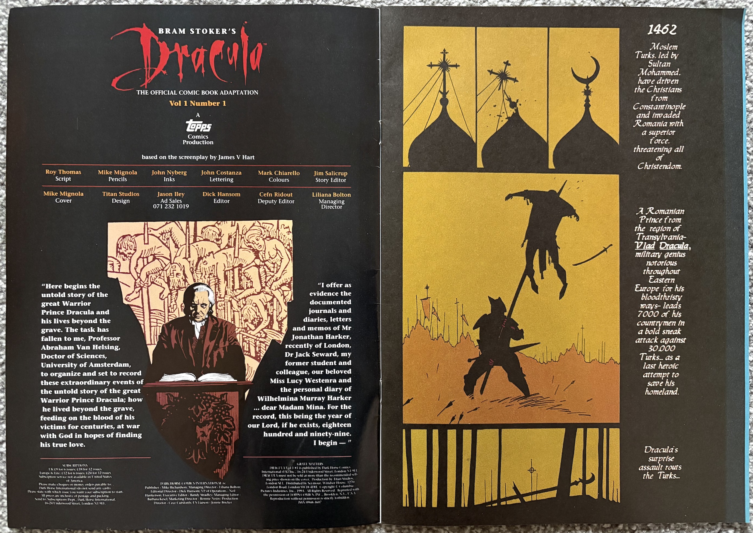
Edited by Dick Hansom (Jurassic Park, Aliens, Speakeasy), the 36-page comic has a lovely glossy cover with matte interior pages, a 28-page first chapter and two two-page features at the rear. So far, so DHI. The real stand out here is the strip’s art. Regular readers will know how I feel about movie adaptations but to see an original art style filled me with confidence for this one.
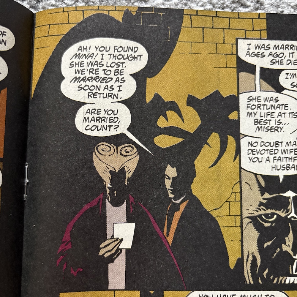
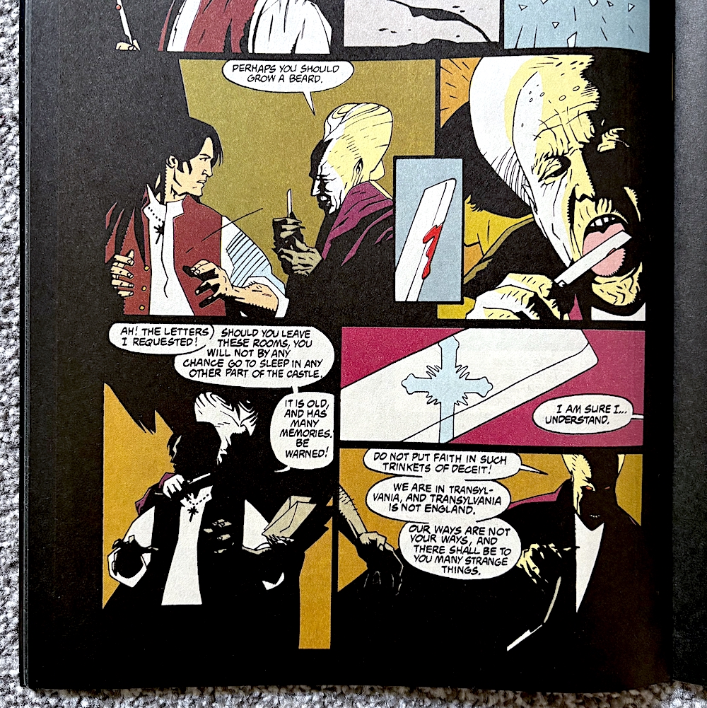
The art goes the opposite way of the elaborate, ornate movie. It may have quite simply drawn scenes and characters, but it’s the use of shadow that ties it in so neatly to the film. There’s simply no way of capturing the intricacy of the design and the style of Francis Ford Coppola’s direction so instead it feels like penciller Mike, inker John Nyberg (Action Comics, Doom Patrol, Nexus) and colourist Mark Chiarello (Batman/Houdini, Hellboy, Hush) have gone for atmosphere over detail.
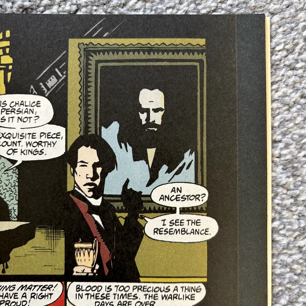
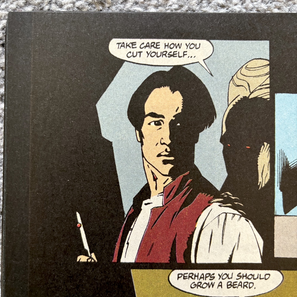
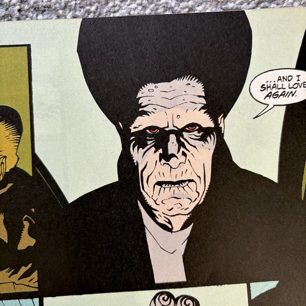
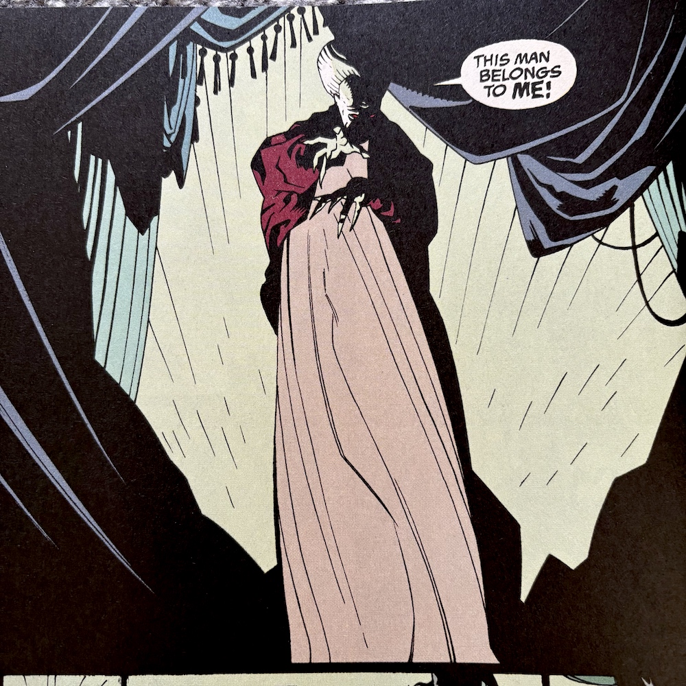
It works. It looks old-fashioned but I don’t mean in an ‘out-of-date comic’ kind of way. I mean the individual panels feel like they could’ve been drawn around the time the story is set and cleaned up for the 90s. Simple, sometimes scratchy line work with a mixture of bold colours for the more horrific scenes and subdued, almost washed out colours for the spookier moments, with the swathes of black in all the panels capturing that claustrophobic, haunted feel of the film, it’s just perfect.
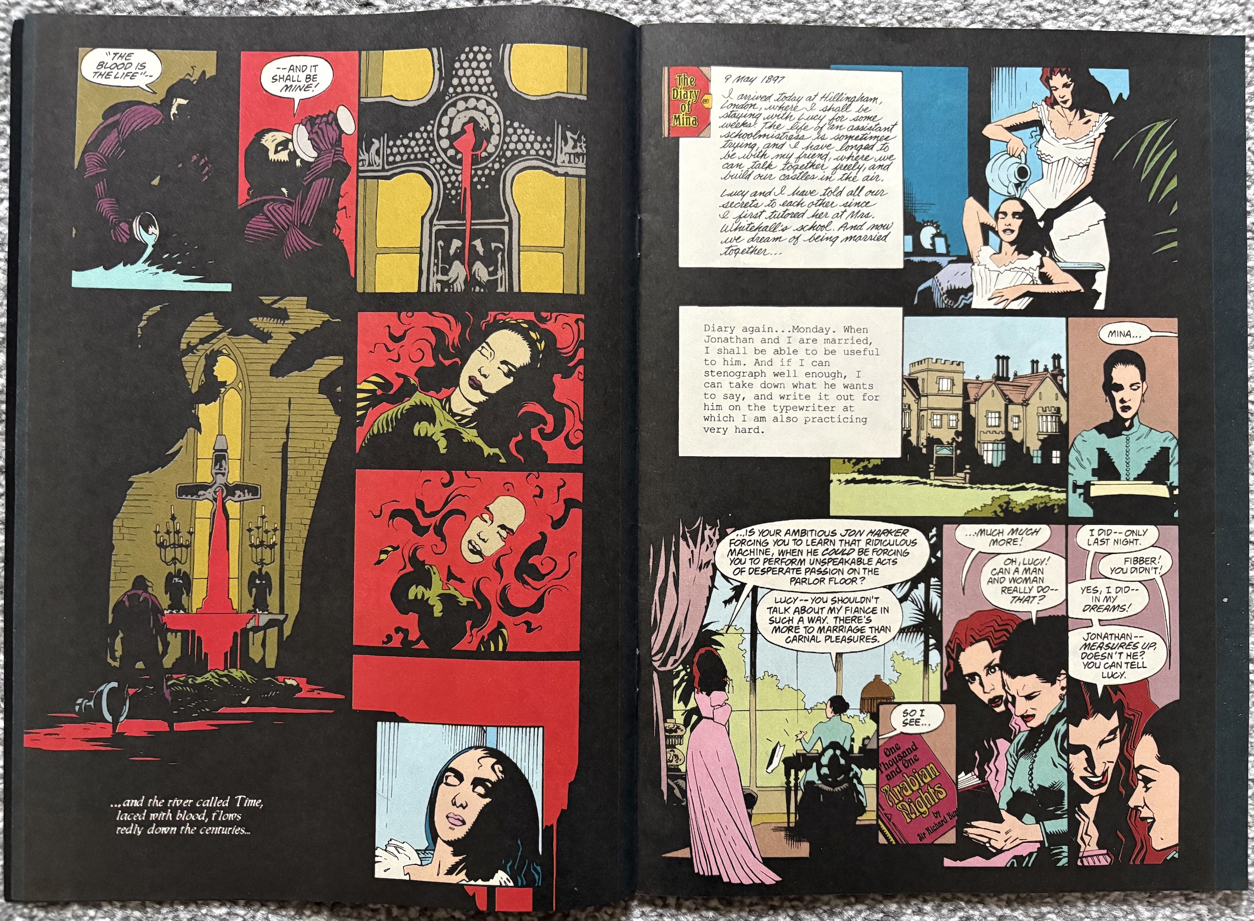
John Costanza (Jurassic Park, The Tomb of Dracula, Red) does an incredible job on lettering Roy Thomas‘ (Conan, Secret Origins, Stoker’s Dracula) script too. Whether it’s historical prose, different handwriting (or typed text) for each character’s diary or his regular style, it’s all very clever and captures the narrative aspects of the film, as you can see above. The original US comic edited by story by Jim Salicrup (writer on Transformers, Sledge Hammer and The A-Team), credited here as story editor.
Sometimes, however, the use of shadow can make it difficult to work out sequences of events and once or twice I found myself perusing panels a few times to work out what was happening, and that’s with me having seen the film recently. Like most comics adaptations the main audience would’ve been those who’d seen the movie already rather than new readers. Even more so with this one, I feel.
I’ve criticised previous movie adaptations for rushing through their screenplays or for being poor copies of their big screen originals, but I’ve also praised those that took the time to properly adapt the story to a different medium. Bram Stoker’s Dracula falls into the latter category. While what’s written on the page is basically verbatim from the script, the art does a perfect job of taking the movie fan back into that world to enjoy it in a different way.
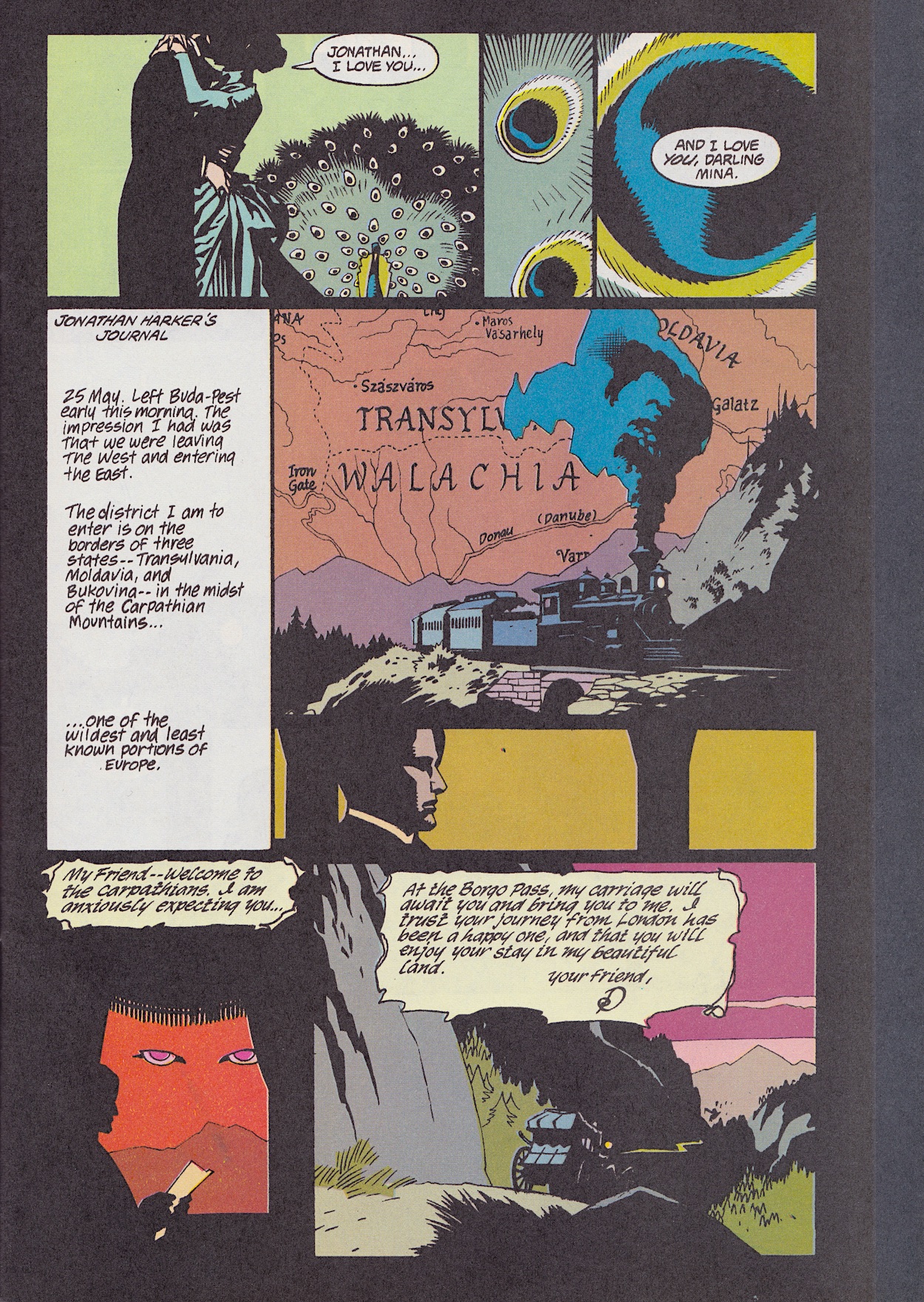
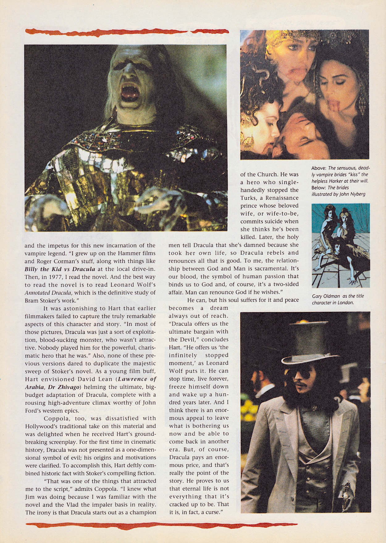
A perfect example of this is the moment when the carriage comes to pick up Jonathan Harker. In the film a massive set was built for this scene and it was full of highly detailed, creepy imagery. Here, all of that is stripped back. Instead, the sparse nature of the art and the use of shadow captures how that moment felt for the viewer. This brings the chill of the scene to the reader much better than any attempt to just copy it ever could have.
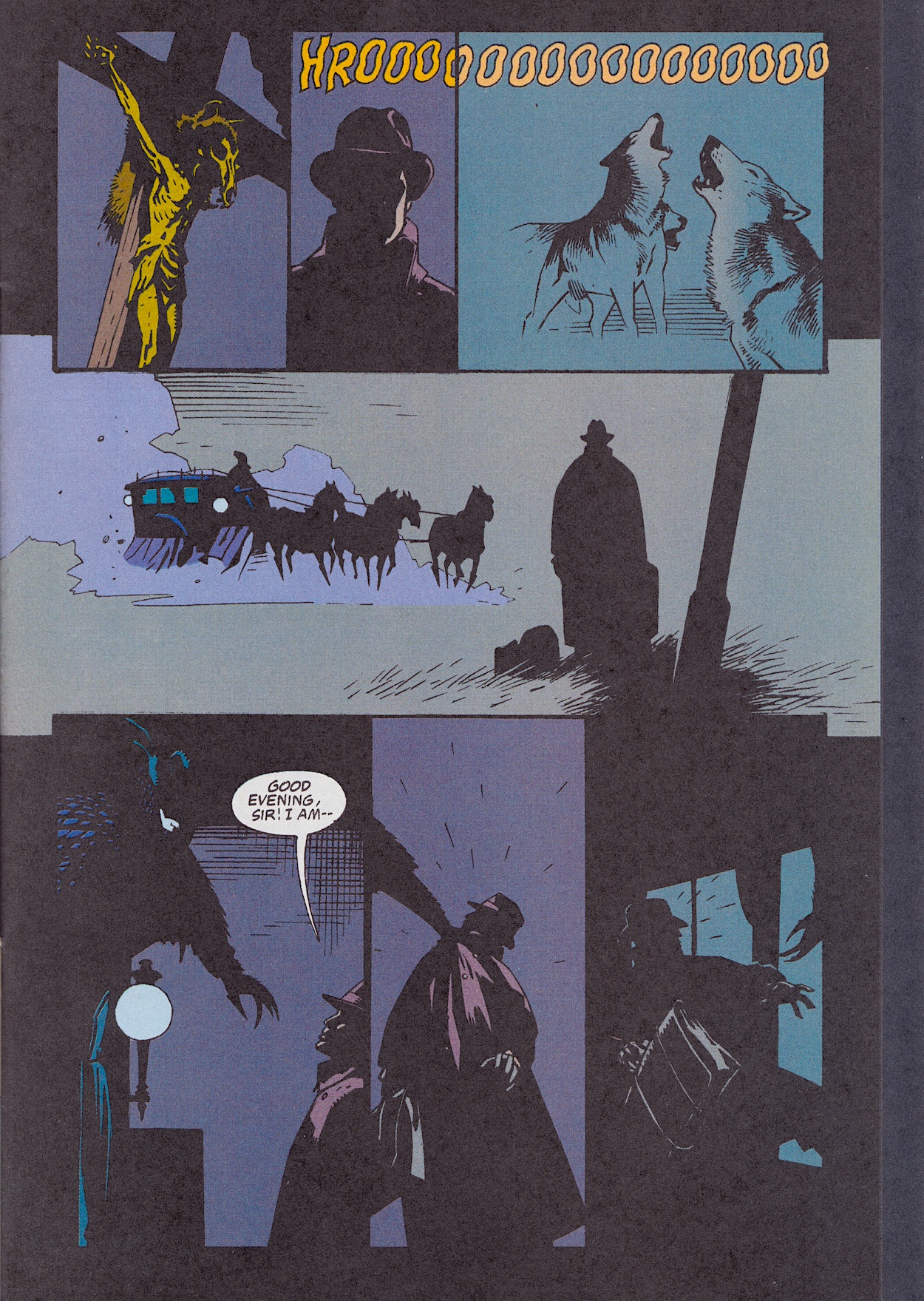
The shadow work brings another benefit too. Previous attempts at adapting a movie have had mixed results in portraying the actors. Most times there’s no attempt at all (and that may have been due to rights), other times they’ve tried so hard to capture their likeness they become stilted and expressionless. This team does something different. Through clever use of dark shadows the characters look enough like the actors without having too much detail, meaning they retain their expressiveness and, most importantly (and something Alien³ failed to do) their faces remain distinct from each other’s.
Not all of the film’s iconic visuals translate well to the page though, the best/worst example being Jonathan’s train journey. While that marvellous model shot couldn’t hope to be replicated on the page, the zooming in on the peacock’s feathers makes no sense here and Dracula’s eyes in the sky just look weird. These moments were great examples of the film’s iconic style but I can’t help thinking they’d have been best left out here, or at least have the Count’s eyes elaborated on to make more sense in this medium than the seemingly random panel below.
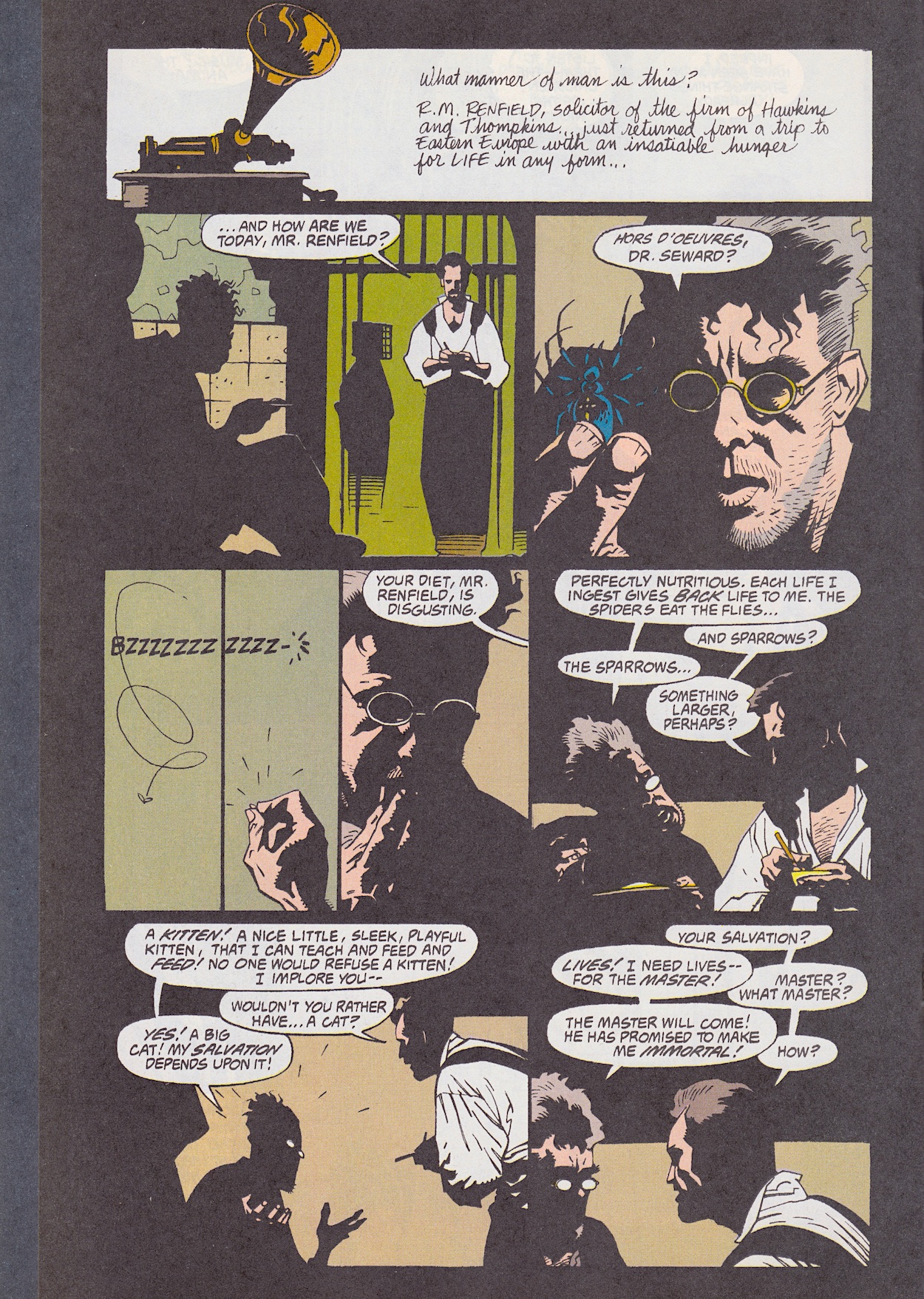
The first chapter of the story ends on that horrible/terrifying scene with the baby. Anyone who has seen the film will know exactly which moment I’m talking about! Then it’s quite jarring to come to white pages. I kind of wish they’d kept them black, but that may have made them hard on the eyes. As with the first five issues of Jurassic Park, Gary Gerani’s behind-the-scenes feature is in parts and begins with the original source material. I remember at the time some people complaining about what they thought were “changes” to the character (e.g. Dracula walking about outside), so thankfully that’s all put to rest here, confirming this film is the one that follows the book and portrays the character most accurately.
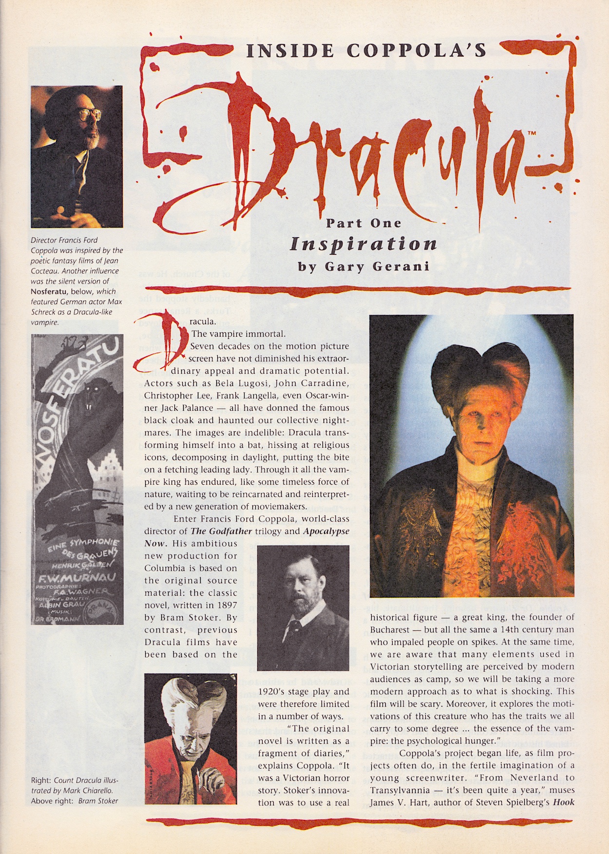
I’m usually one who likes to read opening credits and link the names listed to other films I’ve watched, but I was surprised to find out which family-friendly Steven Spielberg movie James V. Hart had written! Although, I do disagree with him on the best way to read Bram Stoker’s novel. If it’s your first time reading any novel it shouldn’t be the annotated version, or at the very least ignore the annotations until your second reading. They can be fascinating on second reads, but they interrupt the flow of the work and can also contain spoilers for later in the book.
Dave Hughes’ Bloodlines is the news feature of the comic, similar to his Motion Tracker pages in Aliens. With Bram Stoker’s Dracula still in the cinemas at the time of publication the comic was keeping us up to date with its takings so far. It would go on to rake in over four times that amount. Also truly placing the comic in the past is the description of Anthony LaPaglia (Without a Trace) as a new actor on the scene! But it’s surely another film release that will catch blog readers’ attentions.
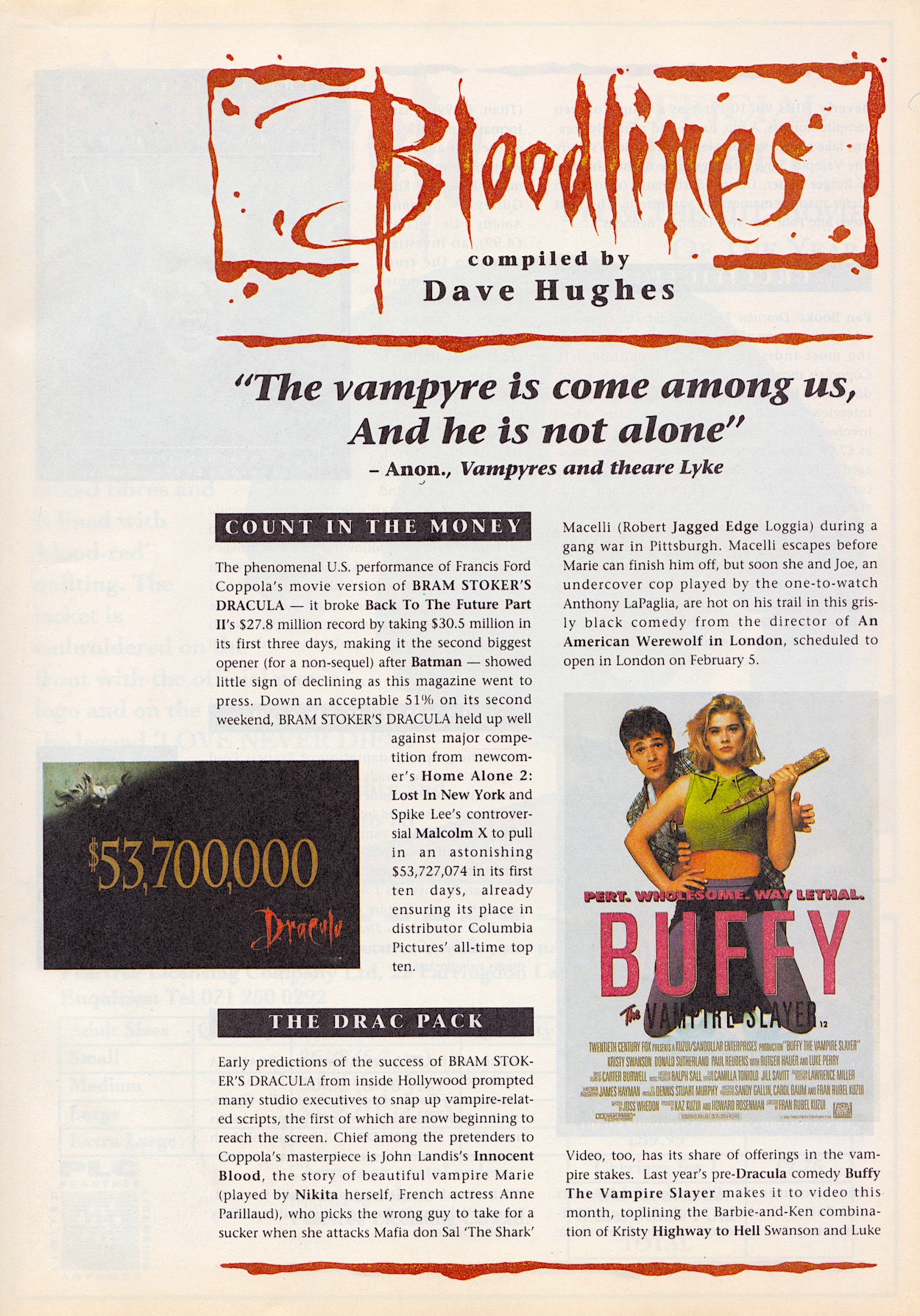
Who knew that silly film would go on to be reincarnated as a hit TV show? A show I really enjoyed until (coincidentally) Dracula turned up. Treating him like an easily-slayed villain-of-the-week was annoying and I remember that season becoming too sombre and lacked the humour of previous years, so I stopped watching. But anyway, it’s another example of placing this comic in our own timelines.
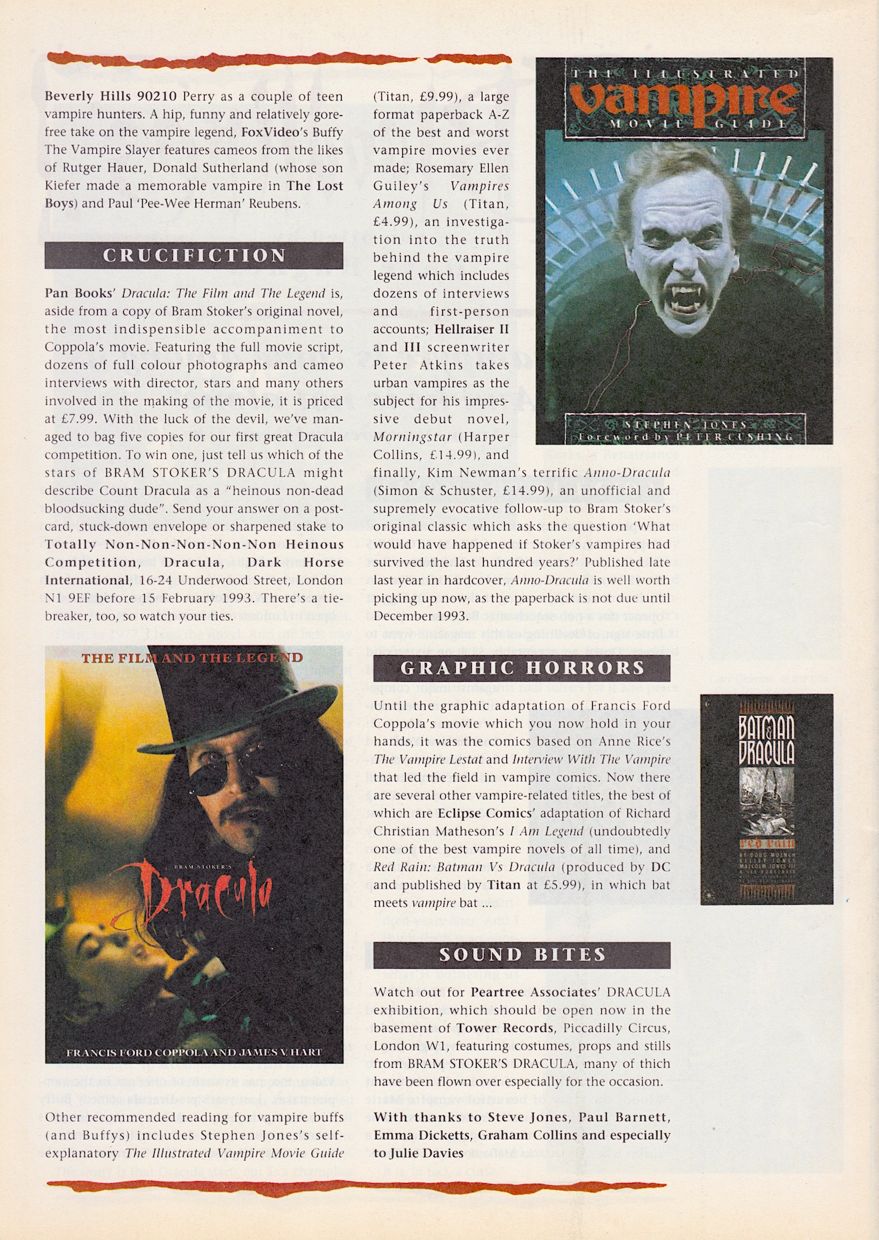
The news pages also mention Malcolm X, another film of the same era that I must revisit sometime, and Anno Dracula, an alternate history novel by Kim Newman which sounds fascinating, although I admit even all these years later I’ve never heard of it. Upon doing a bit of research I found out that in Anno Dracula, the Count’s first wife is called ‘Elisabeta’, a name taken from this film. Also above, you’ll see the usual fun competition and address our comics and magazines like to do at the time.
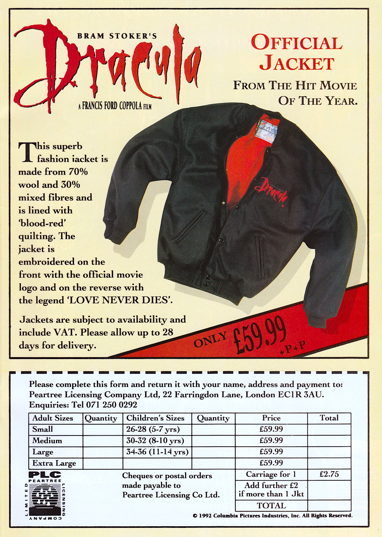
Rounding off the issue on the inside back cover is this advert for a very 90s jacket tie-in The Master from Doctor Who would’ve liked, and on the back page is an advert for #9 of Aliens. Even though #8 was still to be released two days later, the next one had some exciting new additions and this was also used as a Next Issue page in the Aliens comic itself.
It’s never going to tell the story as well as the film for newbies but this comic was clearly aimed at those who had just enjoyed Bram Stoker’s Dracula at the cinema. In that regard this is the best movie adaptation I’ve come across so far on the blog. That art, that brave decision to create its own unusual style that somehow feels just right, is wonderful. There’ll hopefully be for wonderfulness in just three weeks with #2 on Sunday 9th February 2025.
